
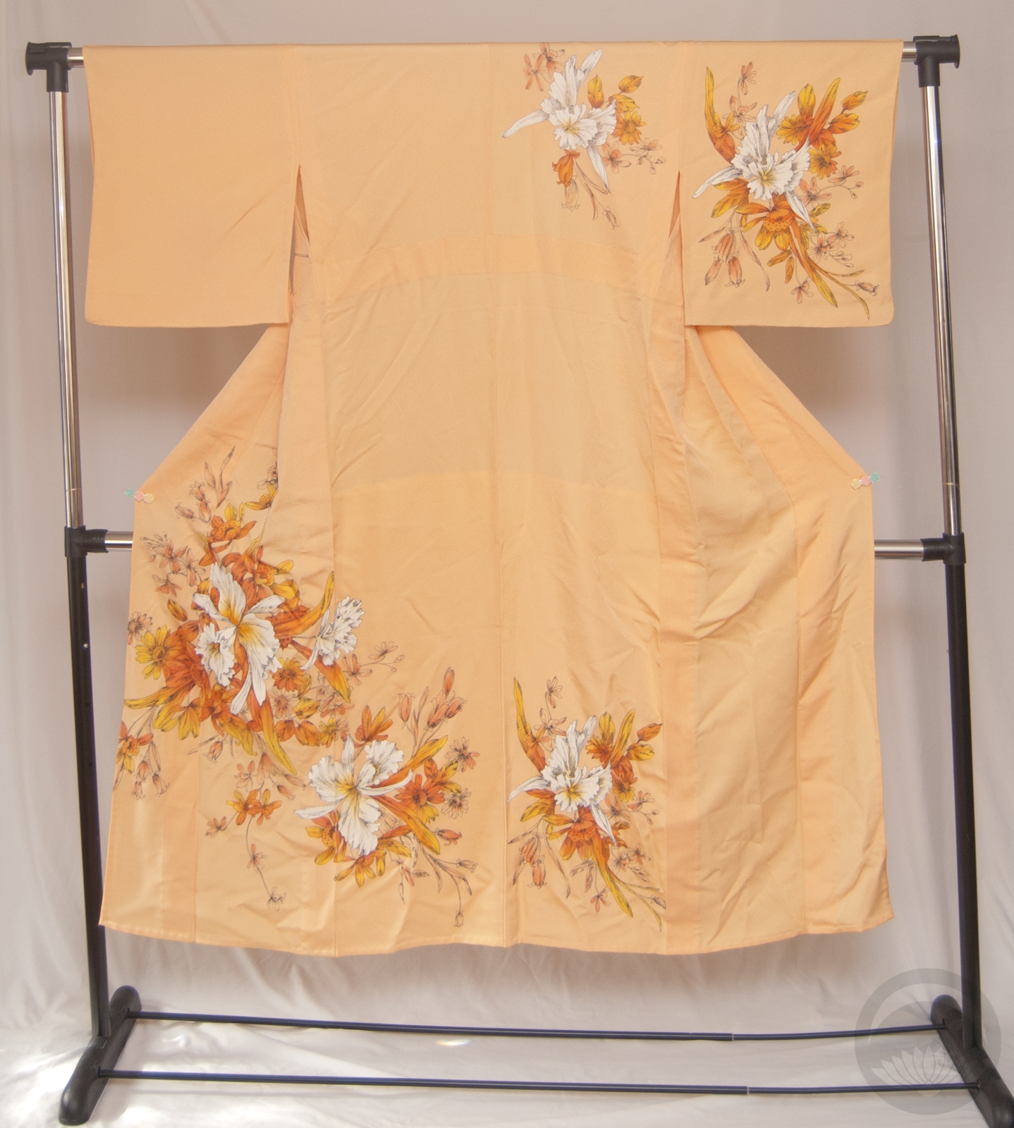
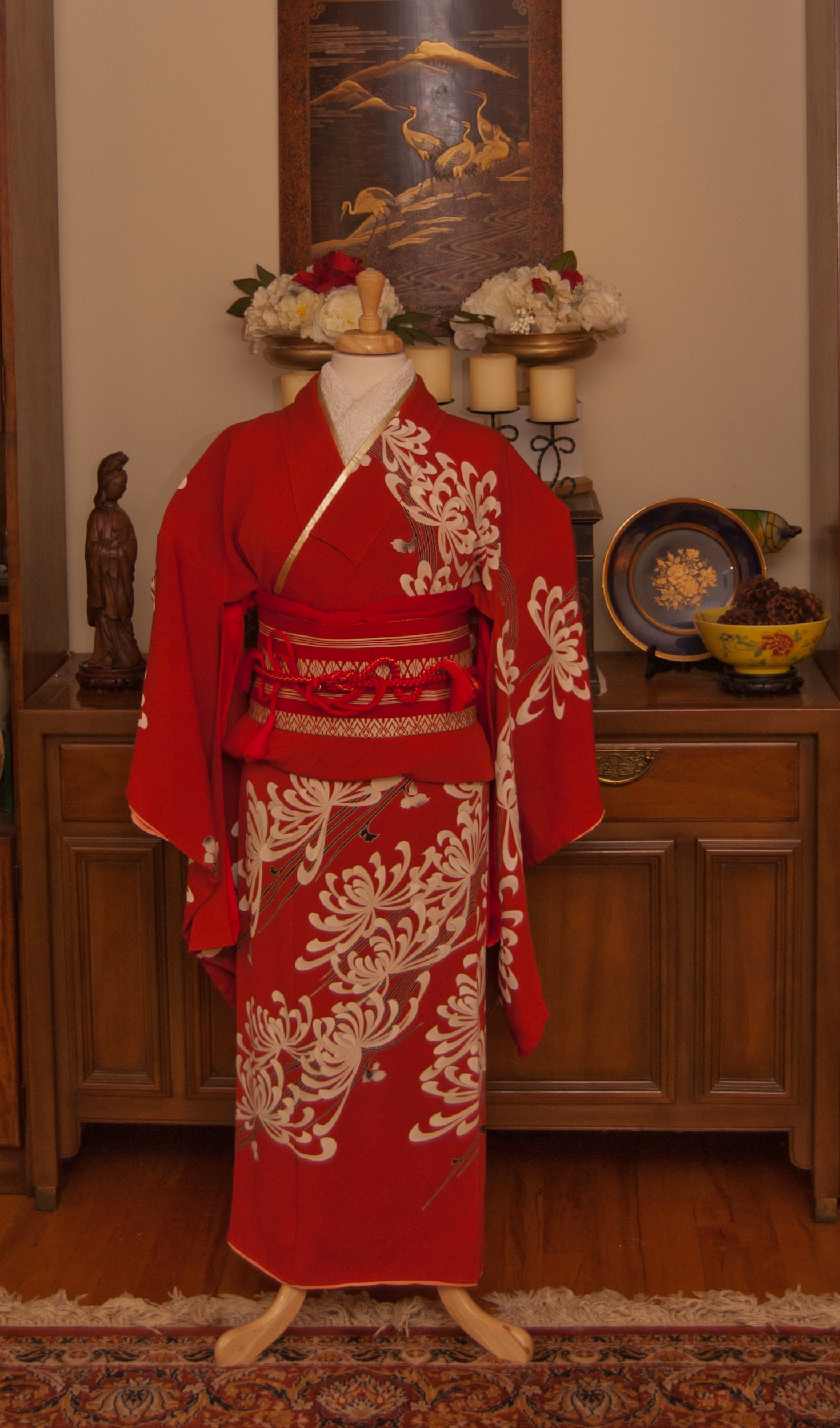
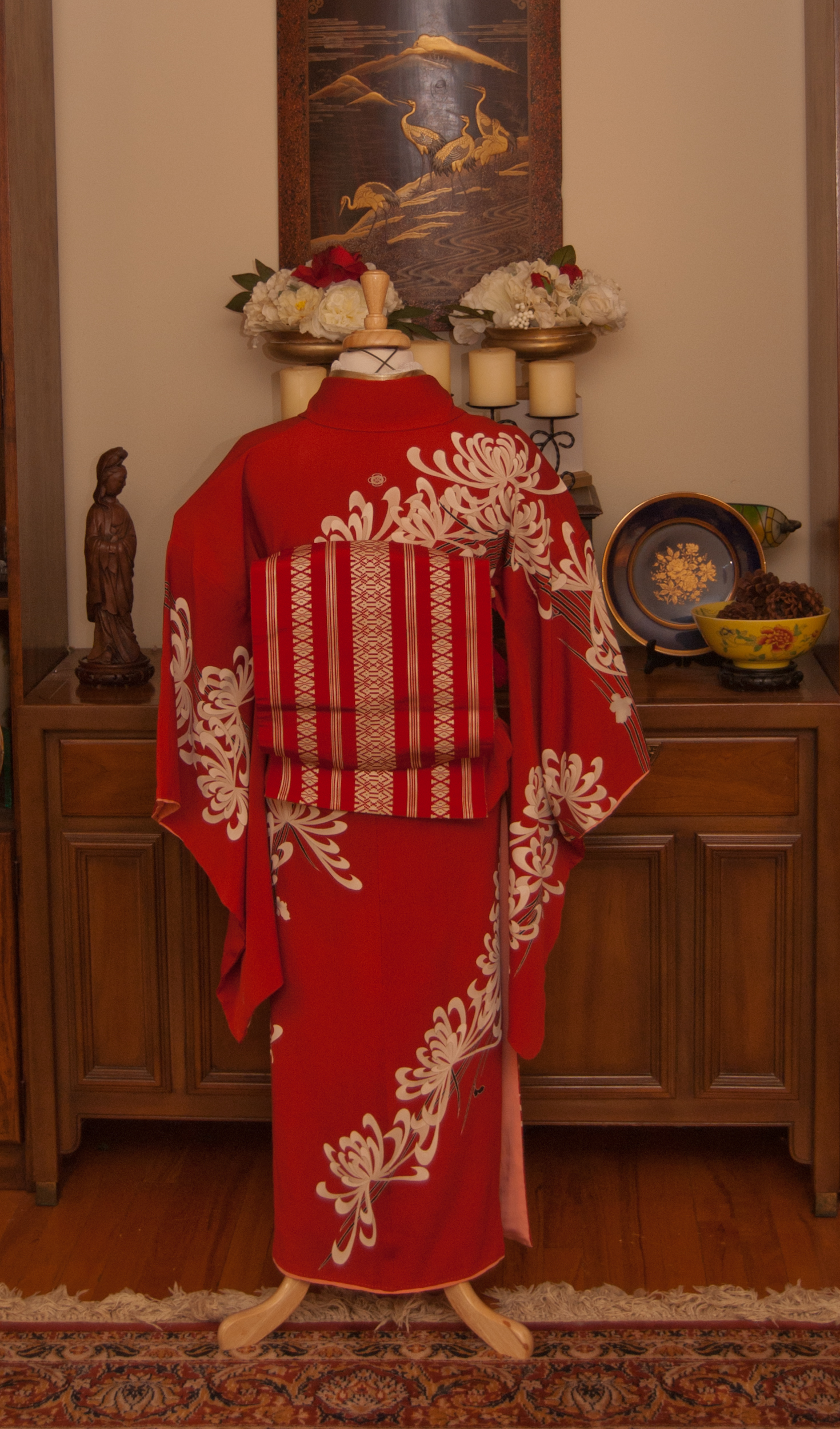
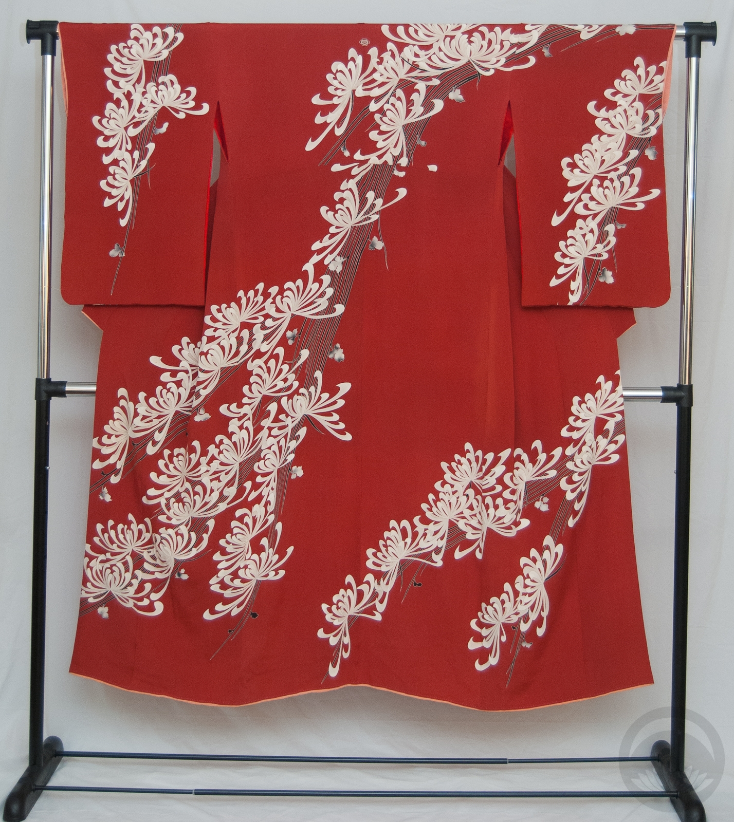
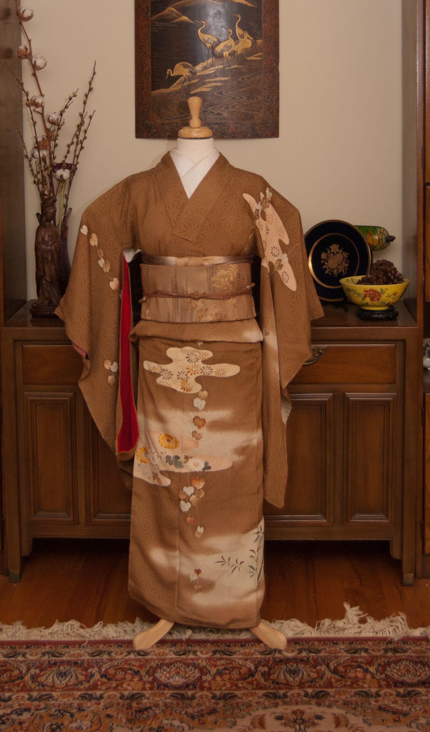
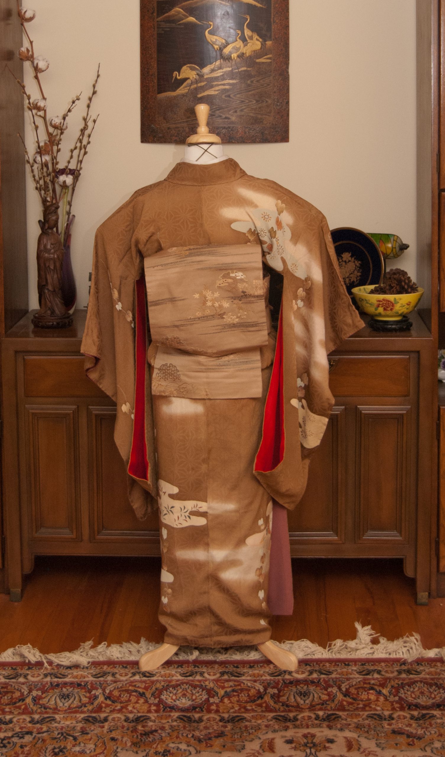
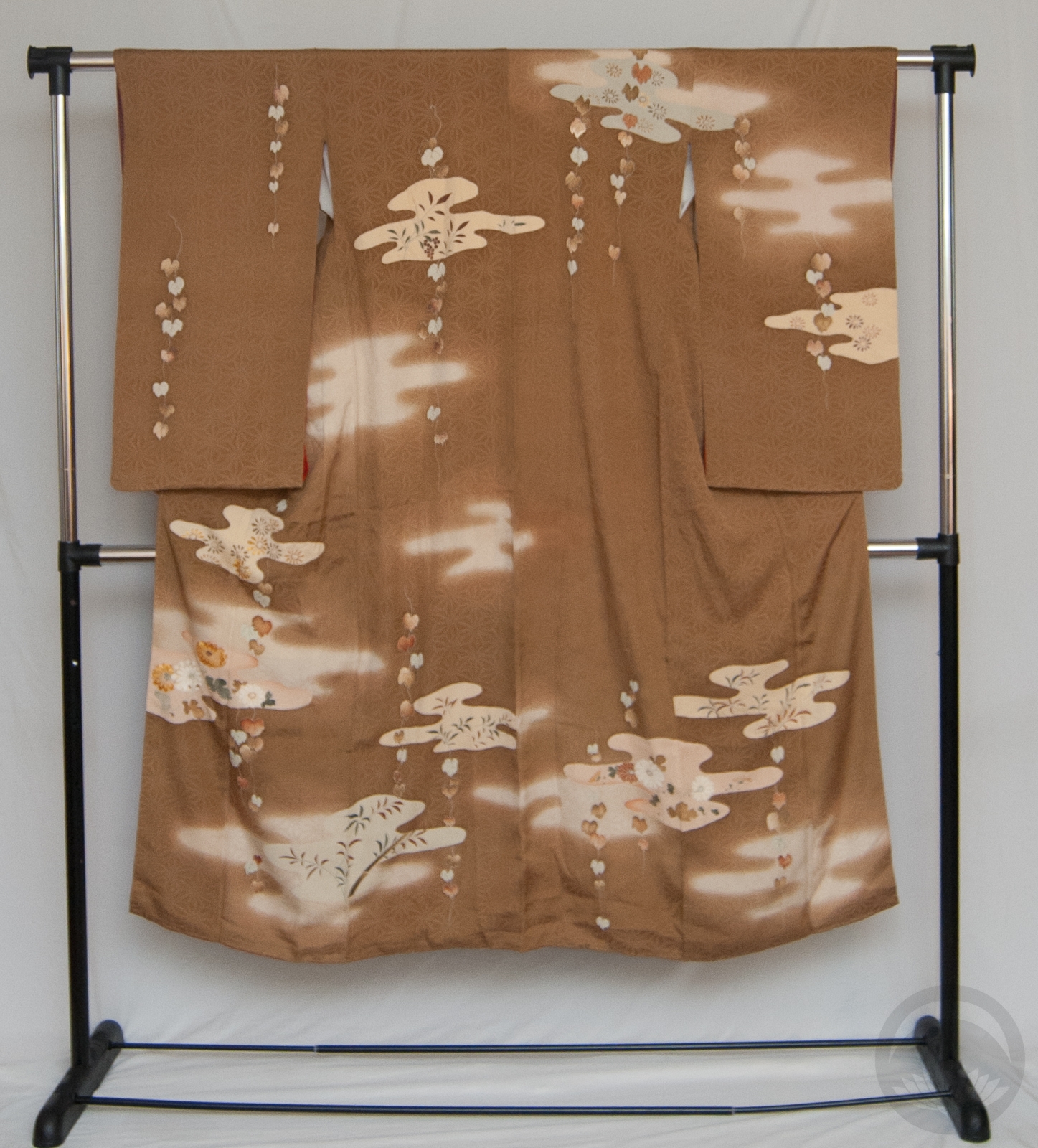
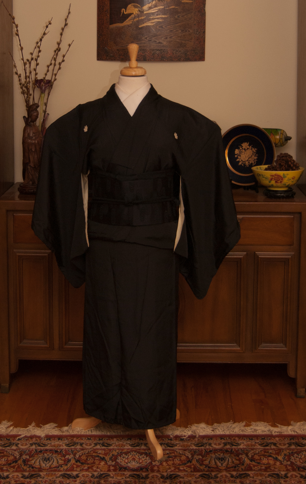
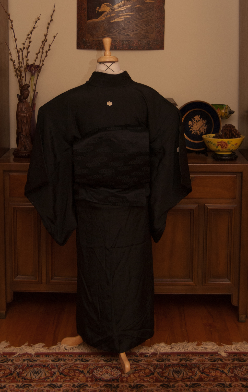
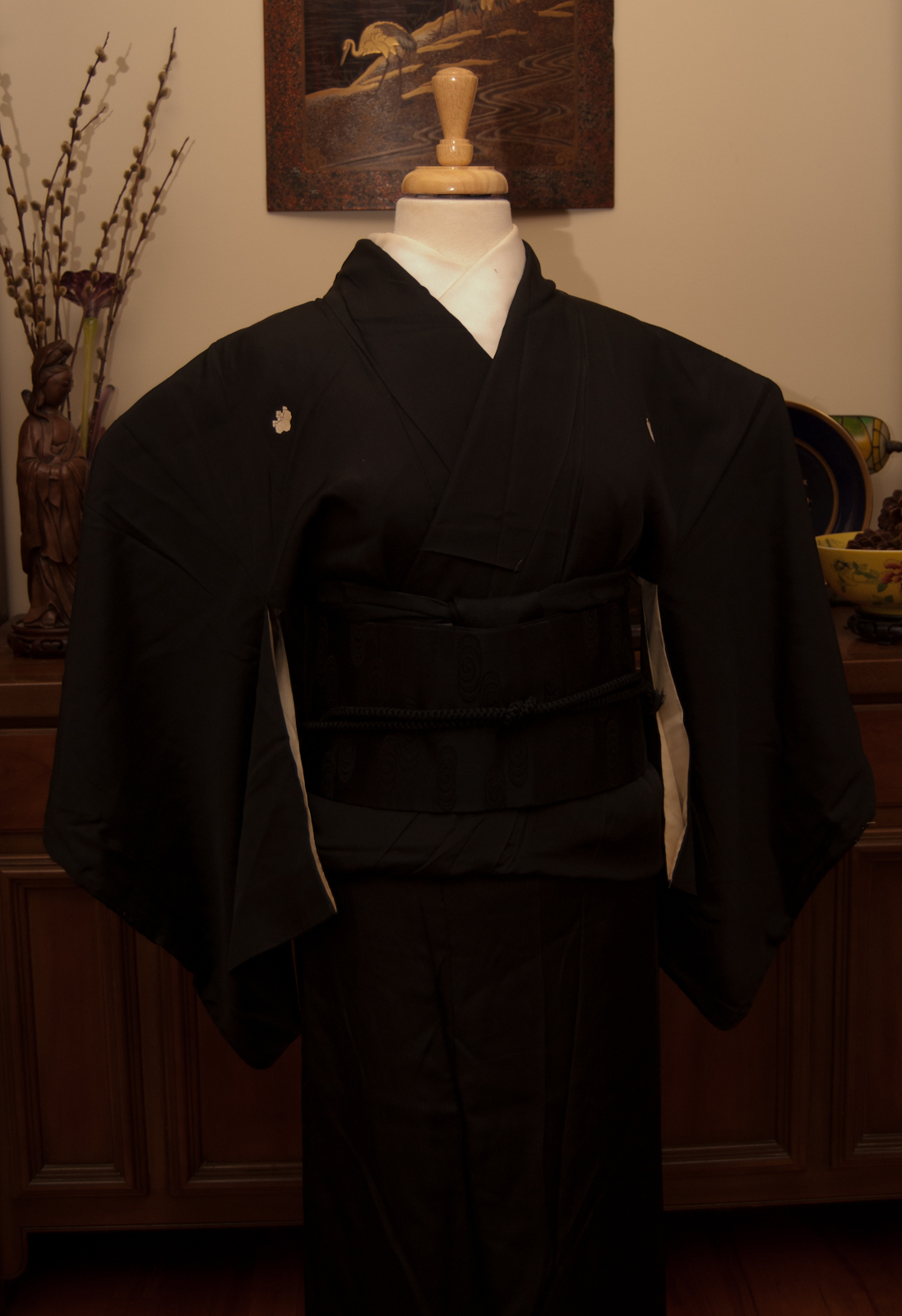
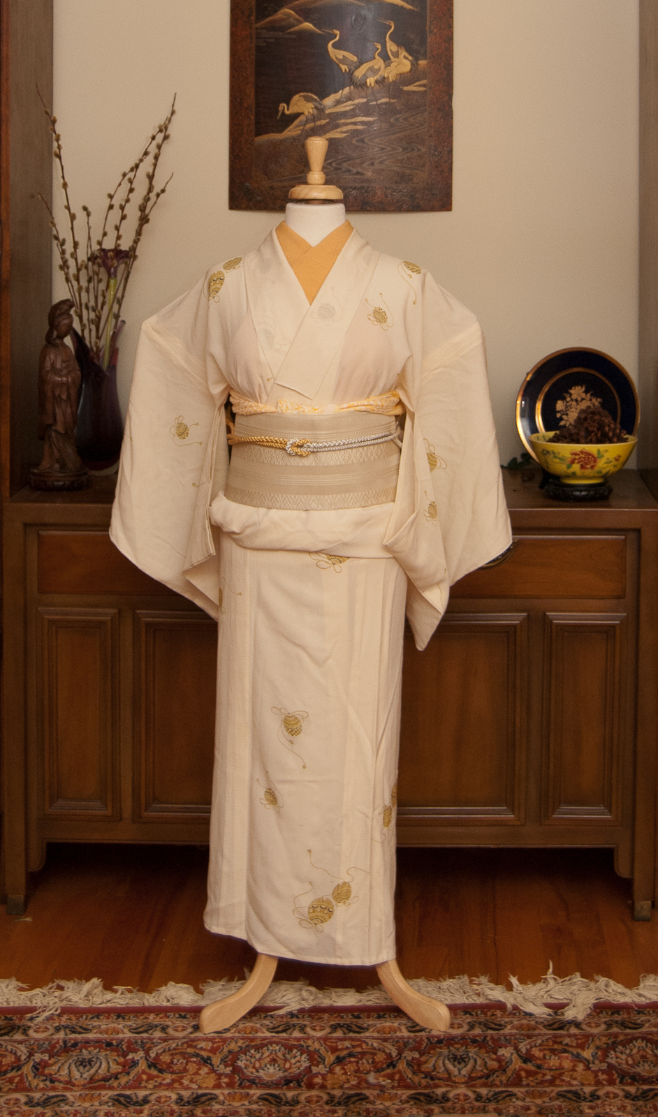
As much as people love to mock the trend of pumpkin spice everything, there’s a reason it’s so popular. It’s comforting and familiar and warming, and utterly perfect for this time of year. So when this kimono arrived in the mail, I knew I had to do an orangey-peach monochrome look with it, despite the orchid motifs being quite out of season.
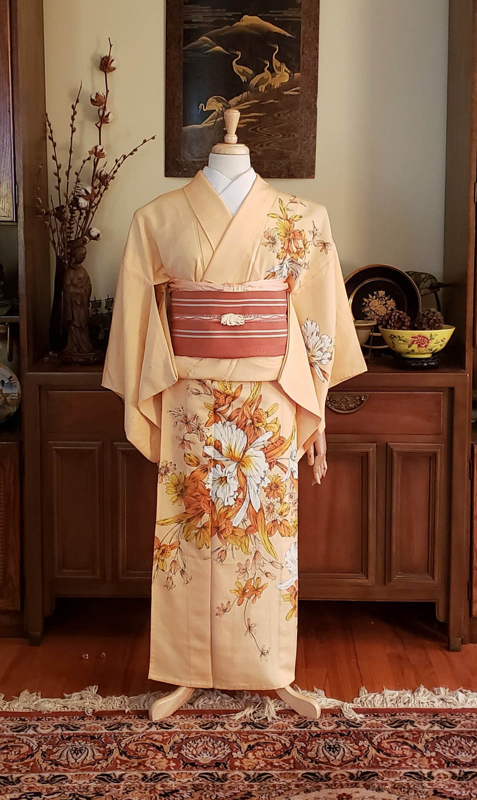
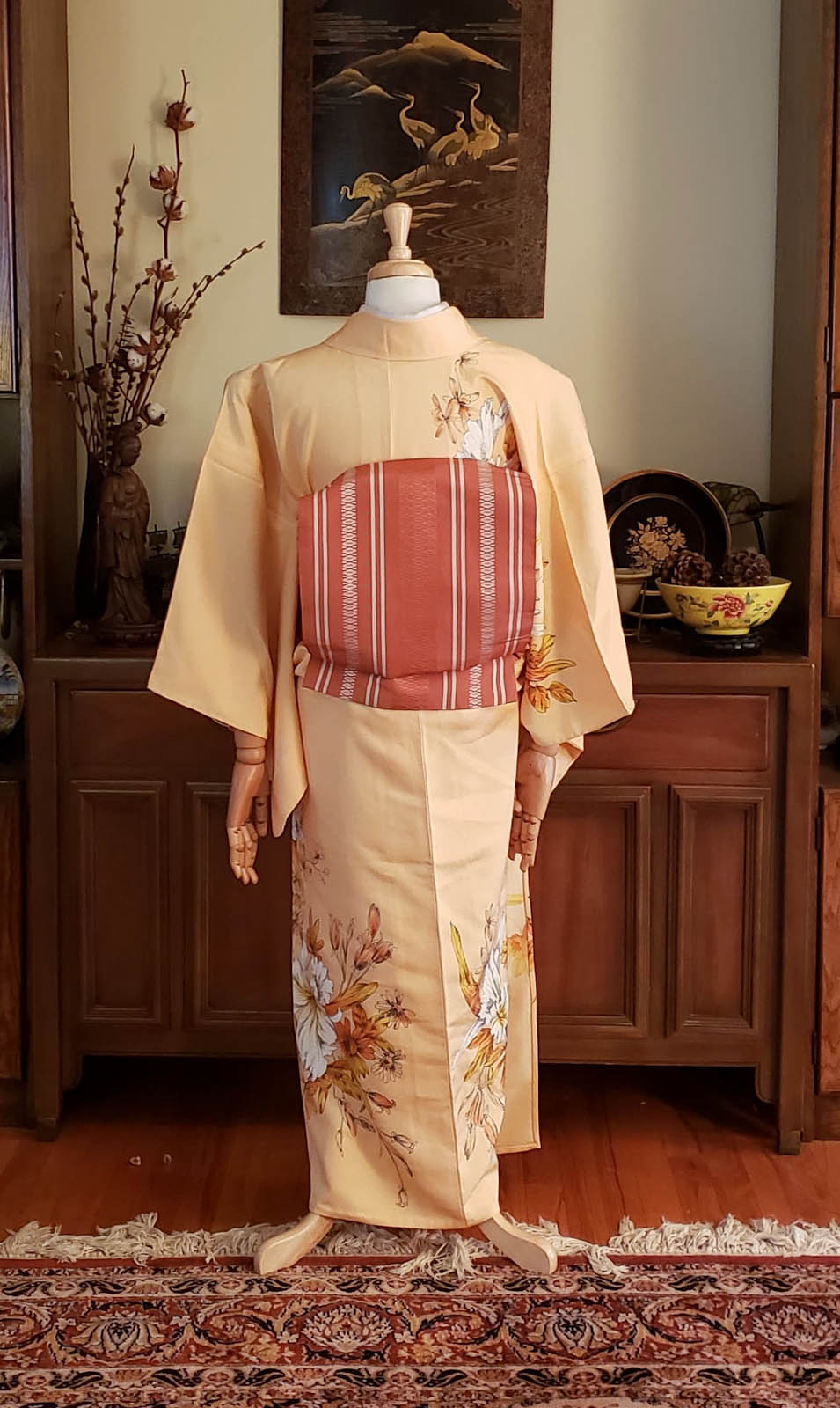
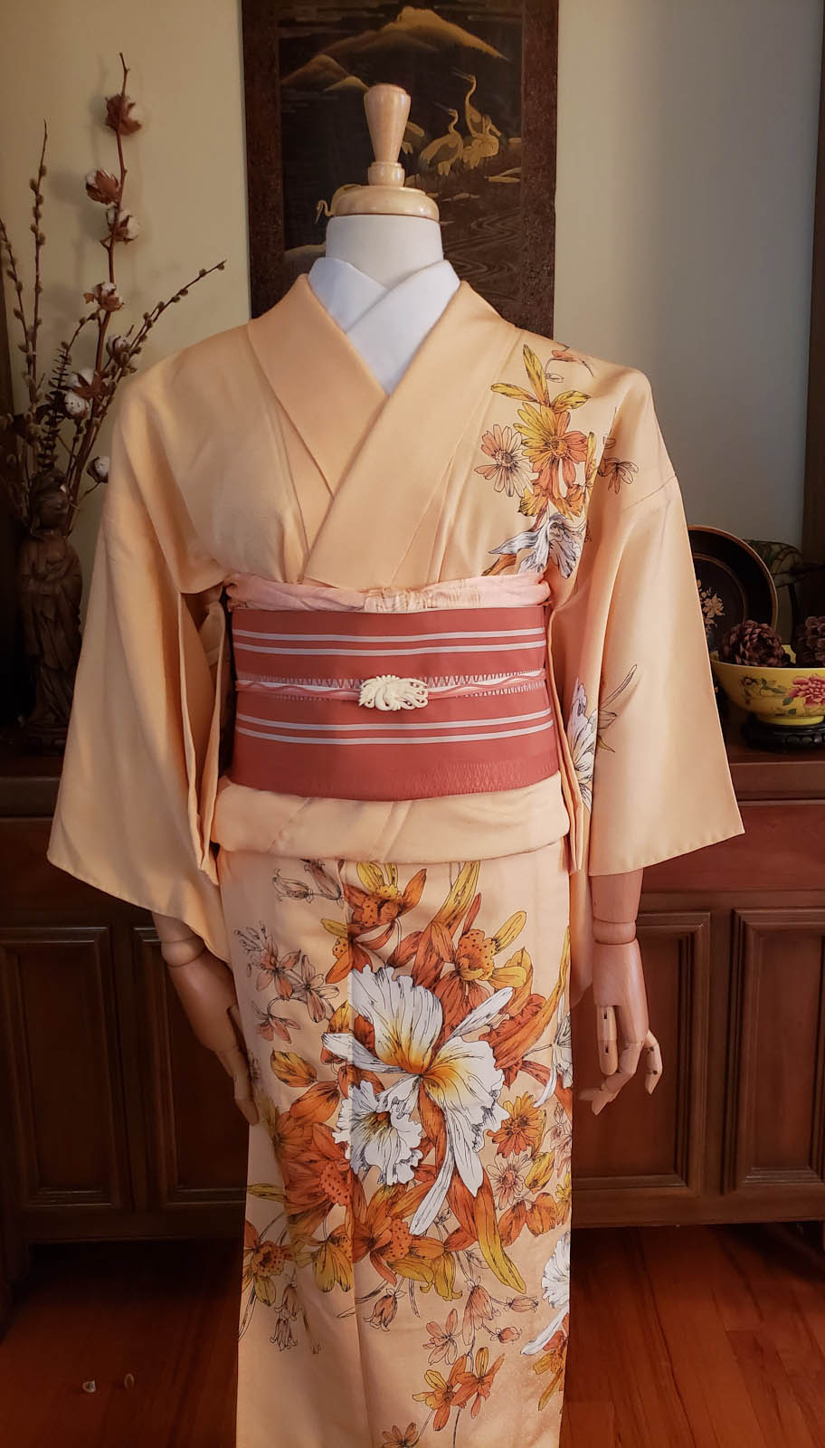
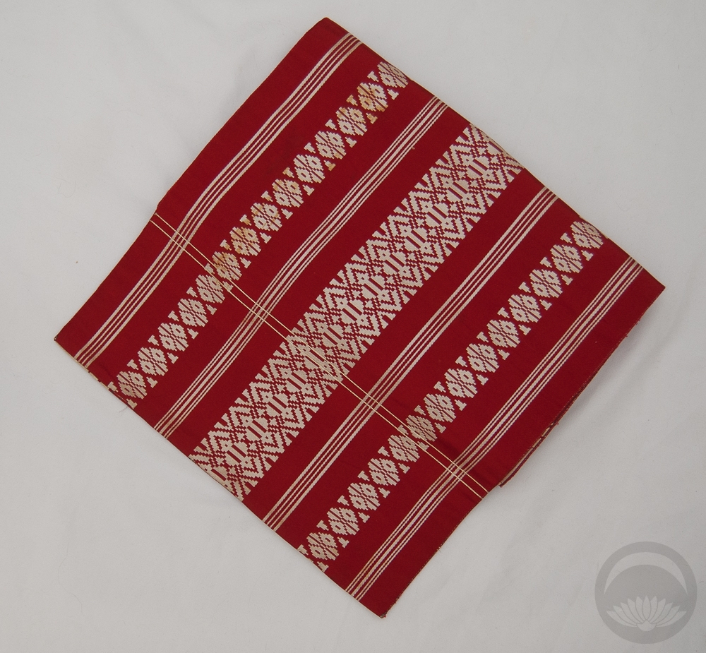
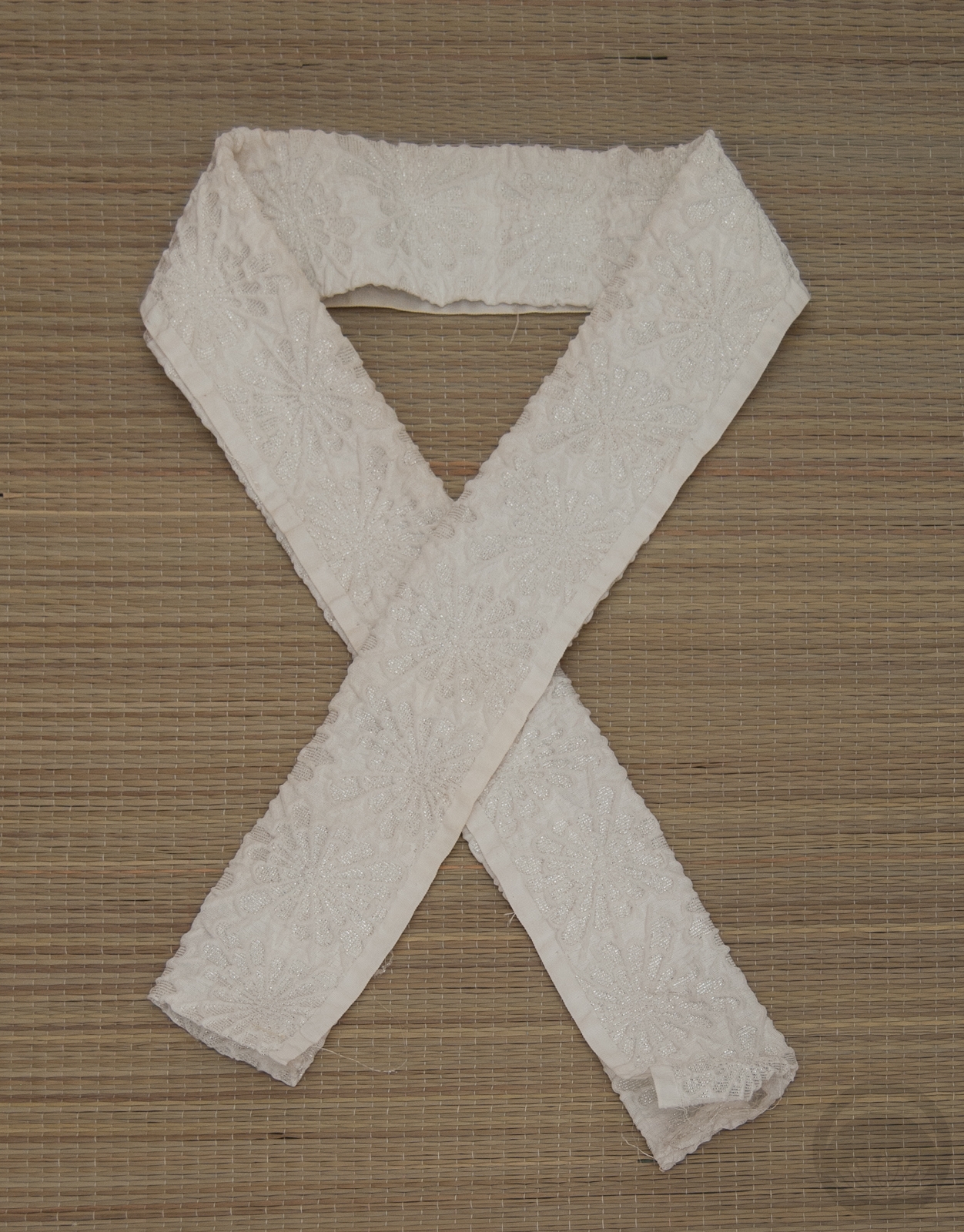
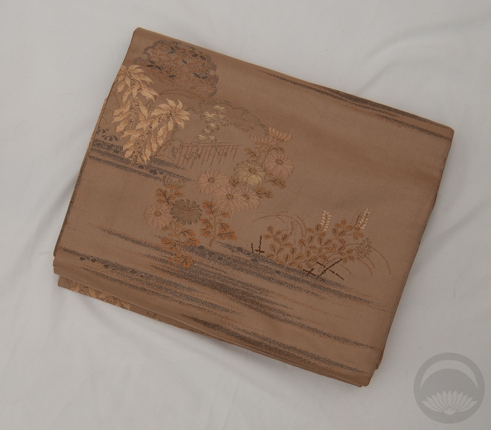
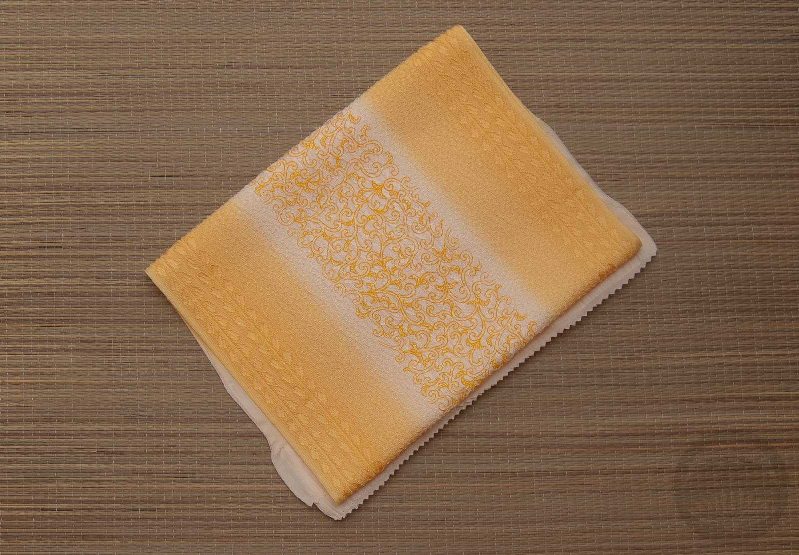
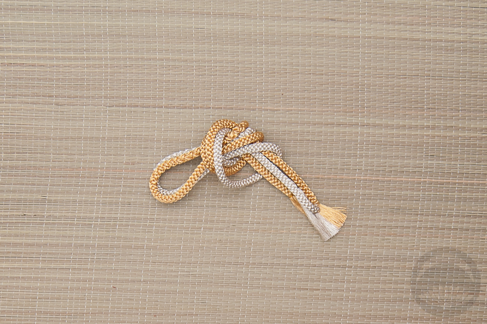
The kimono is stunning; big blousy cattleya orchids in white and all shades of orange. They’re outlined in black in such a way that they feel like ink drawings. I don’t have a single other kimono painted in quite this style, and I freaking love it. I paired it up with the orange and white hakata side of one of my favourite chuuya obi, some peach accessories, and a new obidome I got recently. It’s a little ivory phoenix, and I love the final little punch of white it adds to the whole ensemble. I didn’t use a decorative haneri because I liked how the plain white echoed the big white orchids of the kimono. Overall, I’m really really happy with how this one turned out.
If these photos look a little off to you, I apologise. Firstly, my camera was giving me grief and I ended up taking these with my phone, and on top of that, the peach base colour of the kimono is nearly impossible to capture properly. I tried to do my best to balance everything but in reality the peach is more vibrant and the obi is much more orange, almost carrot-like and a perfect match to the orange in the kimono’s designs.
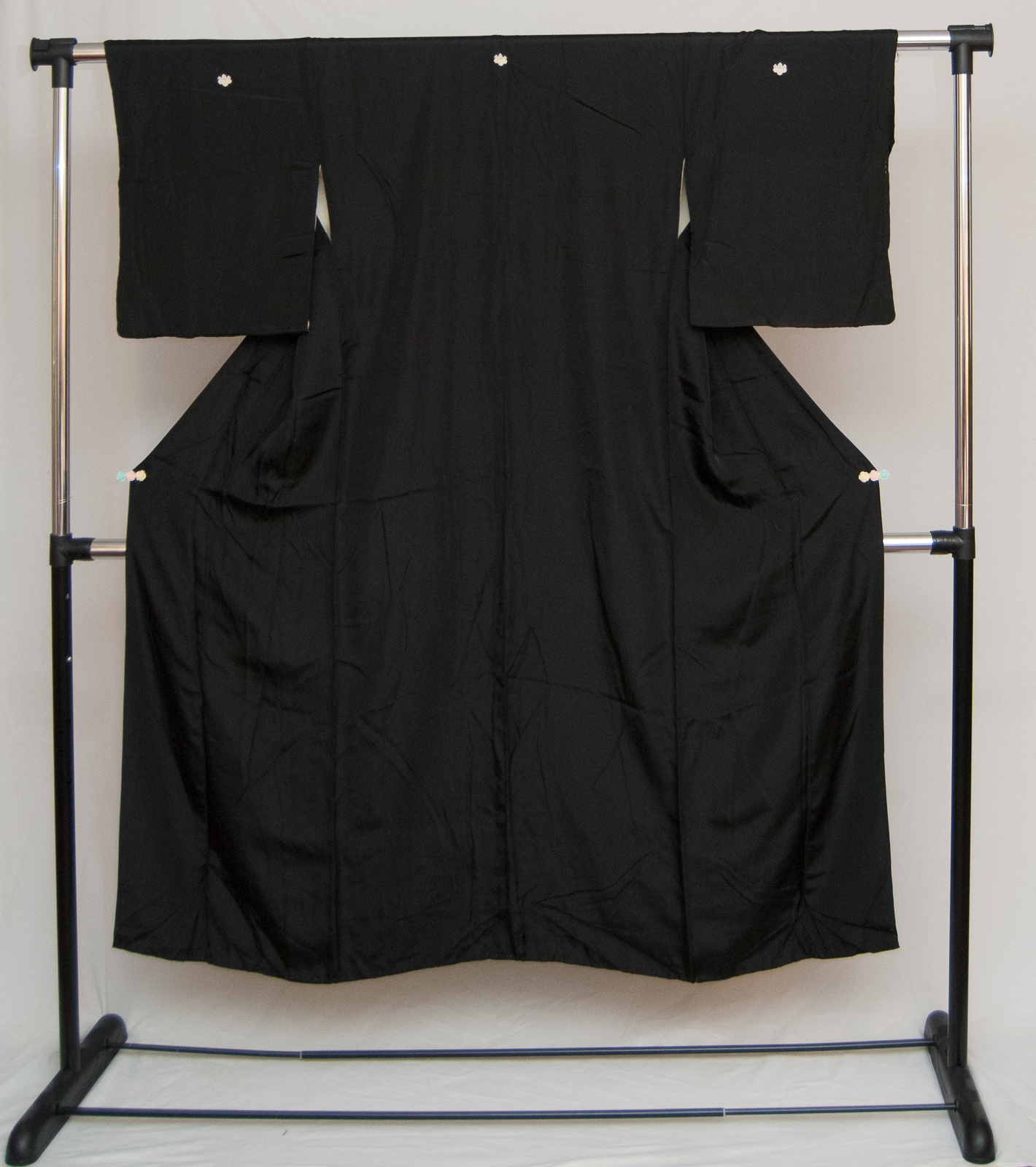
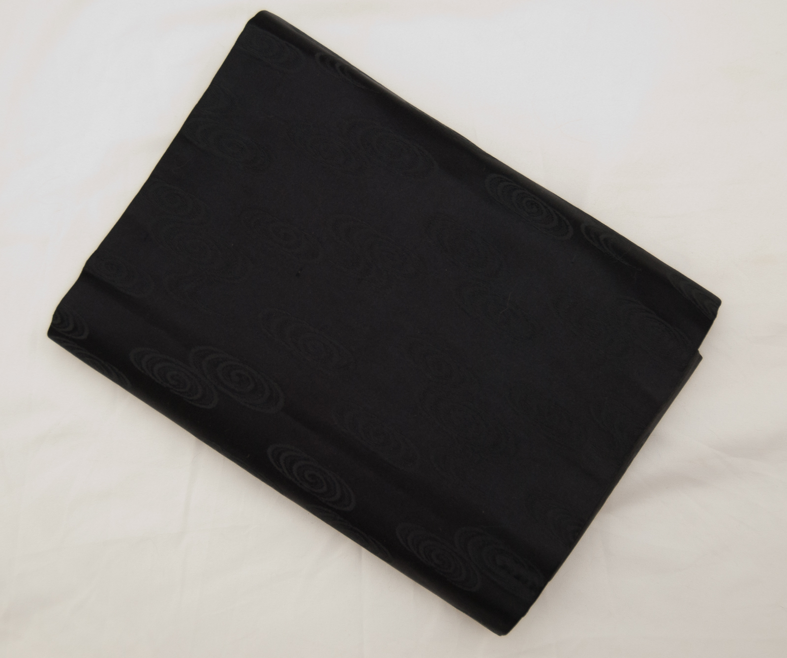
Items used in this coordination
-

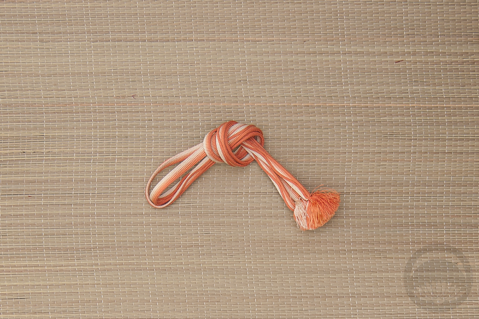
- Peach Orchids
-

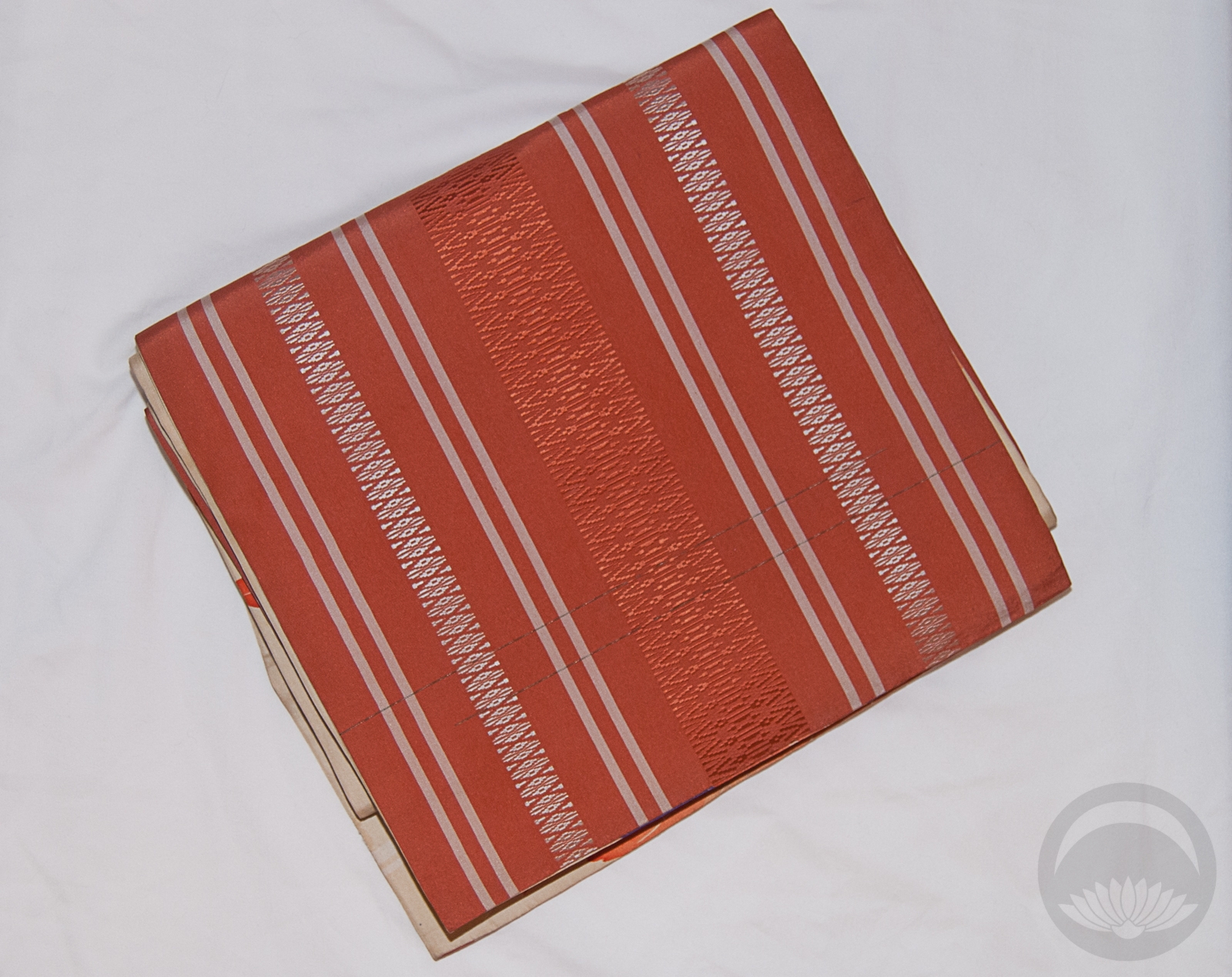
- Momiji side 2
-
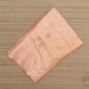
- Peach with Tachibana
-

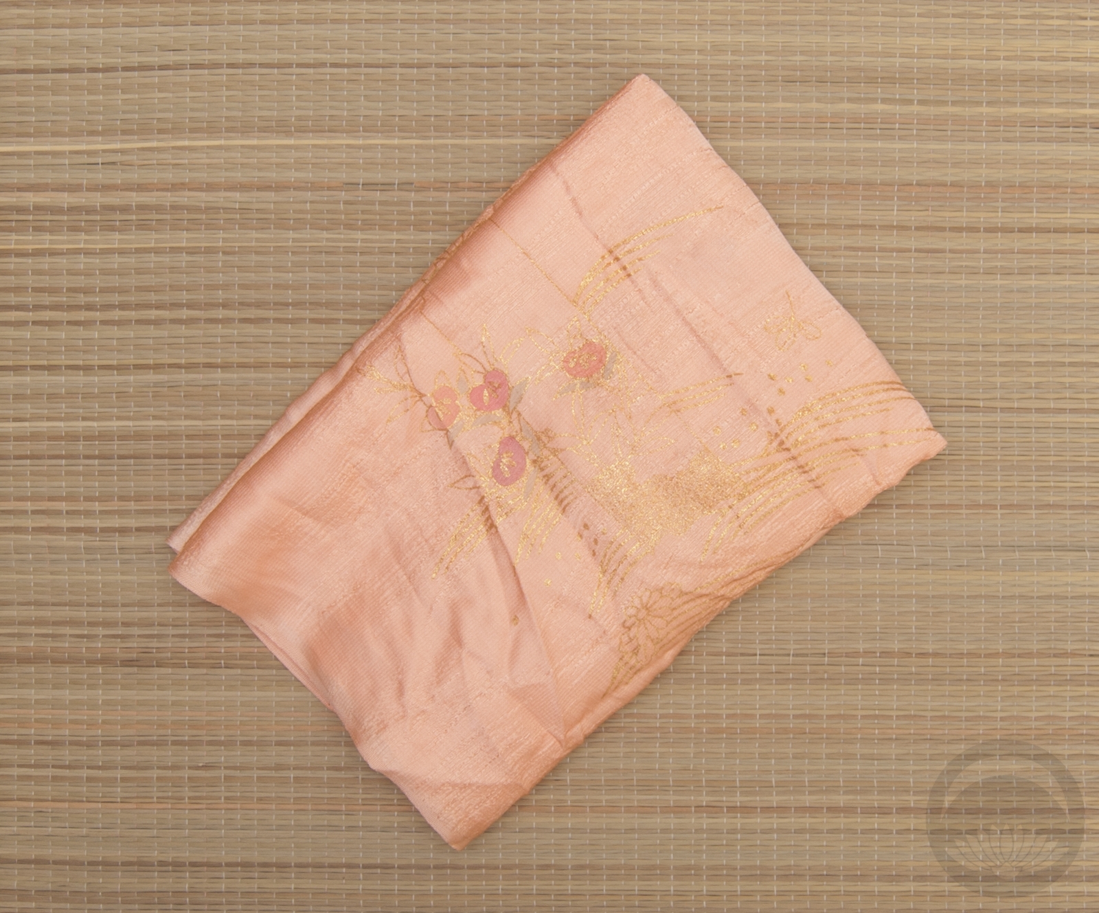
- Shades of Peach


 Bebe Taian
 CHOKO Blog
 Gion Kobu