
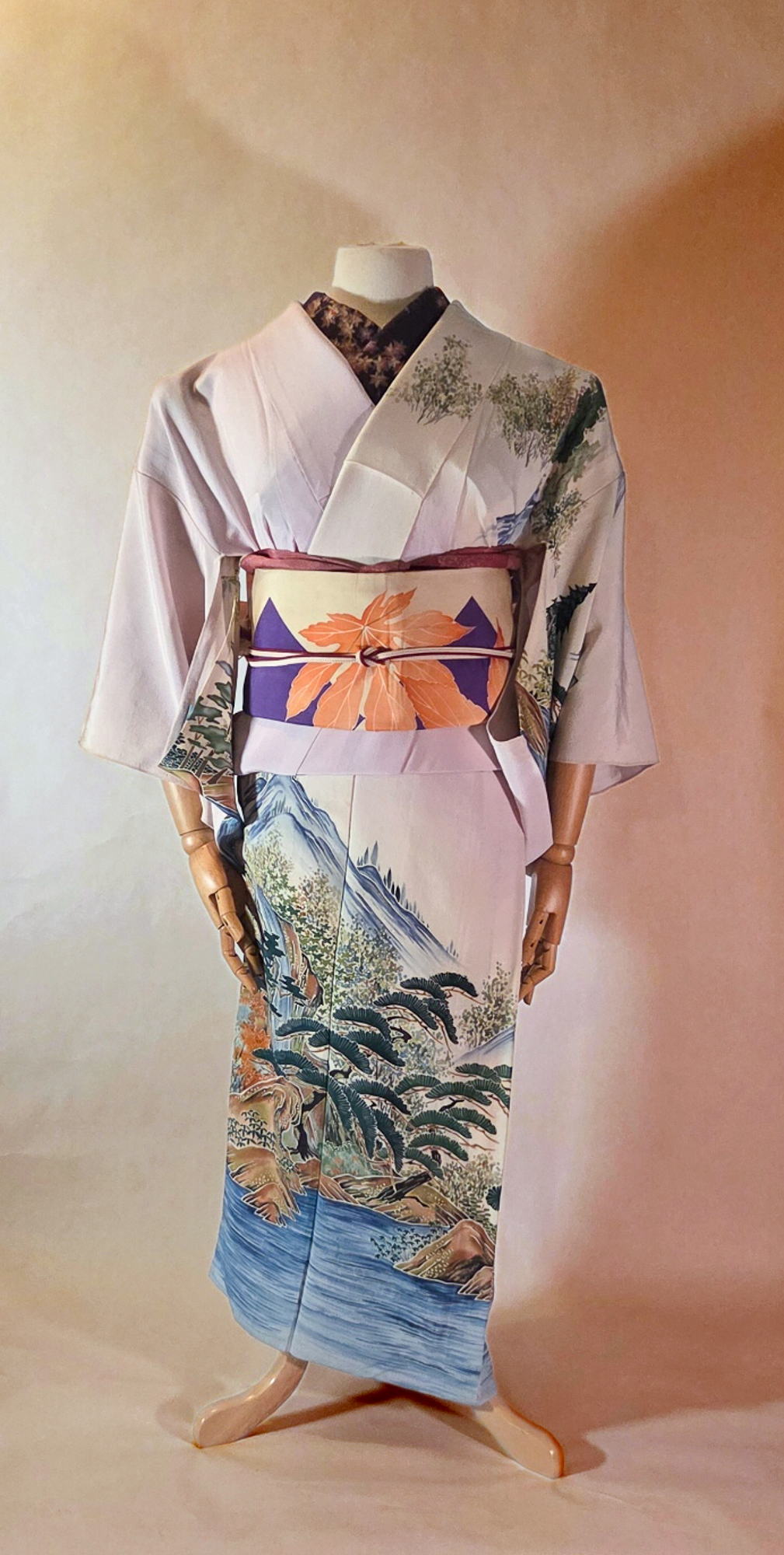
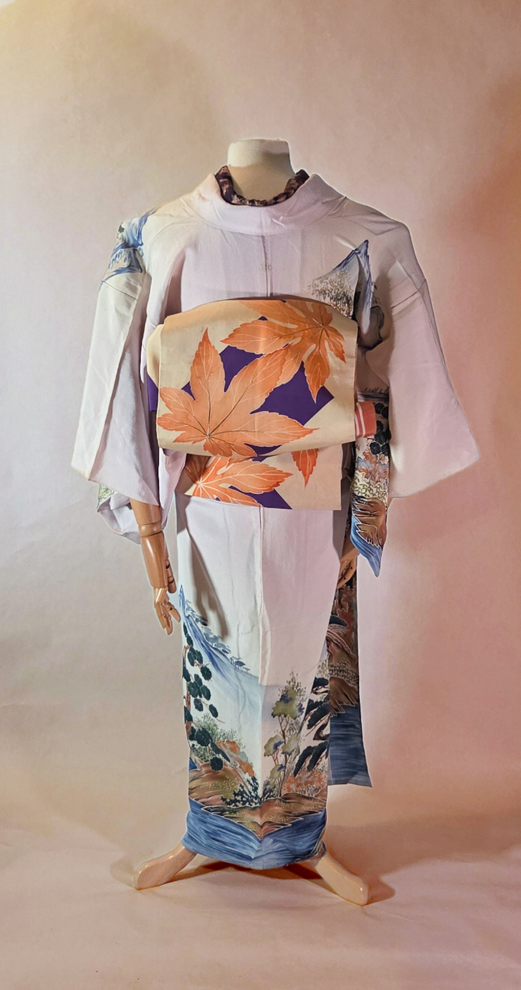
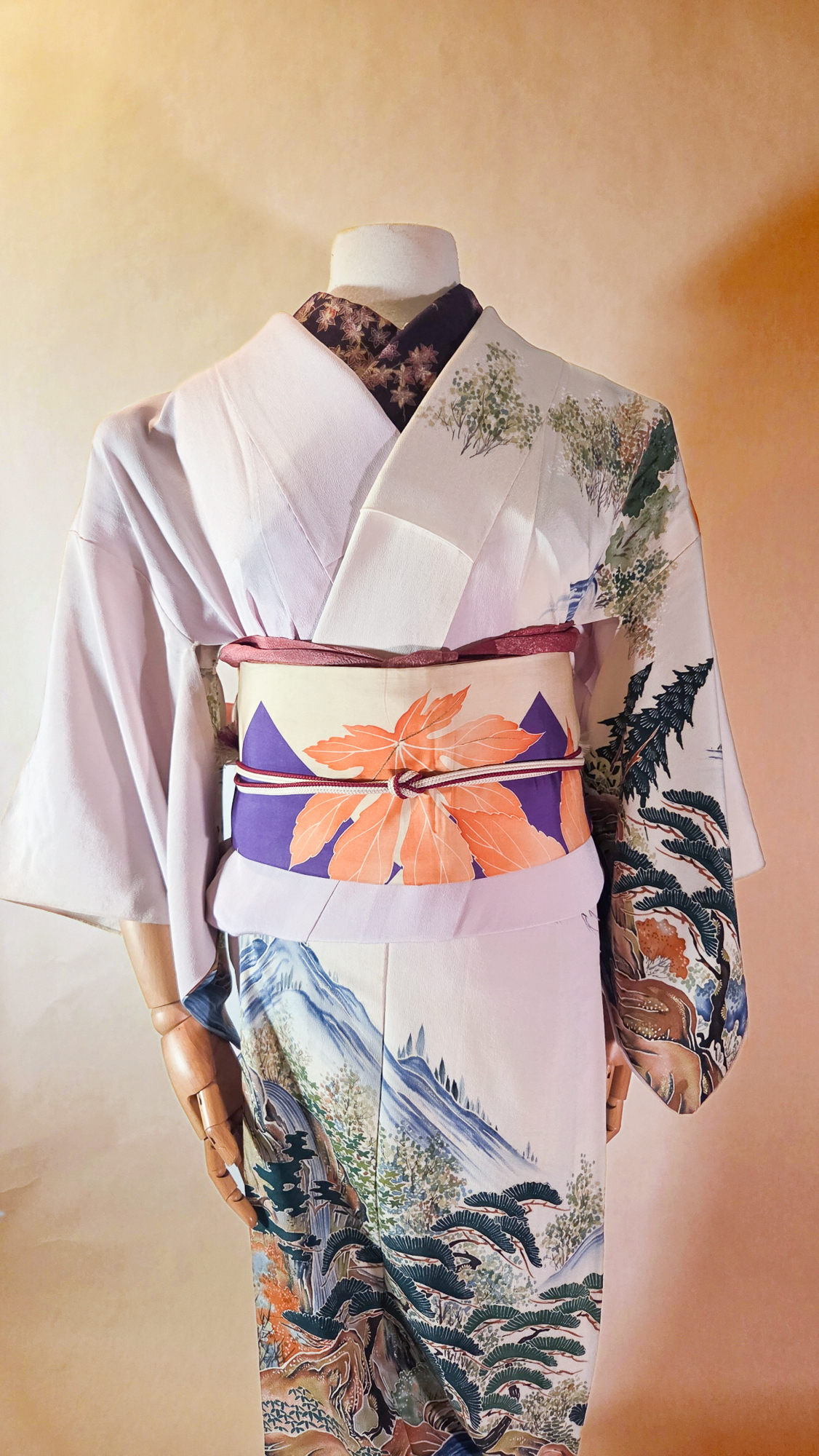
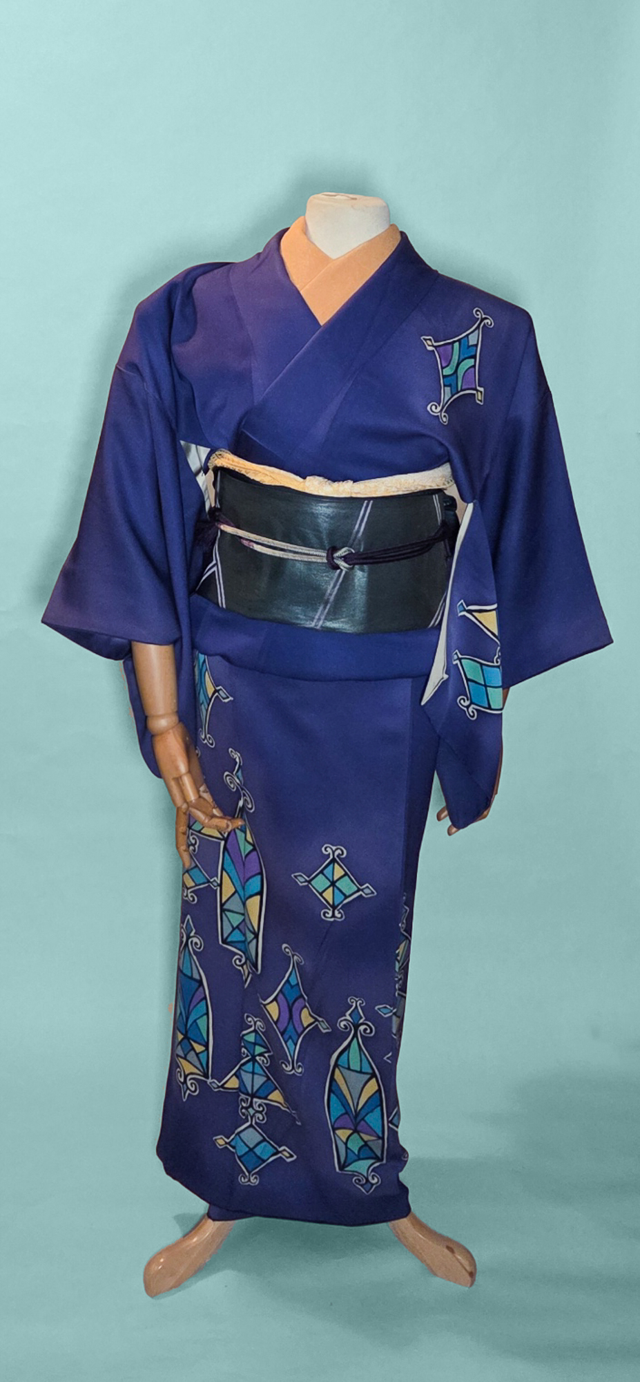
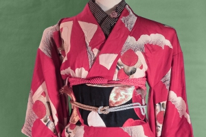
Another month, another beautiful birthstone! For July, we have the bright and bold ruby. If you saw my sneaky little addendum to the series last week, you’ll know that I just did garnet for January, and I wanted to make sure Ruby was a much flashier and more vivid ensemble despite them both being red.
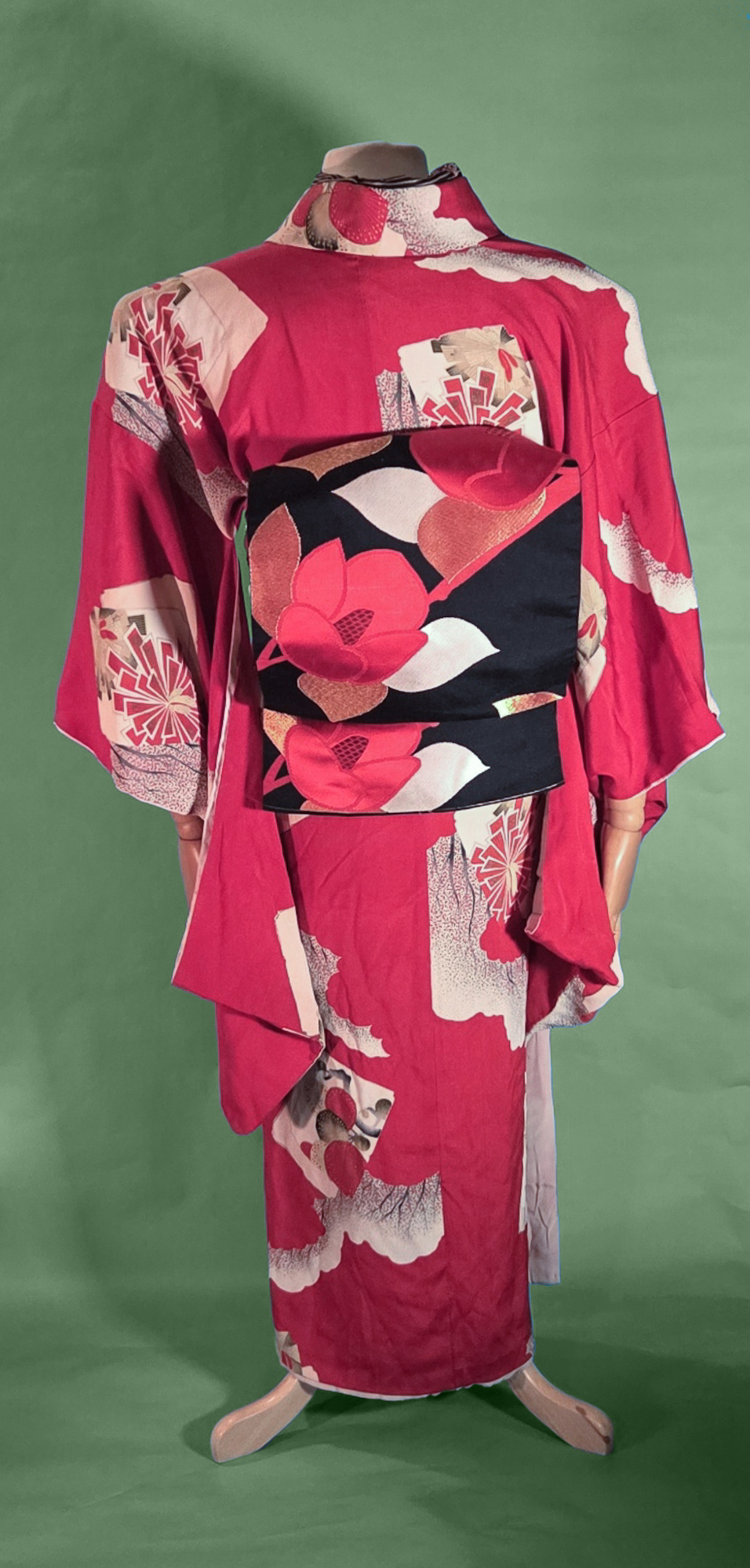
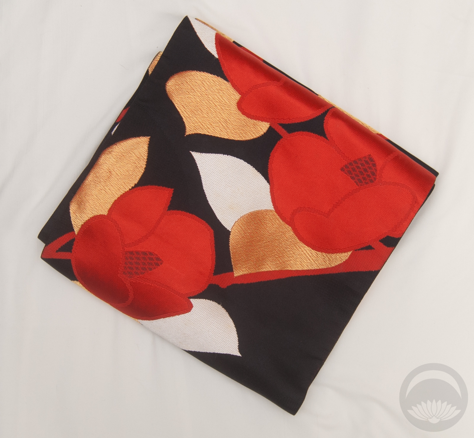
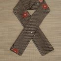
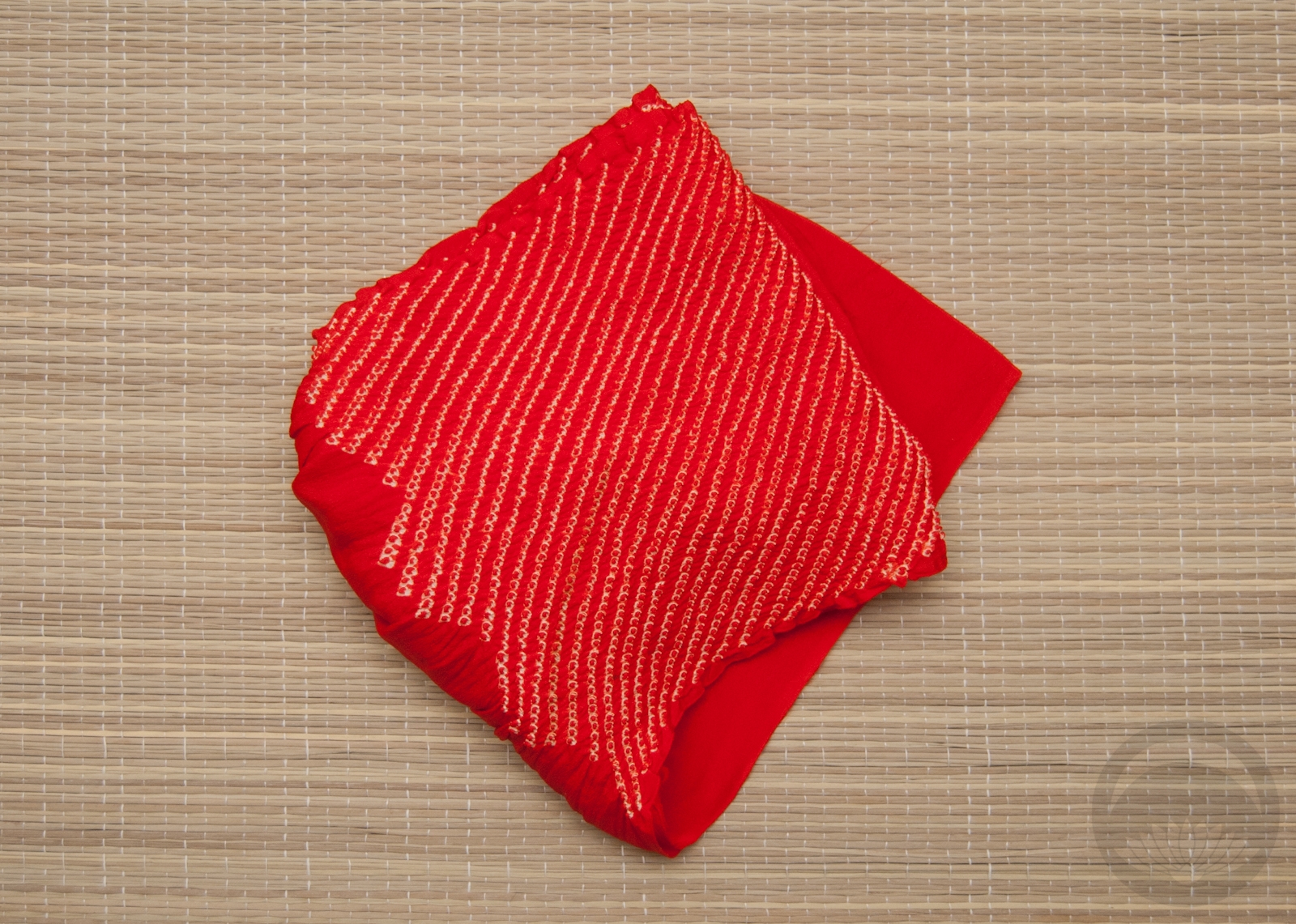
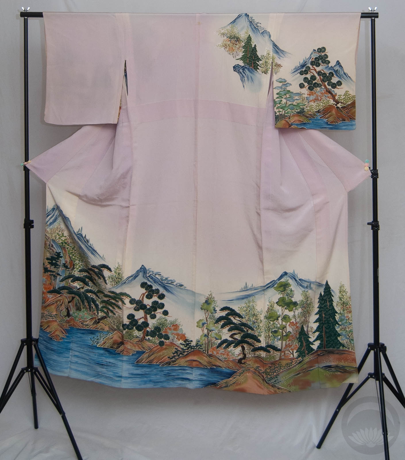
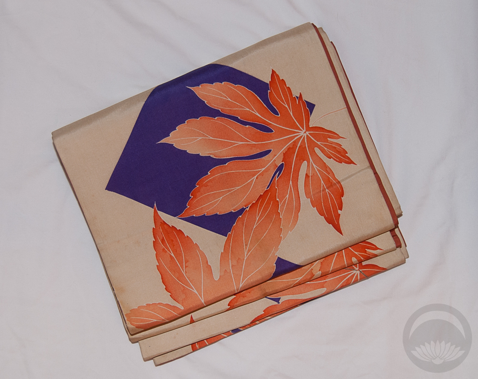
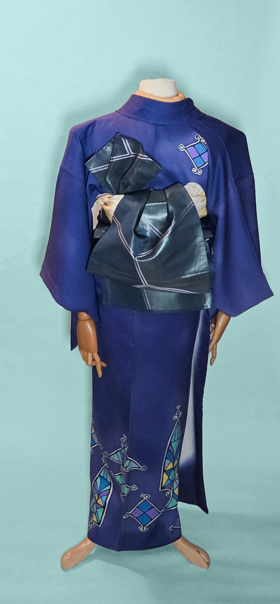
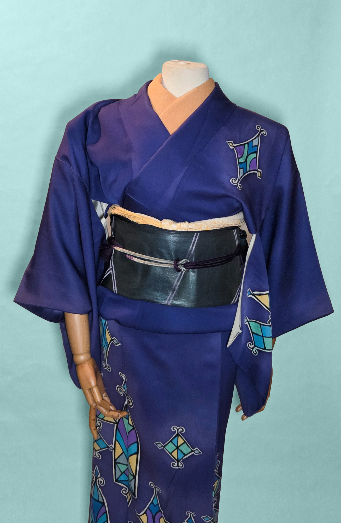
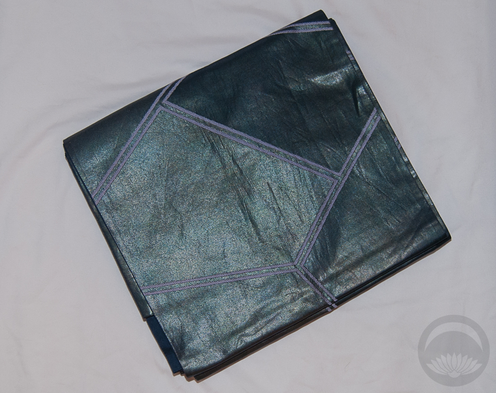
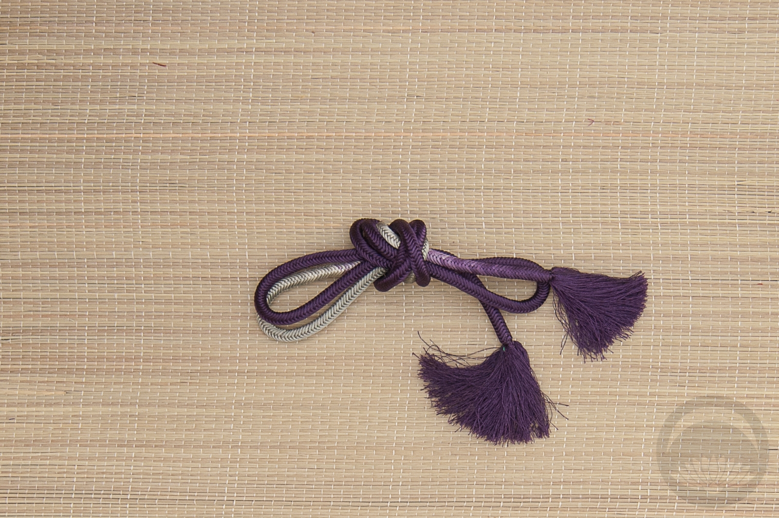
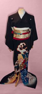
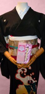
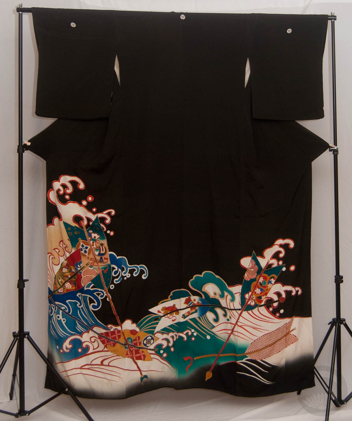
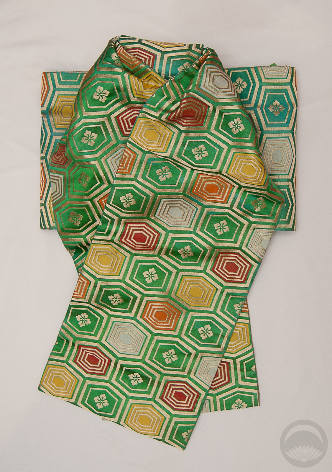
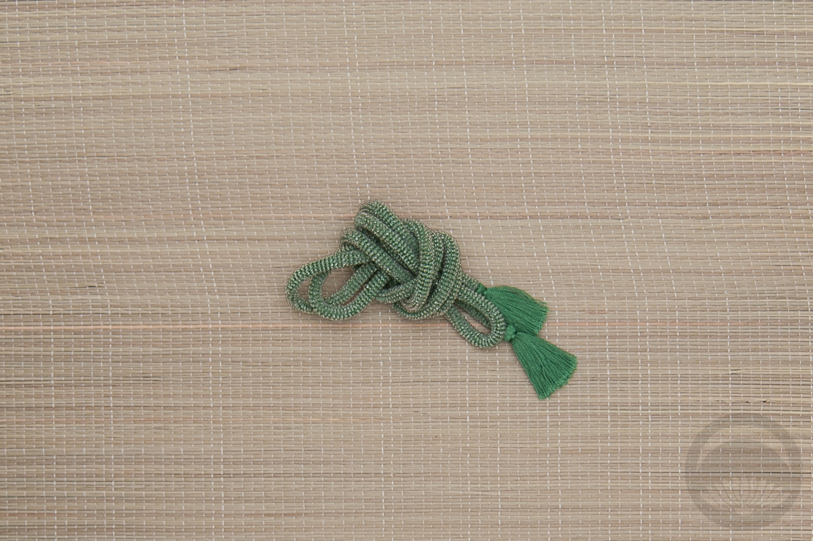
I was also feeling the urge for a bit more contrast, since so many of these outfits have been very monochrome. Of course the kimono had to be red, so I took the opportunity to feature this vintage komon again. It’s bright red with a hint of a magenta undertone, just like an actual ruby. I had this black, gold, and red nagoya that still hasn’t been used much, and I though it would tie in the black and gold accents on the kimono and bring some metallic sparkle to the outfit. Red, black, and gold accessories to finish things off, including this haneri that I use way too frequently. In fact, I think I may have used it last time I used this kimono. Oops!
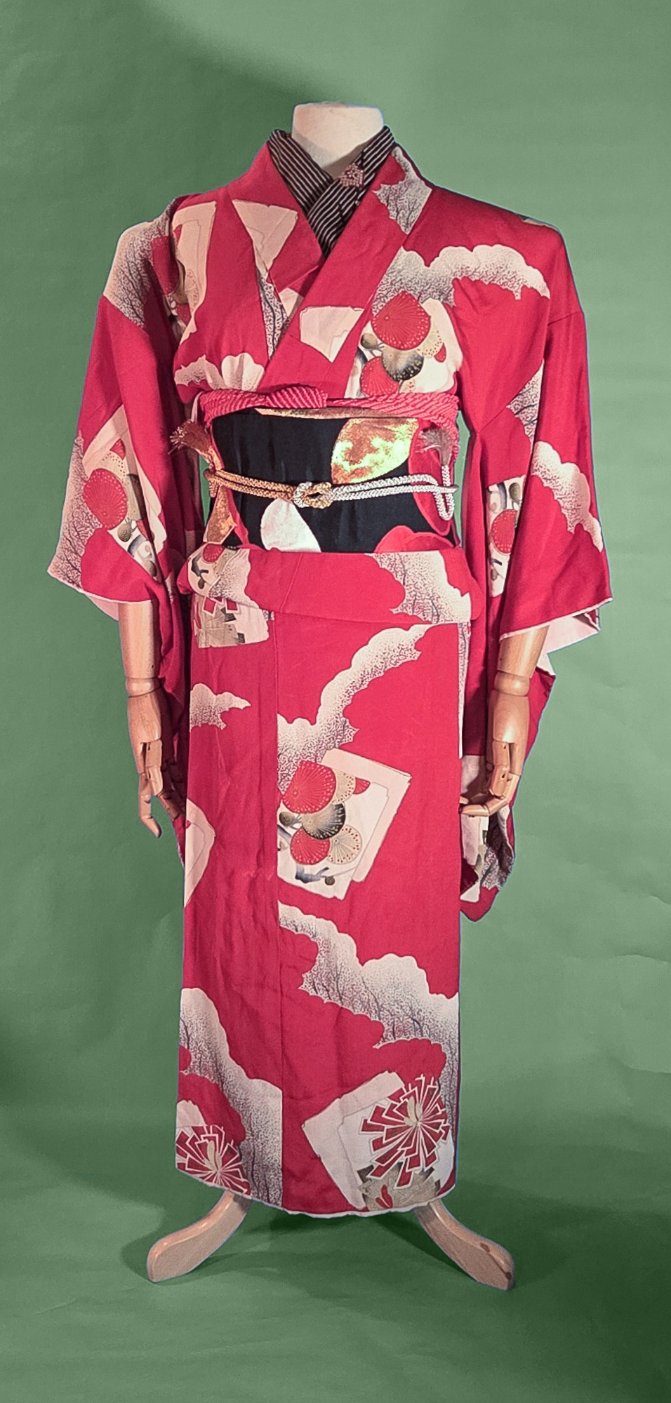
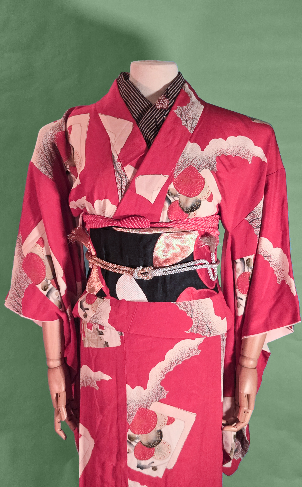
Seasonally, the motifs here are somewhat wintery (ume, tsubaki), which doesn’t exactly suit the July theme, but eh. This is more of a vibe project. Maybe next year I’ll focus on seasonal/birthday flowers and see how that goes!
It also reminds me of a more casual riff on the very first kimono and obi I ever purchased. That kimono is still one of my fondest treasures and I really should get her out and feature her sometime soon.
- January - Garnet
- February - Amethyst (coming soon)
- March - Aquamarine
- April - Diamond
- May - Emerald
- June - Alexandrite
- July - Ruby
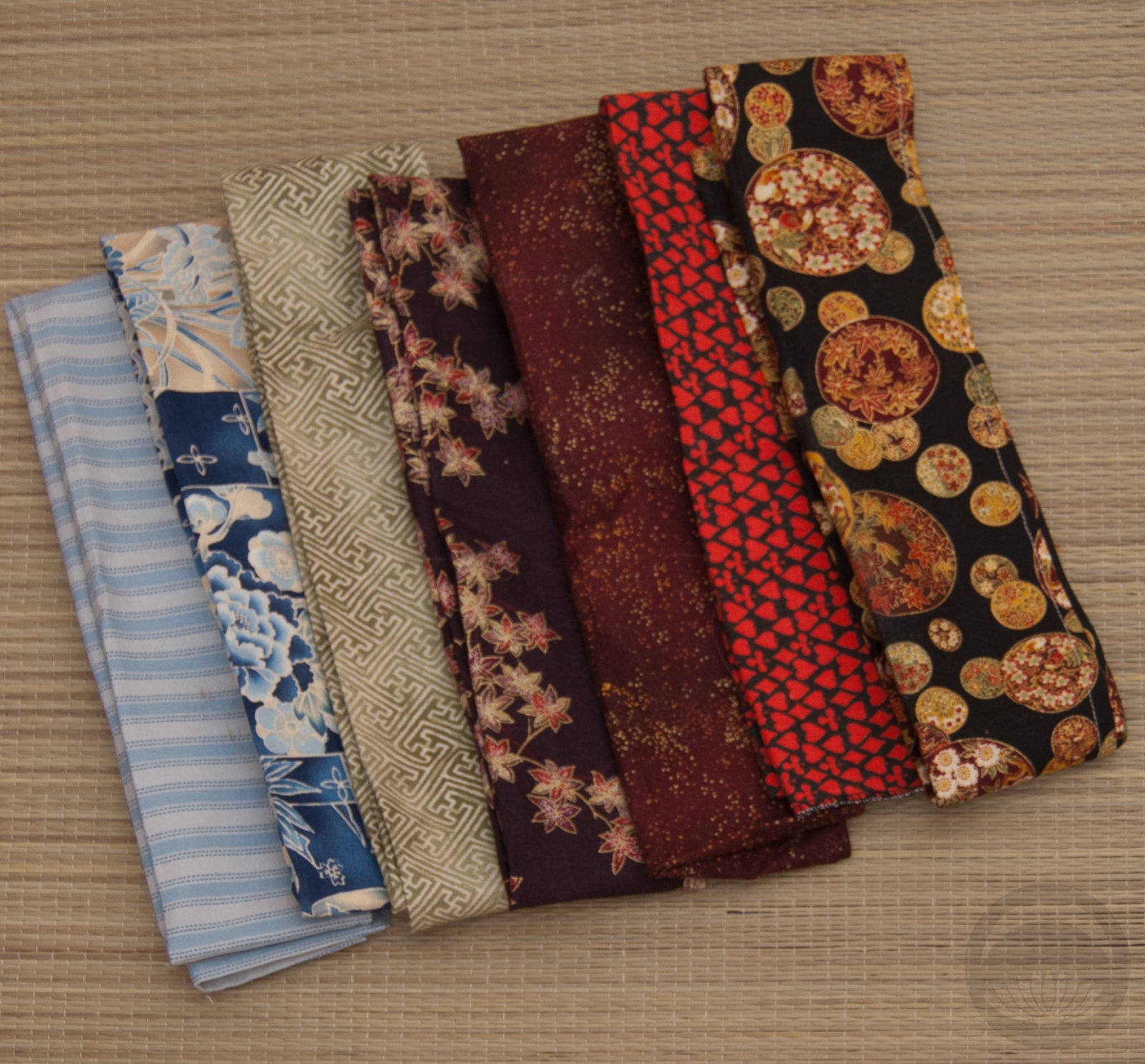
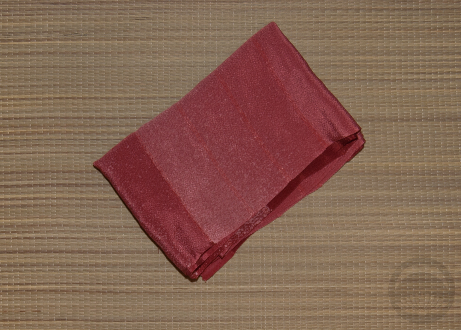
Items used in this coordination
-

- Black and Red Tsubaki
-
- Stripes with Ume

-
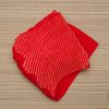
- Red Shibori
-
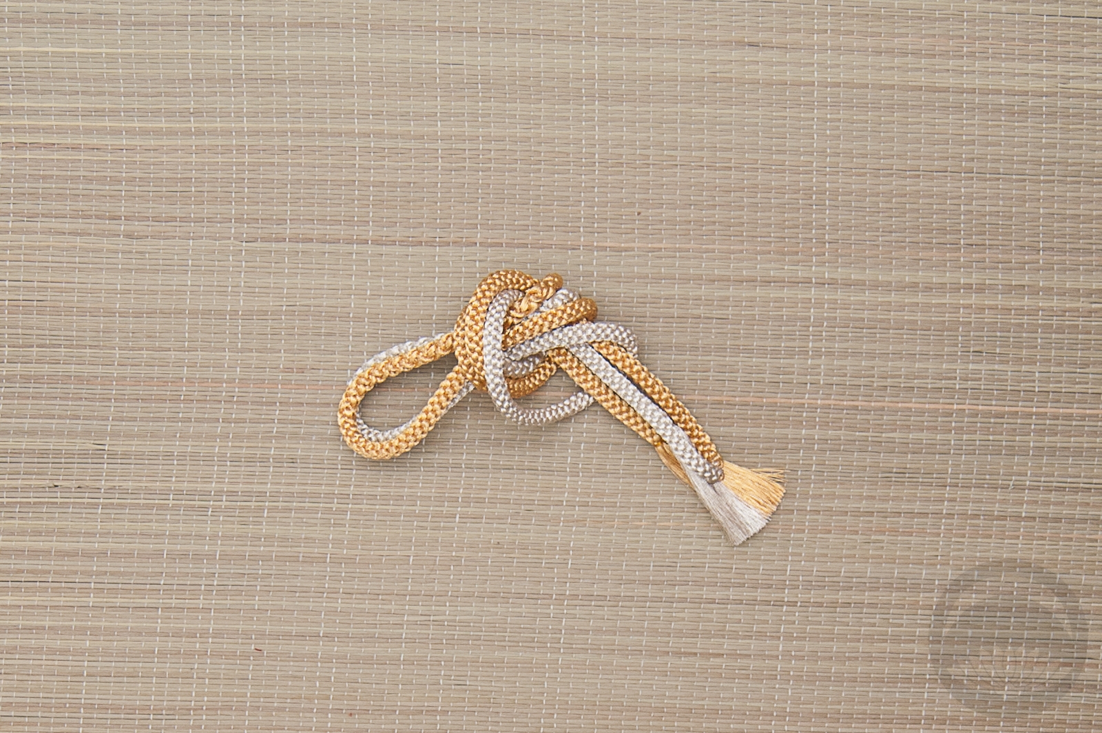
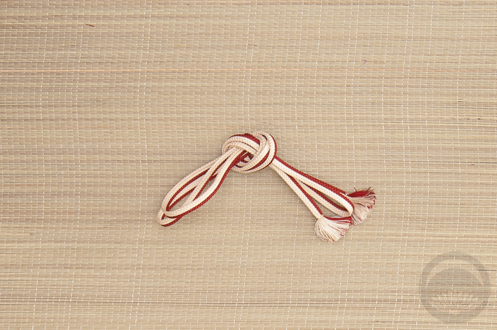
- Gold & Silver


 Bebe Taian
 CHOKO Blog
 Gion Kobu