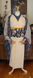
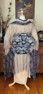
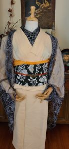
The Seventies called; they want their outfit back

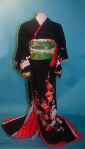
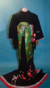
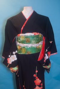
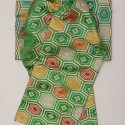
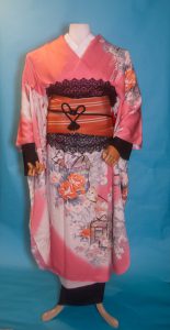
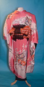
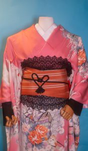
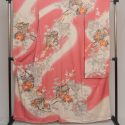
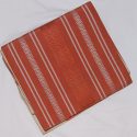
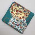
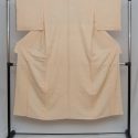
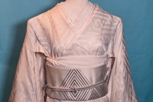
I haven’t used this gorgeous showa-fabulous houmongi Sophie got me for my birthday a while back anywhere near frequently enough. I decided to have some fun with it today, and realised this obi (which I nearly sold! what was I thinking?) is the absolute perfect seventies-style match for it.

As timeless as the shape of a kimono may be, the patterns and colours are just as susceptible to trends as western clothing is. This particular shade of orange, especially paired with gold, and the big warm-toned and almost pop-art flowers, are very emblematic of the middle of the second half of the Showa era, from the late 60s to the early 80s. I could just as easily see this general colour and pattern scheme on a polyester pantsuit as I could on this particular coordination.

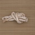
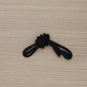
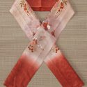
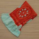
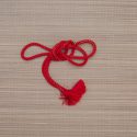
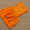
I decided to keep things relatively quiet with the accessories, since the kimono and obi are so flashy already. This soft leafy green picks up the green accents in the design so it seemed like the best choice, but the obijime did get a bit lost against the obi. Then I remembered this padded, decorative little cord I picked up at the Daiso last time I was in California. It’s a bit too thin and delicate to be a functional obijime by itself but it’s absolutely perfect wrapped around as an accent. The black and bold colours just call back to the kimono so well and I’m so happy I remembered I had it!

Items used in this coordination

2023, New Year’s Revelations

Happy new year! This year I’m not going to make any resolutions, because I’ve learned that life always gets in the way. Instead, within the next few weeks I will be sharing a road map for the future of this blog. Don’t worry, it’s not going anywhere and it’s not going to stop being about kimono. It’s all good news, I promise. I just need some time to formulate my thoughts.
In the meantime, starting the year off with a new coordination seemed like a good way to open things up. My initial plan was going to use my usagi shifuku tsukesage but I couldn’t find it. This relates back to my aforementioned plan and roadmap. My collection is that much of a mess.

I decided instead to use this kurotomesode with the tagasode motif, which seemed like a good kimono-related omen to start the year off with. I paired it with a gold obi with a celebratory tabane-noshi motif and white accessories, for a more traditional coordination than I usually do. I feel like these combine for an outfit that invites good luck and celebration of kimono for 2023, which I need right now!

I apologise for the lighting in these photos, up here in the wilds of Montreal it gets dark very early in the winter, so I don’t have much light to work with. I still think they convey the essence of the coordination so I’m happy enough.

This will be my only coordination for a few months, as I’m flying out to California again on the 7th. I’ll still be updating though! See you soon!

Items used in this coordination

Autumn Fairy Tale

Both this kimono and this obi are nearly impossible to coordinate. I’ve used the kimono before, but despite having had this obi in my possession for nearly a year now, I’d never found a good way to use it. Last night it came to me while I was soaking in the bath, as many great ideas do.

They both have a sort of fantastical, storybook, decidedly un-Japanese vibe to them. The kimono has always reminded me of The Moomins and other Scandinavian childrens’ books, and the obi has a vaguely Middle-Eastern fantasy feel to it that wouldn’t be out of place in One Thousand and One Nights. I also thought the green and brown would complement each other very well, and the gold accents would echo each other nicely too.

Was I right, or was I right? I’m over the moon with how these pieces look together. I decided go with pink accessories to make the pink trees in the kimono stand out a bit more, since they can get a bit lost against the white hill. They also help to add a touch of light and contrast between the kimono and obi, which are both quite dark. It worked very well, I think. From a distance they almost read as white, just like the trees do, but when you get close you get this lovely surprise. There are also tiny pink and gold botan on the haneri, which are decidedly out of season but the colours worked so well I had to run with it. Next time I might add a gold date-eri to break things up a little further, but I think it works fine without it too. It also just occurred to me that my pink lace haori would look amazing with this too, so I will have to try that sometime.

Another neat thing about this outfit is that all the items aside from the obijime are significantly larger than average, which means I might be able to wear it if I ever have the energy to dress myself again. Something to look forward to, maybe?

Items used in this coordination

Happy Halloween 2022!

Tomorrow is Halloween! The day we celebrate errant bloggers rising from the grave, apparently. I am actually working on an entry discussing my increasing absences, and a slight shift in the purpose and focus of this blog, so keep an eye out for that. Don’t worry, it’s not bad news!

In the meantime though, I actually have a coordination for you! I bought this piece last time I was in California. I realise it’s supposed to be a sunset over the landscape, but to me it absolutely looks like a spooky forest fire scene. The spindly black trees and bright orange background just felt very Halloween to me and I decided it would be the perfect piece to get back into the swing of things.

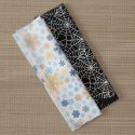
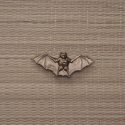
I wanted to keep the Halloween vibe relatively subtle, but I did try to amp up the spooky factor with a black and silver spiderweb haneri and brass bat obidome made out of a vintage menuki. The obi is a solid black mofuku nagoya, paired with white and orange accessories.

I don’t have a catalogue photo of this piece yet, but that’s a problem for another day. It is coming, I promise!

Items used in this coordination

Chic Modern Kiku

I found this piece on eBay when it had less than an hour to go, and I just fell head over heels. I love how bold it is, how minimalistic it is despite the motif itself being huge and dramatic, I love the very simple colour palette. And of course, rangiku is one of my favourite motifs. I really lucked out here, someone actually bumped it up to my maximum bid in the last few seconds, but didn’t bid any higher so I ended up winning it by the skin of my teeth.

I was so eager to coordinate it that I haven’t even had time to take a photograph for my catalogue – I just wanted to get it on to the mannequin as soon as I had some free time.

I paired it with a mofuku nagoya obi, since I really wanted the punch of black contrast. I think the rest of the outfit is obviously enough not mofuku that I can get away with it. Ideally, I would have used accessories in the same blue as the accents on the flowers, but I don’t own anything in that specifically “blurple” colour. I went with some of my favourite blue pieces, my icy blue obiage and beaded obijime. The haneri is actually my silver spiderweb one turned inside out. That made me chuckle a bit, since in English rangiku are often referred to as spider chrysanthemums. Maybe one day I’ll coordinate it with the webs visible.

Items used in this coordination