
Happy new year! This year I’m not going to make any resolutions, because I’ve learned that life always gets in the way. Instead, within the next few weeks I will be sharing a road map for the future of this blog. Don’t worry, it’s not going anywhere and it’s not going to stop being about kimono. It’s all good news, I promise. I just need some time to formulate my thoughts.
In the meantime, starting the year off with a new coordination seemed like a good way to open things up. My initial plan was going to use my usagi shifuku tsukesage but I couldn’t find it. This relates back to my aforementioned plan and roadmap. My collection is that much of a mess.
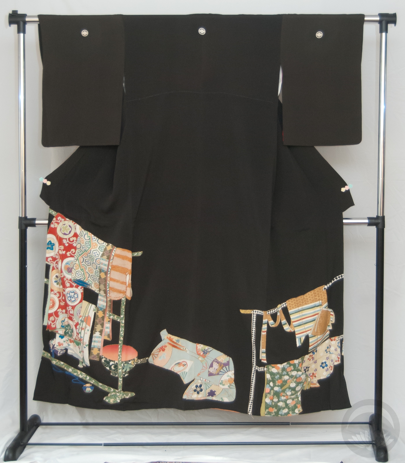
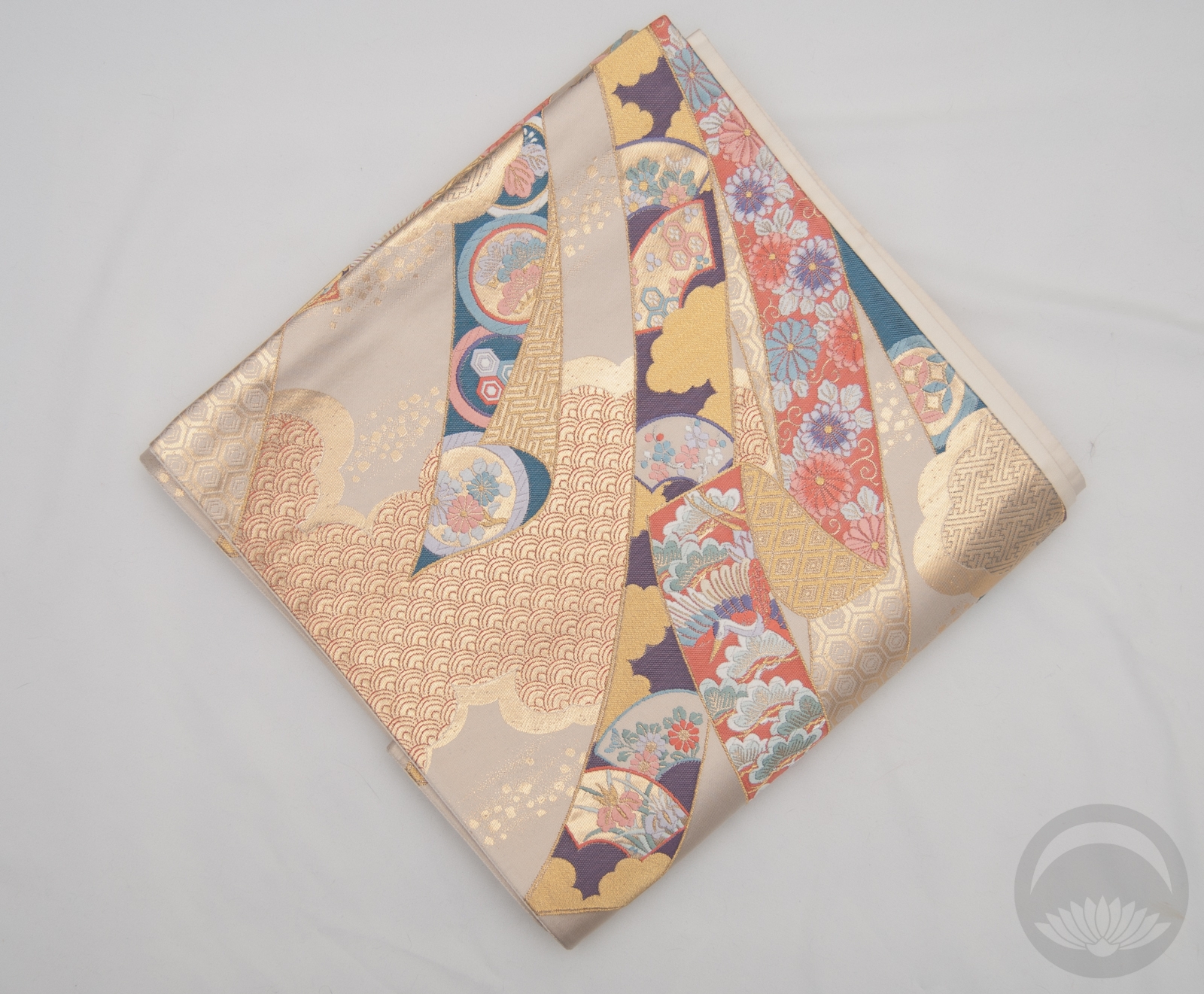
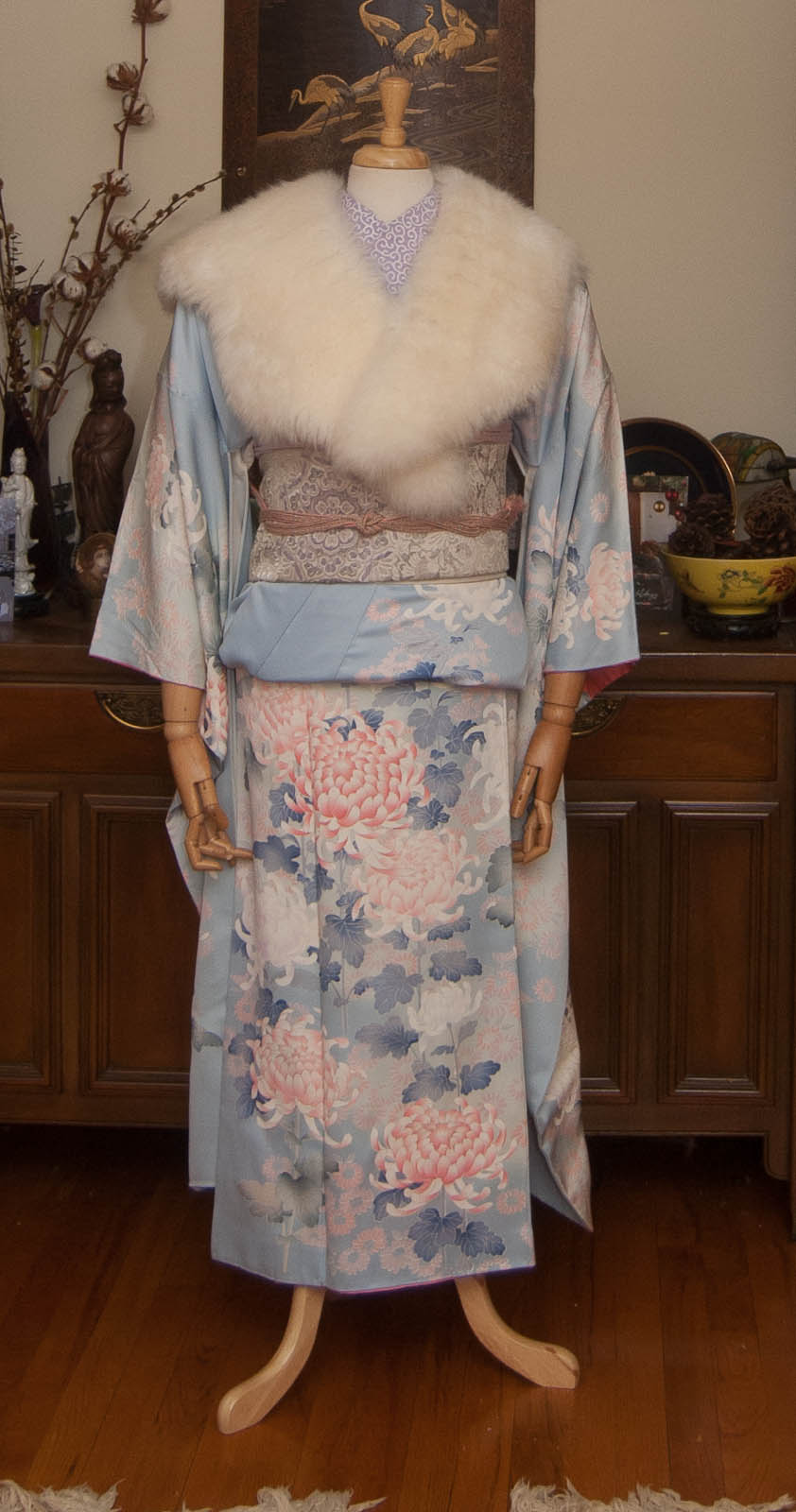
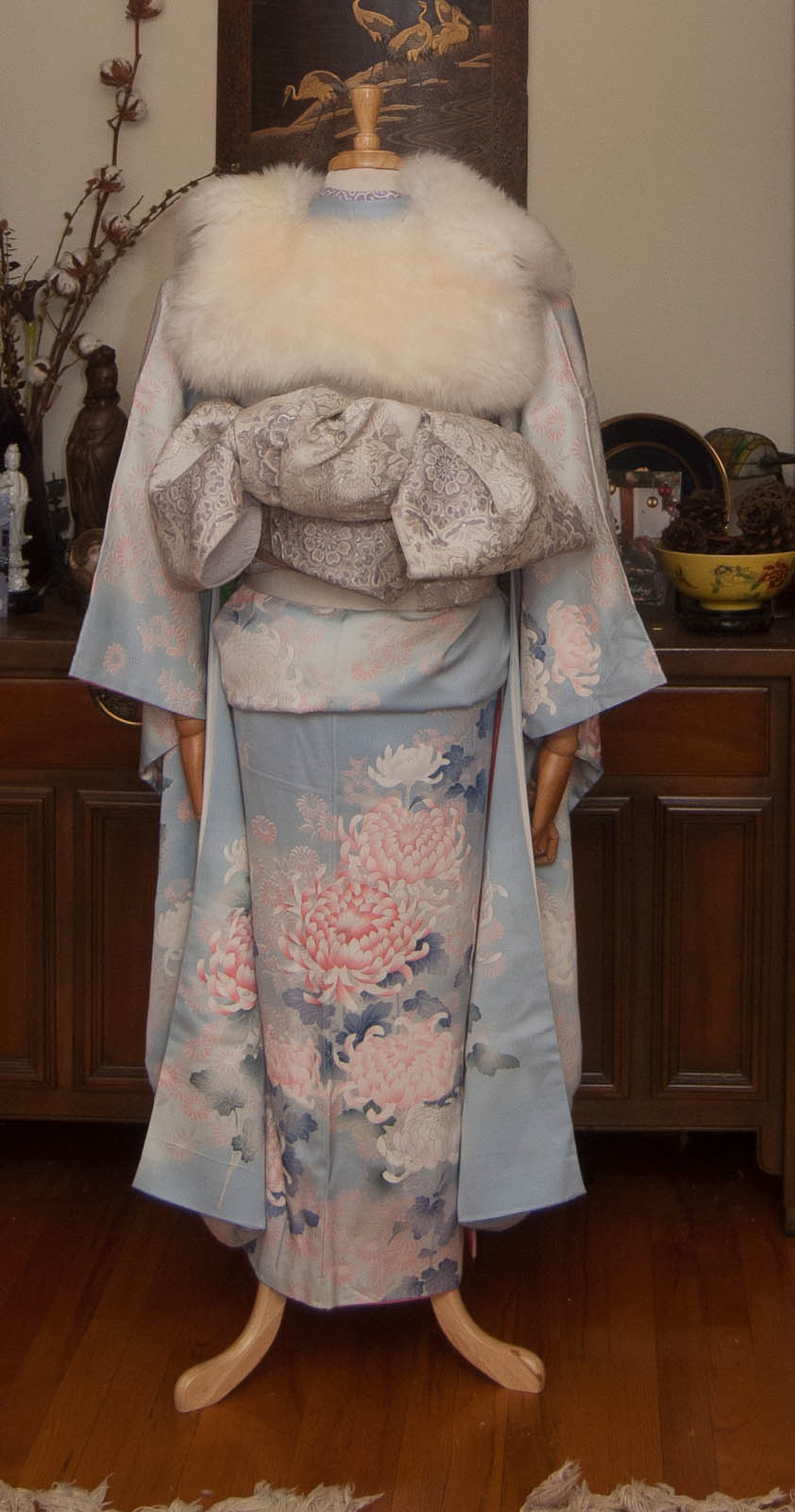
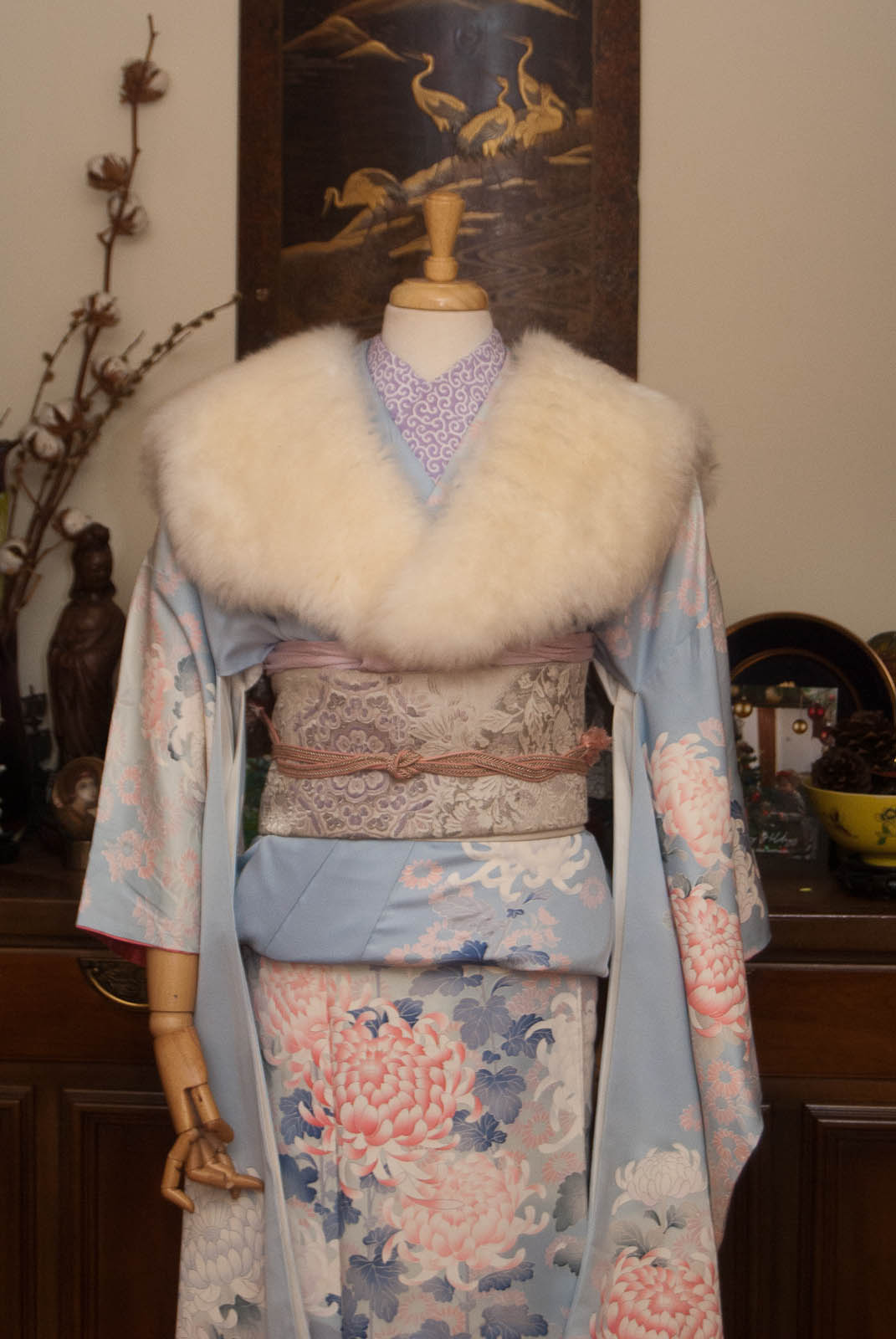
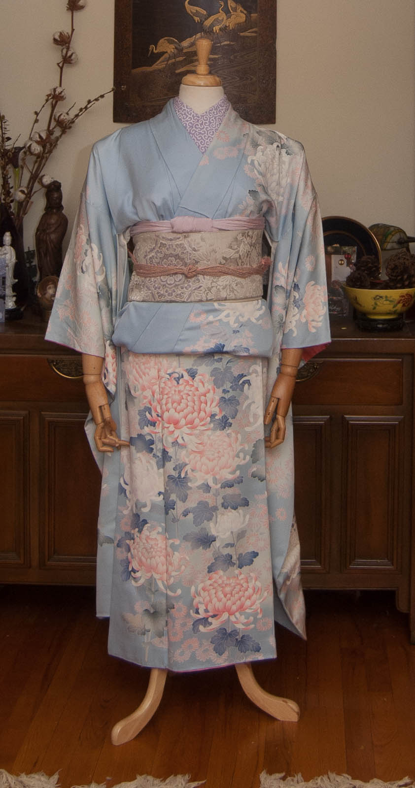
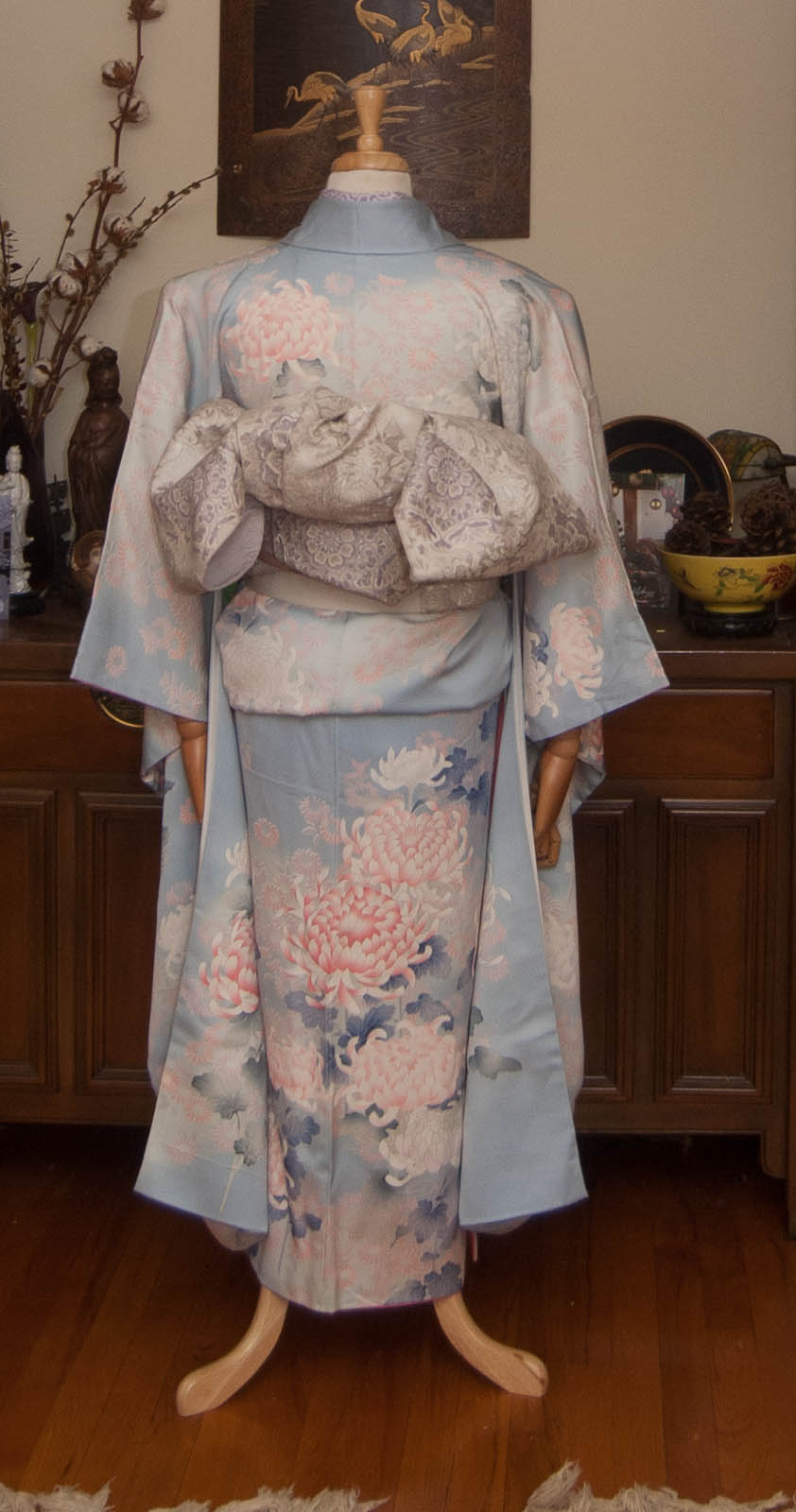
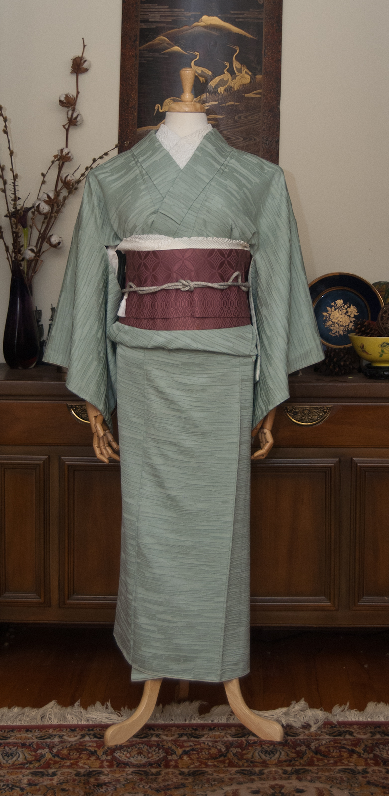
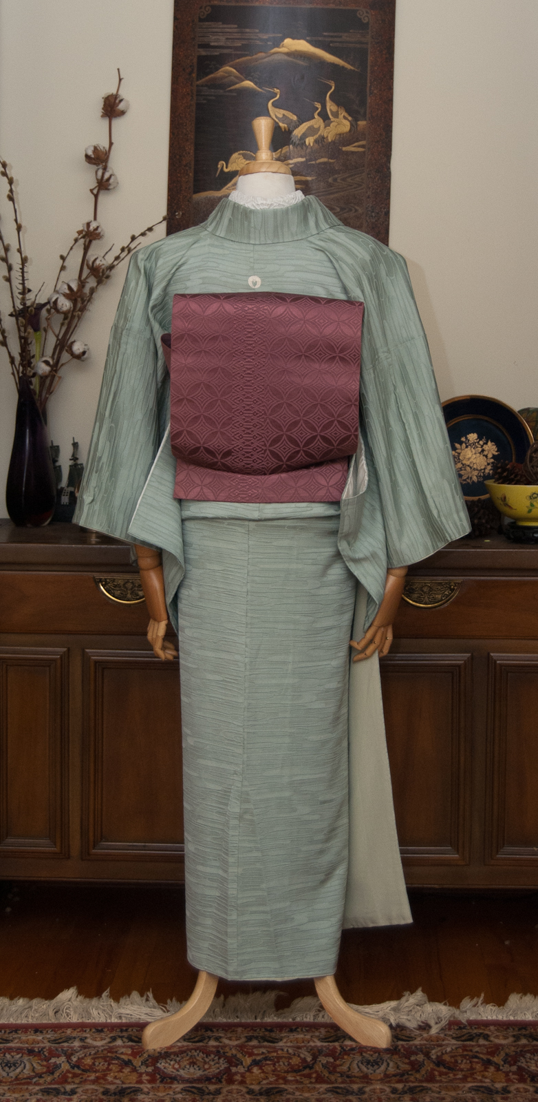
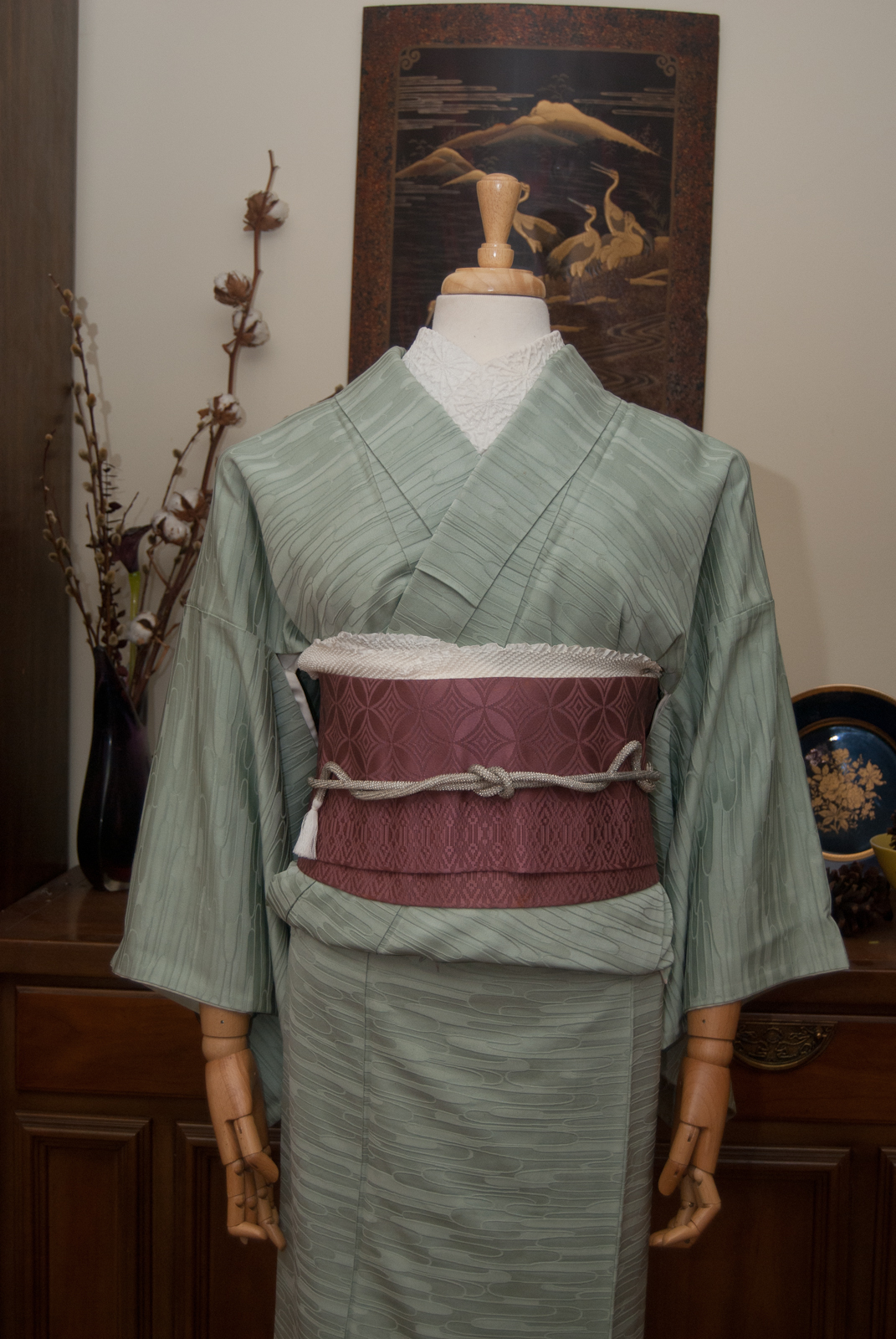
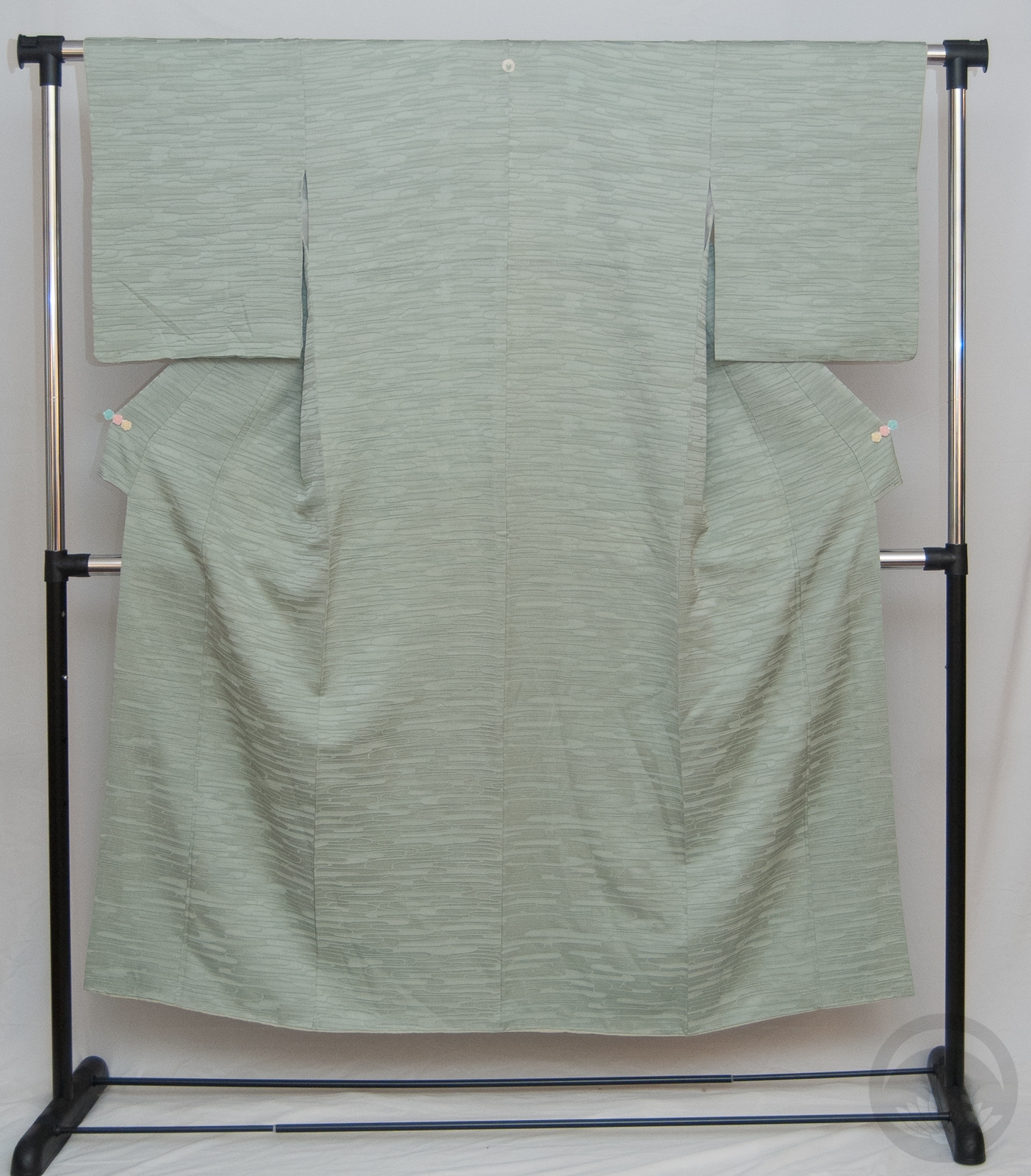
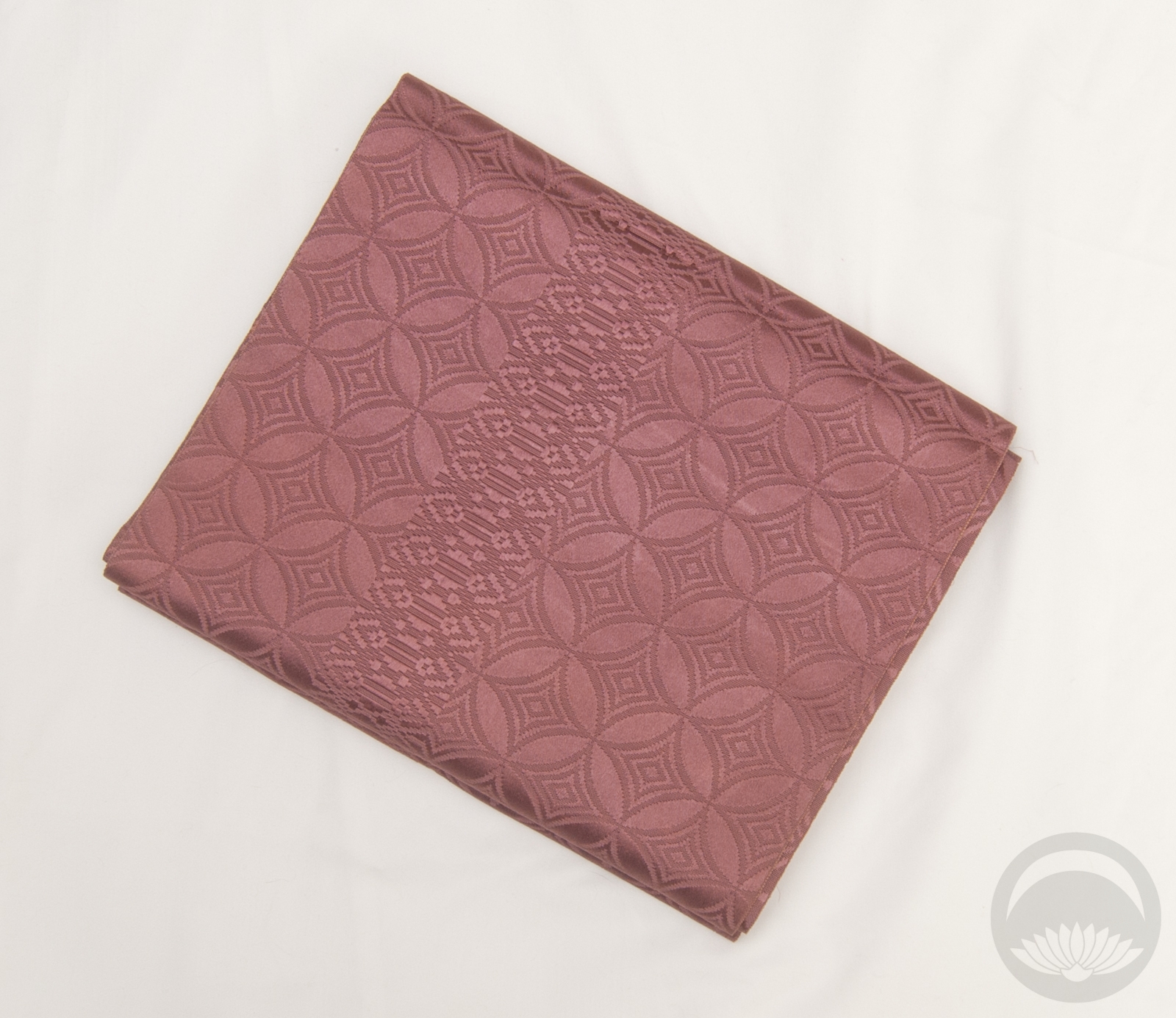
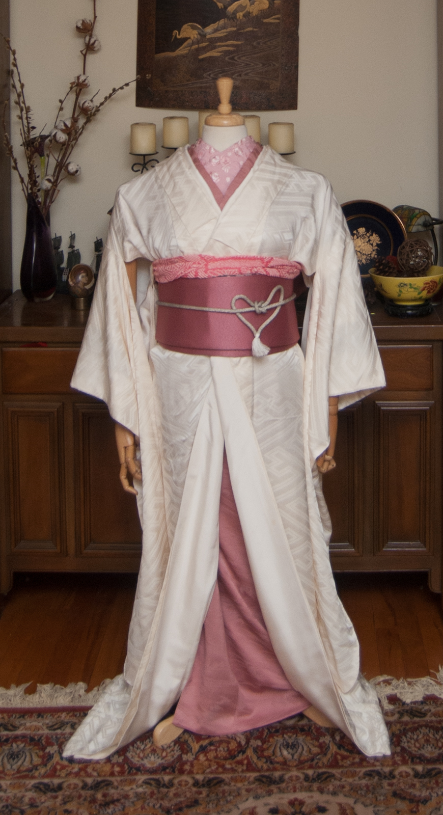
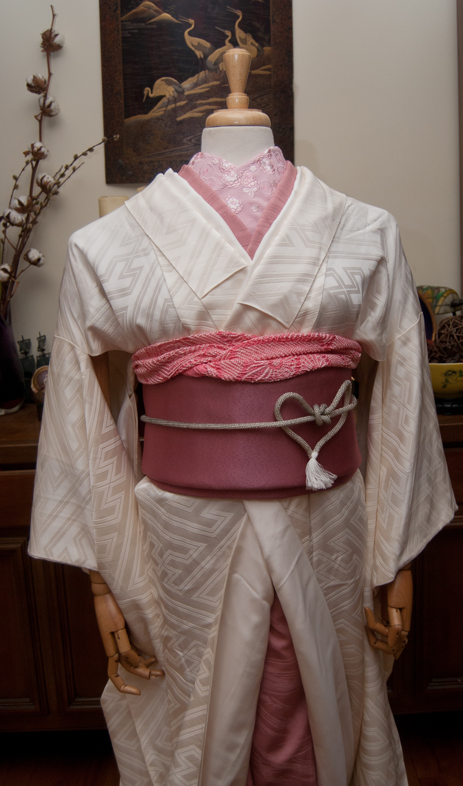
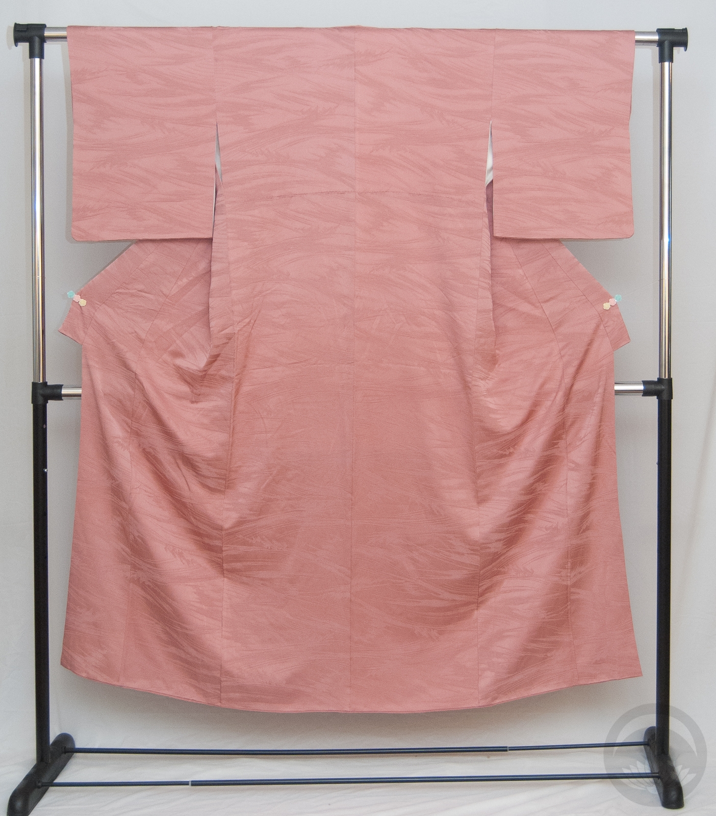
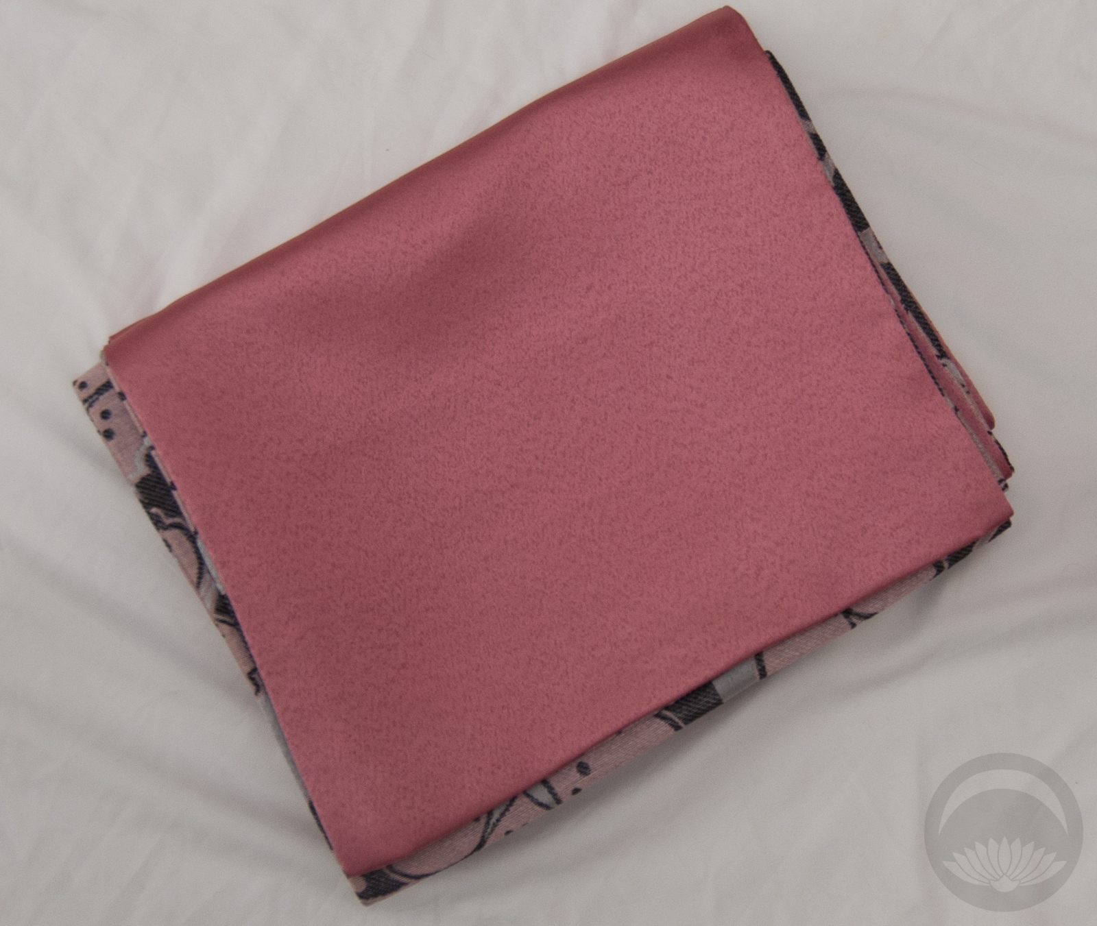
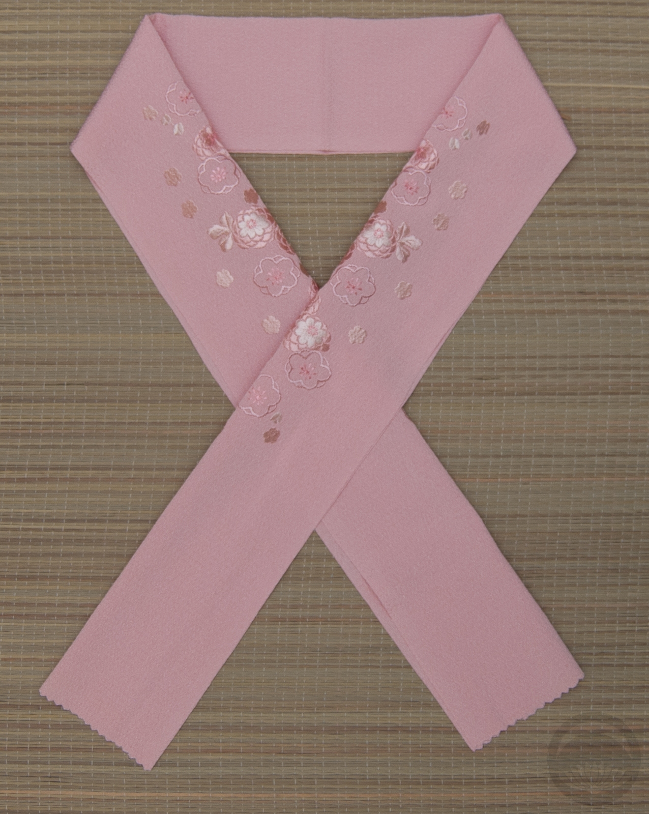
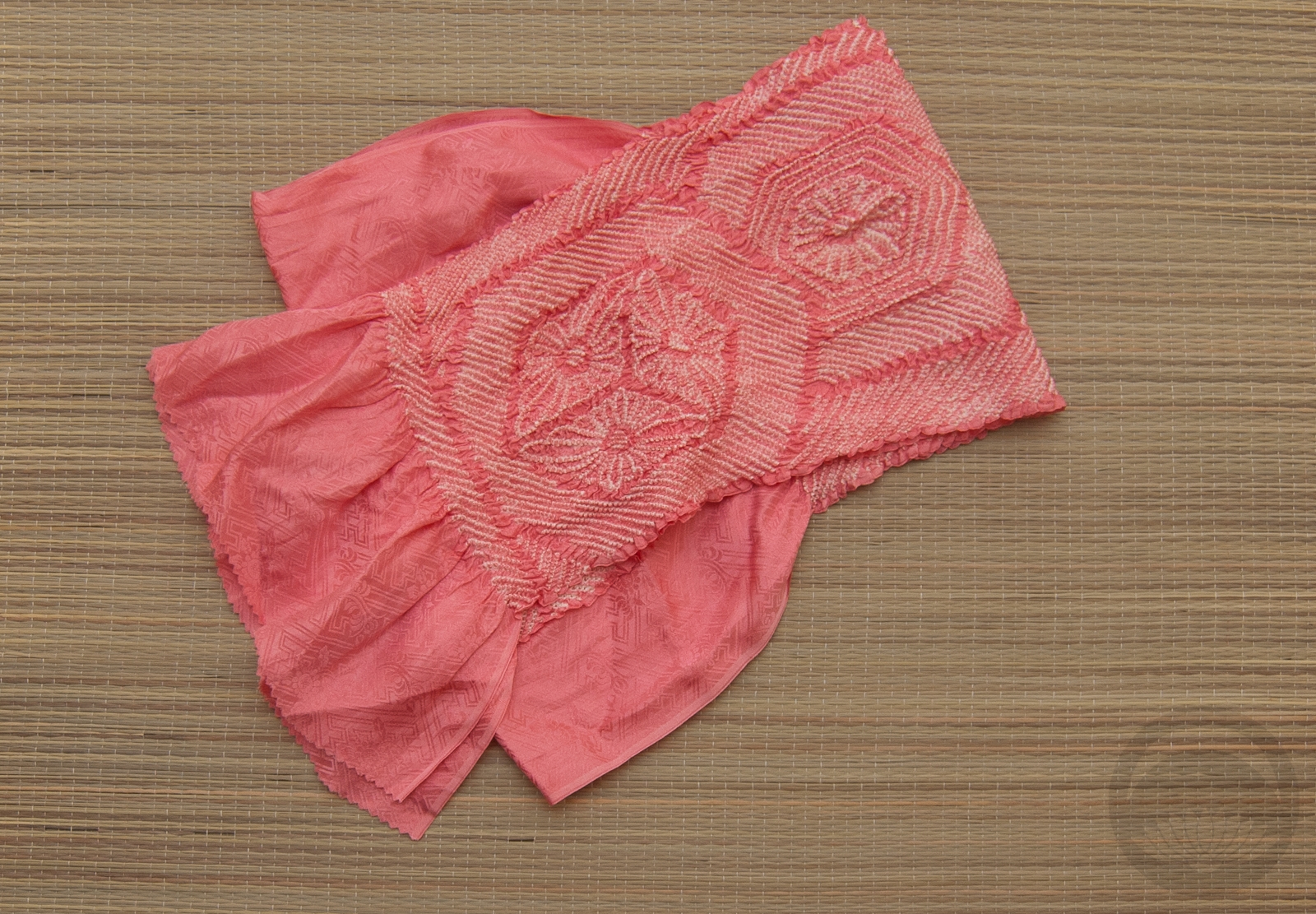
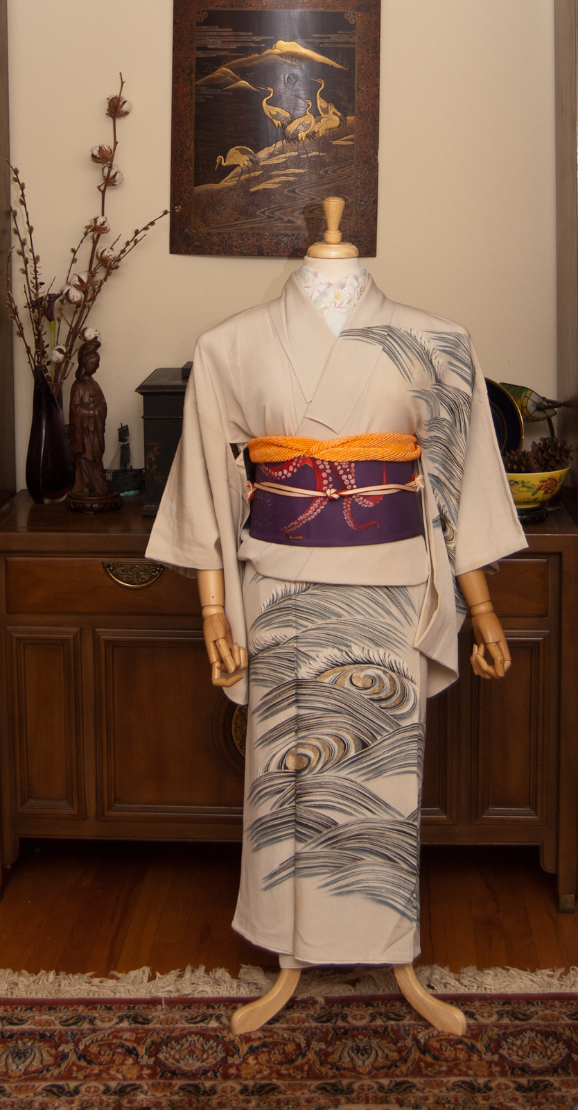
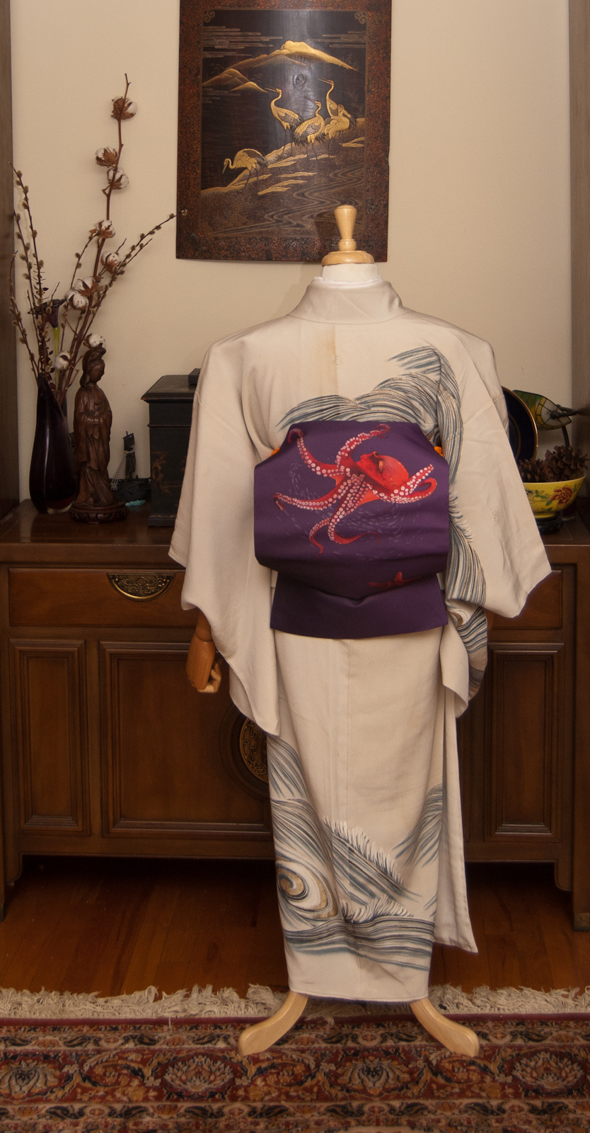
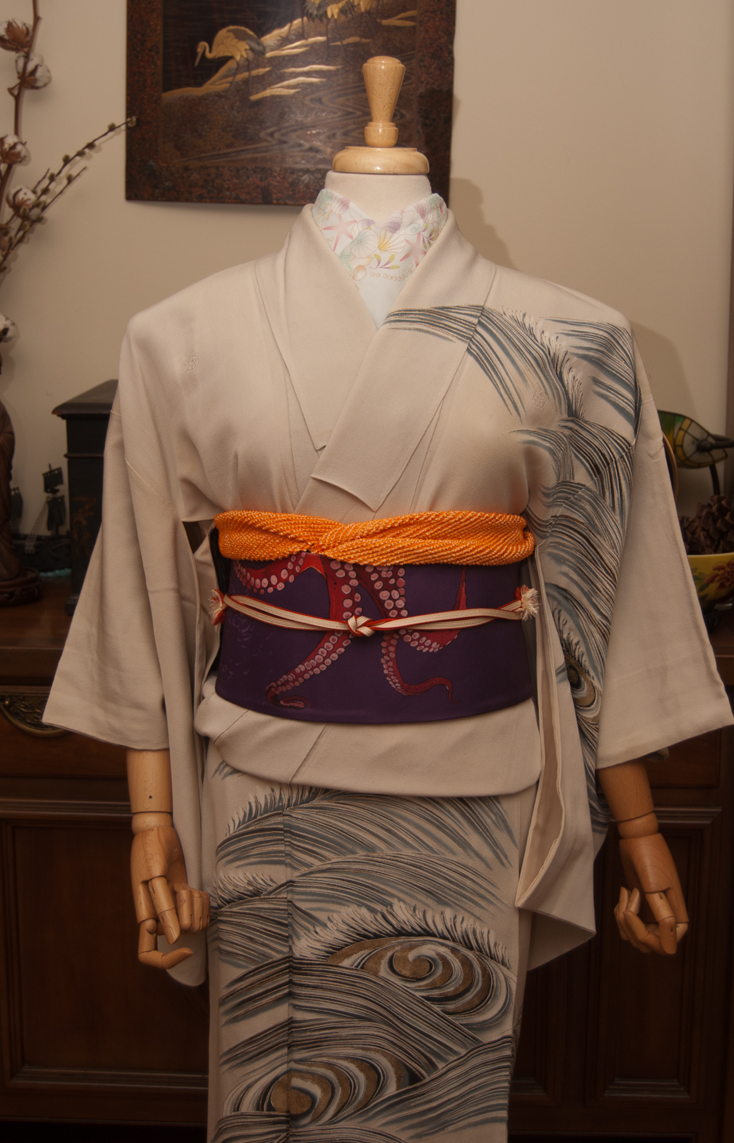
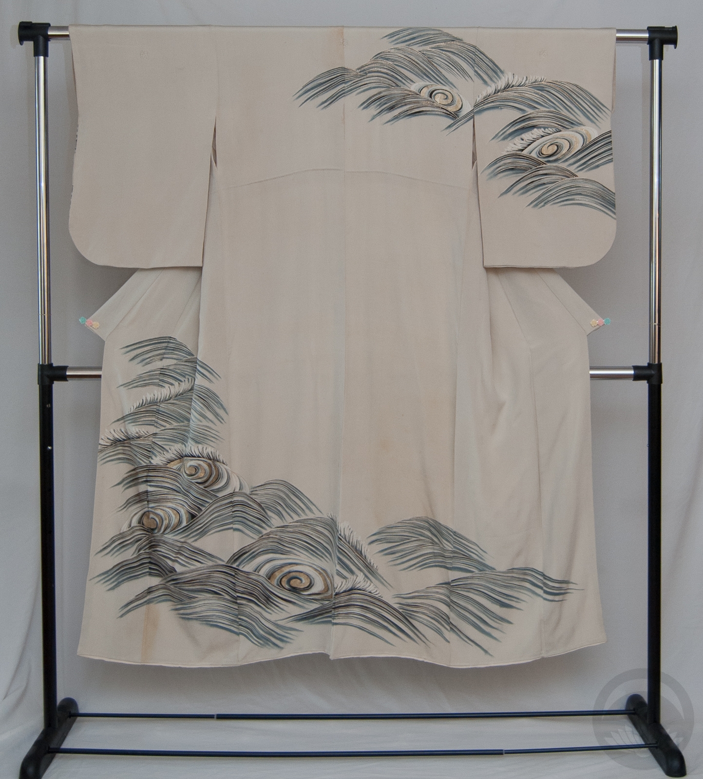
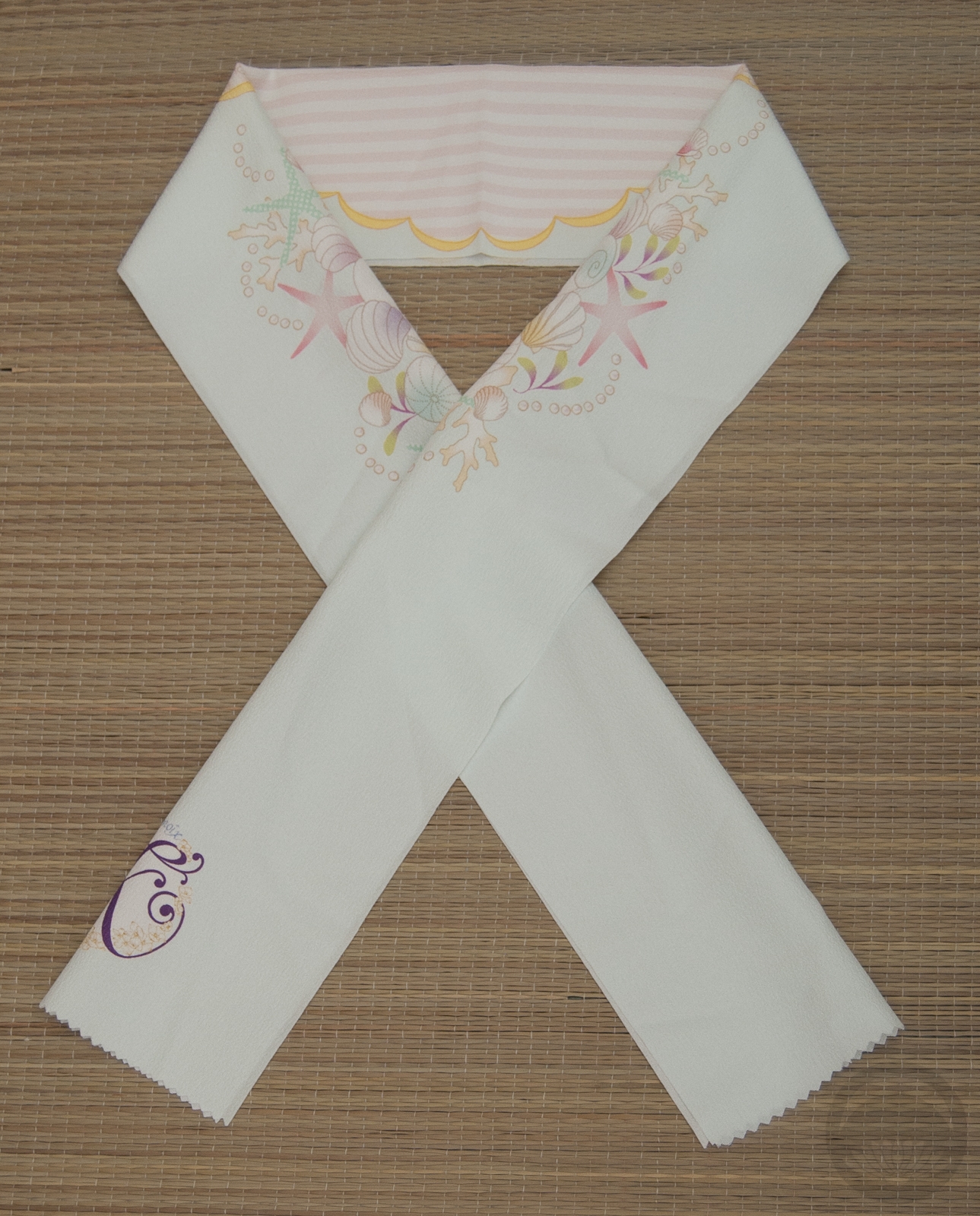
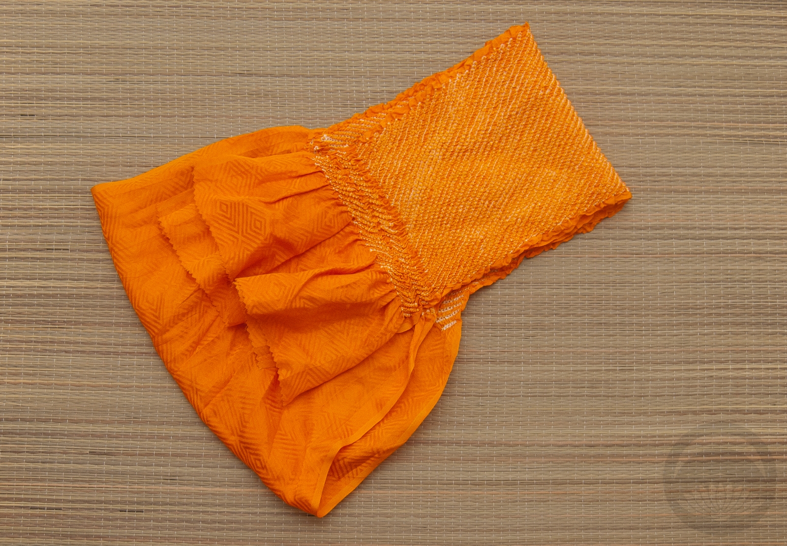
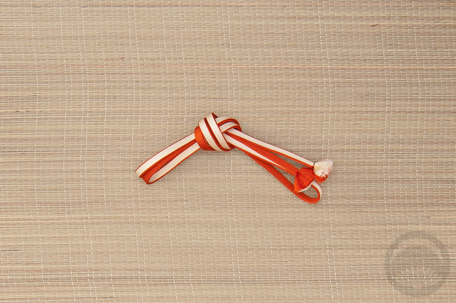
I decided instead to use this kurotomesode with the tagasode motif, which seemed like a good kimono-related omen to start the year off with. I paired it with a gold obi with a celebratory tabane-noshi motif and white accessories, for a more traditional coordination than I usually do. I feel like these combine for an outfit that invites good luck and celebration of kimono for 2023, which I need right now!
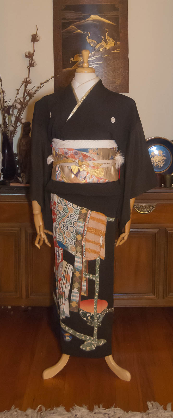

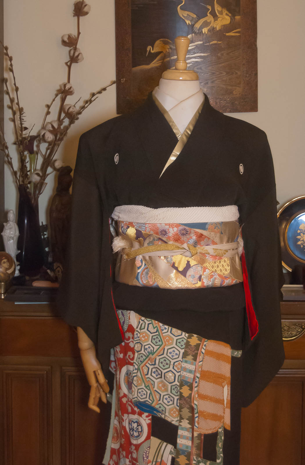
I apologise for the lighting in these photos, up here in the wilds of Montreal it gets dark very early in the winter, so I don’t have much light to work with. I still think they convey the essence of the coordination so I’m happy enough.
This will be my only coordination for a few months, as I’m flying out to California again on the 7th. I’ll still be updating though! See you soon!
Items used in this coordination
-
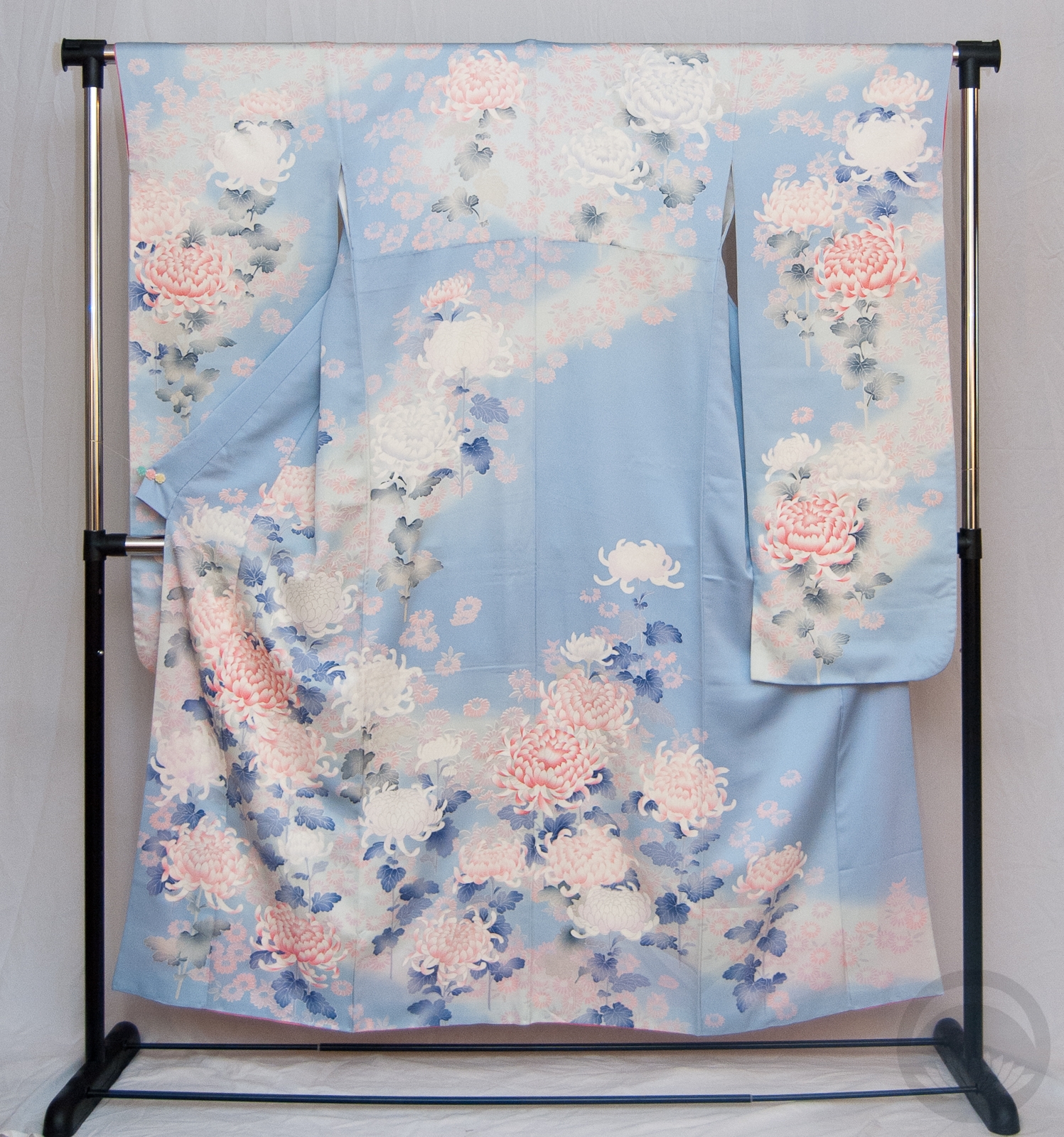
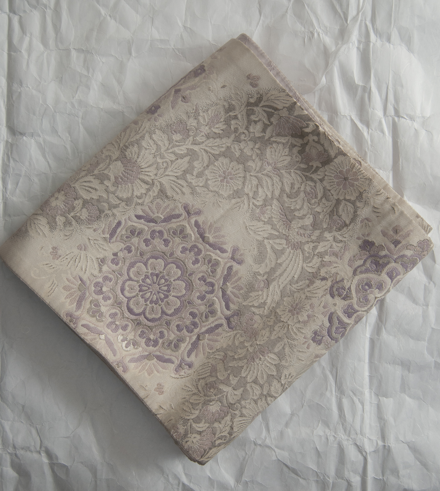
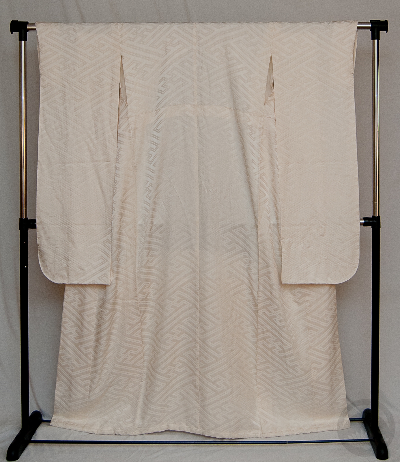
- Tagasode Kurotomesode
-
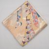
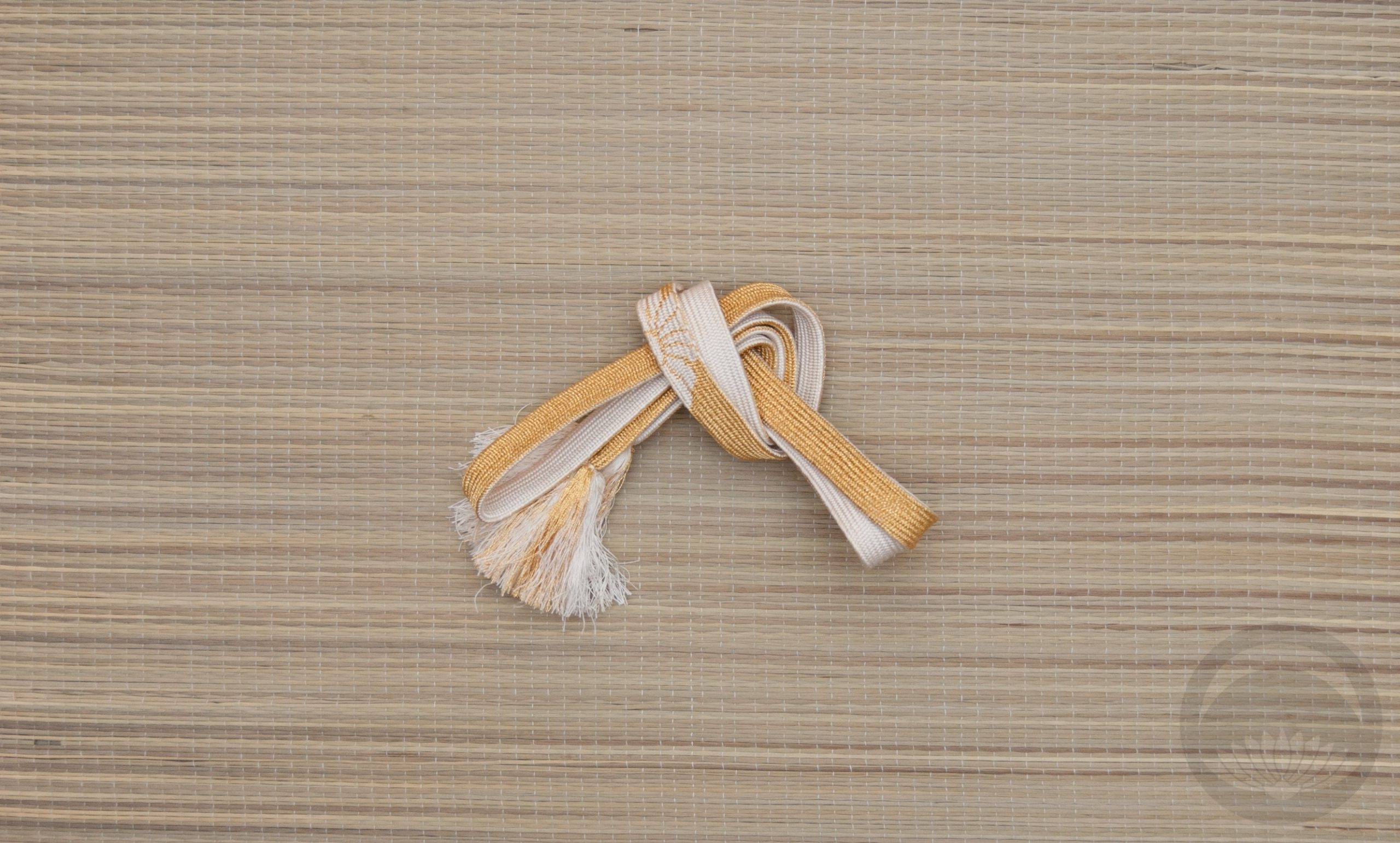
- Pastel Tabane-Noshi
-
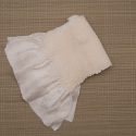
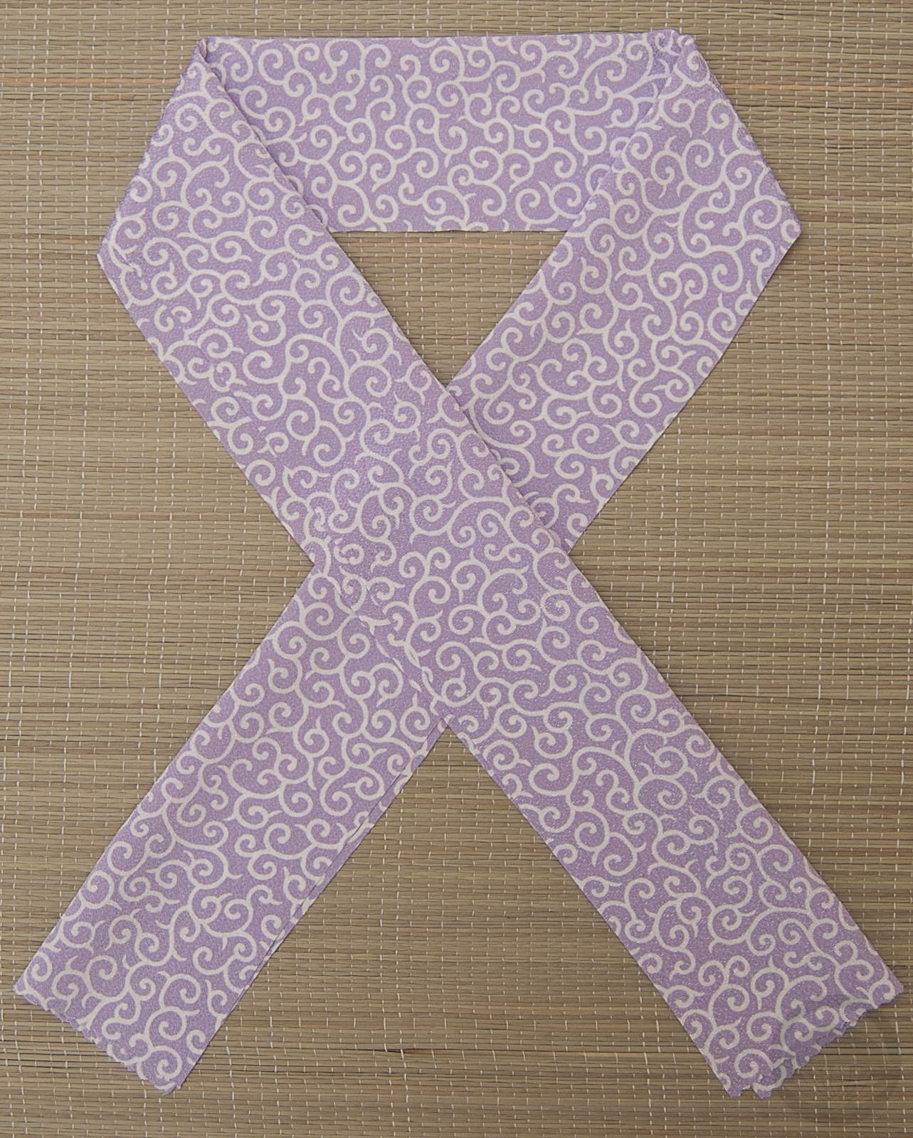
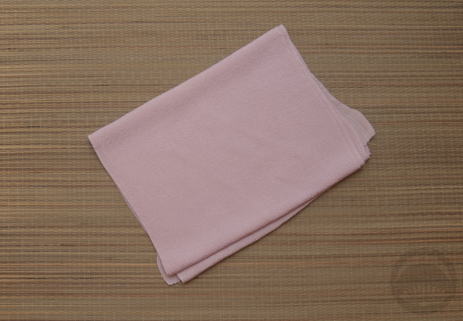
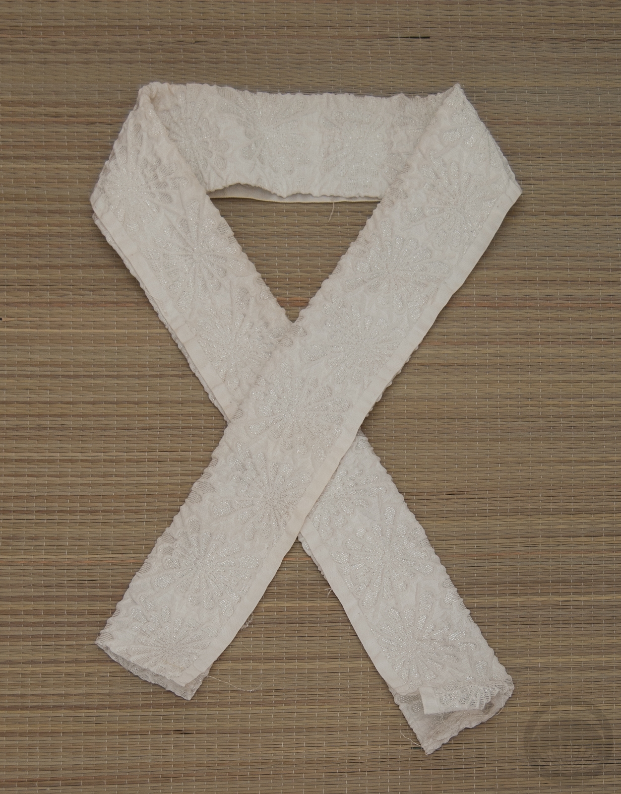
- White Shibori

-
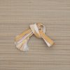
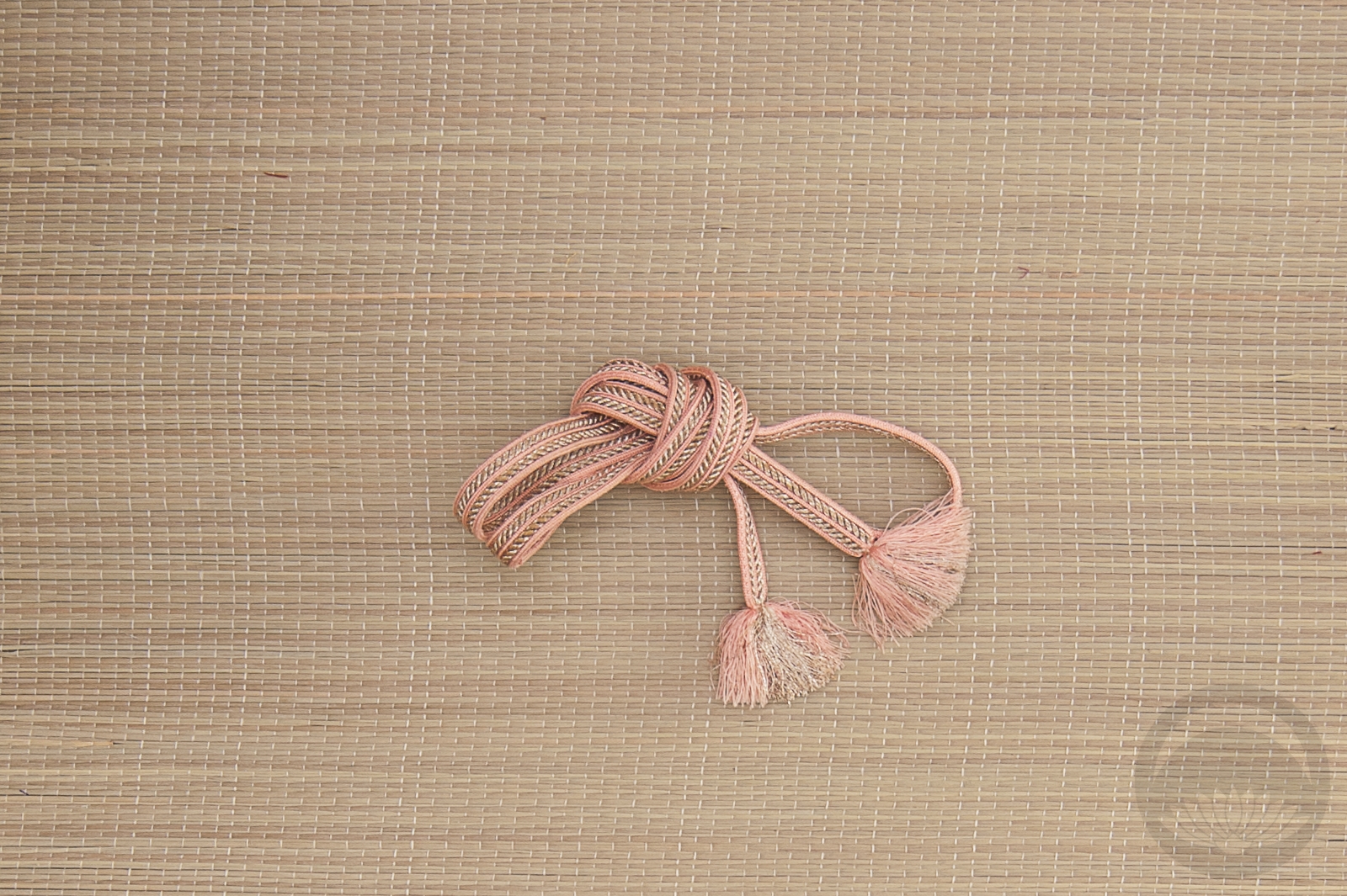
- Gold and White


 Bebe Taian
 CHOKO Blog
 Gion Kobu
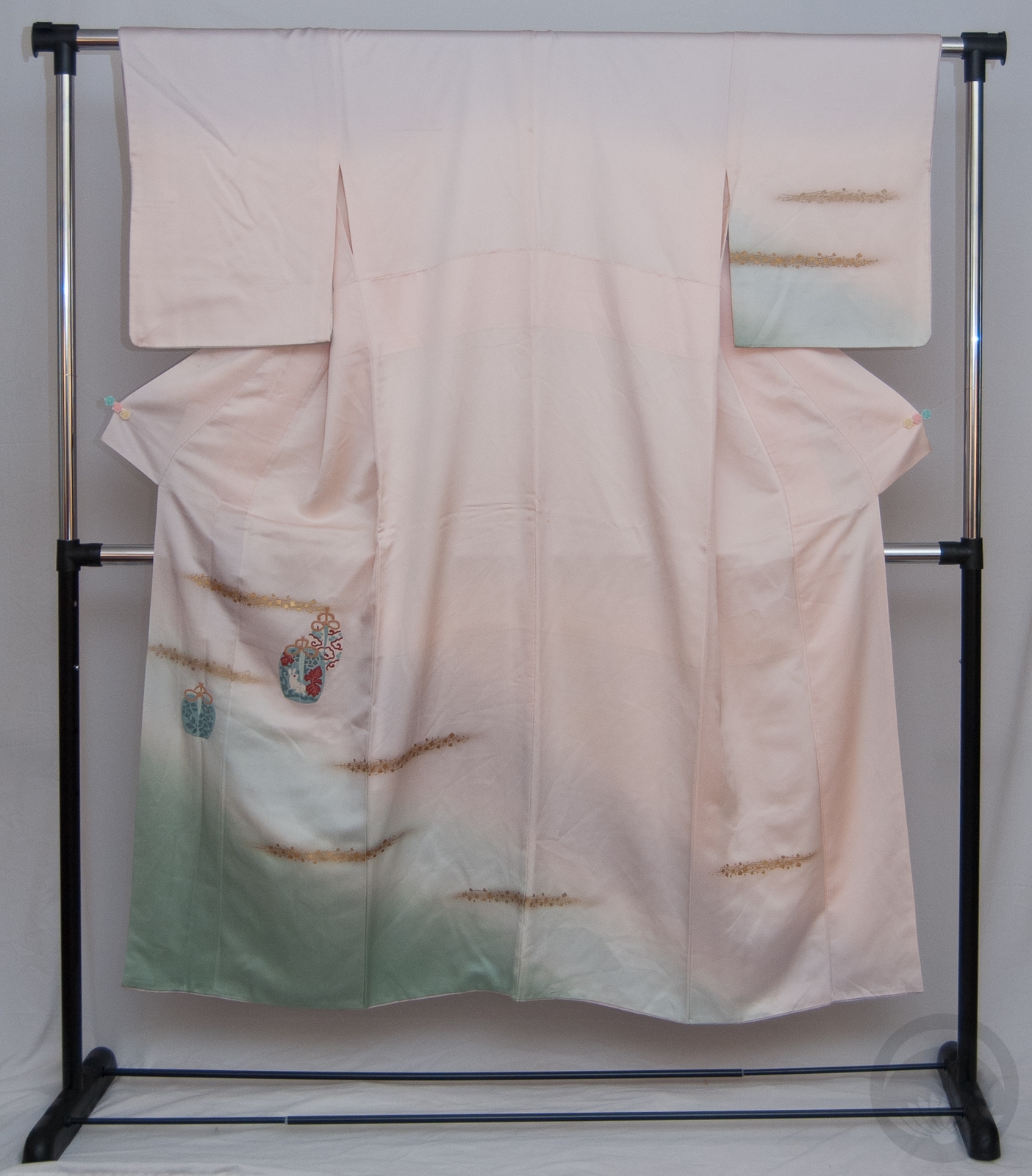