
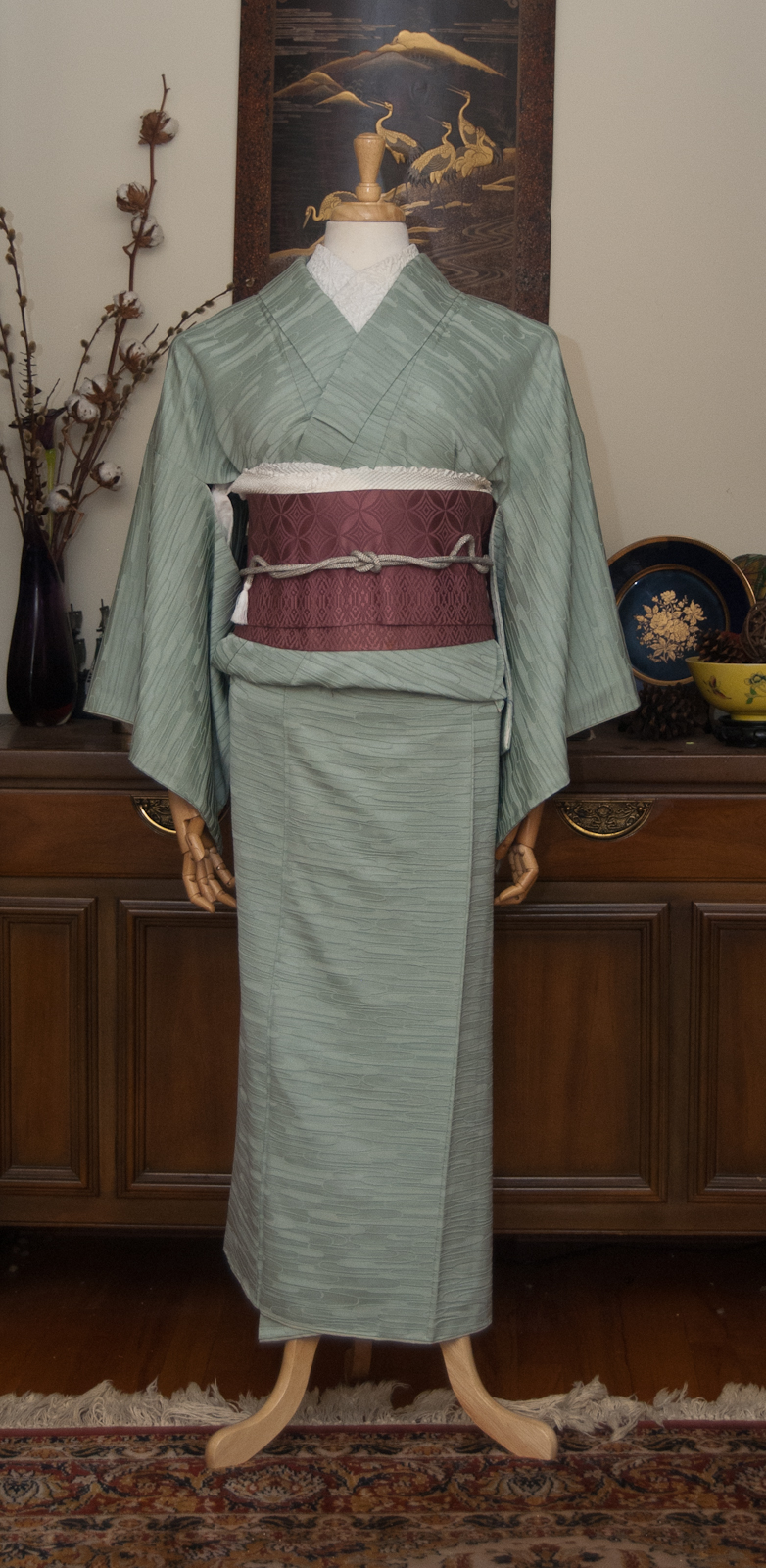
Monochrome outfits that focus on texture and light have always caught my attention, but pieces like that don’t tend to show up on the secondary market very often. I decided I would just go ahead and work with what I’ve got, and I’m very glad I did! It was a bear to take photos of, and they don’t show the depth and richness of all these blacks and textures combined, but hopefully the close-ups help a bit.
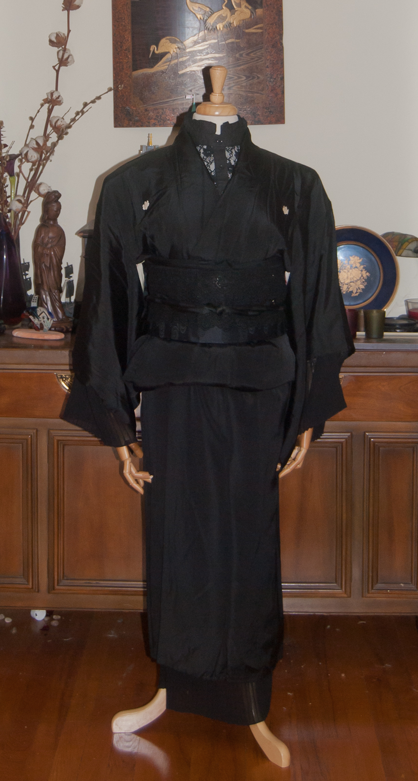
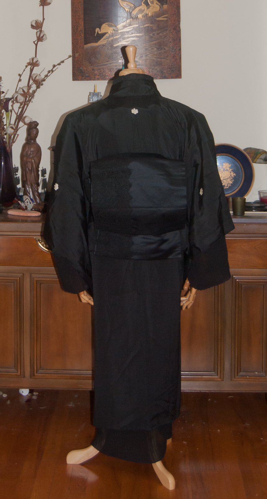
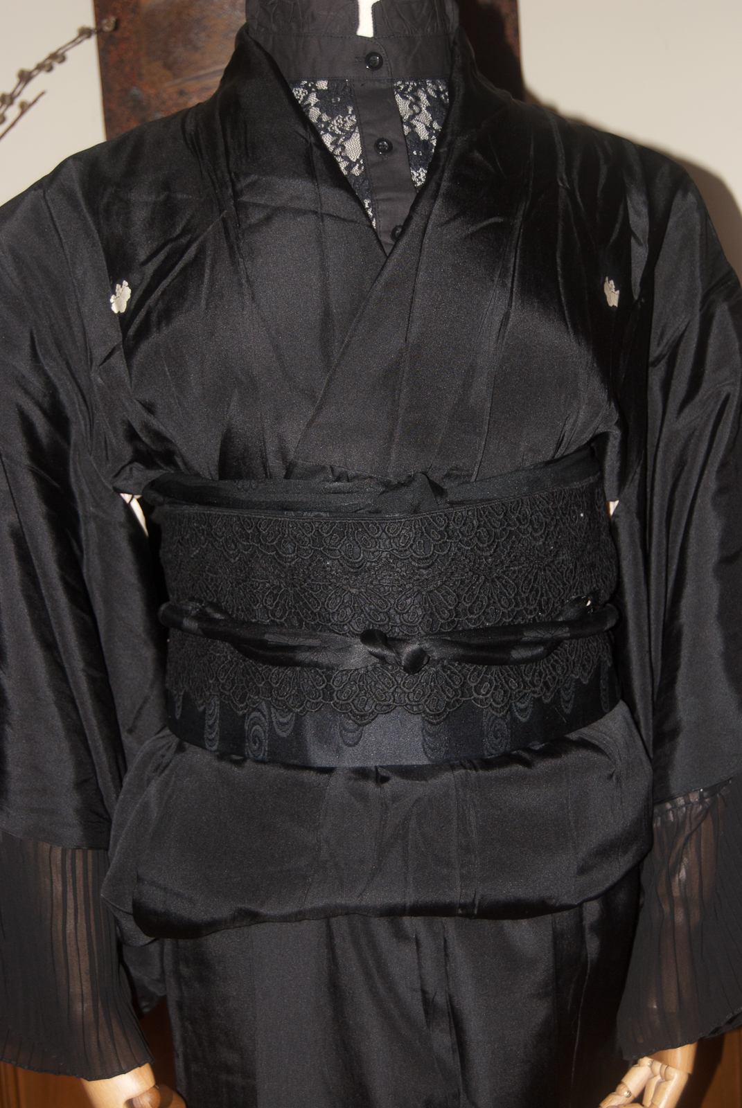

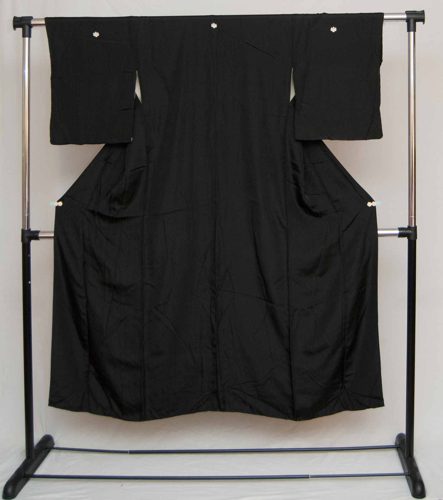
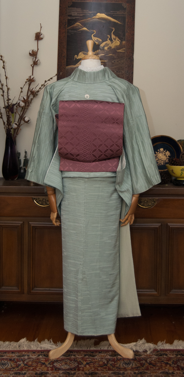
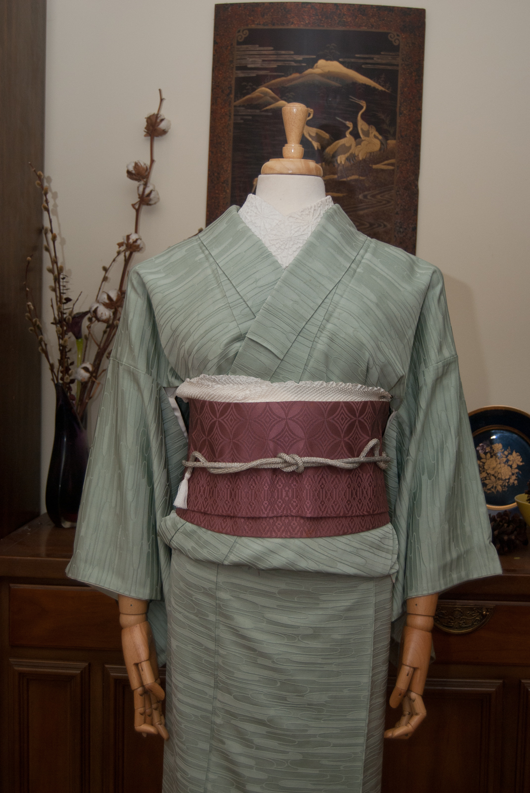
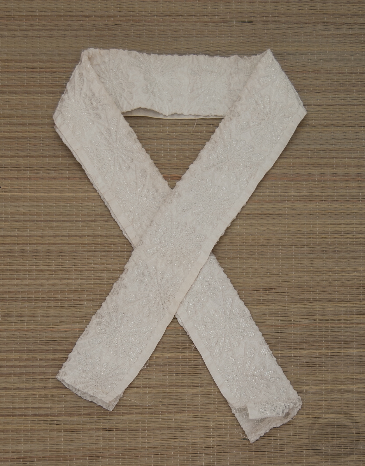
I started with my juban with the black ruffle trim, which pretty much determined the colour of my outfit. I have to admit, it made my inner goth very happy. The mofuku kimono is smooth and solid, but it’s such a rich silk that it has an almost reflective quality which brings in another layer of tones and textures. I also added a black lace collar underneath everything, which adds to that gothic Victorian vibe and works so well. I really love the look of a lace collar under kimono and I’m glad I’ve invested in a black one now.
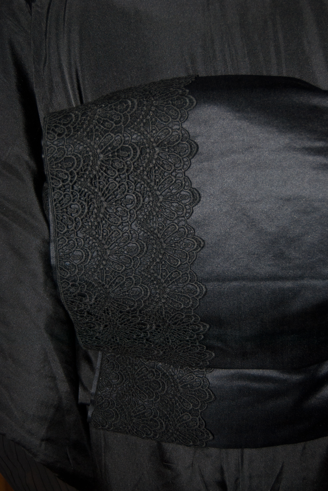
I bought a roll of eyelet lace and temporarily affixed it to a mofuku obi for another layer of lacy texture, and I could not love how it turned out more. I want to do it to a bunch of other obi now where it’s more visible. Black obiage and obijime finish off the outfit.
I’m not thrilled with how poofy the ohashori is here, because there’s so much excess fabric from the hiked-up hem of the kimono, but aside from that everything turned out exactly how I’d pictured it in my mind!
Items used in this coordination
-
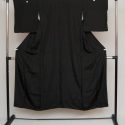
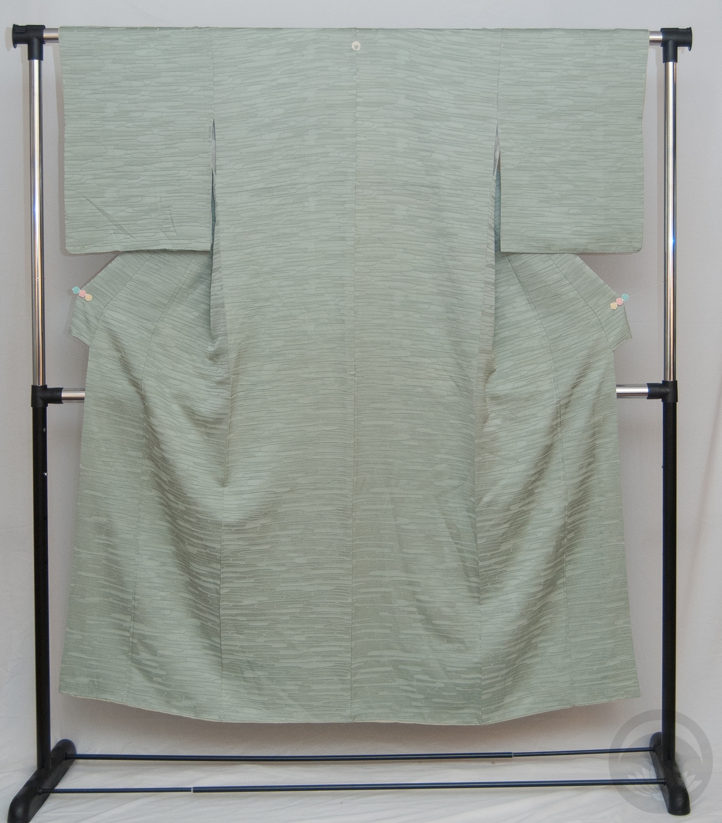
- Mofuku Kimono
-
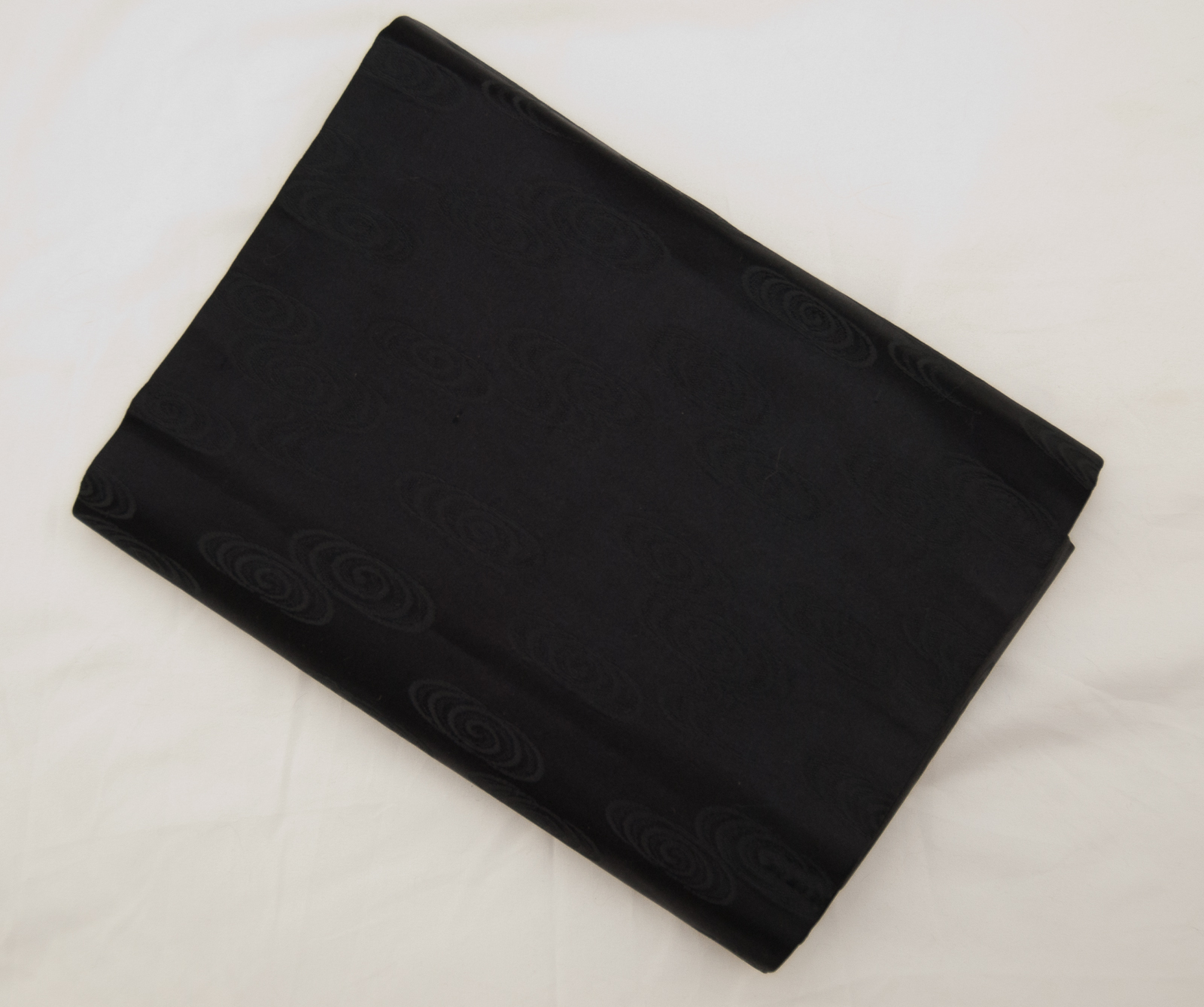
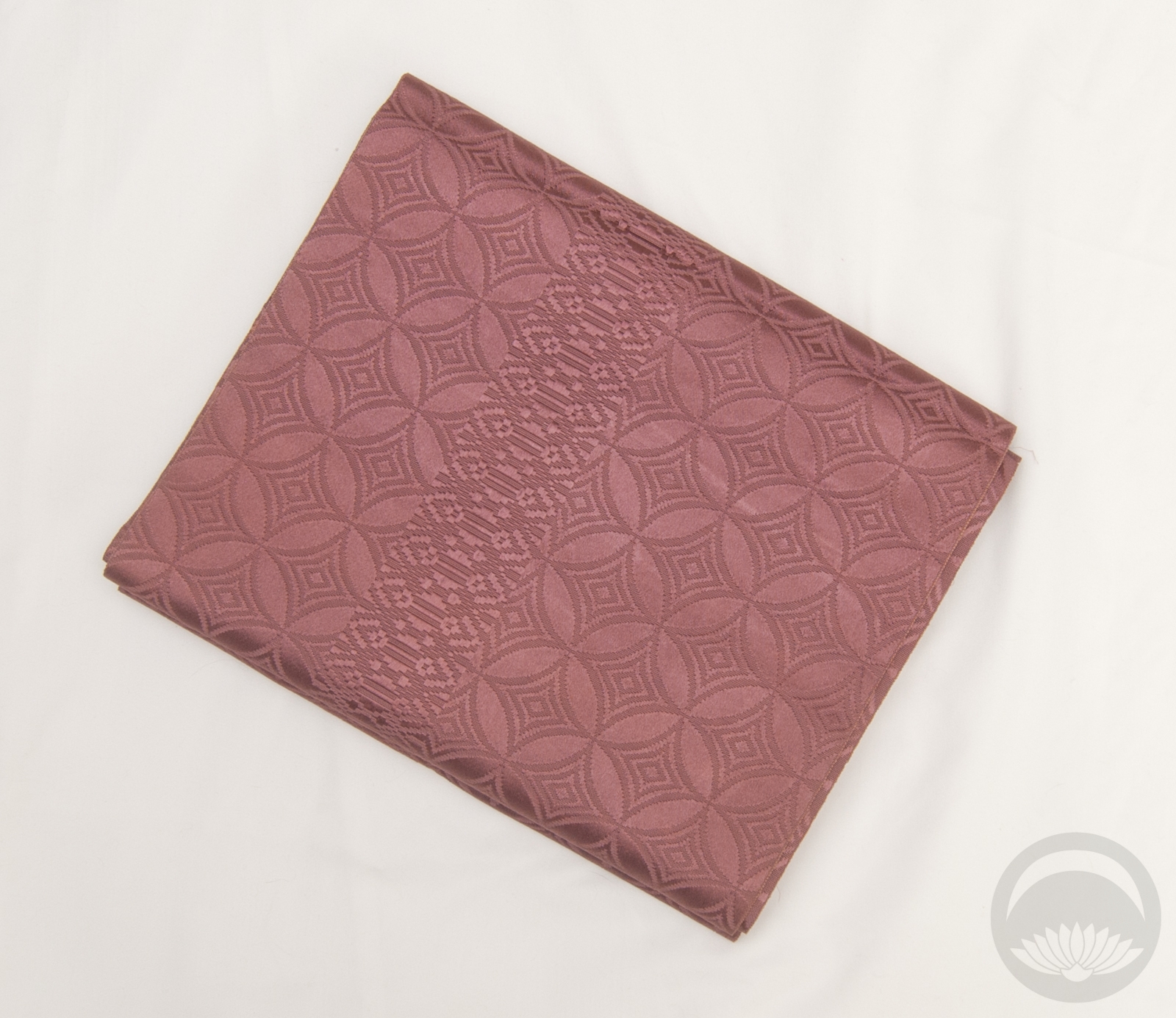
- Mofuku Nagoya Obi
-
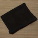
- Mofuku Rinzu Obiage

-
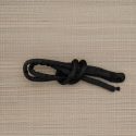
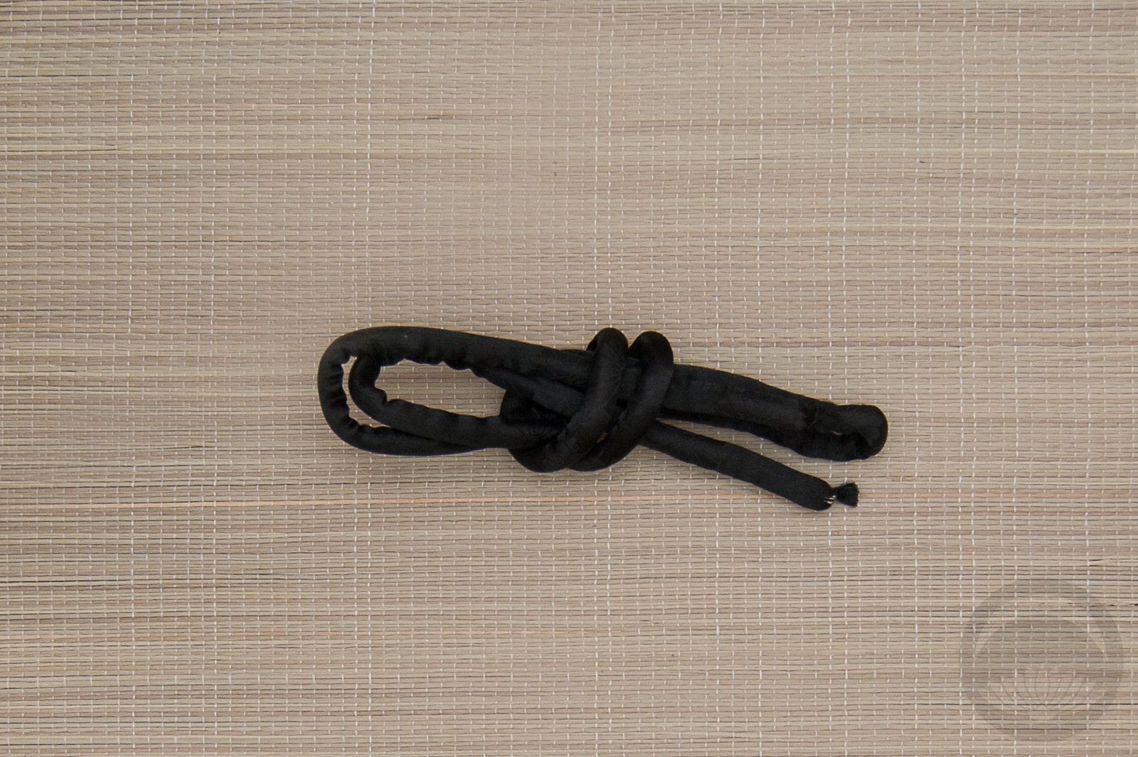
- Black Maruguke


 Bebe Taian
 CHOKO Blog
 Gion Kobu