
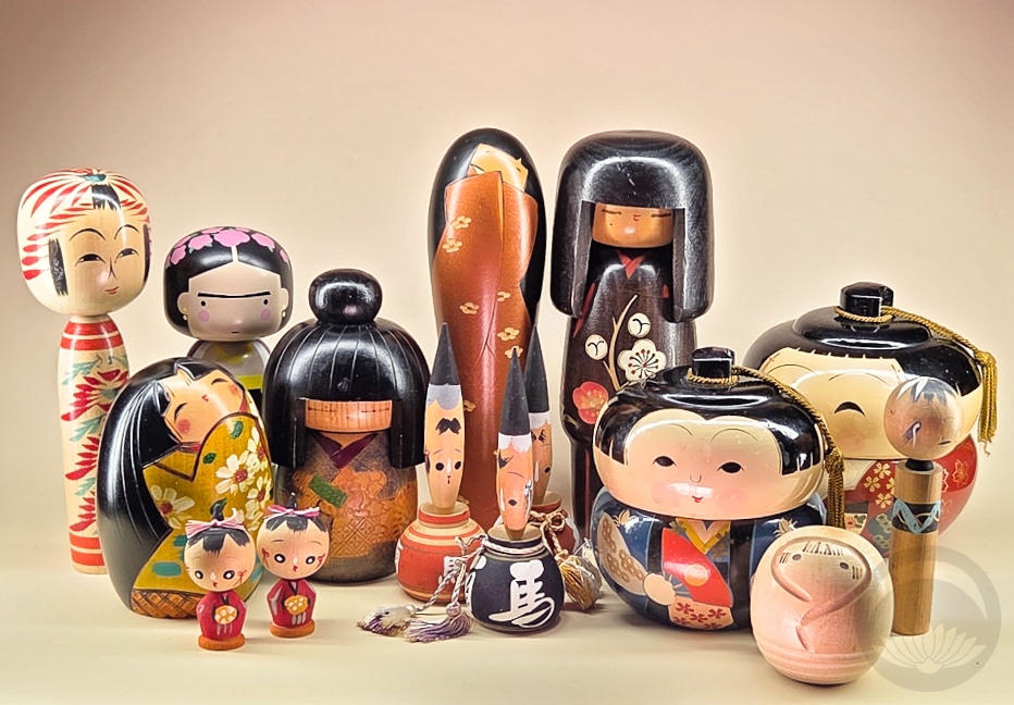
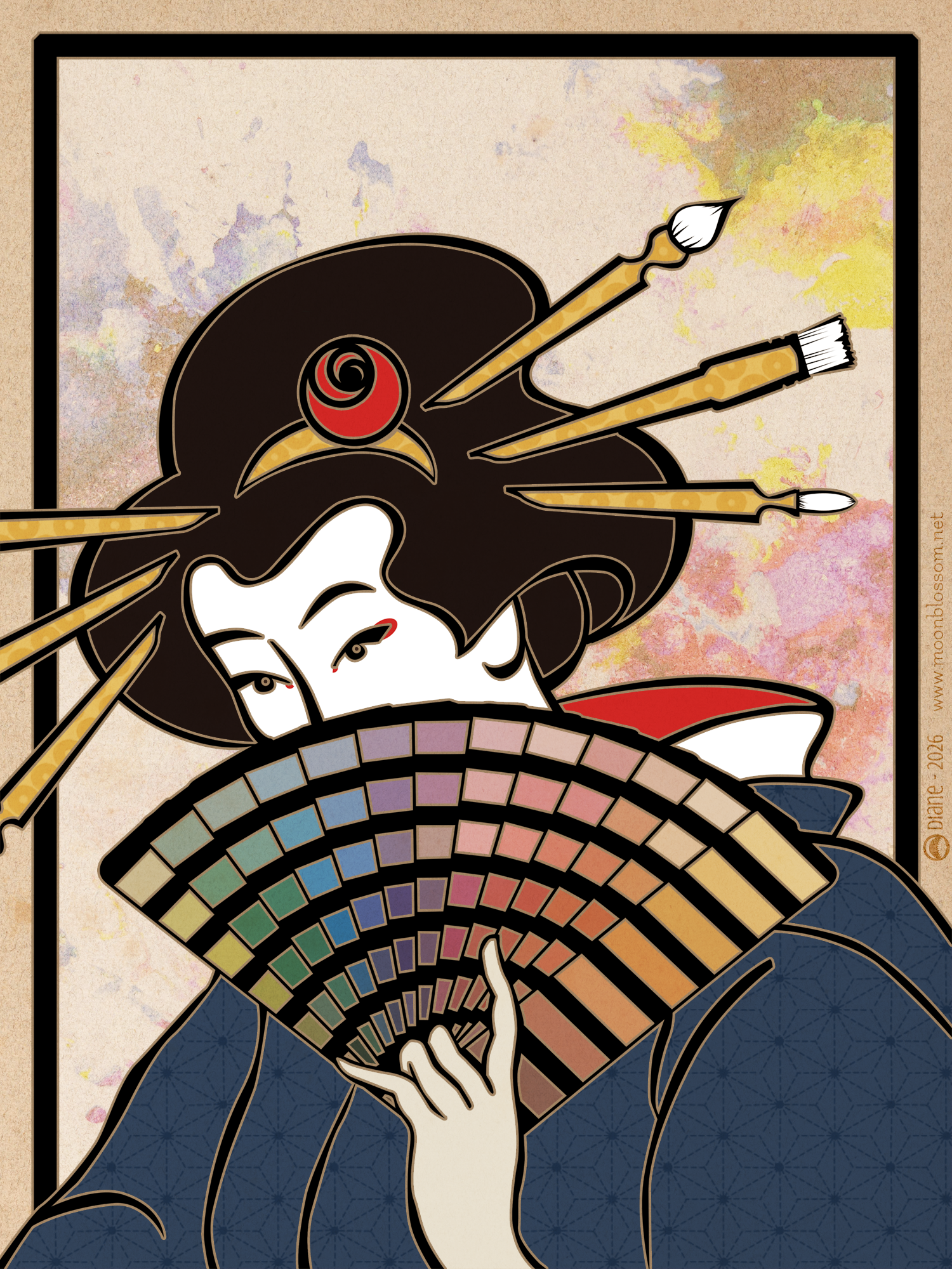
I didn’t set out to start collecting kokeshi ( 小芥子, こけし) dolls, but let’s be realistic — if you’re in any way involved in Japanese traditional arts it’s going to happen eventually. Whether it be gifts, souvenirs, impulse purchases, or any other myriad options, these charming little figurines will find their way into your heart and your home.
I’ve already posted about my Kimmidolls, which are a more modern Australian take on kokeshi-style figures, but as my actual kokeshi collection continues to grow, thanks in no small part to this incredible mystery bundle I got from the Los Angeles Toy, Doll and Amusements Museum, I figured it was time I gave these lovely ladies (and occasional gentleman) their moment in the spotlight.
Dento (Traditional) Kokeshi
Starting with the classic Tohoku-style lathe kokeshi most folks are familiar with, and including regional variations and tourist souvenir types. These tend to have the most “vintage” style faces and decorations.
 |
 |
 |
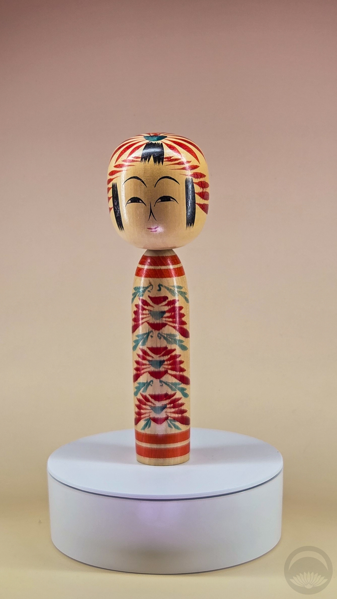
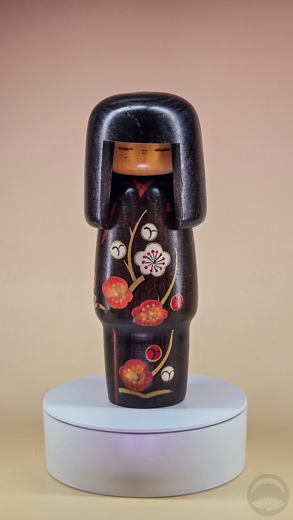
Traditional Togatta (遠刈田)-style kokeshi
gifted by a local kimono vendor in Montreal, QC |
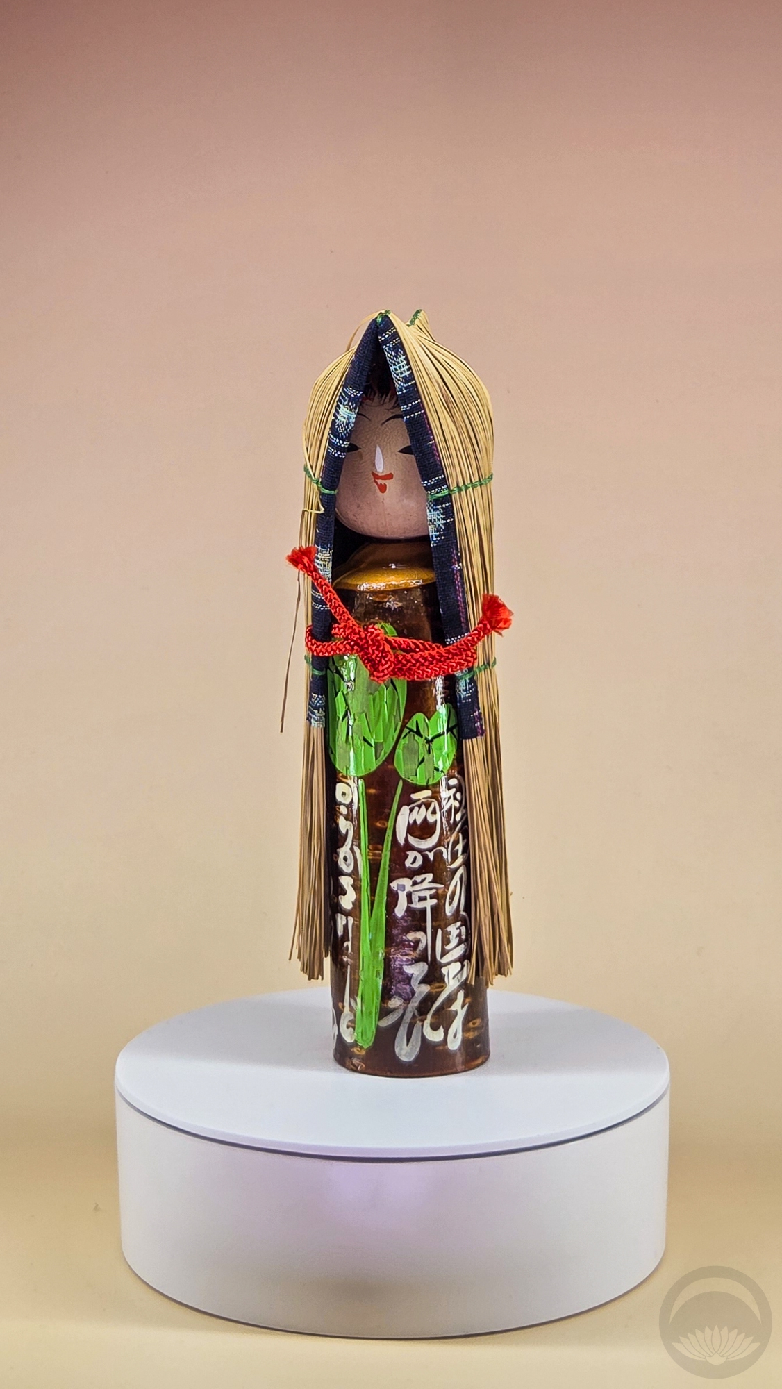
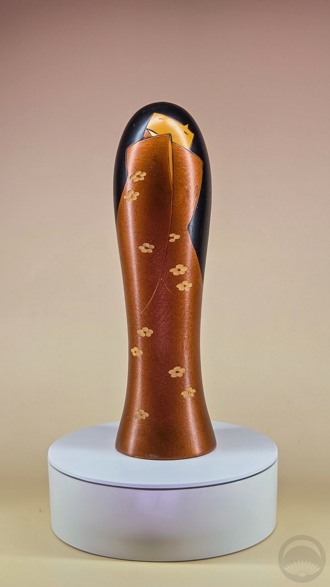
Yukinko (雪ん子) – Child in Snow kokeshi
LATDA kokeshi mystery box |
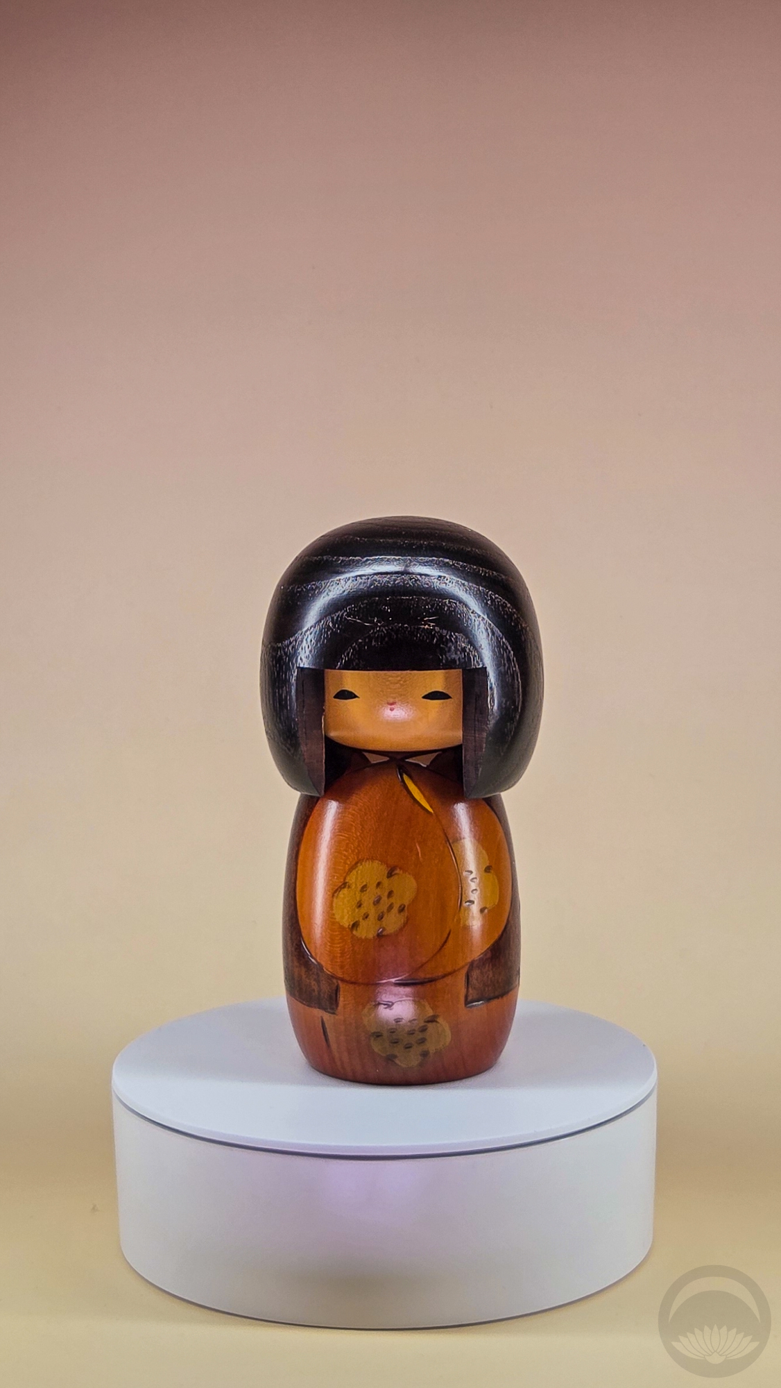
Koke-shoe? Yukinko (雪ん子) – Child in Snow kokeshi
LATDA kokeshi mystery box |
 |
 |
 |
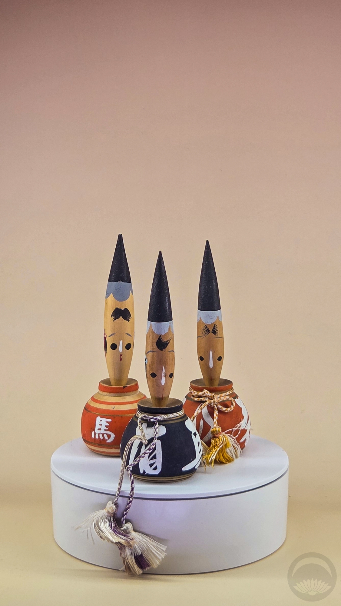
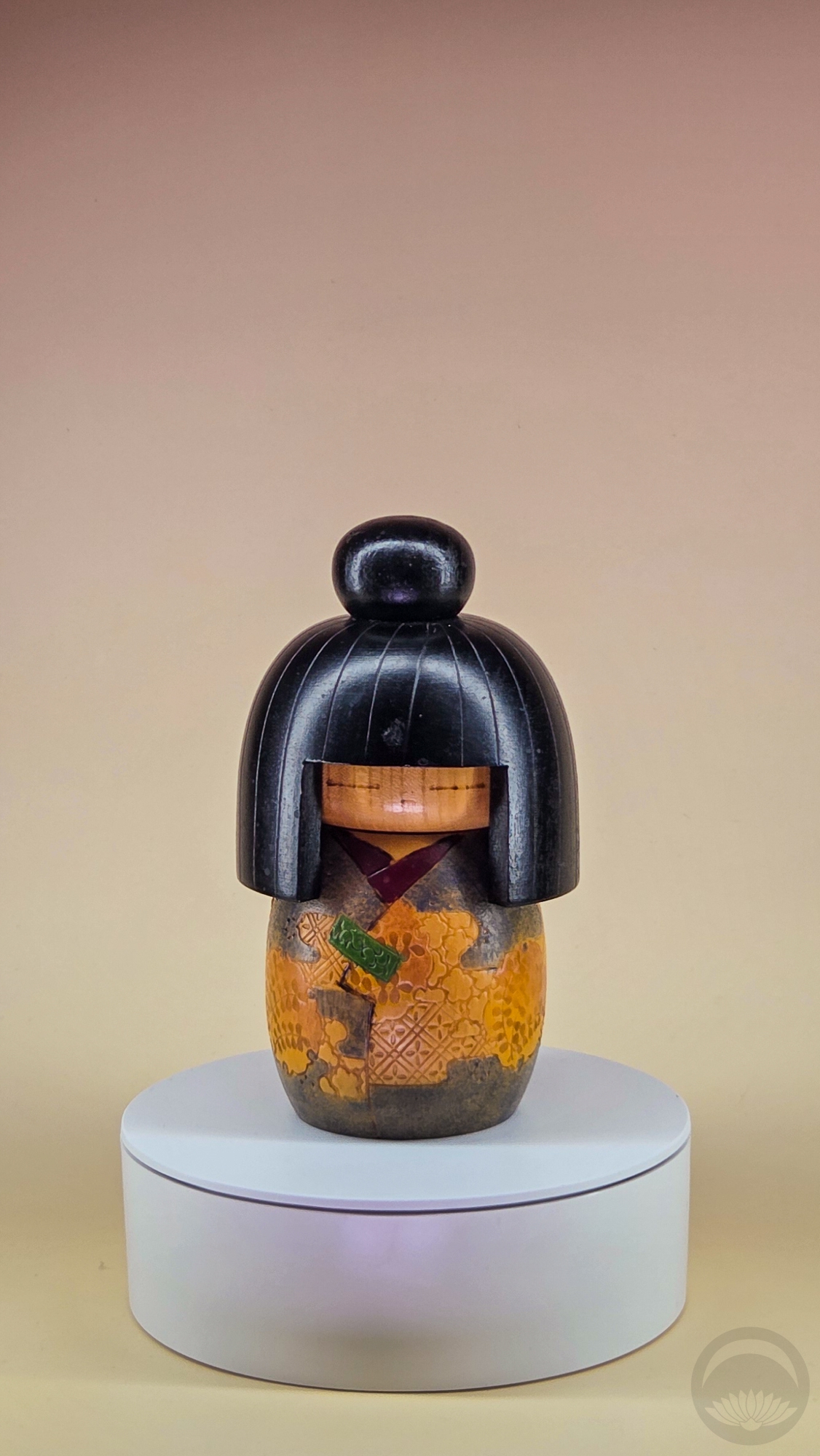
Three Fude (筆こけし) – Ink Brush kokeshi
LATDA kokeshi mystery box |
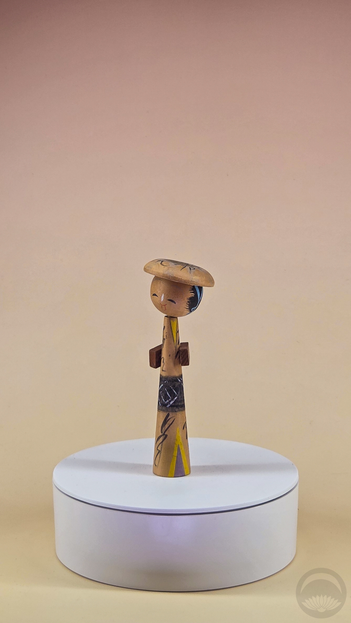
Tall stylish kokeshi with packages and hat
LATDA kokeshi mystery box |
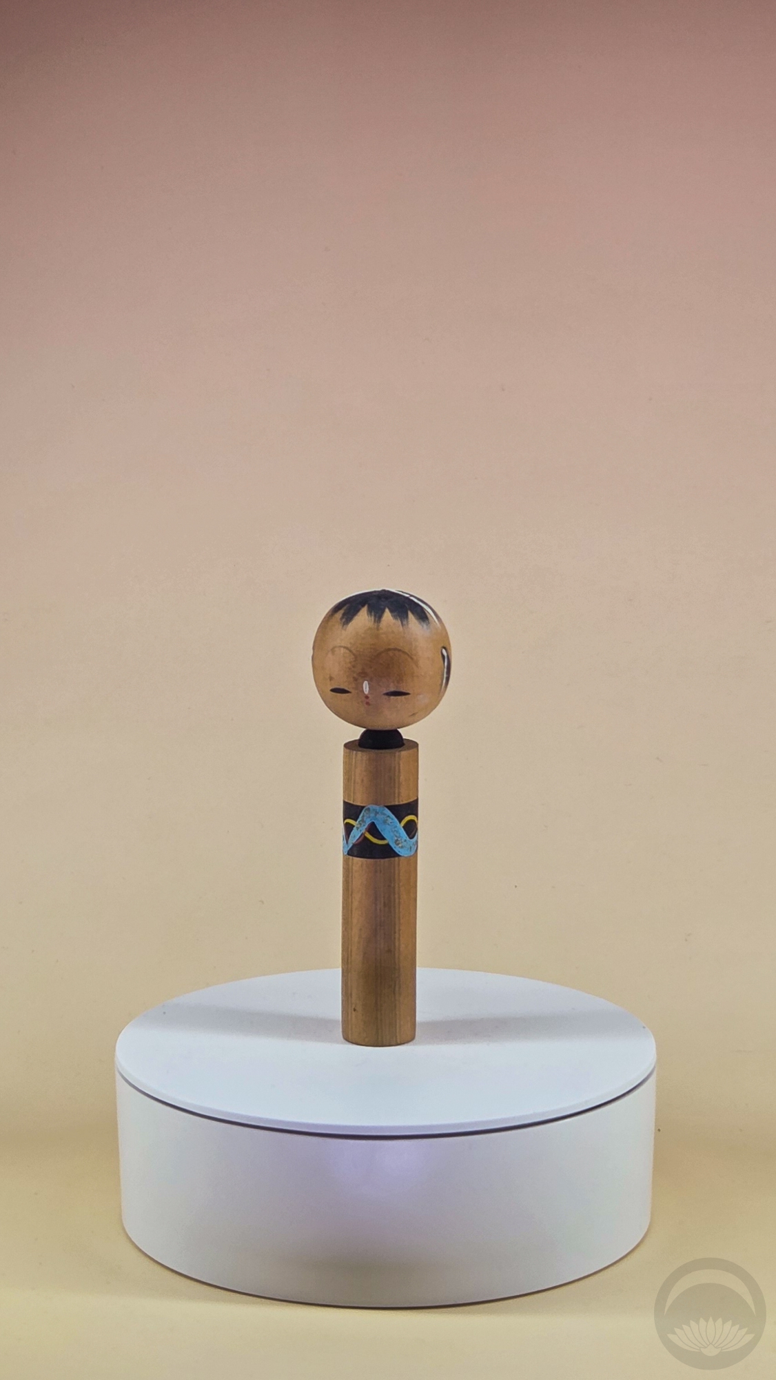
Tall skinny kokeshi
LATDA kokeshi mystery box |
 |
 |
 |
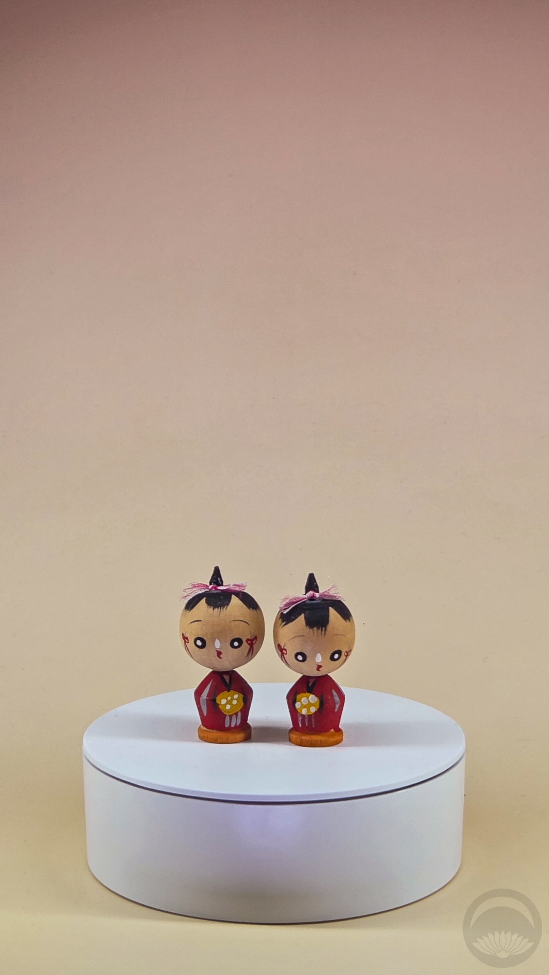
Twin girl kokeshi-nodda (nodding/bobble head)
gifted by restaurant owners in Montreal, QC |
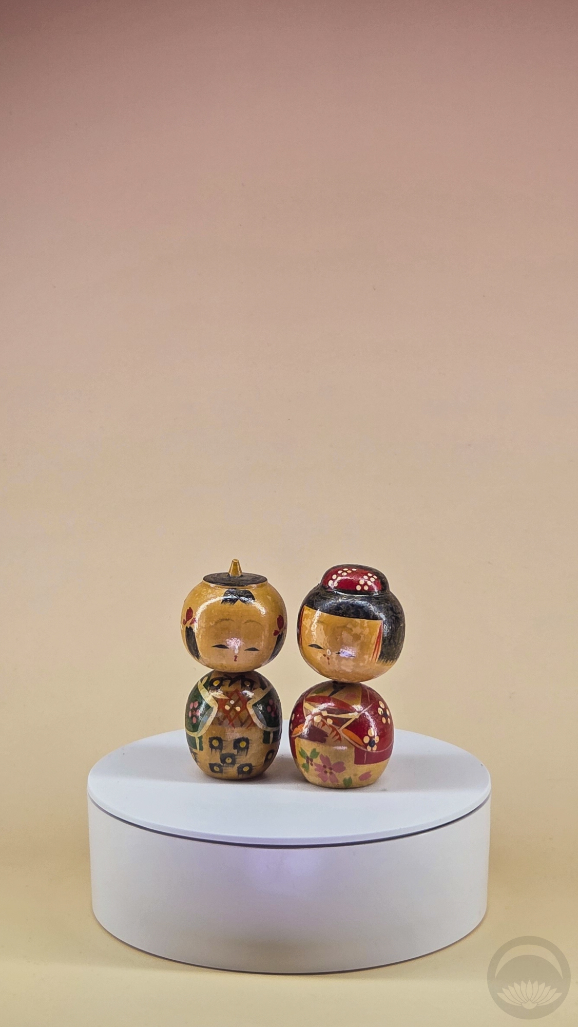
Charming pair of kokeshi-nodda (nodding/bobble head)
LATDA kokeshi mystery box |
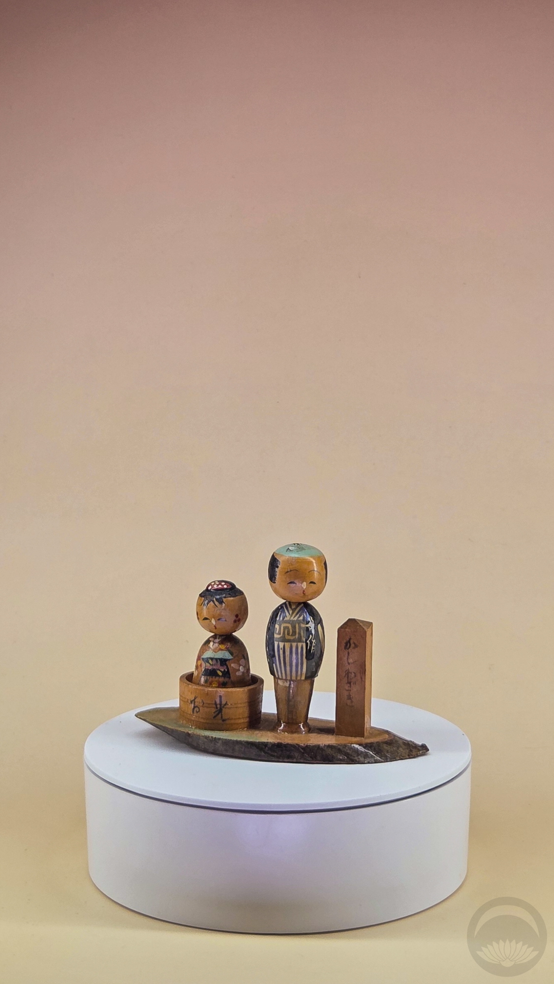
Couple on wooden base
LATDA kokeshi mystery box |
 |
 |
|
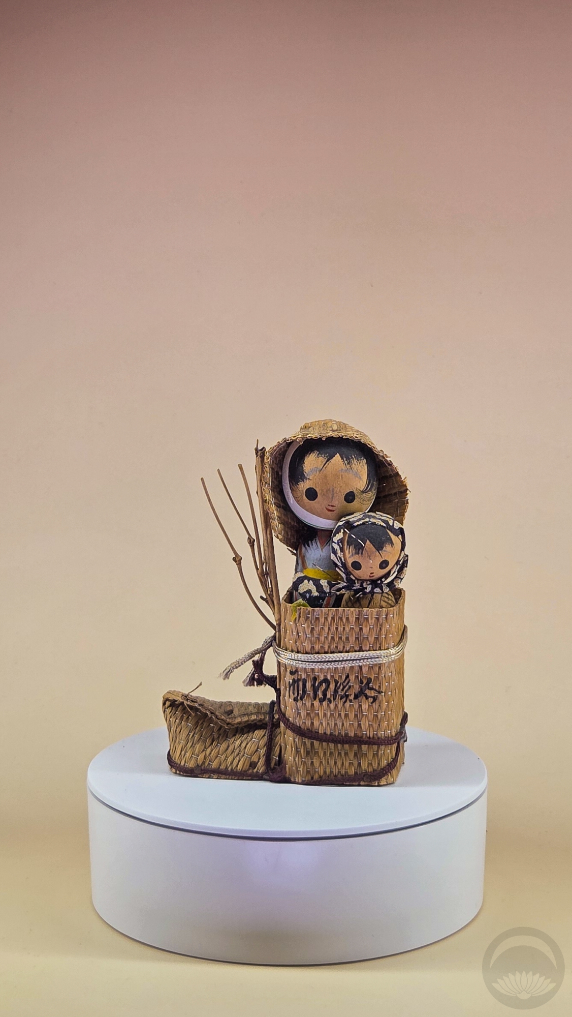
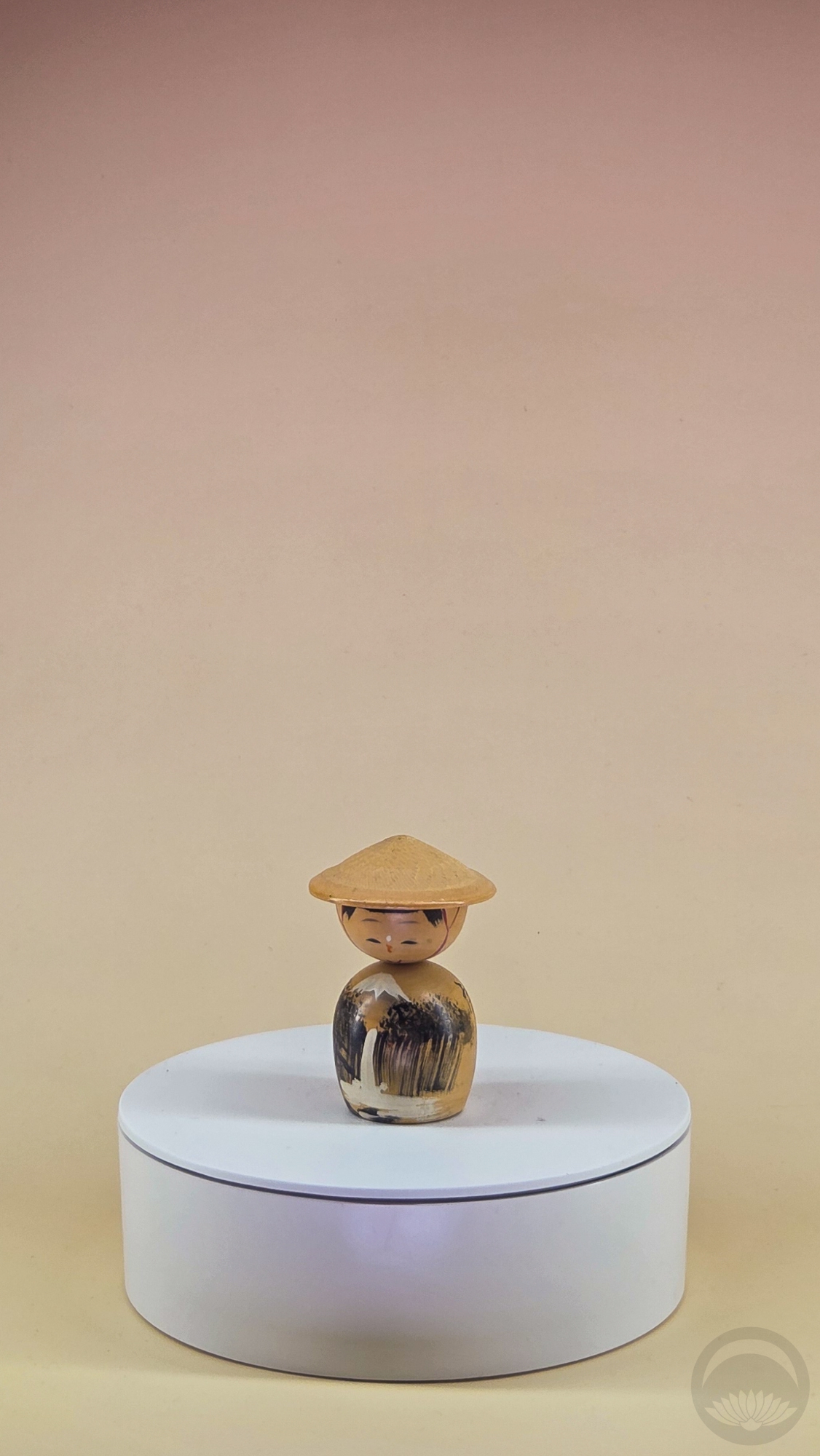
Adorable small kokeshi with landscape
LATDA kokeshi mystery box |
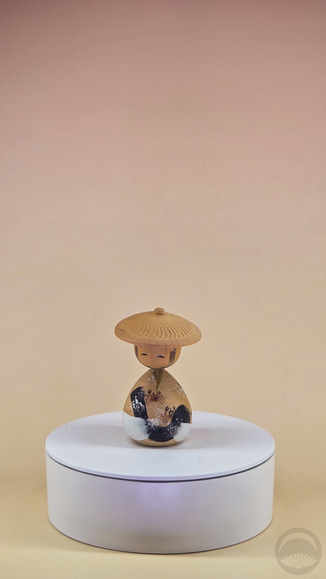
Small kokeshi with charming crab motif
LATDA kokeshi mystery box |
Sosaku (Modern) Kokeshi
Still crafted by Japanese artisans, these fall under the modern style that became popular in the fifties and sixties. Their designs are more fluid, the shapes are more organic. This is personally my favourite style. I love how shapely they are, and tend to have an excellent and comforting feel when held.
 |
 |
 |
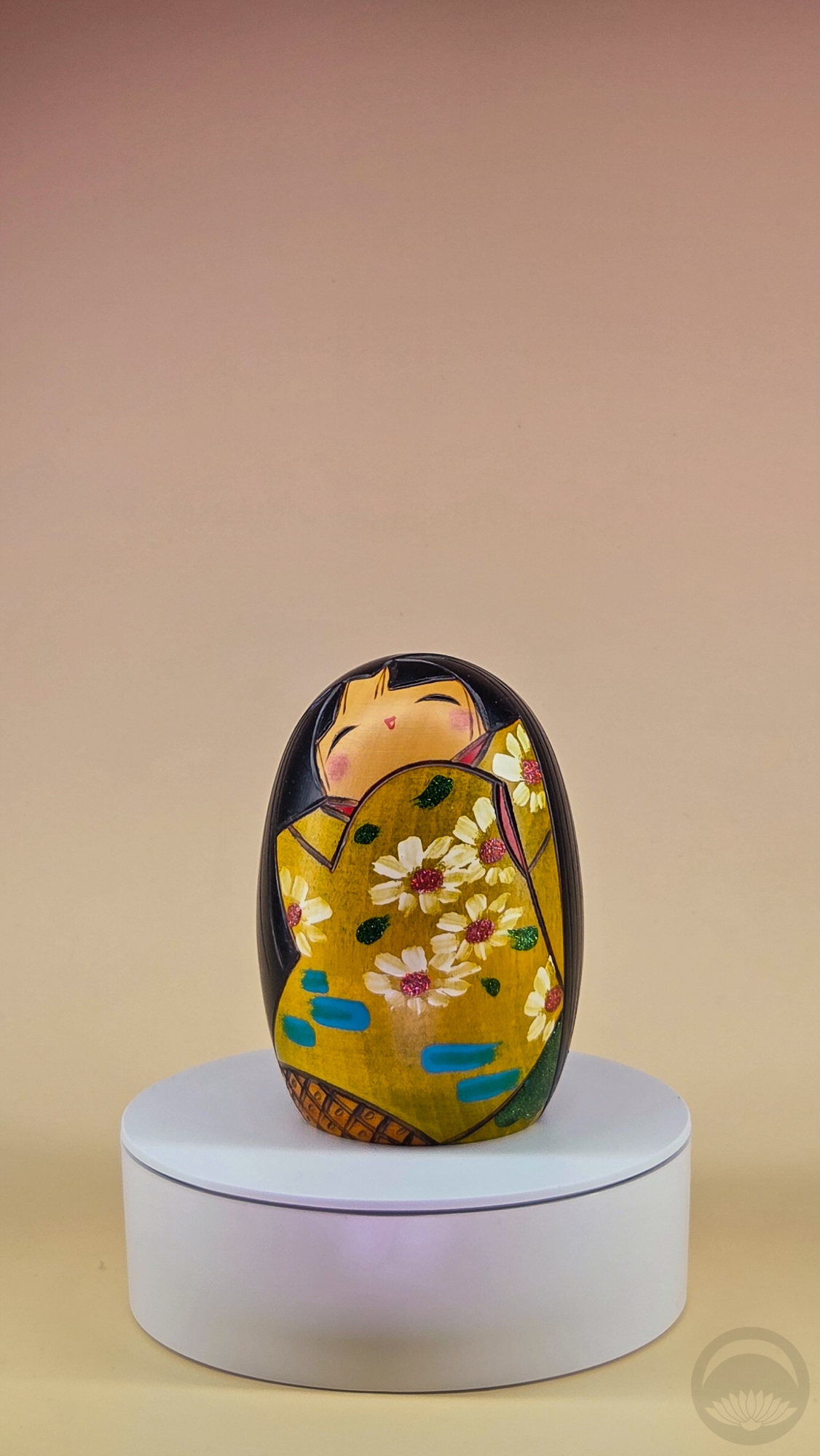
Ume kokeshi with interesting shape, unmarked
thrifted in Oak Glen, CA |
Slender Usaburo kokeshi
thrifted in Montreal, QC |
Petite kokeshi with bob, unmarked
gifted by a friend |
 |
 |
 |
Carved kimono kokeshi by Takamizawa Kazuo
LATDA kokeshi mystery box |
Hanakasumi kokeshi by Artforum
gifted by a friend |
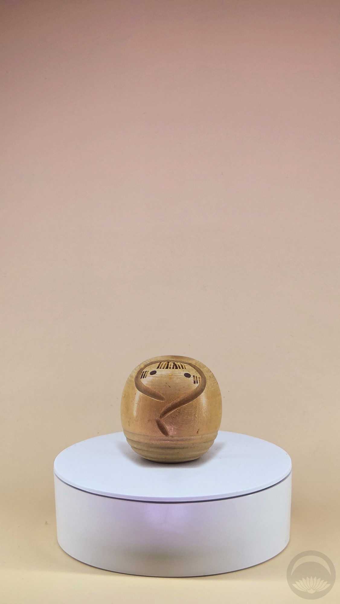
Diminutive unpainted round kokeshi
gifted by a friend |
Alternative Kokeshi
These may include Japanese dolls that don’t fit elsewhere or kokeshi-inspired art dolls from around the world.
 |
 |
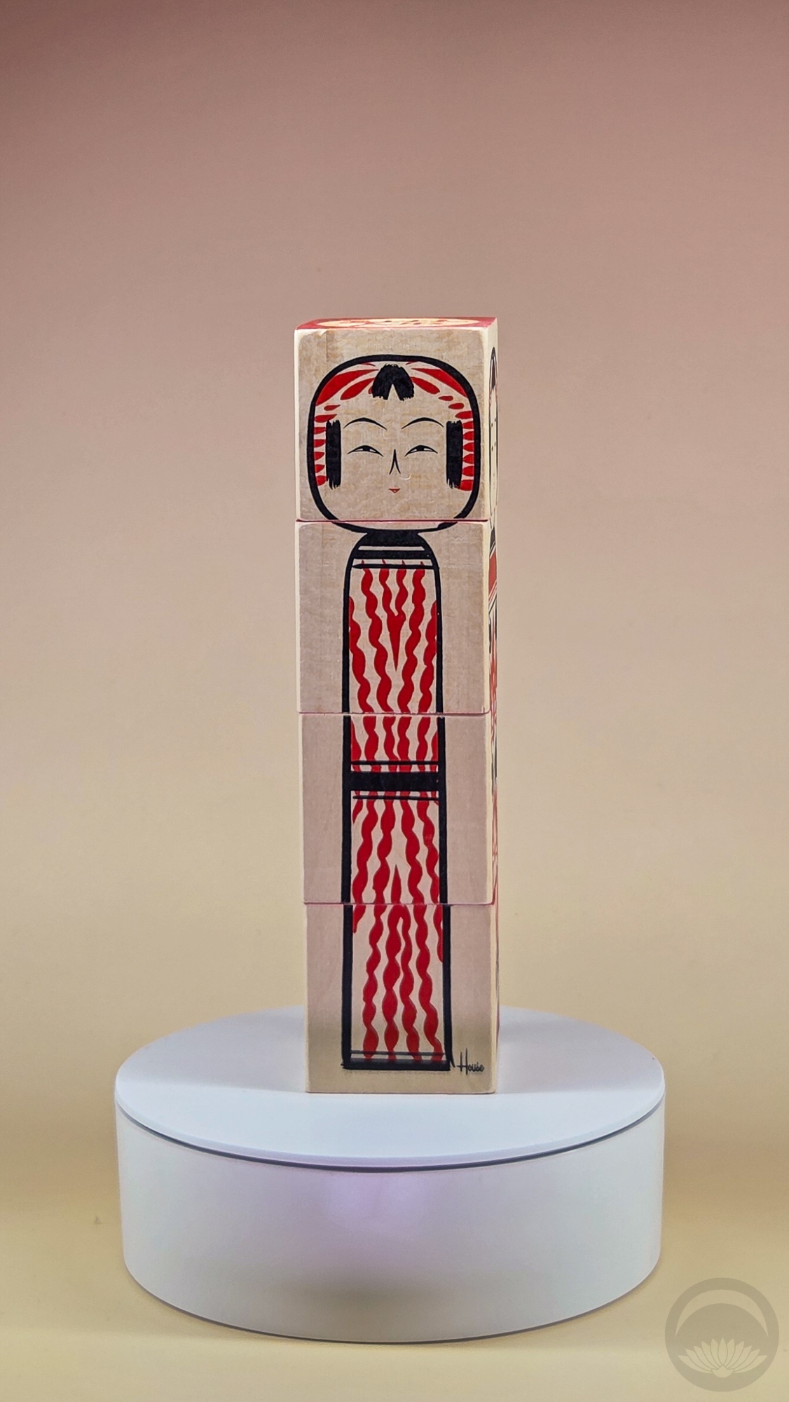 |
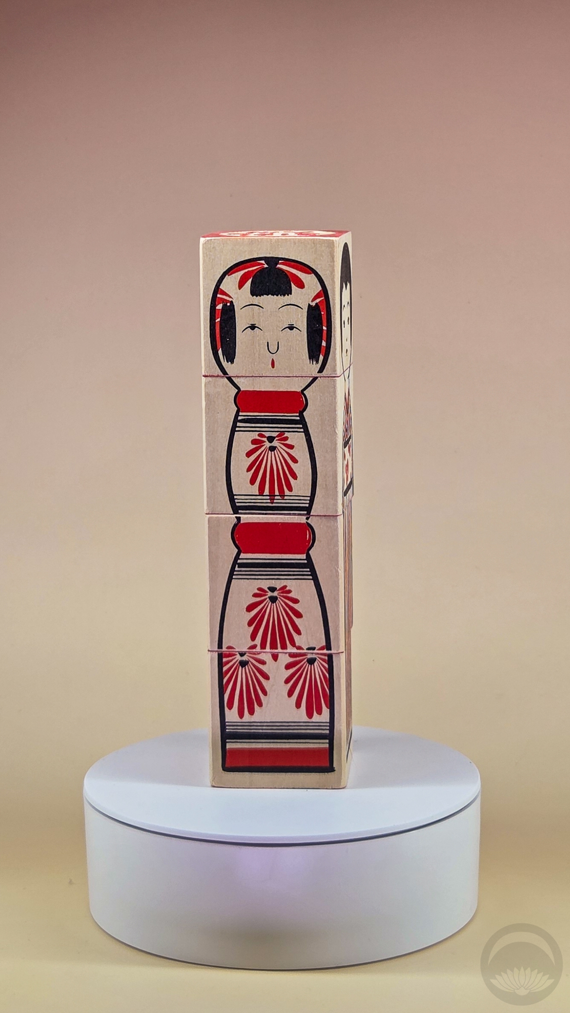
Kokeshi stacking block toys by House Industries x Uncle Goose
purchased on Etsy |
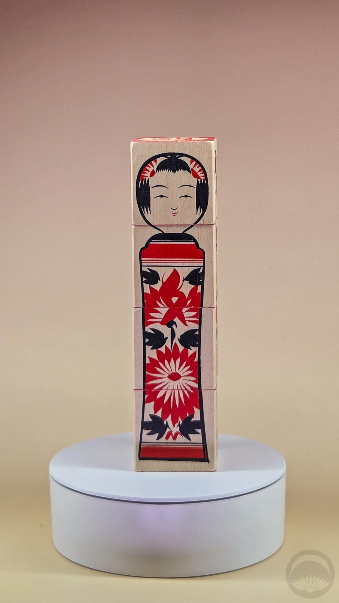
Kokeshi stacking block toys by House Industries x Uncle Goose
purchased on Etsy |
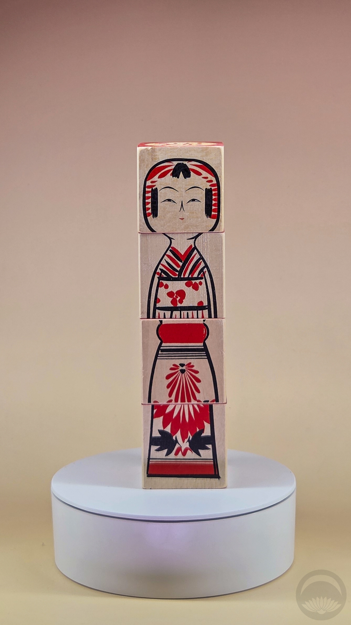
Kokeshi stacking block toys by House Industries x Uncle Goose
purchased on Etsy |
 |
 |
 |
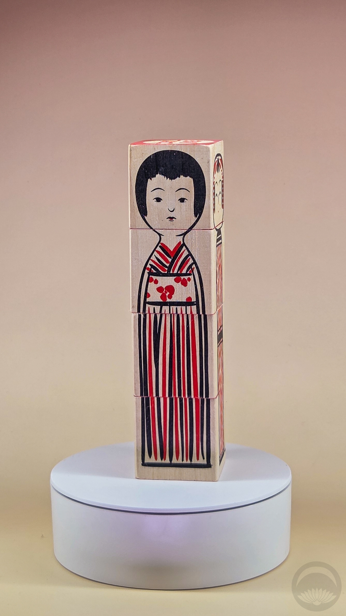
Kokeshi stacking block toys by House Industries x Uncle Goose
purchased on Etsy |
Kokeshi stacking block toys by House Industries x Uncle Goose
purchased on Etsy |
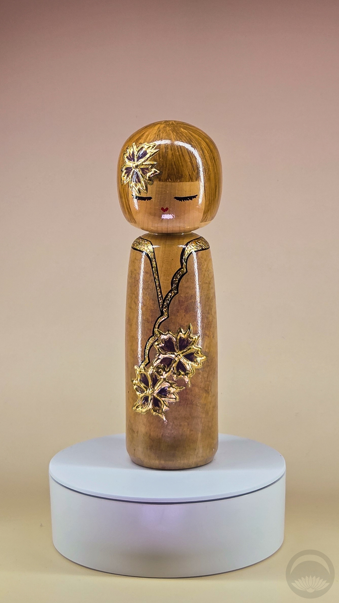
Elegant kokeshi by Canadian artist Christiane Bissonnette
thrifted in Montreal, QC |
 |
 |
 |
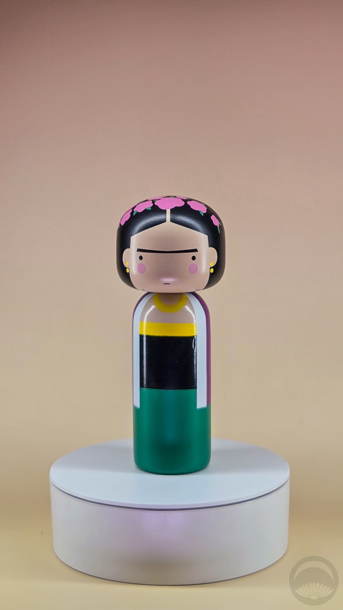
Frida Kahlo art doll Kokeshi by Lucie Kaas
purchased at Palm Springs Art Museum gift shop |
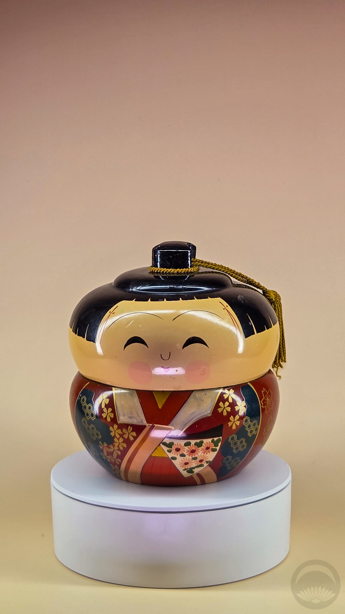
Kokeshi-style trinket box, girl purchased at Palm Springs Vintage Market |
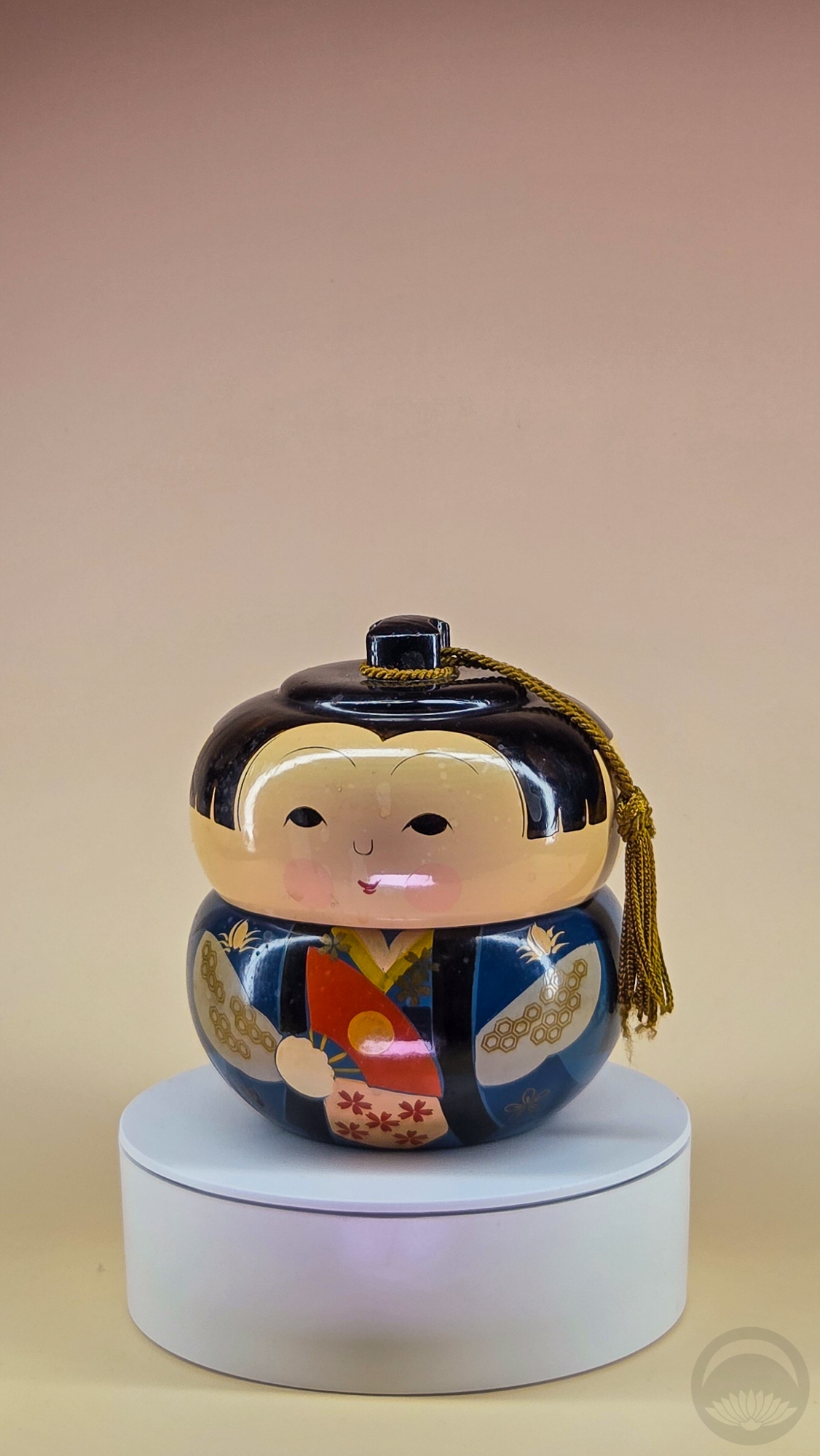
Kokeshi-style trinket box, boy
purchased at Palm Springs Vintage Market |
 |
 |
|
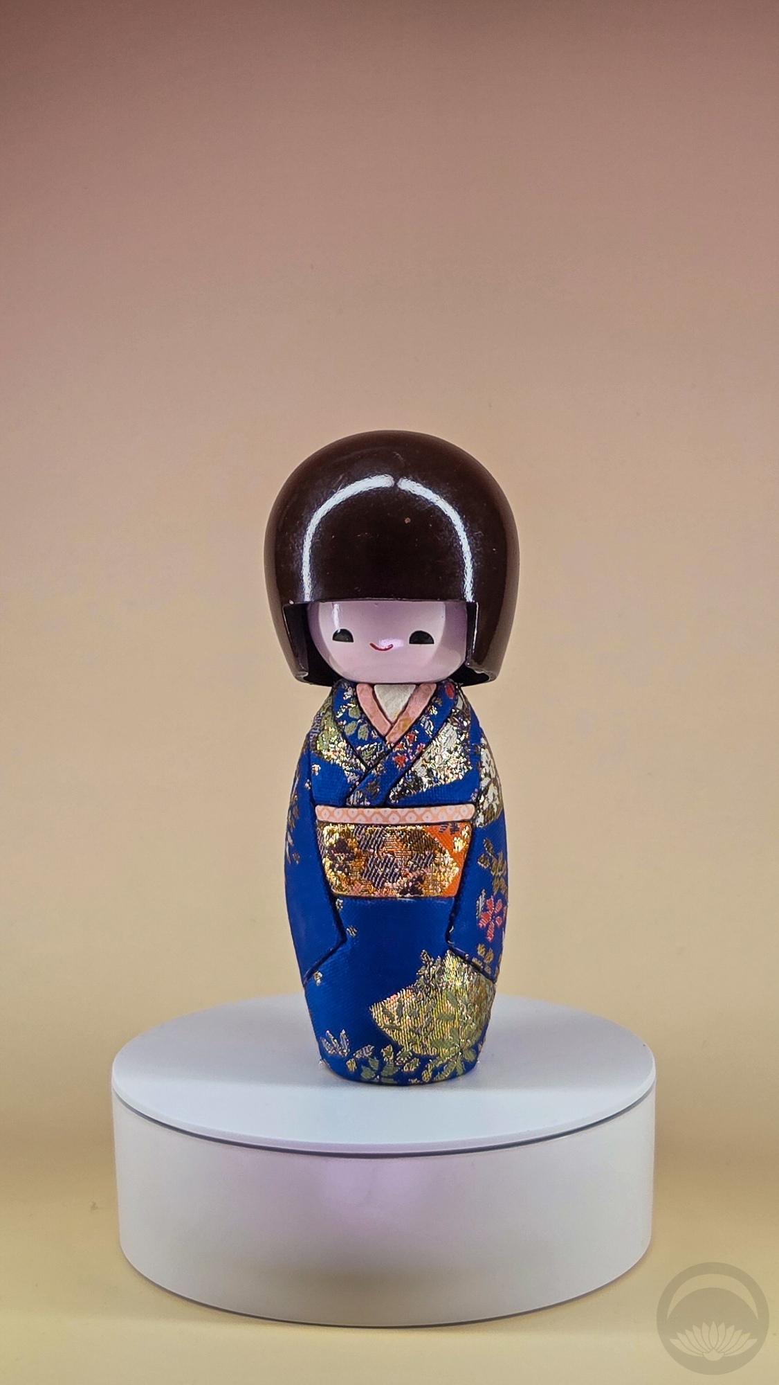
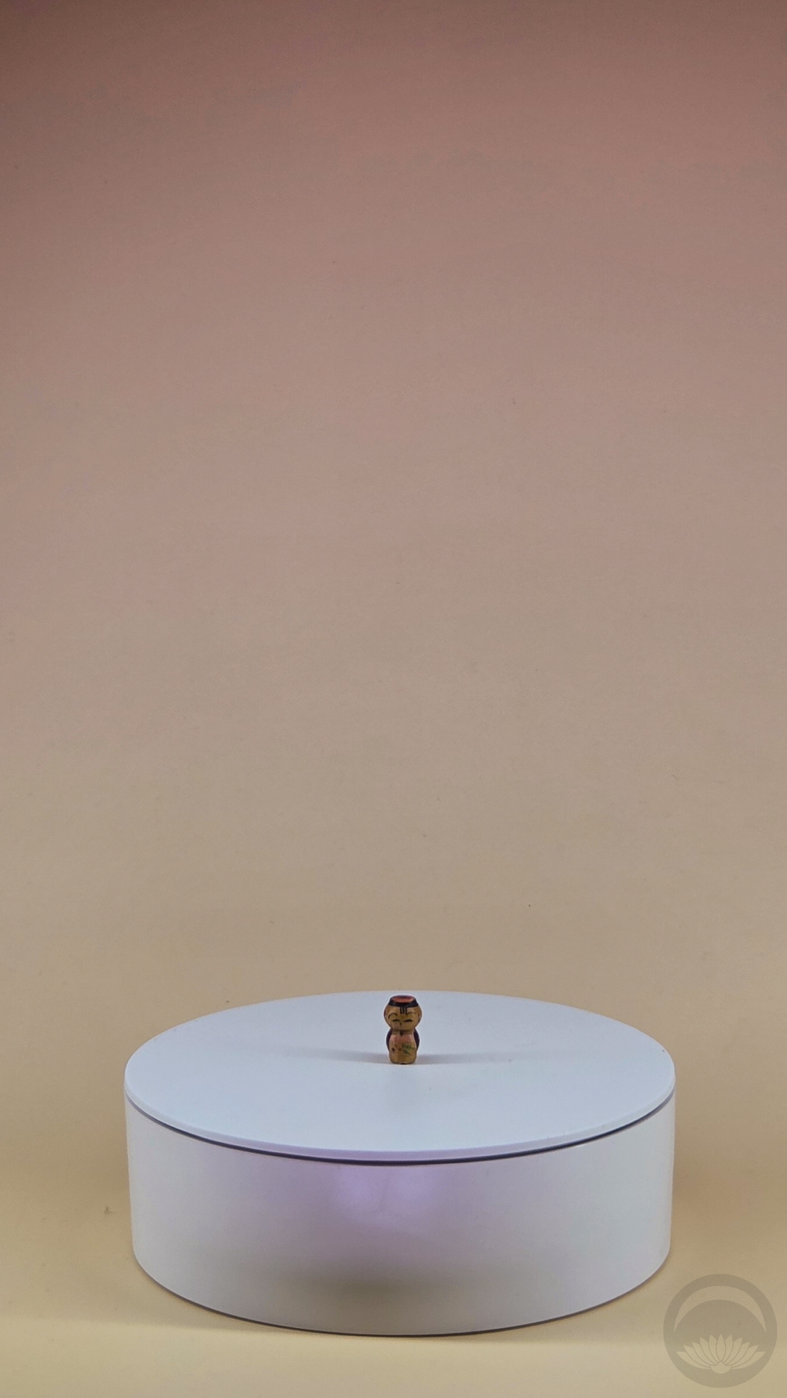
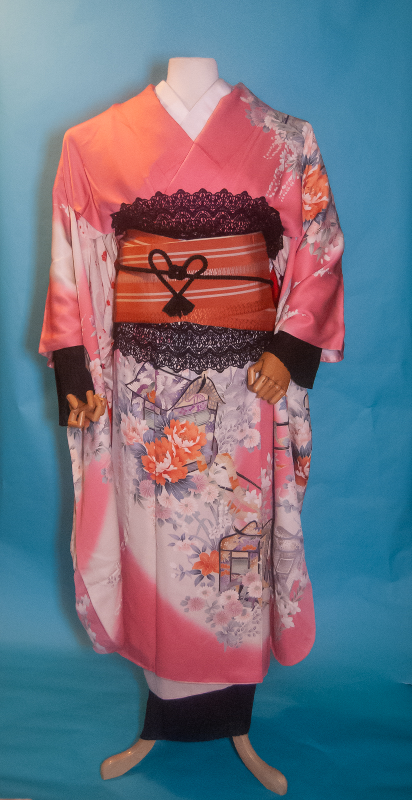
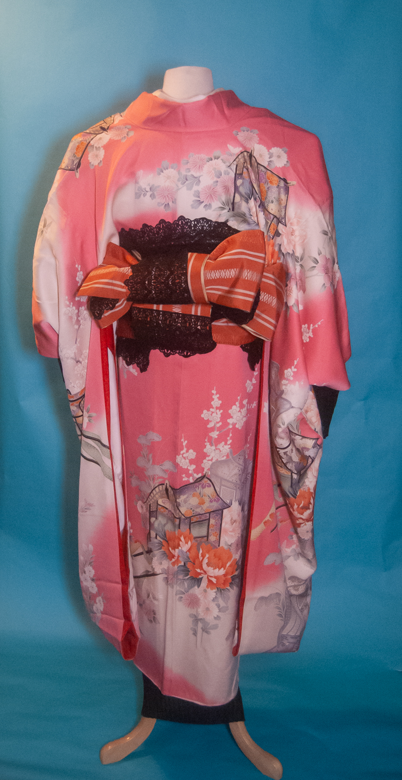
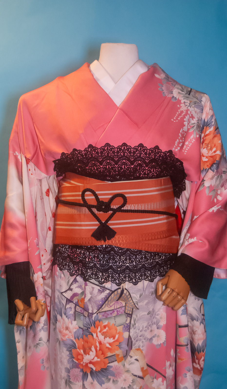
Mass-produced tourist kokeshi I bought because it looked like me in this outfit.
purchased in Montreal QC’s Chinatown district |
Teeeeny Tiny Kokeshi. You can view a close-up here. This one lives in this diorama now.
gifted by a friend |
I do intend to get full 360 video of each of these beauties, since some of them have writing or fun details on alternate sides, but that’s a project for when I have more free time.
Because I am nothing if not shameless, I do have a wishlist of easily-available kokeshi on Amazon right now too. I am also on the hunt for the Usaburo Kuromi and may snag her soon, as well as Lucie Kaas Vincent Van Gogh but it’s not available at any North American retailers I can find at the moment.


 Bebe Taian
 CHOKO Blog
 Gion Kobu