“Group of Seven” Landscape Houmongi

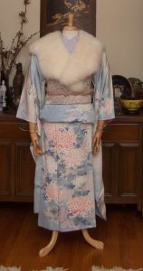
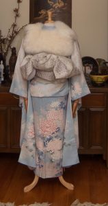
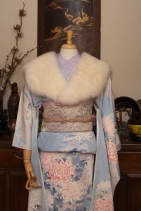
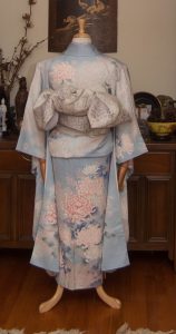
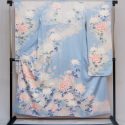
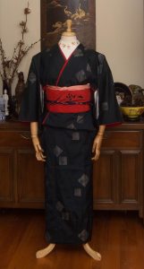
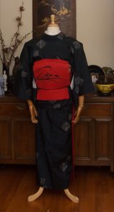
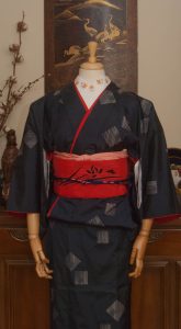
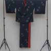
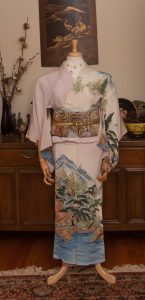
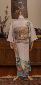
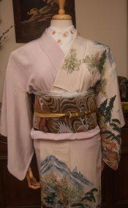
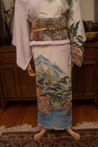
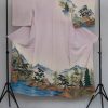
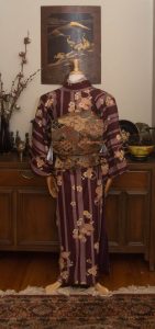
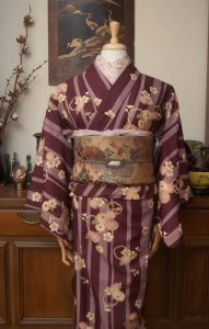
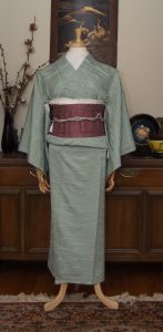
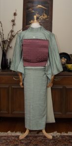
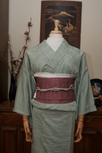
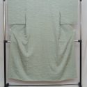
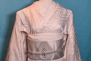
When I saw this gorgeous landscape houmongi up for auction recently, the Canadian in me just had to have it. It reminded me immediately of something by the Group of Seven and while I realise it’s a Japanese landscape it could just as easily be any of the wild, untamed nature of this beautiful country.

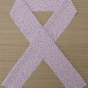
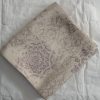
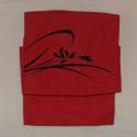
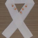
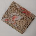
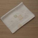
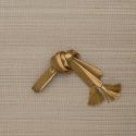
I actually have a handful of obi that will all look incredible with this piece but for my first time showing it off this metallic hawks-over-water nagoya obi felt like the right direction. I love the idea of the birds flying high over the landscape, and the heavy gold of the obi helps up the very subtle gold decoration in the hem pop. It also increases the formality of the whole outfit, and since the kimono has one crest it can be dressed up a bit. I went subtle with the rest of the accessories to let the kimono and obi speak for themselves, and I think it worked well.
 

I can’t wait to do other things with this stunning piece. I’m so happy I was able to add it to my collection.
Items used in this coordination

Proof of Life

Rumours of my demise have been slightly exaggerated. Further information below the cut if you’re curious.

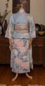
Ideally, for my return to regular kimono blogging I would have loved to showcase some gorgeous new piece, some rare curiosity… but I honestly have not purchased anything since the men’s set I wrote about back in May. Instead, I resorted to my old standby of blindly pulling something out of storage and forcing myself to work with it. It’s a great exercise if you’re feeling uninspired or unmotivated! I grabbed this vintage-inspired modern poly piece that I love and used to wear quite frequently, but somehow never think of when it comes time for a mannequin coord.

I thought it would look lovely and even more vintage-inspired with this dusty peacock obi, which I unfortunately forgot was hikinuki-style so it’s tied upside down. Oh well. Not too shabby for being so out of practice! A few similarly desaturated accessories in dusky pinks and beigey browns completed the look and this outfit feels like a great way to transition from summer into autumn.

Continue reading

Terrific Texture

As much as it pained me to remove last week’s coordinate, it was time to change the mannequin. I thought for today I would focus on textures, an often-overlooked facet of kimono style and construction. This outfit may have no real variation in colour, and yet it’s anything but boring!

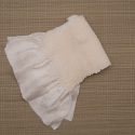
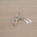
I paired my richly-textured mint iromuji with a tone-on-tone dusty pink hakata obi. Not only do these two pieces play well together texture-wise, the muted colour palettes complement each other perfectly. I emphasised the texture aspect even more with this haneri with a thick woven kiku design, a white shibori obiage (which is a bit too formal for this coord but it worked so well thematically) and a a white beaded obijime to introduce one last texture without adding more colour. I even arranged the obiage so the ruffled hem was visible, just to add one more layer of interest. Typically that edge is tucked away out of sight, but I thought it was a nice little touch.

I really like how this all came together. It’s very simple but also feels very luxurious, due to the nature of all the fabrics together. It’s even more effective in person, but you’ll just have to take my word on that!

Items used in this coordination

If this combination is wrong, I don’t wanna be right

I’m back! I’m feeling motivated again and have ideas for plenty of new coordinates using new items and ones I’ve had in my collection for a long time. The little break I ended up taking did wonders for my mental health and I thank you all for sticking around and being patient. 💖

Today I’ve got something really special for you. I have loved this kimono for over a decade, ever since I was lucky enough to wear it during a fashion show at a convention. You remember conventions, right? When thousands of people gathered together, packed themselves into small rooms, hugged, laughed, and shared common interests? Funny how alien that seems in our current world! They’ll come back eventually, though.

Anyway, Naomi dressed me in this stunning chocolate brown furisode with all kinds of gentle foliage and gold butterflies, and I was smitten. Fast forward a few years to when she’s thinning out her collection and now it’s come to live with me! It doesn’t fit me at the moment, but thankfully it looks gorgeous on the mannequin.

Typically, with a furisode like this the obi should be tied in a much larger, showier musubi. However, it’s got a more mature feel than a lot of furisode, and I knew I really wanted to pair this beloved obi from my 53 Stations of the Tokaido collection with it, so I went for a more grown-up style in general. I couldn’t resist adding back a bit of youth and flash with how I tied the obijime, though.

I’m sure I’ll do a more “appropriate” outfit with this piece in the future, but right now I’m really quite thrilled with how this turned out.

Items used in this coordination

Touches of Gold

(There’s some personal emotional garbage as well as an attempt at explaining the lack of content lately at the bottom of this entry. Feel free to skip it if you’re just here for the pretties.)

My lovely friend Maral was helping someone destash some kimono and I fell in love with this green odori piece as well as a gorgeous purple and white obi that will make an appearance sooner or later. Everything about this piece makes me happy; the colour, the bridge, the willow branches, and the size. It’s deceptively large!

I decided I really wanted to play up the warm orange and touches of gold in the kimono. I used my black shishi obi to help anchor the coordination and bring in even more metallic accents, and the red obiage to tie in the red date-eri that was already sewn into the kimono. My initial instinct was a white and gold haneri but I defaulted to this yellow chirimen one that I use way too often, because somehow despite being the colour of stale mustard it seems to go with almost everything.

This outfit is quite straightforward compared to a lot of what I’ve been doing lately, but there’s a lot to be said for the classics. The whole coordination feels balanced, and just flashy enough. It’s also sort of accidentally Christmas colours, which works well because it’ll be on the mannequin over the holidays. It wasn’t intentional, but let’s pretend it was.

Items used in this coordination

If you’re reading this far, thank you. The past month or so has been rough, you guys. I was supposed to spend my birthday (Nov 16) and American Thanksgiving with my dude but then my household got exposed to the virus that shall not be named and we all had to quarantine for two weeks. As we were dealing with the aftermath of that, we lost my grandmother. She’d been ill for quite a long time and it’s a relief to know she’s not suffering anymore, but considering I was going through some emotionally messy garbage before all this happened, you can imagine how I was feeling afterwards. However, we’ve buried my grandmother’s ashes and she’s at peace, and barring another exposure incident I will be spending Christmas with Keith so I’m starting to feel better finally. I should have much more new content and a more regular update schedule in the new year. 💕