
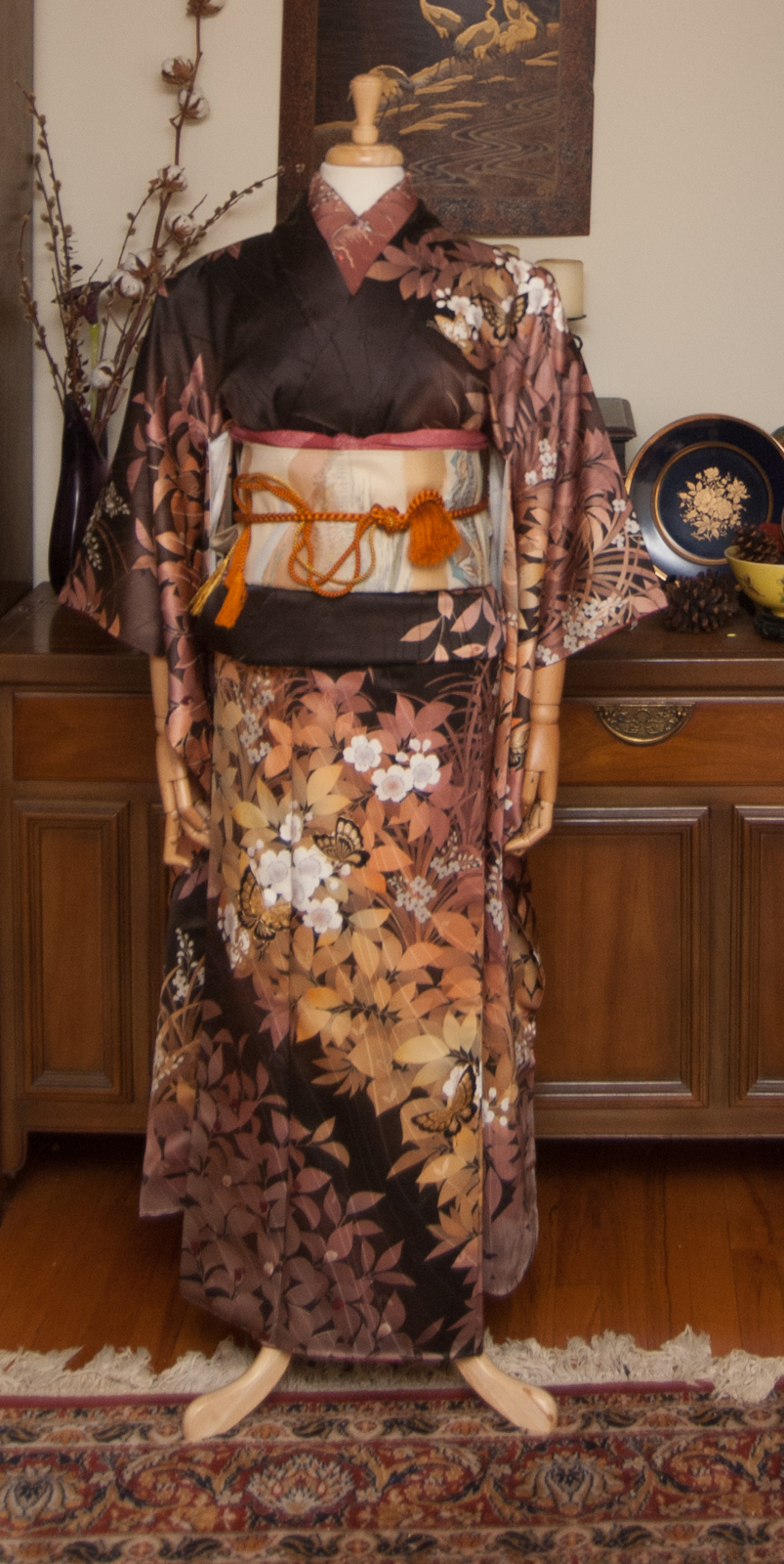
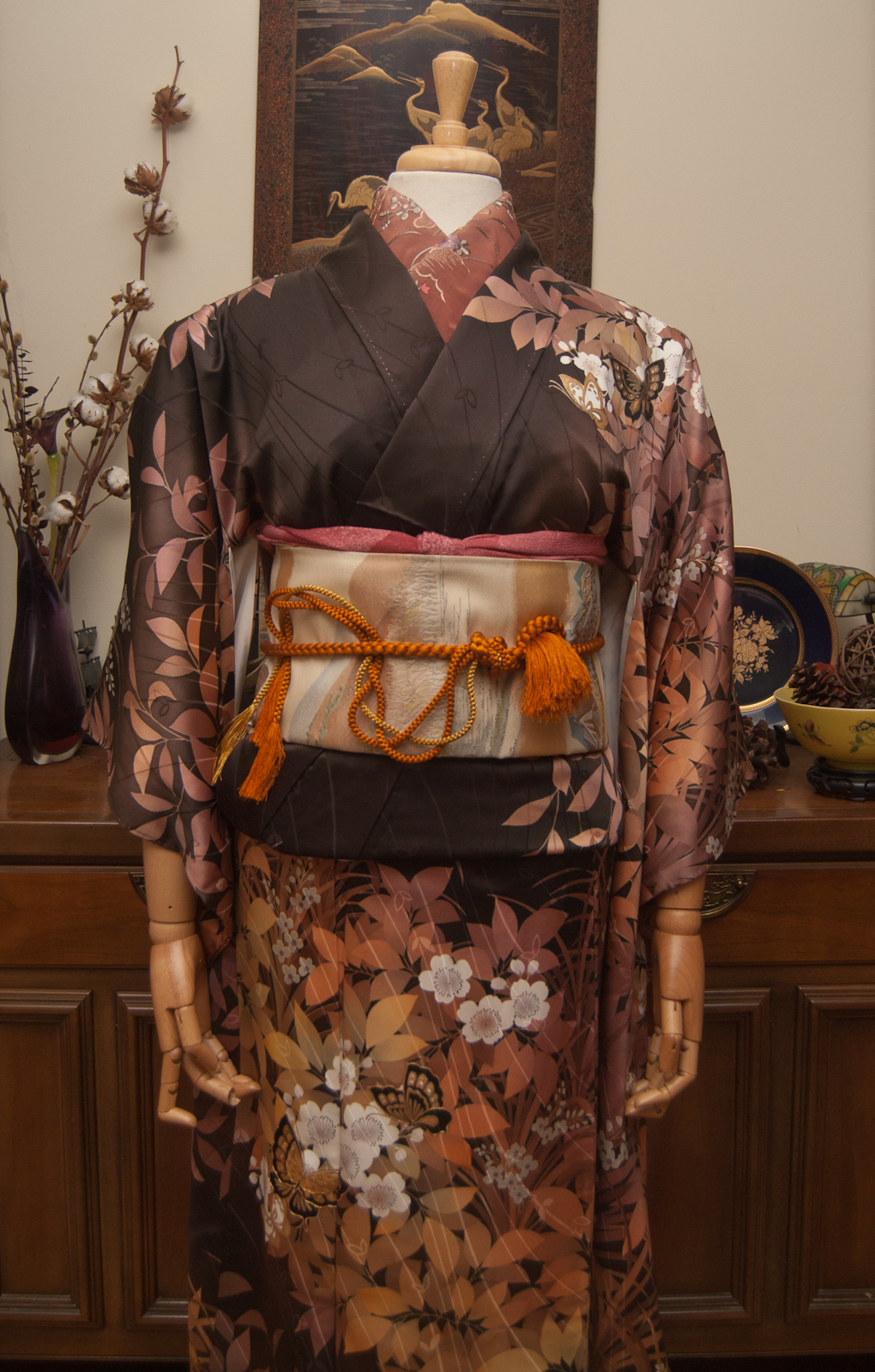
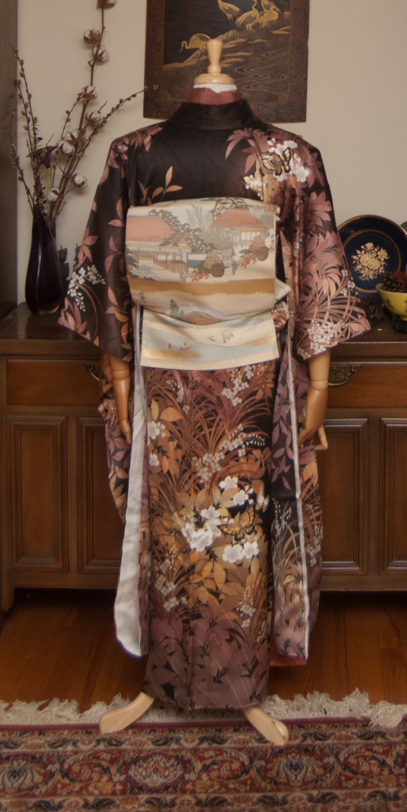
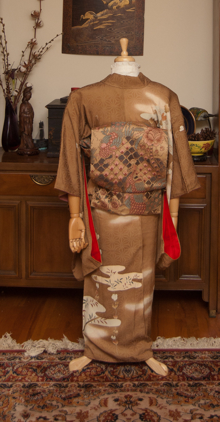
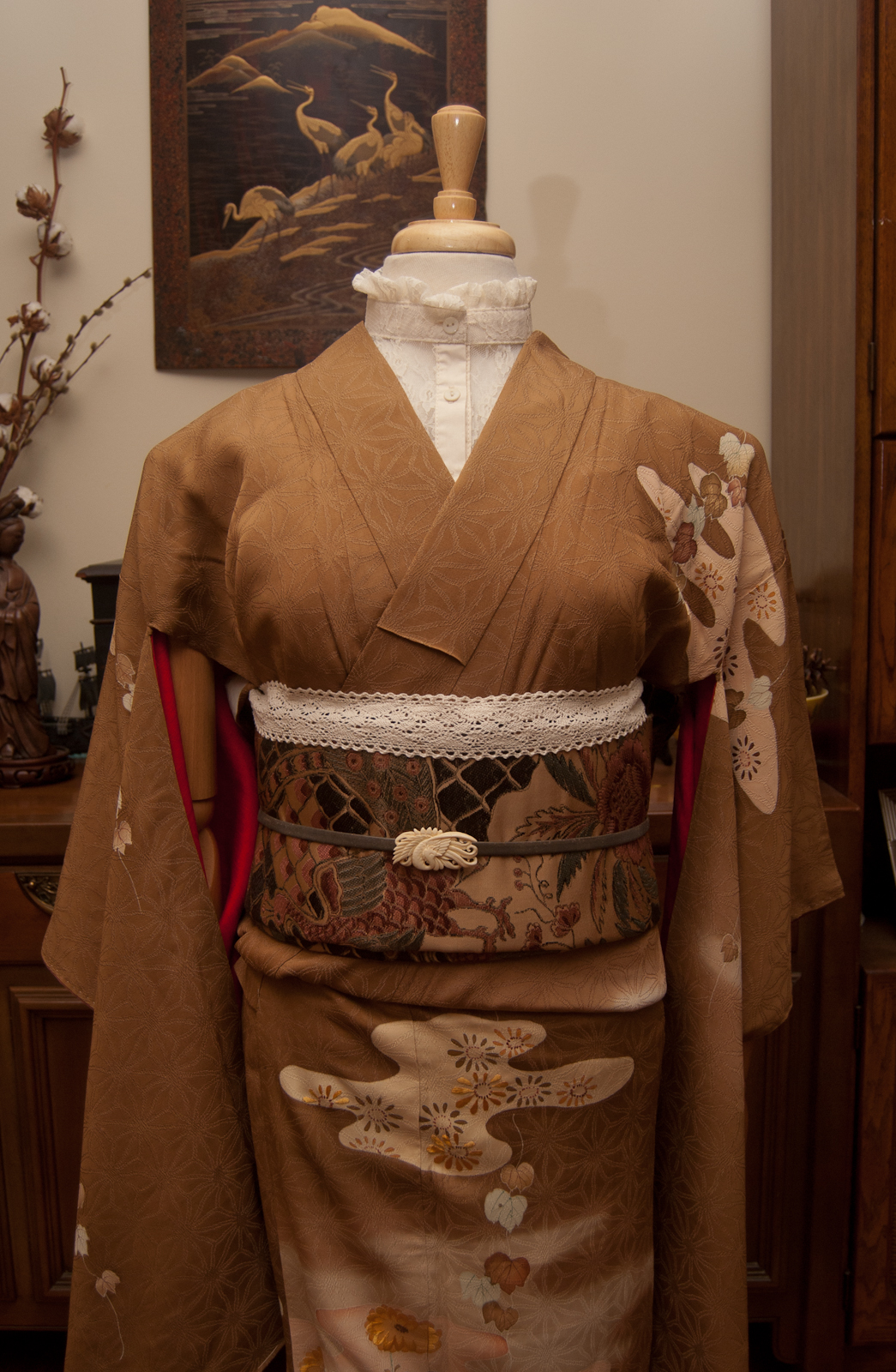
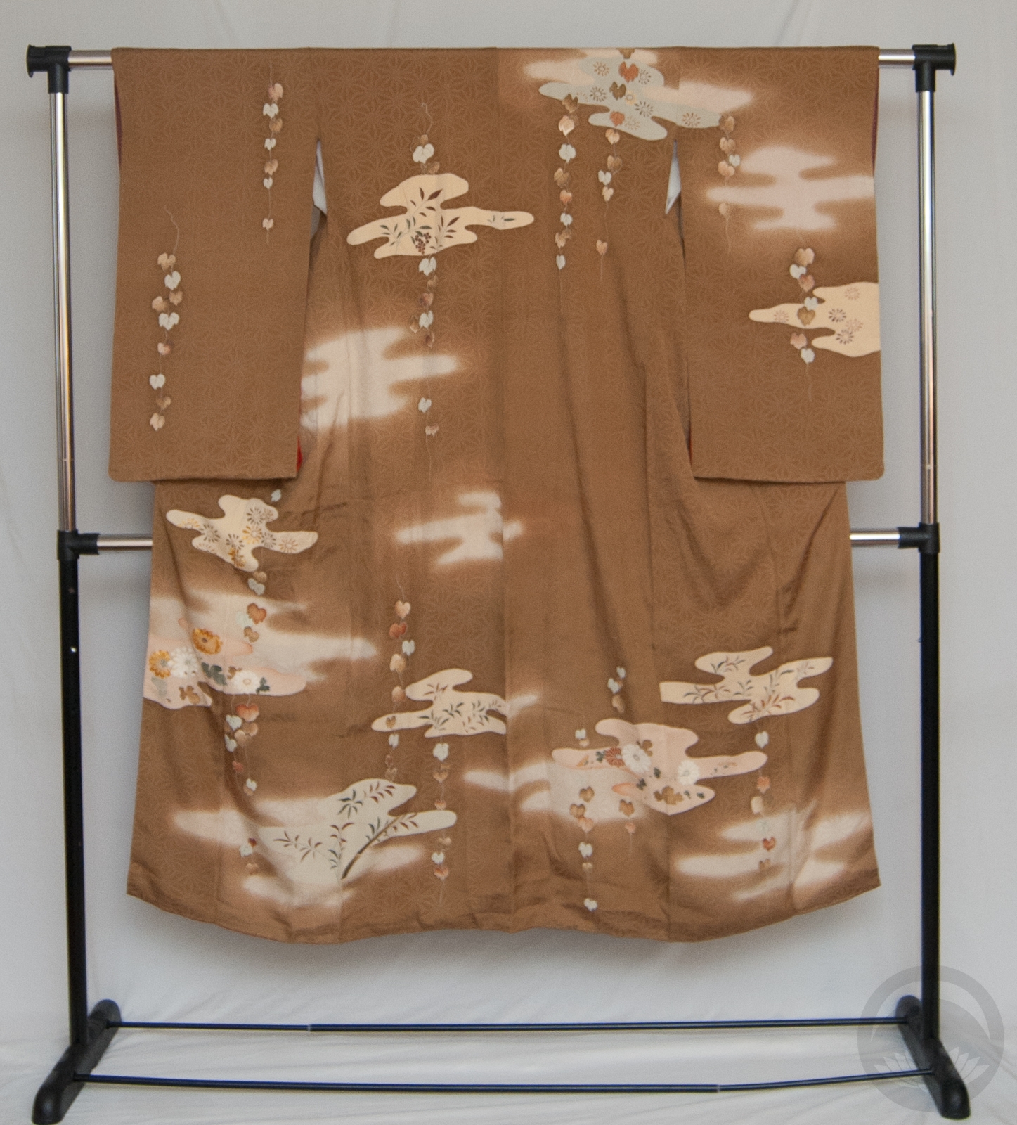
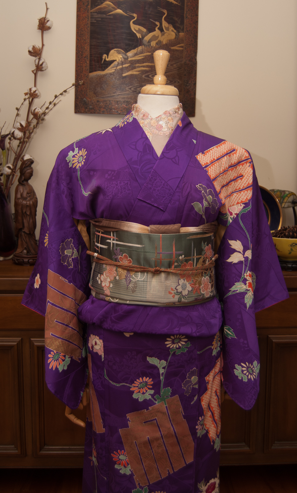
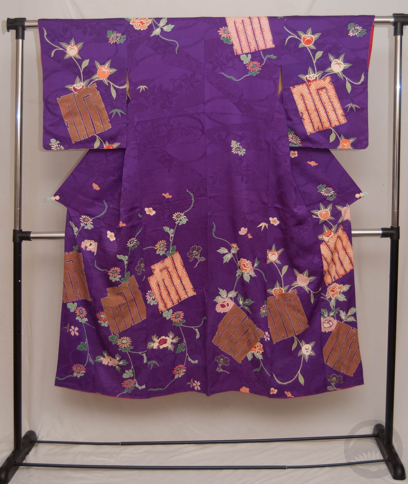
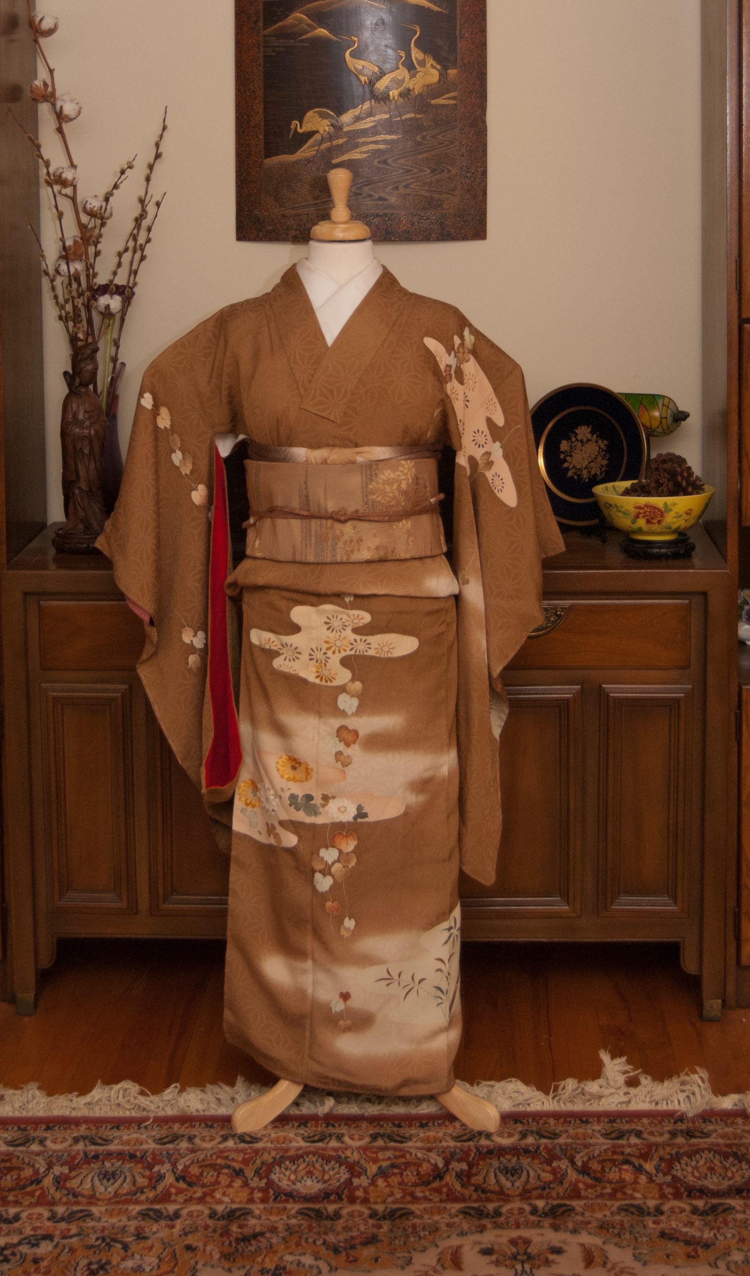
I’ve generally been pretty good about not buying kimono lately, but when I saw this absolutely lush warm-brown houmongi with wisteria – a motif I’ve been wanting more of – on Etsy for a fantastic price I had to have it. I also got another piece I’ll be featuring soon, more on that later.
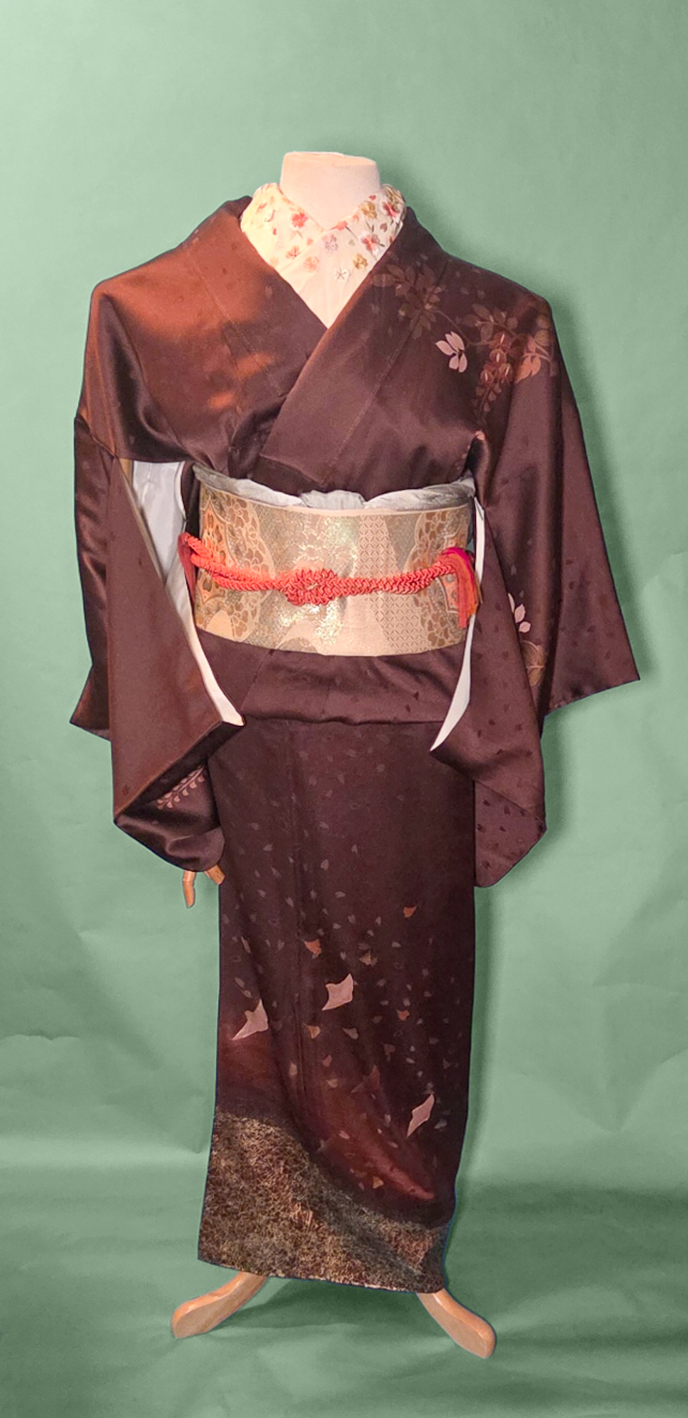
I love how elegant and subtle this piece is, it feels very “quiet luxury” to me. The silk is rich and thick and heavy, the gold decoration is not overdone, and it has an almost monochrome quality to it that I feel ads to the understated feel of the whole thing. If I ever manage to lose all the weight the medical debacles of the past decade have put on me, this will be one of the first things I wear I think.
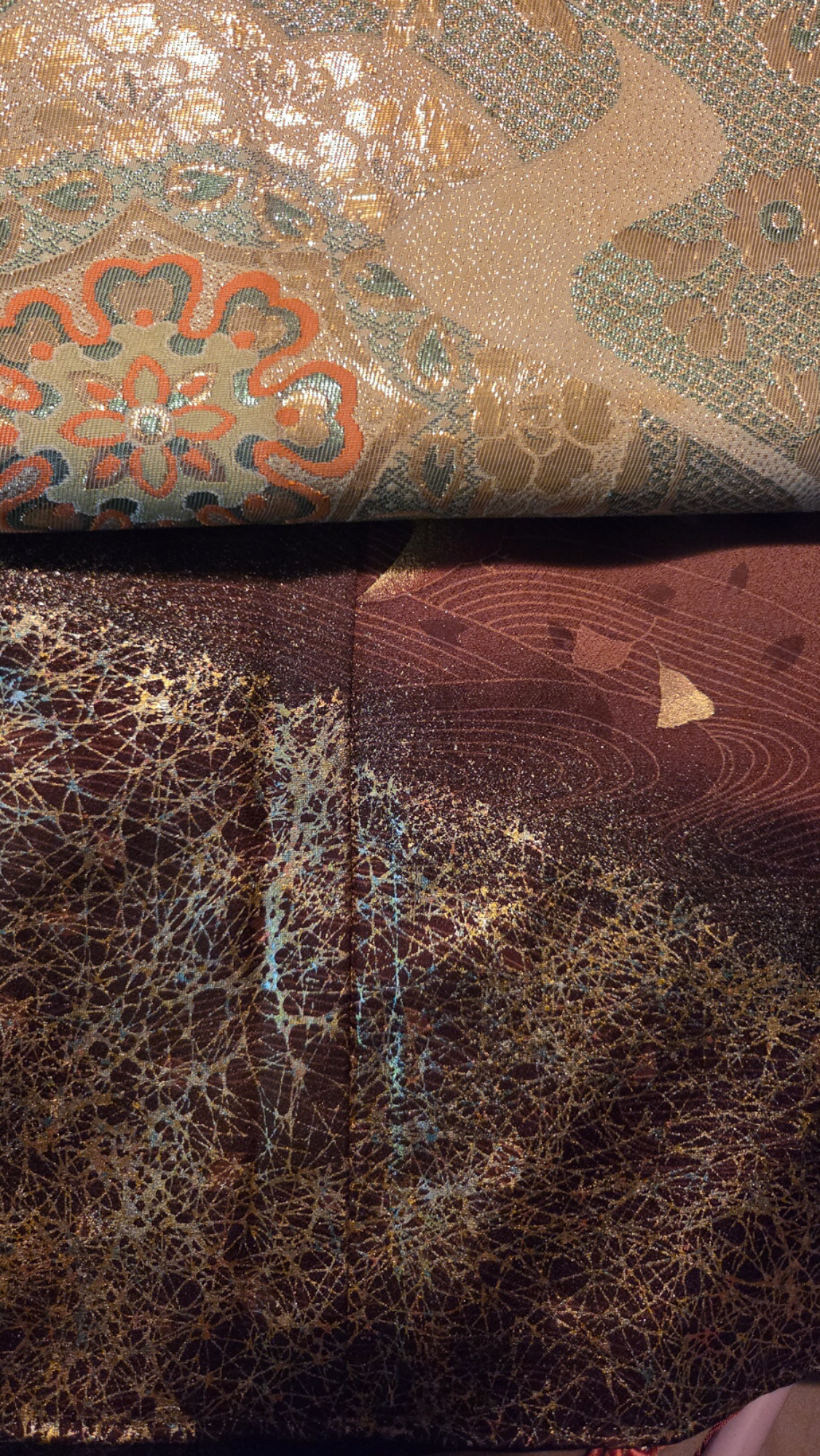
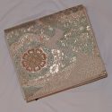
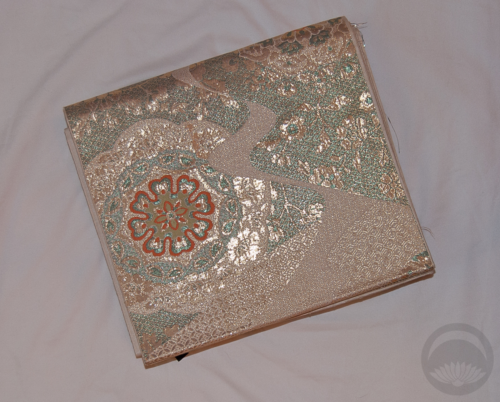
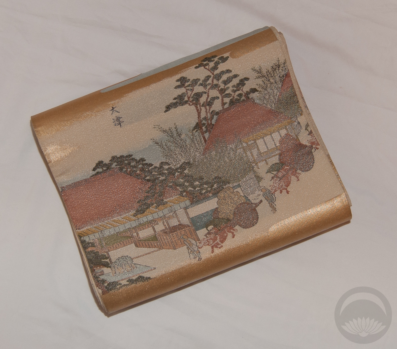
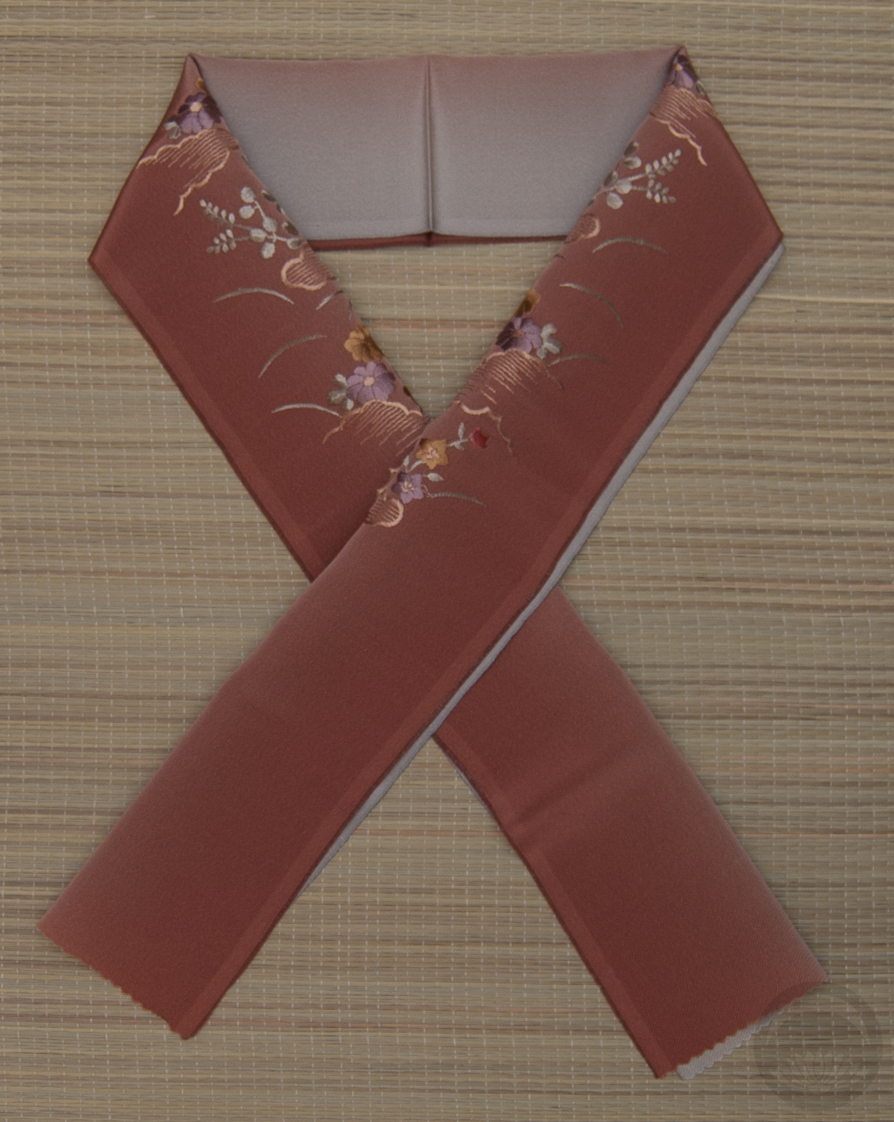
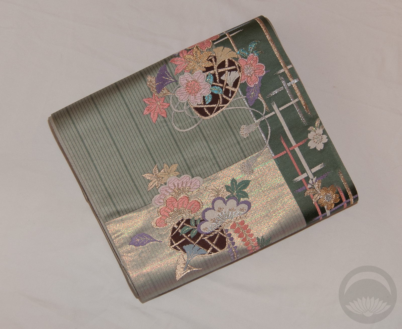
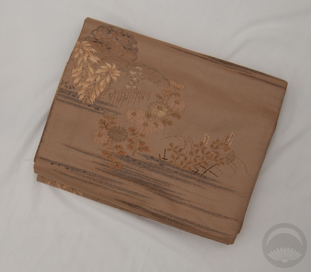
I specifically chose this gold obi because of the seafoam accents it has. That may seem like an odd choice, but there are flecks of nearly the exact same minty colour in the hem of the kimono. I couldn’t believe what a fortuitous match it was!
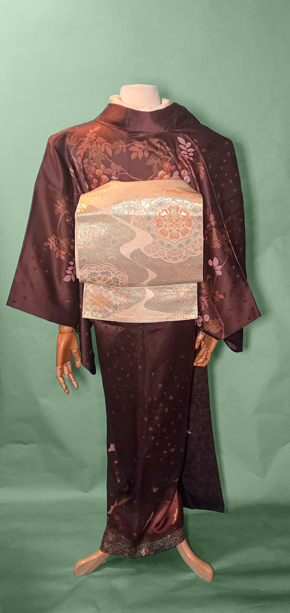
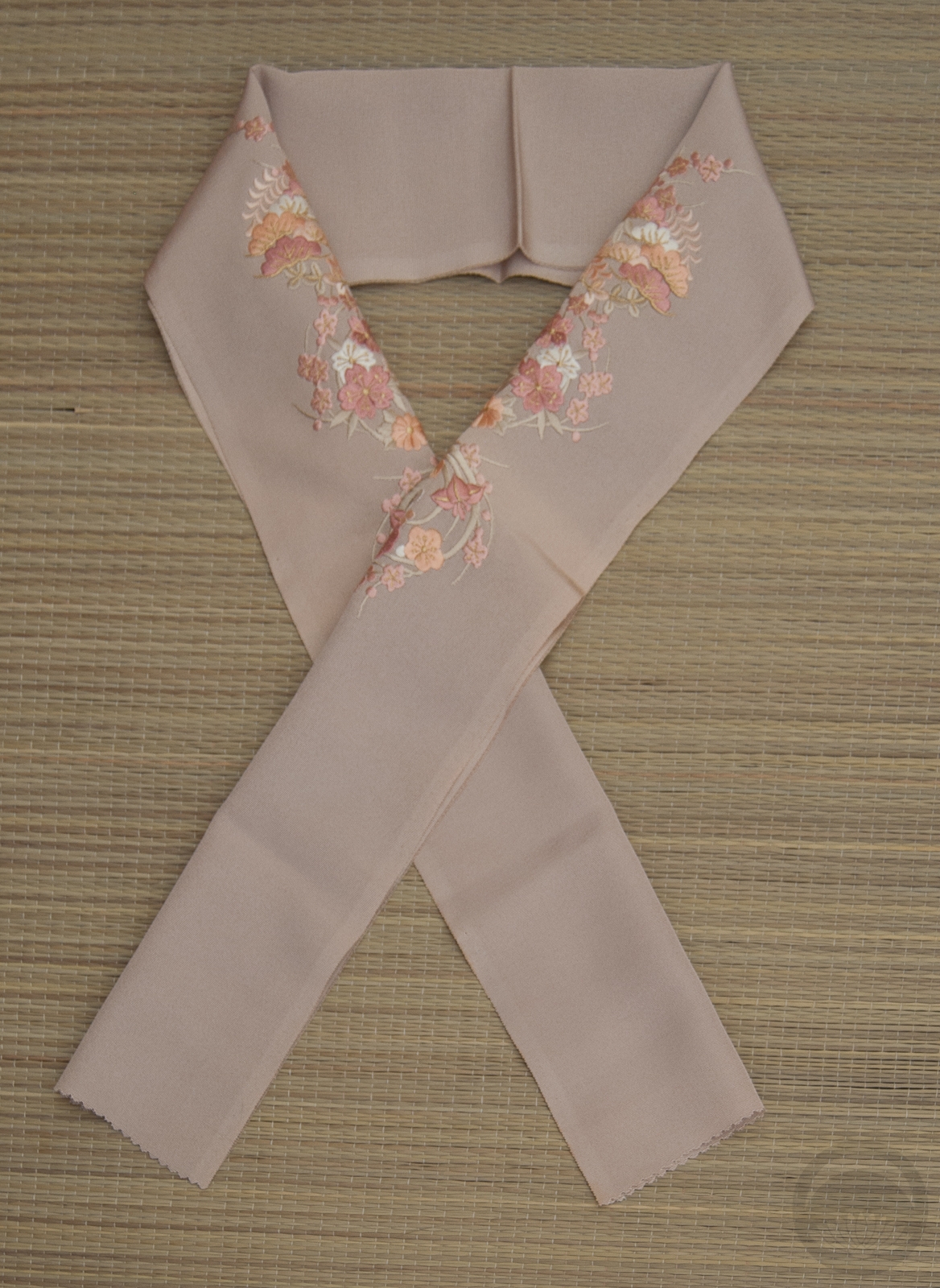
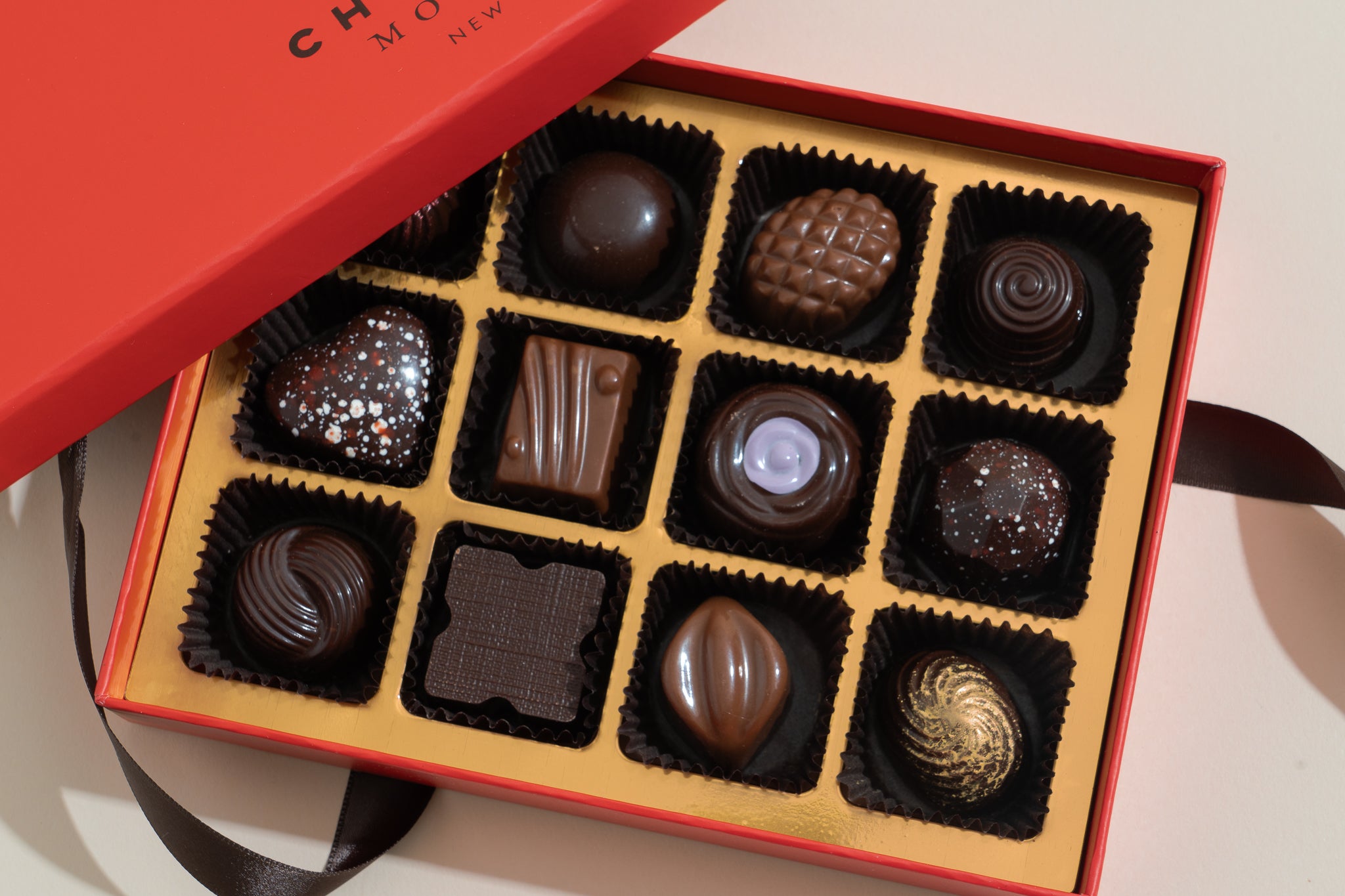 Once I had these pieces next to each other, I ran with similarly coloured accessories and realised the whole combination reminded me of a box of expensive chocolates, reinforcing the whole luxury vibe I had in mind. It was an accident, but a happy one!
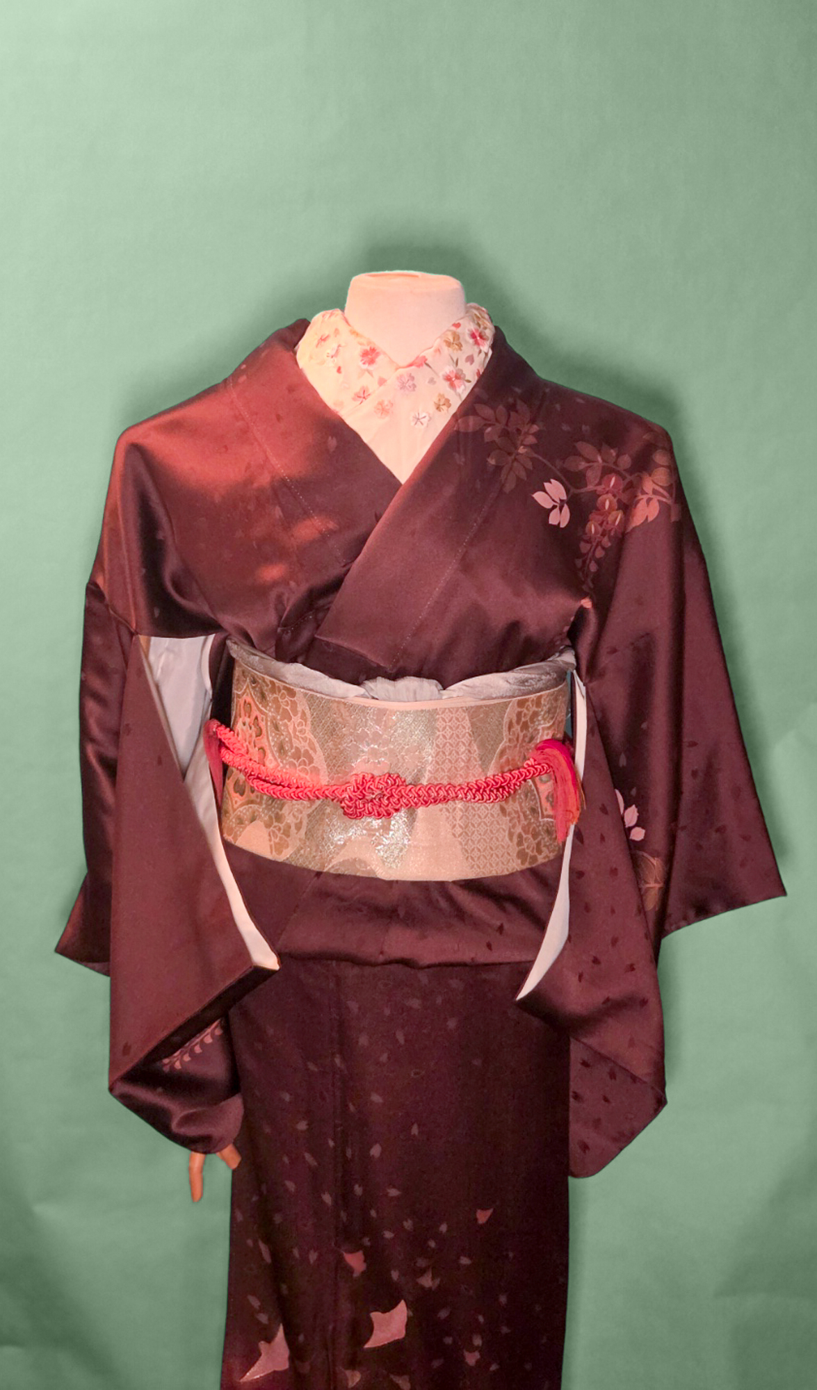
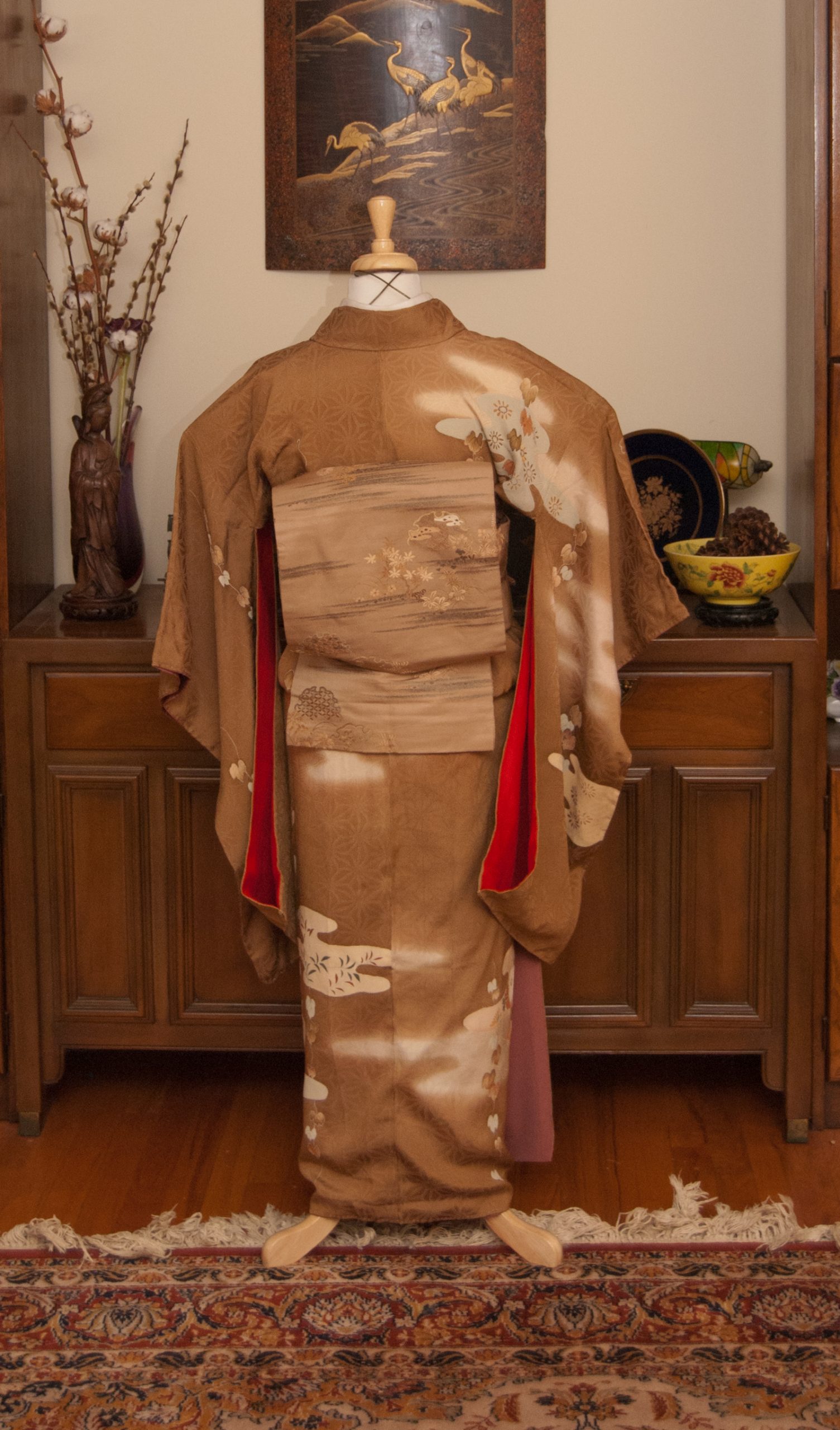
Overall I’m very happy with the coordination, even if I am slightly less happy with the actual kitsuke. The collars were giving me grief but I knew if I kept fighting them I would get frustrated and give up. Perfection is the enemy of done, after all.
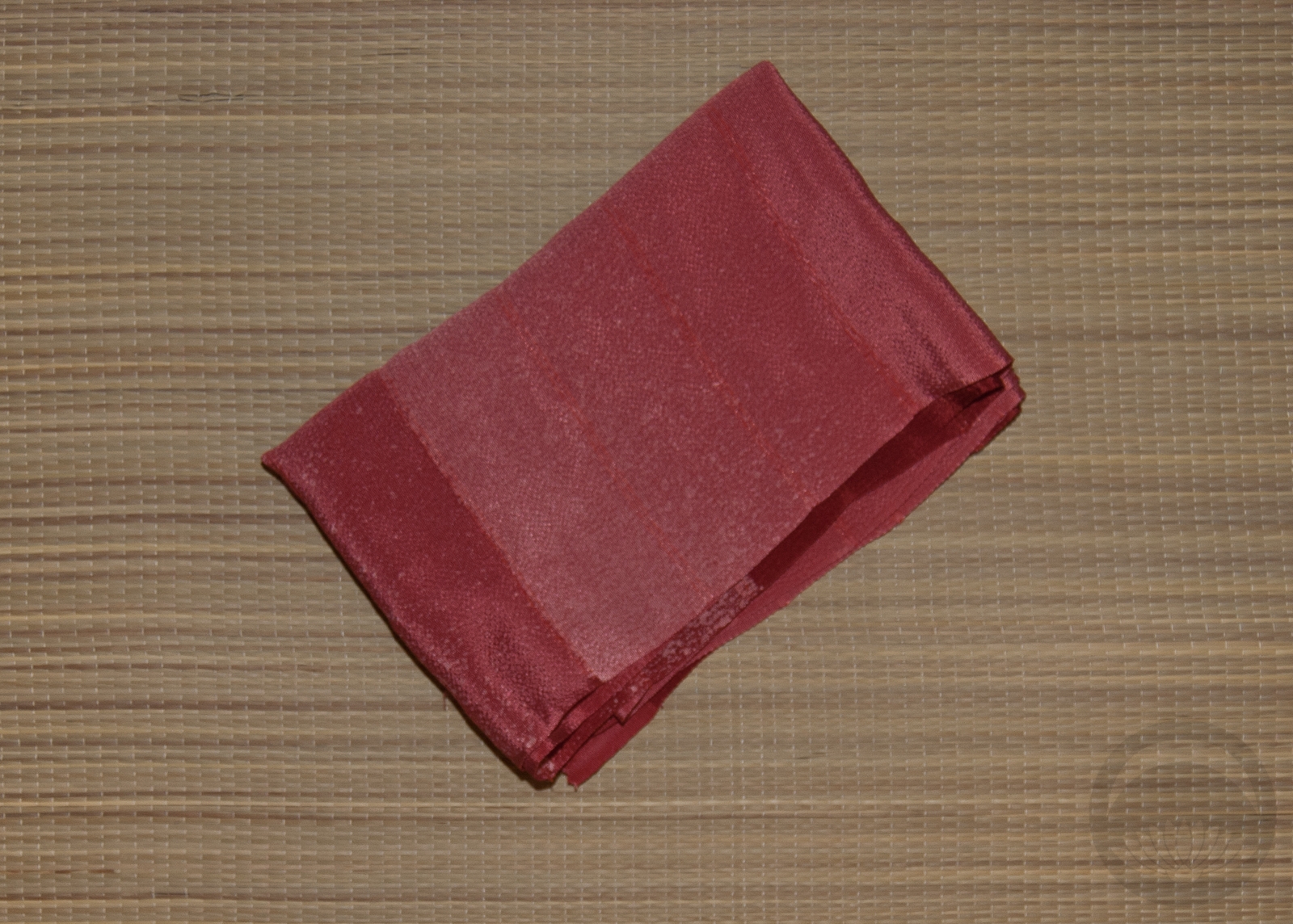
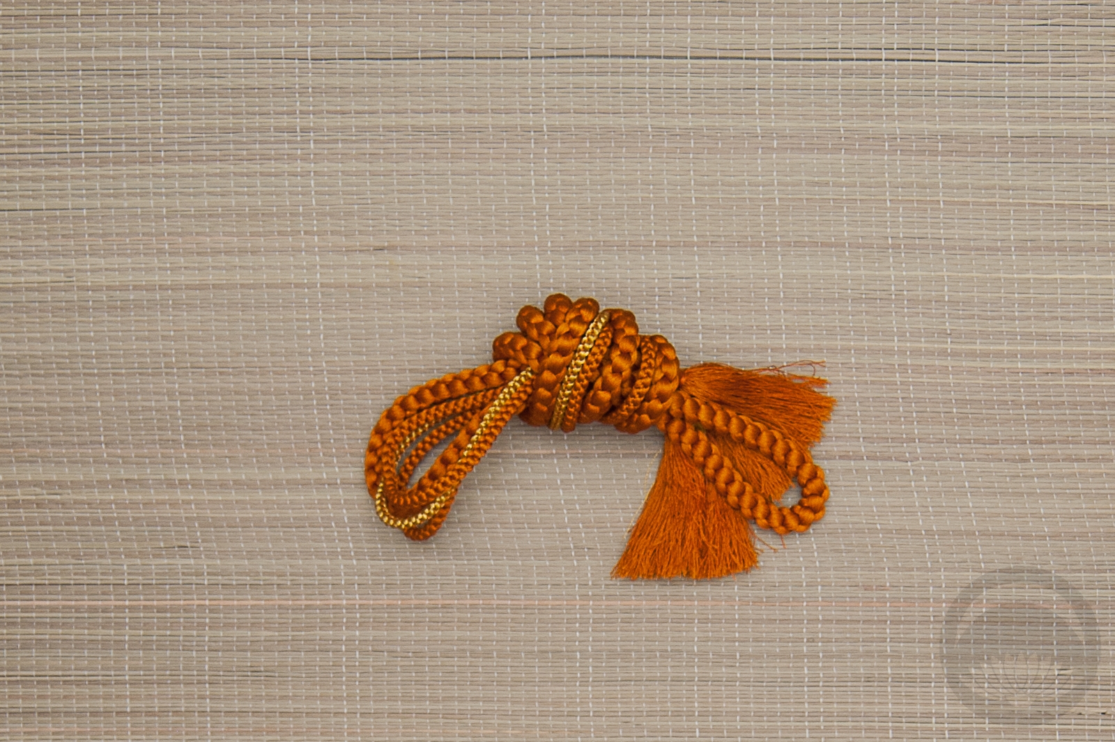
Items used in this coordination
-
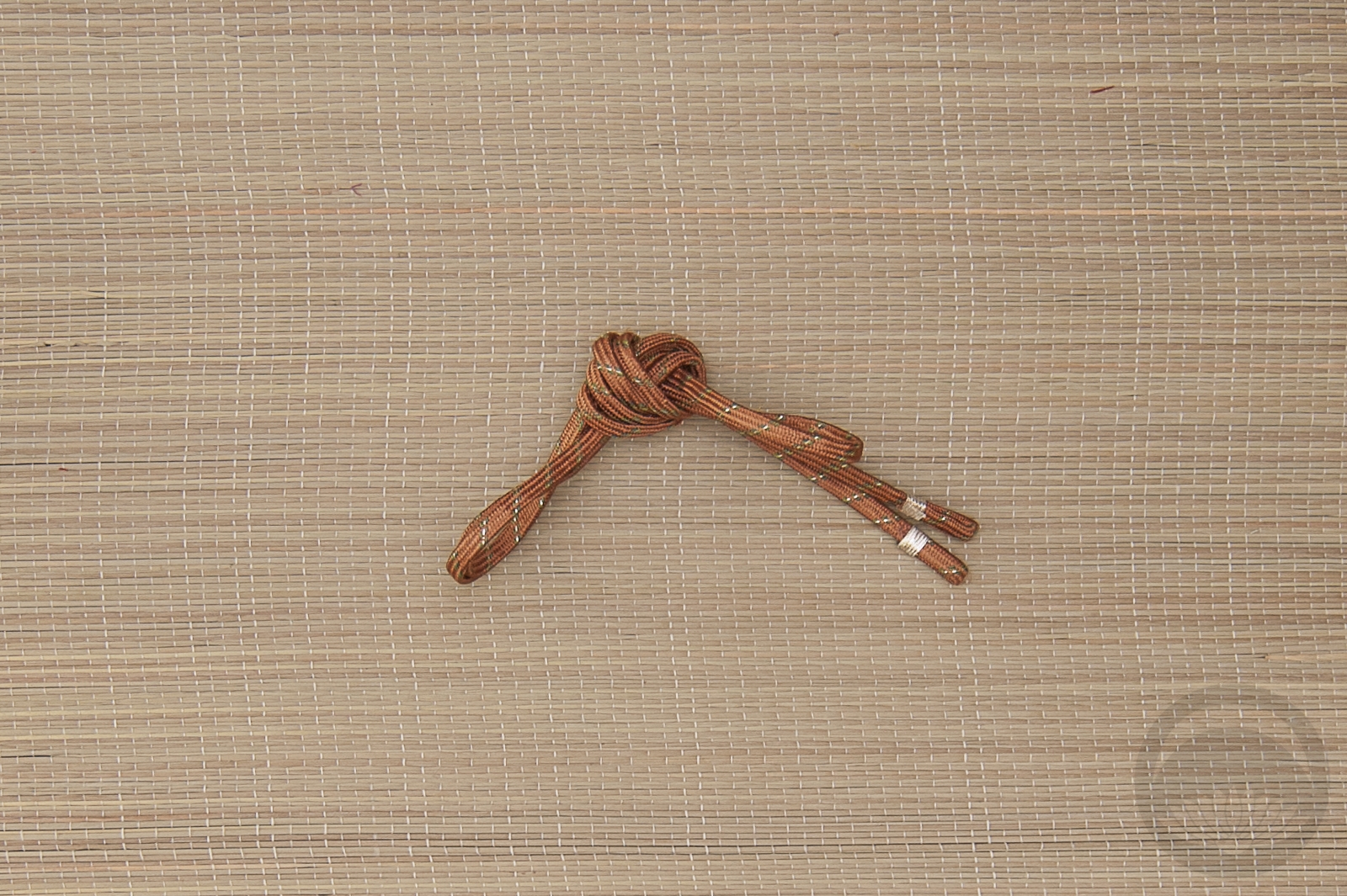
- Seafoam Arabesque
-
- Sakura

-
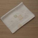
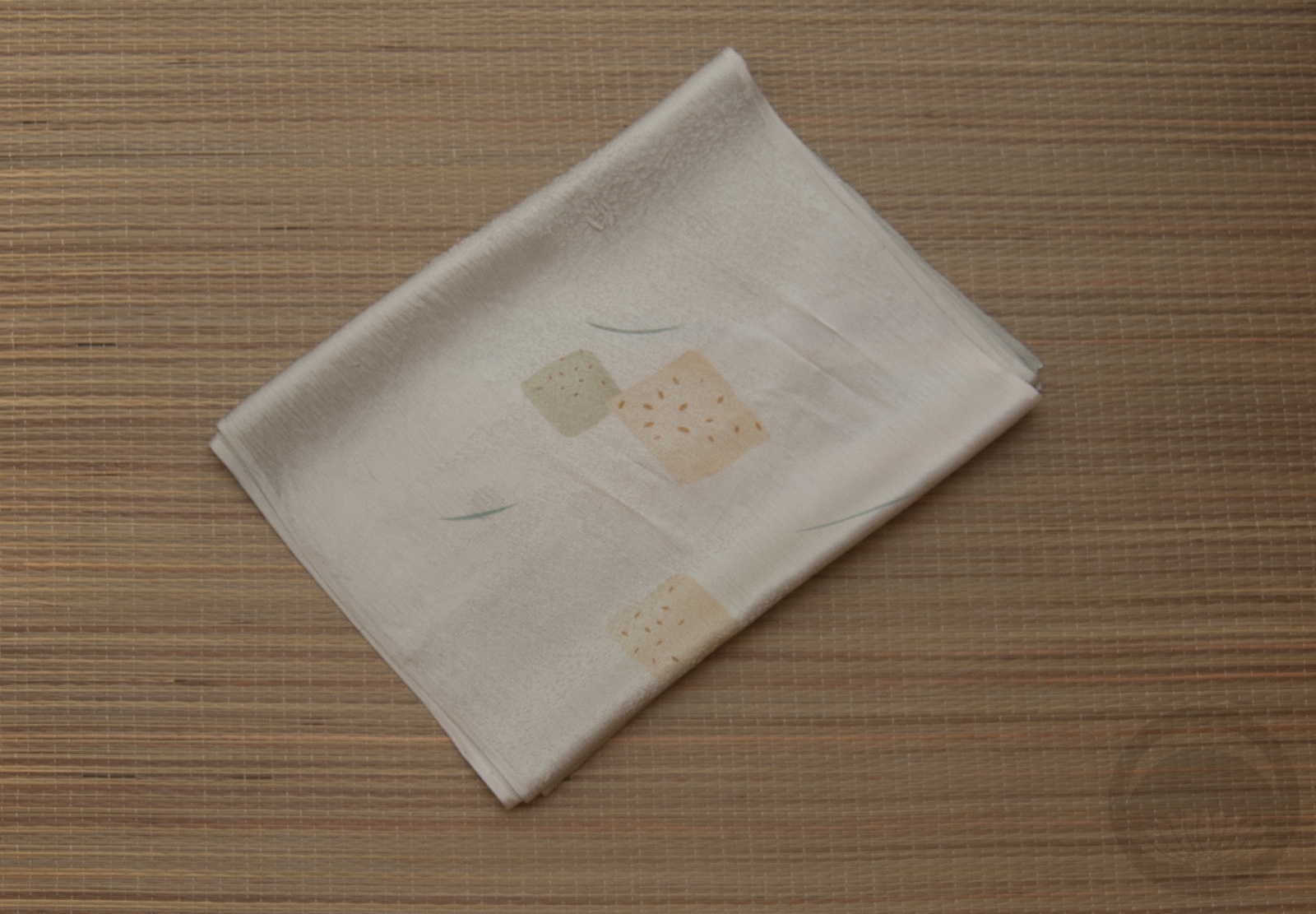
- Ice-blue Rinzu
-
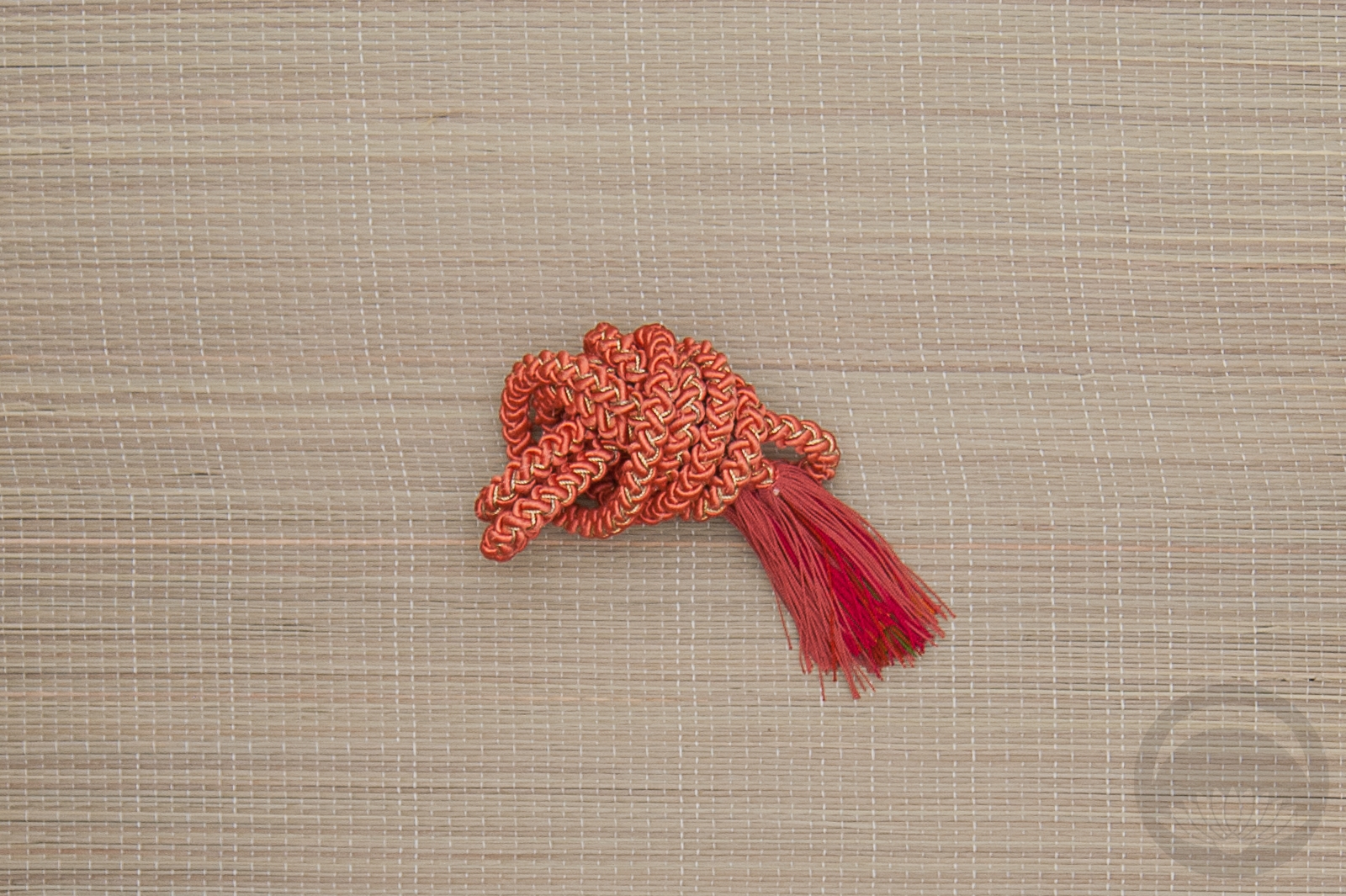
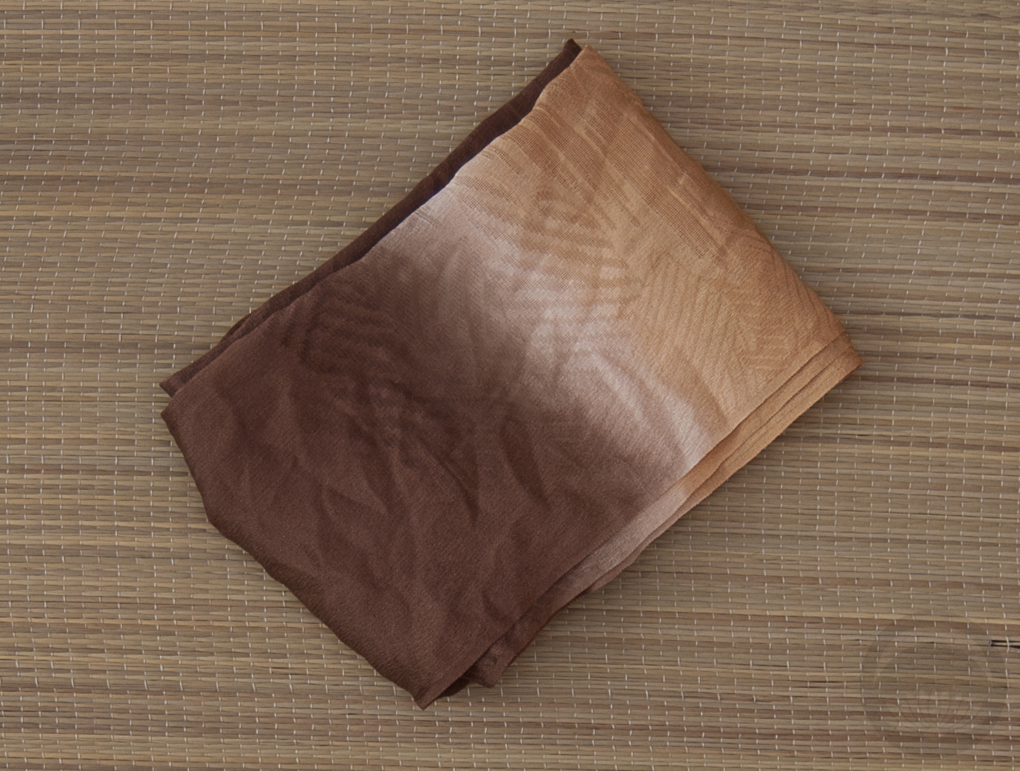
- Salmon Furisode


 Bebe Taian
 CHOKO Blog
 Gion Kobu