Birthstone Ensembles – July – Ruby

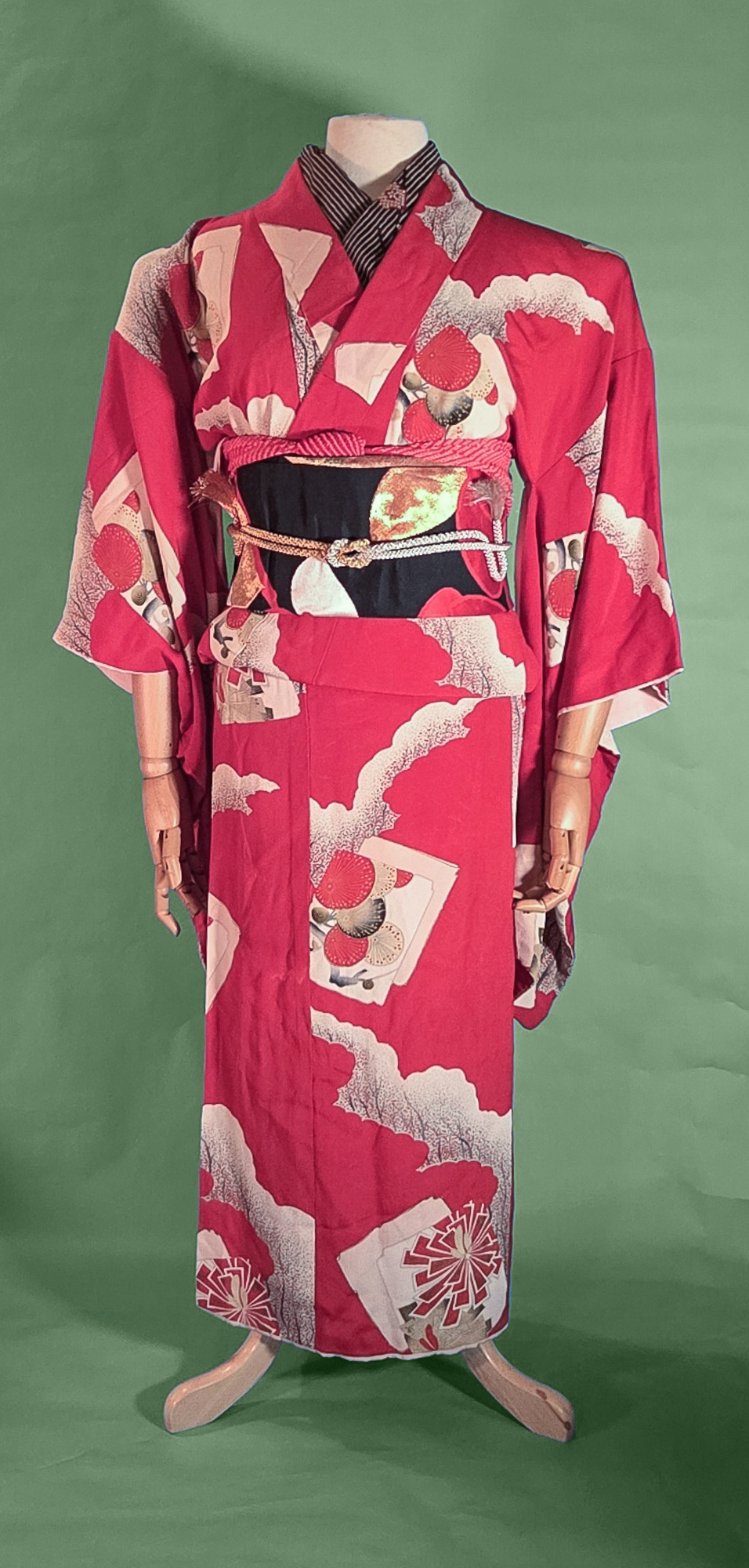
Another month, another beautiful birthstone! For July, we have the bright and bold ruby. If you saw my sneaky little addendum to the series last week, you’ll know that I just did garnet for January, and I wanted to make sure Ruby was a much flashier and more vivid ensemble despite them both being red.

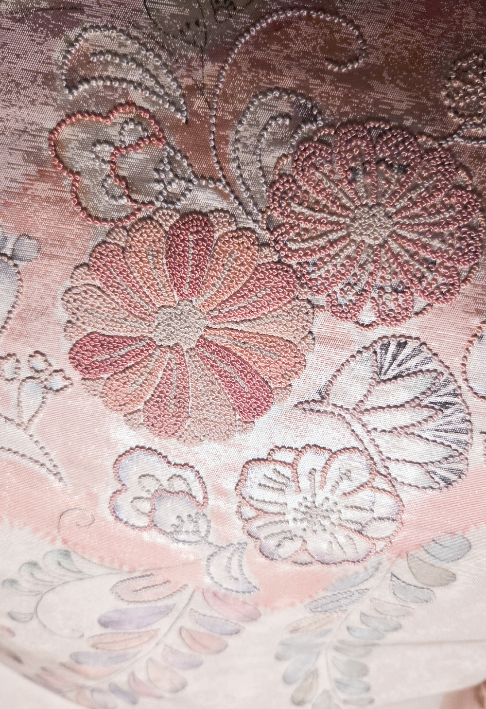
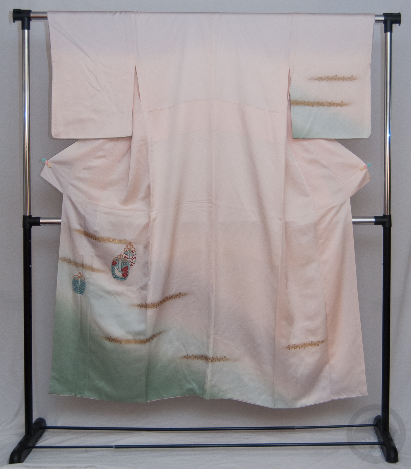
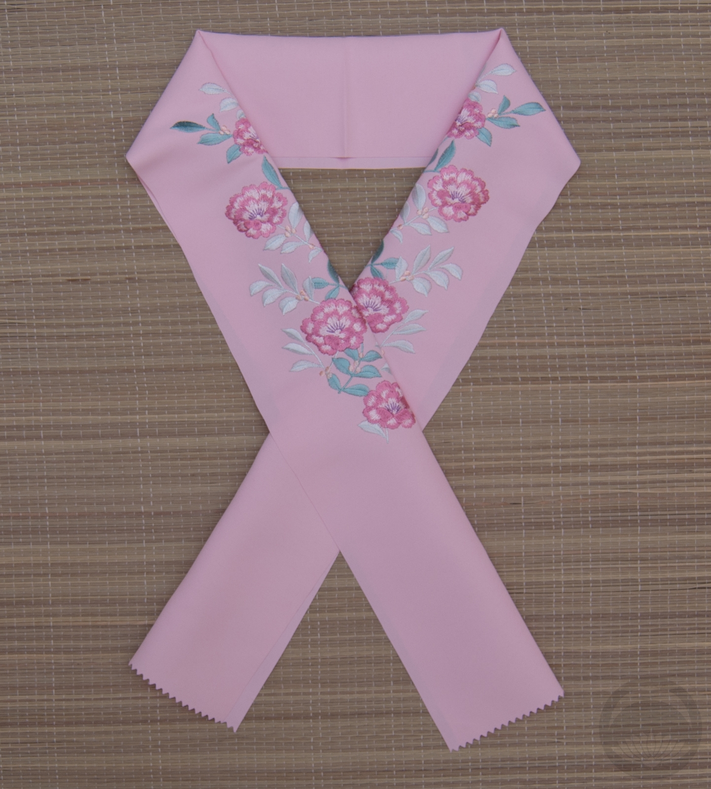
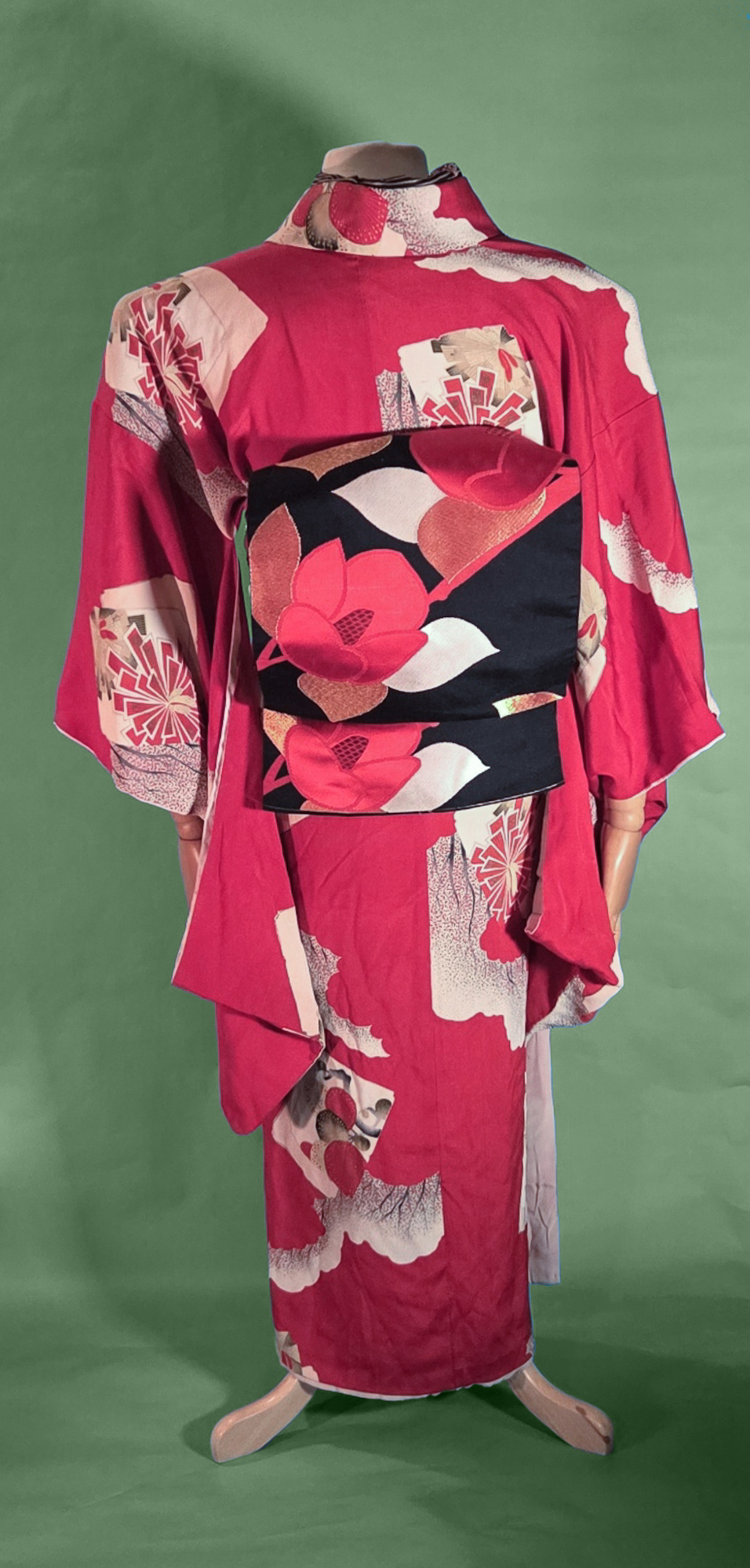
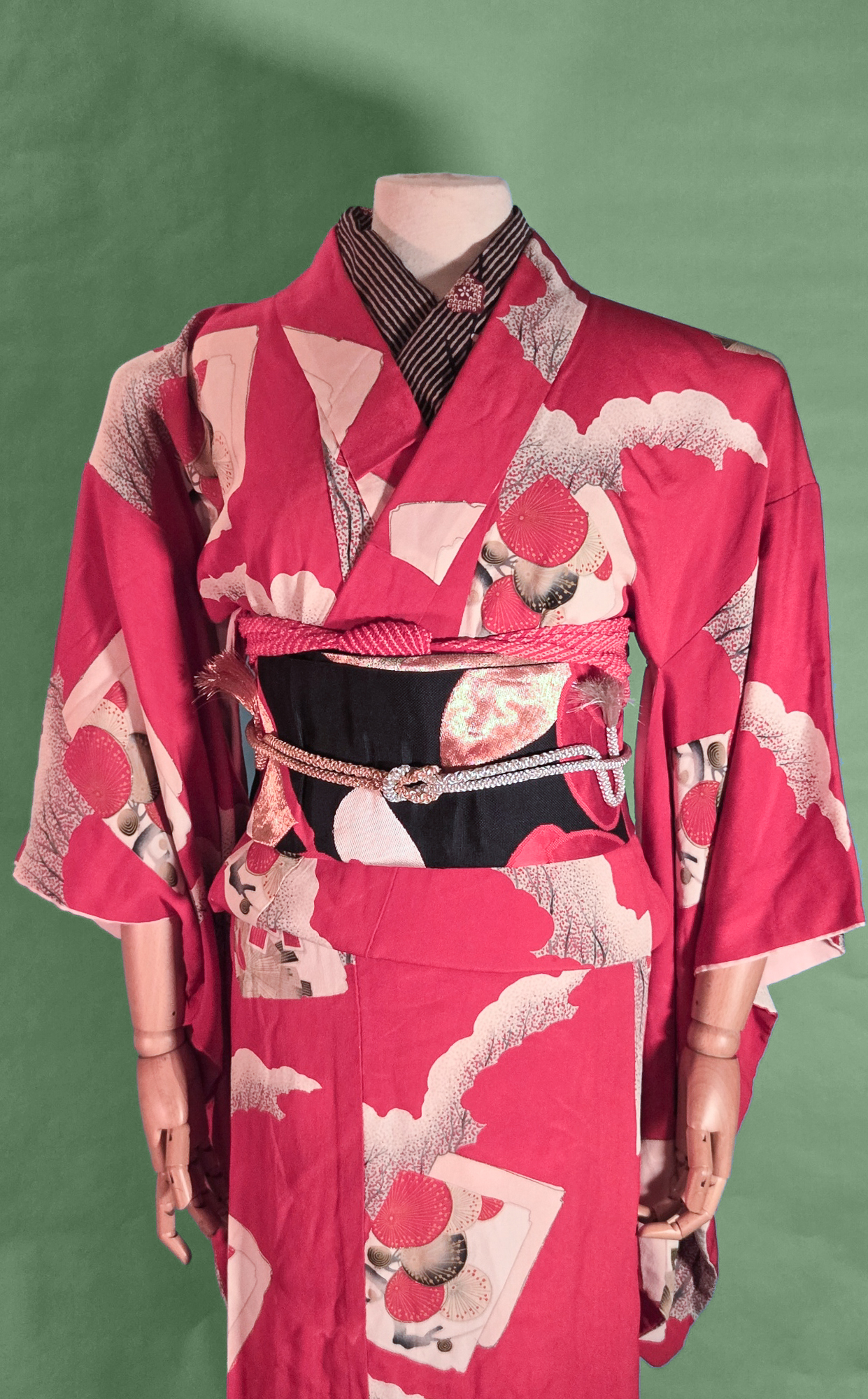
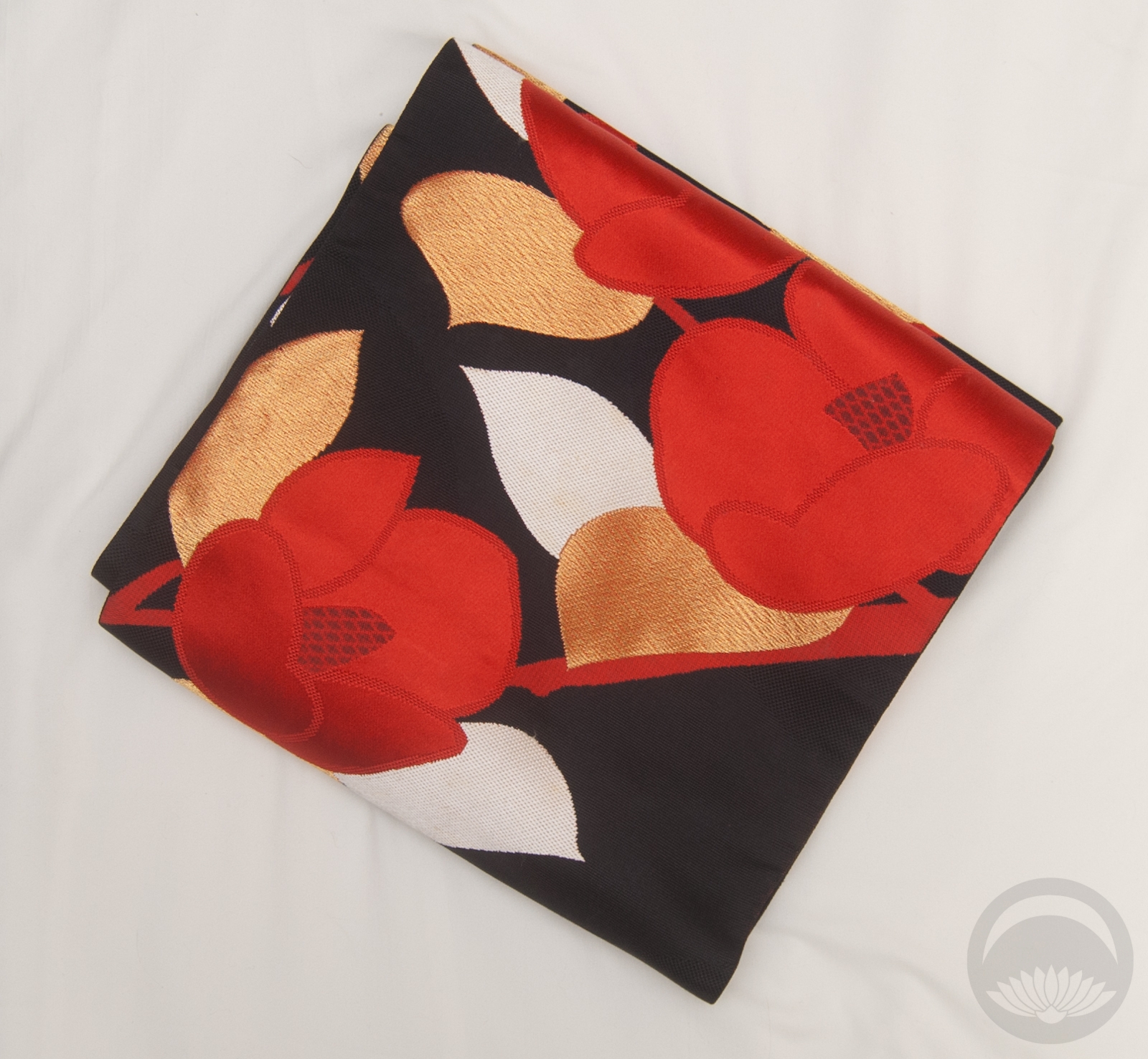
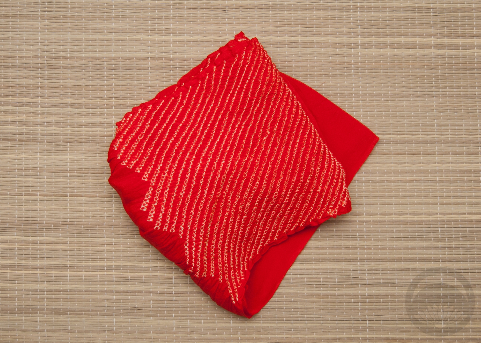
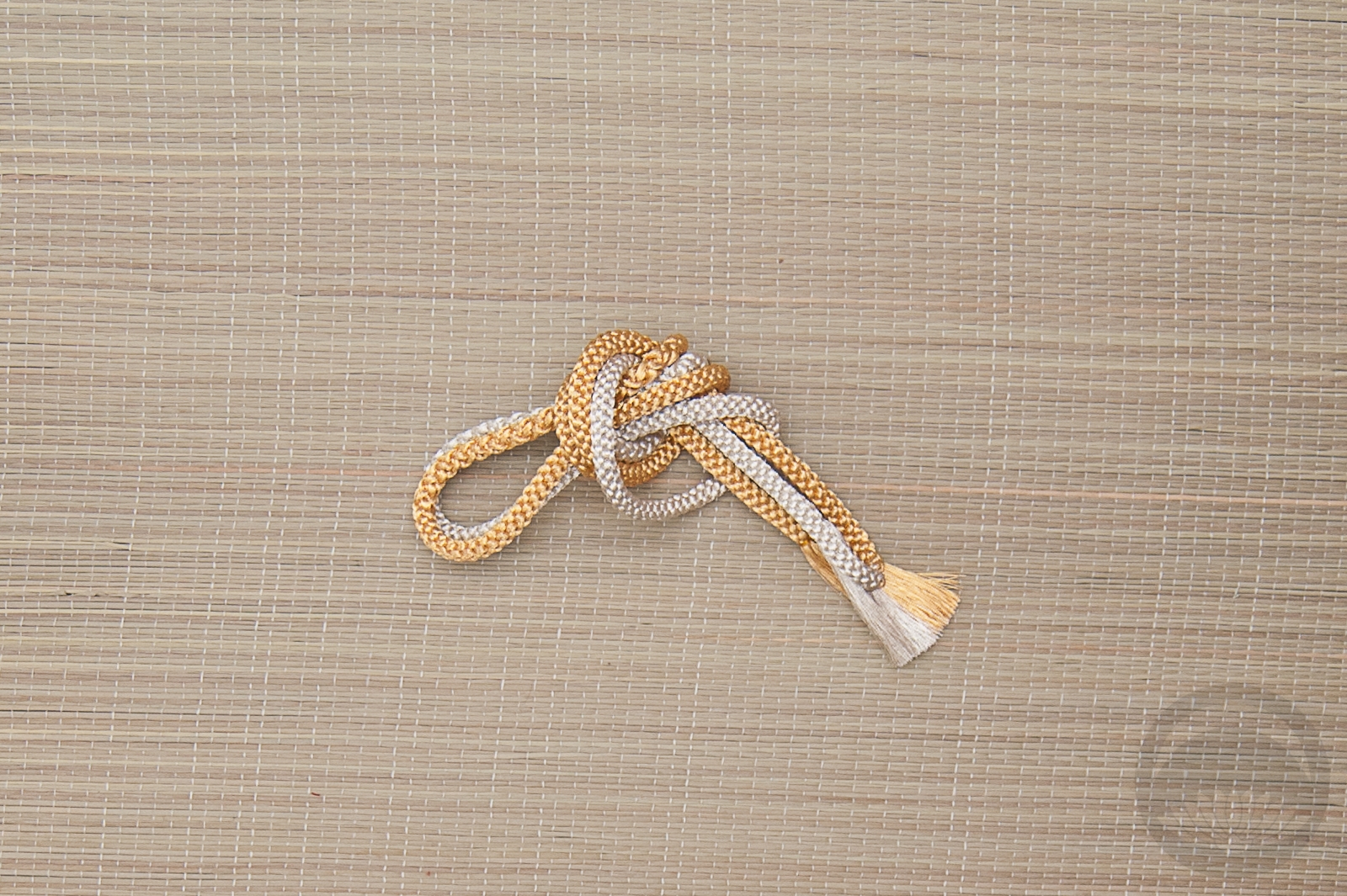
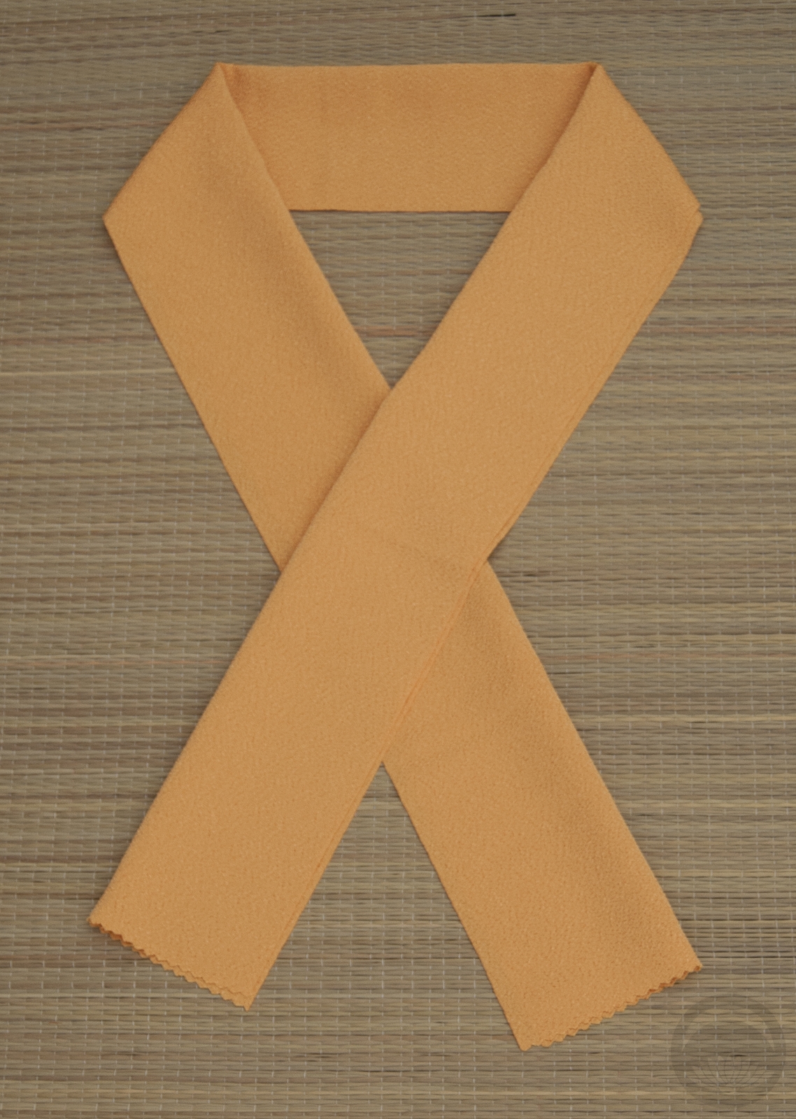
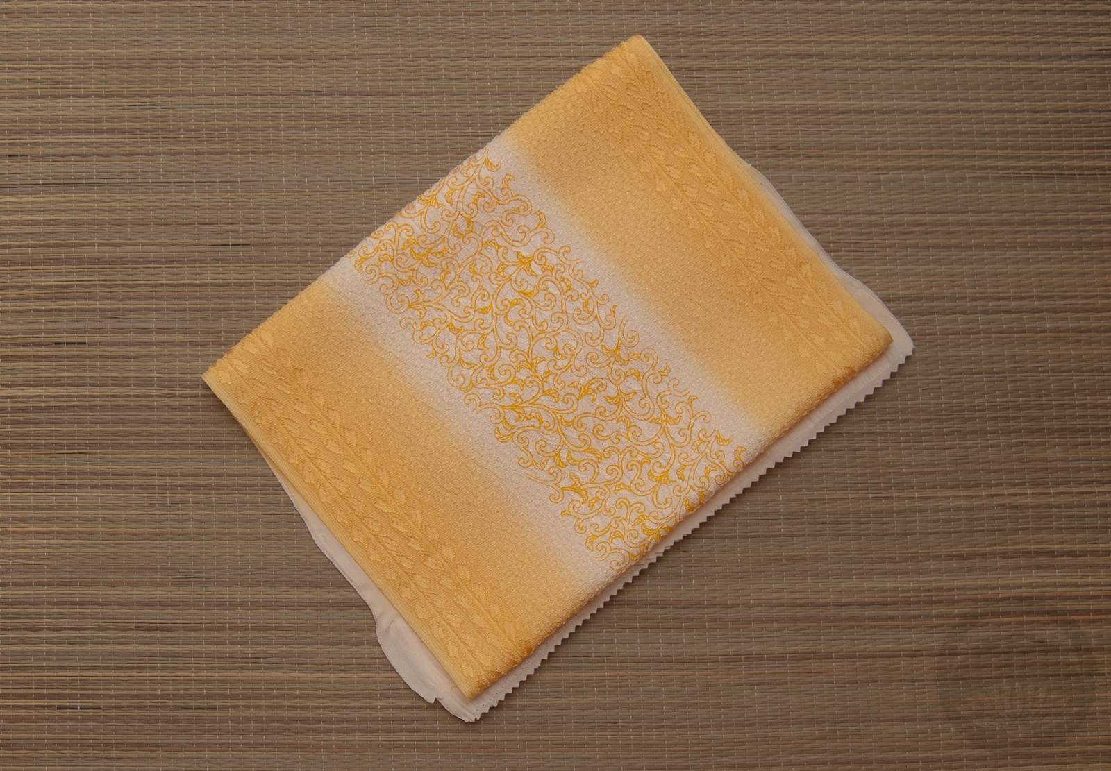
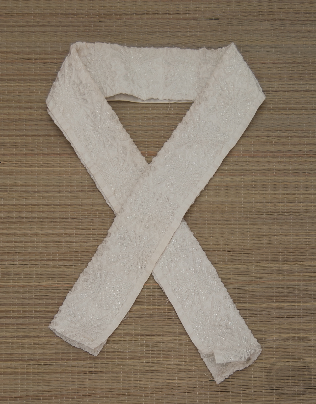
I was also feeling the urge for a bit more contrast, since so many of these outfits have been very monochrome. Of course the kimono had to be red, so I took the opportunity to feature this vintage komon again. It’s bright red with a hint of a magenta undertone, just like an actual ruby. I had this black, gold, and red nagoya that still hasn’t been used much, and I though it would tie in the black and gold accents on the kimono and bring some metallic sparkle to the outfit. Red, black, and gold accessories to finish things off, including this haneri that I use way too frequently. In fact, I think I may have used it last time I used this kimono. Oops!

Seasonally, the motifs here are somewhat wintery (ume, tsubaki), which doesn’t exactly suit the July theme, but eh. This is more of a vibe project. Maybe next year I’ll focus on seasonal/birthday flowers and see how that goes!

It also reminds me of a more casual riff on the very first kimono and obi I ever purchased. That kimono is still one of my fondest treasures and I really should get her out and feature her sometime soon.

Items used in this coordination

Fit for a Party

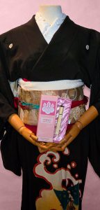
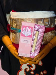
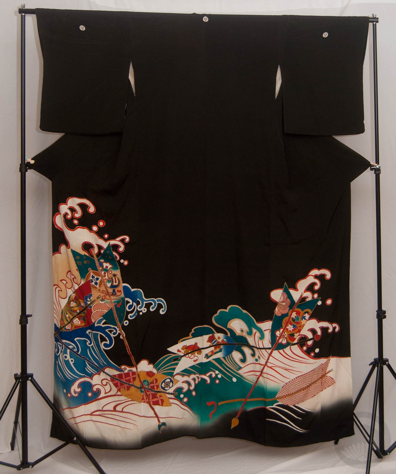
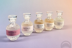
Just a little entry today, but I was so inspired by the Oshiroi perfume that I knew I had to make an outfit worthy of it. I knew it had to be something timeless and elegant, so using a kurotomesode was the way to go and this gorgeous hamaya piece fit the bill. It’s quite long and the design comes up very high. Also, when worn in a more standard way a lot of the design gets lost in the ohashori. This leads me to believe it was originally intended to be worn hikizuri-style, so of course I ran with it.

I went with my own twist on typical tachikata geiko-inspired styling, with a gorgeous gold obi and white and gold accessories. I even used a red obiage as a sort of momi beneath the obi, but it got a little lost. The obijime is technically too casual, but it matches the kimono so perfectly with that rich teal and almost pinkish red, I couldn’t not use it. 

Getting the mannequin to show off the beautiful perfume box was a bit of a challenge, and I’ve had to photoshop the hands slightly so if they look mangled I apologise.

Items used in this coordination

Birthstone Ensembles – May – Emerald

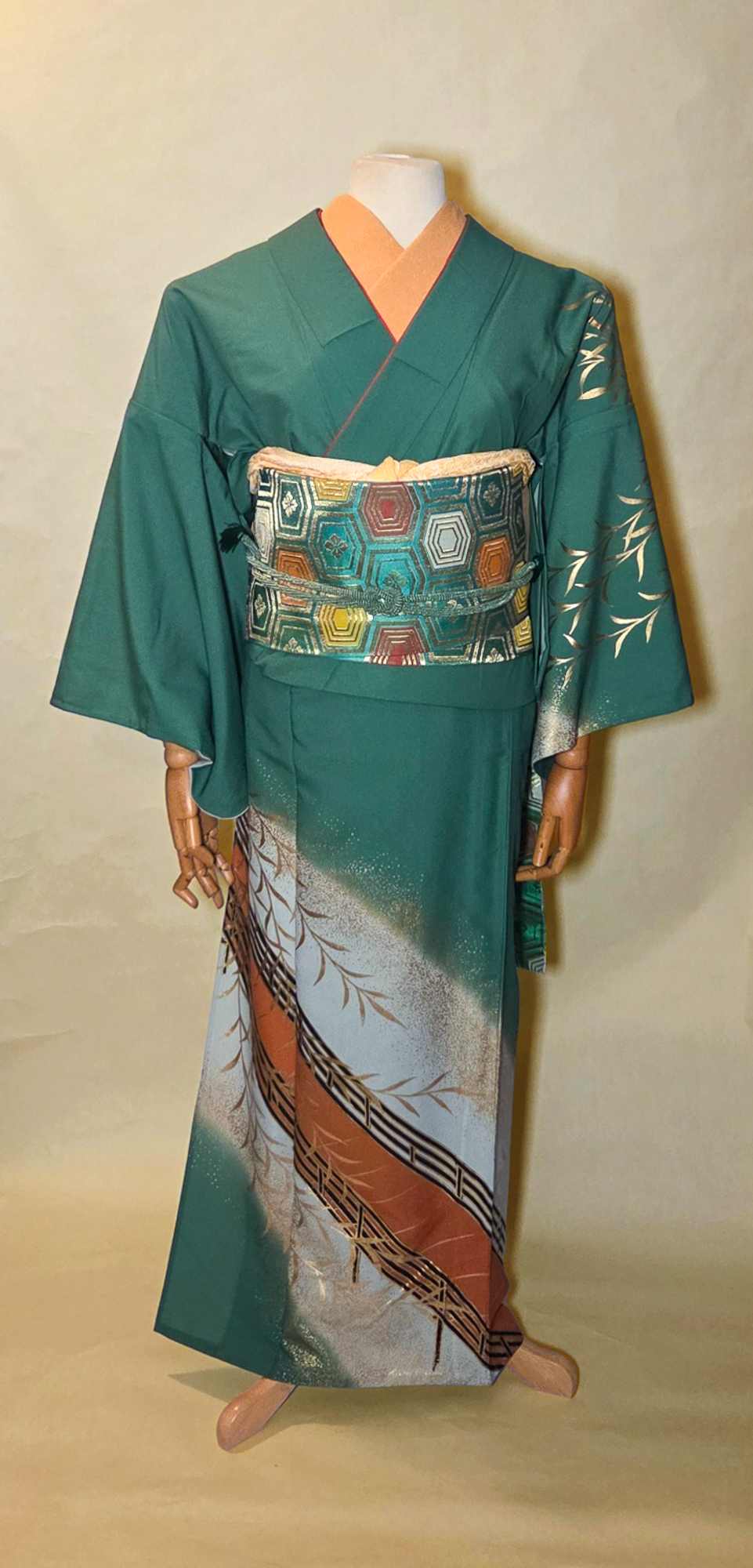
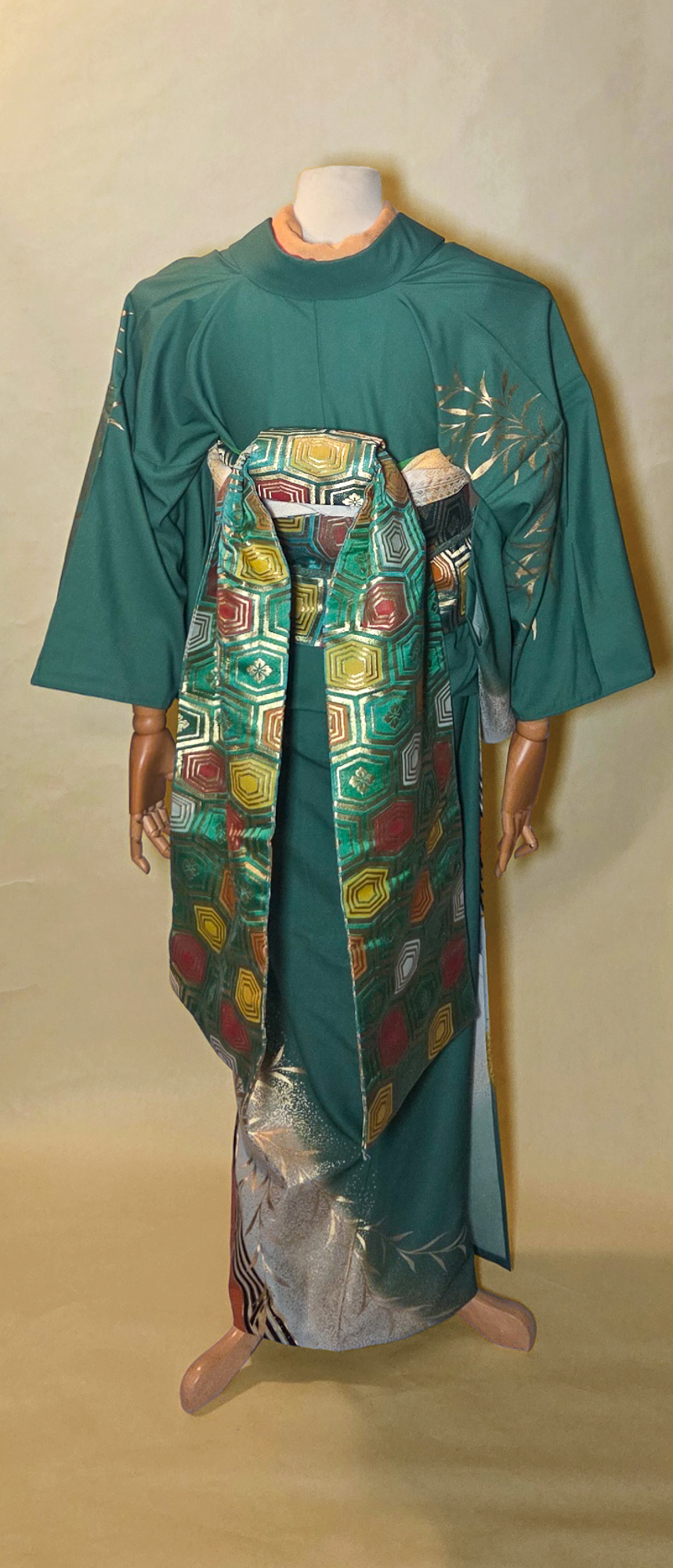
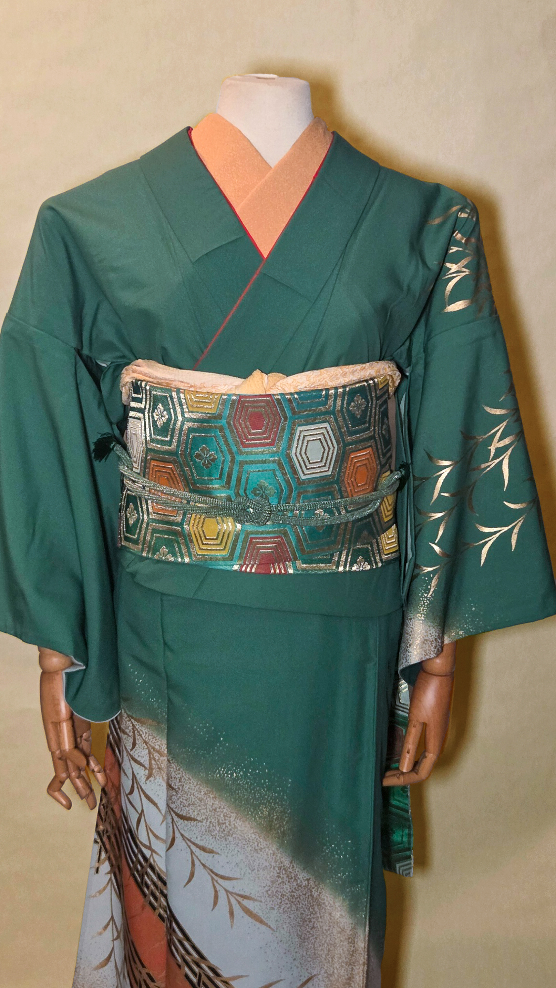
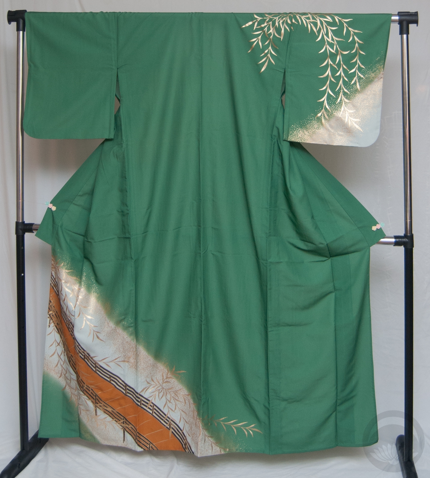
It’s (roughly) the middle of the month, which means it’s time for another birthstone ensemble! This month, the queen of green gems, the emerald. Emeralds are often treated with oil to fill in microscopic fissures and fractures, and in certain lights those fill-ins can flash yellow or orange, so I knew this green odori piece with orange and gold accents was the perfect choice. I feel like they’re also quite often considered one of the more “regal” stones, and this flashy outfit works well in that aspect as well, doesn’t it?

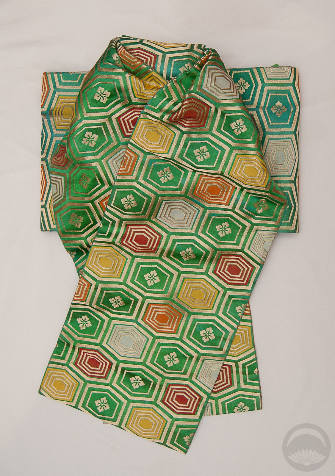
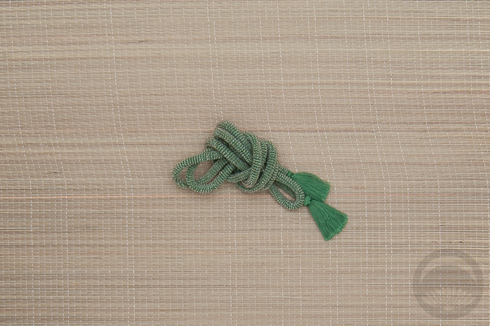
Further emphasizing the green, the gold, the orange, and the dance aspect, my go-to pretied darari obi was the obvious pairing for this outfit. When I bought it I honestly did not think I’d end up using it as frequently as I do, but I am certainly not complaining. I decided to add a bit more pop and contrast with more yellow and gold accents in the accessories. Of course I had to use my green beaded obijime though. This whole birthstone project makes me wish I had beaded obijime in a whole array of colours, but they tend to be incredibly expensive due to the labour involved, and I’ve only managed to get the three I own through sheer luck. You can be darned sure I’m always on the hunt though. If you happen to come across any you don’t want to purchase for yourself, hit a girl up.

Items used in this coordination


Birthstone Ensembles – April – Diamond

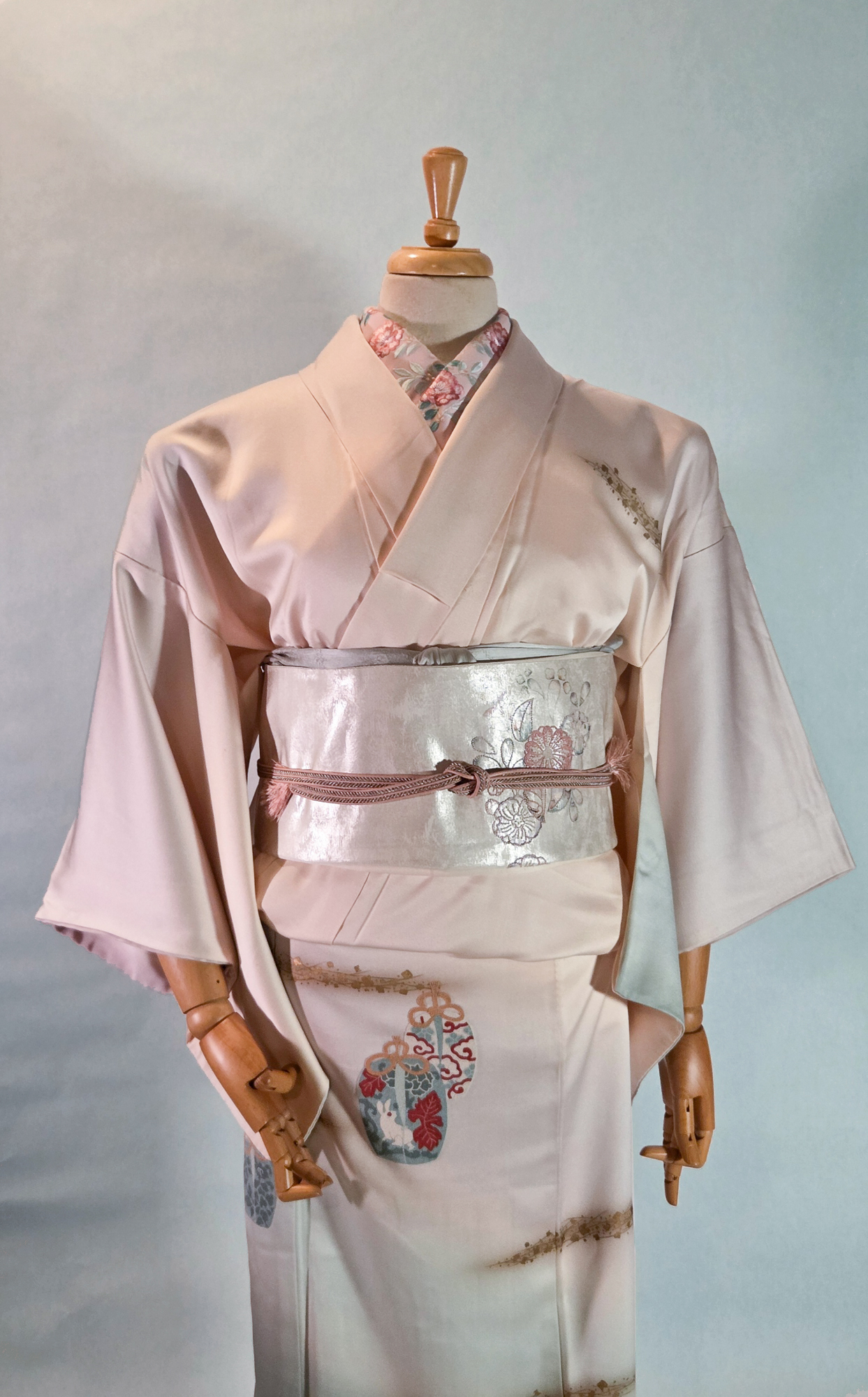
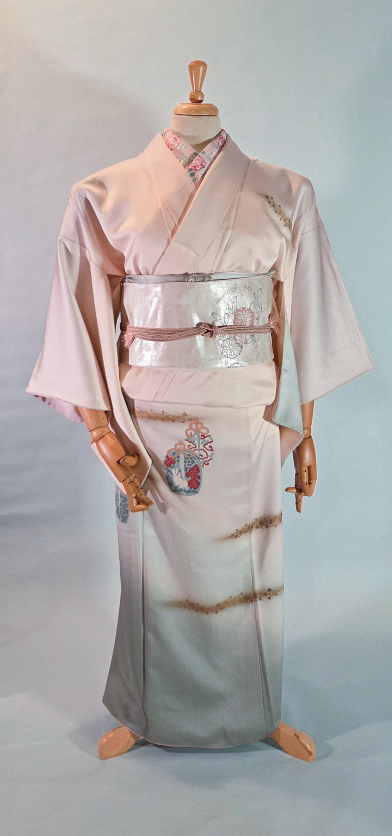
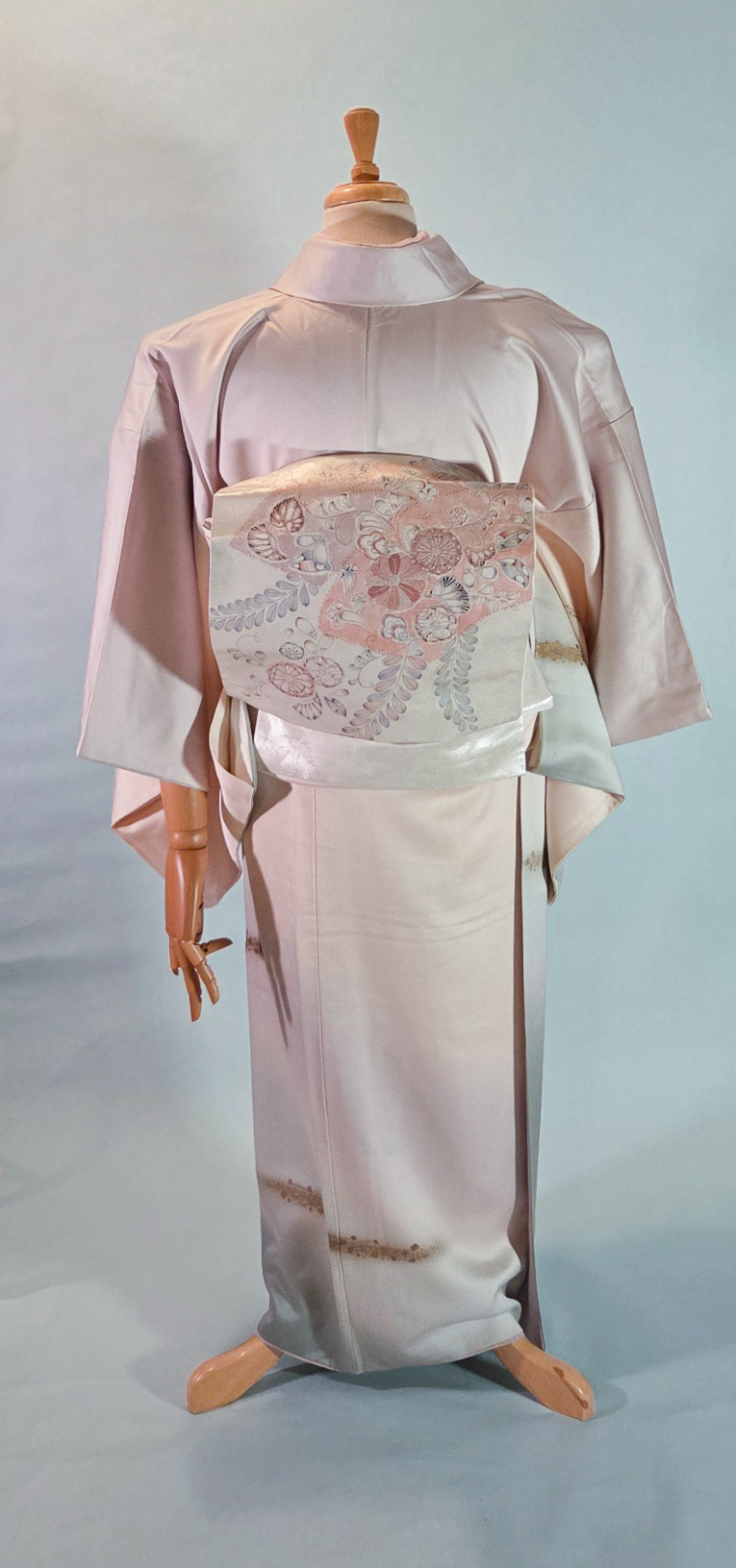
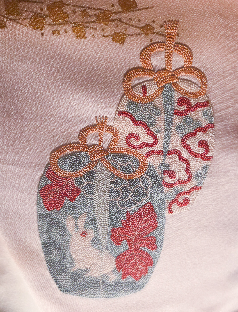
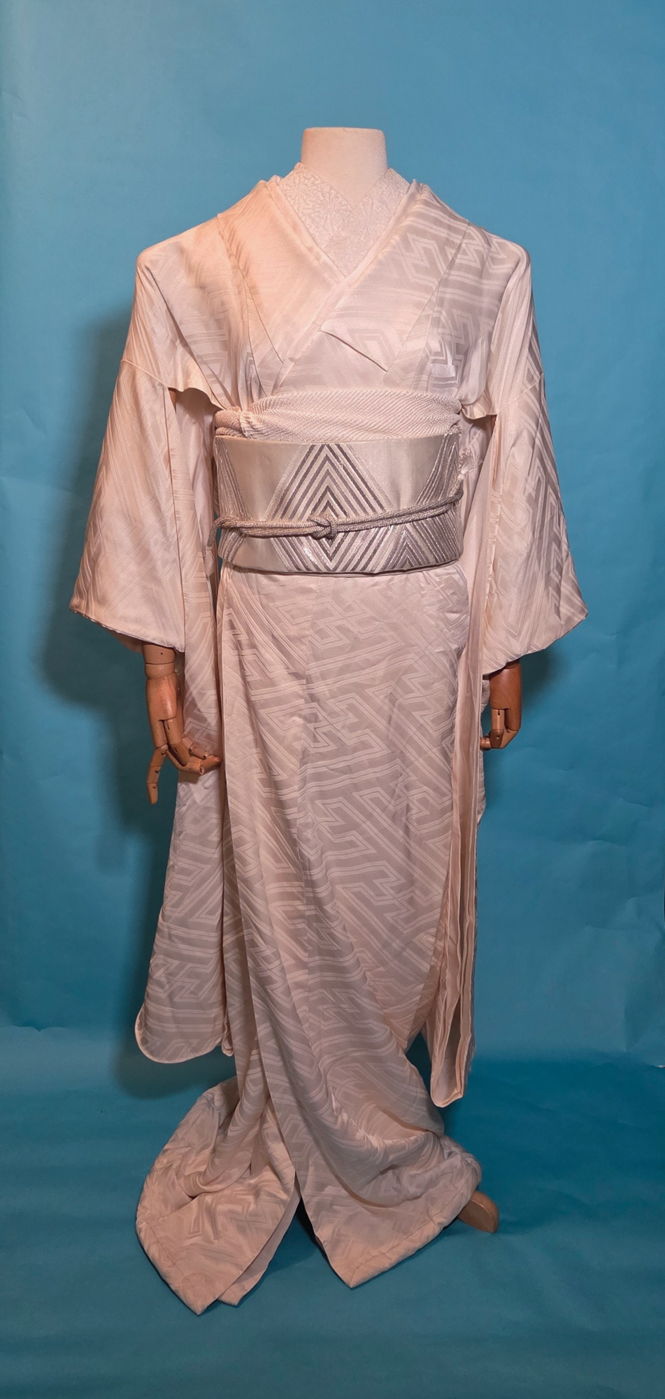
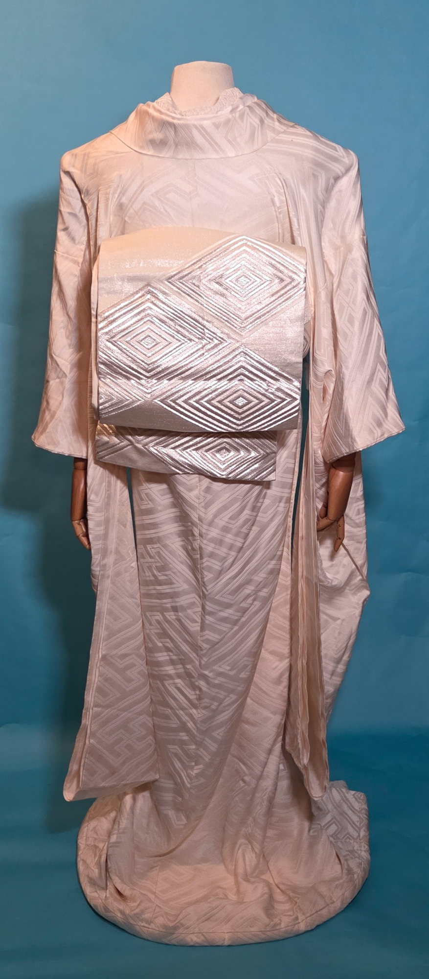
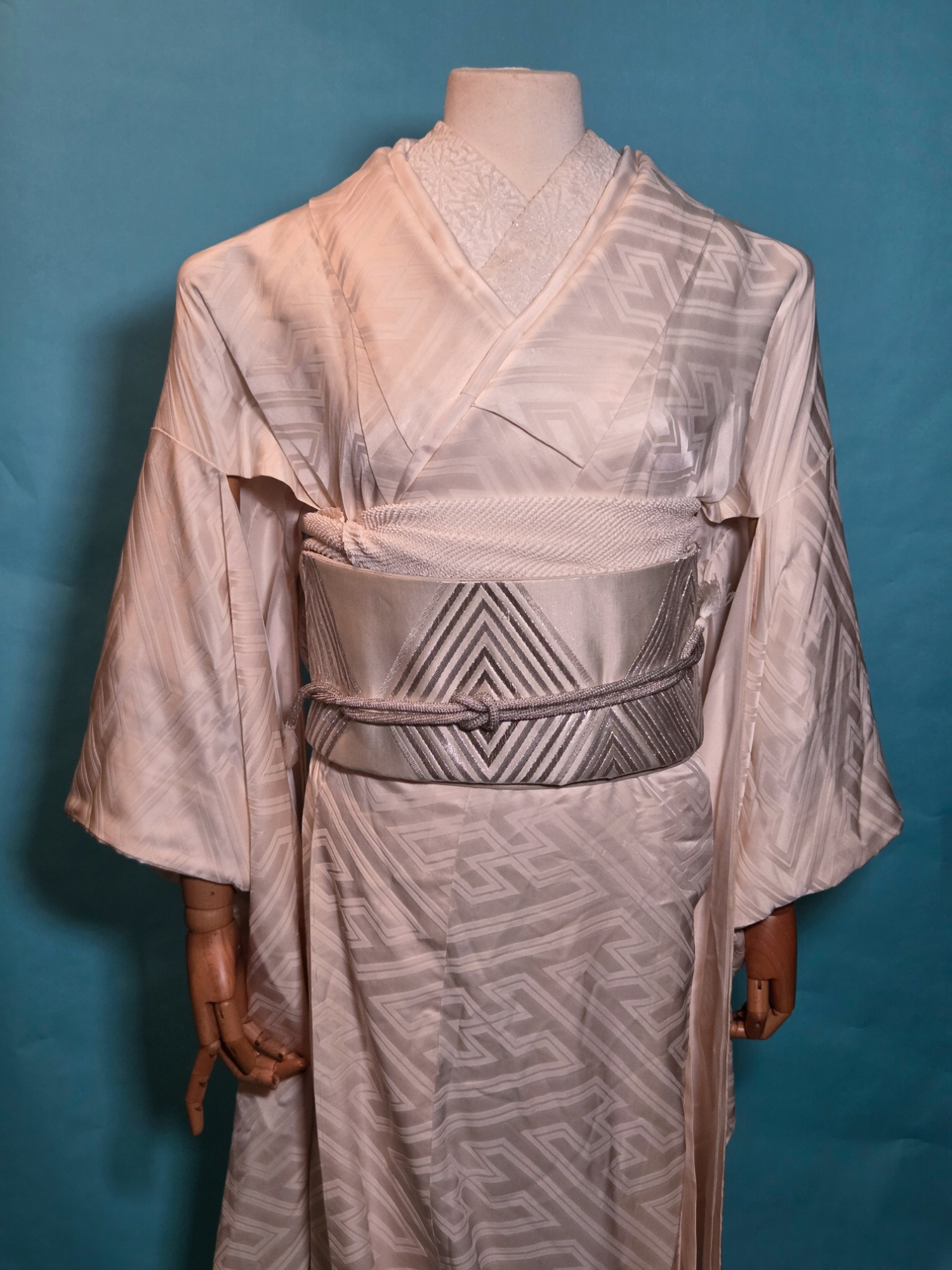
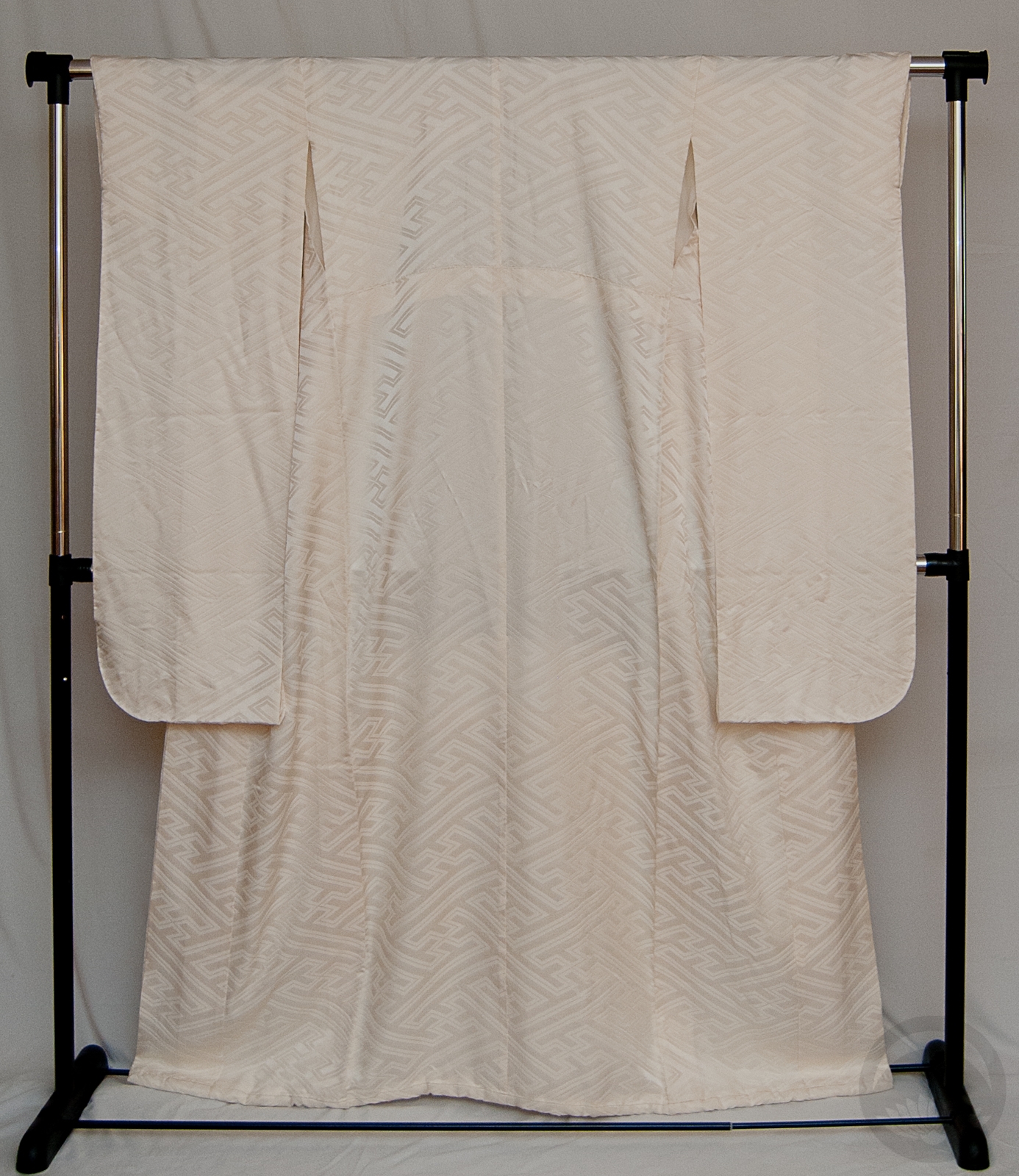
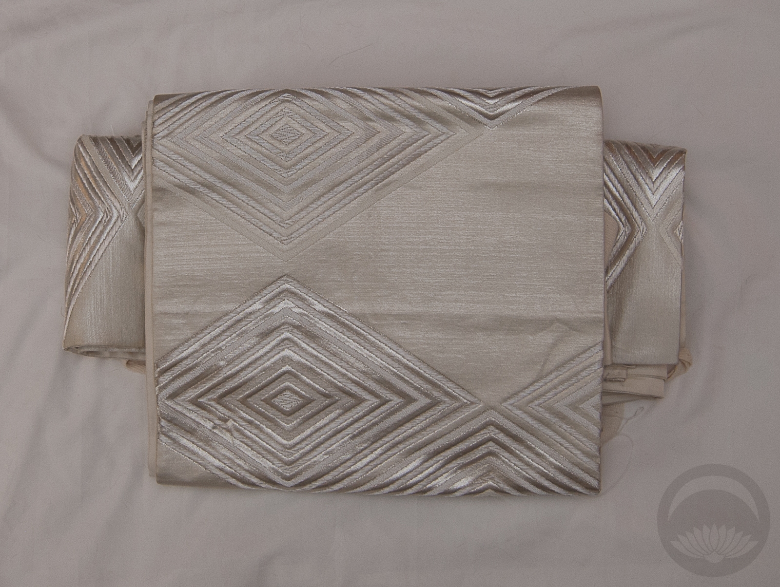
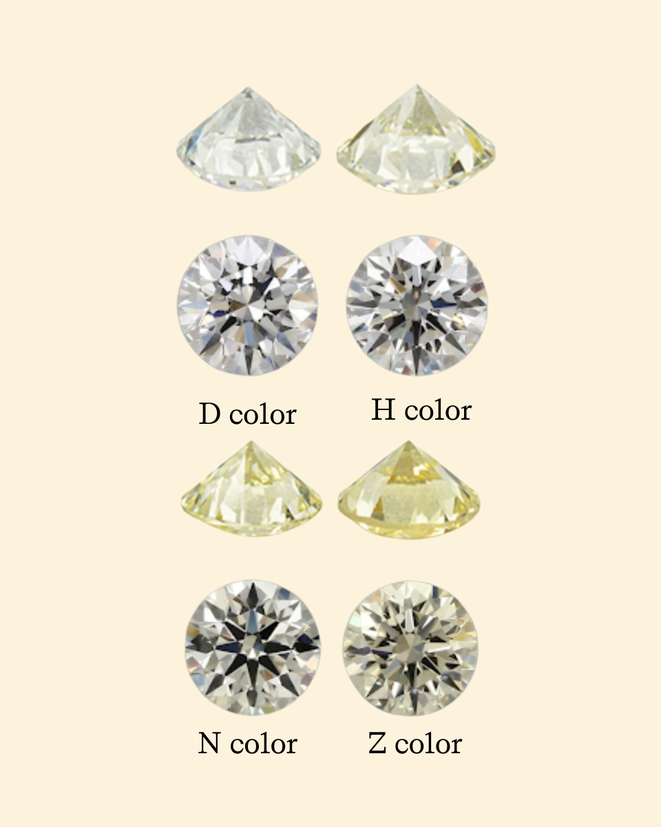
There really was only one choice for April’s birthstone – this shiromuku with sayagata pattern that looks like facets, and a white obi with silver hishi (diamond) designs. Add in a textured white and silver haneri and a white beaded obijime, and I honestly don’t know how I could have evoked diamond better without gluing crystals onto the ensemble. Which is not something I was keen to do on a wedding piece, frankly.

My only real wish was that the kimono and obi were both in the same undertone family. It’s not entirely evident here due to the blue background, but the kimono is more of a warm ivory white and the obi is a cool greyish white. But eh, lets pretend that’s to evoke light refraction or the colour variation you can find in natural diamonds.

I honestly don’t have a lot more to say about this particular coord. It came together like a dream, the kitsuke didn’t give me grief, and overall I’m beyond happy with this interplay of textures and now I’m even more motivated to stick with this project!

Also, does anyone else remember this Old Spice commercial? The “the tickets are now DIAMONDS” line has been looping in my head since I started.

I’m on a horse!


Items used in this coordination

Stepping out of my comfort zone

In the more than two decades I’ve been studying, collecting, and coordinating kimono and Japanese arts and aesthetics, one thing I still find myself struggling with is Japanese colour palettes. I studied graphic design before I fell into this little rabbit hole, and my colour sensibilities are innately Western.


It’s possible you’ve seen this adorable little A Dictionary Of Color Combinations book on some fashion and personal style social media accounts lately, it’s gone somewhat viral, and for good reason. It’s less a book and more a collection of colour palettes that appeal to the Japanese aesthetic. If you’re ever stuck for inspiration, it’s a fantastic place to start. You can either open a random page and go from there, or if you have a piece in your collection you’re unsure of what to do with, there’s a handy index at the back. Find the swatch closest to your piece and then view all the options! That’s what I ended up doing here, with this gorgeous early-Showa komon I picked up at the Palm Springs vintage market a few months back.
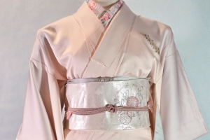


I found this palette with the colour “Eugenia red”, which was about as close as I could find to the kimono. The complementary options were “Sulphine yellow”, “Green Blue”, and “Raw Sienna.” The obi is nearly spot-on for the sulphine yellow, and the other two colours show up in the obi motifs quite nicely. Would I normally have paired a red kimono with mustard and green accessories? Not in a million years! Was it successful? That’s for you to decide. I think it works, but it’s definitely not my favourite thing I’ve ever put together. I will definitely keep trying combos from this book though

Also if you’re curious about my manicure in the book pics, it’s Zoya Midori stamped with this Maniology sashiko plate. I was going for “matcha latte” vibes.


Items used in this coordination


 This post contains affiliate link(s). If you choose to purchase, I receive a small rebate or commission which goes to the continued maintenance of this site.