
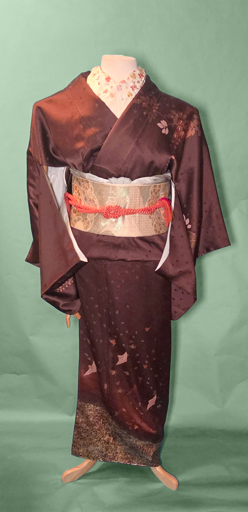
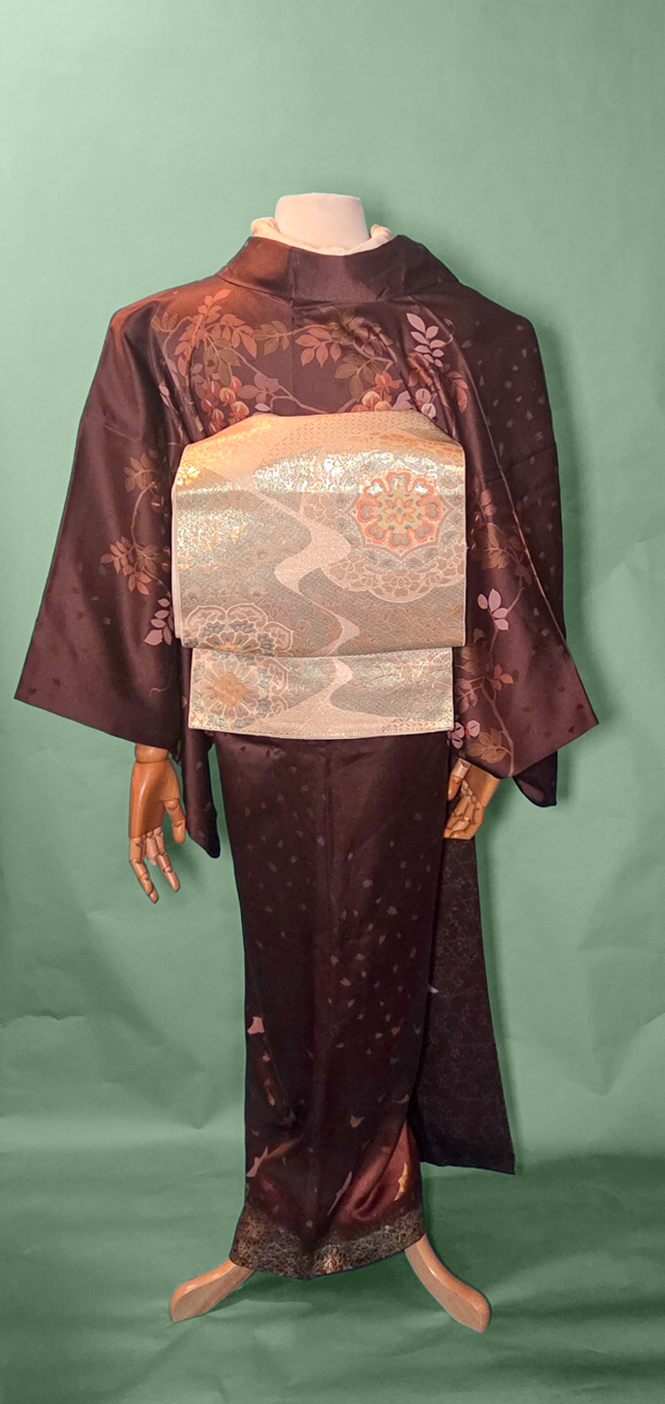
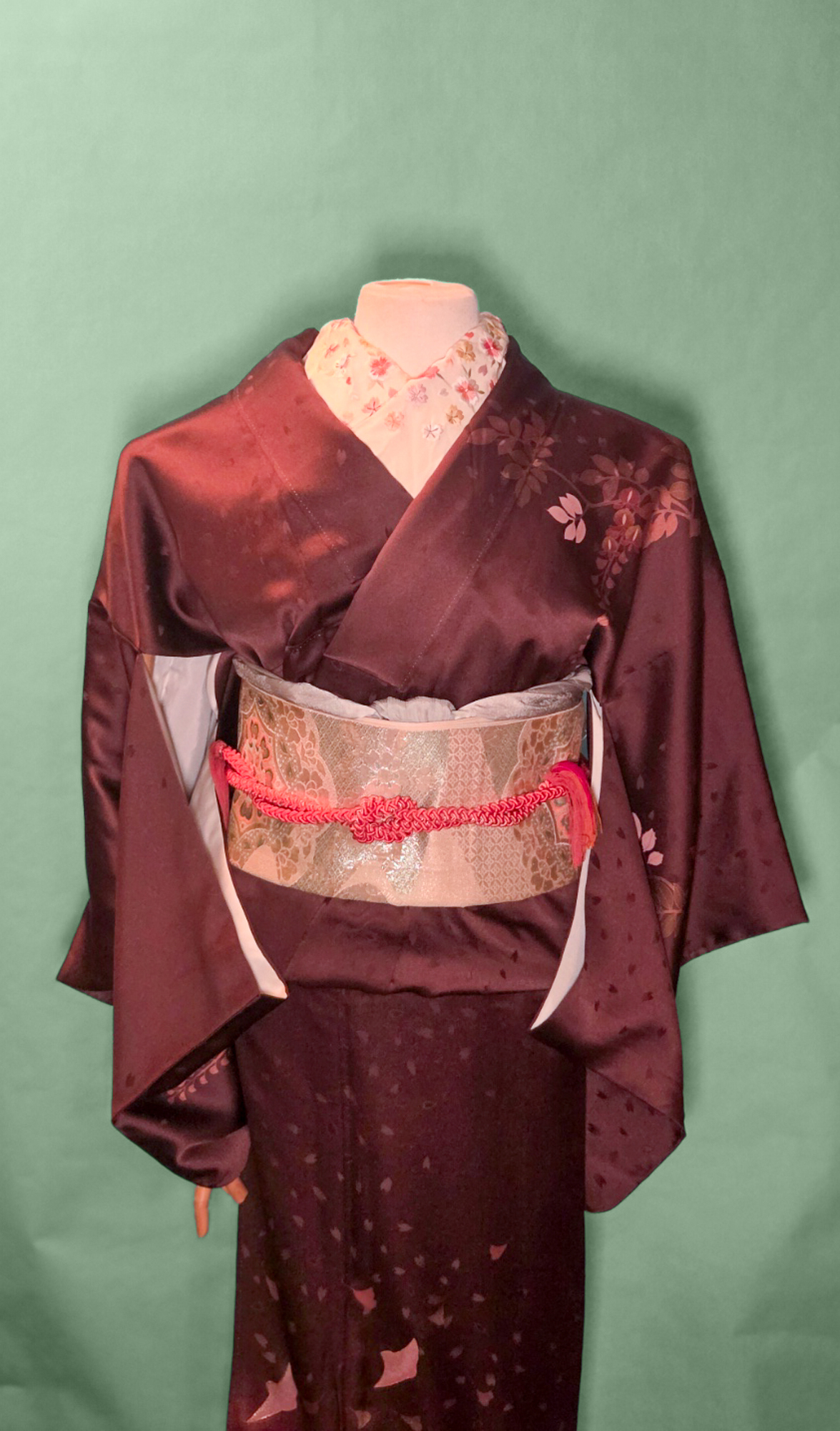
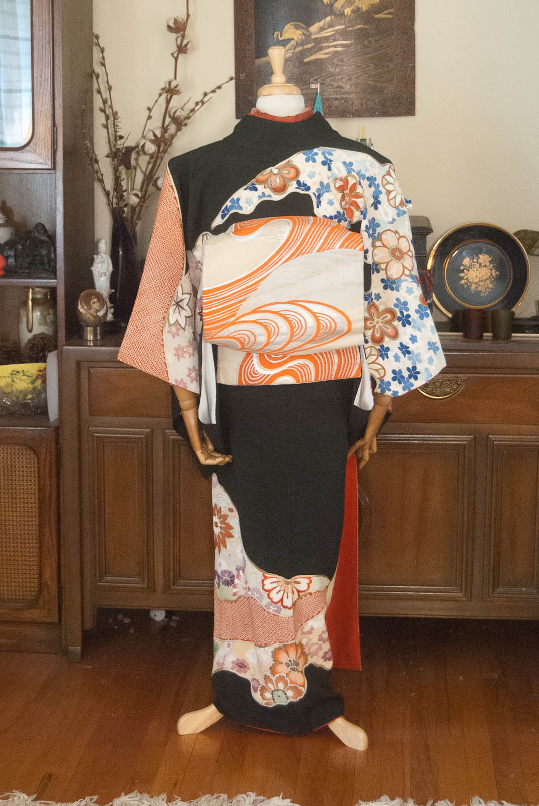
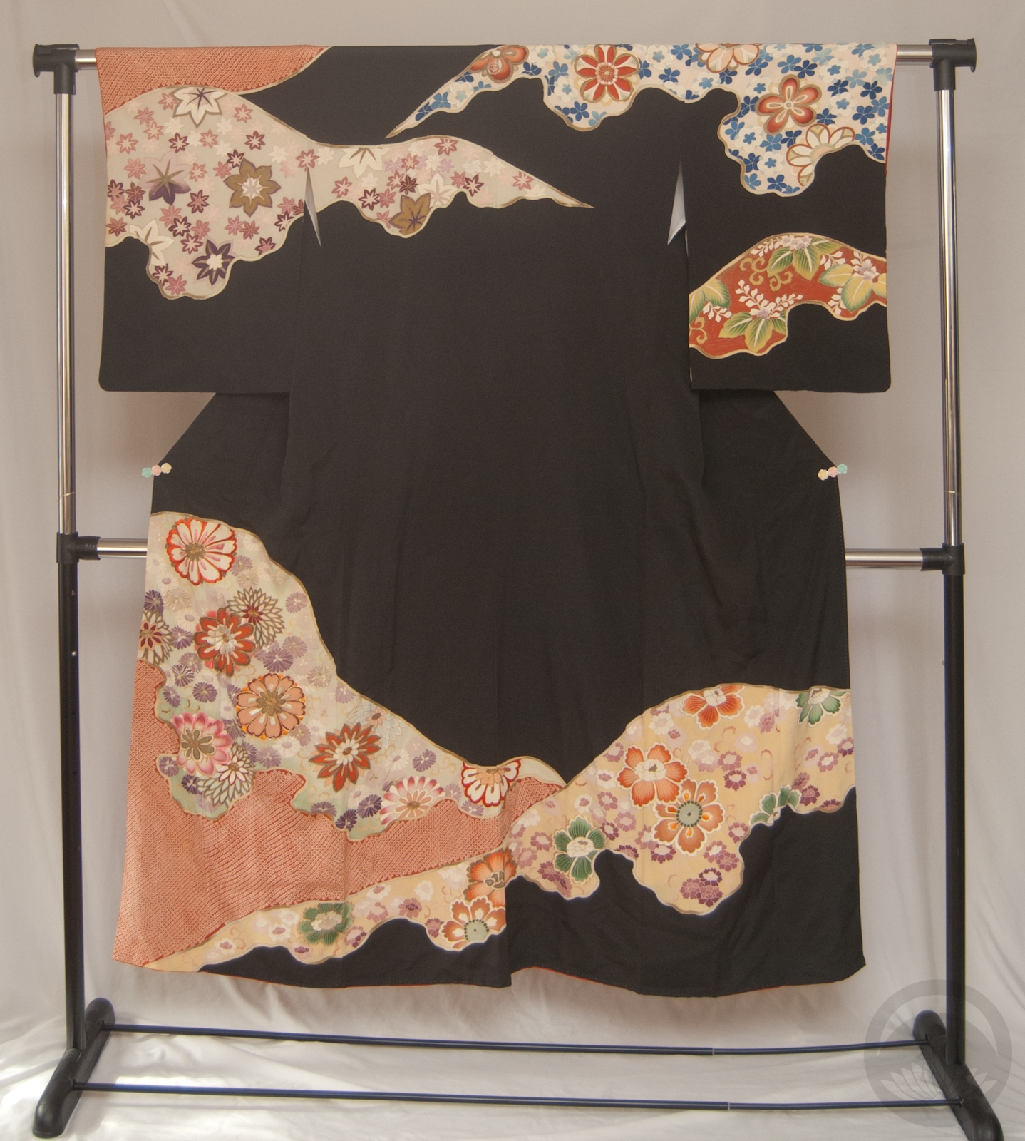
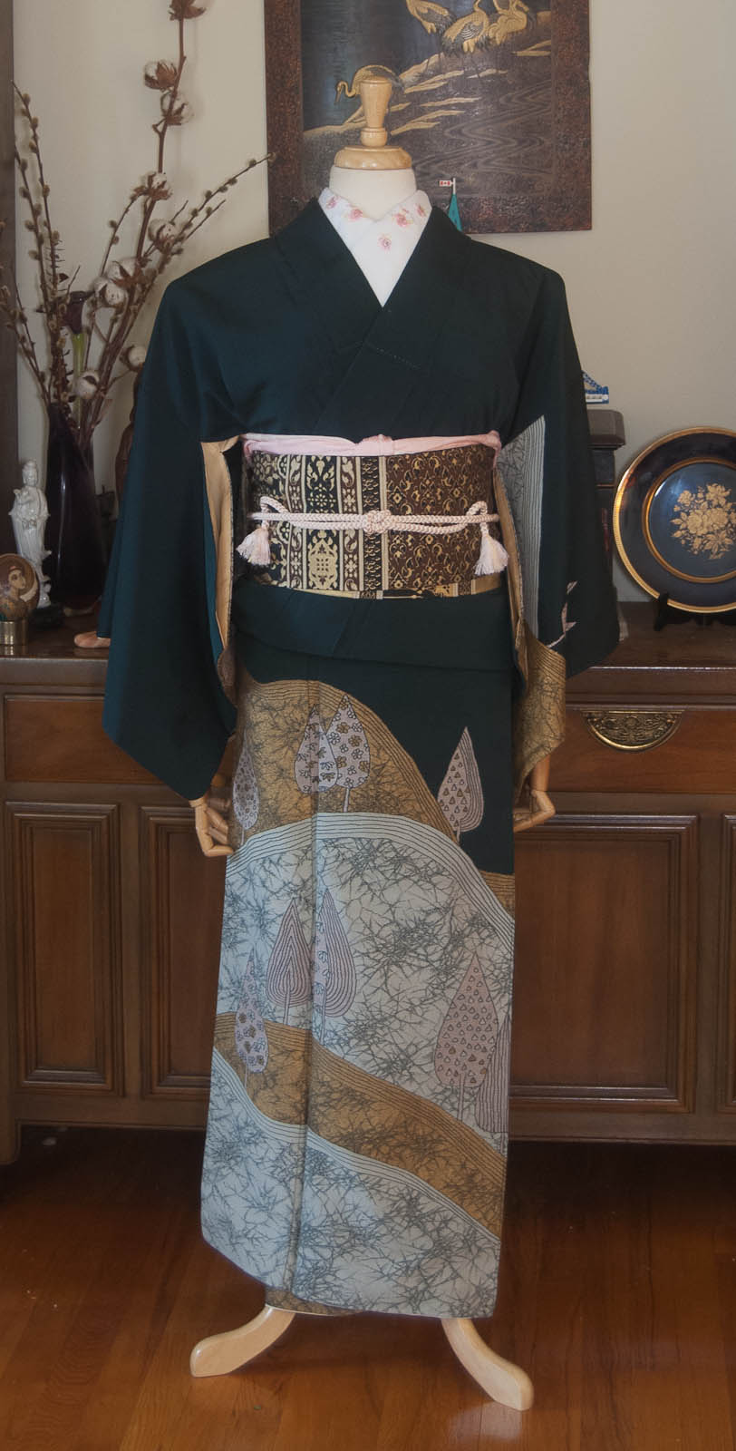
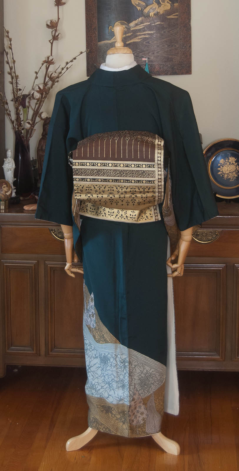
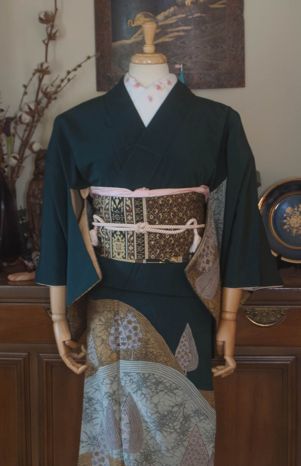
Alexandrite is my favourite of the birthstones, and it holds a special place in my heart. Not because I’m a June baby — far from it, my birthday is in November — but because I love the unexpected intersection of physics, chemistry, and aesthetics that cause it to change colour so much that my engagement ring and wedding band feature it heavily. Many stones have a sort of iridescent shimmer or glow to them, but few legitimately change colour the way alexandrite does. The main stone in my ring is typically a rich indigo, looks teal under fluorescent lights, bright purple in the sun, deep plum in candlelight, and on the rare occasion I’m under direct UV light (gel manicures, the occasional round of day-glo mini-golf) it beams an impossibly eerie neon red.
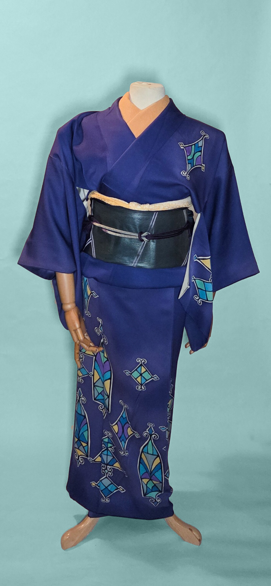
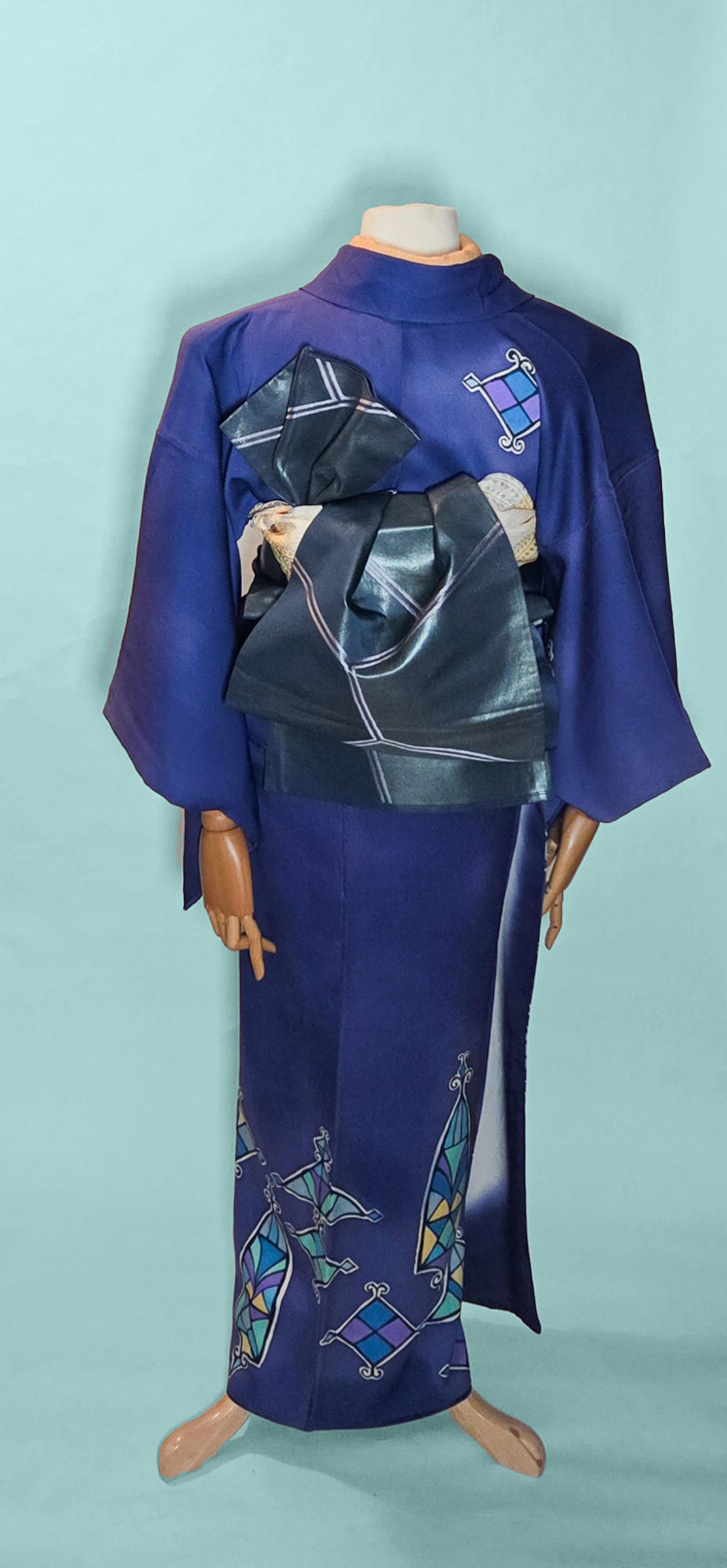
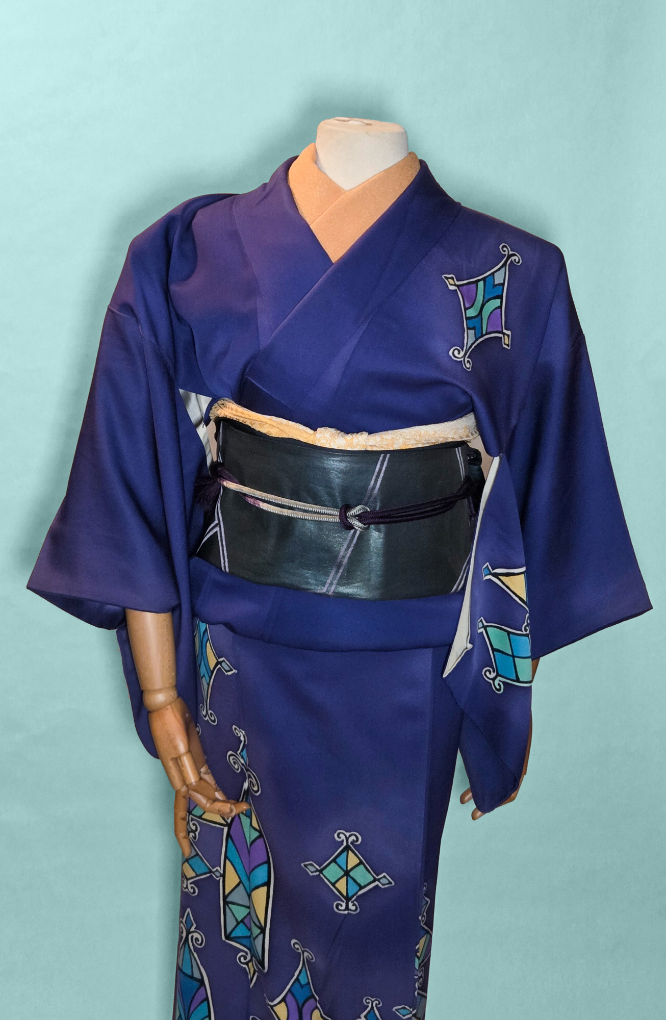
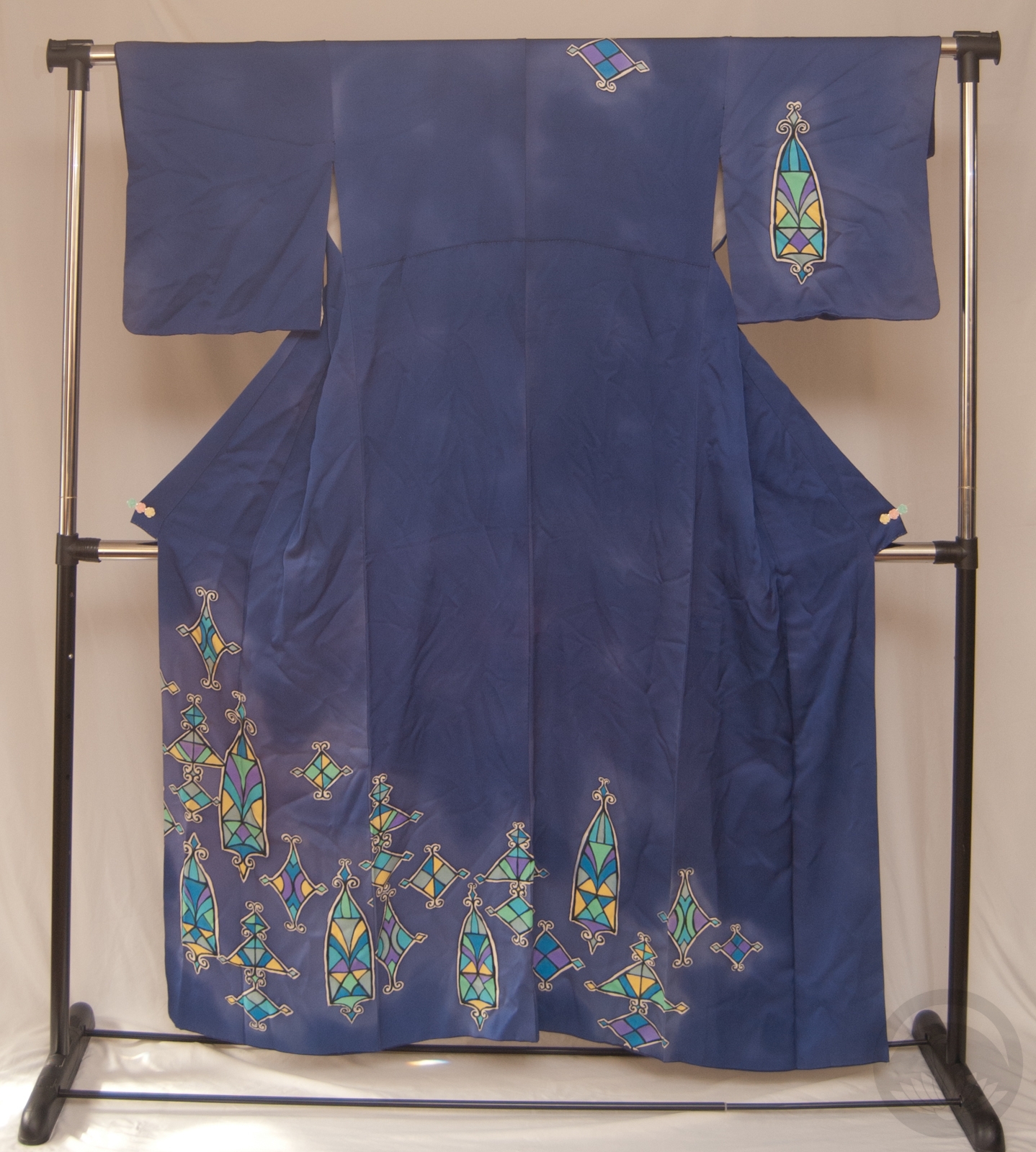
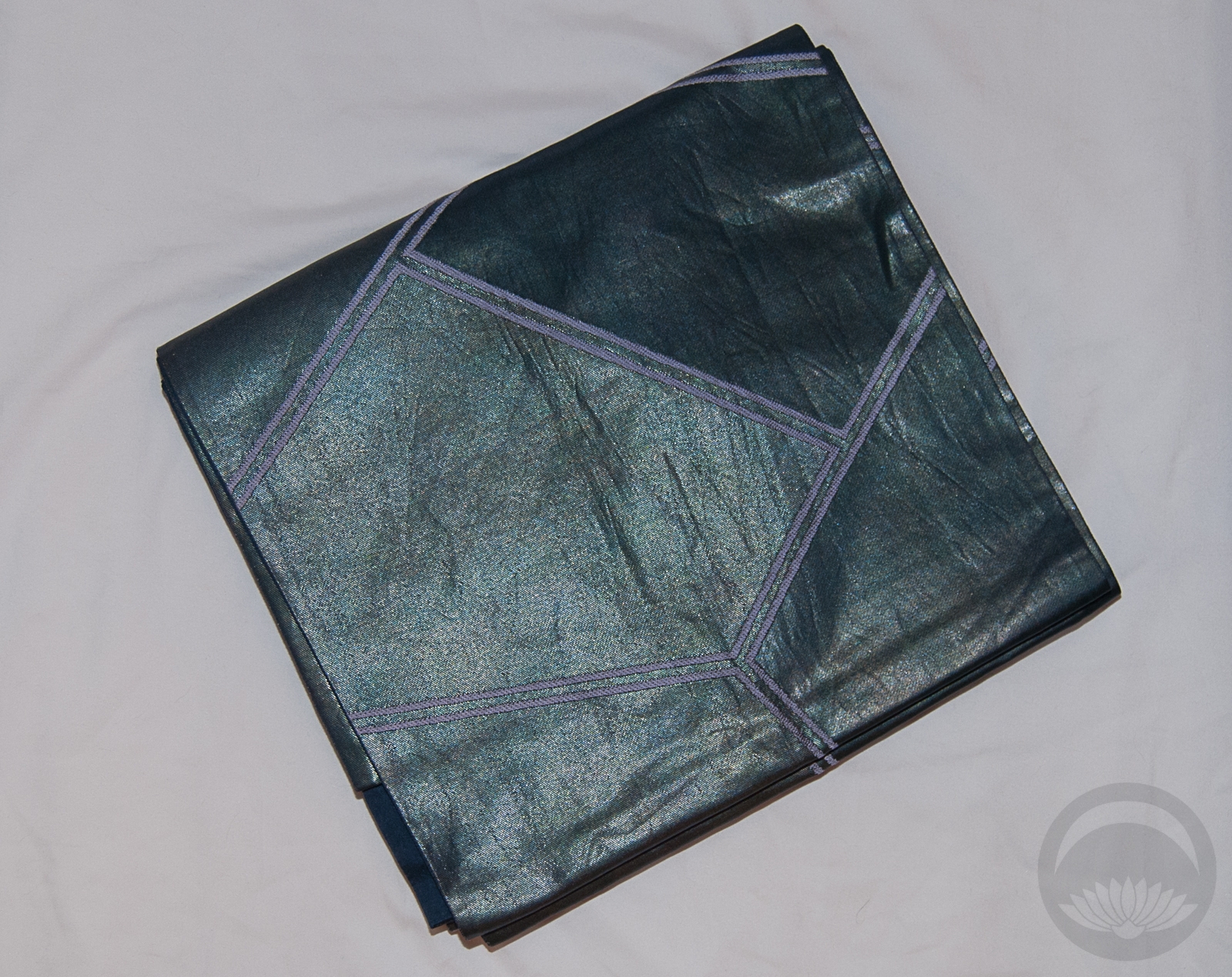
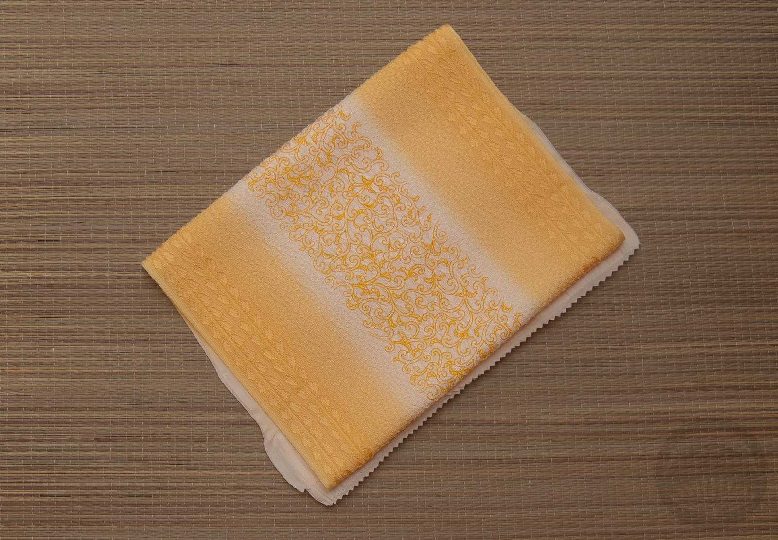
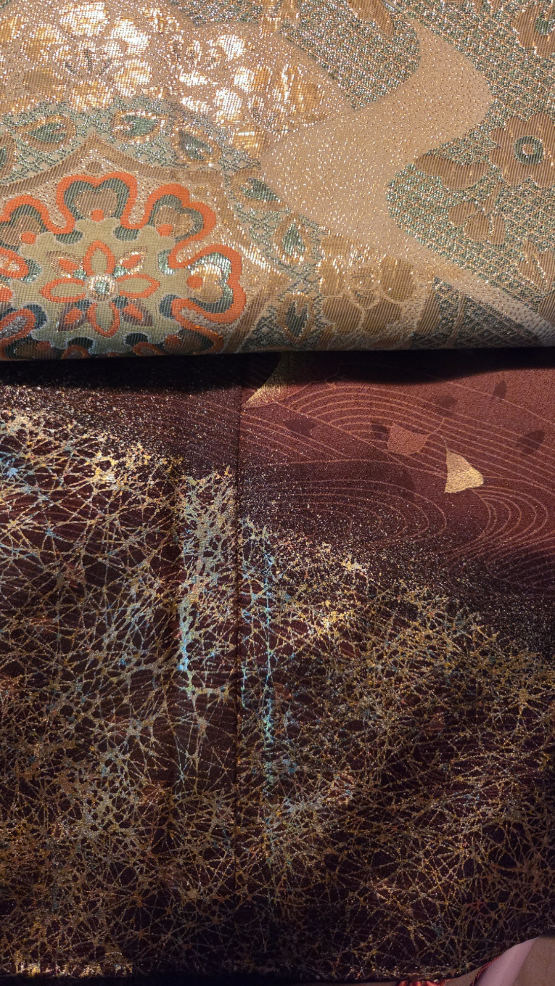
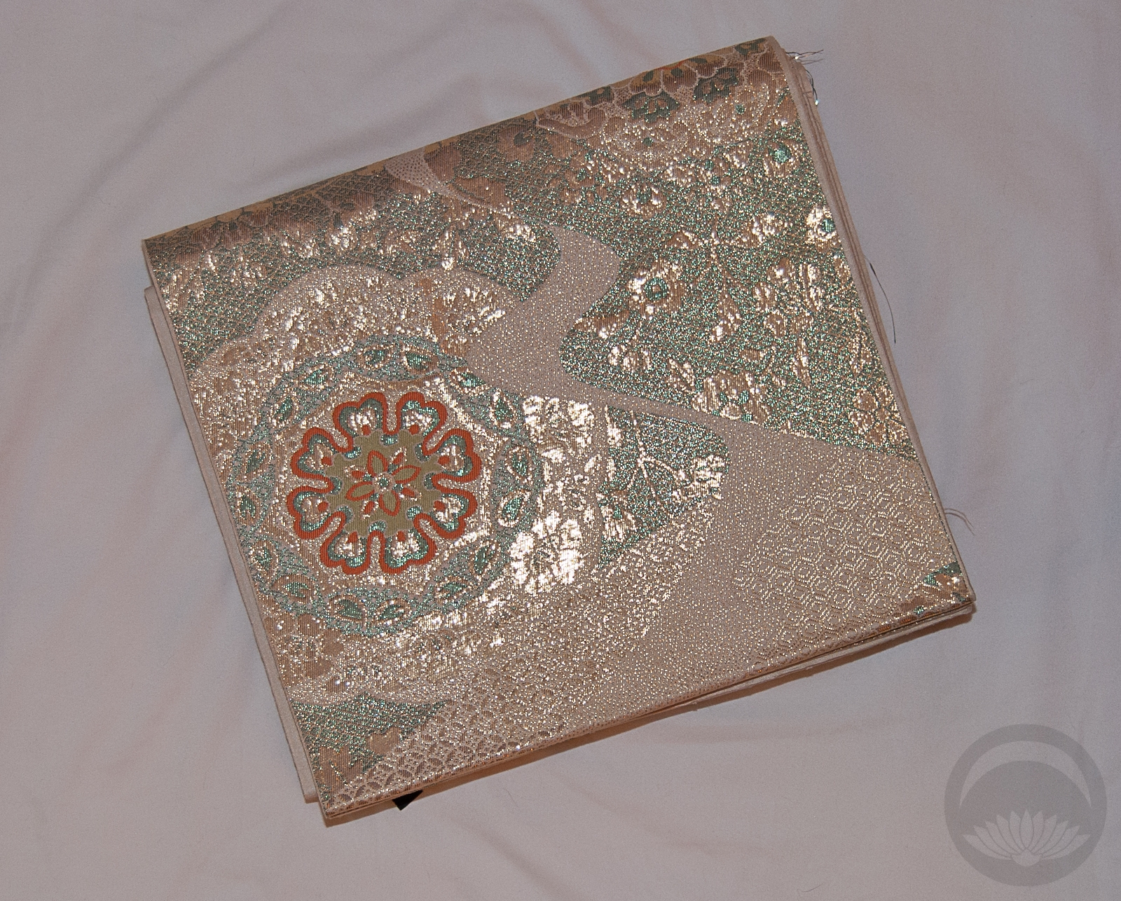
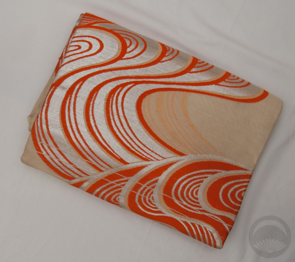
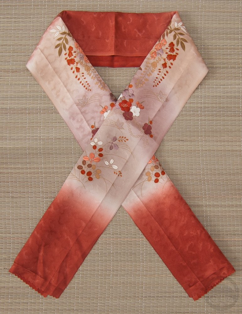
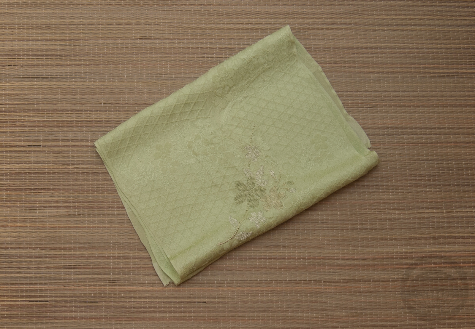
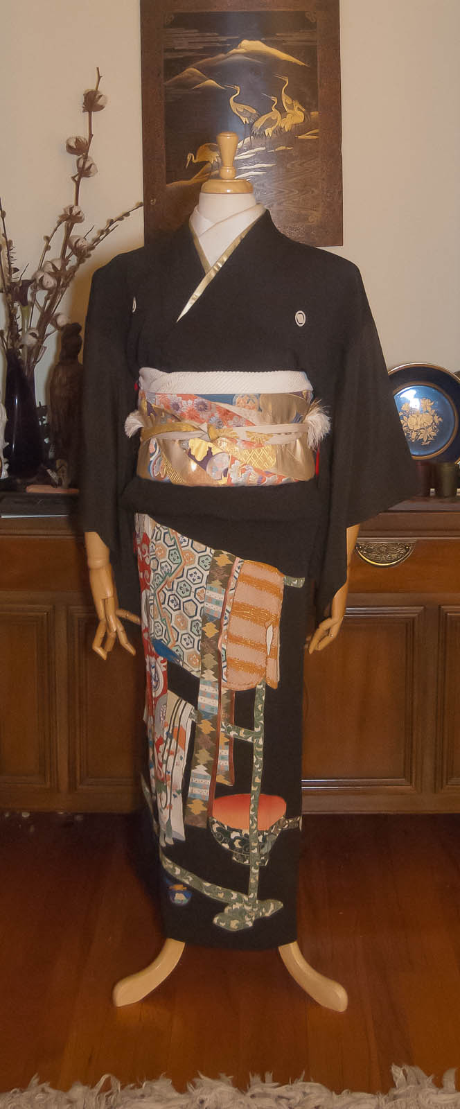
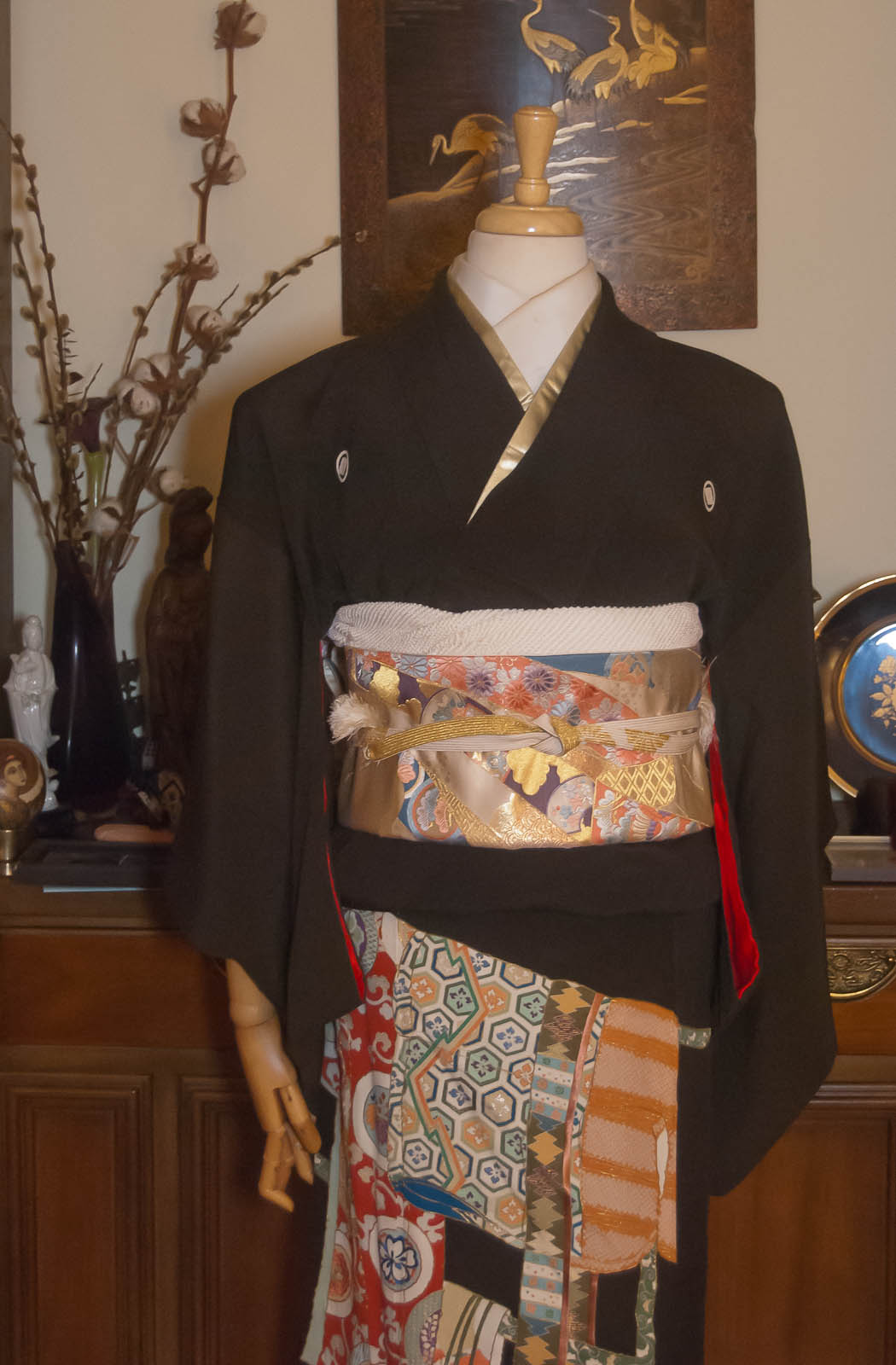
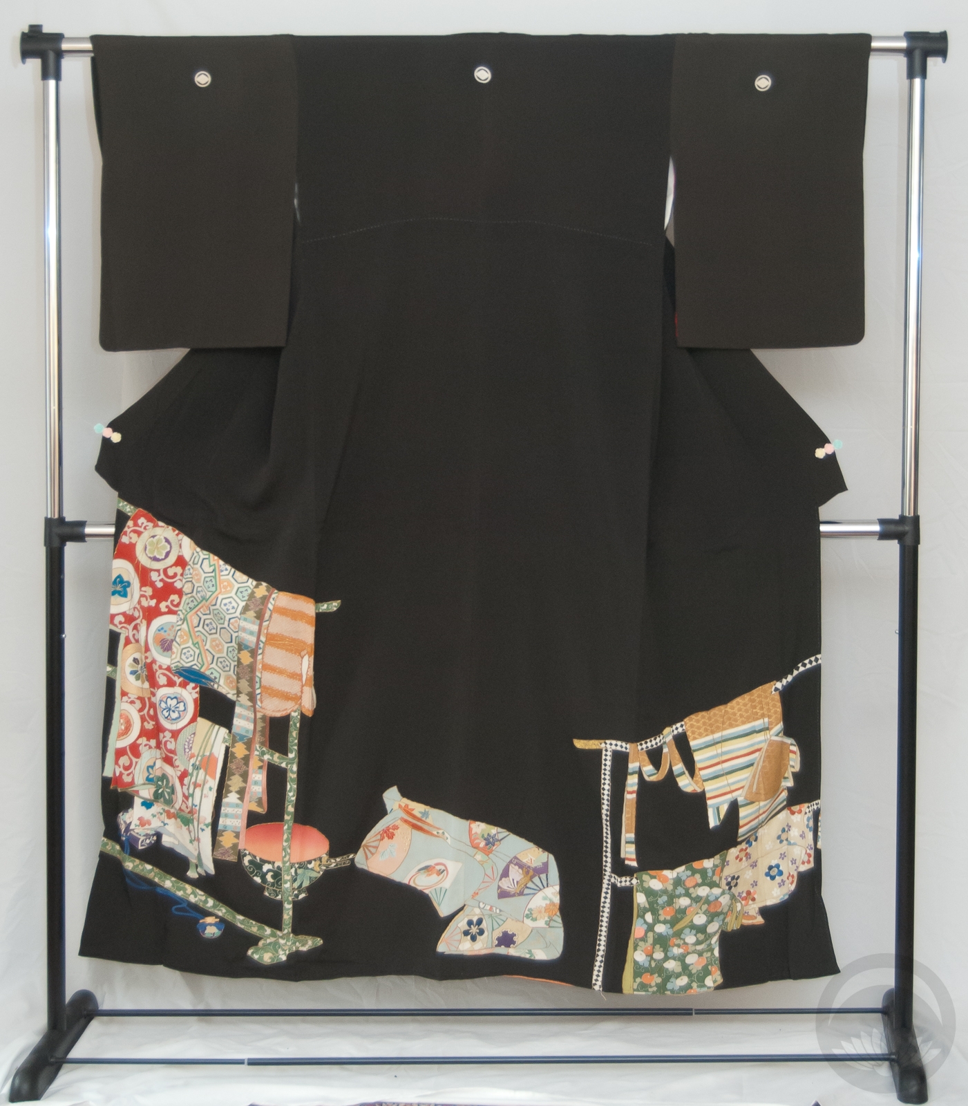
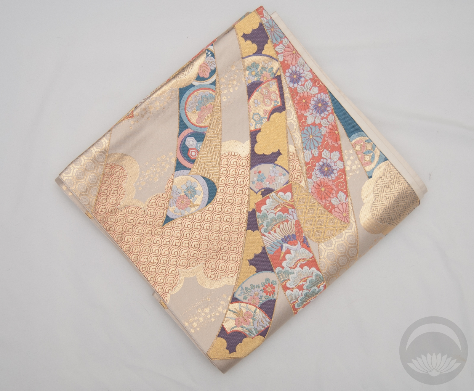
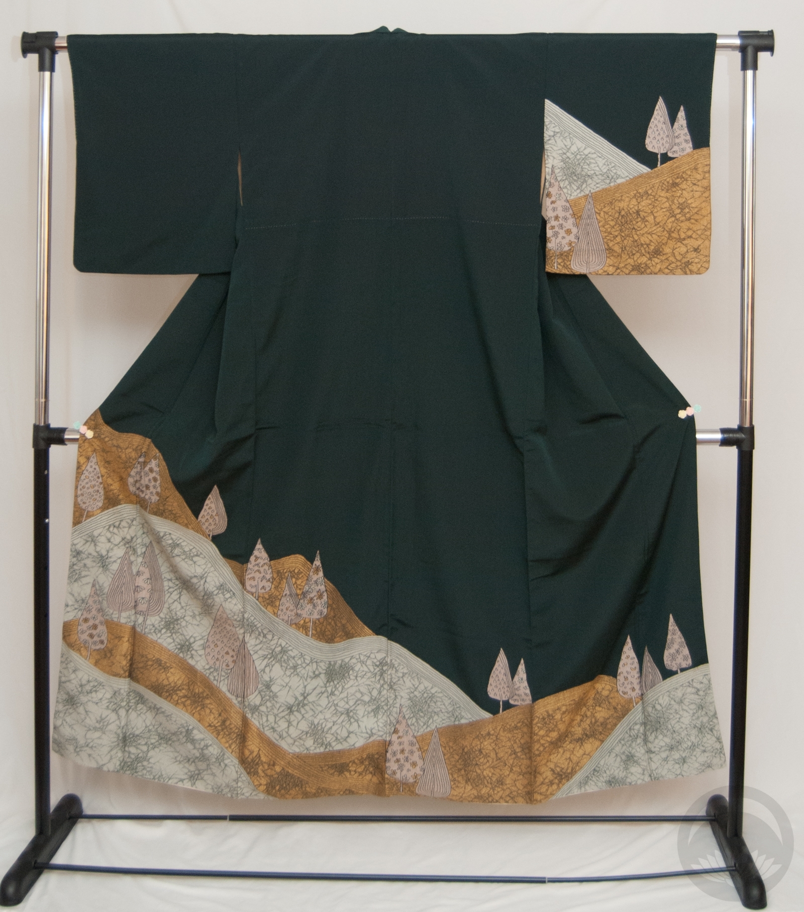
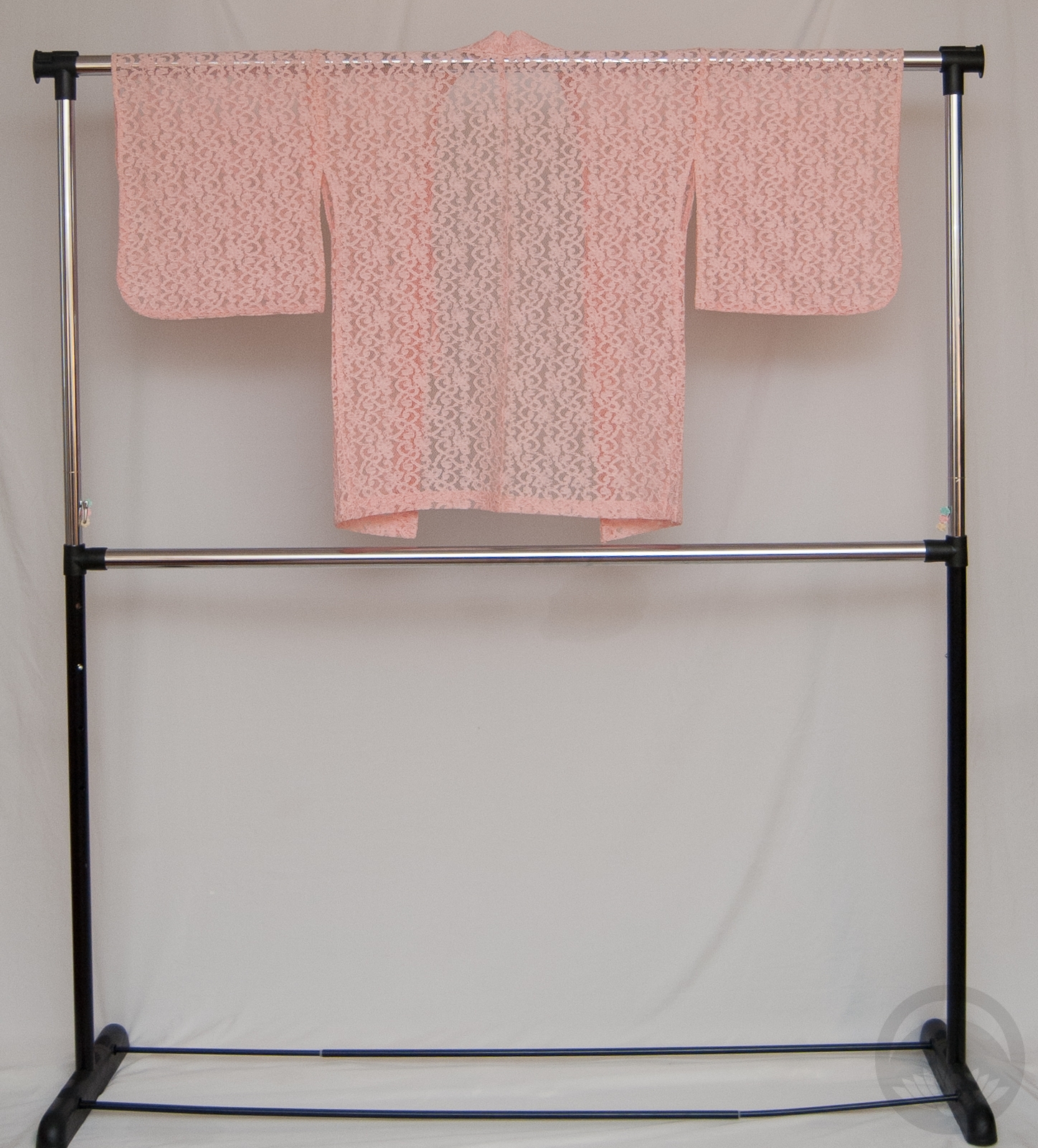
Of course, I knew I had to reflect as many of these colours in today’s coordinate as I could, and this houmongi has them all aside from the neon red. The shapes of the… windows? around the hem also remind me of cut gemstones, which made it even more perfect. While the actual gemstone does not have a propensity to shine yellow, there’s already yellow accents in the kimono and they reminded me of gold so I ran with that for the accessories. The obi also looks faceted and shimmers between blue, green, and teal, so that was a no-brainer as well.
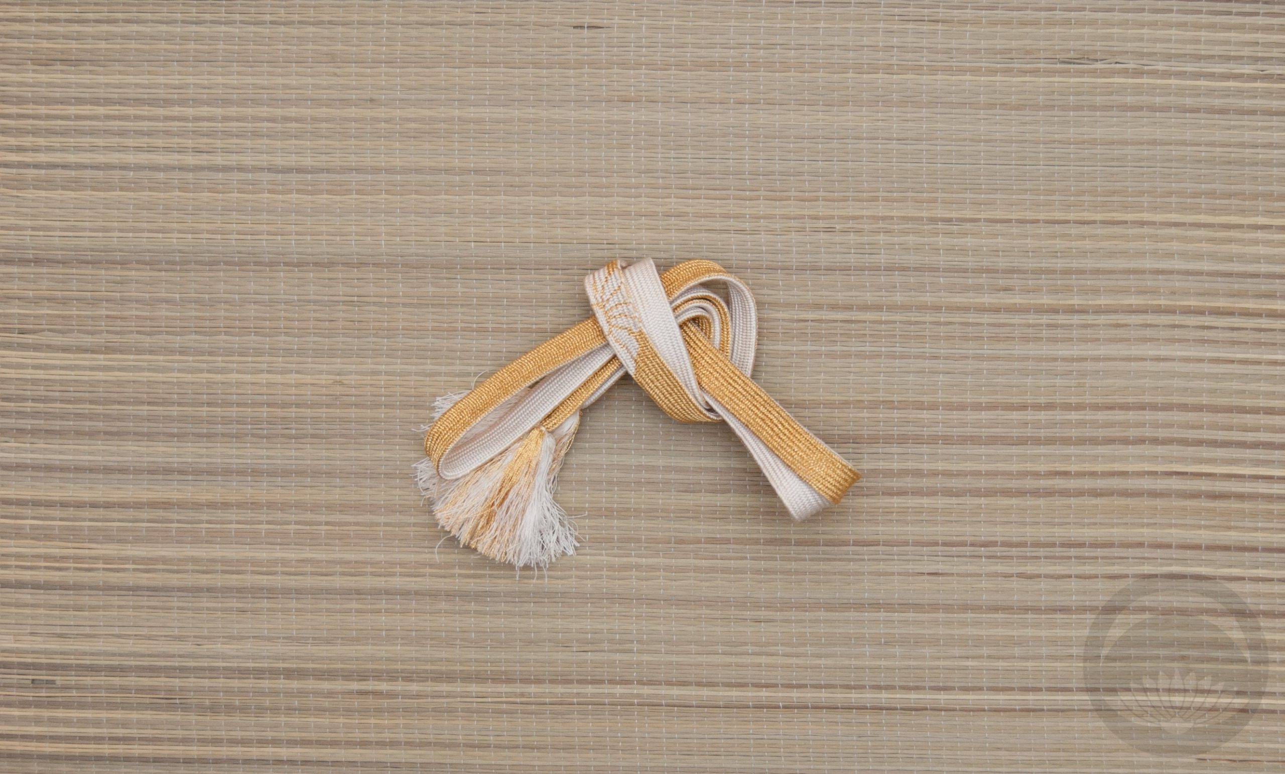
I tried something funky with the obi musubi but to be honest I’m not sure it worked. At least the pieces all work well together otherwise!
- January - Garnet
- February - Amethyst (coming soon)
- March - Aquamarine
- April - Diamond
- May - Emerald
- June - Alexandrite
Items used in this coordination
-

- Indigo Stained Glass
-
- Teal Geometric
-

- Solid yellow

-
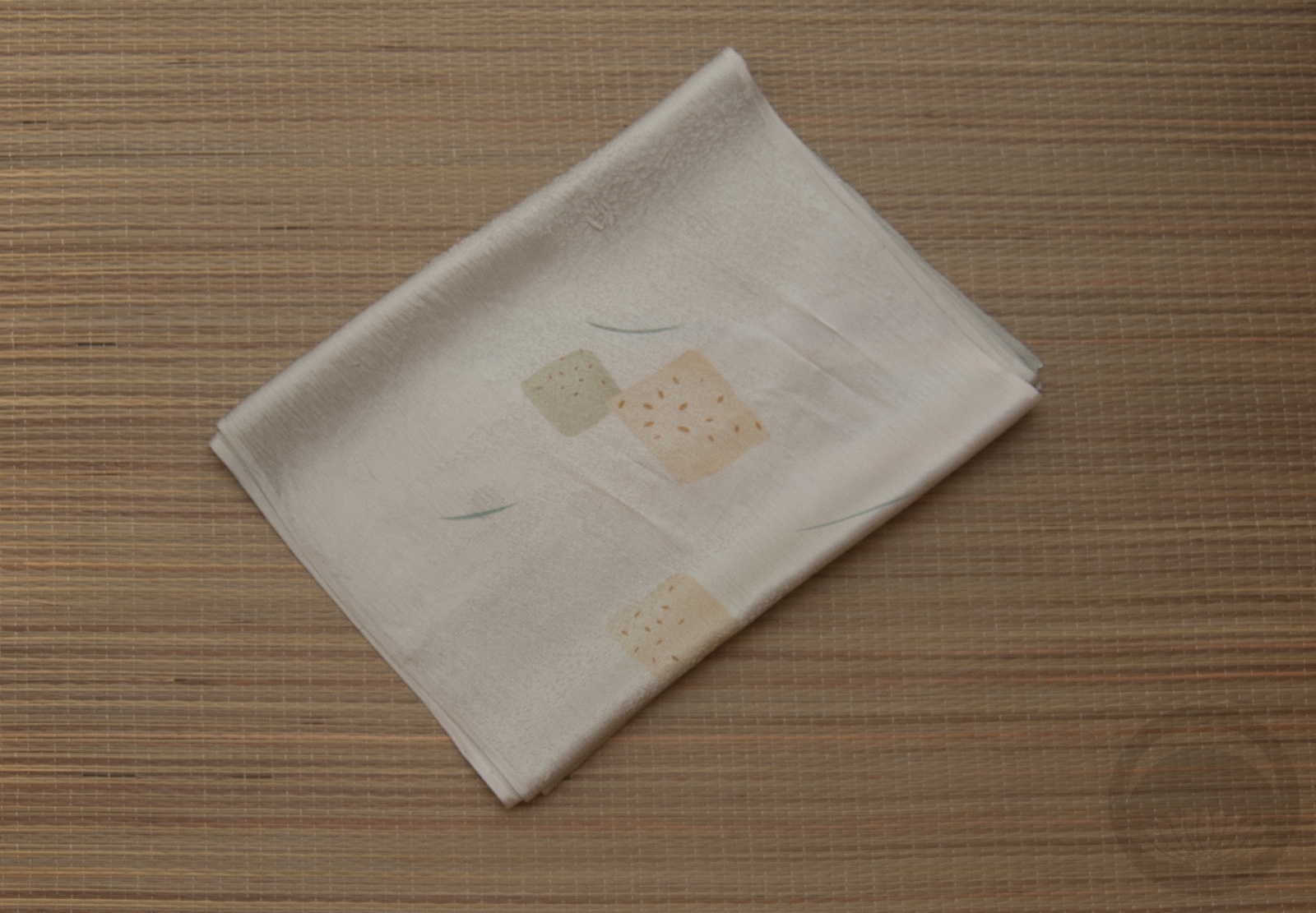
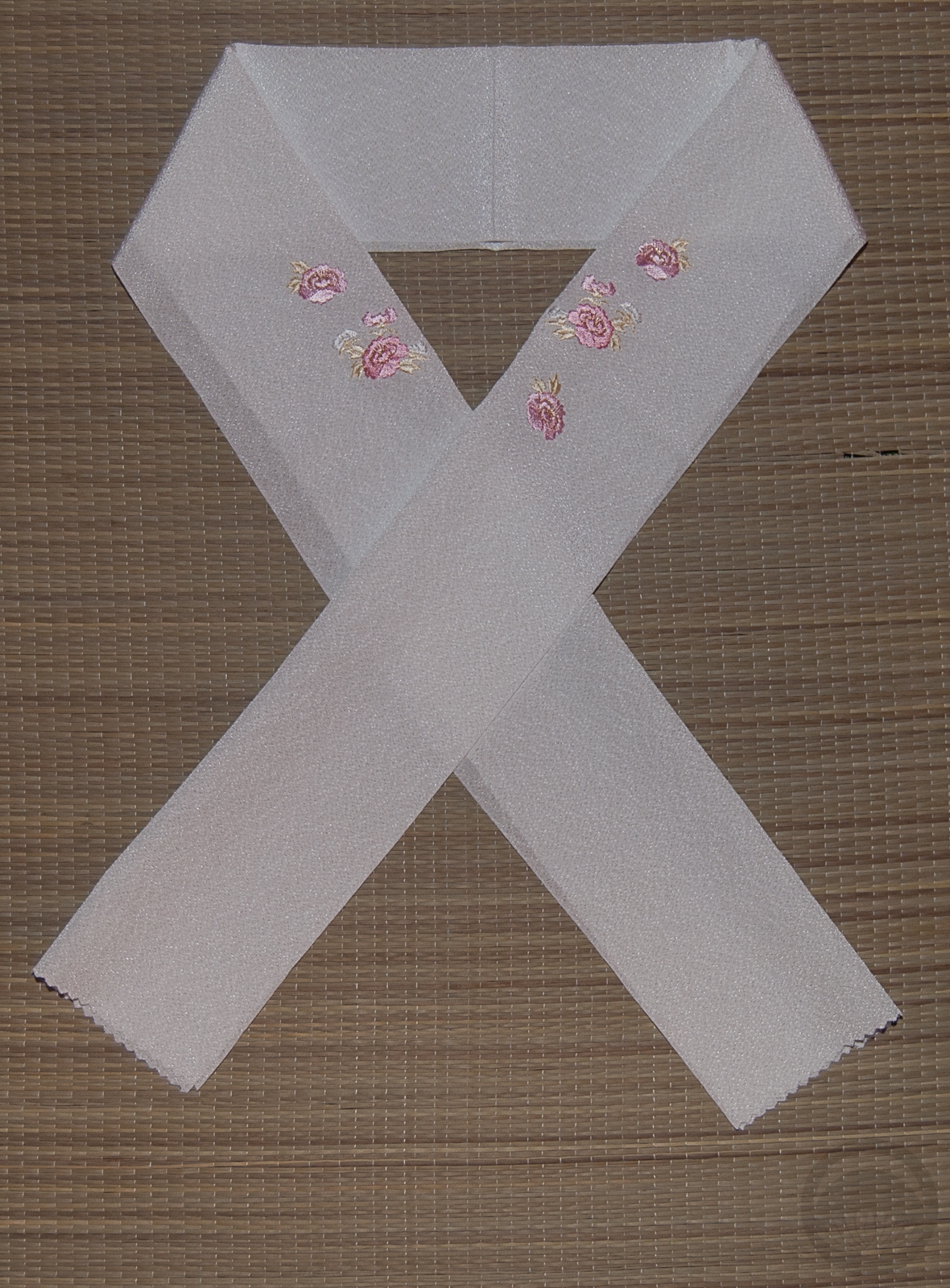
- White and Gold Rinzu
-
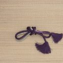
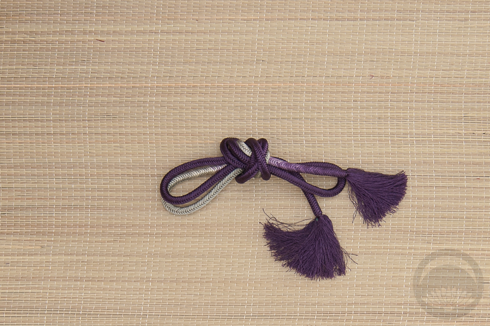
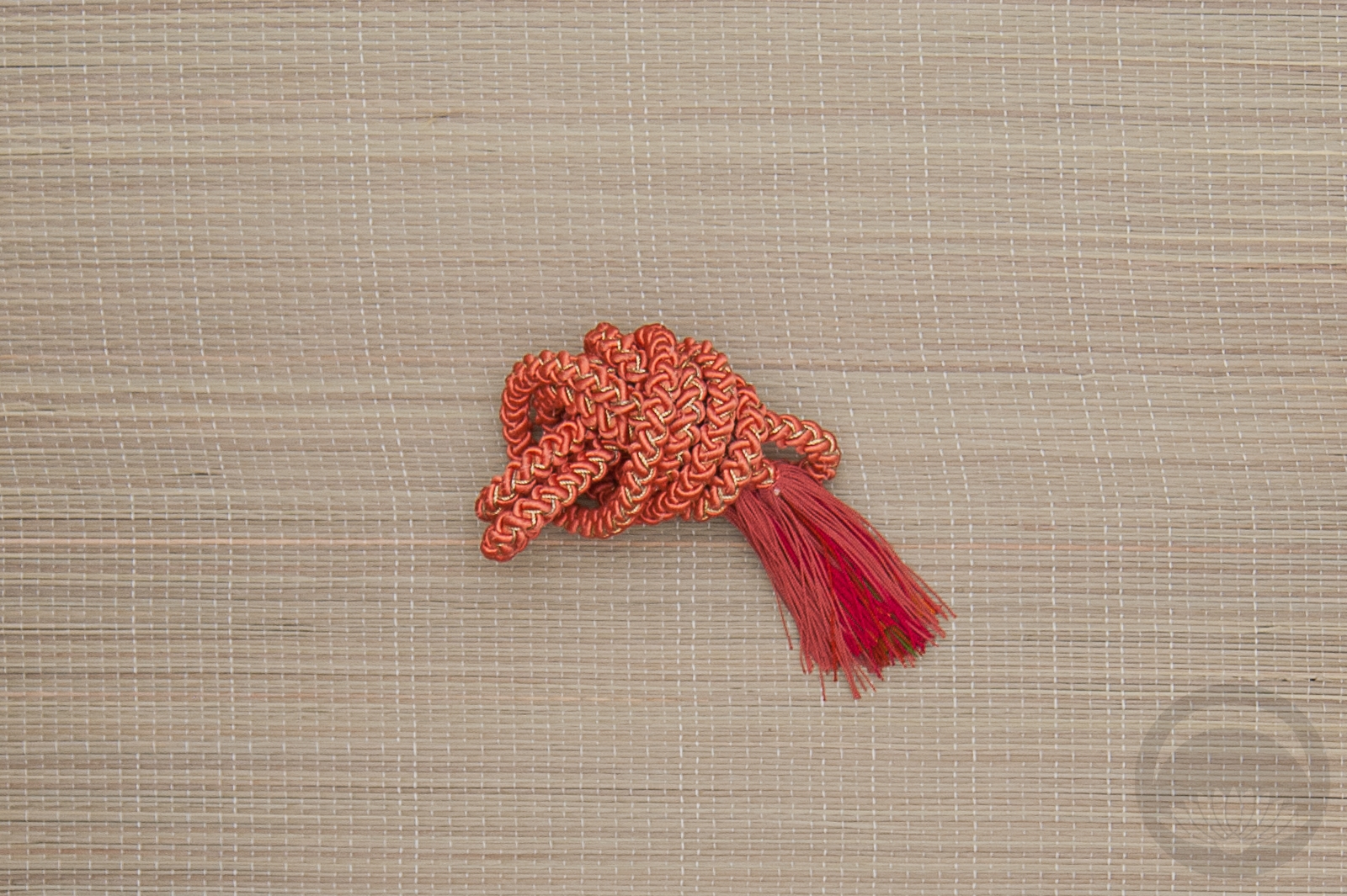
- Shades of Indigo


 Bebe Taian
 CHOKO Blog
 Gion Kobu
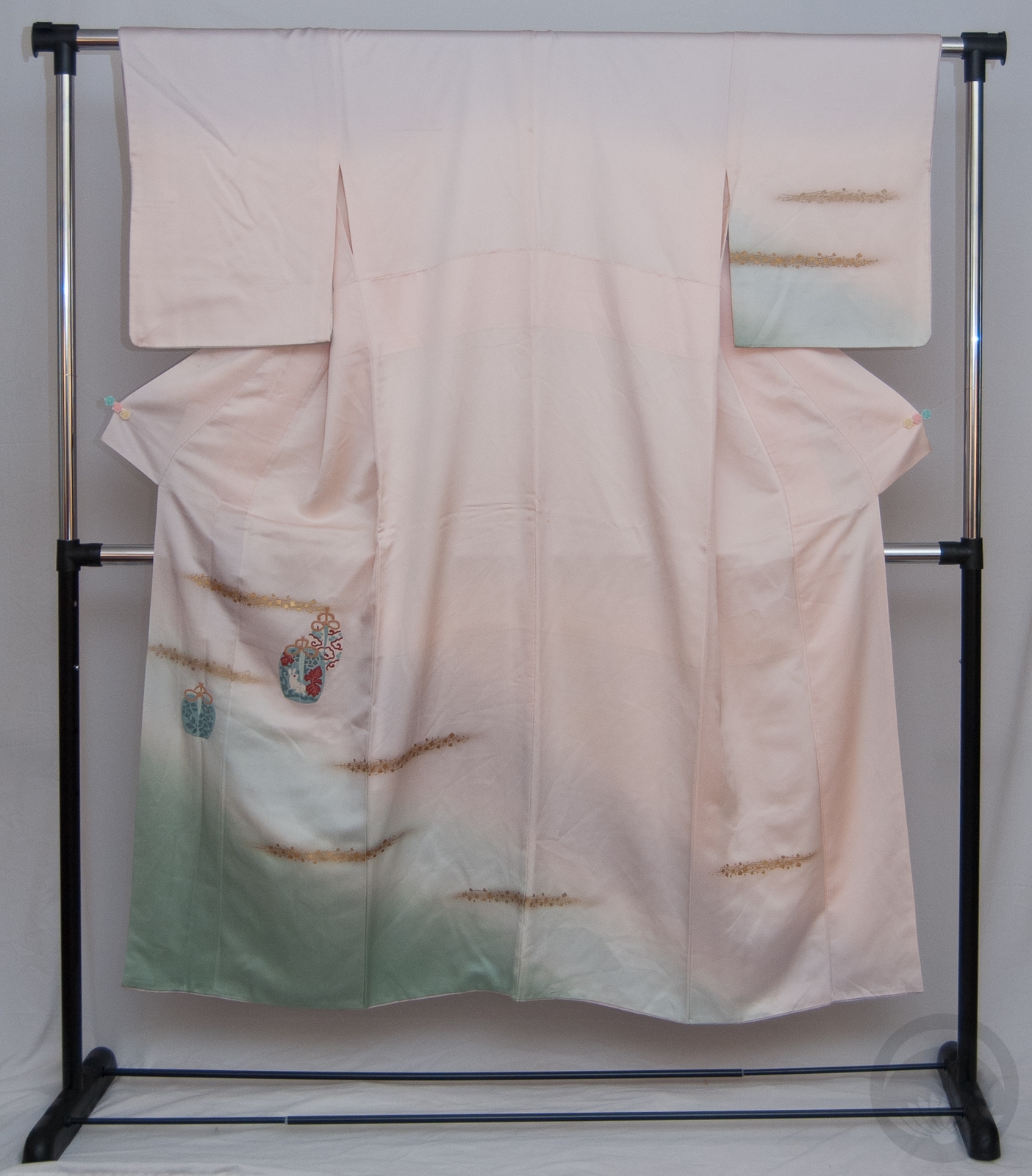