The Seventies called; they want their outfit back

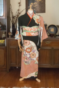
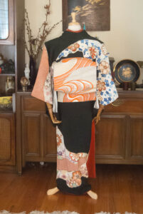
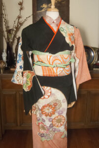
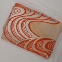
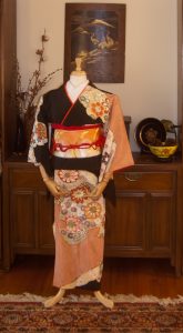
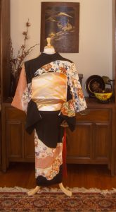
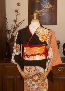
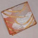
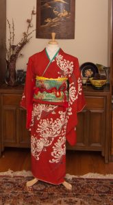
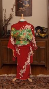
I haven’t used this gorgeous showa-fabulous houmongi Sophie got me for my birthday a while back anywhere near frequently enough. I decided to have some fun with it today, and realised this obi (which I nearly sold! what was I thinking?) is the absolute perfect seventies-style match for it.

As timeless as the shape of a kimono may be, the patterns and colours are just as susceptible to trends as western clothing is. This particular shade of orange, especially paired with gold, and the big warm-toned and almost pop-art flowers, are very emblematic of the middle of the second half of the Showa era, from the late 60s to the early 80s. I could just as easily see this general colour and pattern scheme on a polyester pantsuit as I could on this particular coordination.

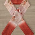
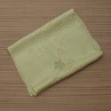
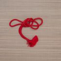
I decided to keep things relatively quiet with the accessories, since the kimono and obi are so flashy already. This soft leafy green picks up the green accents in the design so it seemed like the best choice, but the obijime did get a bit lost against the obi. Then I remembered this padded, decorative little cord I picked up at the Daiso last time I was in California. It’s a bit too thin and delicate to be a functional obijime by itself but it’s absolutely perfect wrapped around as an accent. The black and bold colours just call back to the kimono so well and I’m so happy I remembered I had it!

Items used in this coordination

I’m back!

First of all, I’d like to take a moment to thank you for your patience, support, and faith in me. It’s been a very long few months. As you may know, my bedroom flooded a few months back. Mercifully, my kimono are stored in a separate room upstairs, so they were safe. But my life got turned quite upside-down while my room was being renovated and restored. Then the holidays hit, and as I’ve mentioned before, I work in a toy store so things get very hectic around then. To top things all off, I somehow forgot to put my anti-depressant/anti-anxiety medication in my pill organiser at the end of December. If anyone’s gone off anti-depressants cold turkey, you know how rough it can be. I did that without even realising what I’d done wrong, so January was a very, very hard month for me.
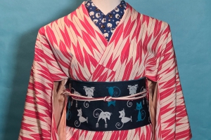
Thankfully, that’s all behind me now. My room is complete, work has definitely quieted down, and my medication is stable again. I knew it was time to get back into the swing of things and start blogging properly again.

I received this gorgeous kimono as a birthday gift from Sophie back in November, and I think it was the perfect piece to use to celebrate my return. I love the variety of colour and pattern, and I’m always a sucker for black-based kimono that aren’t kurotomesode. It came with the red date-eri already attached, so using more red accessories was a no-brainer. I felt that the orange and gold obi had a similar showa-fabulous vibe, and the colours are very harmonious. It’s not a risky or adventurous coordination by any means, but it works well.

Honestly, I was worried I’d be rusty and out of practice, but kitsuke really is like riding a bicycle. After a few minutes, the muscle memory just takes over.

I also have some exciting news to share. Costume-Con 38 is taking place here in Montreal next month and I will be doing three panels; two kimono dressing workshops and one lecture on the history and evolution of kimono. If you’ll be attending, I’d love to see you!

Thank you again if you’ve stuck around during my little break, I really do appreciate the support. <3

Items used in this coordination

Showa Fabulous Christmas in July

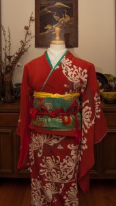
It’s still hotter than the surface of the sun here in Montreal, but I was determined to see if I could turn my han-darari tsuke obi into a passable fukura suzume bow in preparation for the Otakuthon fashion show. I figured while I had the mannequin and obi out, I may as well go all-in and change her outfit. This isn’t going to be a full outfit in the show but it’s good practice and visualisation for something that’s in the works.

The obi has such a gorgeously shiny showa fabulous feel to it that it felt like the perfect time to bust out my precious post-war kiku houmongi. I went with gold, red, and green accessories, and while I worried initially that the outfit would feel Christmassy, it actually worked out really well. Besides, Christmas in July might help me feel a little bit cooler!

As for the obi experiment, it definitely worked in theory. I just need a few more himo to make things a little tidier, but I’ll definitely be able to pull it off properly for the show on a real model, and I’m thrilled.

Items used in this coordination

Vibrant Vintage

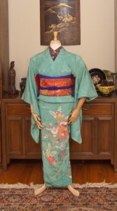
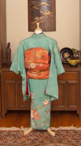
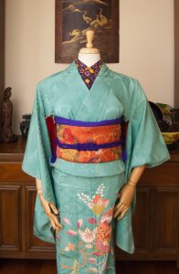
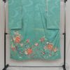
For someone who keeps telling herself she doesn’t need more kimono, I sure do keep ending up with more kimono. But when I saw this gorgeous vibrant turquoise Taisho irotomesode on Ichiroya recently, I knew it had to come live with me. This piece is not in great shape, admittedly. It’s got sun damage that leads me to believe it was folded and then stored badly at some point in its life. But I was just so in love with the colour that I couldn’t pass it up, and it became my tax refund gift to myself. It’s also incredibly small, bordering on too small for the mannequin even, so I have no delusions of ever being able to wear it even if I lose weight. Alas. 🙁

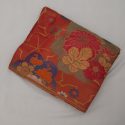
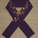
I knew immediately that I wanted to pair it up with this bold orange nagoya obi that really pulls out all the gorgeous warm tones in the hem design of tachibana and kaioke. My initial instinct was to go for more muted accessories, including an obijime that has nearly the same shade of turquoise, but then I remembered I have this bold haneri with tachibana in the same colours as the obi and just ran with it. I love the emphasis the rich purple tones bring to the whole coordination. I will definitely be revisiting this kimono soon with a more gentle and subtle coordination, but I really do love how bold and vibrant this turned out.

Items used in this coordination

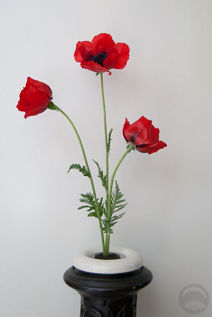
Vibrant Poppy Ikebana

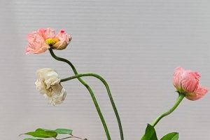
More beauties from our garden – this time it’s these stunning, vibrant poppy blossoms! Poppies hold a special place in this household, for multiple reasons. My mother’s name is Poppy, and my parents met in the Canadian Armed Forces, so the poppy also represents remembrance. There are poppy-themed items all over our house, I have poppies incorporated into one of my tattoos, and of course my mother planted some in our front garden.

I really wanted this piece to be a very simple and clean arrangement with no clutter. I went for a traditional format inspired by what I learned of the Sogetsu school style at the workshop I attended a few months back. A plain white vessel and black pedestal serve to anchor the whole thing while ensuring that all the focus remains on the blossoms themselves. And look, no screen today! Don’t worry though, it’ll definitely be back soon.