
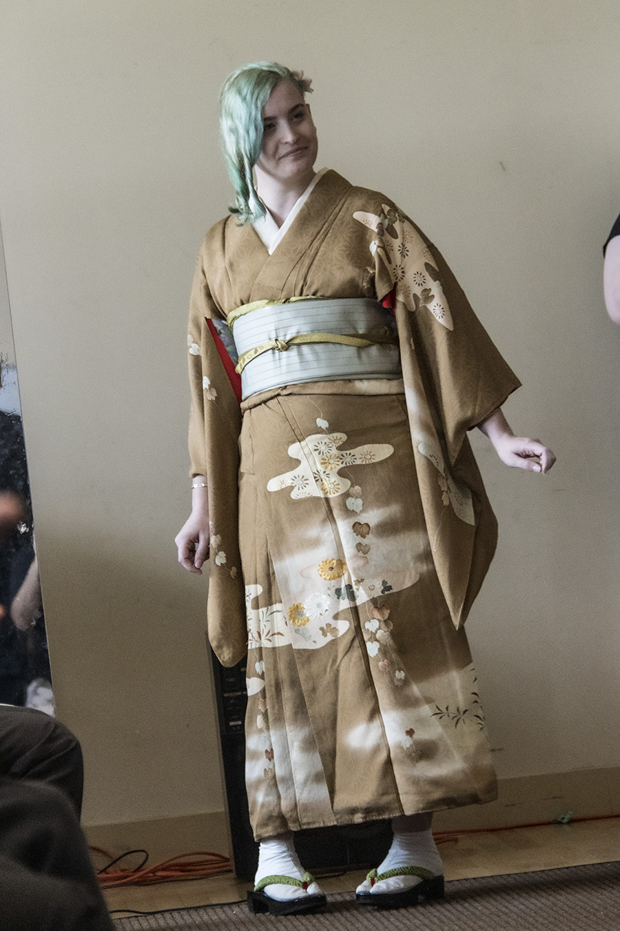
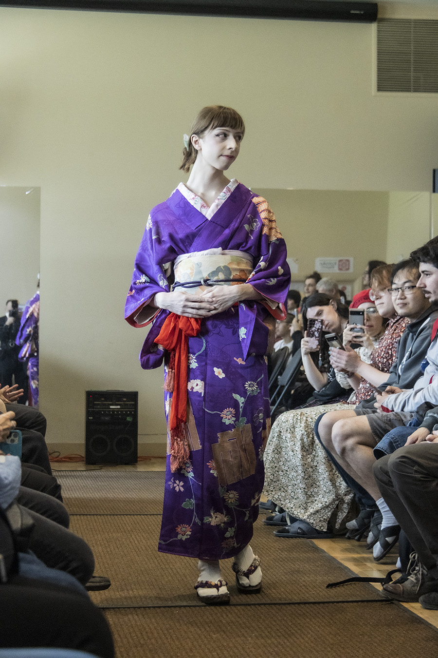
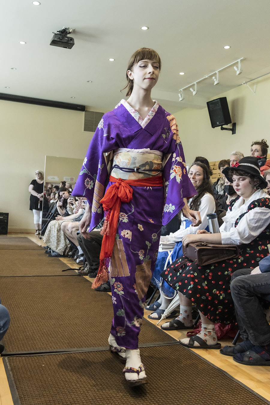
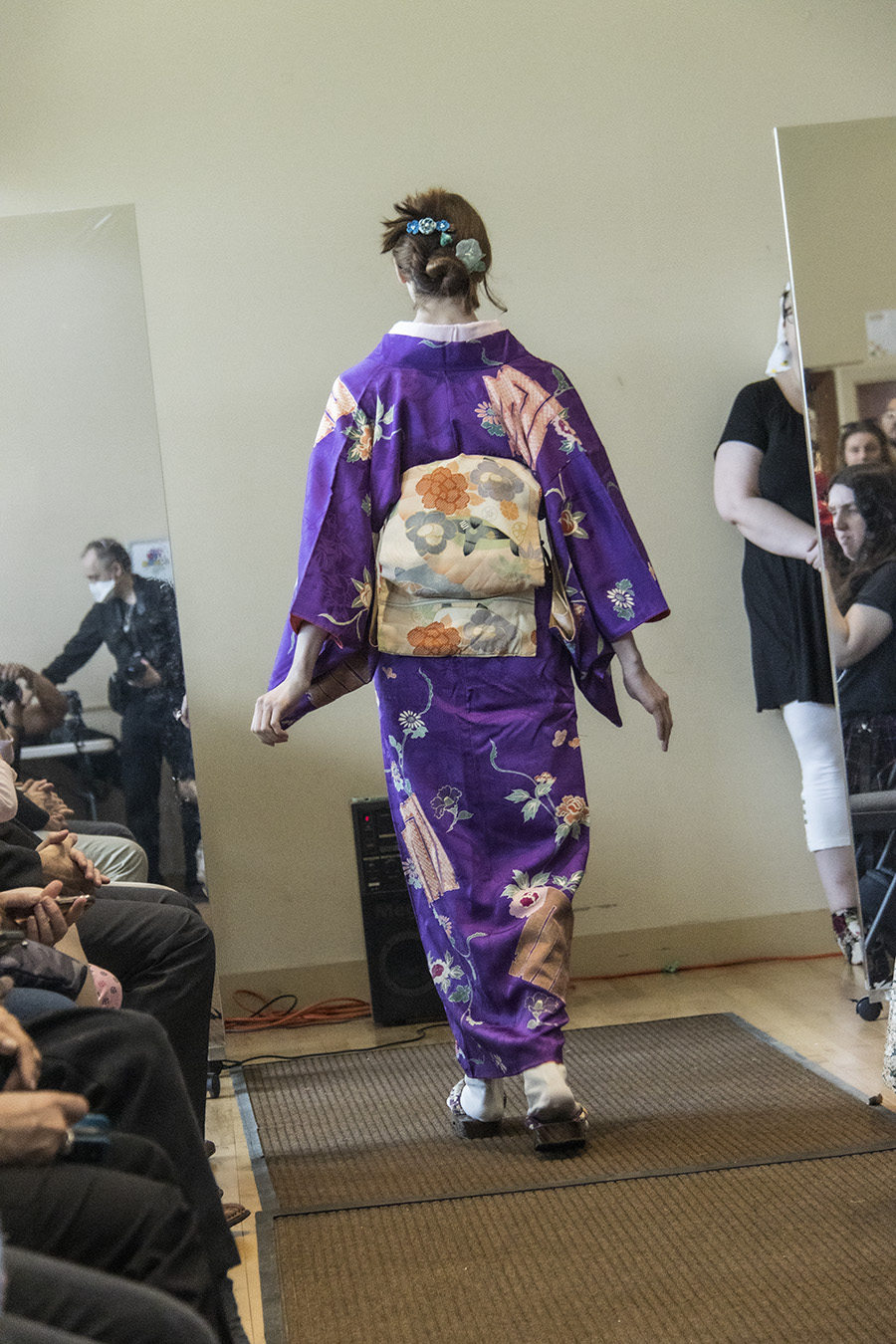
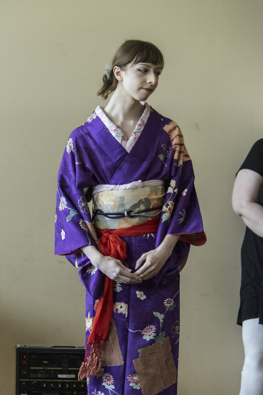
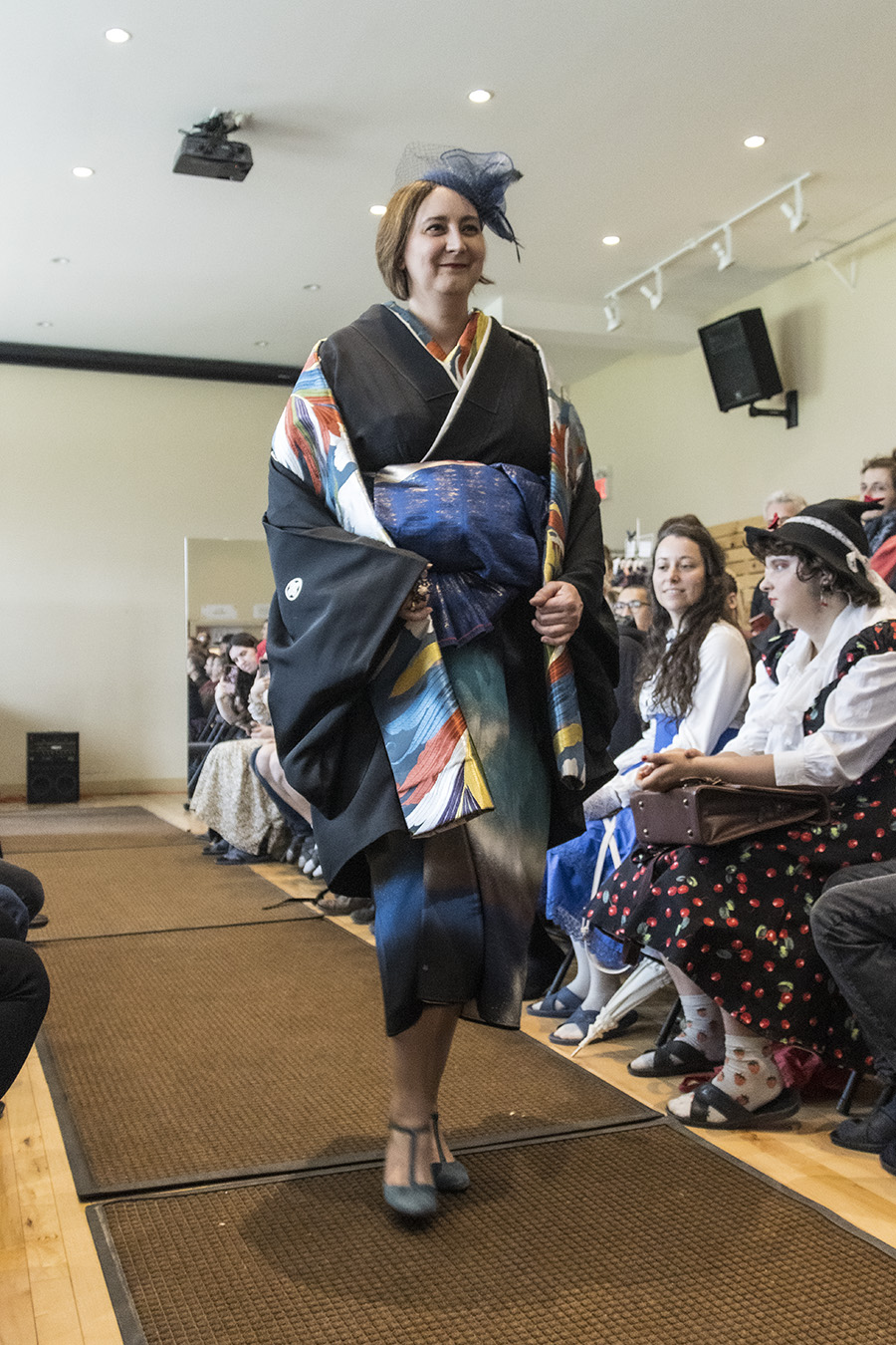
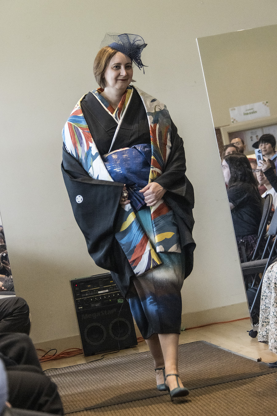
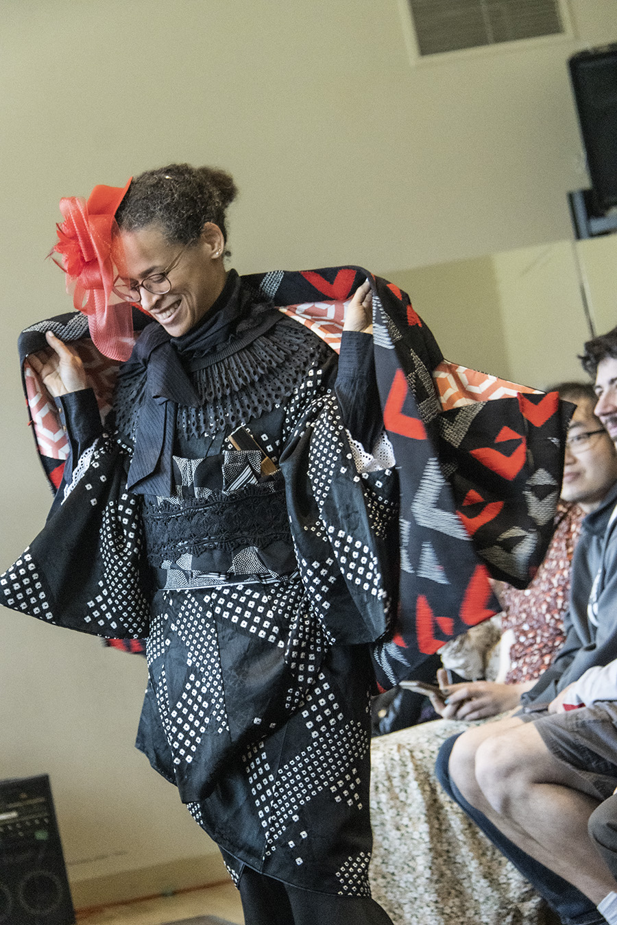
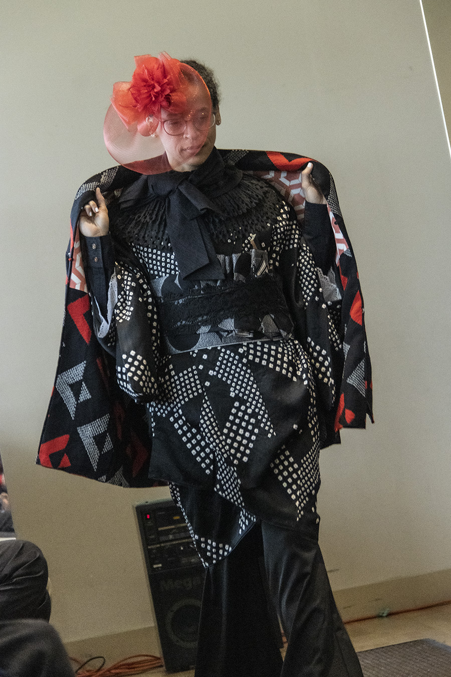
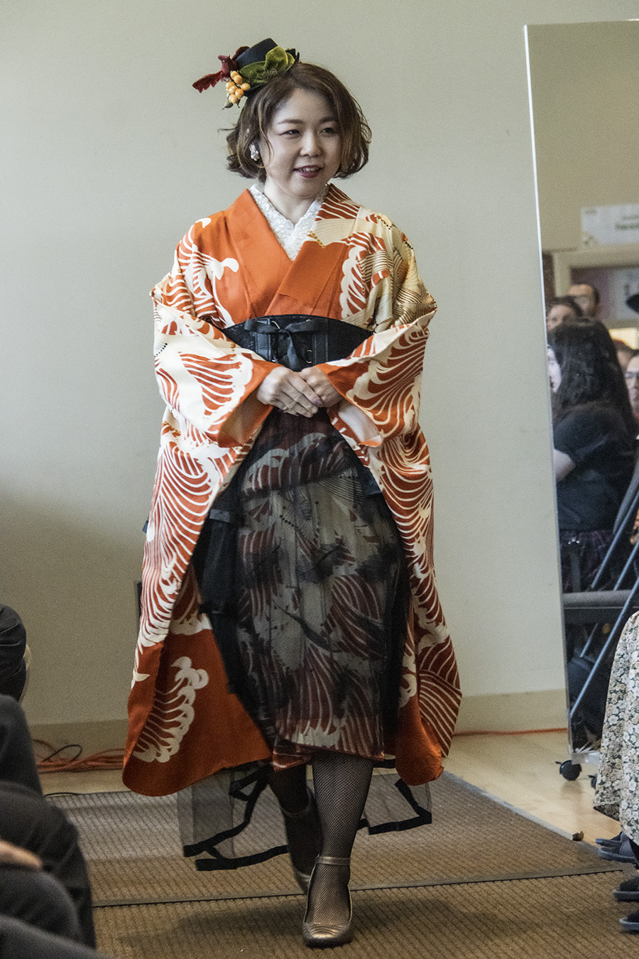
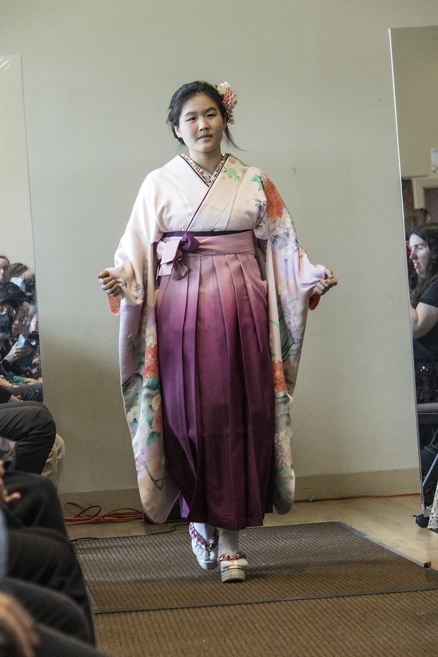
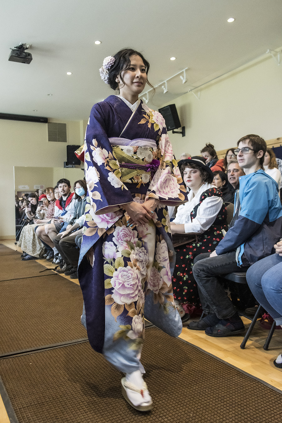
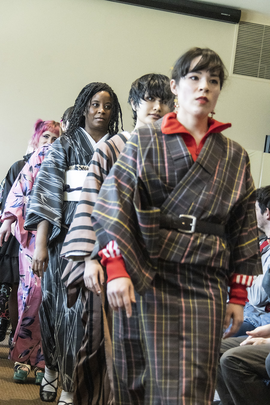
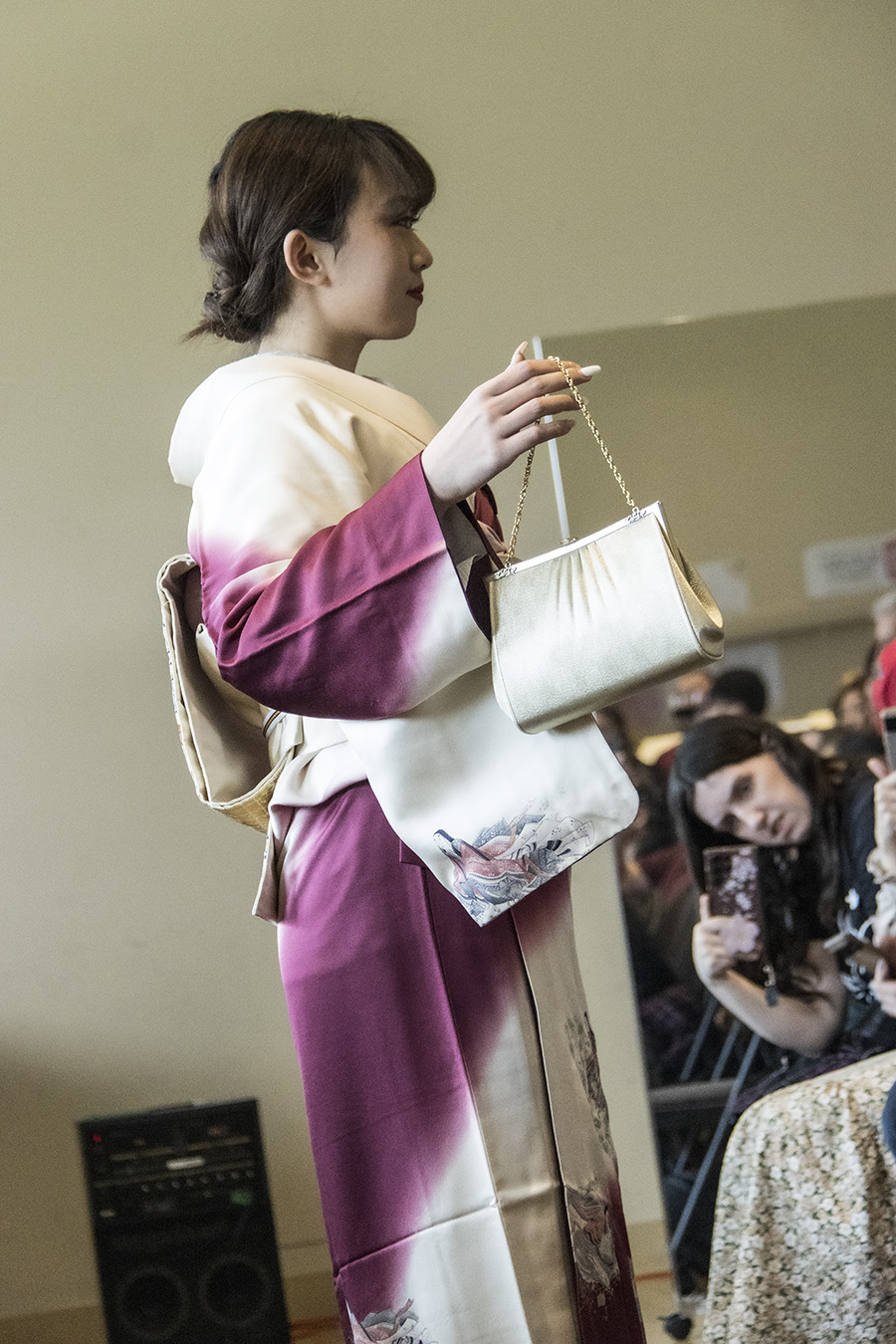
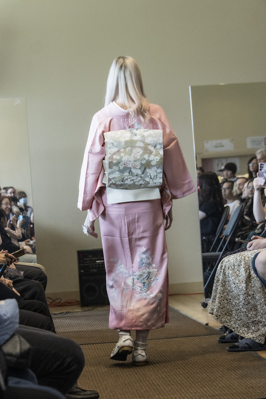
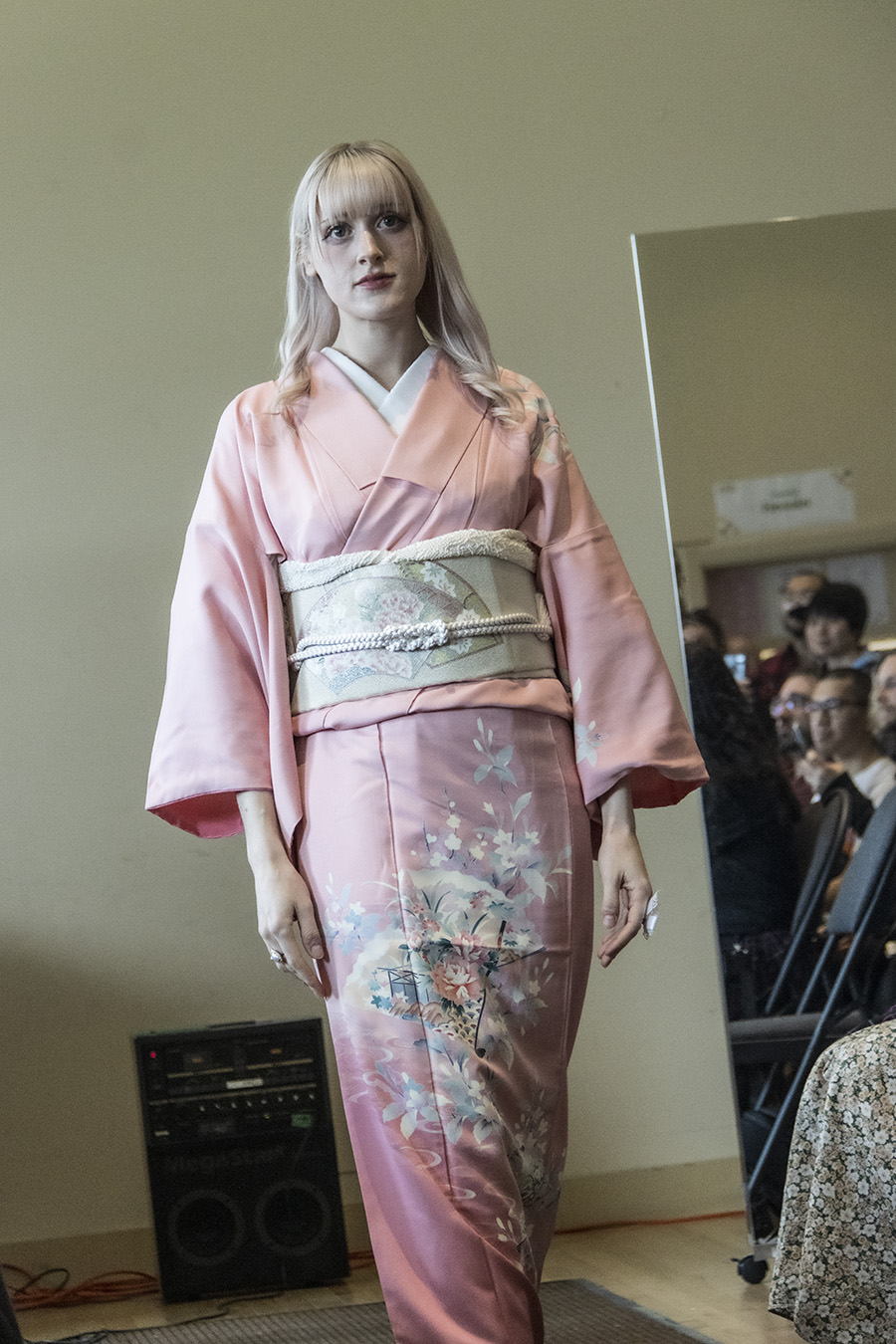
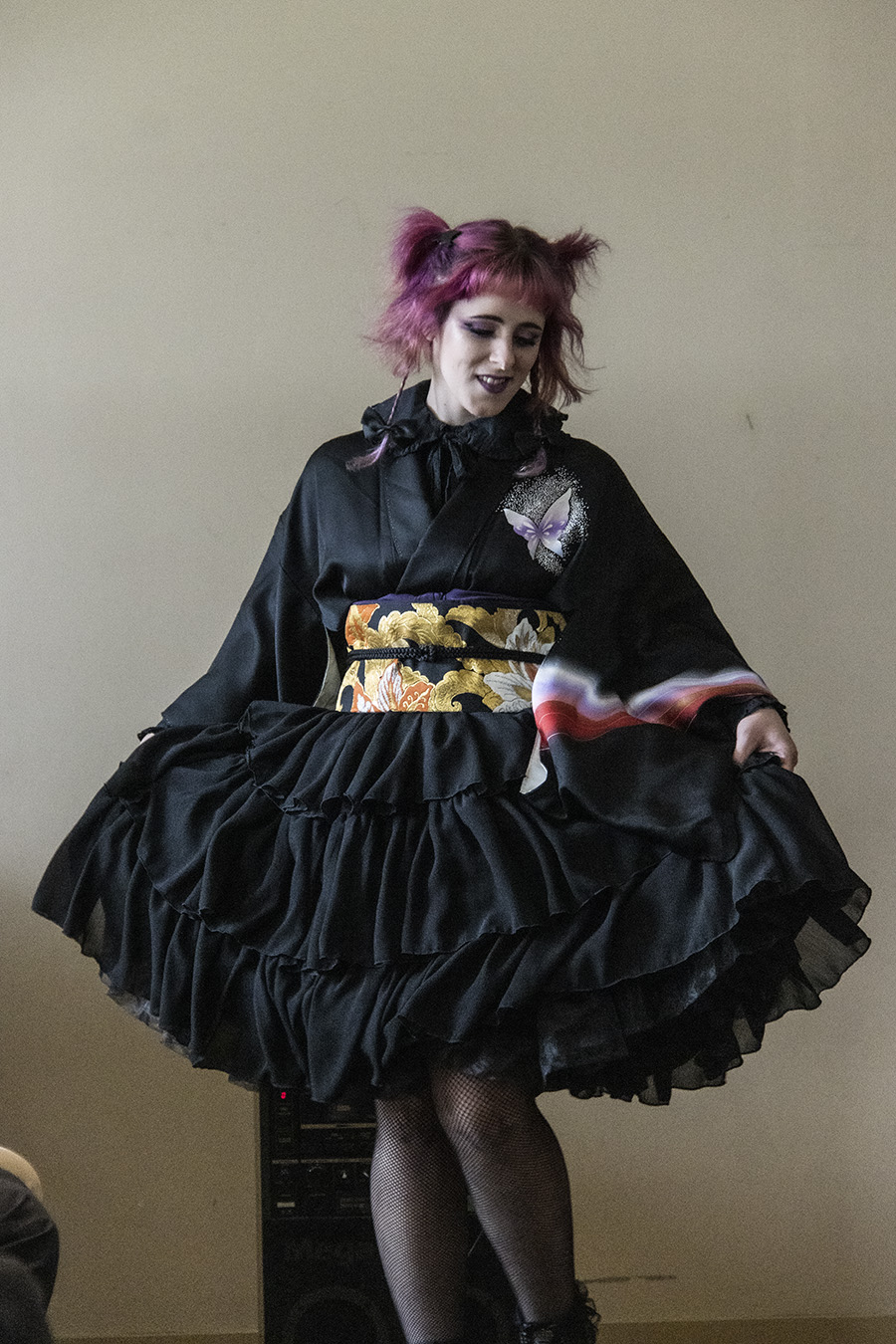
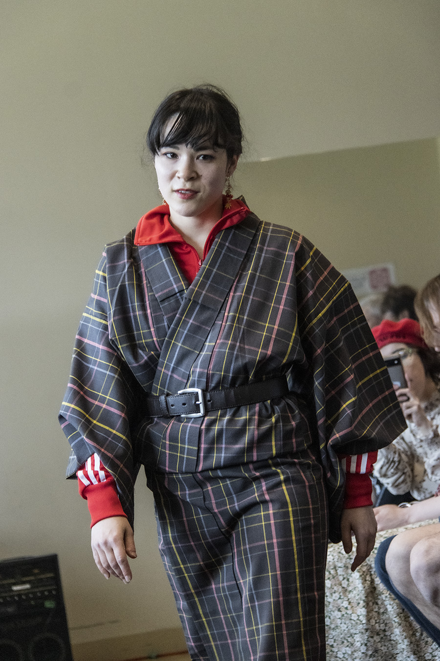
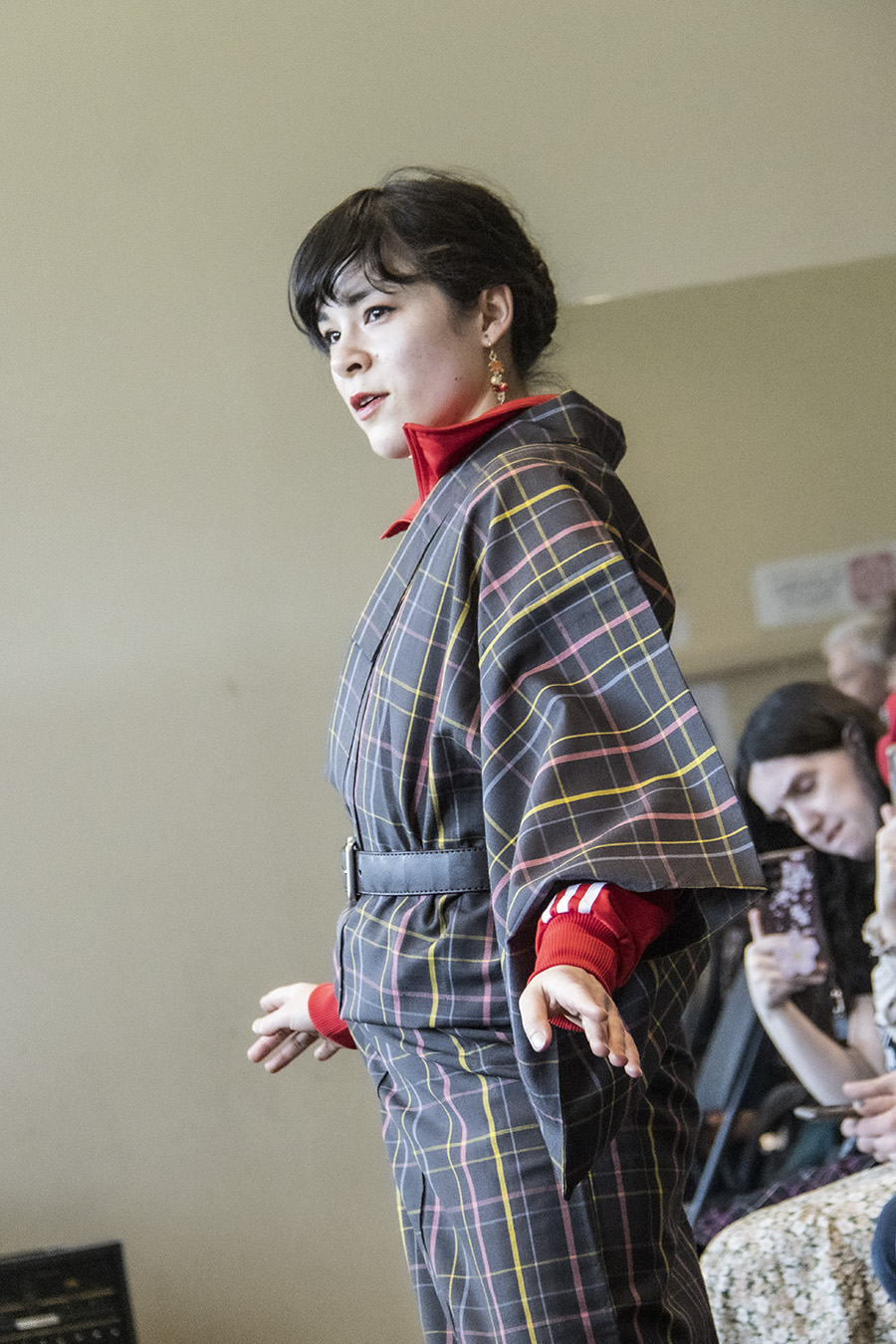
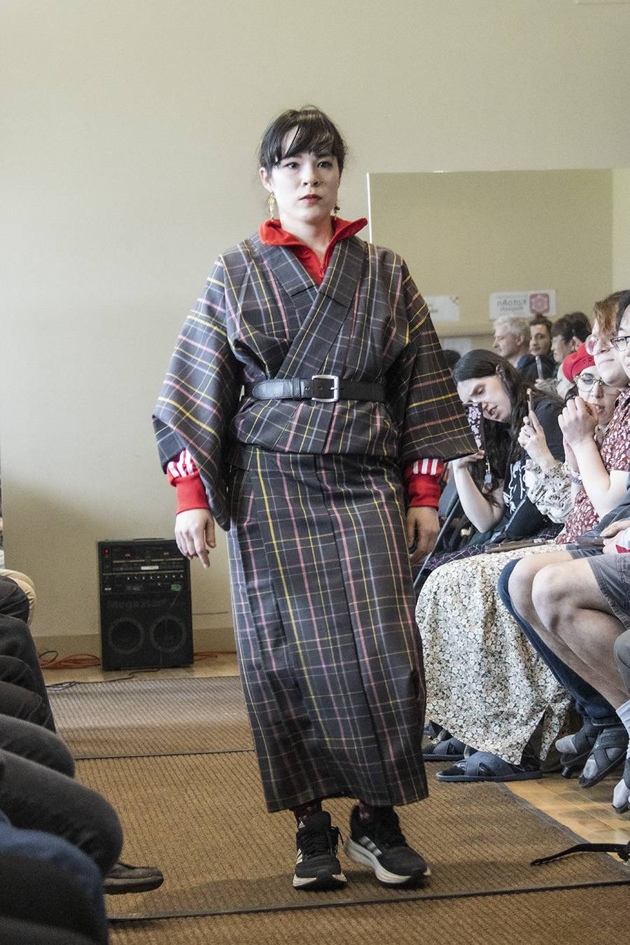
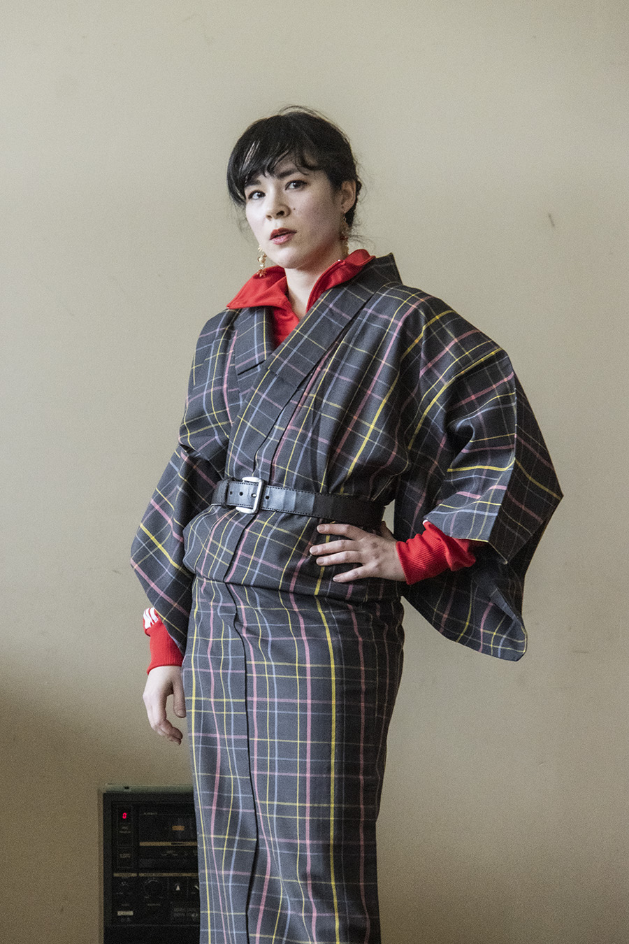
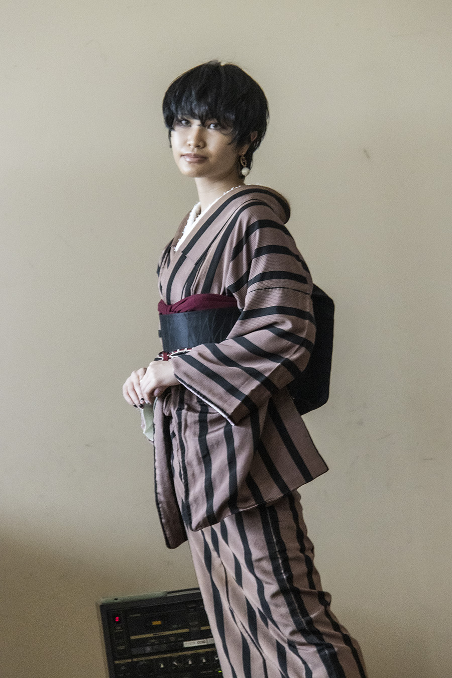
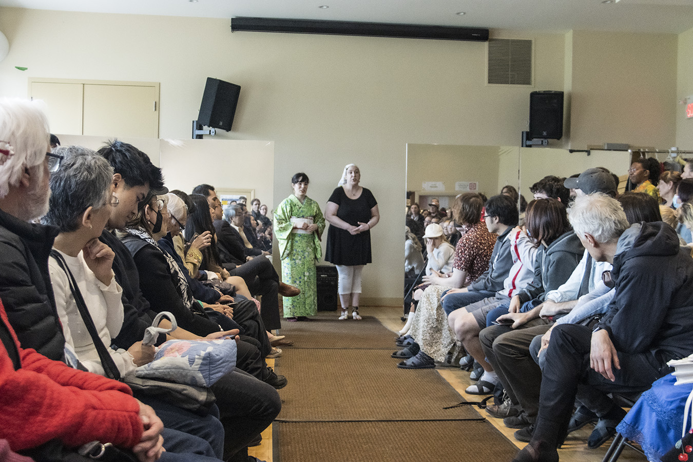
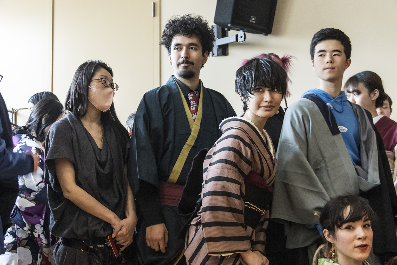
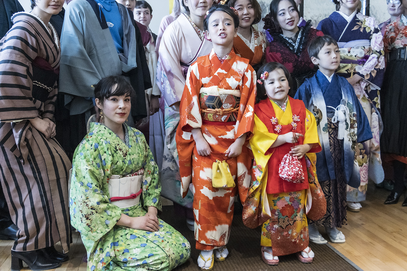
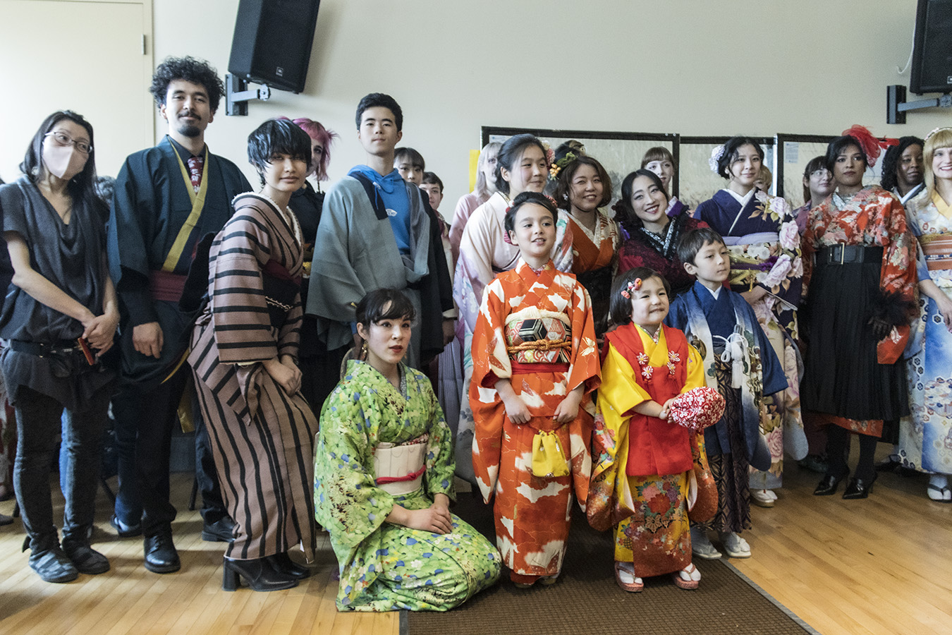
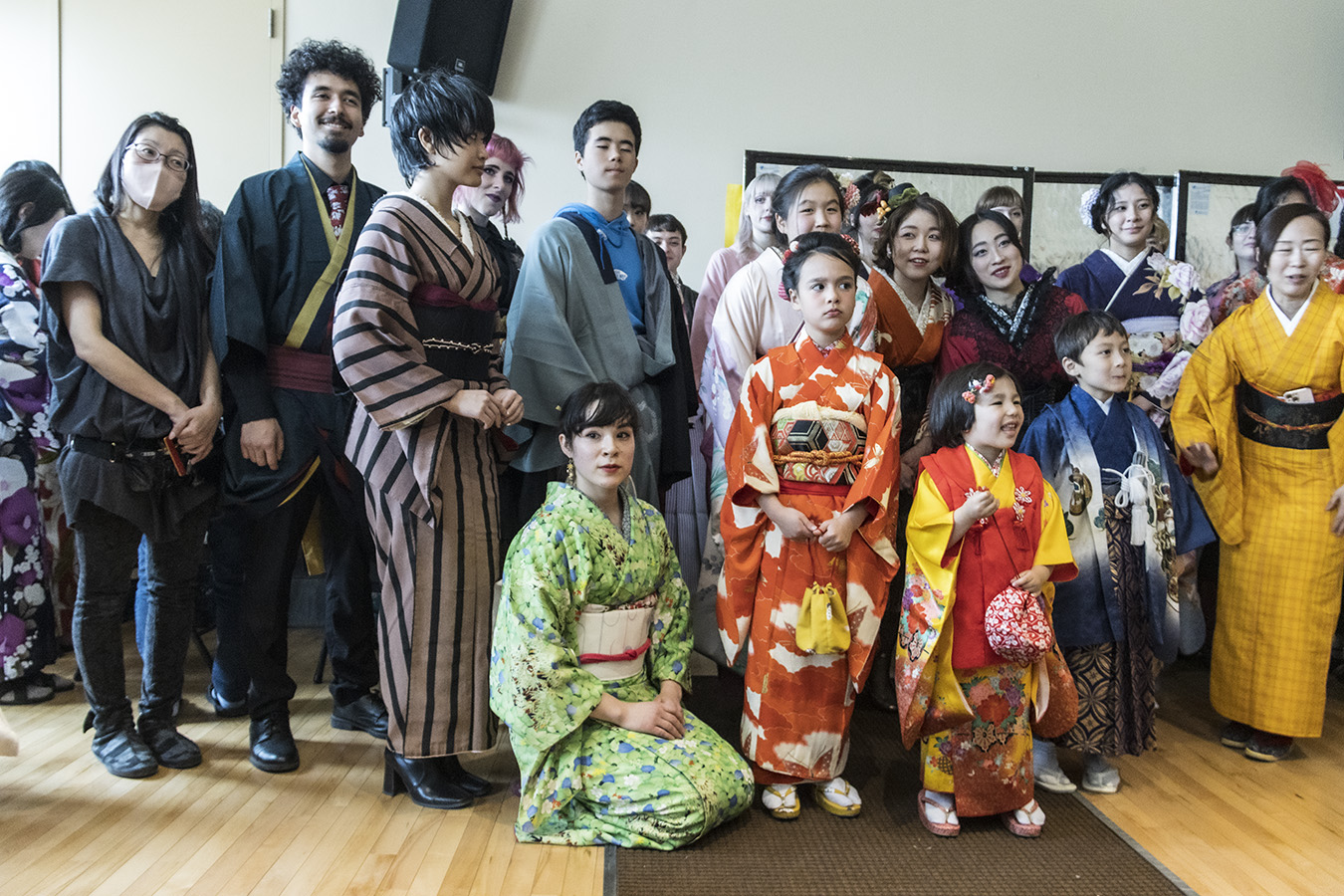
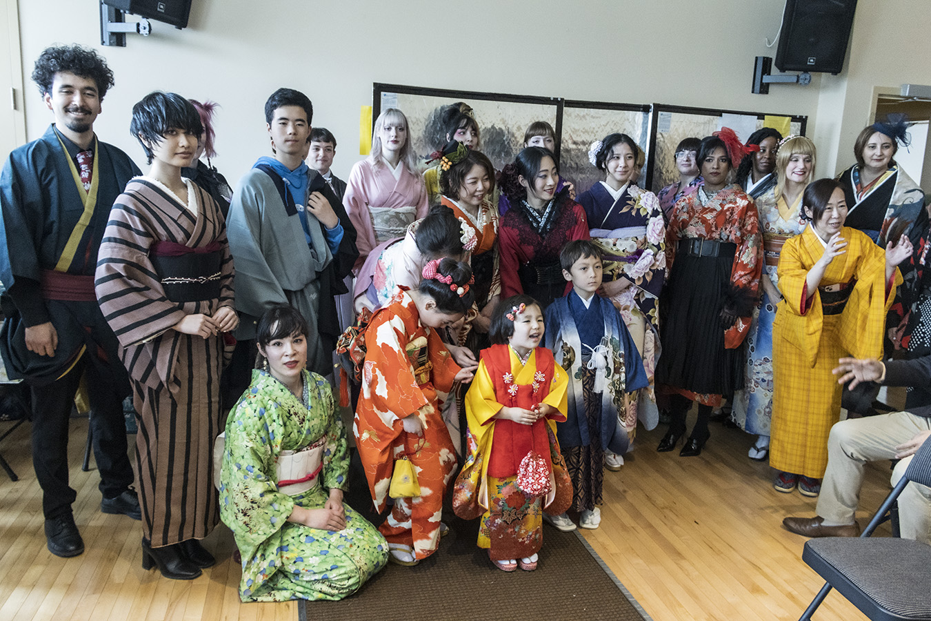
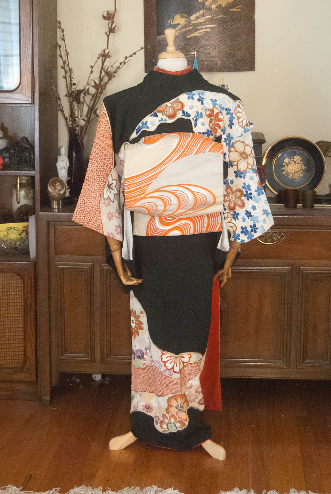
In the more than two decades I’ve been studying, collecting, and coordinating kimono and Japanese arts and aesthetics, one thing I still find myself struggling with is Japanese colour palettes. I studied graphic design before I fell into this little rabbit hole, and my colour sensibilities are innately Western.
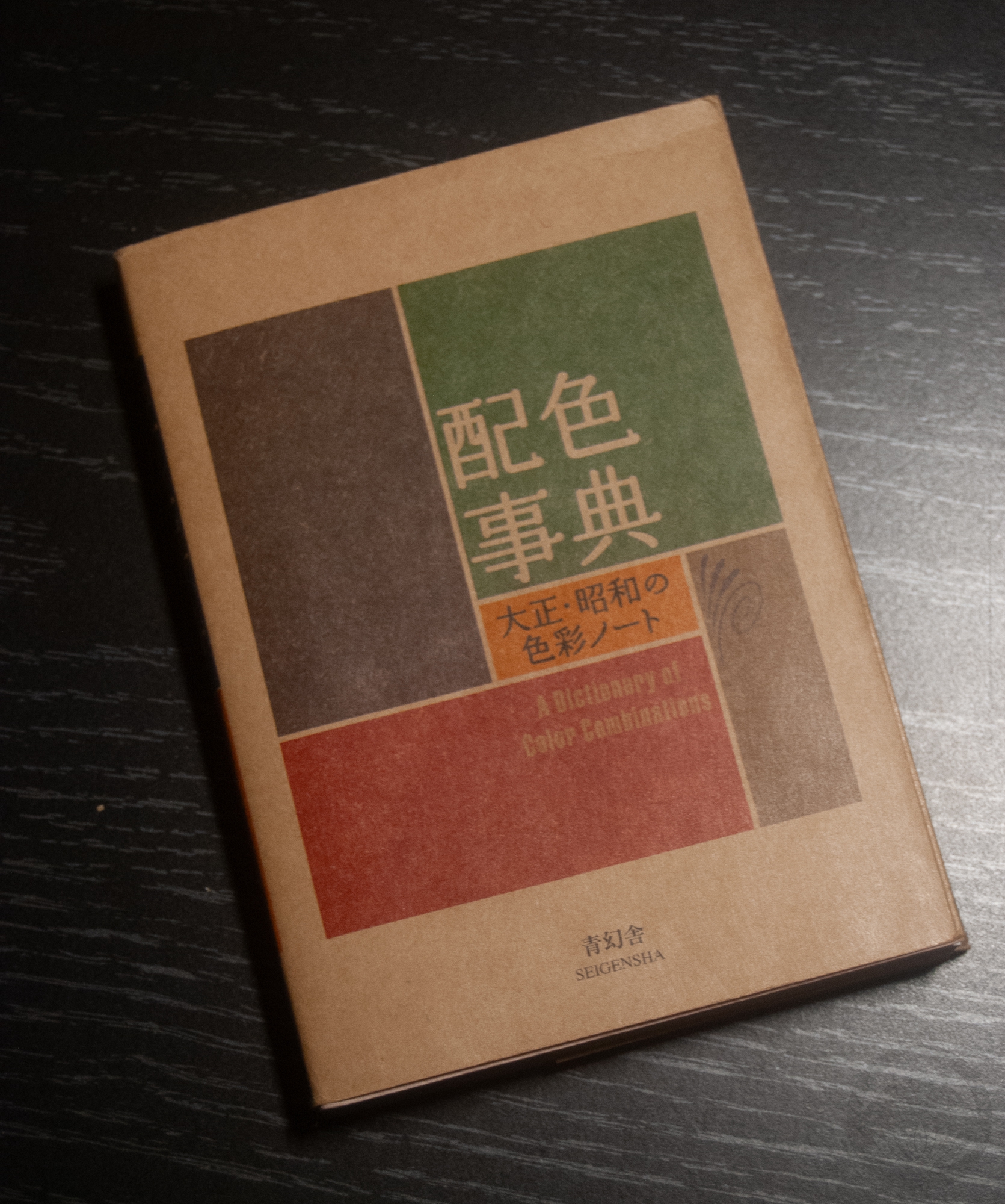
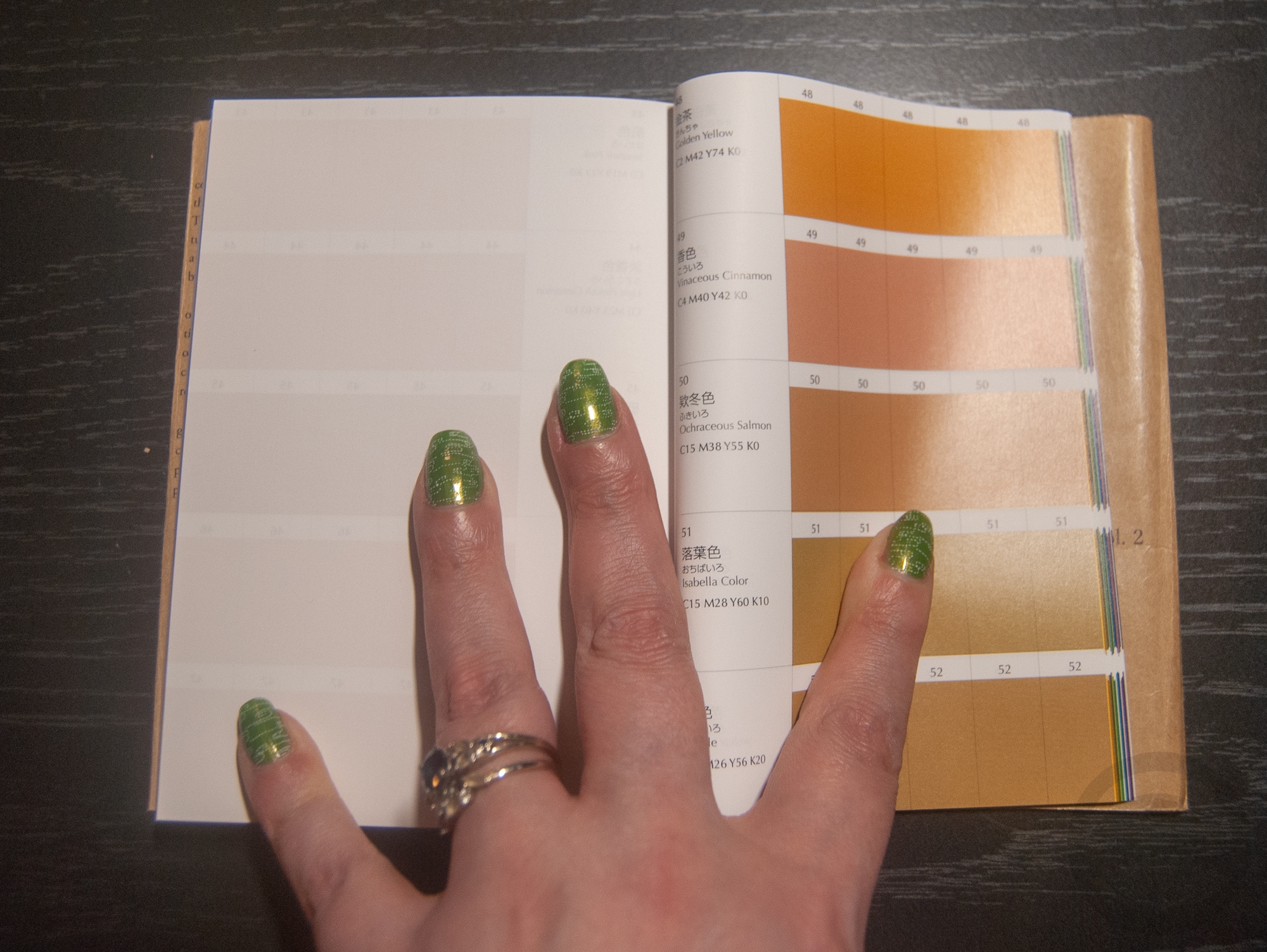
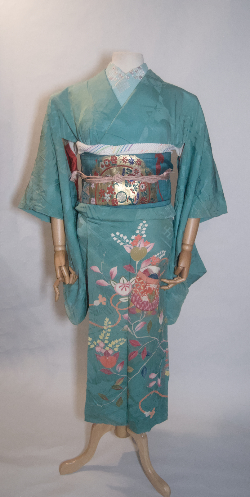
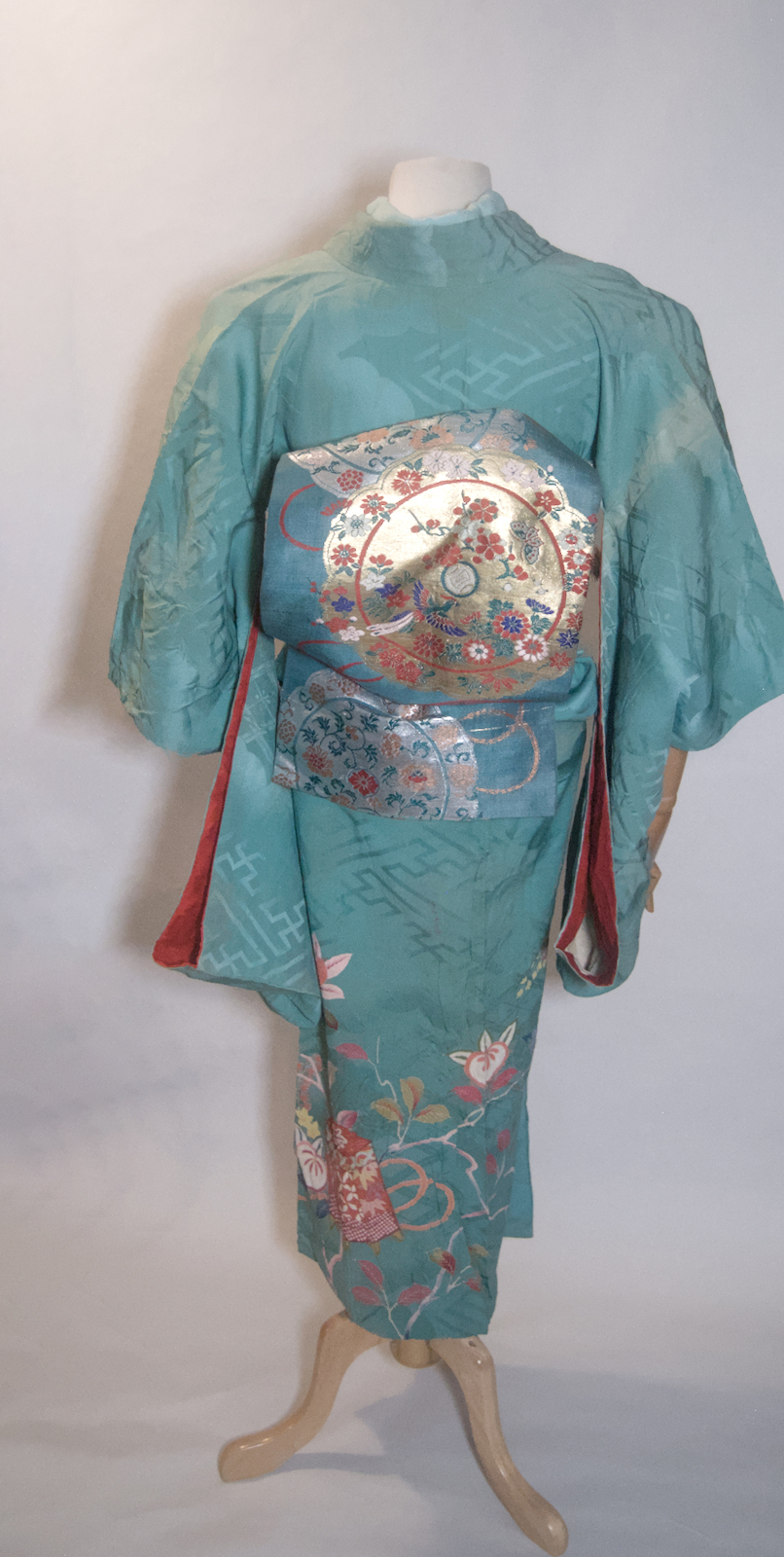
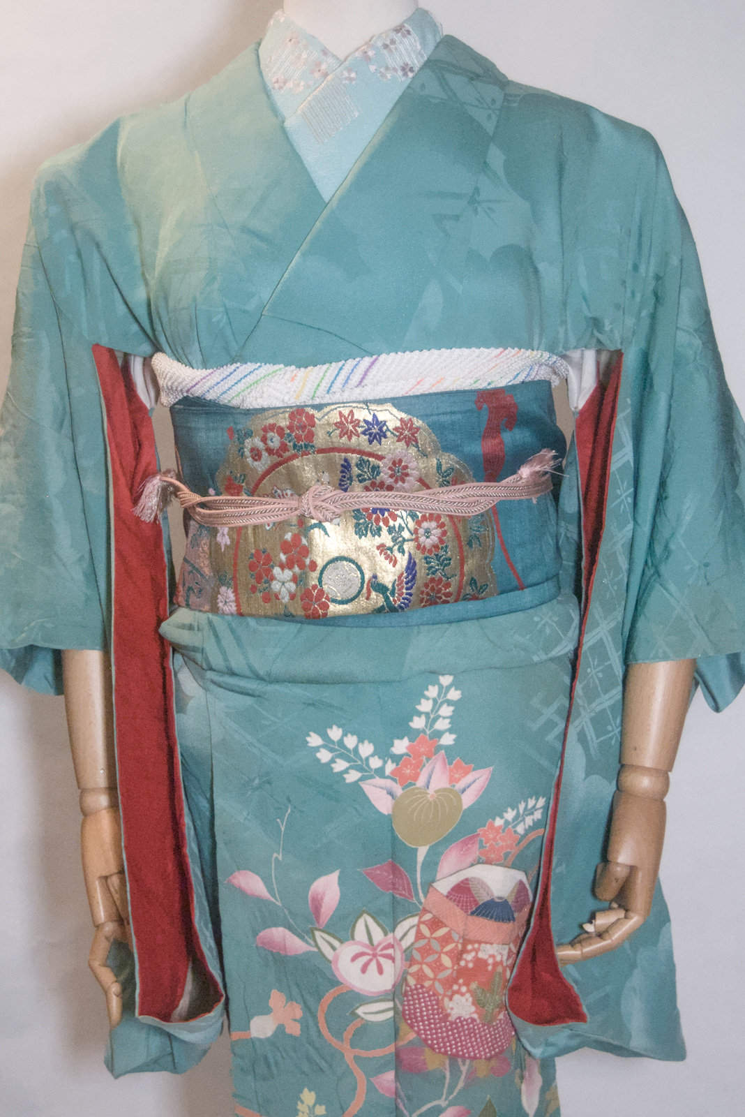
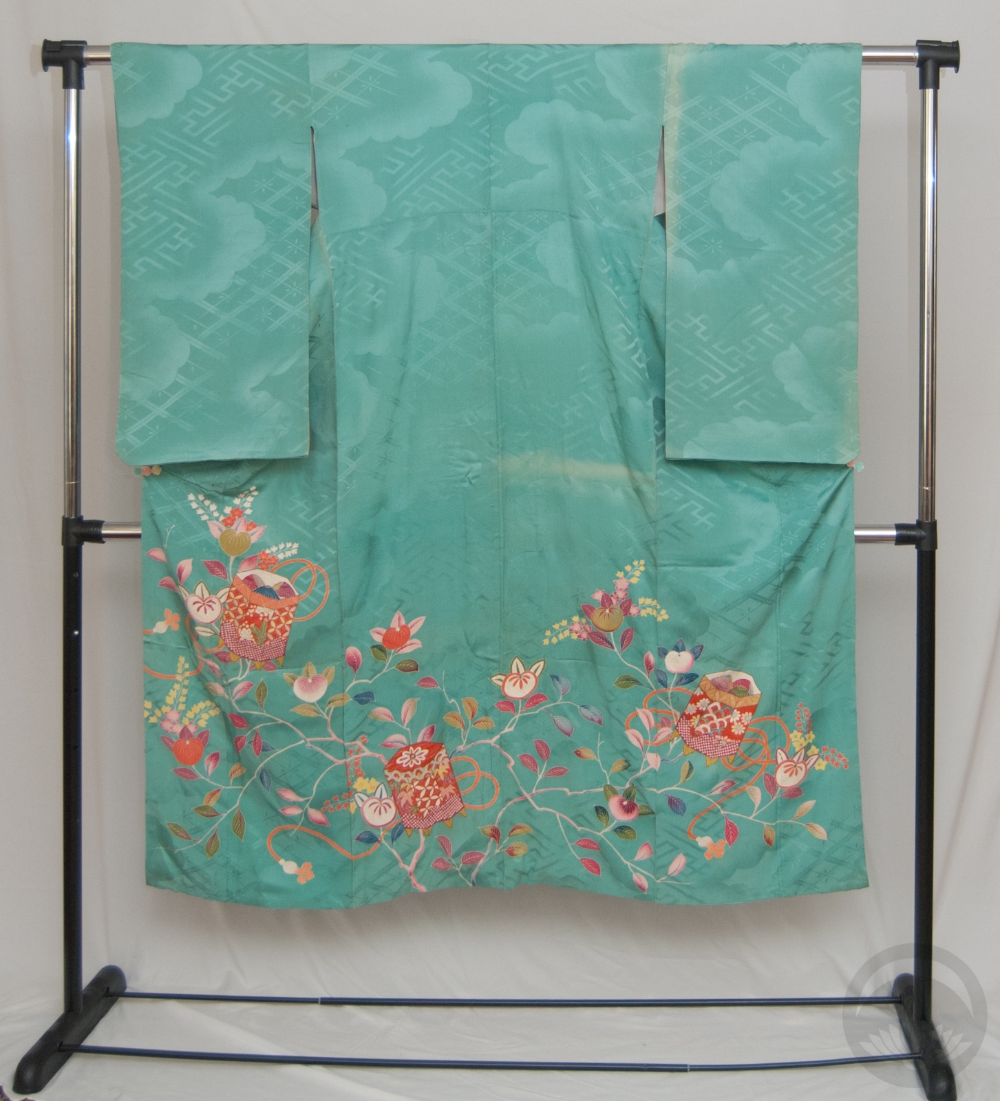
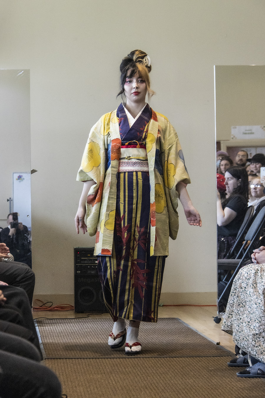
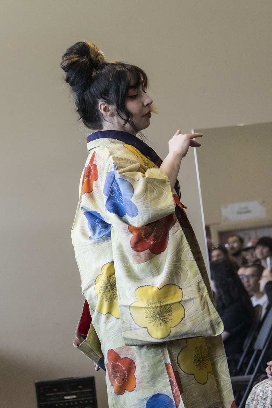
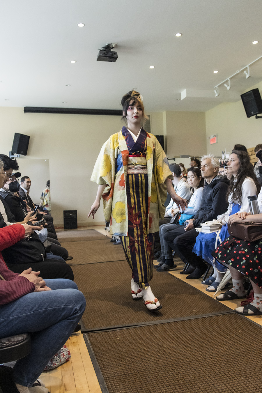
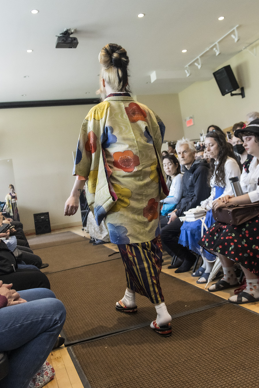
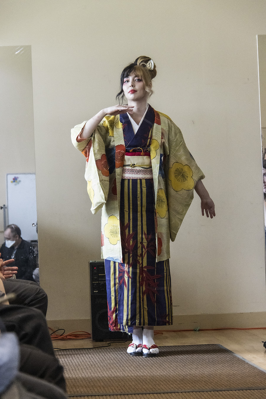
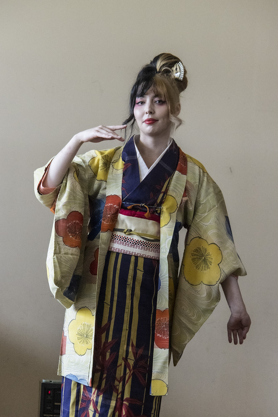
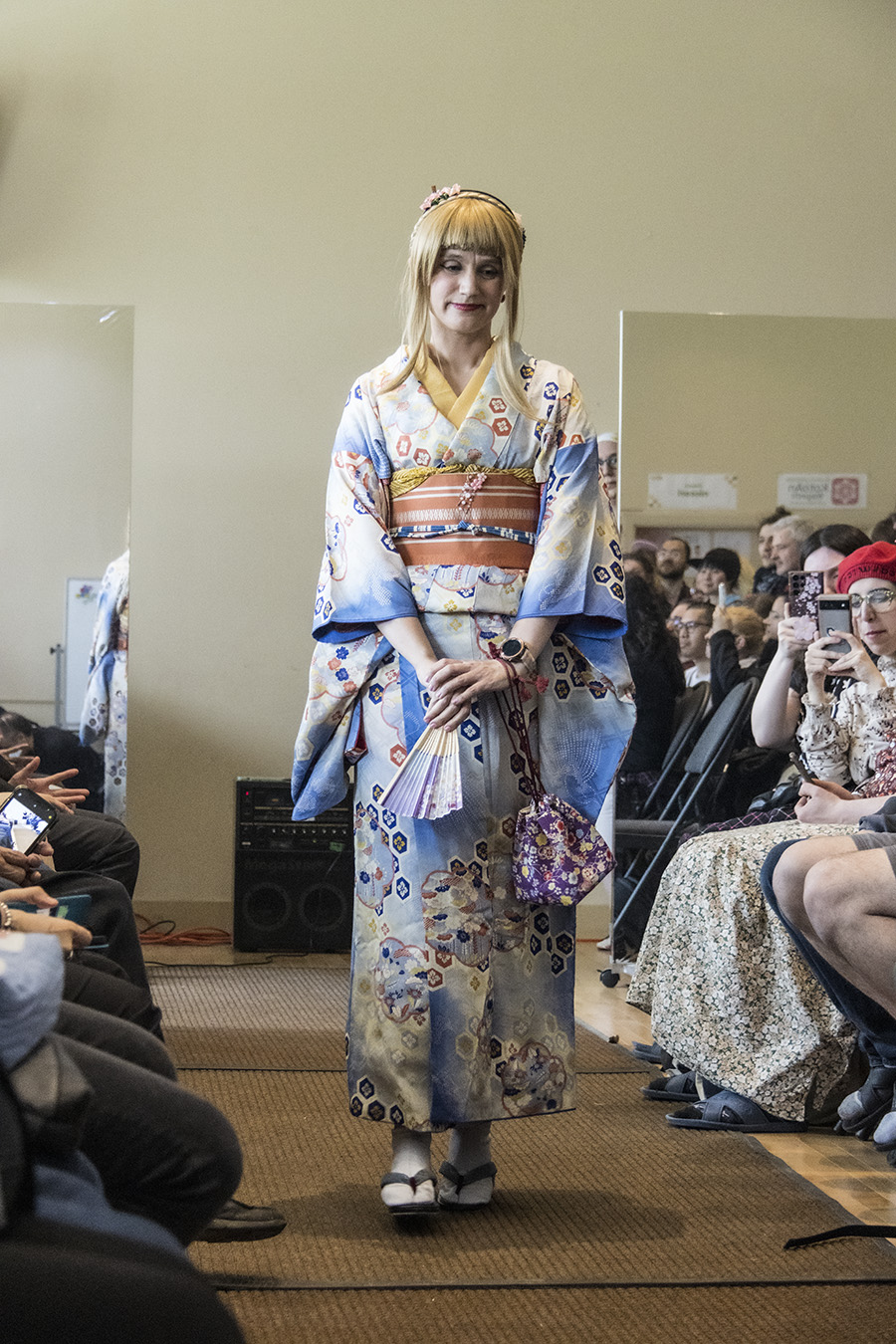
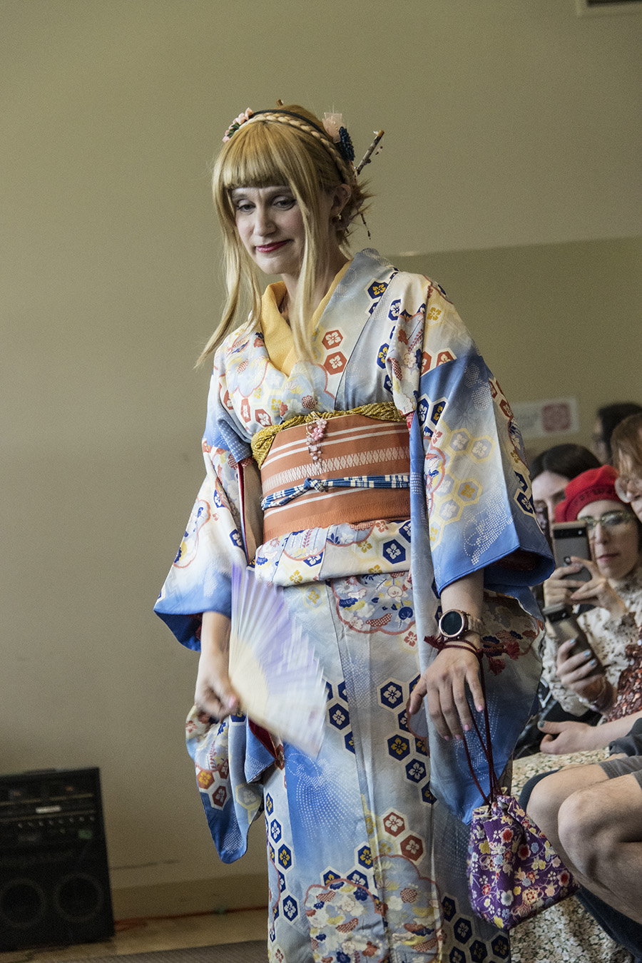
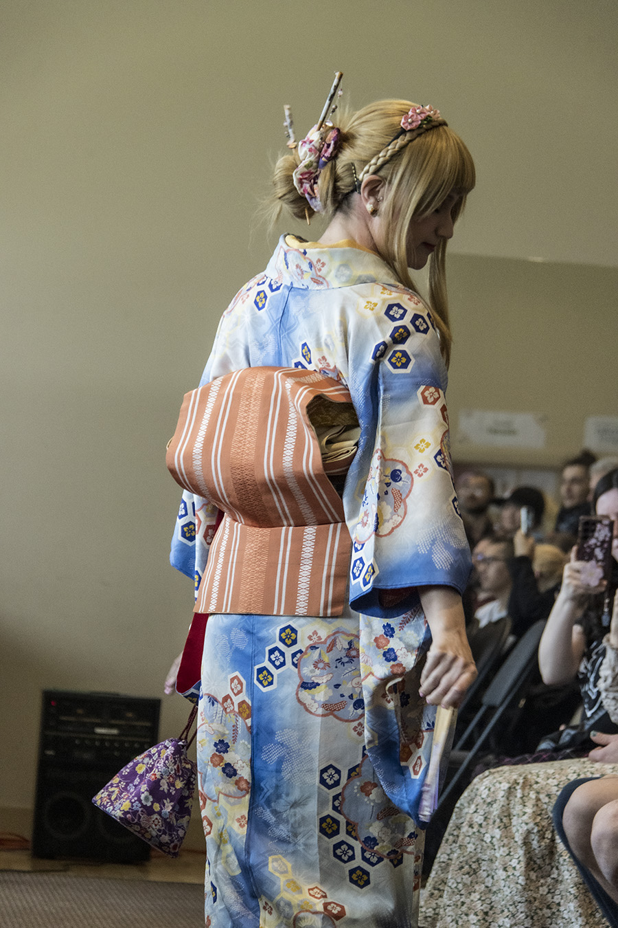
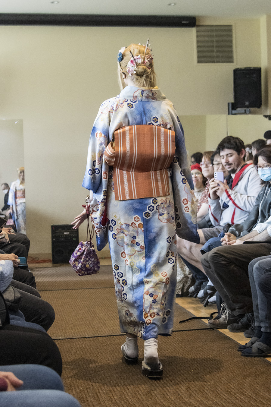
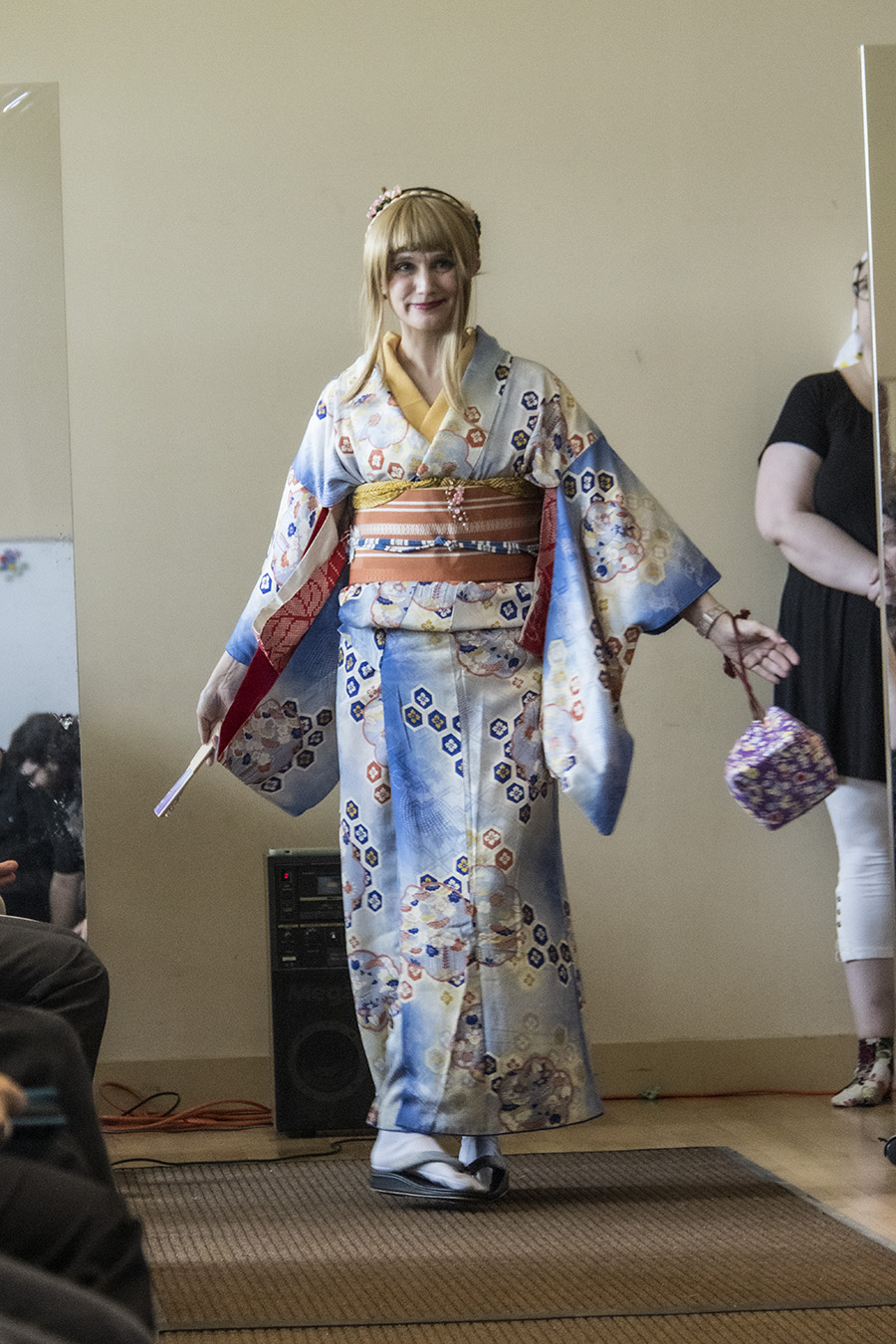
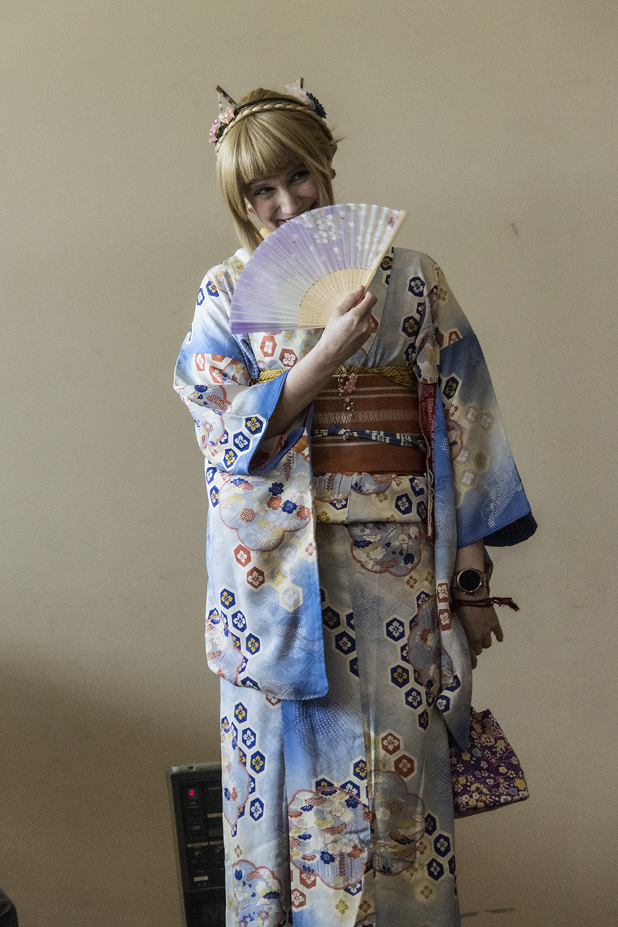
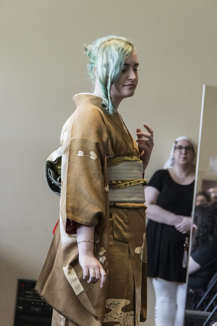
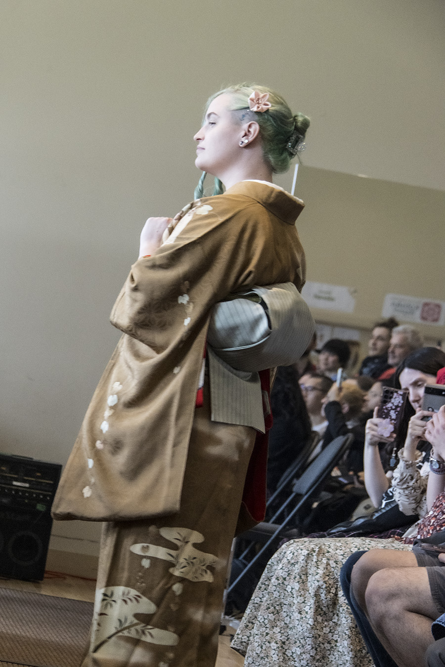
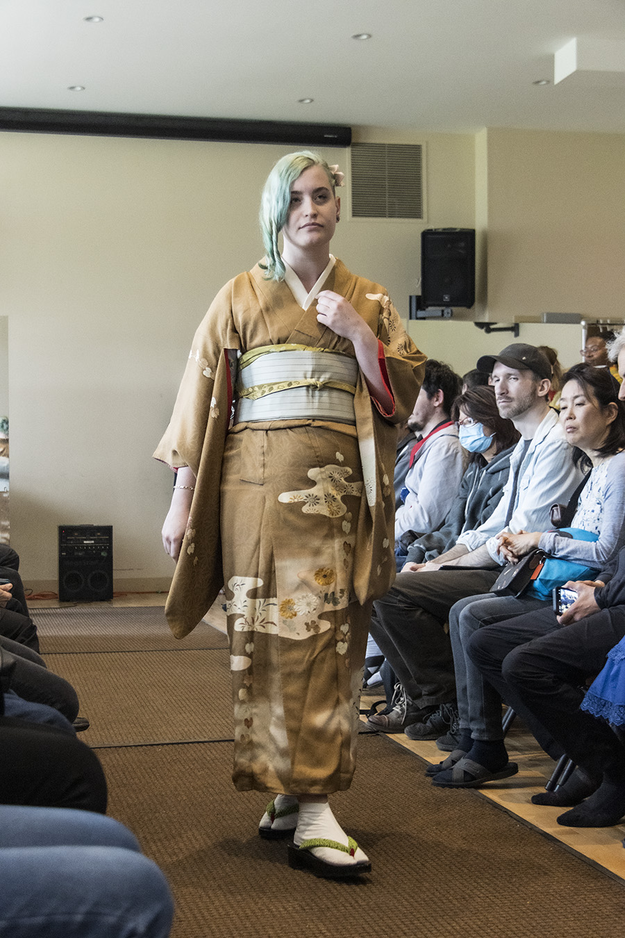
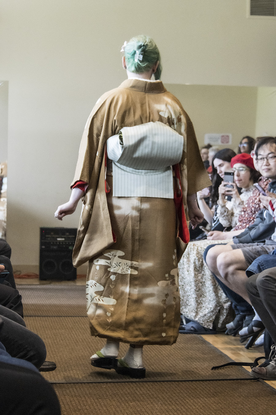
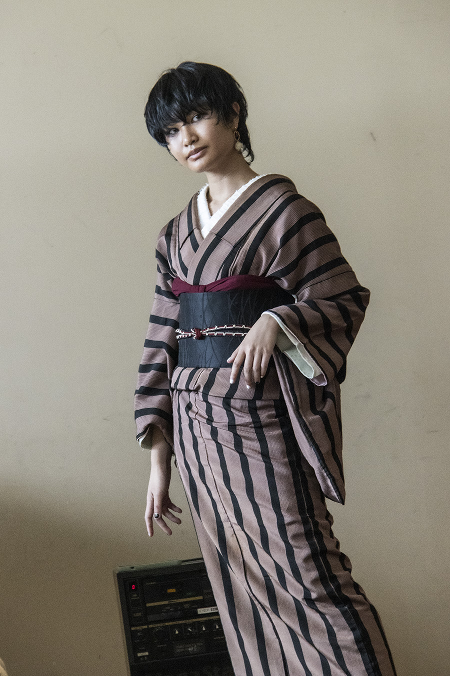
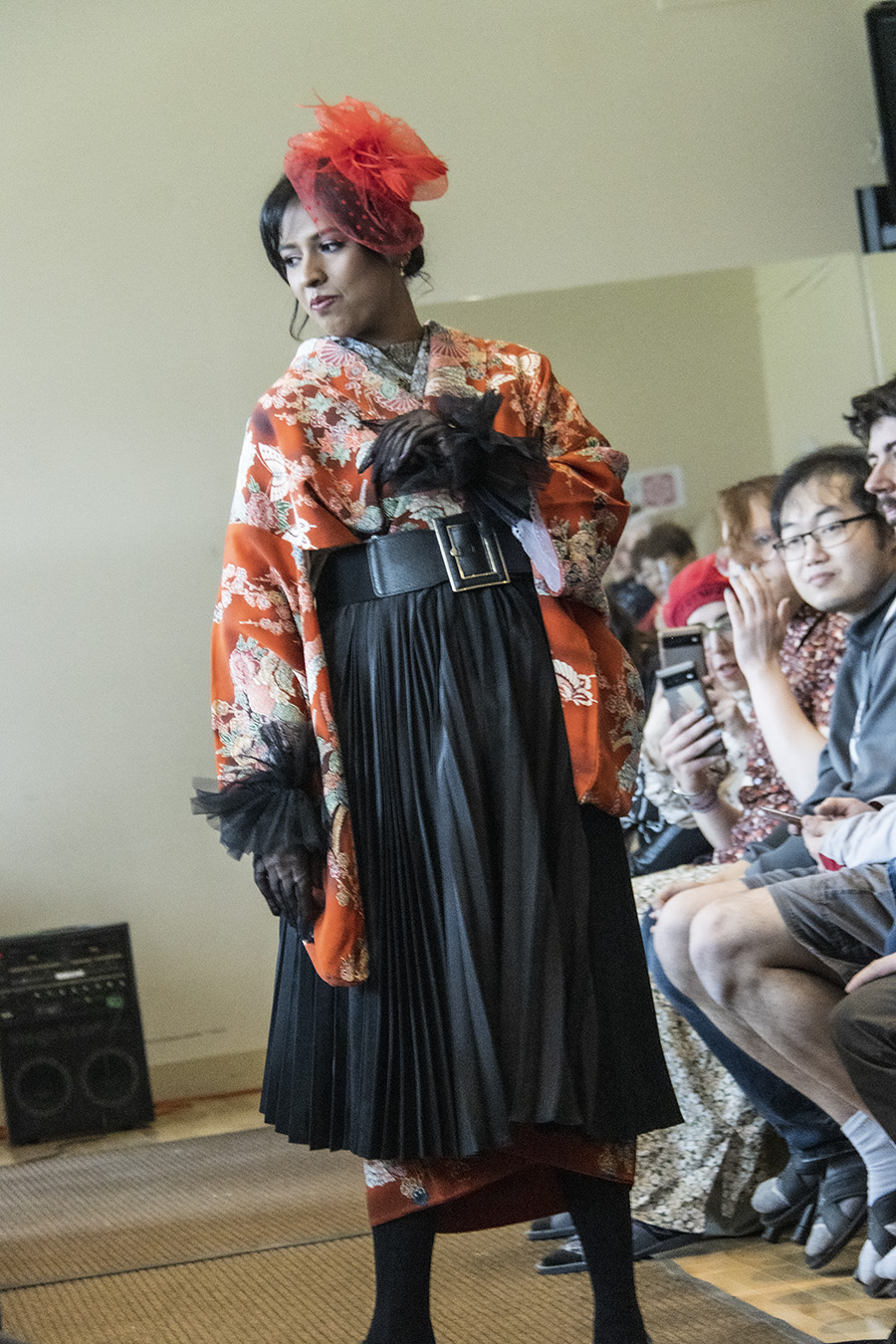
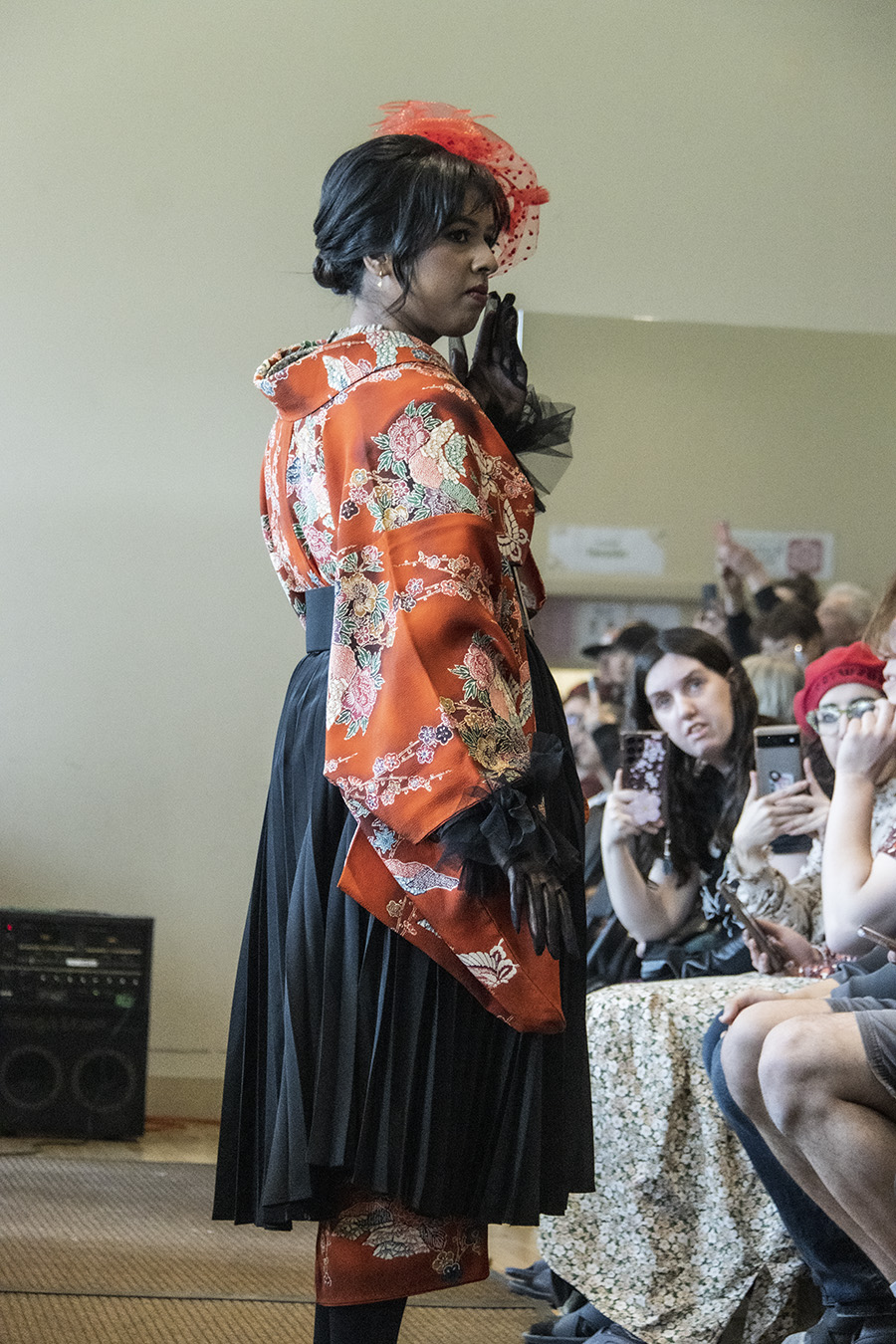
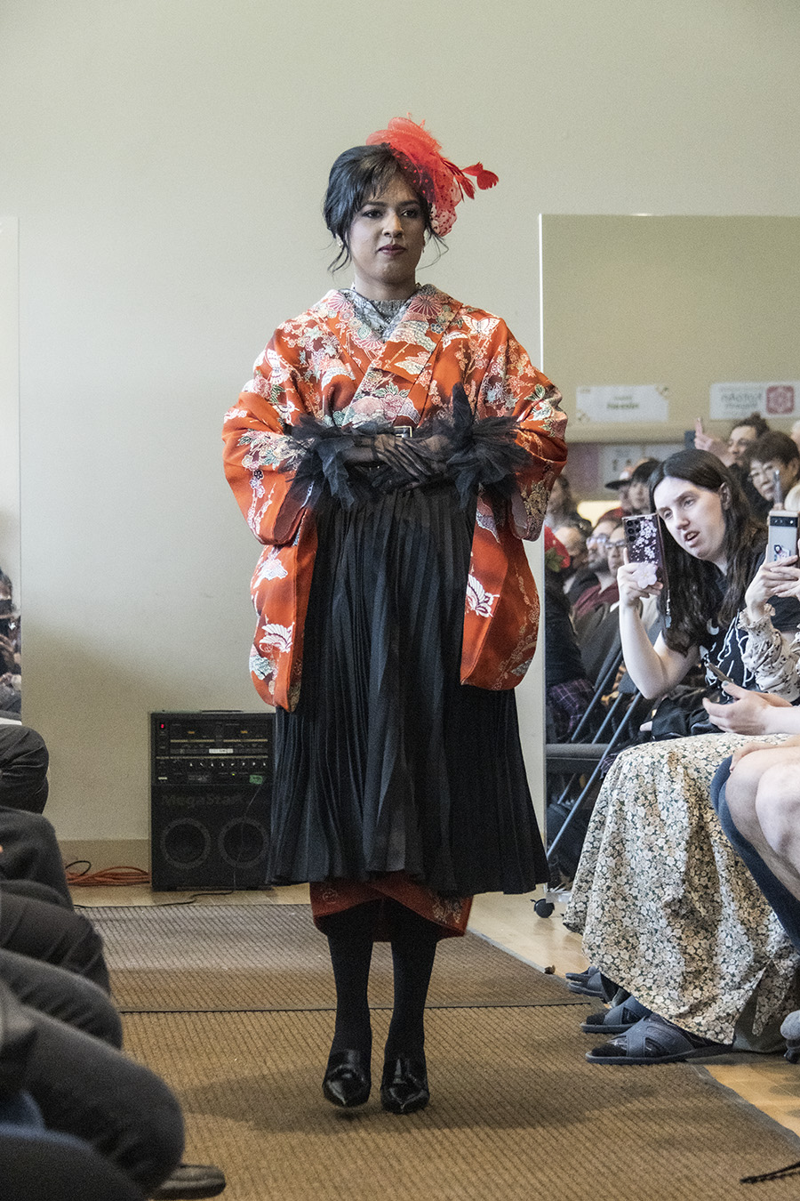
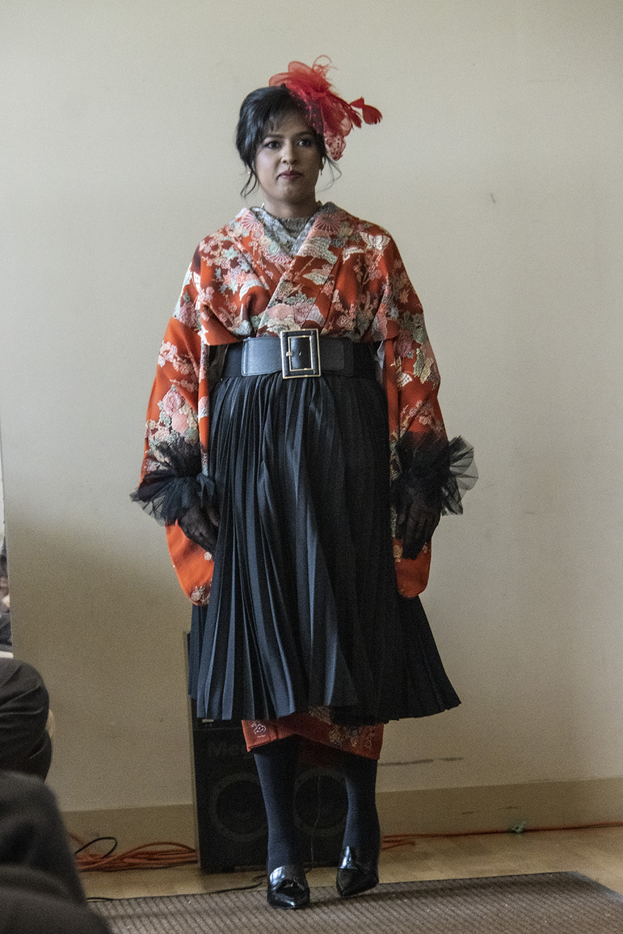
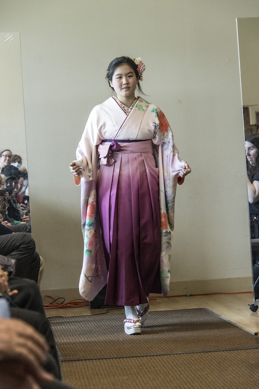
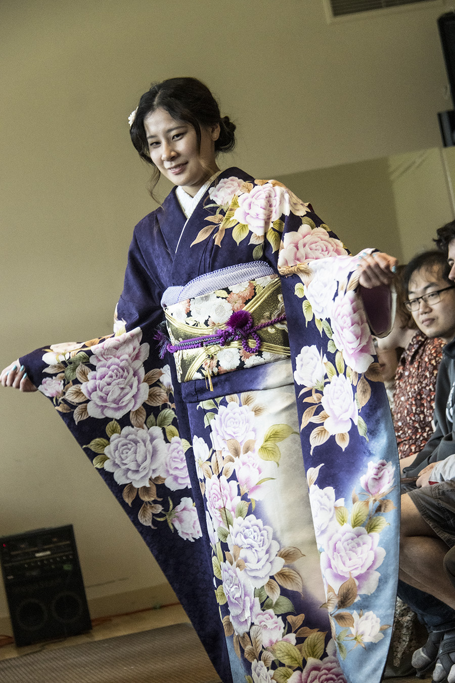
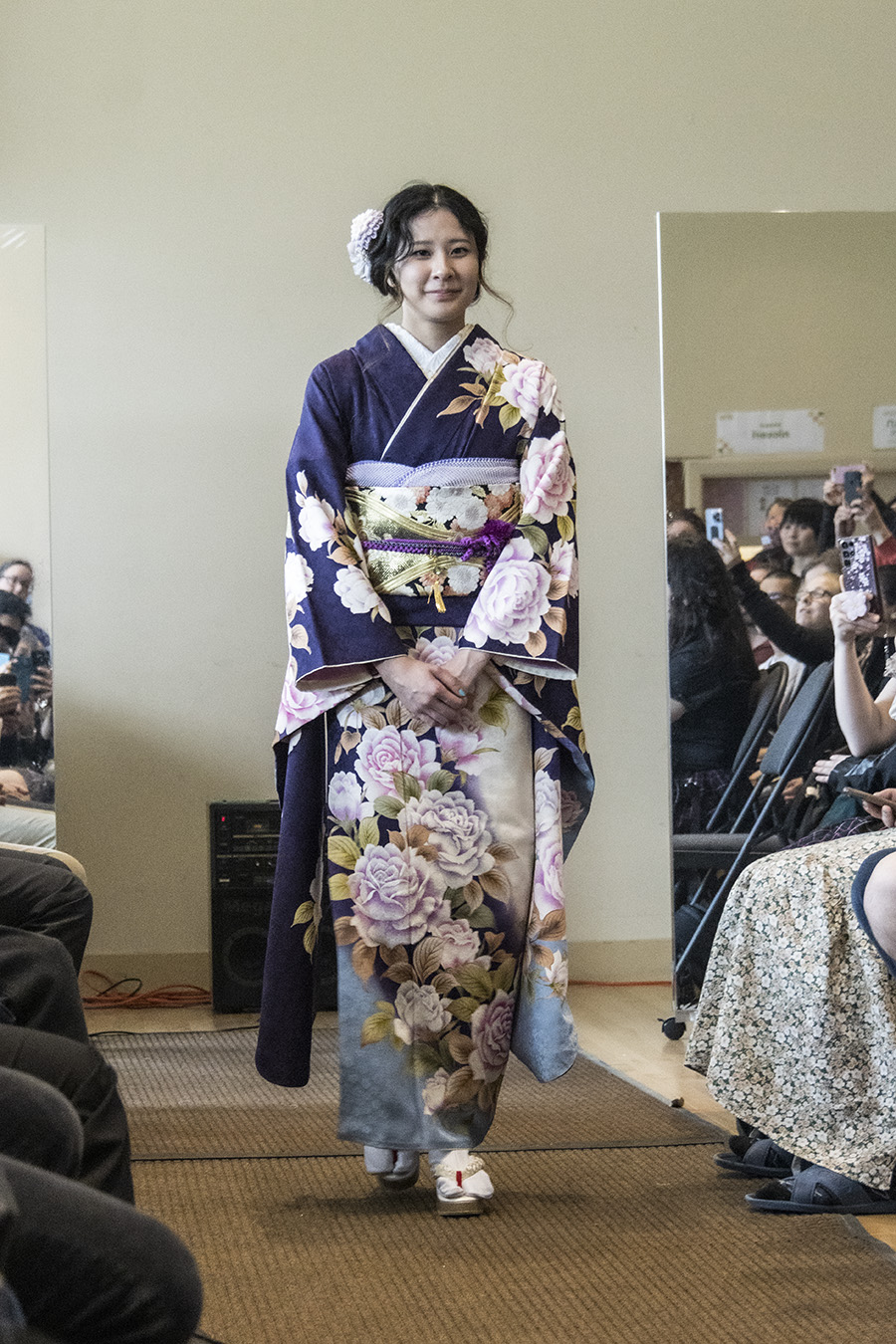
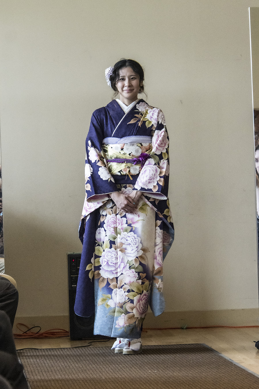
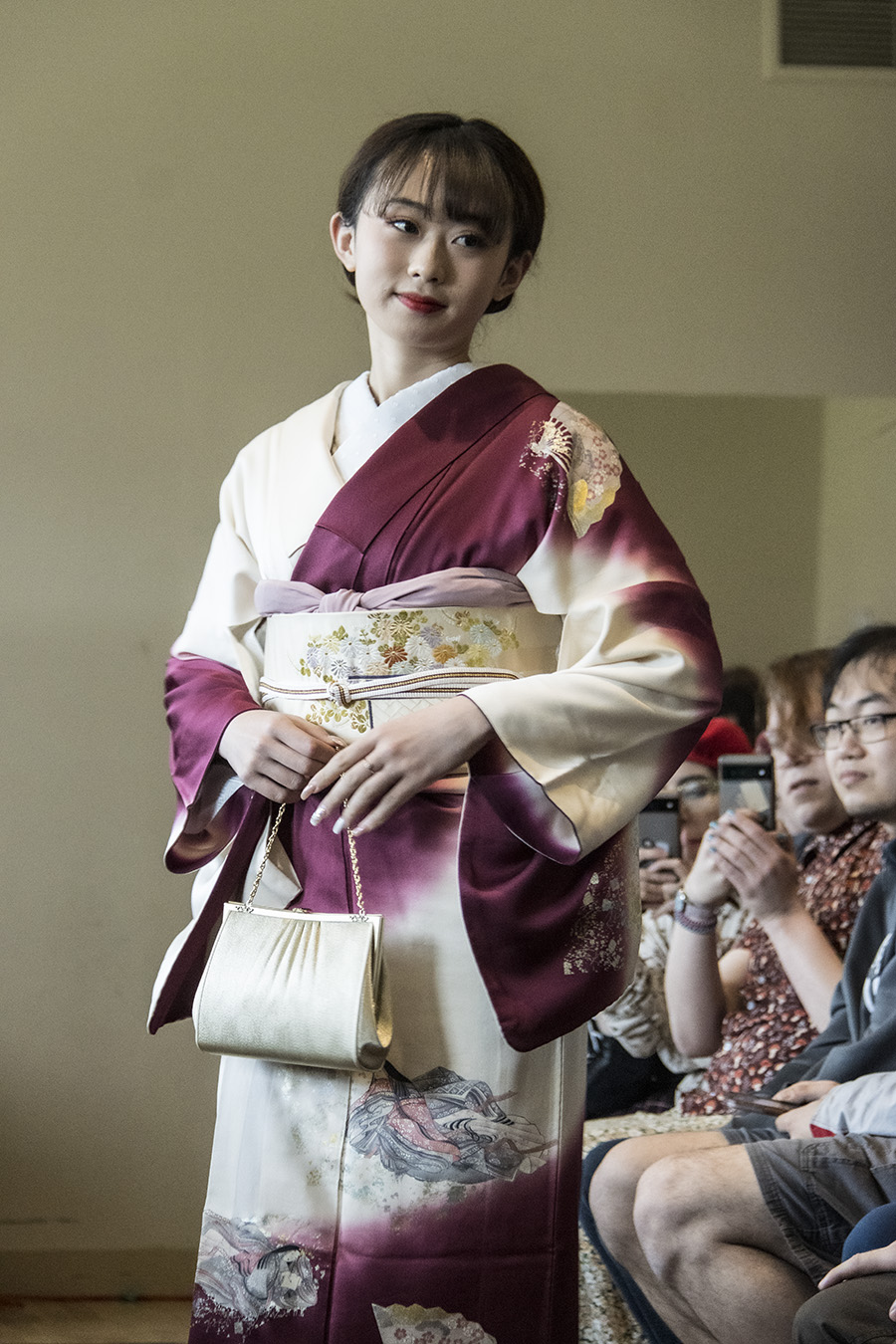
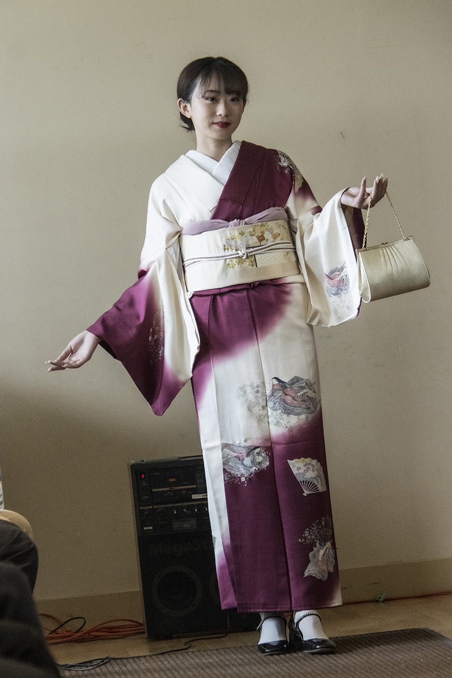
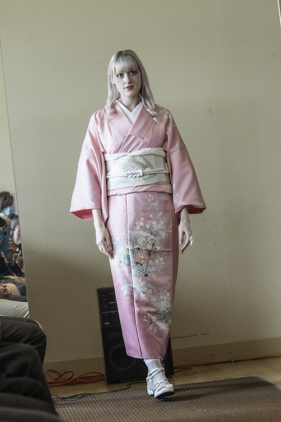
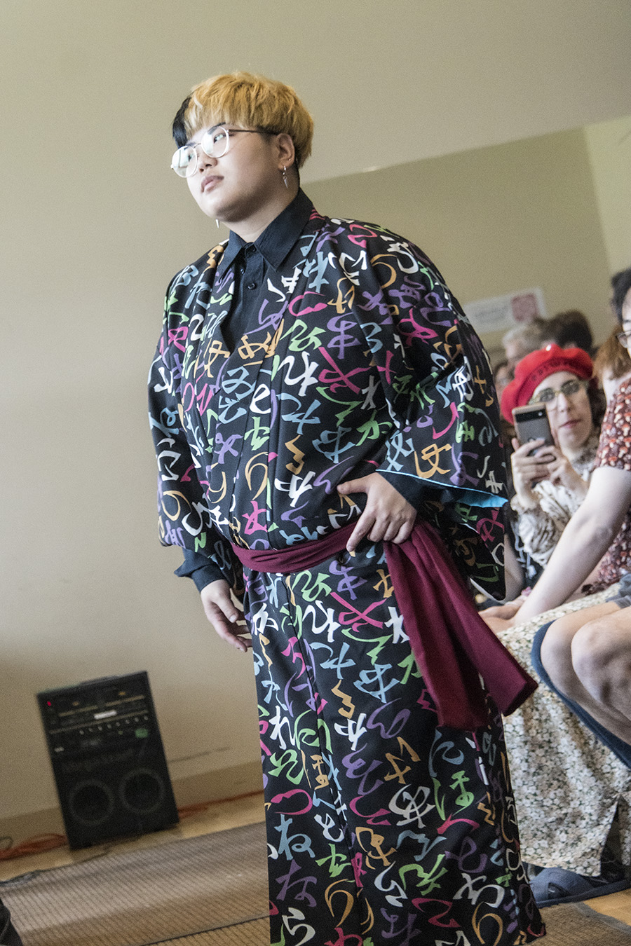
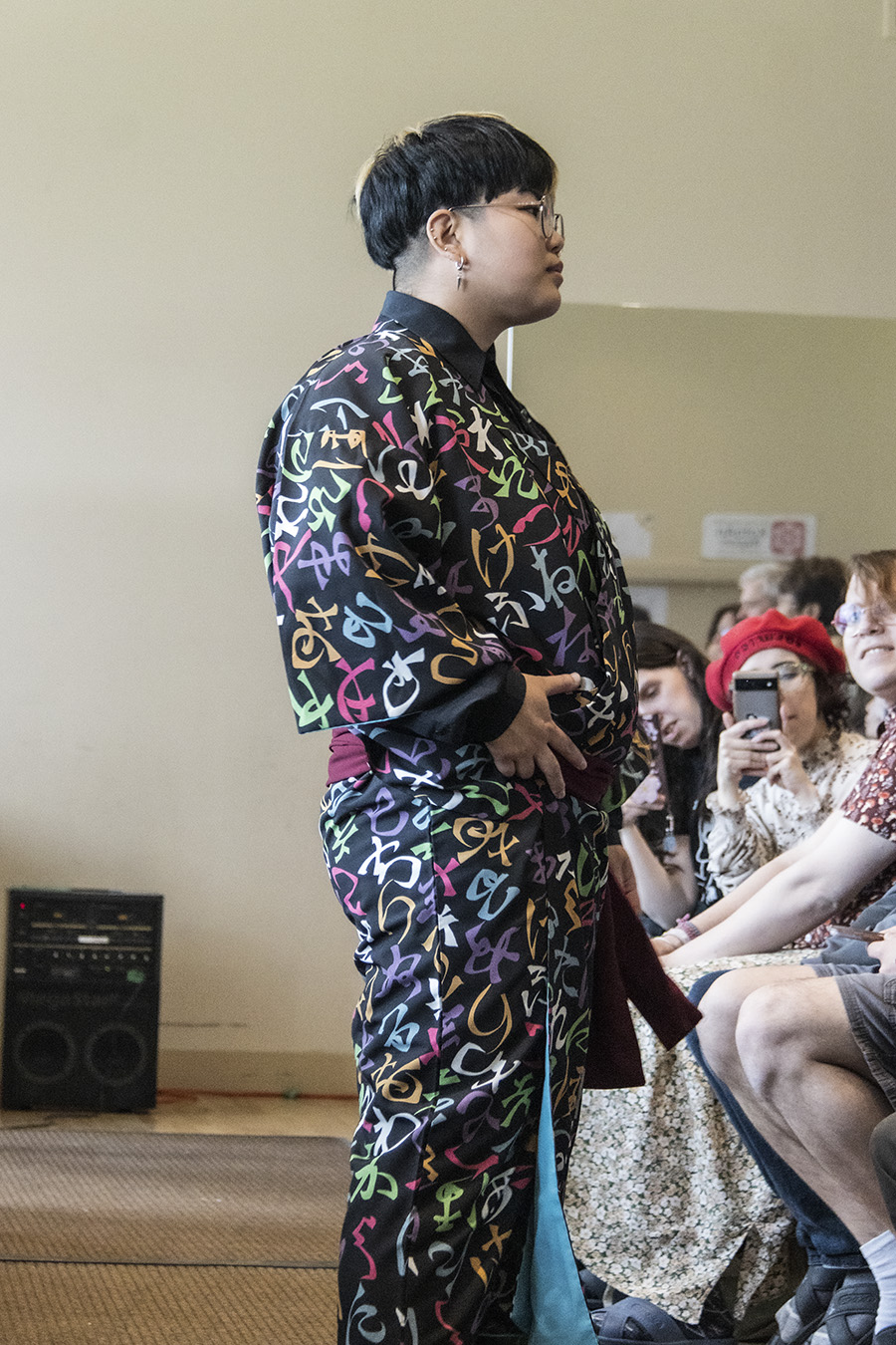
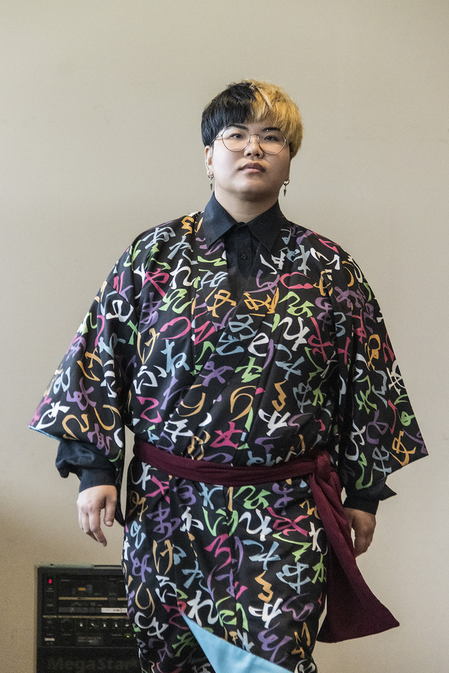
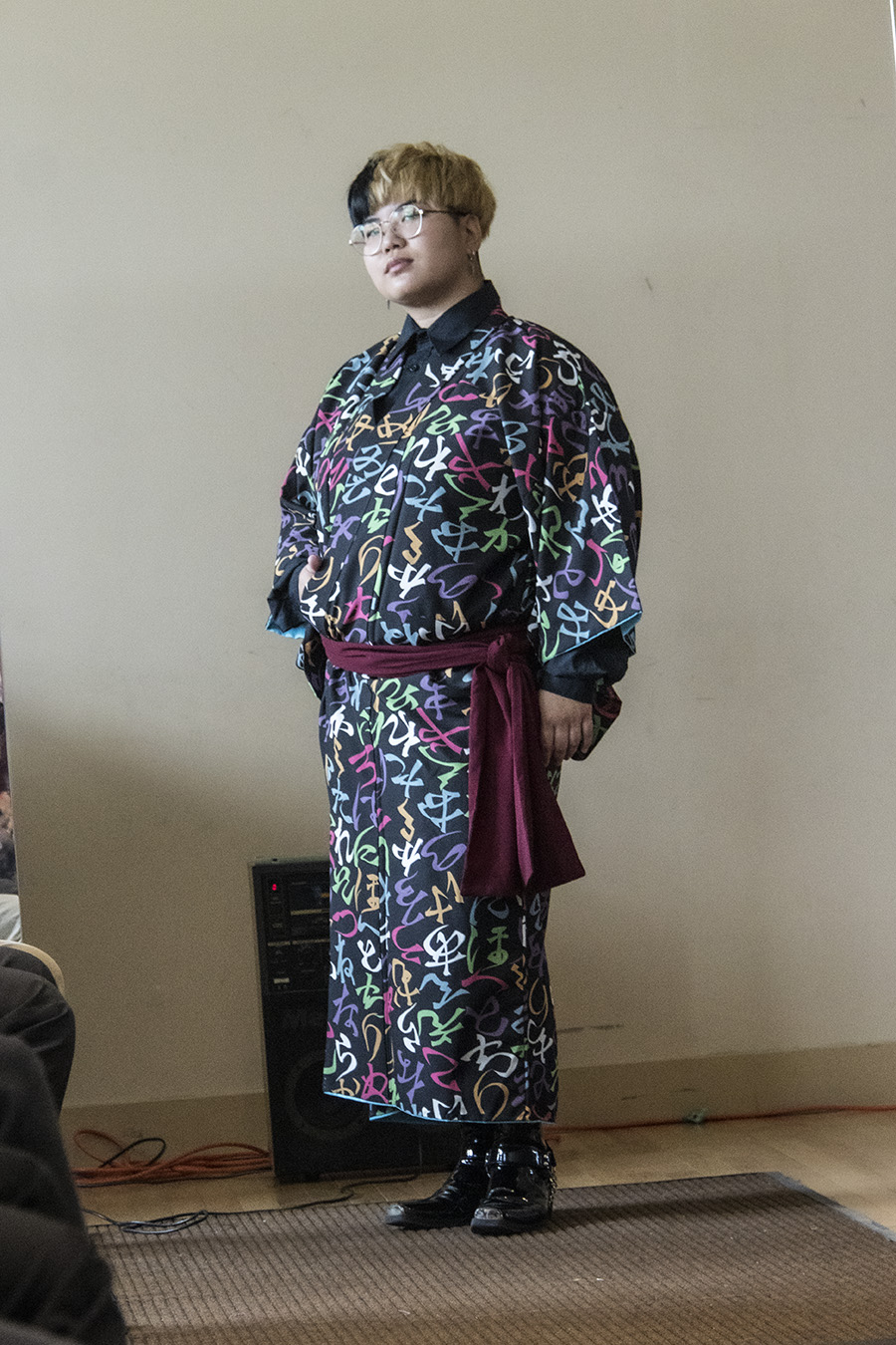
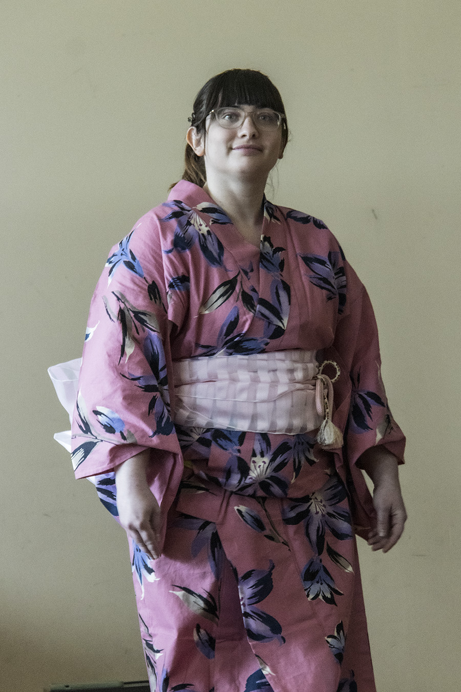
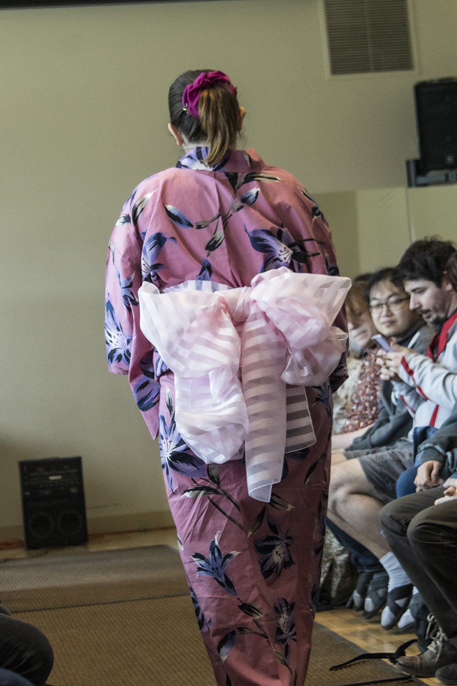
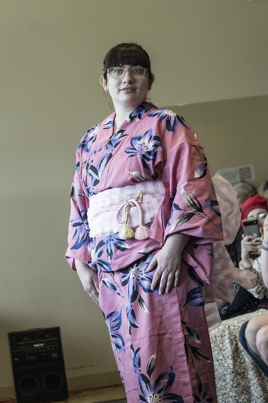
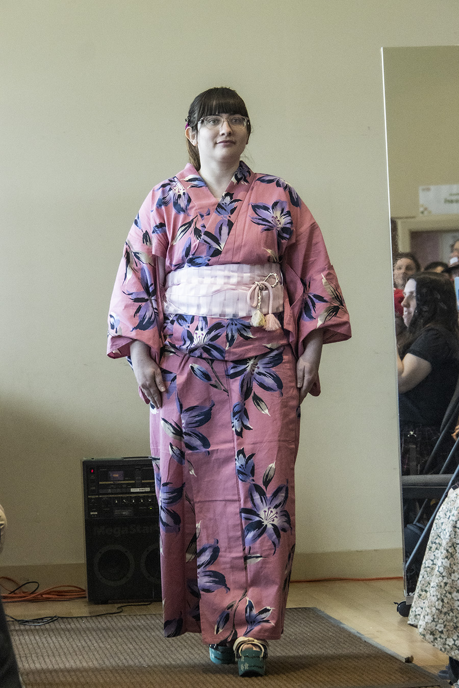
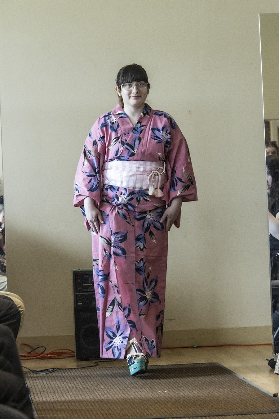
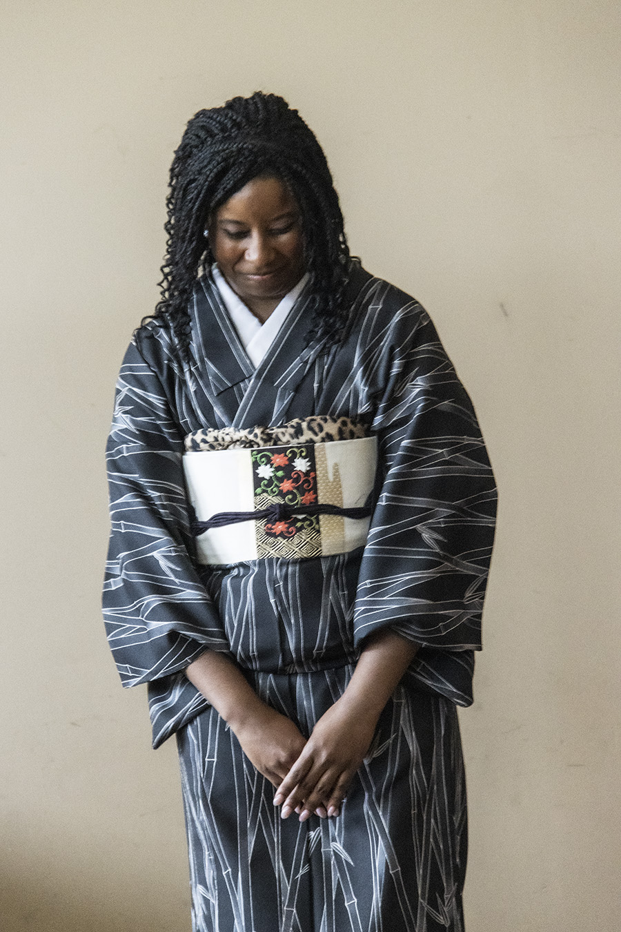
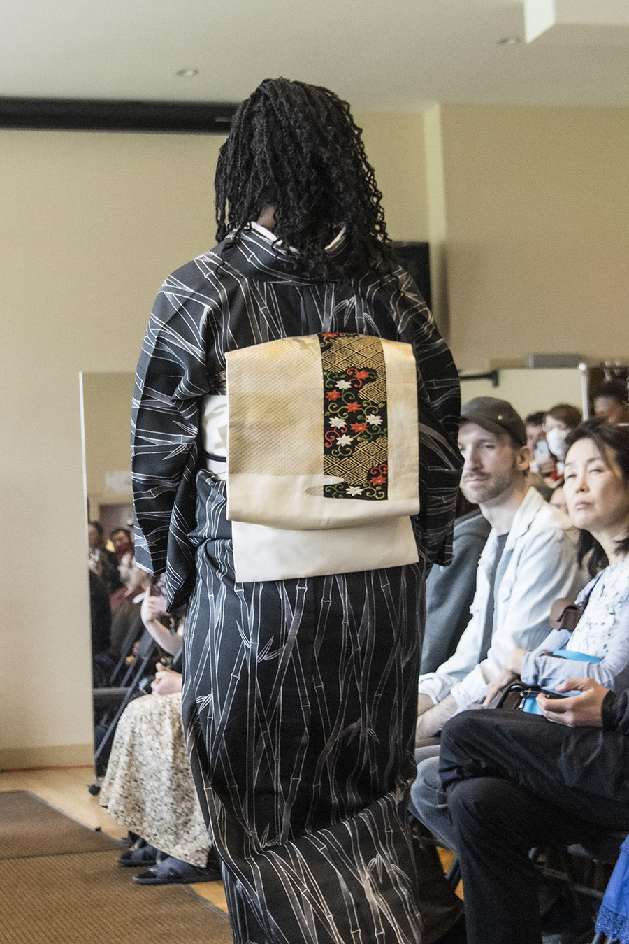
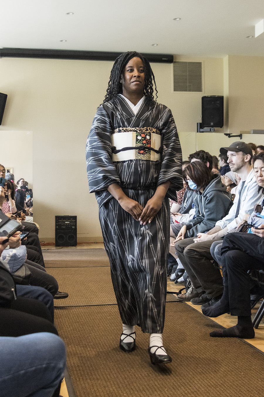
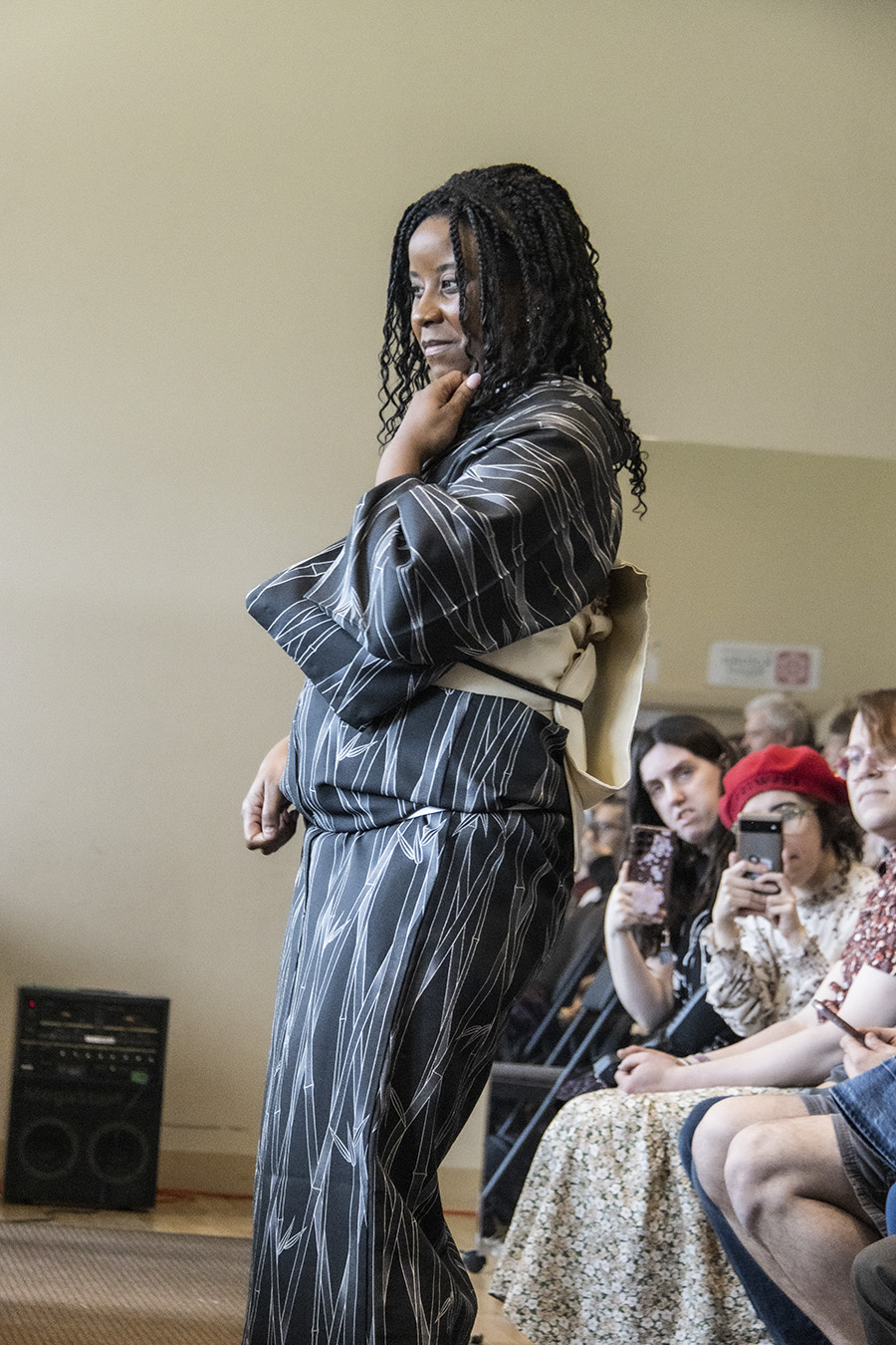
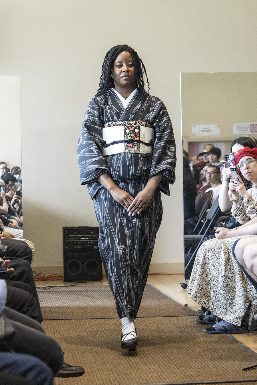
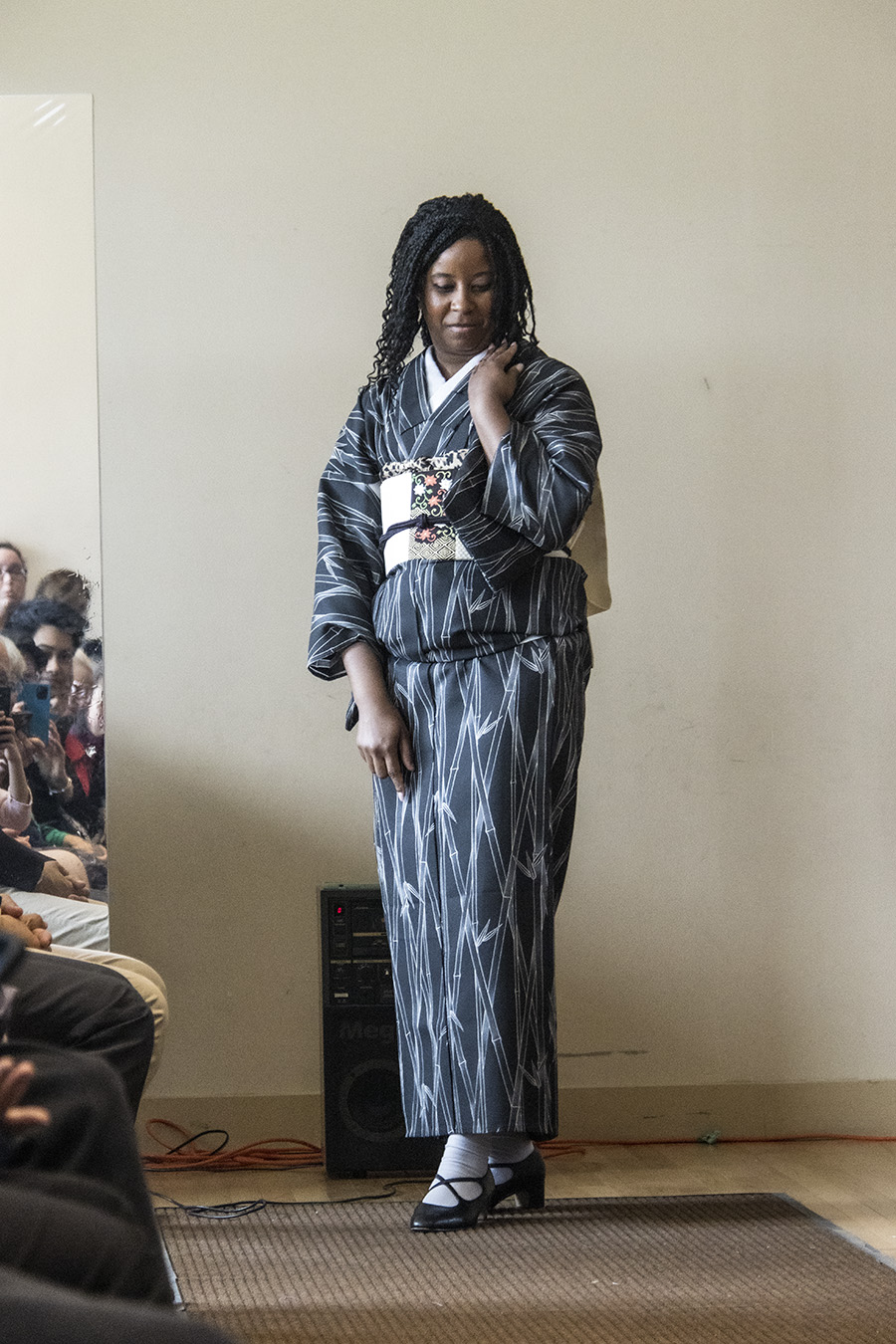
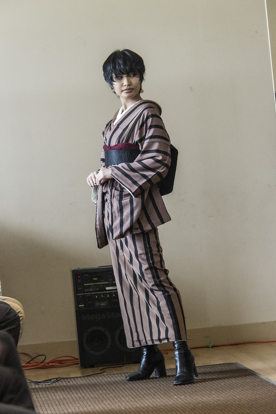
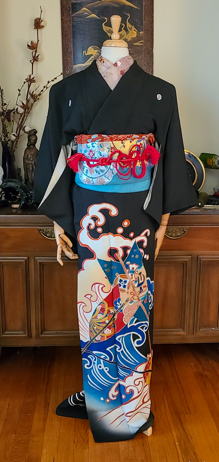
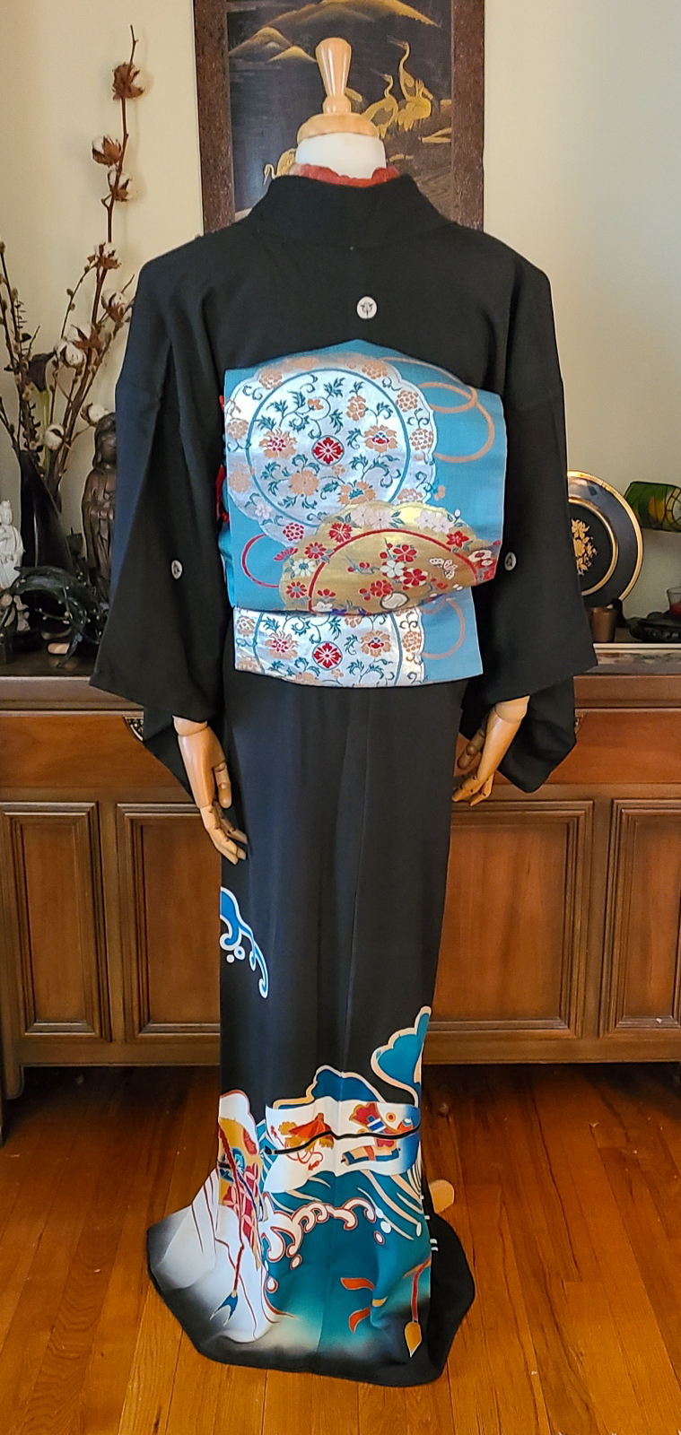
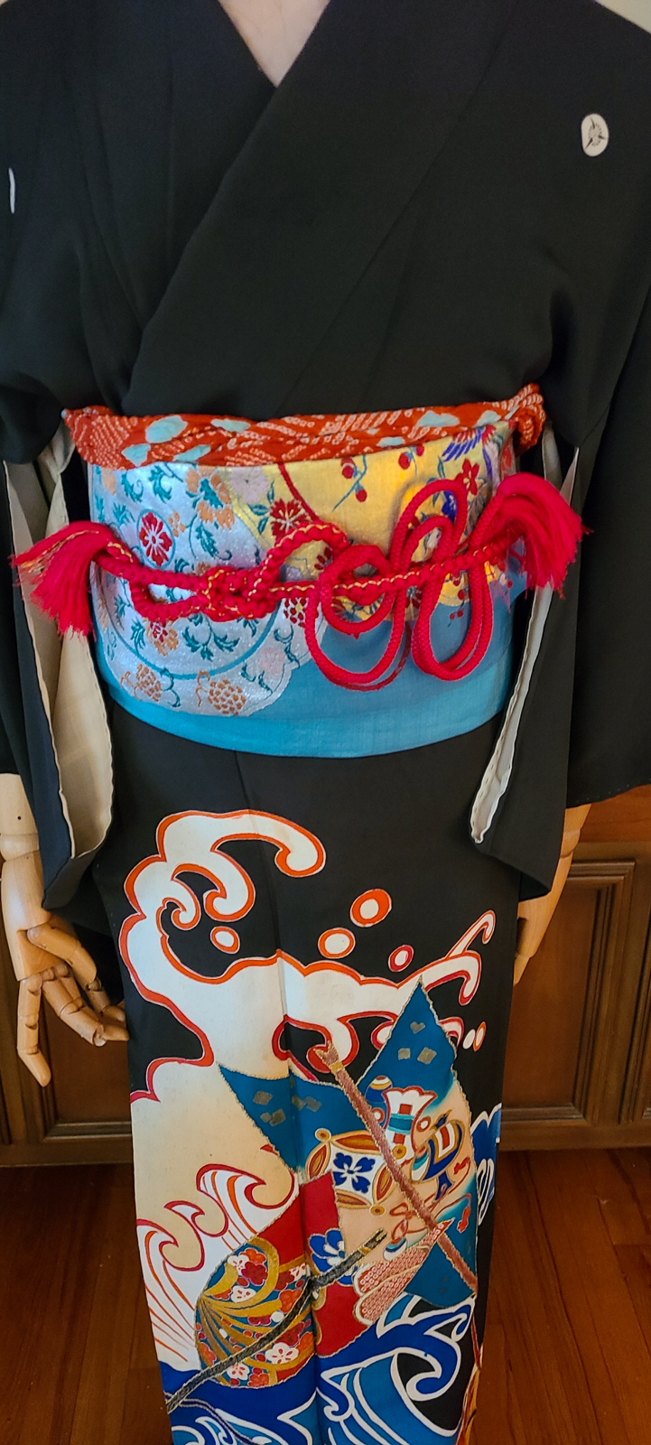
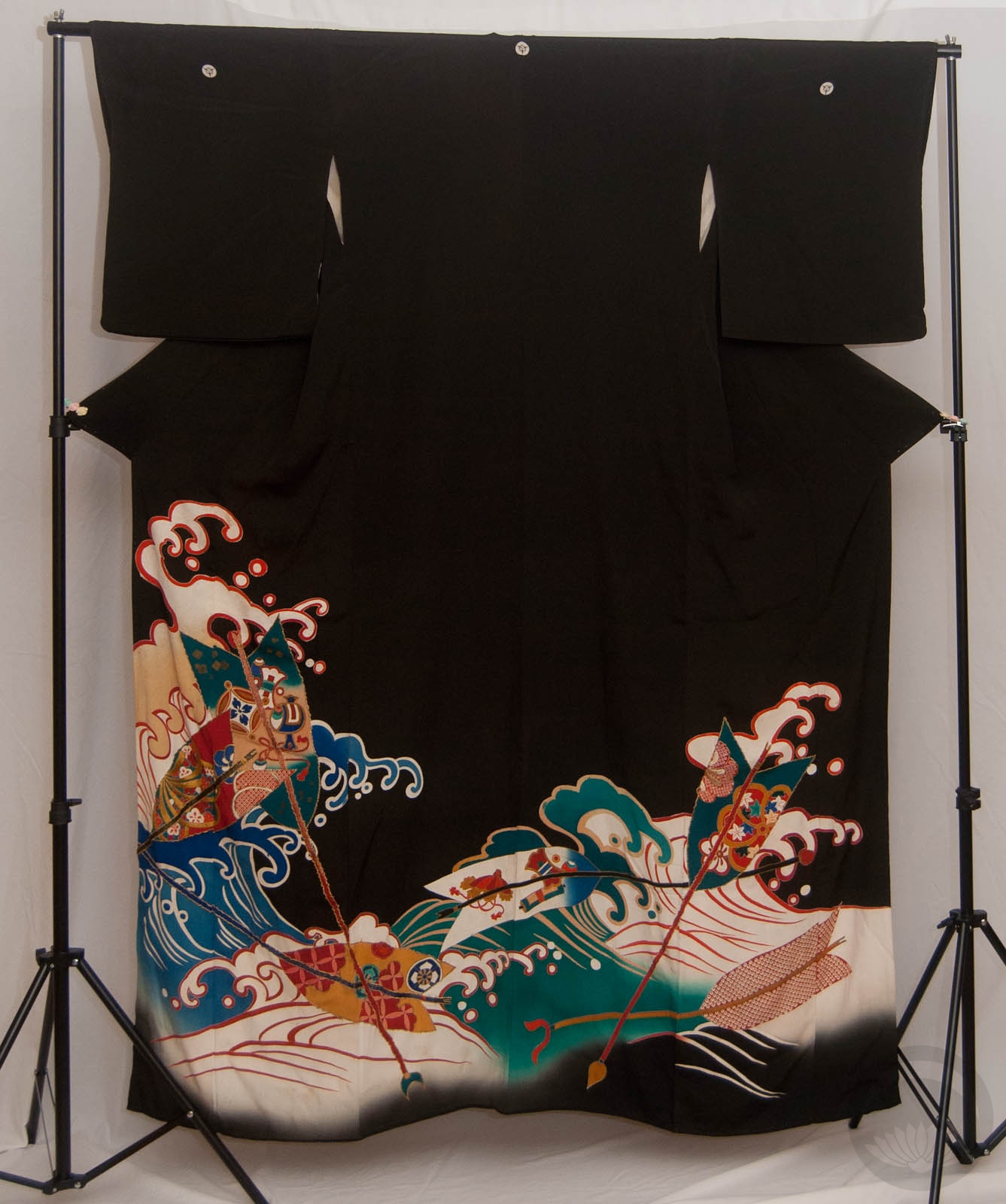
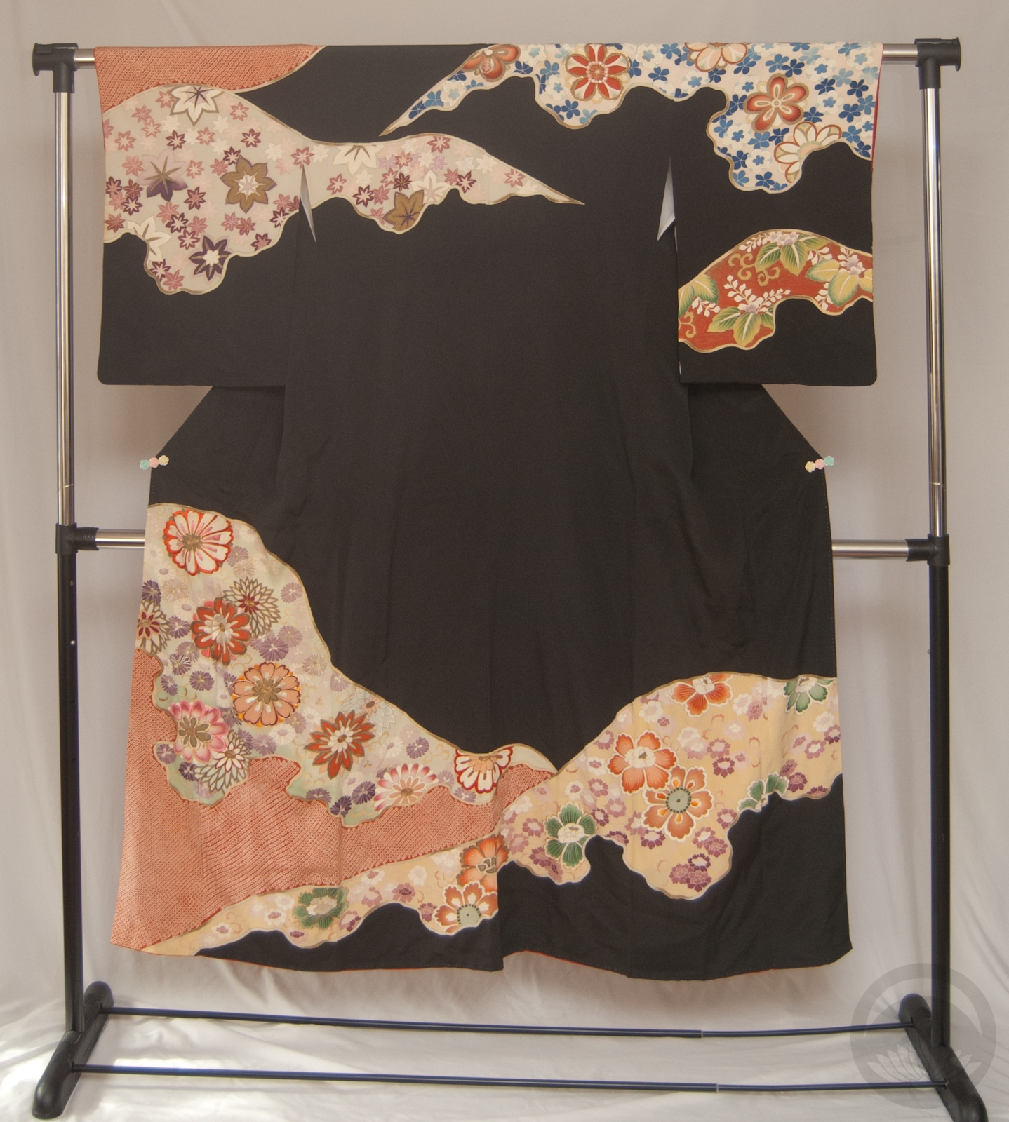
It’s possible you’ve seen this adorable little A Dictionary Of Color Combinations book on some fashion and personal style social media accounts lately, it’s gone somewhat viral, and for good reason. It’s less a book and more a collection of colour palettes that appeal to the Japanese aesthetic. If you’re ever stuck for inspiration, it’s a fantastic place to start. You can either open a random page and go from there, or if you have a piece in your collection you’re unsure of what to do with, there’s a handy index at the back. Find the swatch closest to your piece and then view all the options! That’s what I ended up doing here, with this gorgeous early-Showa komon I picked up at the Palm Springs vintage market a few months back.
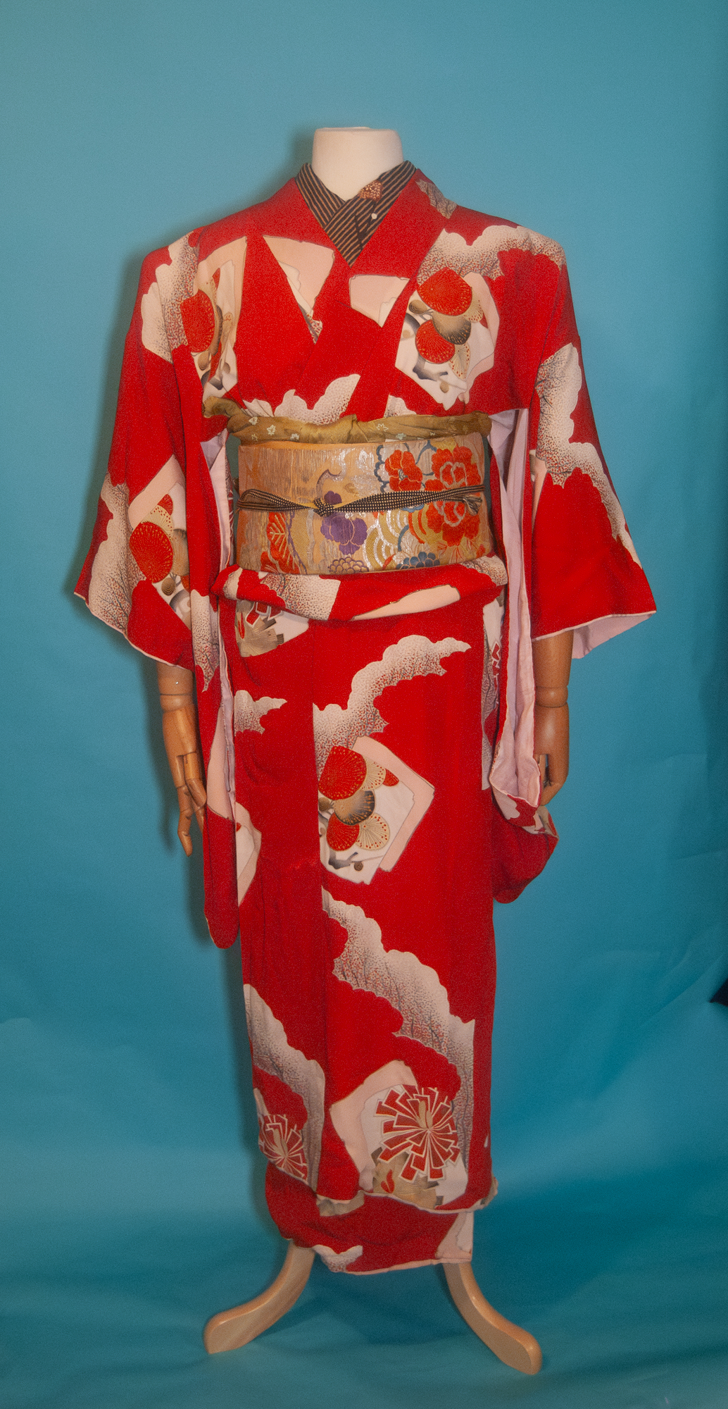
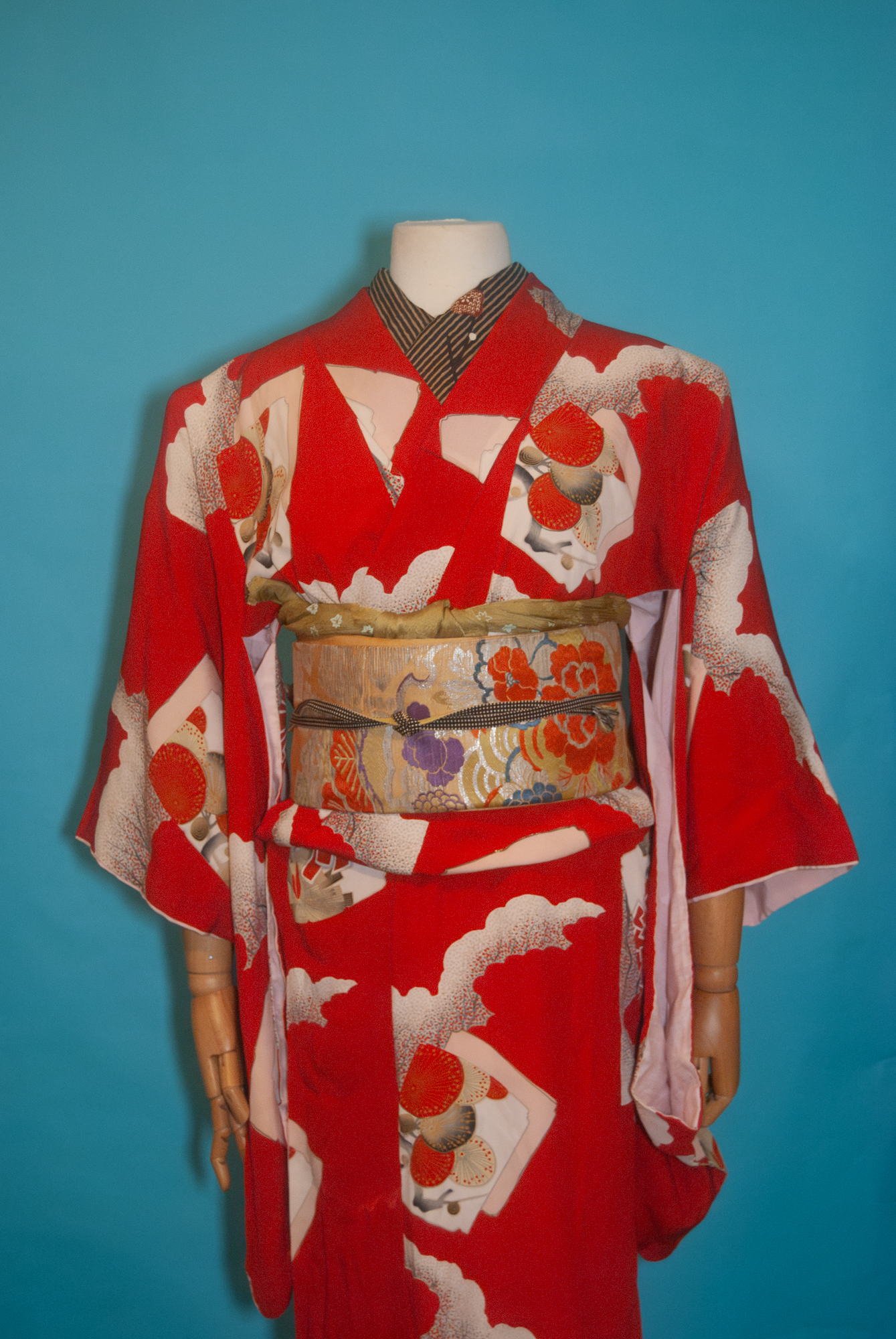
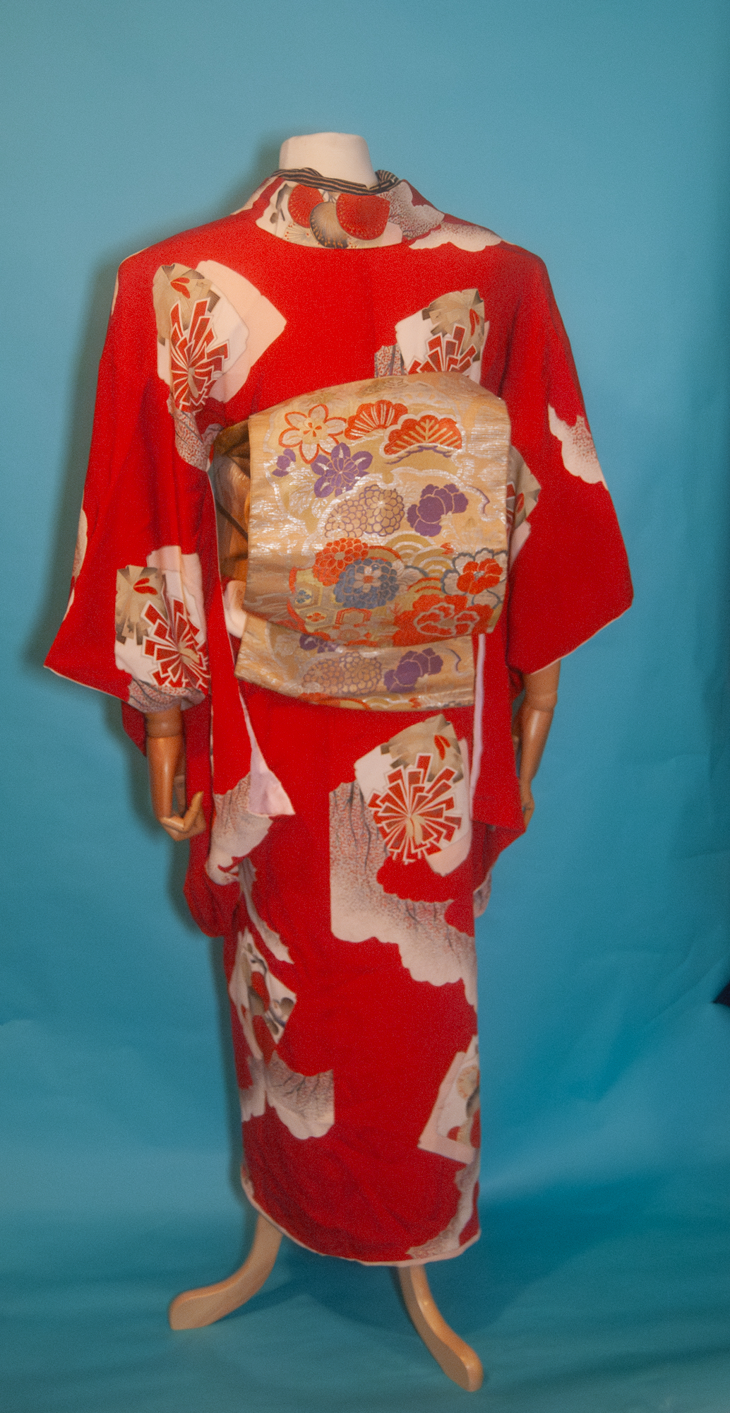
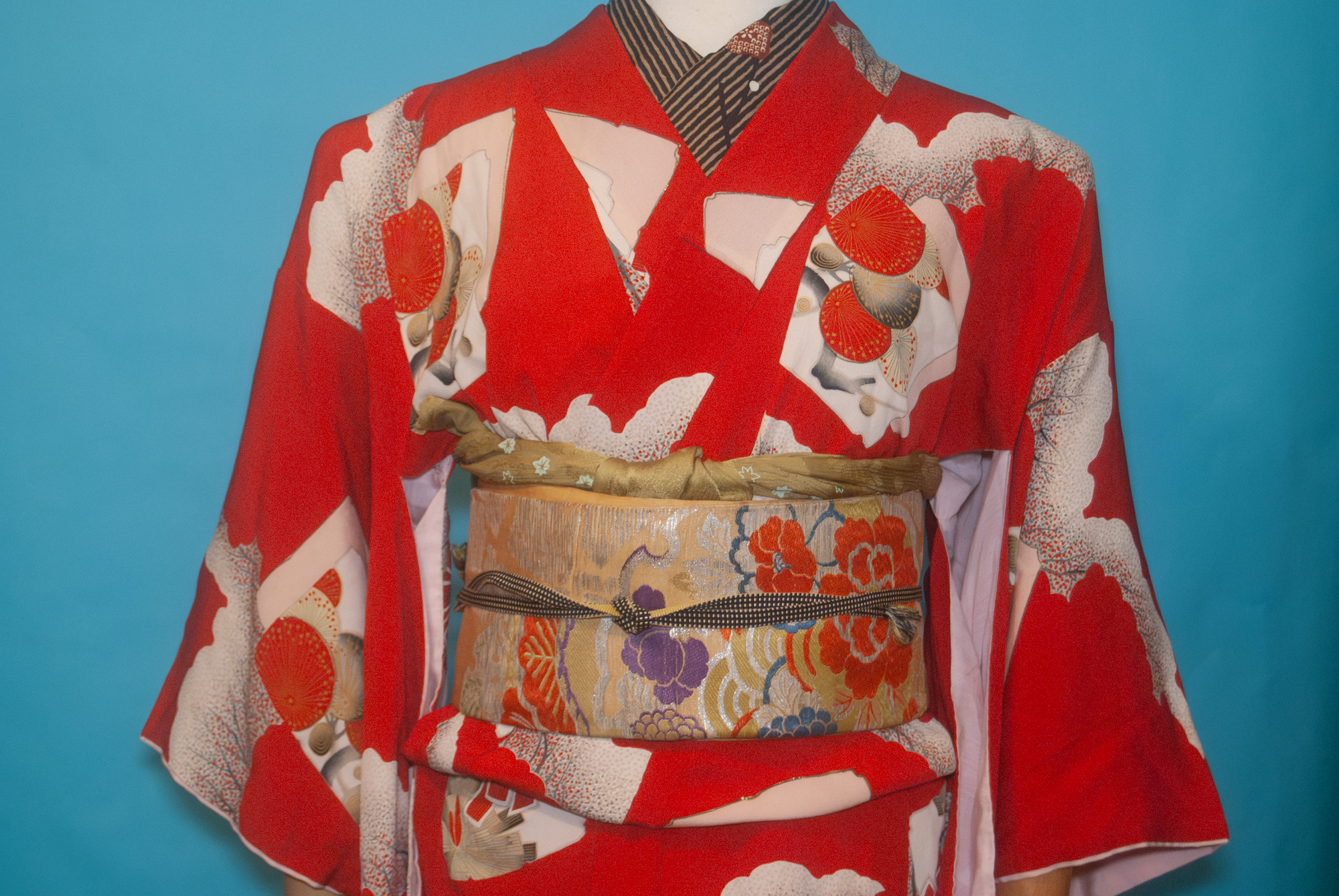
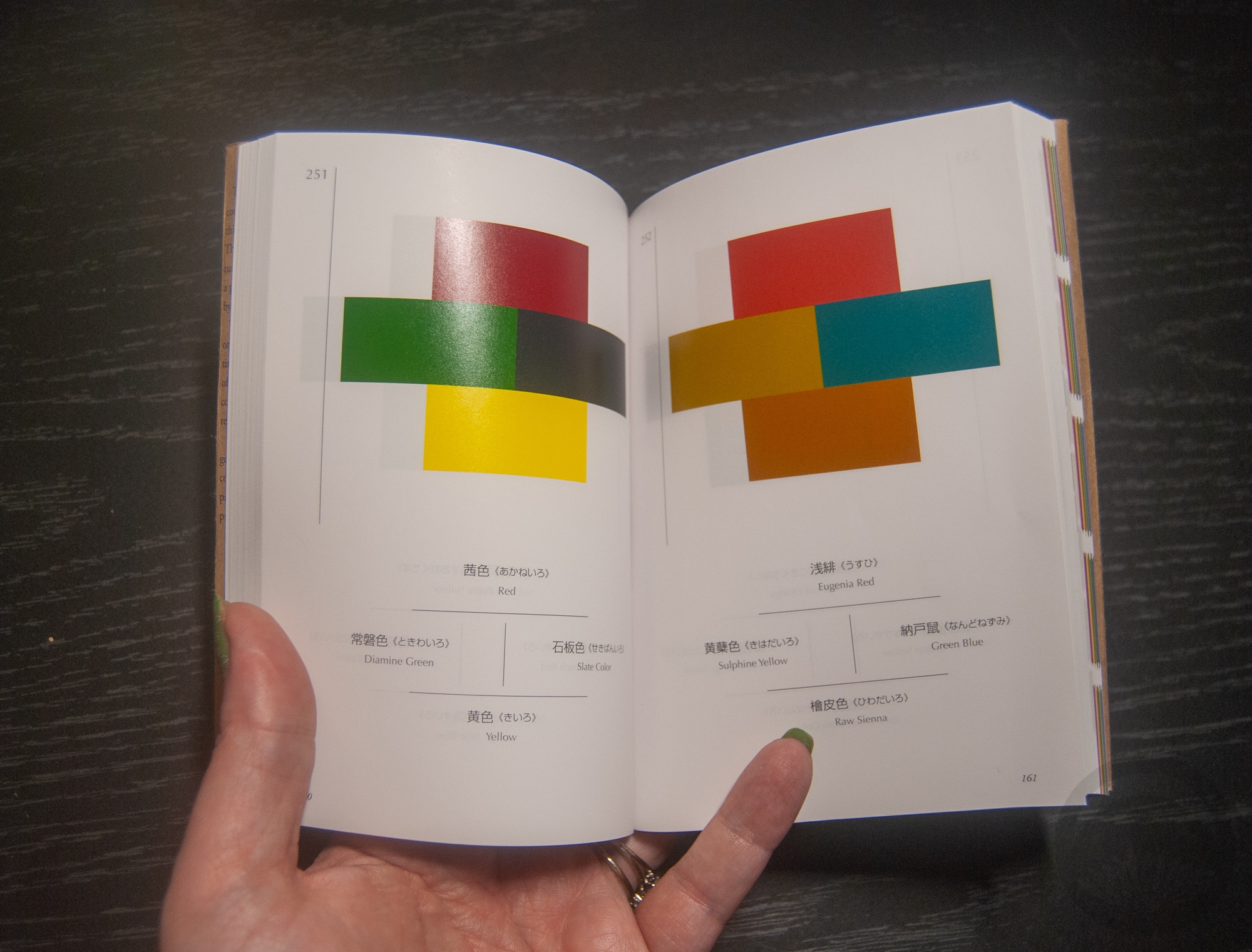
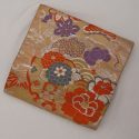
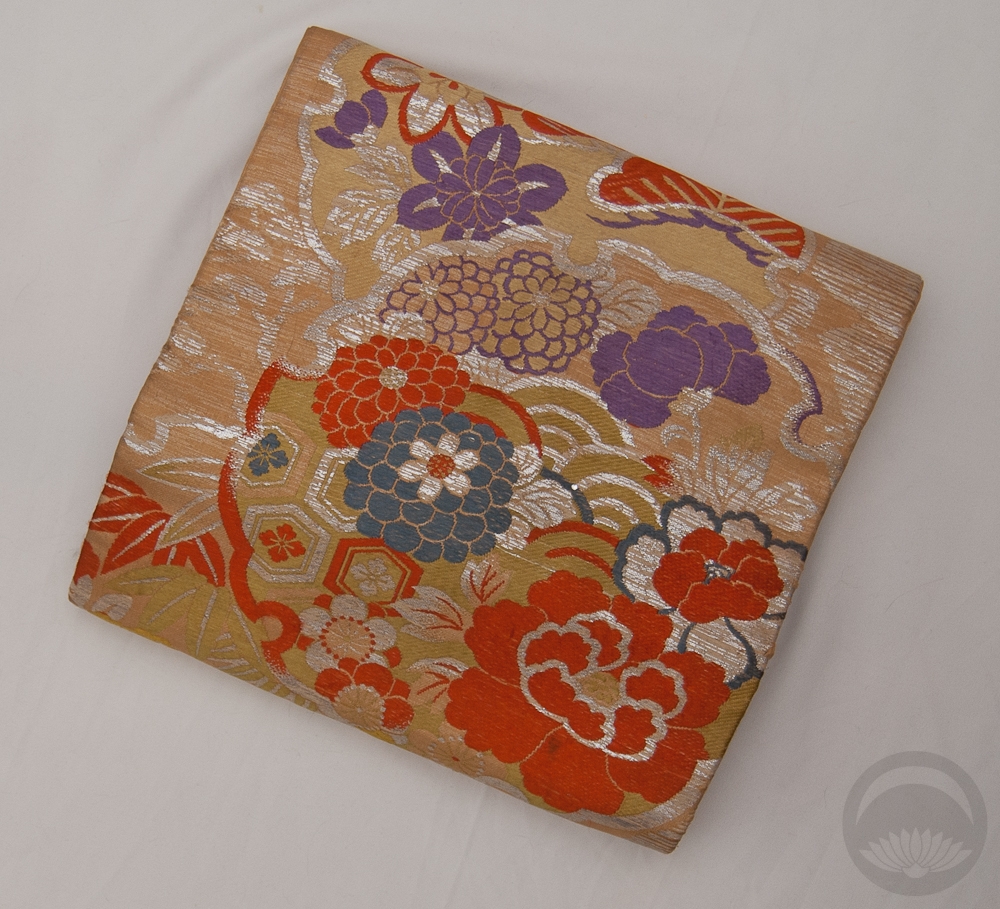
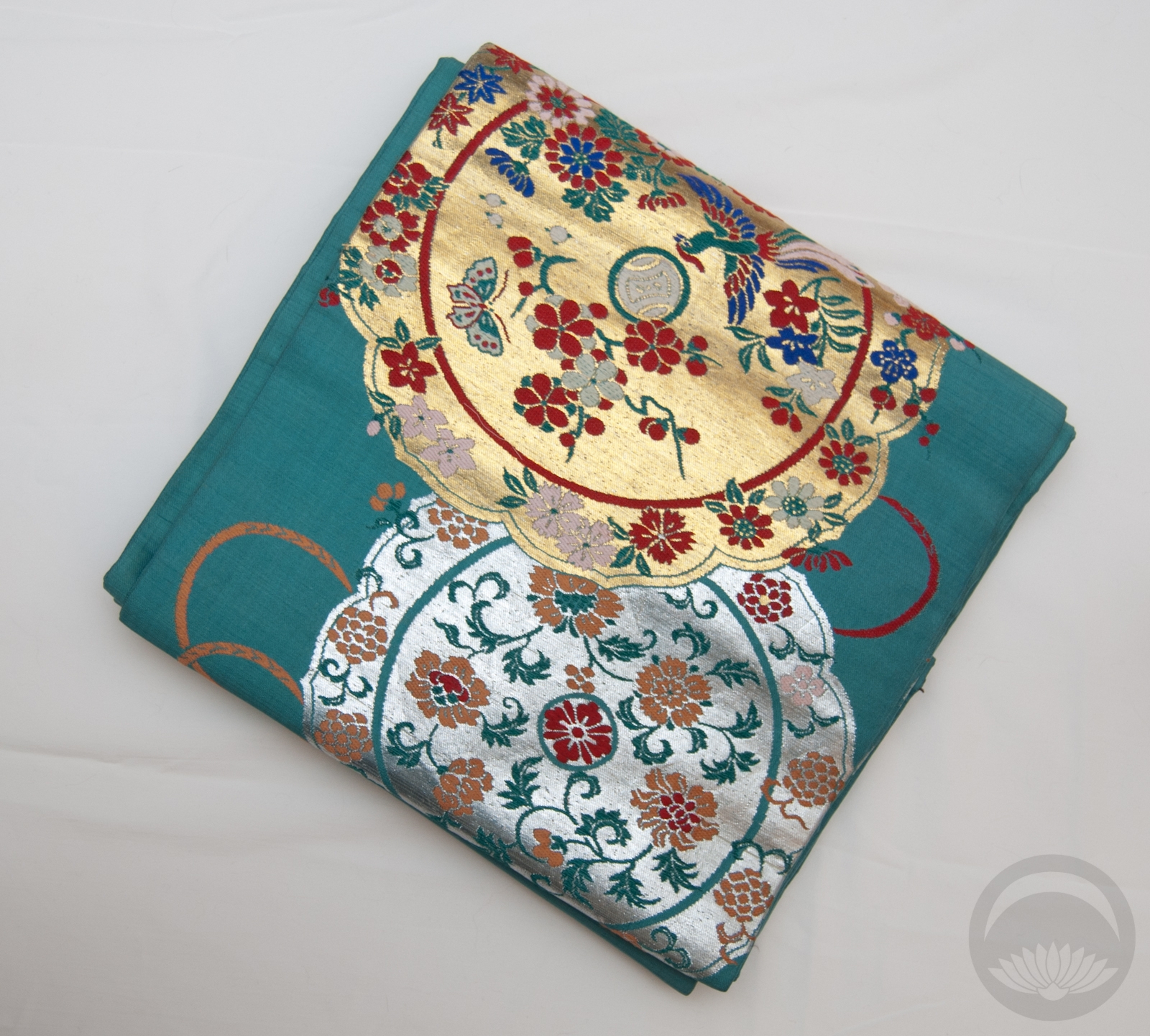
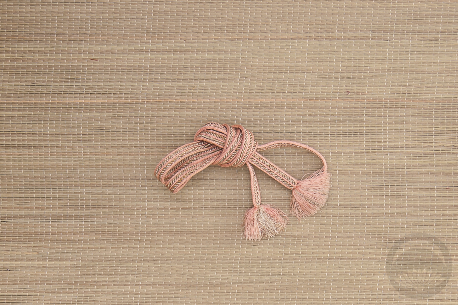
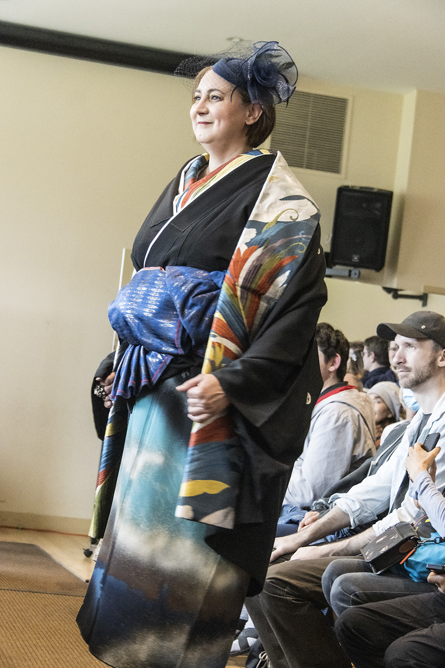
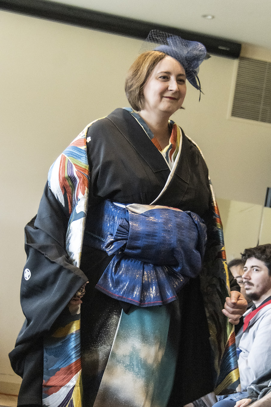
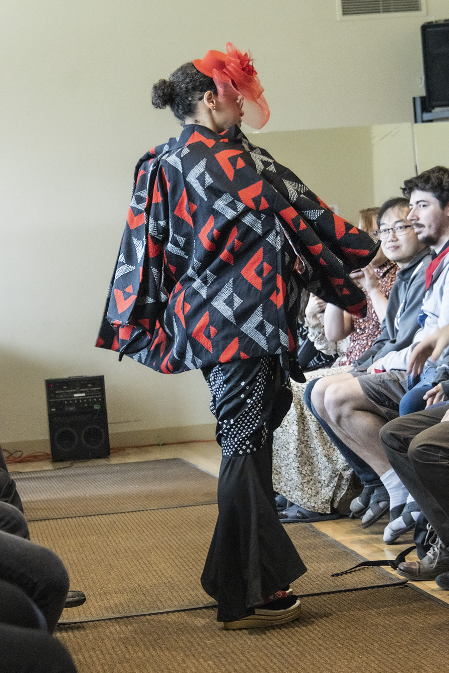
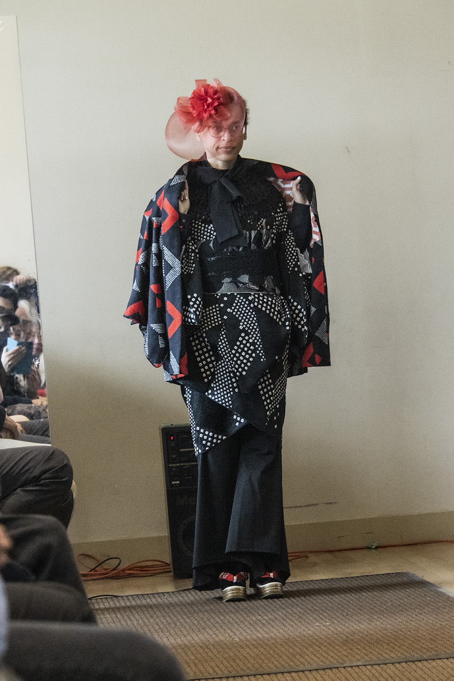
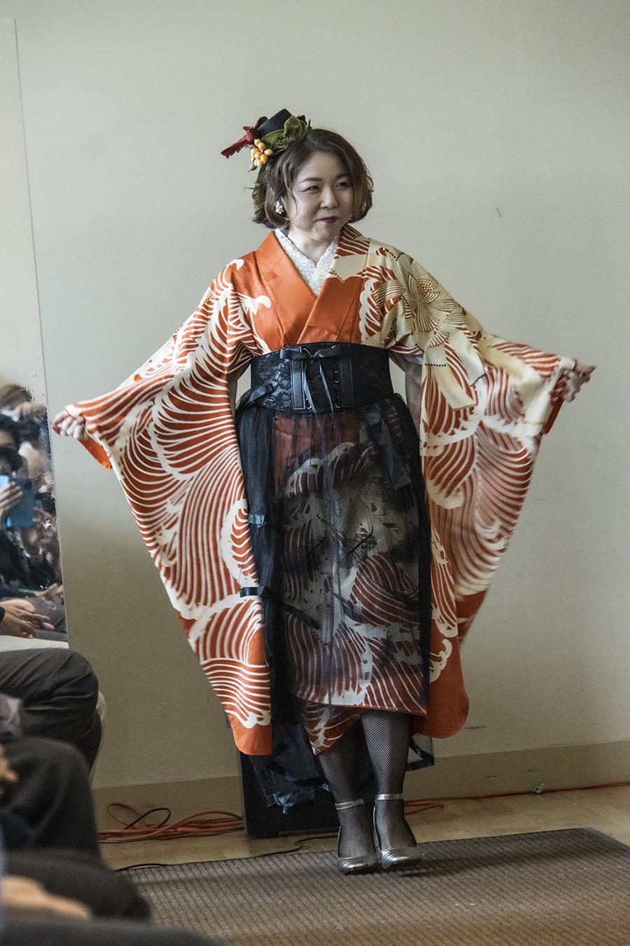
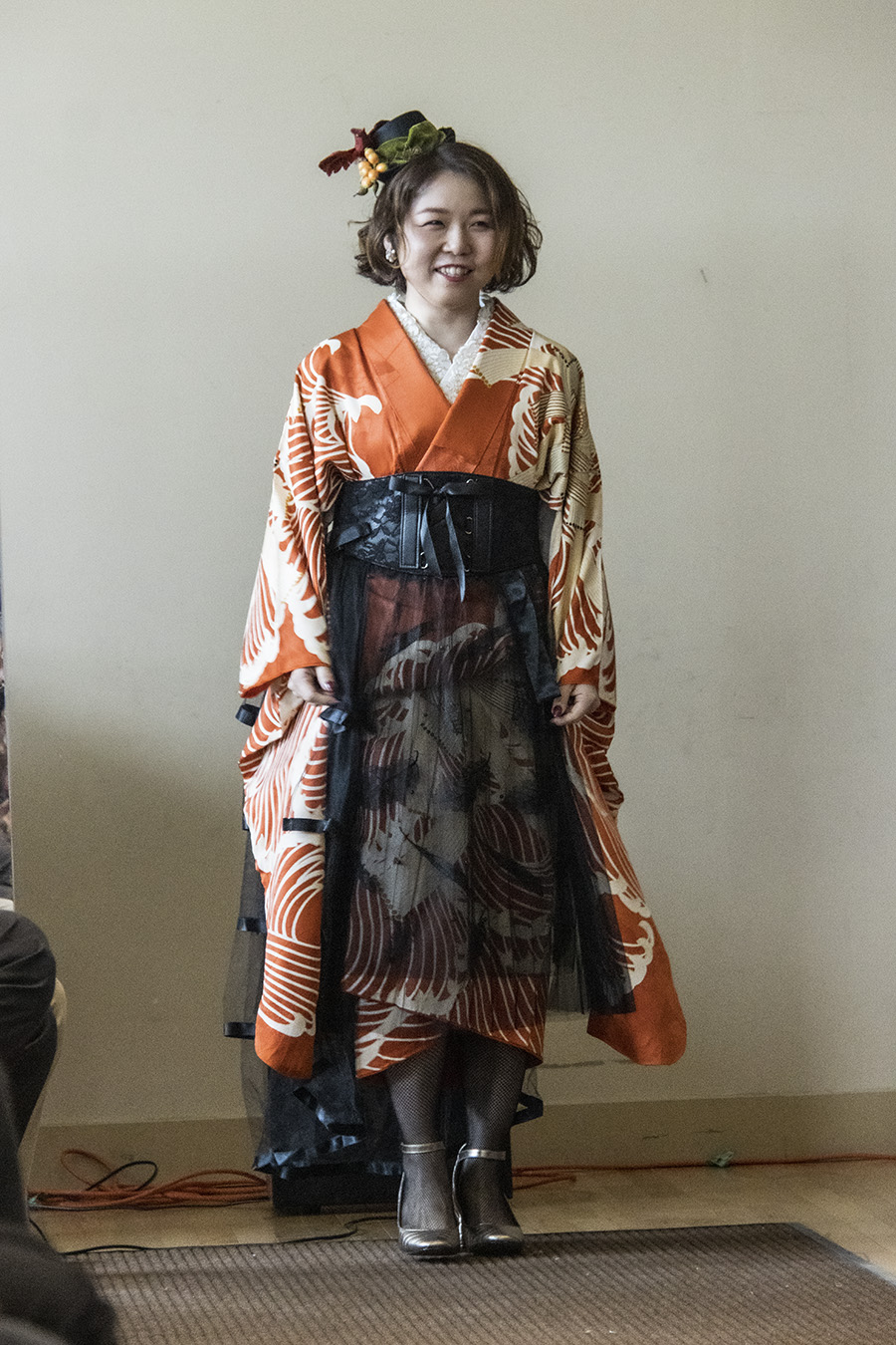
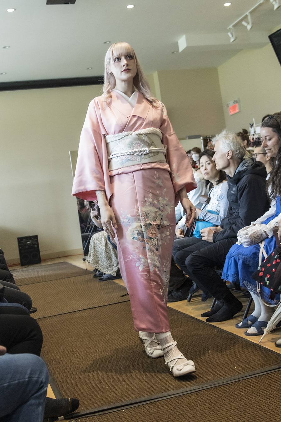
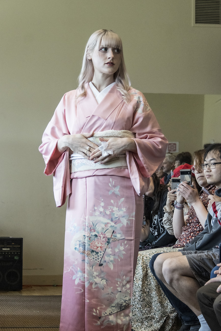
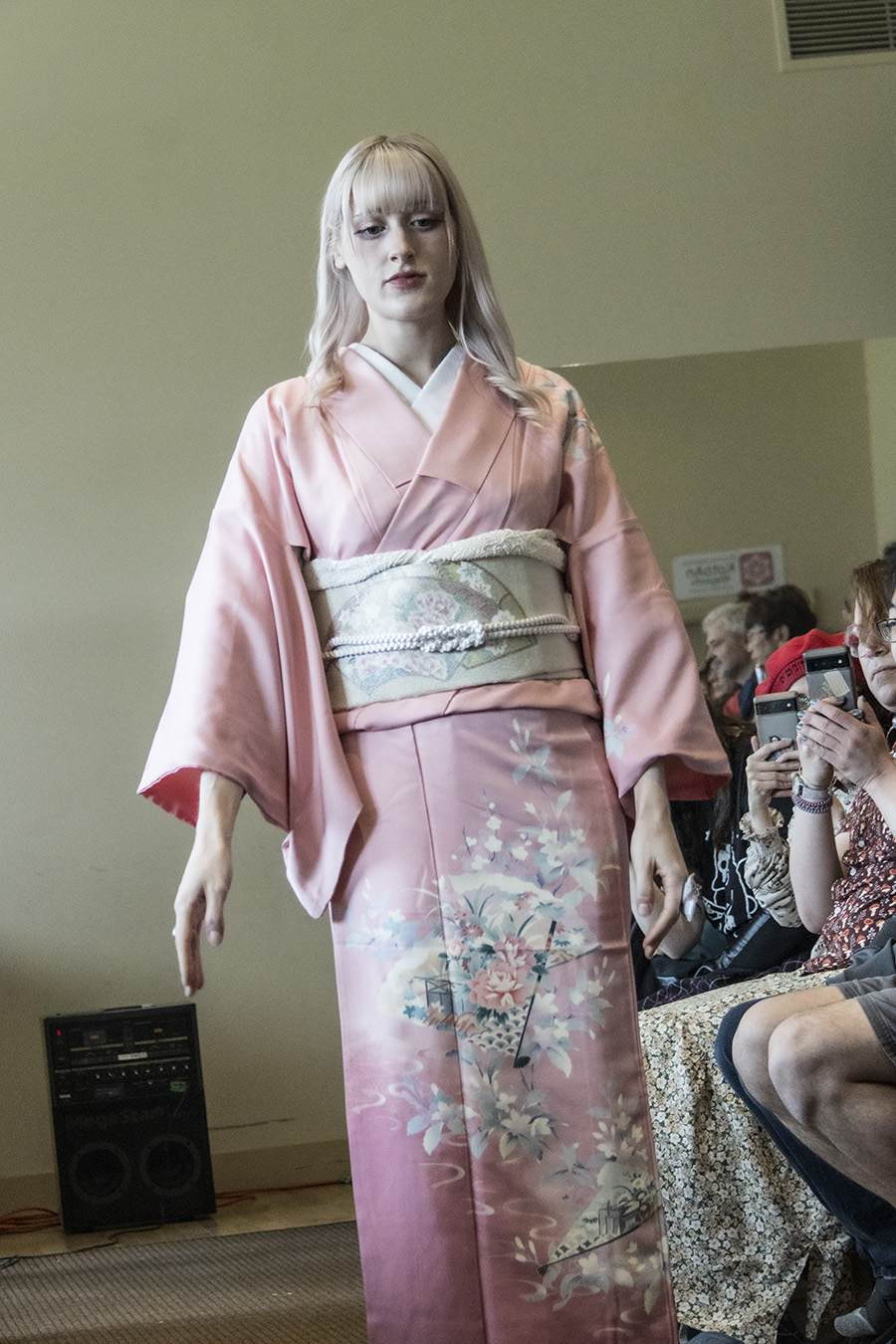
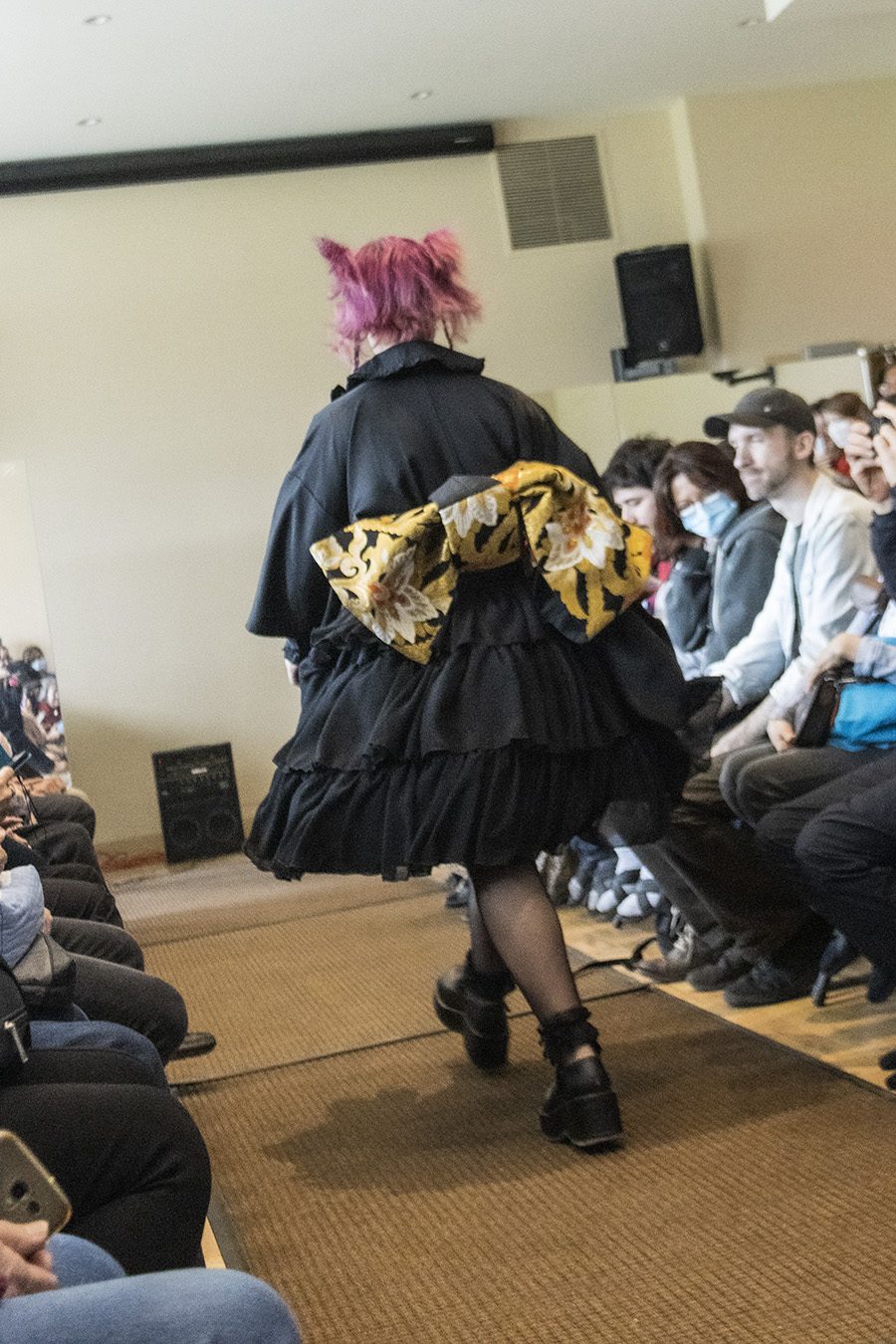
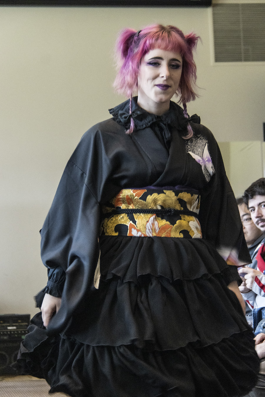
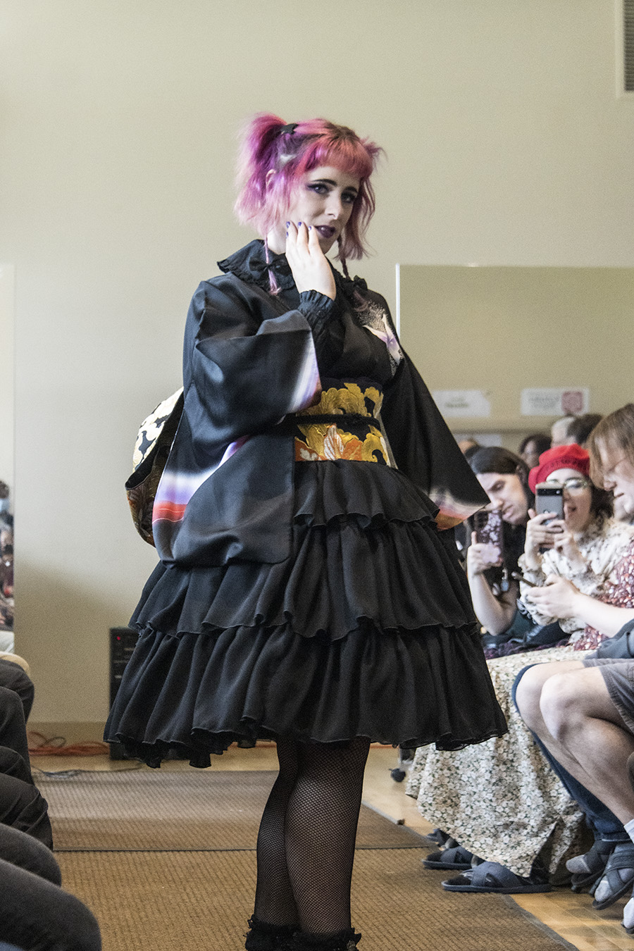
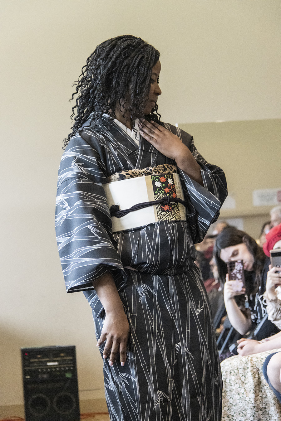
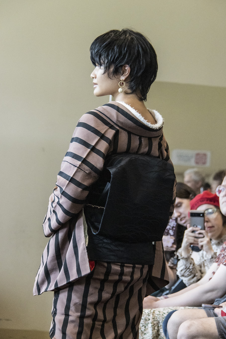
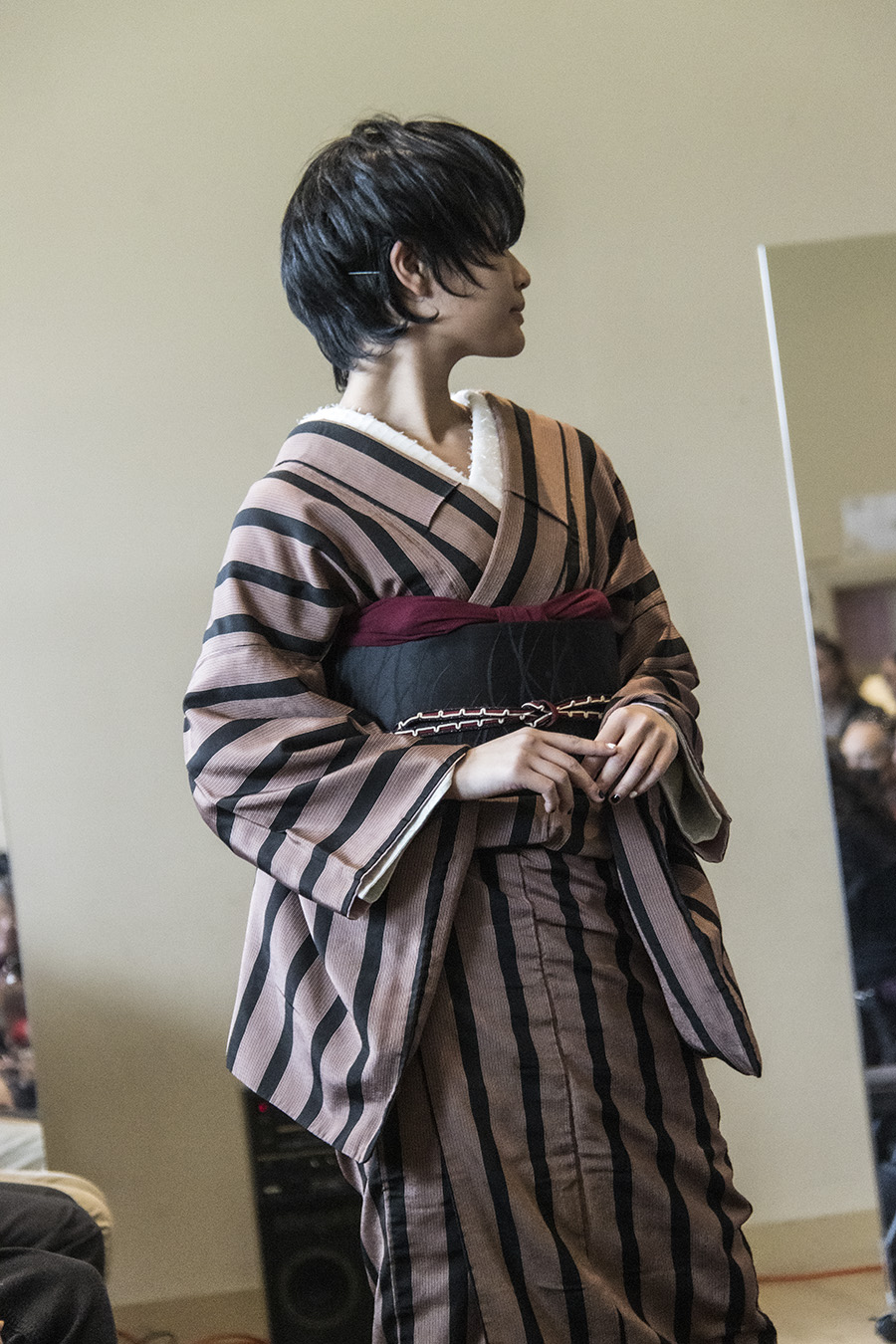
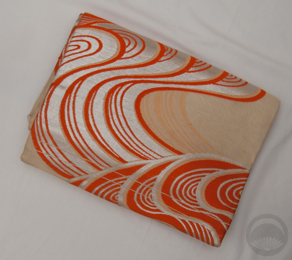
I found this palette with the colour “Eugenia red”, which was about as close as I could find to the kimono. The complementary options were “Sulphine yellow”, “Green Blue”, and “Raw Sienna.” The obi is nearly spot-on for the sulphine yellow, and the other two colours show up in the obi motifs quite nicely. Would I normally have paired a red kimono with mustard and green accessories? Not in a million years! Was it successful? That’s for you to decide. I think it works, but it’s definitely not my favourite thing I’ve ever put together. I will definitely keep trying combos from this book though
Also if you’re curious about my manicure in the book pics, it’s Zoya Midori stamped with this Maniology sashiko plate. I was going for “matcha latte” vibes.
Items used in this coordination

-
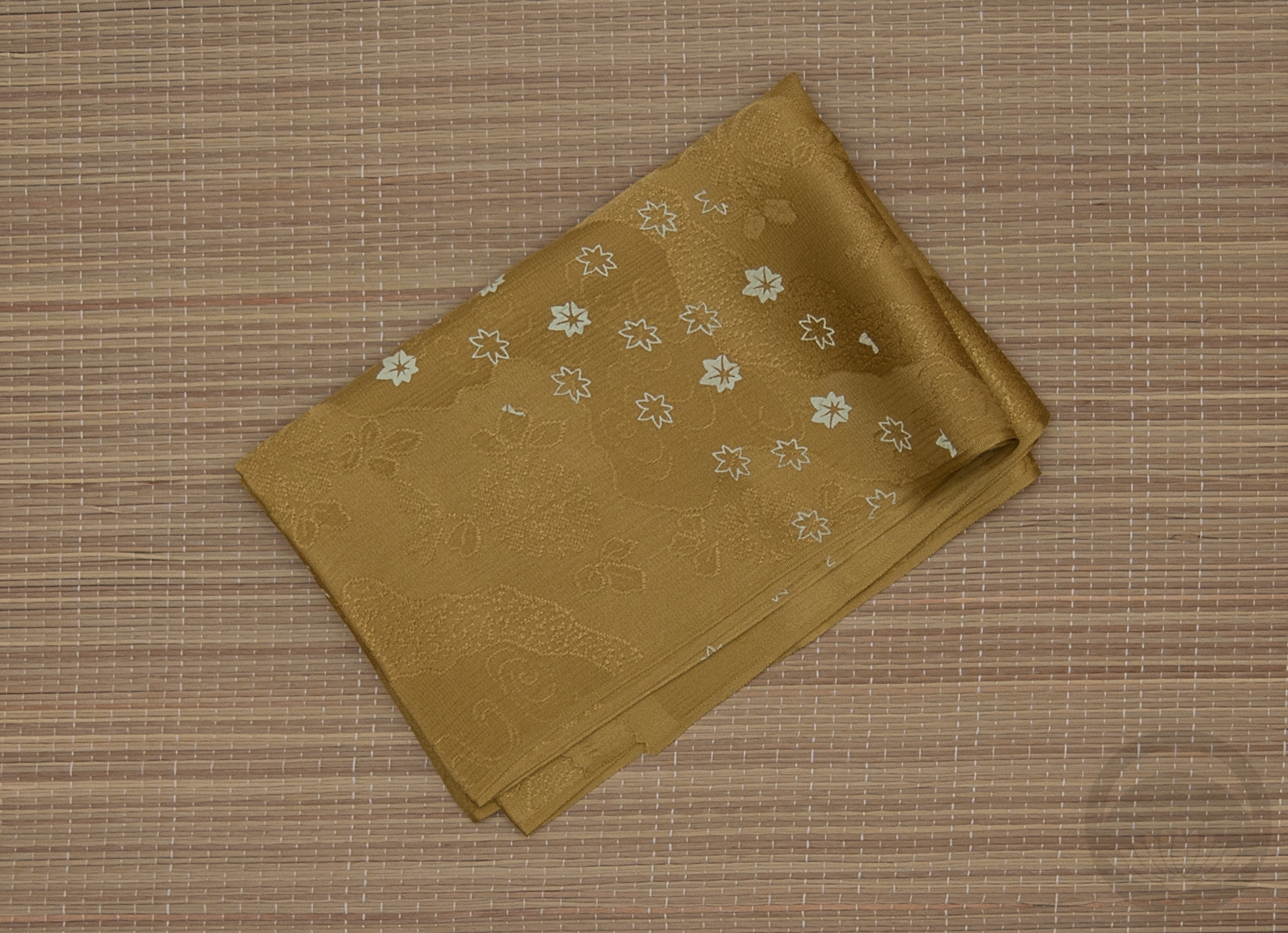
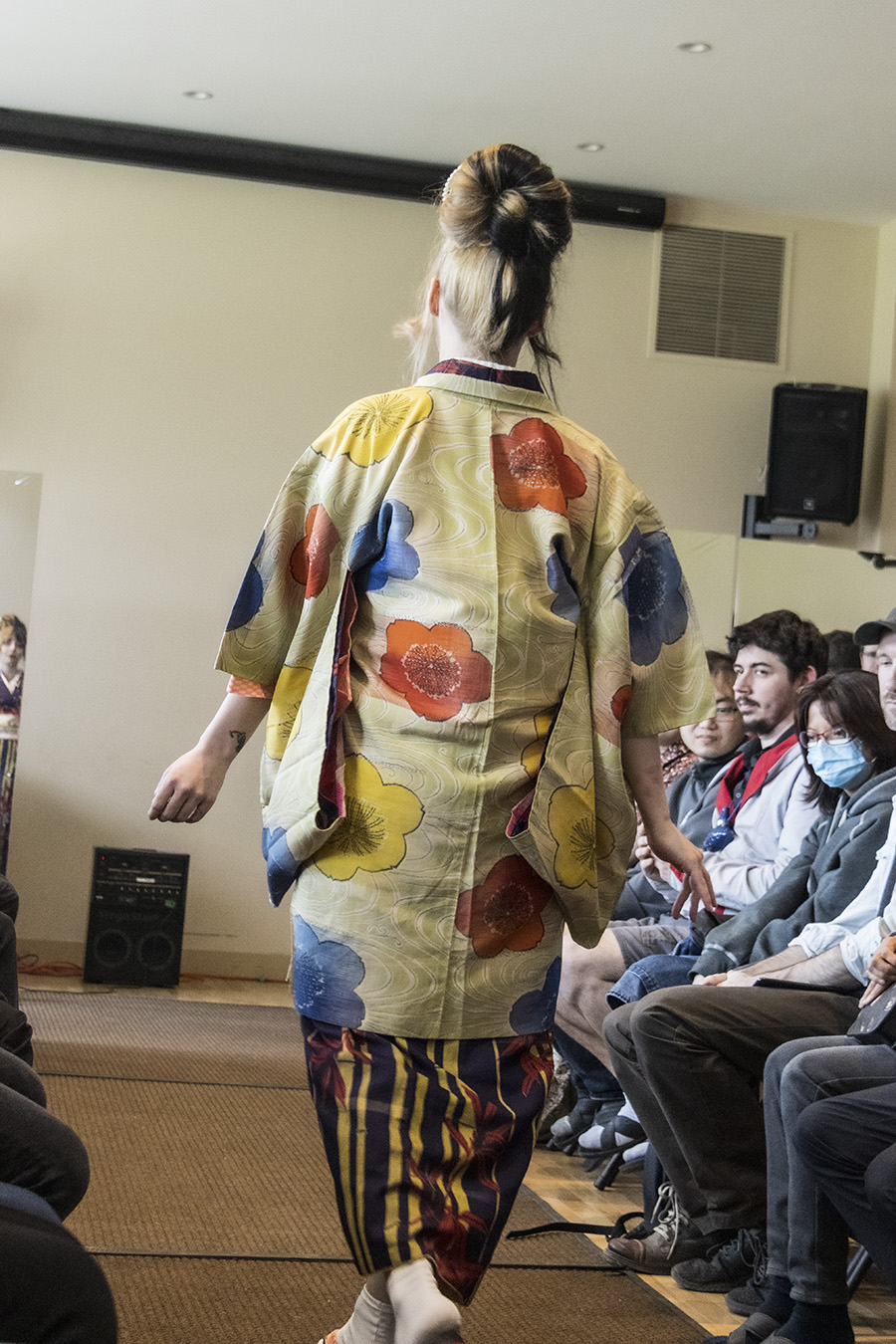
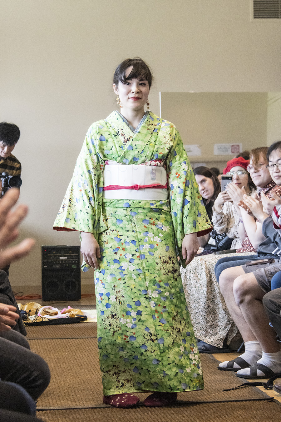
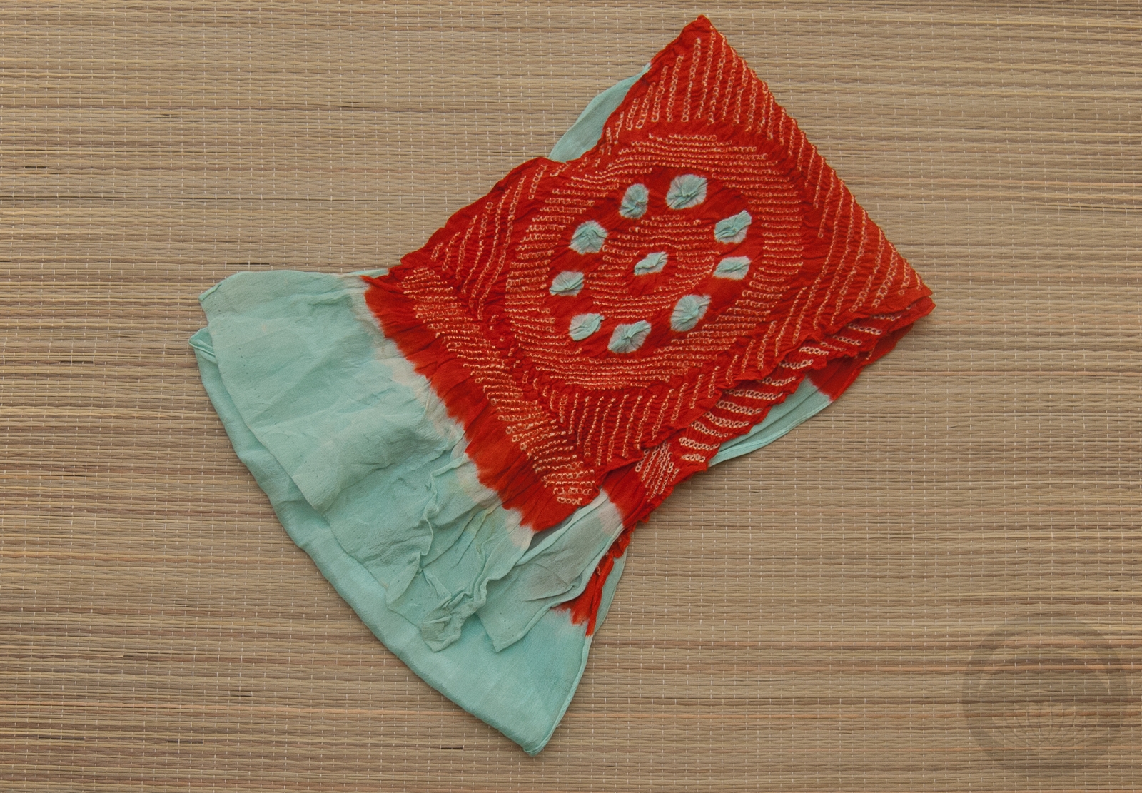
- Yellow Florals
-
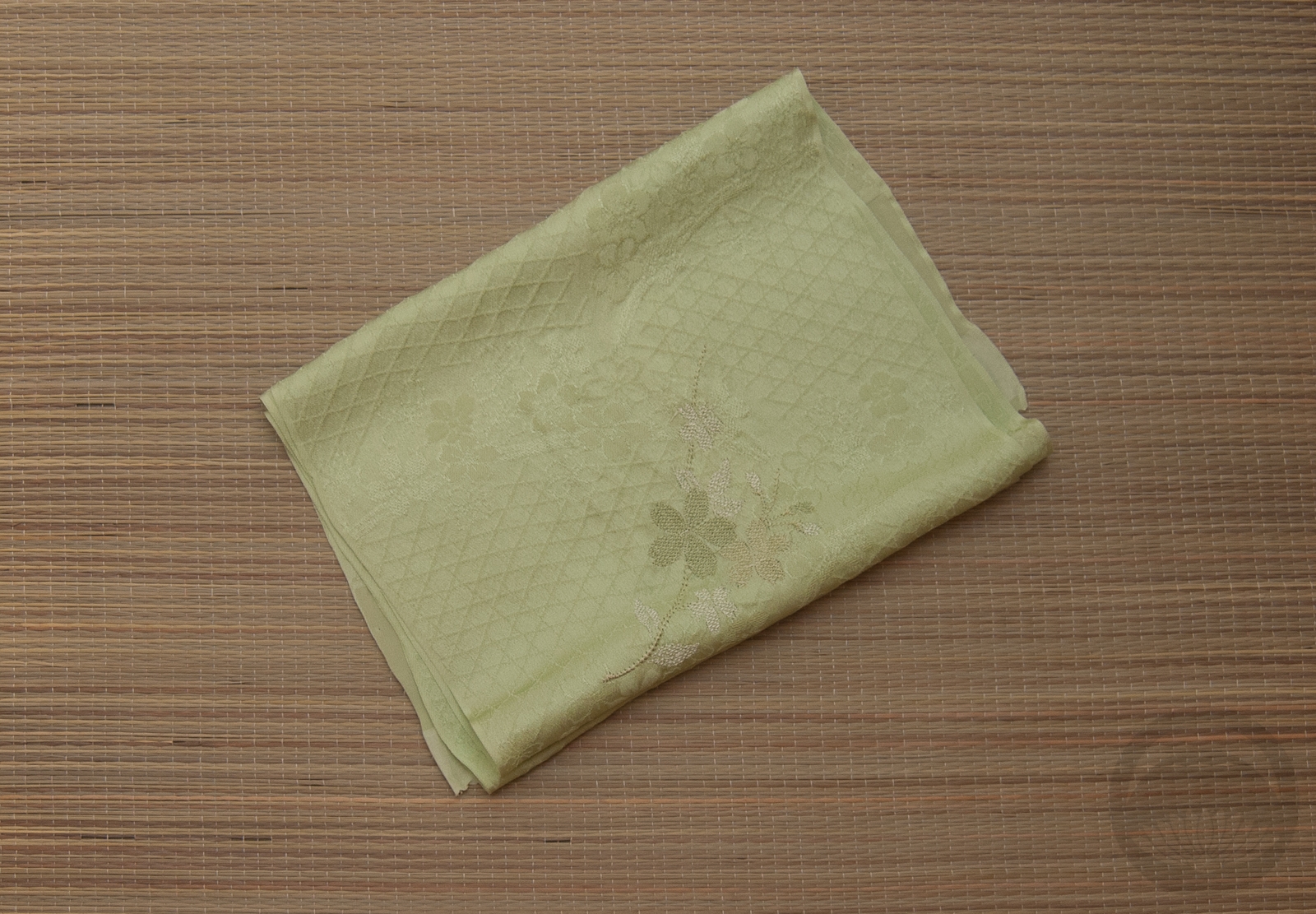
- Olive Rinzu
-
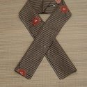
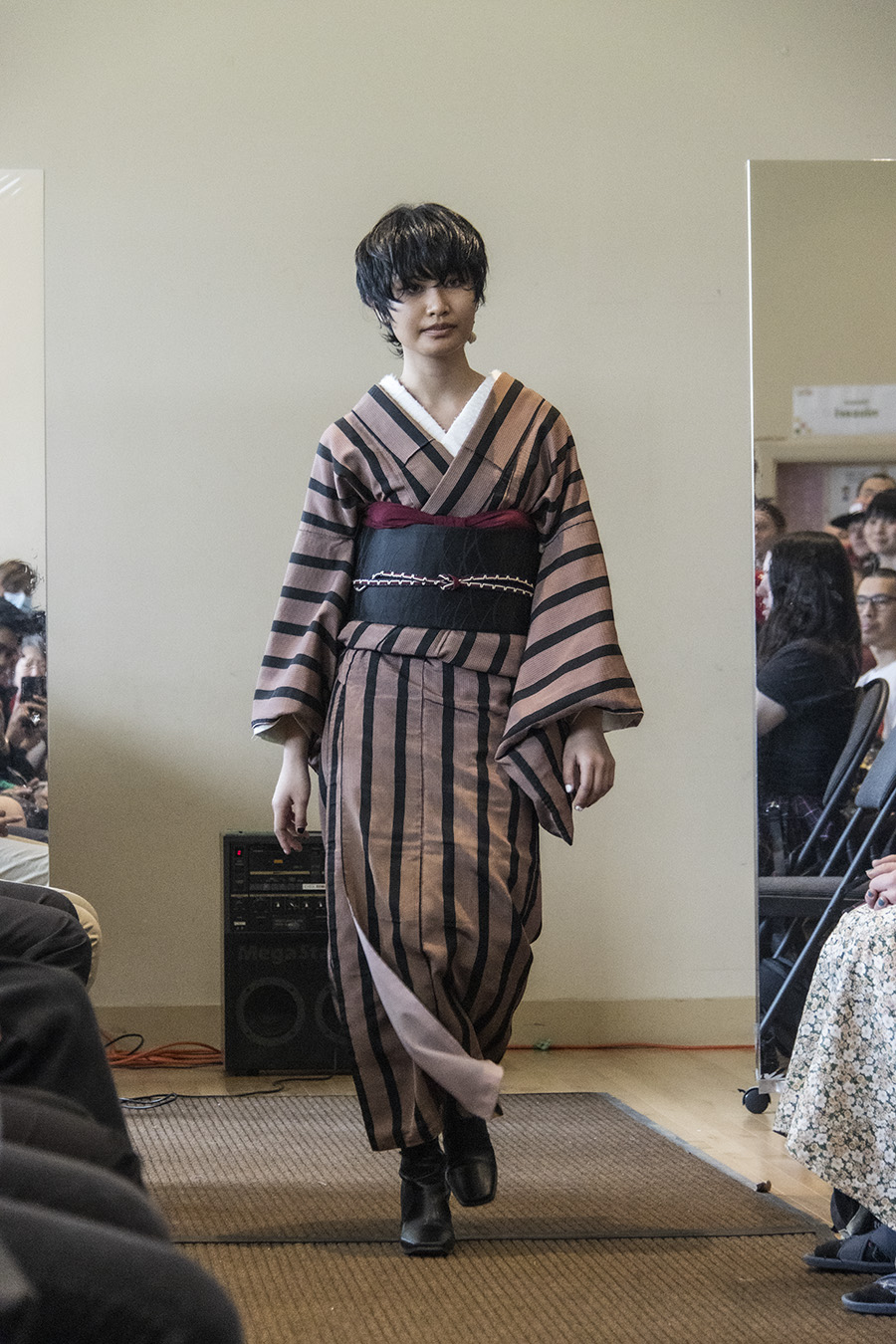
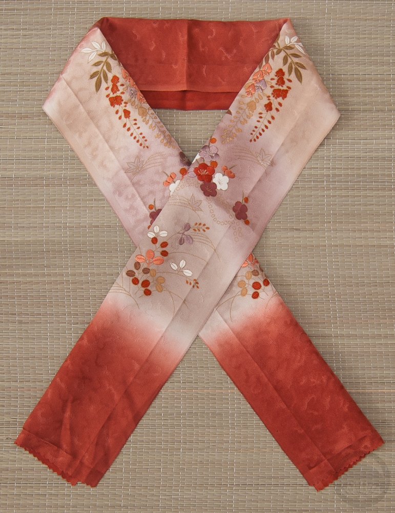
- Stripes with Ume

This post contains affiliate link(s). If you choose to purchase, I receive a small rebate or commission which goes to the continued maintenance of this site.


 Bebe Taian
 CHOKO Blog
 Gion Kobu