
Welcome to the first/third installment of a year-long project. I’m determined to make a coordination every month that features the primary colour of one of that month’s commonly accepted birthstones. I say one of because many months have more than one accepted stone.
Should I have started this in January? Probably, yes. But I only got the idea a week or so ago, and here we are. I will be doing January and February’s shortly and backdating them. I will also have to do a few in advance, when I know I’ll be in California, but at least this way I’m guaranteed to get back to my roots and post at least one kimono ensemble per month, barring some unforeseen disaster like the Great Legsplosion of ’23 or some other such nonsense.
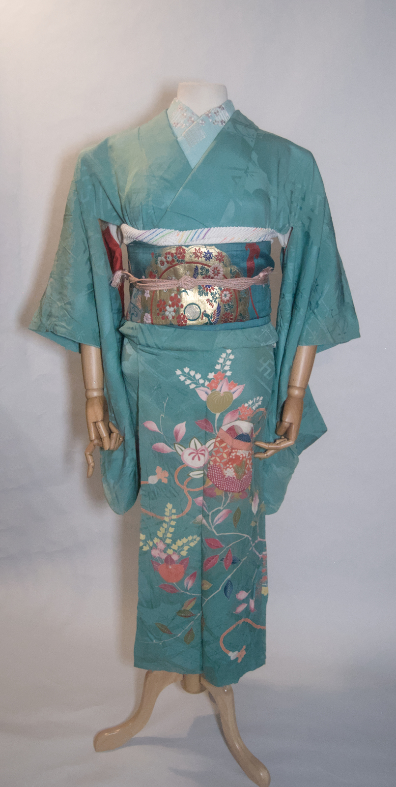
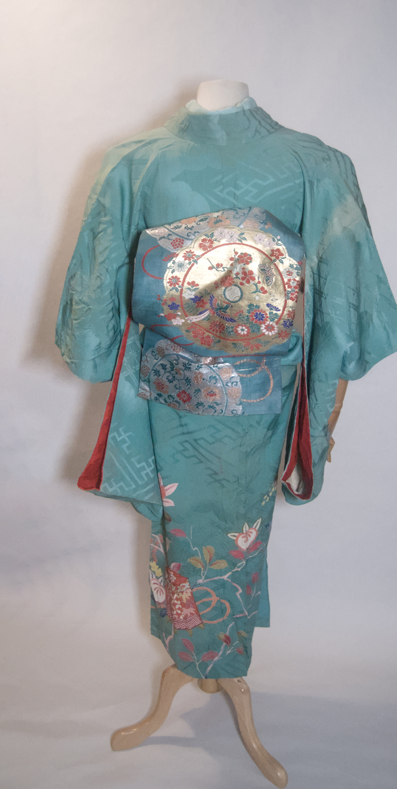
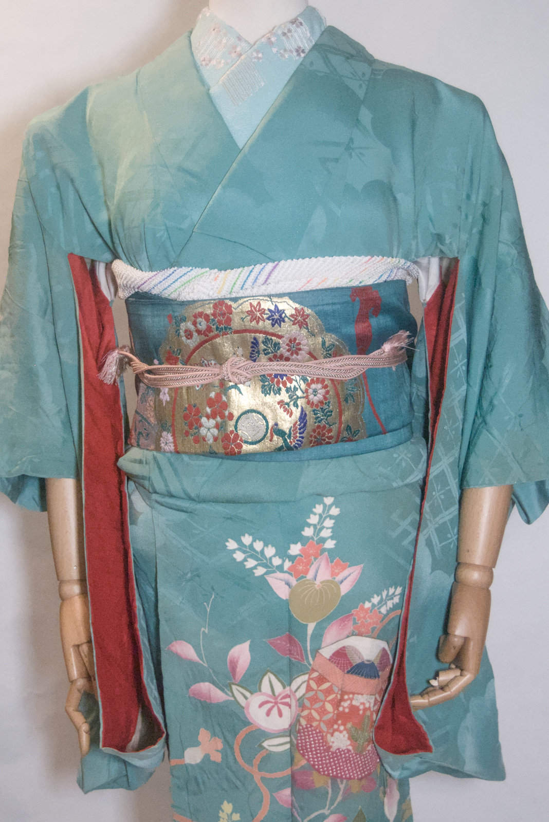
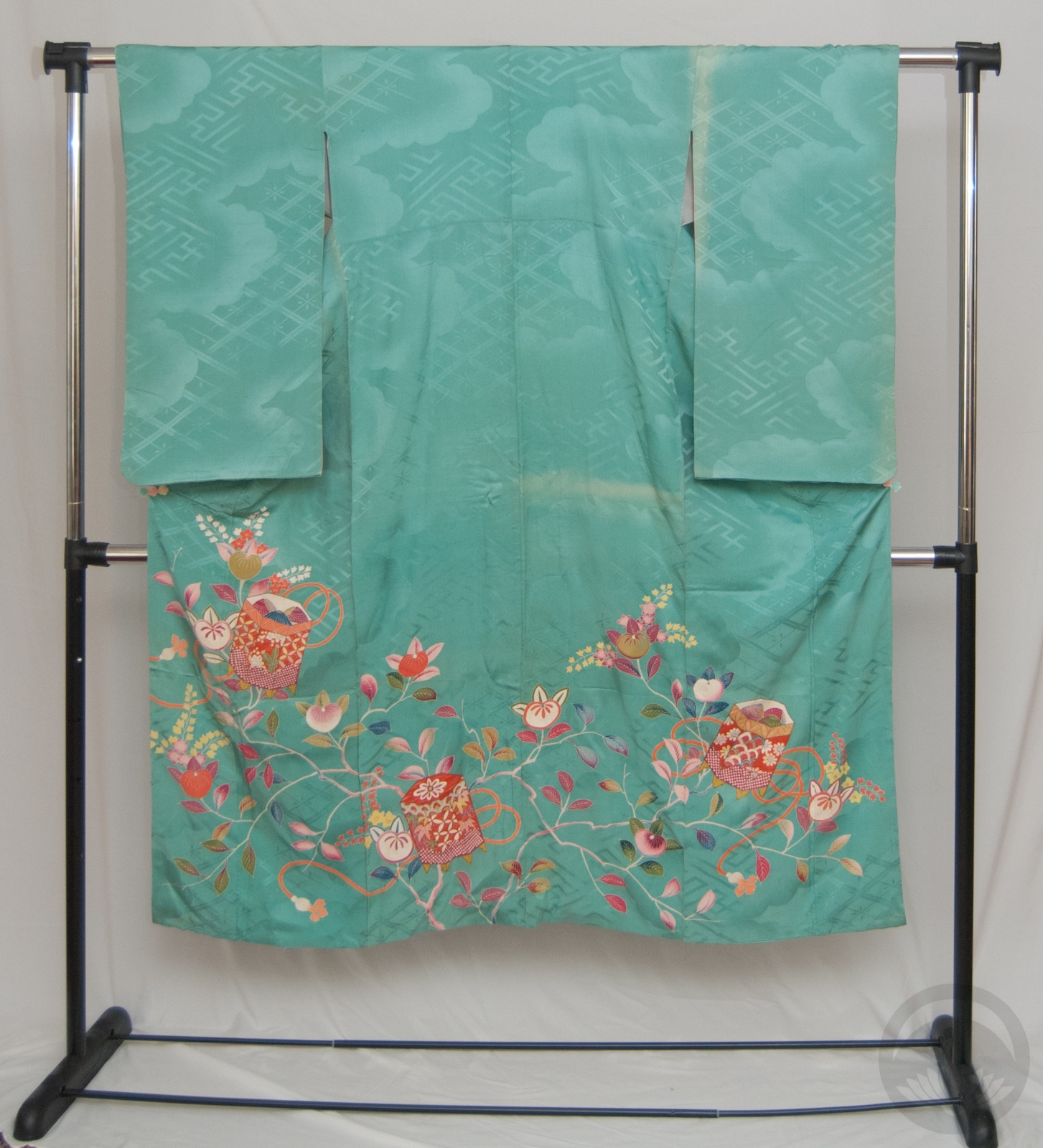
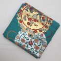
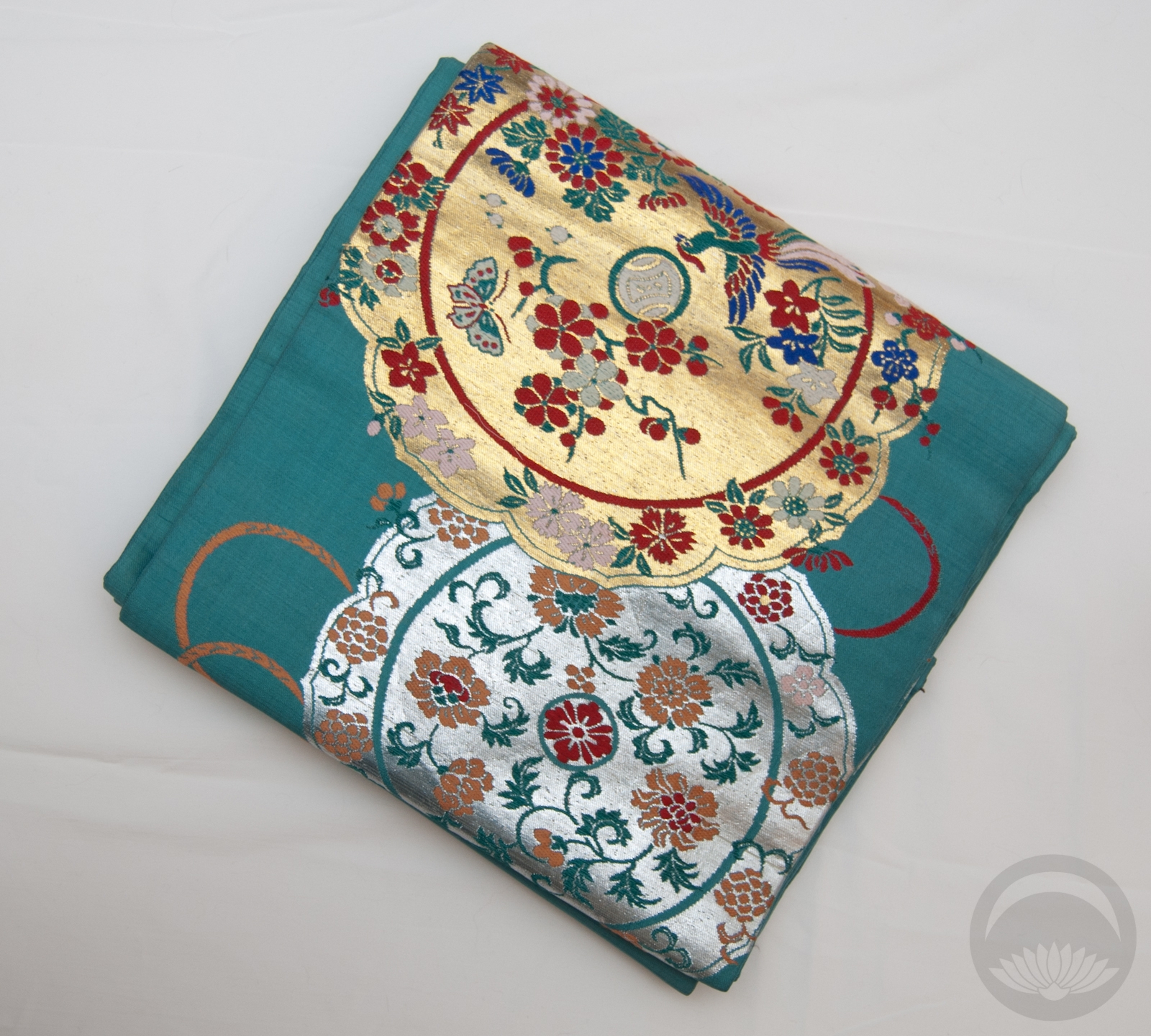
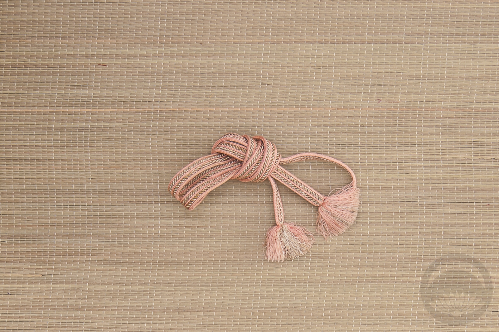
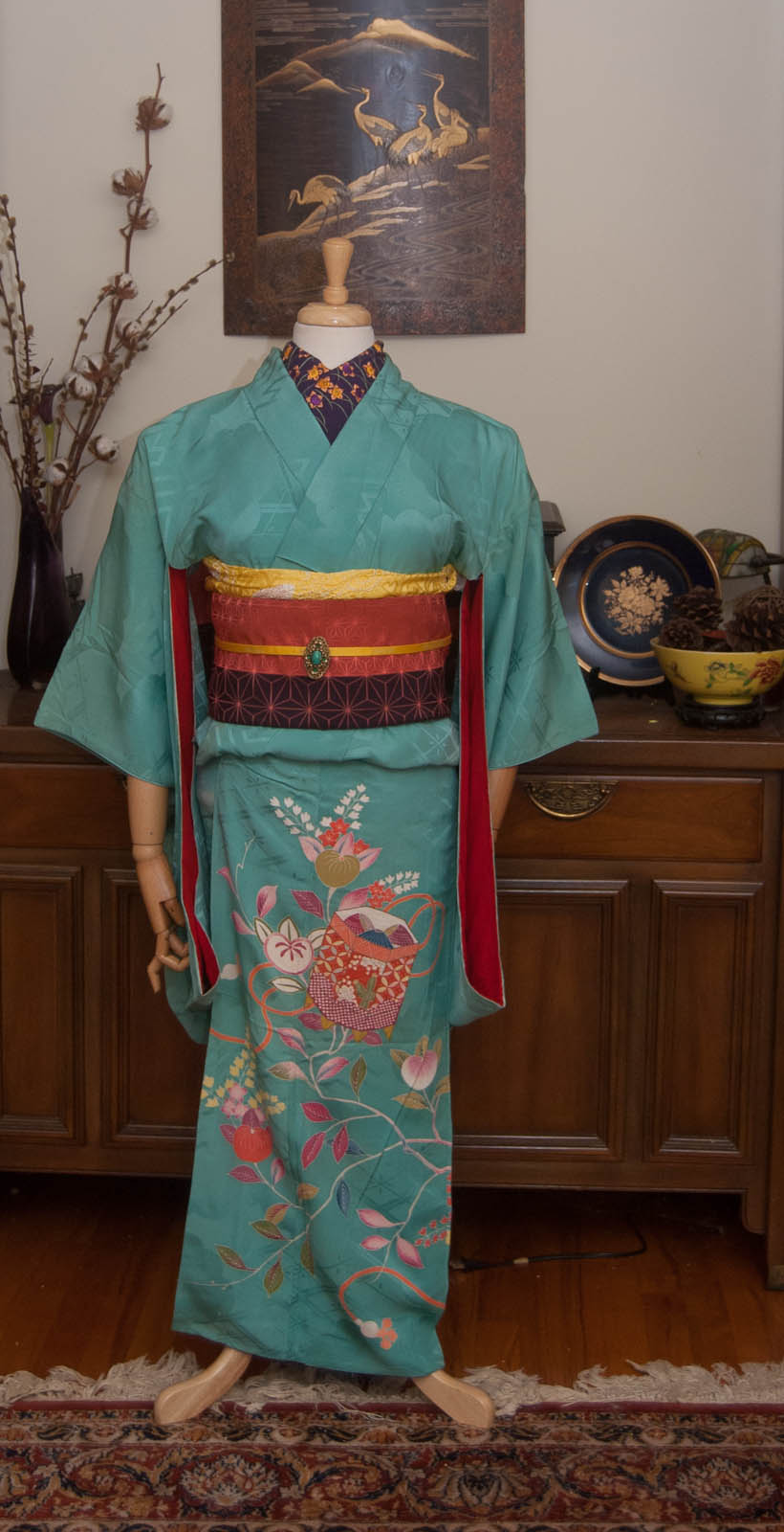
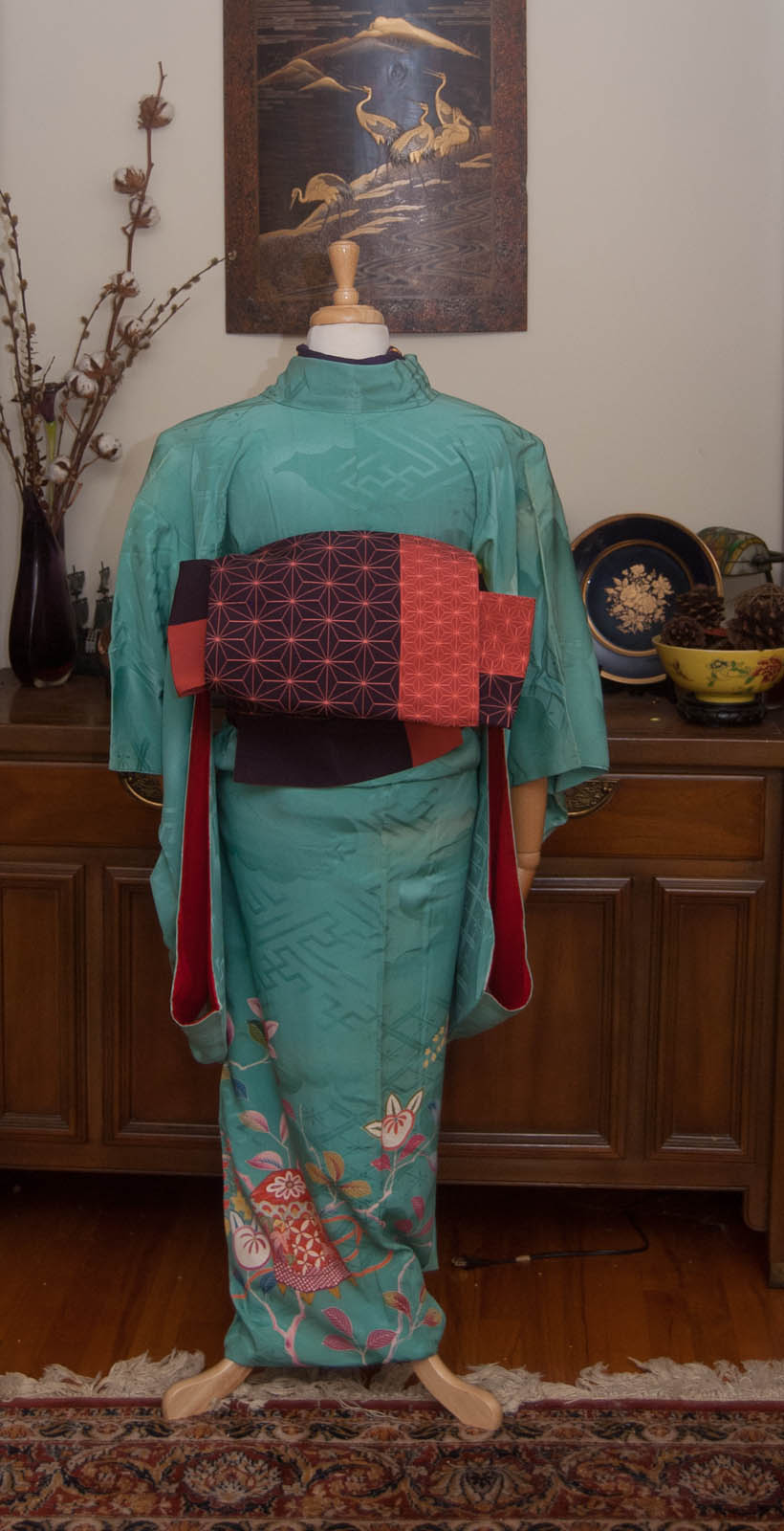
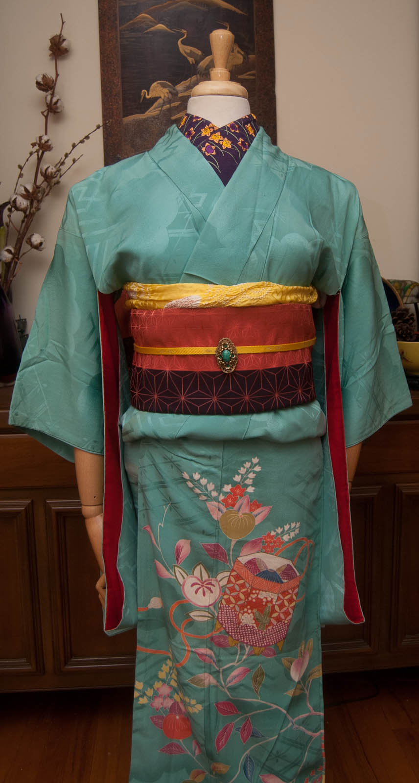
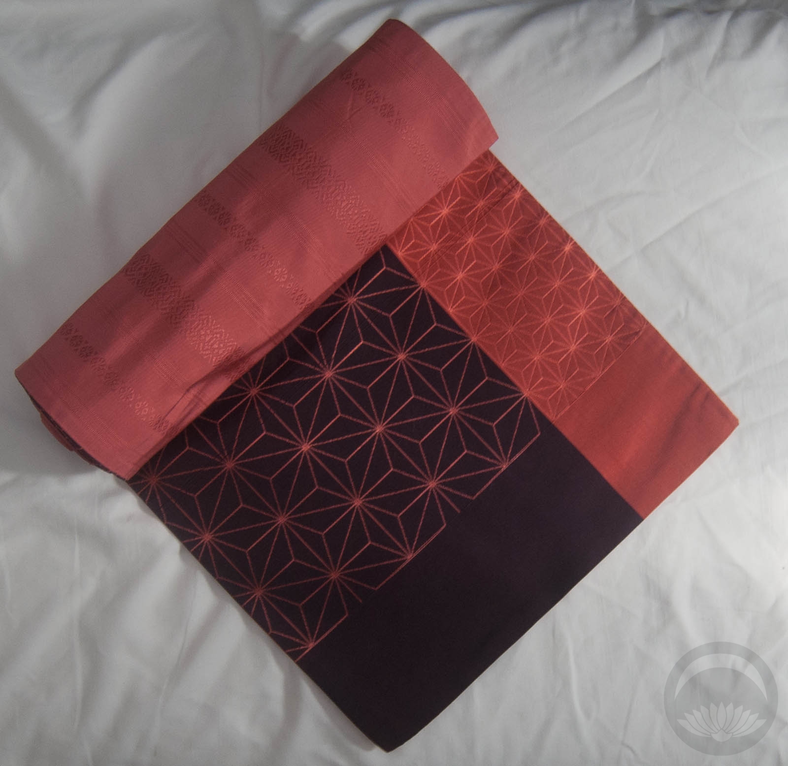
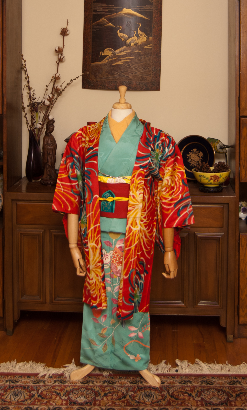
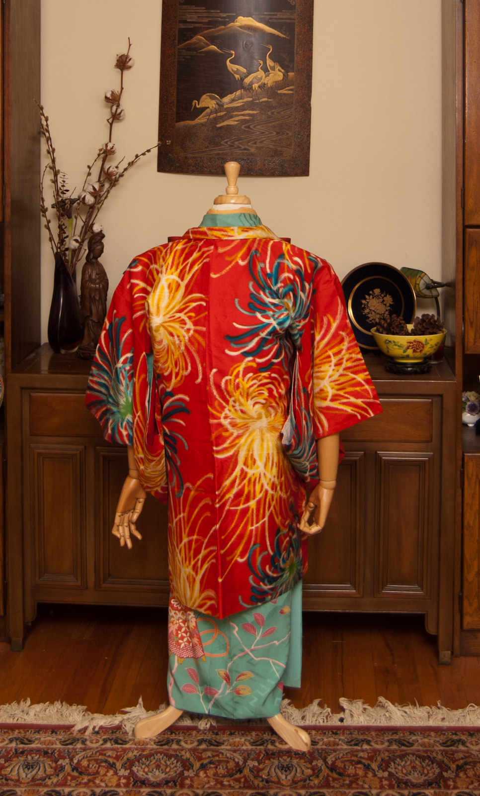
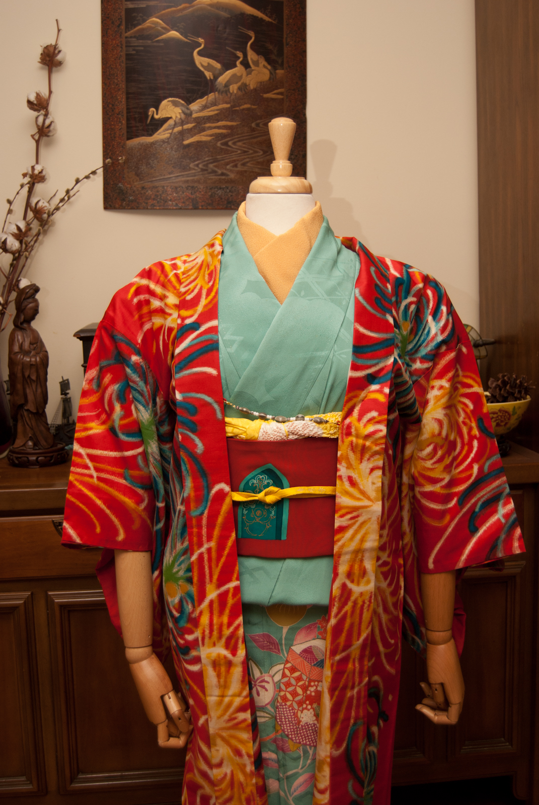
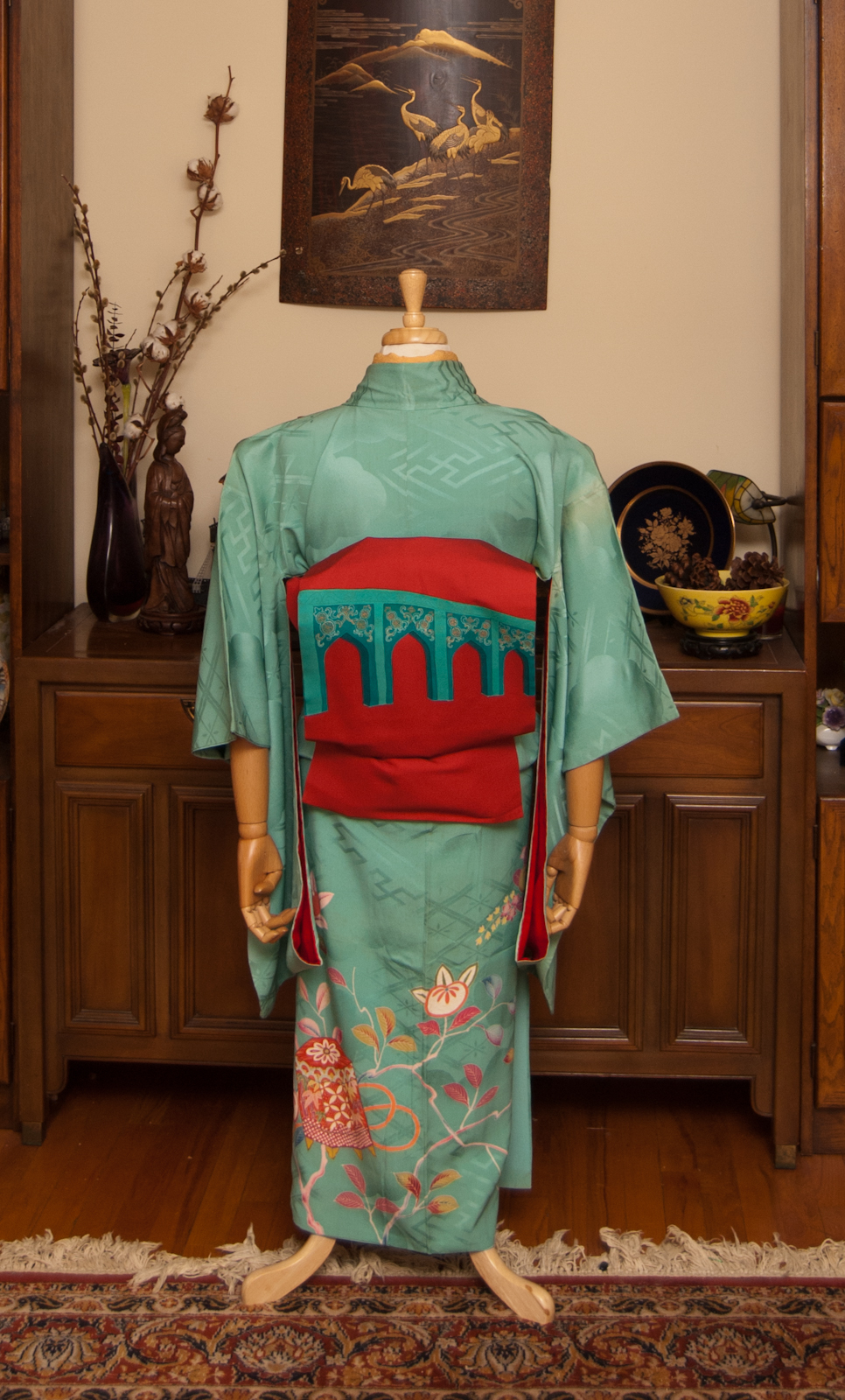
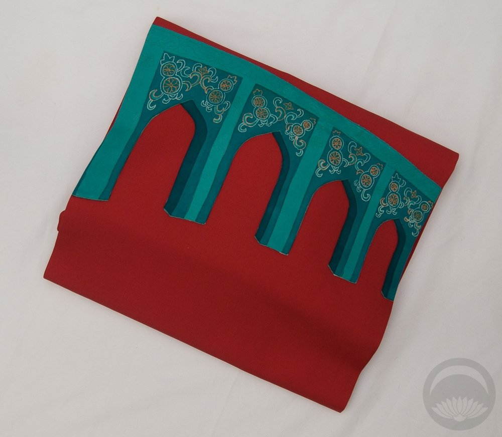
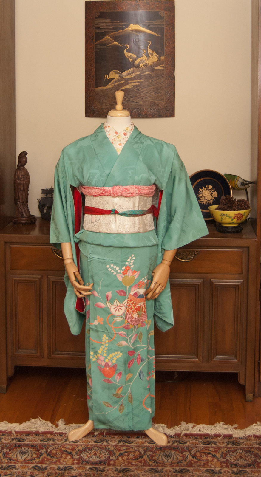
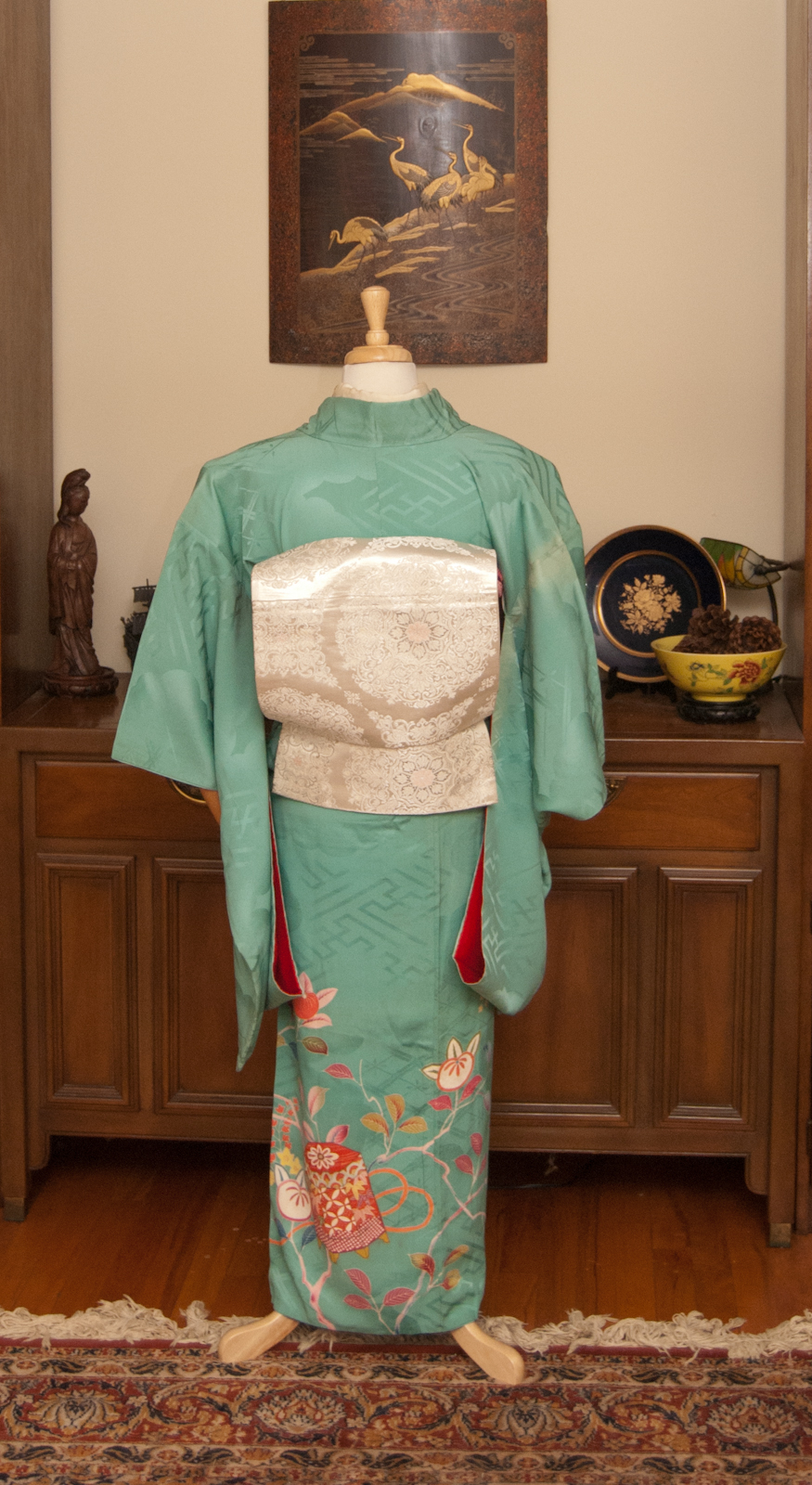
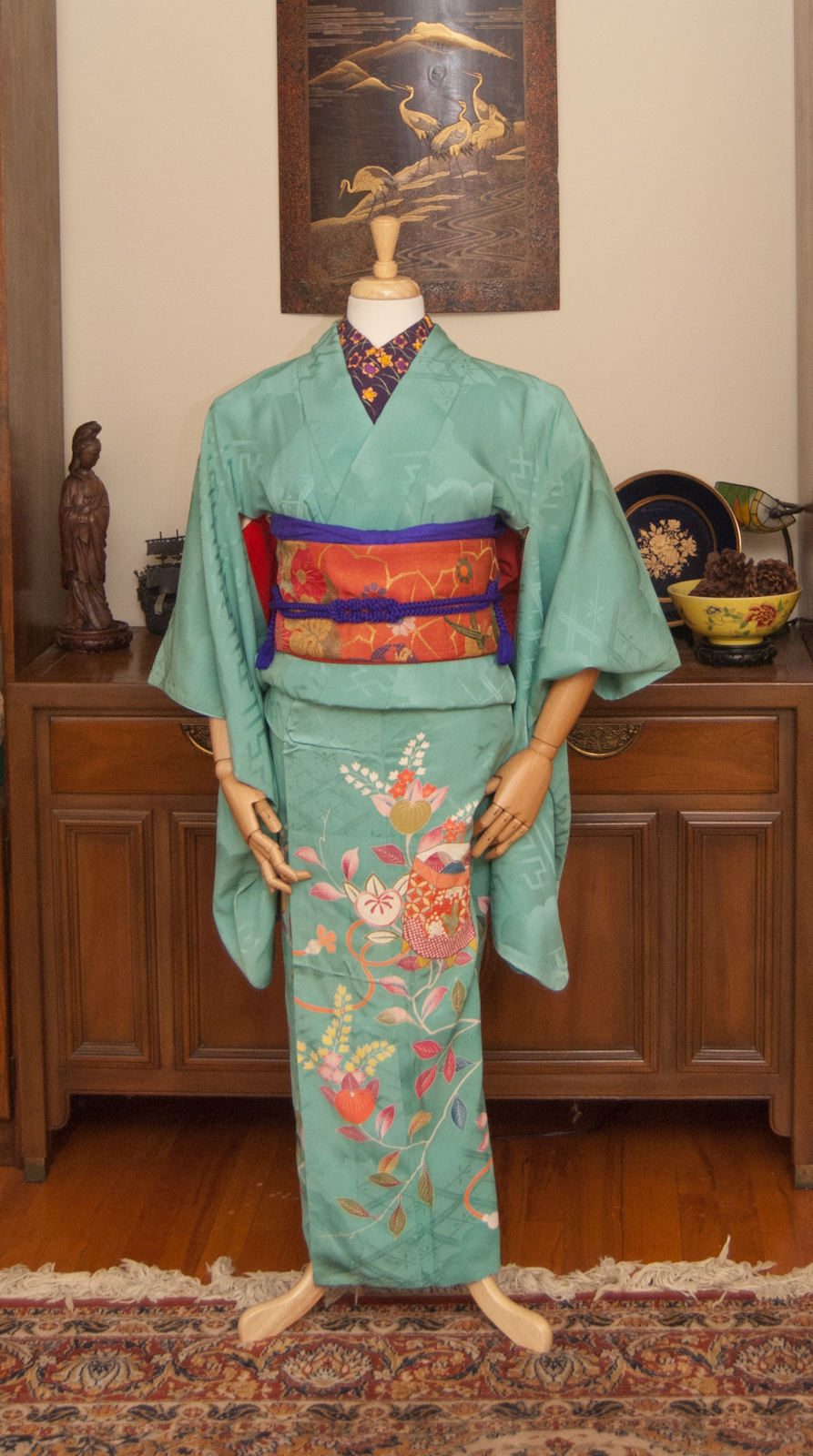
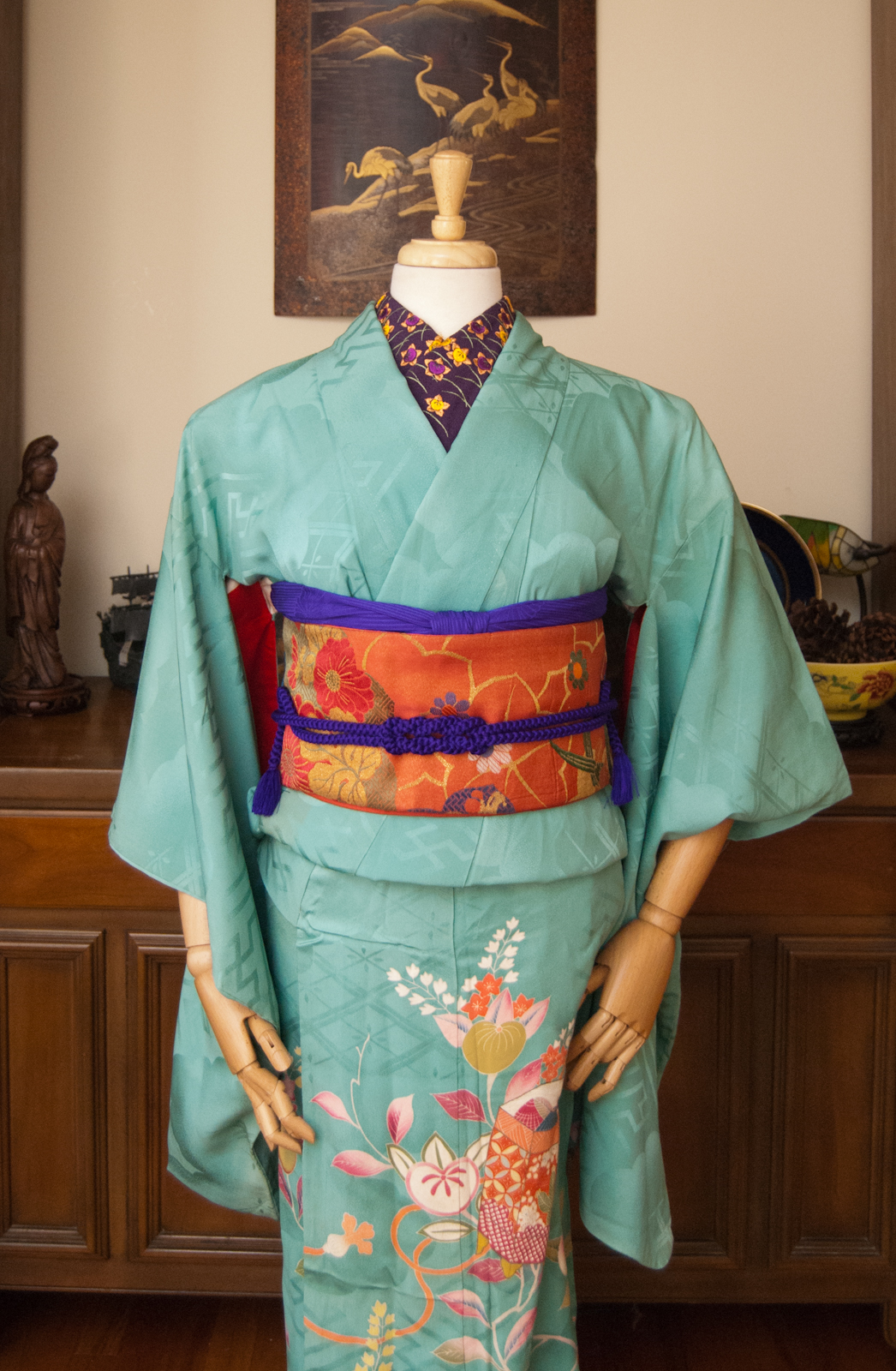
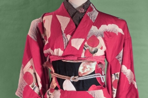
For March, we have the beautiful aquamarine. Not quite blue, not quite turquoise, but that ephemeral middle-ground. I knew I had to use this Taisho-era irotome, and the vintage mirror motif obi was a spot-on pairing. I love how it adds some sparkle and shimmer, very appropriate for a gemstone theme! I decided for a few hints of pink in the accessories because they’re already present in the kimono and read almost as neutral here. It also gave me an opportunity to use the amazing rainbow obiage I got from Chayatsuji Kimono recently. I am happy with how this all came together, and it gives me hope and encouragement for the rest of the project.
What’s your birthstone? Or, if you have several, which one do you prefer?
- January - Garnet
- February - Amethyst (coming soon)
- March - Aquamarine
- April - Diamond
- May - Emerald
- June - Alexandrite
- July - Ruby
Items used in this coordination
-
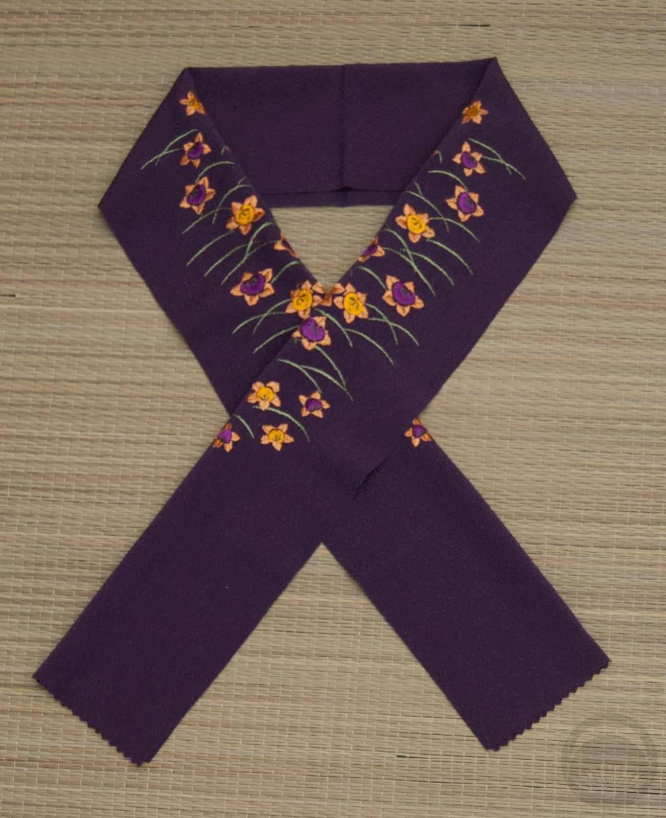
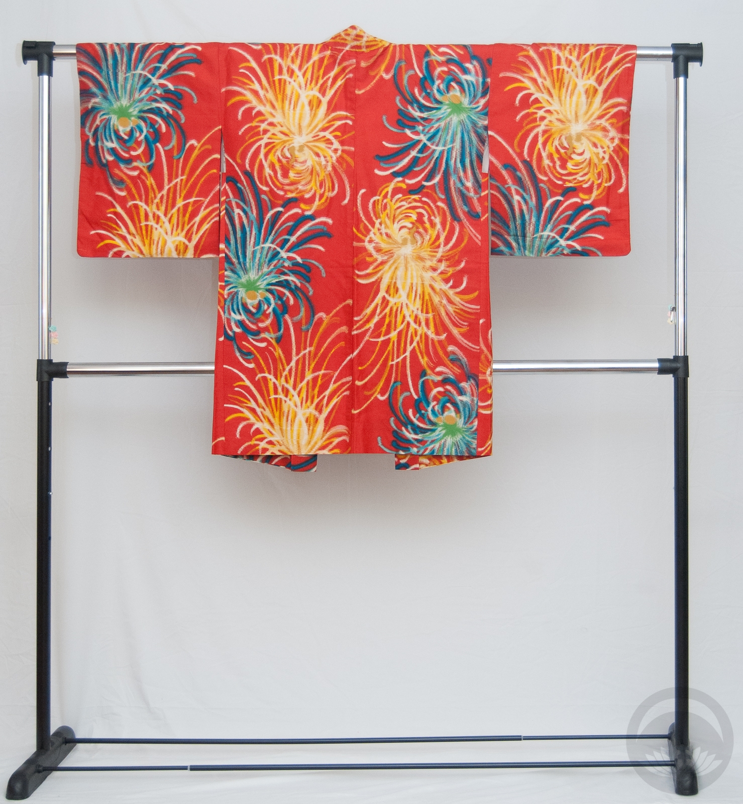
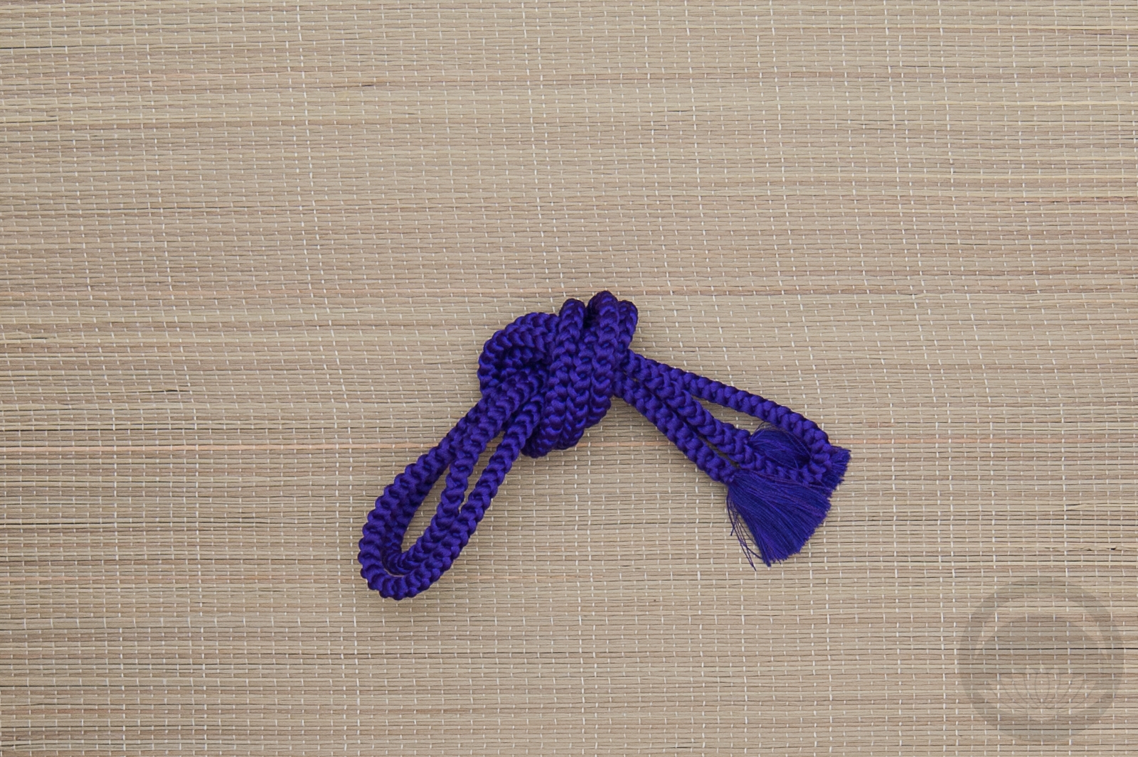
- Turquoise Tachibana
-
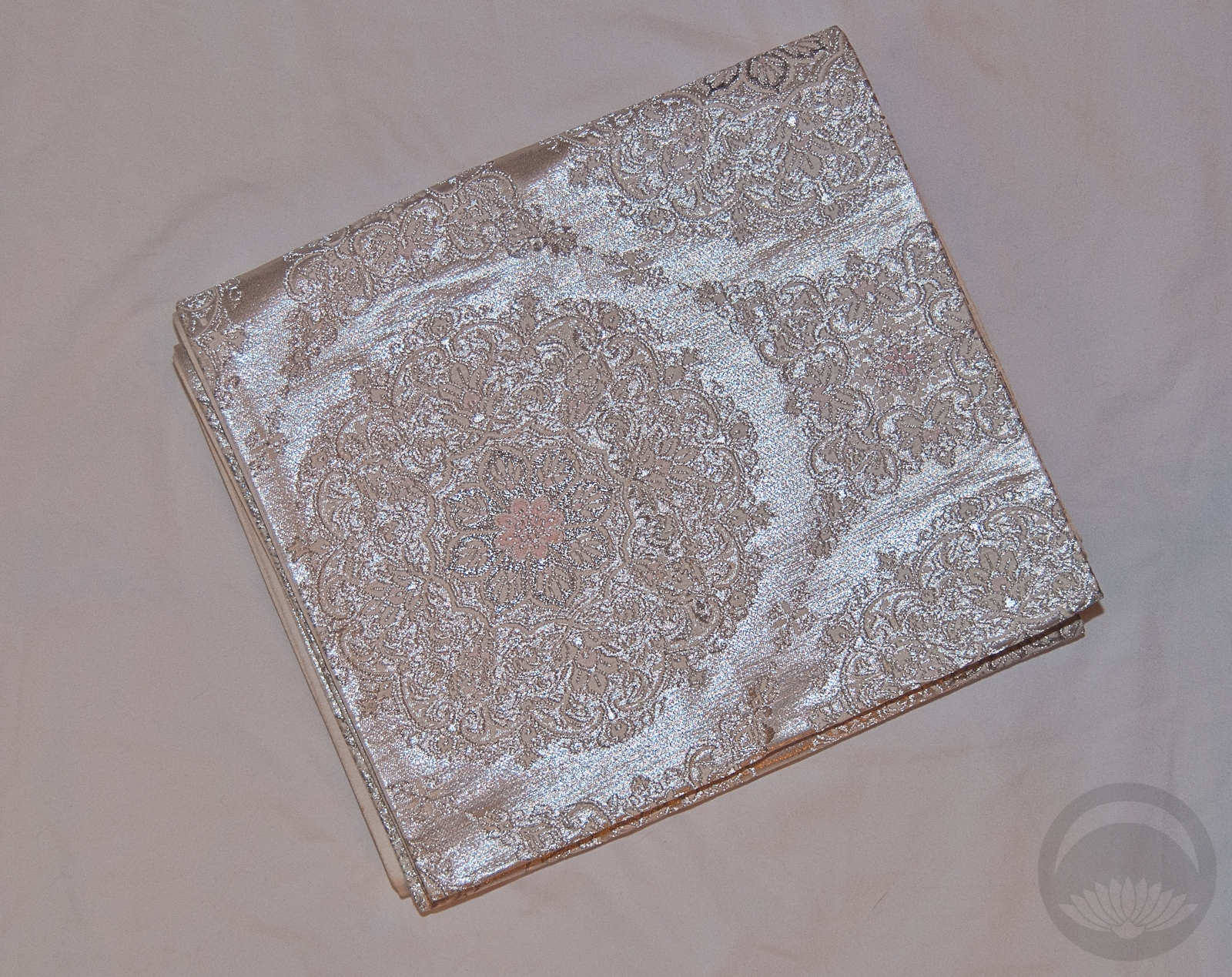
- Teal with Mirrors
-

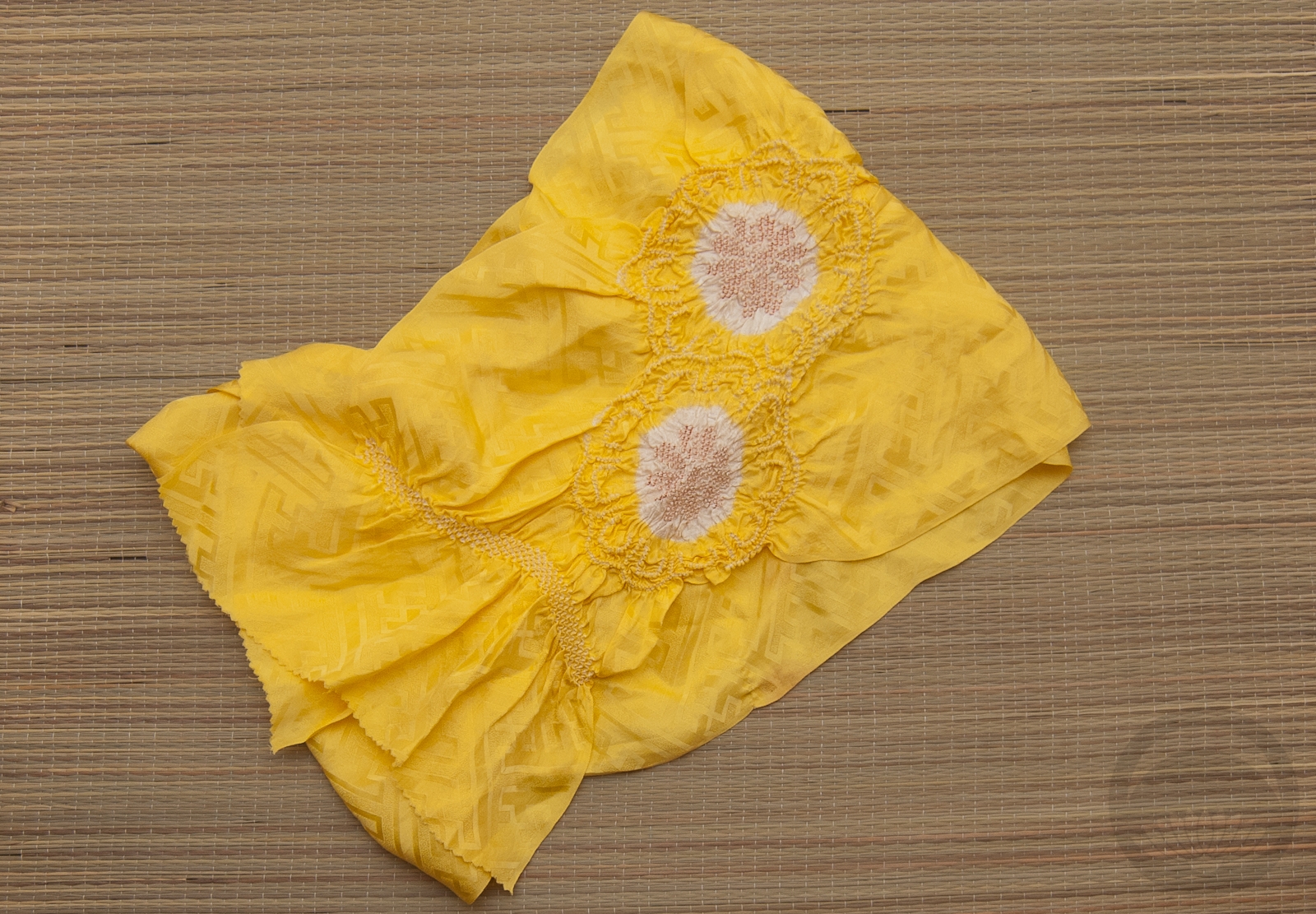
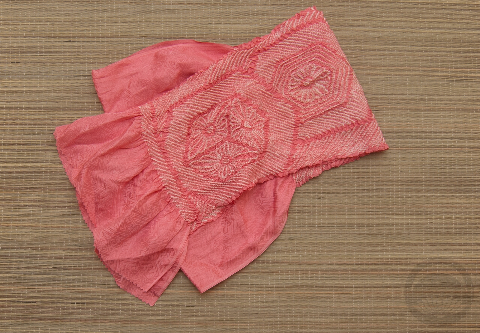
- Sakura

-

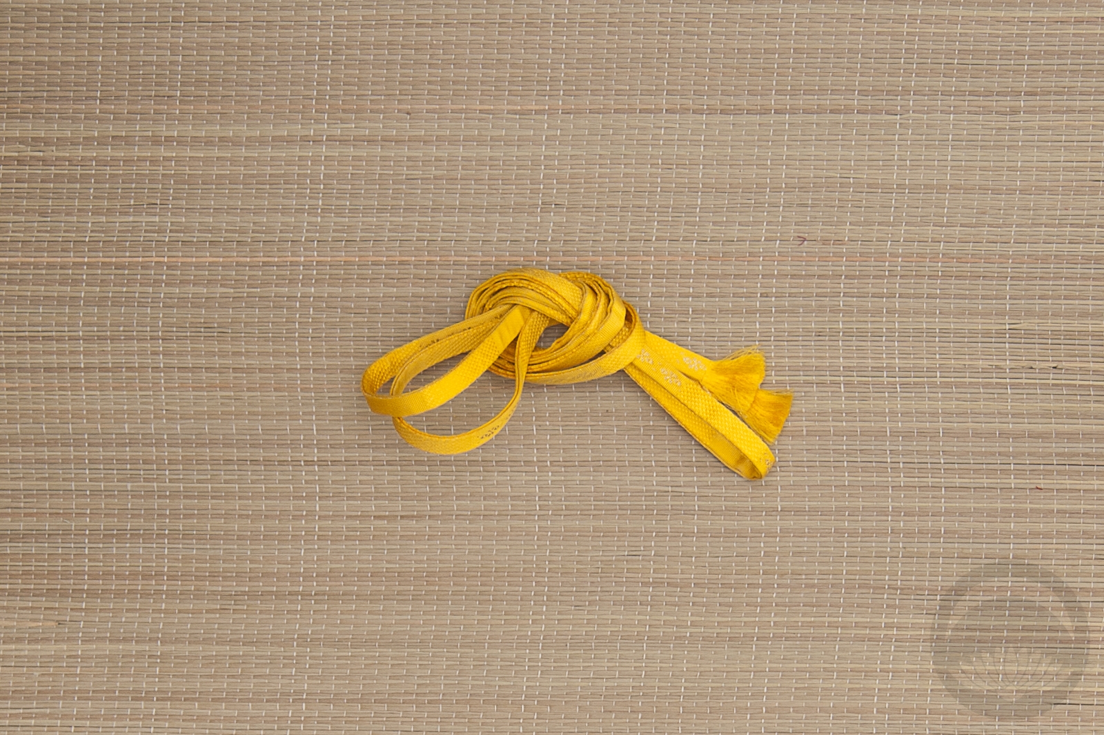
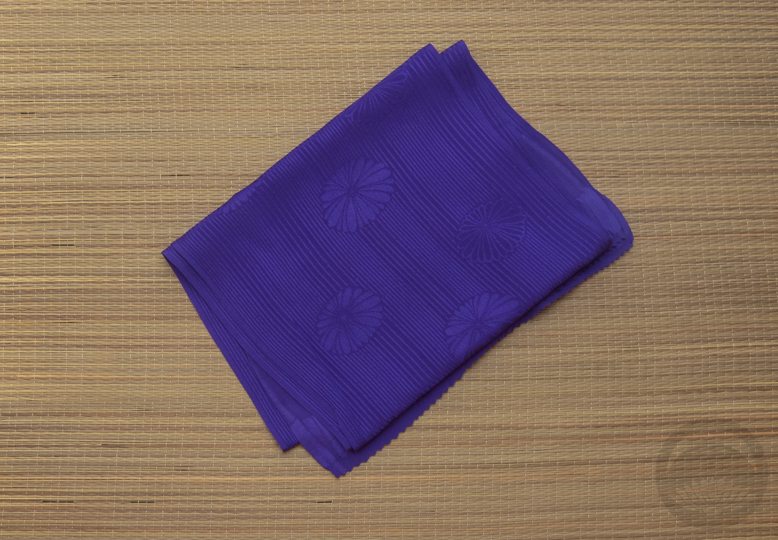
- Pink & Silver


 Bebe Taian
 CHOKO Blog
 Gion Kobu