Kiku The Bucket Ikebana

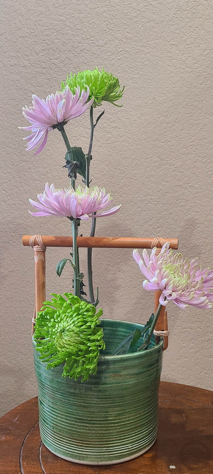
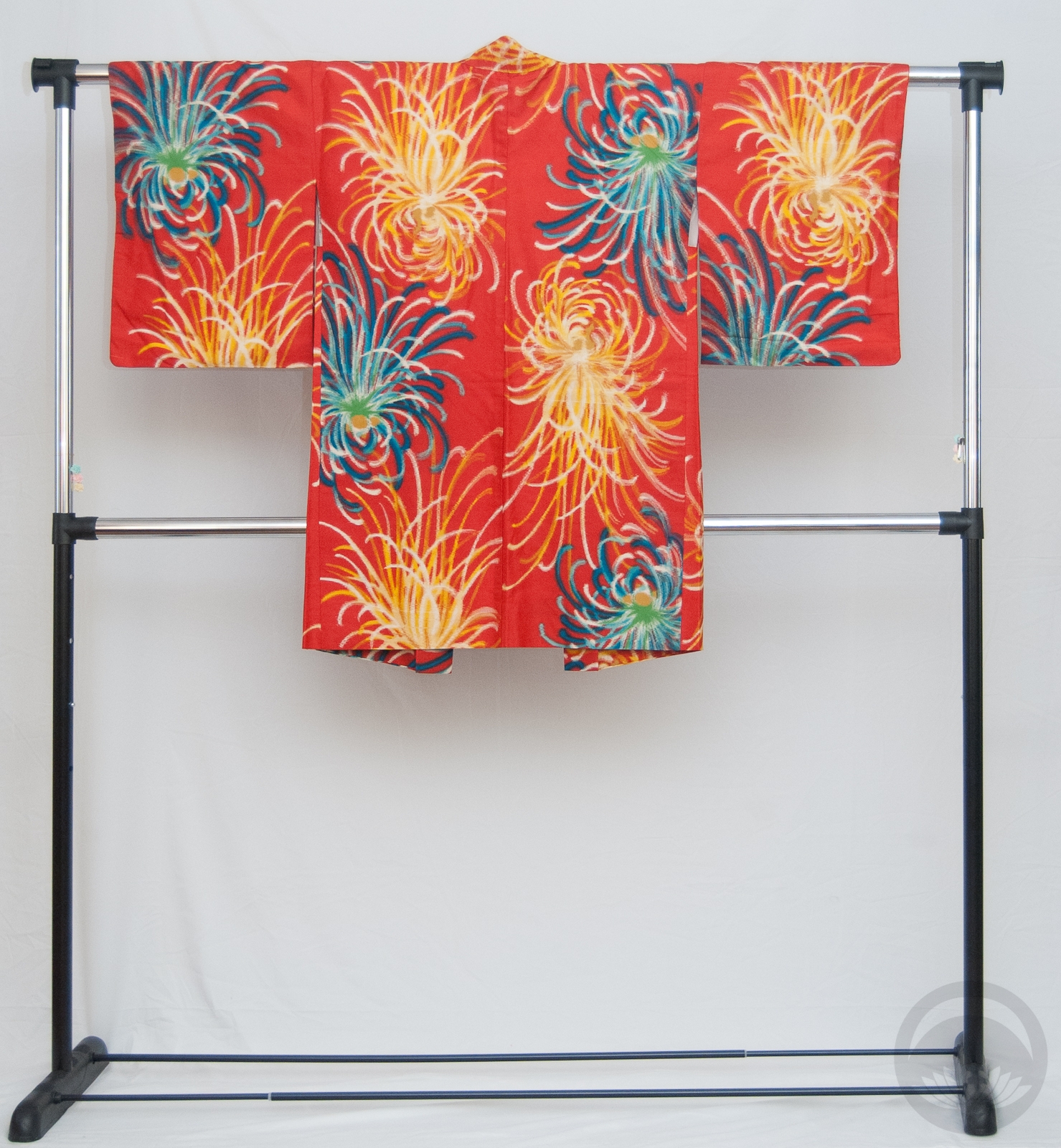
Behold, proof that I have not kiku’d the bucket. I’m sorry, that was a terrible pun but you put chrysanthemums is a lovely bucket-like container, that’s what you get.

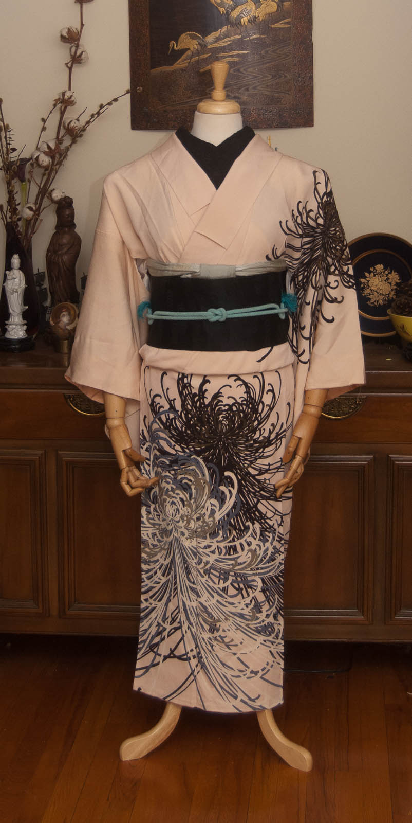
I have been in southern California for the past few months and will be here a while longer, which is why I haven’t updated in so long. I don’t have access to my mannequin or any of my kimono, but I do have a few things I can share now so be prepared for more regular updates again!

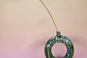
The first is this charming ikebana I arranged after not having done one for so long. I have to say, it felt really good and I regret not sticking more regularly to it. The vessel, while looking very Japanese-inspired, is actually from a local ceramic artist who unfortunately does not have any sort of online presence (I did suggest he consider at least setting up an instagram or something, but he was, in his own words, “old and set in [his] ways”, alas). I saw it and fell in love, and had to buy it. I had no idea how much it cost, but when he said I could have it for twenty dollars I was over the moon.

The rangiku were actually from Wal-Mart, of all place. Mixed in with all the generic flower bundles were these little darlings and I knew they’d be absolutely perfect in this particular container. I’m so happy with how they combined!

I might try to do more ikebana in the near future, but it will likely all be in this container because I don’t have others with me XD

Chic Modern Kiku

I found this piece on eBay when it had less than an hour to go, and I just fell head over heels. I love how bold it is, how minimalistic it is despite the motif itself being huge and dramatic, I love the very simple colour palette. And of course, rangiku is one of my favourite motifs. I really lucked out here, someone actually bumped it up to my maximum bid in the last few seconds, but didn’t bid any higher so I ended up winning it by the skin of my teeth.

I was so eager to coordinate it that I haven’t even had time to take a photograph for my catalogue – I just wanted to get it on to the mannequin as soon as I had some free time.

I paired it with a mofuku nagoya obi, since I really wanted the punch of black contrast. I think the rest of the outfit is obviously enough not mofuku that I can get away with it. Ideally, I would have used accessories in the same blue as the accents on the flowers, but I don’t own anything in that specifically “blurple” colour. I went with some of my favourite blue pieces, my icy blue obiage and beaded obijime. The haneri is actually my silver spiderweb one turned inside out. That made me chuckle a bit, since in English rangiku are often referred to as spider chrysanthemums. Maybe one day I’ll coordinate it with the webs visible.

Items used in this coordination

Matchy Matchy Mums

There’s two things “wrong” with this outfit, but when has that ever stopped me? I had another outfit planned for this week’s coordination but when this kiku furisode arrived I knew I had to pair it up with my purple kiku obi. Normally you wouldn’t match the motif of the kimono to the obi, especially not identically stylised ones like this, but the colours and the round mums were just too perfect to pass up. I also tied the obi in niijudaiko, which isn’t a musubi you’d typically pair with furisode, but I thought it added an interesting, more mature feeling to the outfit.

Since I was on such a matchy kick, I ran with accessories that were also perfect matches to some of the colours in the kimono. This outfit definitely feels very autumnal, which also happens to be my favourite season, so of course I love the end result!

What do you think? Do you like to understand the rules but deviate from them now and again, or do you prefer to stick to what works? I think both have merit; so long as you can explain why you chose to break a rule and aren’t doing it in a formal situation or stealing the focus from someone else, sometimes it can work out really well!

Items used in this coordination

Proof of Life

Rumours of my demise have been slightly exaggerated. Further information below the cut if you’re curious.

Ideally, for my return to regular kimono blogging I would have loved to showcase some gorgeous new piece, some rare curiosity… but I honestly have not purchased anything since the men’s set I wrote about back in May. Instead, I resorted to my old standby of blindly pulling something out of storage and forcing myself to work with it. It’s a great exercise if you’re feeling uninspired or unmotivated! I grabbed this vintage-inspired modern poly piece that I love and used to wear quite frequently, but somehow never think of when it comes time for a mannequin coord.

I thought it would look lovely and even more vintage-inspired with this dusty peacock obi, which I unfortunately forgot was hikinuki-style so it’s tied upside down. Oh well. Not too shabby for being so out of practice! A few similarly desaturated accessories in dusky pinks and beigey browns completed the look and this outfit feels like a great way to transition from summer into autumn.

Continue reading

V is for Vivid

Vivid, intensely deep or bright colour

We’ve reached another one of those super-fun letters that essentially don’t exist in Japanese. Like the L and Q posts, I knew I had to run with an English word and what better word than Vivid? Or possibly vibrant!

Taisho and early Showa era kimono are absolutely some of my favourites, due in no small part to the vivid, bold colour choices brought about by the advent of synthetic dyes. Prior to the 1910s, kimono colours tended to veer to the gentle, subdued, and either pastel or very dark tones thanks to natural dyes. With the introduction of synthetics, colours went pretty crazy.

I went with my beloved turquoise irotomesode with tachibana, since I didn’t get to use it last week. And heck, compare the colour story of that entry to this one, and you’ll get a really good sense of what I mean by vivid!

My initial plan was to use a vintage mustard-yellow floral obi but it just wasn’t bright enough. Then I remembered this gorgeous modern piece with the moorish arches that are a spot-on complement to the kimono. This obi was a gift and to this day I still don’t know who sent it to me! Next up was this gorgeously eye-searing meisen haori. Doesn’t get more vivid than this piece, when it comes to my wardobe. And to bring in the hit of yellow to echo the yellow accents in both the kimono I ended up using my yellow obiage and obijime again. This is starting to feel like a running gag, but they really do match just about everything!  Honestly these photos don’t even do this ensemble justice. One day I’d love to see this coordination on a person, but this kimono will never fit me so I’ll have to find a willing model.

Items used in this coordination