
Vivid, intensely deep or bright colour
We’ve reached another one of those super-fun letters that essentially don’t exist in Japanese. Like the L and Q posts, I knew I had to run with an English word and what better word than Vivid? Or possibly vibrant!
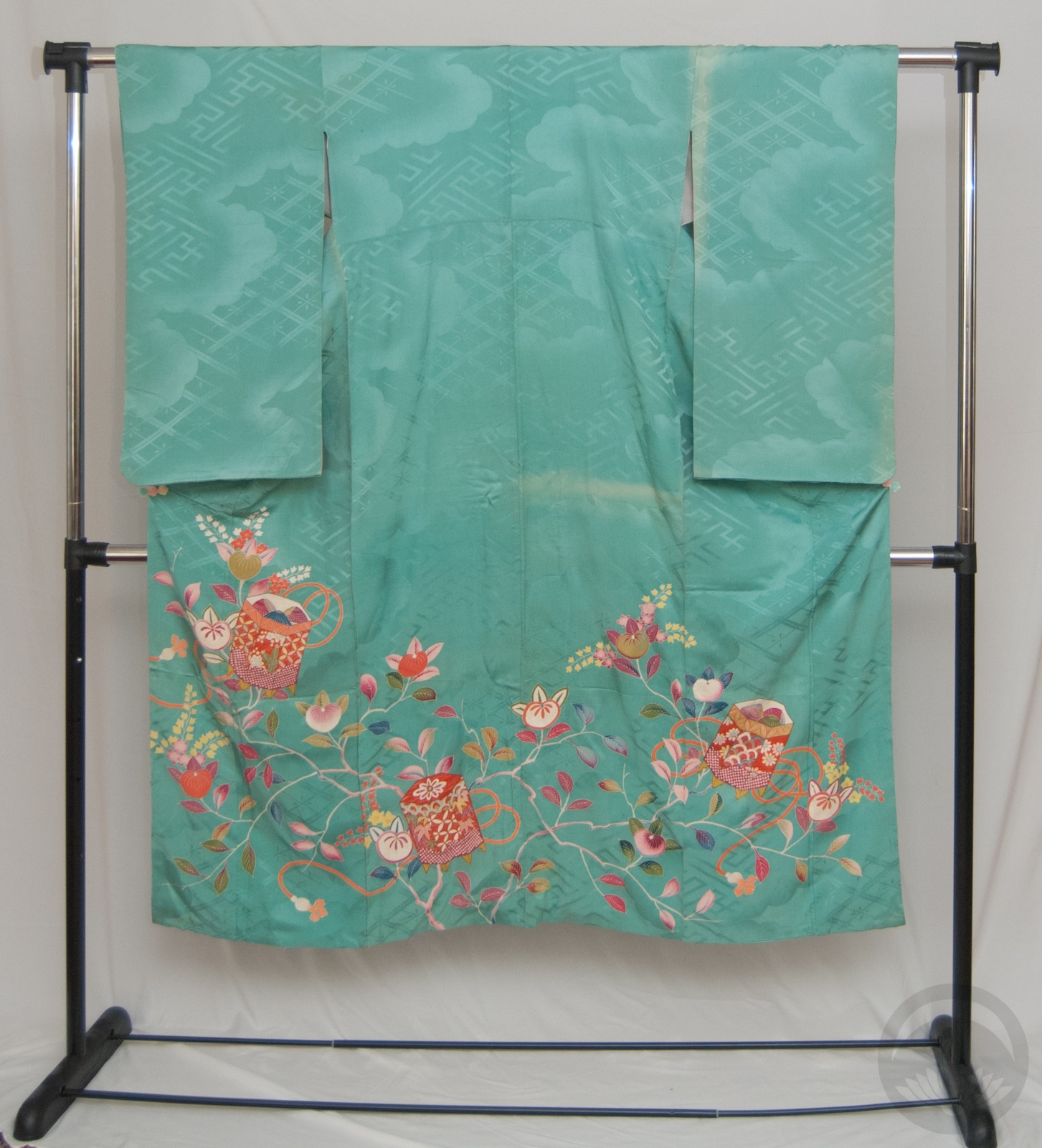
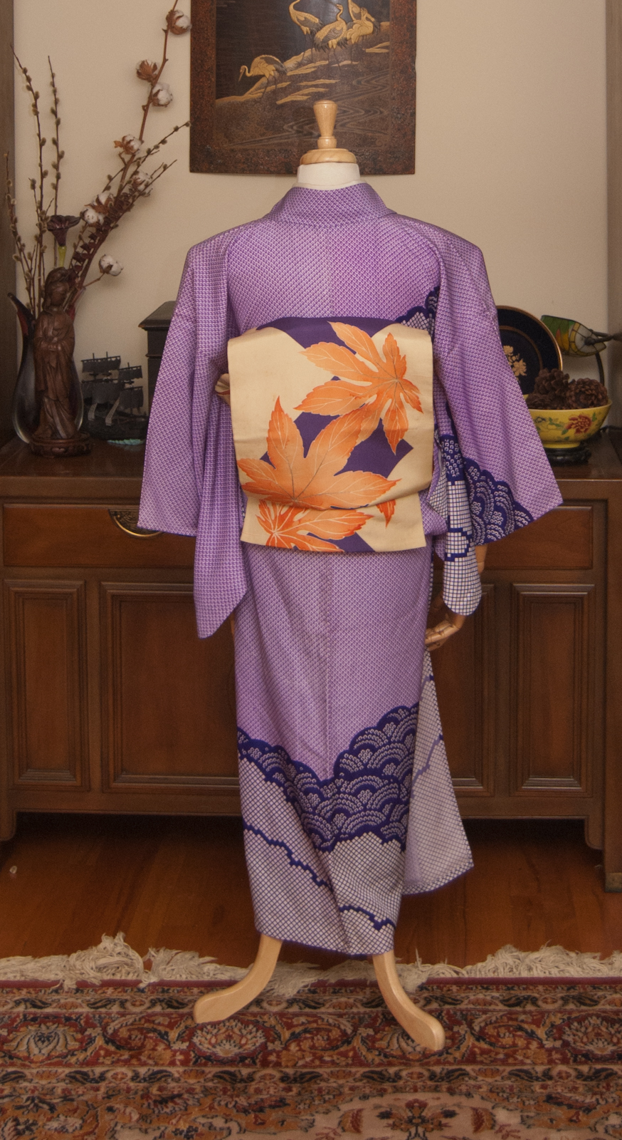
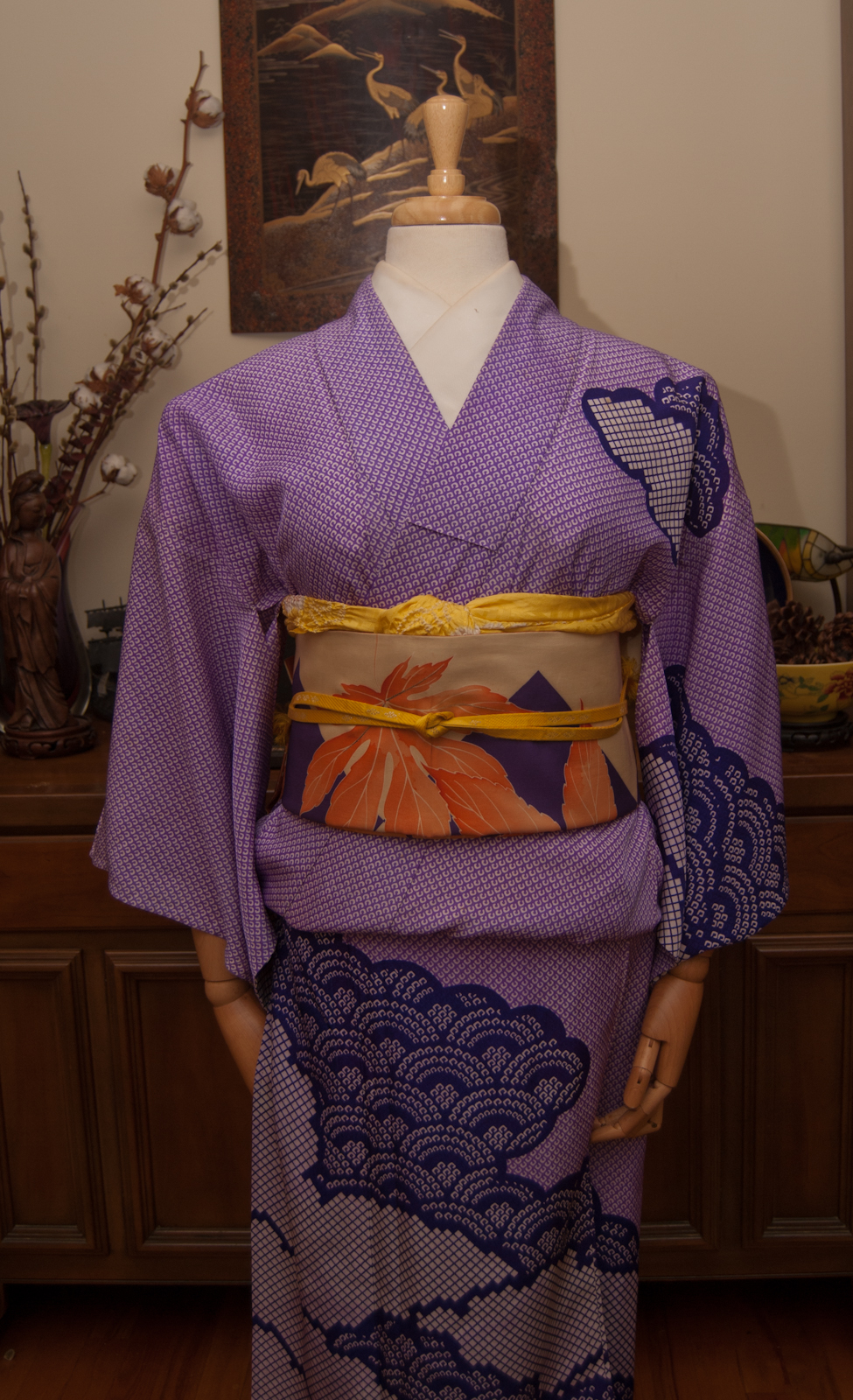
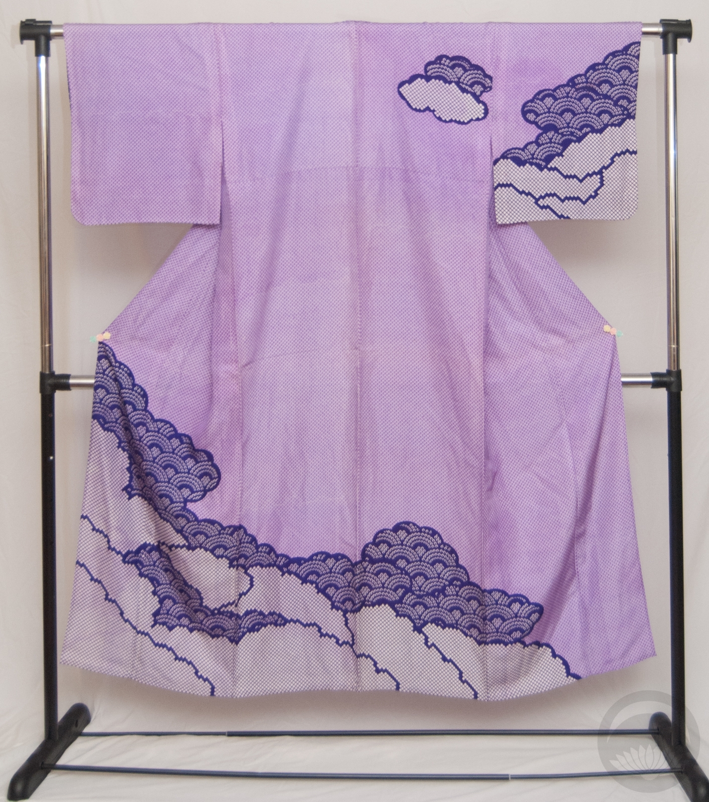
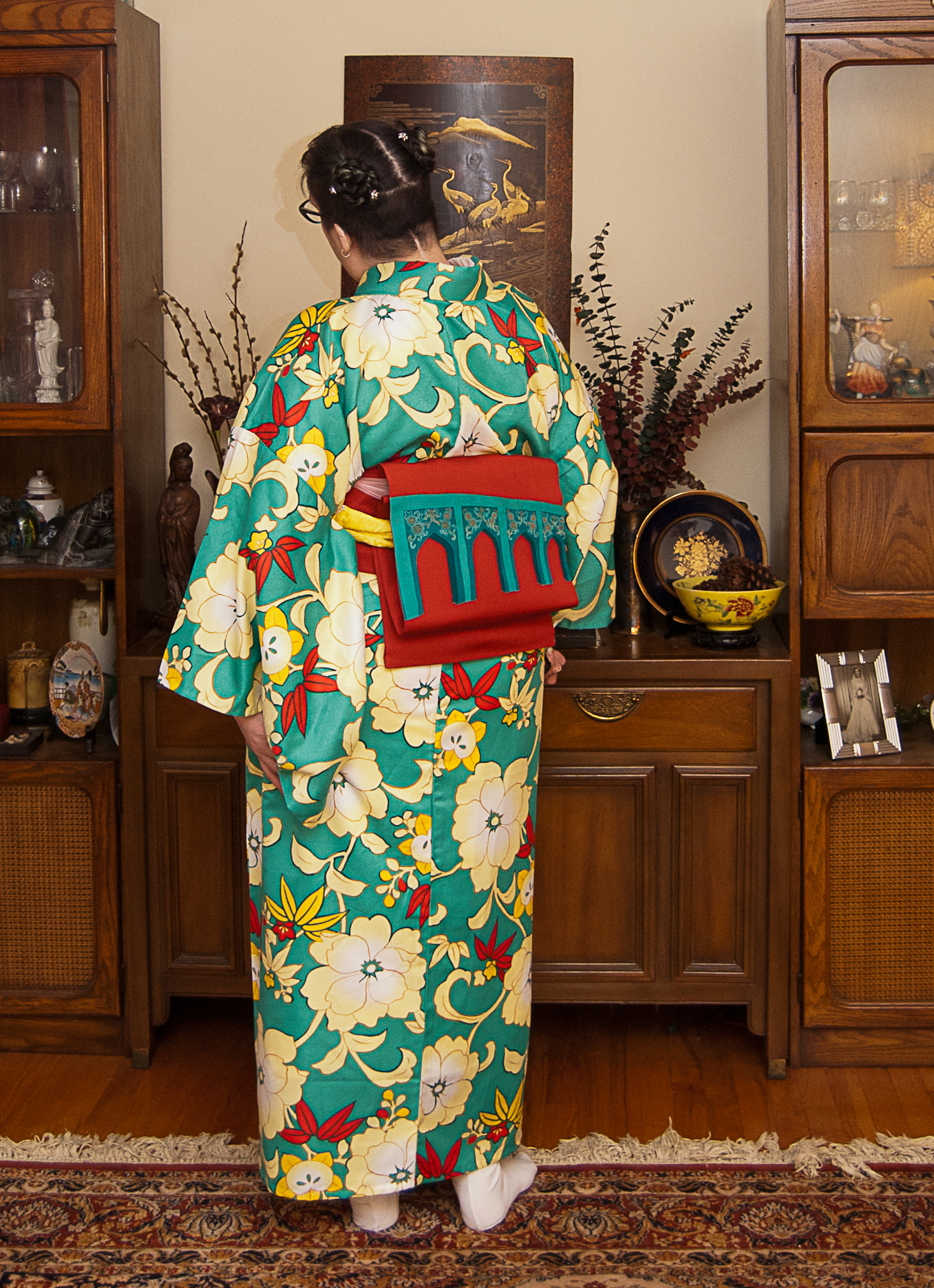
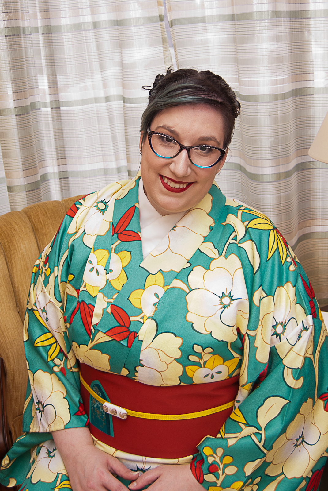
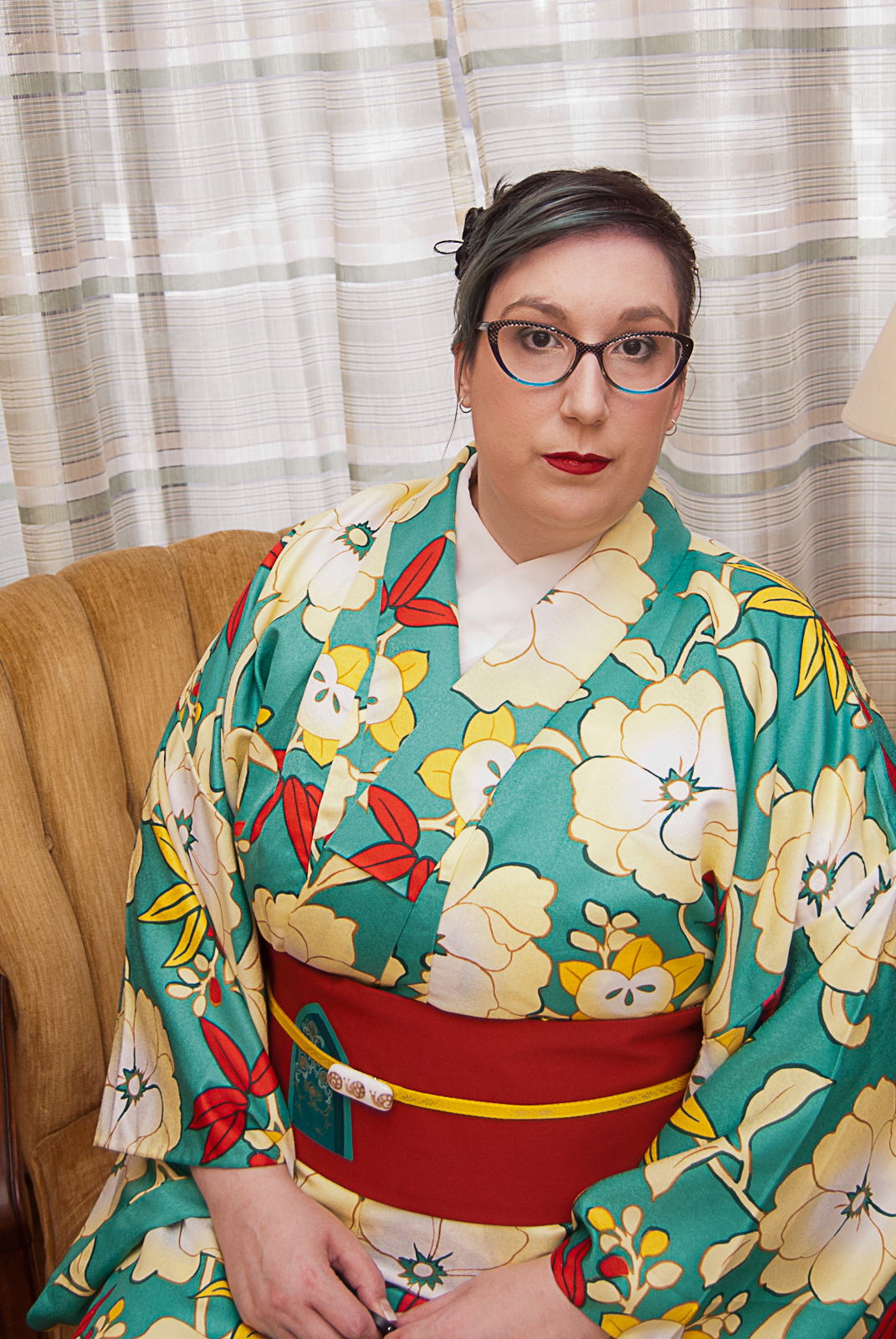
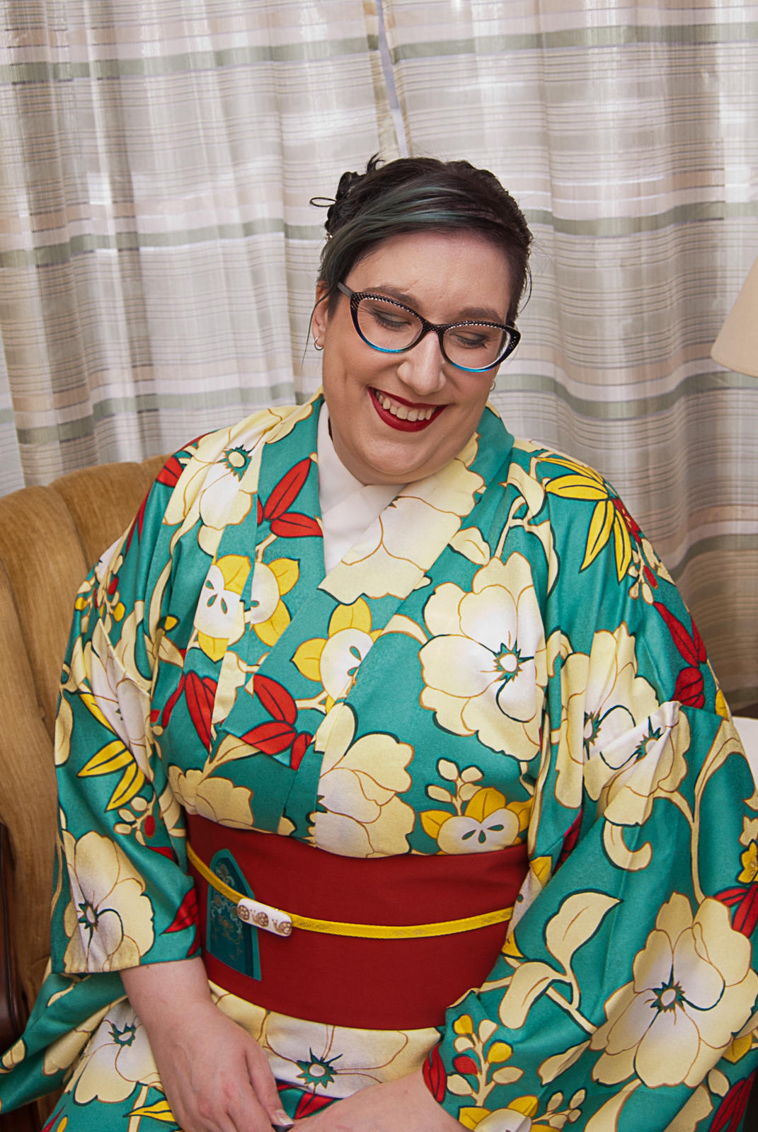
Taisho and early Showa era kimono are absolutely some of my favourites, due in no small part to the vivid, bold colour choices brought about by the advent of synthetic dyes. Prior to the 1910s, kimono colours tended to veer to the gentle, subdued, and either pastel or very dark tones thanks to natural dyes. With the introduction of synthetics, colours went pretty crazy.
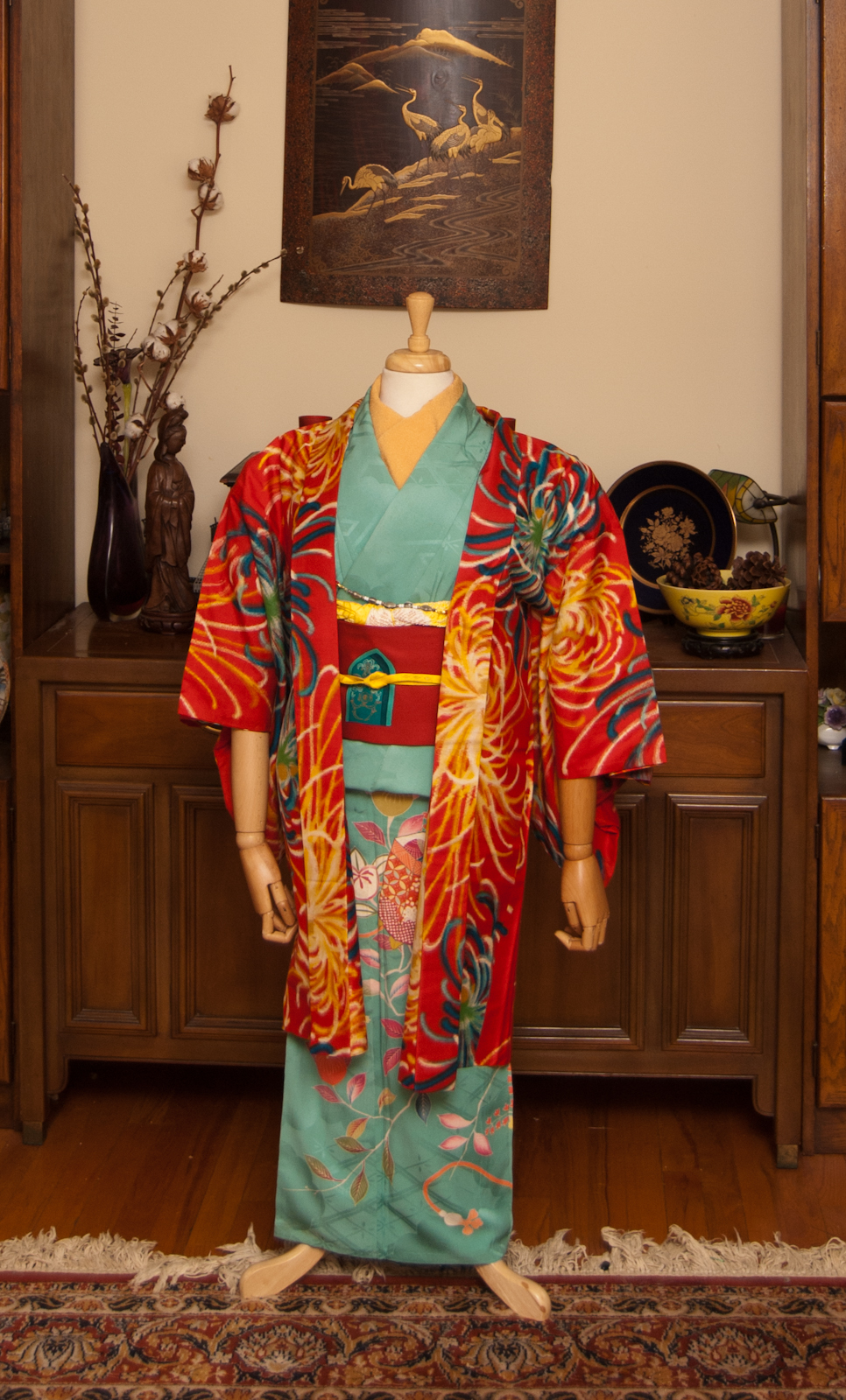
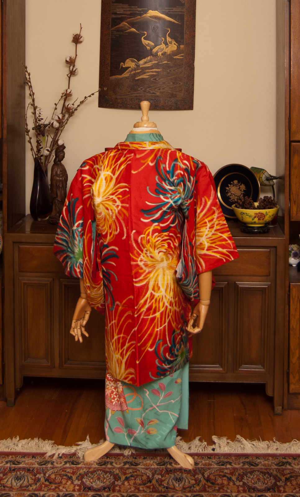
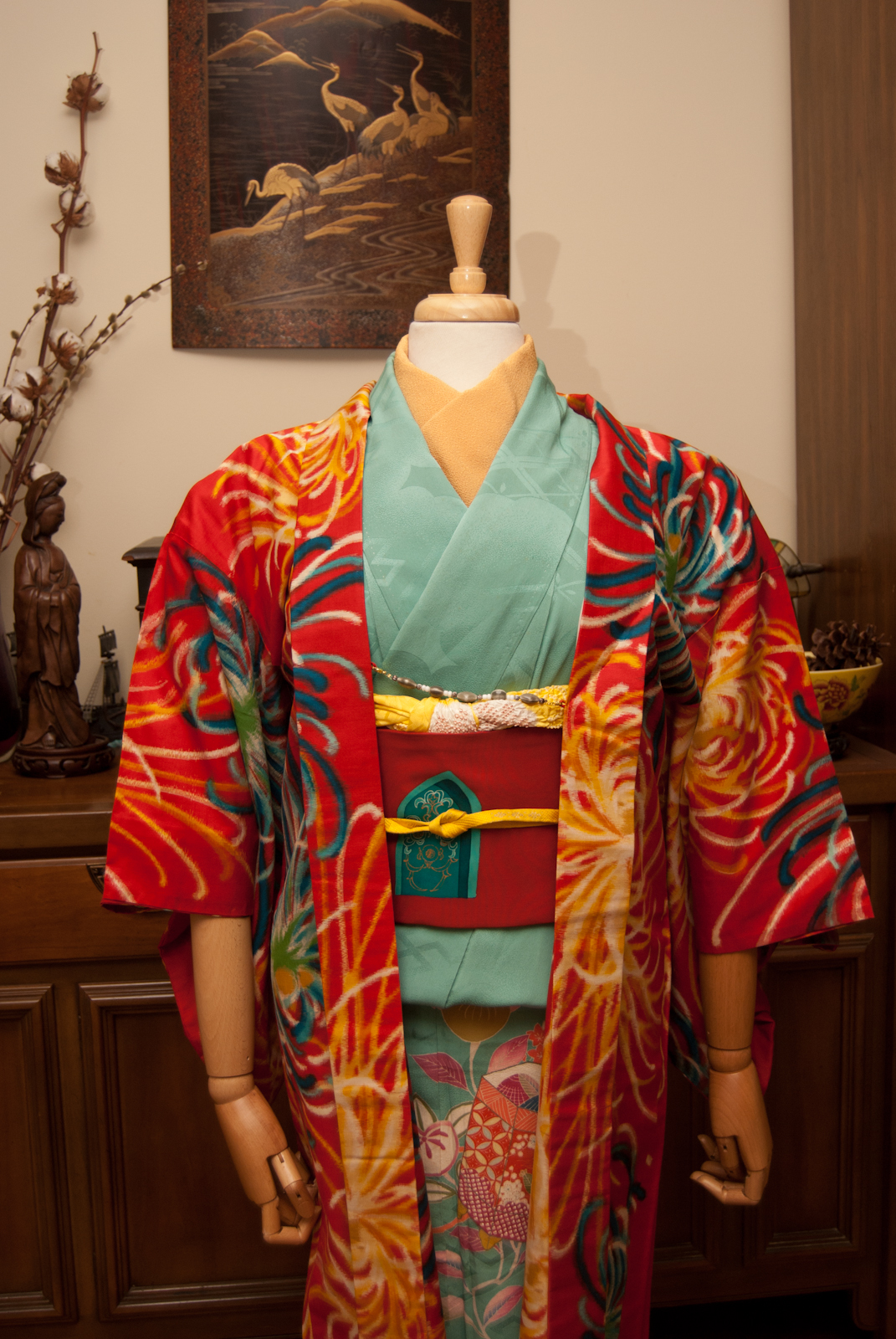

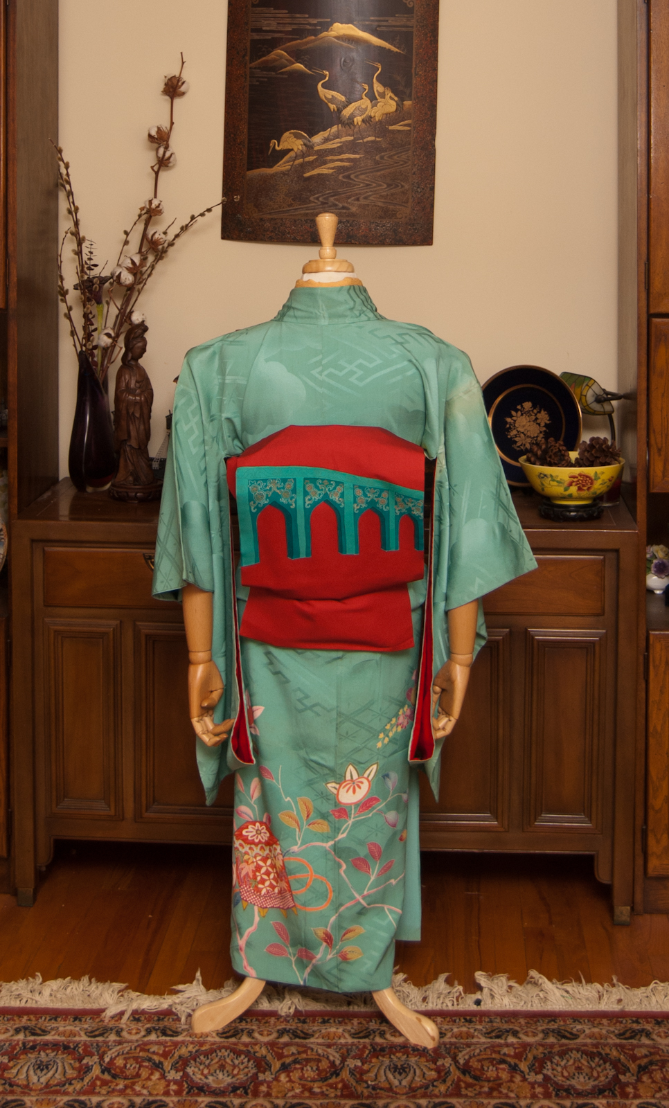
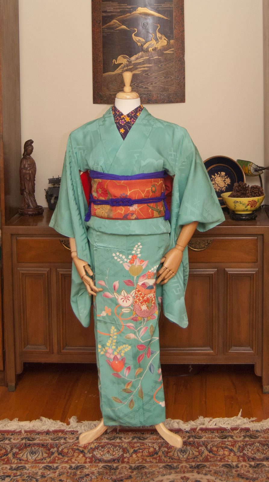
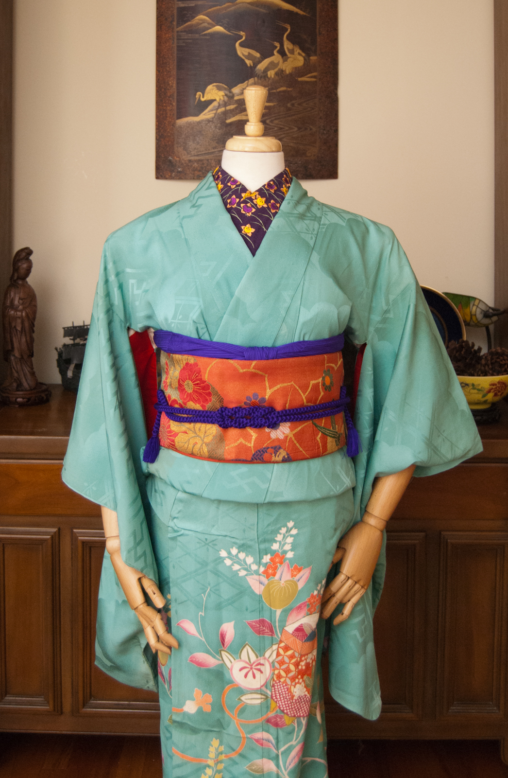
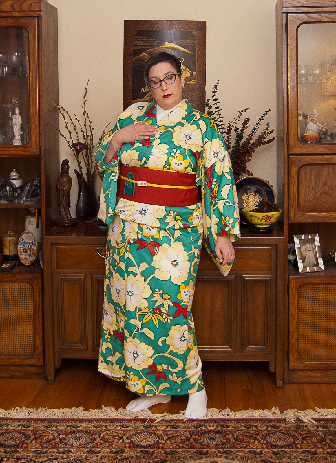
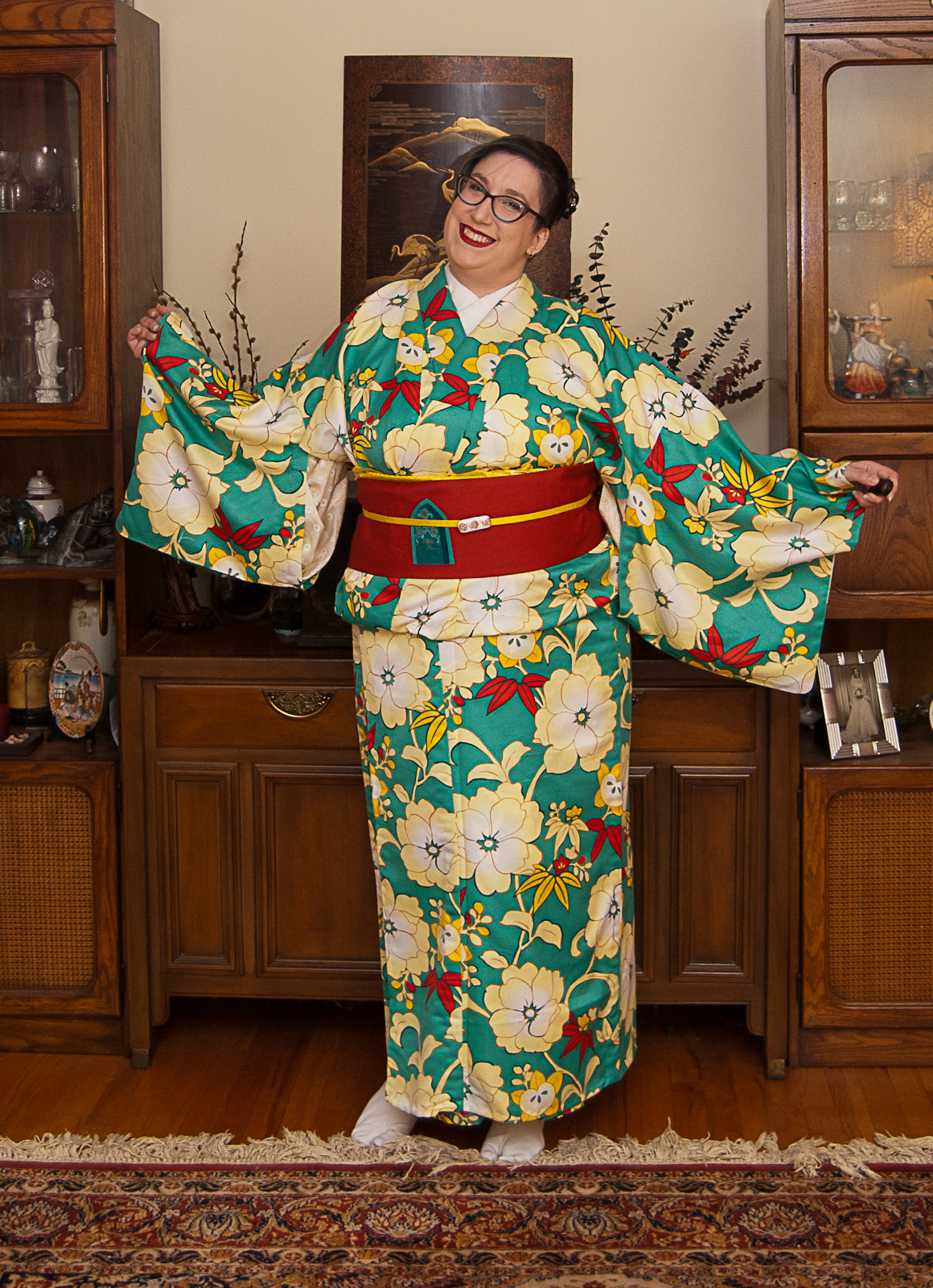
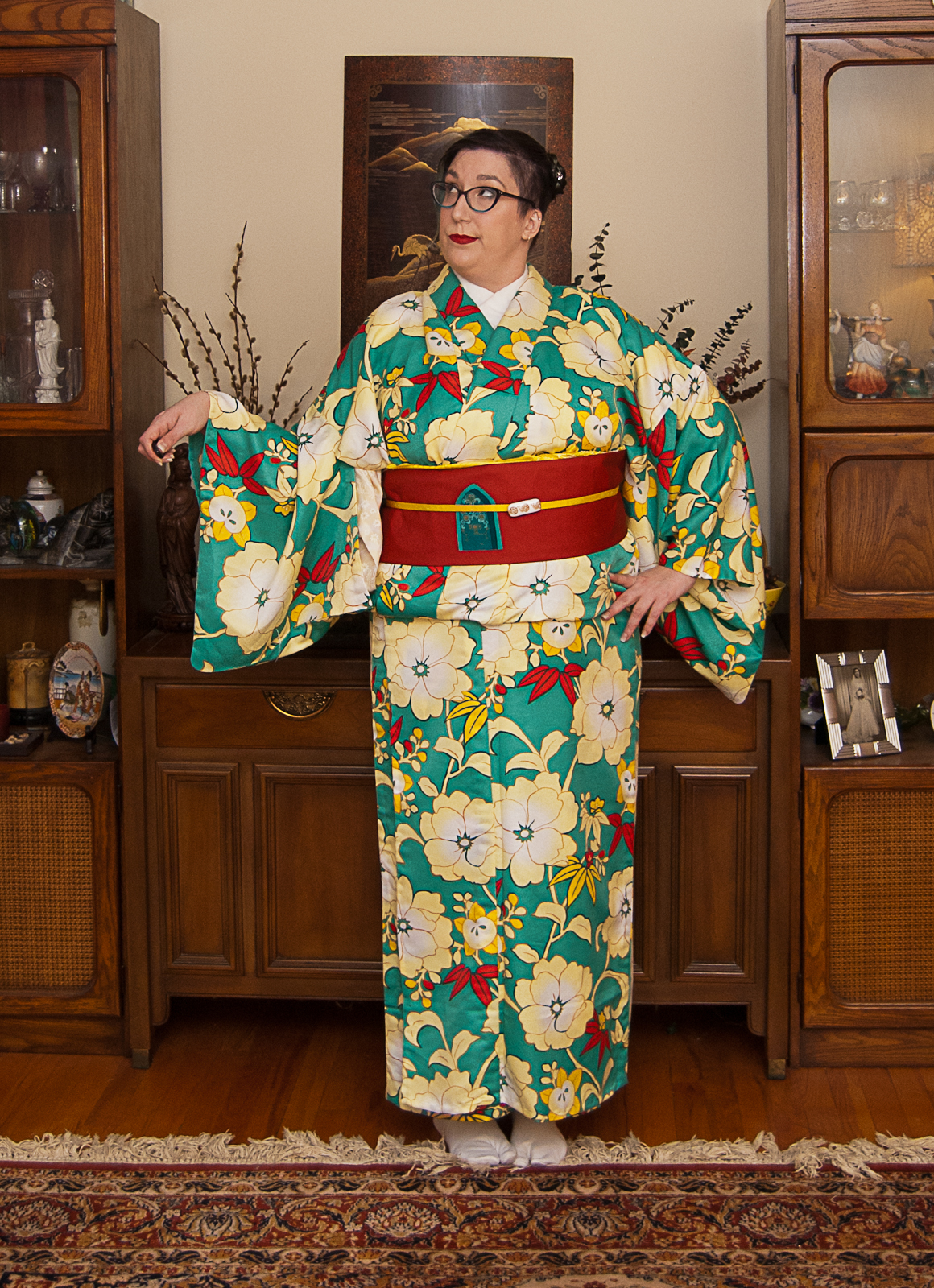
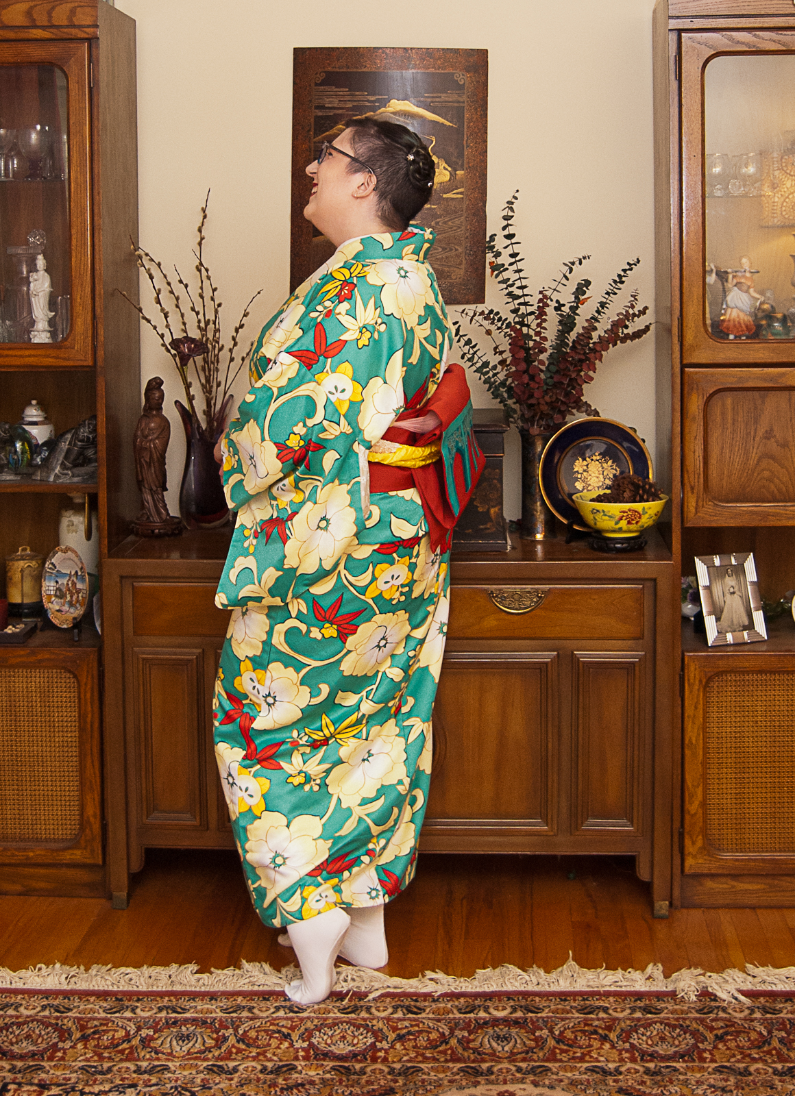
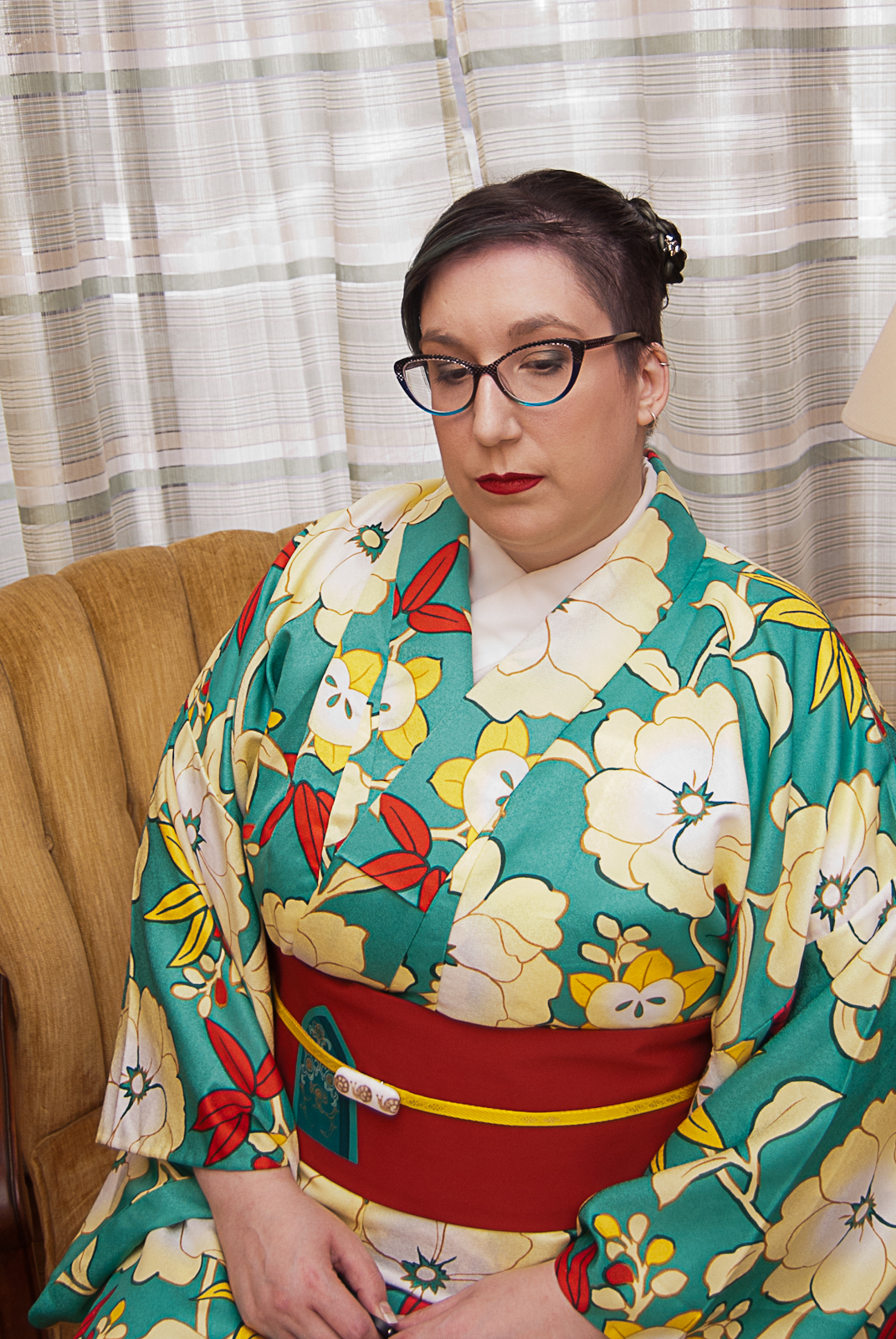
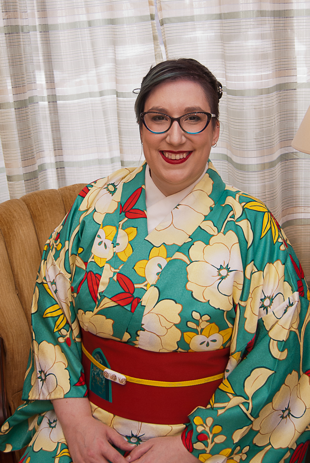
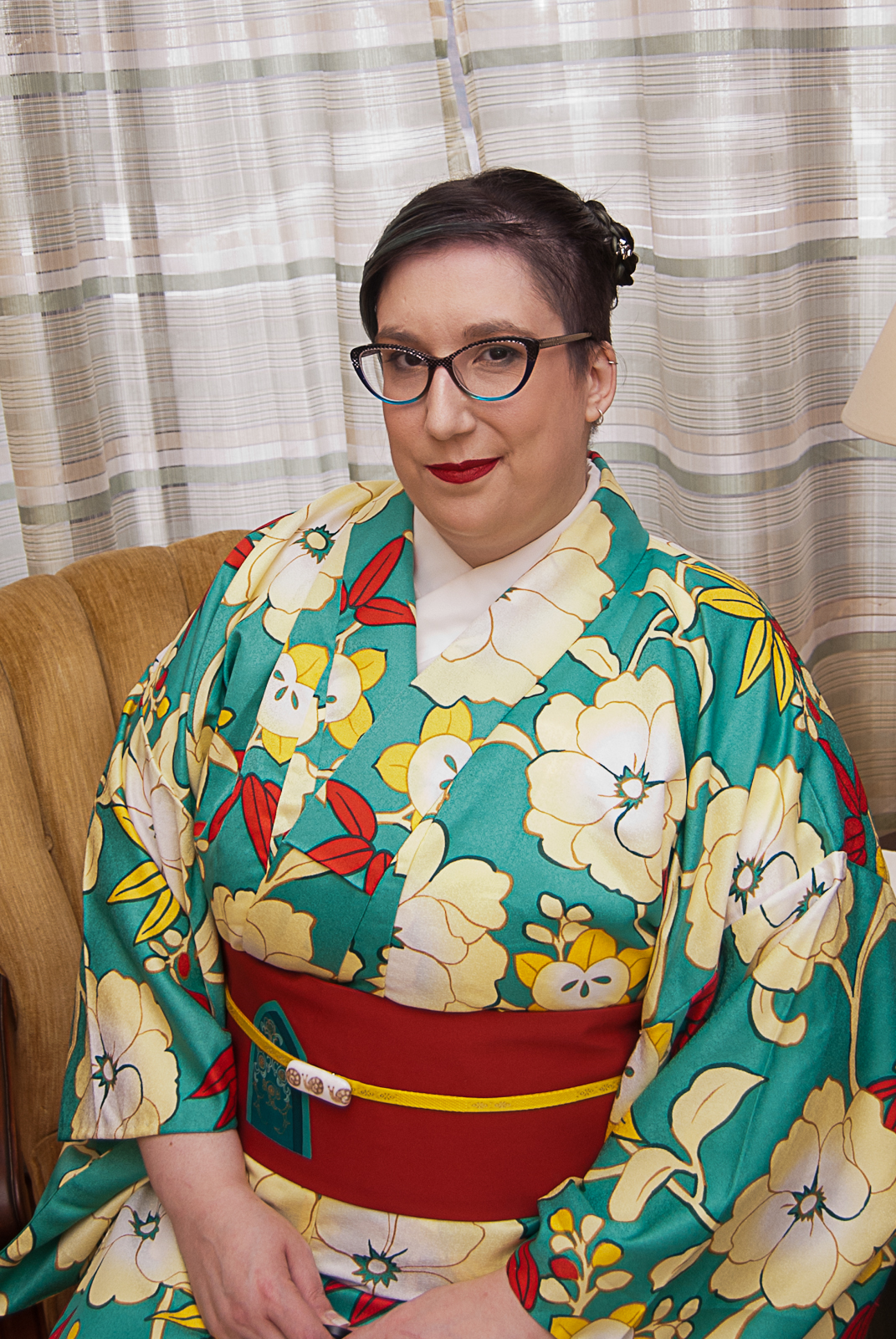
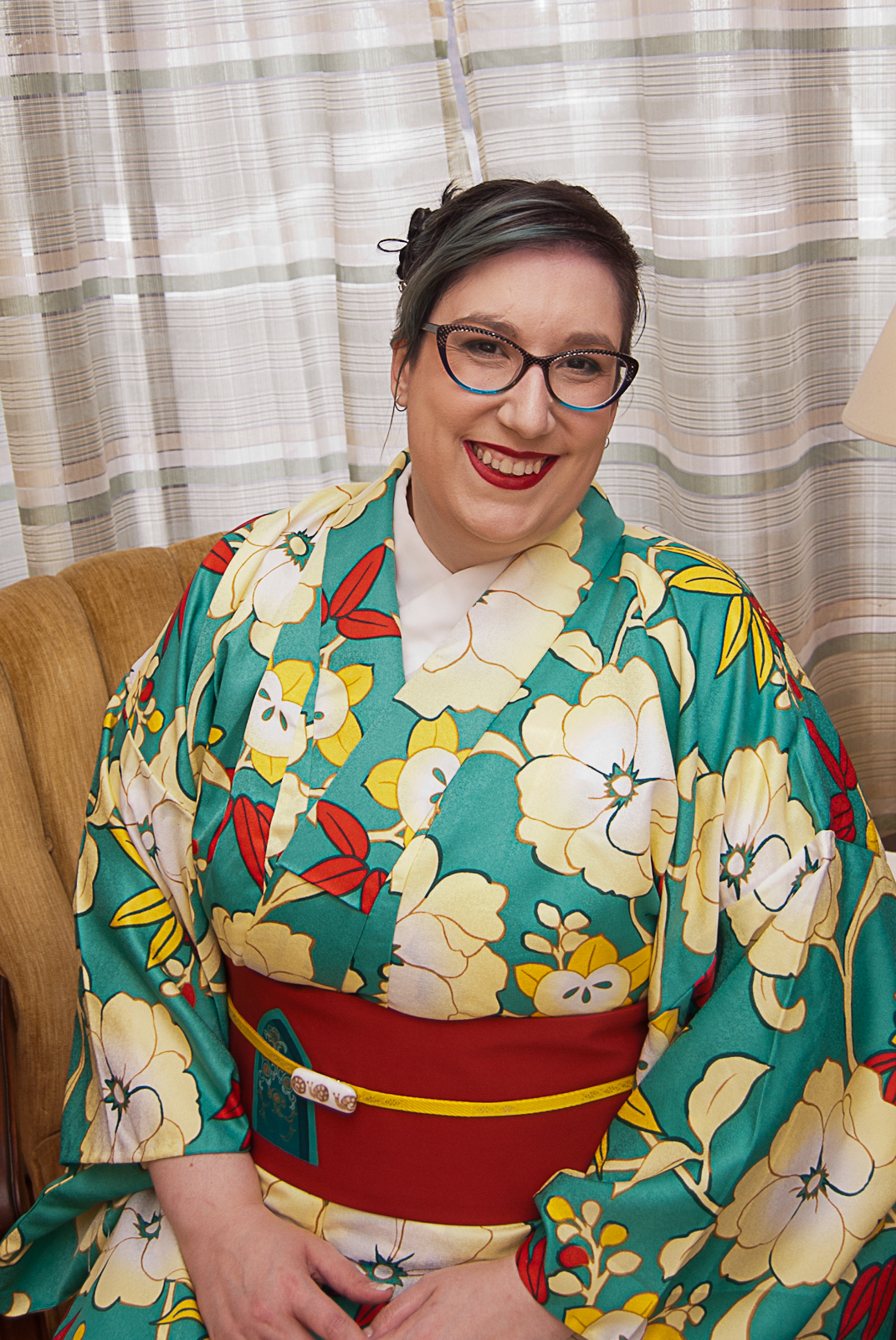
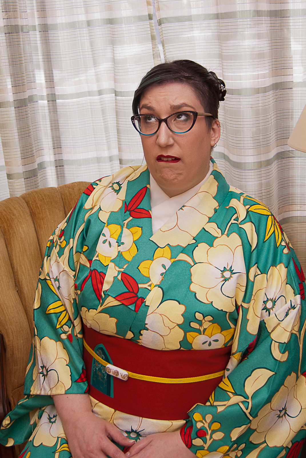
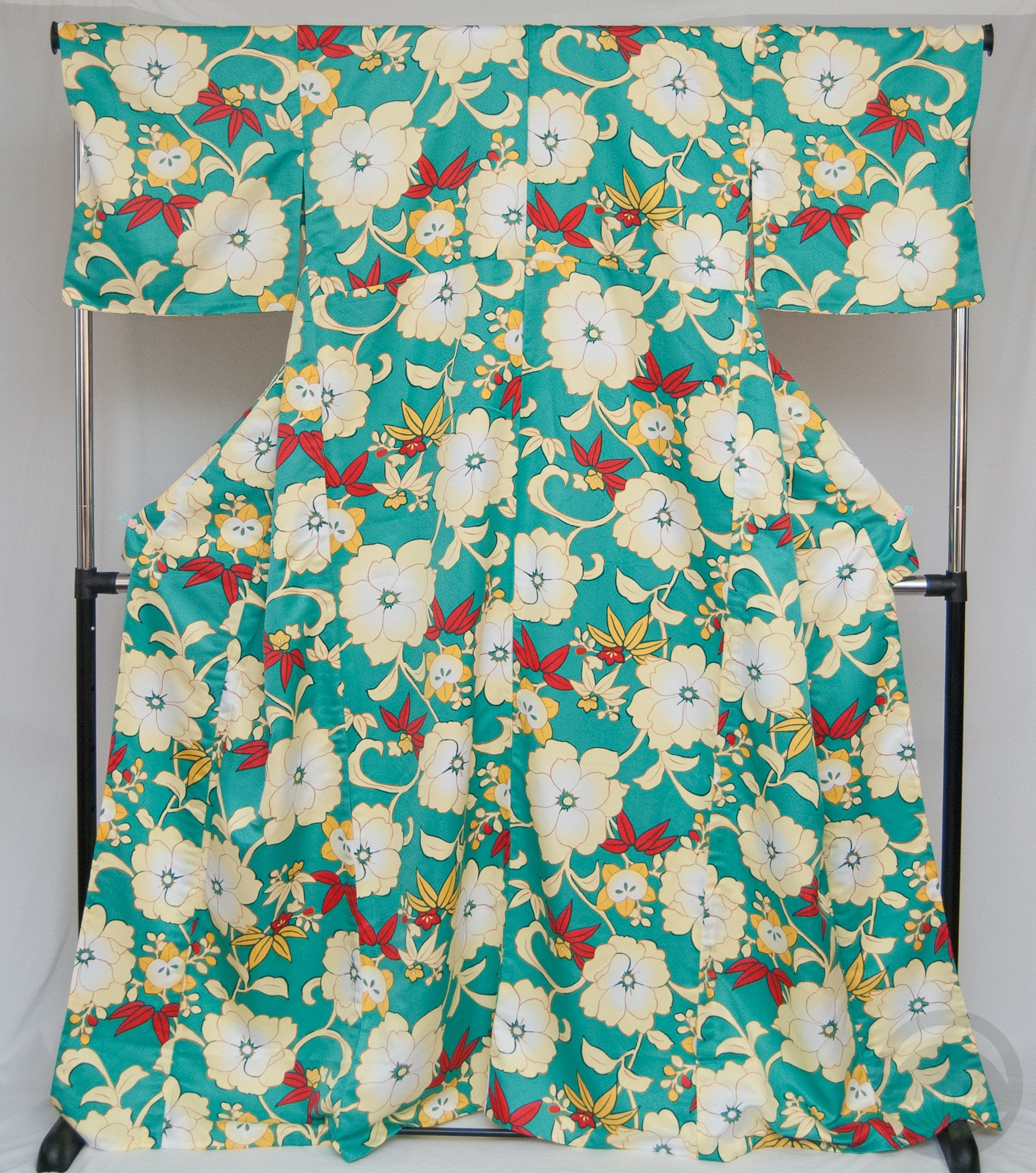
I went with my beloved turquoise irotomesode with tachibana, since I didn’t get to use it last week. And heck, compare the colour story of that entry to this one, and you’ll get a really good sense of what I mean by vivid!
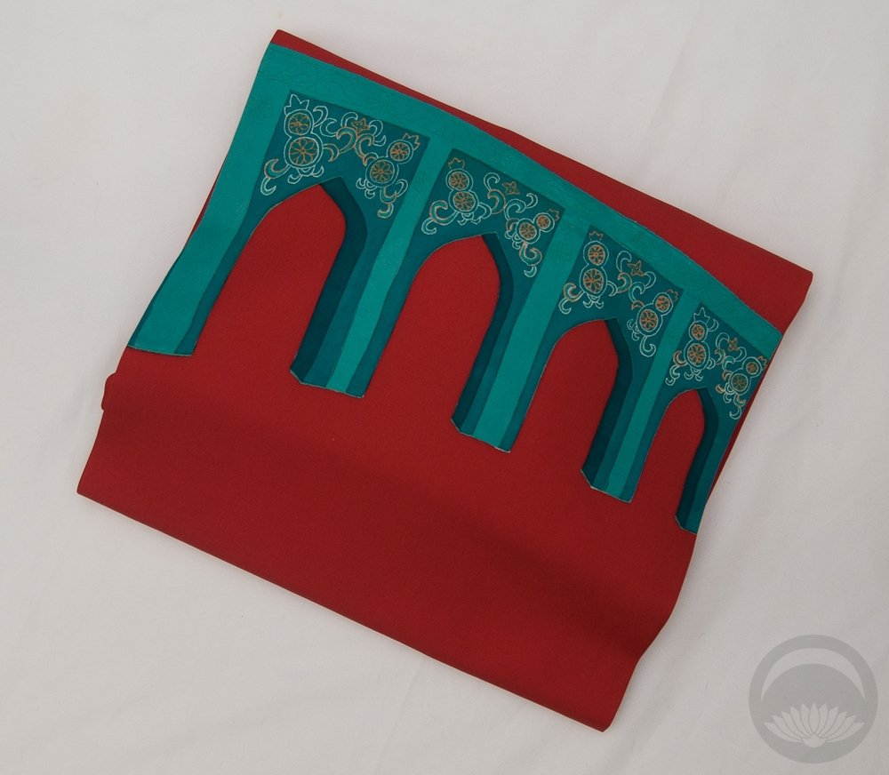
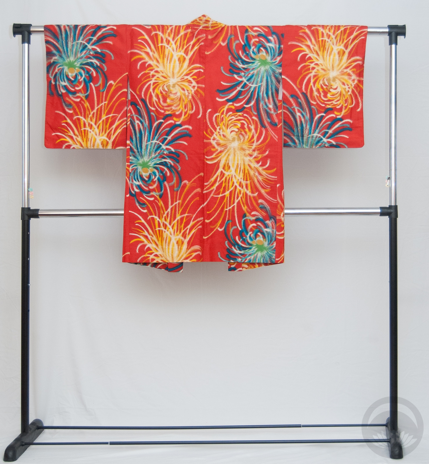
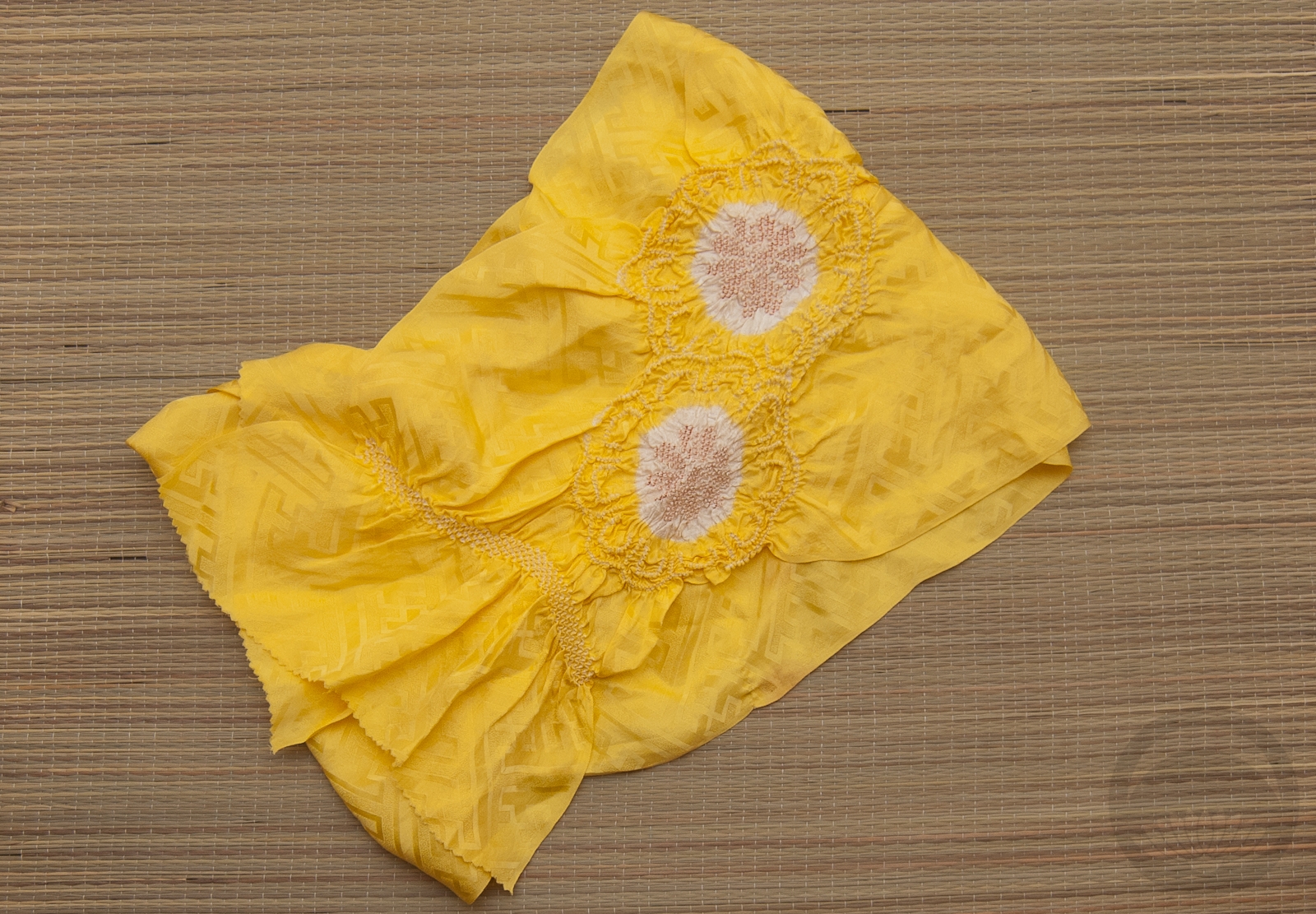
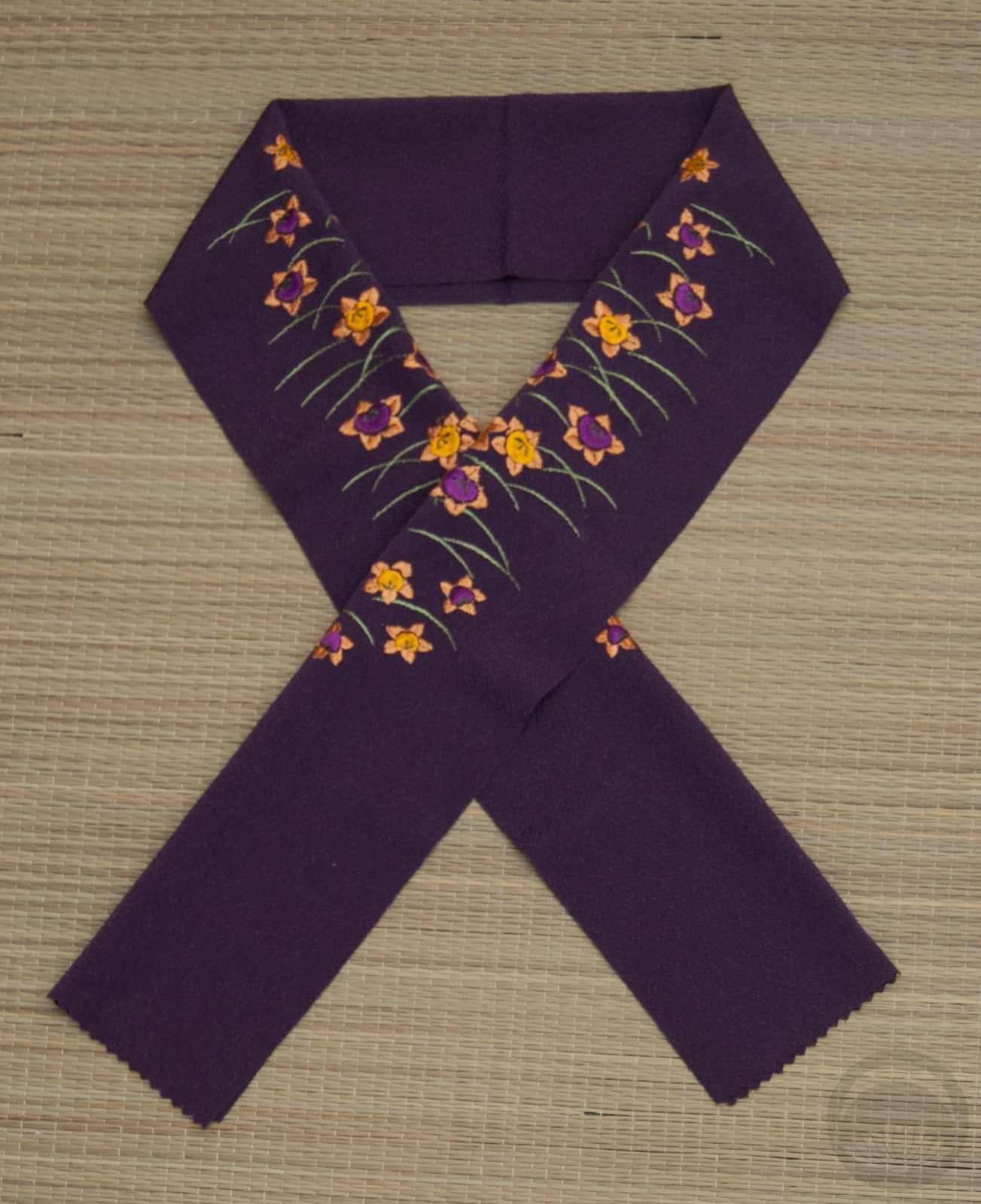
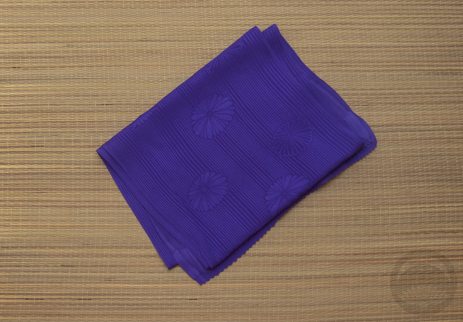
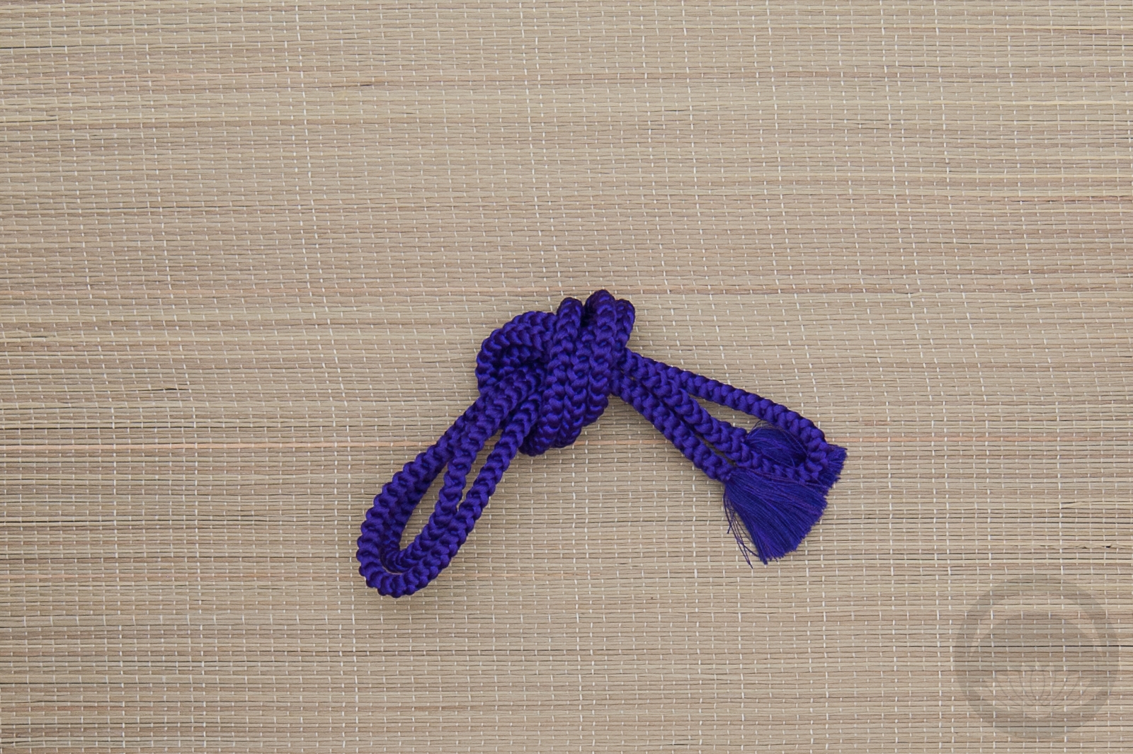
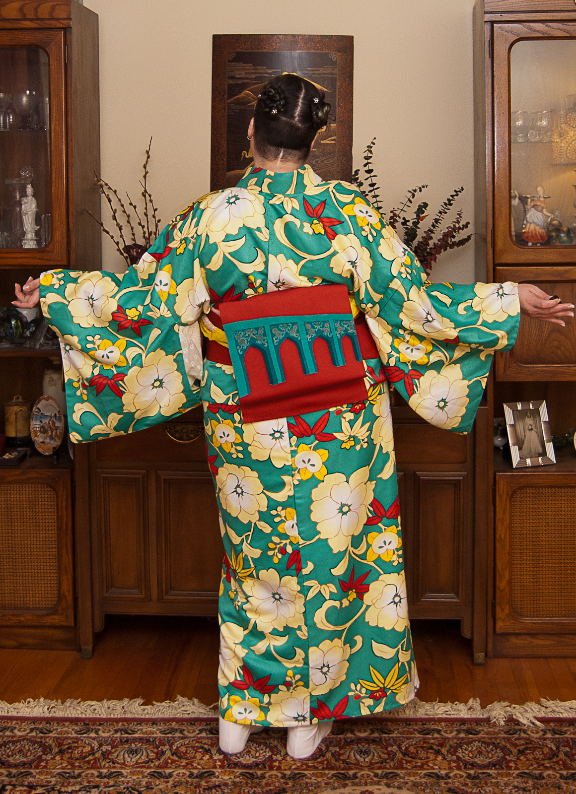
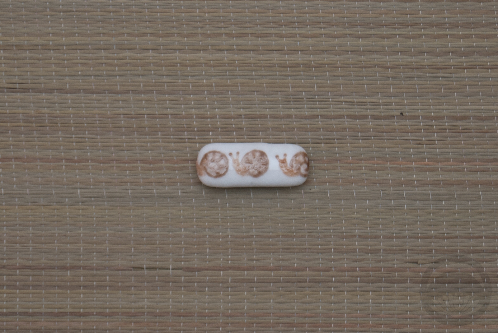
My initial plan was to use a vintage mustard-yellow floral obi but it just wasn’t bright enough. Then I remembered this gorgeous modern piece with the moorish arches that are a spot-on complement to the kimono. This obi was a gift and to this day I still don’t know who sent it to me! Next up was this gorgeously eye-searing meisen haori. Doesn’t get more vivid than this piece, when it comes to my wardobe. And to bring in the hit of yellow to echo the yellow accents in both the kimono I ended up using my yellow obiage and obijime again. This is starting to feel like a running gag, but they really do match just about everything! Honestly these photos don’t even do this ensemble justice. One day I’d love to see this coordination on a person, but this kimono will never fit me so I’ll have to find a willing model.
Items used in this coordination
-
- Turquoise Tachibana
-
- Moorish Arches
-
- Vibrant Kiku Meisen
-

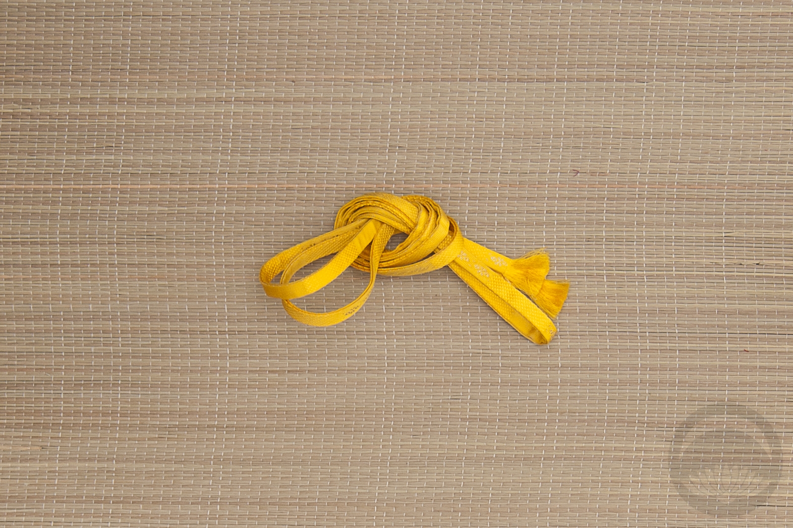
- Solid yellow

-
- Lemon Yellow Shibori
-
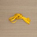
- Yellow Hakata


 Bebe Taian
 CHOKO Blog
 Gion Kobu
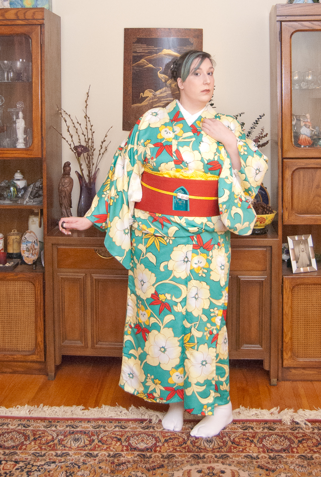