
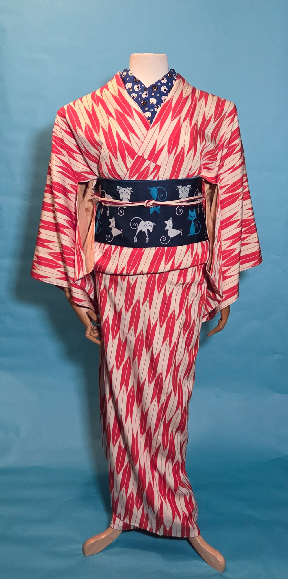
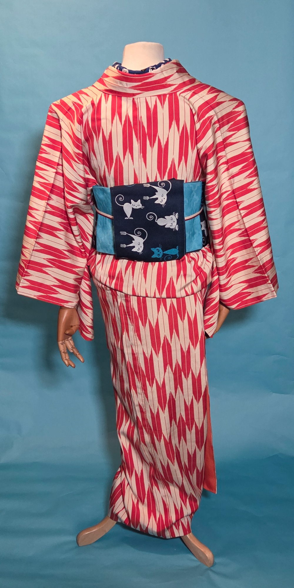
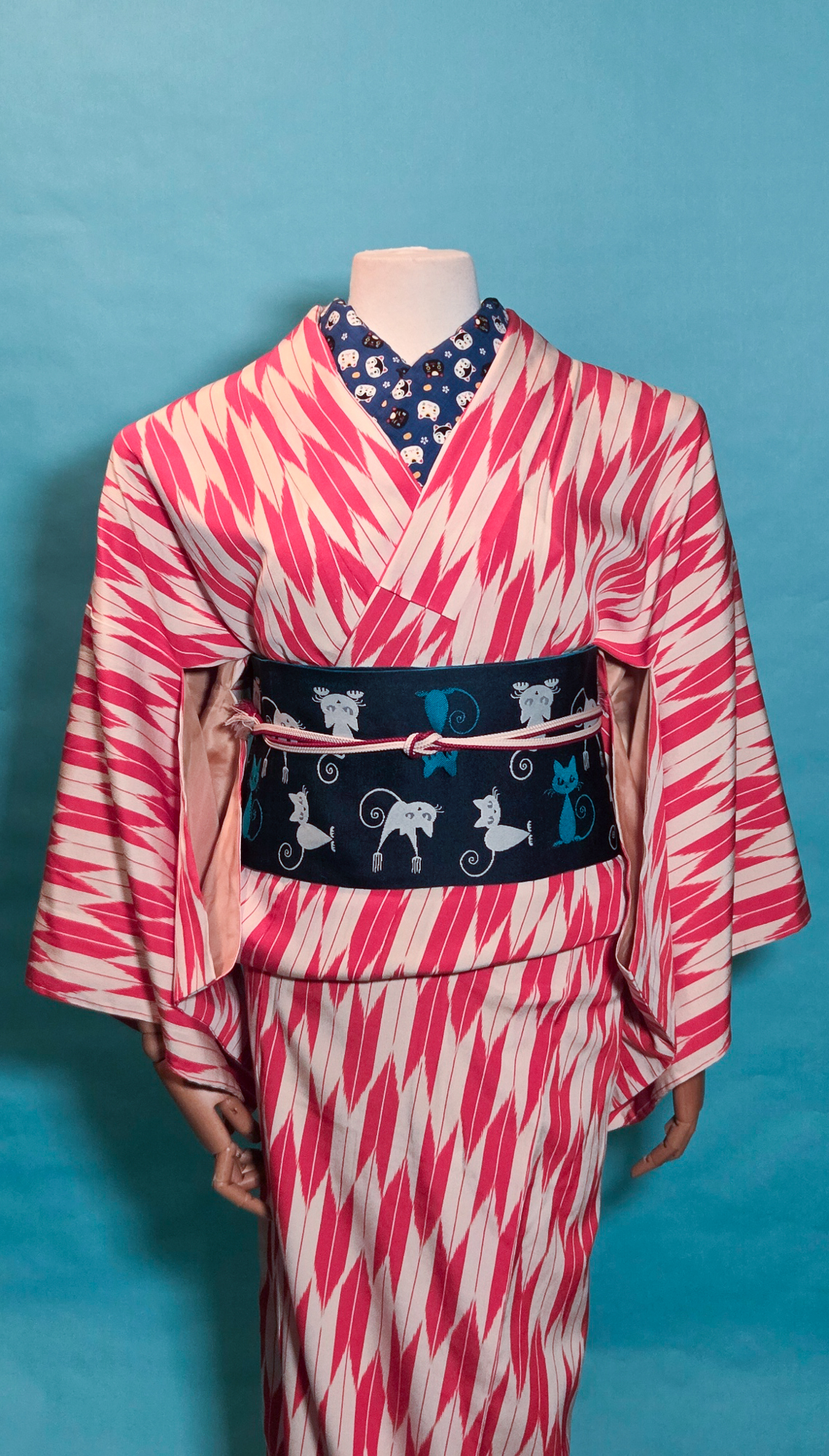
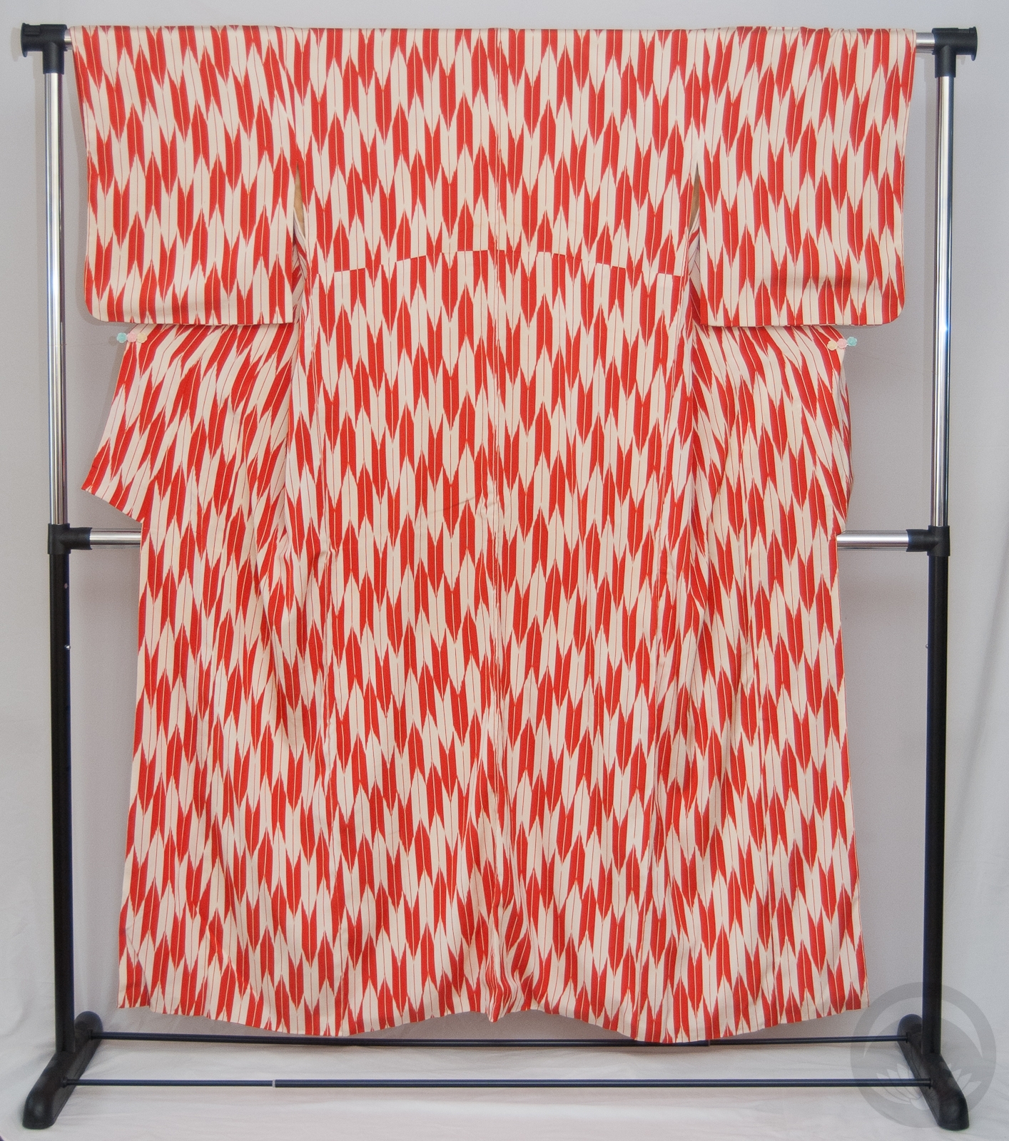
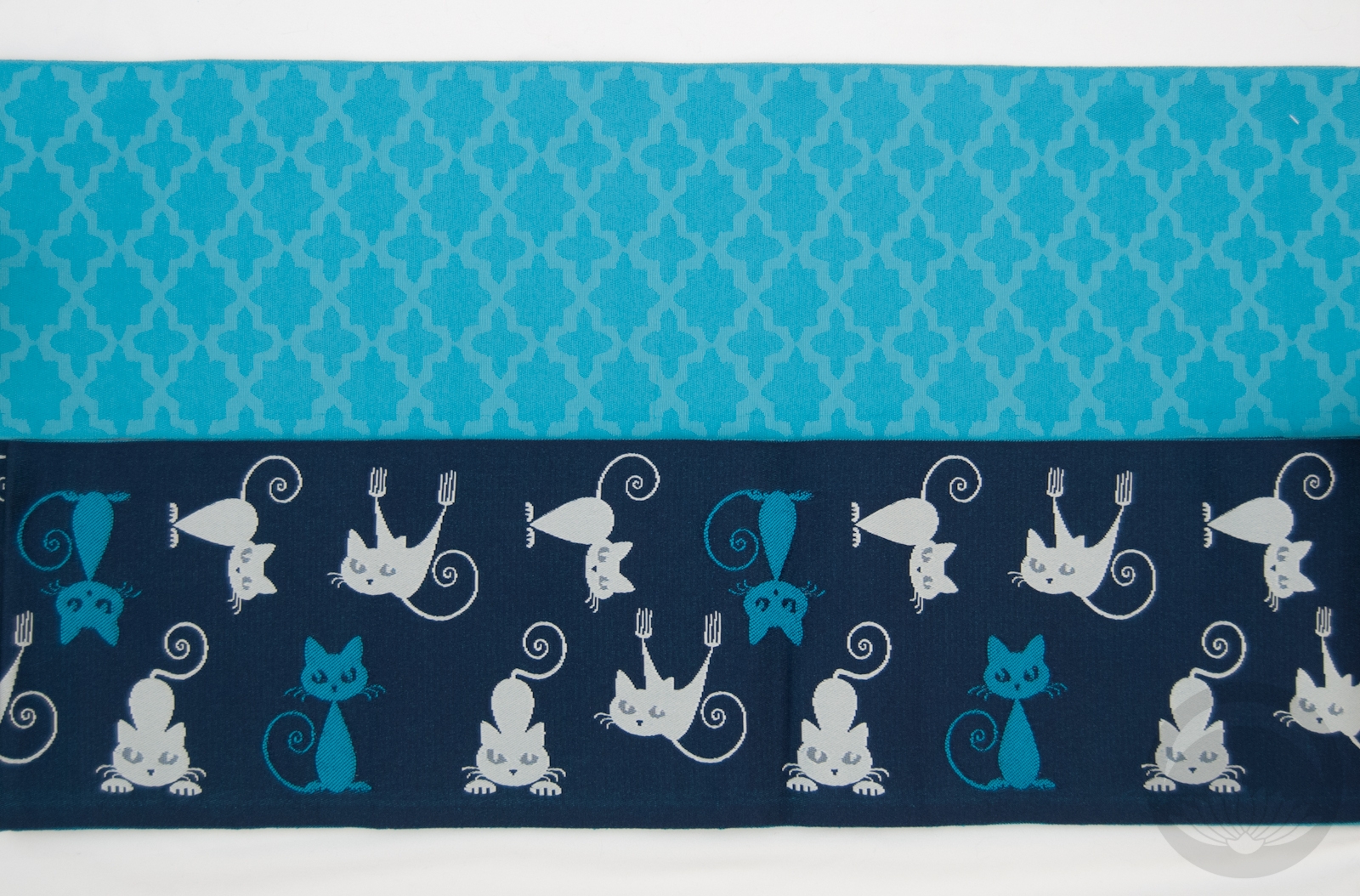
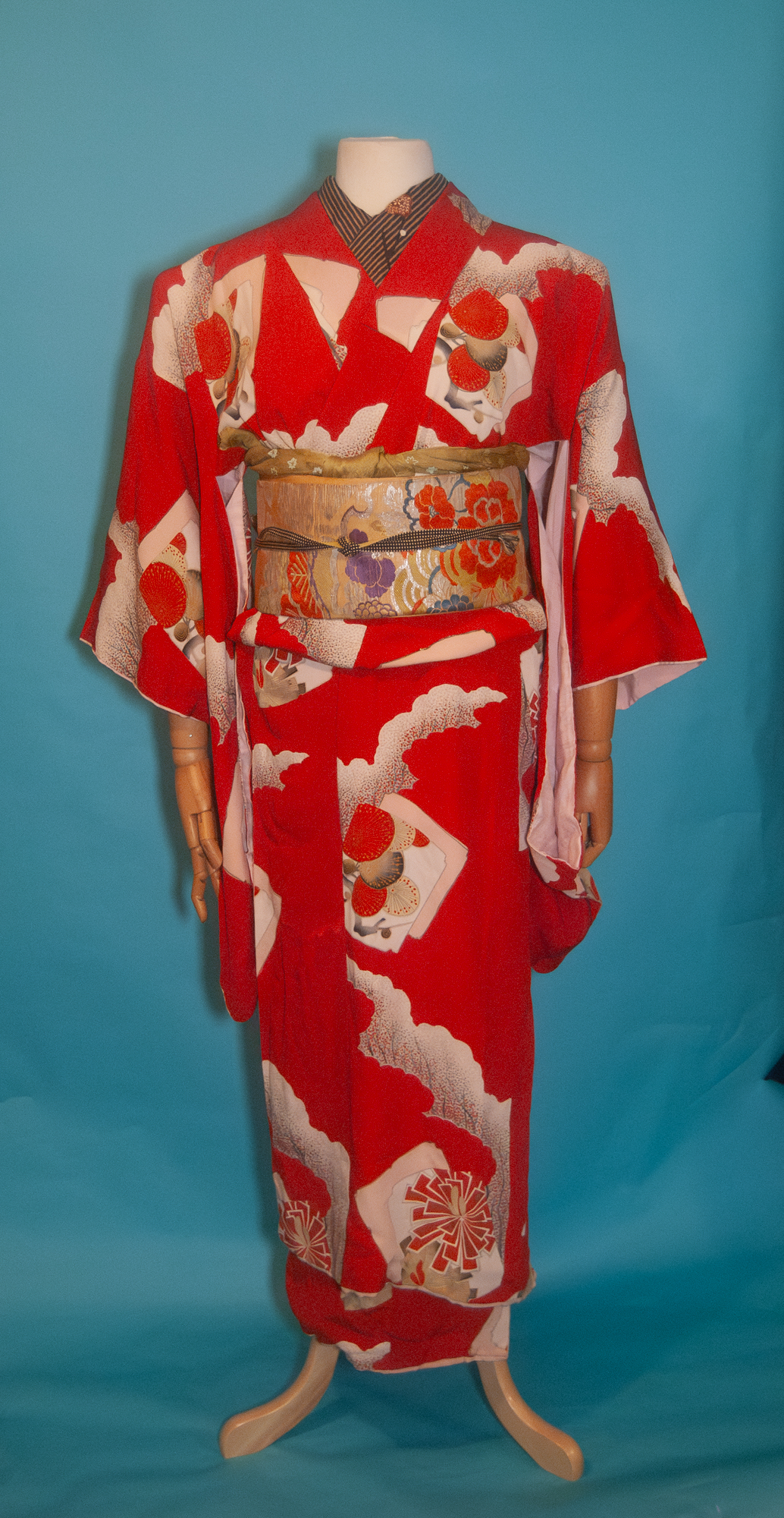
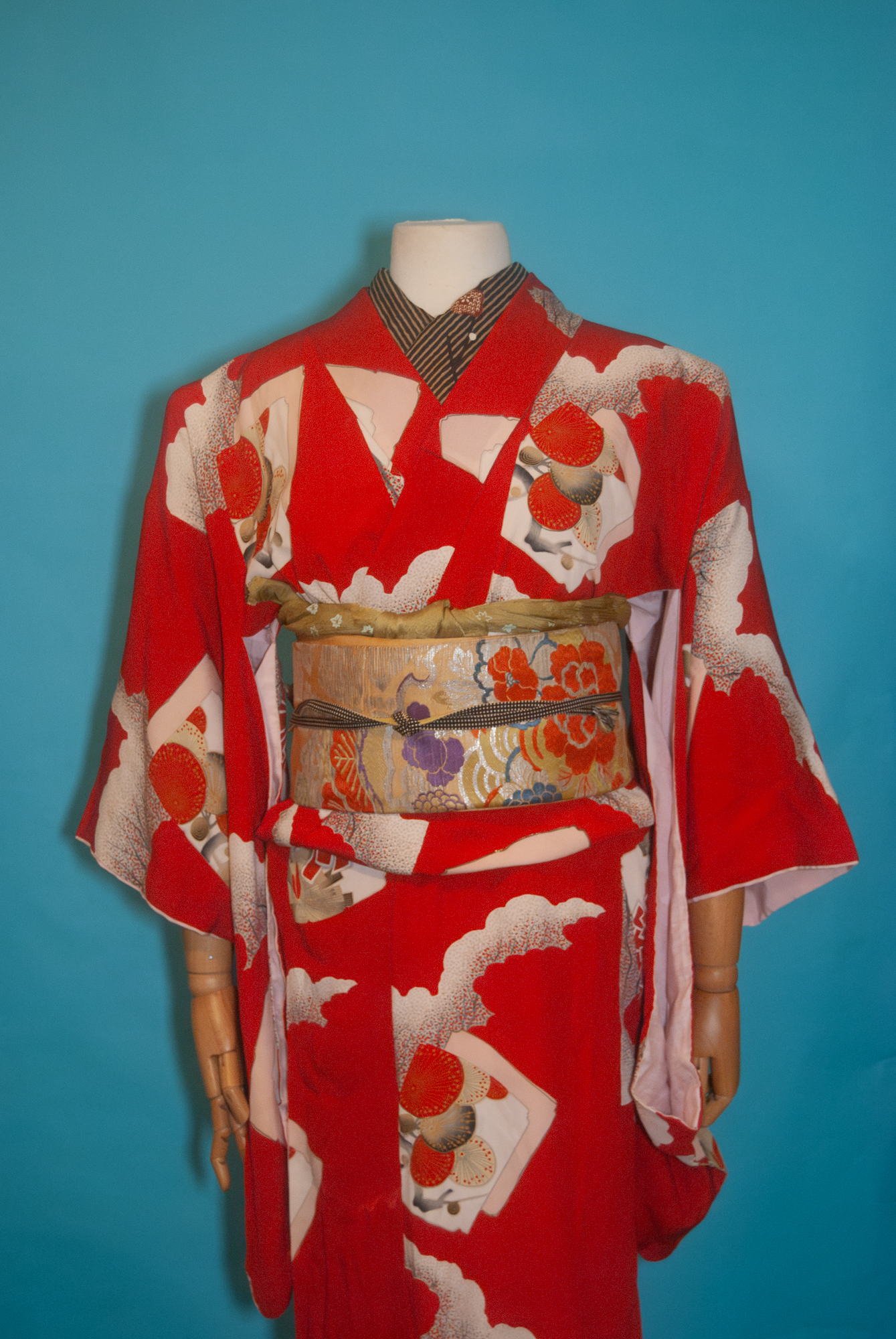
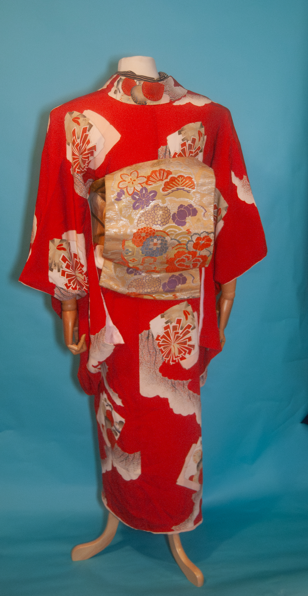
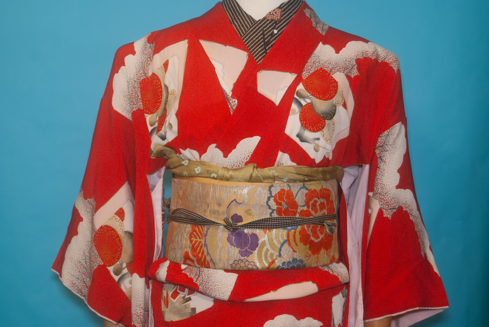
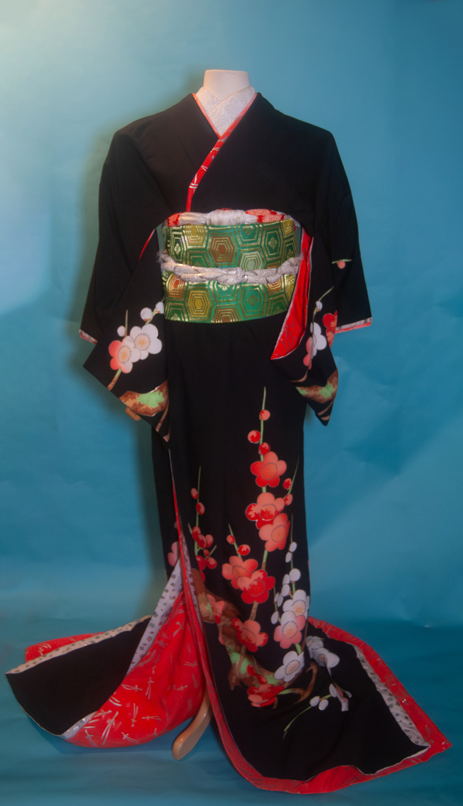
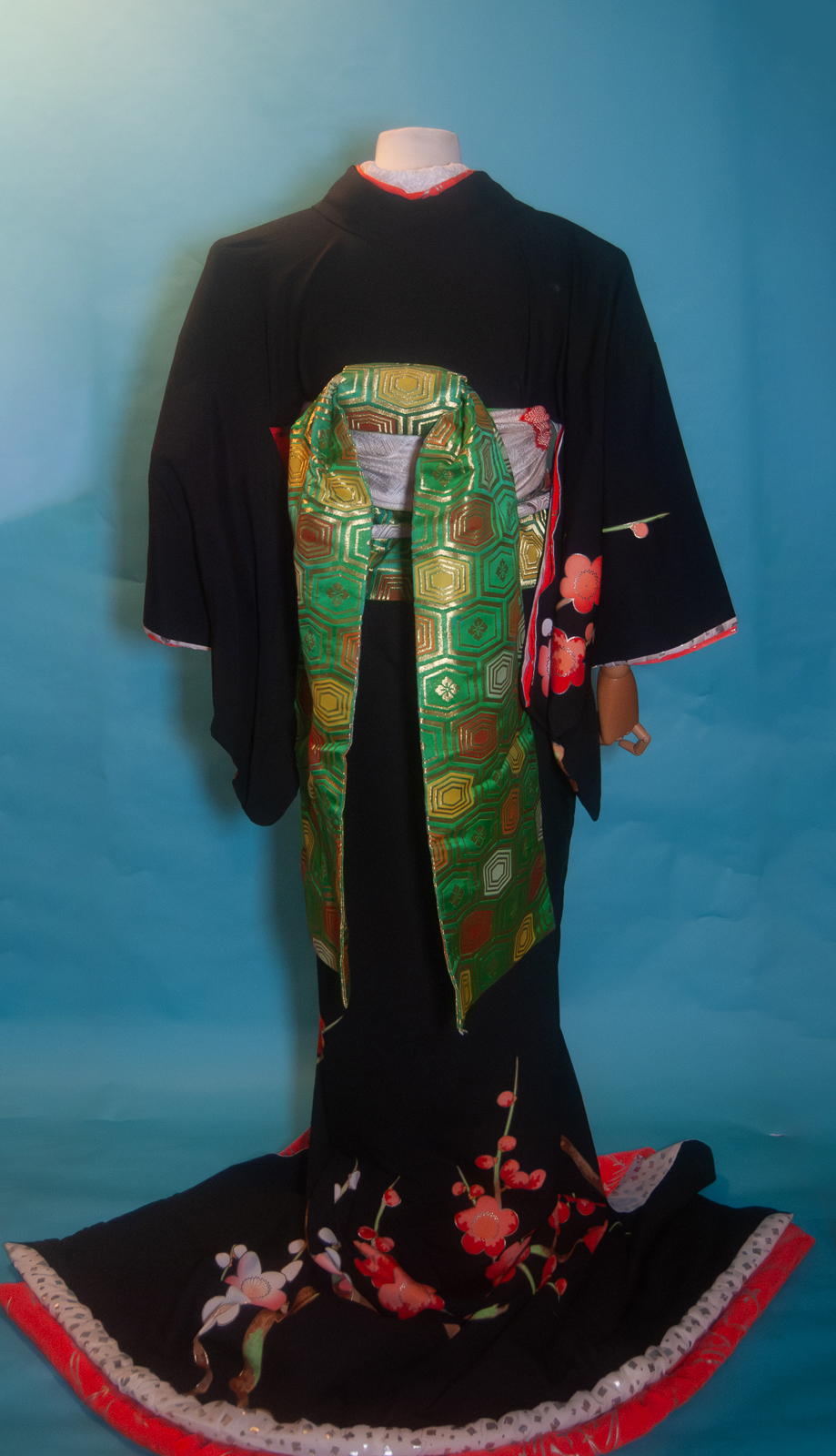
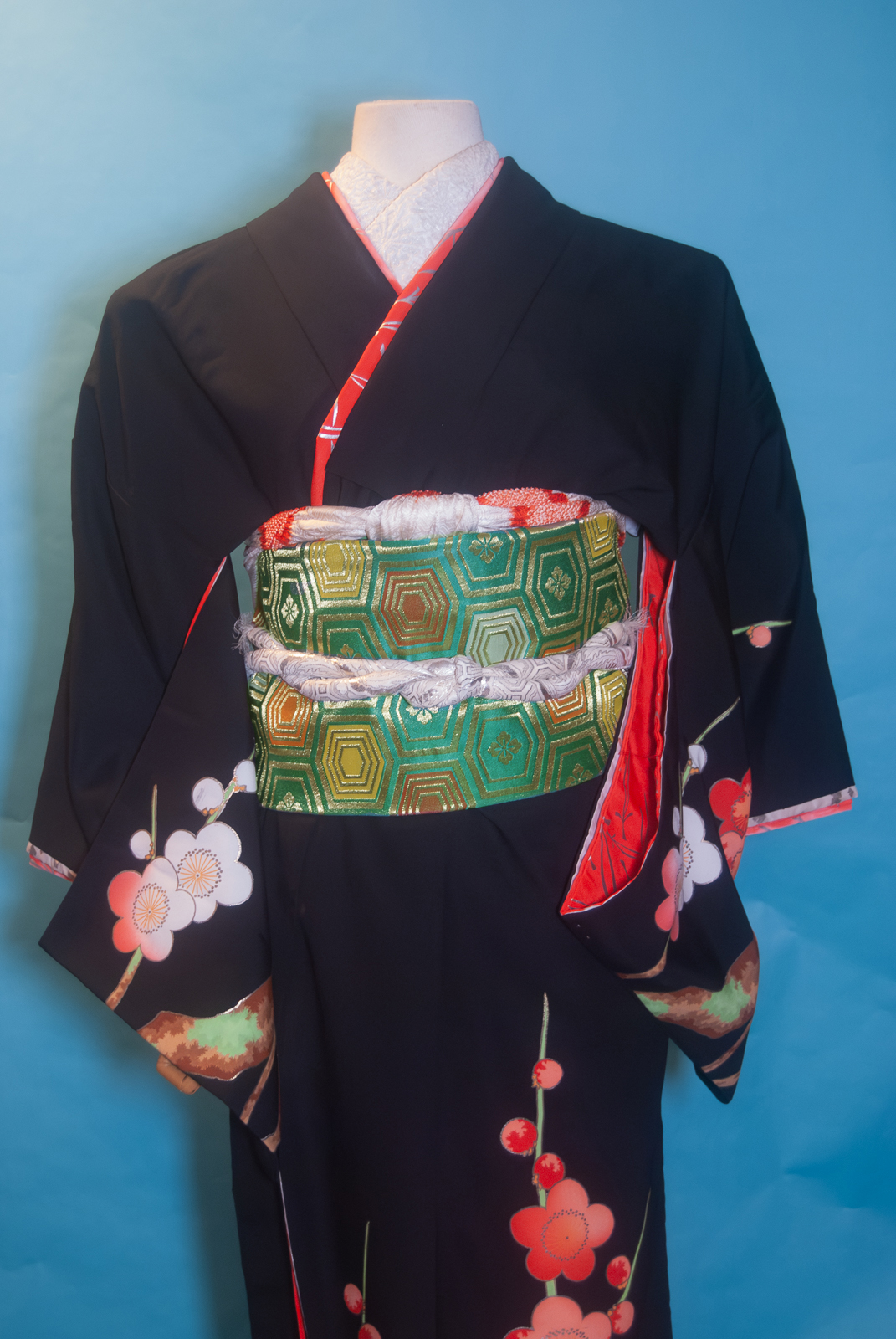
I found this charming rose furisode at the same time as I got the absolutely unctuous brown houmongi recently. As a married woman in her mid-forties, did I need yet another furisode? Heck no. Was I going to let that stop me? Also no. I love how subtle and demure it is, especially for a furisode. And the price was fantastic.
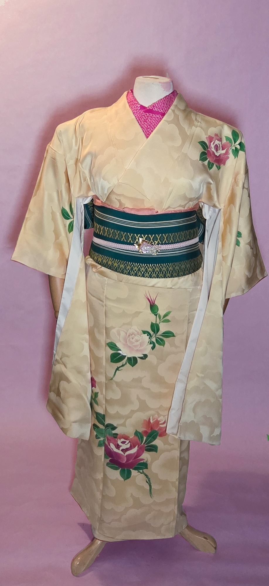
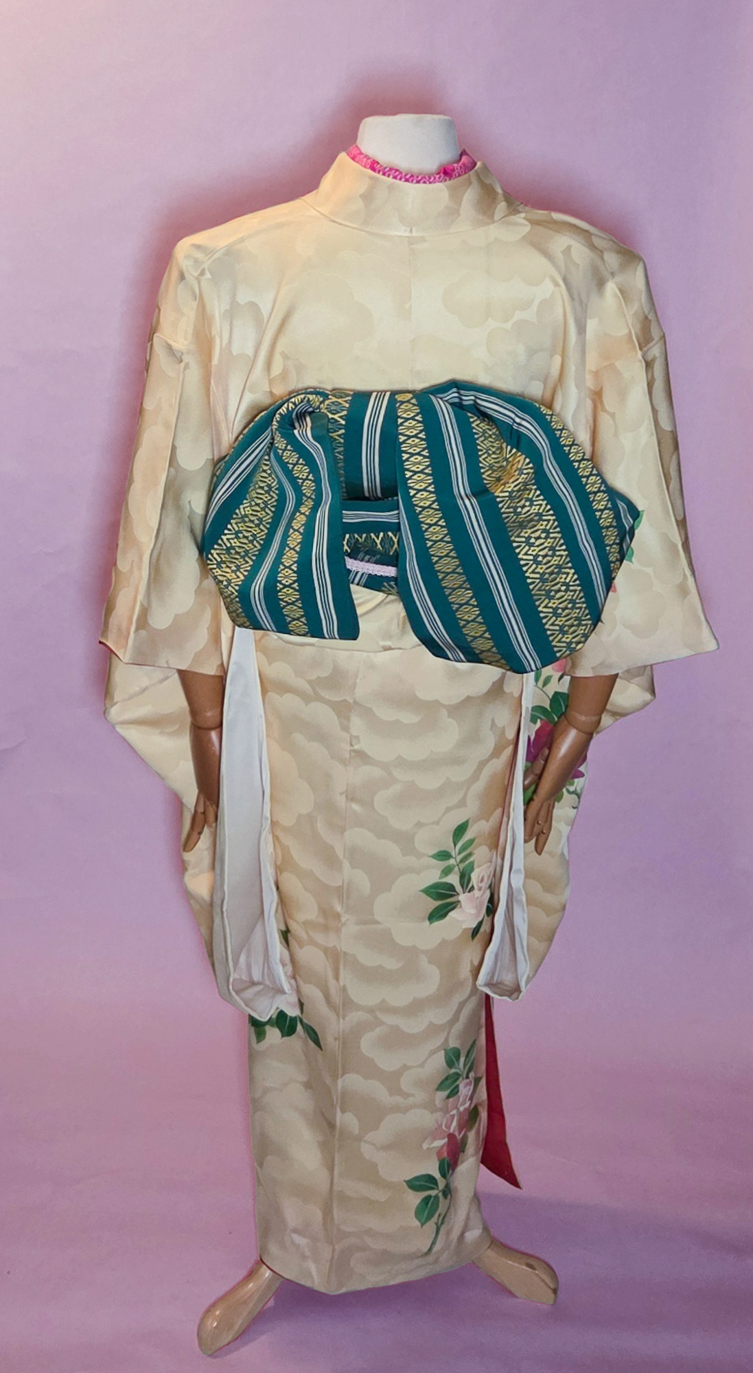
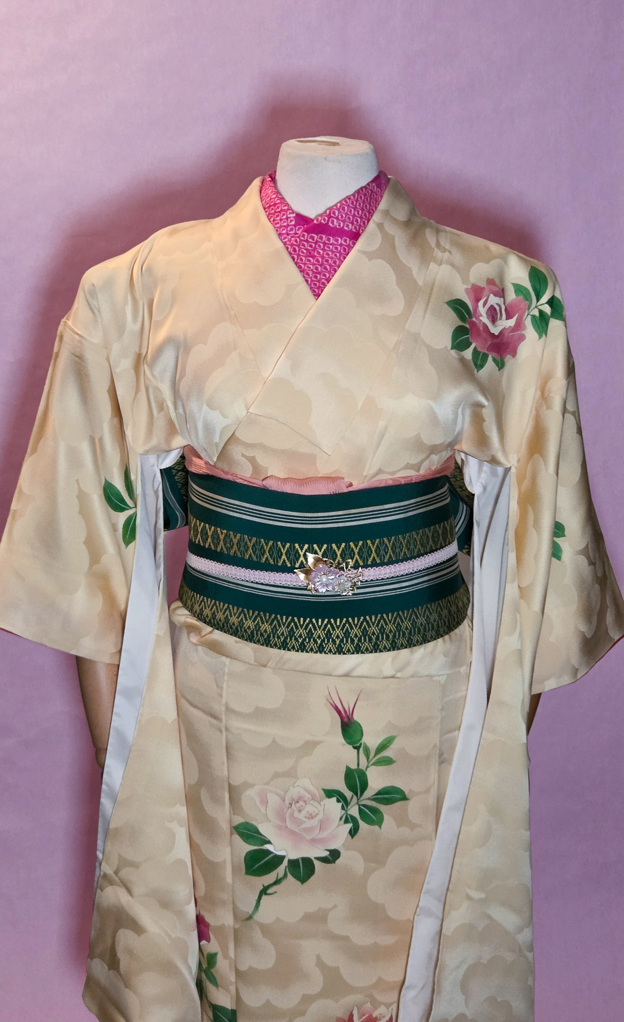
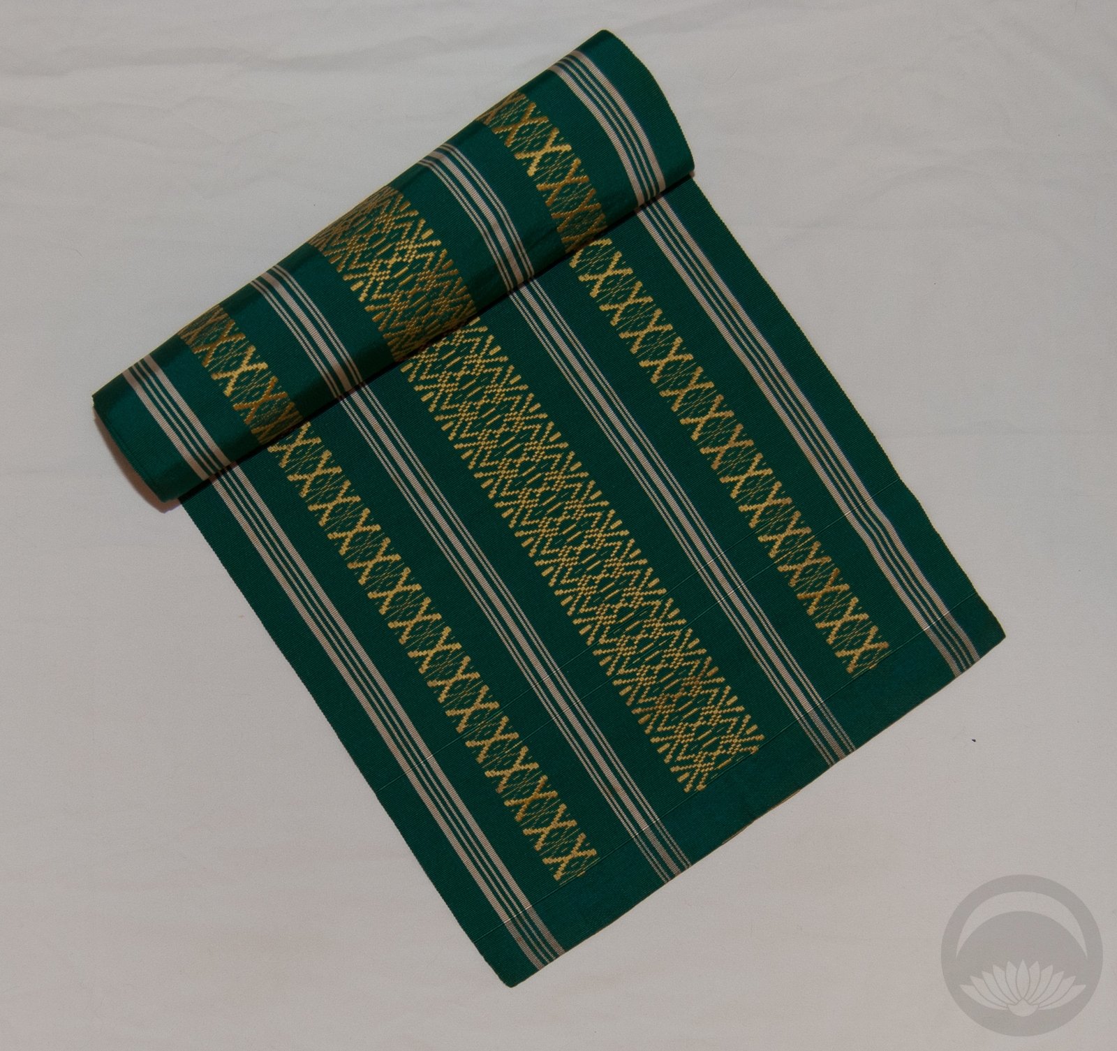
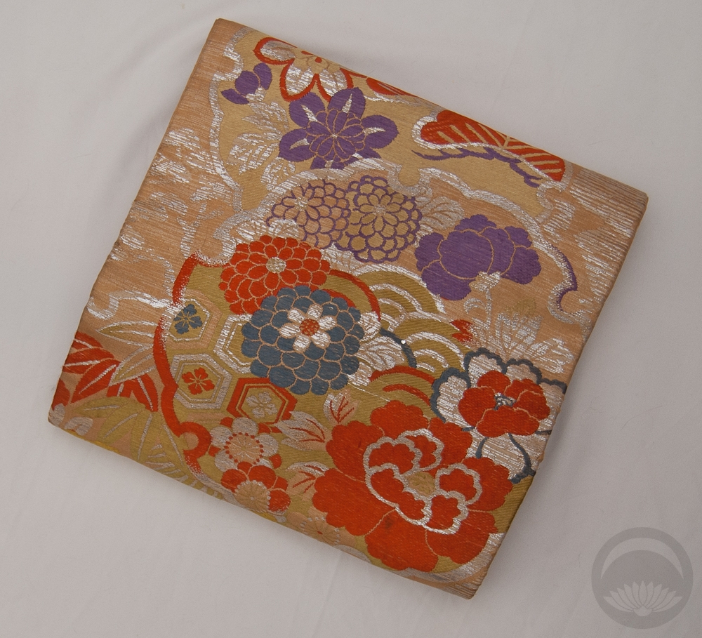
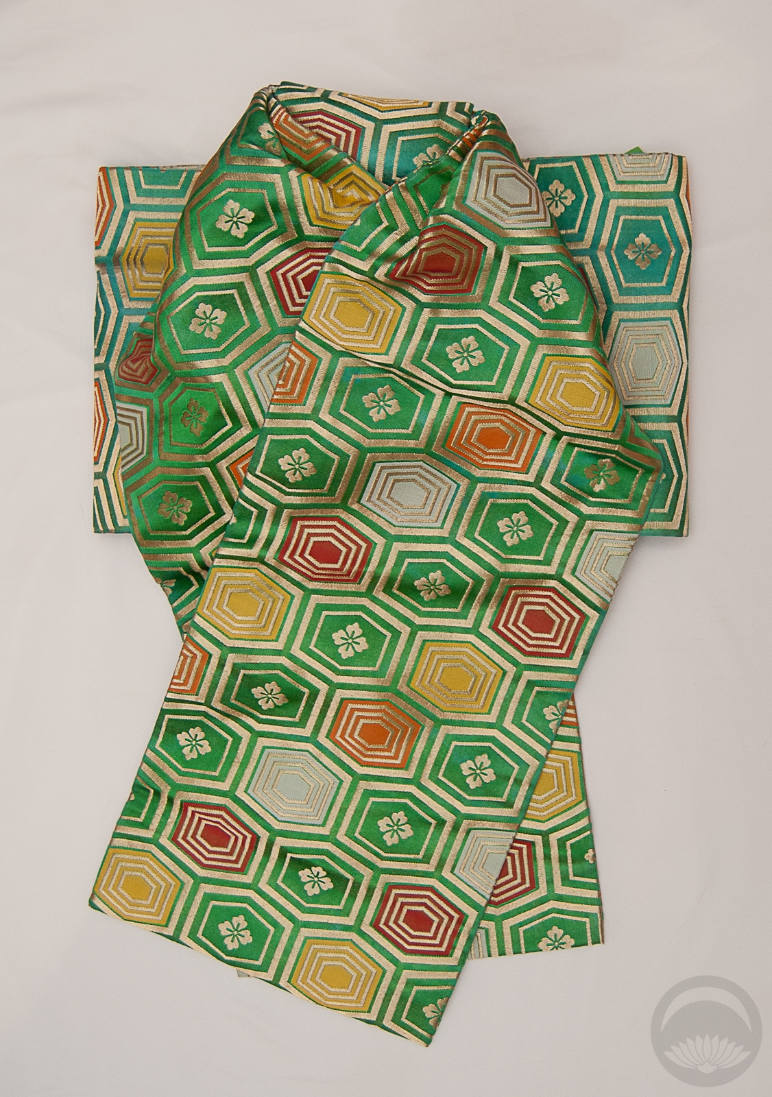
My beloved emerald and gold hakata packs a nice punch against the muted creme tone of the kimono, and pink accessories were a no-brainer. I’d love to get an actual rose obidome or obi-kazari to go with it, but this gold and sakura piece works in the meantime. I feel like this is a good “mature” furisode outfit, especially if I were to tie the obi in something a bit less large and fluffy next time.
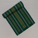
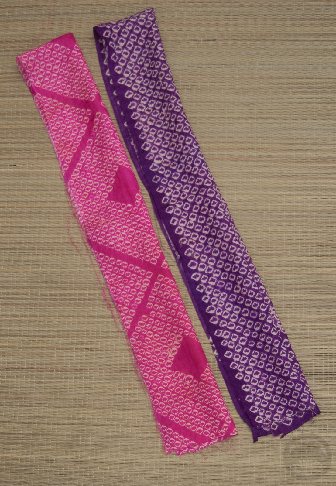
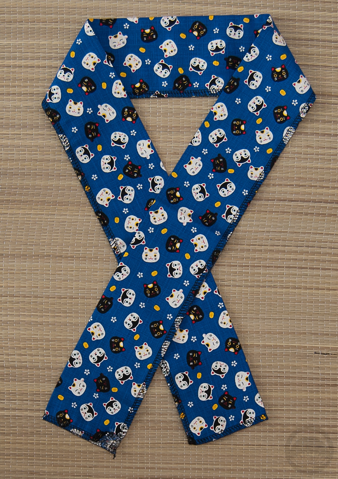
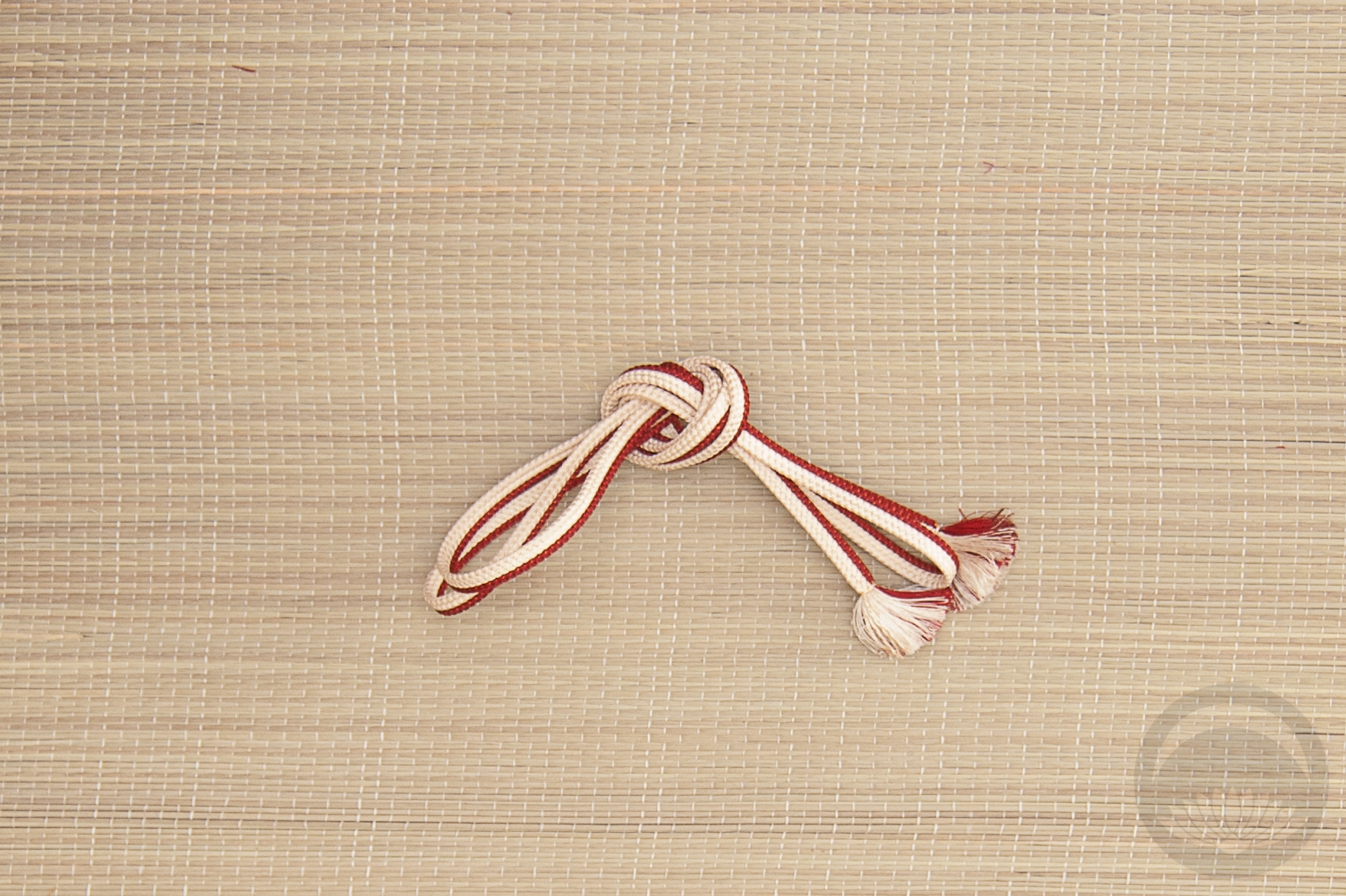
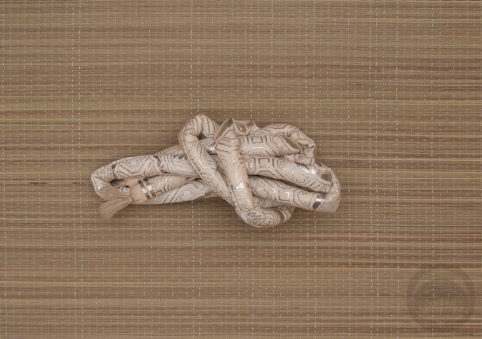
The kimono is quite new so I don’t have a catalogue photo for it, but weirdly I don’t seem to have one for this sanbuhimo either? Which is odd, because I’ve had it for eons. One day I’ll get my collection catalogue up to date. One day…
Items used in this coordination
-
- Emerald with Gold
-
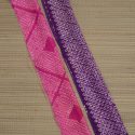
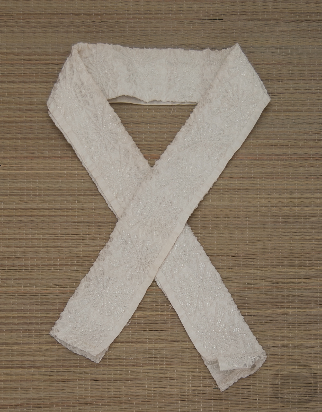
- Mixed Shibori
-
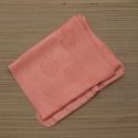
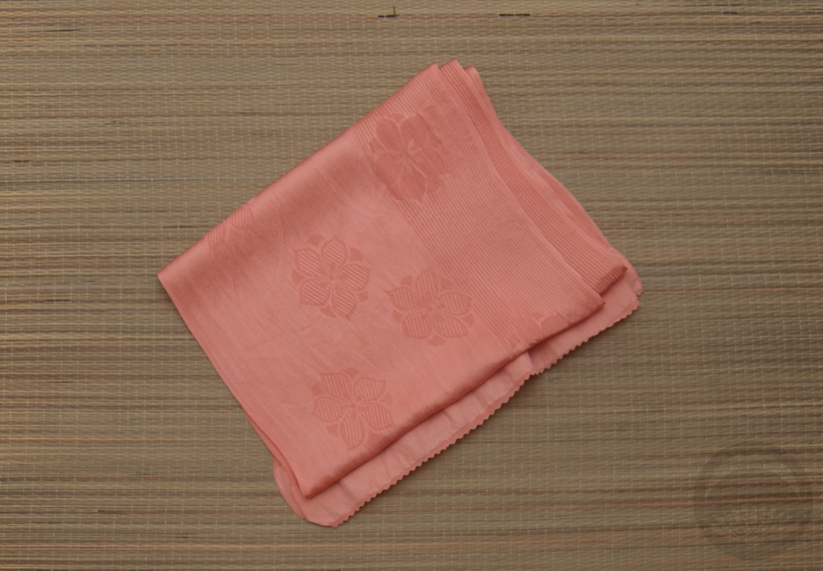
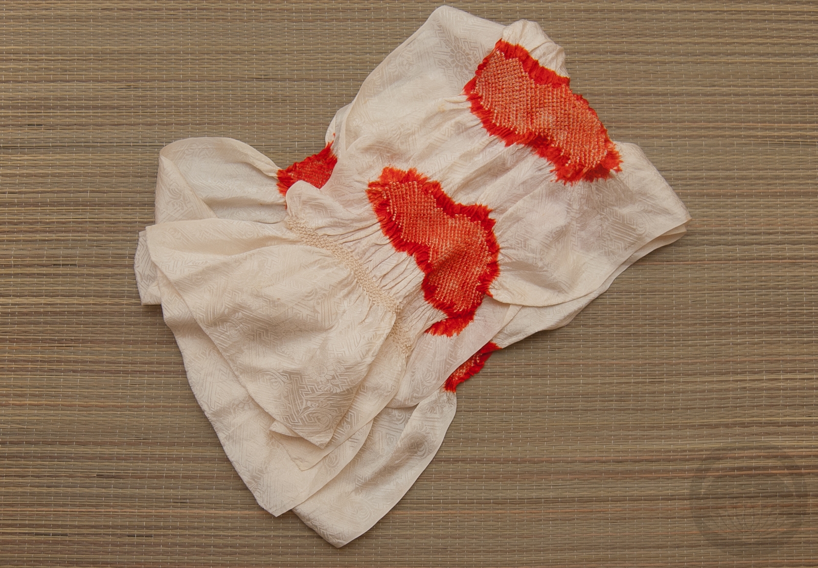
- Salmon Rinzu
-
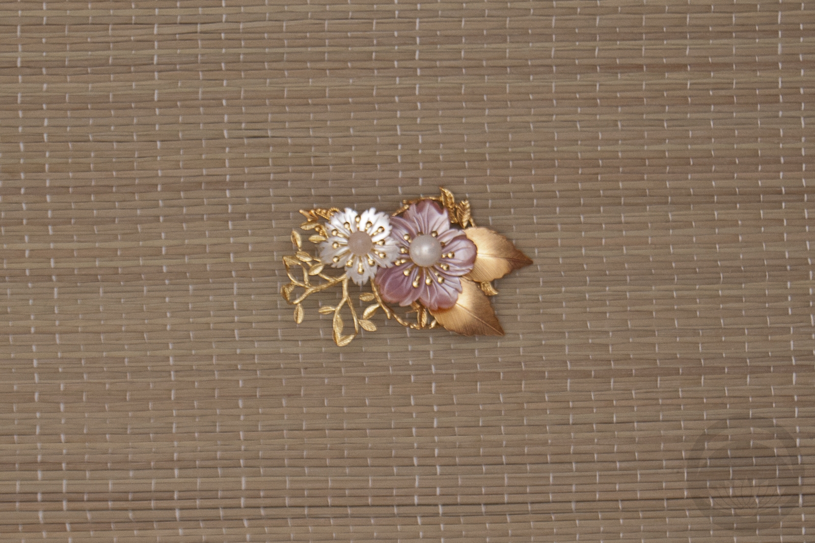
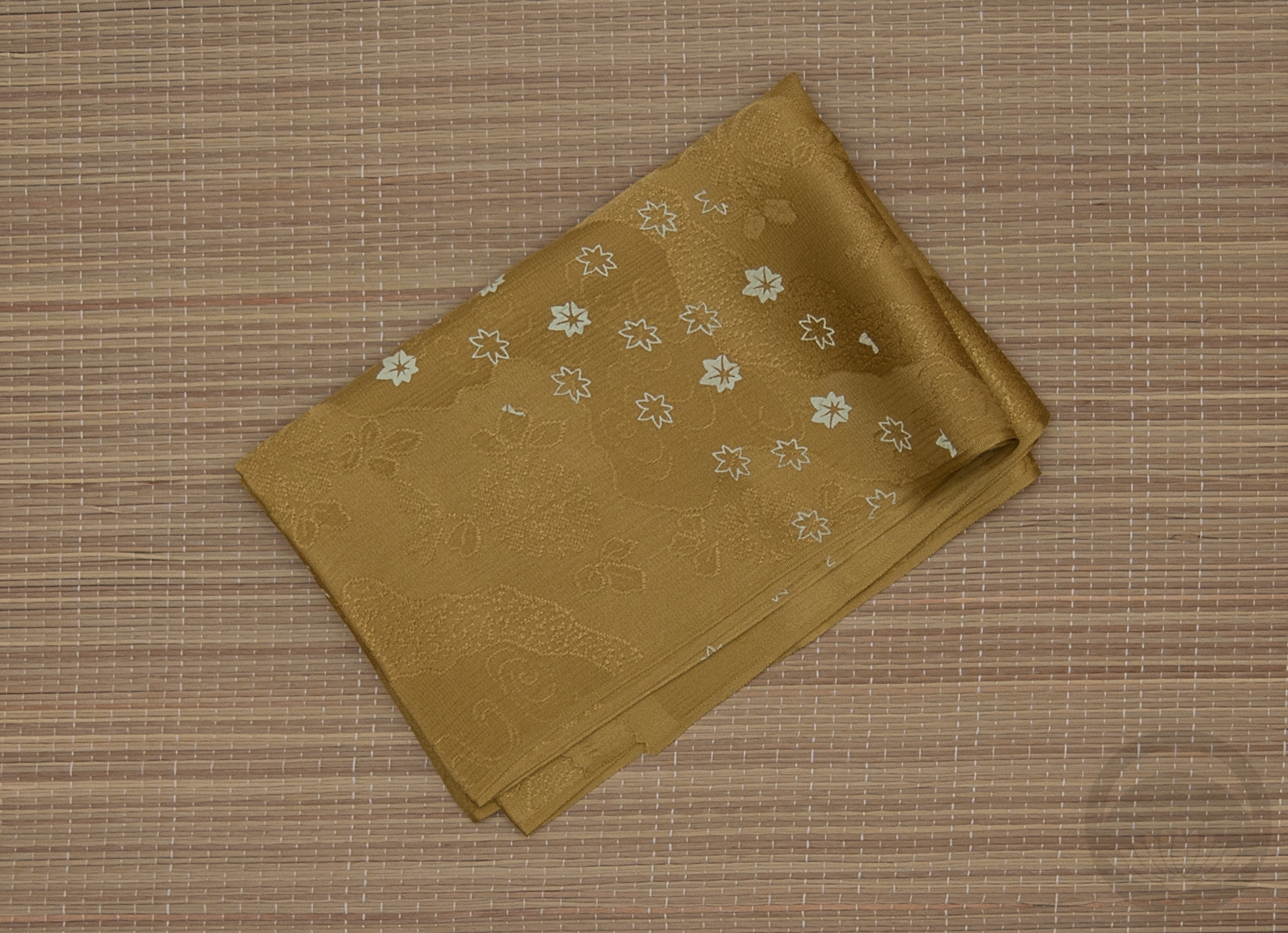
- Pearl Sakura


 Bebe Taian
 CHOKO Blog
 Gion Kobu