
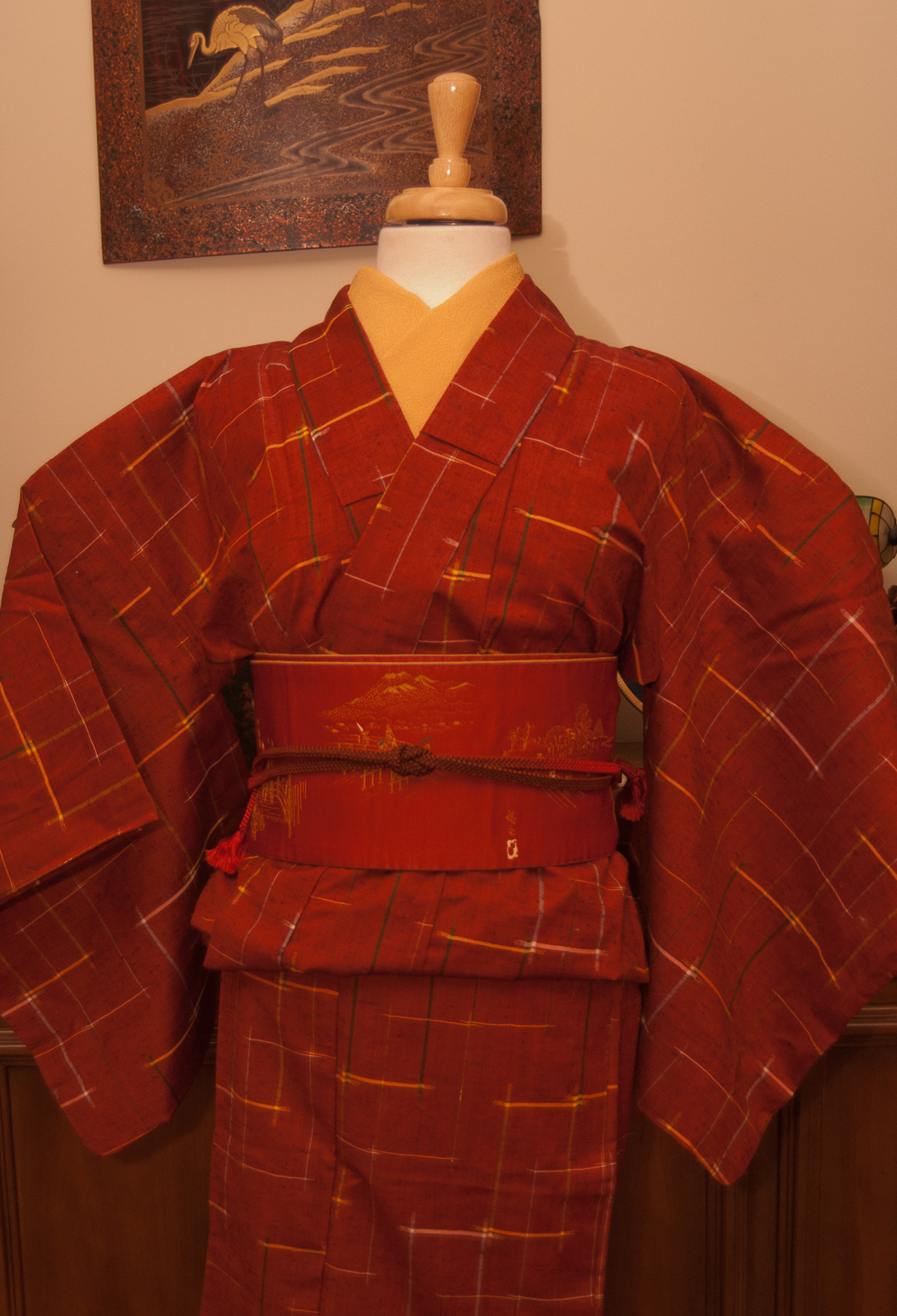
Can you believe the year is finally over? I knew I wanted to end the #monokimono challenge with a bang, so I went with a really festive-feeling bold red coordination.
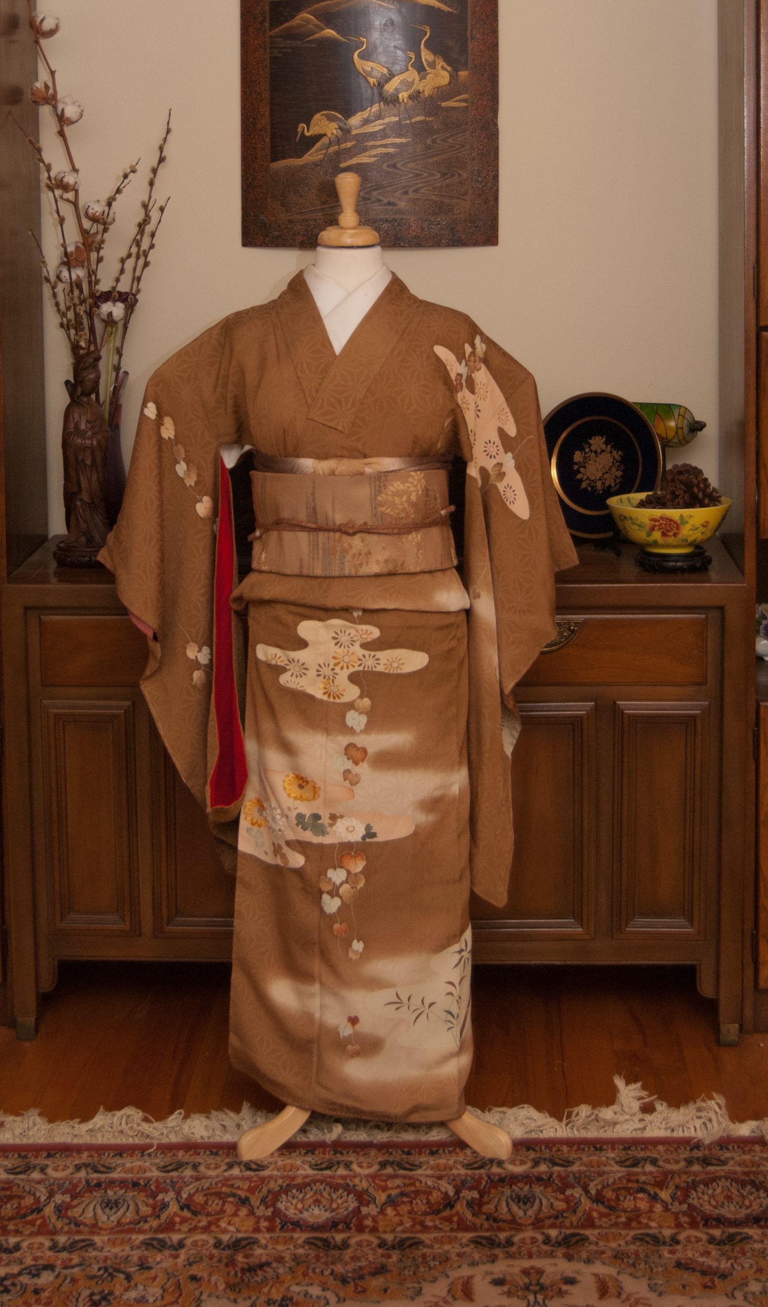
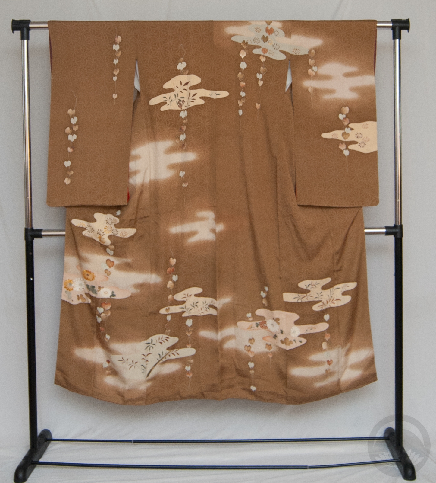
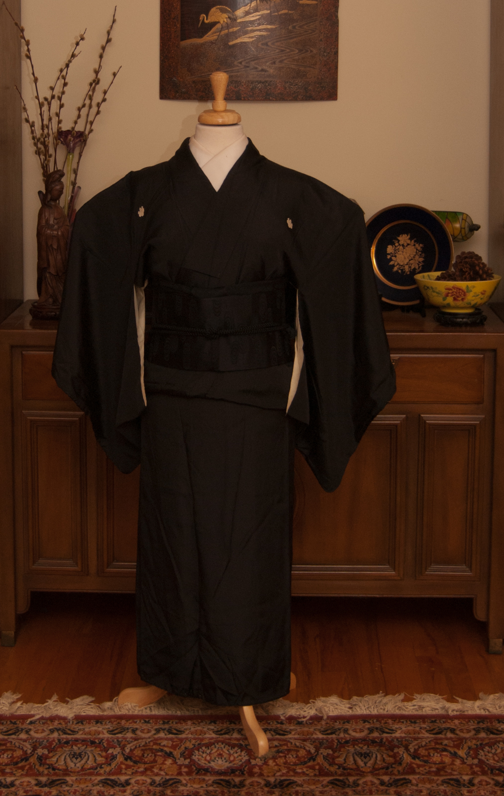
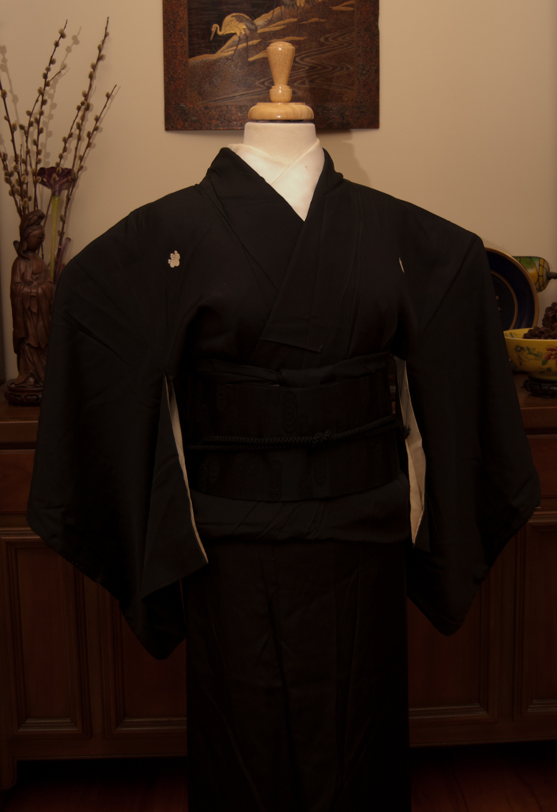
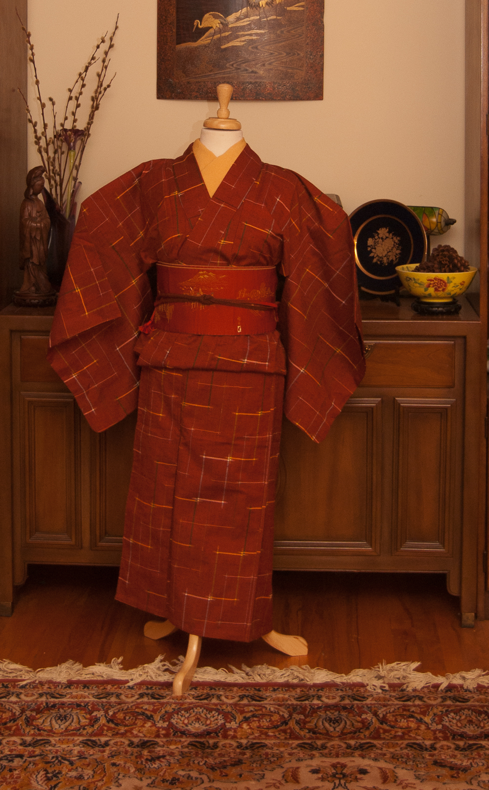
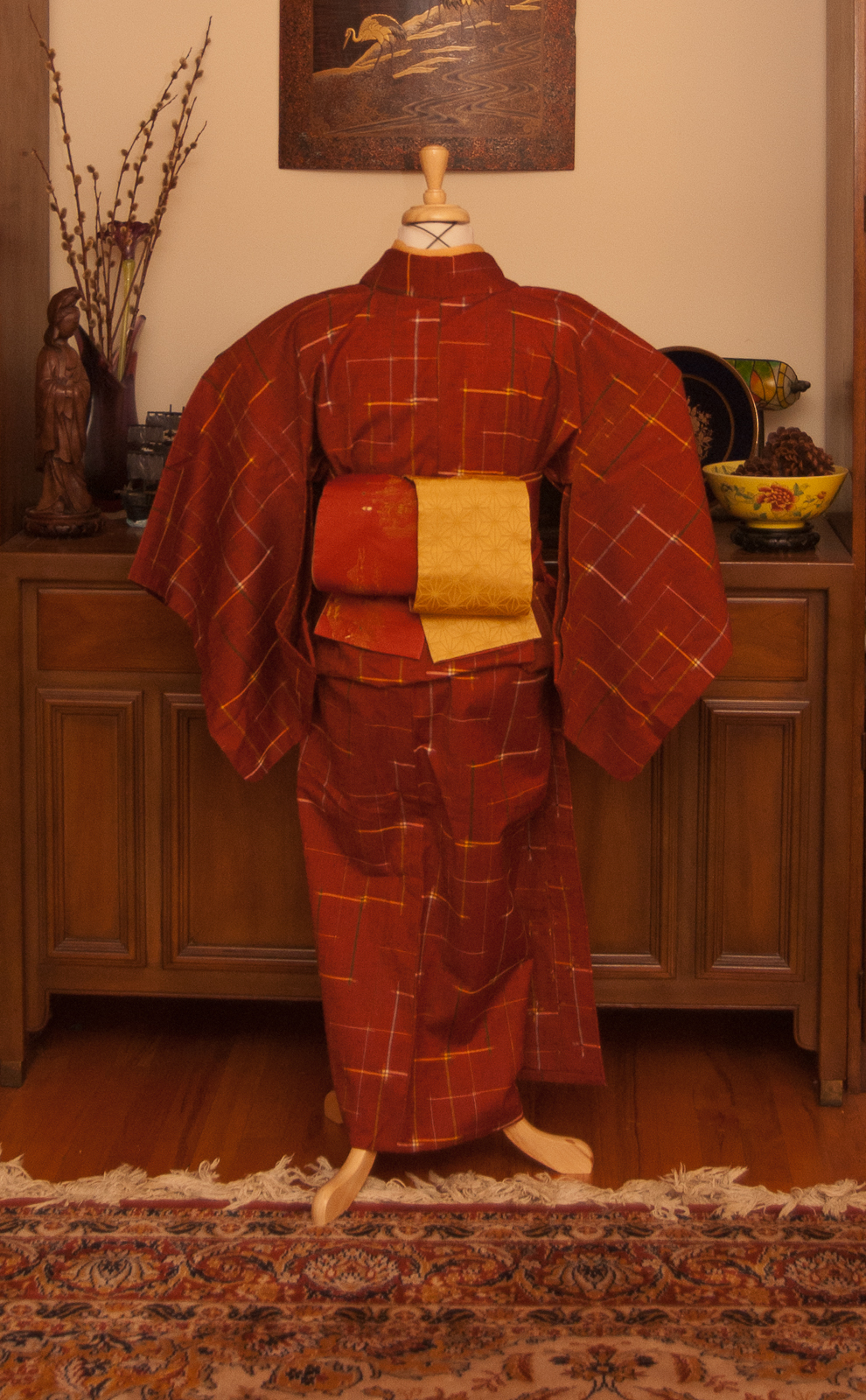
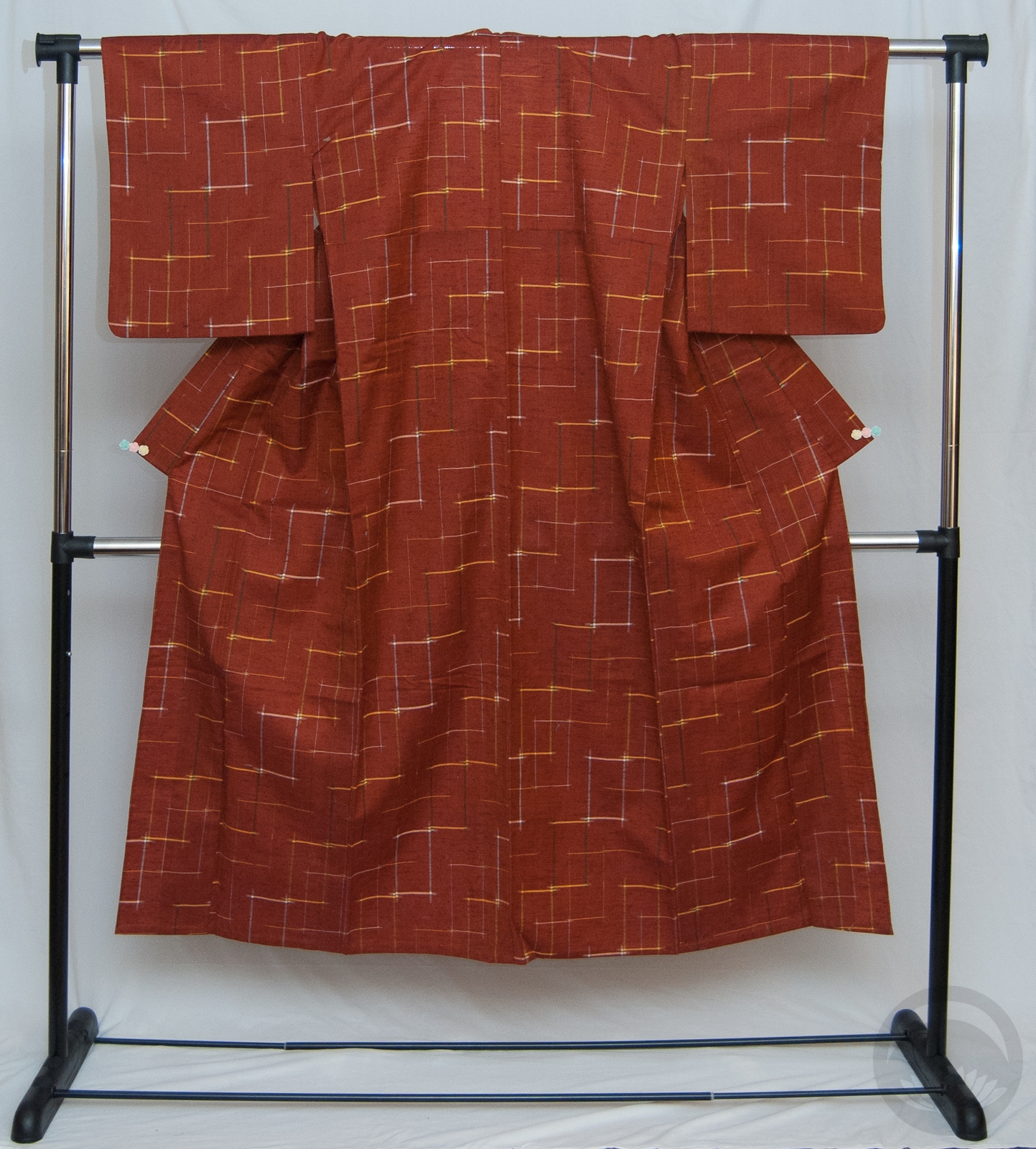
I know I use this kimono a lot, but I do love it to bits. It was my first kimono and it’s still one of the easiest to work with. This whole outfit fell into place very easily and dressing the mannequin took no effort at all. Which is a good thing, because I slipped on the ice getting into the car last night and pulled my entire right side out of alignment. Nothing serious, but it’s uncomfortable and annoying! So I’m very glad this outfit cooperated so well.
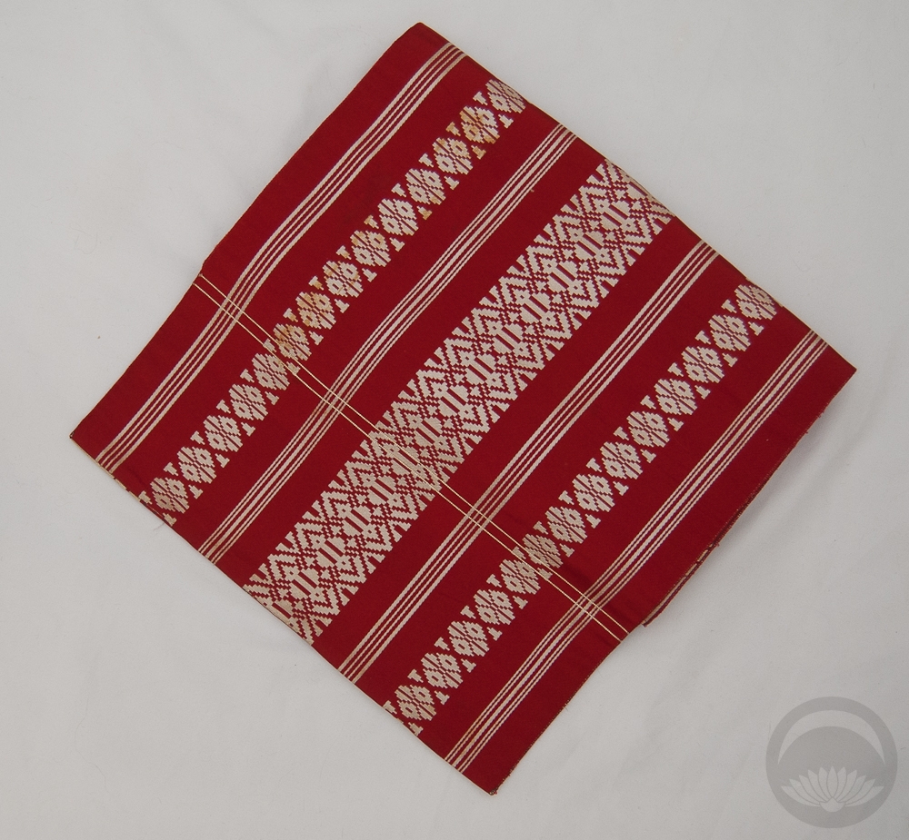
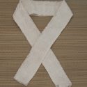
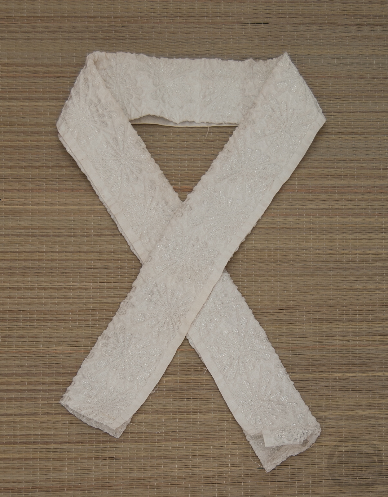
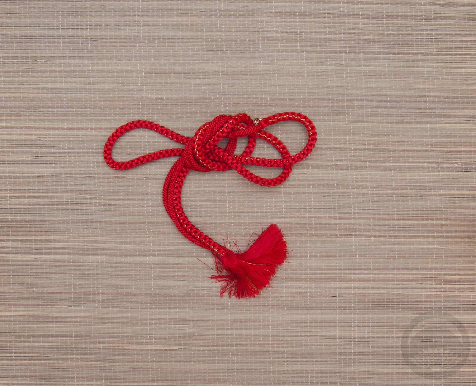
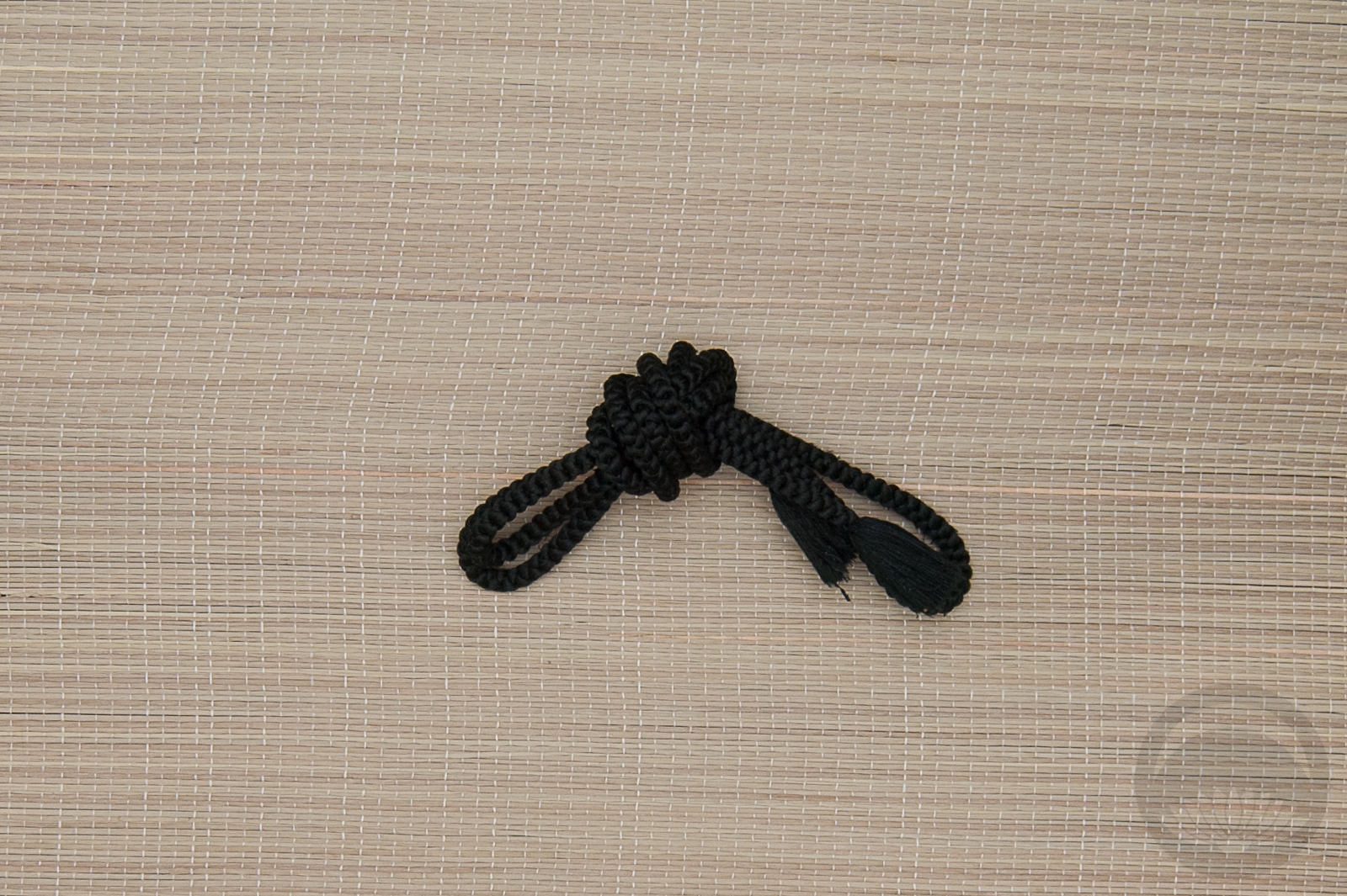
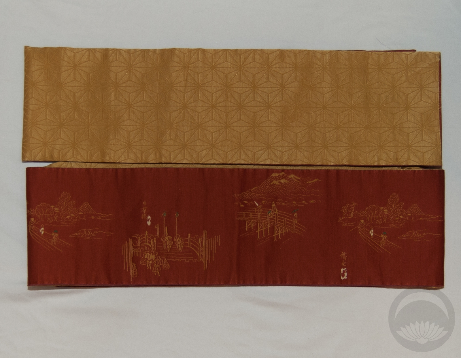
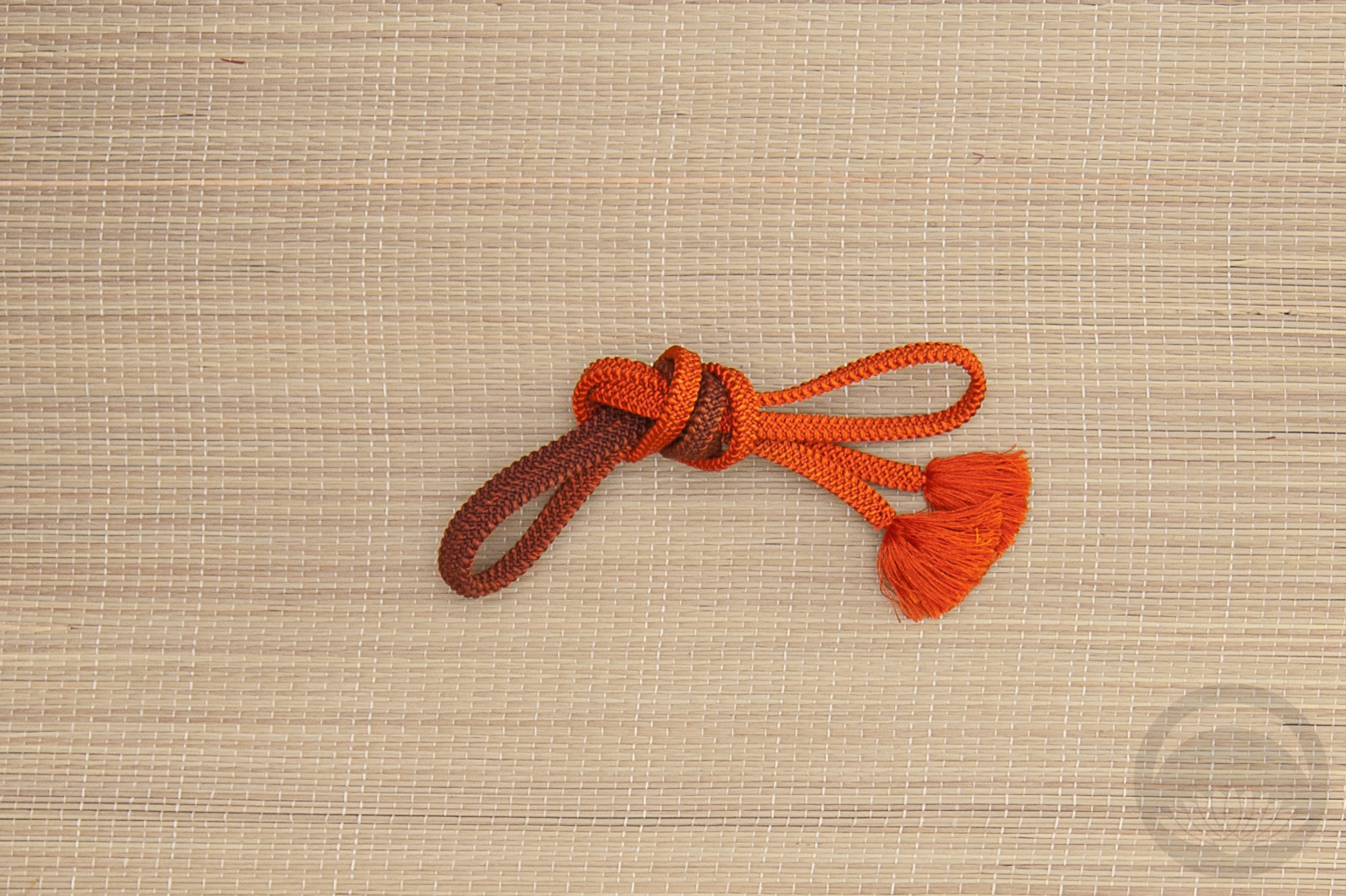
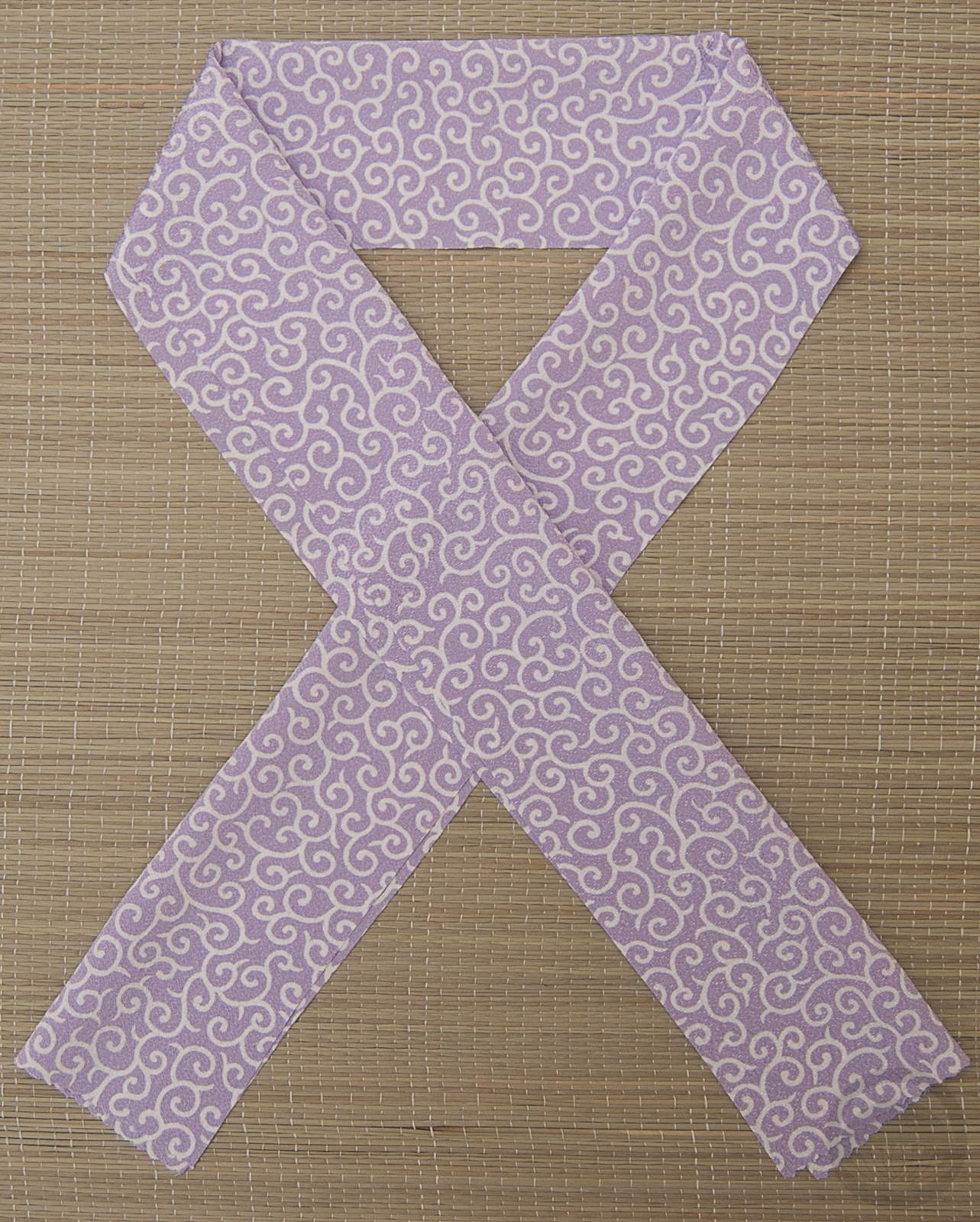
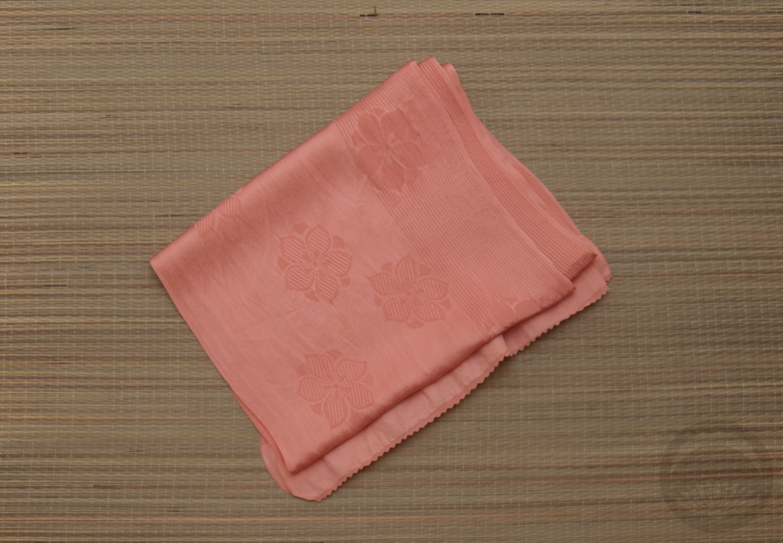
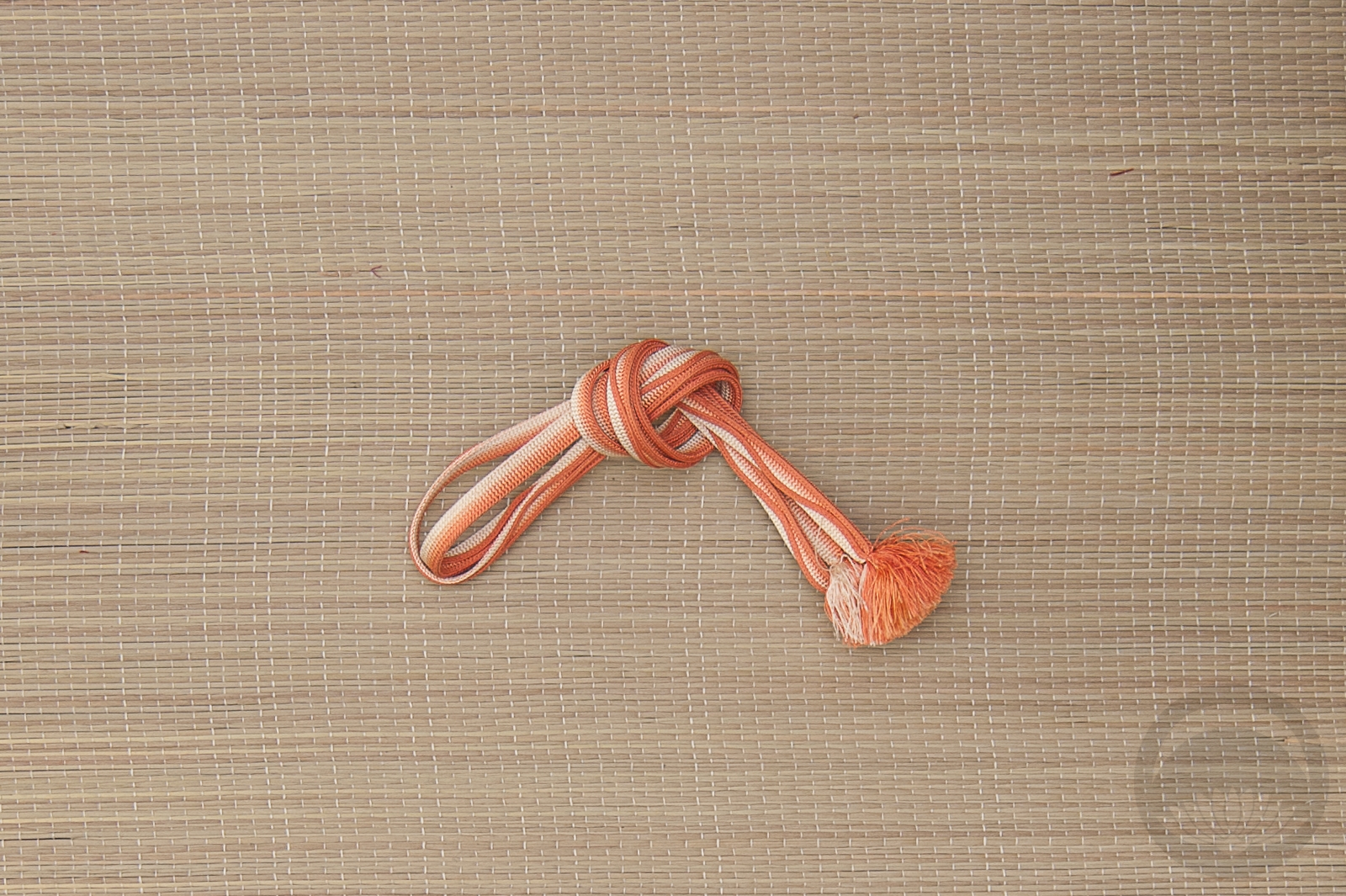
Once I had the red kimono sorted, this red and white hakata obi was a no-brainer. The reds are nearly identical, and the white geometric plays off the flowing white kiku of the kimono. I don’t have a red haneri so I went with white, also with kiku motif, and a gold kasane-eri for a little bit of punch. The obijime is one I bought at that big kimono bazaar in the autumn and I’m so happy to have found a way to feature it.
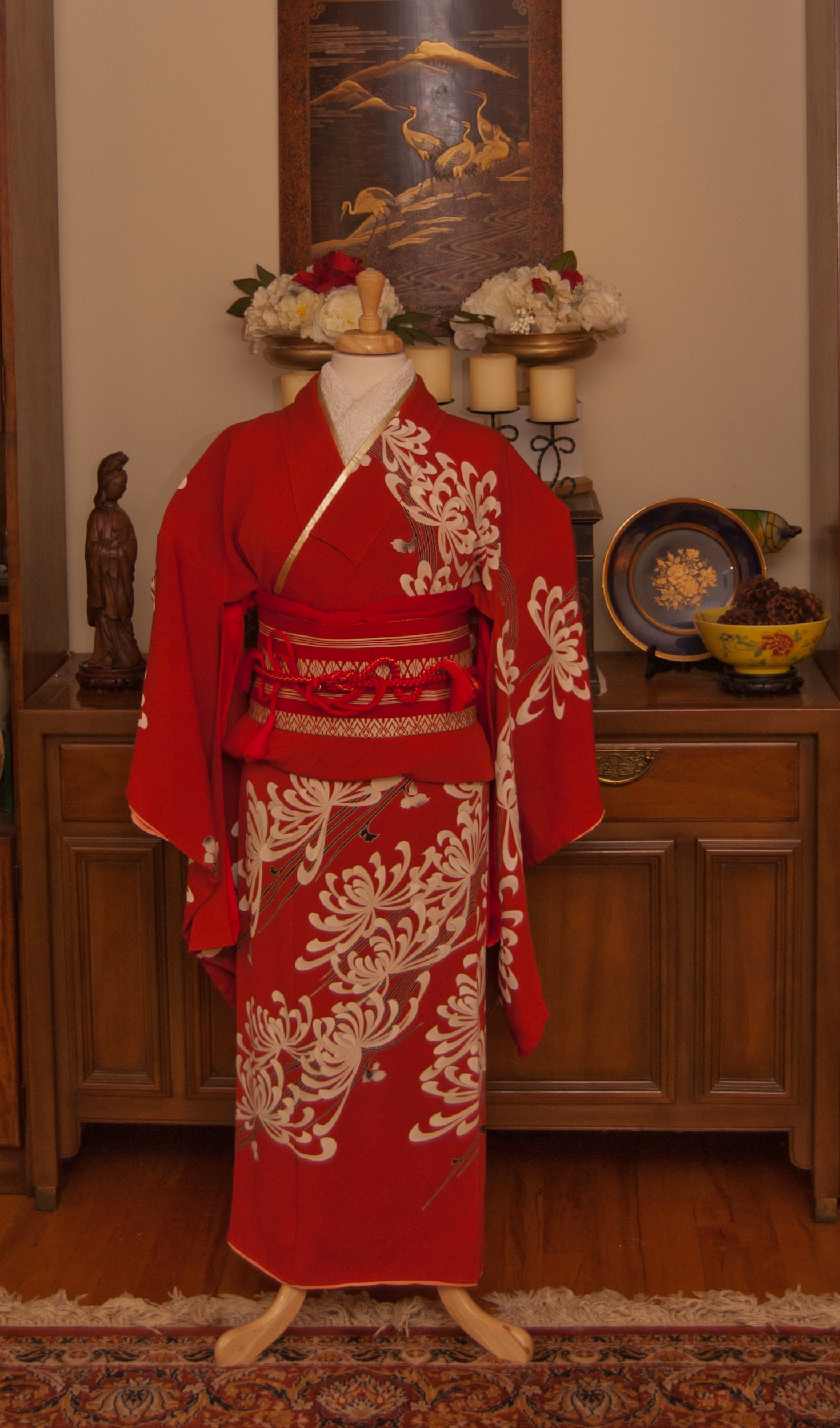
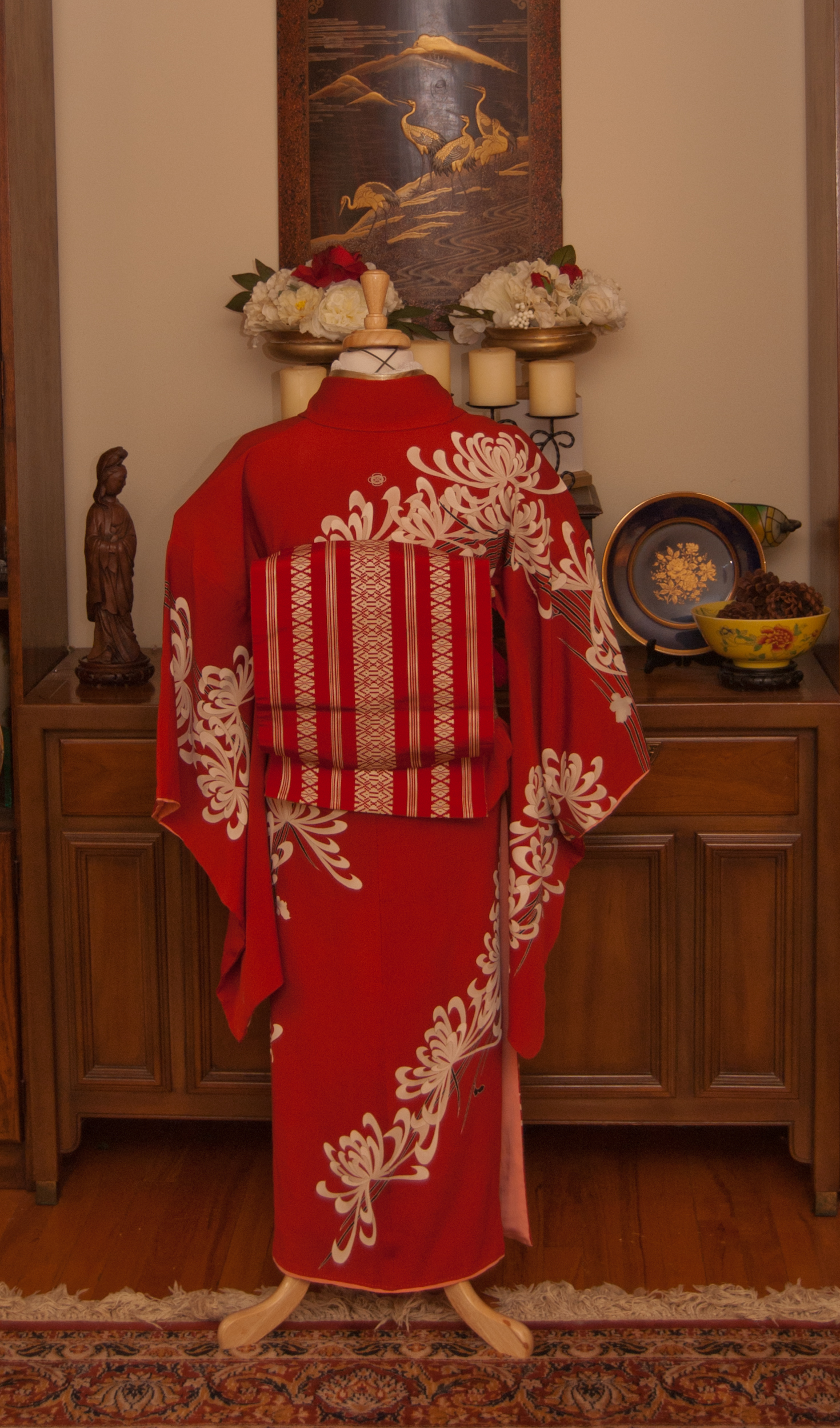

This is such a bright, vibrant outfit. It feels perfect for that liminal time between Christmas and New Year’s day. It also brought me a lot of joy to coordinate it, and that’s something I sorely needed in my life right now.
I don’t know if I’ll do this monthly challenge again in 2019, but I know I will still be making monochrome outfits now and again because it’s a lot of fun and encourages me to step out of the “typical kimono comfort zone”.
Items used in this coordination
-
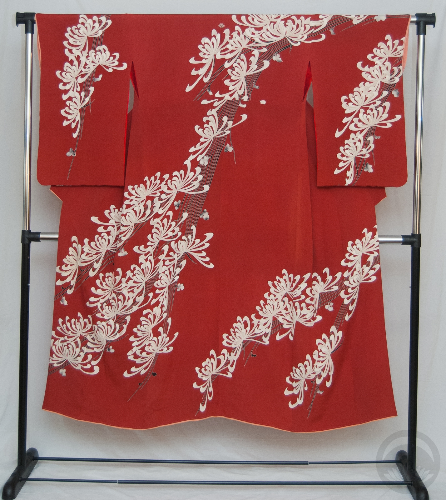
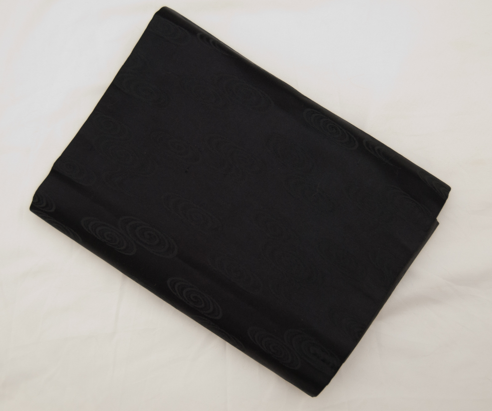
- Vibrant Red with Kiku
-
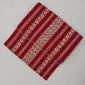
- Red & White Hakata side 1
-
- Textured Kiku
-

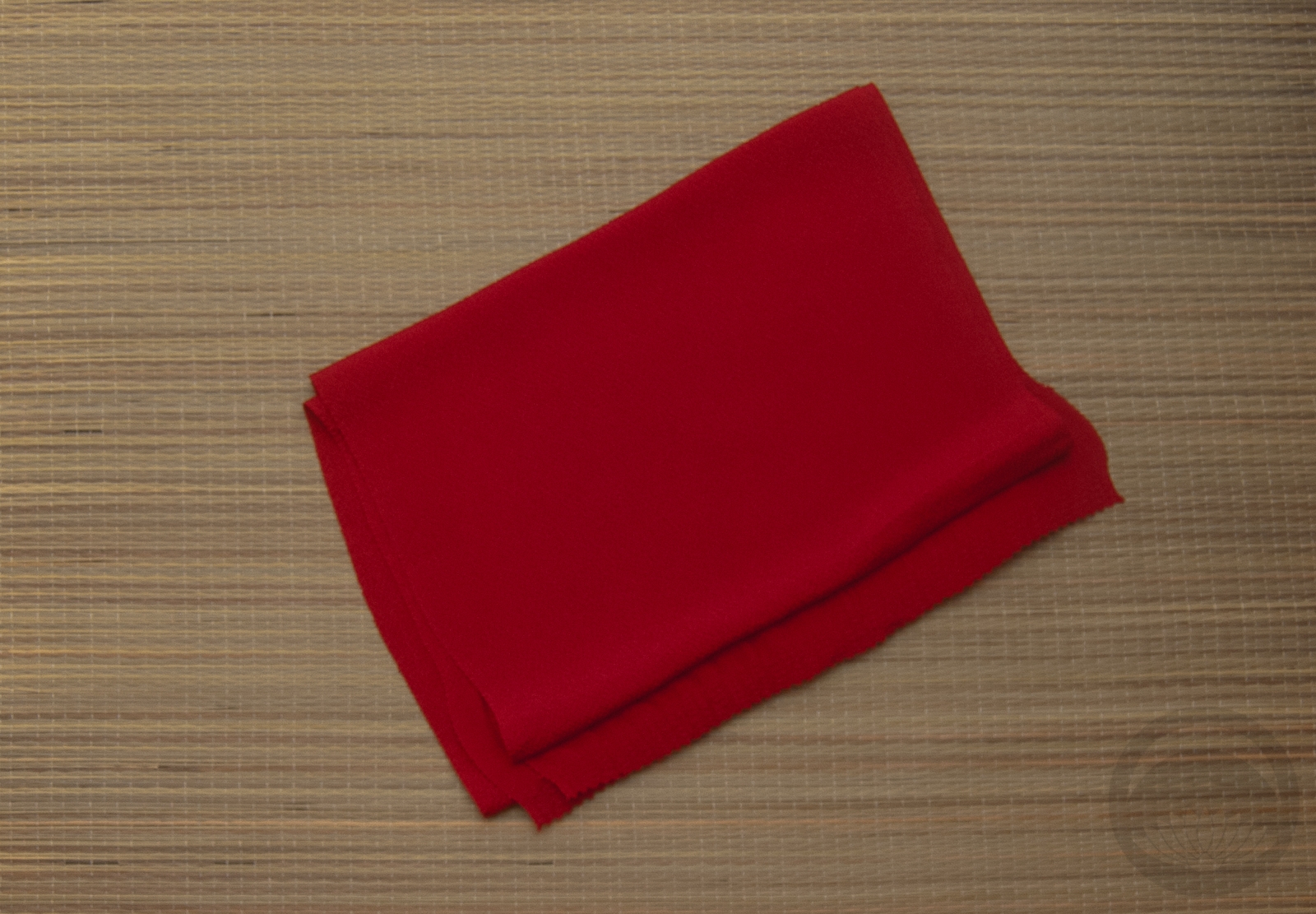
- Red Chirimen
-

- Red Furisode


 Bebe Taian
 CHOKO Blog
 Gion Kobu