Go Habs Go!

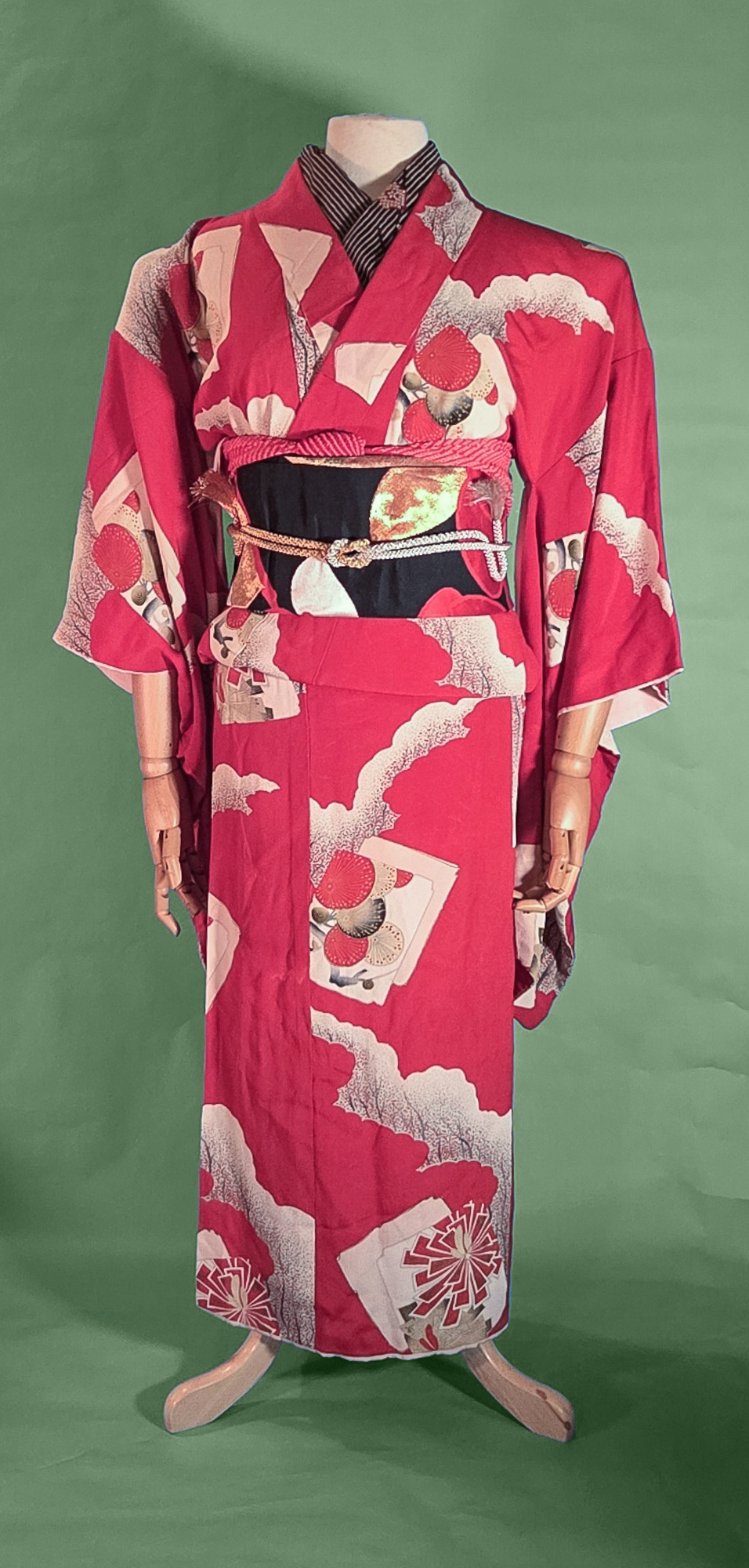
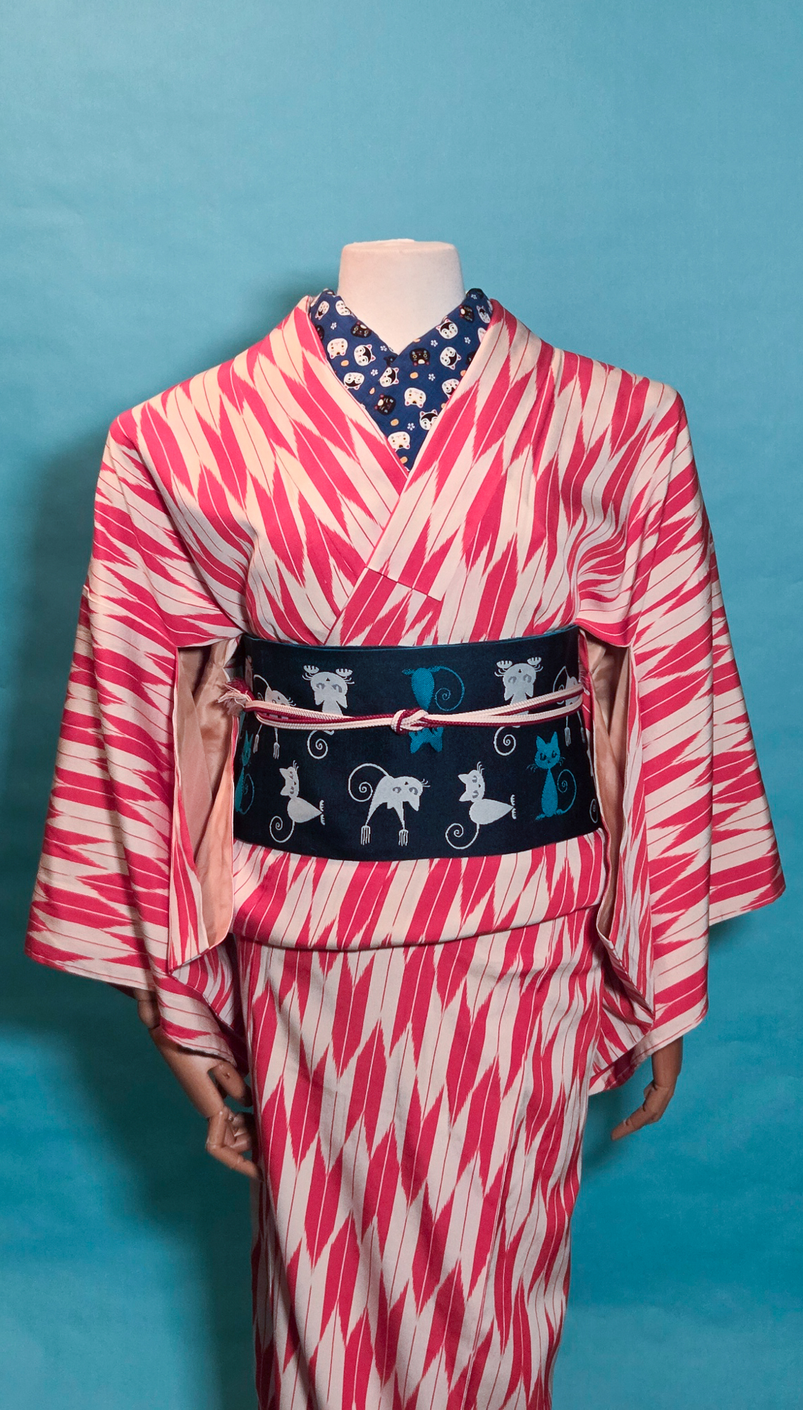
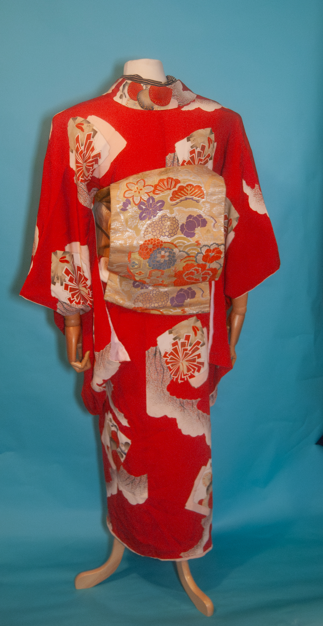
One thing you may not know about me is that I am descended from hockey royalty. Newsy Lalonde was my great-grandfather. While this isn’t something that generally overlaps with my kimono interests, sometimes a girl’s just got to represent hometown and familial pride, in the form of a coordination evoking the Montreal Canadiens team colours. Especially now that we’ve made it into series two of the Stanley Cup playoffs. Go Habs Go! Tricolore jusqu’au bout!*  I’d originally planned to put this up before Series 2 Game 1 on Wednesday but was feeling under the weather, so I’m making sure it goes up before Game 2.

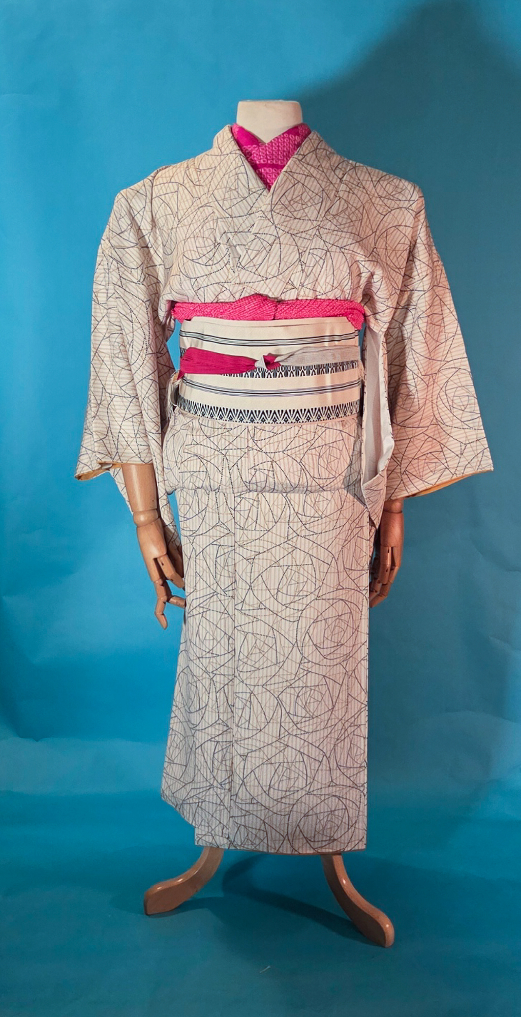
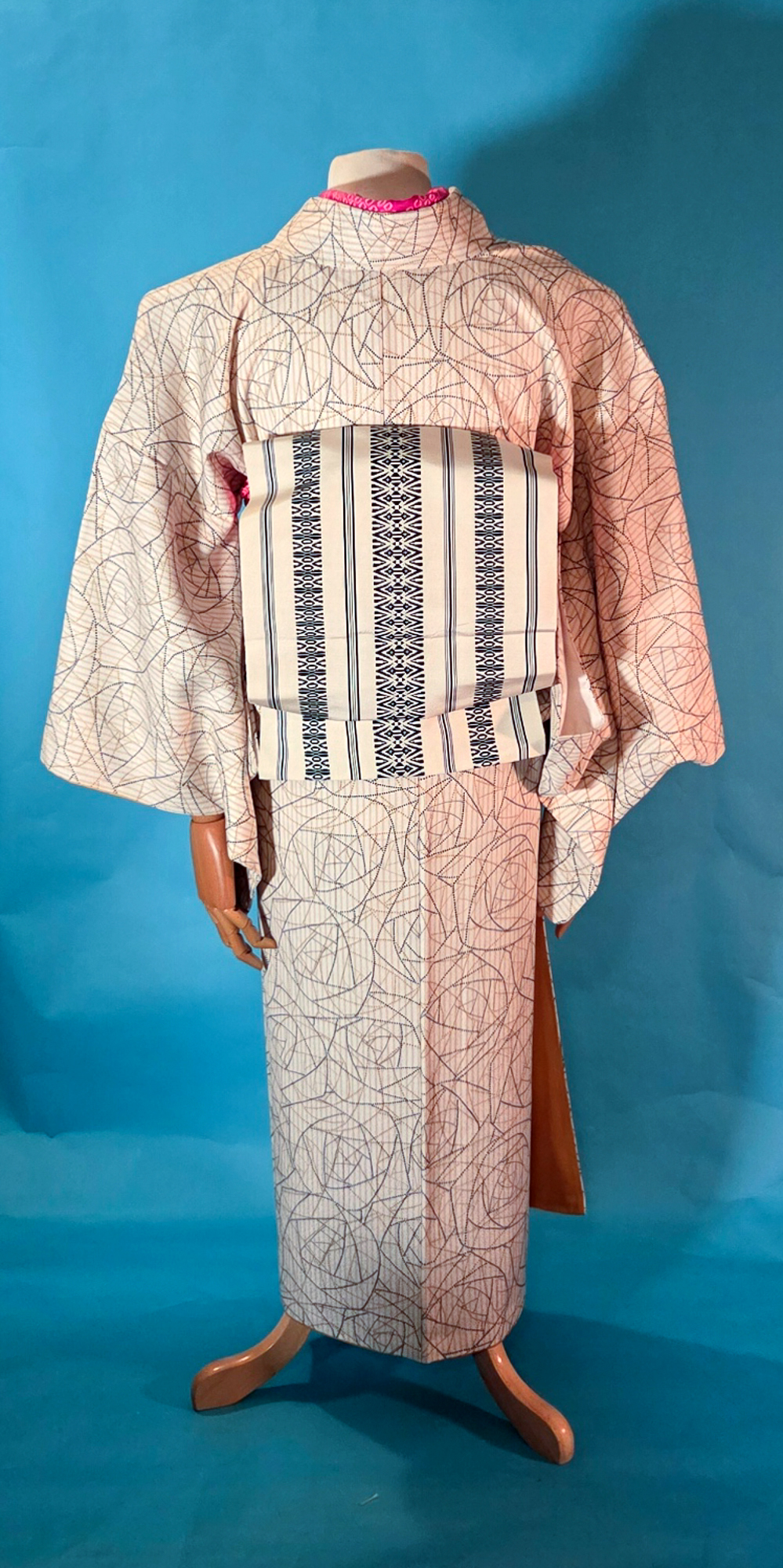
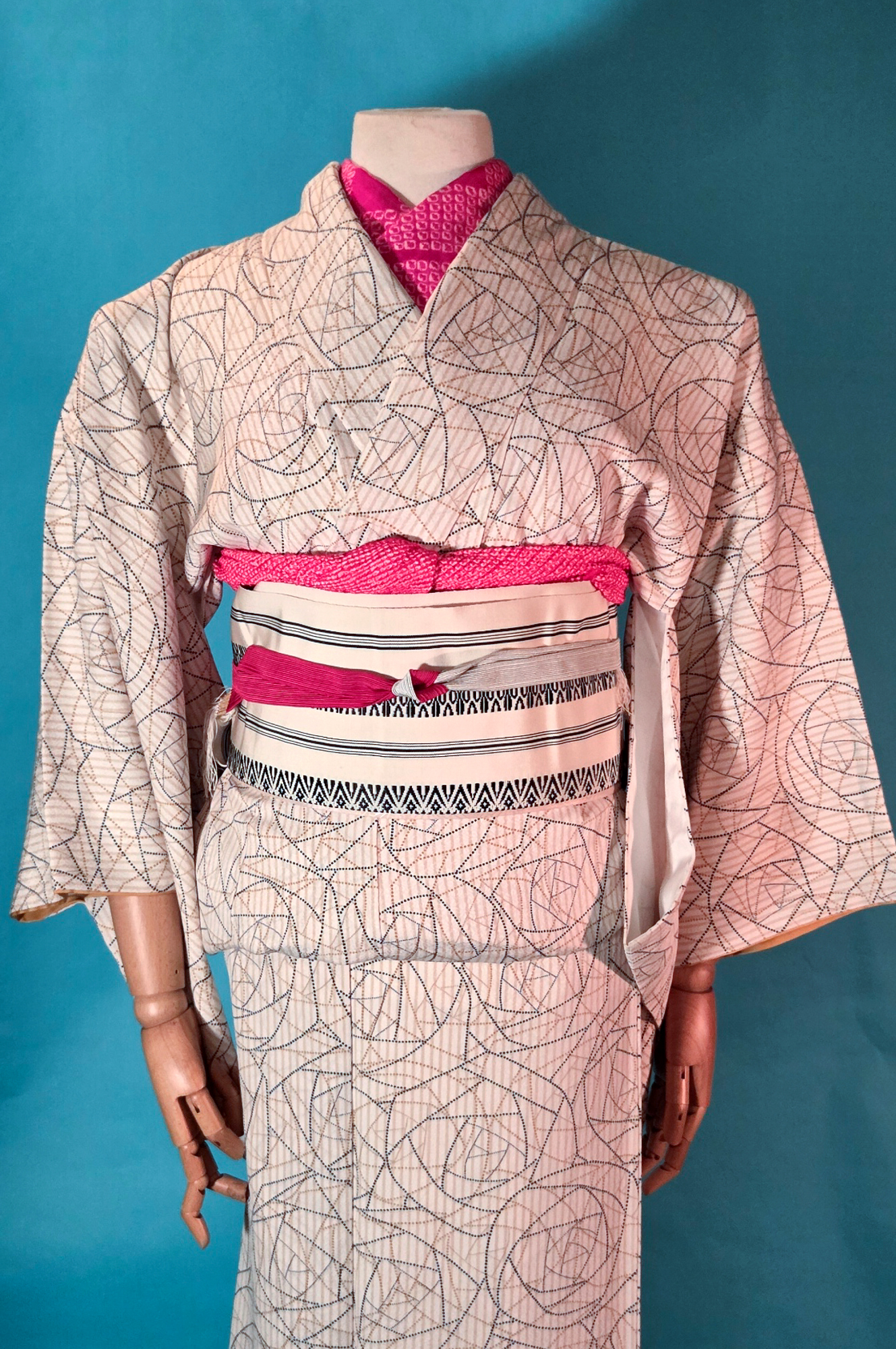
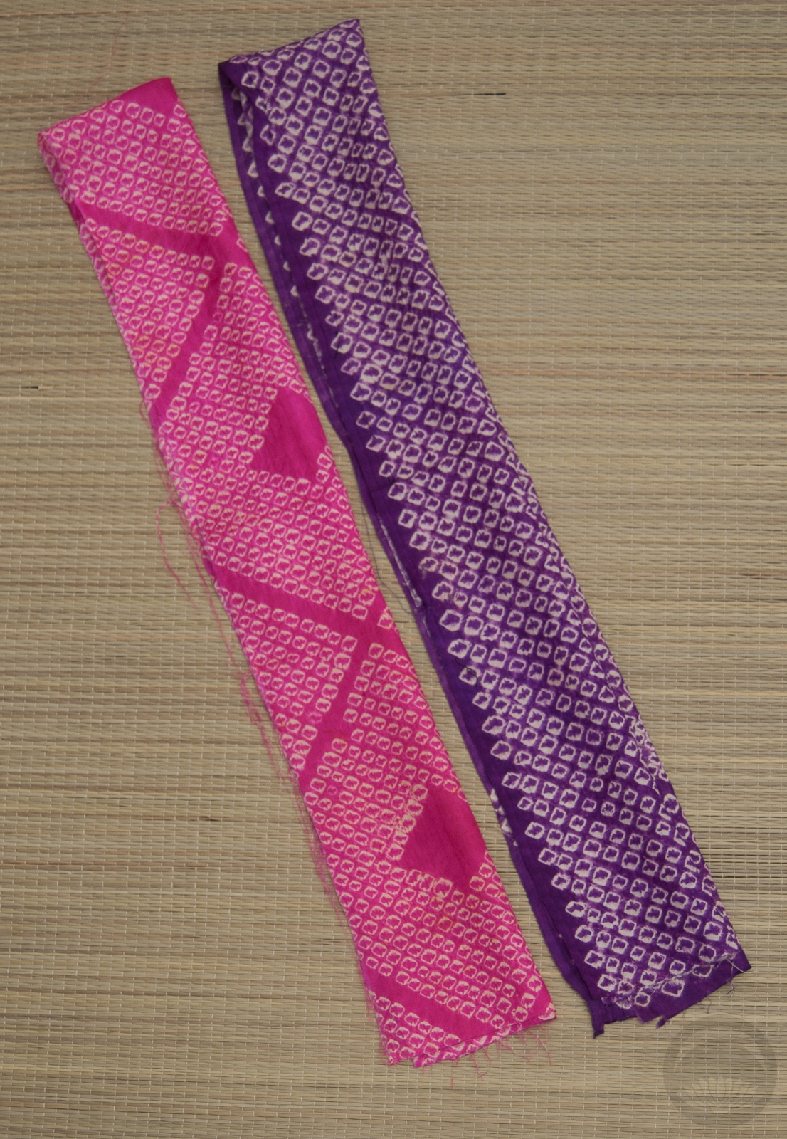
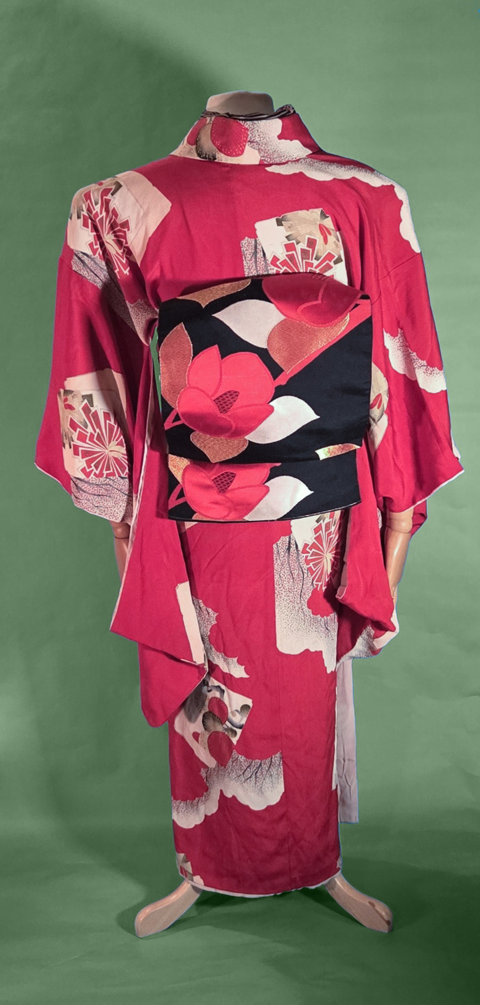
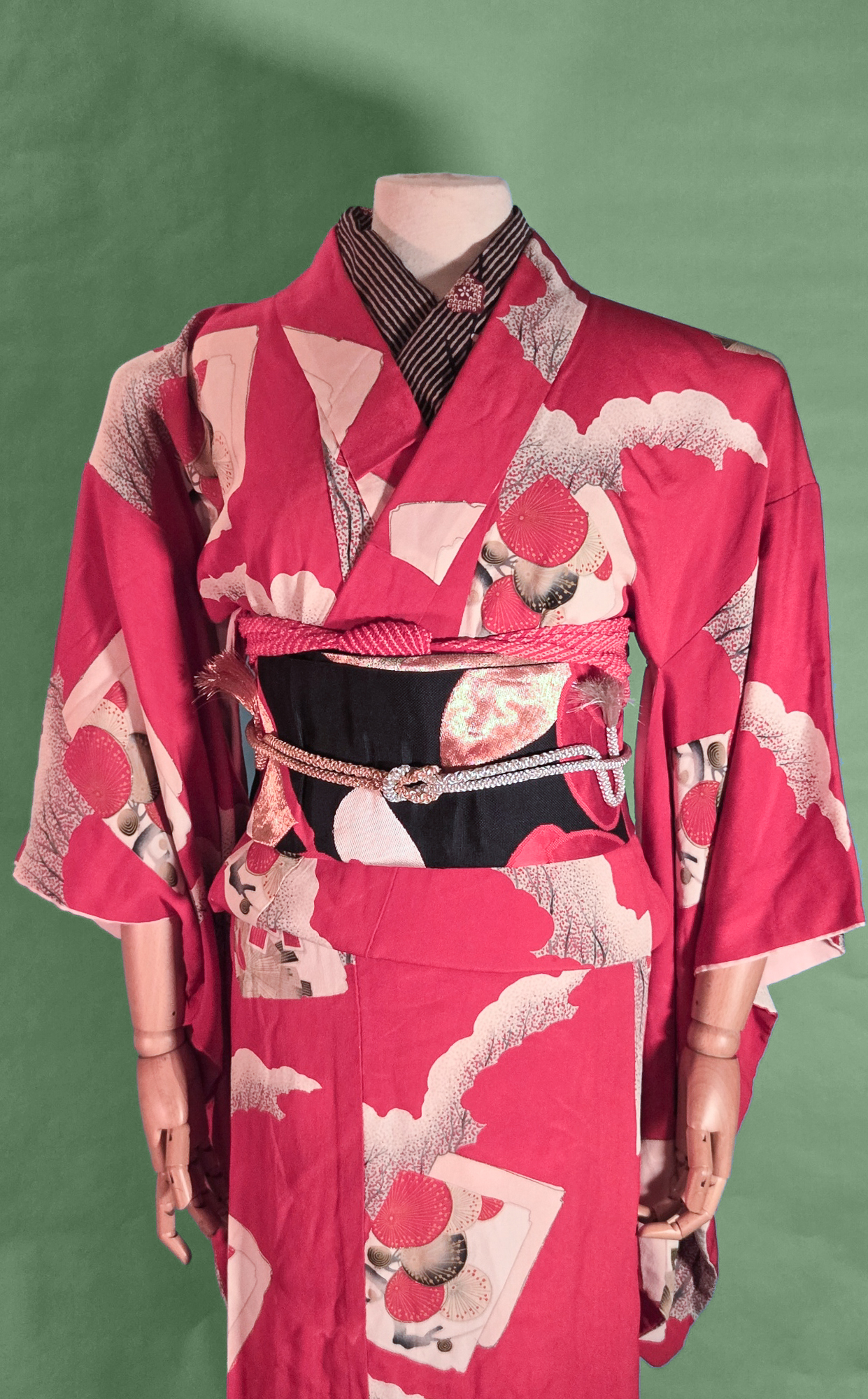
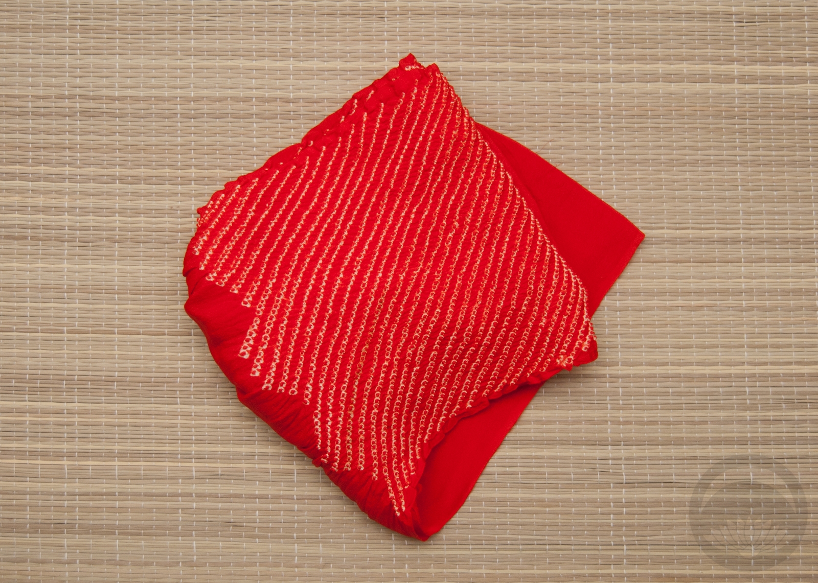
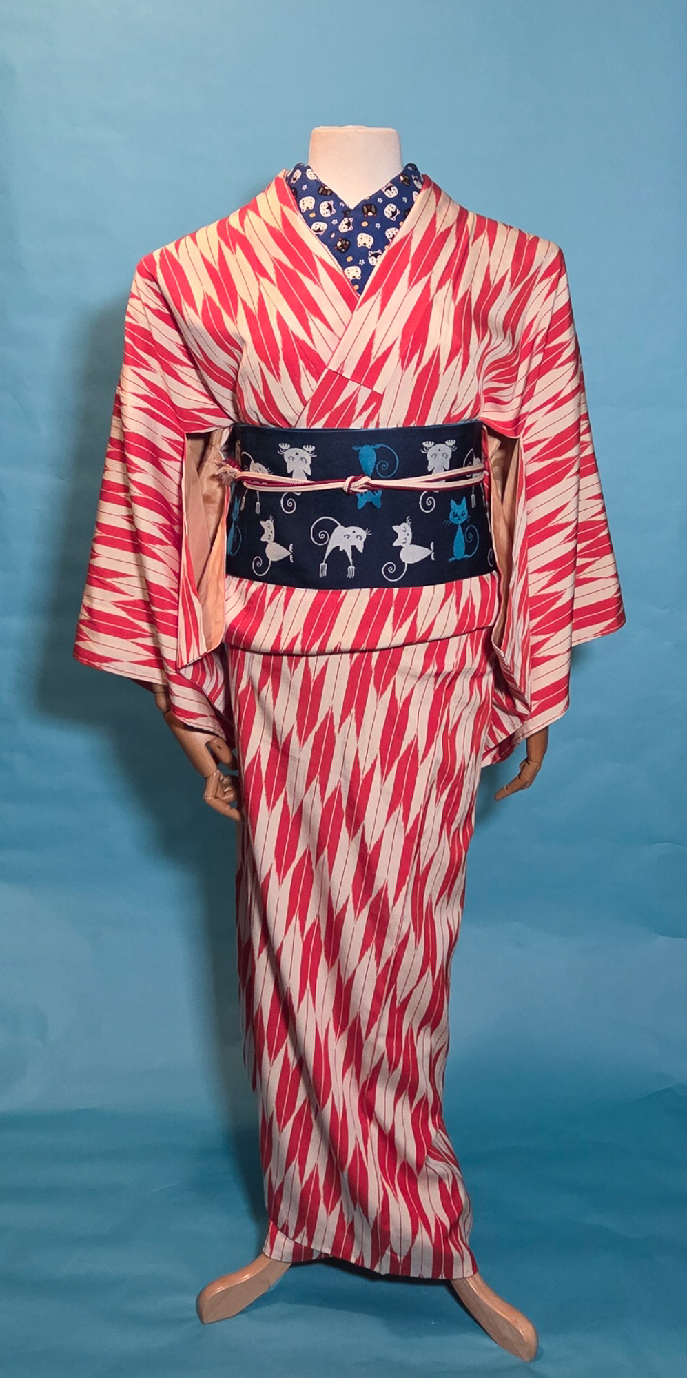
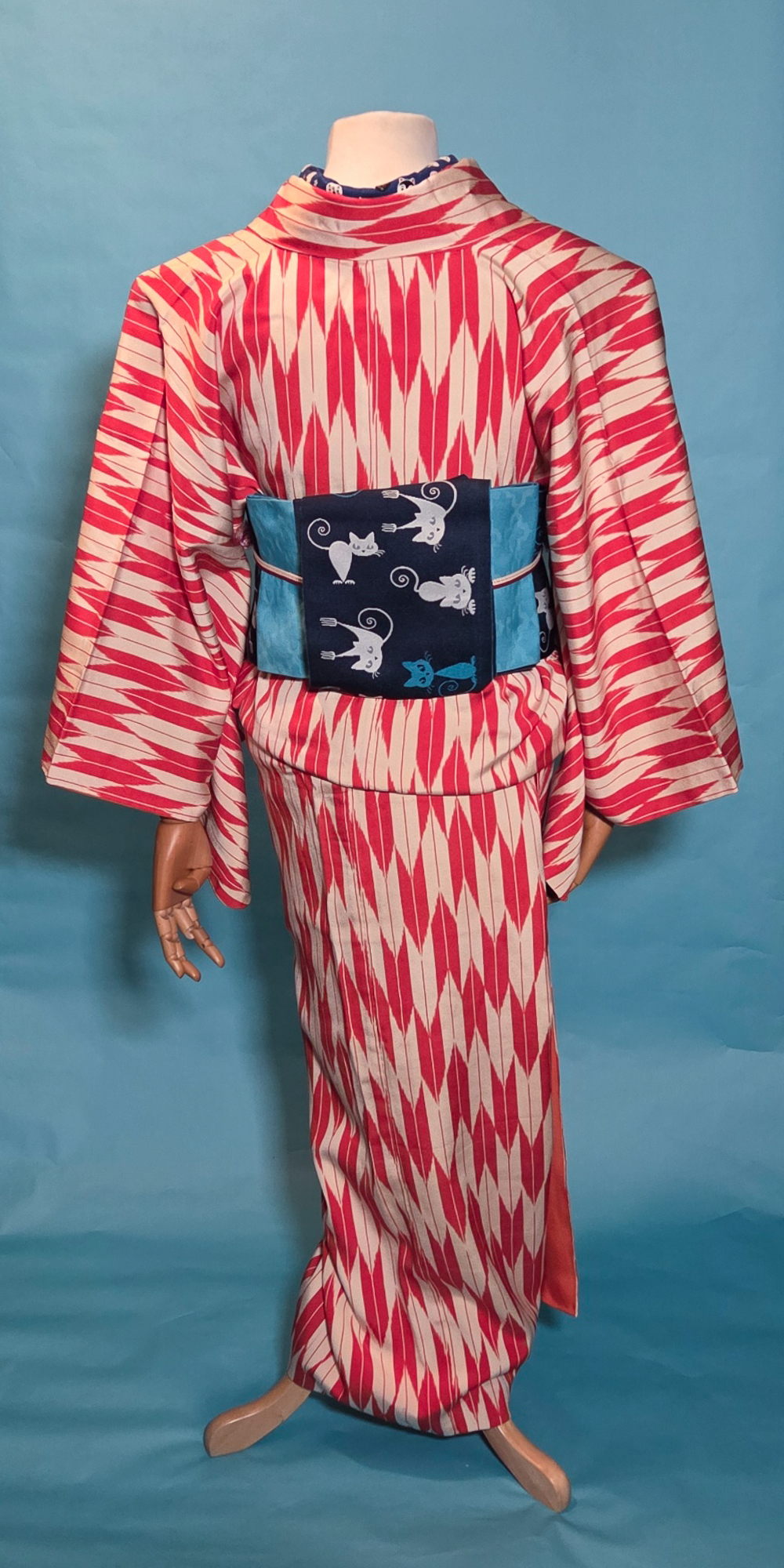
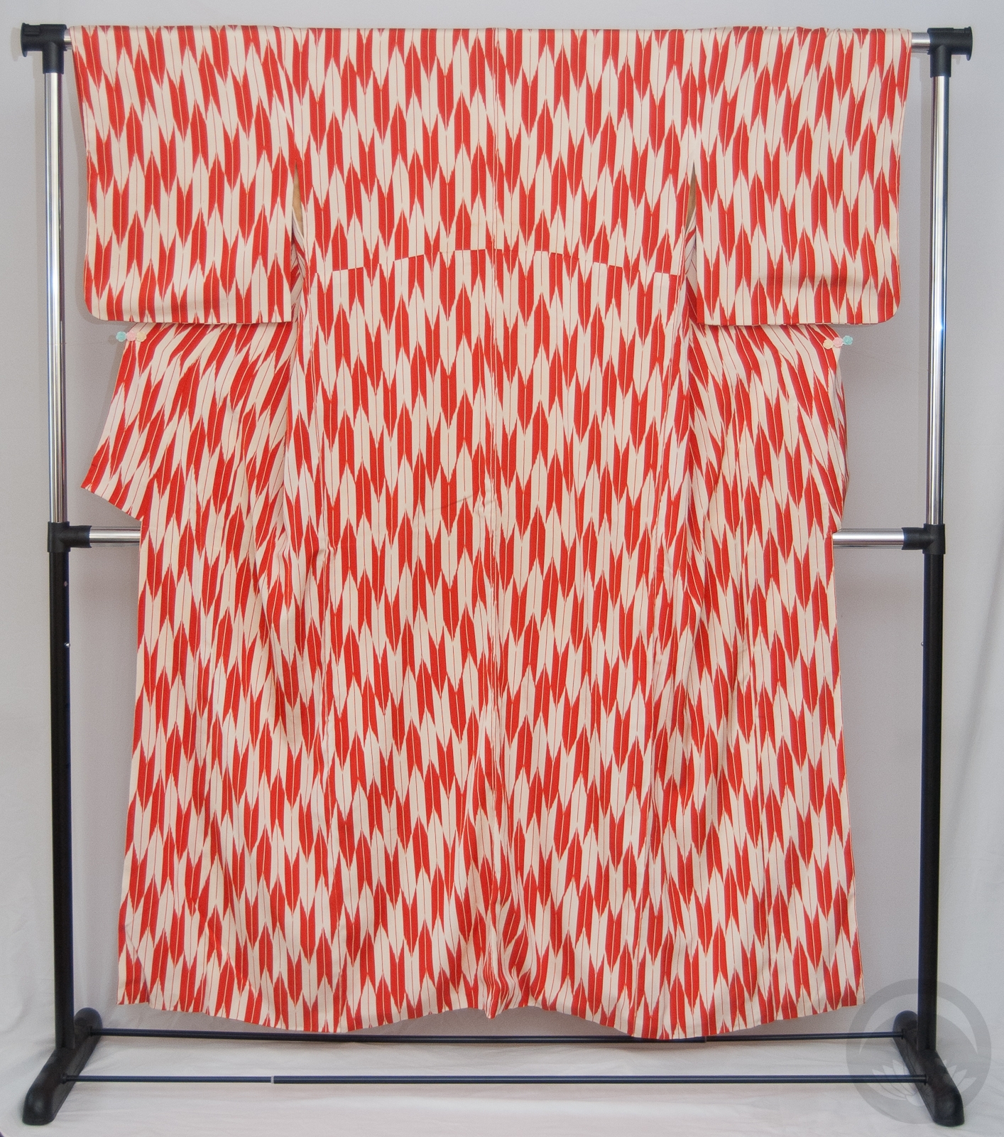
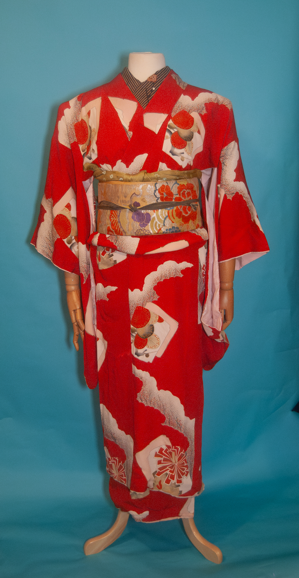
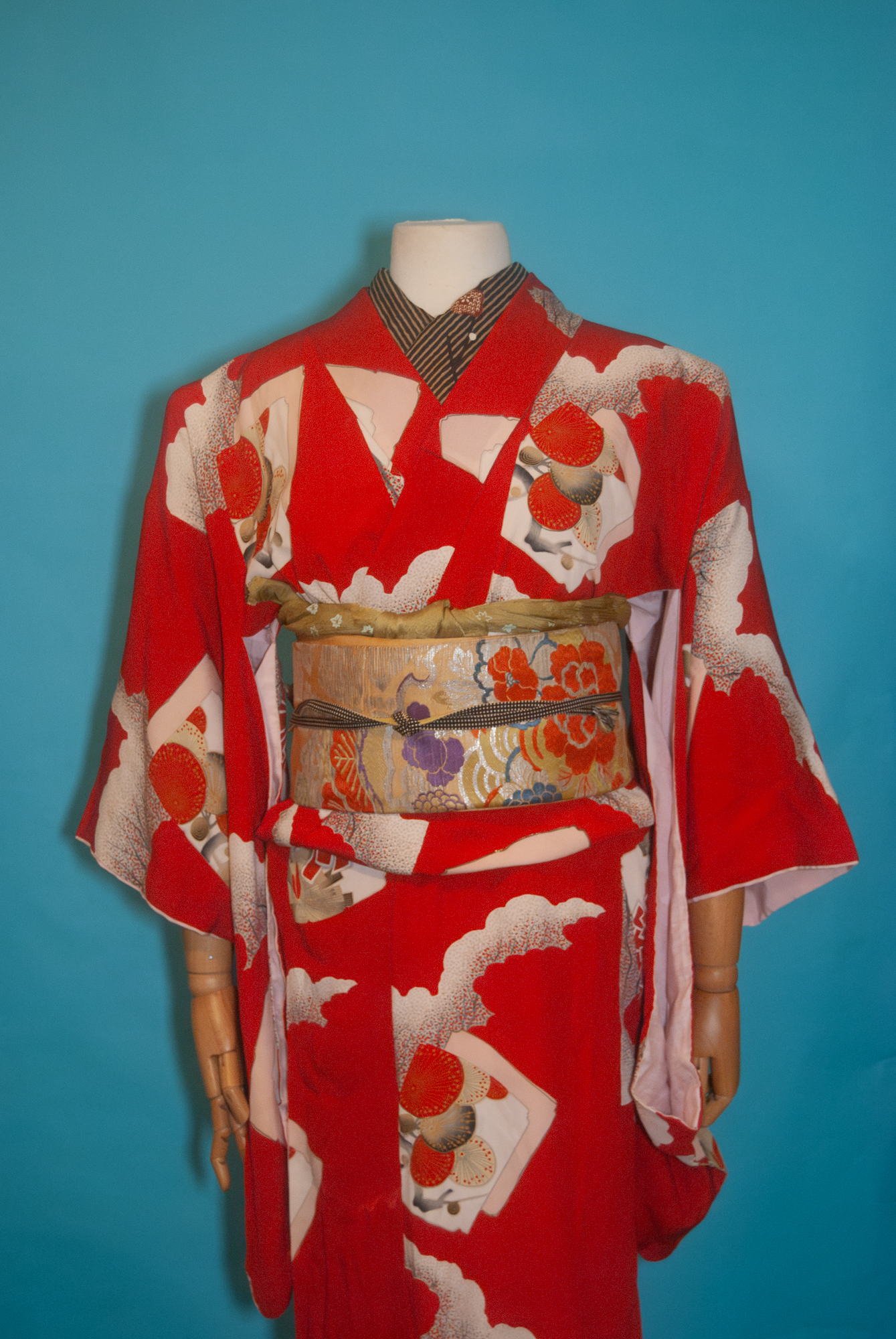
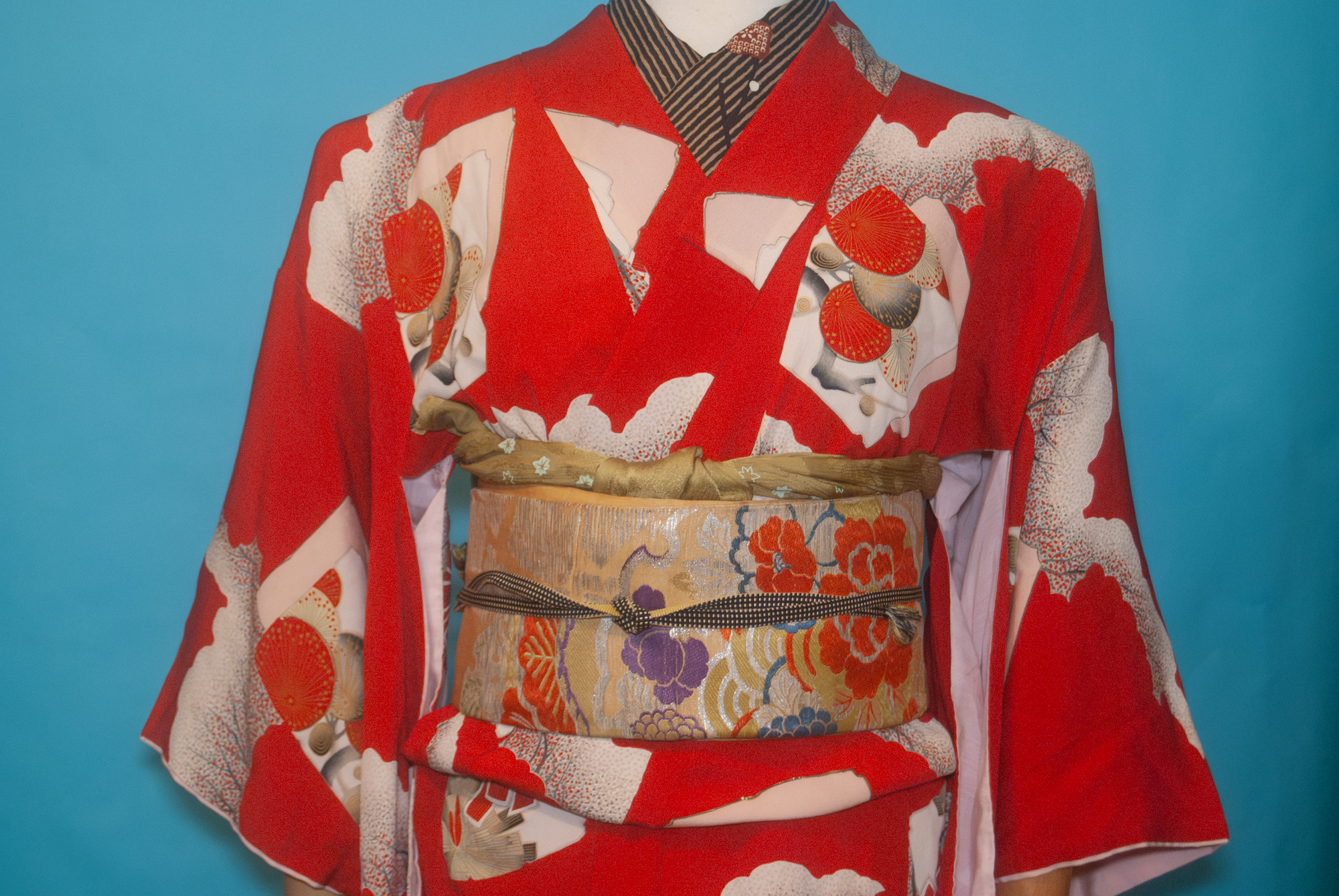
Sadly, I don’t have any hockey-themed accessories, and I don’t think my father would be too thrilled with me using things like his grandfather’s Hockey Hall of Fame ring as an obi-kazari, so I had to work with the “tricolore” (three colours) emblematic of the Habs — red, with blue and white as accents. Our primary jersey colour is, of course, a nice bright red, and as is standard in the NHL the away jersey is white so of course this red-and-white yagasuri komon was the perfect base. I just always forget how danged huge it is, which makes putting it on the mannequin a little awkward. It also looks a bit pinker in these photos; blame the light in my room. In person it’s definitely a true red.

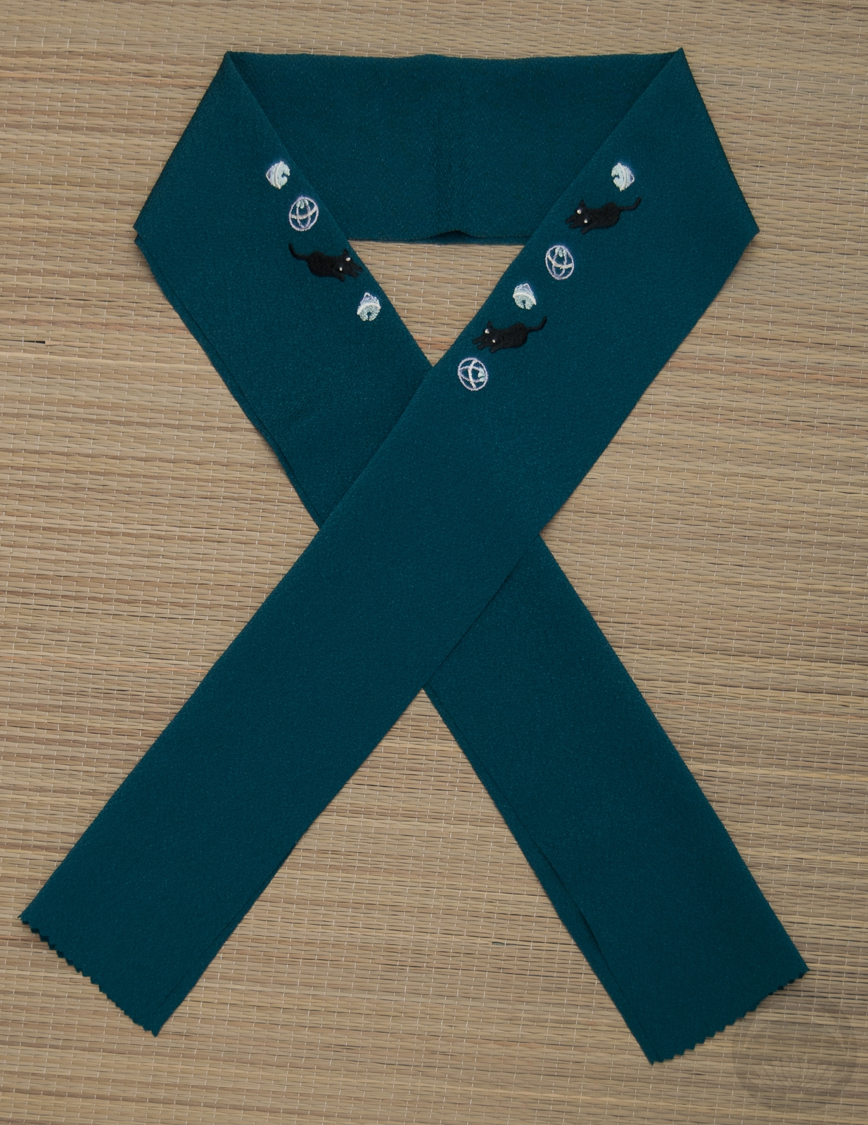
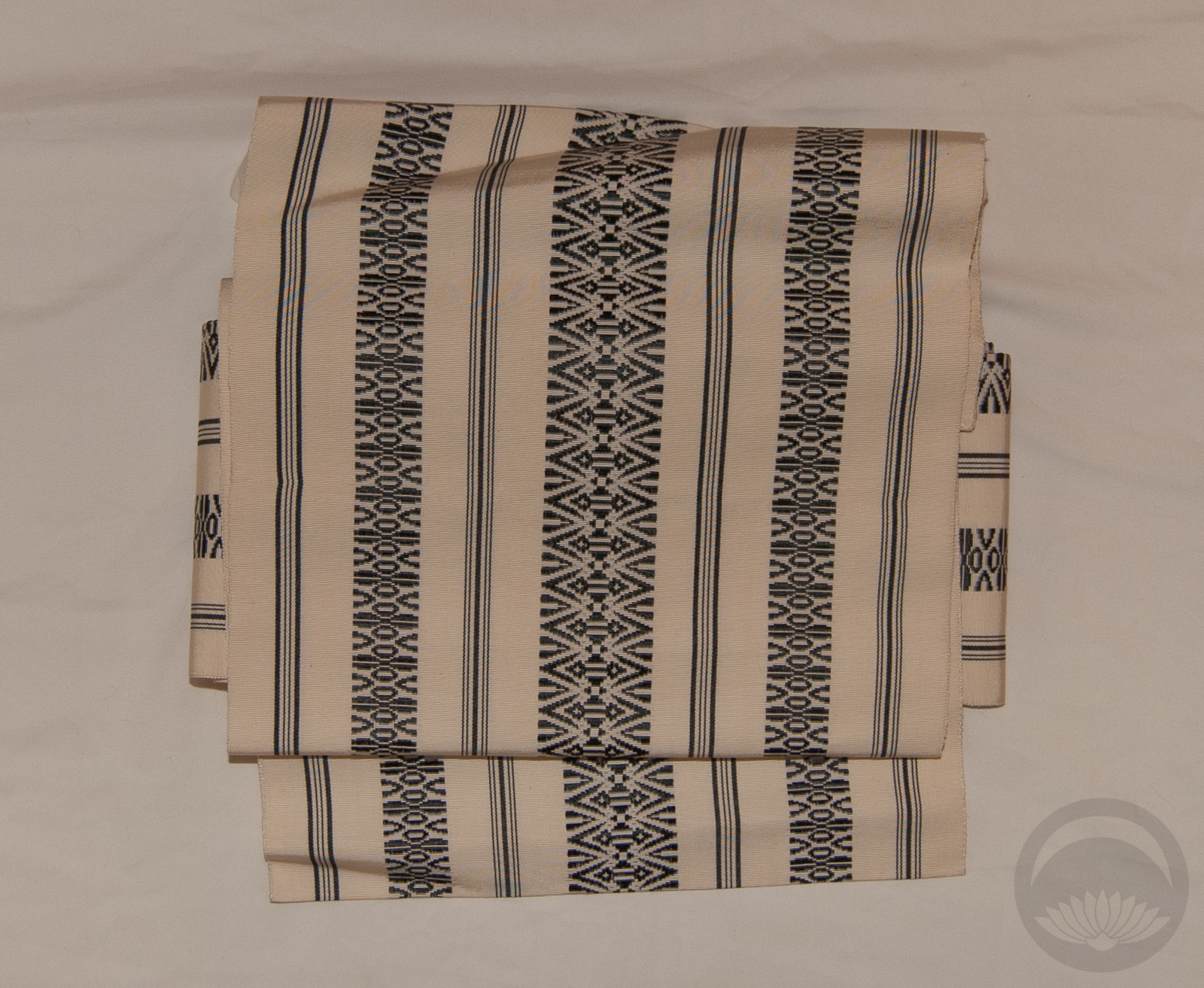
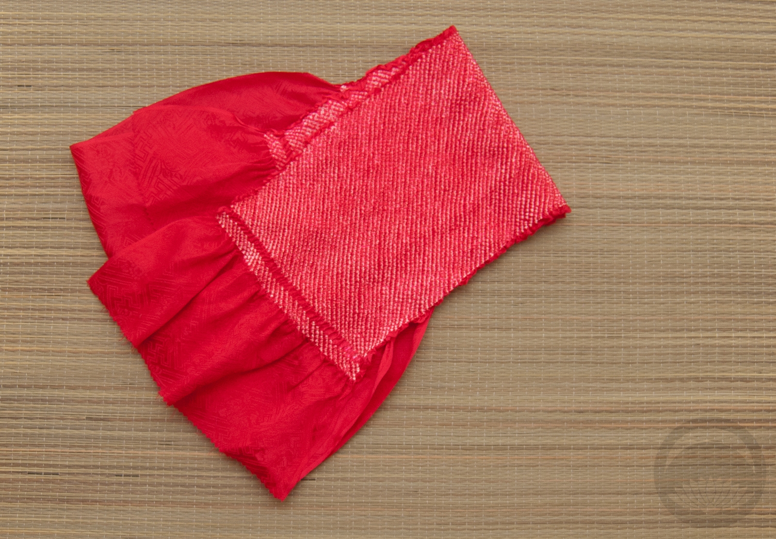
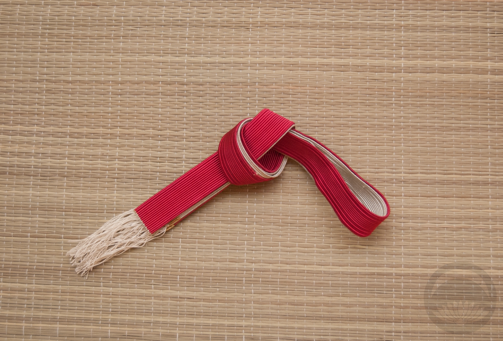
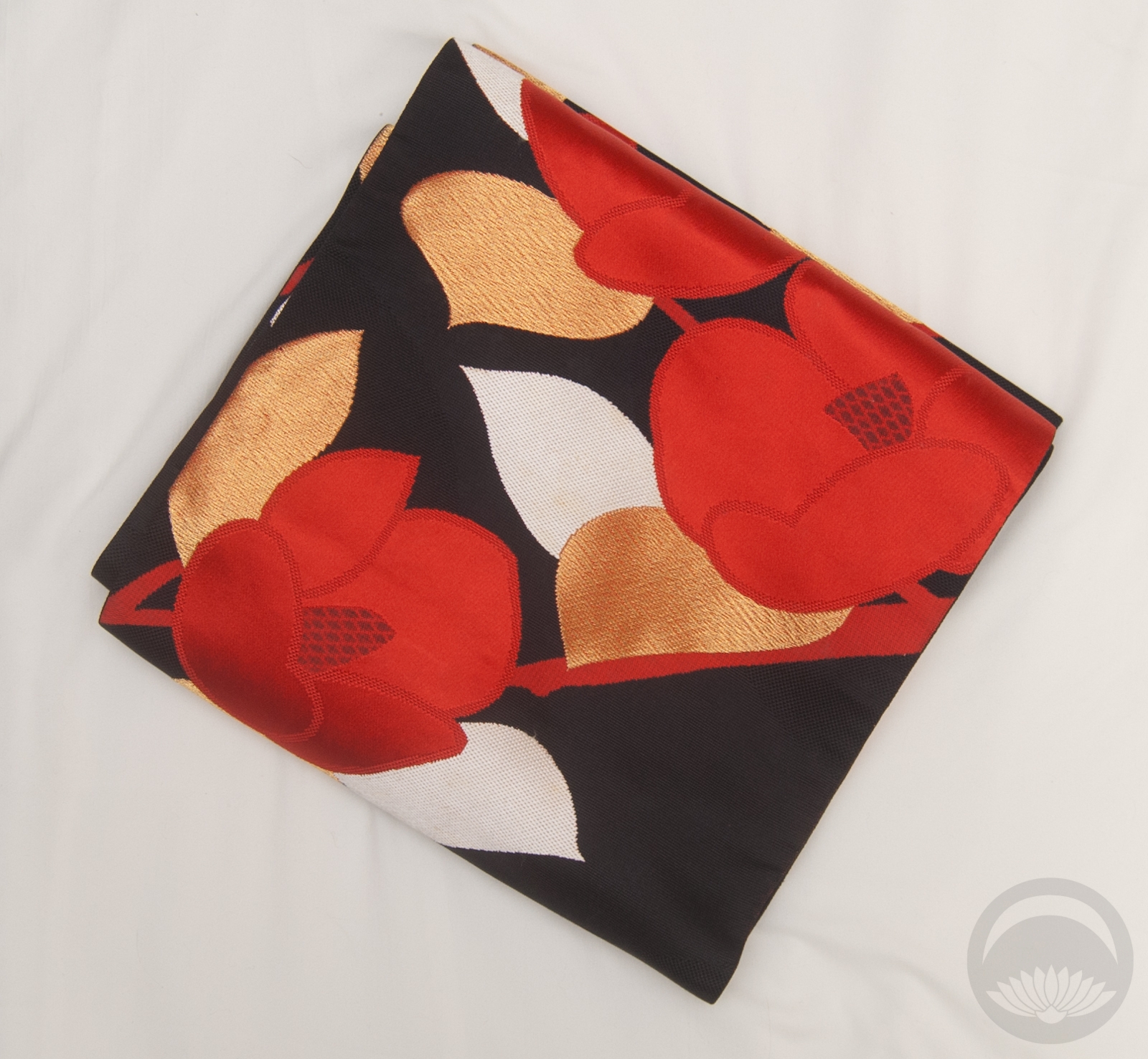
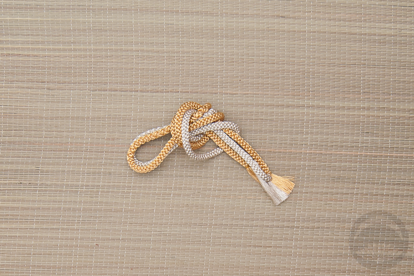
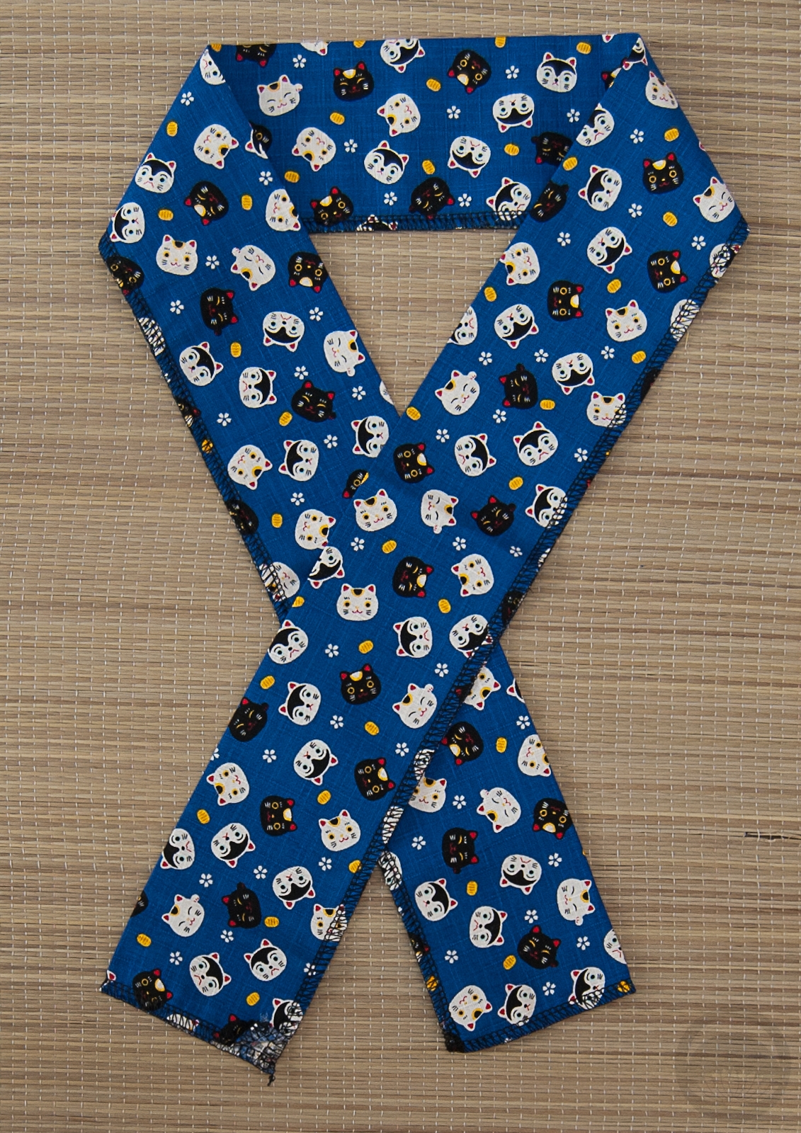
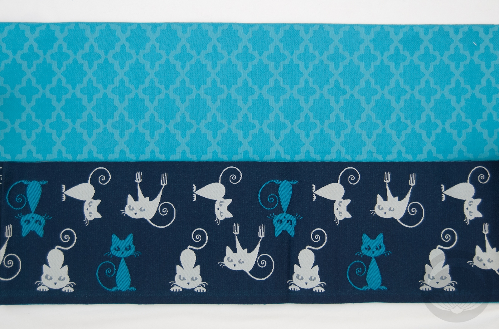
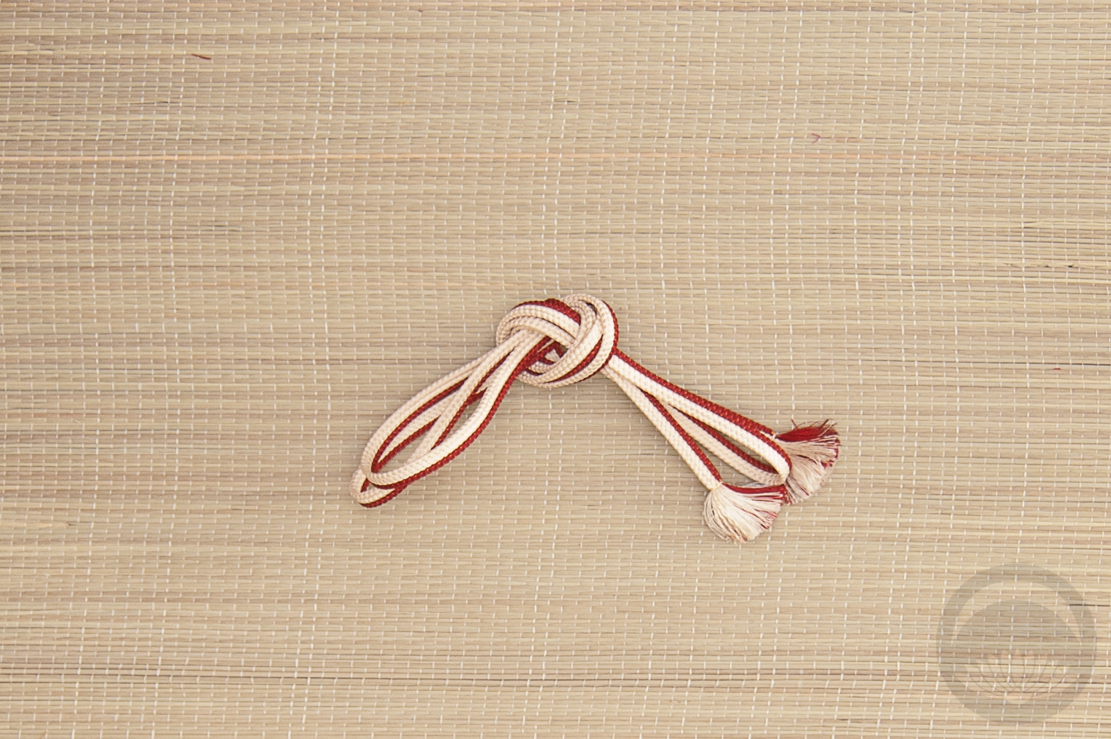
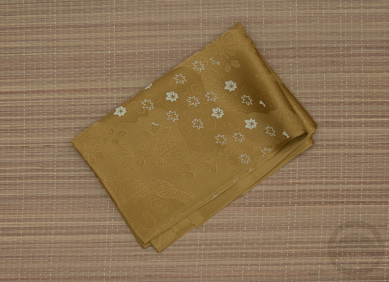
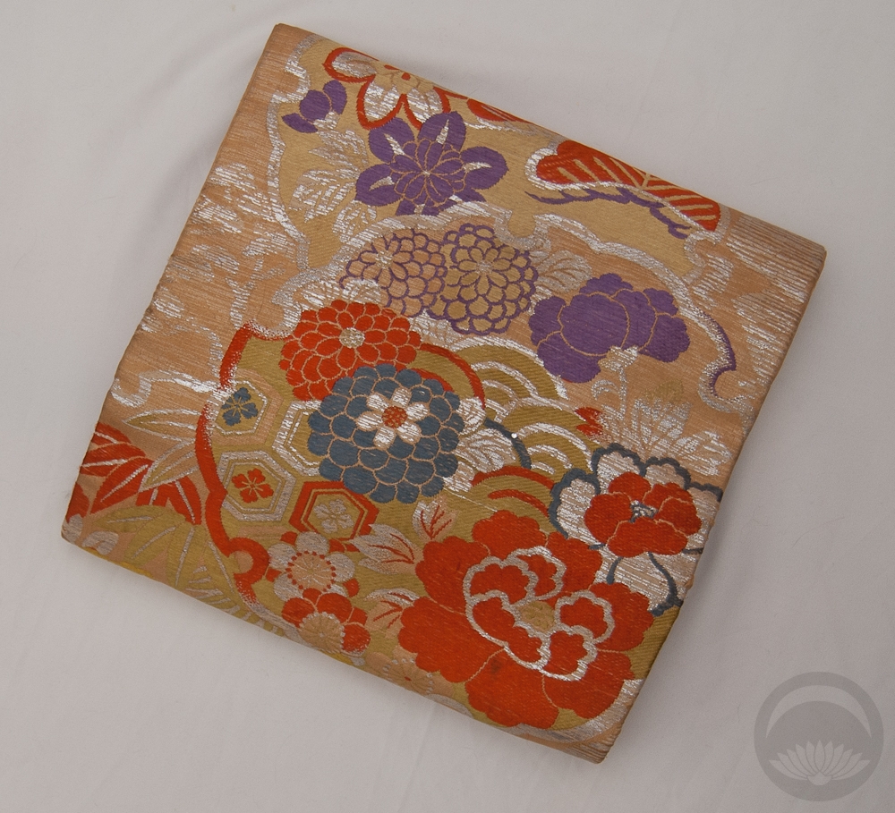
Sadly I don’t have any obi that are quite the right shades of blue, but this one works pretty well. I tied it in a karuta musubi because the square shape with the red and white lines of the obijime reminds me a bit of an ice rink, if you squint! There’s no significance to the cat motif, I was just going for colour cohesion. It does tie in nicely with the blues and white and the motif on the haneri though, doesn’t it?

How about you — are you a hockey fan? Are you watching the playoffs, and rooting for any particular team? If so, let me know so I can tell you how factually incorrect you are (I kid, I kid).

Items used in this coordination

*(this literally means tricolour until the end or tricolour all the way, referencing the three team colours)

Stepping out of my comfort zone

In the more than two decades I’ve been studying, collecting, and coordinating kimono and Japanese arts and aesthetics, one thing I still find myself struggling with is Japanese colour palettes. I studied graphic design before I fell into this little rabbit hole, and my colour sensibilities are innately Western.


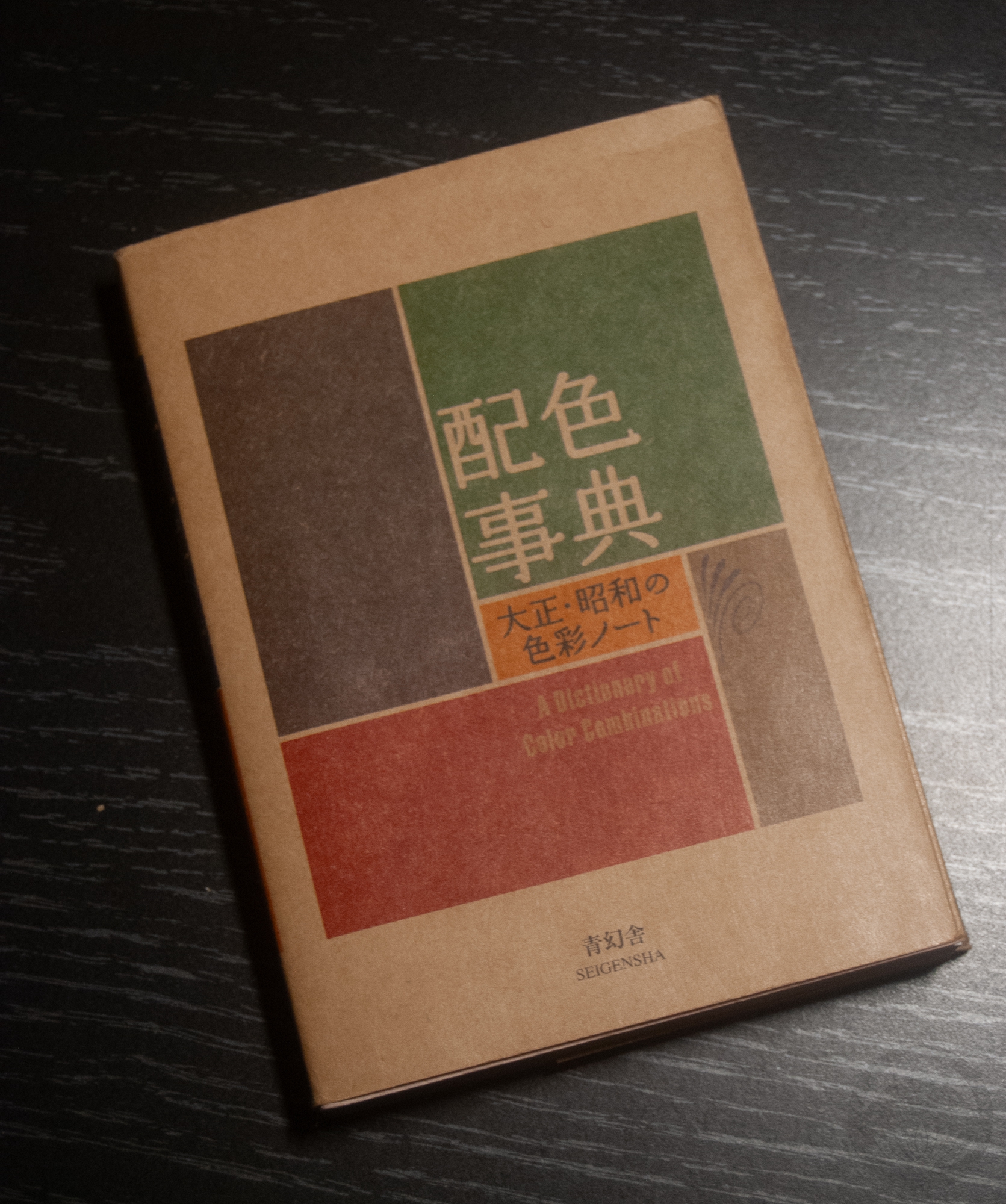
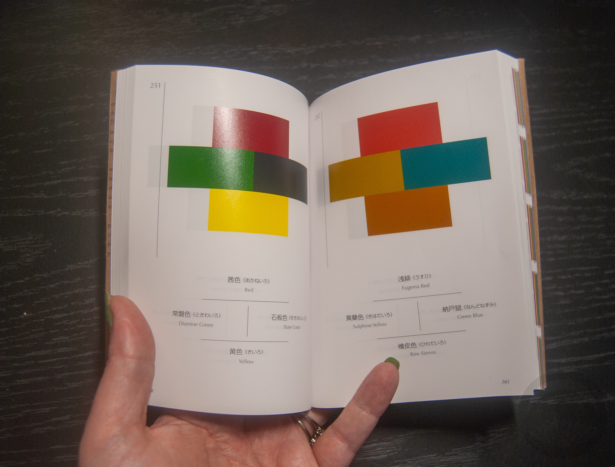
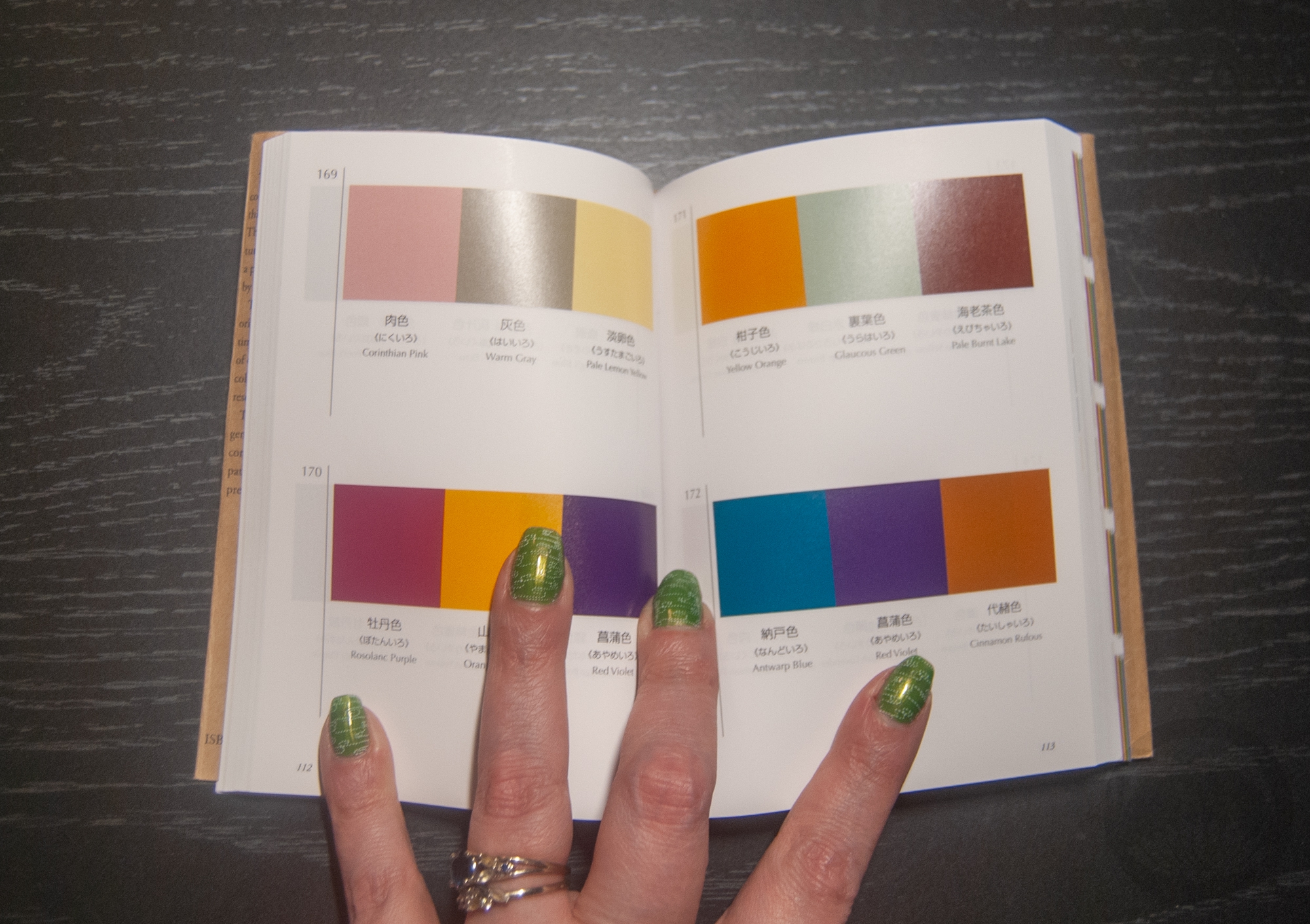
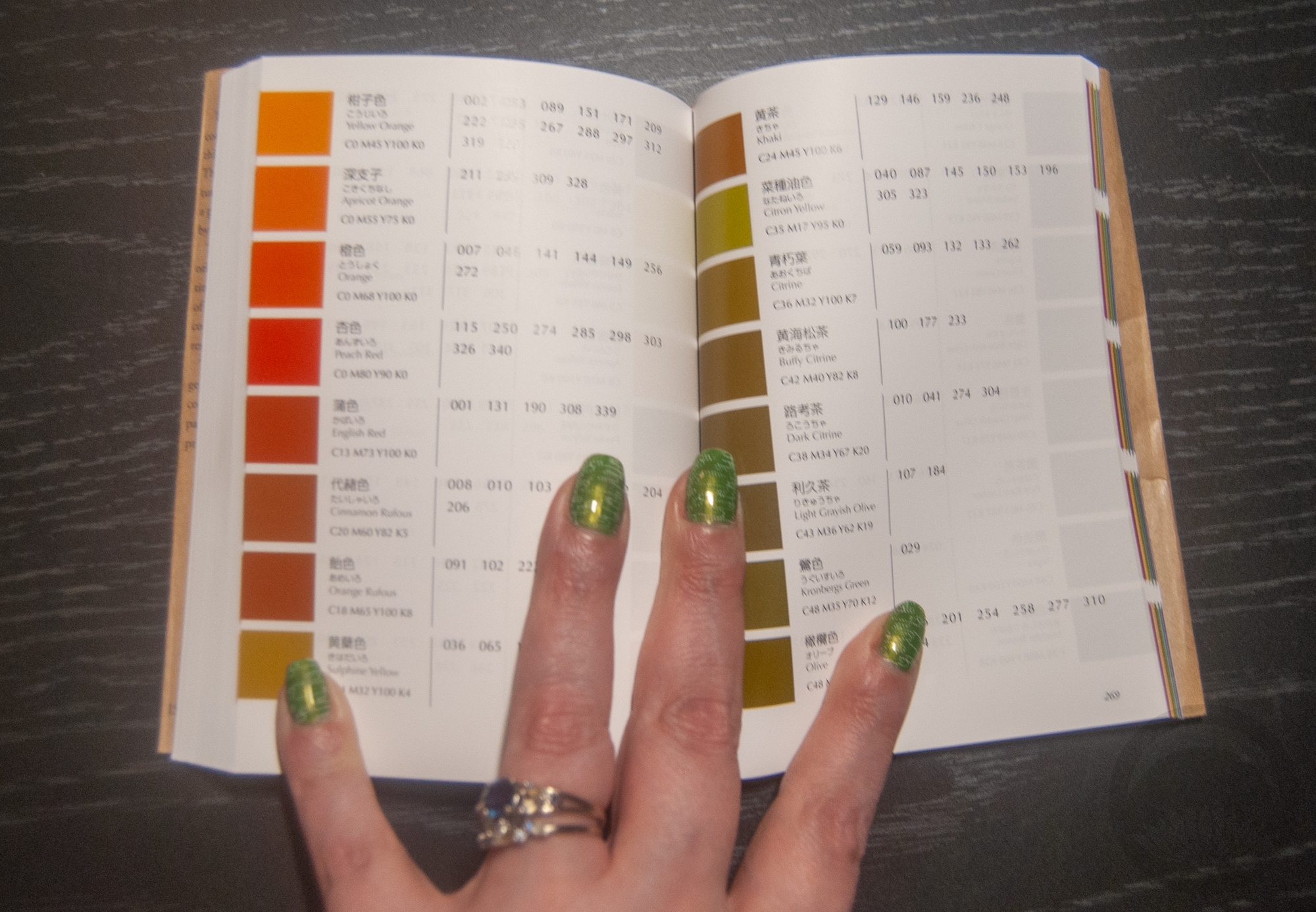
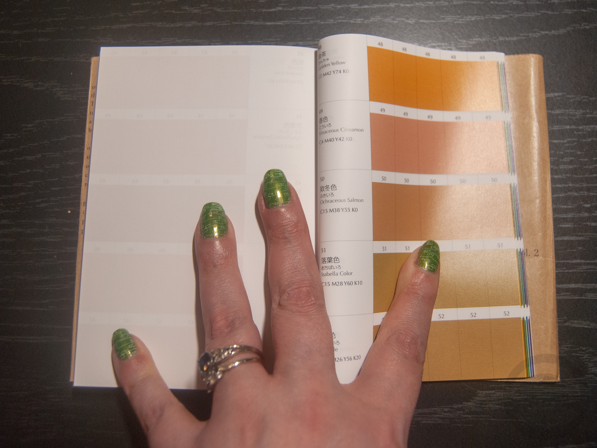
It’s possible you’ve seen this adorable little A Dictionary Of Color Combinations book on some fashion and personal style social media accounts lately, it’s gone somewhat viral, and for good reason. It’s less a book and more a collection of colour palettes that appeal to the Japanese aesthetic. If you’re ever stuck for inspiration, it’s a fantastic place to start. You can either open a random page and go from there, or if you have a piece in your collection you’re unsure of what to do with, there’s a handy index at the back. Find the swatch closest to your piece and then view all the options! That’s what I ended up doing here, with this gorgeous early-Showa komon I picked up at the Palm Springs vintage market a few months back.


I found this palette with the colour “Eugenia red”, which was about as close as I could find to the kimono. The complementary options were “Sulphine yellow”, “Green Blue”, and “Raw Sienna.” The obi is nearly spot-on for the sulphine yellow, and the other two colours show up in the obi motifs quite nicely. Would I normally have paired a red kimono with mustard and green accessories? Not in a million years! Was it successful? That’s for you to decide. I think it works, but it’s definitely not my favourite thing I’ve ever put together. I will definitely keep trying combos from this book though

Also if you’re curious about my manicure in the book pics, it’s Zoya Midori stamped with this Maniology sashiko plate. I was going for “matcha latte” vibes.


Items used in this coordination


 This post contains affiliate link(s). If you choose to purchase, I receive a small rebate or commission which goes to the continued maintenance of this site. 

Cozy quilting and cute kanzashi

Now that I’m back in Montreal and settled in, it’s time to get back in the groove. What better way to start than with pieces I acquired while I was in California? Ohio Kimono shared these on facebook and I just fell hard. I’m not generally drawn to casual pieces like this lately, but they’re both so unique that I couldn’t resist. The kimono may look like patchwork but it’s actually woven wool like this. The obi is utterly charming with lots of little kanzashi on it. I thought the warm muted tones suited each other really well so I decided to put them together. The outfit did feel a bit heavy though, so I introduced some yellow accessories to brighten things up a little. I think it worked out well, the yellow was just the right finishing touch.

I’d forgotten how much I love wool kimono for their ease of dressing, especially on a mannequin. Silk and polyester are so slippery and want to fight you every step of the way. Wool is grippy and textured and stays exactly where you put it. I wish it wasn’t such a casual-only fabric! Maybe I should make more of a point of coordinating the wool pieces I have in the near future.

Ohio Kimono was kind enough to gift these pieces to me. You should absolutely check their shop out if you haven’t already, they have new gorgeous stock directly from Japan all the time.

I haven’t had the chance to catalogue these pieces yet so no little items thumbnails today, sorry!

 I received this item from the retailer or manufacturer for honest review purposes.If you have a topically appropriate craft, product, or service you would like me to review, please contact me. 

Palate Cleanser

Lately, all the outfits I’ve put together have been high-concept in one way or another, be it stage hiki styling, non-traditional accents, or bugging other people for ideas. I was really in the mood for a simple, classic, and familiar palate cleanser of an outfit. I’ve also been watching the j-drama Watashitachi wa Dōka Shiteiru rather obsessively (review coming soon!) and was feeling inspired by the classic, traditional, and subtly elegant komon kitsuke often displayed in that show.

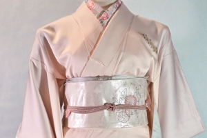
A while back I’d noticed that the dusty pink of this hakata weave nagoya obi perfectly  matched the flowers on this komon; I had been meaning to work with them for a while but kept putting it off in favour of “more interesting” pairings. But with my urge to do something clean and elegant, this was the perfect time.

A handful of matchy-matchy accessories, and this was exactly the mood I was going for. There’s enough contrast between the obi and kimono to be interesting, but nothing really screams out for attention. It just feels very balanced and effortlessly chic to me.

Items used in this coordination

A Punch of Pink!

What’s this? I’ve worn kimono twice in less than a month?! Apparently unemployment agrees with me…

I’ll be honest, I got dressed for part of a bigger group project that I’ll hopefully be able to share with you all soon. But I figured while I was all done up I should take advantage of it. Also, you get to see part of my bedroom for once, instead of the living room. It’s a fair bit more boring, but I wanted a more neutral background. So not only do you get to see my goofy face, you get to see a small part of my ridiculous pile of collectables. I’m sure you’re thrilled.

I really do love these giant kimono from Kimonomachi. Unfortunately, Rakuten Global has shut down so ordering from Canada is way more of a hassle now than it used to be. I decided to pair the pink one with this awesome red and black faux-shibori obi in a sort of cute improvised casual musubi. Black haneri and black zori (which got mostly cropped from the photos, alas) help anchor the outfit and echo the black of the obi. I kept my makeup soft and pink to suit the kimono, since my hair is already edgy enough at the moment. My moonblossom kamon kanzashi earrings were the perfect finishing touch, I think.

Items used in this coordination