Bold, Bright, Beautiful

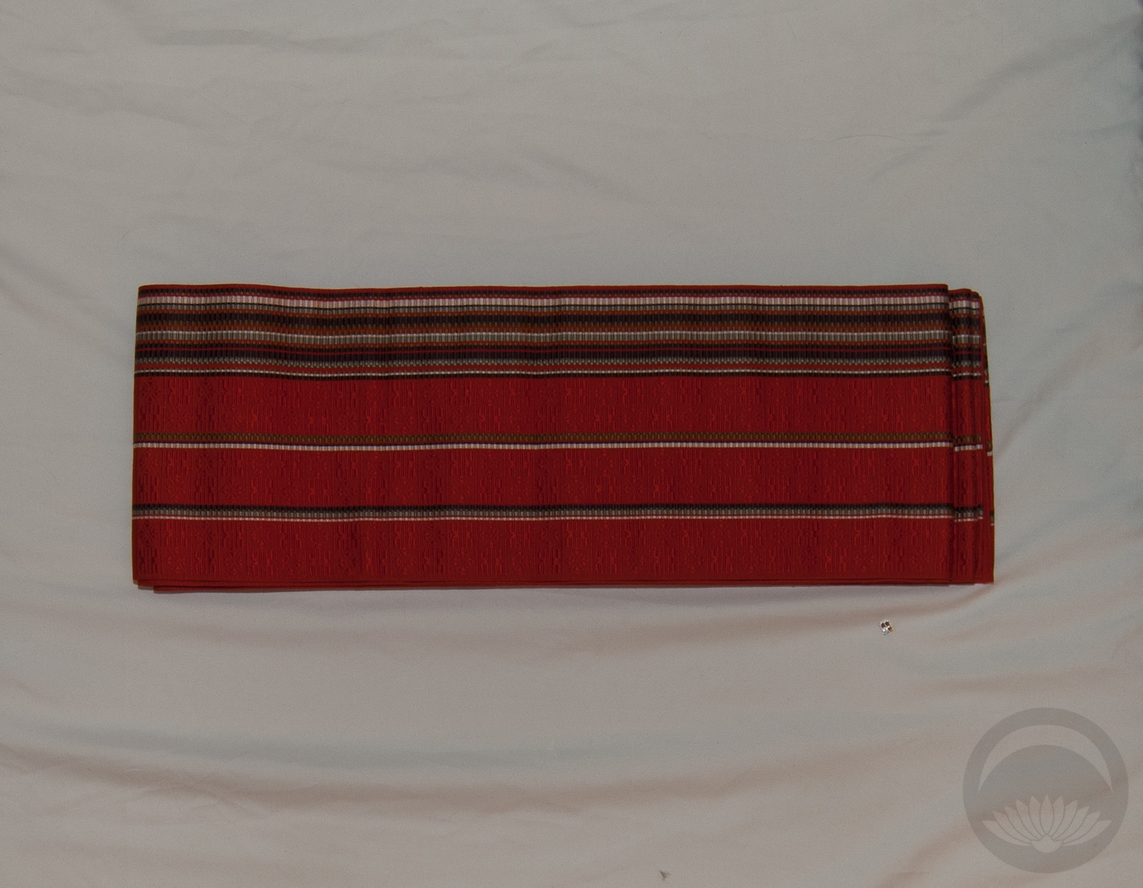
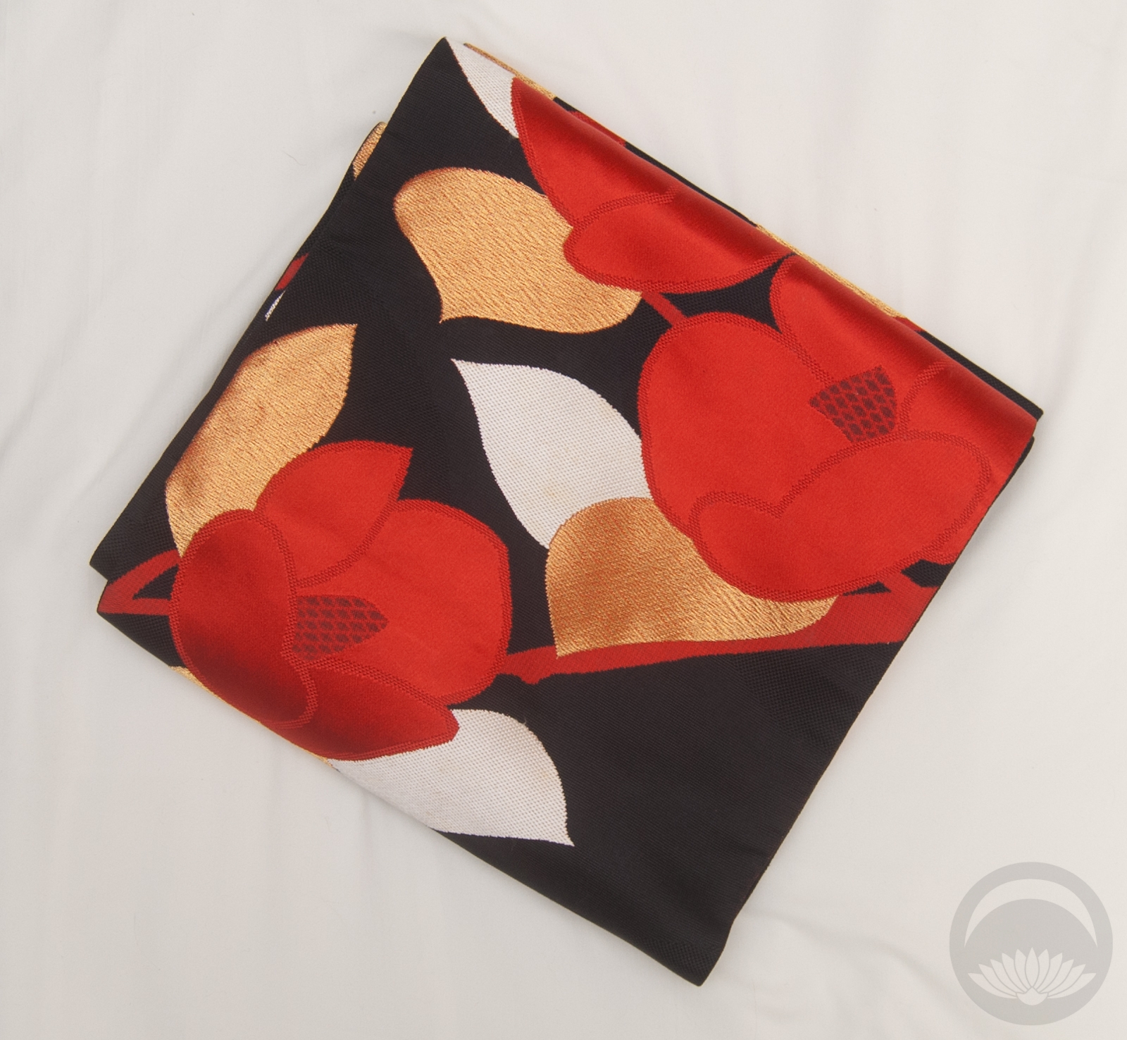
Yesterday I got two obi in the mail that I wasn’t expecting until at least a few weeks from now. It was a lovely surprise! Of course, I knew I’d want to coordinate them soon, so I asked you guys on Facebook and Instagram which of the two I should coordinate. This bold black and red tsubaki nagoya won by a landslide, so here we go.

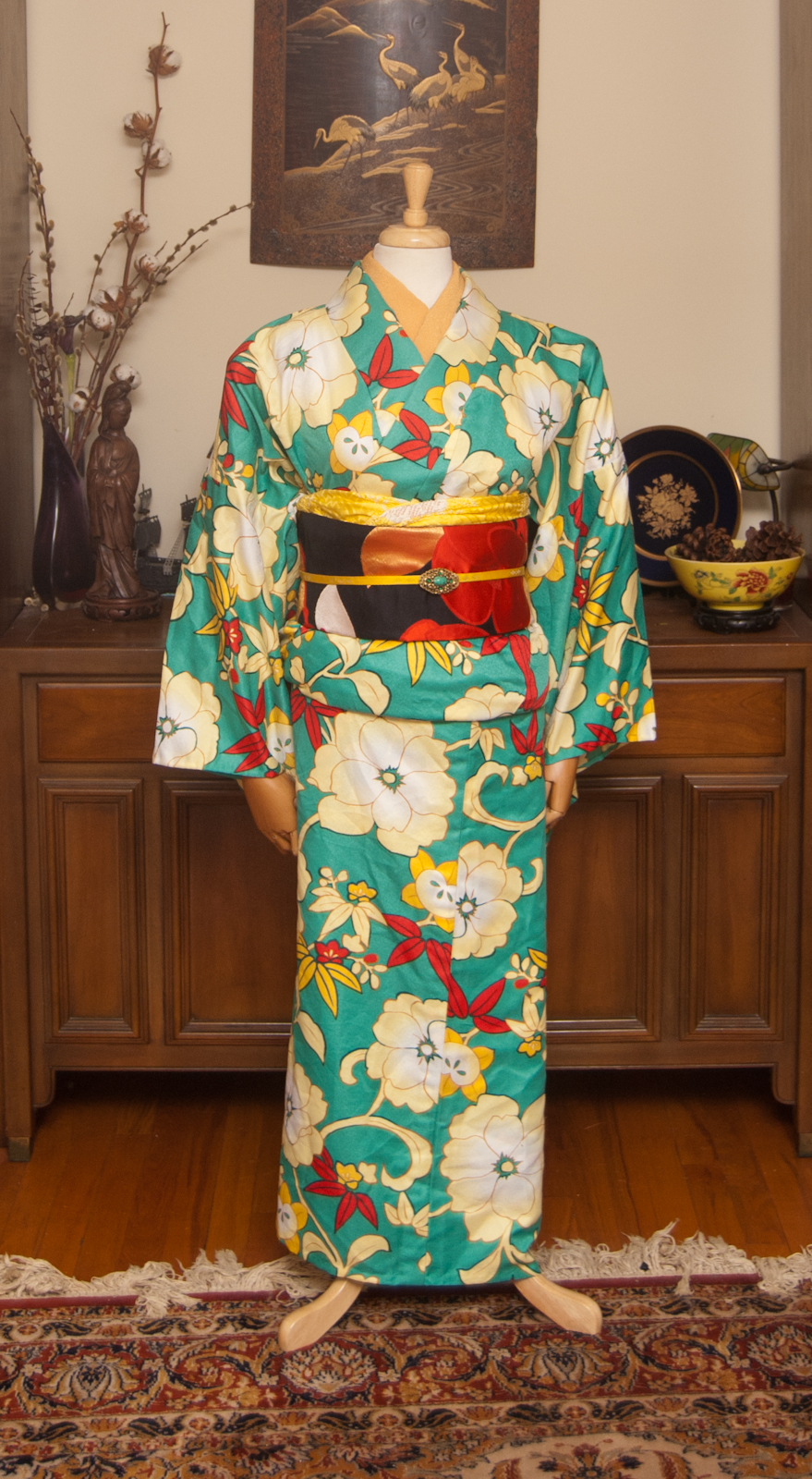
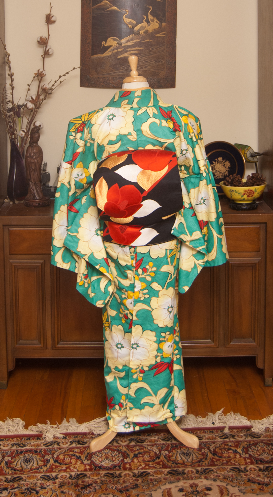
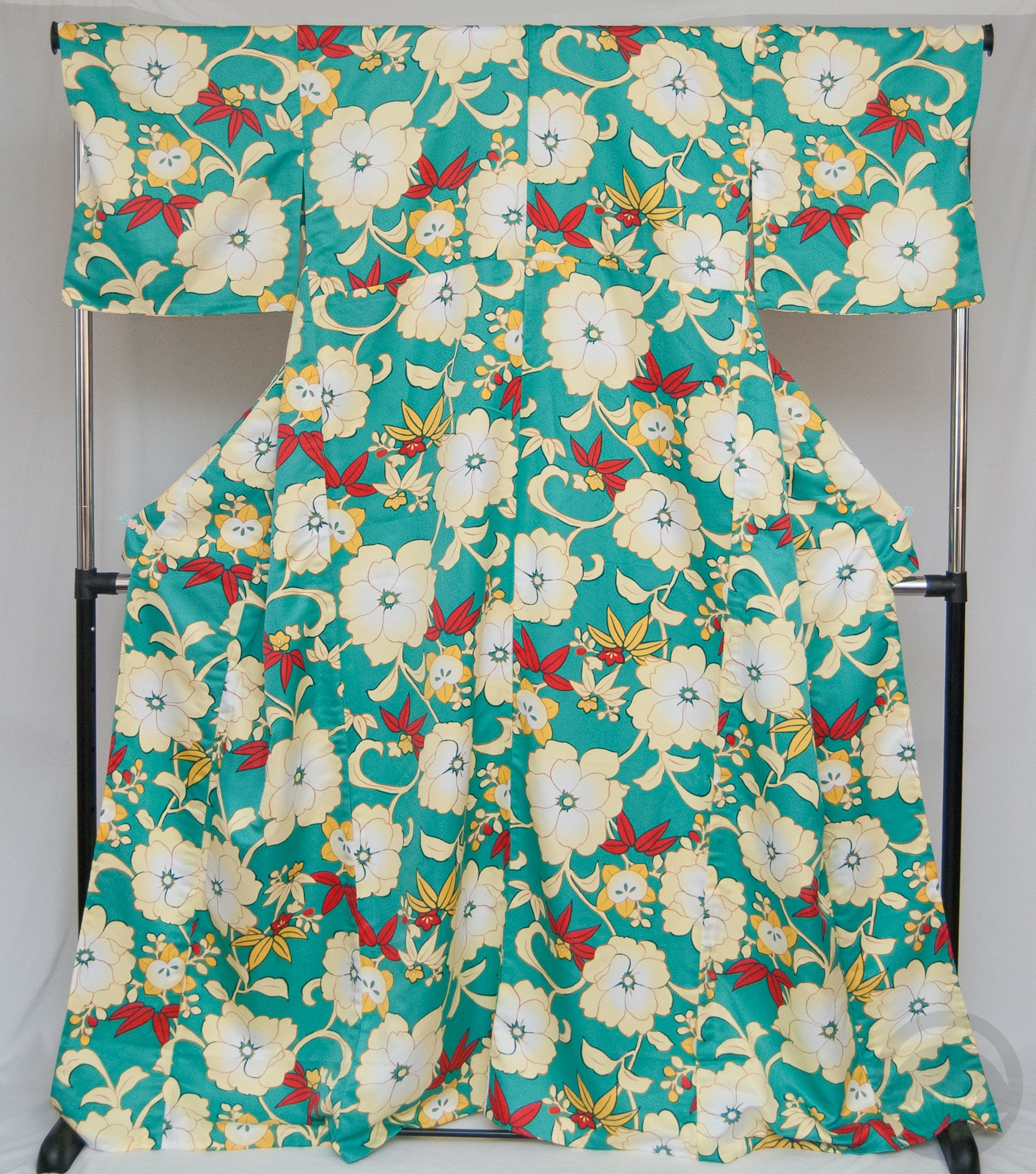
I couldn’t decide if I wanted to go with a very subdued kimono to really show off the obi, or something a bit more bright to try to balance it out visually. Then I remembered that this giant poly komon (one of two kimono I own that currently fit my fat butt) has accents of pretty much the exact same colours – red, cream, and yellow/gold. Loud and busy won the day, as it often does in my life lately!

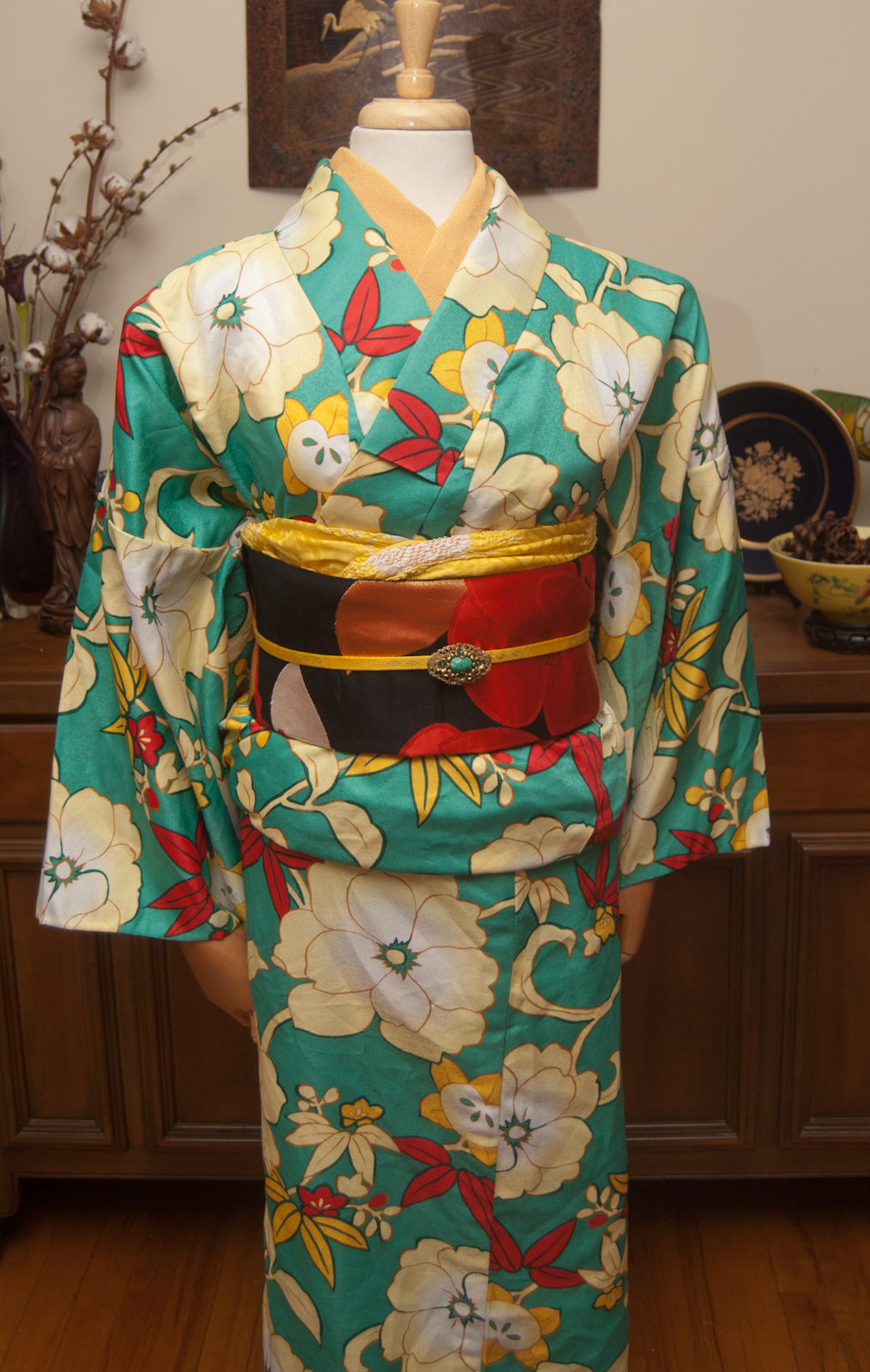
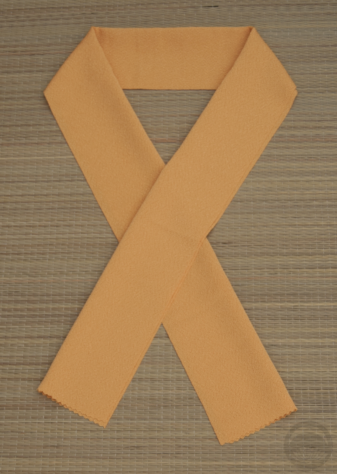
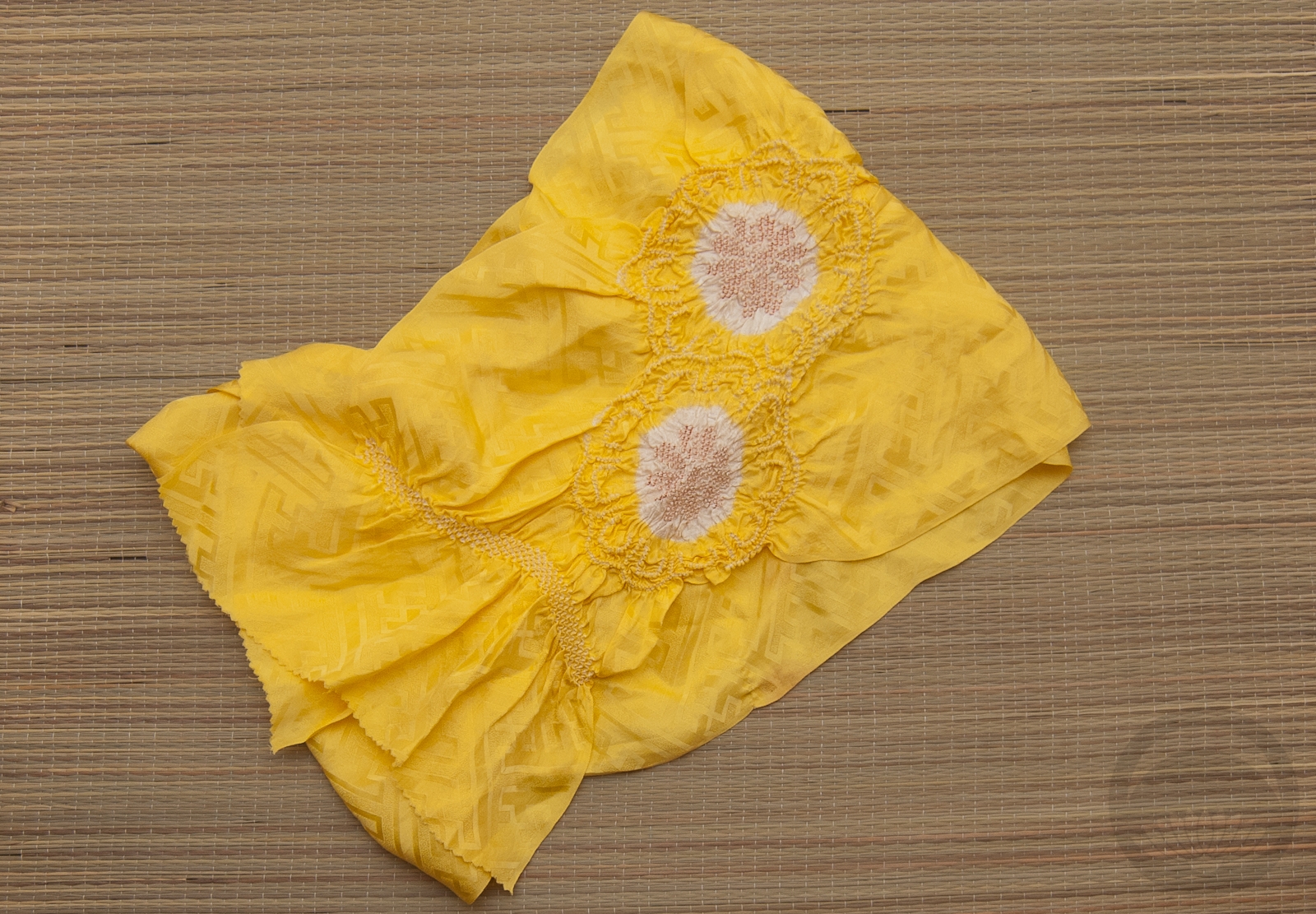
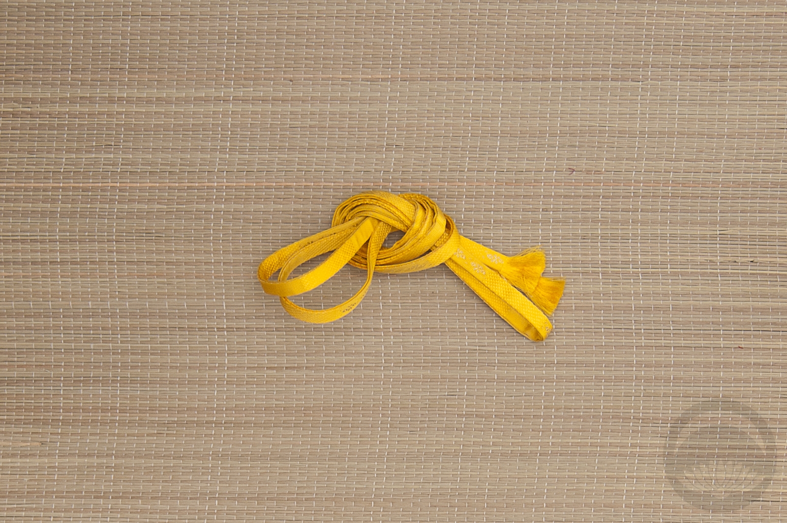
Because the pattern on the obi is so large and graphic it almost reads as quiet next to the busy quality of the kimono. I think that rather than competing for attention they complement each other beautifully. I went with a solid yellow haneri because I figured there was enough going on with the two main pieces that I didn’t want to introduce yet another pattern or visual element. As for the obiage and obijime, I know I use these so often but they just work with so many of my things. I still don’t quite understand how such obnoxious, lemon-yellow accessories match basically everything, but they do. Kimono sorcery!

The finishing touch was a brooch that belonged to my grandmother. I’m not sure what the stone in the centre is, but it’s a perfect match to the kimono, and brings just the right pop of teal in to break up the obi slightly.

Items used in this coordination

Octopus’ Garden

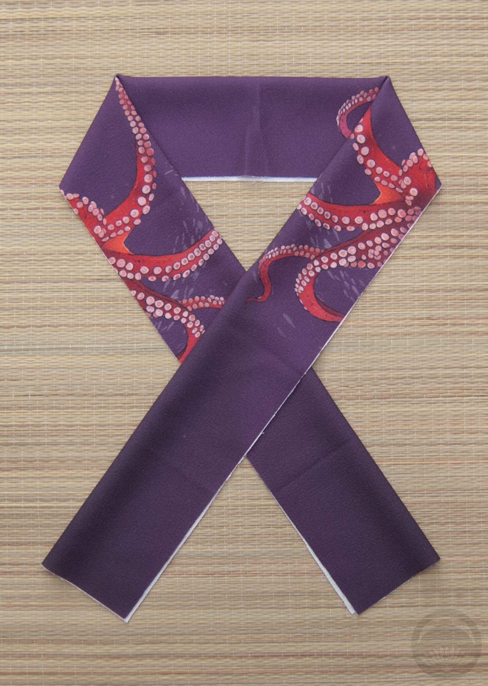
A few months ago, my father ordered this incredible octopus obi from 3Magpies Studio for me as a Christmas present. It was a pre-order and I knew it would arrive after the holidays, but I didn’t mind a bit. I knew it would be worth the wait. Also included was an incredible matching haneri, which unfortunately doesn’t seem to be available any more. I love how the tentacles just seem to be creeping in, and can’t wait to pair this with other outfits.

The obi nearly got lost in the mail – it was scanned leaving Poland and then the tracking never updated again for over a month. It finally showed up last week, much to everyone’s relief. I’m so happy it found its way home, because it’s awesome!

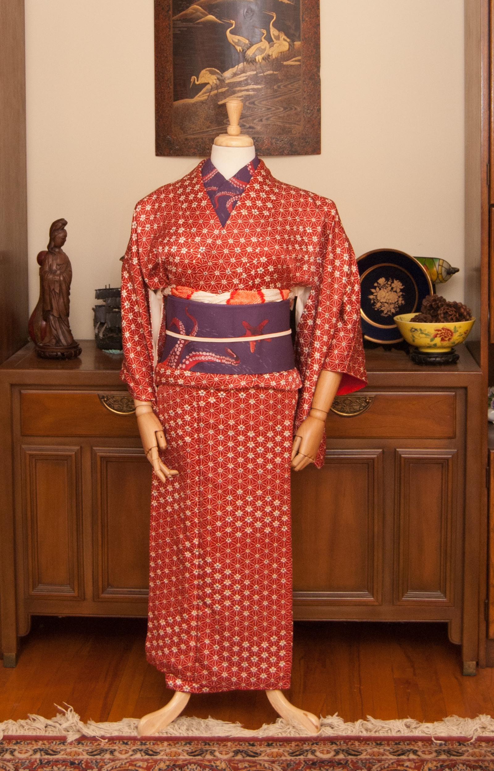
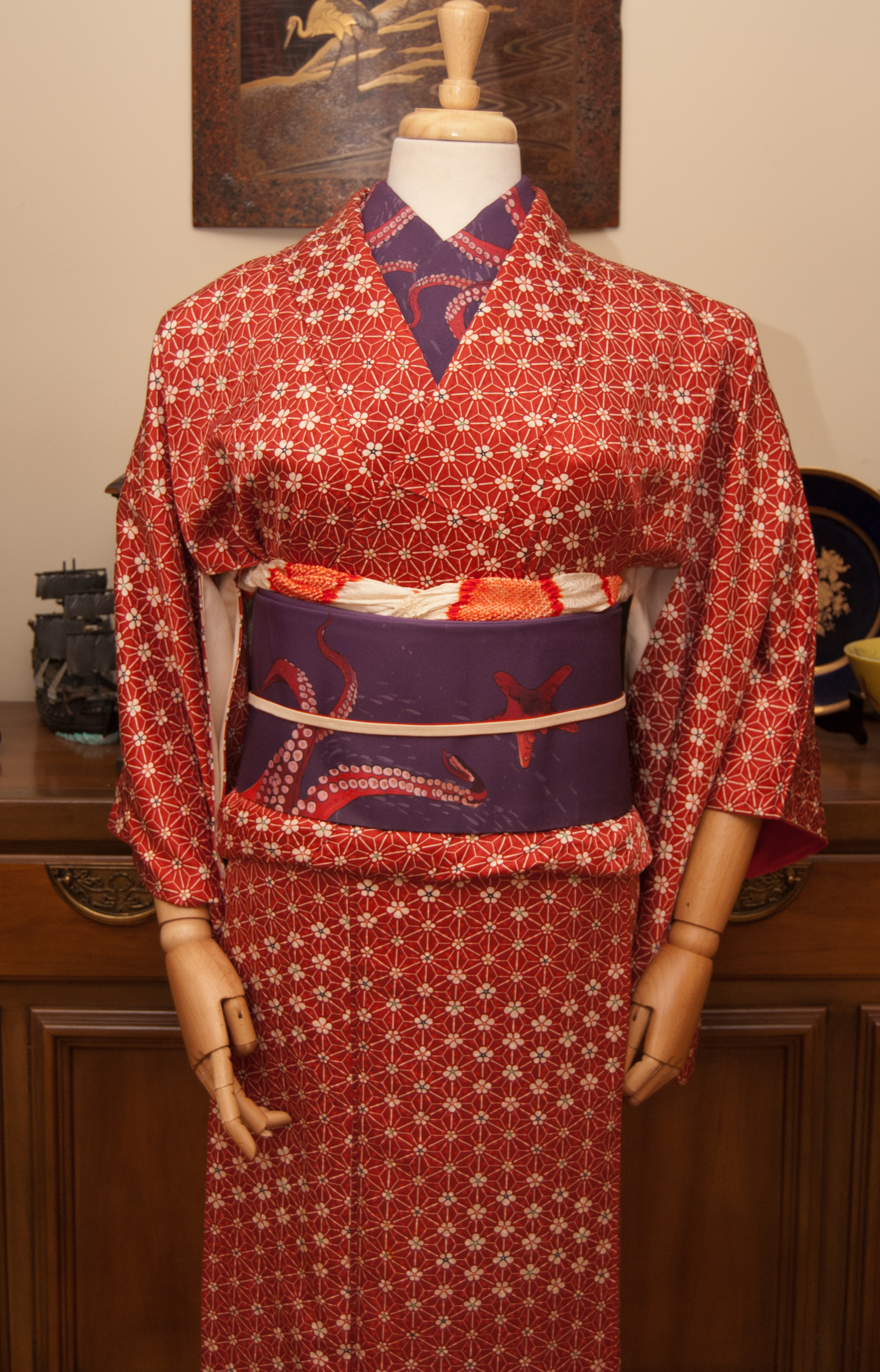
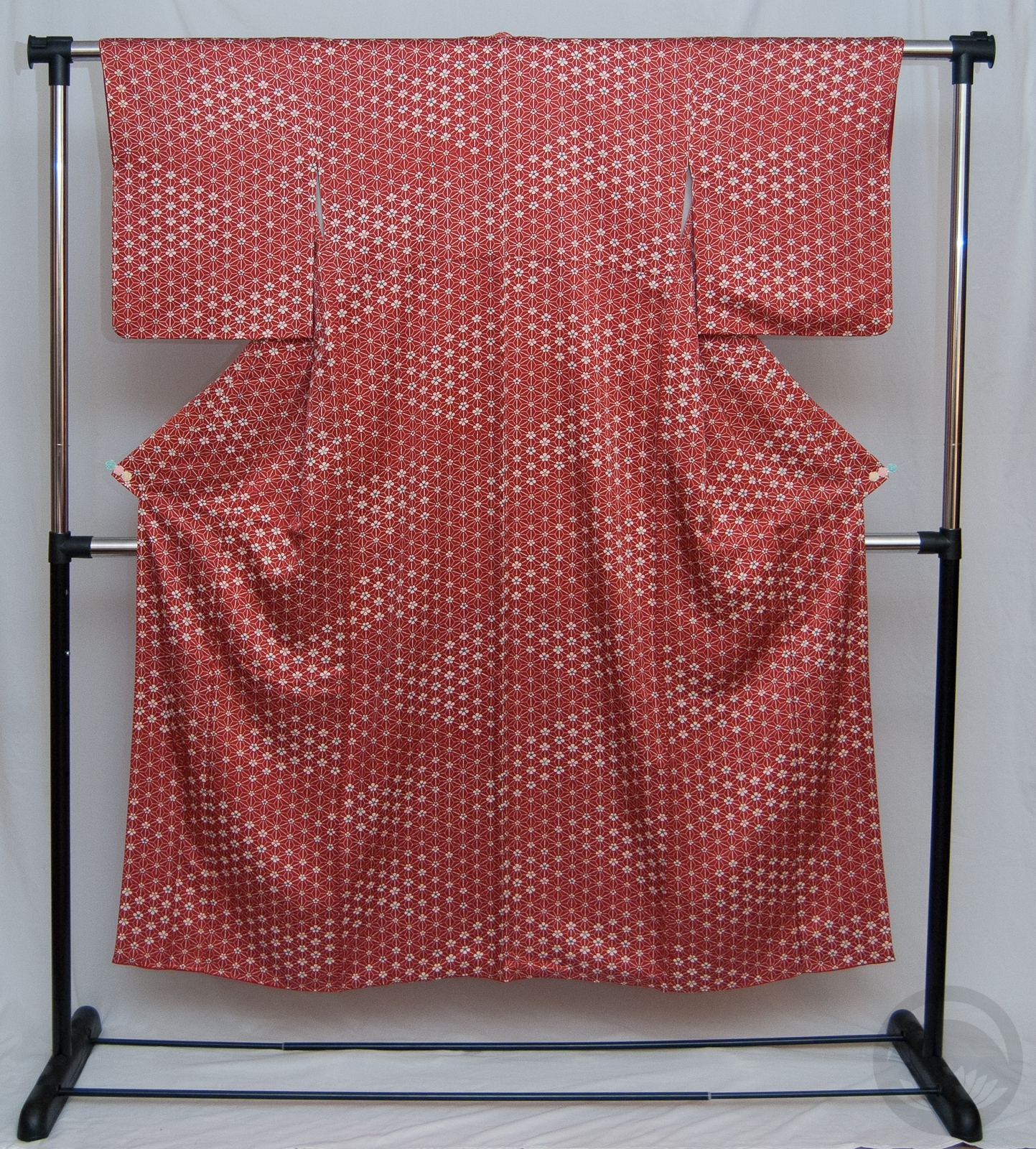
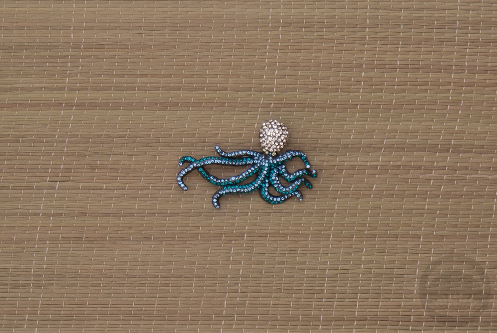
I really wanted to make sure the focus stayed on the fantastic obi, so I pulled out the red tones for the kimono. This one is covered in tiny ume, but from a distance they totally look like the suckers on the octopus tentacles. It’s a match made in watery, undersea heaven. I kept things simple with more white and red accessories. My initial plan was to use this rhinestone octopus obidome as well, but in the end it felt distracting and sometimes enough really is enough. One day I’ll likely pair them up, maybe with a different kimono to pull the blue colour in somewhere else and feel more cohesive.

Items used in this coordination

Memories of Summer

It’s snowing today. Again. We had a blizzard on Monday. It’s been frigid enough lately that there’s been warnings to stay indoors. I live in Quebc, I expect winter to be unpleasant. But this winter hasn’t just been unpleasant, it’s been brutal. So I thought I’d do my best to remind myself that summer will be here eventually!

I bought this gorgeous usumono (summer weight) vintage komon at the kimono bazaar back in November and initially had no plans to do anything with it until it was more seasonally appropriate. But I really needed a breath of warm summer air, and decided to feature it.

I love the colour of this piece; it’s a shade of plum that’s somehow rich but muted all at once. And the art-deco feeling birds on it are utterly charming. It’s tiny and will never fit me, but it was incredibly affordable for its age and fragility, and I loved it too much to pass it by.

Typically, I don’t bother putting a juban on the mannequin. She doesn’t sweat so I don’t need a layer to protect the kimono, she doesn’t move so I don’t need the security of it, and she doesn’t need any further padding or smoothing, so usually it’s not necessary. However, this kimono is so sheer that it would have looked odd and shapeless, and I’ve been wanting to feature this ridiculously adorable shrimp juban Naomi gave me for a while now. It’s technically too heavy for the weight of the kimono, but I love how the colours work together and thematically I like the idea of birds swooping over the cool, breezy ocean and diving in to catch the shrimp!

I used my white ro hakata obi, partially because it looks refreshing against the purple and partially because it’s the only summer weight obi I own. Pale purple summer weight accessories and a cool white ro haneri tie it all together.

It may be completely disgusting and frigid and messy outside, but it’s good to look back on happy memories of summer.

Items used in this coordination

Olive, the Other Reindeer

Hello! First off, let me say I cannot be blamed for the terrible title of this entry; it’s actually the title of a children’s book. It’s always made me laugh, and since today’s coordination features my favourite olive-green kimono and Christmas is coming up soon it seemed appropriate.

For those of you who aren’t aware, I work in a toy store so this time of year is always a bit exhausting for me, to say the least. I knew I wanted to do something simple and cute that wouldn’t take much fussing, and remembered that the salmon-coloured accents on this kimono are a near-perfect match for a black winter motif tsuke-obi I own. More salmon pink accessories including ume on the haneri pulled it all together.

I do have a few other things in the work for this month, but entries will likely be a bit sparse for a bit. I do post regular smaller updates and curiosities on my Facebook and Instagram, so be sure to follow those if you don’t already!

Items used in this coordination

Fudangi First Friday – Flirty Florals

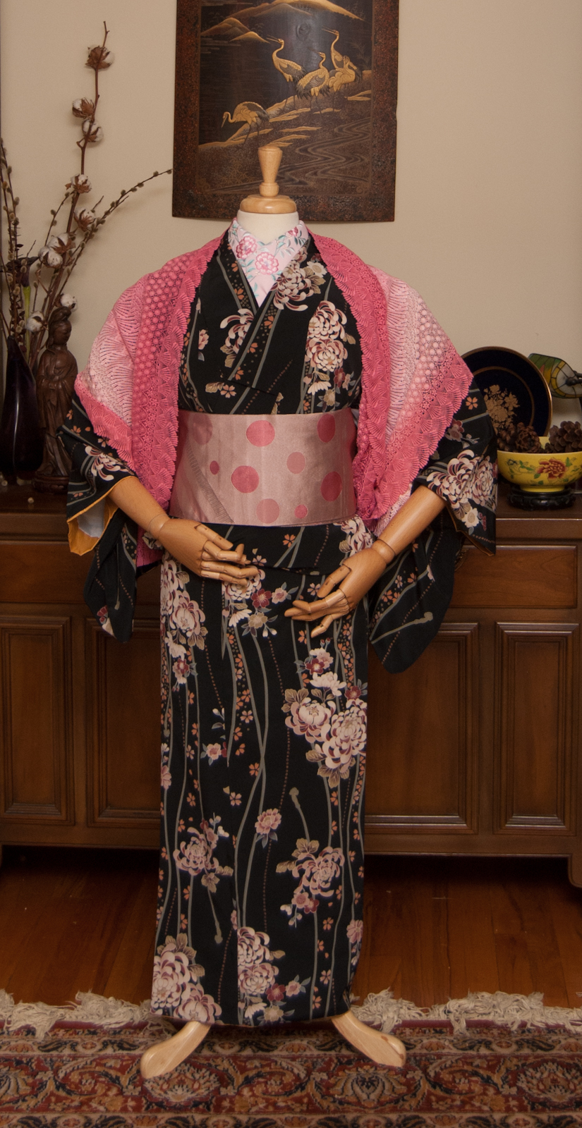
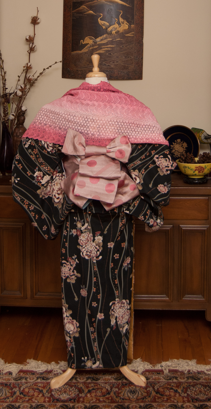
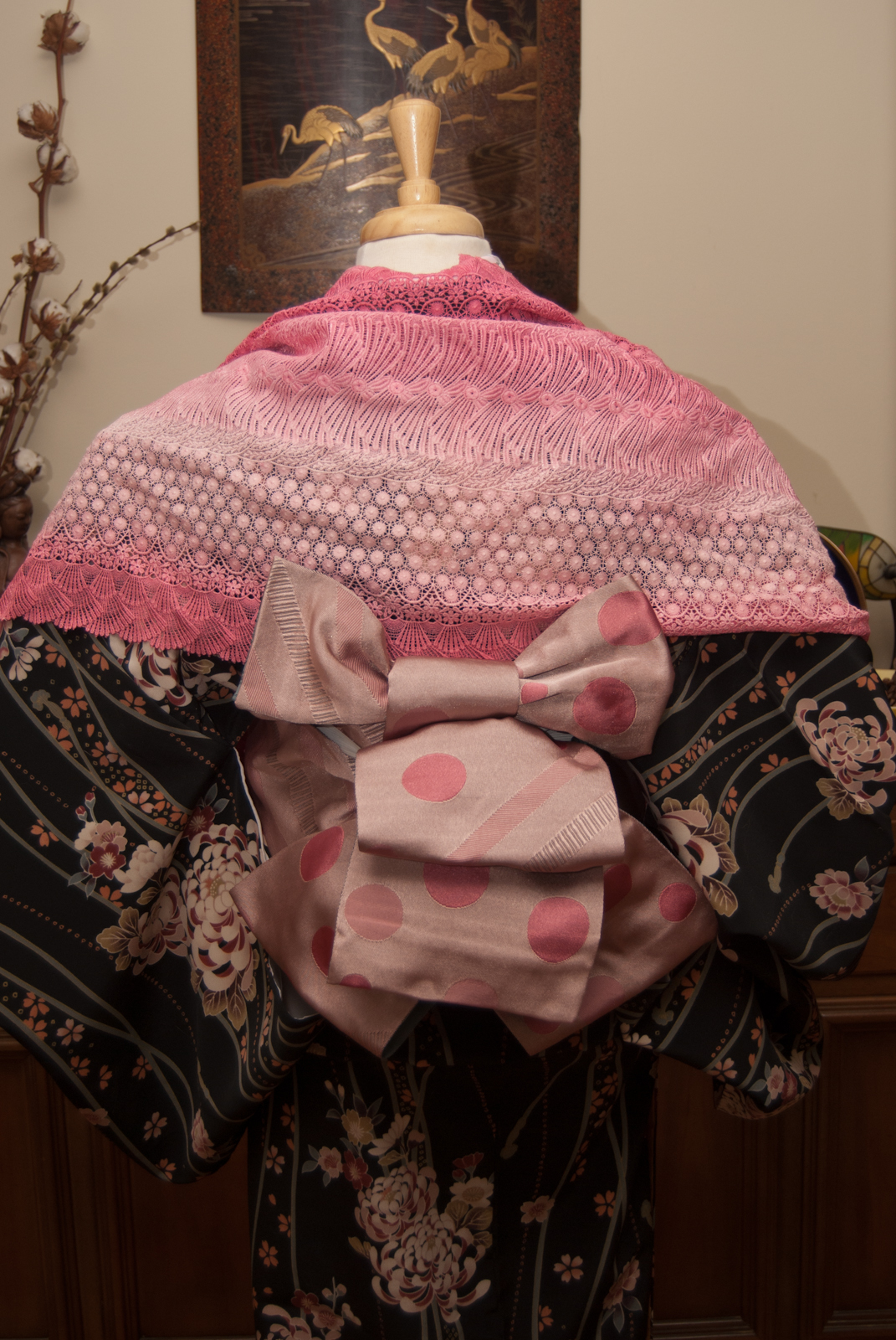
I’ve been pretty terrible at keeping up with my Fudangi First Friday project, but since this is the last one of the year I figured I had to make an effort! This gorgeous raspberry red hakata obi is one I got from Kimono Yuki back during the summer and hadn’t gotten around to coordinating yet. I love how rich the colour is, and it’s also super long, I can’t wait to wear it myself!

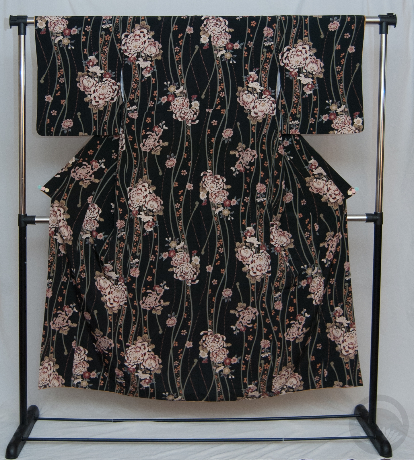
The obi is one of those strange colours that’s super bold and vivid but still manages to fall into the neutral category, at least when it comes to kimono. So I knew I could pair it up with almost anything. I haven’t done much with this multi-season komon recently but thought it could work and make a sort of sweet, feminine outfit that still felt a little mature due to the black base and richer tone of the obi.

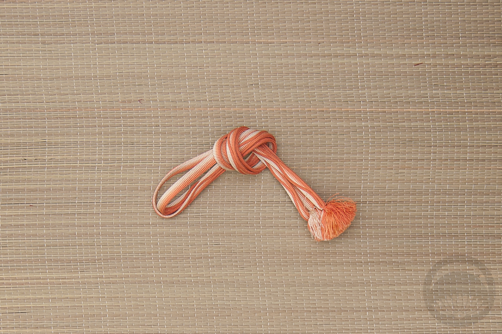
I’d also never gotten the opportunity to use this adorable owl haneri. It matched some of the pinks in the kimono so perfectly, I’m very glad I thought of it. The finishing touch was a peach and white obijime that again ties in to some of the accent colours on the kimono. It was feeling a little drab against the obi, somehow, so I thought tying it in a cute bow would help balance things out a little better.
As much as I’ve loved doing the Fudangi First Friday project (and the MonoKimono challenge), I’m pretty sure that in 2019 I’m not going to commit to any challenge or project where I have to do something at a fixed and repeated time. I’ve just got too much going on. I hate feeling like I’ve failed and I don’t need that sort of stress going forward.
Today’s post was apparently brought to you by the letter F.

Items used in this coordination