
What’s this? I’ve worn kimono twice in less than a month?! Apparently unemployment agrees with me…
I’ll be honest, I got dressed for part of a bigger group project that I’ll hopefully be able to share with you all soon. But I figured while I was all done up I should take advantage of it. Also, you get to see part of my bedroom for once, instead of the living room. It’s a fair bit more boring, but I wanted a more neutral background. So not only do you get to see my goofy face, you get to see a small part of my ridiculous pile of collectables. I’m sure you’re thrilled.
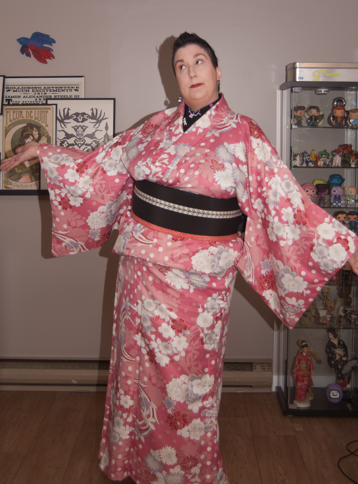
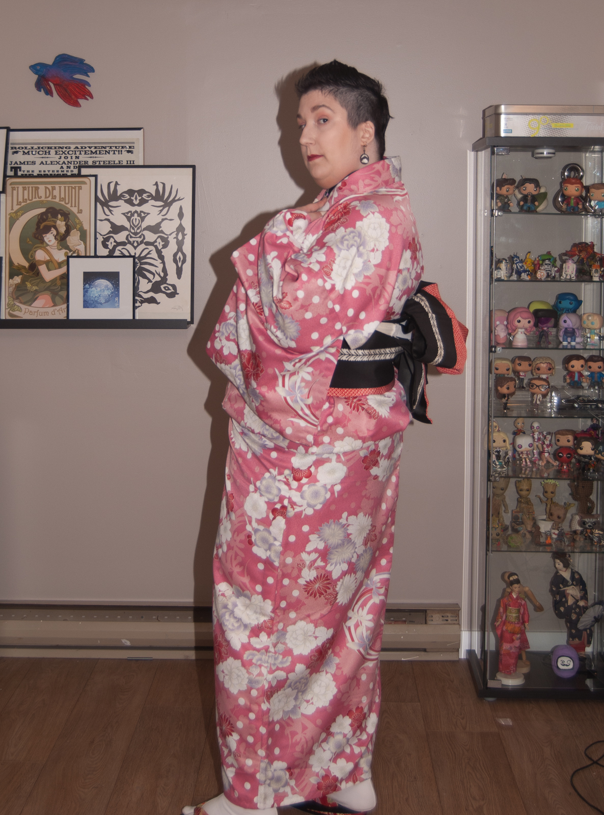
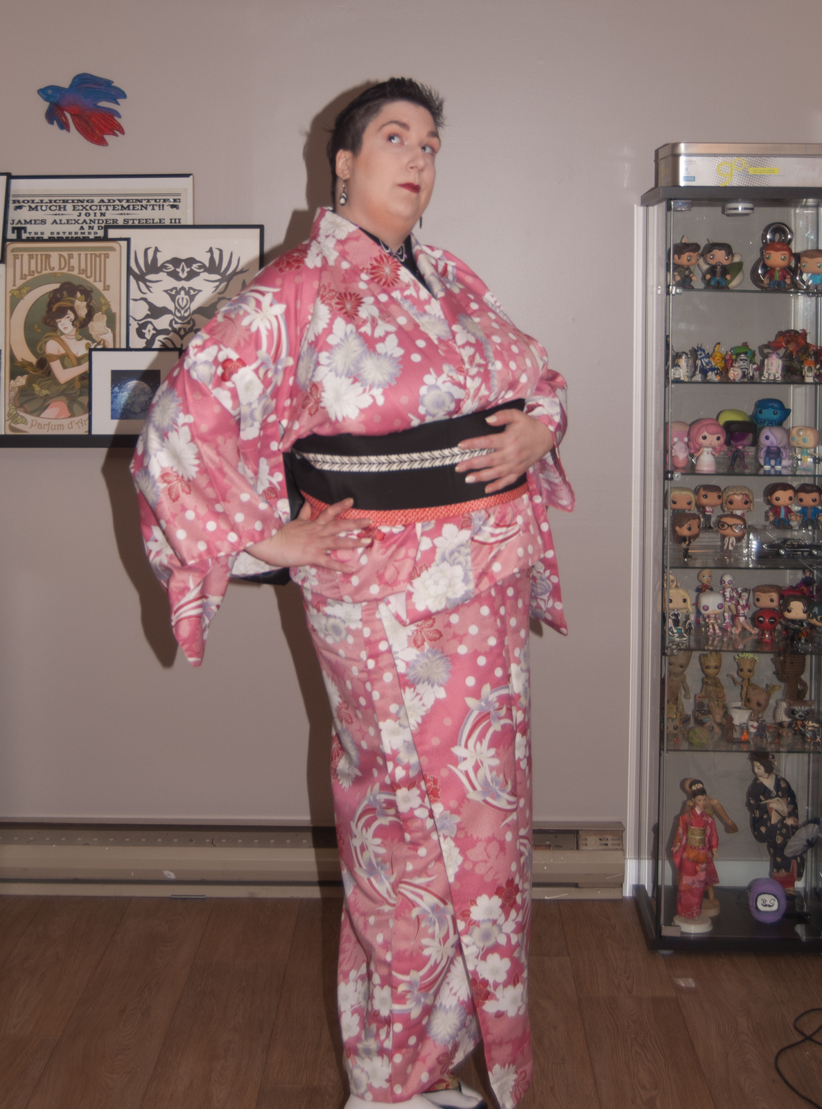
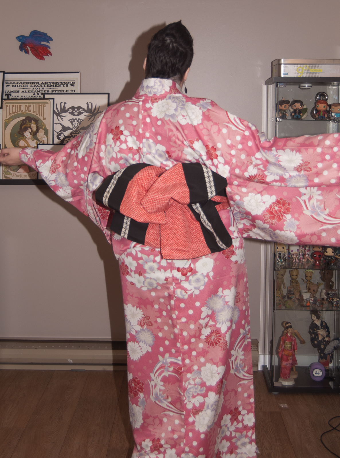
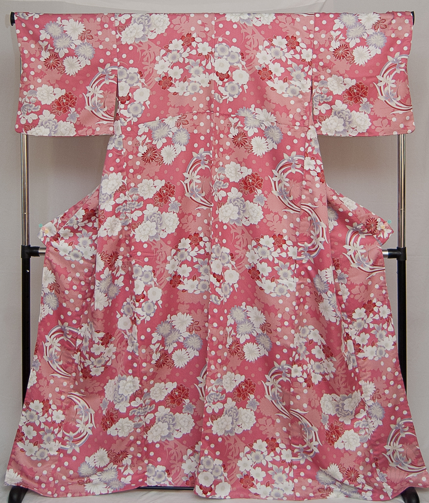
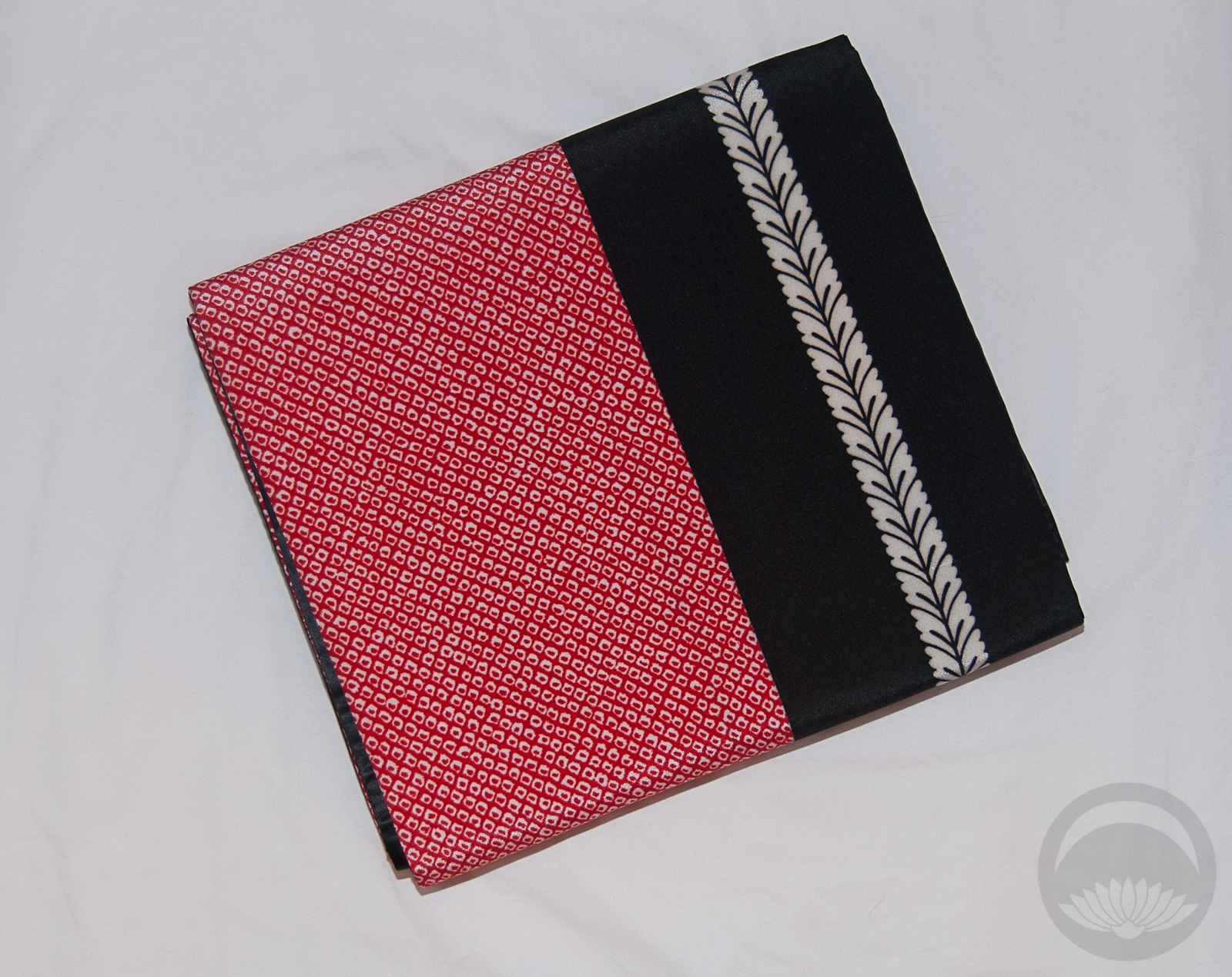
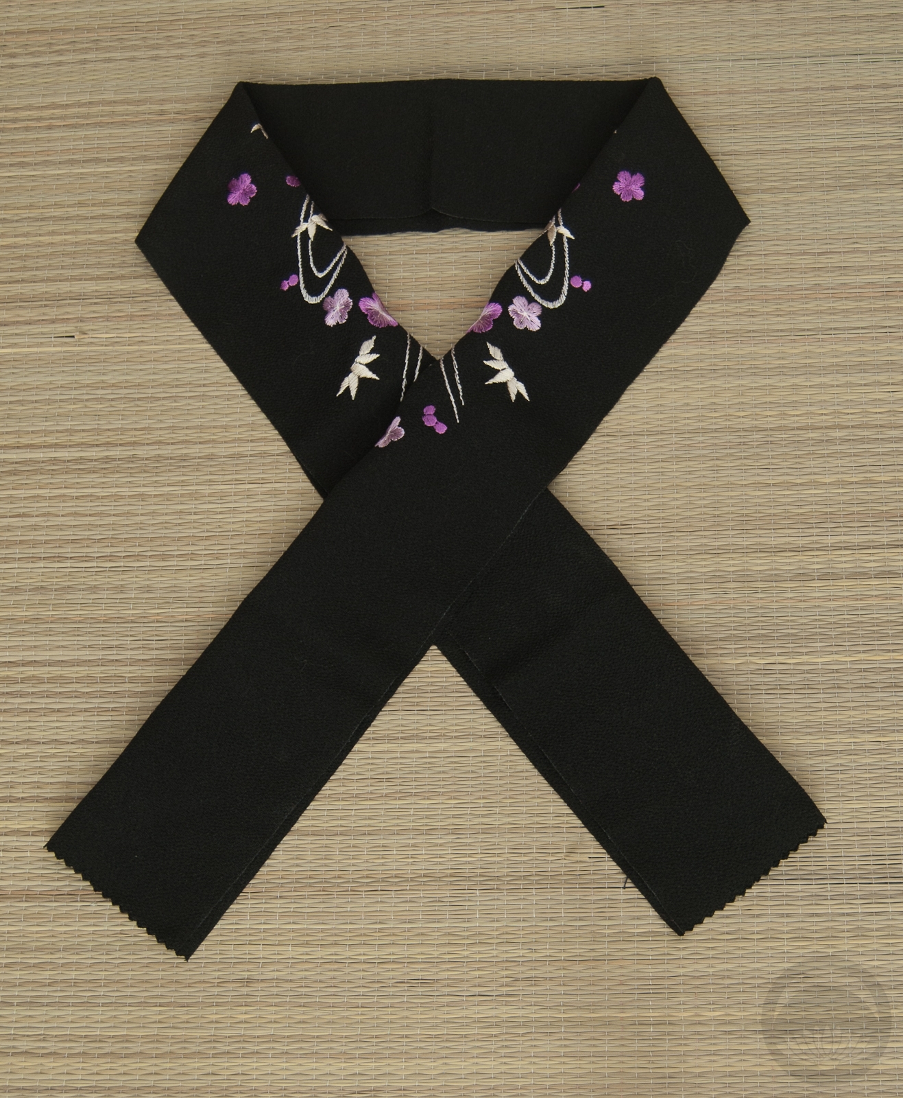
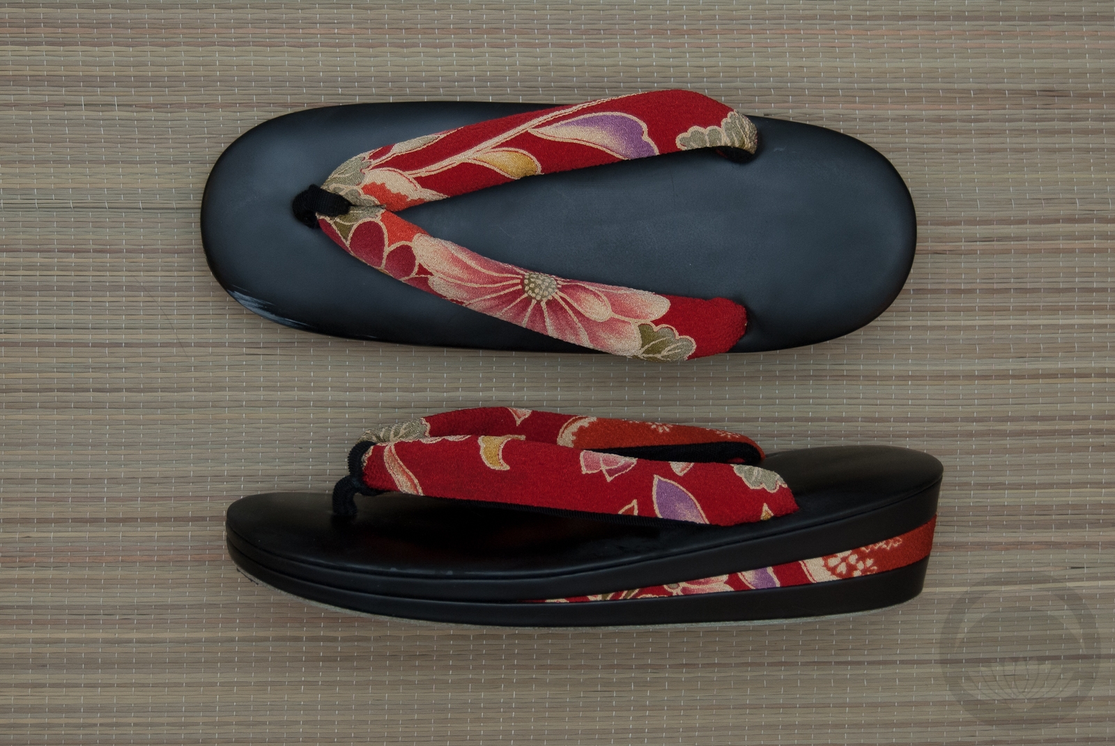
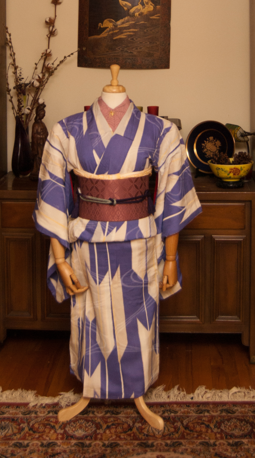
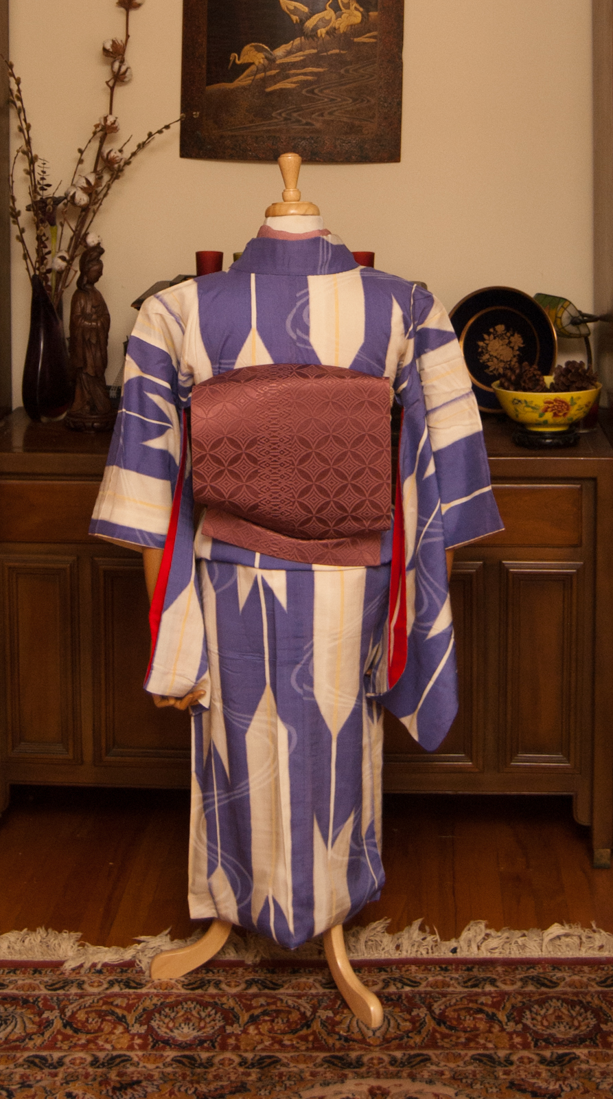
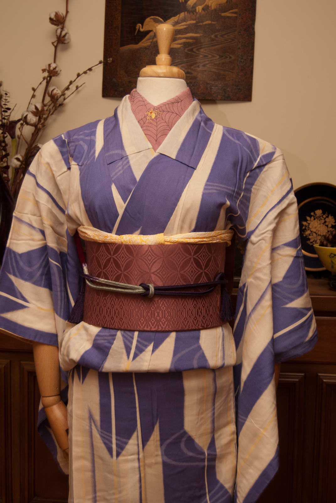
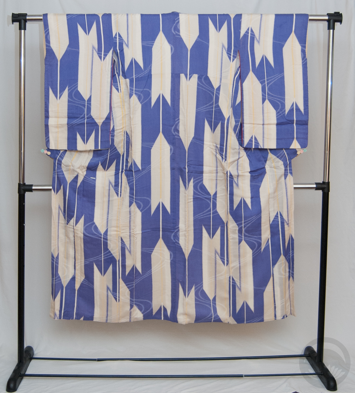
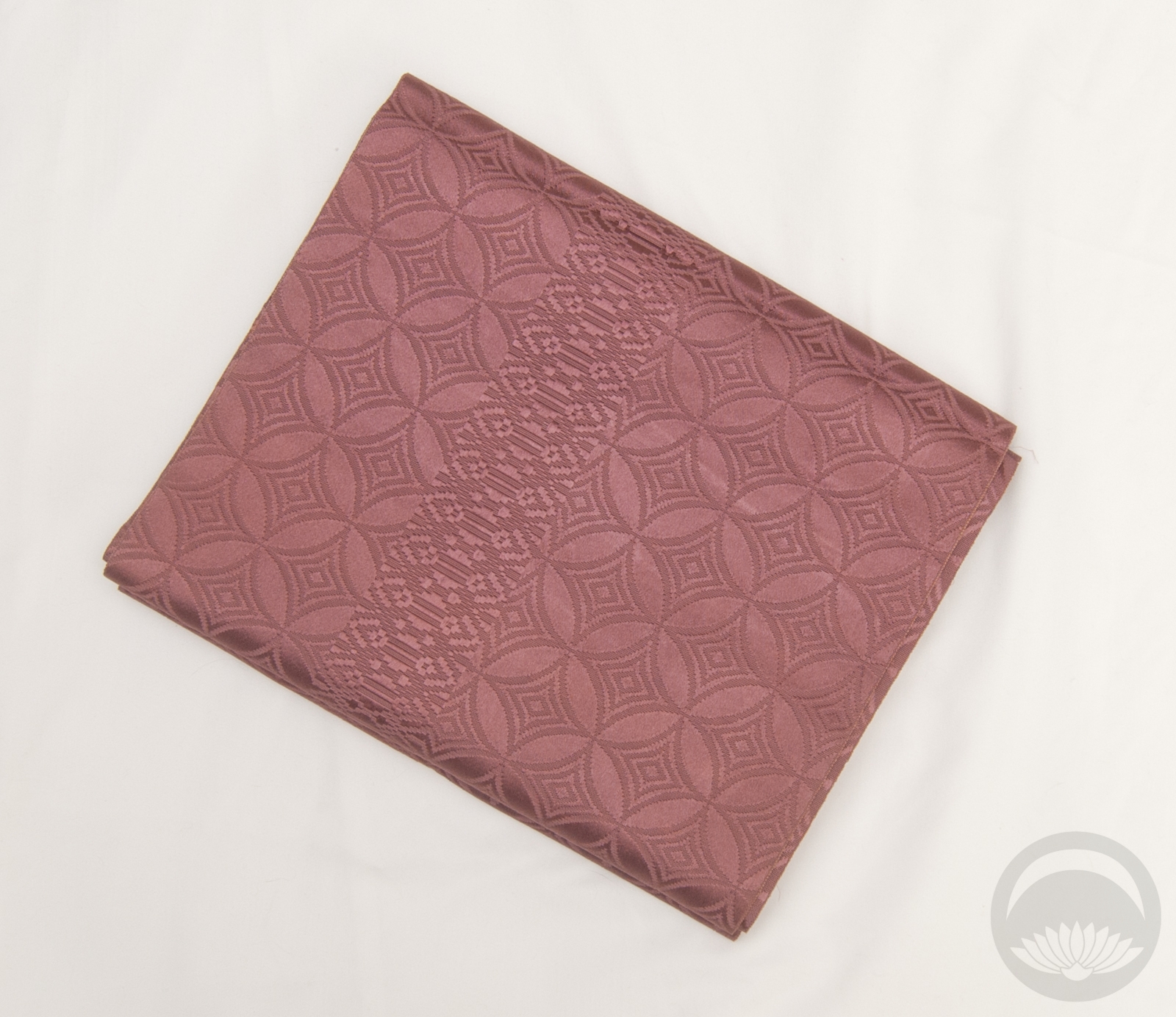
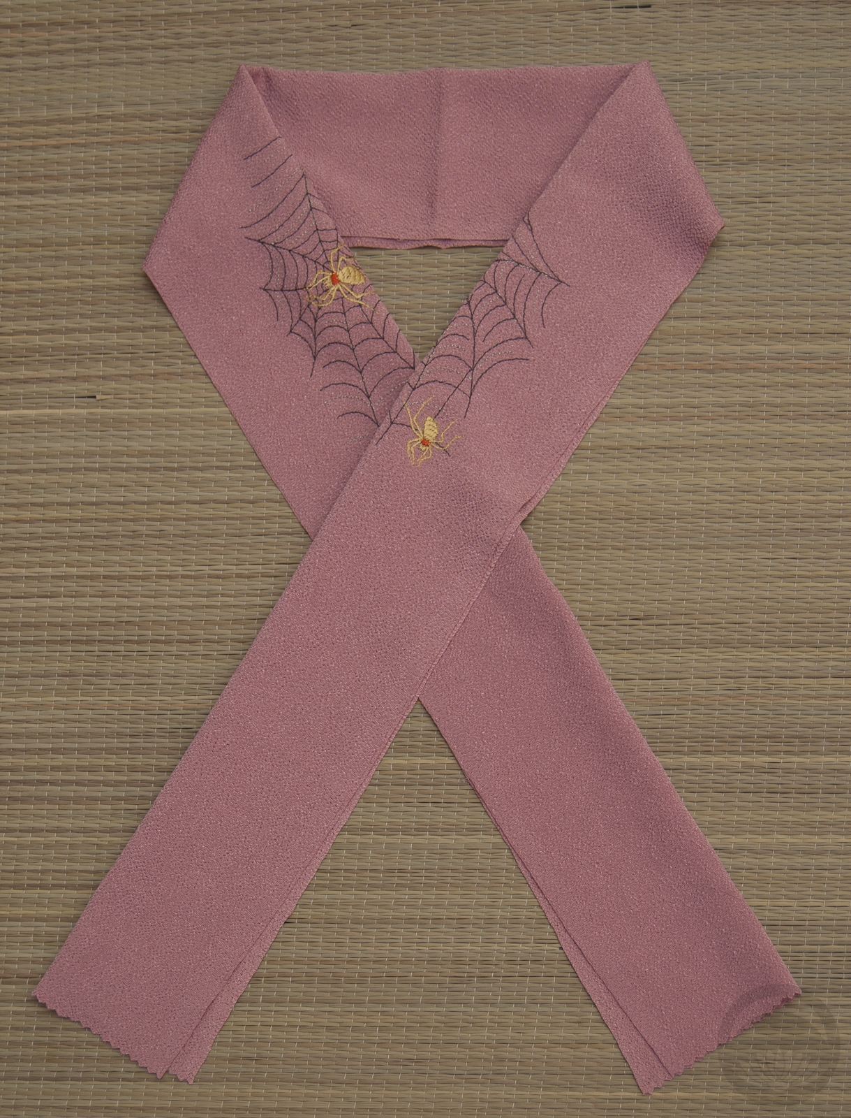
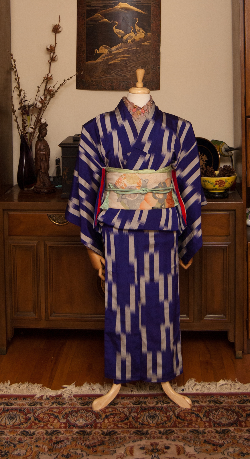
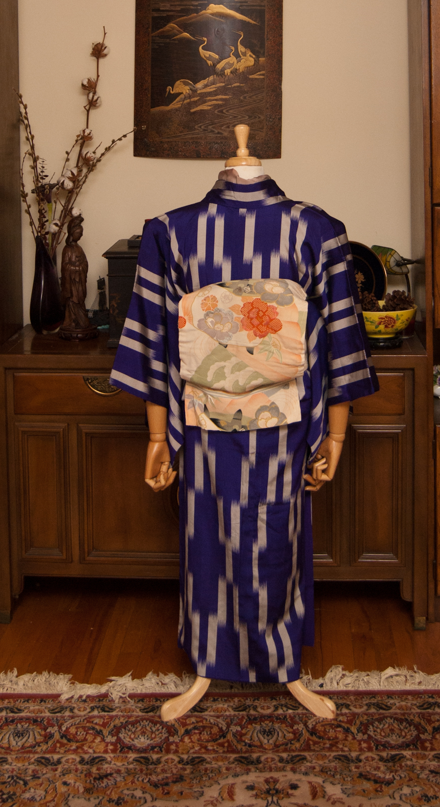
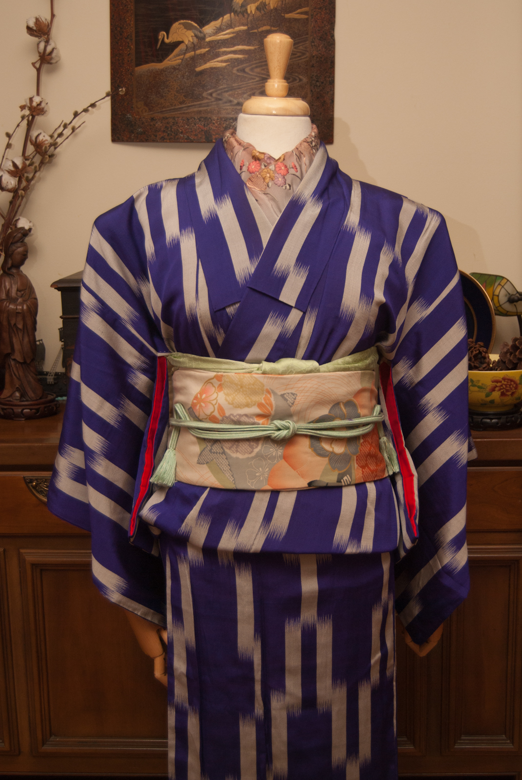
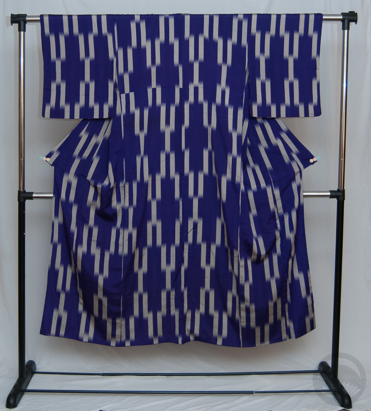
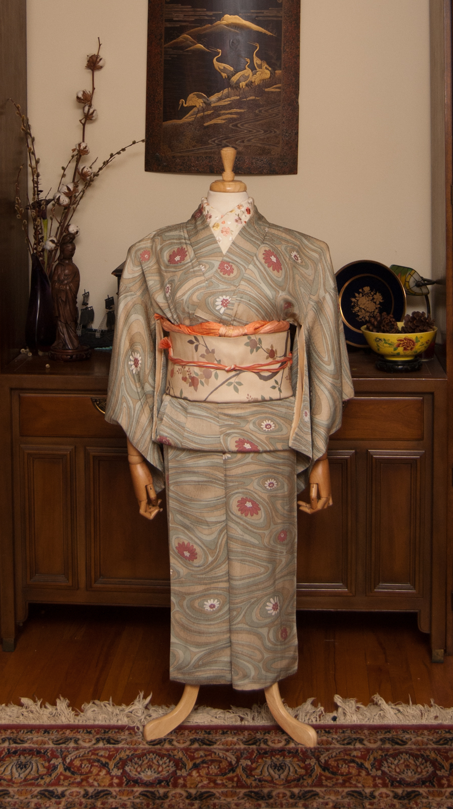
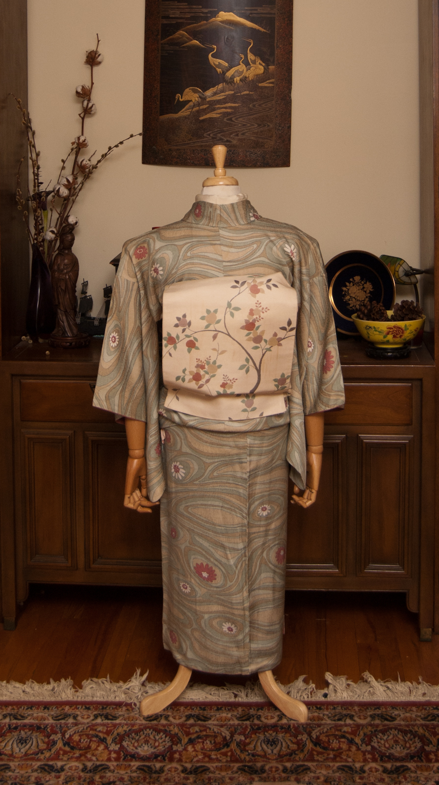
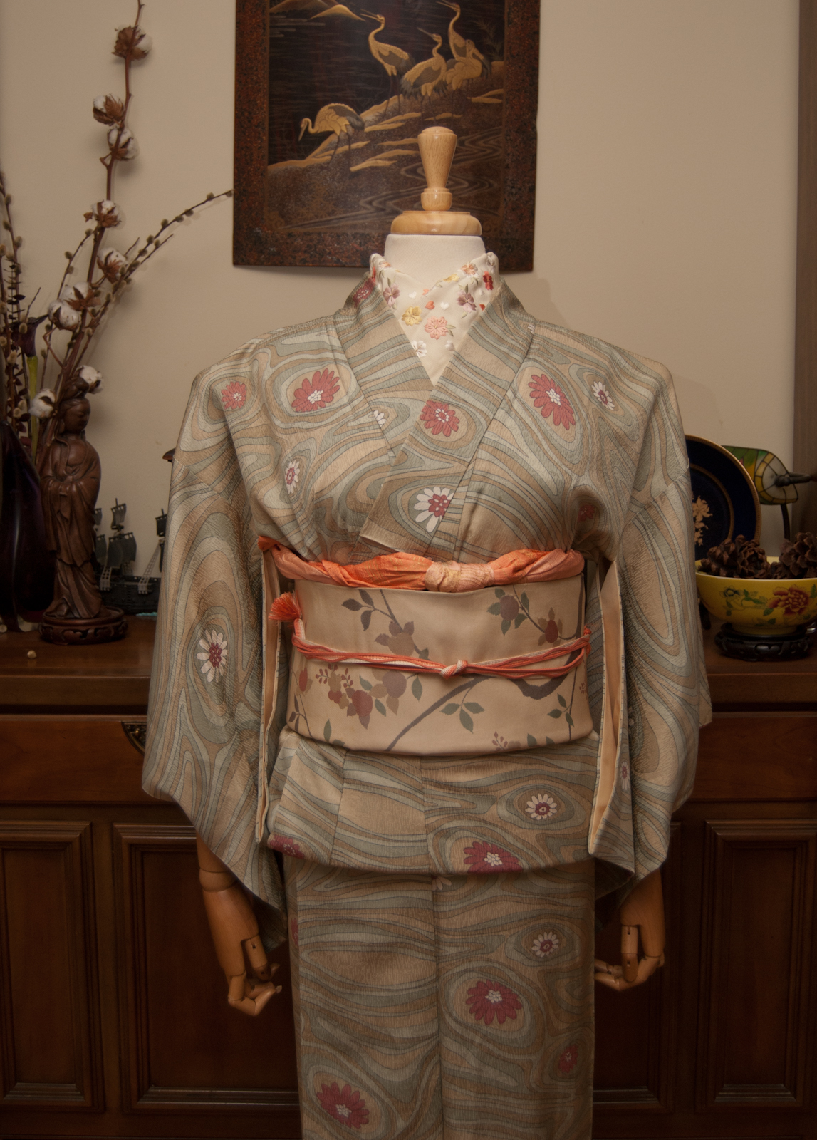
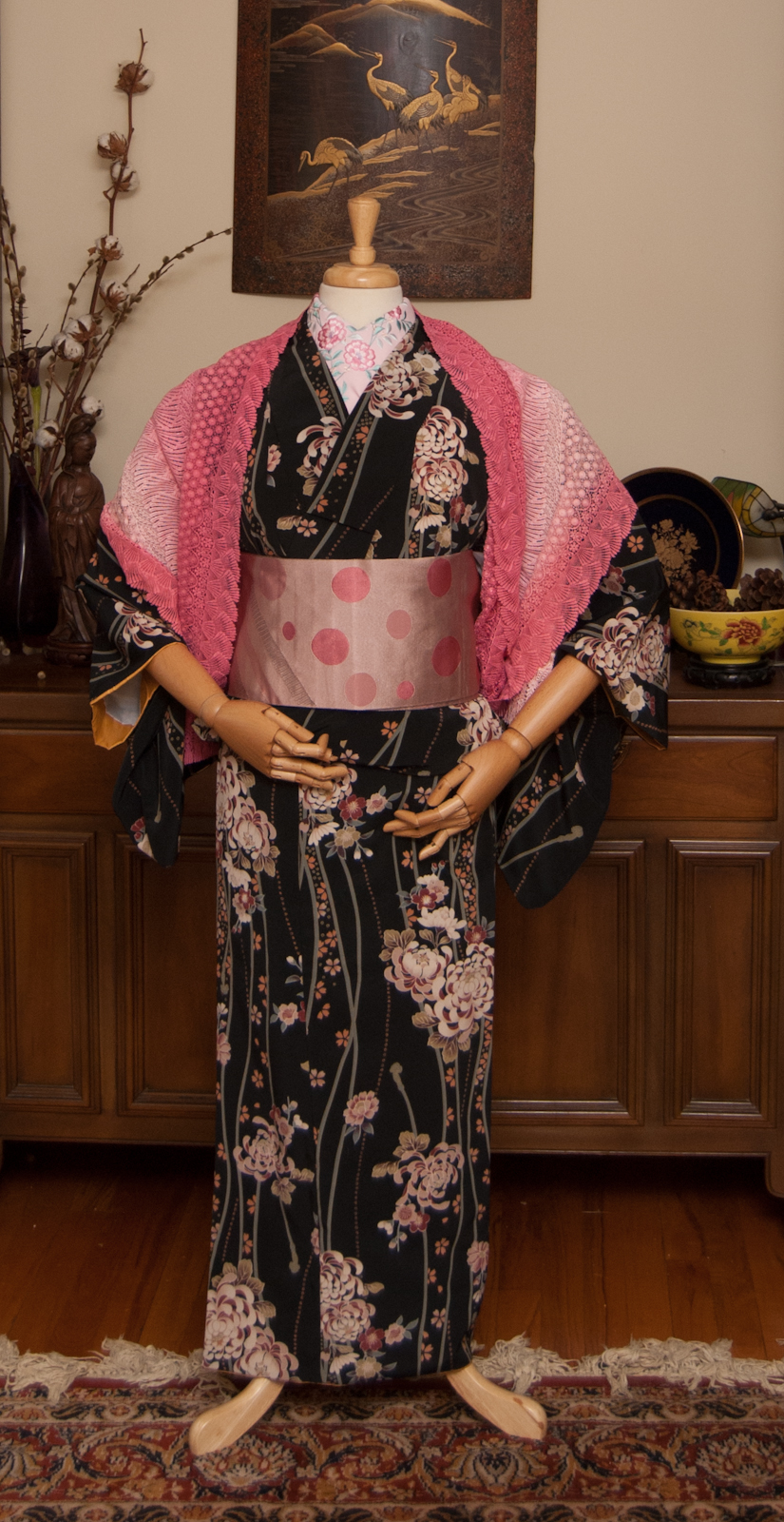
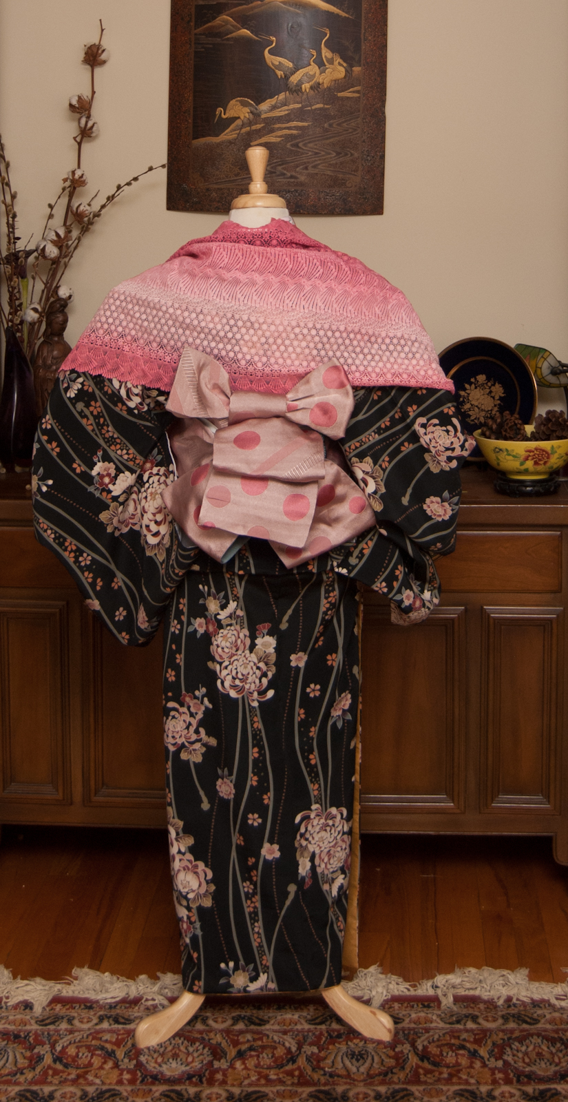
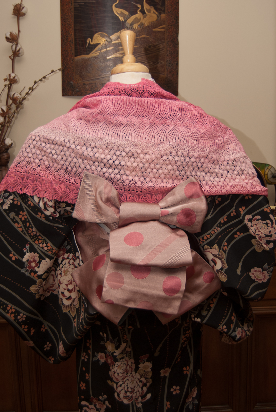
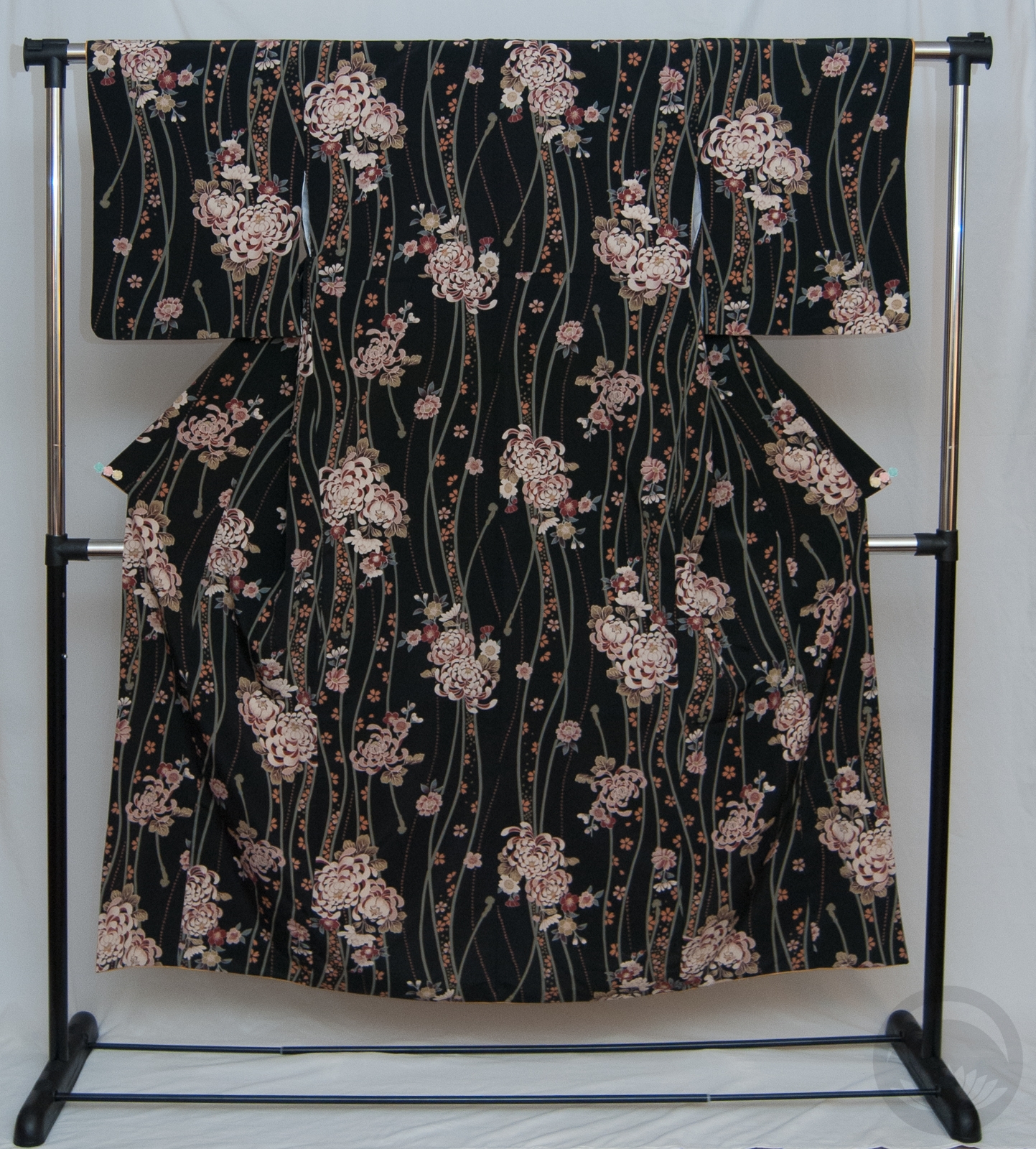
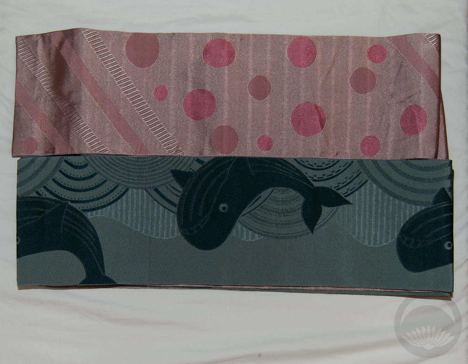
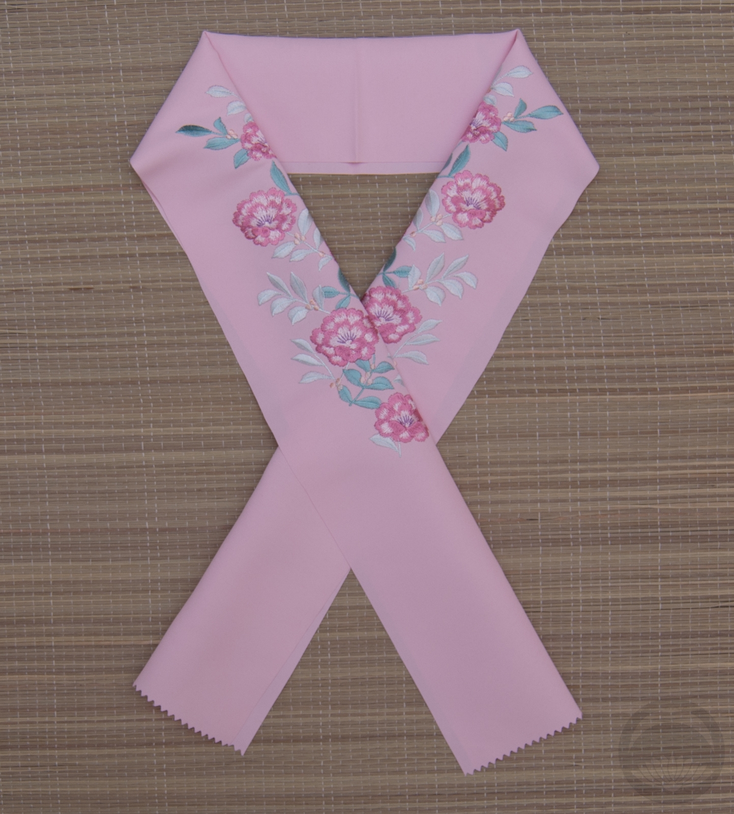
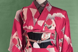
I really do love these giant kimono from Kimonomachi. Unfortunately, Rakuten Global has shut down so ordering from Canada is way more of a hassle now than it used to be. I decided to pair the pink one with this awesome red and black faux-shibori obi in a sort of cute improvised casual musubi. Black haneri and black zori (which got mostly cropped from the photos, alas) help anchor the outfit and echo the black of the obi. I kept my makeup soft and pink to suit the kimono, since my hair is already edgy enough at the moment. My moonblossom kamon kanzashi earrings were the perfect finishing touch, I think.
Items used in this coordination
-
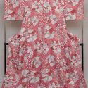
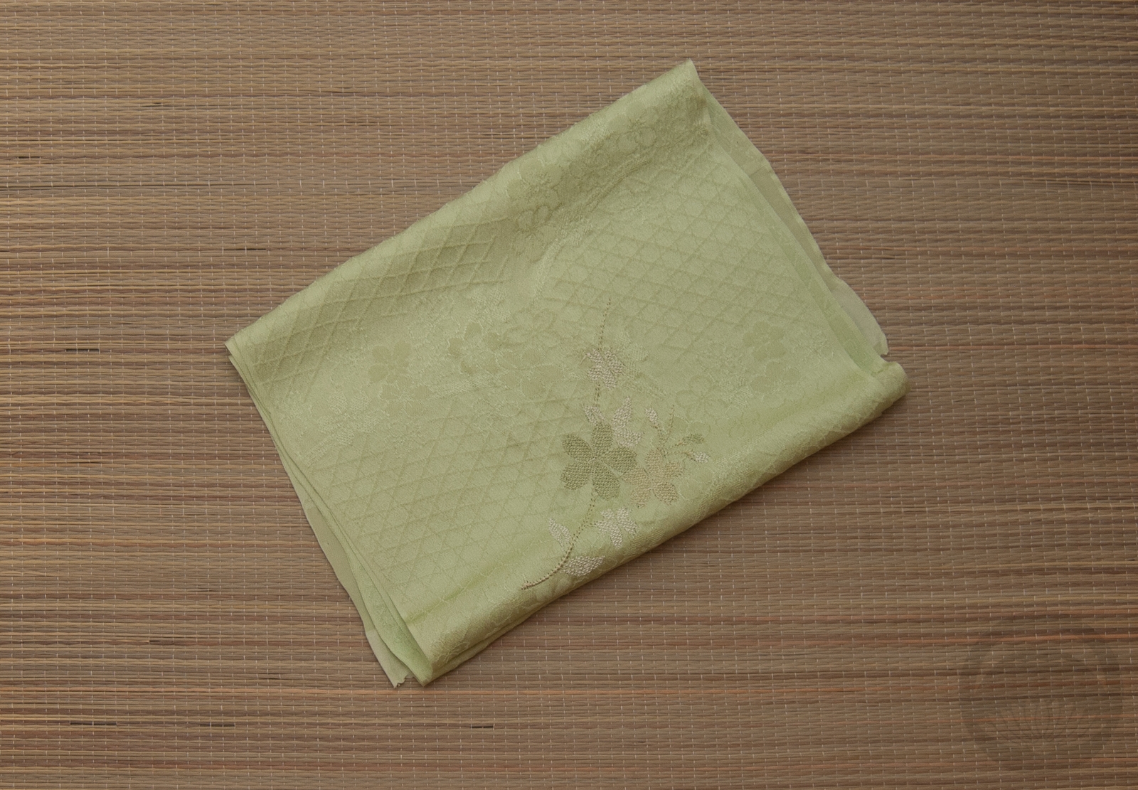
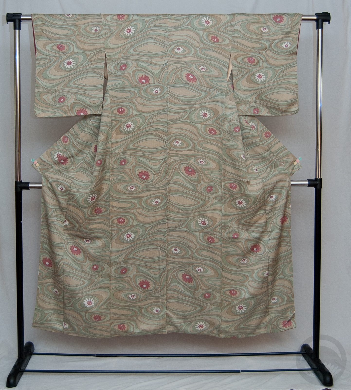
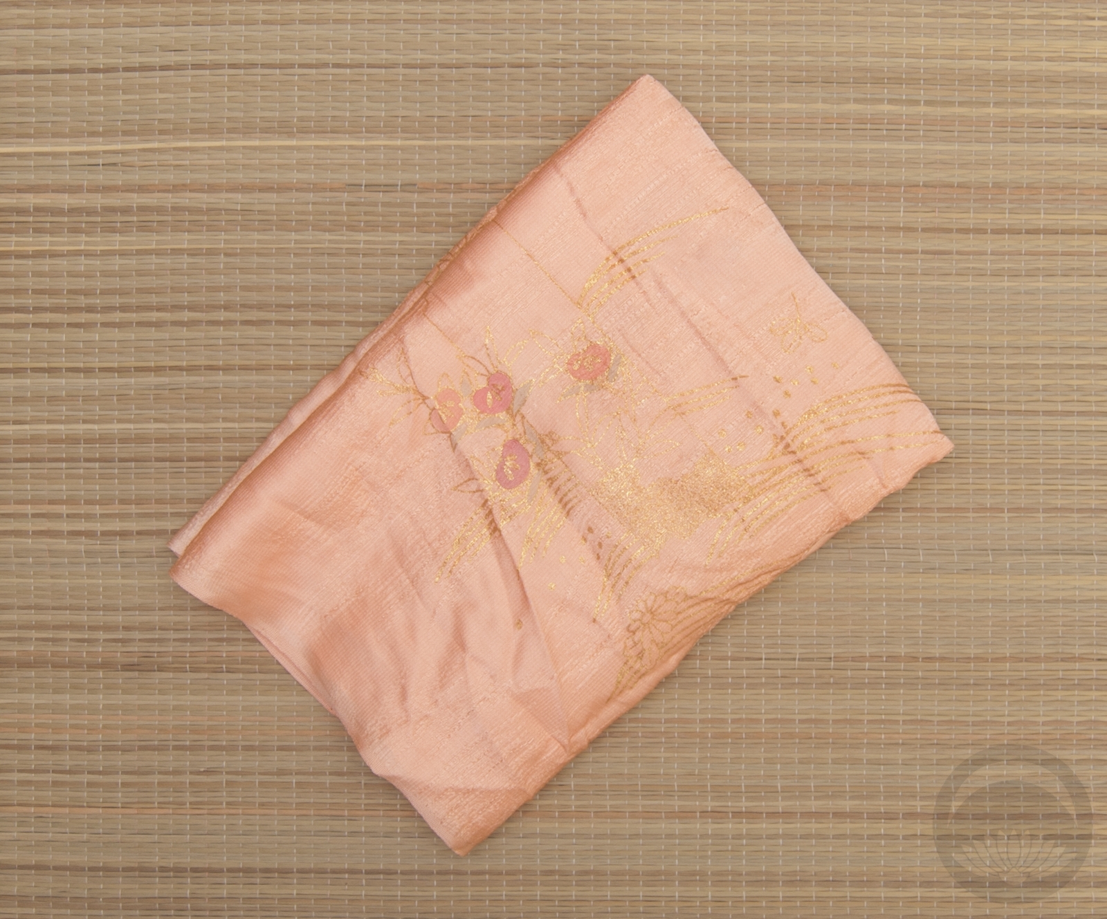
- Pink Multi-season Floral
-
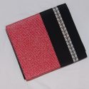
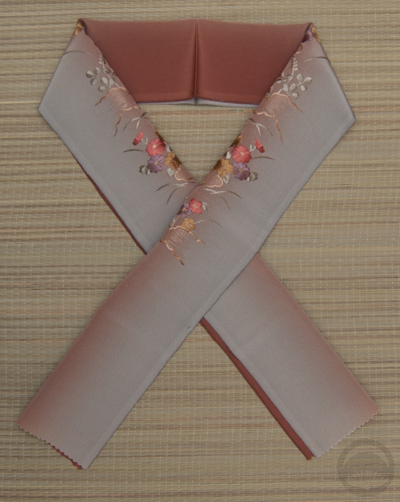
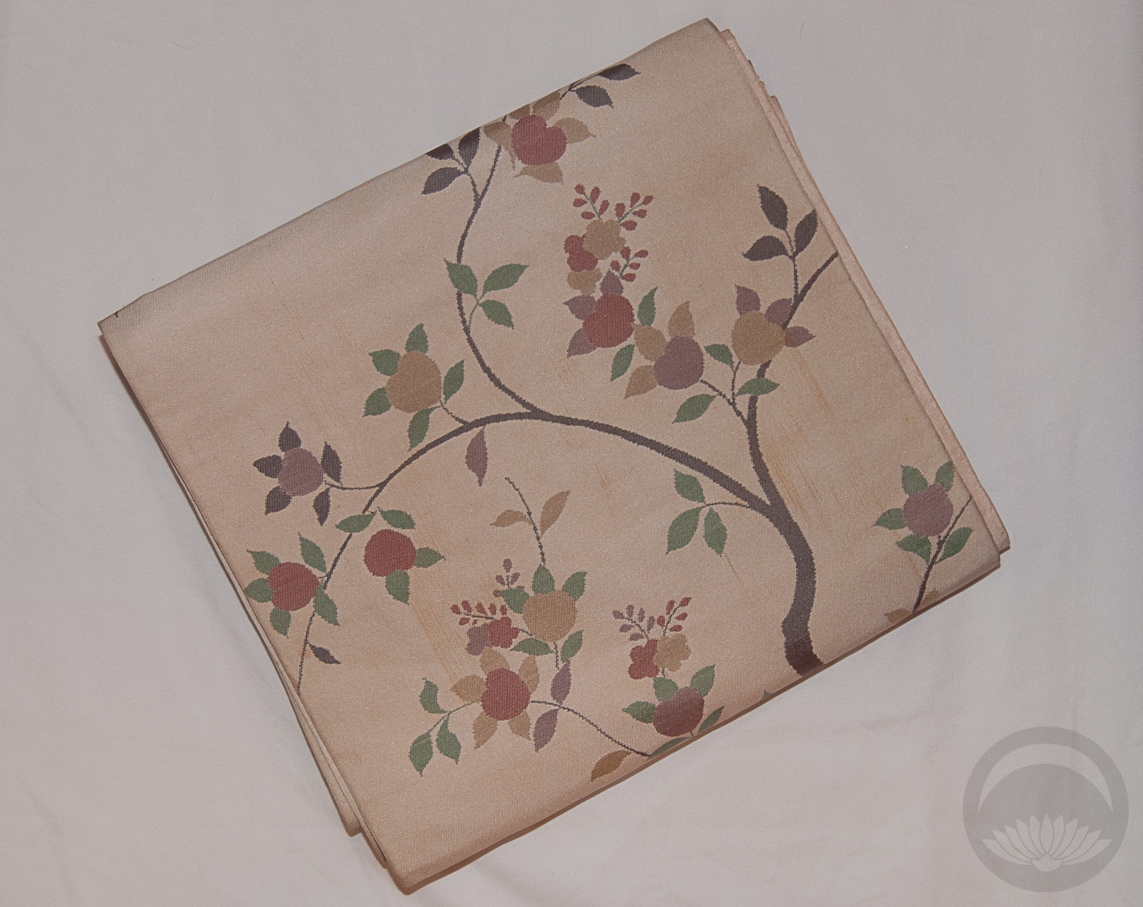
- Red Faux-Shibori
-
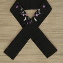
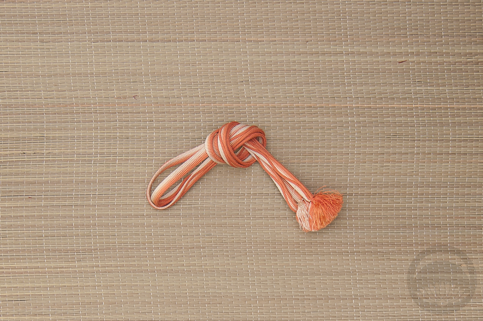
- Ume
-
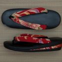
- Black and Red Casual Zori


 Bebe Taian
 CHOKO Blog
 Gion Kobu