
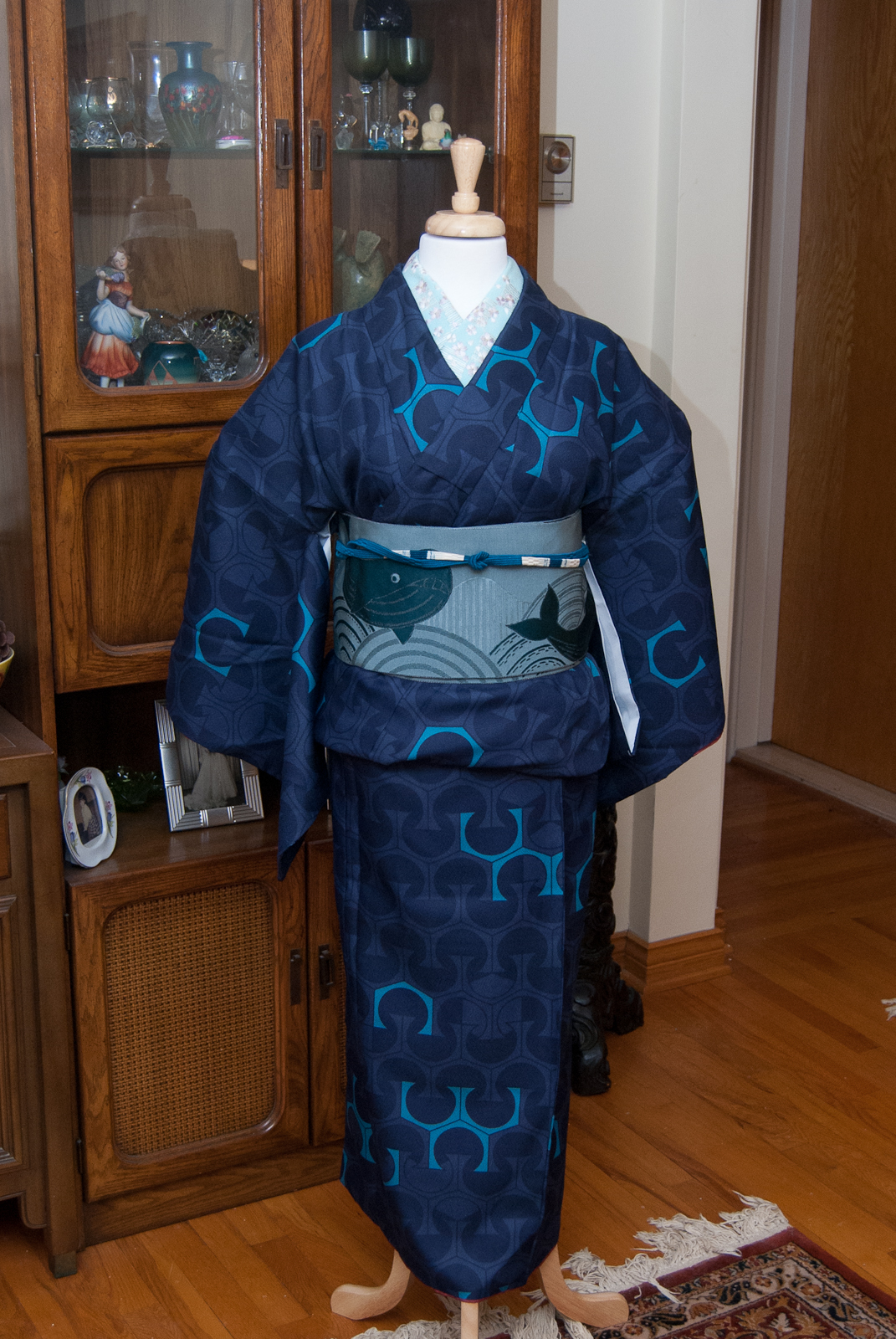
One thing you may not know about me is that I am descended from hockey royalty. Newsy Lalonde was my great-grandfather. While this isn’t something that generally overlaps with my kimono interests, sometimes a girl’s just got to represent hometown and familial pride, in the form of a coordination evoking the Montreal Canadiens team colours. Especially now that we’ve made it into series two of the Stanley Cup playoffs. Go Habs Go! Tricolore jusqu’au bout!* I’d originally planned to put this up before Series 2 Game 1 on Wednesday but was feeling under the weather, so I’m making sure it goes up before Game 2.
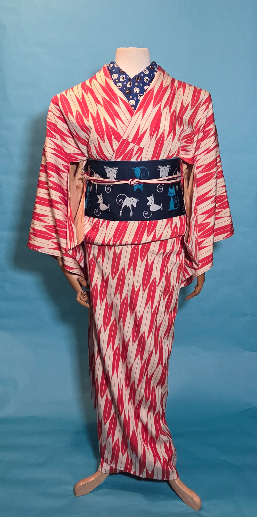
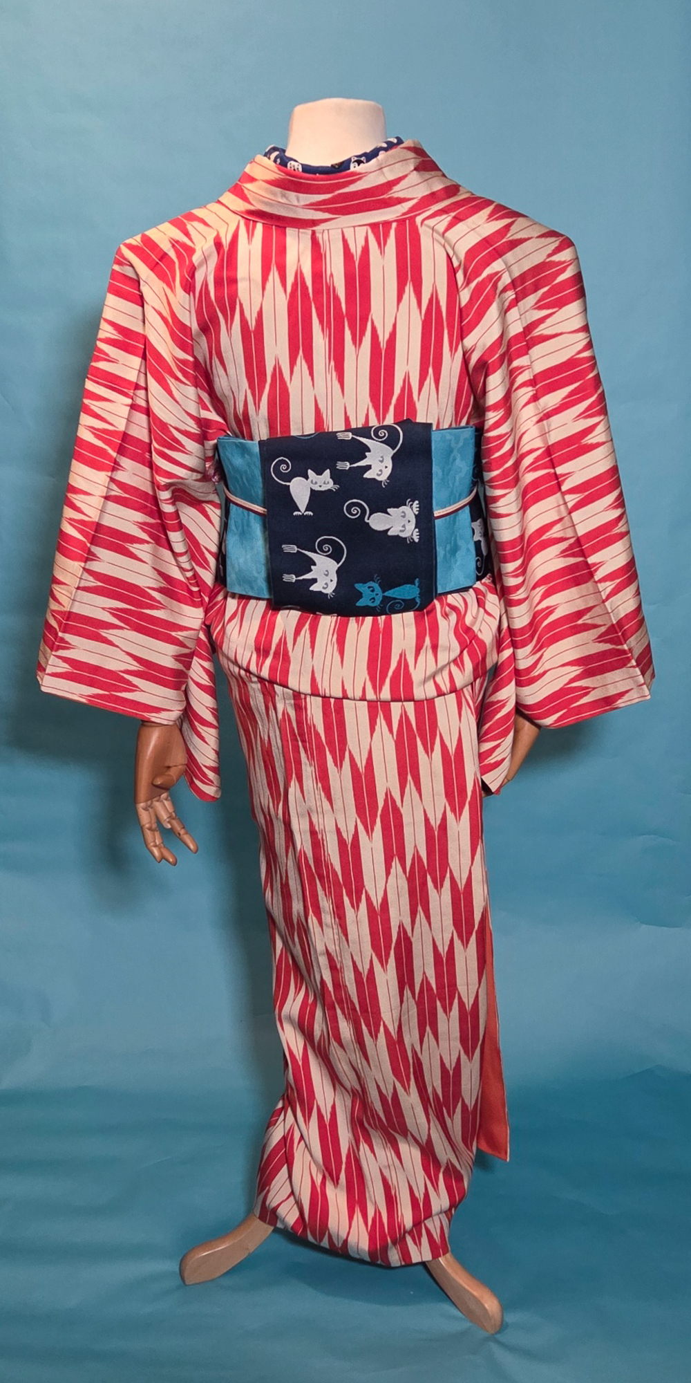
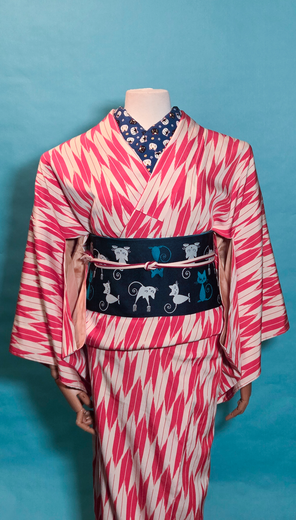
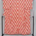
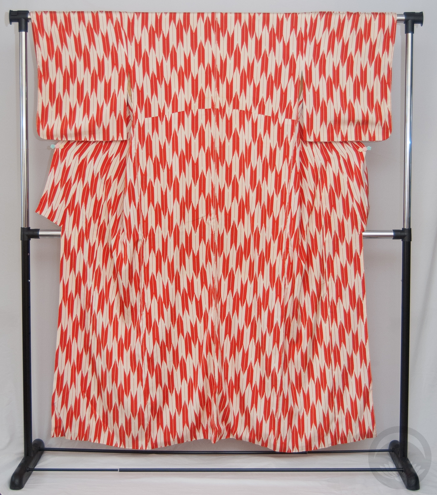
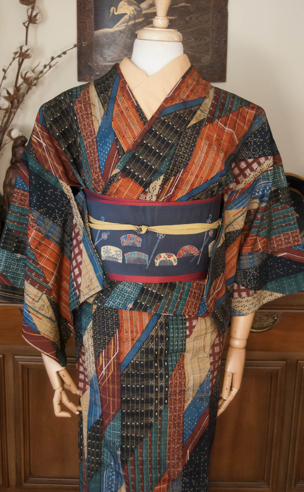
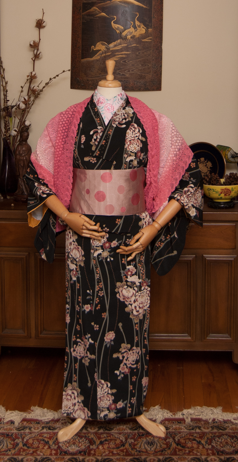
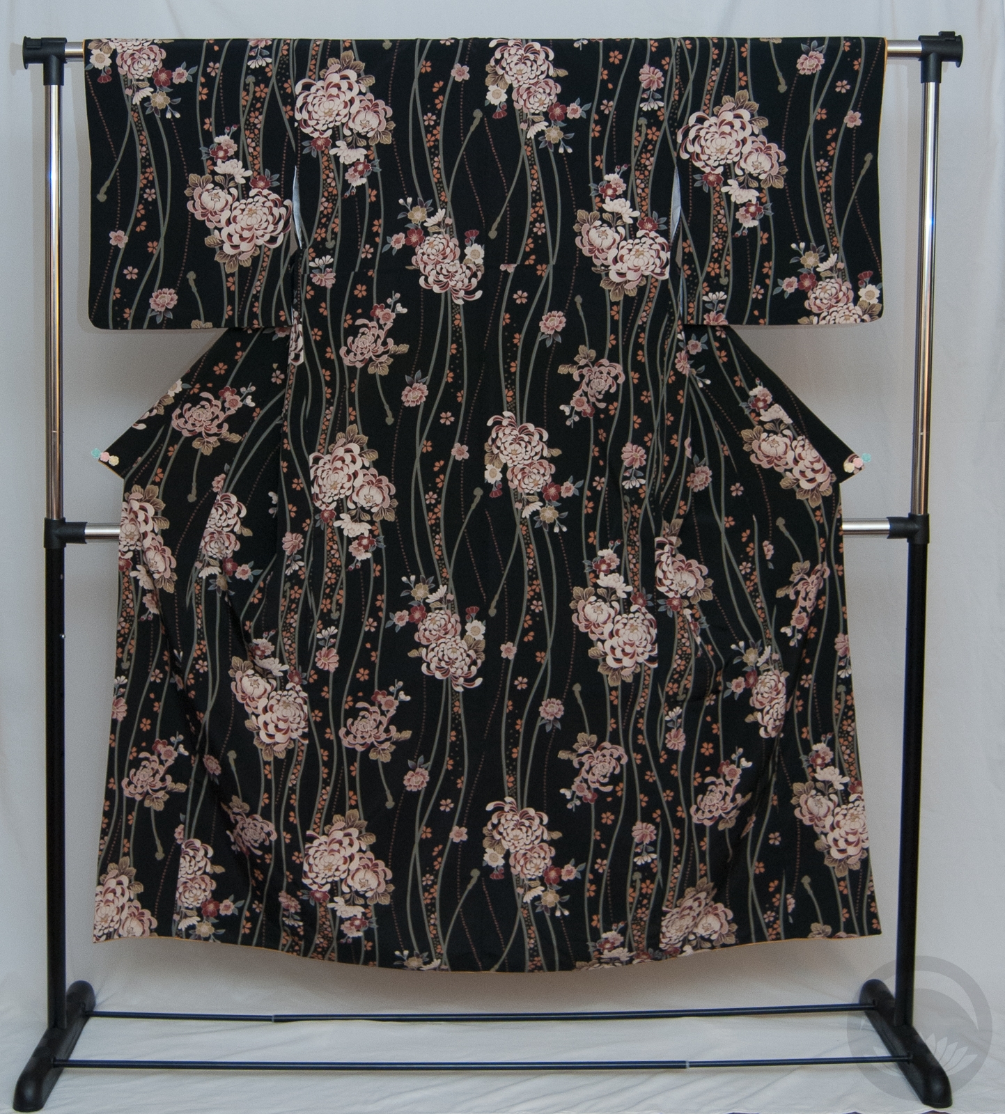
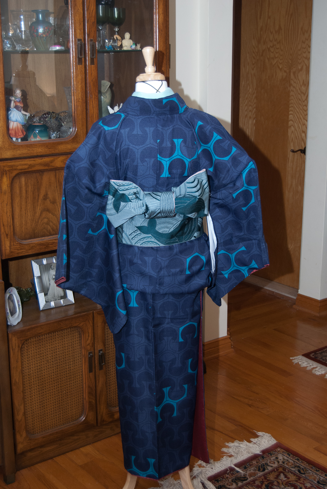
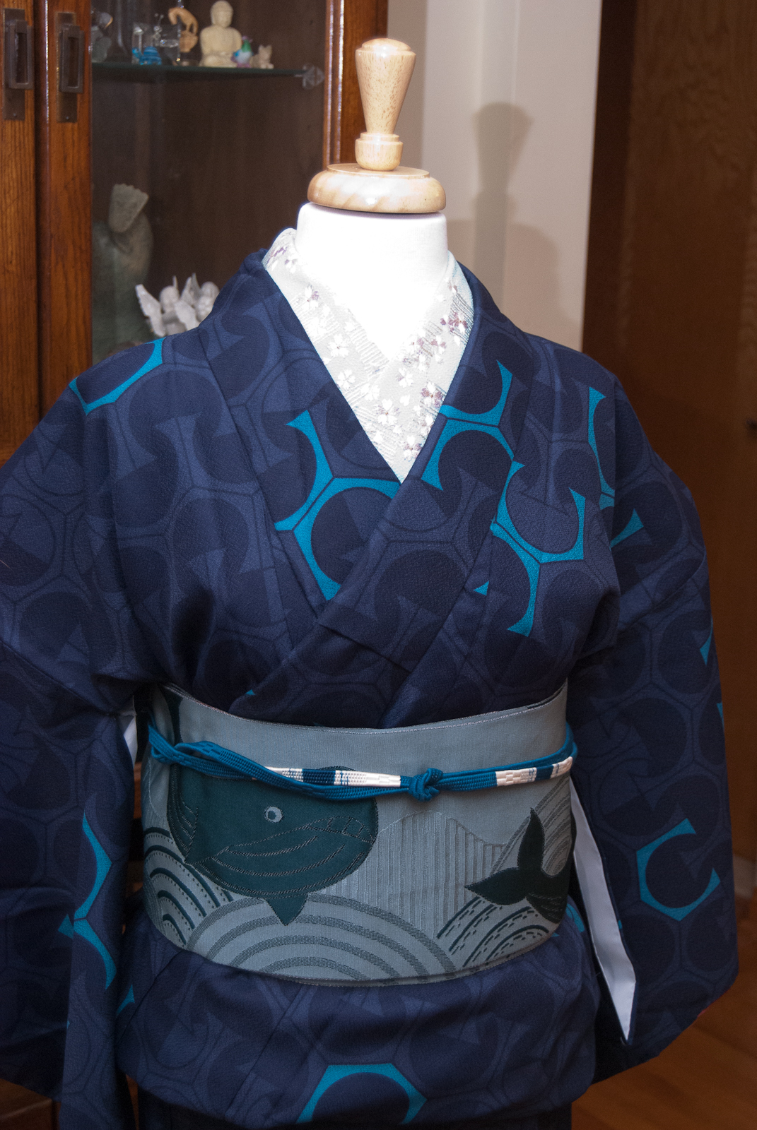
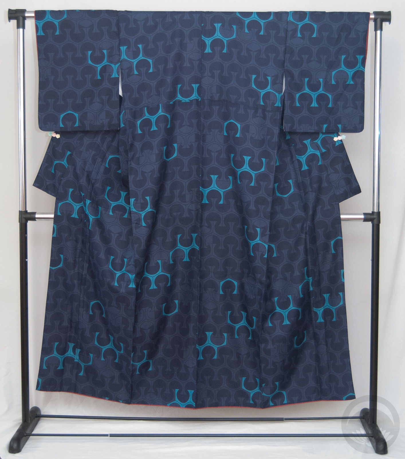
![]() Sadly, I don’t have any hockey-themed accessories, and I don’t think my father would be too thrilled with me using things like his grandfather’s Hockey Hall of Fame ring as an obi-kazari, so I had to work with the “tricolore” (three colours) emblematic of the Habs — red, with blue and white as accents. Our primary jersey colour is, of course, a nice bright red, and as is standard in the NHL the away jersey is white so of course this red-and-white yagasuri komon was the perfect base. I just always forget how danged huge it is, which makes putting it on the mannequin a little awkward. It also looks a bit pinker in these photos; blame the light in my room. In person it’s definitely a true red.
Sadly, I don’t have any hockey-themed accessories, and I don’t think my father would be too thrilled with me using things like his grandfather’s Hockey Hall of Fame ring as an obi-kazari, so I had to work with the “tricolore” (three colours) emblematic of the Habs — red, with blue and white as accents. Our primary jersey colour is, of course, a nice bright red, and as is standard in the NHL the away jersey is white so of course this red-and-white yagasuri komon was the perfect base. I just always forget how danged huge it is, which makes putting it on the mannequin a little awkward. It also looks a bit pinker in these photos; blame the light in my room. In person it’s definitely a true red.
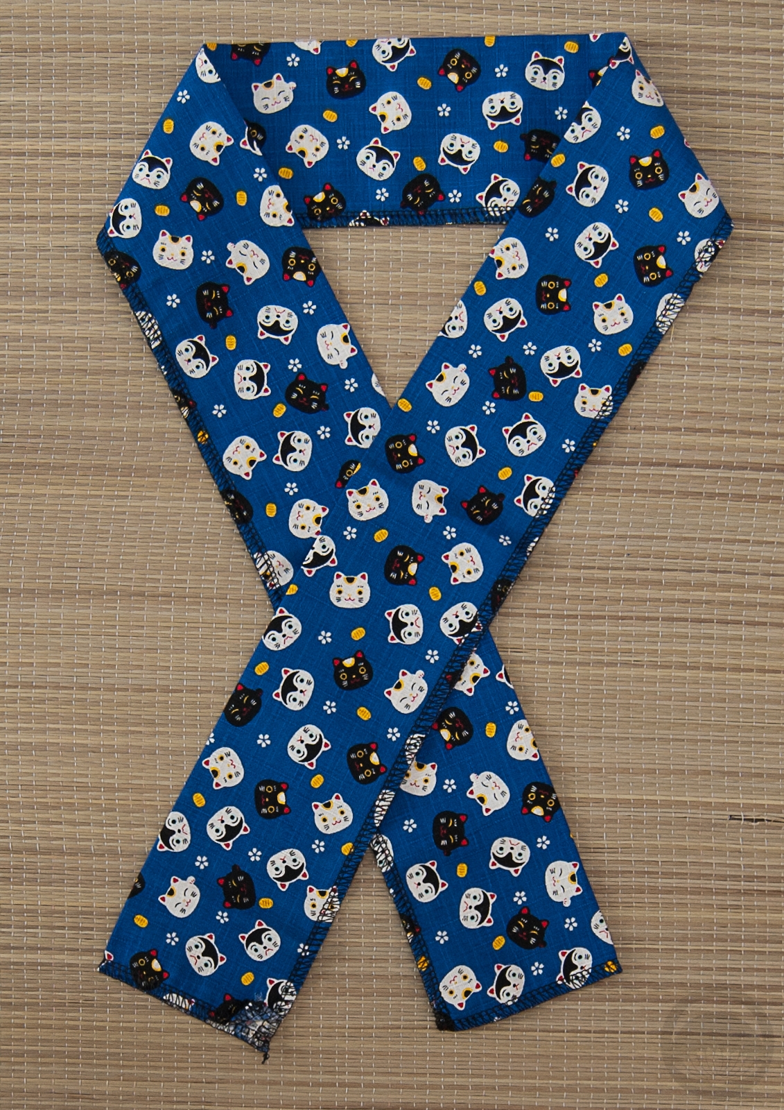
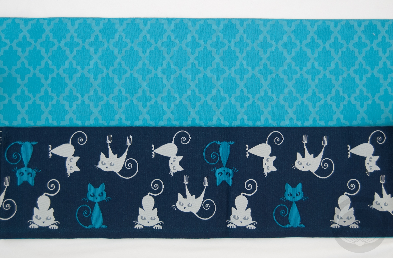
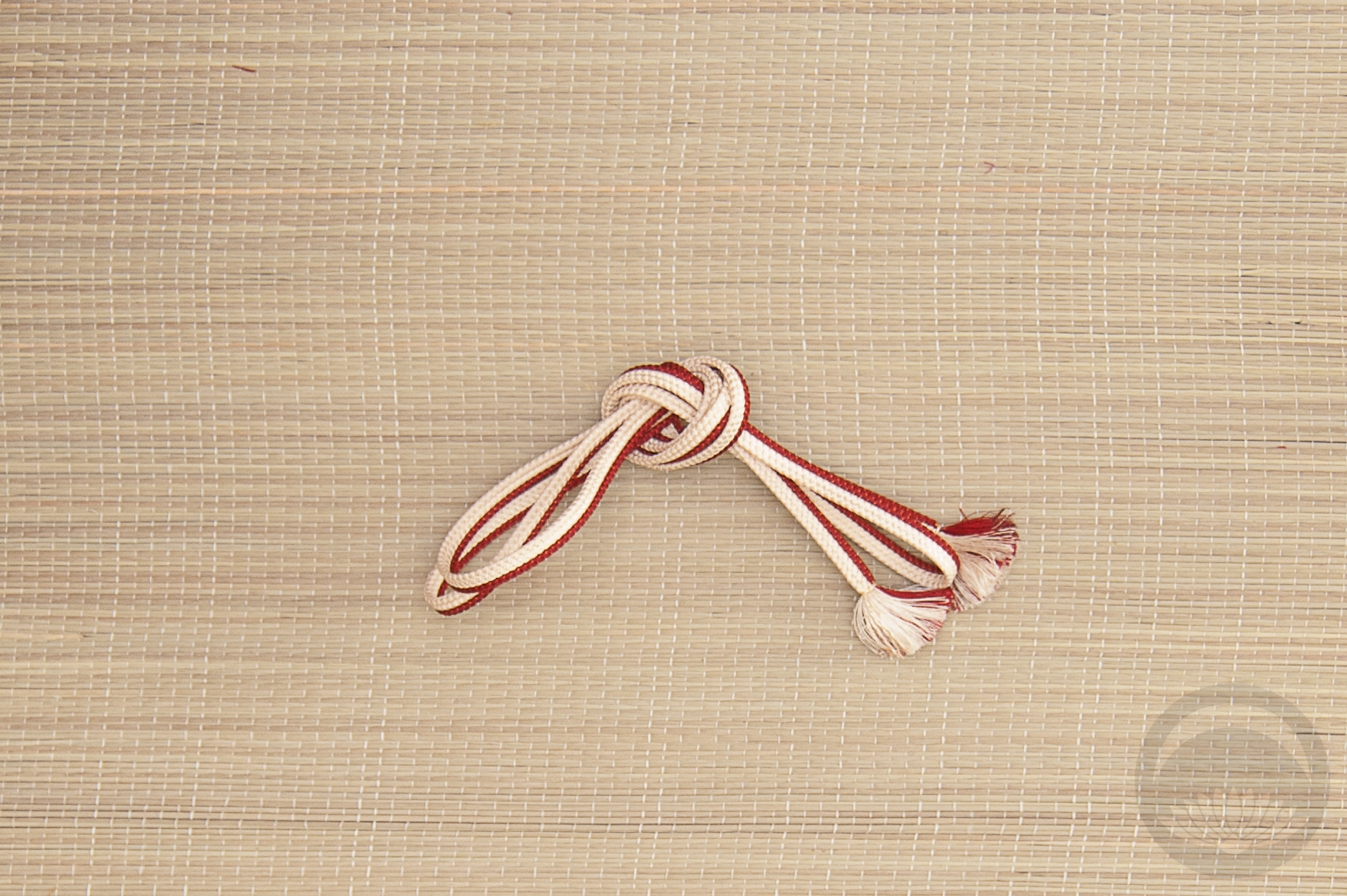
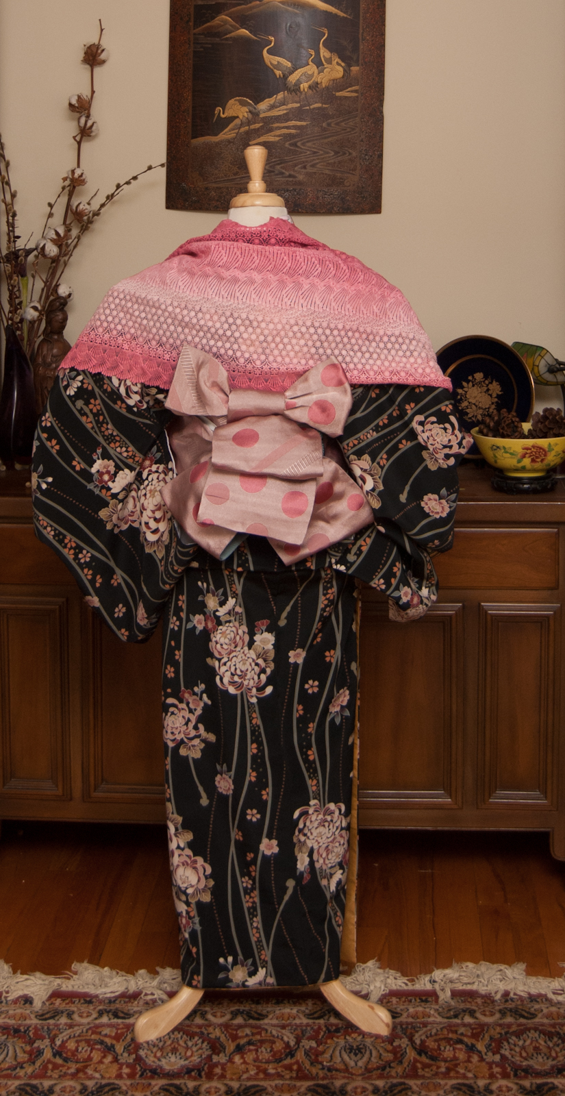
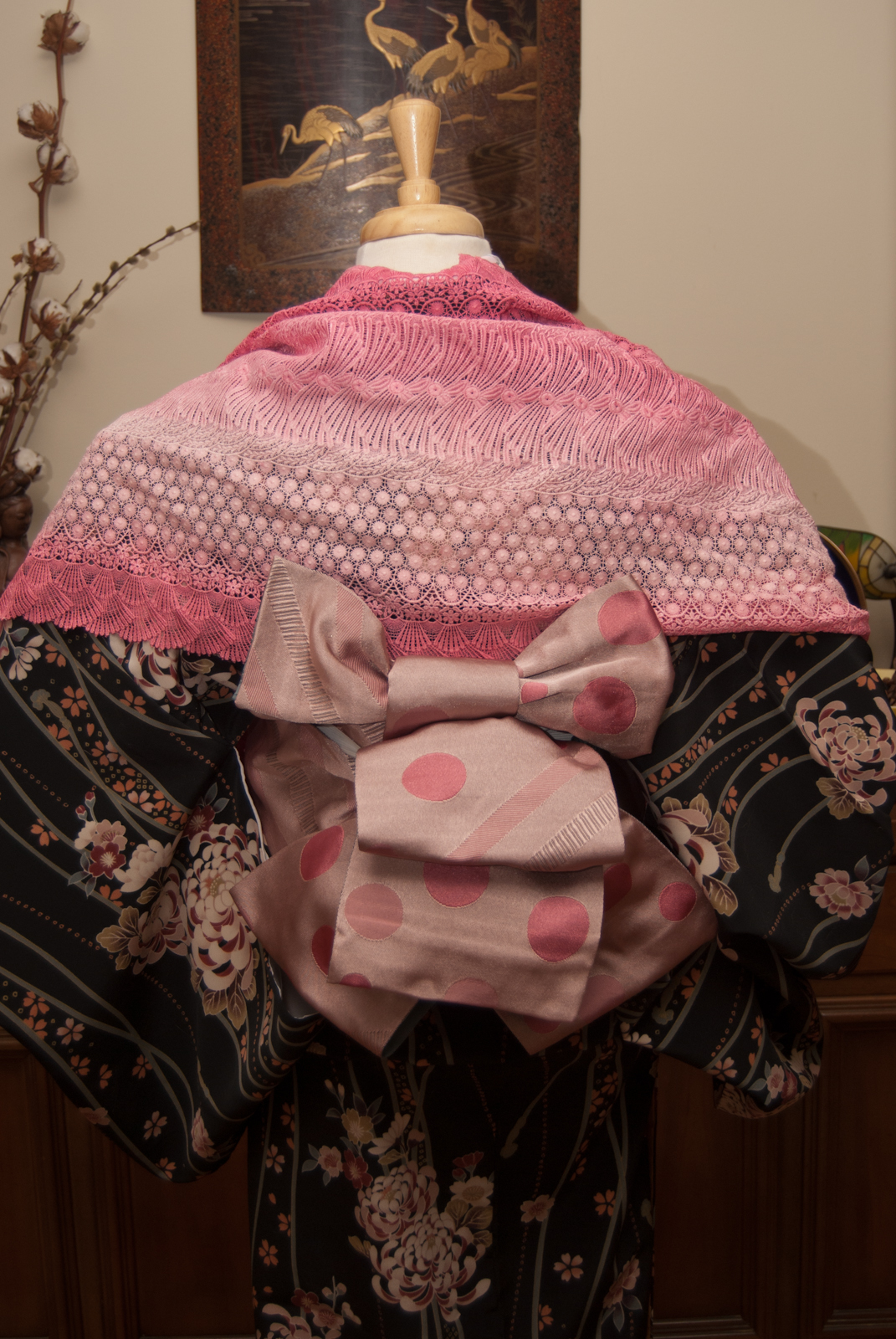
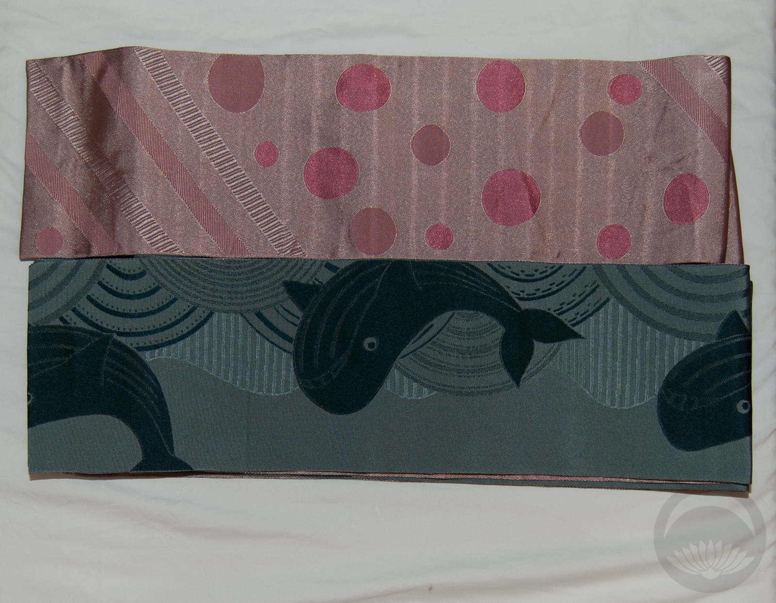
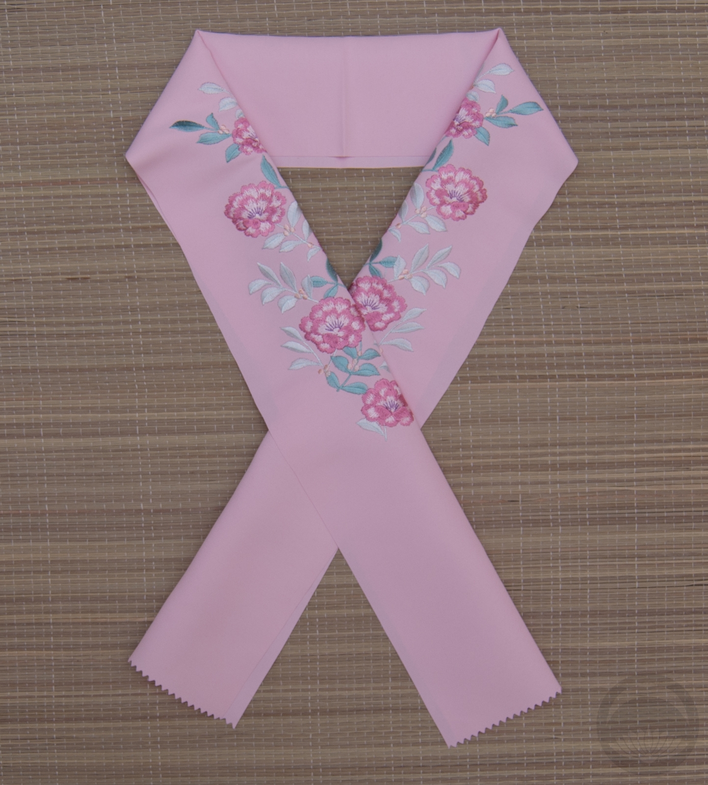
Sadly I don’t have any obi that are quite the right shades of blue, but this one works pretty well. I tied it in a karuta musubi because the square shape with the red and white lines of the obijime reminds me a bit of an ice rink, if you squint! There’s no significance to the cat motif, I was just going for colour cohesion. It does tie in nicely with the blues and white and the motif on the haneri though, doesn’t it?
How about you — are you a hockey fan? Are you watching the playoffs, and rooting for any particular team? If so, let me know so I can tell you how factually incorrect you are (I kid, I kid).
Items used in this coordination
-
- Yagasuri
-
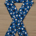
- Cotton Neko & Inu
-
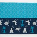
- Blue Cats/Blue
-
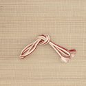
- Red & White
*(this literally means tricolour until the end or tricolour all the way, referencing the three team colours)


 Bebe Taian
 CHOKO Blog
 Gion Kobu