
First of all, I’d like to take a moment to thank you for your patience, support, and faith in me. It’s been a very long few months. As you may know, my bedroom flooded a few months back. Mercifully, my kimono are stored in a separate room upstairs, so they were safe. But my life got turned quite upside-down while my room was being renovated and restored. Then the holidays hit, and as I’ve mentioned before, I work in a toy store so things get very hectic around then. To top things all off, I somehow forgot to put my anti-depressant/anti-anxiety medication in my pill organiser at the end of December. If anyone’s gone off anti-depressants cold turkey, you know how rough it can be. I did that without even realising what I’d done wrong, so January was a very, very hard month for me.
Thankfully, that’s all behind me now. My room is complete, work has definitely quieted down, and my medication is stable again. I knew it was time to get back into the swing of things and start blogging properly again.

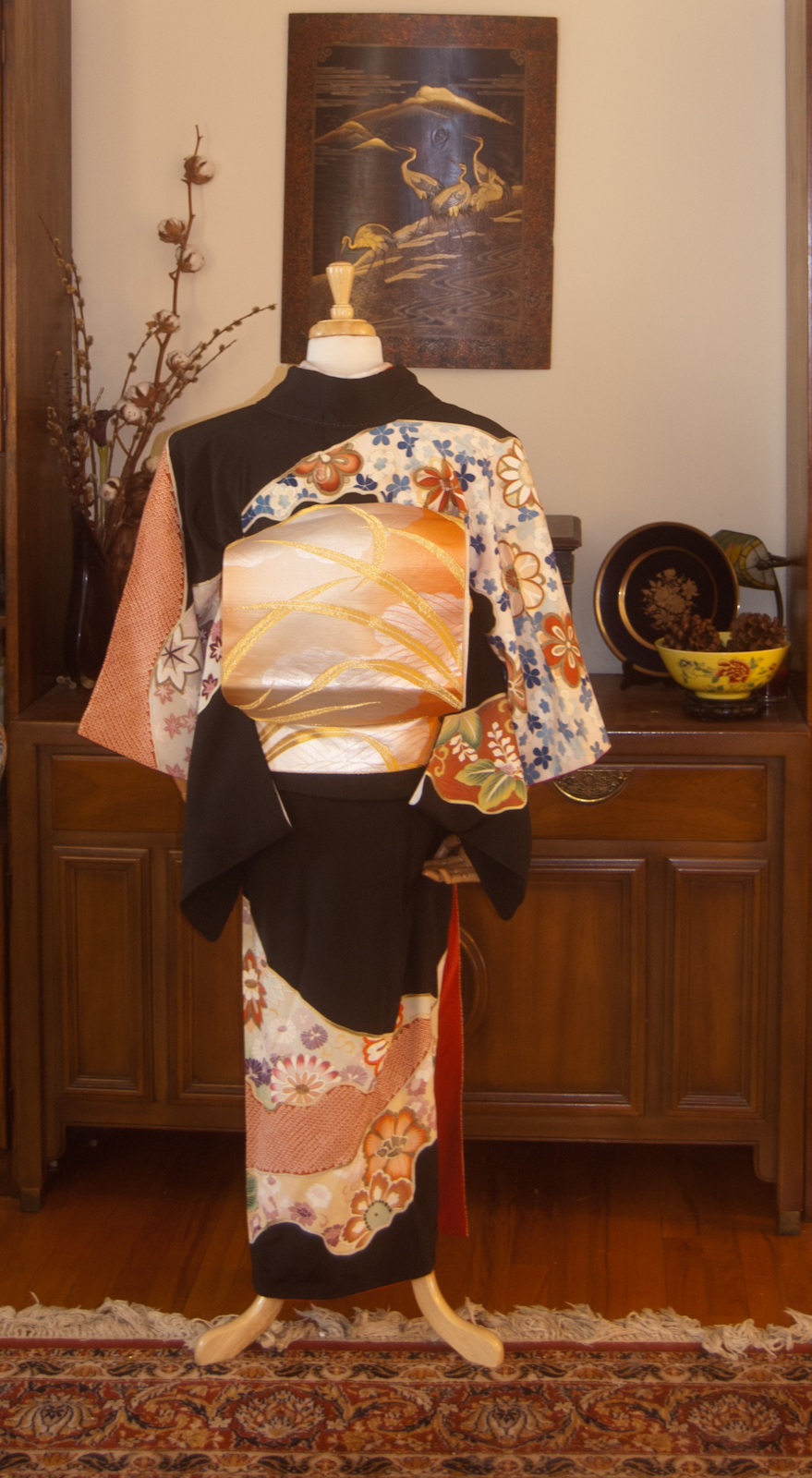
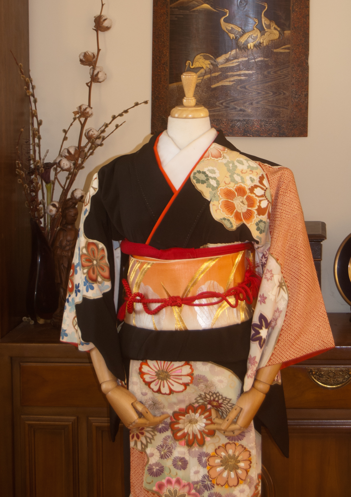
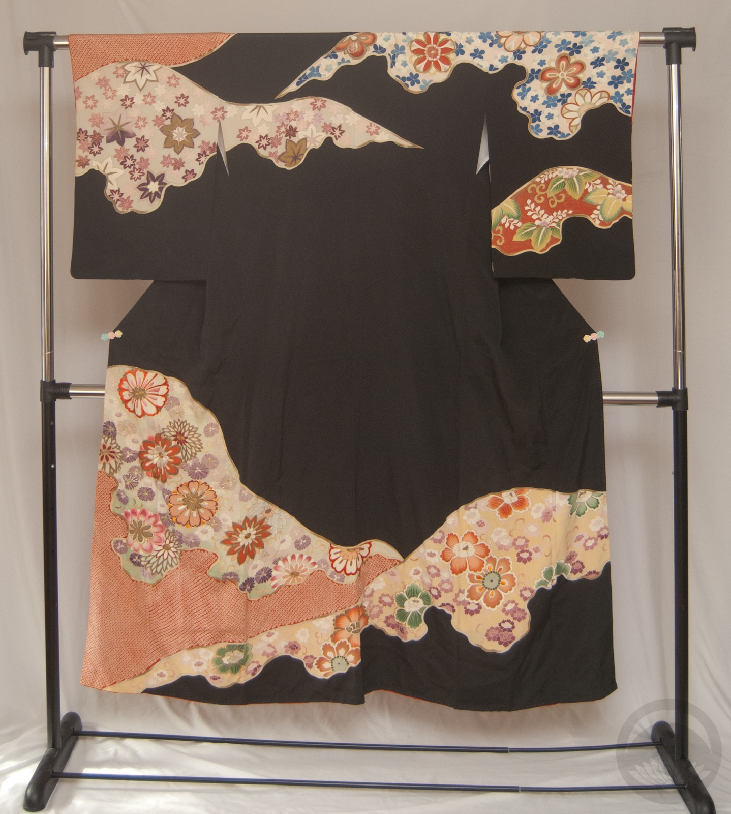
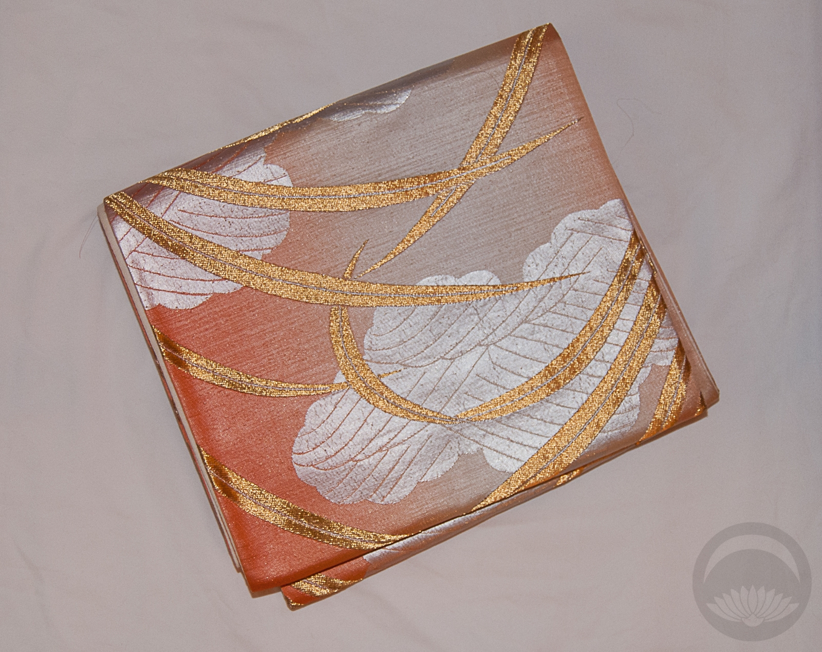
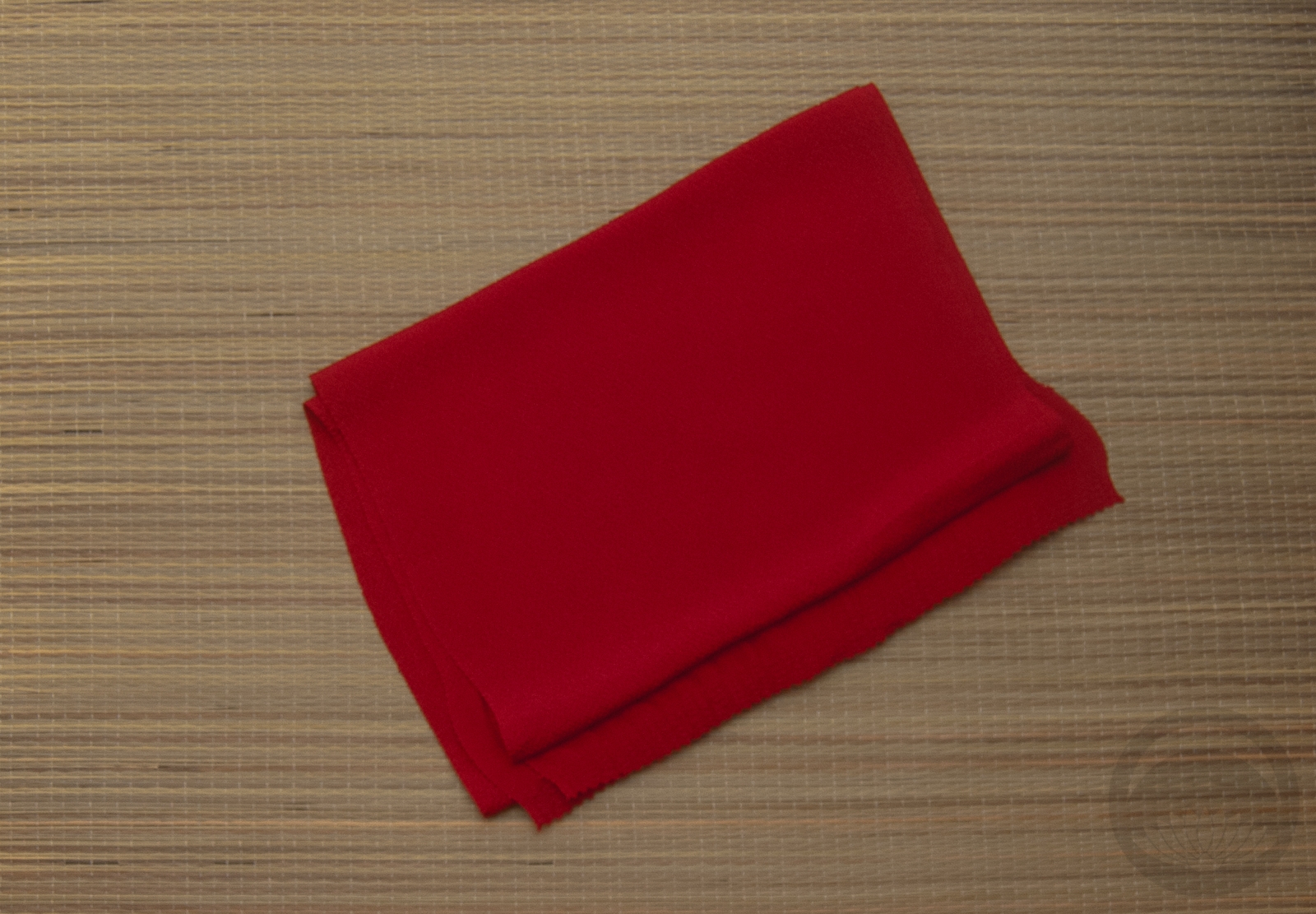
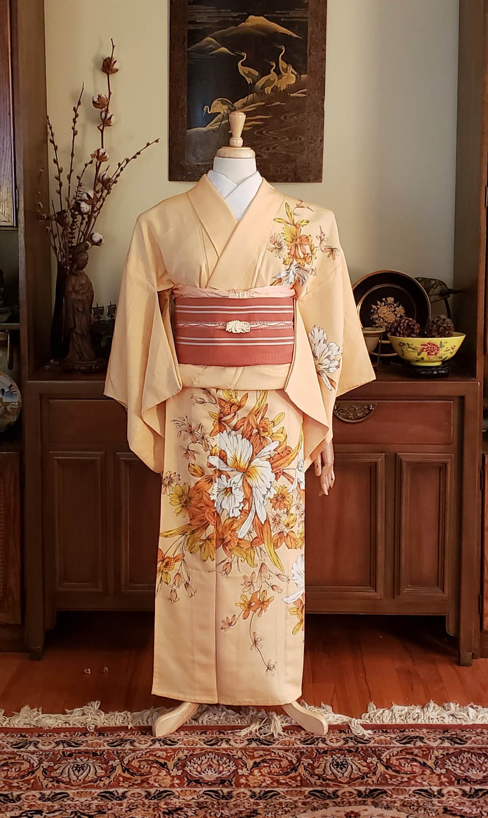
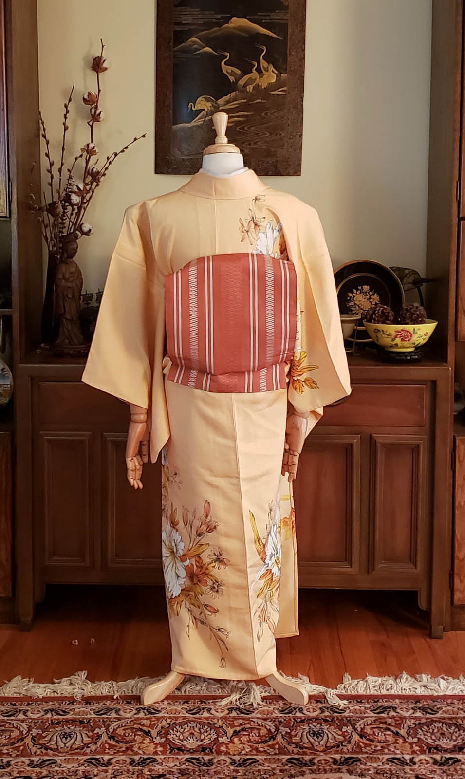
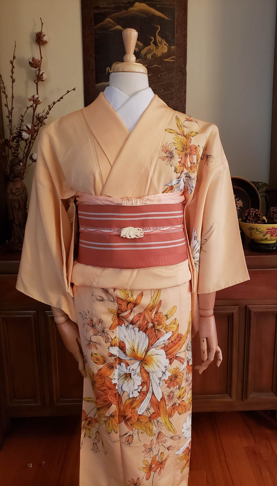
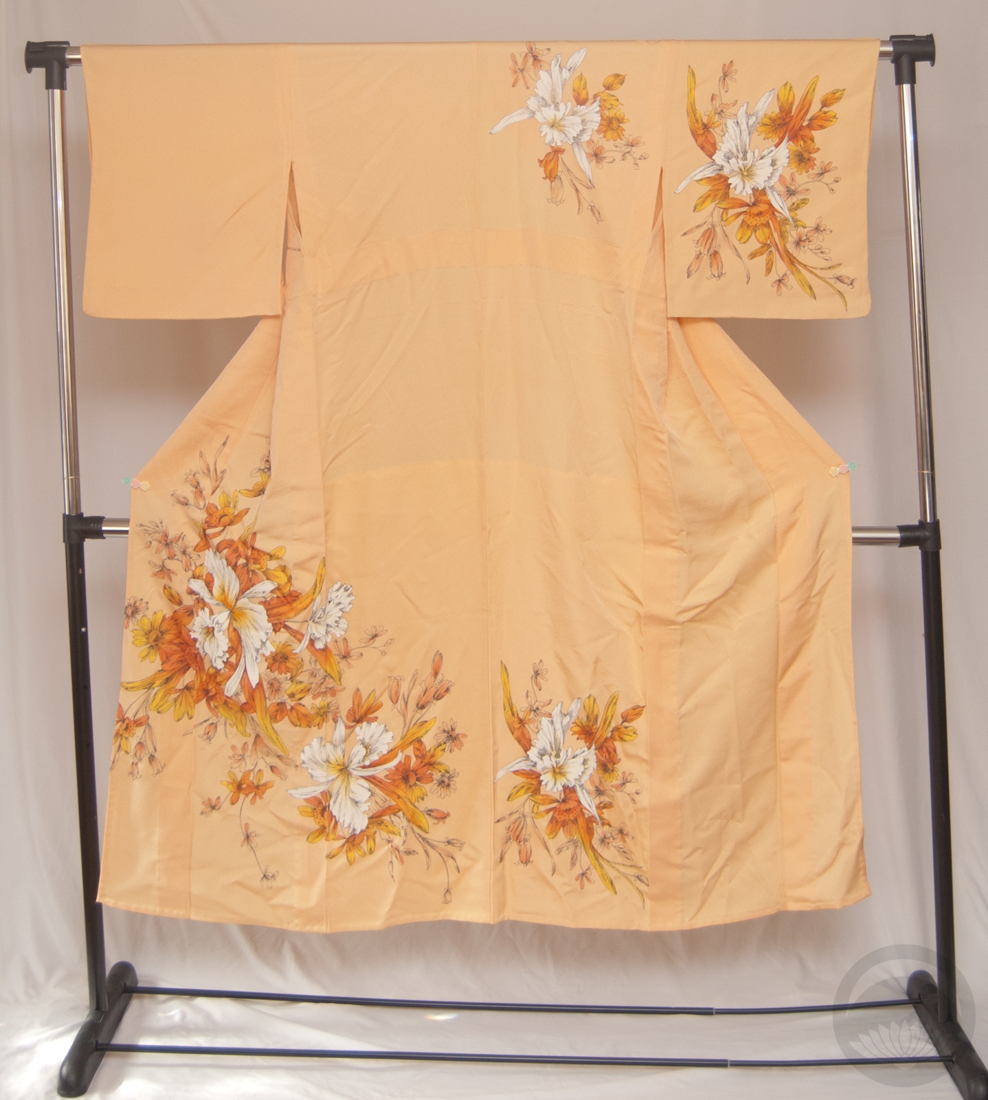
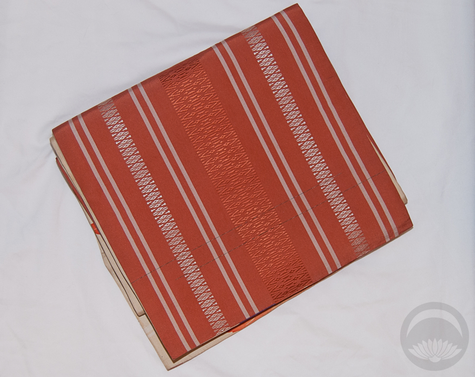
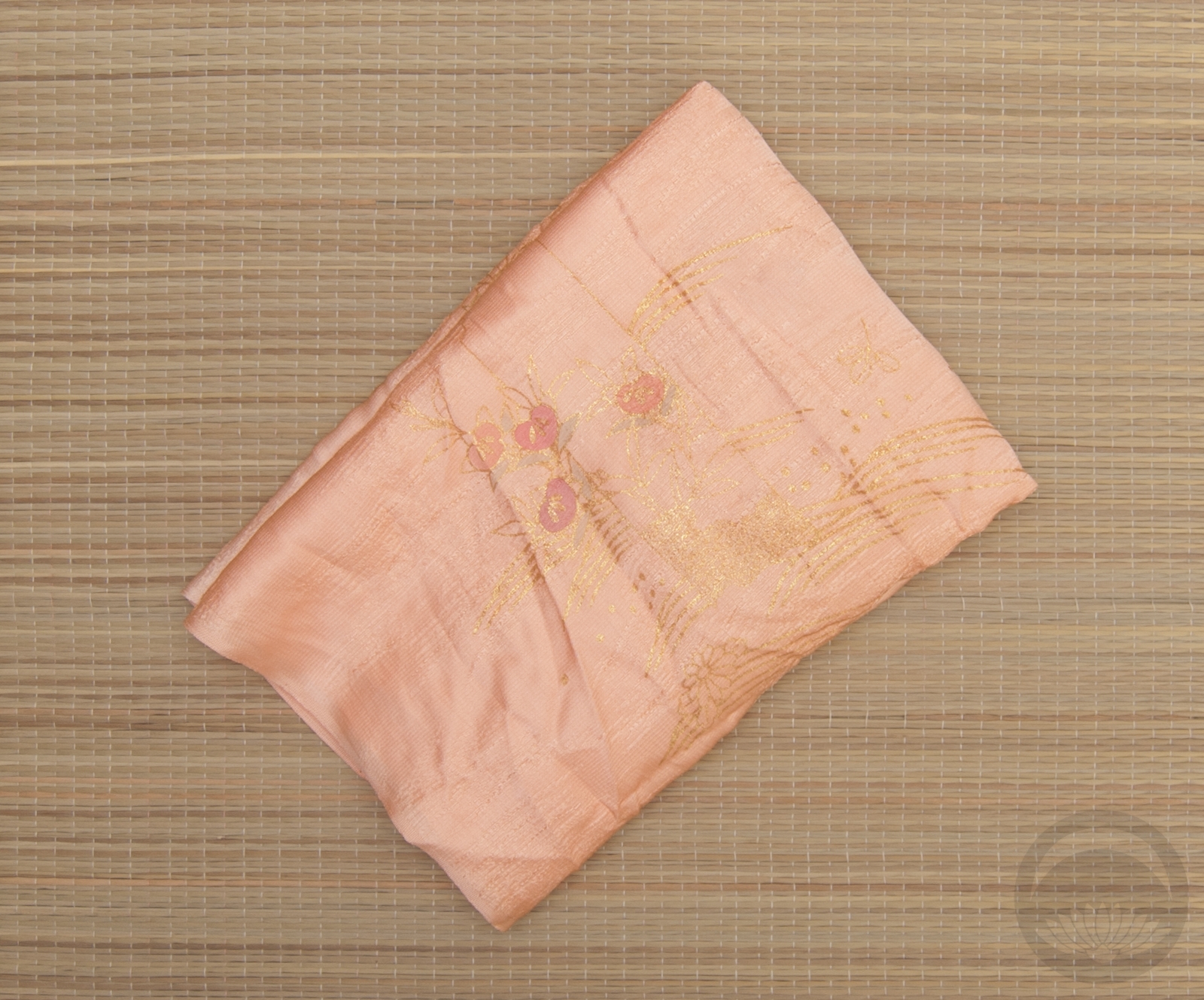
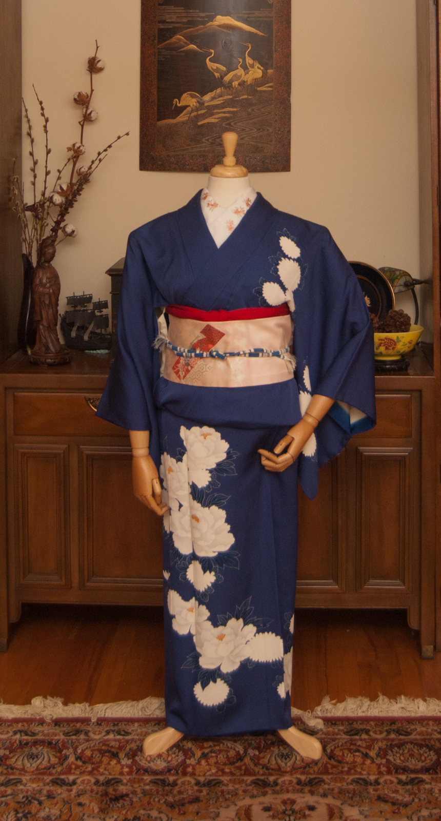
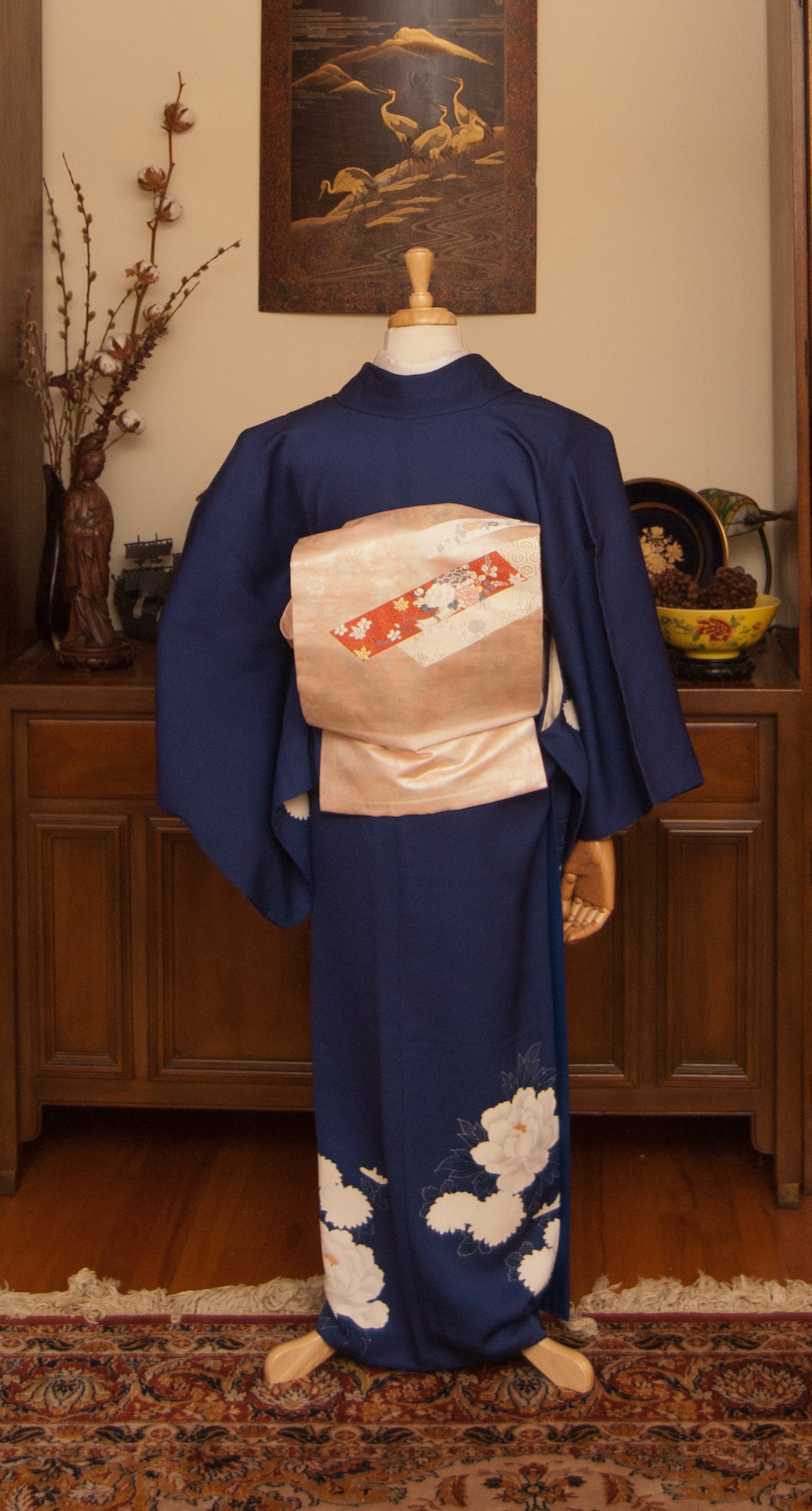
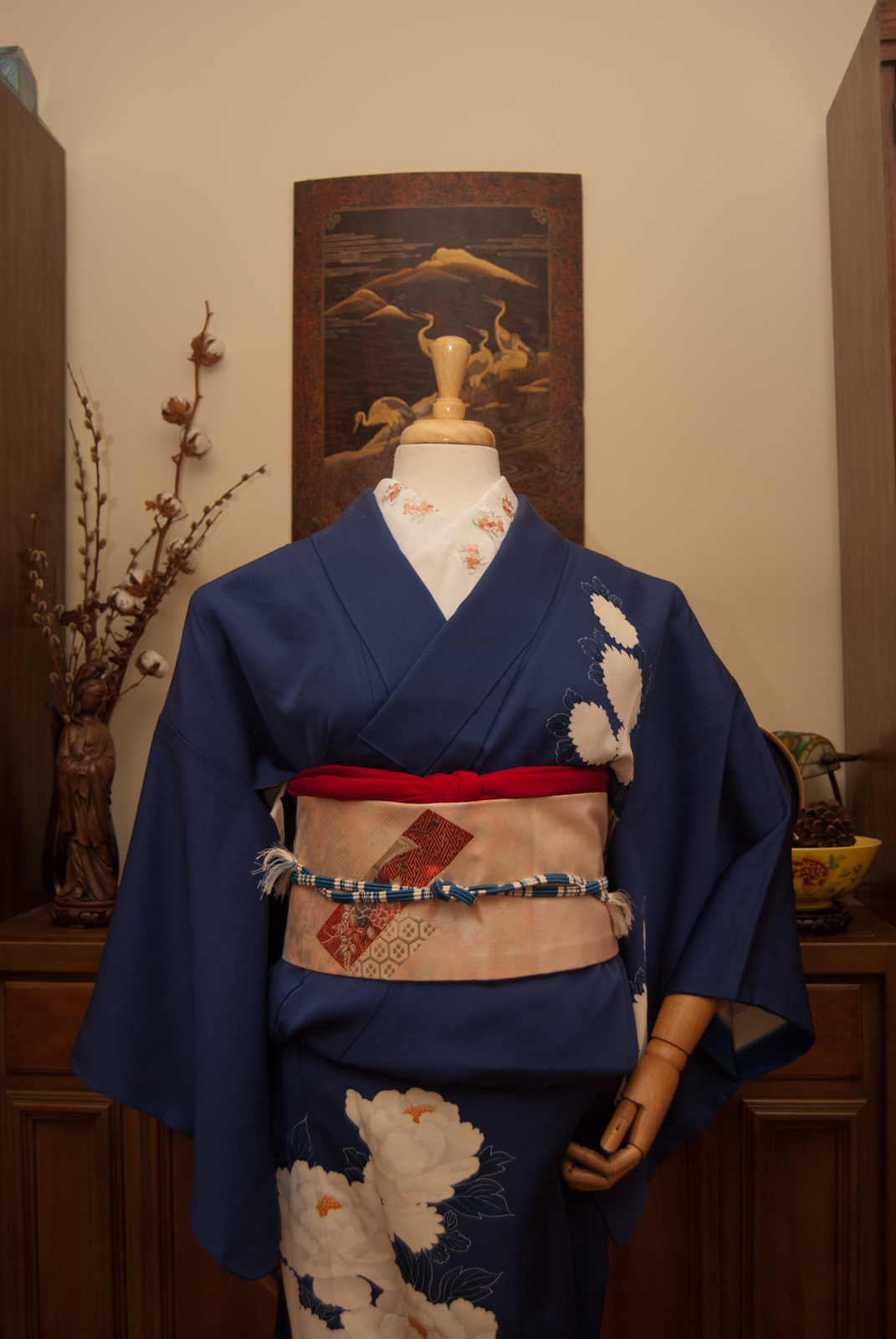
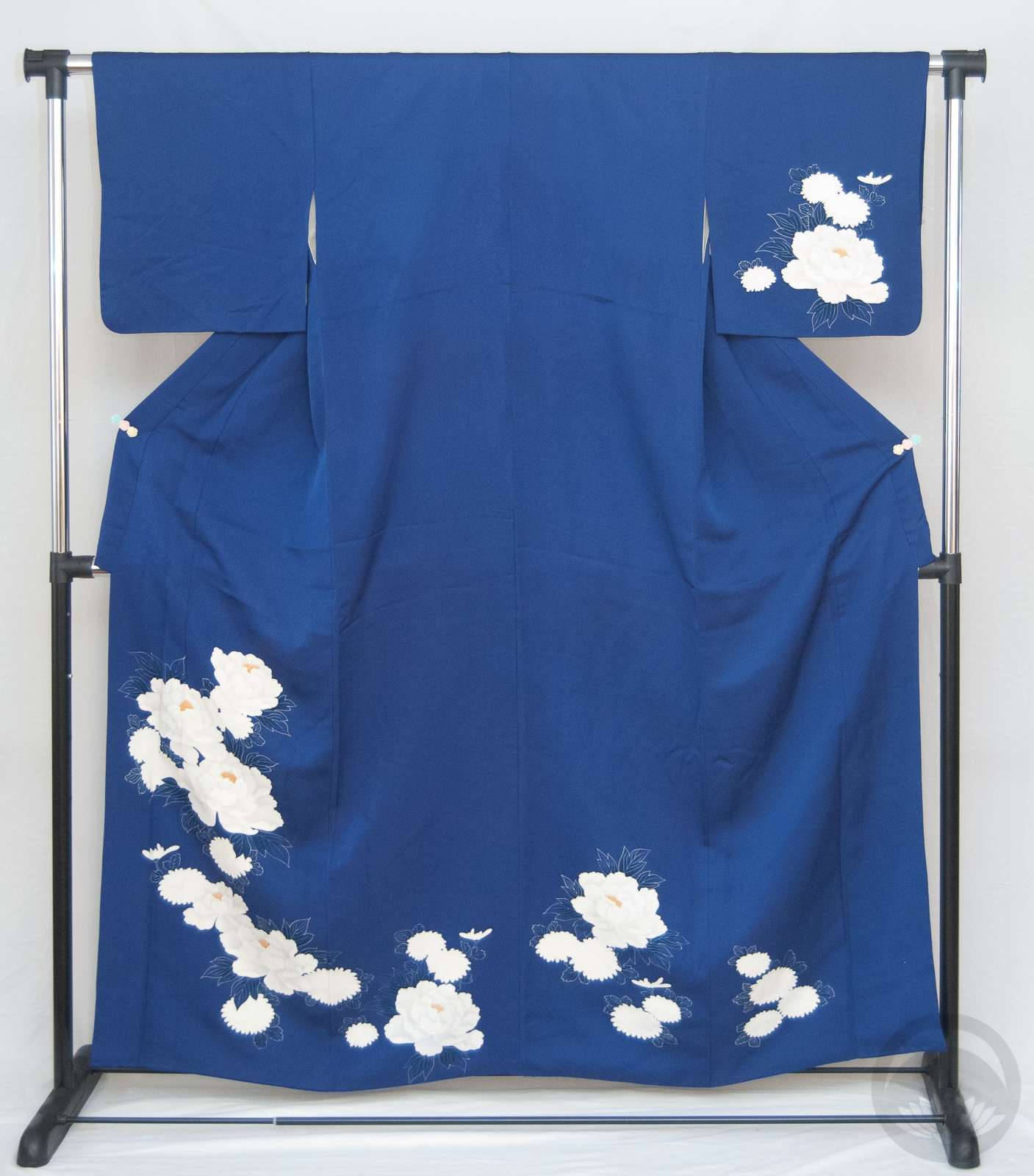
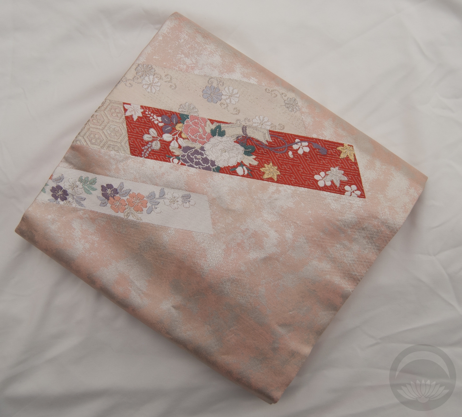
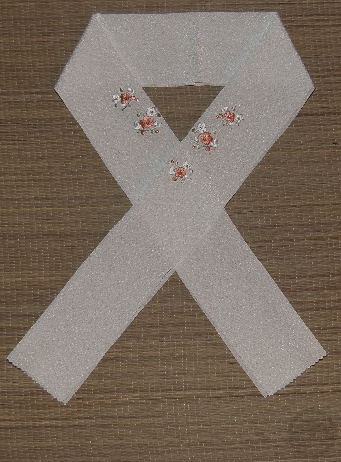
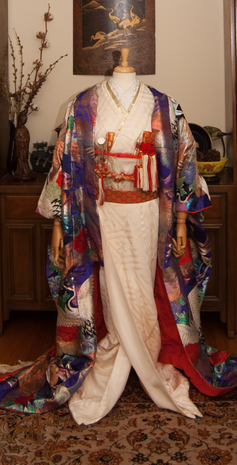
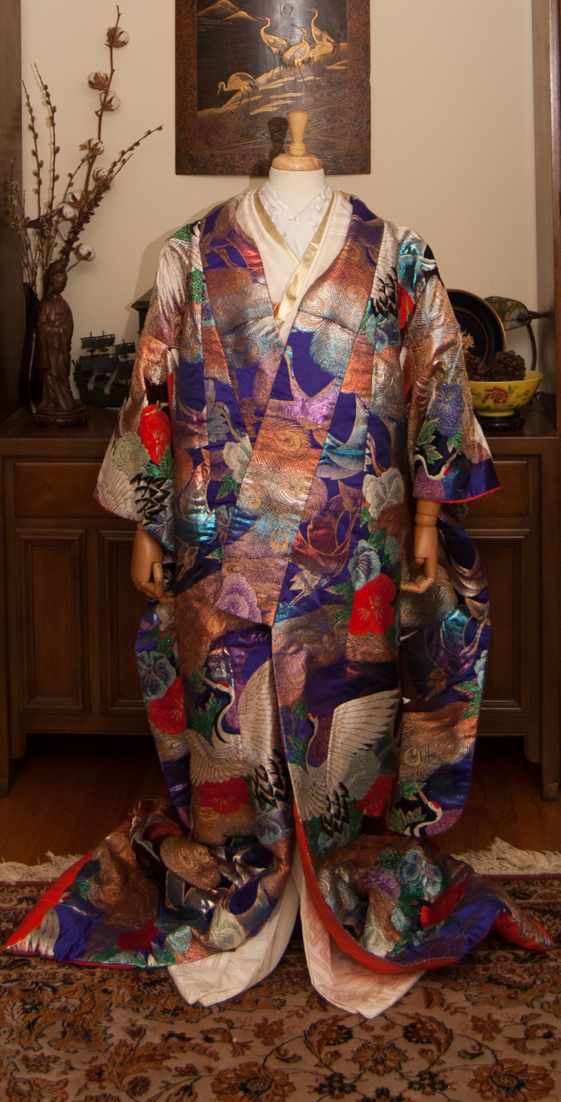
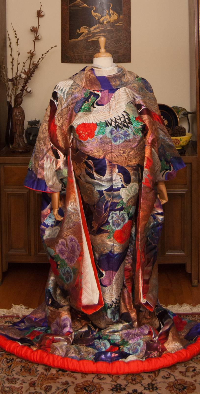
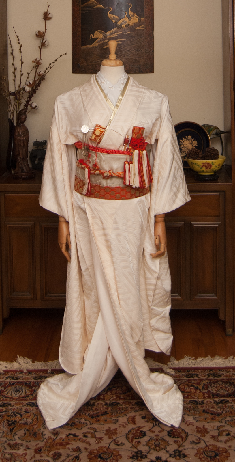
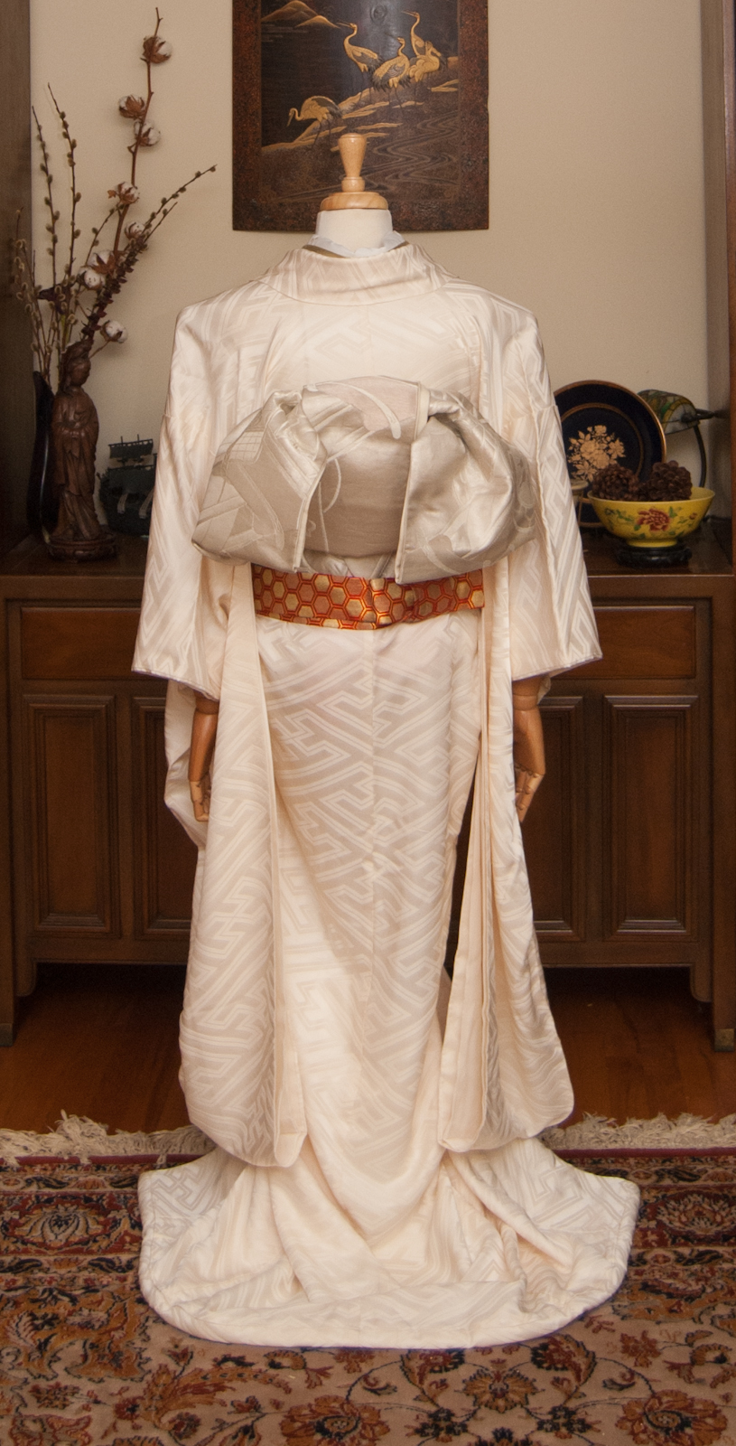
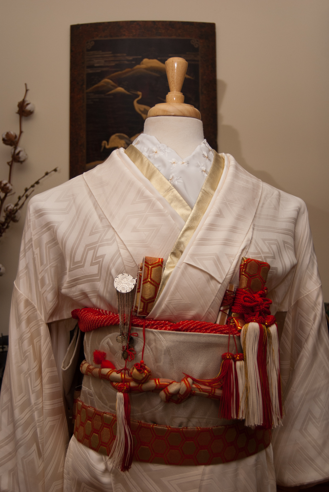
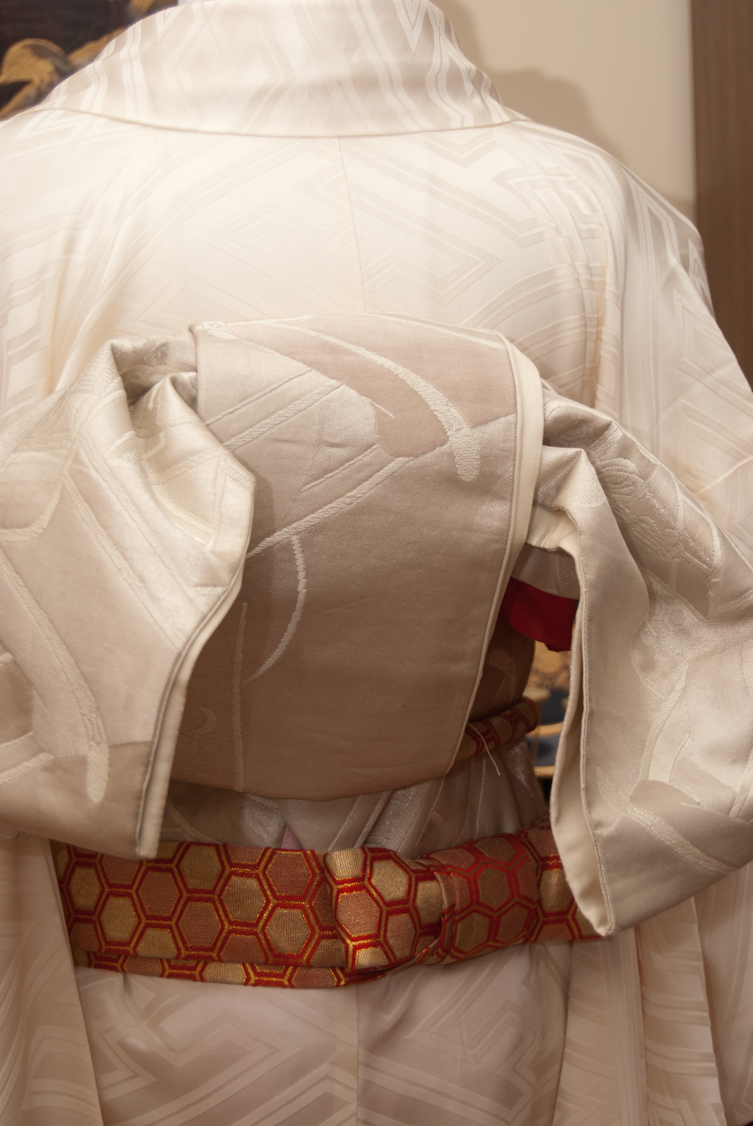
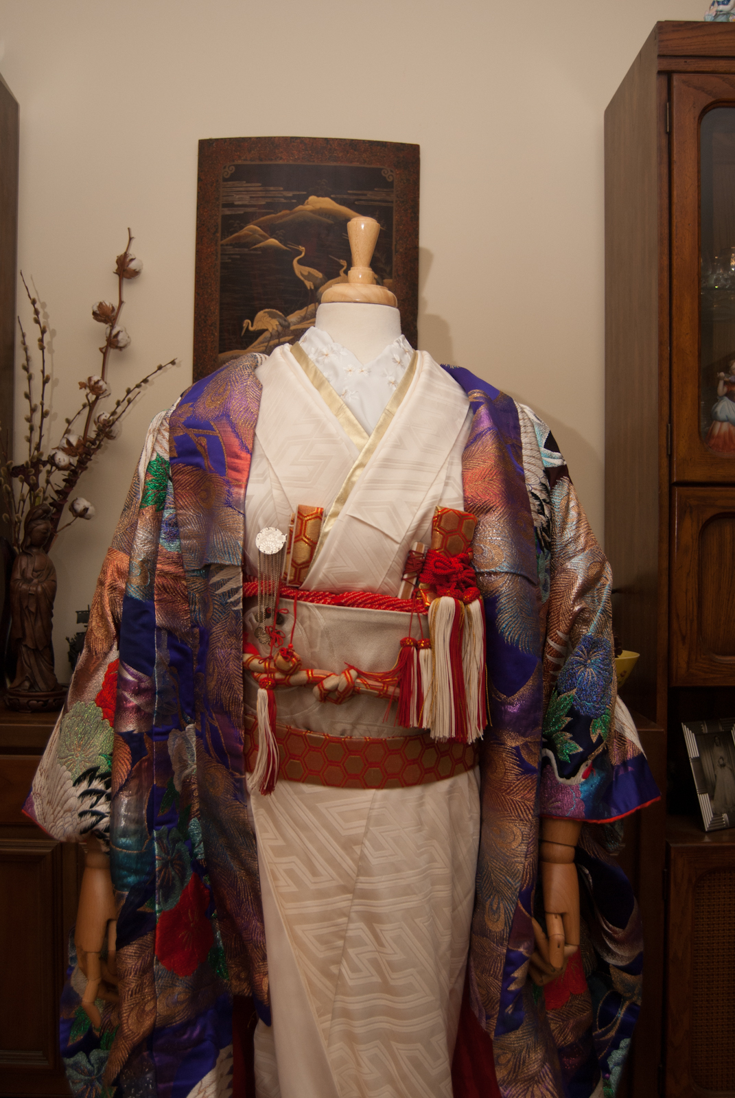
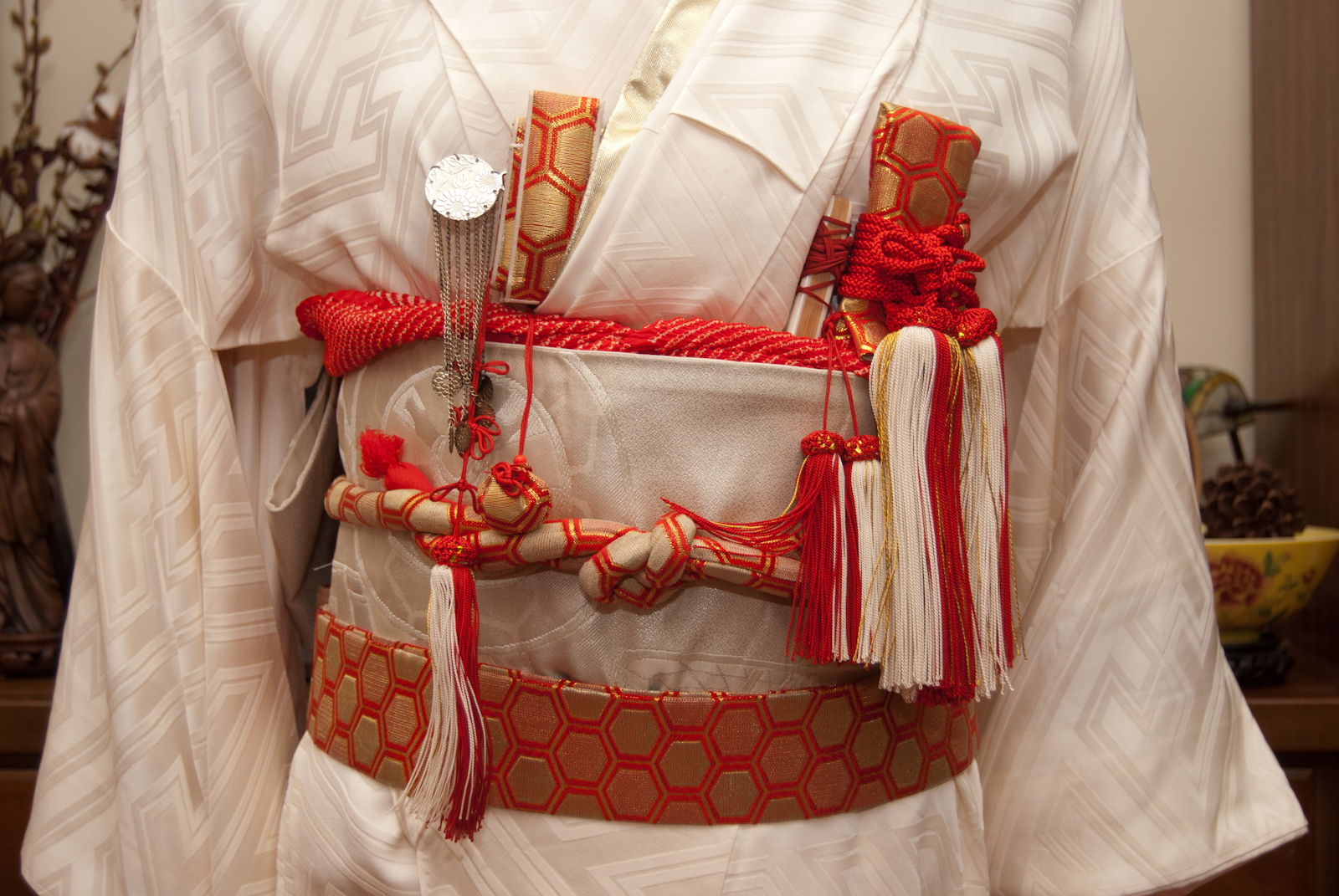
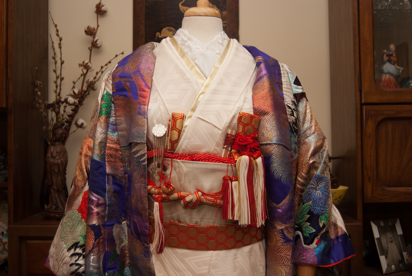
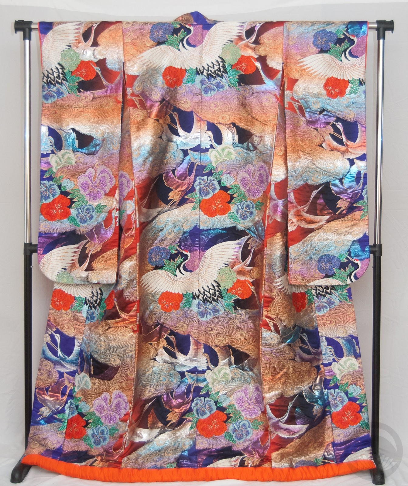
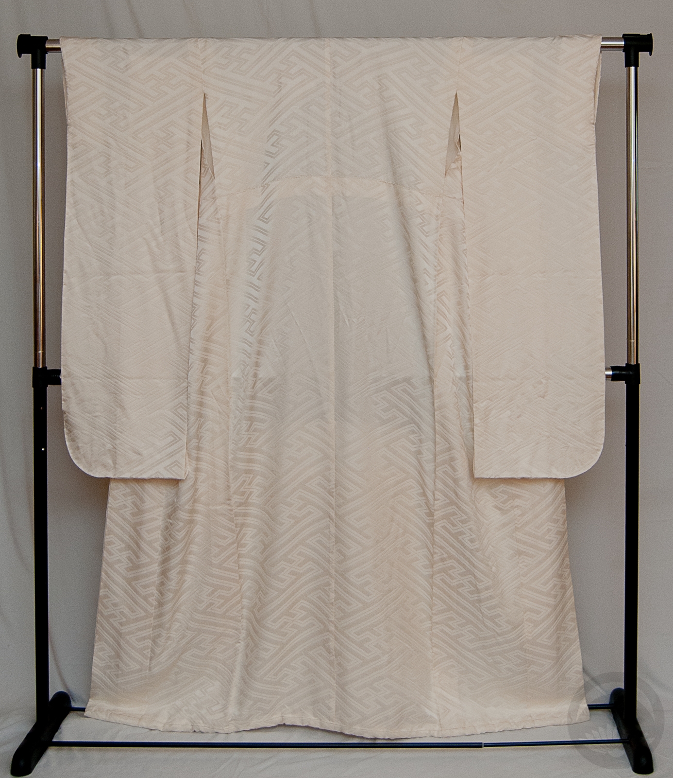
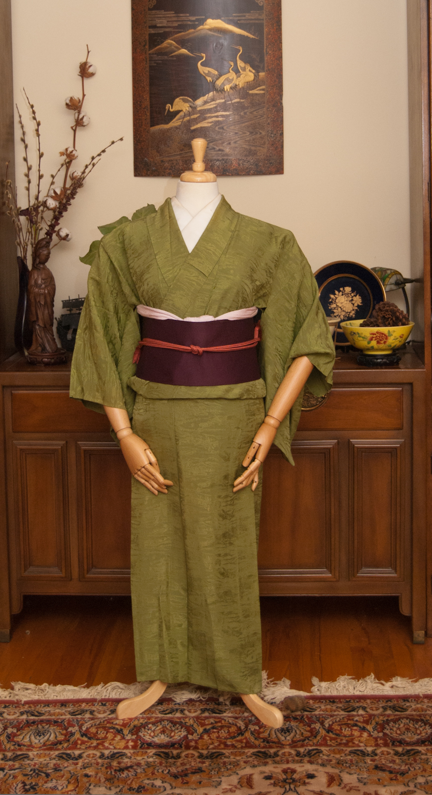
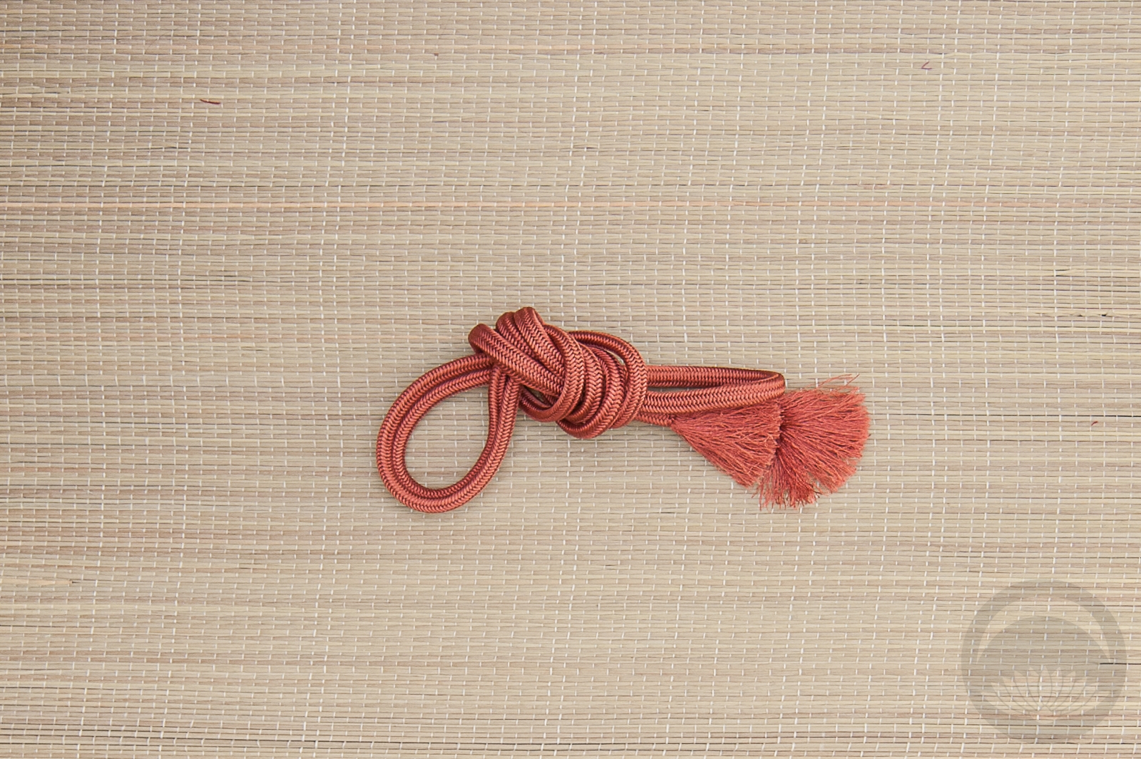
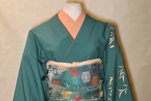
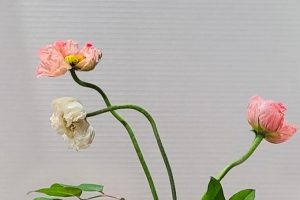
I received this gorgeous kimono as a birthday gift from Sophie back in November, and I think it was the perfect piece to use to celebrate my return. I love the variety of colour and pattern, and I’m always a sucker for black-based kimono that aren’t kurotomesode. It came with the red date-eri already attached, so using more red accessories was a no-brainer. I felt that the orange and gold obi had a similar showa-fabulous vibe, and the colours are very harmonious. It’s not a risky or adventurous coordination by any means, but it works well.
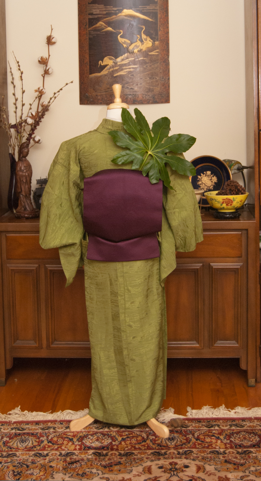
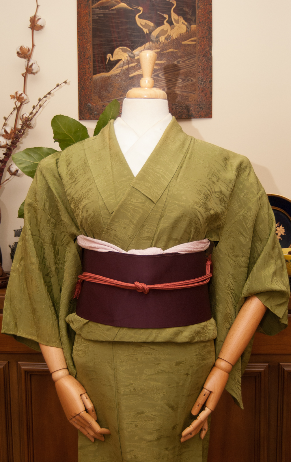
Honestly, I was worried I’d be rusty and out of practice, but kitsuke really is like riding a bicycle. After a few minutes, the muscle memory just takes over.
I also have some exciting news to share. Costume-Con 38 is taking place here in Montreal next month and I will be doing three panels; two kimono dressing workshops and one lecture on the history and evolution of kimono. If you’ll be attending, I’d love to see you!
Thank you again if you’ve stuck around during my little break, I really do appreciate the support. <3
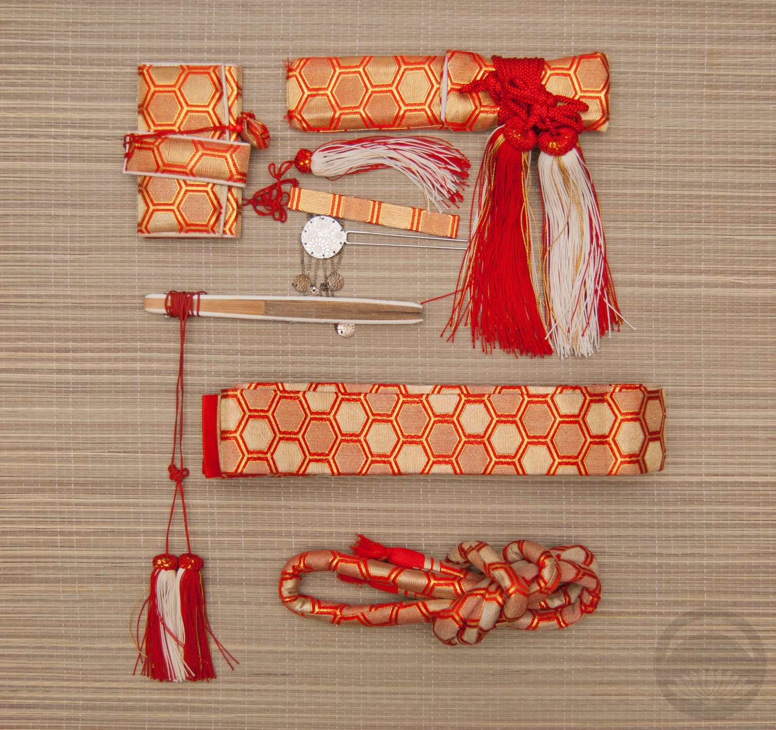
Items used in this coordination
-
- Black Floral
-
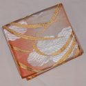
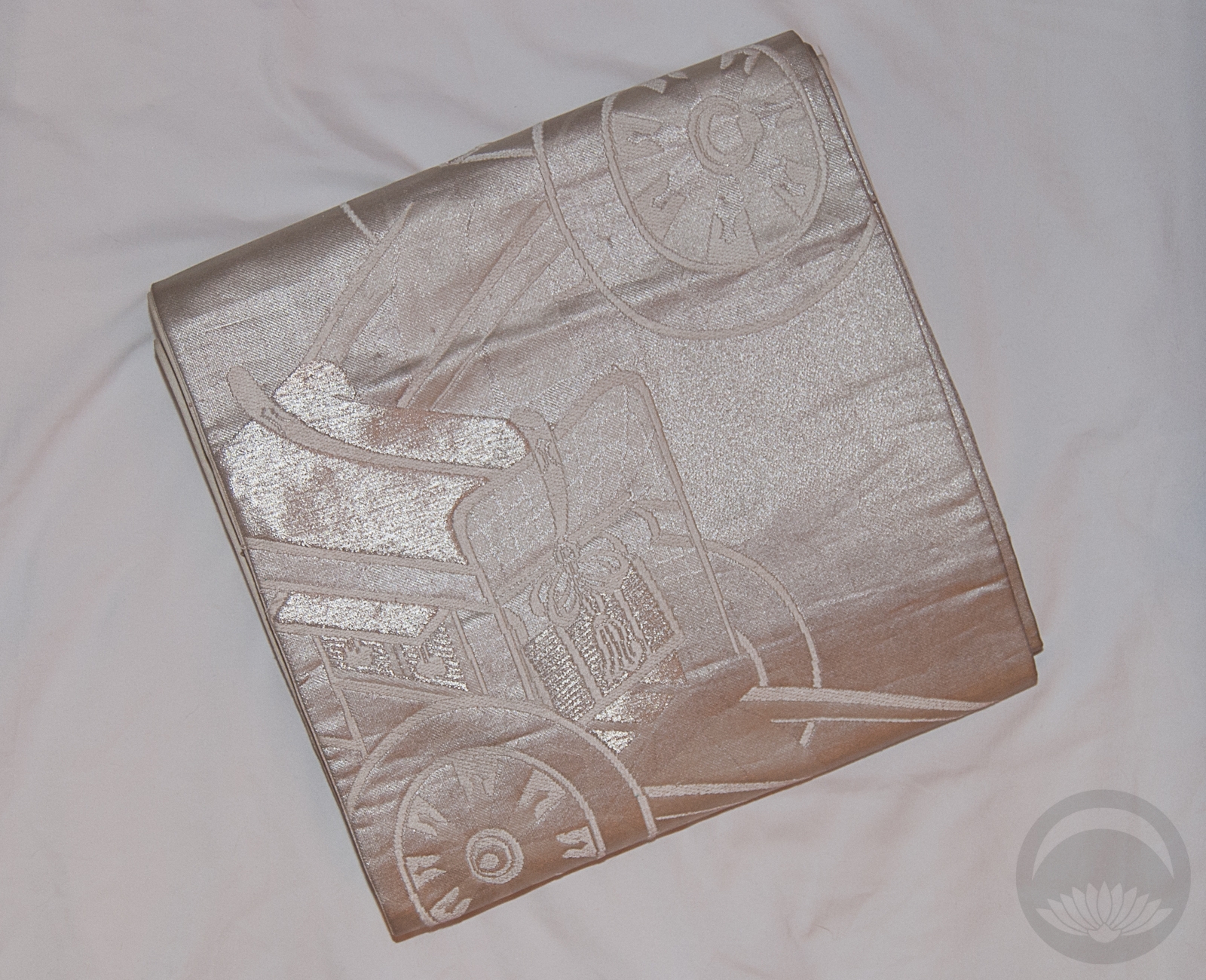
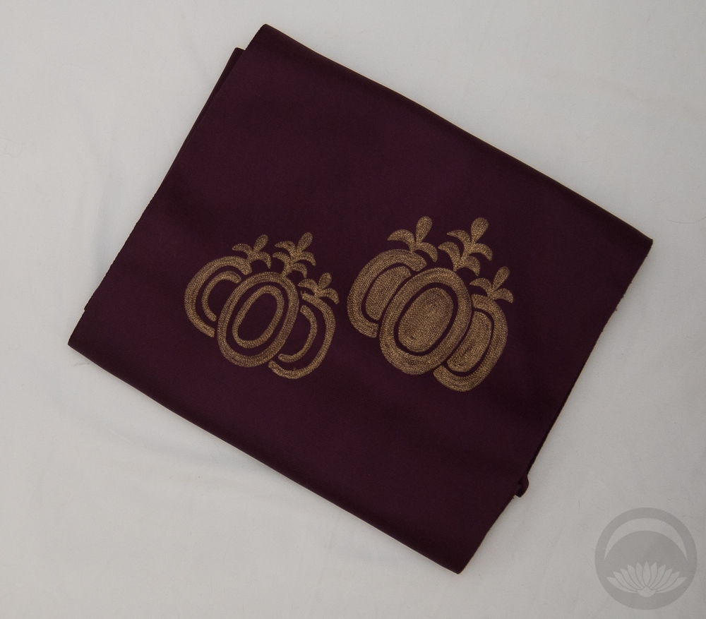
- Orange and Gold
-
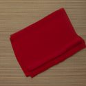
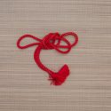
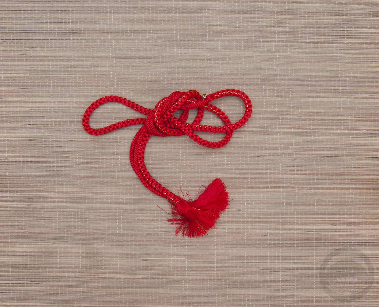
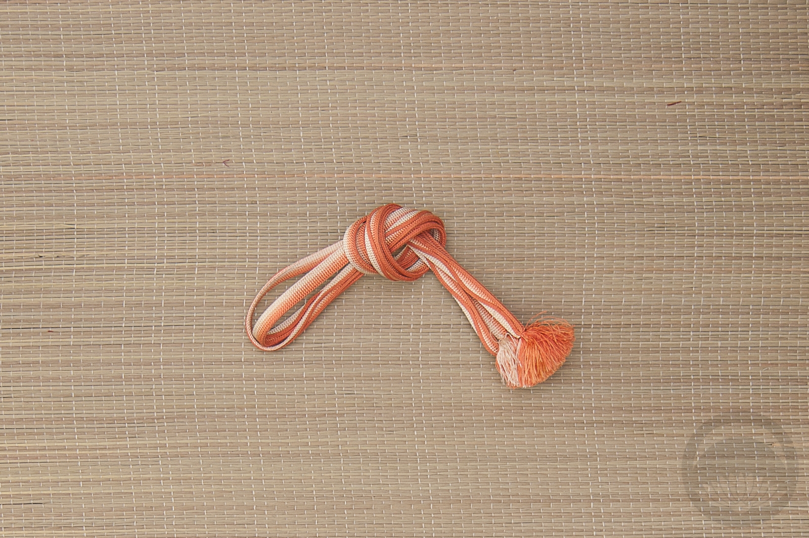
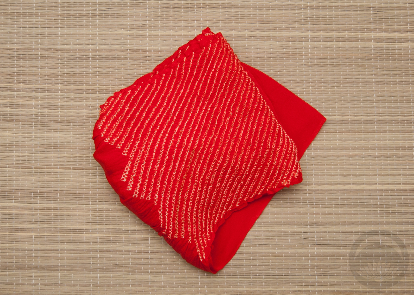
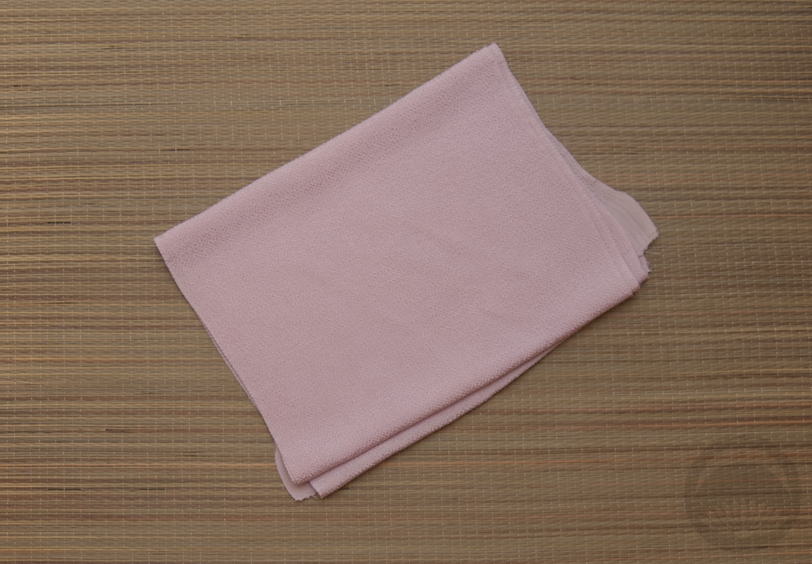
- Red Chirimen
-
- Red Furisode


 Bebe Taian
 CHOKO Blog
 Gion Kobu