Sea Day by Emi Nishizuka – Life Imitating Art

Before we get to the entry today, I have to speak out on what's happening in the United States (and really, around the world) right now. I've always aimed to keep this blog positive and apolitical, but it's reached a point where saying nothing is complicit with the racists. Black lives matter. Here in Canada we also need to acknowledge that Indigenous lives matter. As a white person, I need to use my voice to amplify and uplift the voices that are being silenced at a terrifying rate. Things need to change. The police need to stop killing black people indiscriminately for perceived offences while privileged white folk walk free after documented atrocities. If you're at a loss for ways to help and can't attend rallies or protests, please visit Black Lives Matter for information and resources, and consider donating to the NAACP or the ACLU. Thank you for taking the time to read this. If you feel the need to argue this, tell me it was unnecessary, or tell me that "all lives matter", please unsubscribe and unfollow.

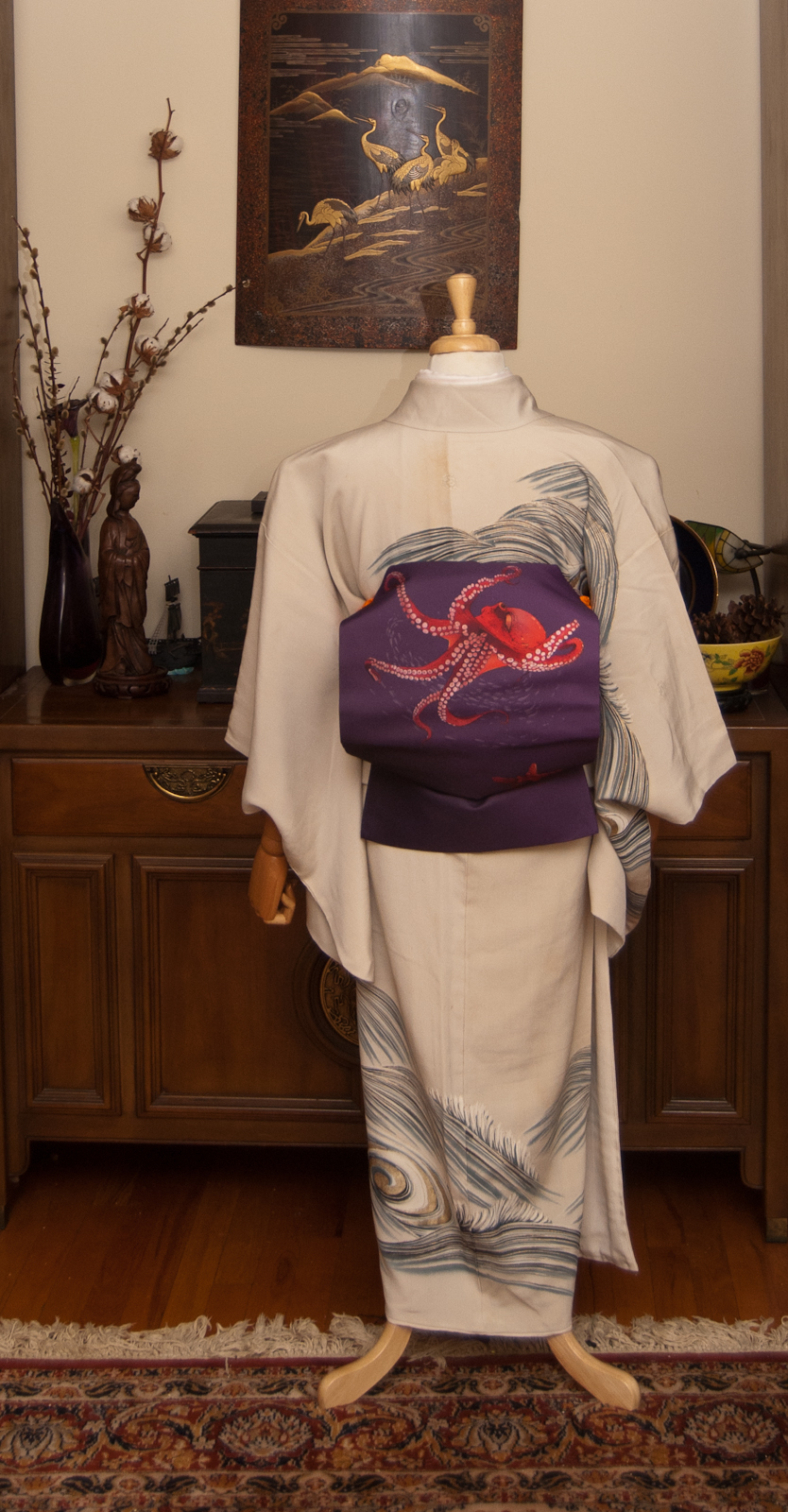
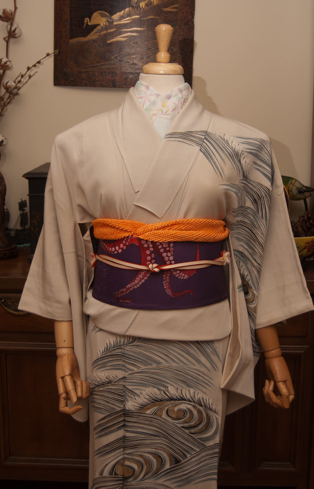
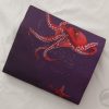
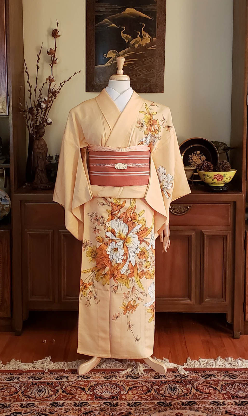
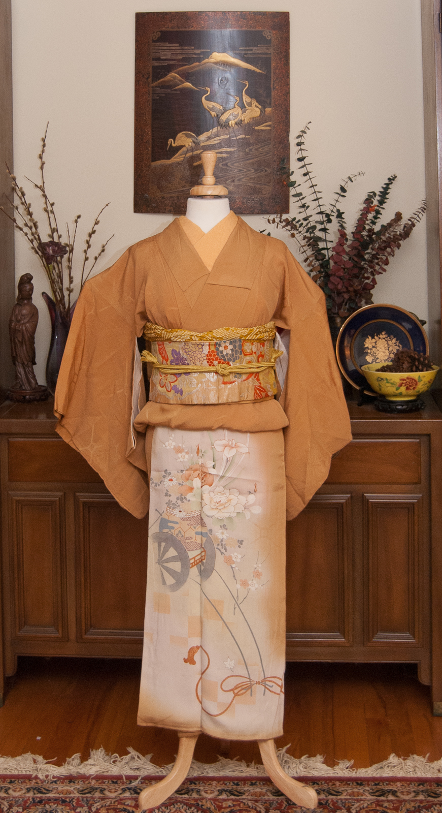
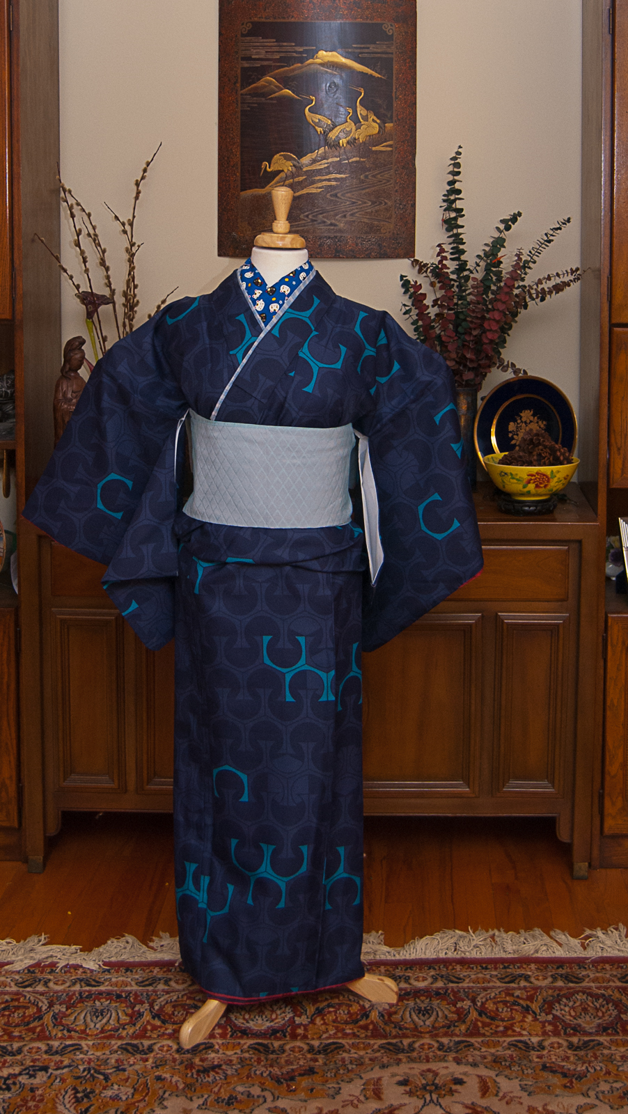
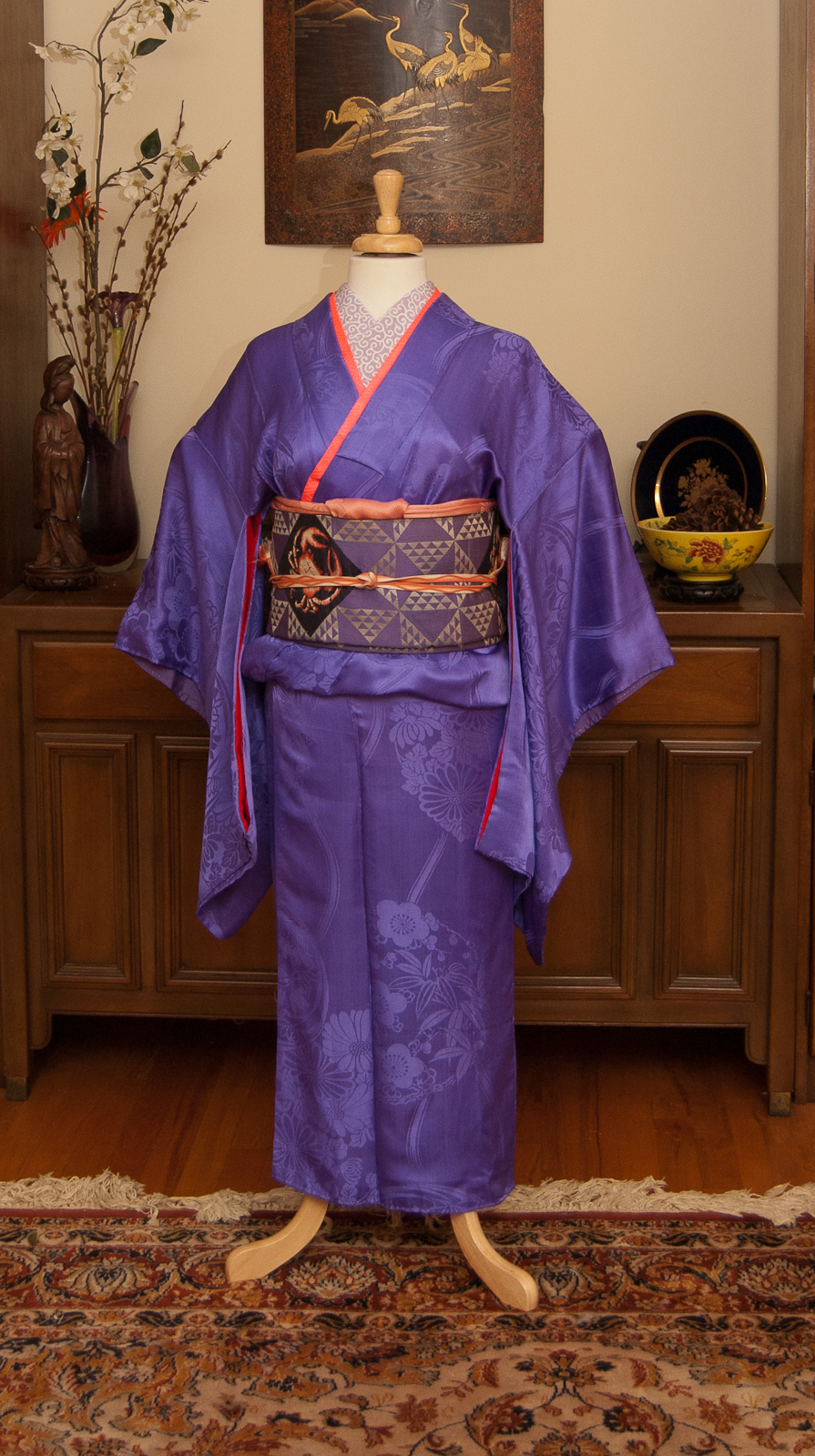
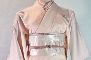
Way back before the flood in my room, COVID-19, and my life (and the whole world, really) going sideways, I found this beautiful little drawing entitled 海の日, Umi no Hi, or Sea Day by Emi Nishizuka and realised I had quite similar pieces, especially my beloved octopus obi. Right away I knew I wanted to try to do the first entry in a new featurette here on the blog, where I plan to reproduce kimono ensembles from artwork. Now that I’m back into the swing of things, I figured it was time for me to give it a shot.
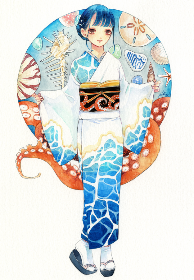
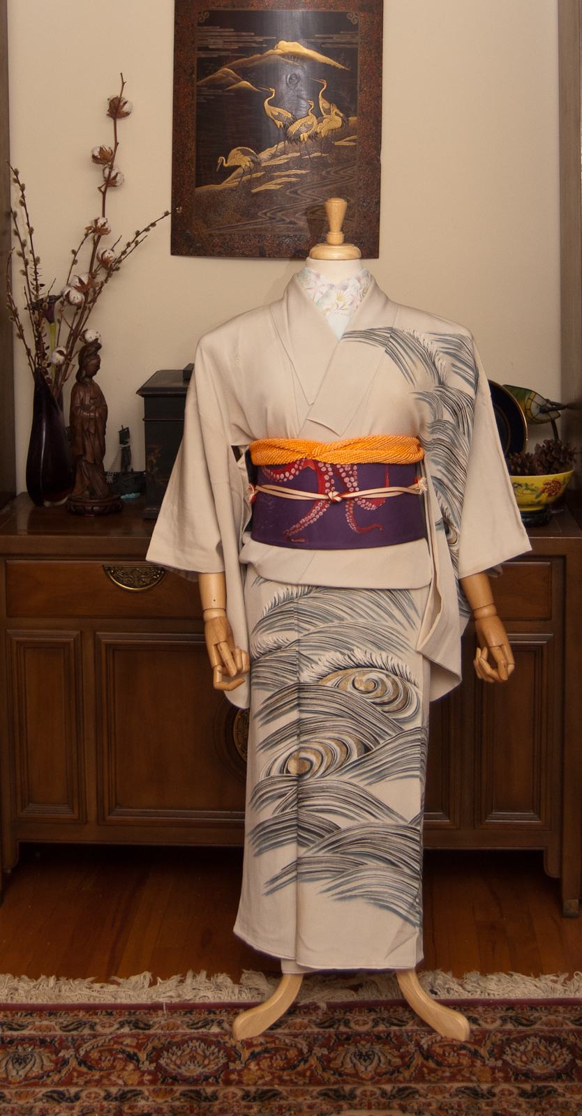
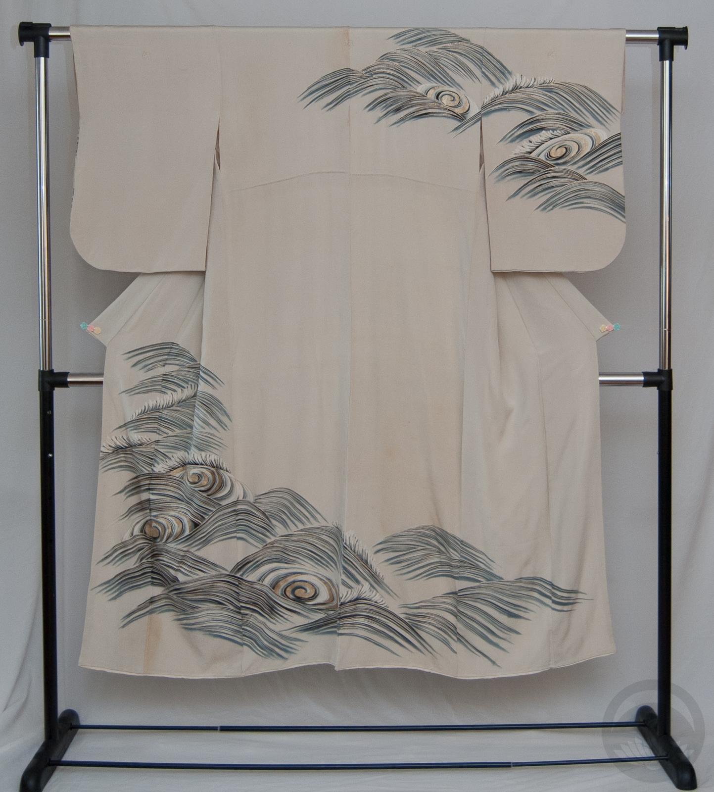
The pieces aren’t exact; the water on the kimono is from a different perspective and less saturated, the obi is purple instead of black, but as a whole I think I did a good job of emulating the mood and feel of the coordination quite well. Also, I’d somehow never noticed before but this kimono is a five-crested houmongi. All my other houmongi are either uncrested or have only one crest. I wonder what sort of event it was intended for.

Doing this coord was a lot of fun, and I look forward to doing more of them. I won’t make any promises or stick to time frames, because I know that’s a surefire way to turn me off from something, but keep an eye out for more of these in the future!

One final note; I have officially lost my job for good. I worked at the same small specialised toy store for almost thirteen years, but unfortunately it has become a casualty of the economy and the coronavirus shut-down and will not be reopening. So for the time being, you will be seeing a lot of older, familiar pieces being reused in new and hopefully interesting ways. My budget is a little tighter than usual so I can’t run around buying new pieces.

Things Will Get Better

First of all, thank you for your patience. I haven’t posted in over a week now – the April A to Z challenge was apparently more exhausting than I’d realised! I’ve also been fighting off nasty allergies and a bout of pericarditis, and wasn’t really up to much. But things are tough for everyone right now, so I thought the least I could do was bring everyone a bit of brightness and hope.

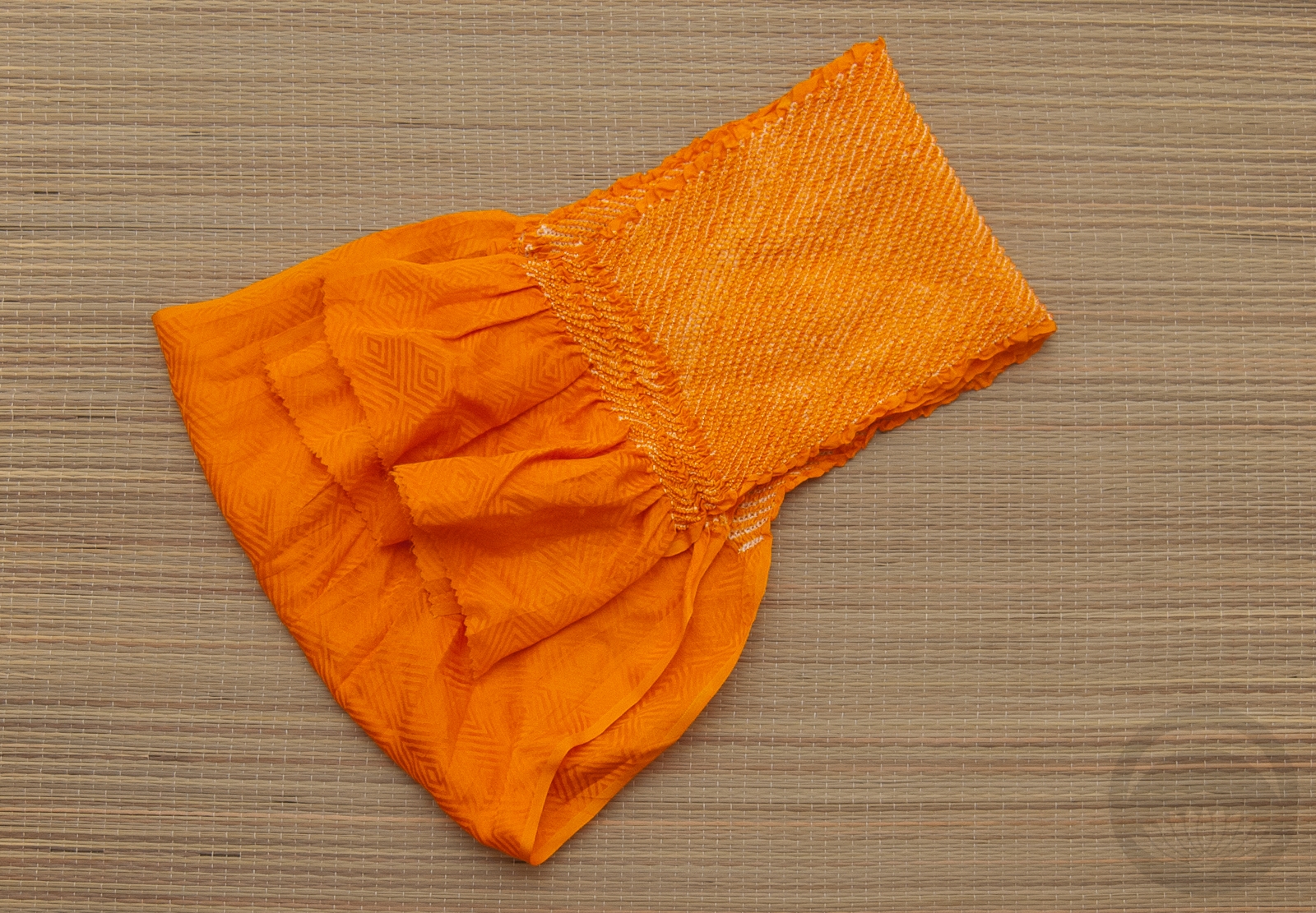
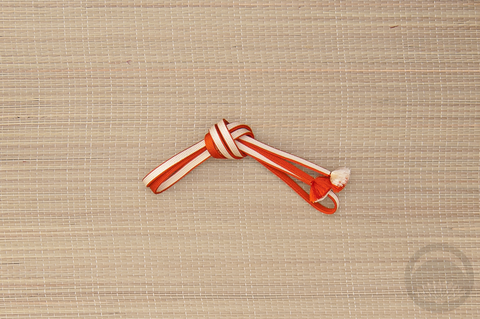
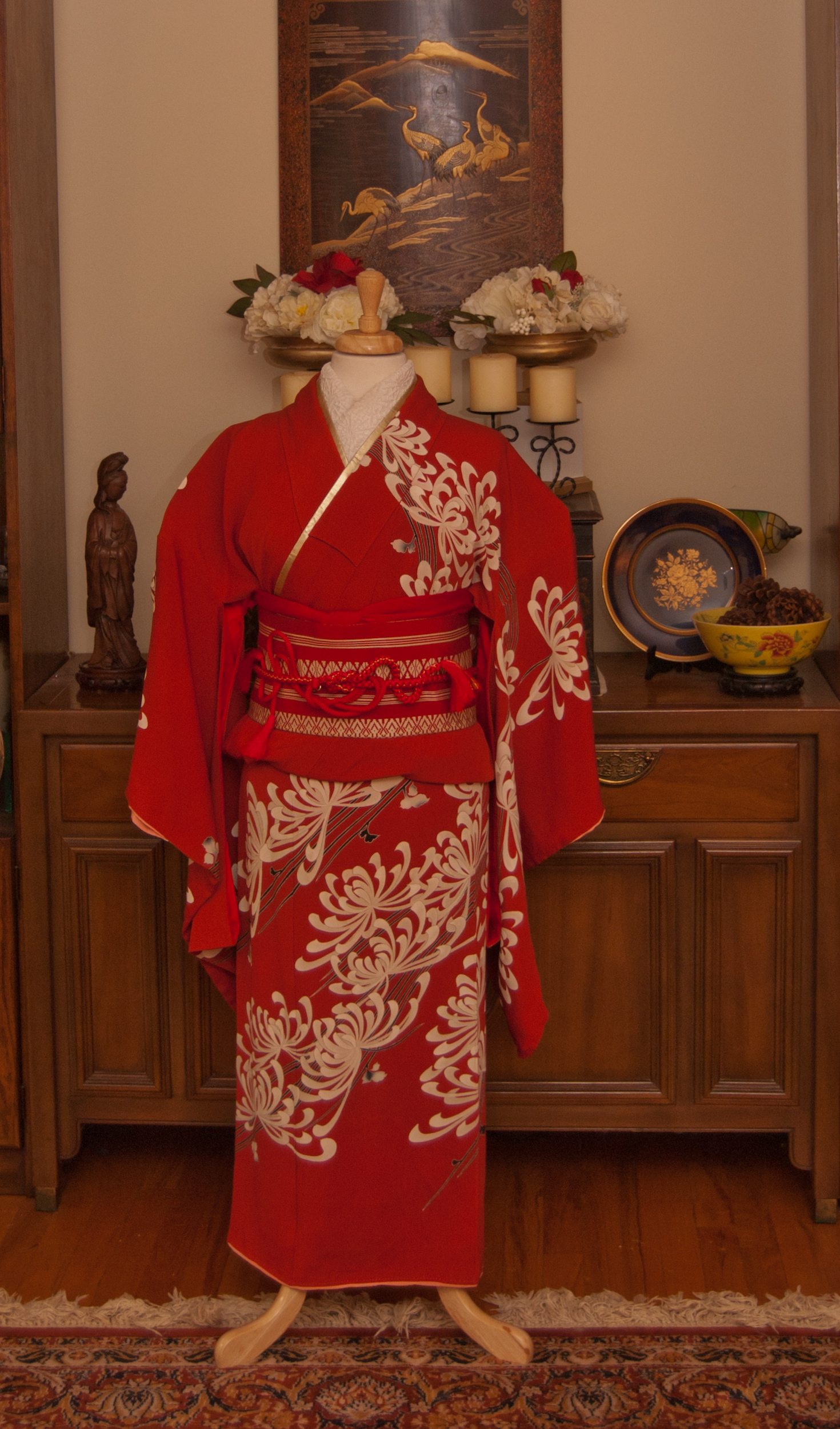
Since the rainbow has become the symbol of hope and optimism in this time of overwhelming fear and confusion, I thought it might be fun to turn a few of my old monochrome coordinations into a kimono rainbow! I don’t have much in the way of pure orange kimono (orange is quite possibly my least favourite colour) but peach is pretty close, right? XD

I promise I’ll be back with new content soon. I’ve got outfits to put together, books to review, and crafts to make. But in the meantime, I hope this silly little rainbow brings a bit of colour and happiness to your life!

If you’d like to see close-up detail shots of each outfit, here you go!

Y is for Yabane

Yabane, 矢羽, Arrow fletching

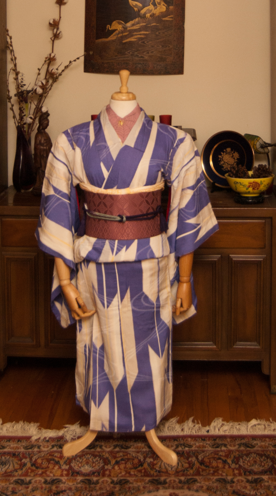
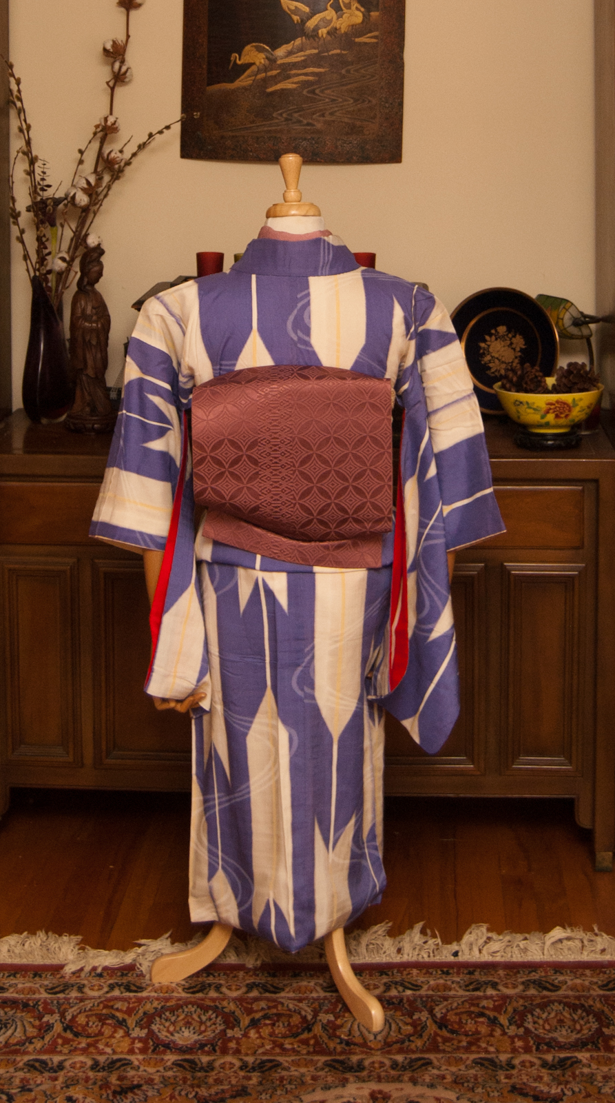
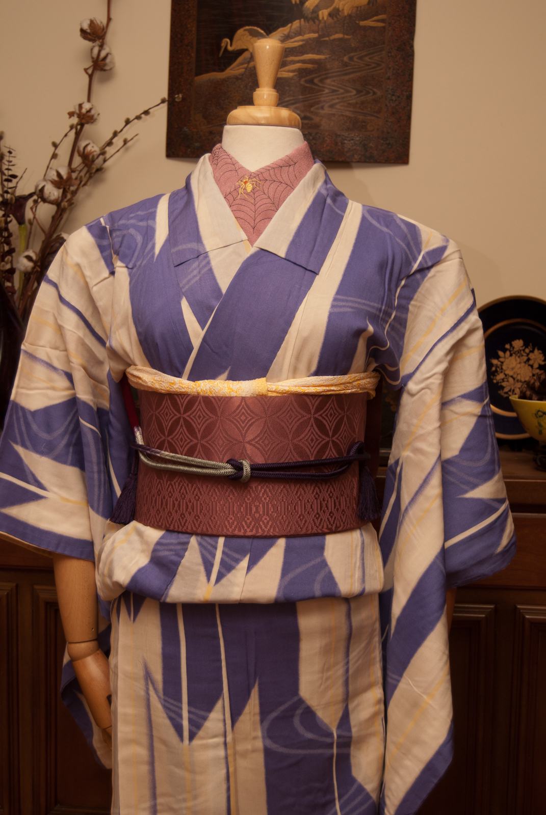
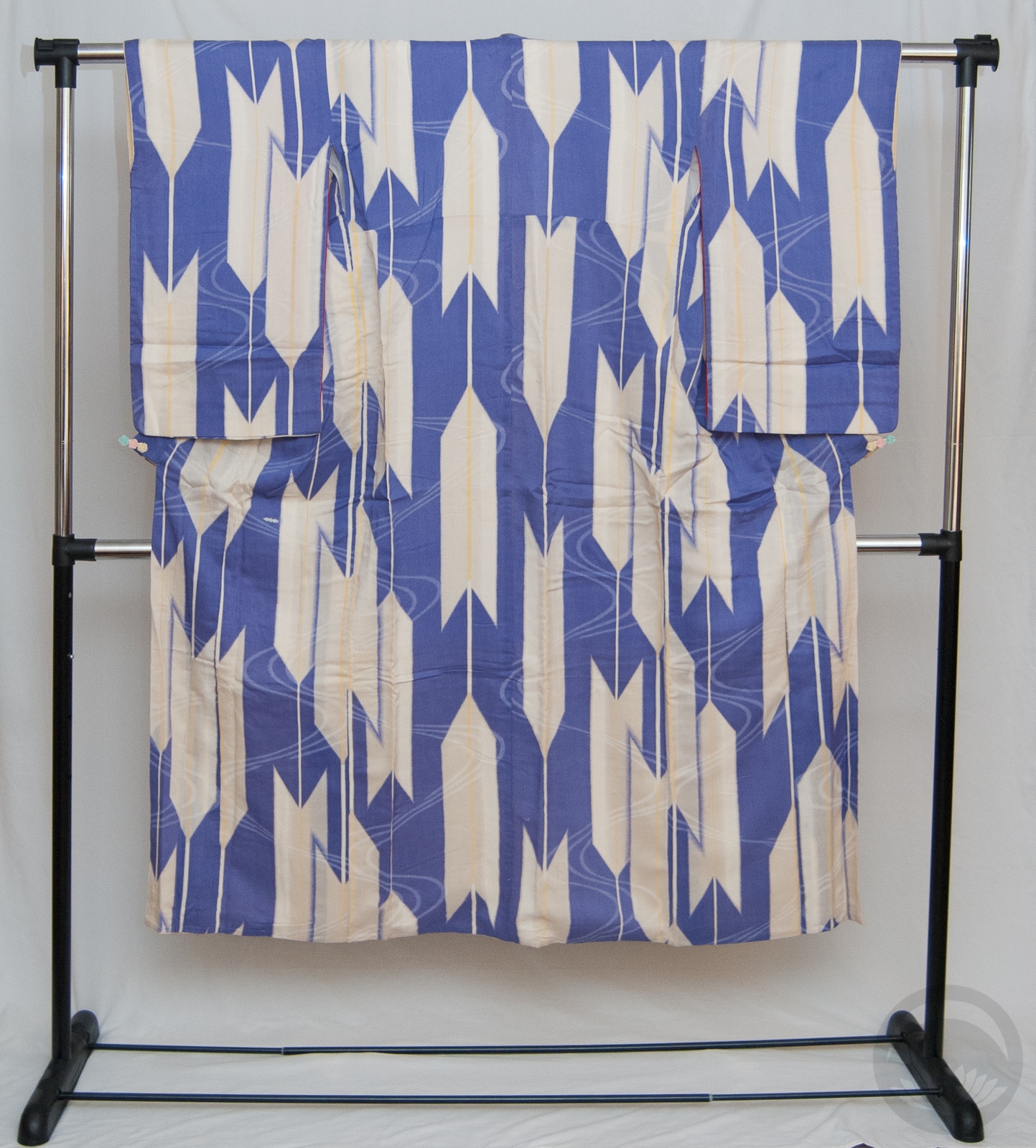
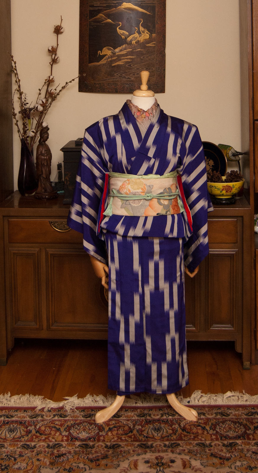
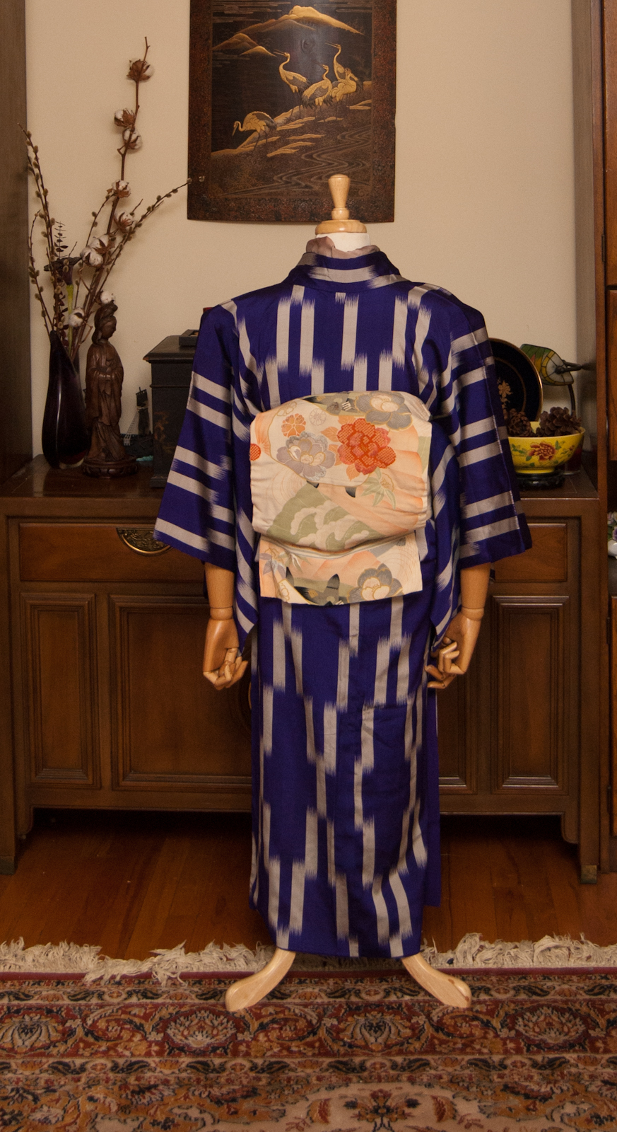
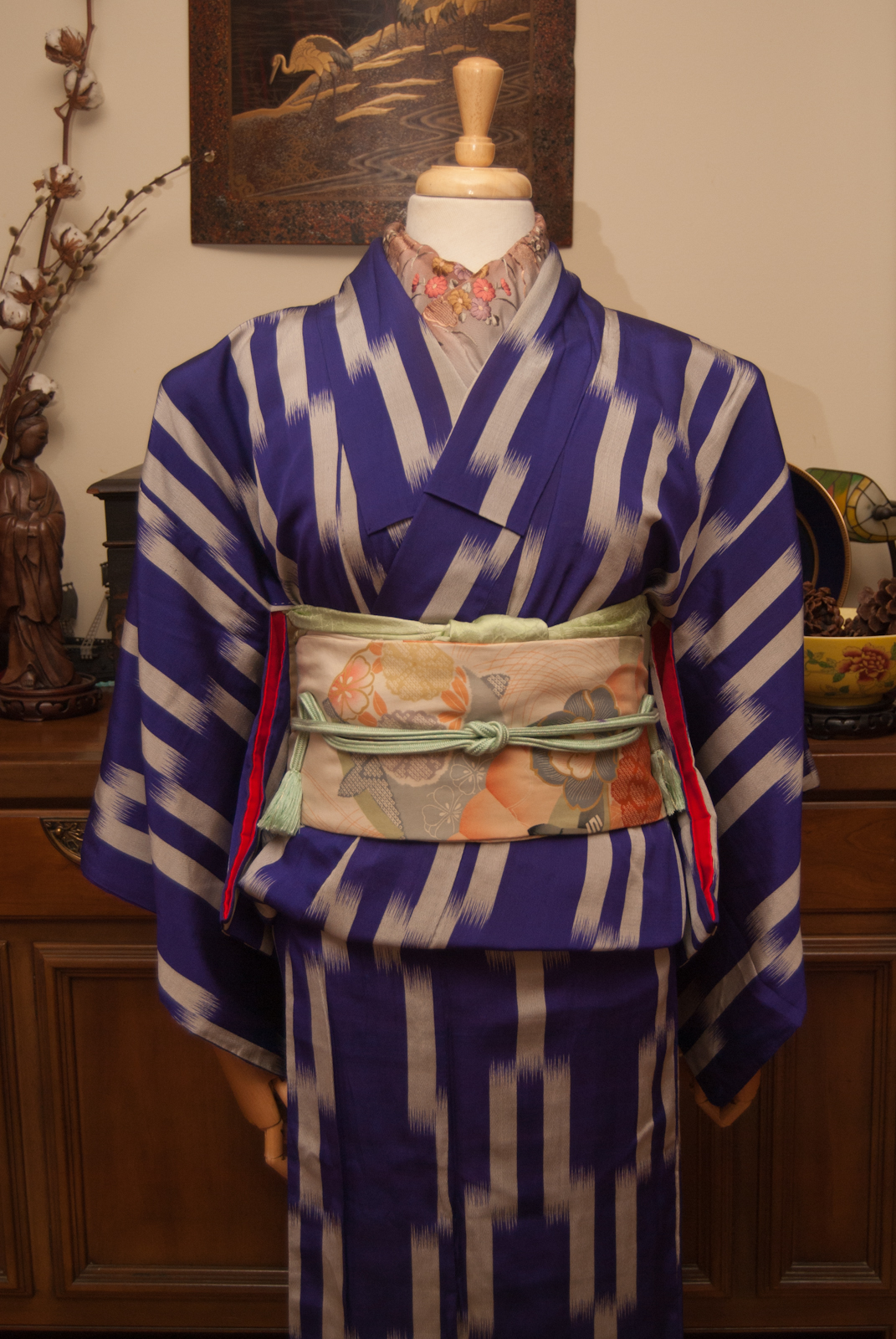
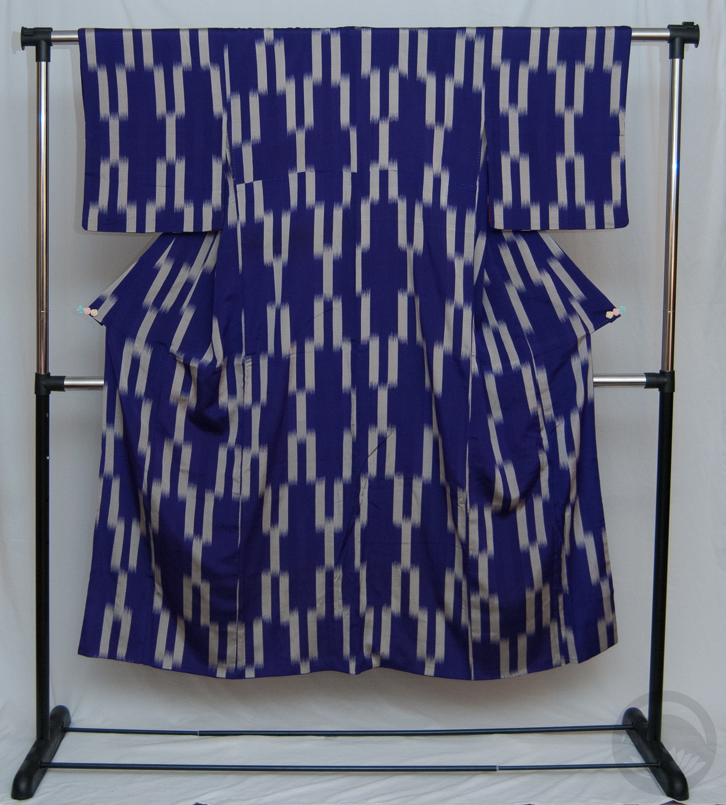
Yabane (also yagasuri for the small, tightly-repeating variation) and hakata; two of my favourite things together! I love all depictions of yabane, but particularly these big, semi-random depictions that were so beloved in the Taisho and early Showa eras really get to me. I’ve loved this kimono ever since I first bought it back in Boulder, Colorado. It’s an odd fabric, it feels like a mix of silk and cotton. It’s very light and breezy, despite being lined, and is smoother than cotton but has a lovely grip that makes it a pleasure to put on. However, I still can’t believe I ever wore this comfortably though. It’s so tiny!

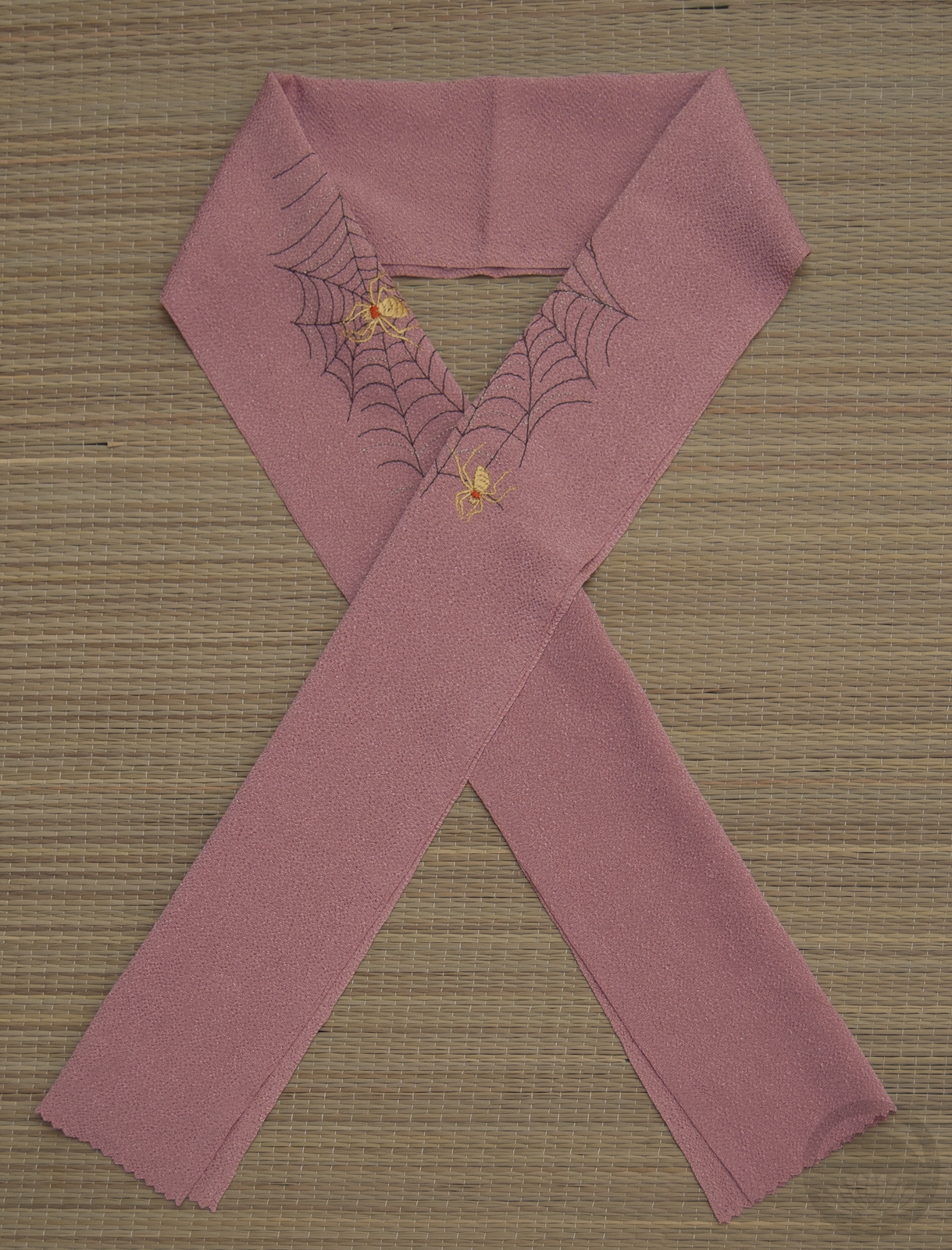
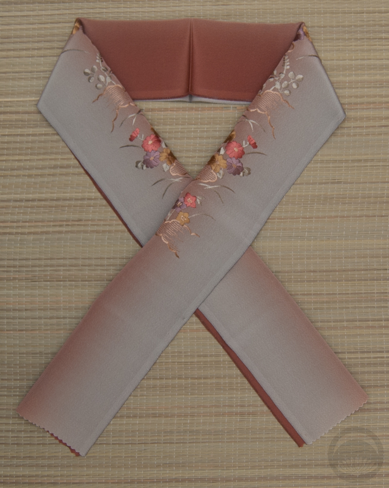
I’m glad I had an opportunity to use this dusty rose-pink hakata nagoya obi. It’s really subdued but the texture of it makes it feel so lush. I couldn’t resist using my spider haneri which is a near-perfect match to the obi. Also, you guys, I’m so proud of myself. I did an ensemble with yellow accents and didn’t use that lemon-yellow shibori obiage and hakata obijime I use all the time. Will wonders never cease? I did use a yellow obiage, but a much more subdued one. The obijime was a better choice in theory than in practice I think, but it’s not terrible. I just know I can do better next time. XD

Items used in this coordination

X is for X Marks the Spot

X Marks the Spot
Expression regarding the target on maps

Whoof, this was a challenge. Not only are there no Japanese words starting with X, there aren’t really many in English either! I certainly don’t have any items with a xylophone or a xerox machine… My friend suggested “x-rated” and I did debate doing a post on erotic woodblock prints for a hot minute, but I’d rather keep this blog family-friendly!

So what was I to do? I racked my brain until I remembered this kimono I have with a vaguely x-shaped meisen design. It’s lovely, and I don’t use it nearly often enough in coordinations, so I figured what better time to feature it than today’s post?

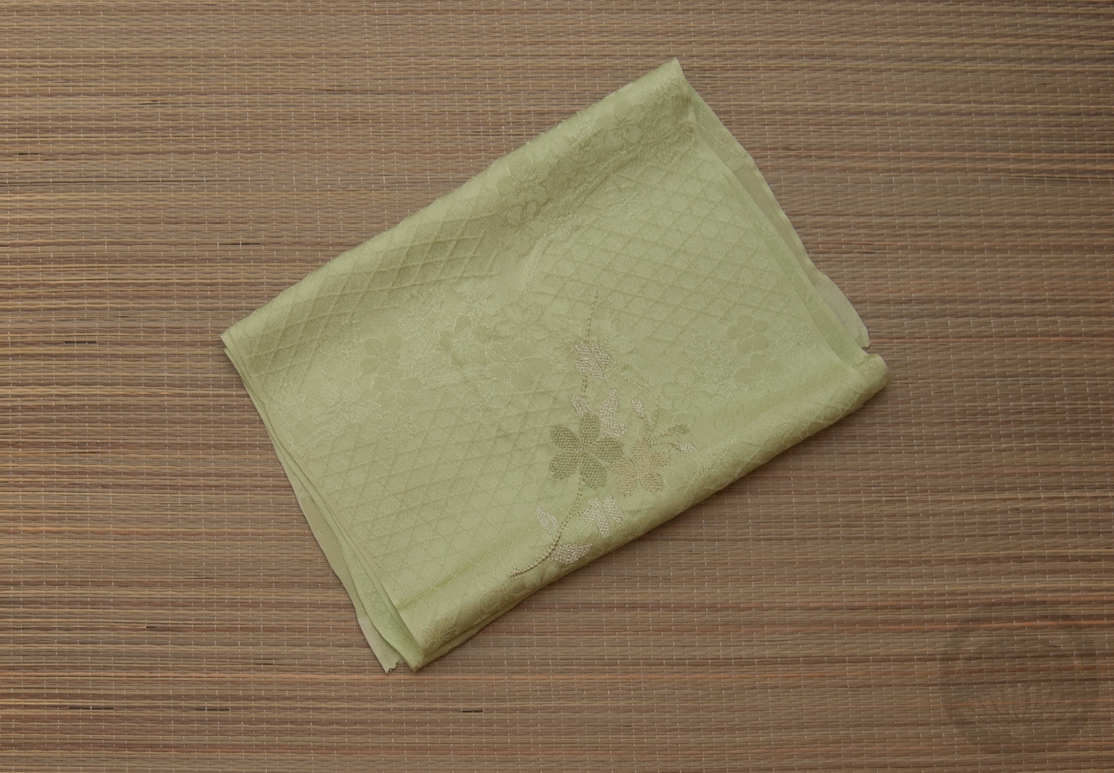
I kept the rest of the outfit fairly simple and desaturated. The obi is pale enough that it contrasts nicely against the kimono but is definitely not the focal point. All the attention stays on the kimono. I pulled out accessories in soft tones from the obi to keep things subdued. Today’s outfit might be a bit of a stretch, but I think I pulled it off in the end. I’m happy with how it looks, even if it does only barely relate to the challenge.

Items used in this coordination

V is for Vivid

Vivid, intensely deep or bright colour

We’ve reached another one of those super-fun letters that essentially don’t exist in Japanese. Like the L and Q posts, I knew I had to run with an English word and what better word than Vivid? Or possibly vibrant!

Taisho and early Showa era kimono are absolutely some of my favourites, due in no small part to the vivid, bold colour choices brought about by the advent of synthetic dyes. Prior to the 1910s, kimono colours tended to veer to the gentle, subdued, and either pastel or very dark tones thanks to natural dyes. With the introduction of synthetics, colours went pretty crazy.

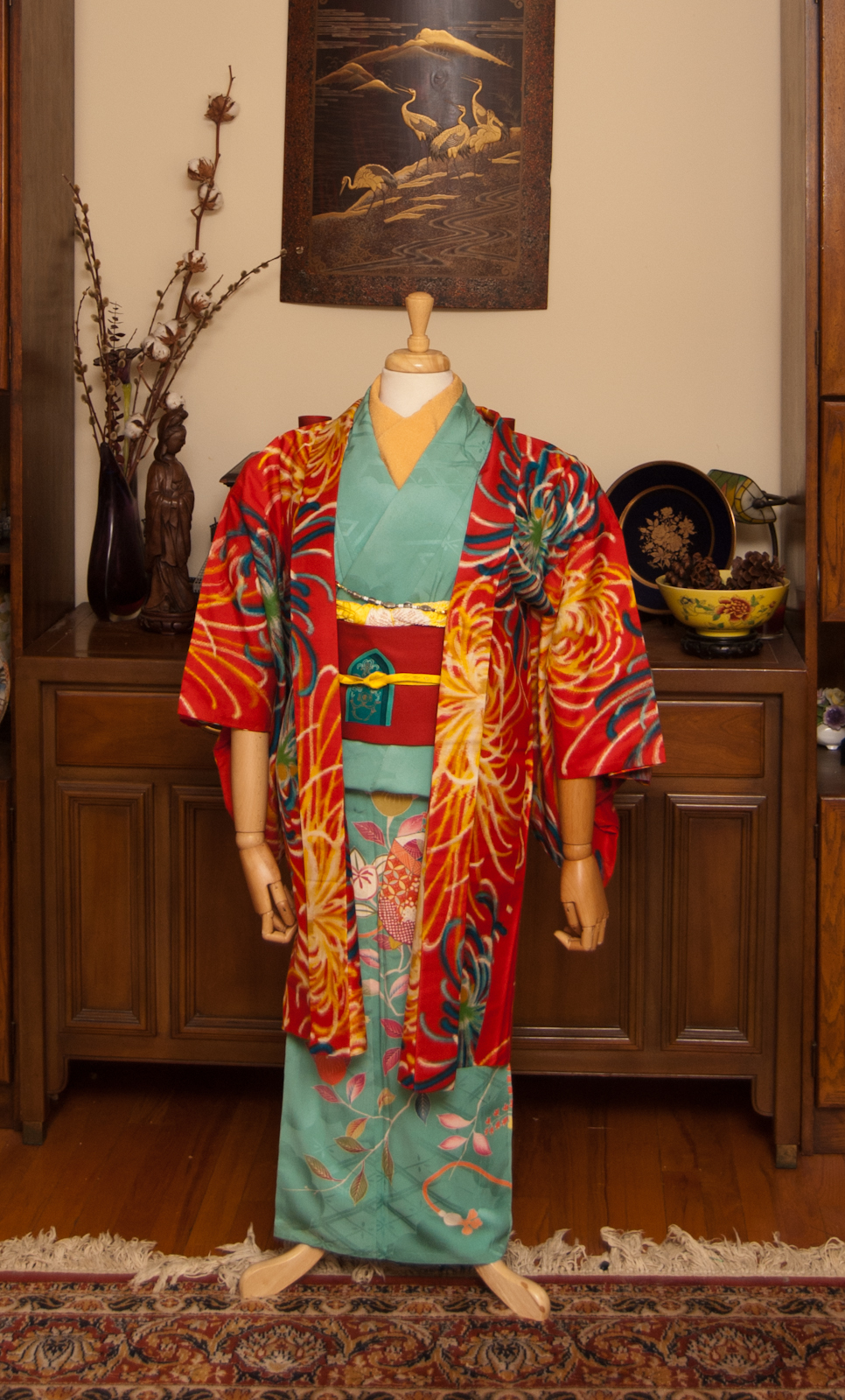
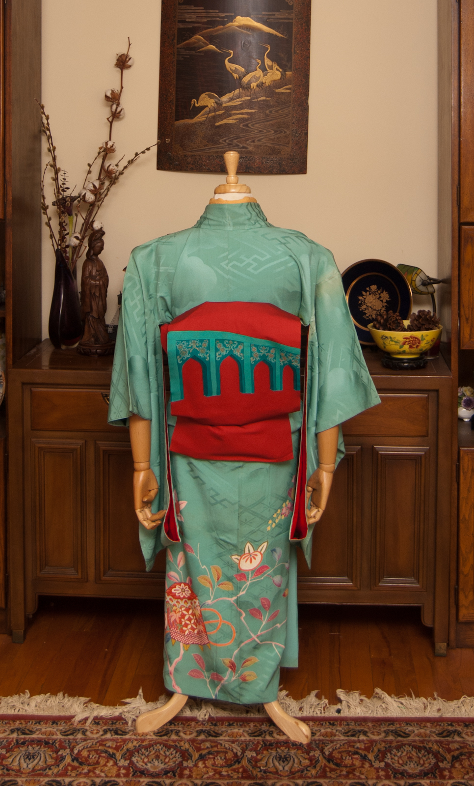
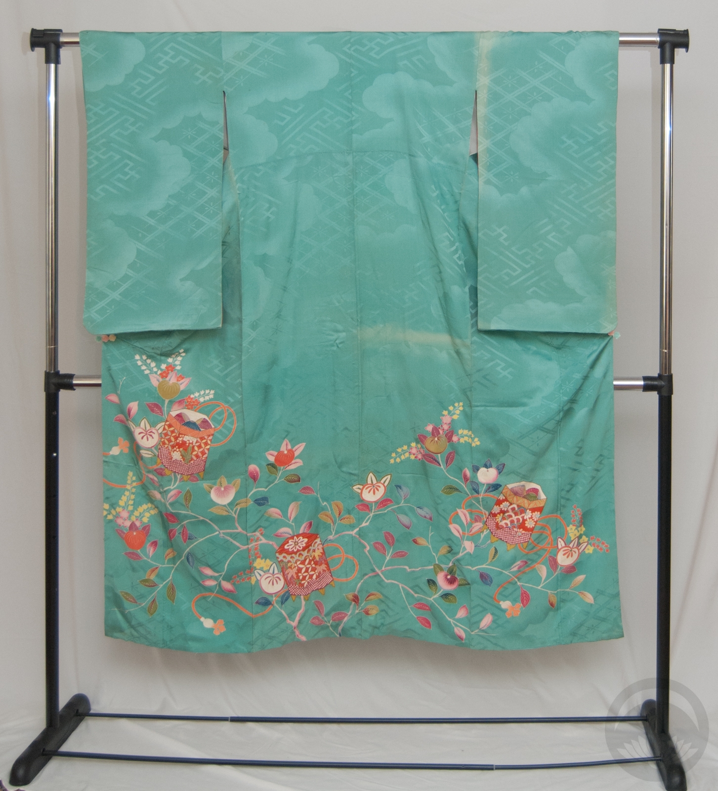
I went with my beloved turquoise irotomesode with tachibana, since I didn’t get to use it last week. And heck, compare the colour story of that entry to this one, and you’ll get a really good sense of what I mean by vivid!

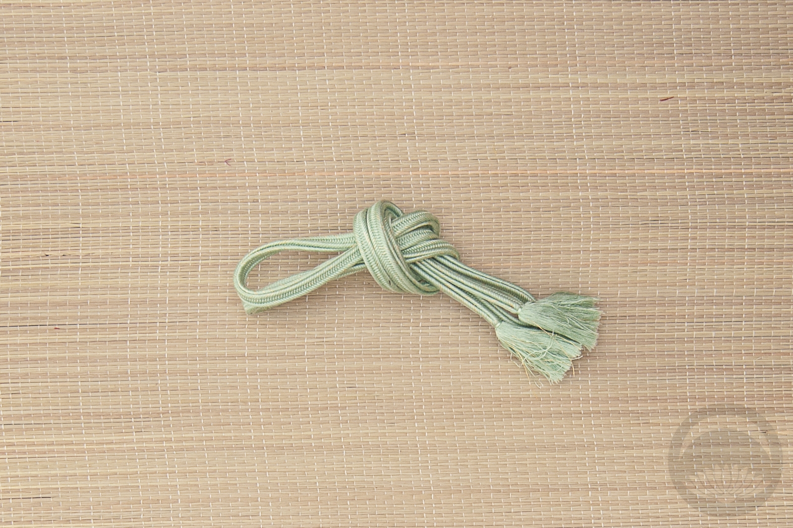
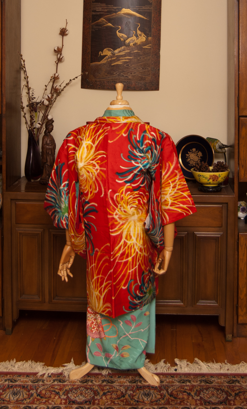
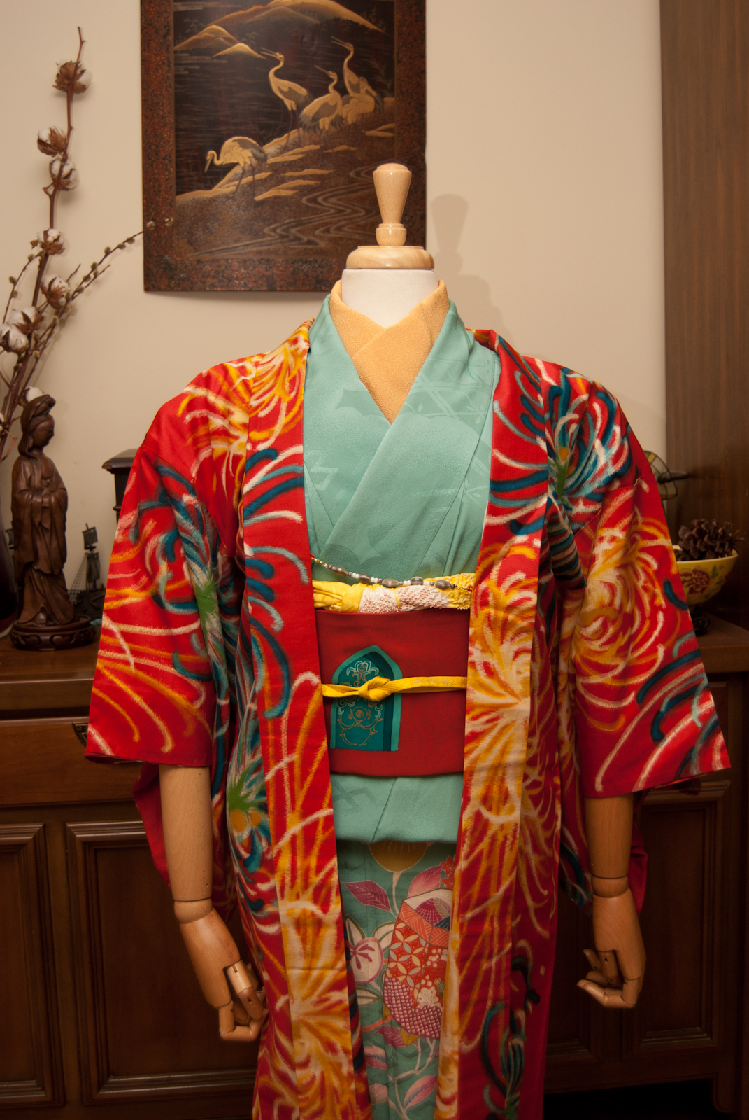
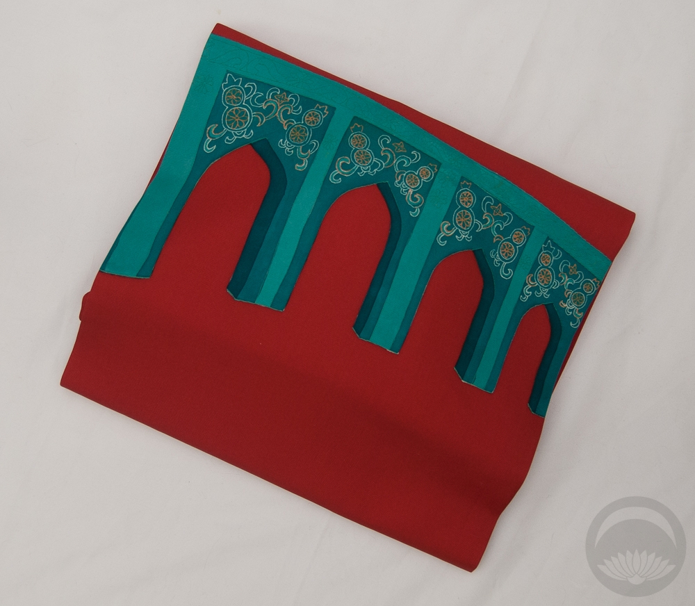
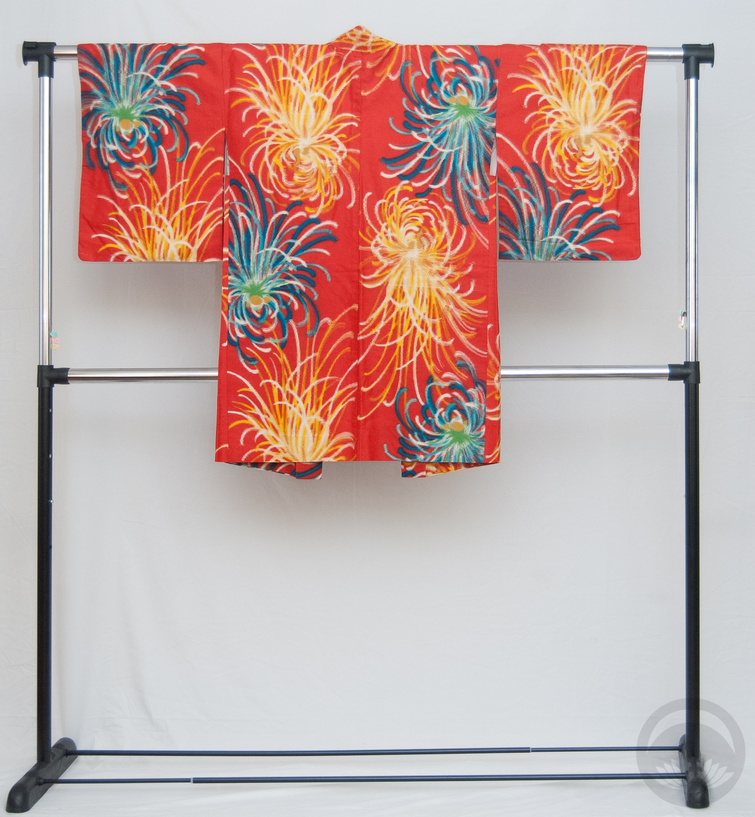
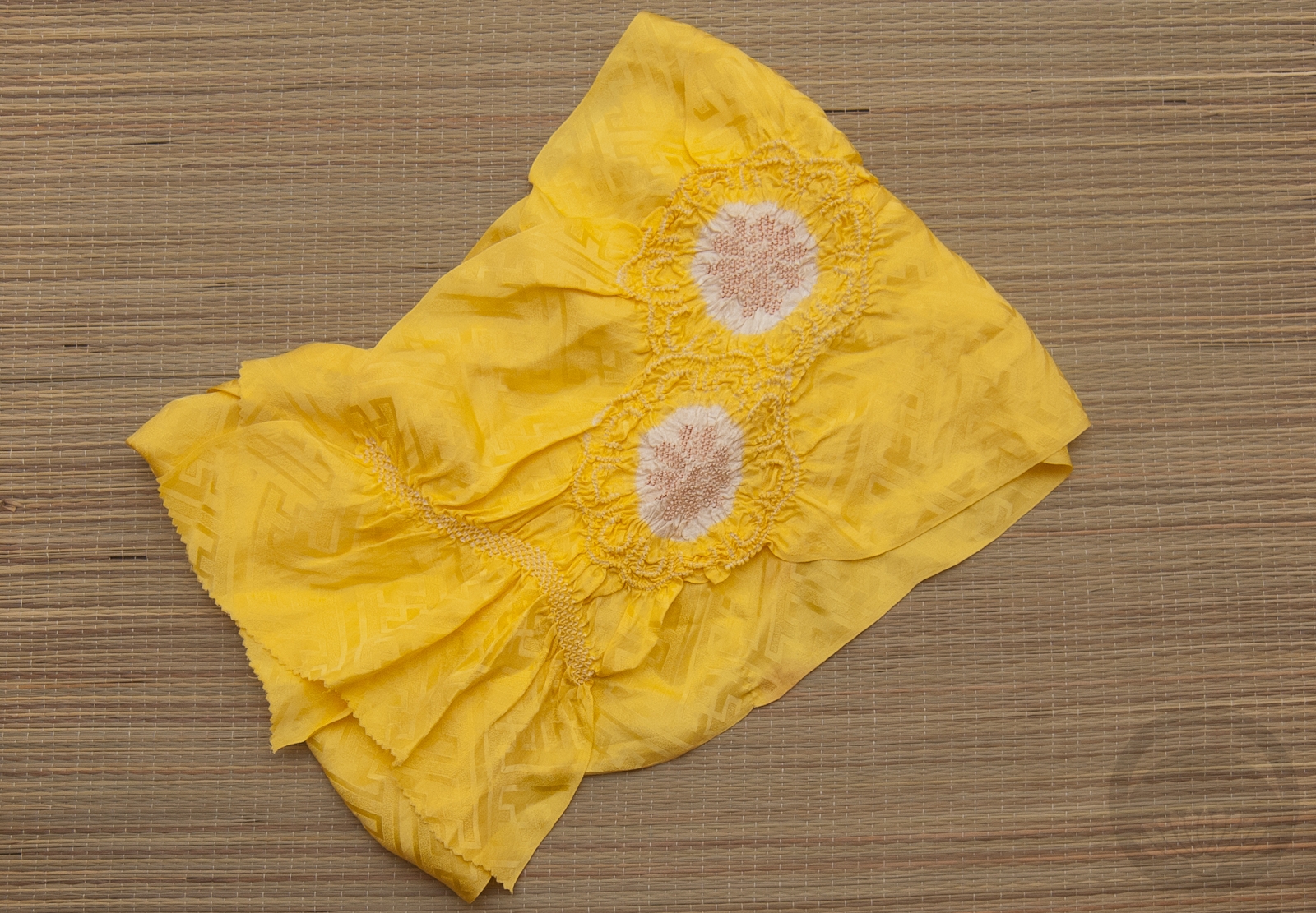
My initial plan was to use a vintage mustard-yellow floral obi but it just wasn’t bright enough. Then I remembered this gorgeous modern piece with the moorish arches that are a spot-on complement to the kimono. This obi was a gift and to this day I still don’t know who sent it to me! Next up was this gorgeously eye-searing meisen haori. Doesn’t get more vivid than this piece, when it comes to my wardobe. And to bring in the hit of yellow to echo the yellow accents in both the kimono I ended up using my yellow obiage and obijime again. This is starting to feel like a running gag, but they really do match just about everything!  Honestly these photos don’t even do this ensemble justice. One day I’d love to see this coordination on a person, but this kimono will never fit me so I’ll have to find a willing model.

Items used in this coordination