
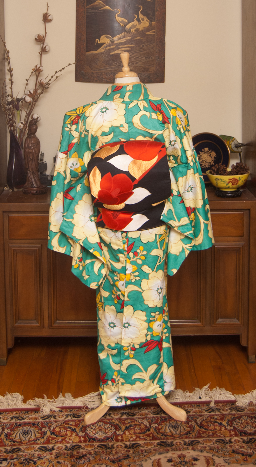
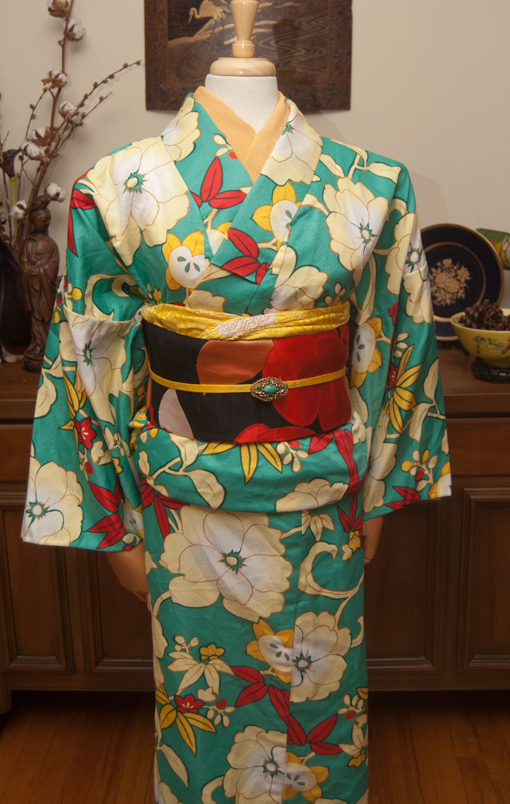
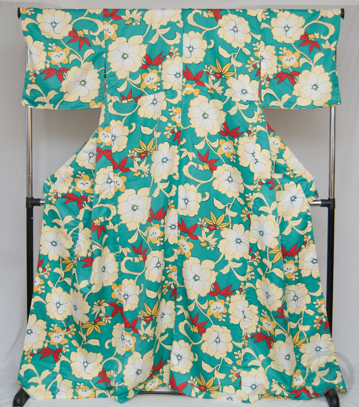
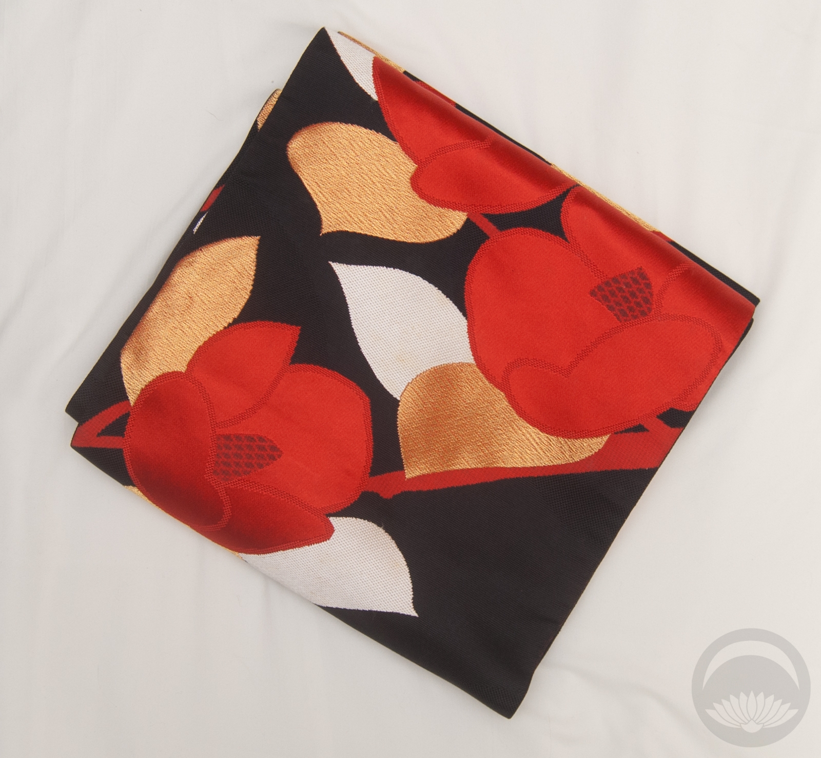
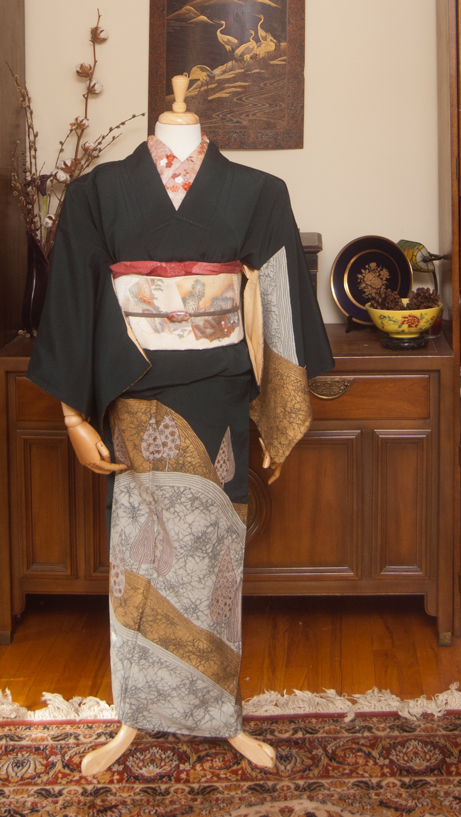
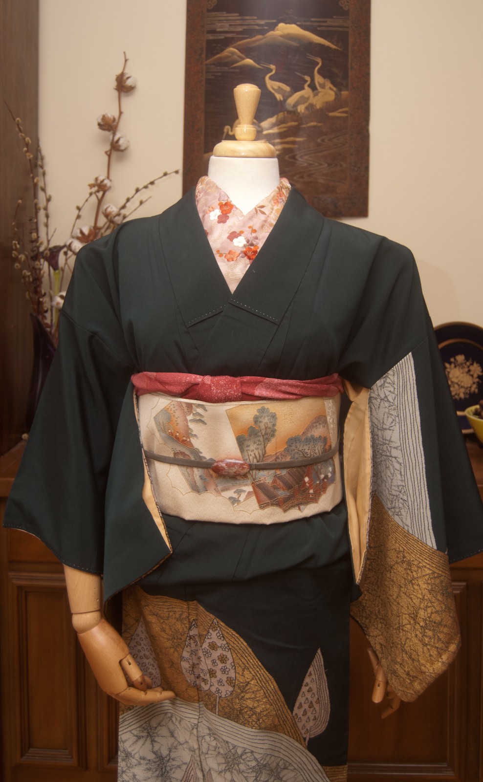
I’ve been rolling the idea of an all black and white coordinate for quite a while now. I find myself with a surfeit of free time now, due to my sudden lack of employment due to the COVID-19 outbreak, so I figured I may as well really buckle down and start doing all the kimono-related things I’ve had loosely percolating in the back of my mind for months now.
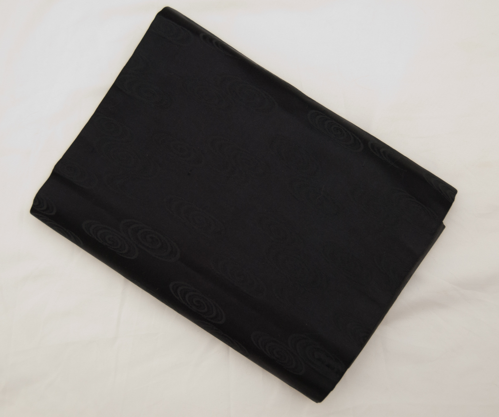
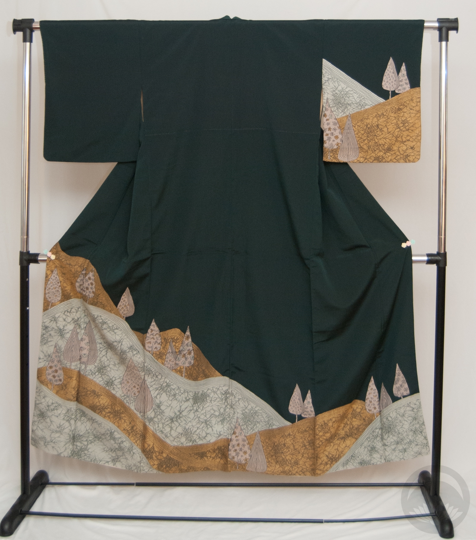
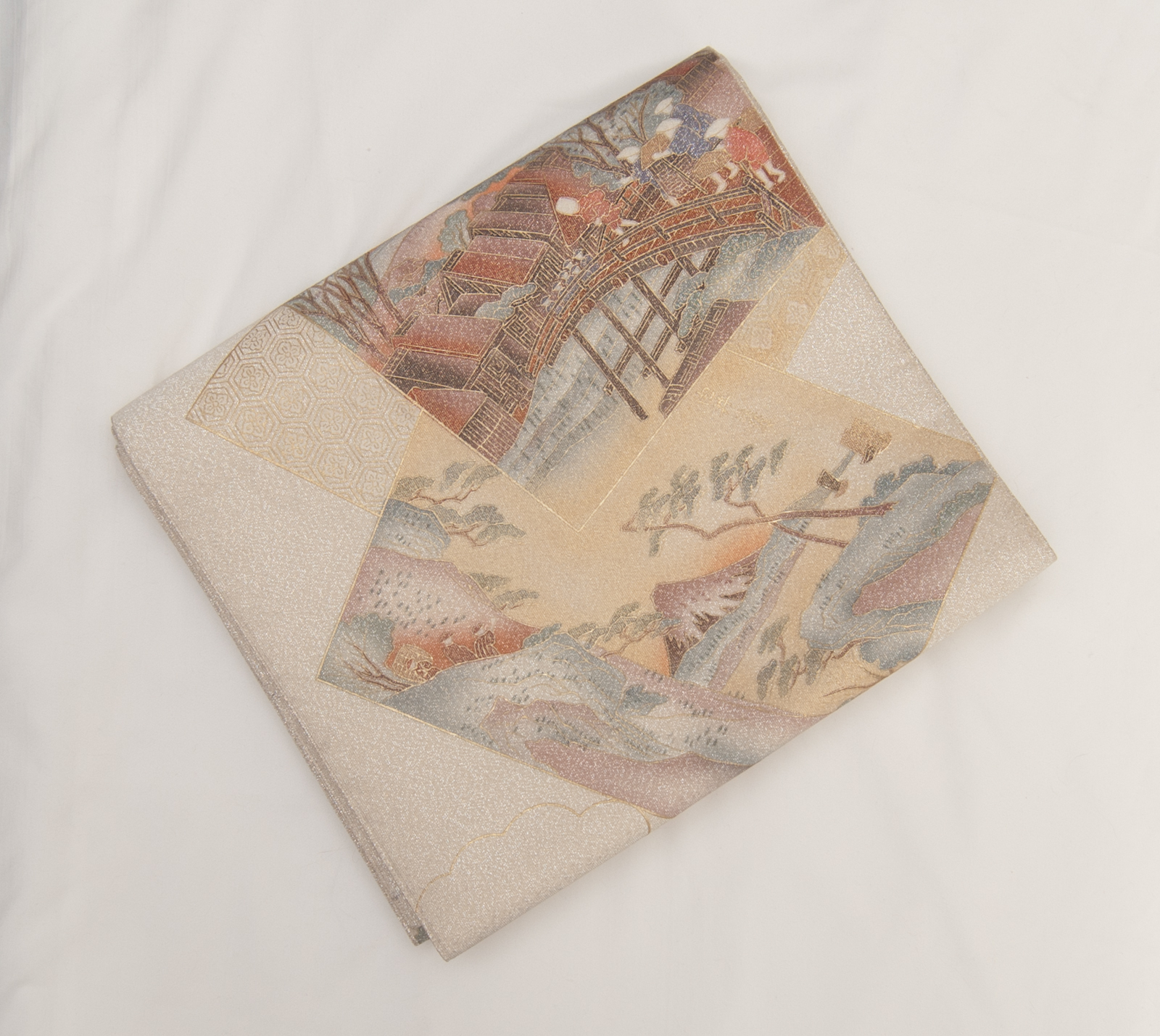
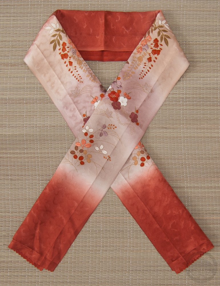
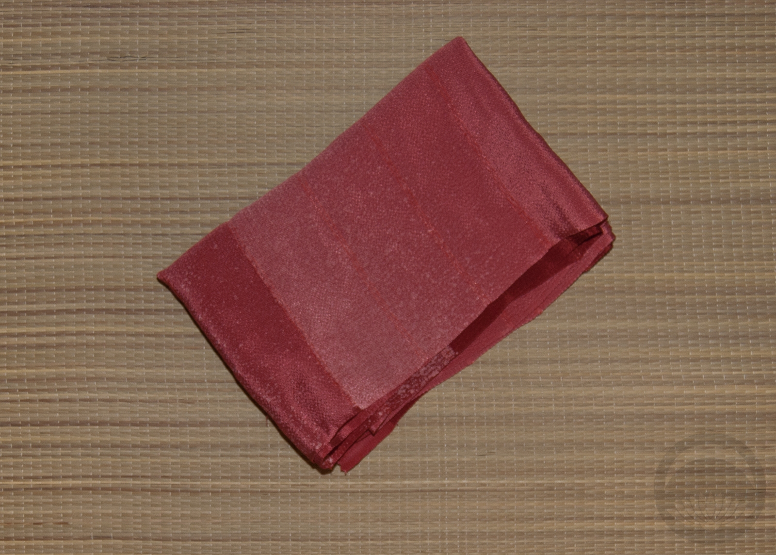
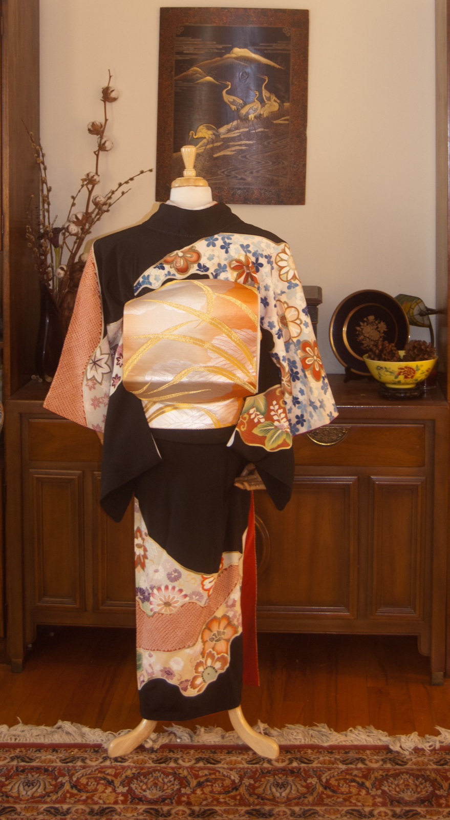
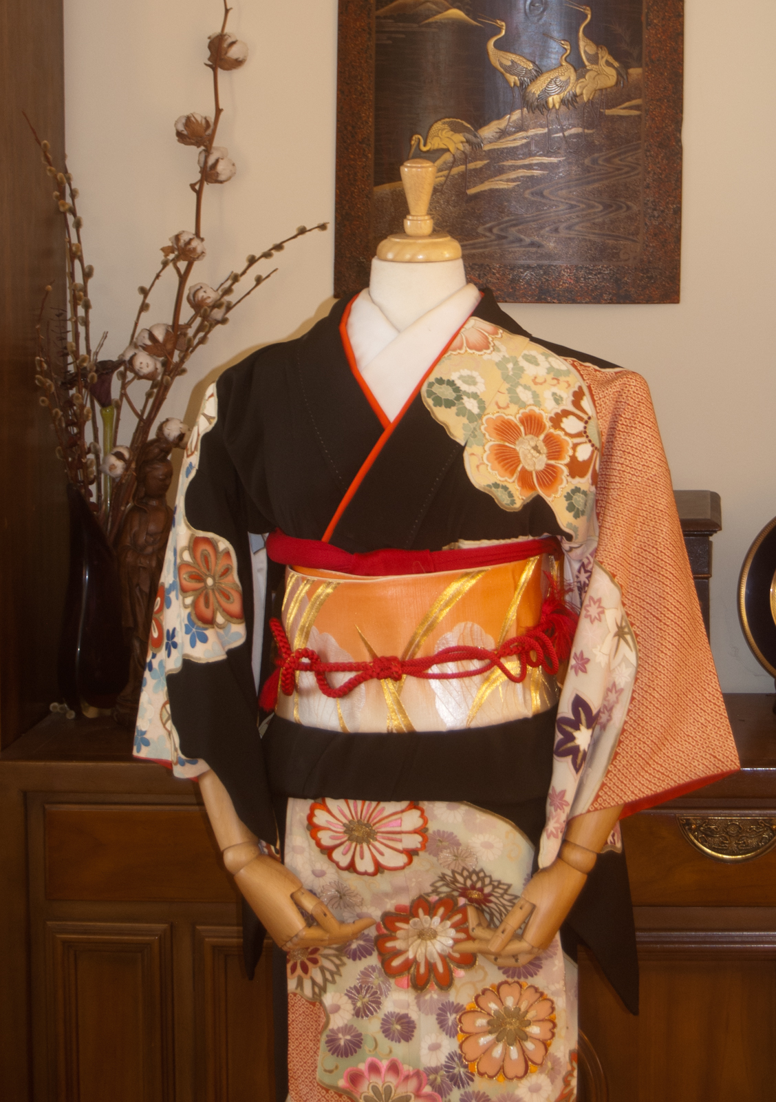
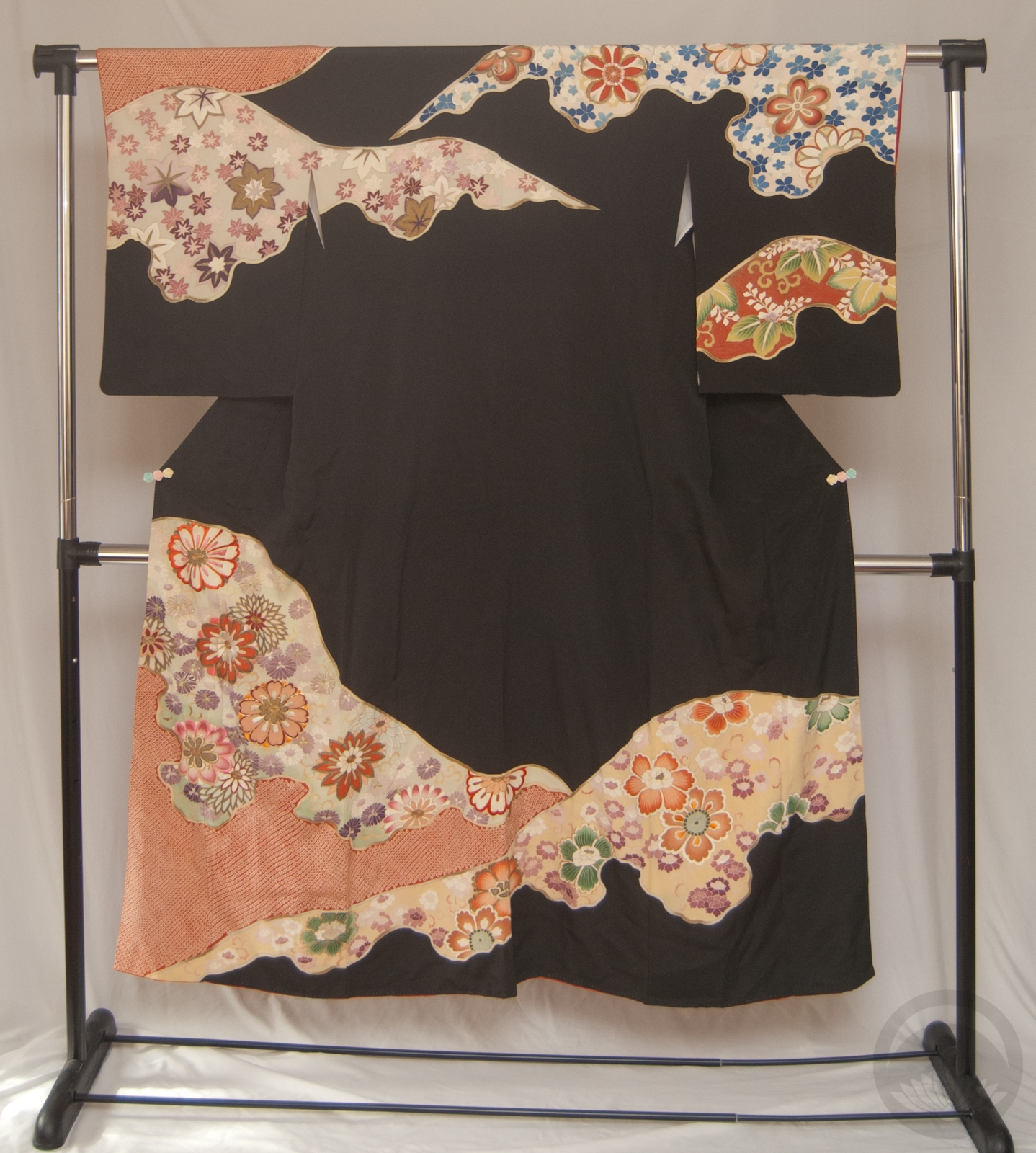
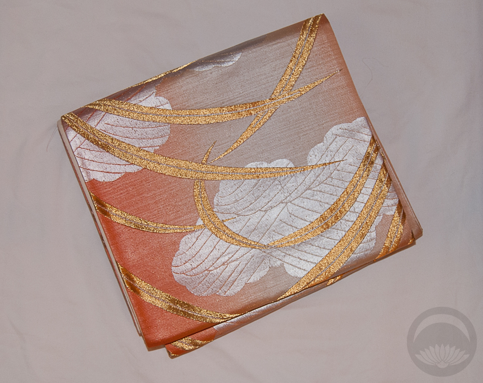
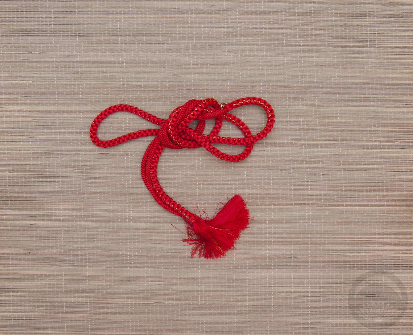
Of course, I started with my all-white shiromuku bridal furisode. The black anchor came from the homsue-hem style juban I made last summer for the fashion show. I debated removing the ruffles afterwards but decided I liked it so much I wanted to use it in other ways. I’m very glad I kept it! To balance out the black at the cuffs and hem, I went with a black obi. For the haneri and obiage, I actually used some fabric I had left over from last year’s Halloween costume, where I went as a sort of celestial moon goddess. I really love how it works here and I’m seriously debating cutting and hemming some pieces properly, to use again in the future. The final finishing touch was a beaded silvery-white obijime that echoes the sparkle of the stars on the accessories as well as breaking up the solid black of the obi.
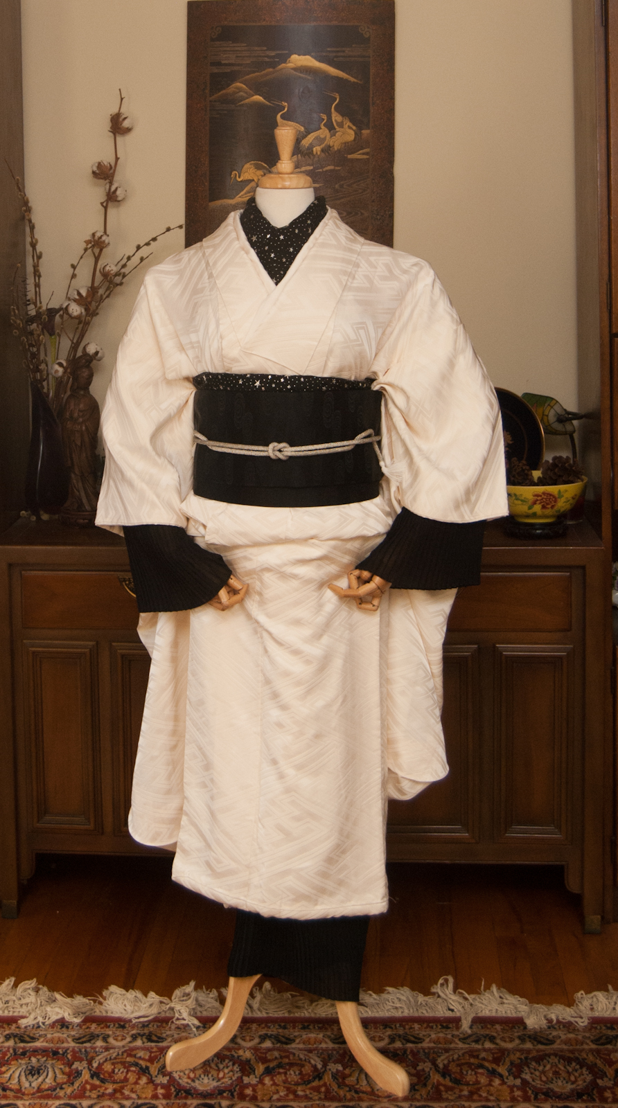

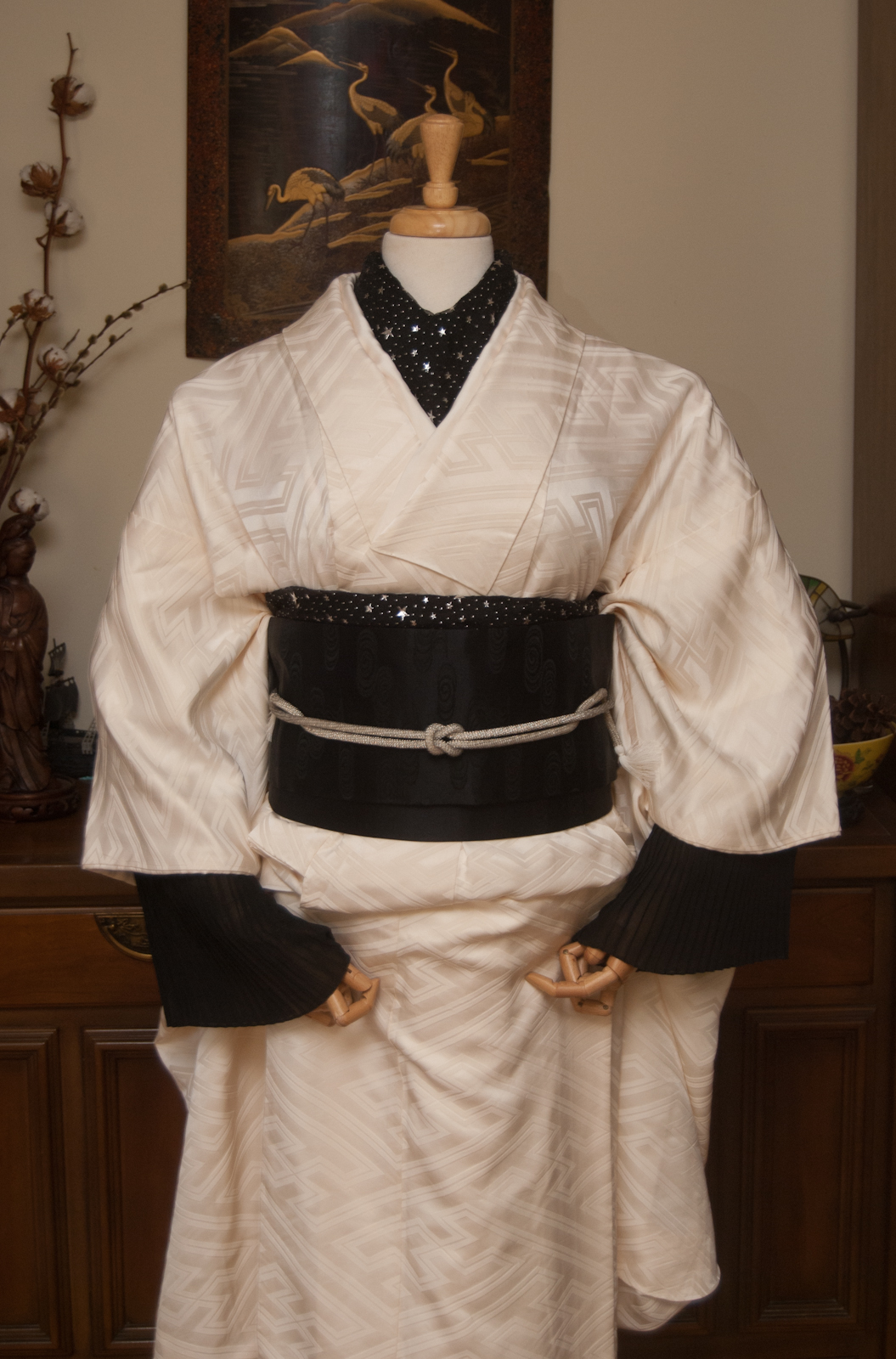
The fun thing about this outfit is that it allows me to use pieces that would traditionally never be used outside of specific circumstances; a wedding kimono and mourning obi and accessories! But since it’s such an out-there ensemble, and the addition of the very non-traditional ruffles on the juban, I think I got away with it just fine 😉
As I mentioned up top, I have indeed (temporarily) lost my job. The store where I work is a small, non-essential business, and we had no choice but to close indefinitely. I’m incredibly lucky to share a house with my folks which means that I’m not at risk for eviction or starvation. However, running this blog and bringing you guys new and exciting content on a regular basis isn’t exactly free. Whether it be new coordinations, book reviews, DIY projects, or even just covering the cost of hosting the blog, things might take a hit if I’m out of work for much longer. I know this crazy pandemic situation is affecting everyone, so I’m certainly not expecting anything, but if you are lucky enough to be working from home and have a steady income, I’m not too proud to add a link here to my donation & support page. Thank you for reading all this!
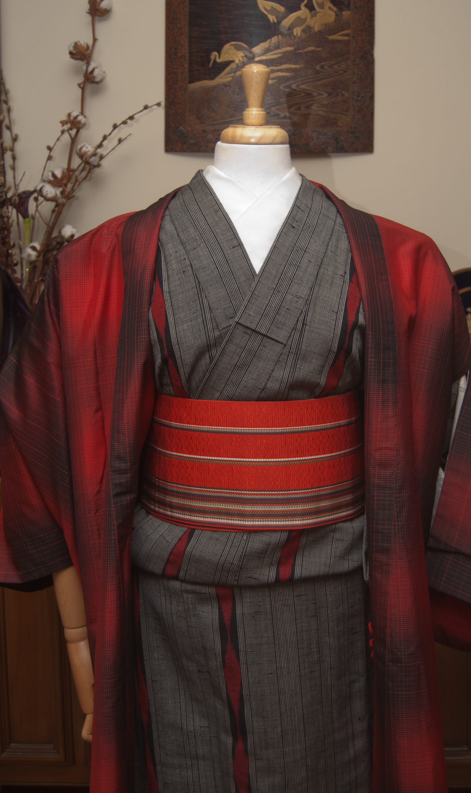
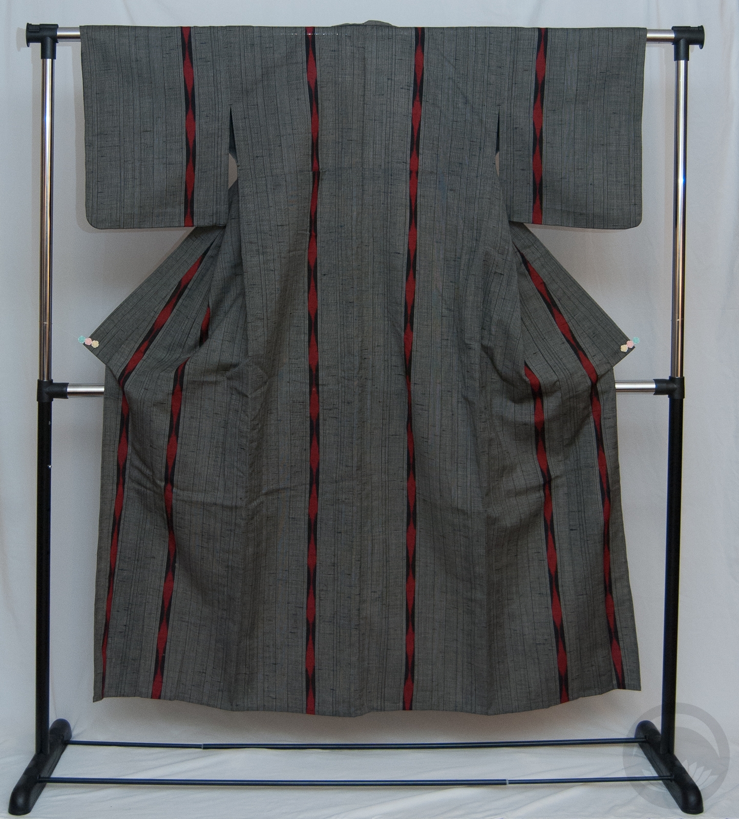
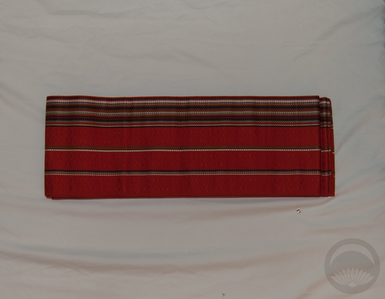
Items used in this coordination
-
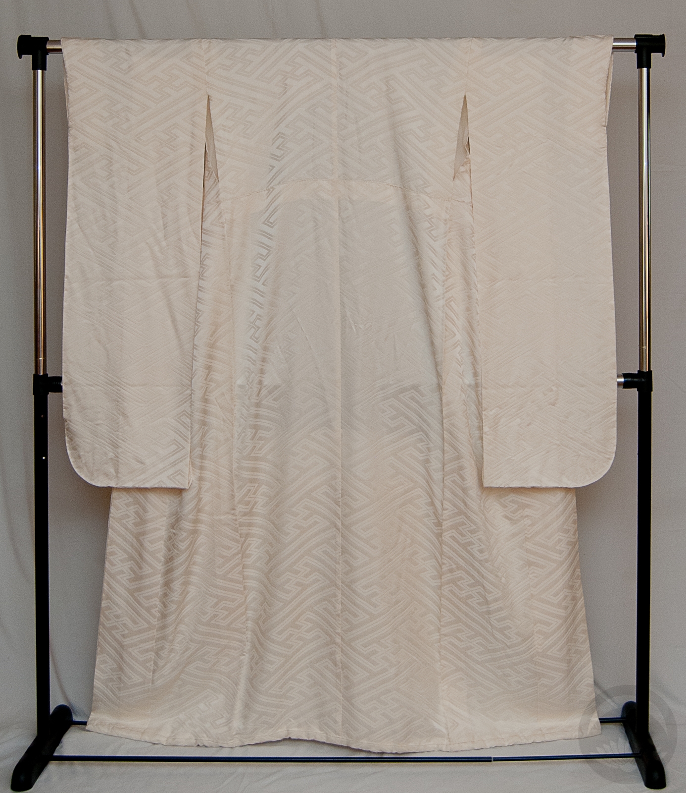
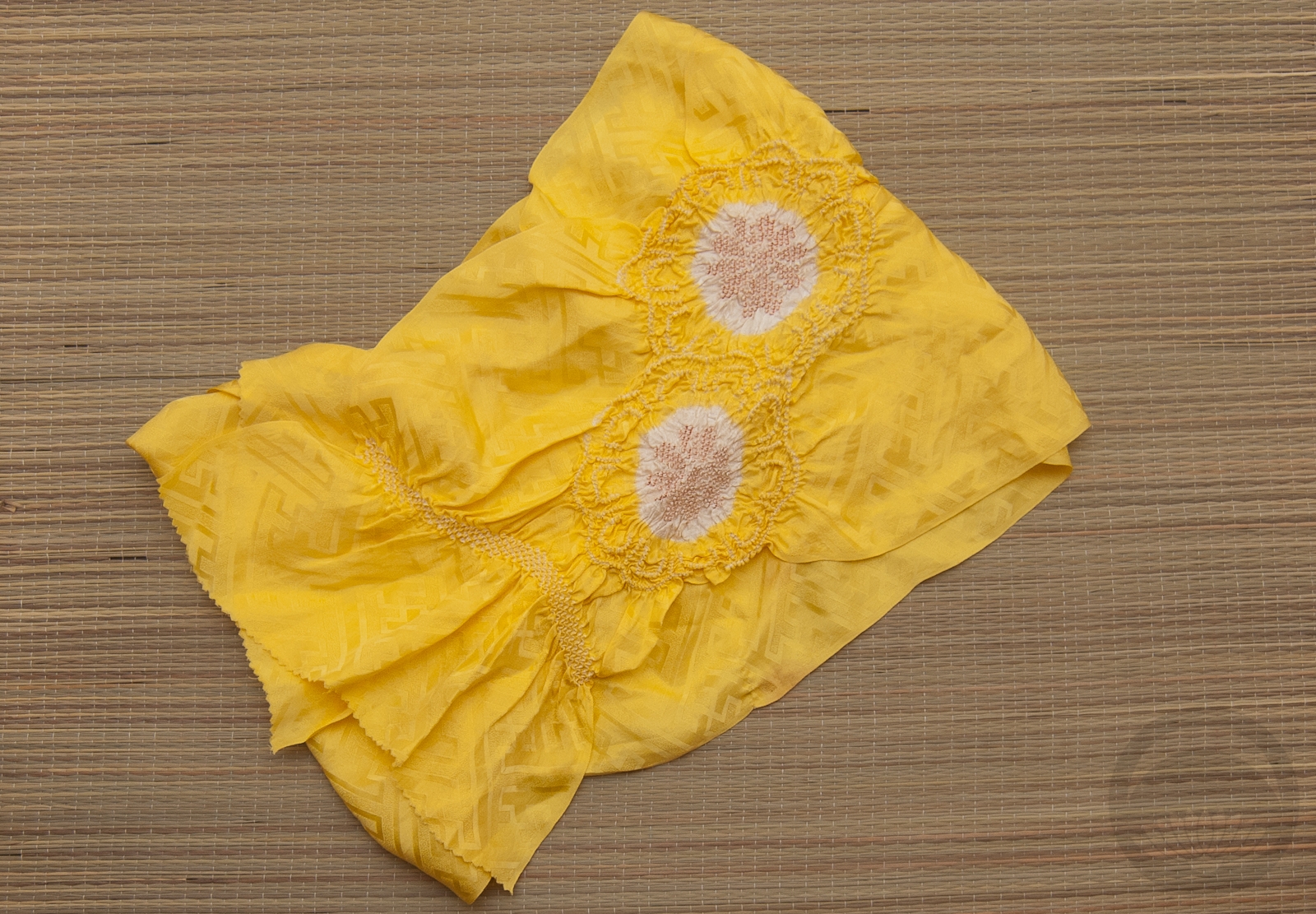
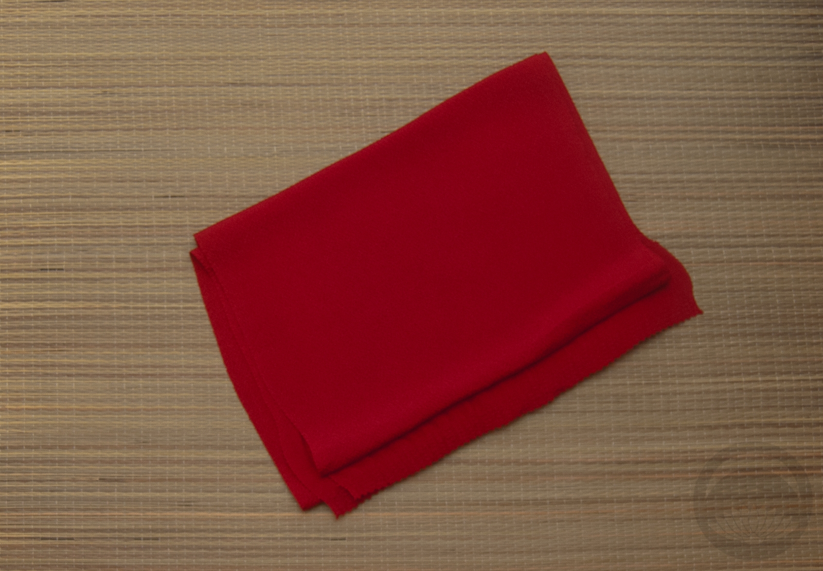
- Ivory Bridal Furisode
-
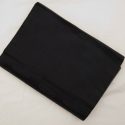
- Mofuku Nagoya Obi
-
- Mofuku Rinzu Obiage

-
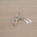
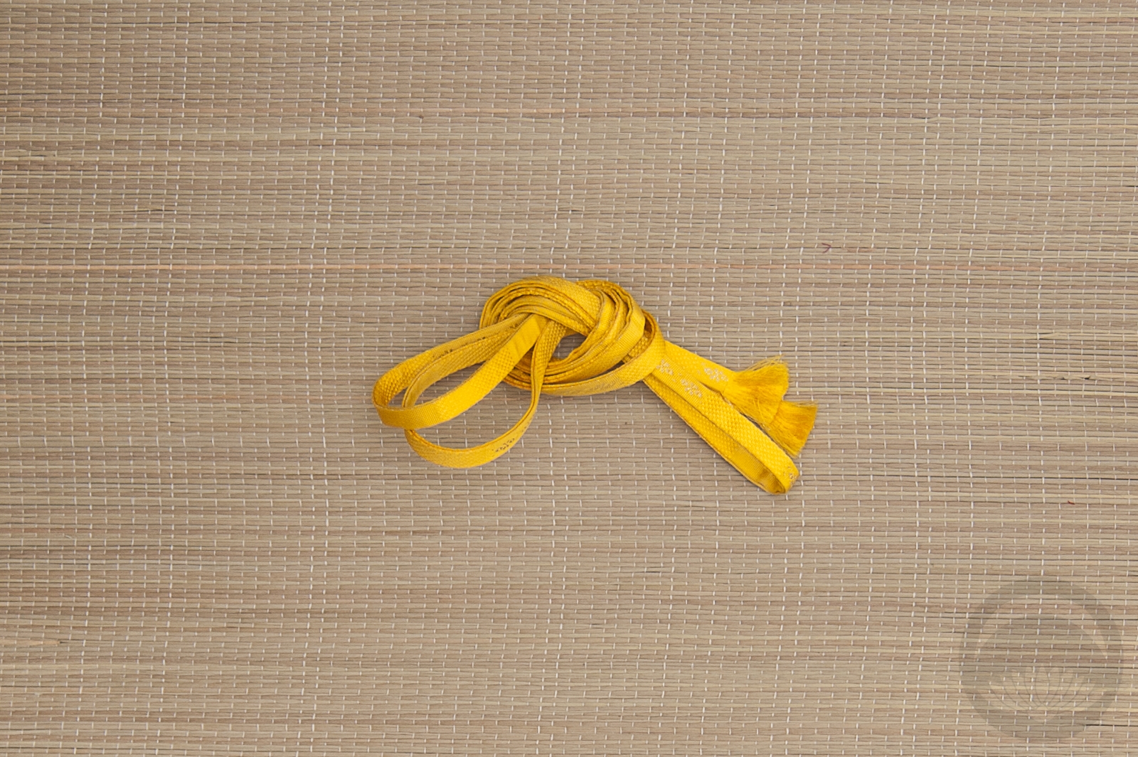
- White Beaded


 Bebe Taian
 CHOKO Blog
 Gion Kobu