
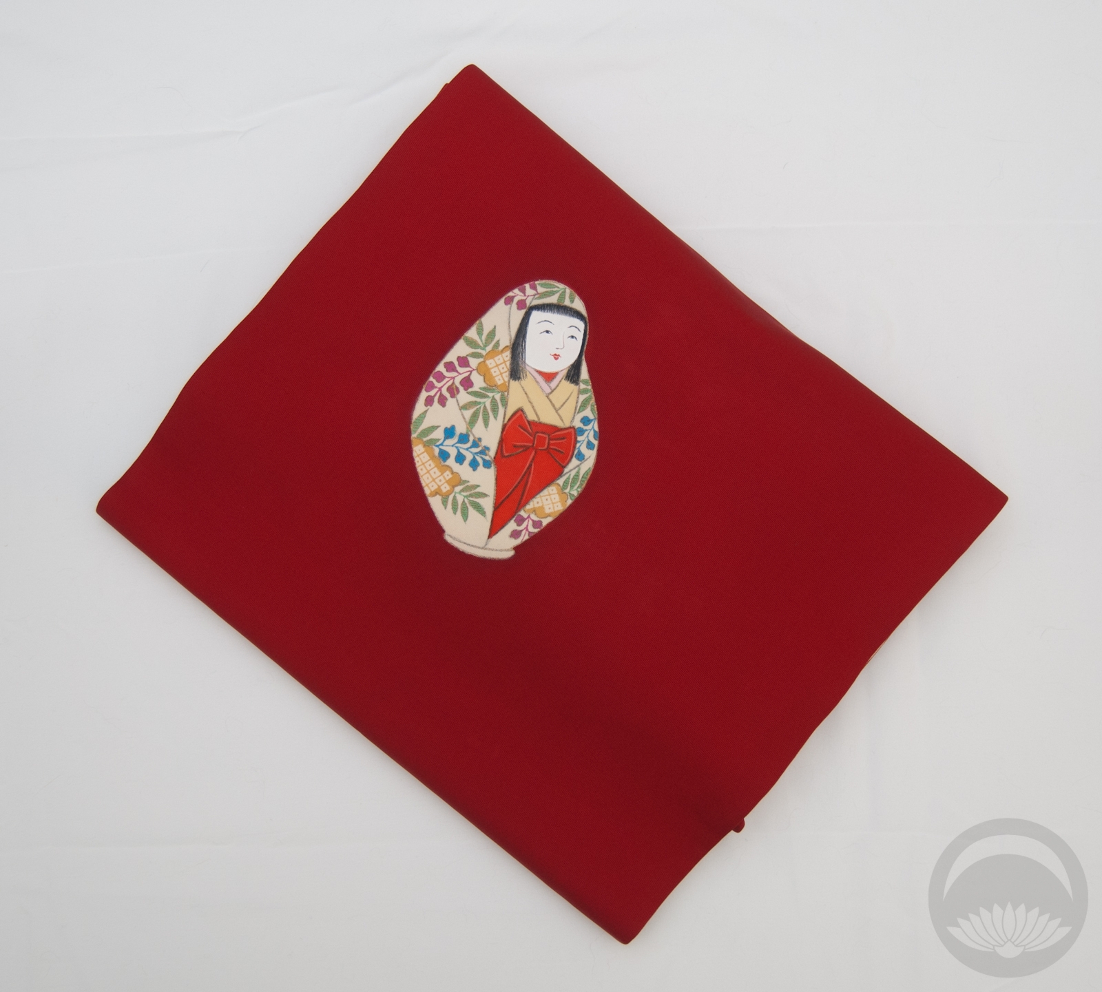
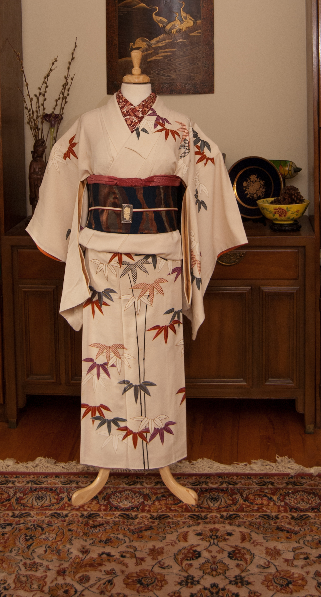
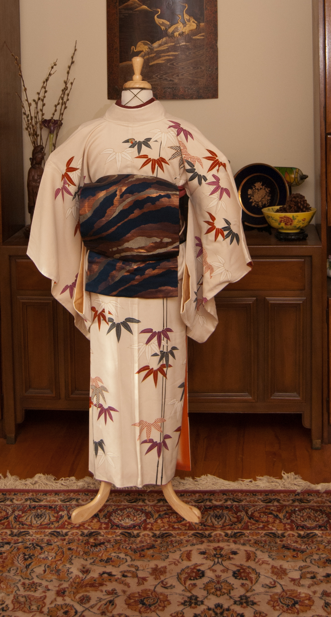
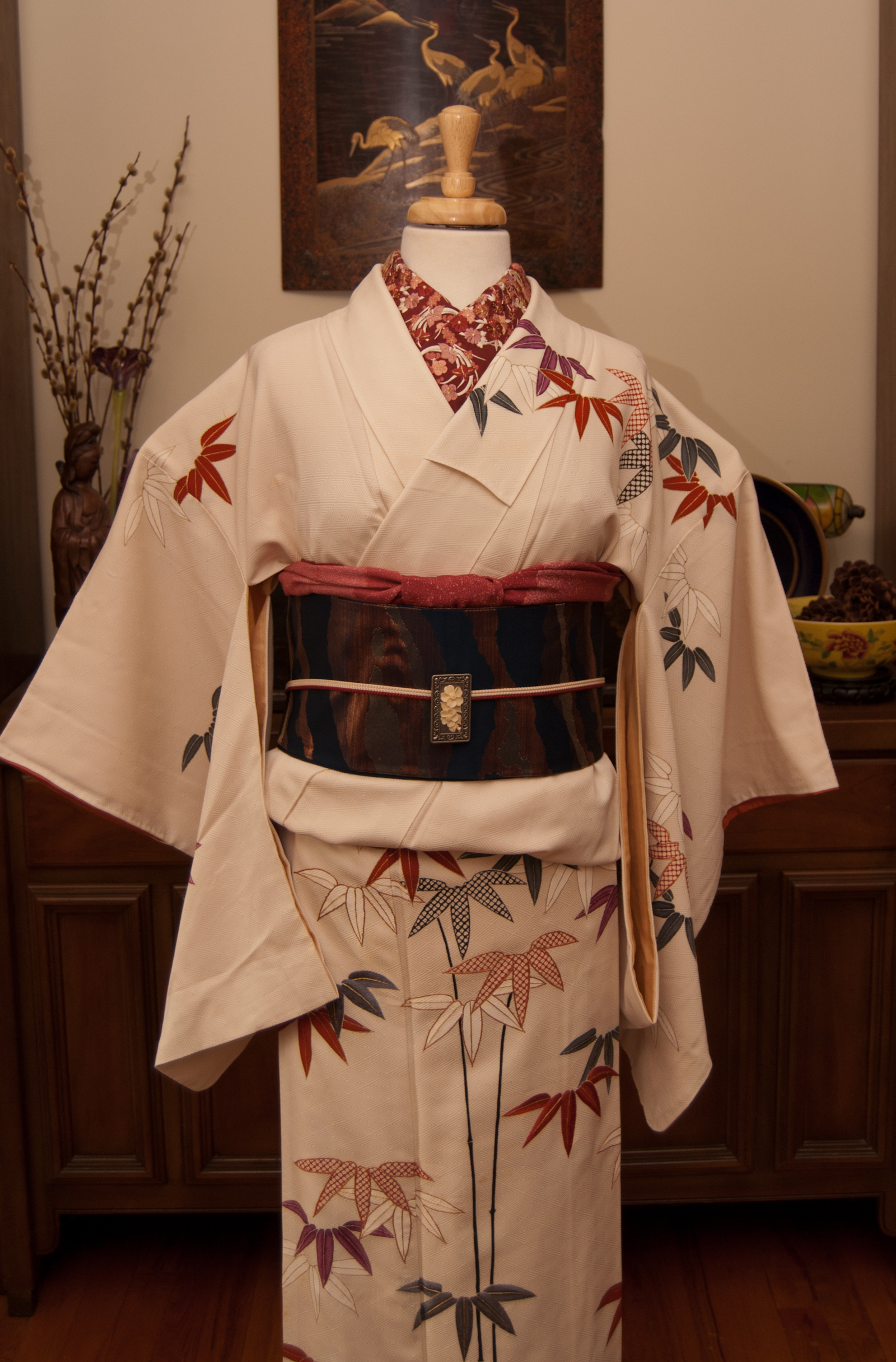
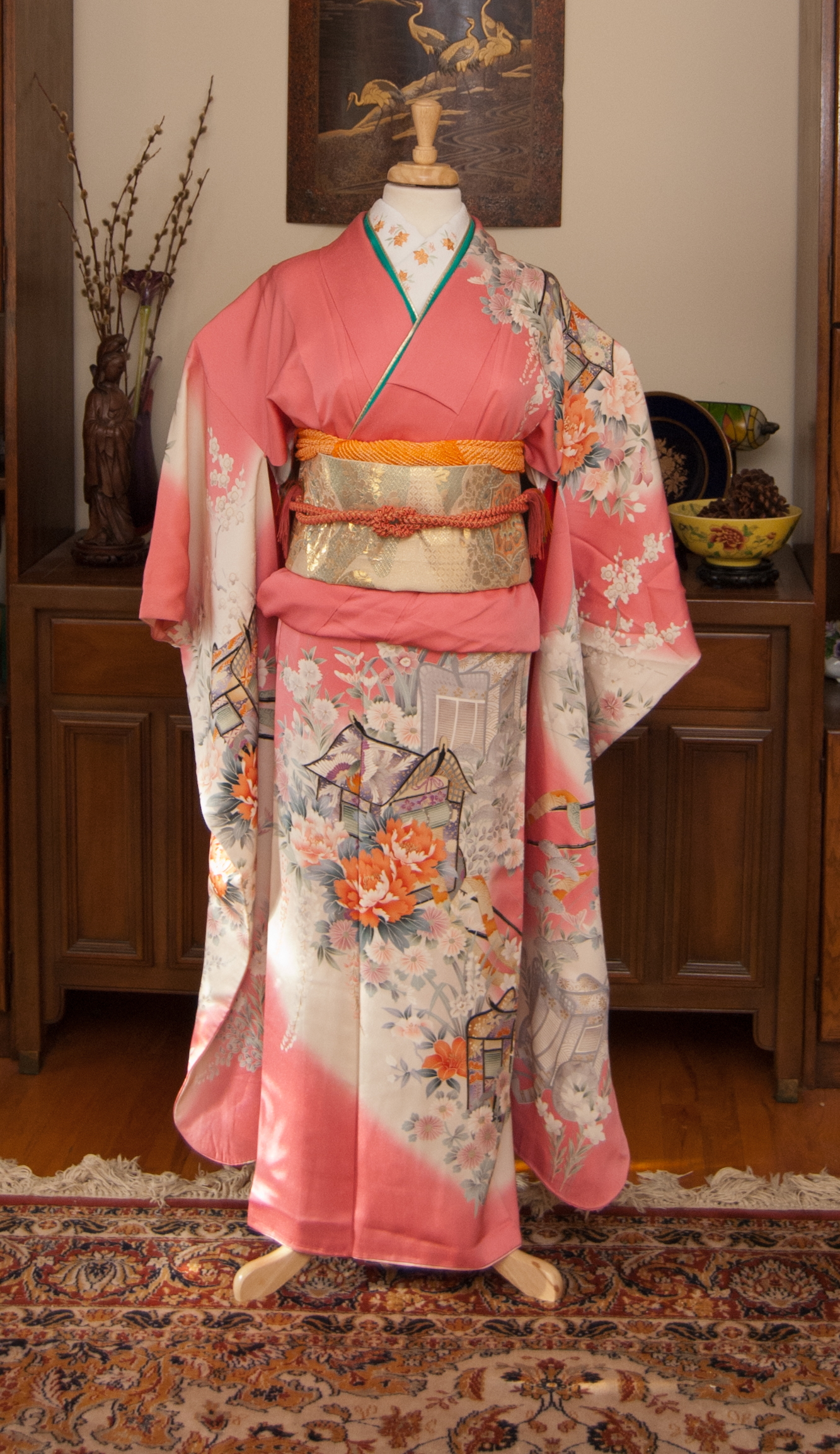
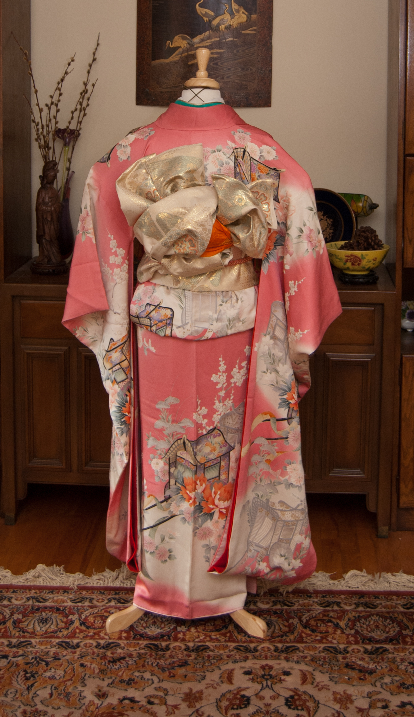
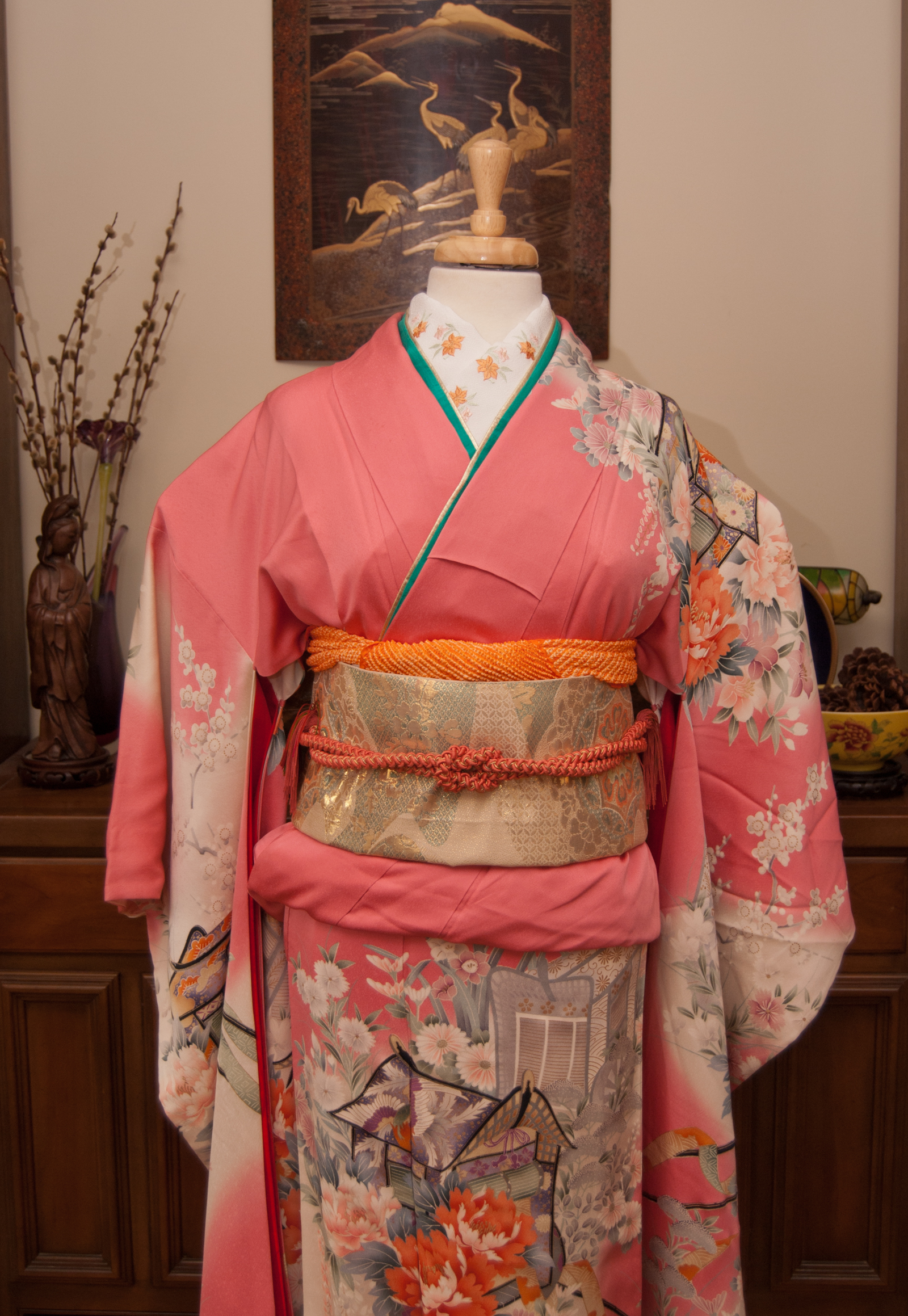
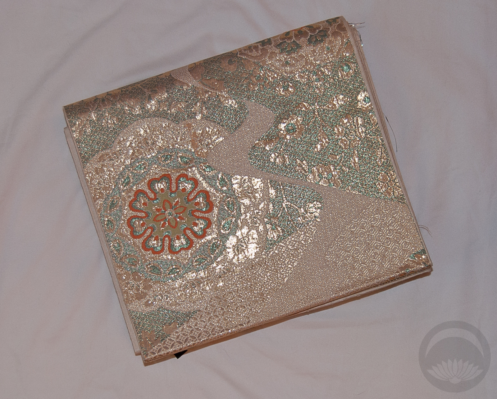
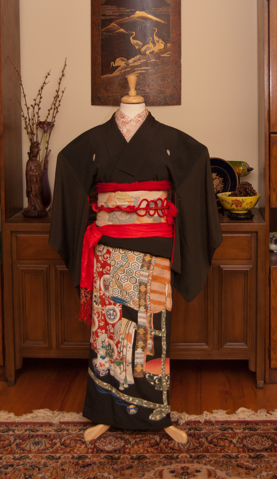
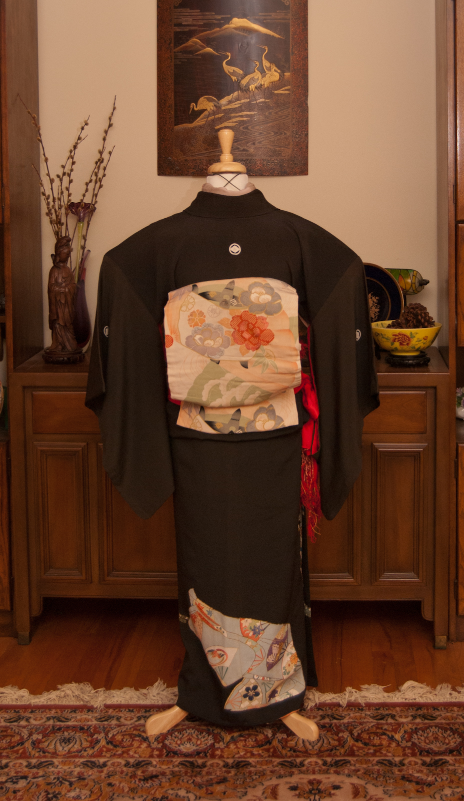
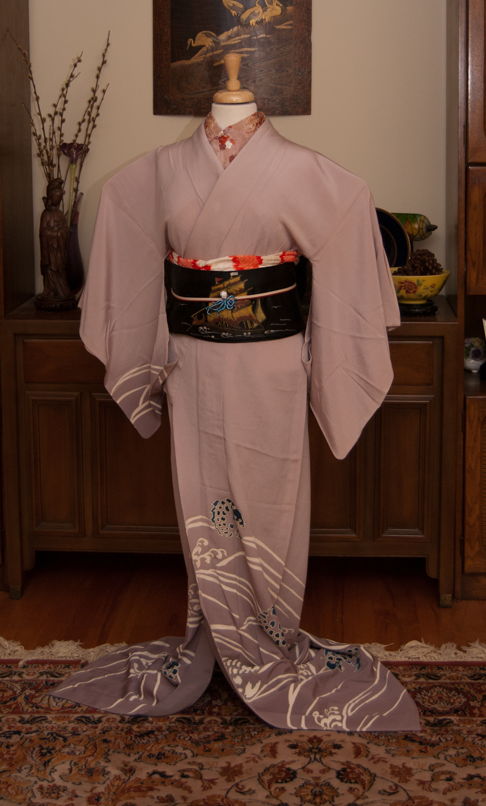
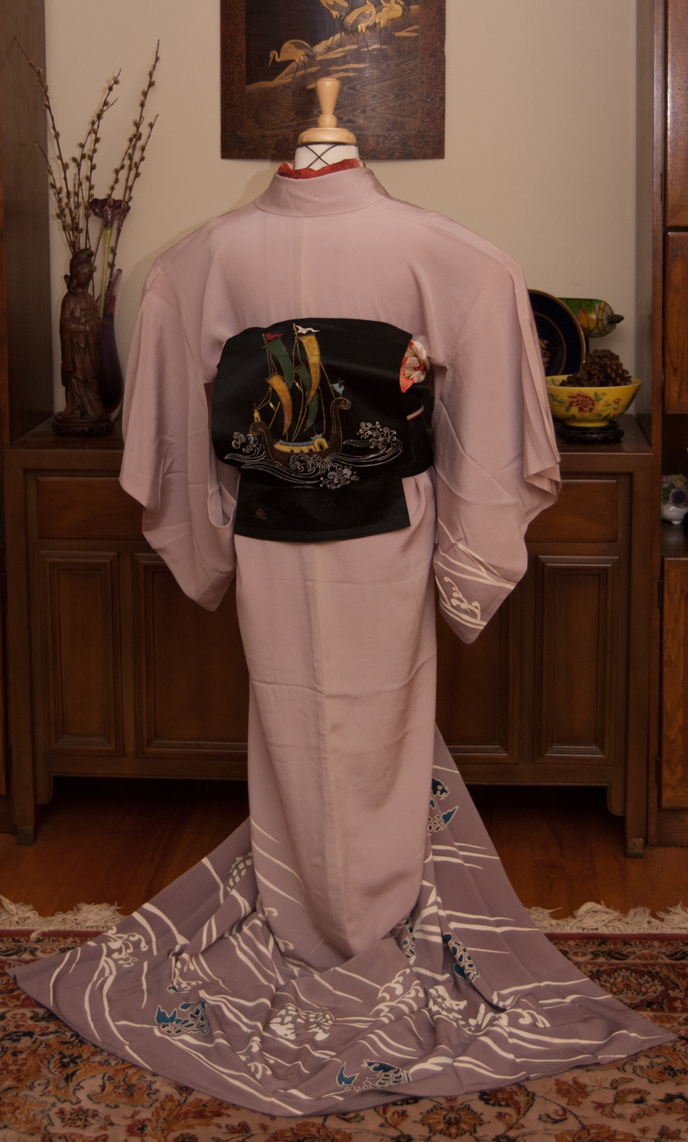
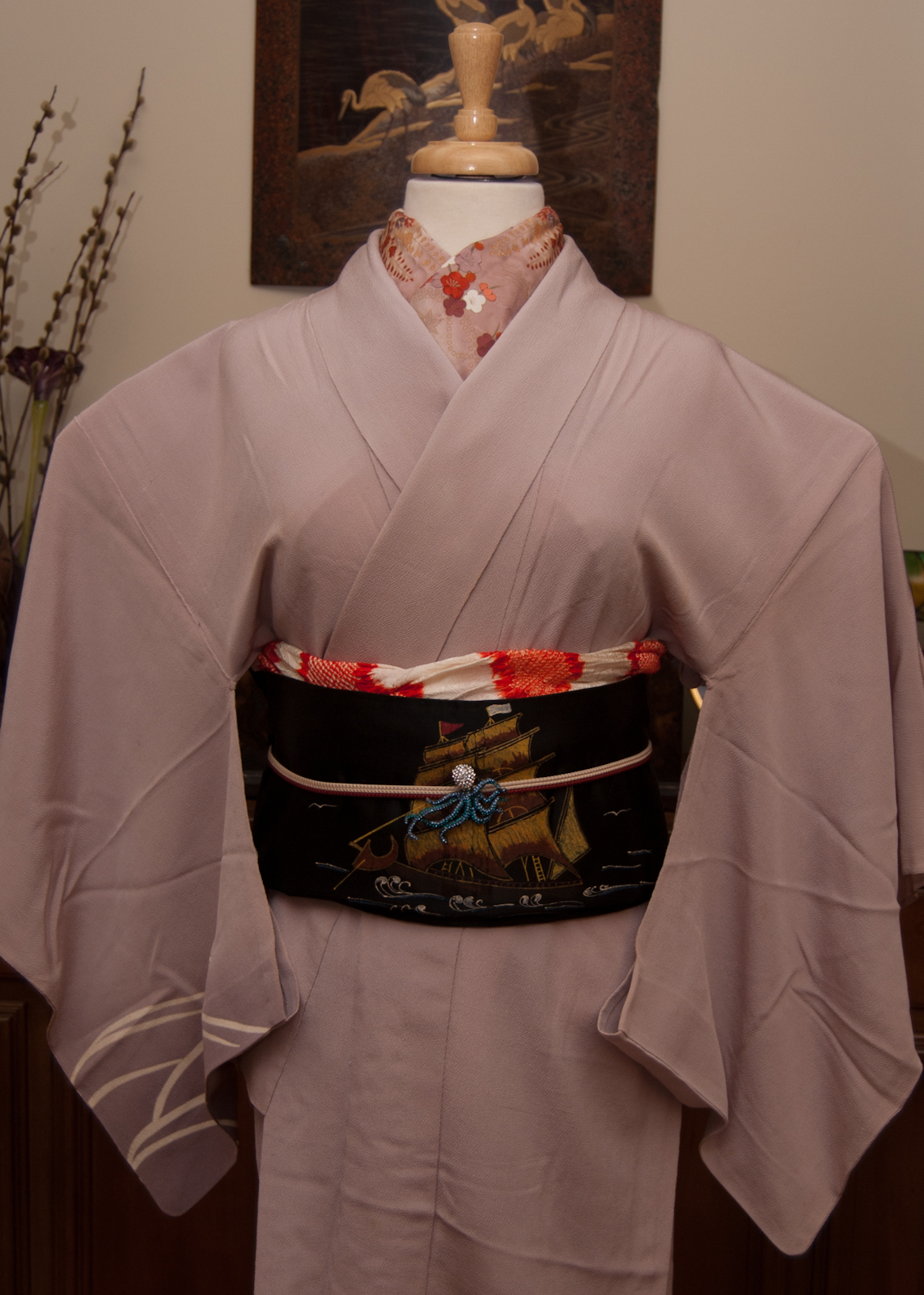
Now we come to the last of my ridiculously indulgent birthday coordinations using items from last month’s kimono bazaar. I fell in love with this obi the moment I laid eyes on it – the dolls are just too cute for words.
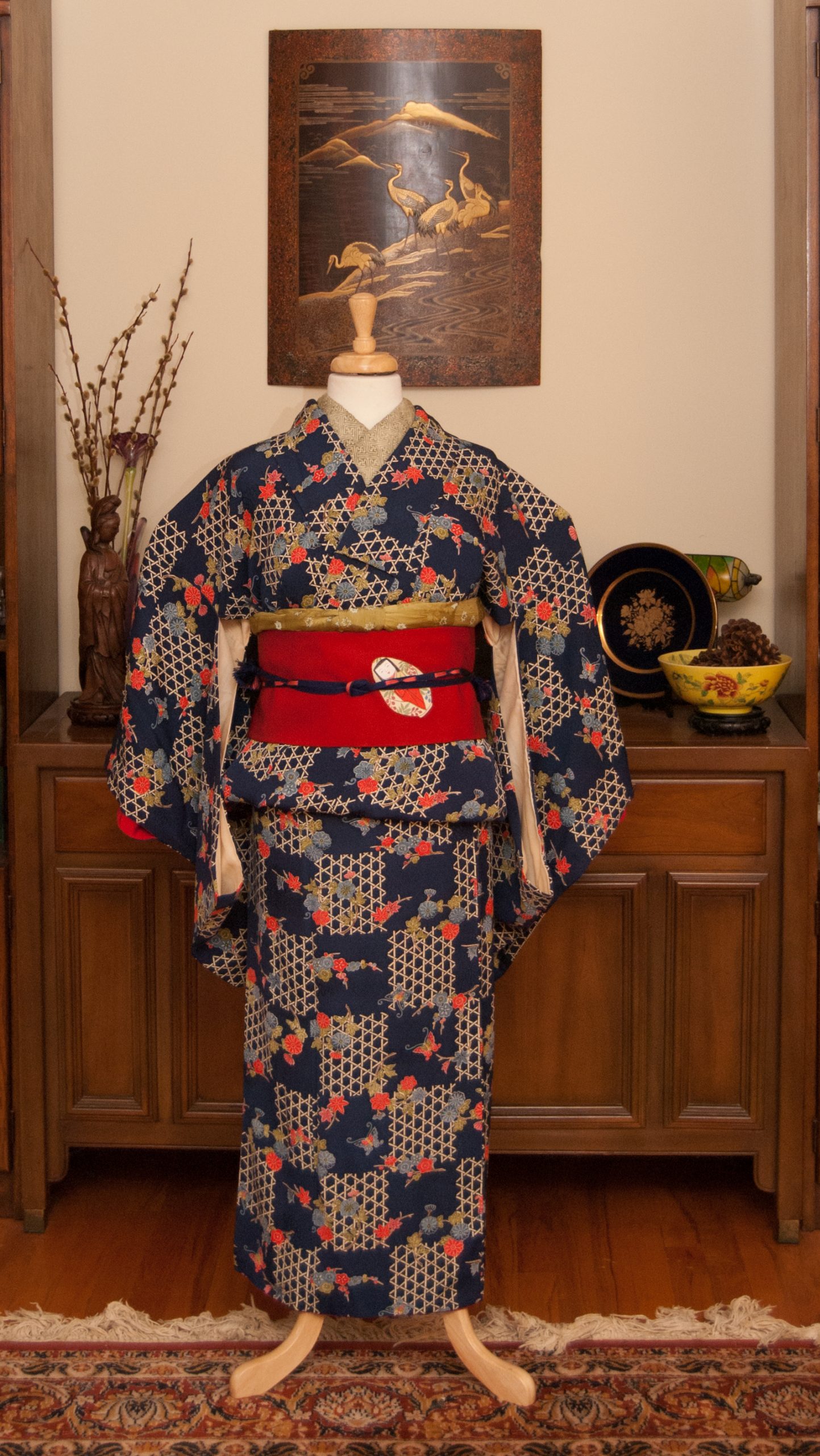
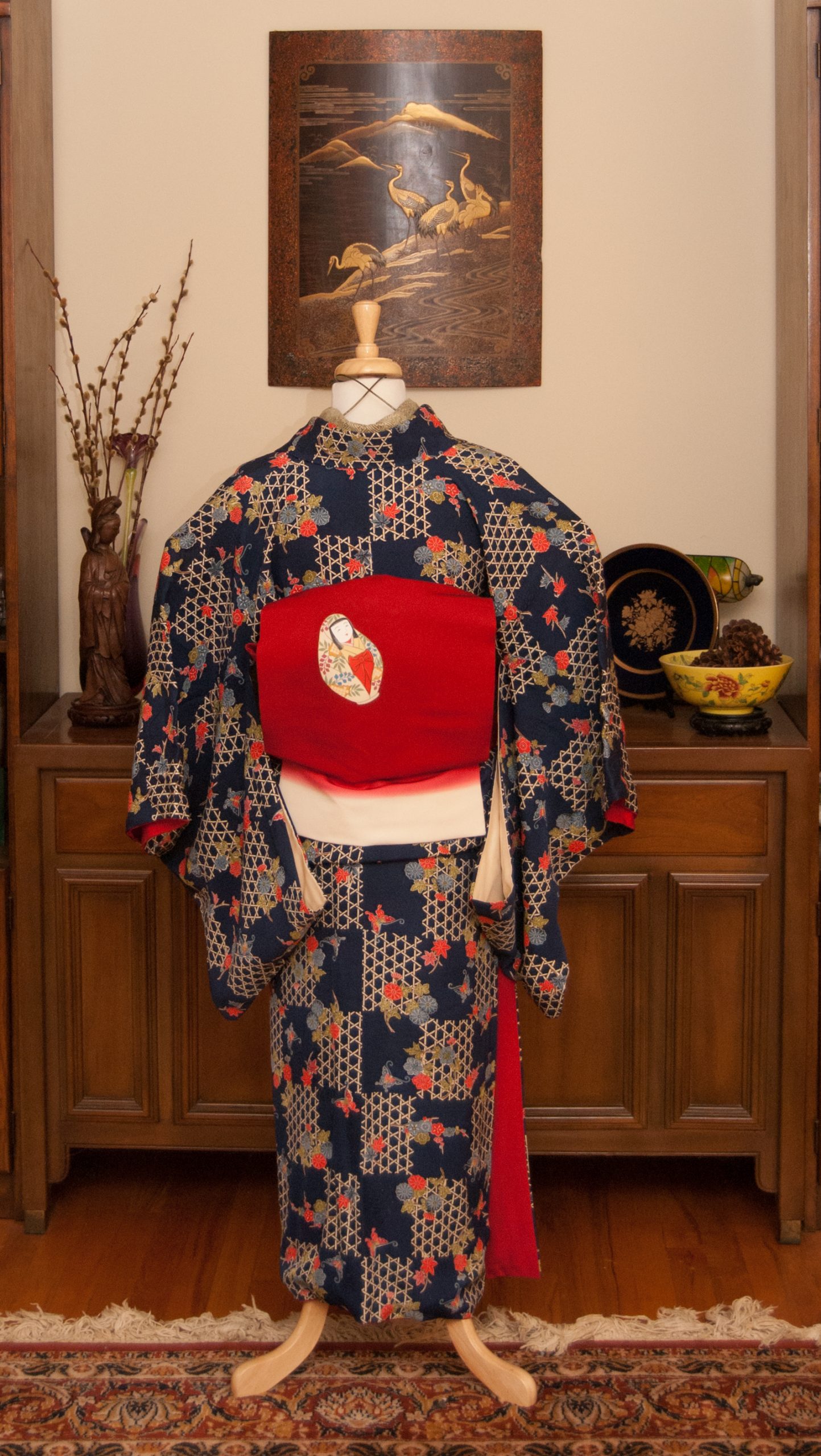
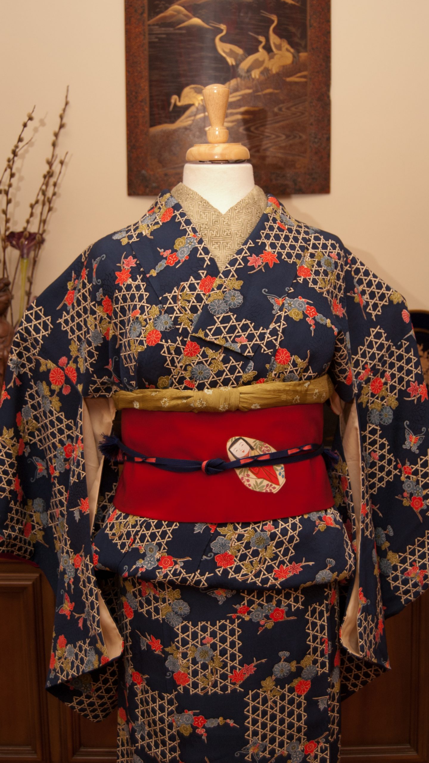
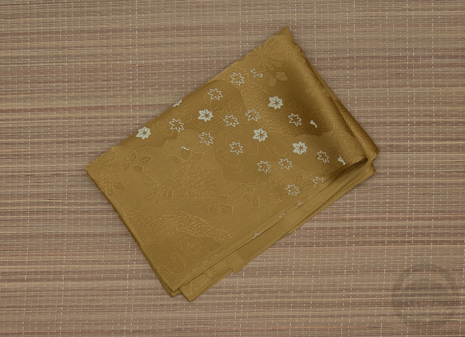
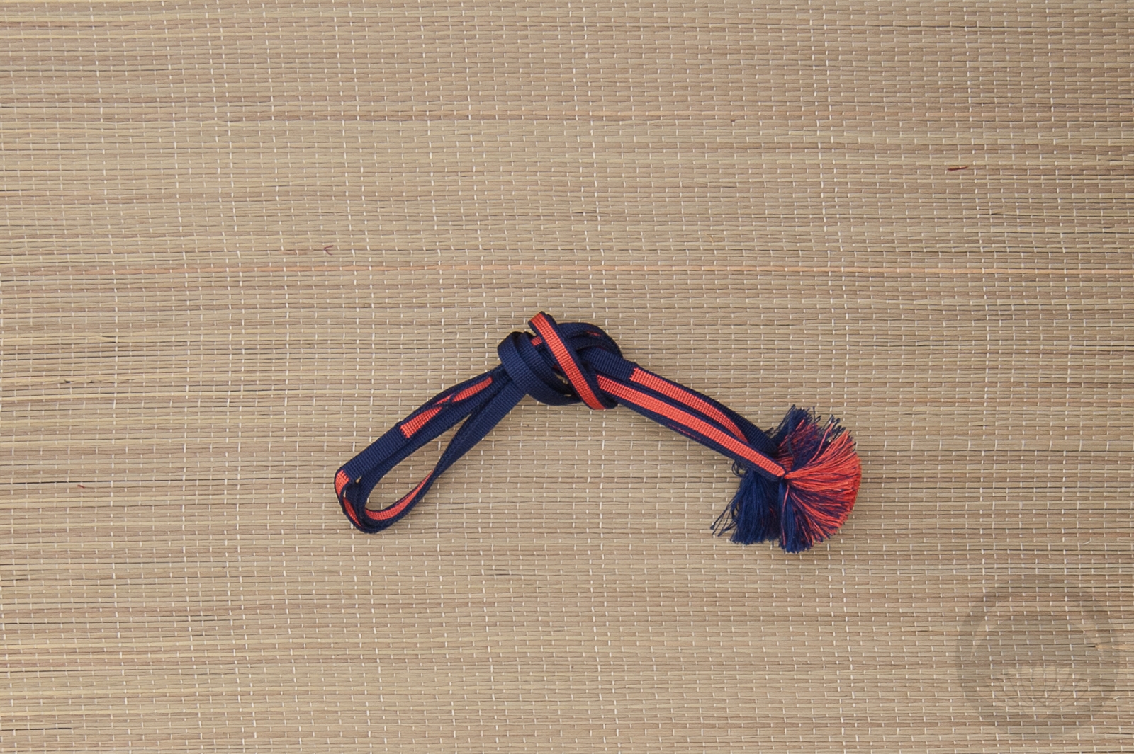
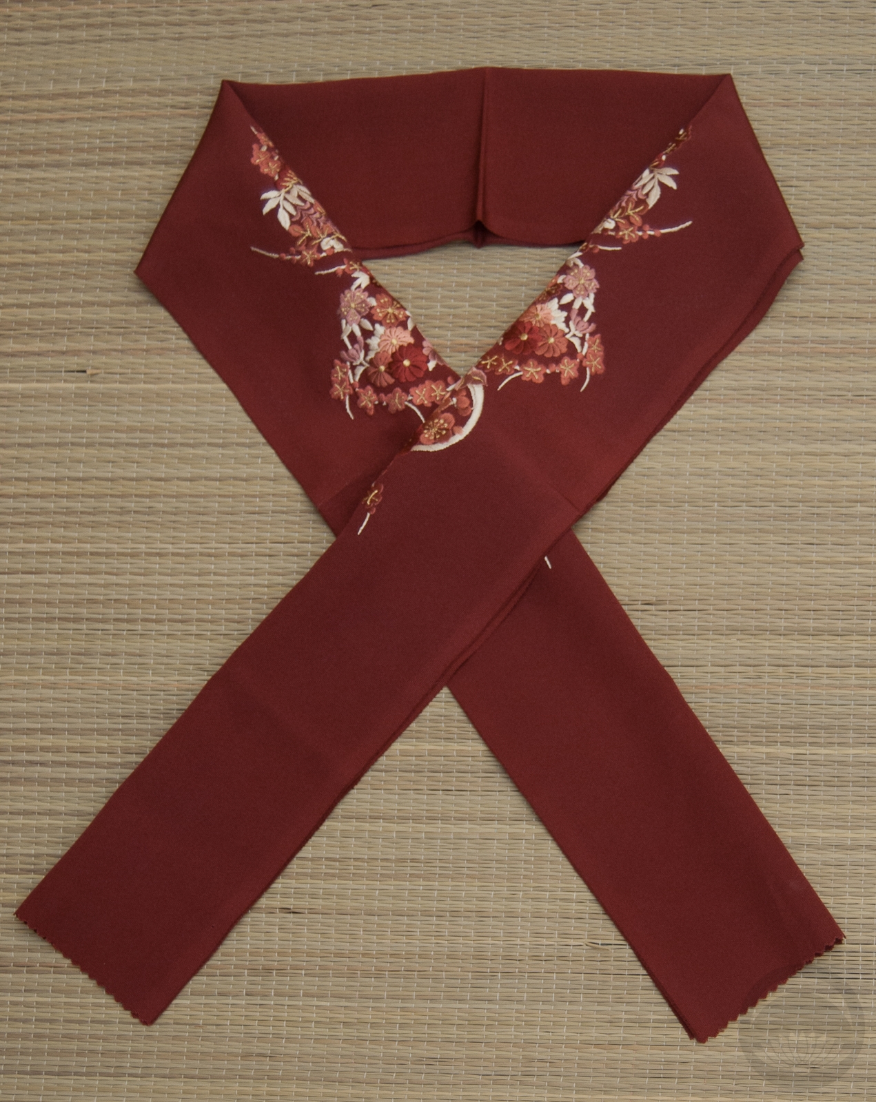
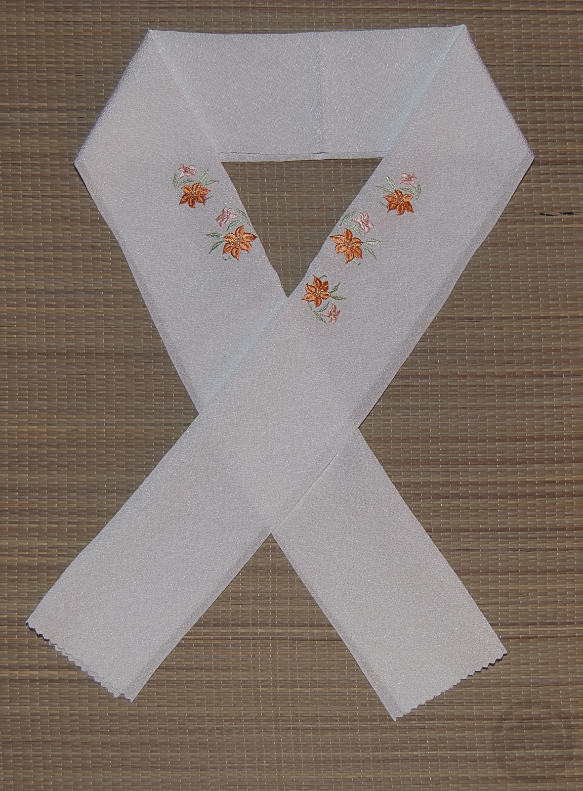
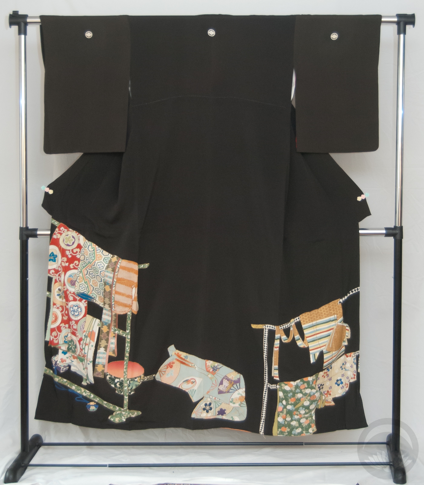
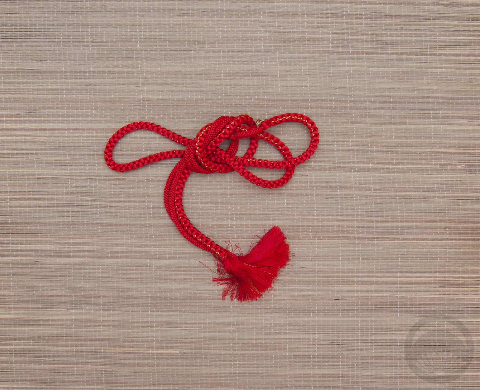
The colours in it paired up perfectly with the colours in this vintage-feeling komon Naomi gave me several years back. I also happened to have a haneri and obiage that were a spot-on match for the olive green tones in the kimono. I was a little stumped when it came to the obijime until I remembered I have this one that is an exact match for the navy background and pink momiji leaves in the kimono. I couldn’t be happier by how well every item in this coordination calls back to at least one other item.
Quick note – I am in the process of changing how images are stored. I used to upload them all to my flickr account and then create linked galleries, but they are now confining free accounts and it’s a system I’ve always found a little inefficient anyway. I used to get traffic from there but I don’t any longer, so I’m going through the arduous task of downloading all my content, hosting it locally, and editing every single entry that contains images from flickr. If you’re browsing and see things broken or missing, please be patient! Thanks for understanding!
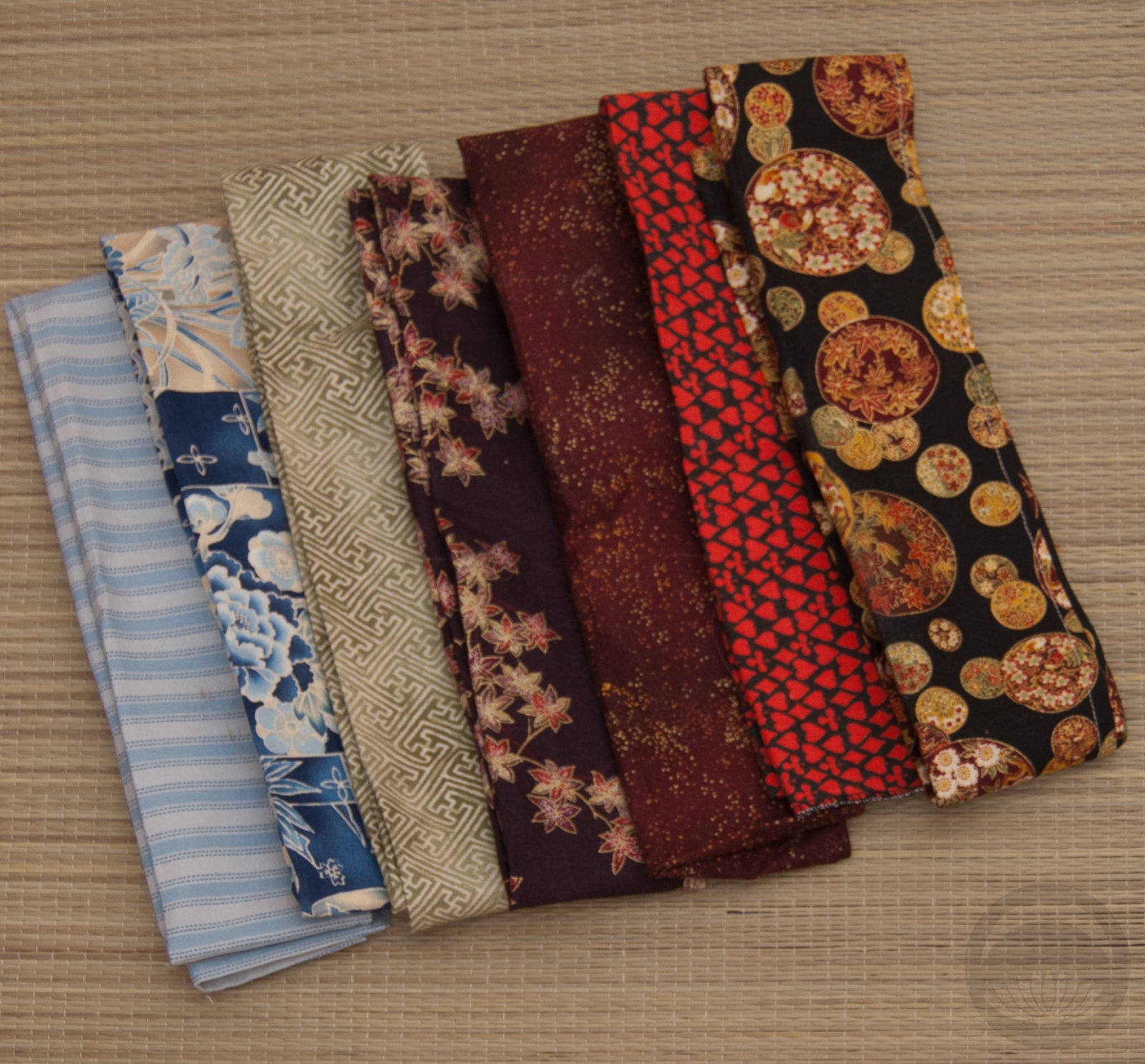
Items used in this coordination
-
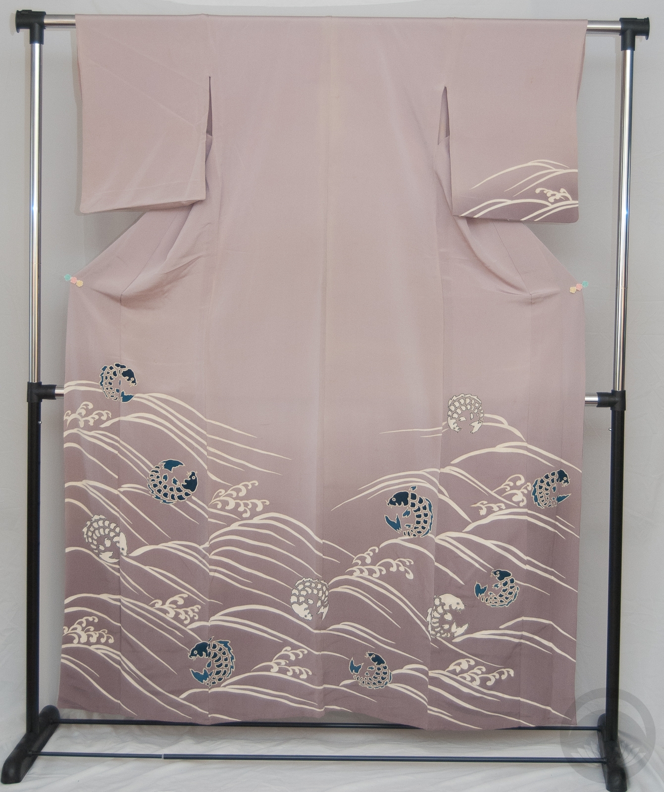
- Bingata-Style Navy

-
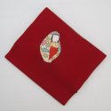
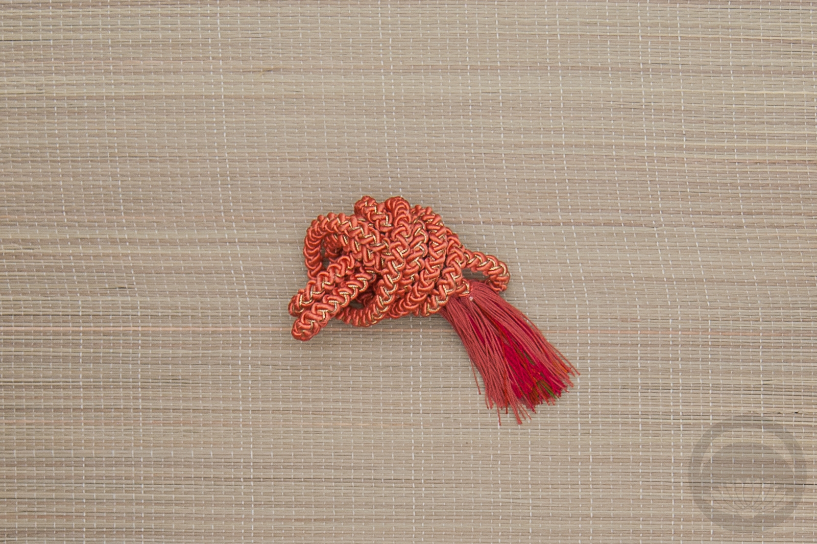
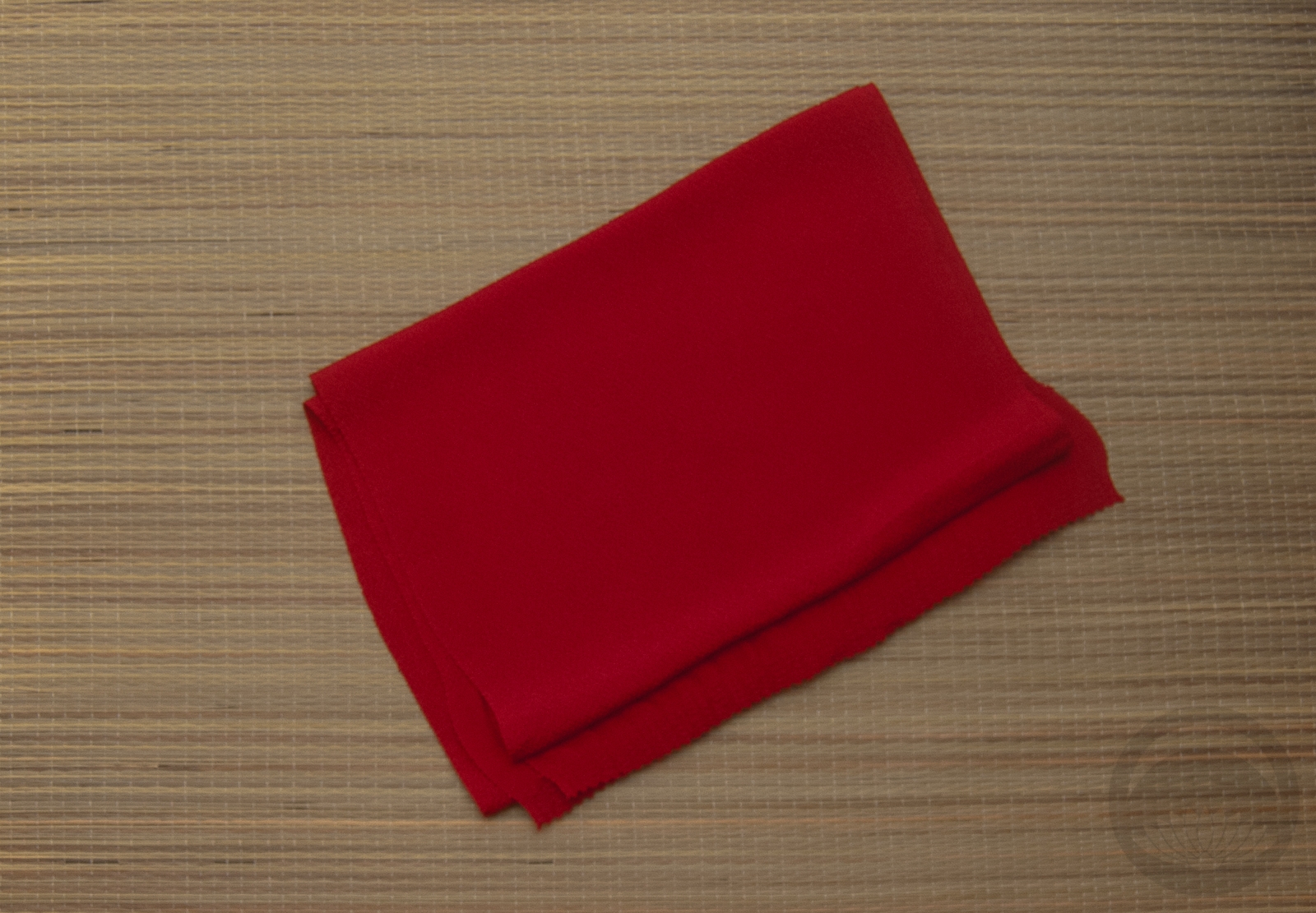
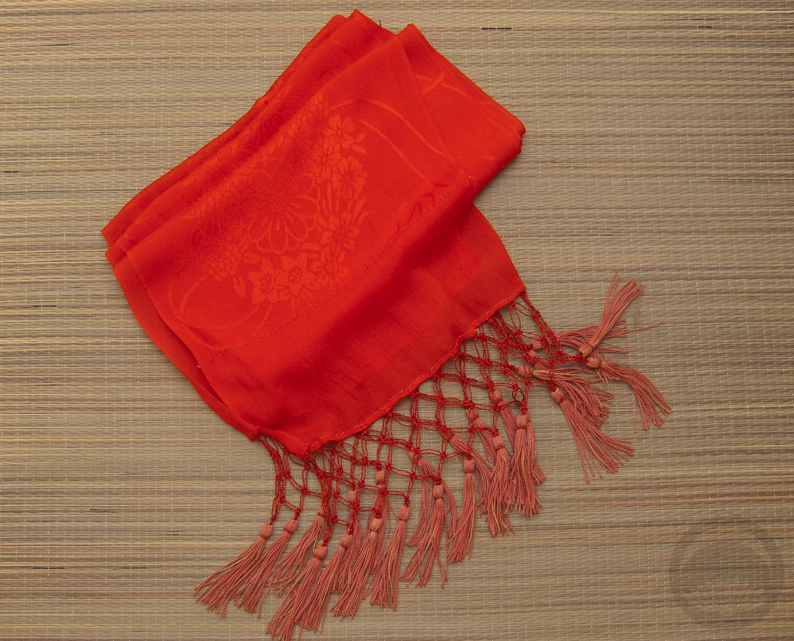
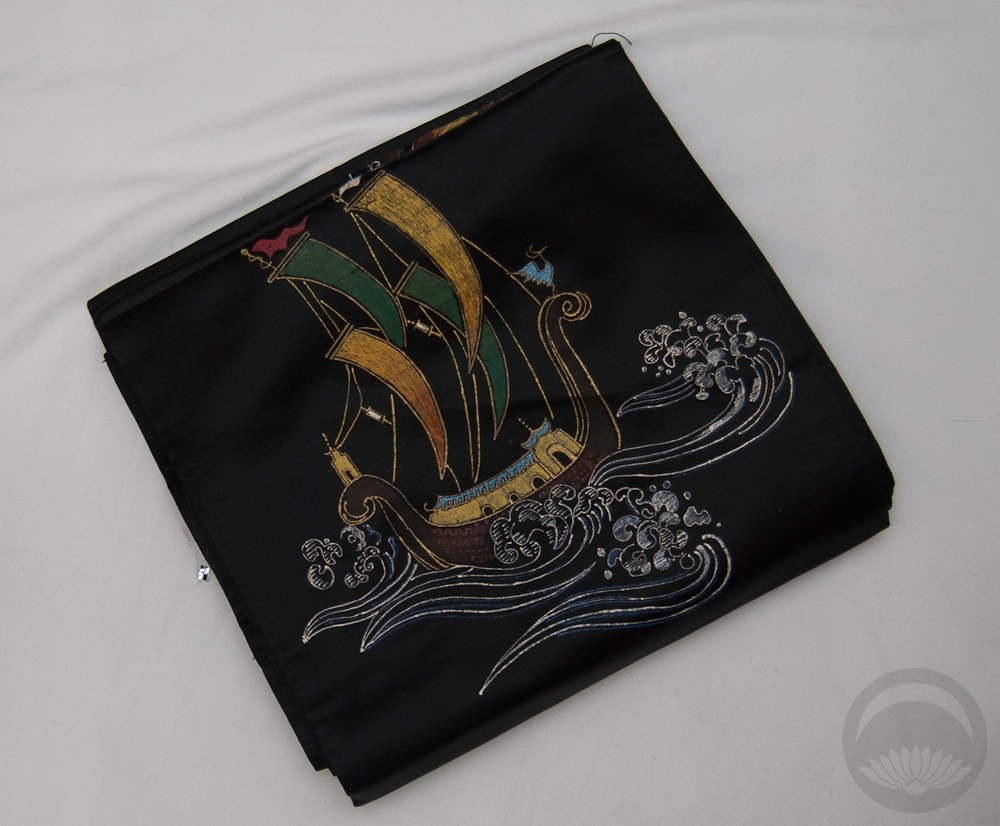
- Red Ningyo
-
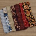
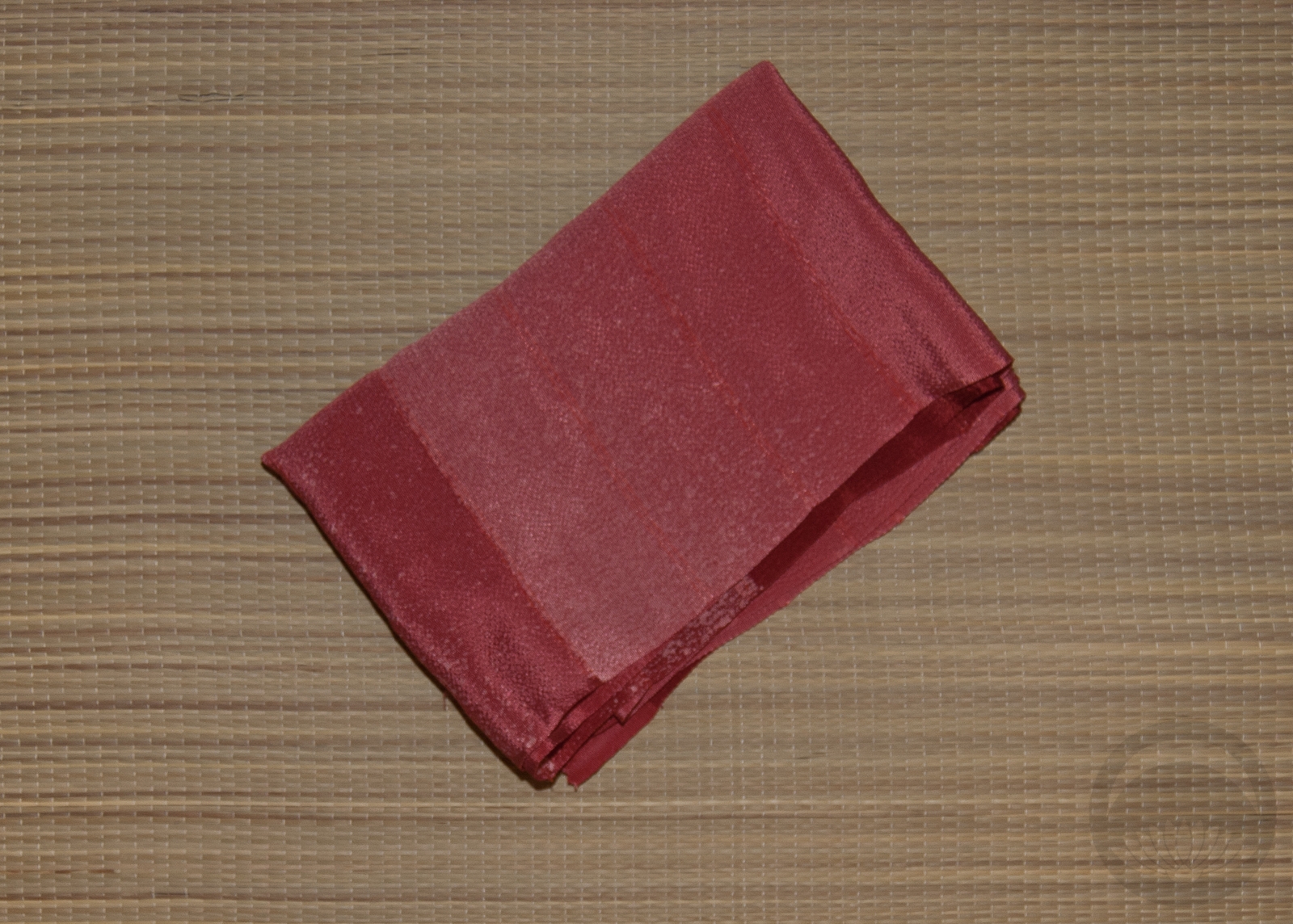
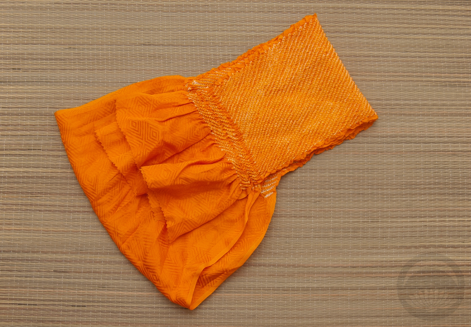
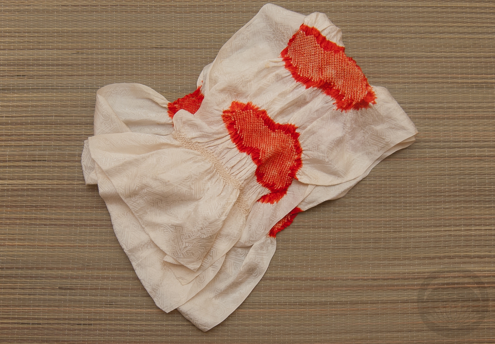
- Mixed Cotton
-
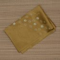
- Olive Rinzu
-
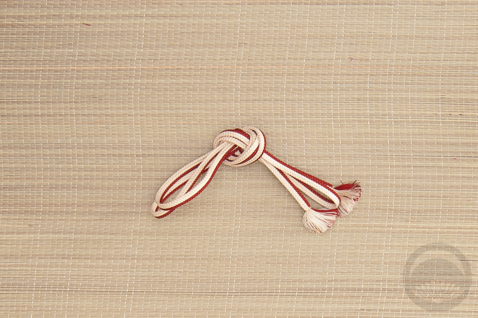
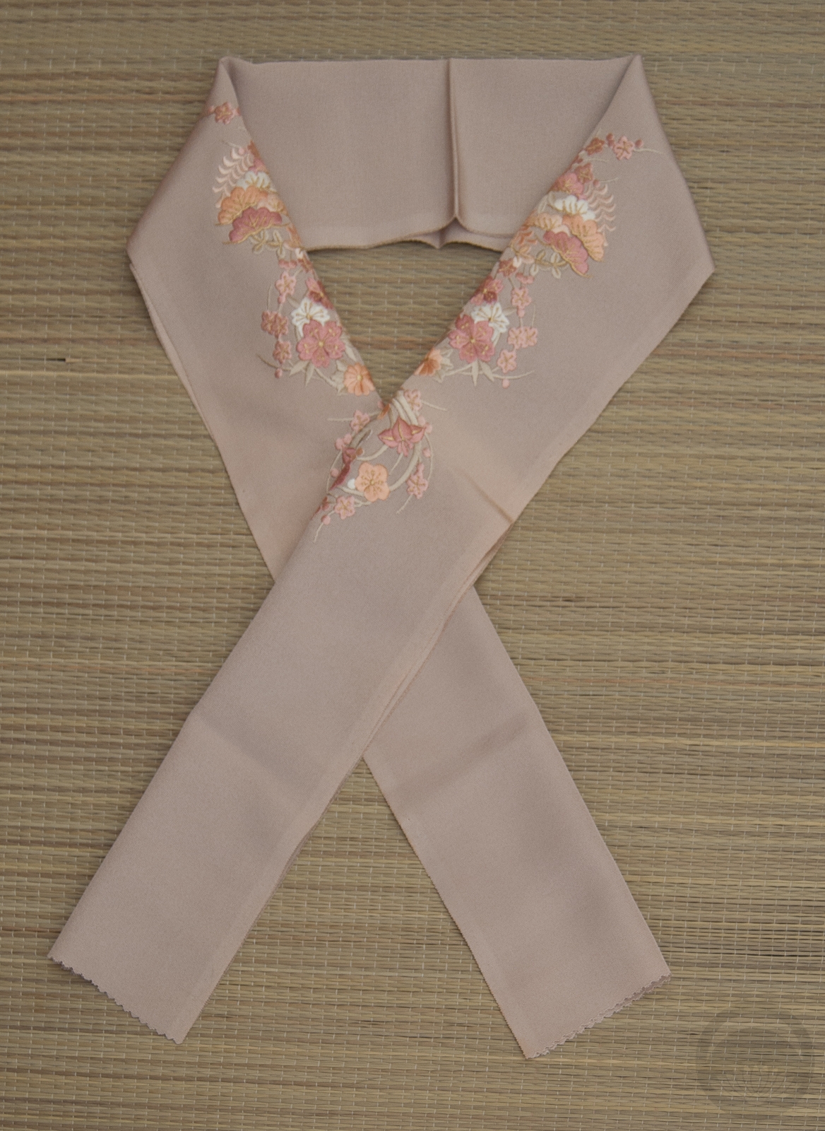
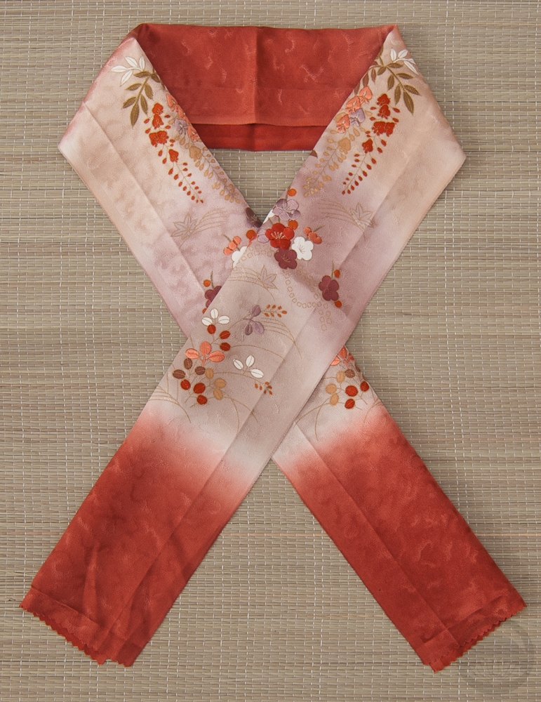
- Navy & Salmon


 Bebe Taian
 CHOKO Blog
 Gion Kobu