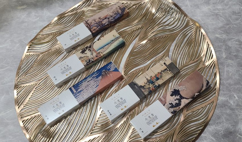
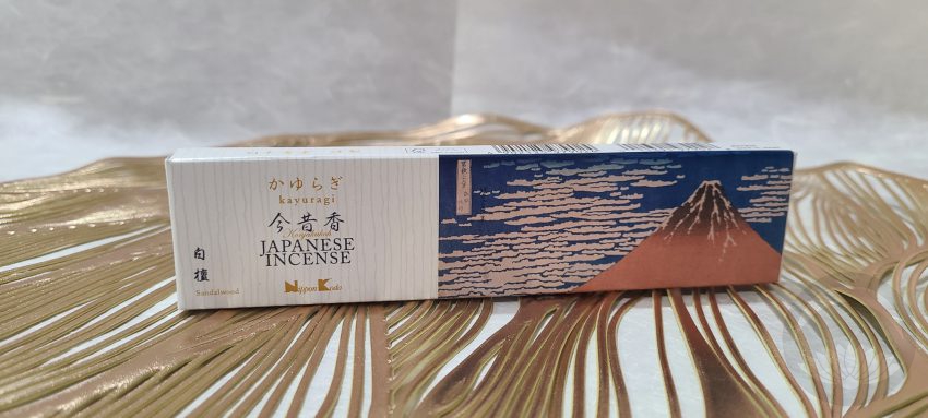
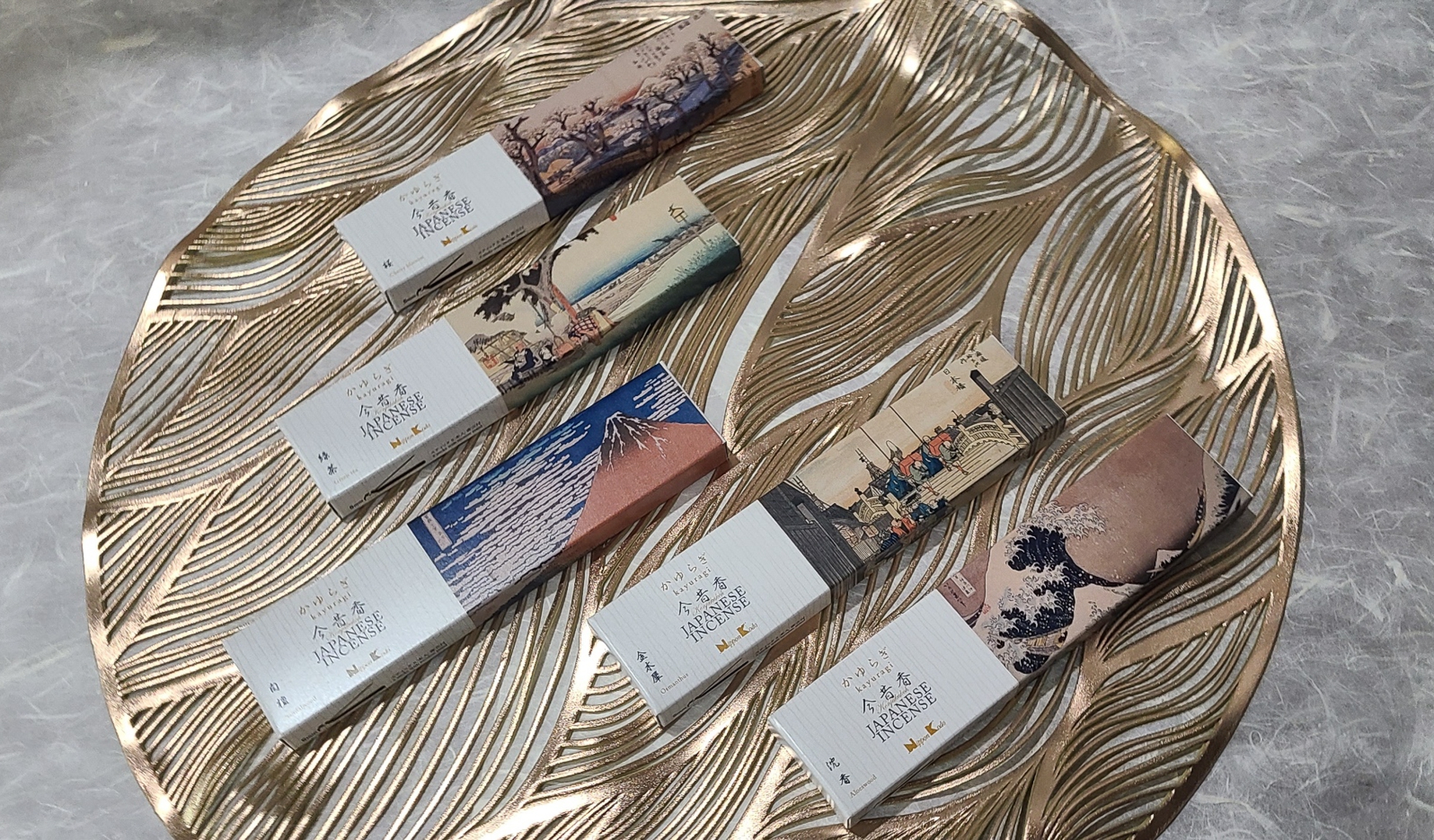
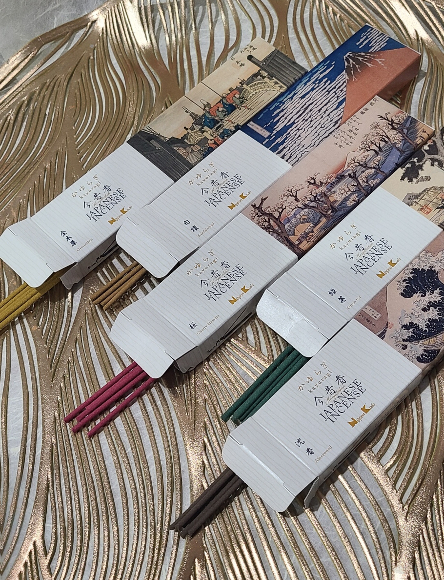
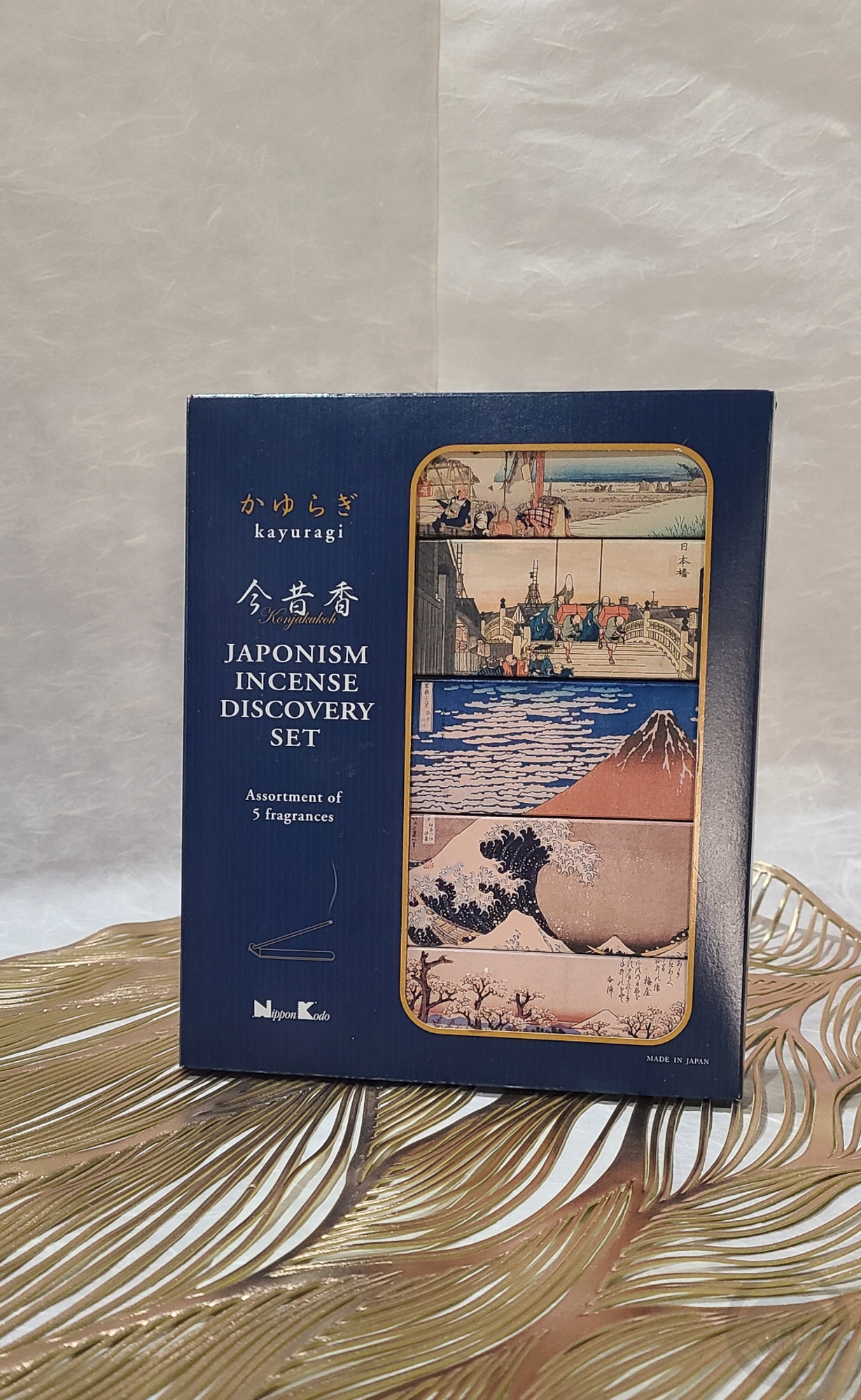
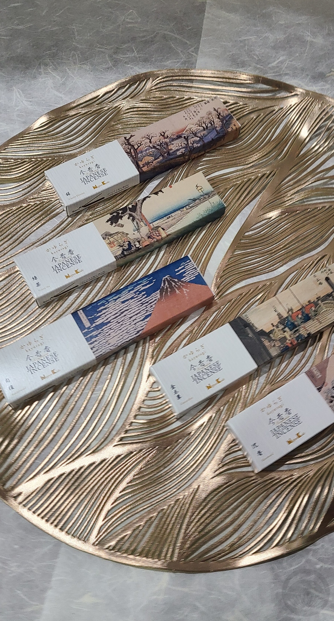
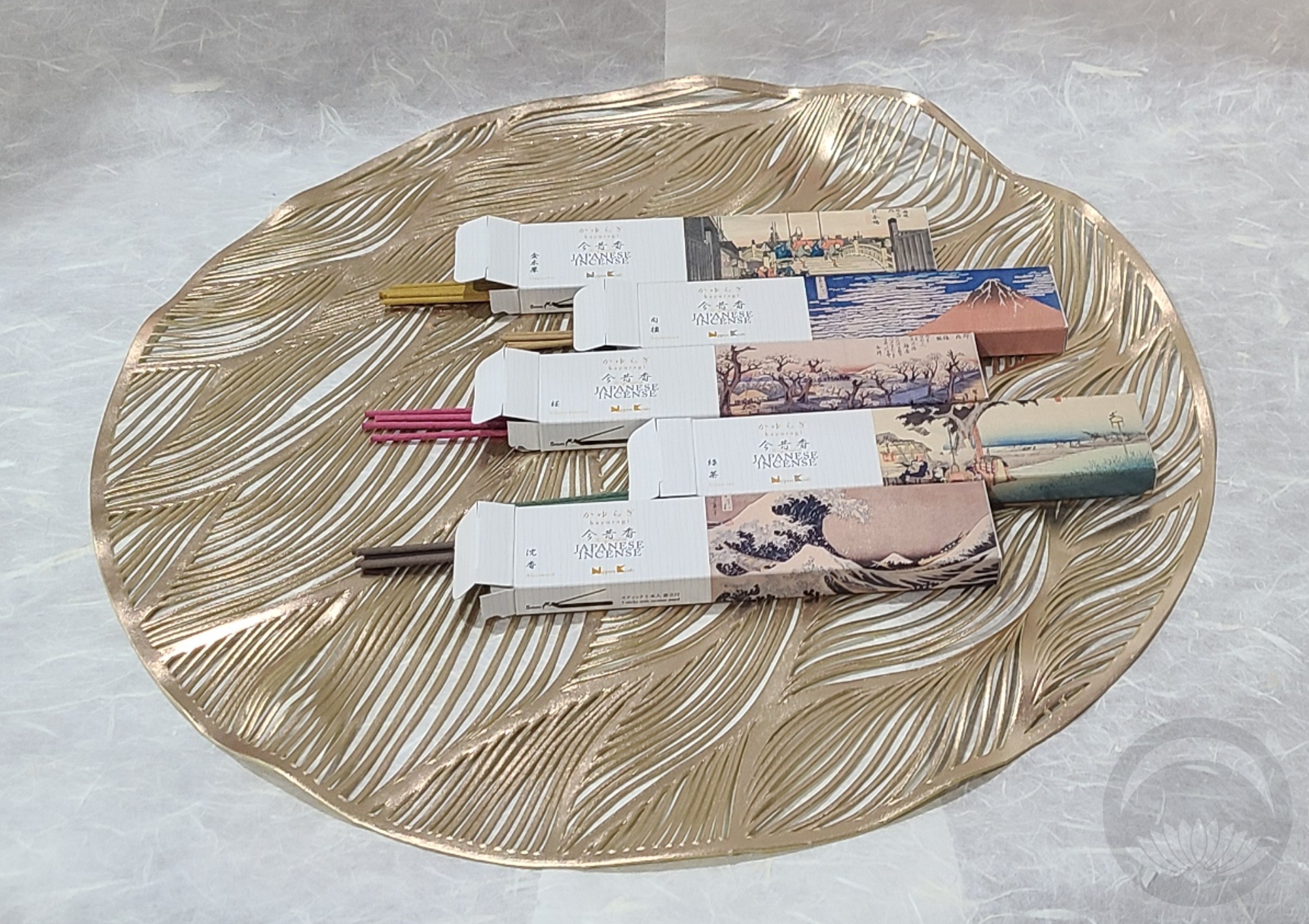
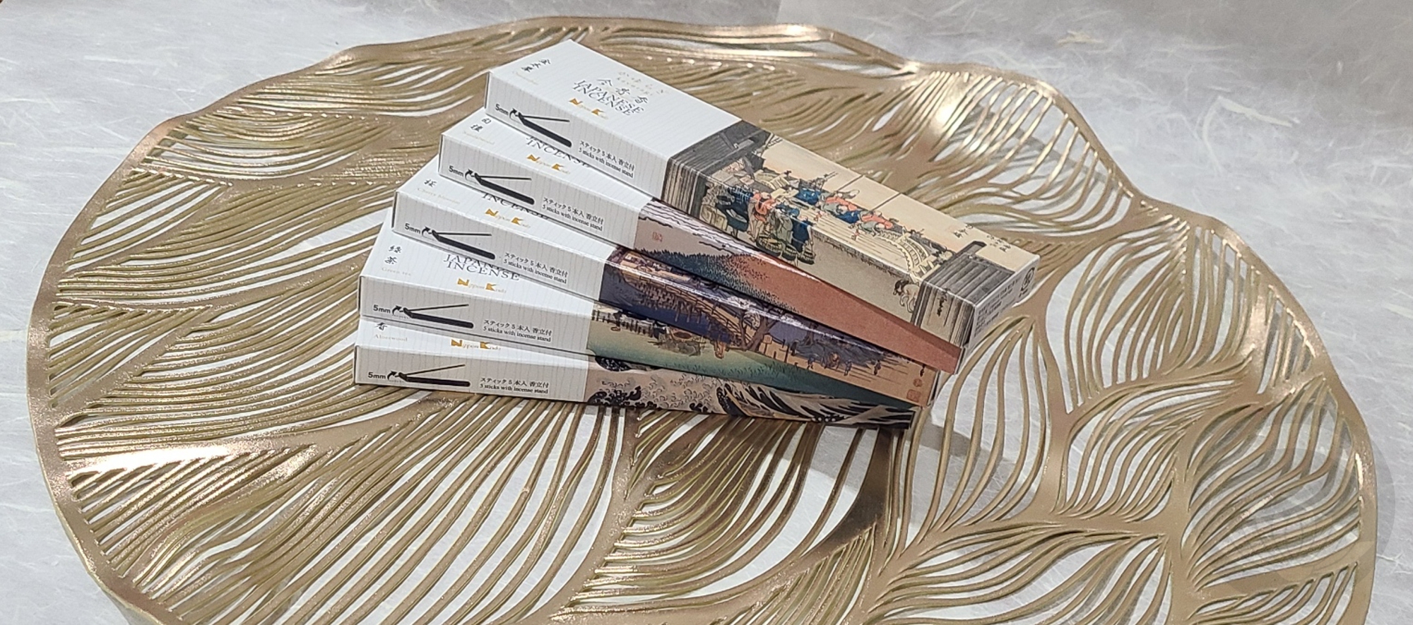
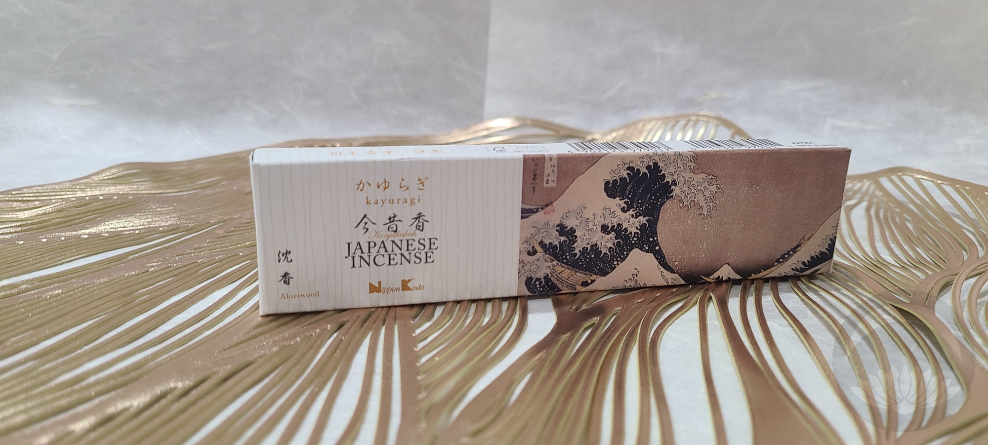
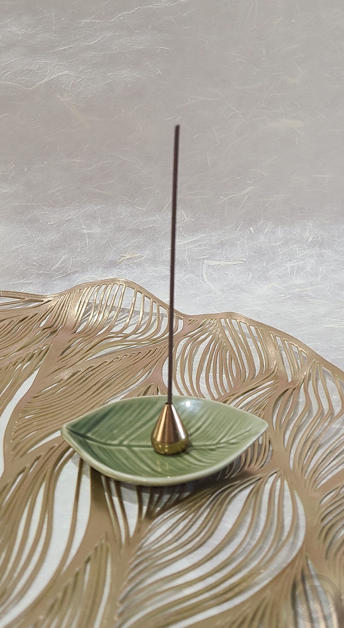
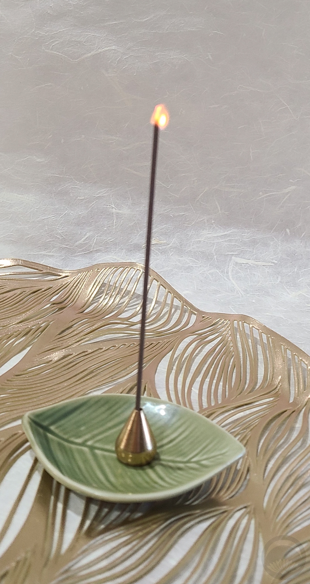
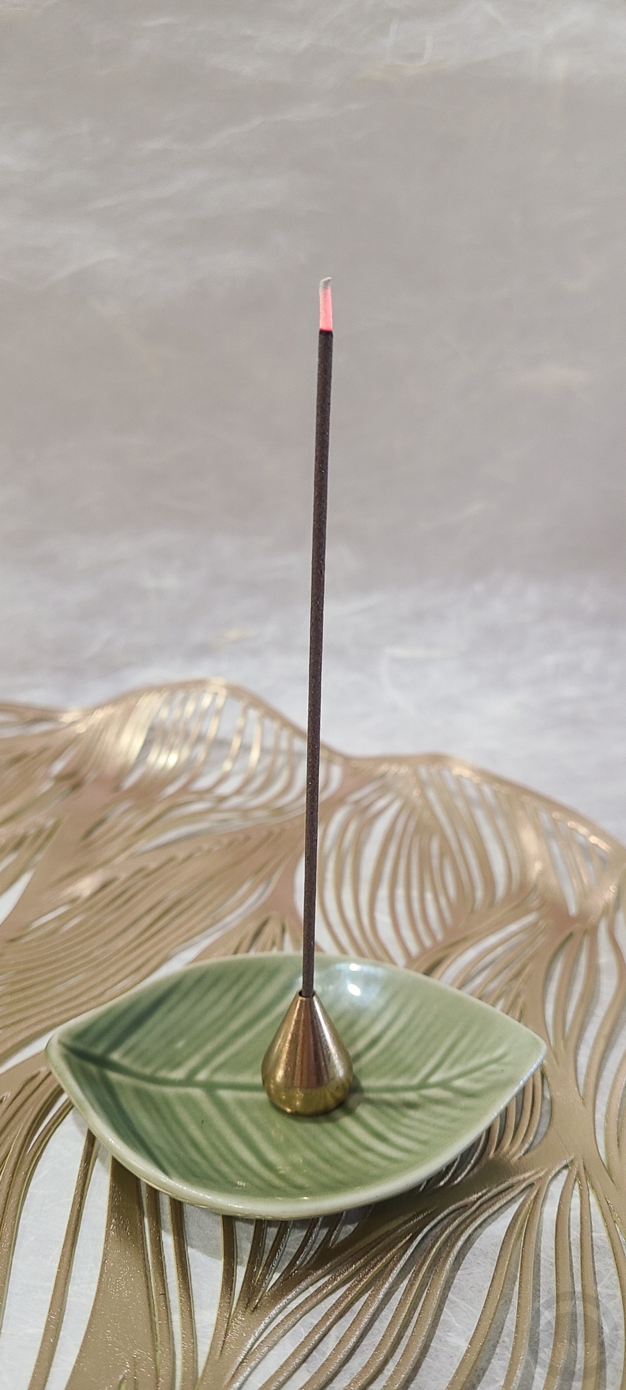
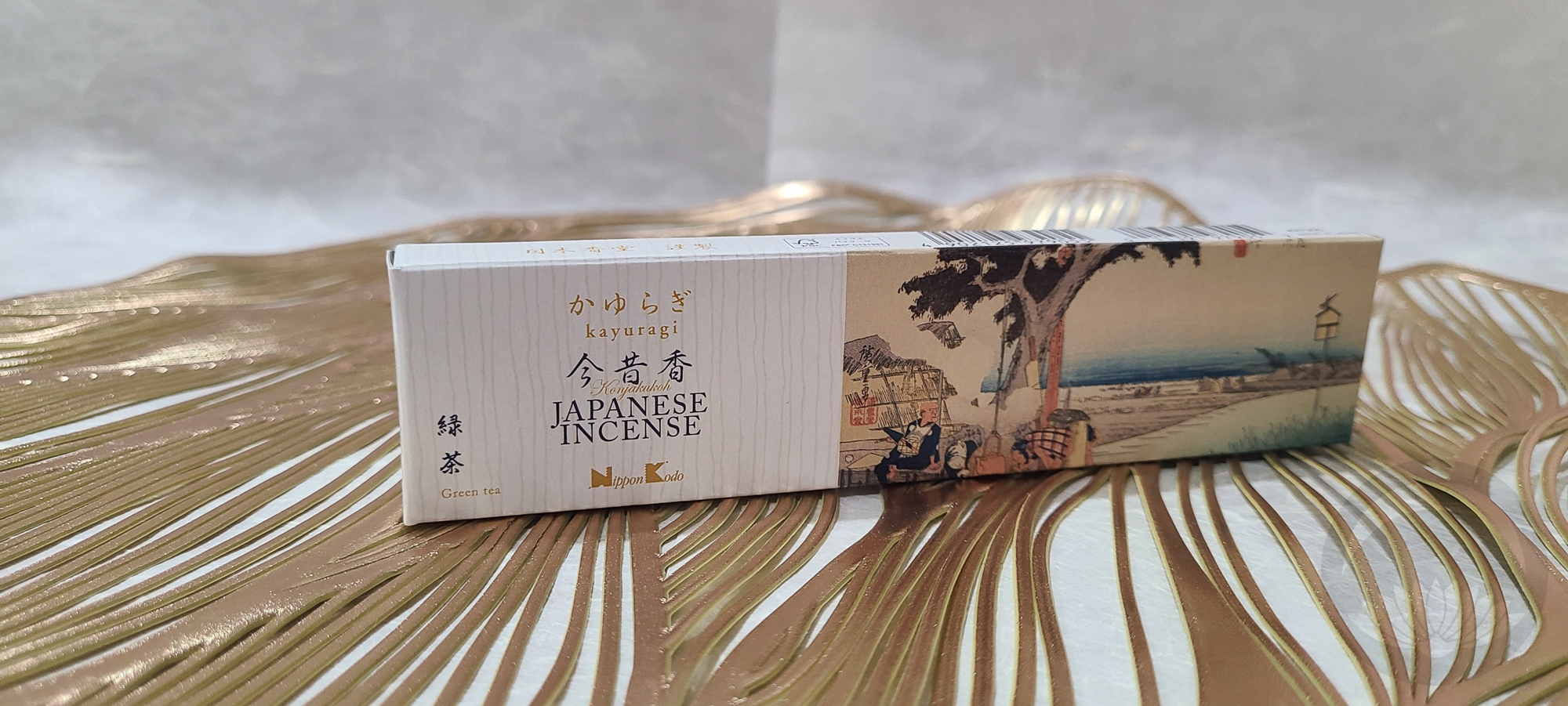
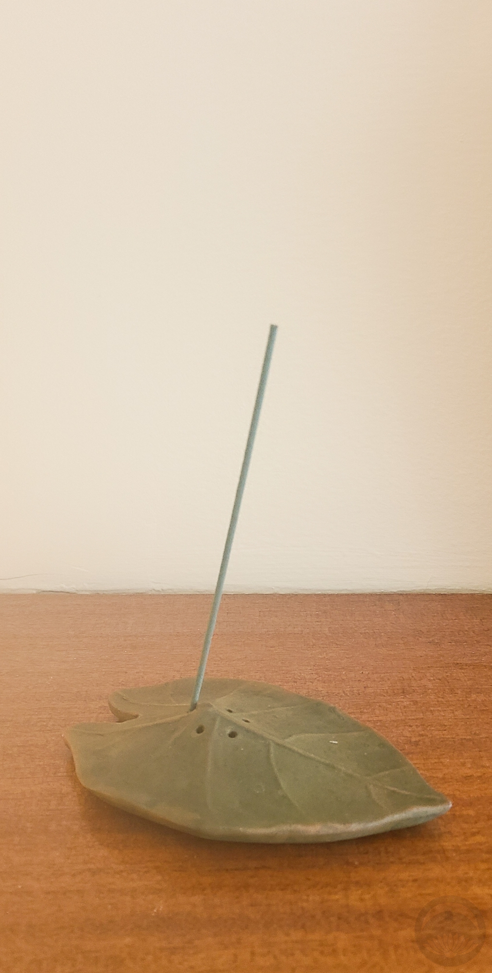
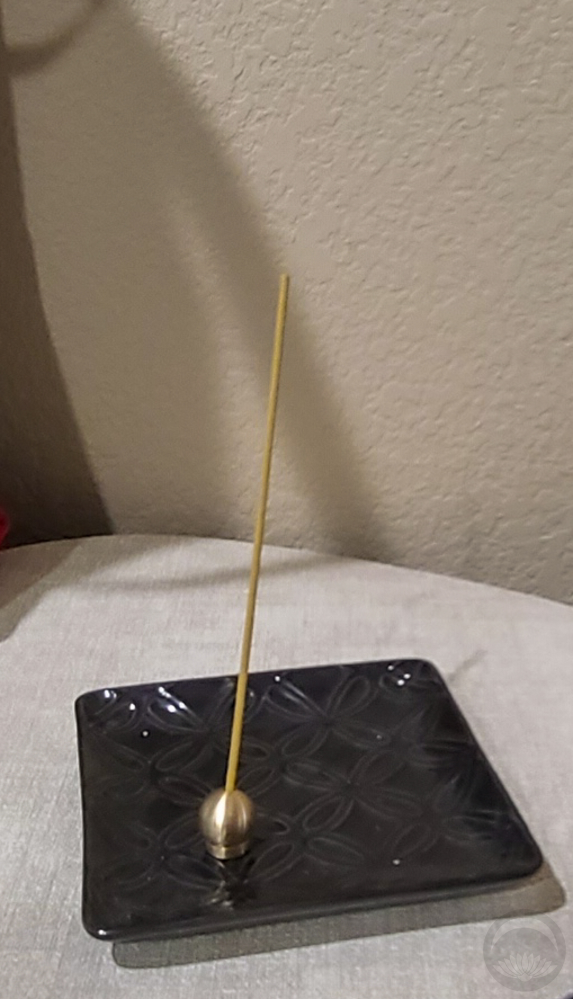
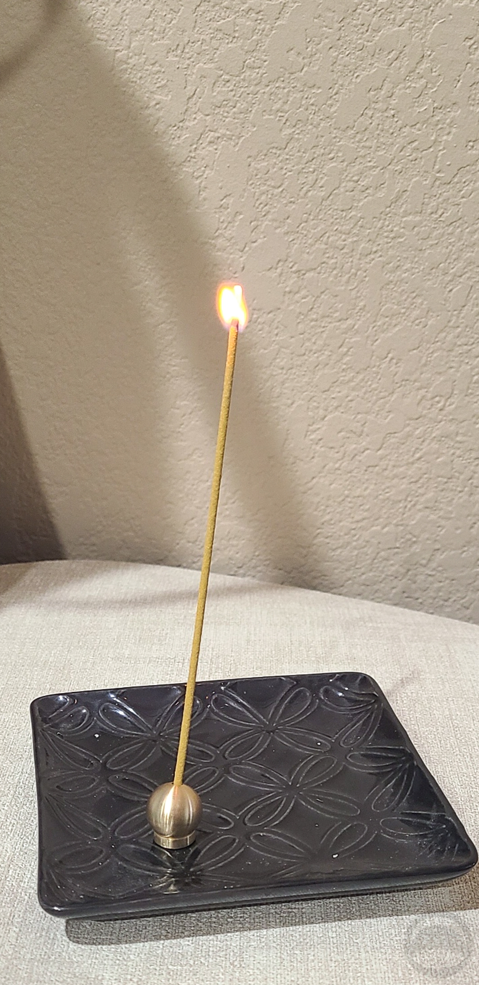
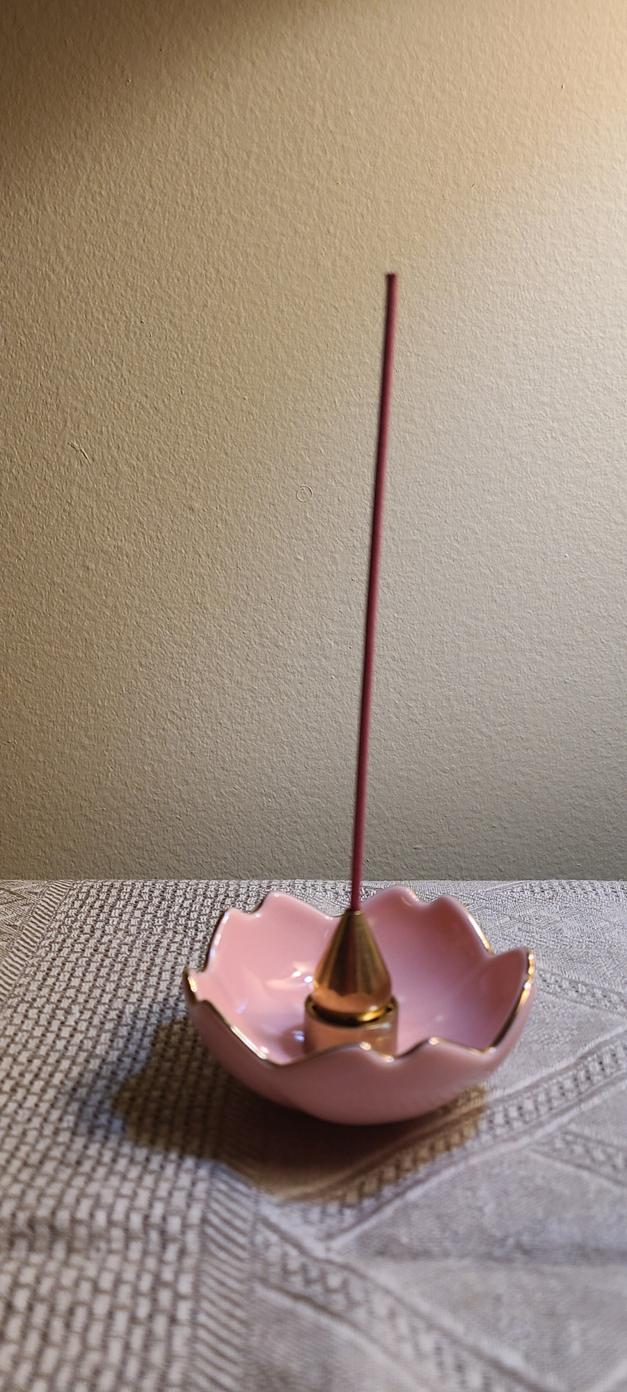
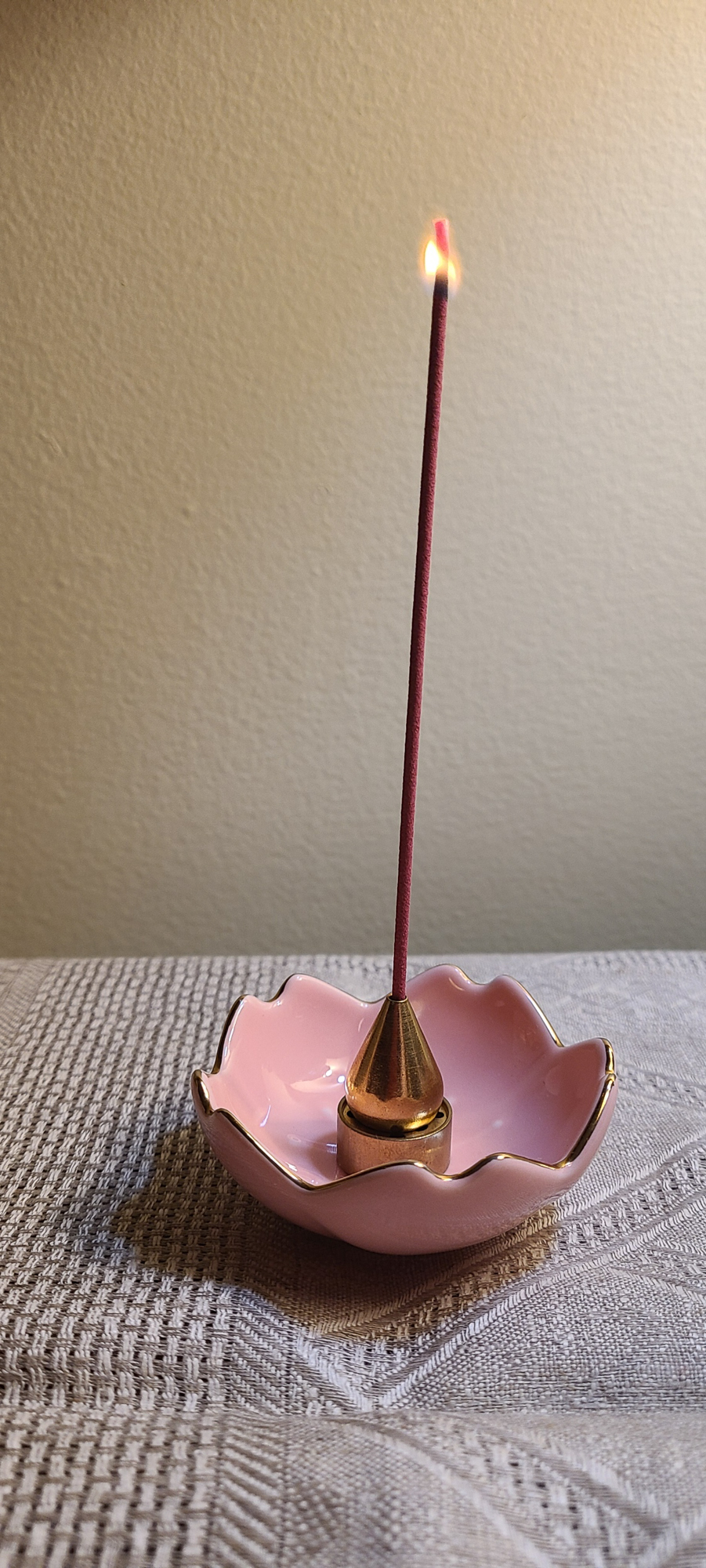
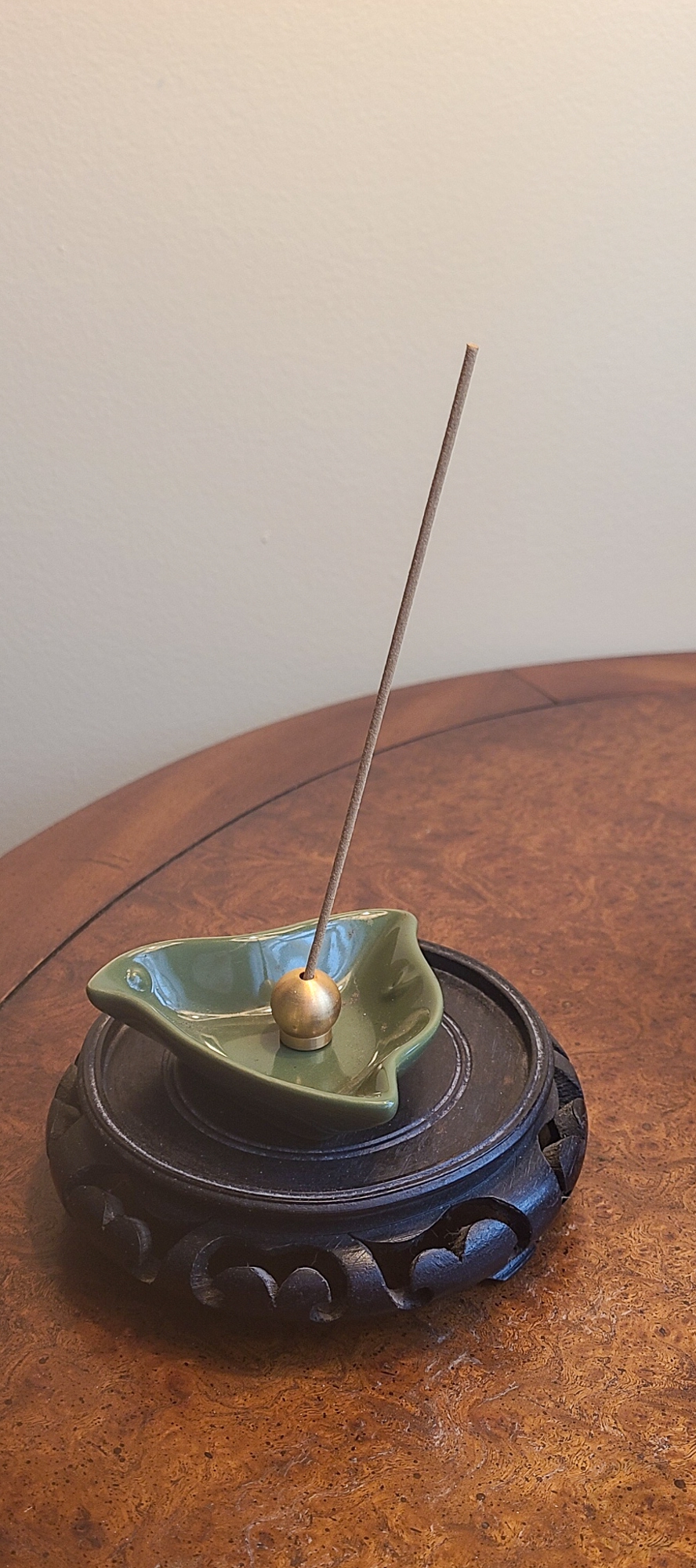
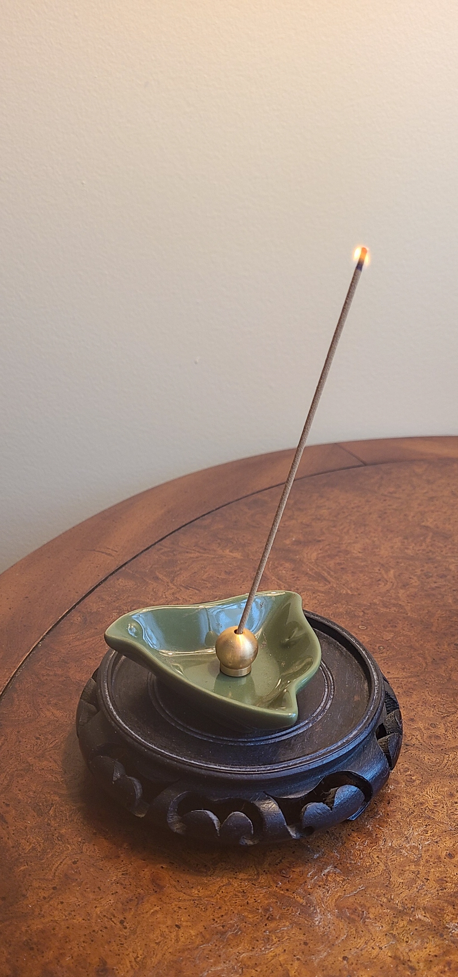
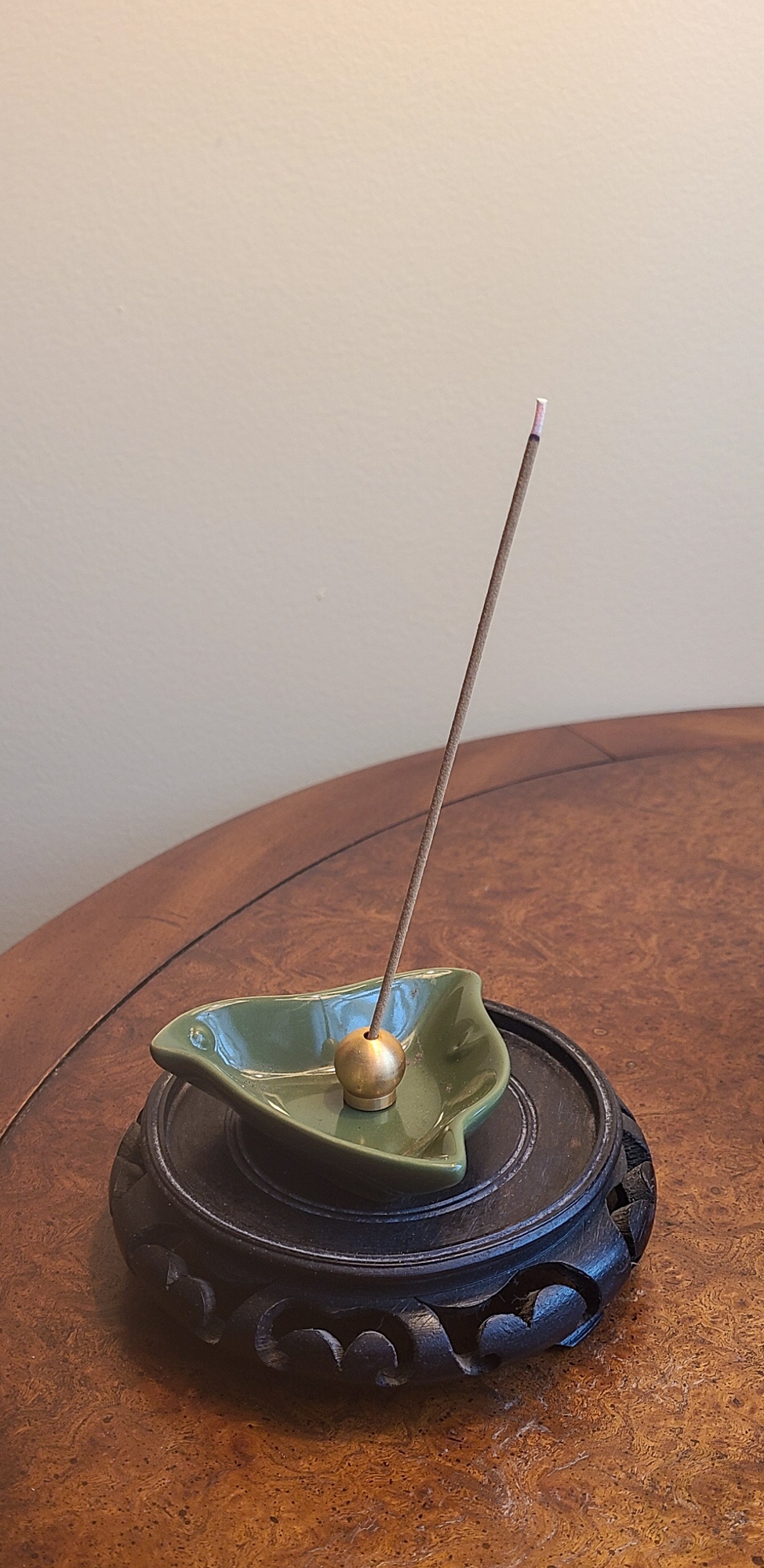
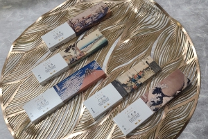
Back when I had my little shopping trip to Wabi Sabi in Palm Springs, one of the treasures I brought home was this lovely set of five kayuragi incense fragrances from Nippon Kodo. It’s a great option for anyone who isn’t ready to commit to a larger box of one scent, and the beautiful packaging with ukiyo-e art makes it an excellent gift as well. These are traditional Japanese compressed incense with no wooden stick in the centre. Each small box comes with a little metal incense holder, but I have so many holders and beautiful little ceramic dishes that I didn’t feel the need to use them. But they’re handy for travel or gifting purposes!
I’ve been trying out the fragrances over the past couple of months, and have broken them all down and collected my thoughts for you.
Aloeswood
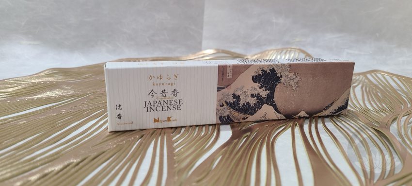 To me, this is the most classic-feeling. It has an almost dreamlike quality, heady but grounded. Something about it smells very “traditional”, like you might smell it in a temple or a minka, but not in a fussy or dated way. Just in a vital, historical, transportive way.
Green Tea

This one is so bright and fresh. It’s got notes of grassiness and an almost citrus-like property. It’s incredibly balancing and would make a great incense for the morning, or to help with focus while working. It’s definitely a light green tea scent, not an earthy matcha-type, and reminds me of a high-end spa. I really like it!
Osmanthus
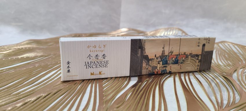 I really enjoy smell of osmanthus, something that’s criminally under-represented in western fragrances but thankfully a staple of Asian scent profiles. This one captures the beautiful floral, slightly fruity aspects of osmanthus blossom without verging into cloying. I knew I’d like it, but I didn’t know I’d absolutely love it.
Sakura
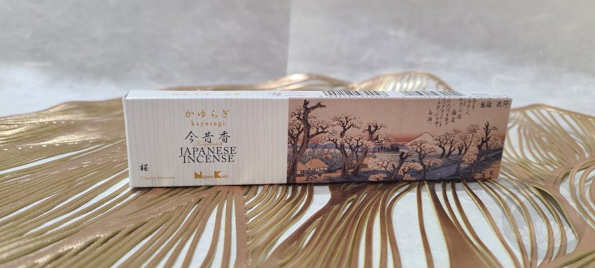 As much as I love sakura for body and personal fragrance, and continue to hunt for the perfect one, it’s not my go-to for home or lifestyle type scents. That said, this one really surprised me. It’s definitely fresh, clean, and floral, but without any of the powdery or soapy quality sakura can often have. I can’t really describe it, other than a happy, upbeat sort of floral. If you need a mood booster, look no further!
Sandalwood
 As someone who lives in North America, I’ve long associated the scent of sandalwood incense with head-shops and a certain sort of lifestyle. Nothing against that sort of lifestyle, but it’s not exactly a fragrance I find myself leaning into. I was apprehensive about these, but I’m so happy to report it was all for naught. This is slightly spicy, slightly woody, and not remotely redolent of unwashed hair and the devil’s lettuce.
I still don’t think it will be my first choice, but it’s definitely a more elegant and elevated sandalwood than I was anticipating.
Overall, the aloeswood and osmanthus top my personal list but any of these would be a fantastic addition to a welcoming home. If you’re not ready to commit to a scent, or are just looking for a housewarming or hostess gift, this set is perfect for you. You can find Nippon Kodo on their own website, or on Amazon.
I purchased this item myself and chose to review it.This post contains affiliate link(s). If you choose to purchase, I receive a small rebate or commission which goes to the continued maintenance of this site.If you have a topically appropriate craft, product, or service you would like me to review, please contact me.

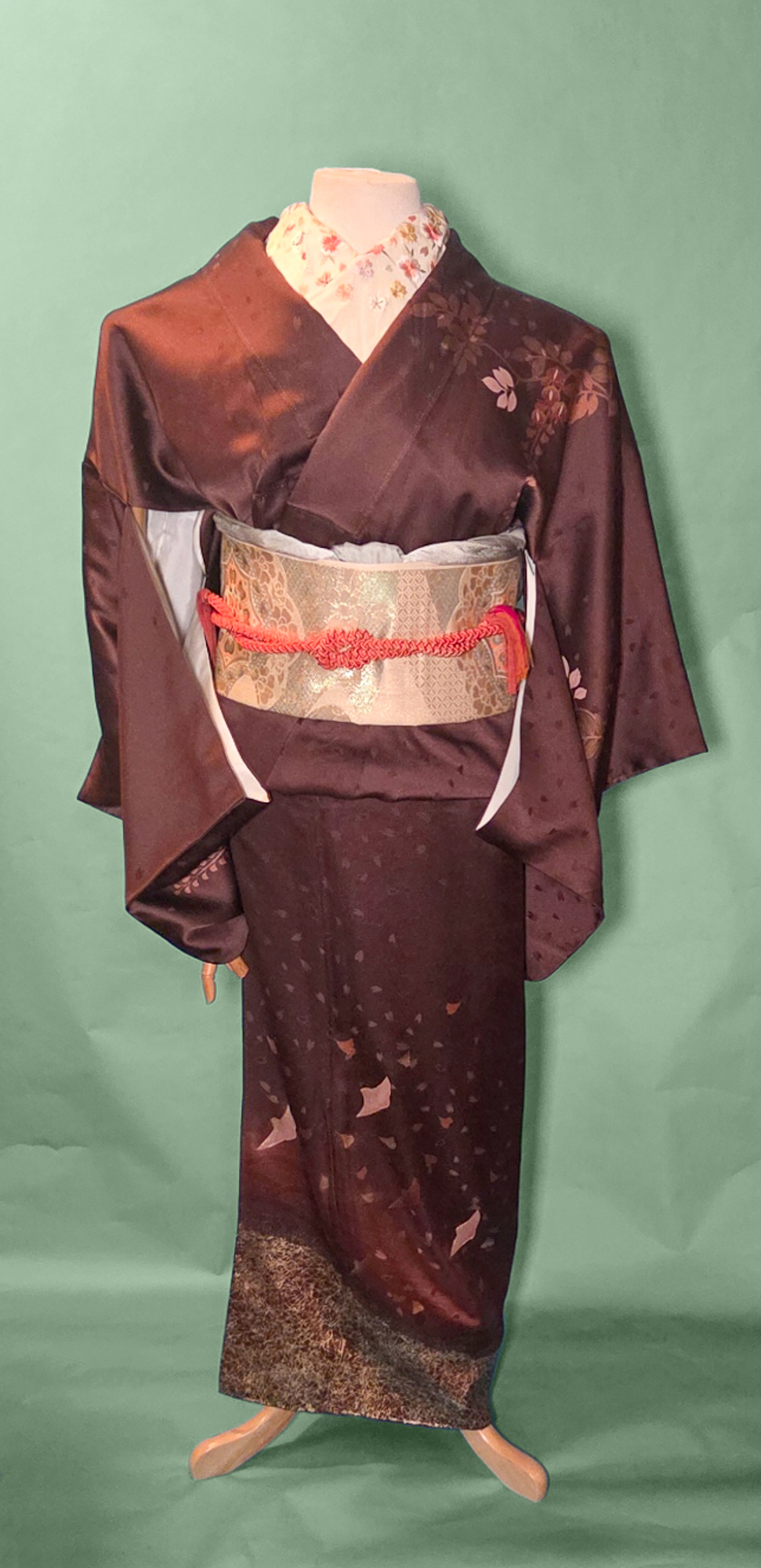
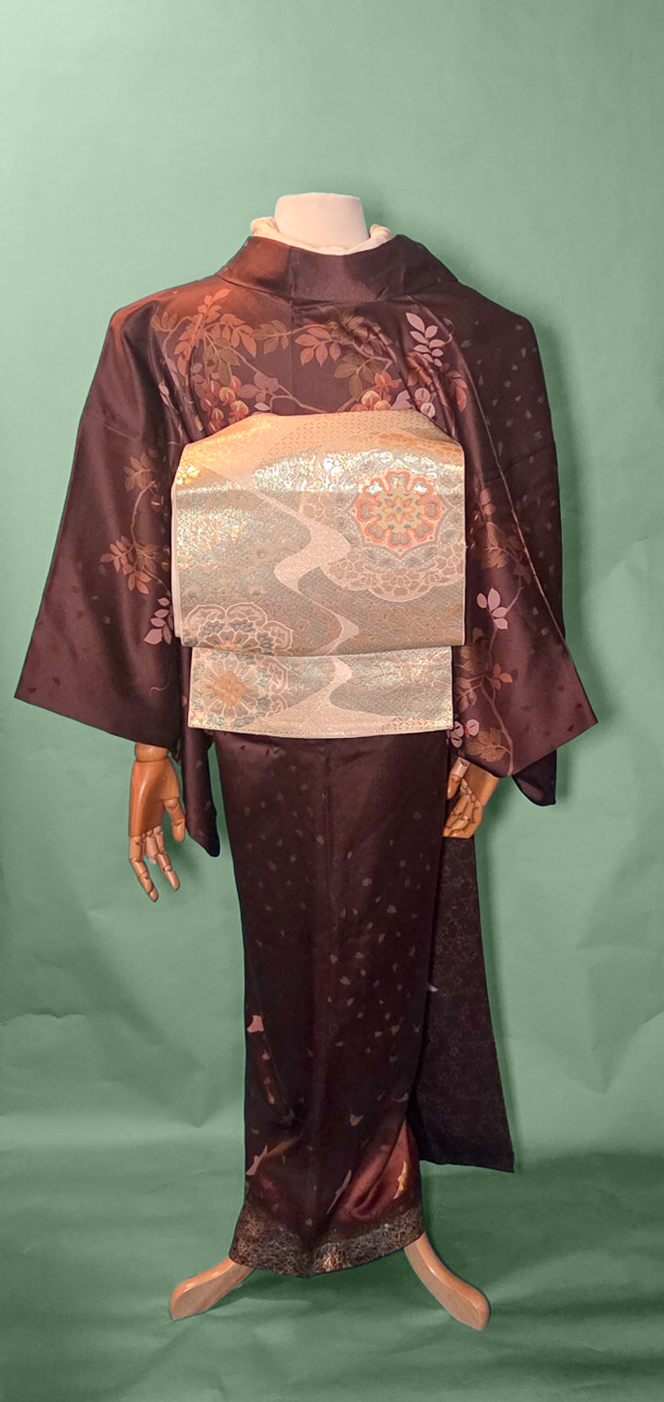
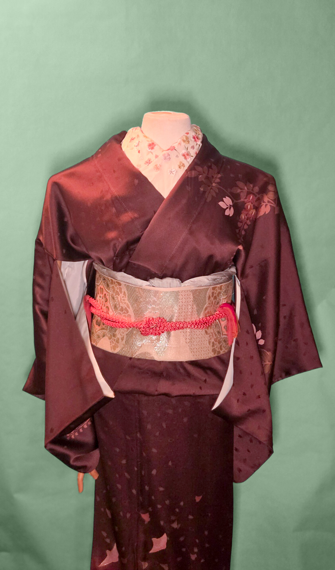
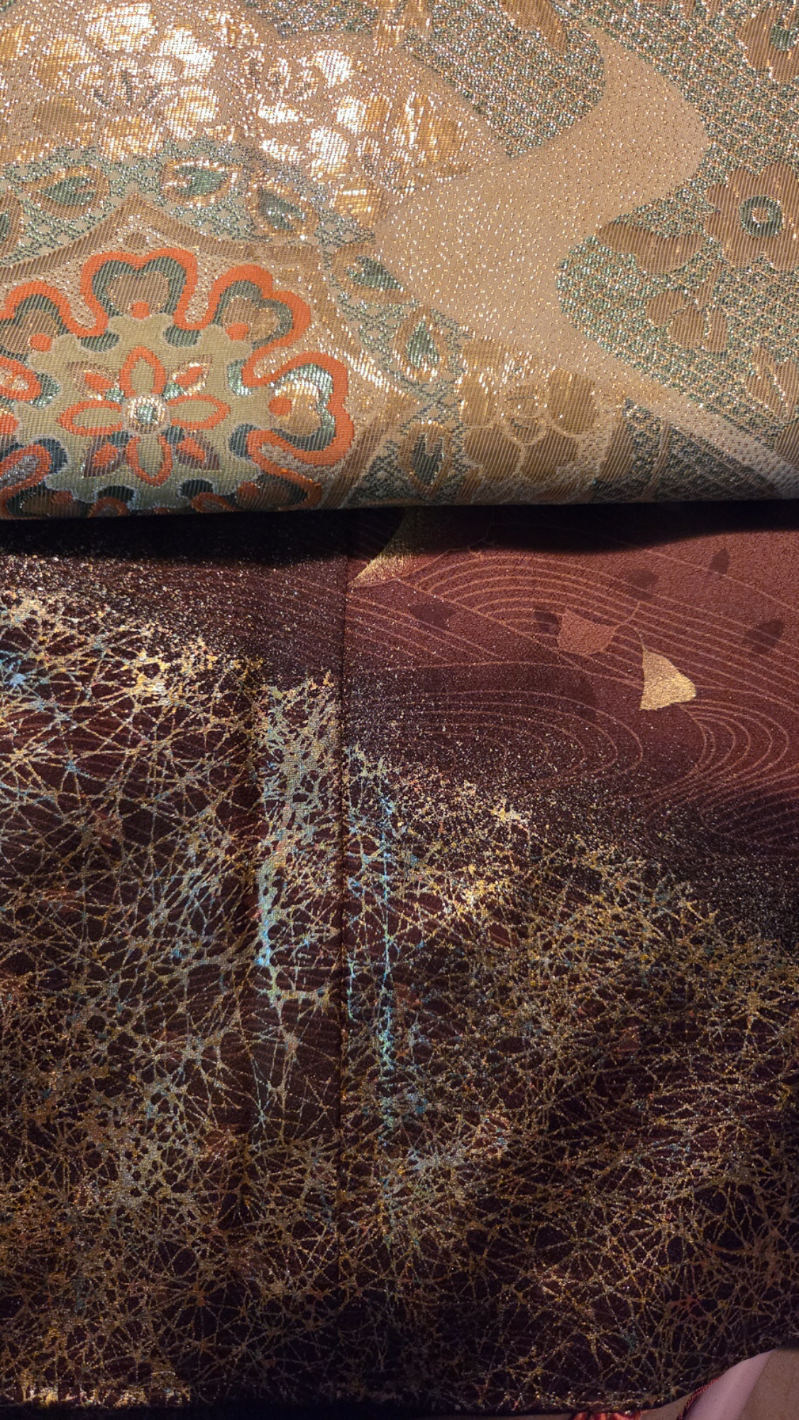
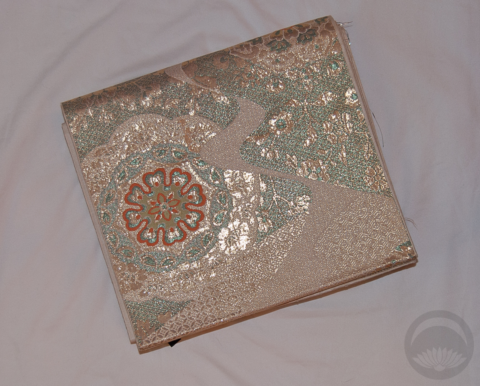
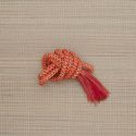
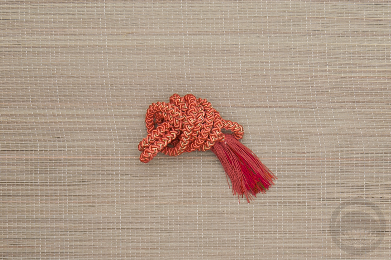
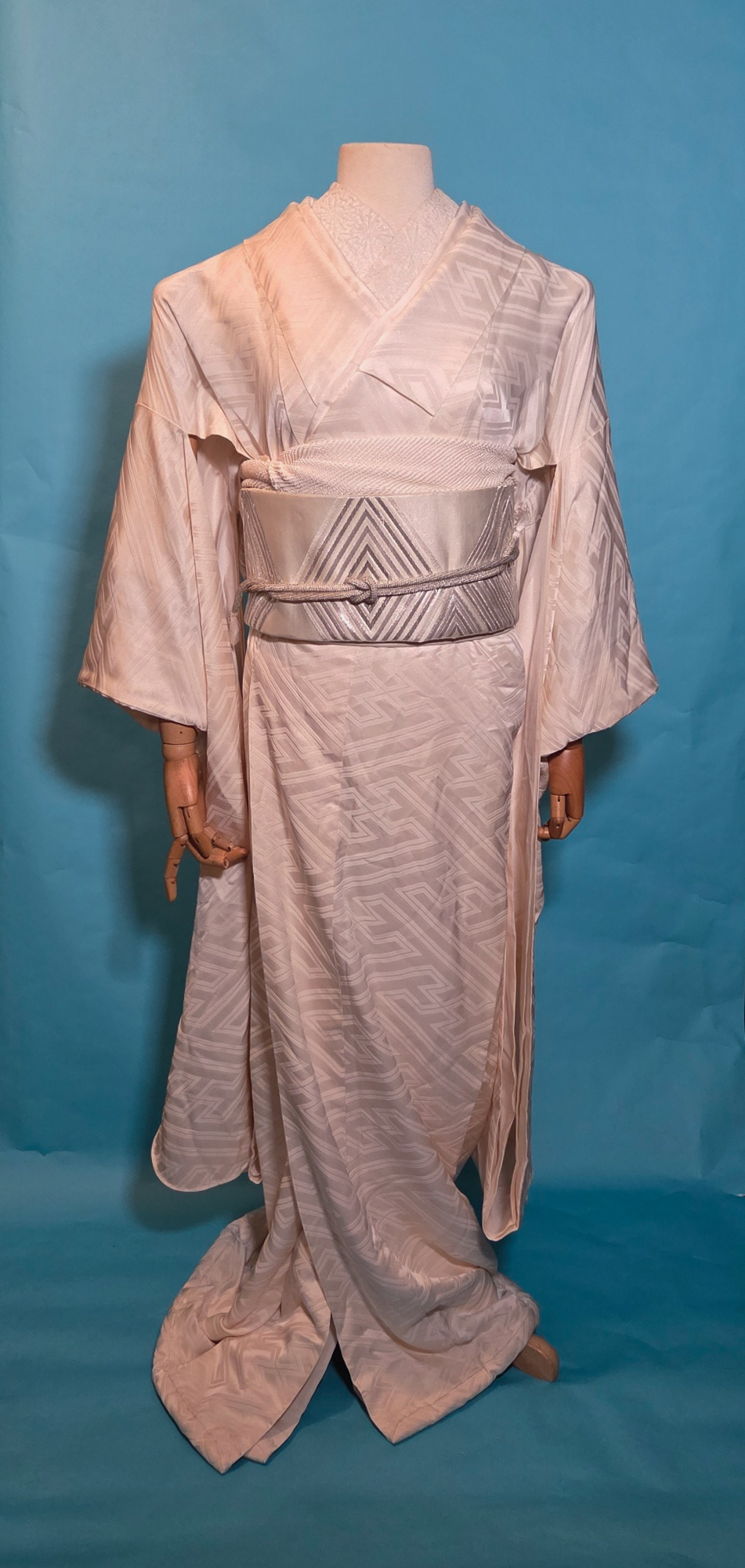
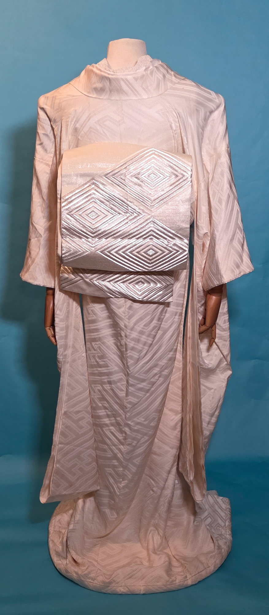
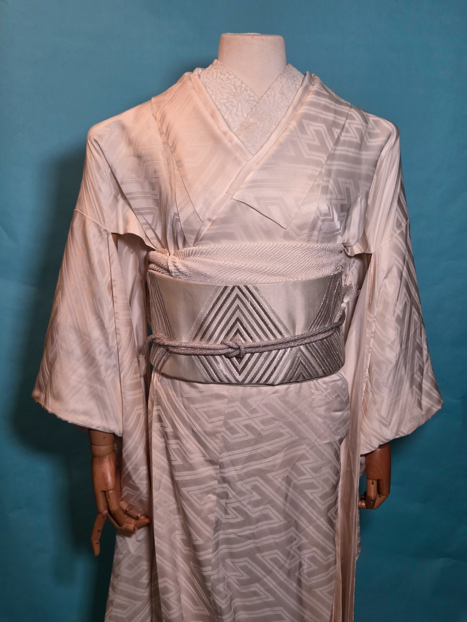
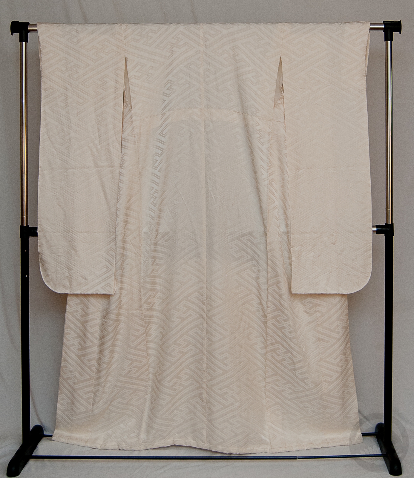
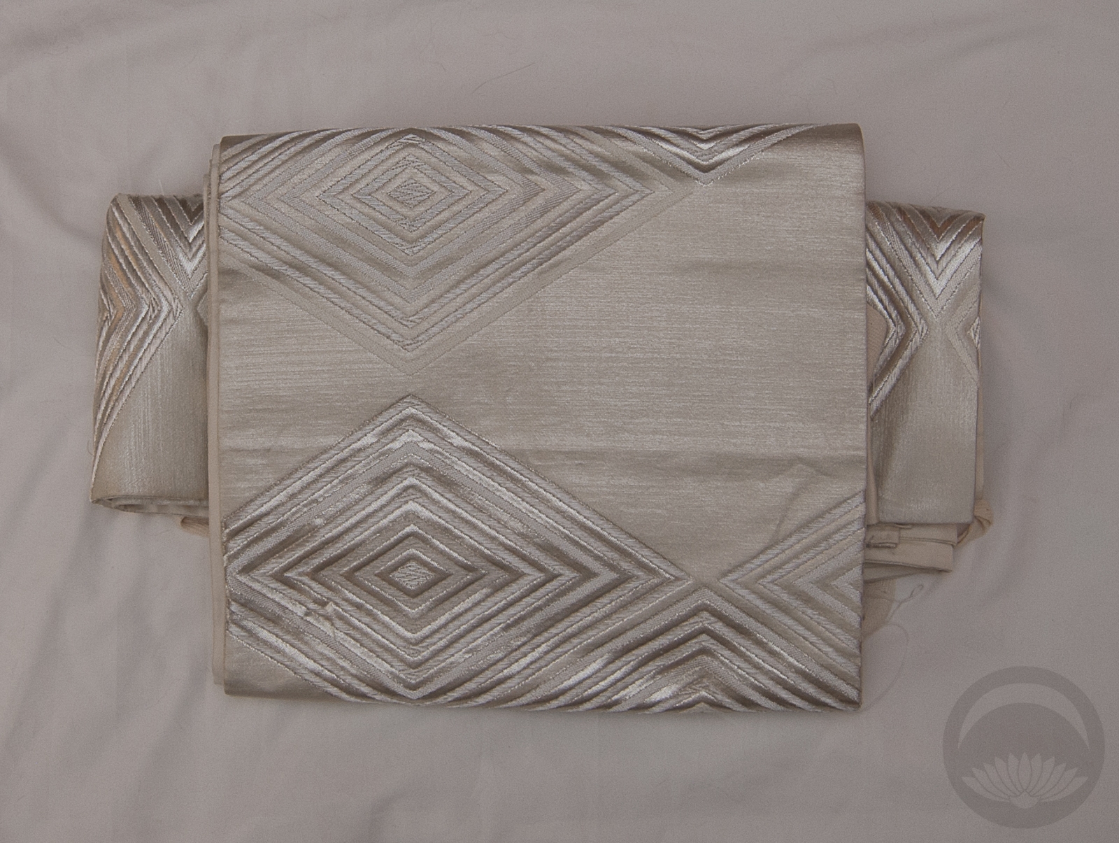
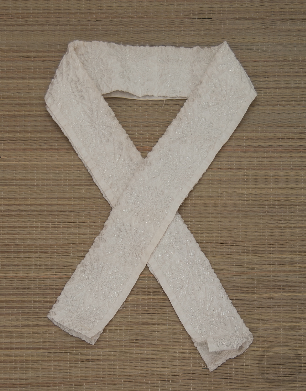
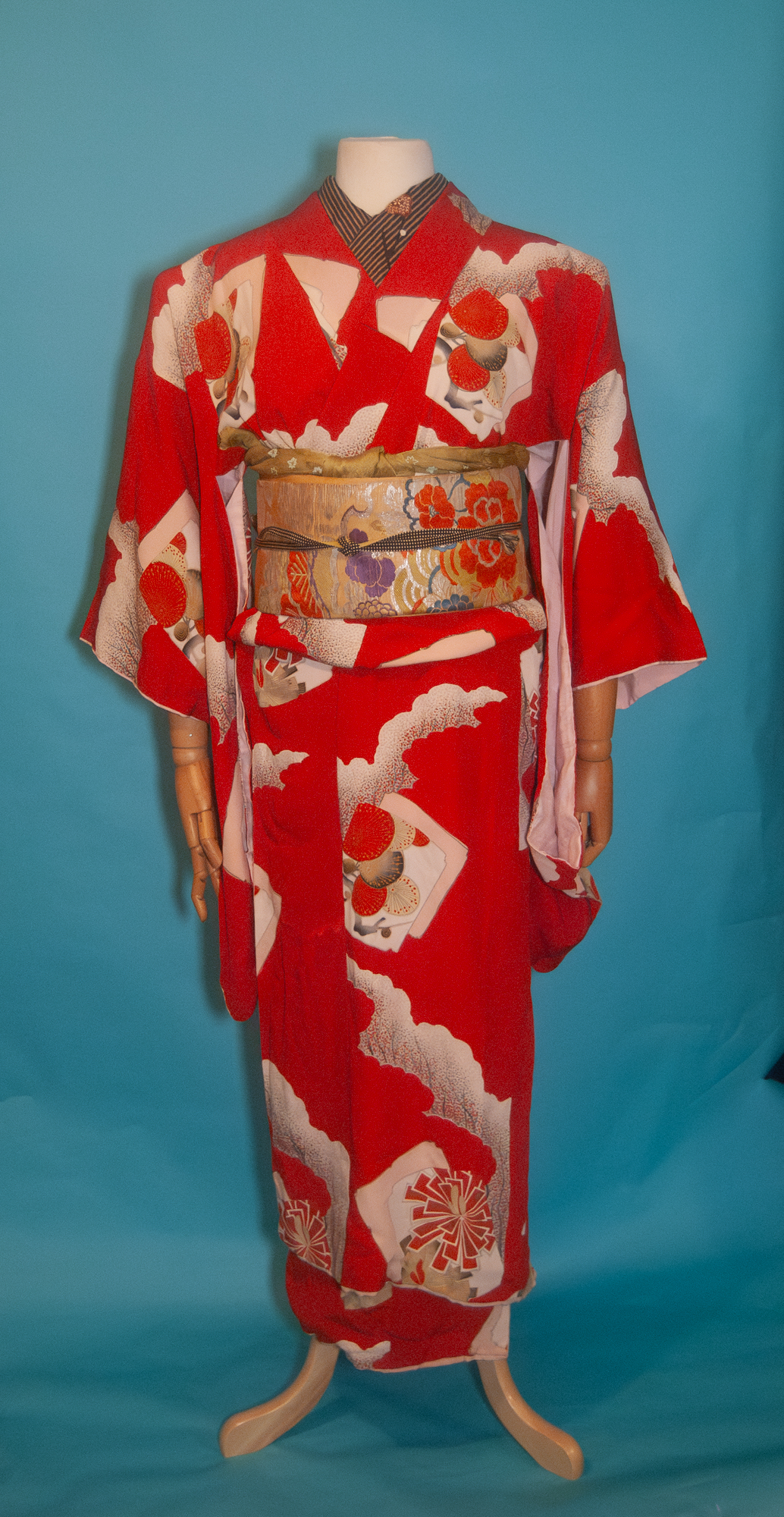
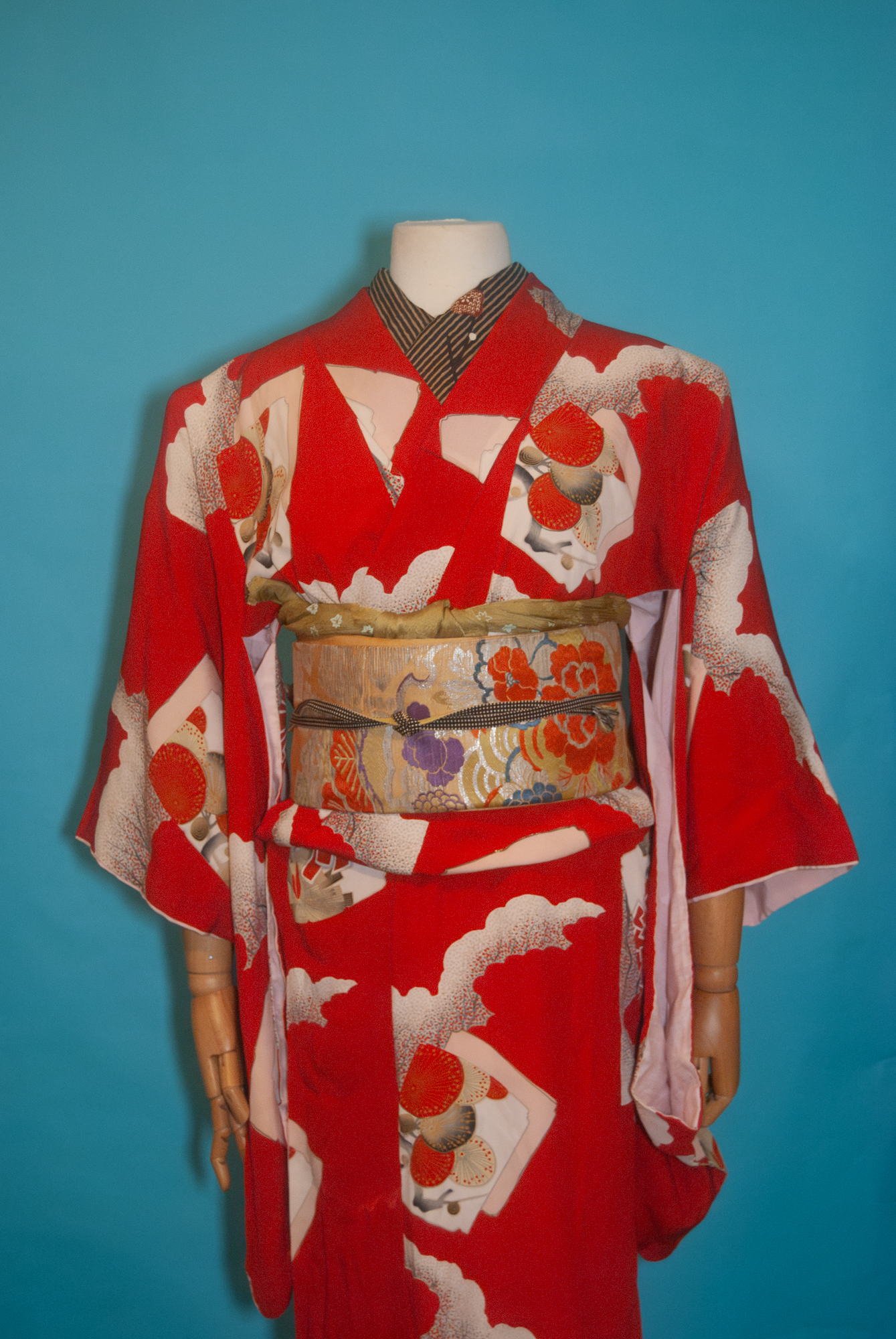
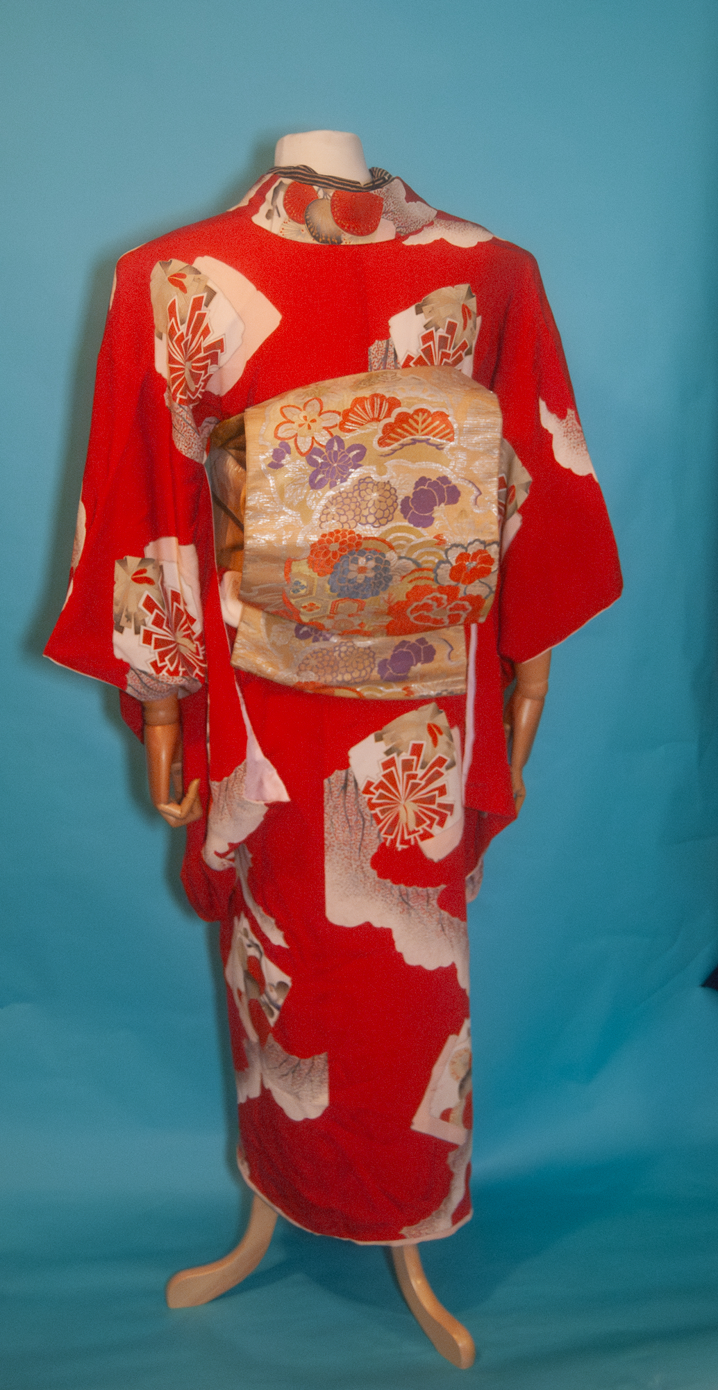
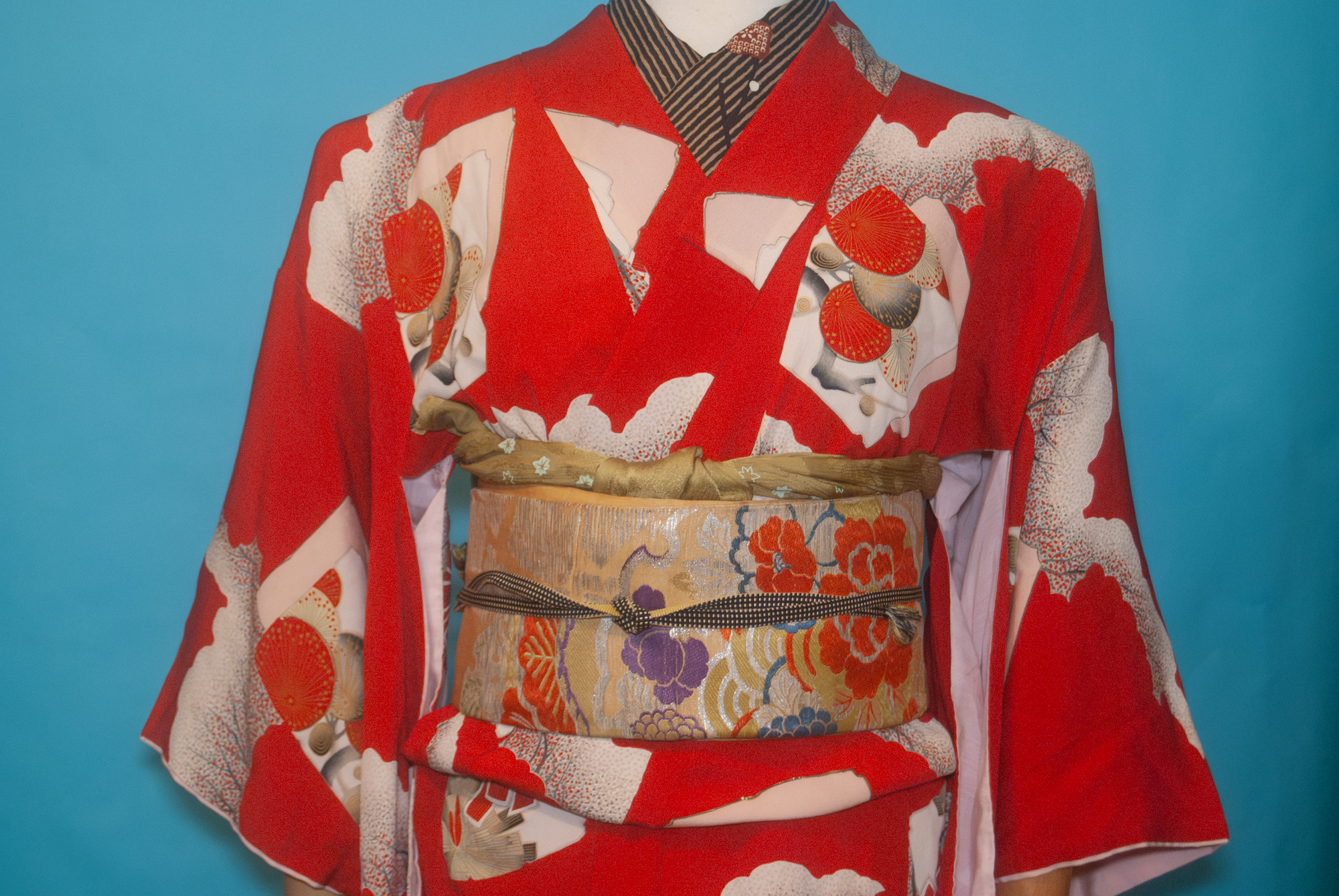
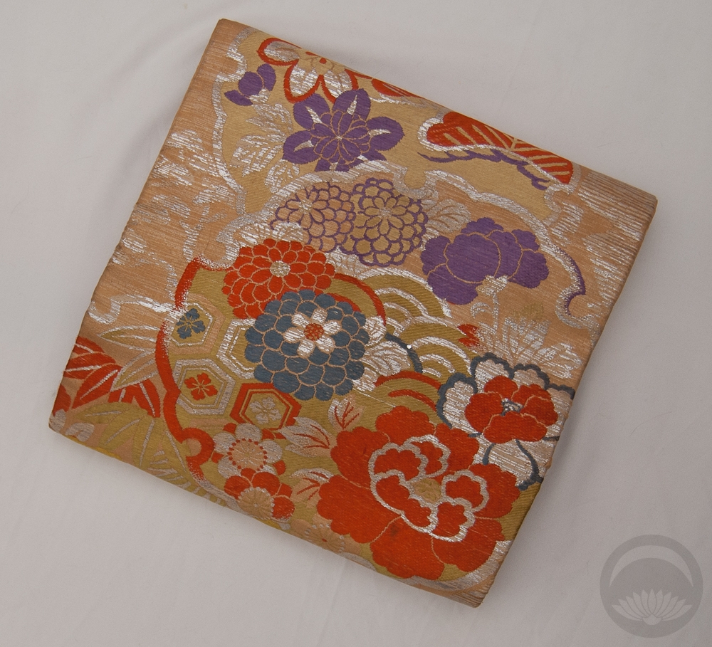
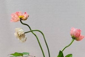
 Once I had these pieces next to each other, I ran with similarly coloured accessories and realised the whole combination reminded me of a box of expensive chocolates, reinforcing the whole luxury vibe I had in mind. It was an accident, but a happy one!


 Bebe Taian
 CHOKO Blog
 Gion Kobu