
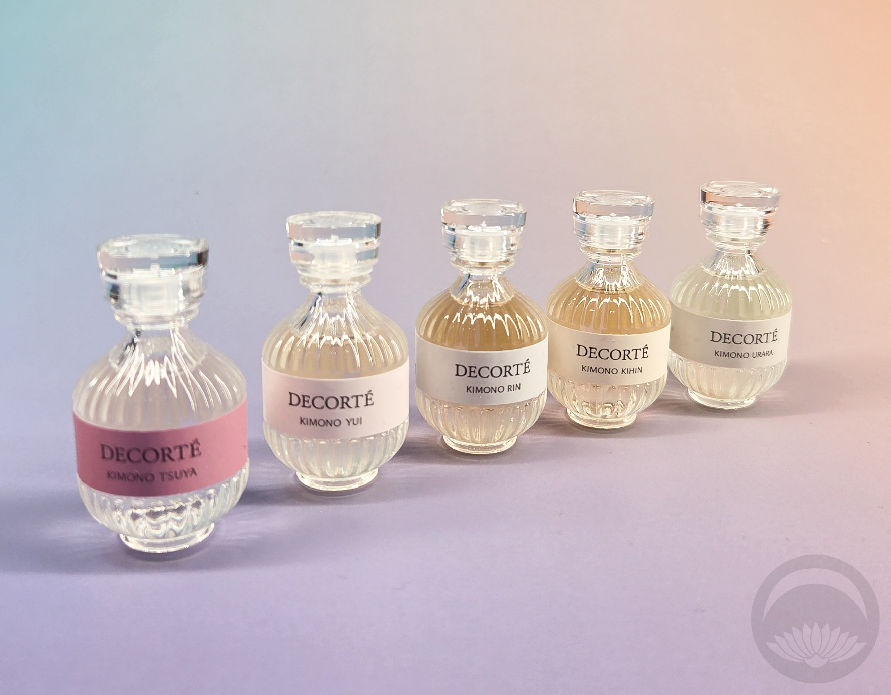
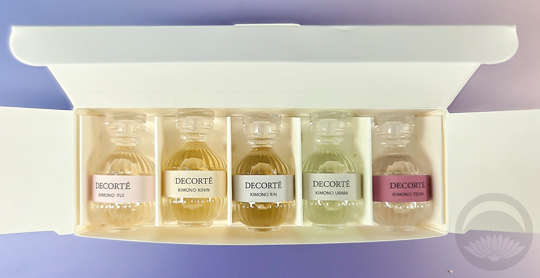
 When did I become a fragrance blog? No complaints, it just amuses me. I’ve been so incredibly lucky to receive a lot of these from the creator or manufacturer, and today’s collection of kimono-themed eaux de toilette from Decorté are no exception. I’ve been wanting to try them for eons, but was unable to afford the full set. I saw a box of travel sizes online so I reached out to Decorte asking if it was still available for purchase somehow. They were kind enough to just gift me the whole travel pack, for which I am very grateful!
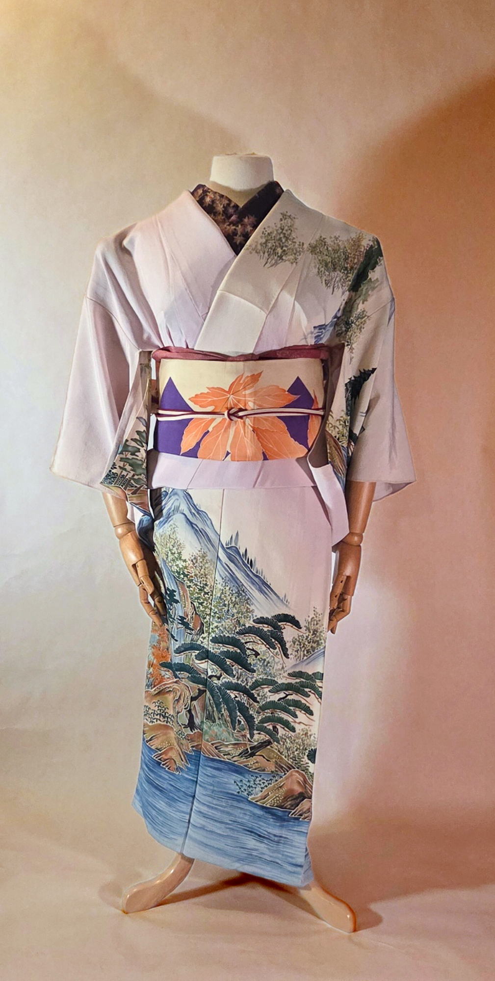
I love the idea of a kimono-themed collection, and these are absolutely perfect because they’re all light, airy fragrances that won’t linger on fabric for too long. These would also be fantastic for someone who wants to start wearing perfume but is looking for something delicate and not overwhelming.
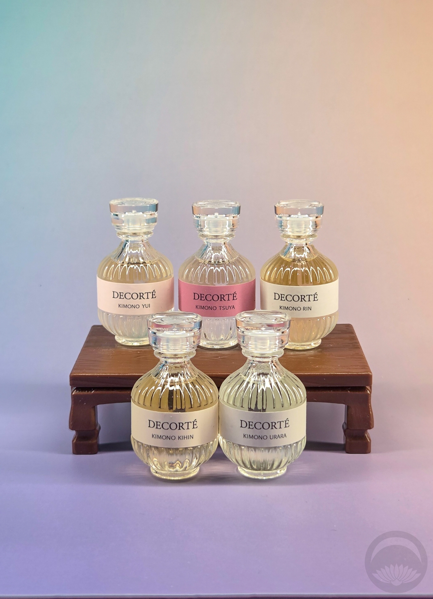
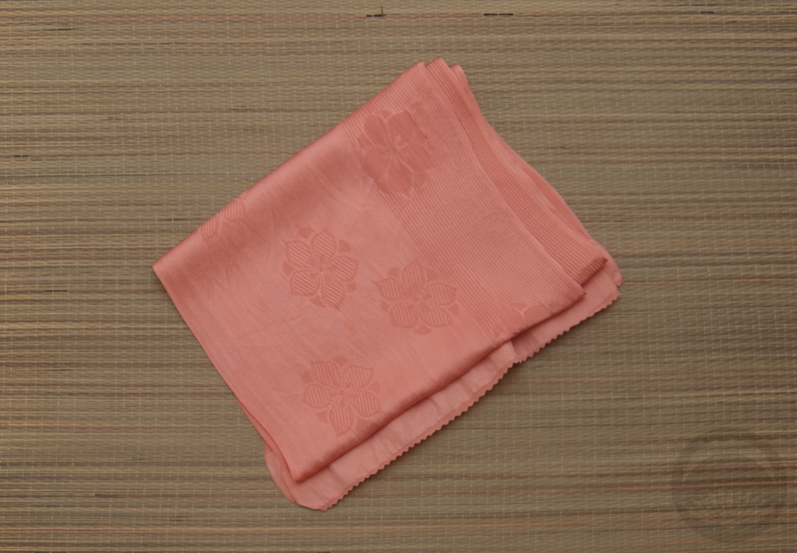
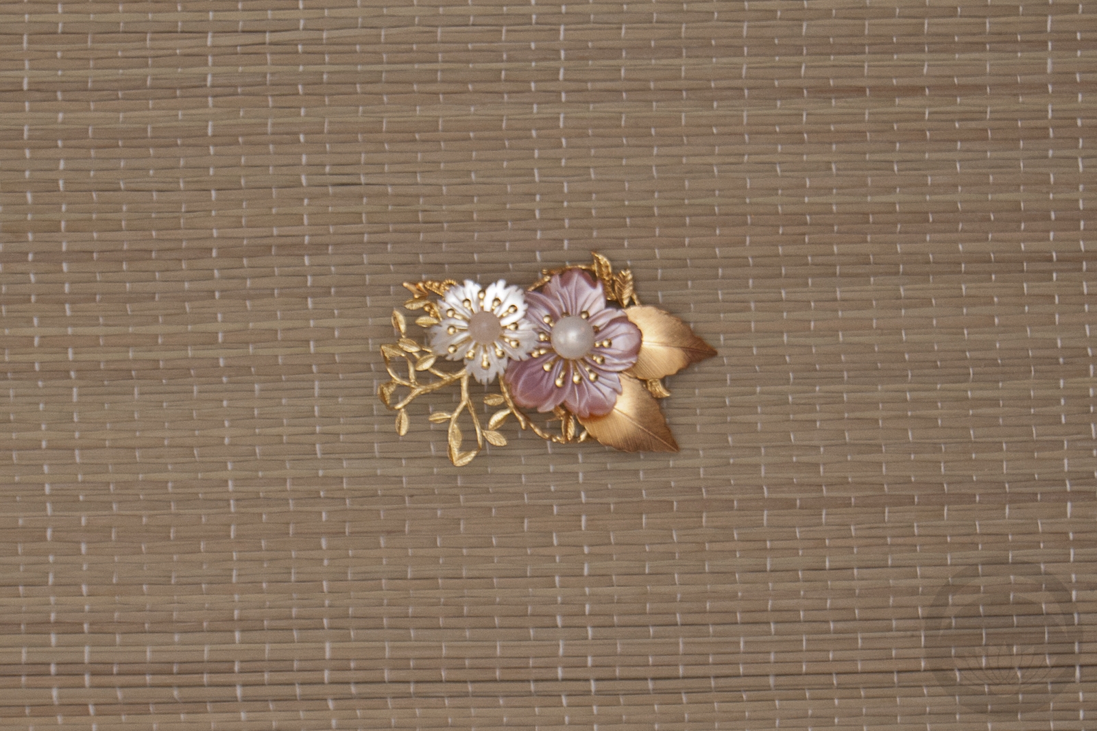
Also, how adorable is the packaging? The sample set are tiny version of the full-size, but those are even more charming as instead of a paper label they have a ribbon tied in the back to evoke the feeling of an obi! I love the art design of the whole line, and how it all matches the gentle feel of the scents themselves.
Of course, those scents are the most important part. I have been rotating through them for about six weeks now, and I’d love to share my thoughts and feelings, as well as Decorté’s own descriptions.
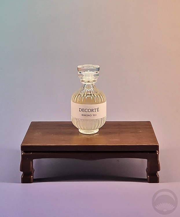
Kimono Yui
A transparent floral that invigorates with the freshness of orange water and pink pepper. Brightly energizing with a vivid facet of citrus sudachi, a fragrant invitation to a gentle feeling of happiness.
Kimono Yui was the first fragrance I tried out of the set, and it was a fantastic welcome to this line especially for June in California. It’s bright, fresh, clean, and absolutely perfect for summer. If I were to imagine a kimono for Yui, it would be a crisp usumono with water and fish motifs.
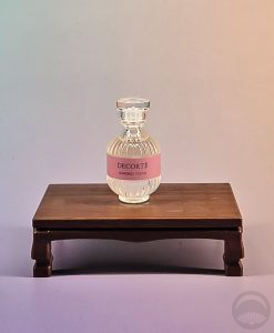 Kimono Tsuya
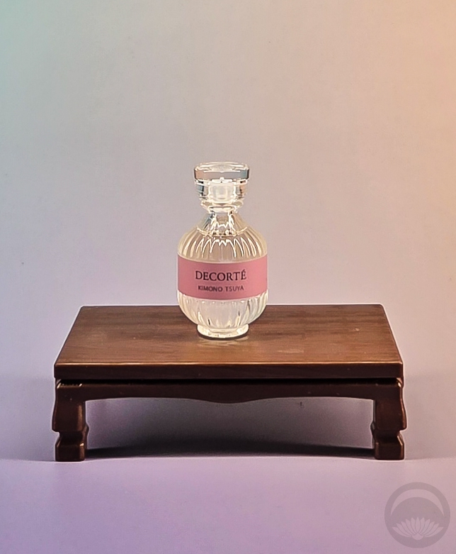
A vibrant floral musk that enchants with rich Japanese magnolia and rose essence, brightened by green citrus, and deepened by warm musk. Energizing, a fragrant invitation of welcome and warmth. Kimono Tsuya leaves a compelling trail that wraps the senses in warmth and reassurance.
This is a lovely, floral-forward fragrance with more of a presence than any of the others. It’s still what I’d consider a delicate perfume, but it’s more noticeable by others and seems to linger a bit longer than her sisters. “Leaves a compelling trail”If I had to rank them, Tsuya would be my lowest ranking but it’s still lovely and wearable — just less my vibe than the others.
 Kimono Urara
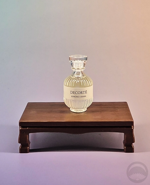
A playful fresh floral homage to the sacred water lily, Kimono Usara is a lightly aquatic floral with sweet melon and Fuji apple top notes and a sandalwood base. Stimulating, a buoyant statement of energy and vitality. Kimono Tsuya persuades by enveloping the wearer in a sense of joy and well-being.
Urara is the “happiest of the fragrances, if that makes any sense. It’s bright and bubbly, fresh without being overly fruity or fake (which is a good thing, as I have life-threatening allergies to artificial melon fragrances). The aquatic base helps keep it from being cloying or candy-like. It smells like a picnic in the park near a lake, perfect for late spring through summer.
 Kimono Rin
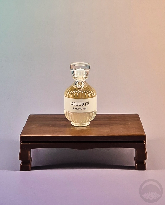
A woody floral that exalts the bold scents of Japanese candied plum and voluptuous jasmine, with a vibrating undercurrent of Patchouli. Sensual, a fragrant evocation of mystery. Kimono Rin leaves a compelling sillage that speaks to confidence and calm.
Kimono Rin is what I would call the most deep or rich fragrance of the bunch. It’s still not heavy or overpowering in the least, but it’s the one that feels the most suited to autumn and winter. That said, I think it might be my favourite of the bunch but that’s no surprise seeing as how I tend to be drawn to woody, warm scents. I can’t wait to wear this one more when it gets cooler out!
 Kimono Kihin
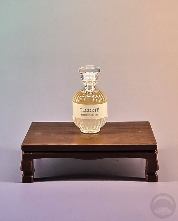
A modern floral chypre that celebrates the opulence of Japanese iris. Brilliantly harmonizing top notes of blended citrus with a rich heart of Japanese iris and jasmine, the base complements with warm sandalwood and musk. Kimono Kihin leaves a trailing wake of mystery that speaks to grace and intelligence.
This one might be tied with Rin for my favourite. Again, unsurprising as it’s described as warm and musky. I’ve also come to learn that I really love iris as a perfume note. It’s more woody and spicy than floral, which makes sense as it’s typically derived from the rhizome(root) and not the blossom. Kihin is is another one that’s made it into my regular rotation and will definitely become even more frequent as autumn rolls around and I head back to California.
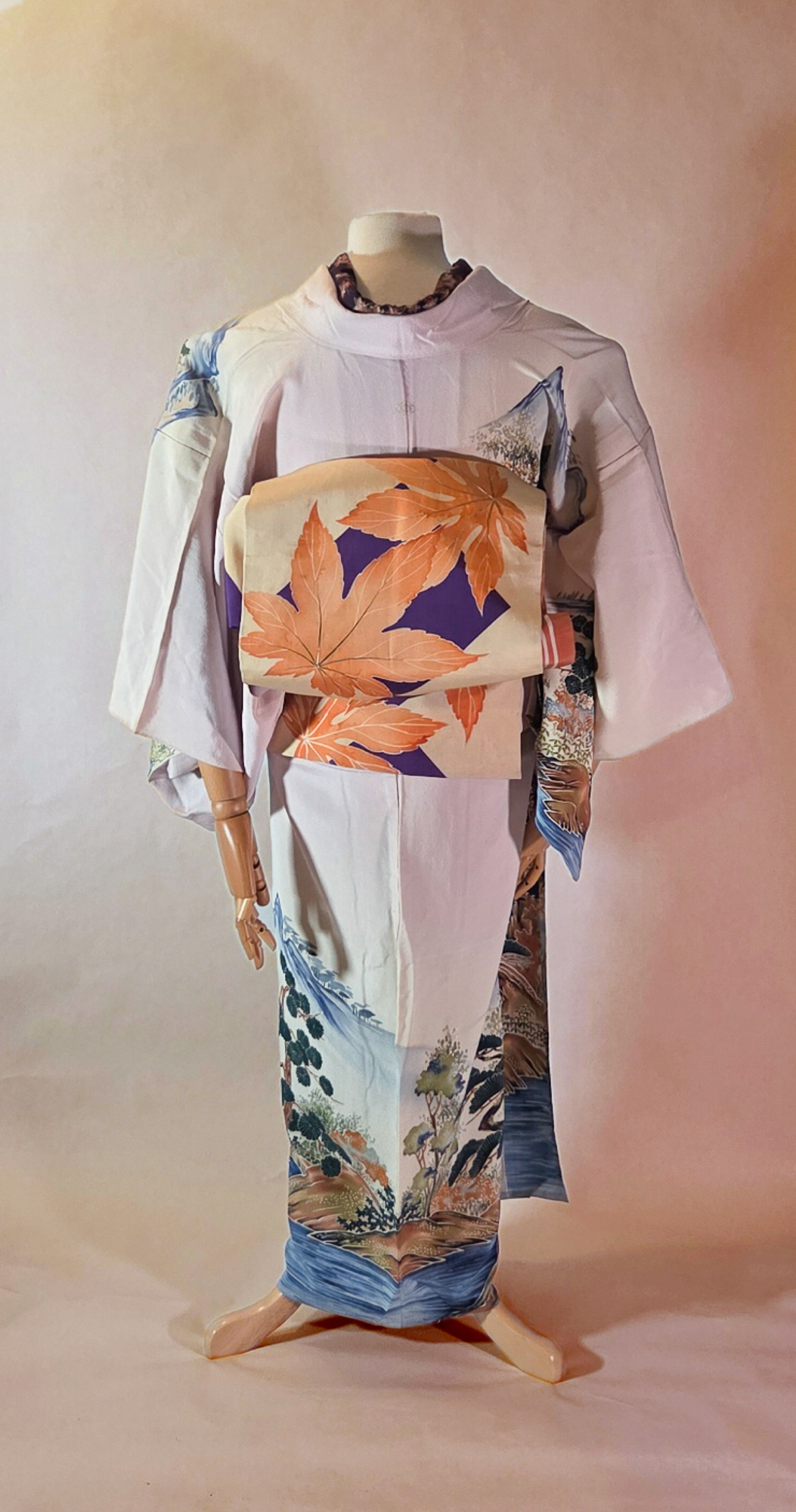
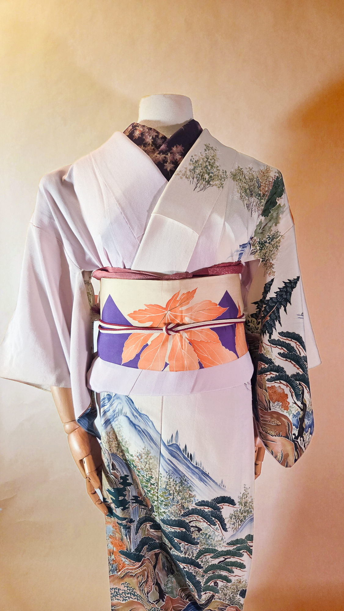
Overall, these are all absolutely lovely and definitely feel like they’d mesh well with kimono. I’m considering doing themed coordinates for each, the same way I did for Oshiroi by Meleg, focusing both on the fragrance notes and the vibes. What do you think, would you like to see kimono ensembles for these?
You can purchase the entire Kimono fragrance lines as well as other Decorté products directly from Decorté’s website, or from Ulta’s website if you are in the US.
I received this item from the retailer or manufacturer for honest review purposes.If you have a topically appropriate craft, product, or service you would like me to review, please contact me.


 Bebe Taian
 CHOKO Blog
 Gion Kobu