Seijin Shiki 2022 – Ice Princess

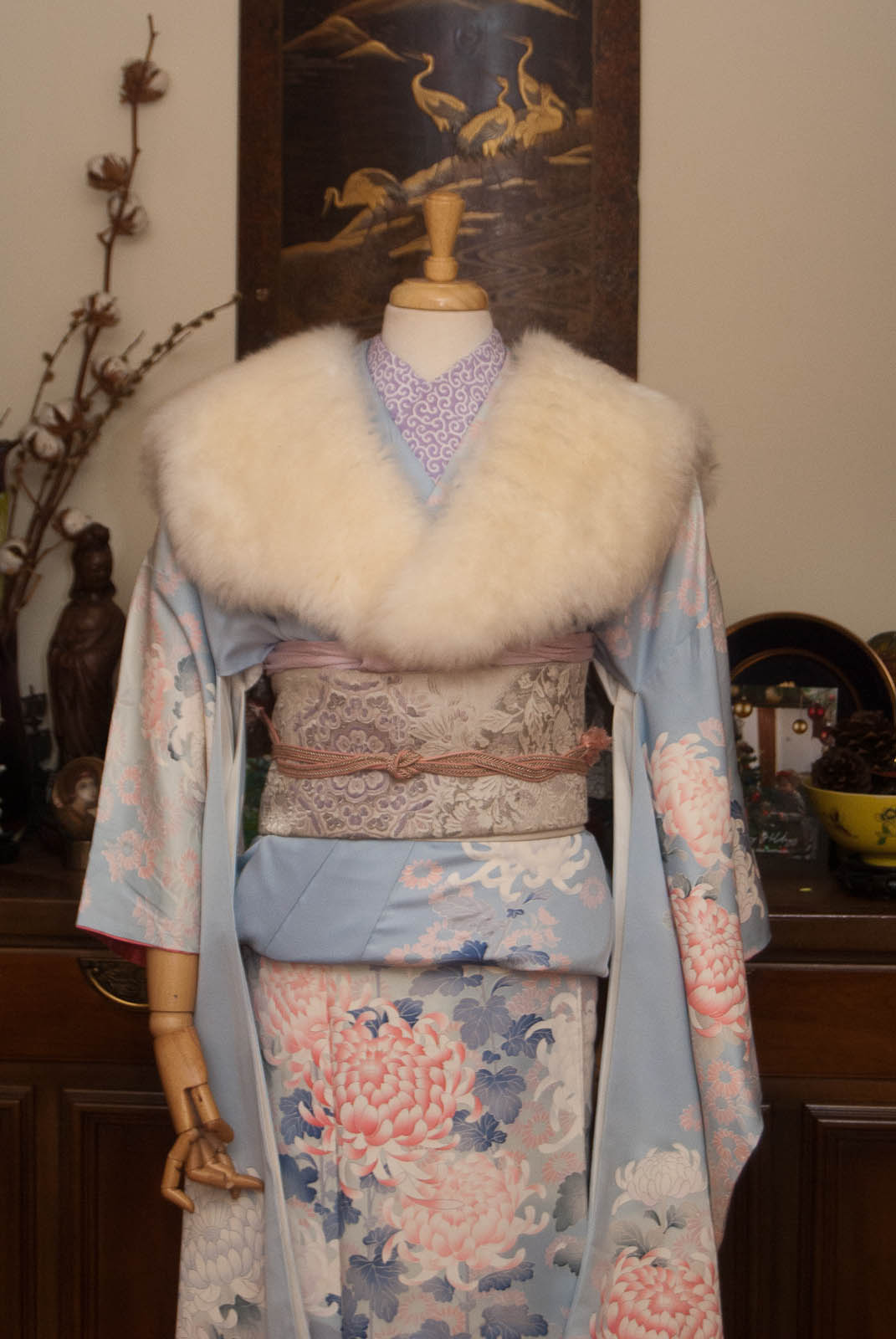
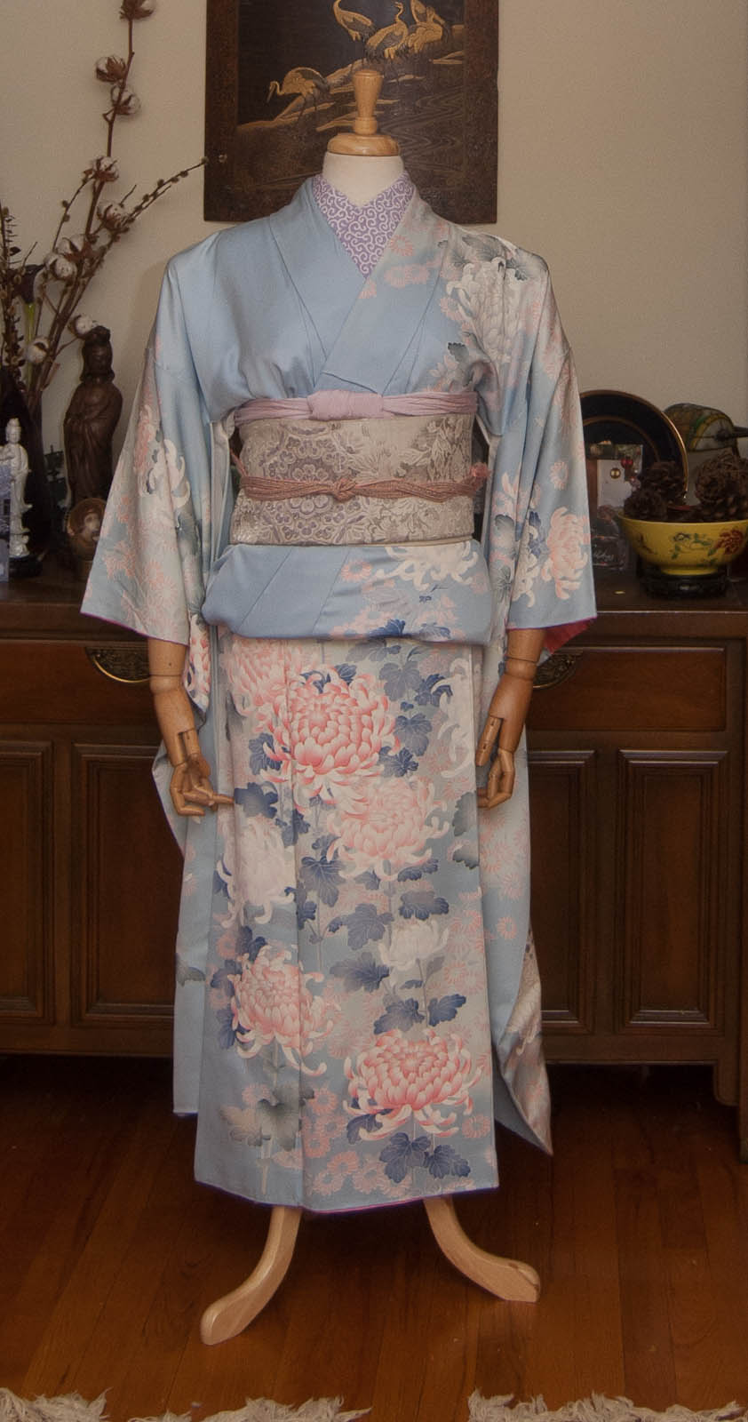
Seijin Shiki (Coming of Age Day) 2022 was this past Monday, January 10. I should probably have done this outfit back then, but work kicked my butt. Better late than never, right?

It’s traditional for young adults who are turning 20 in the coming year to dress up. For young women, this means a beautiful furisode and accessories, and because it takes place in the winter, a fur stole is often used as well. These outfits can vary from subdued to very, very bold, depending on both the location and the personal style of the wearer.

My tastes tend to lead more towards the “mature”, which makes sense because I am literally as old as two people celebrating seijin shiki combined would be. So this outfit is more quiet than a lot of options, but I love it nonetheless. I decided to for a wintery, icy pastel coordinate.
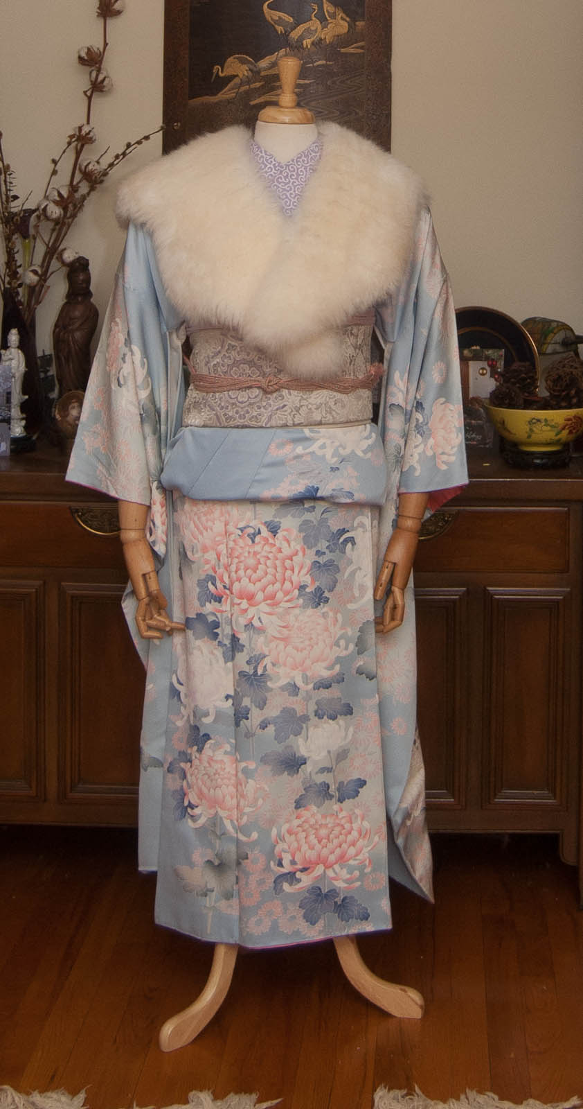
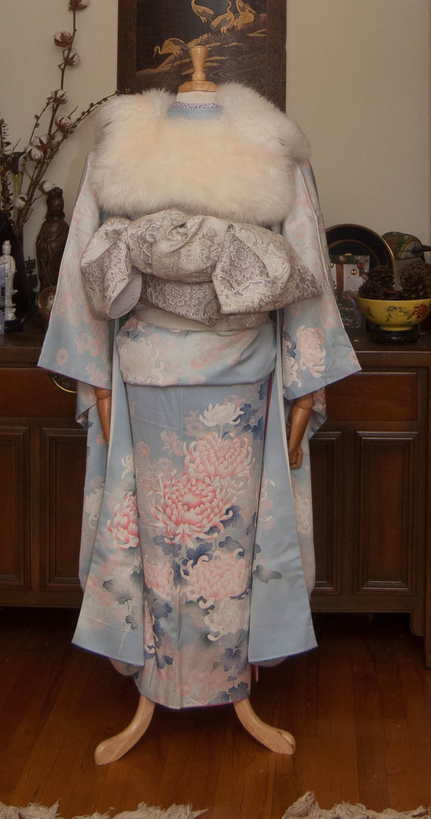
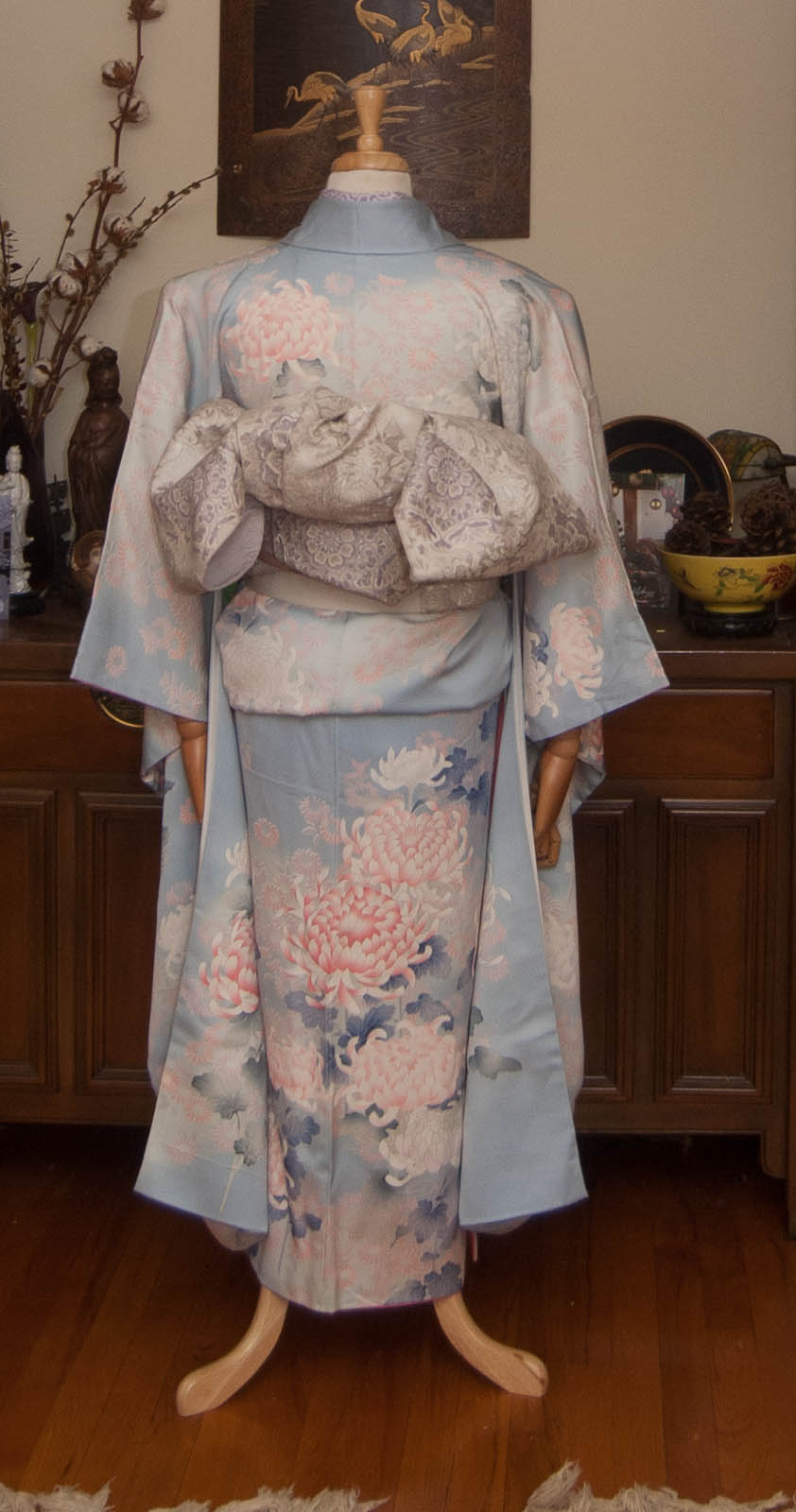
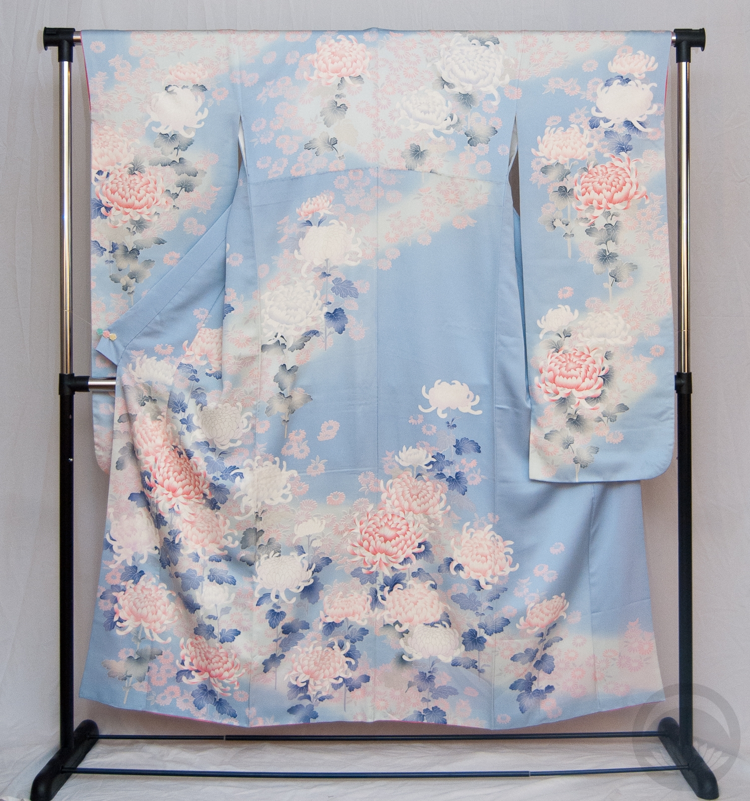
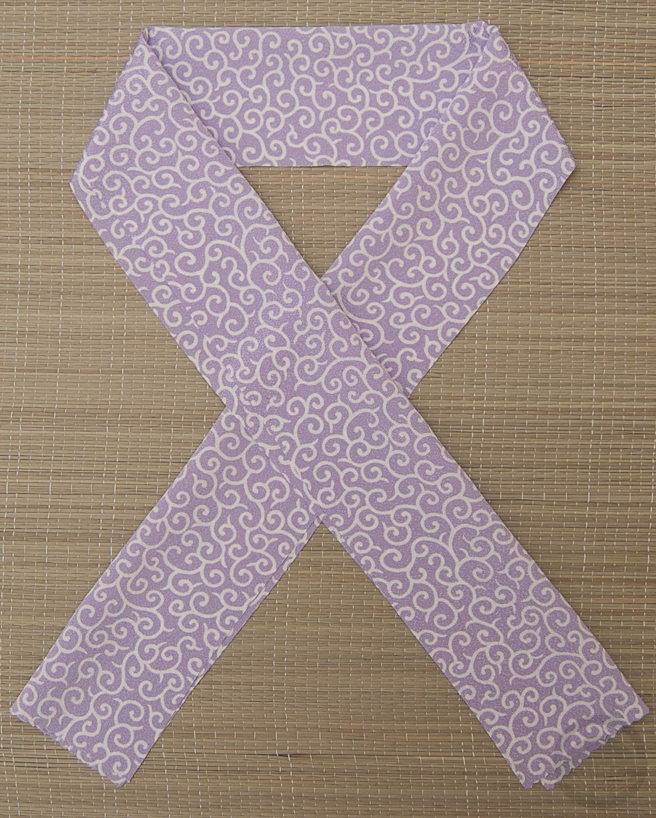
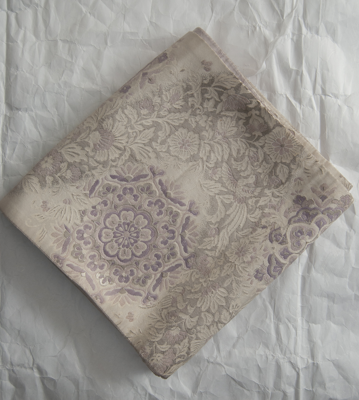
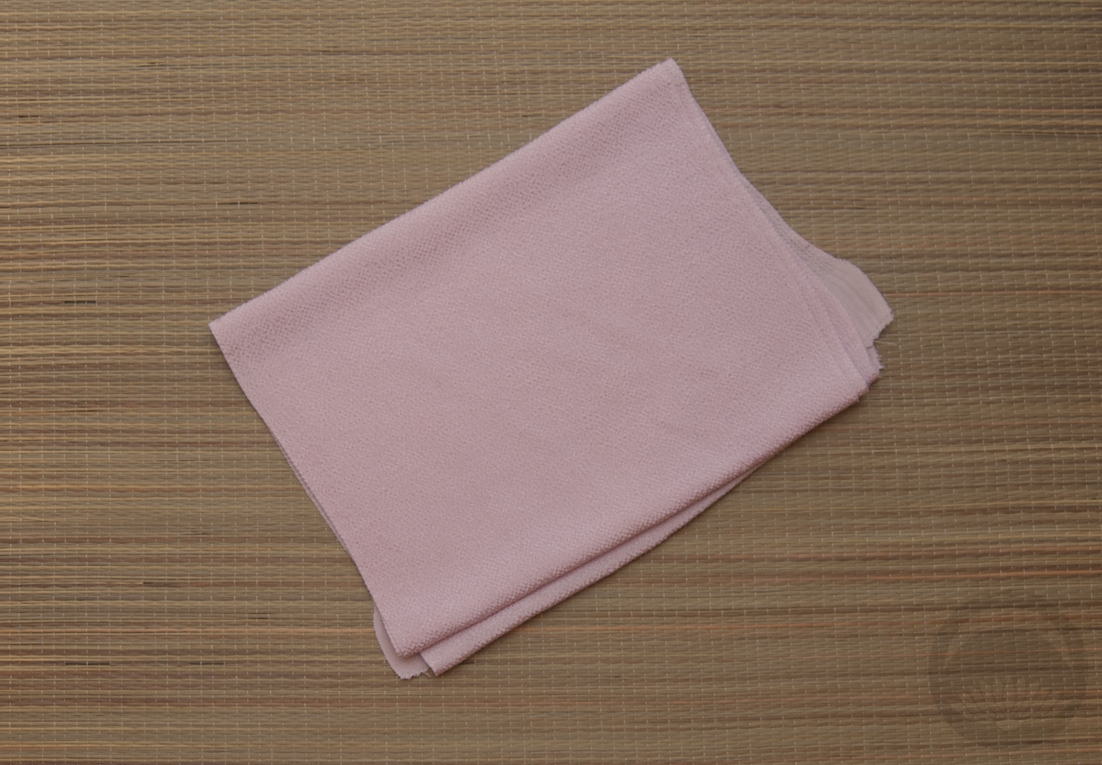
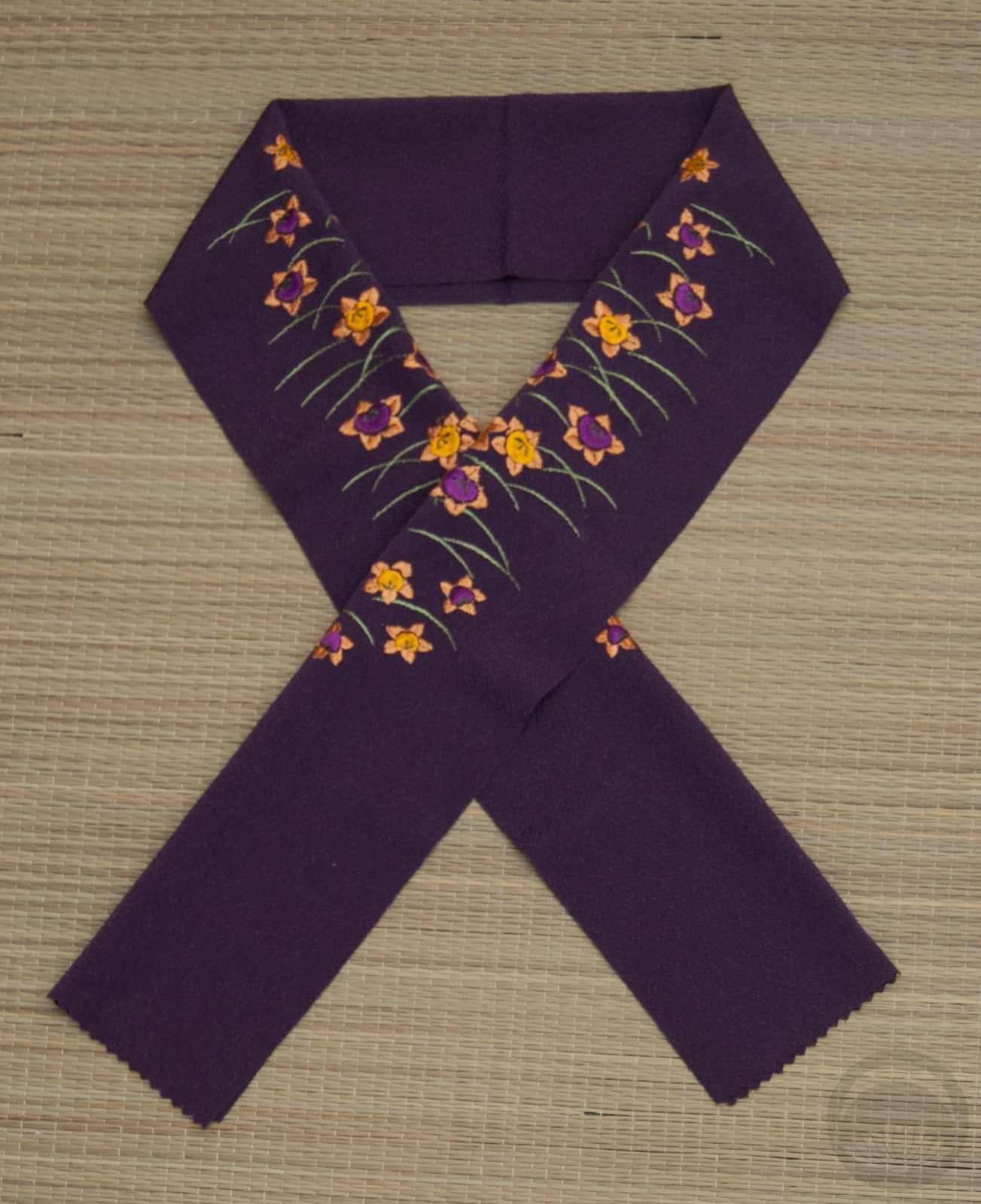
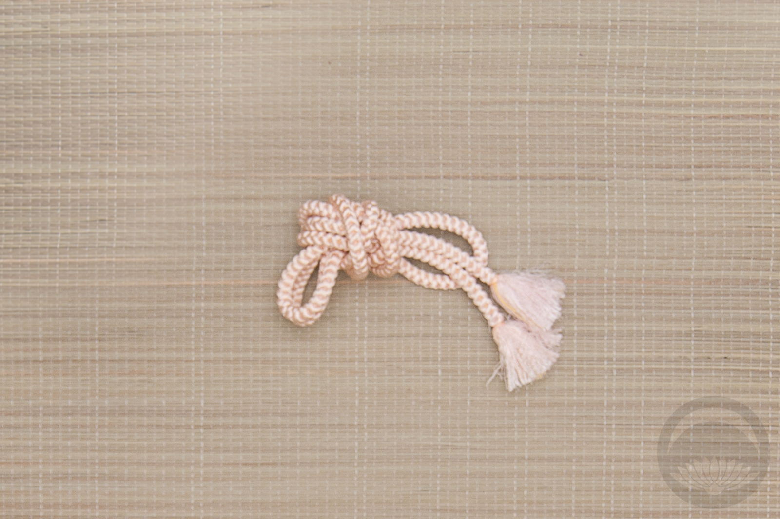
I went for my well-loved blue and pink kiku furisode. Since pastel blue and pastel pink together make pastel purple, this lilac and silver obi seemed like the perfect complement, along with a purple haneri and obiage. A pink and silver obijime was the finishing touch the outfit needed, a bit of contrast against the obi while still flowing with the subtle pastel vibe of the whole thing.

I did try to make a more dramatic and showy obi musubi, but this particular obi is so soft and floppy it just would not hold a more structural shape. I eventually caved in and just went with a sort of poofy bunko musubi. It’s not quite what I originally had in mind but I think it worked out alright.

Go With the Flow

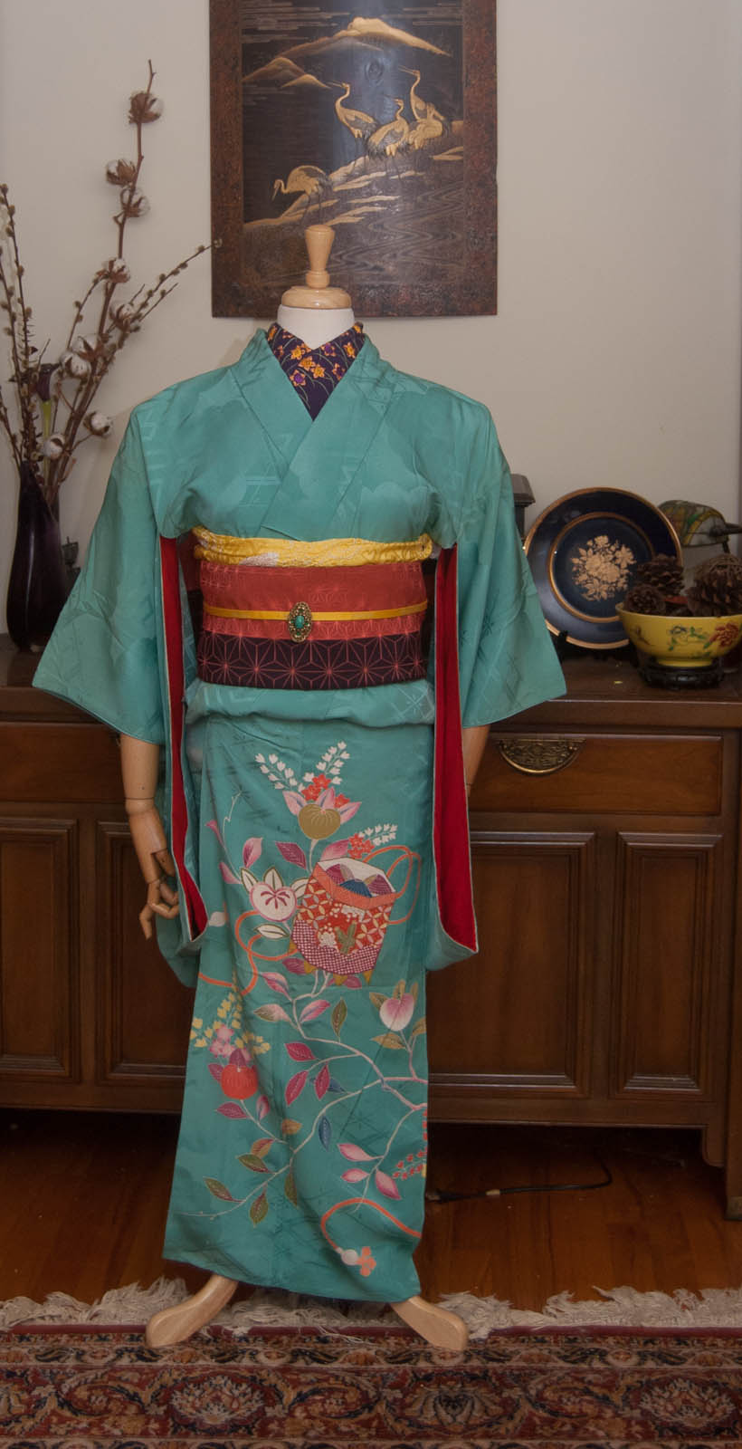
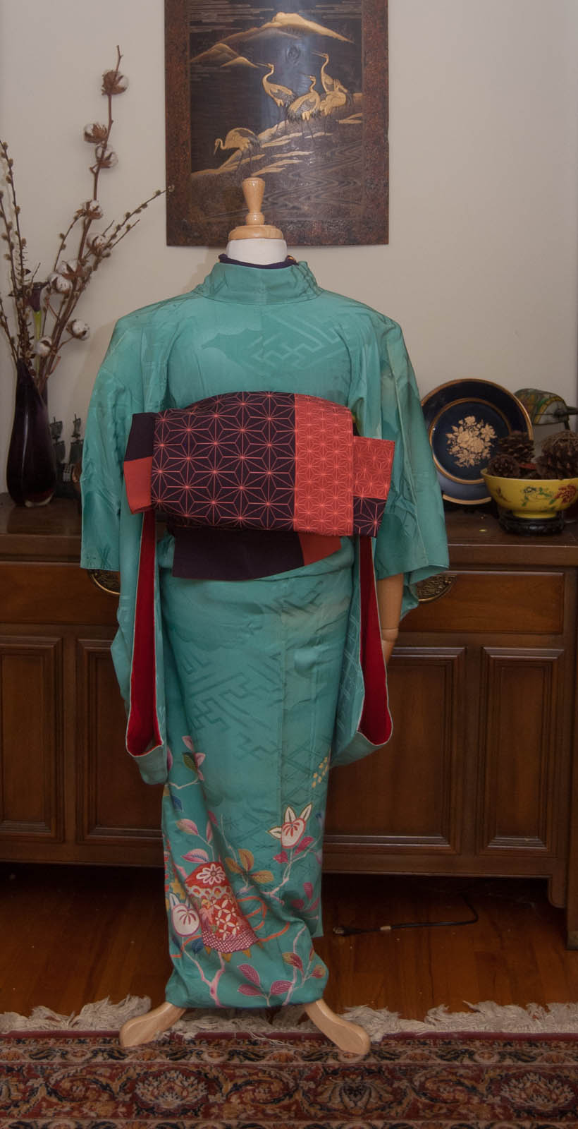
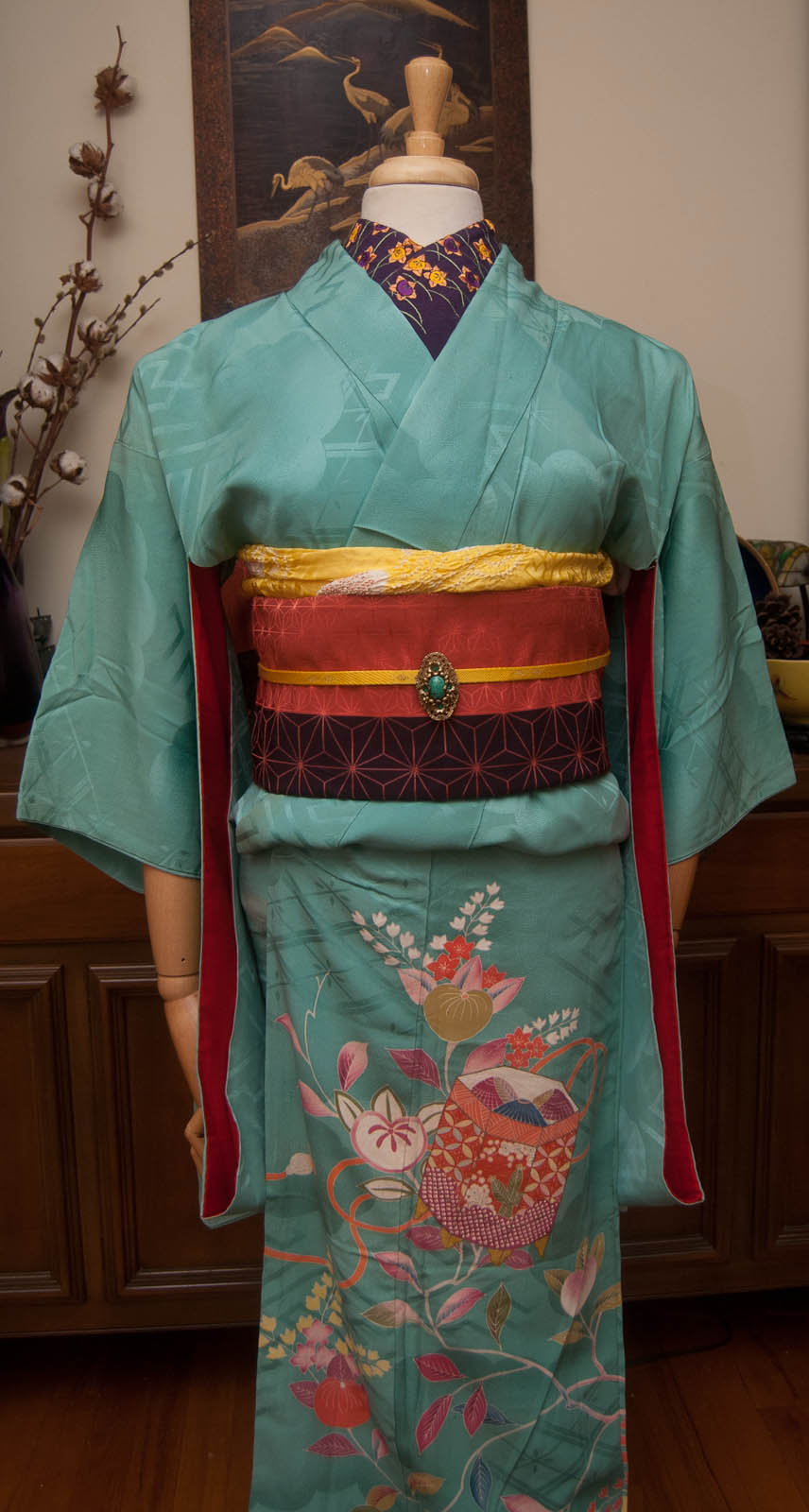
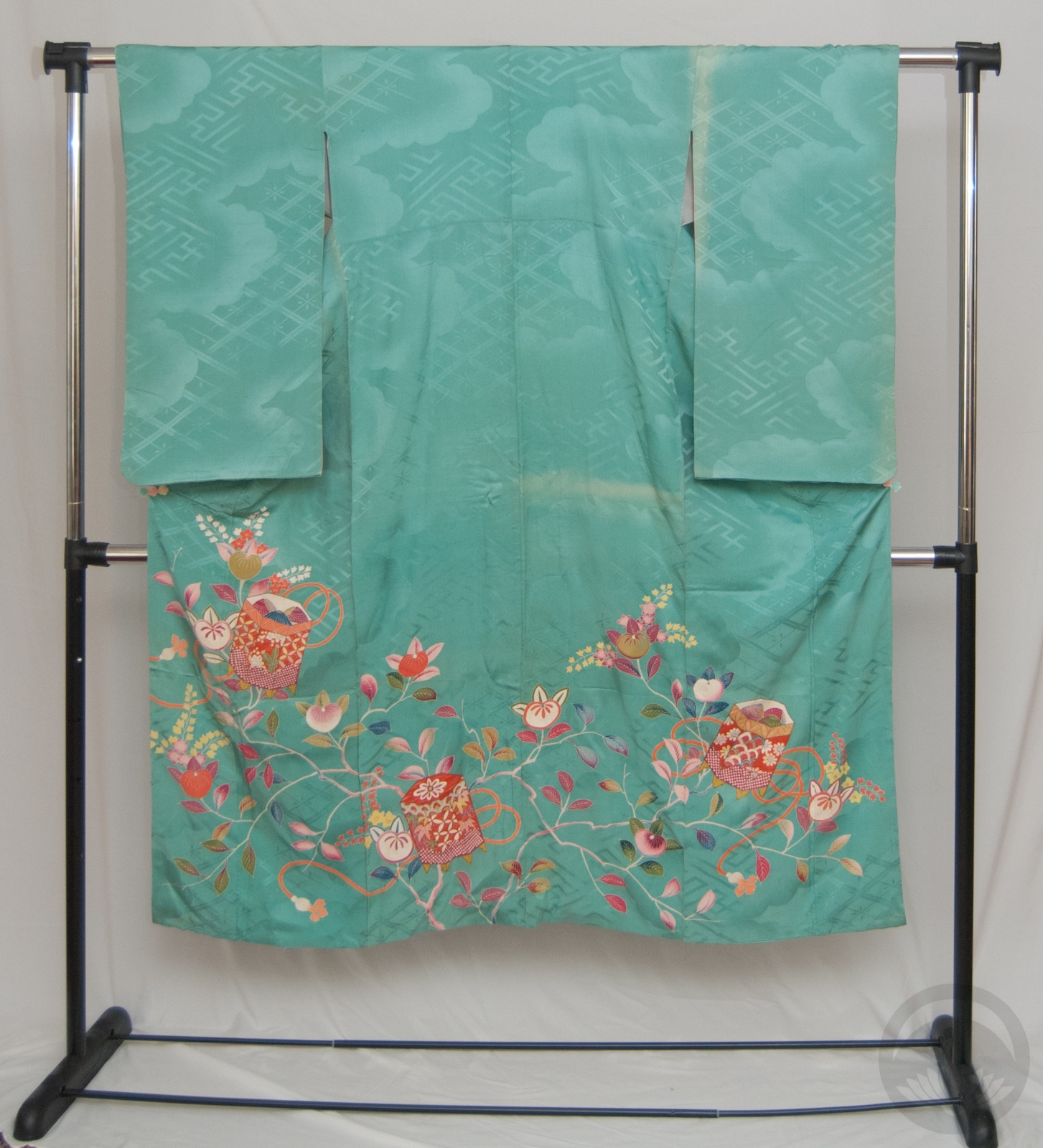
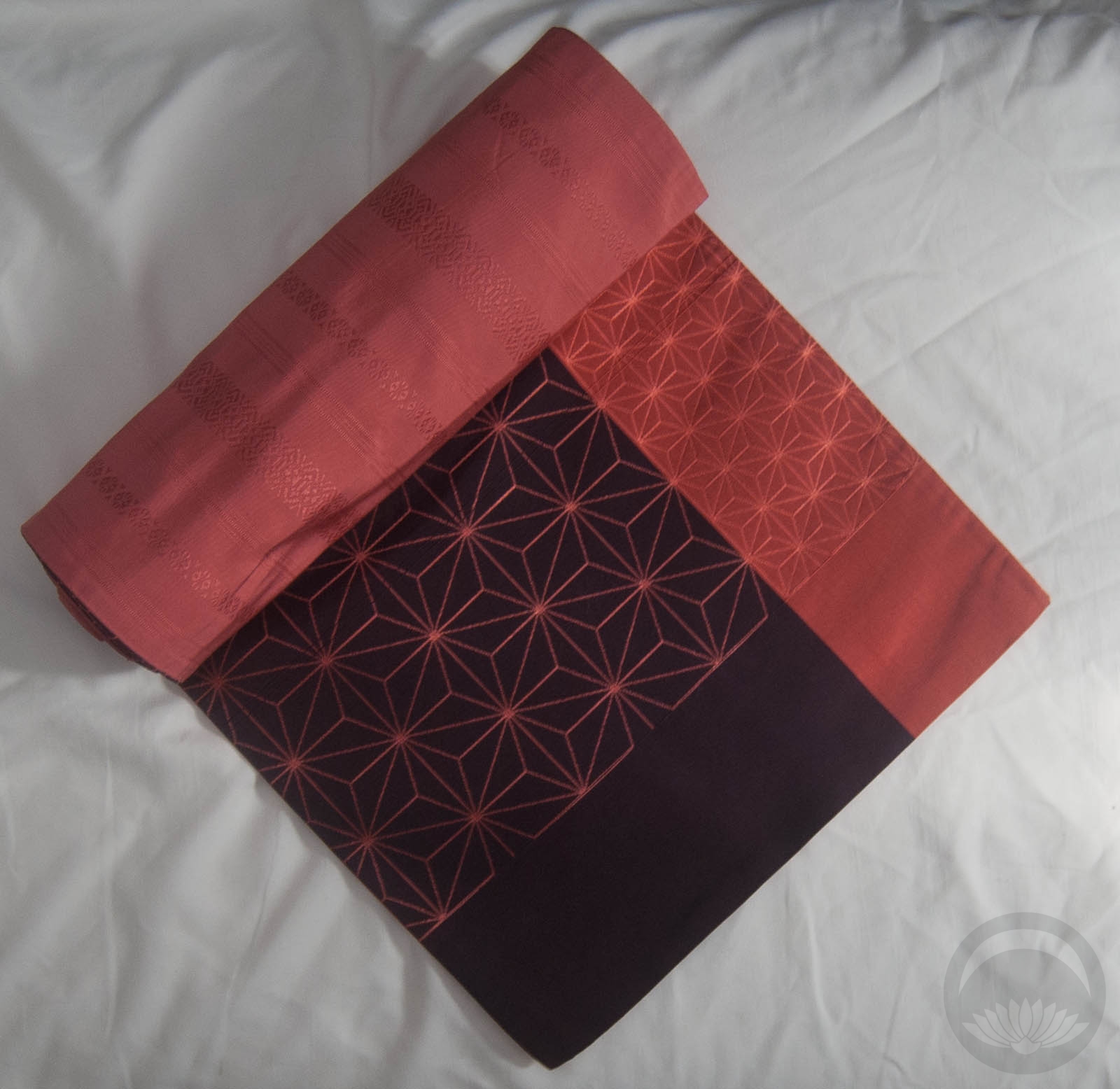
Last week, I espoused the virtues of not always sticking to your initial plan. This week reminded me once again why that’s so important! I received this lovely purple-and-pink hakata and asanoha obi during the week and had an entirely different kimono in mind for it. I’m working from home today, so during some down-time I went into the kimono room to collect the pieces I needed and just couldn’t find the kimono anywhere! While rummaging, I pulled this vintage turquoise beauty out and decided to re-think my entire plan. Pink and purple of the obi are both very prominent accent colours in the kimono so I just ran from there.

Once I’d committed to this kimono the rest all slotted neatly into place. The haneri matches the plum purple of the obi and echoes the tachibana motif in the kimono, and my ridiculously versatile yellow accessories literally tied the rest together. The “obidome” is actually a brooch that belonged to my late grandmother and just happens to be a spot-on match for the kimono, as well as having a lovely vintage feel to it that suits the age of the kimono very well. I tied the obi in a sort of tsunodashi variation because it’s a knot that always feels vintage to me too, and I love the way it shows off the two-colour design of the obi so nicely.

I’m very glad I didn’t fight and get frustrated and give up when I couldn’t find the kimono for my initial plan, because I love this one so much more!

Items used in this coordination


Terrific Texture

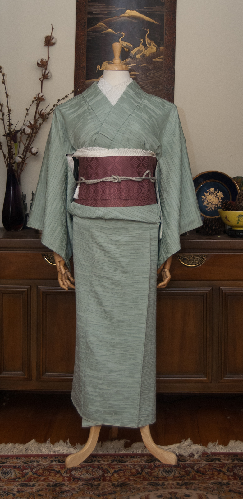
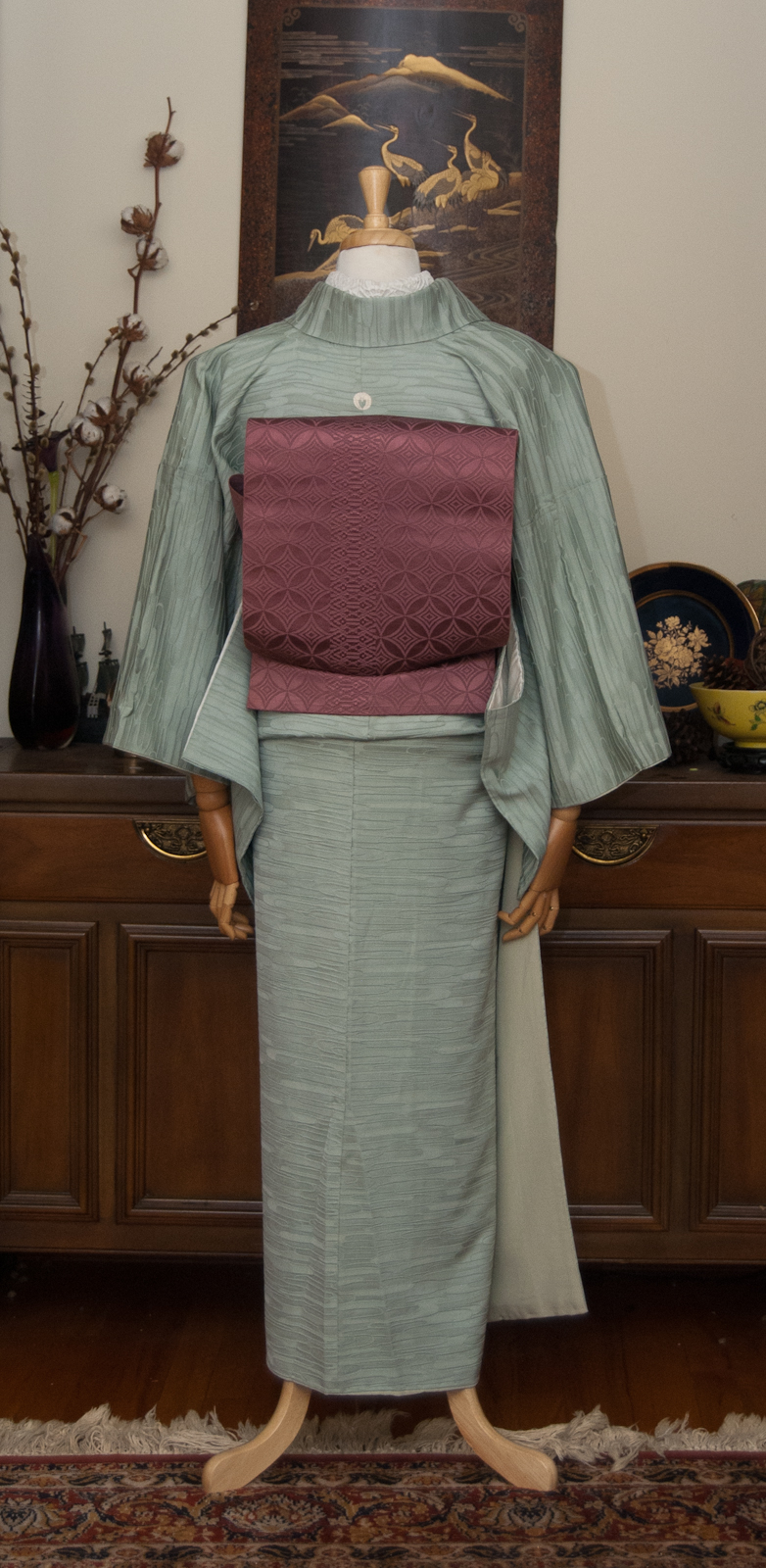
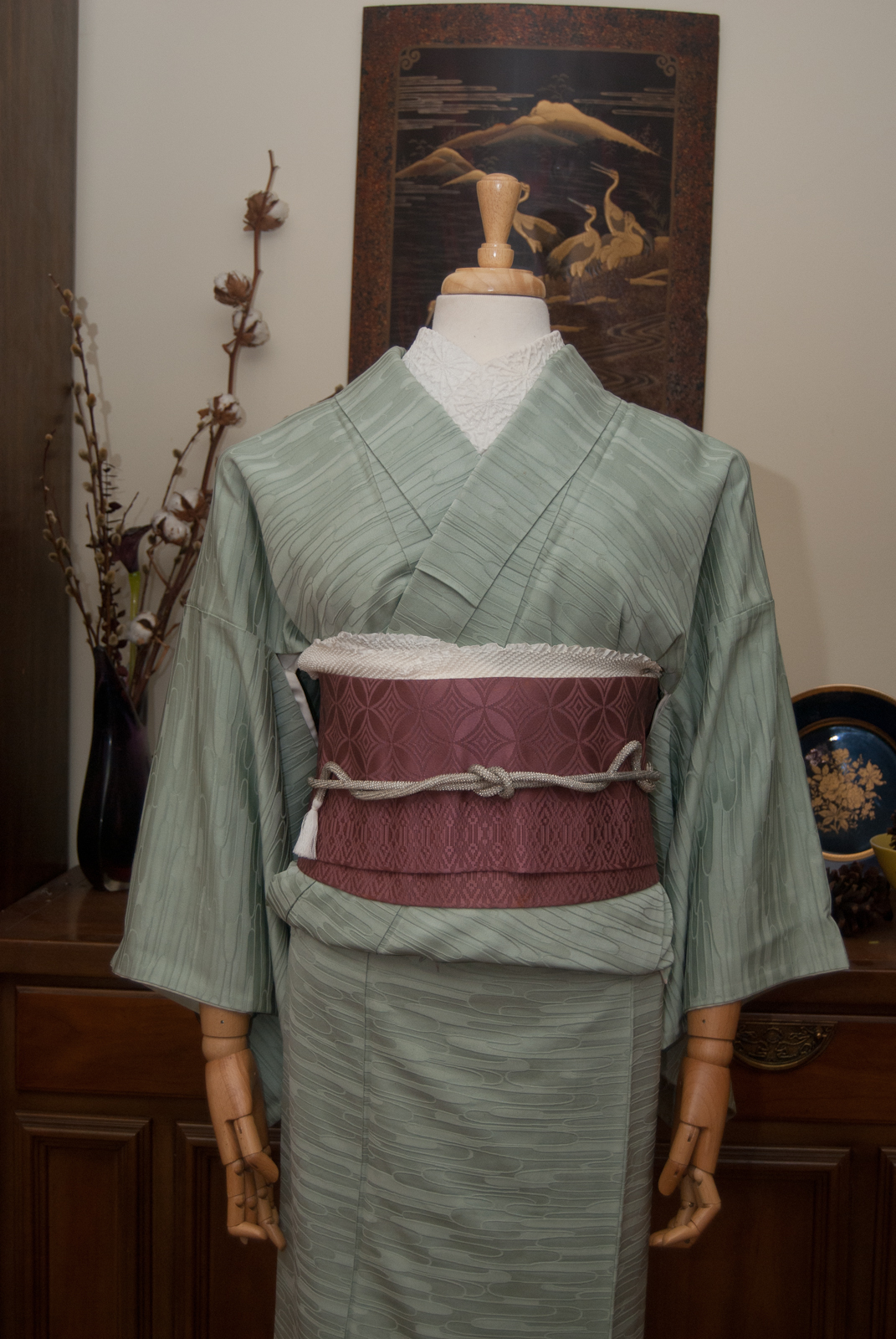
As much as it pained me to remove last week’s coordinate, it was time to change the mannequin. I thought for today I would focus on textures, an often-overlooked facet of kimono style and construction. This outfit may have no real variation in colour, and yet it’s anything but boring!

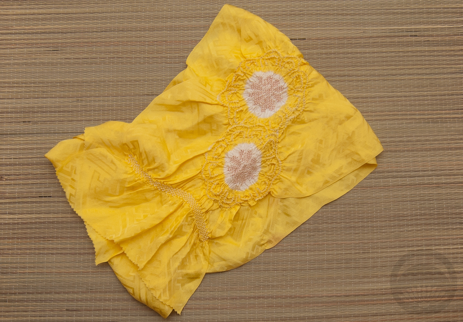
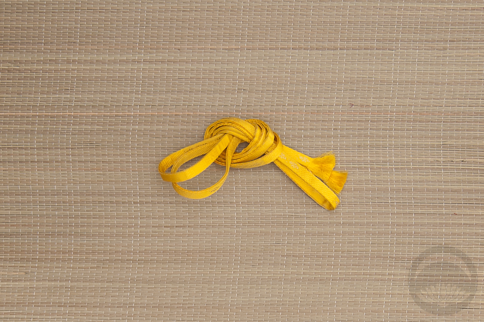
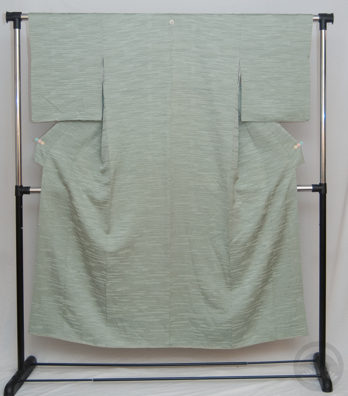
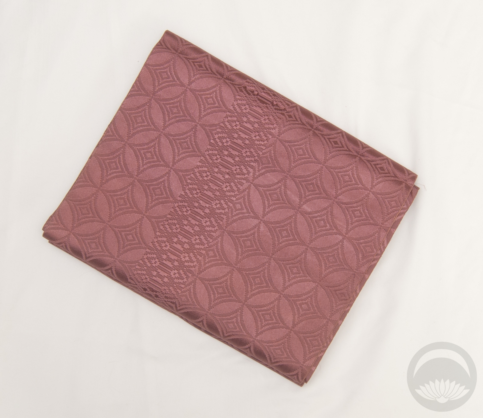
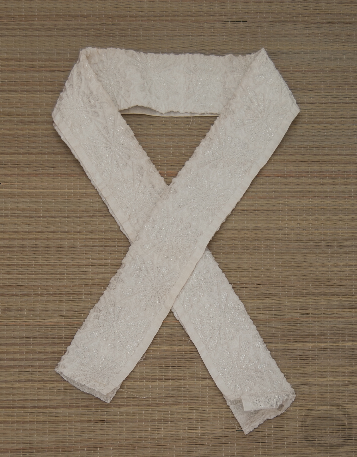
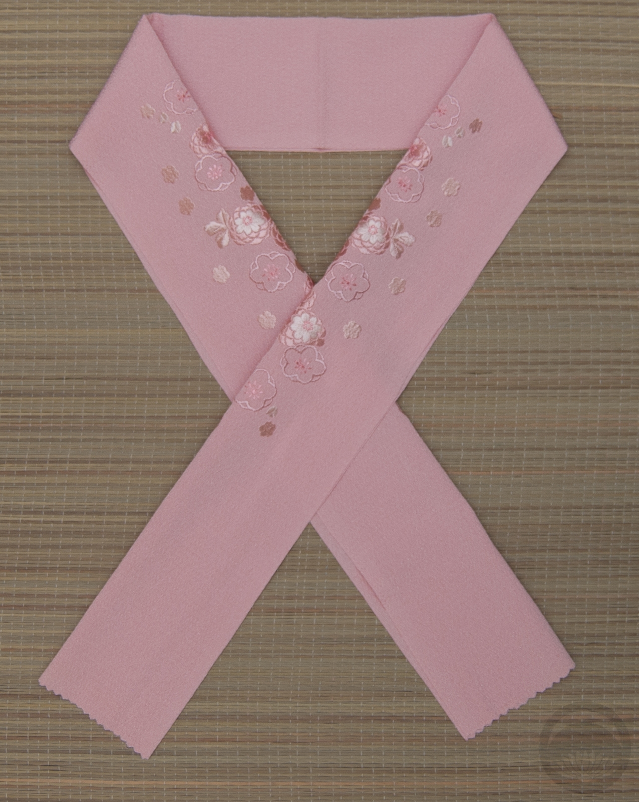
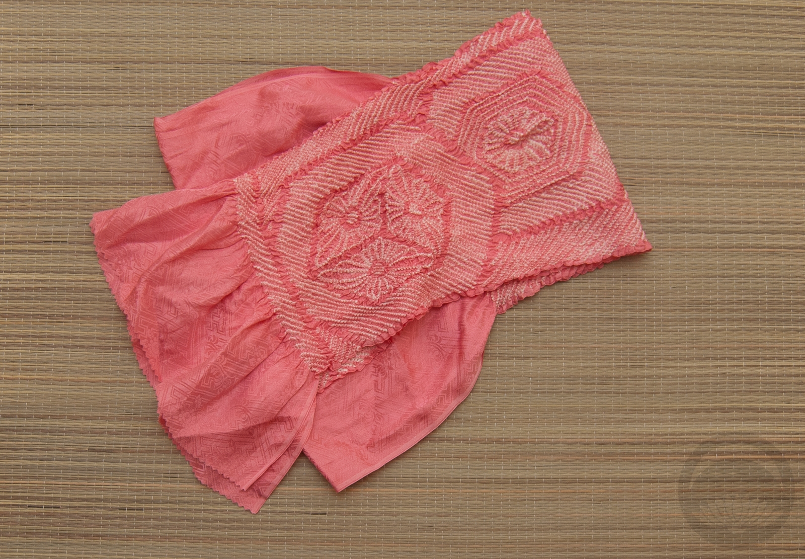
I paired my richly-textured mint iromuji with a tone-on-tone dusty pink hakata obi. Not only do these two pieces play well together texture-wise, the muted colour palettes complement each other perfectly. I emphasised the texture aspect even more with this haneri with a thick woven kiku design, a white shibori obiage (which is a bit too formal for this coord but it worked so well thematically) and a a white beaded obijime to introduce one last texture without adding more colour. I even arranged the obiage so the ruffled hem was visible, just to add one more layer of interest. Typically that edge is tucked away out of sight, but I thought it was a nice little touch.

I really like how this all came together. It’s very simple but also feels very luxurious, due to the nature of all the fabrics together. It’s even more effective in person, but you’ll just have to take my word on that!

Items used in this coordination

Blushing Valentine Bride

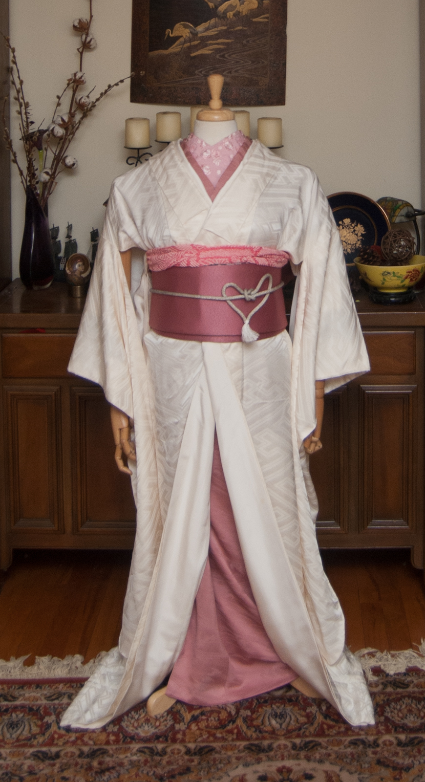
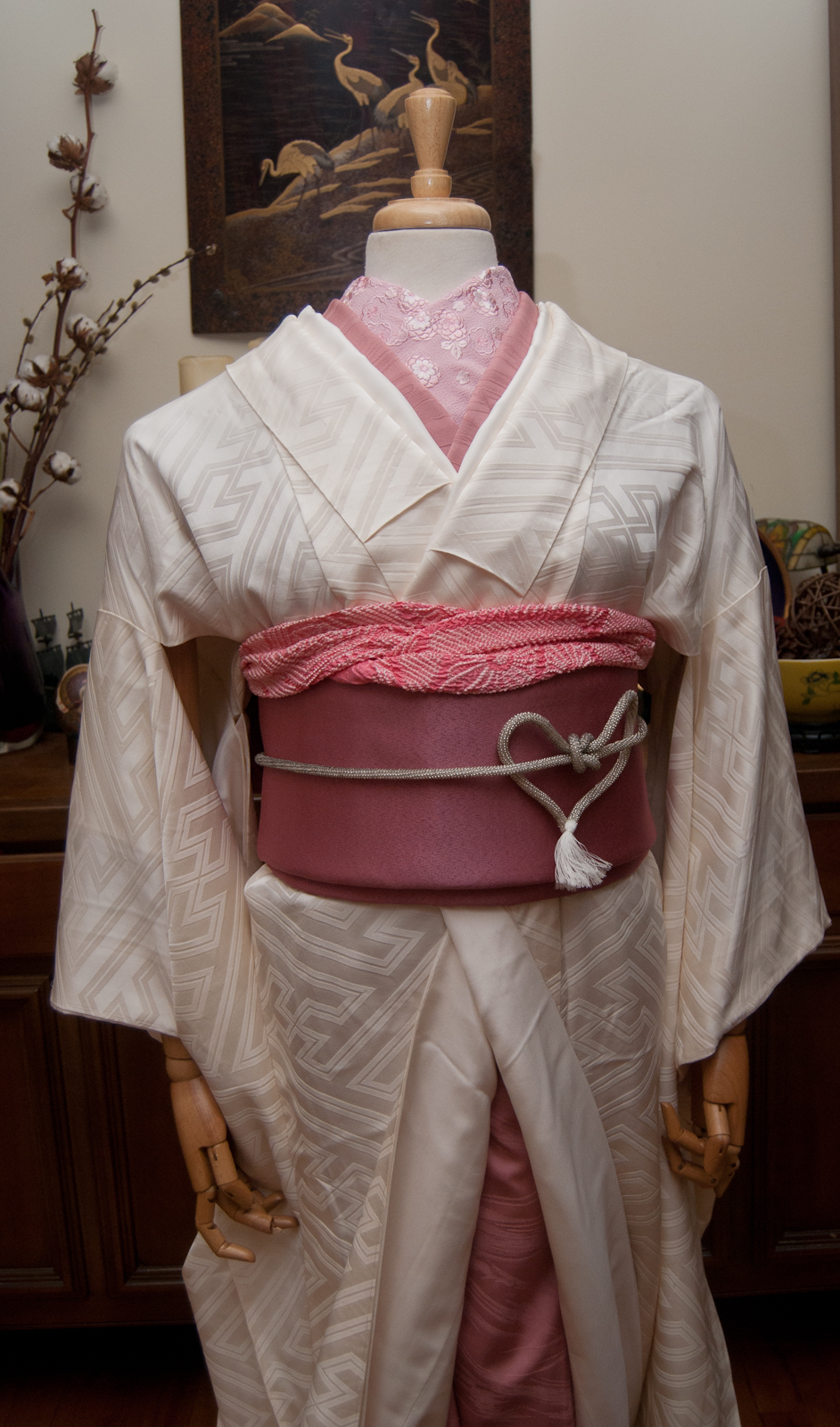
I absolutely intended to do this yesterday, but the universe clearly had other plans. It’s never too late for a little bit of winter romance though, so here we are! For February and Valentine’s Day, I decided to do a bit of a non-traditional wedding coordination. Generally, wedding outfits will be either all white (or white with metallic accents) or boldly coloured, depending on the time, location, and whether it’s for the ceremony or reception. This time though, I decided to go white with one bright accent colour; what could be more romantic than rosy pink?
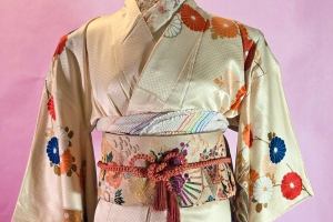
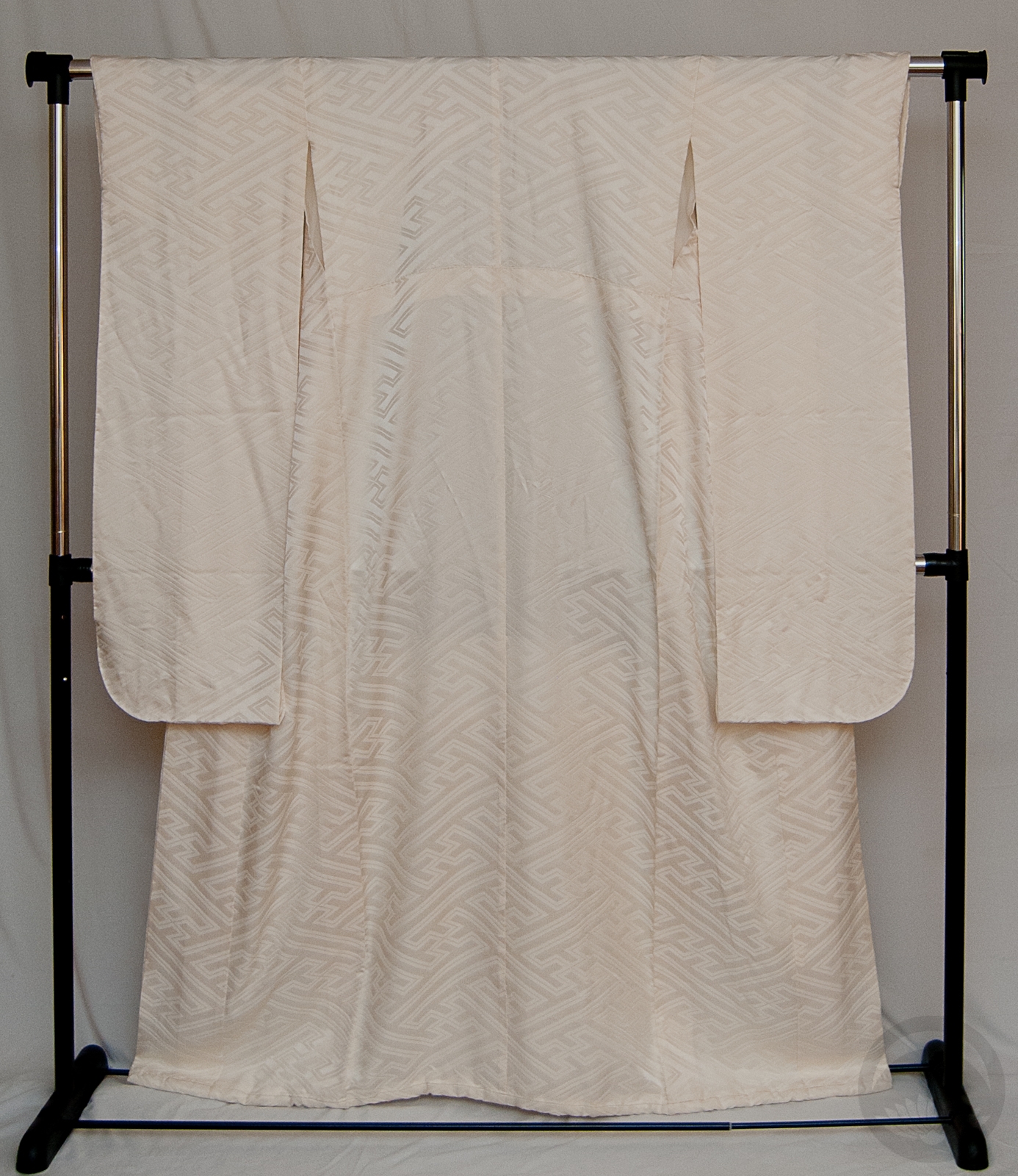
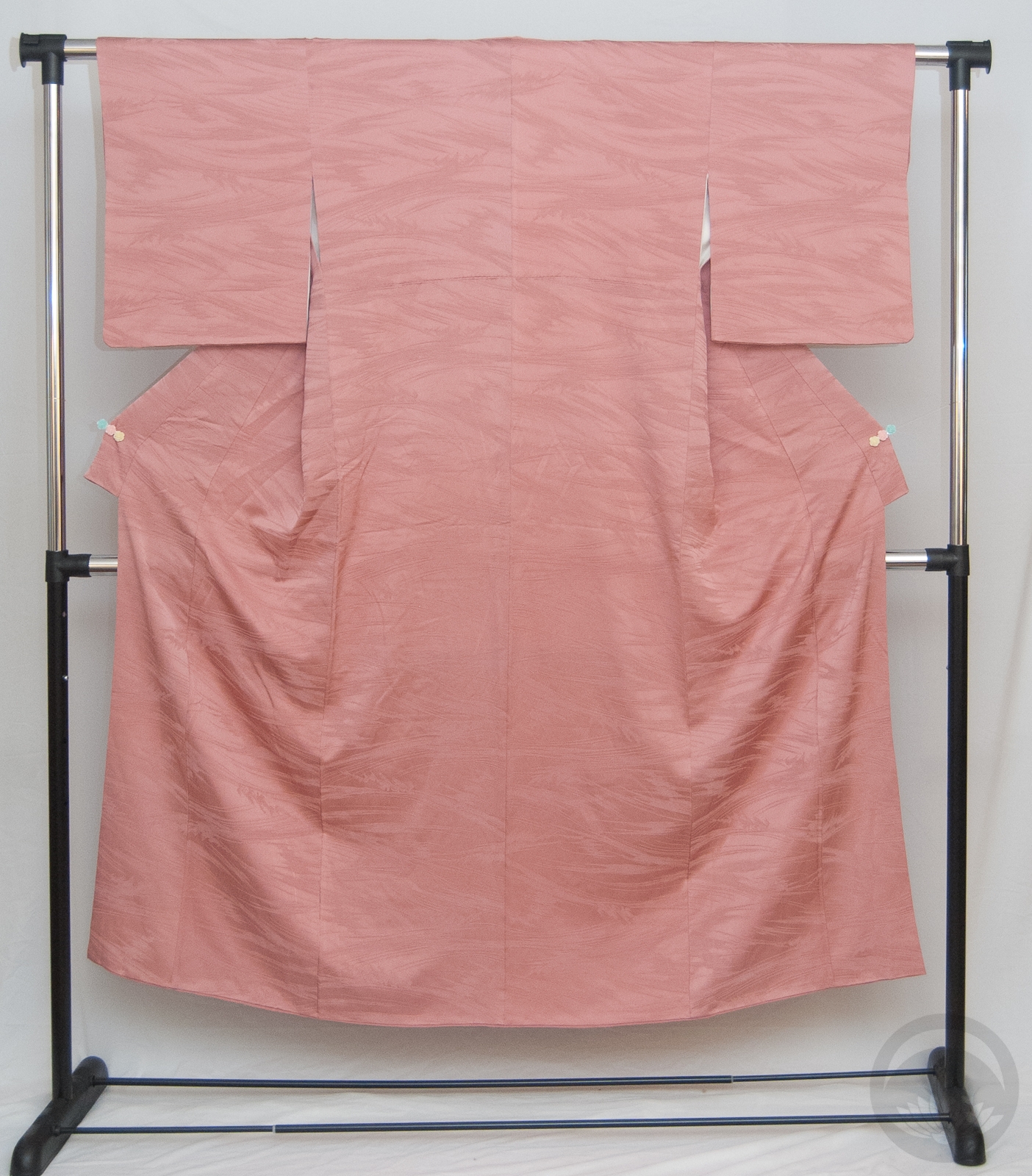
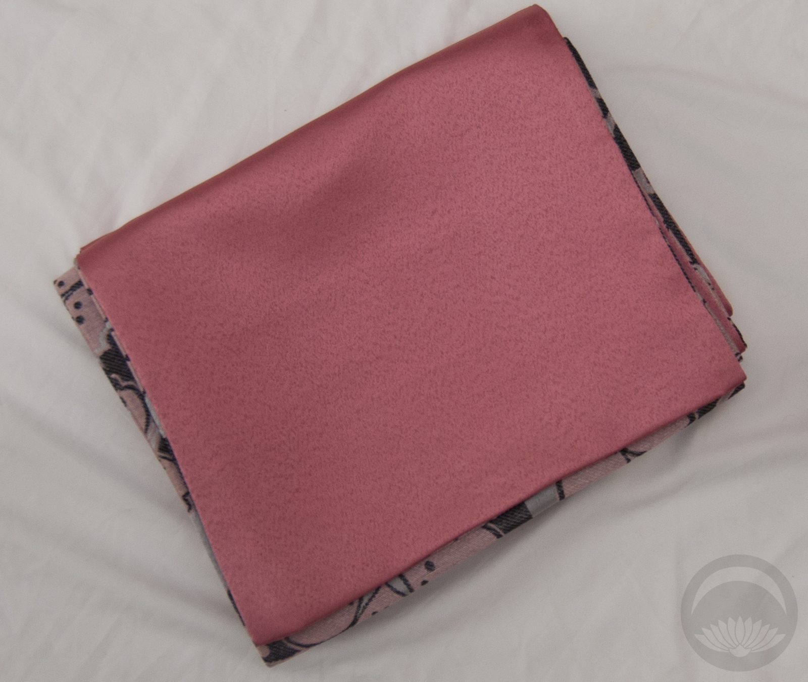
I used a pink iromuji as the under-layer, since the colour was a perfect match, and I’m glad I went for it. I love the solid colours but play of texture – the kimono has a subtle sayagata rinzu, the iromuji is much more heavily textured, there’s the nubbly shibori of the obiage, the smooth flat surface of the obi, and even the shiny bumpy quality of the beaded obiage. Everything plays against everything else to create an outfit that despite being only two colours still remains visually very interesting.

Typically, a bigger musubi like tateya or something fancy created by a bridal studio would be used with a wedding ensemble. However, this obi has no stiffener and is very floppy, which really reduces the ways it can be tied without looking sad and anaemic, so I went with a very timeless soft bunko musubi. This also seemed like the perfect time to use the heart obijime knot (tutorial here). Since beaded obijime tend to be a bit slippery and often shorter than usual I wasn’t able to do it perfectly, but it’s still quite cute I think!

I’ve also gone ahead and reactivated my Patreon account. I know times are tough and money is tight for just about everyone, so I’m not expecting anything. But if you’ve got a few dollars to spare and enjoy the content I provide, please consider pledging! Every penny earned from there will go directly back into this blog, to cover new pieces, new reference materials, website hosting, and the like.

Items used in this coordination

Showa-ing Off

Sometimes it amazes me how small the online kimono enthusiast community can be. A while back I was browsing eBay and saw a bundle of some pieces I really liked for sale by a local seller. I reached out to them to ask if they’d be willing to offer local (but socially distanced!) pick-up and about an hour later I get a Facebook message from my friend Sasa, asking if the message was from me!  😆

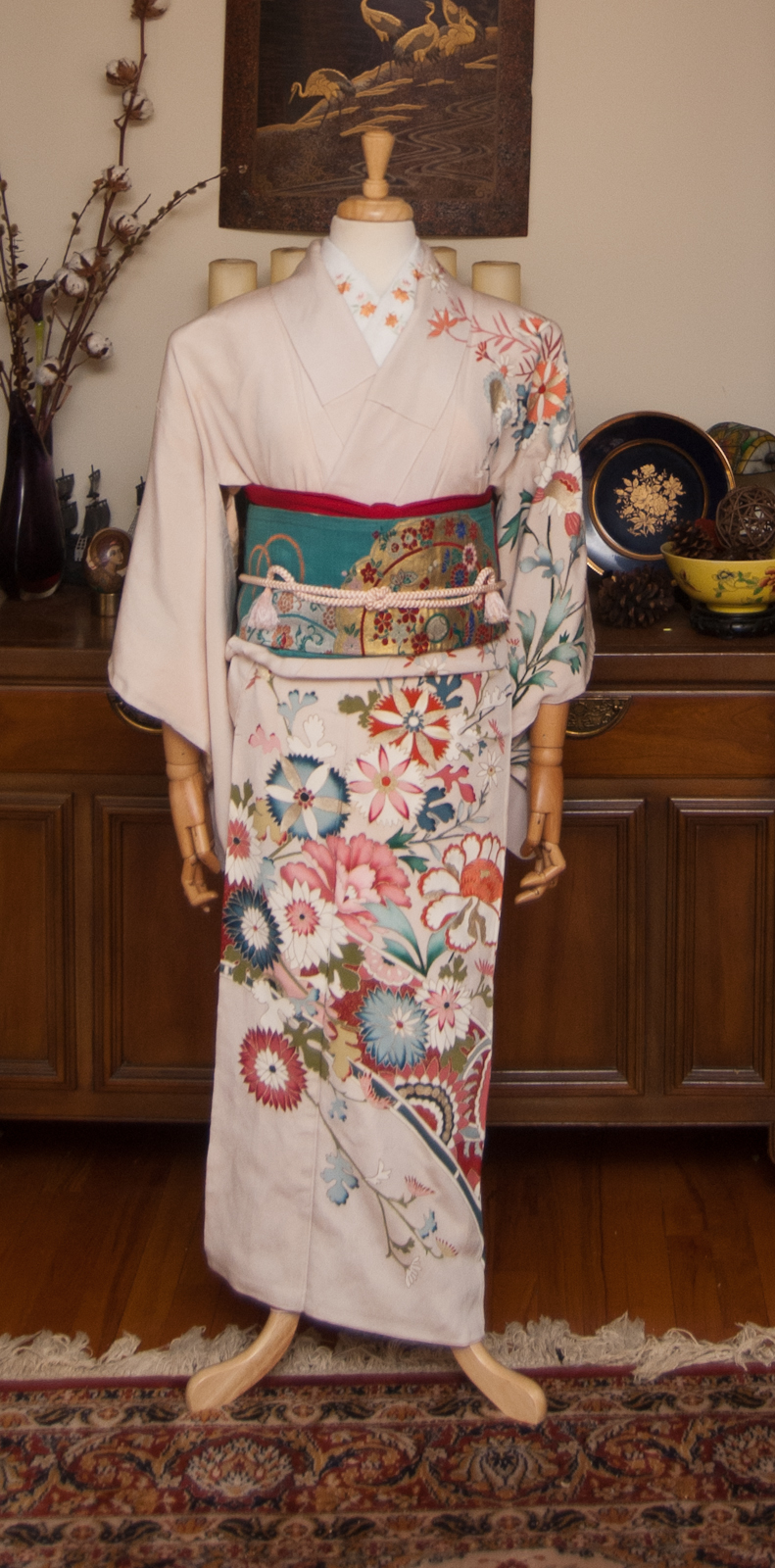
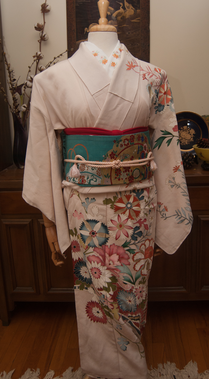
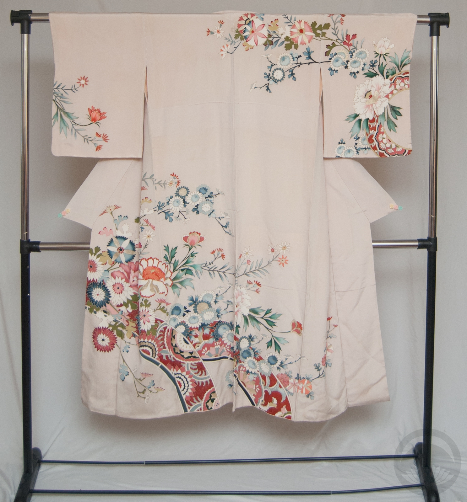
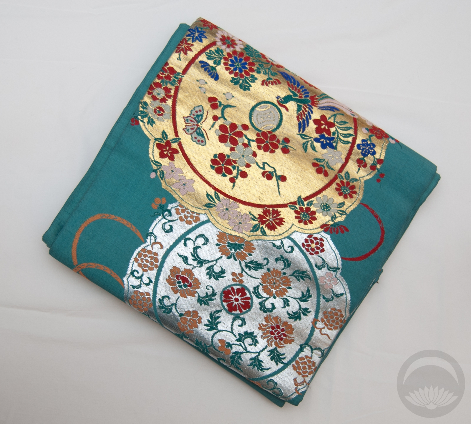
One of the main reasons I wanted the bundle was this particular kimono; it reminds me very much of the first “big loss” I ever had on eBay, the first time I truly fell in love with a piece and was outbid in the last few seconds. It’s got a very distinct mid-late Showa era feel to it, the bold colours contrasting against a very soft background, the fantastical floral motifs that almost feel inspired by 60s psychedelia. I chose to pair it with this slightly older obi that echoes the teal-green foliage and has hints of a pale peachy pink that ties in to the kimono background.

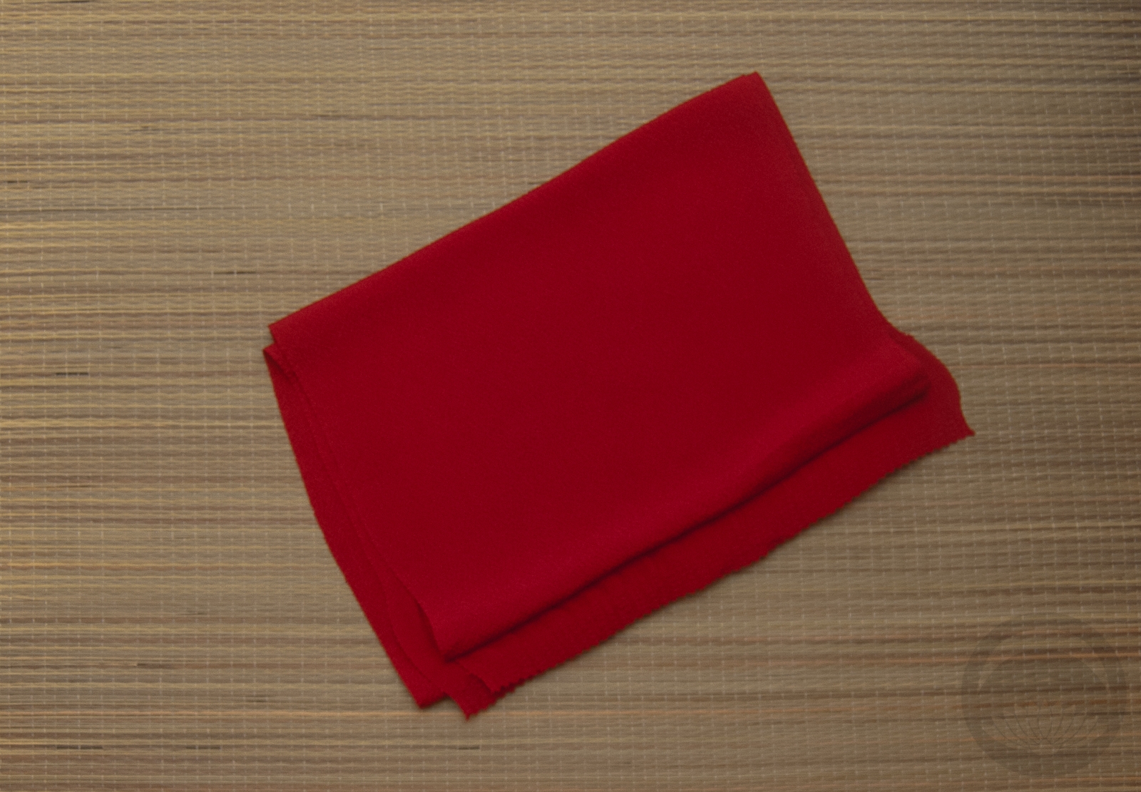
I really love how well it all ties together. The obijime is an utterly perfect match for the kimono, and the red obiage provides just enough punch while echoing the bold red tones in the kimono designs. The soft kimono and bold obi contrast very well and the whole thing just feels very mid/late Showa era. I’m quite pleased!

Items used in this coordination