Modern Valentine

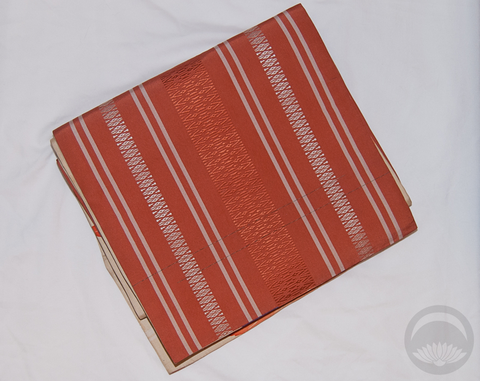
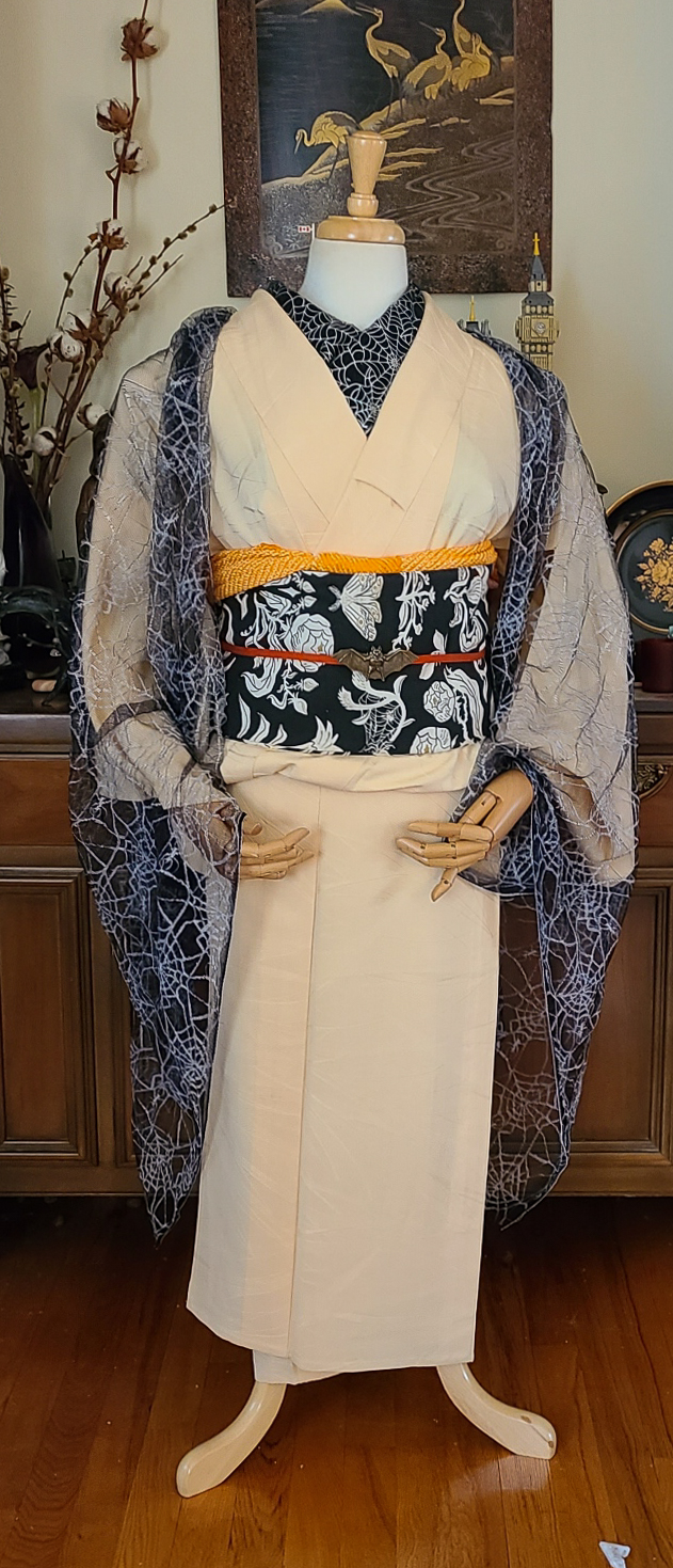
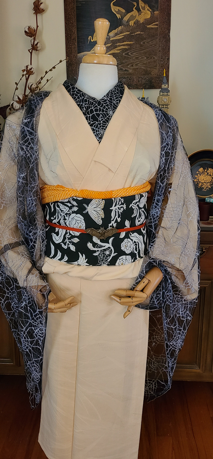
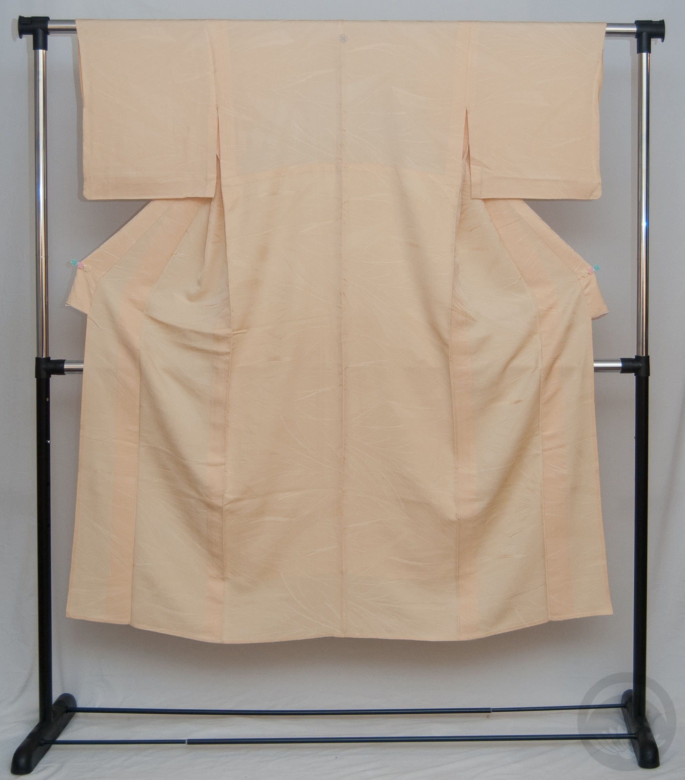
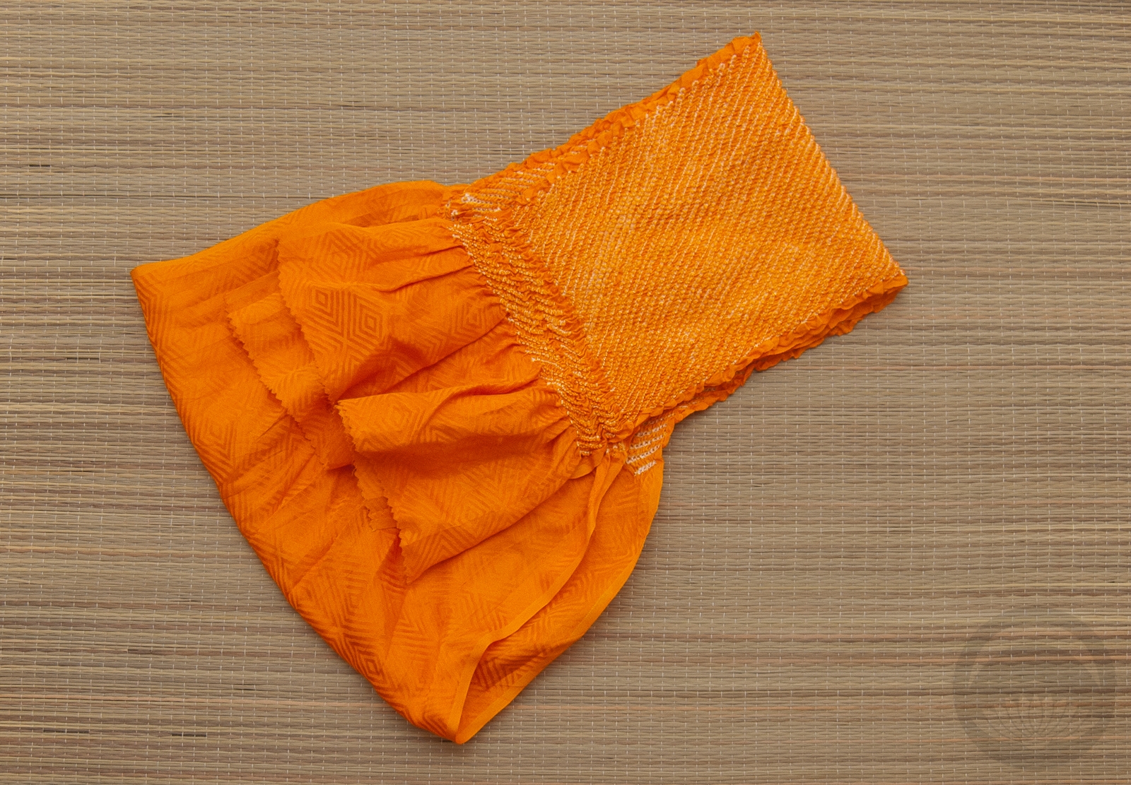
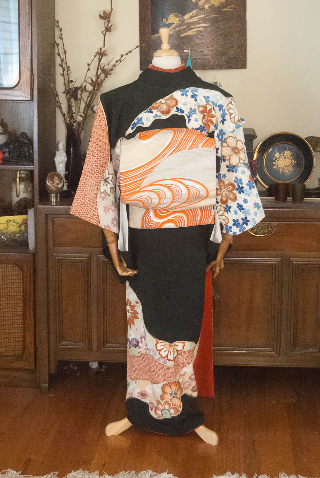
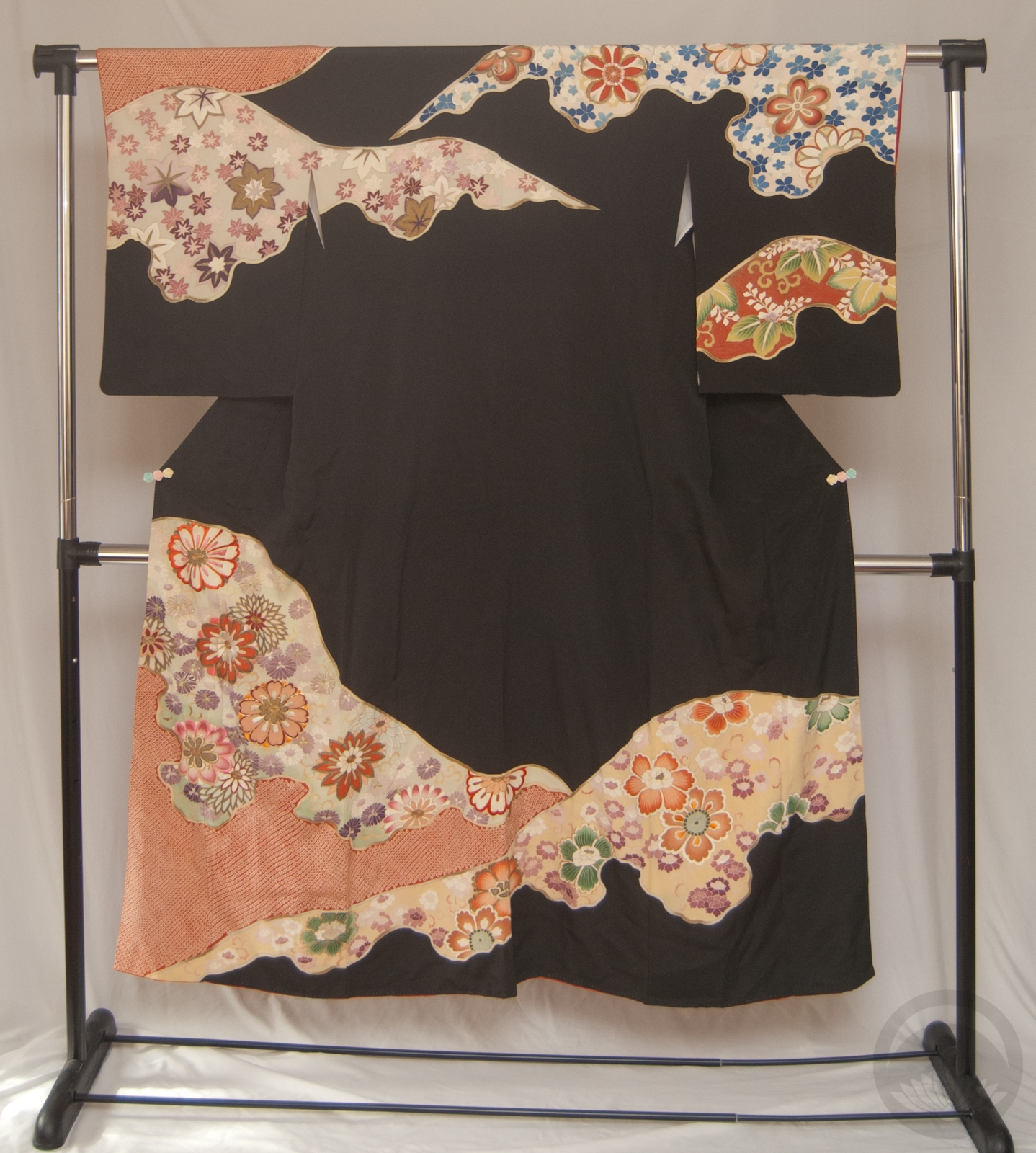
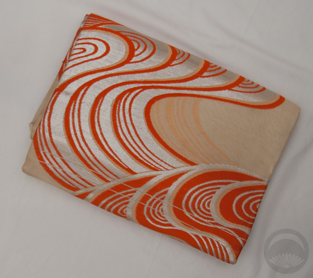
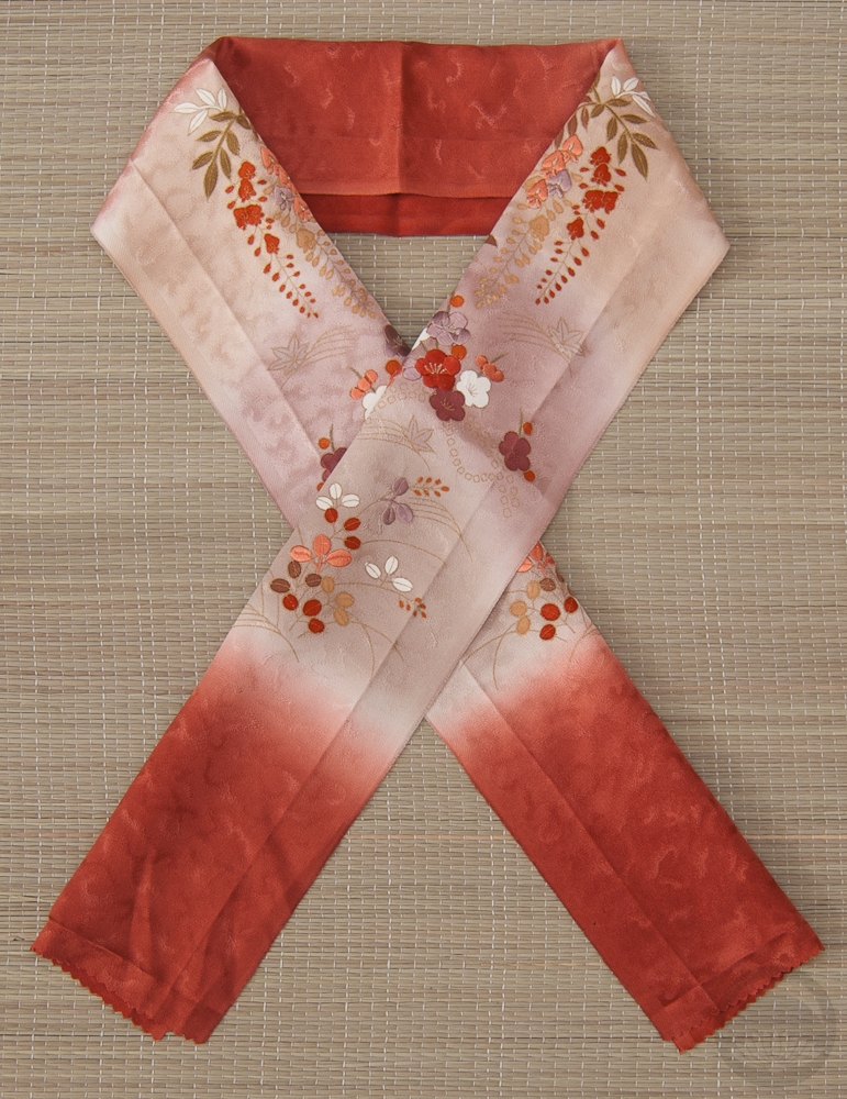
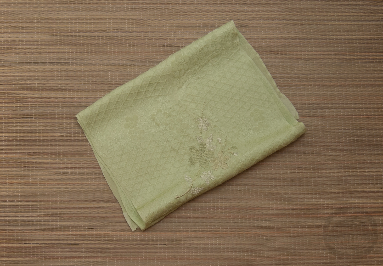
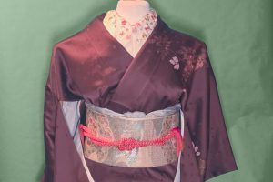
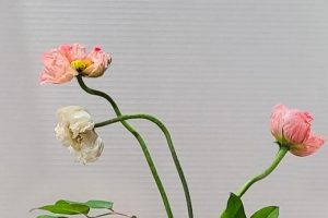
Pink, orange, and black may not be the most expected Valentine’s Day combination, but this is what happens when I’m thousands of miles away from my husband on a day to celebrate love, I guess. No, I kid! I was actually inspired by the incredible modern styling of aedam_furisode on Instagram to pull out a ruffled juban and a big loud furisode. Since the only ruffled juban I own is black, the rest of the outfit had to be built around that. I brought out this bright salmon-pink gosho-guruma (royal cart) furisode, since I knew it had some stark black outlines on it, and then grabbed my trusty orange hakata chuuya obi because it matches the peonies on this kimono so well. If I’m being honest, any excuse to use this obi is a good one.

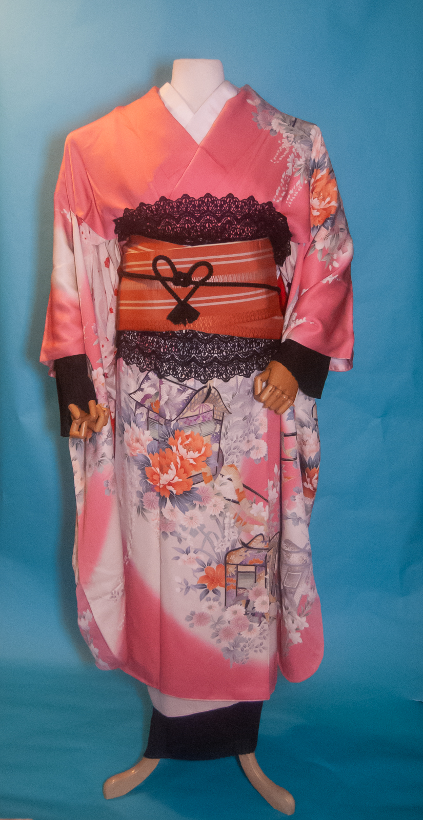
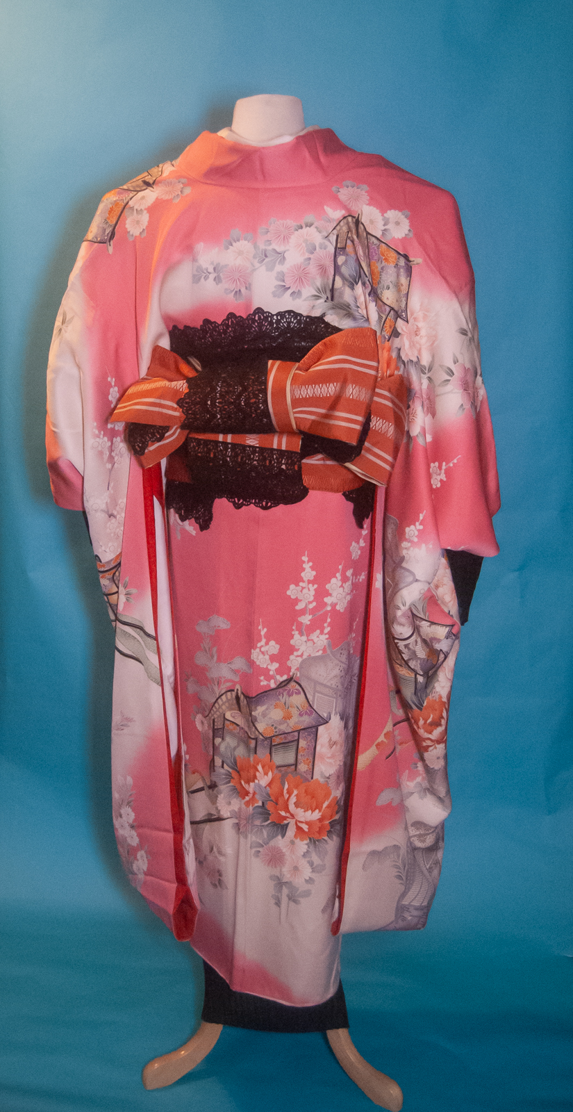
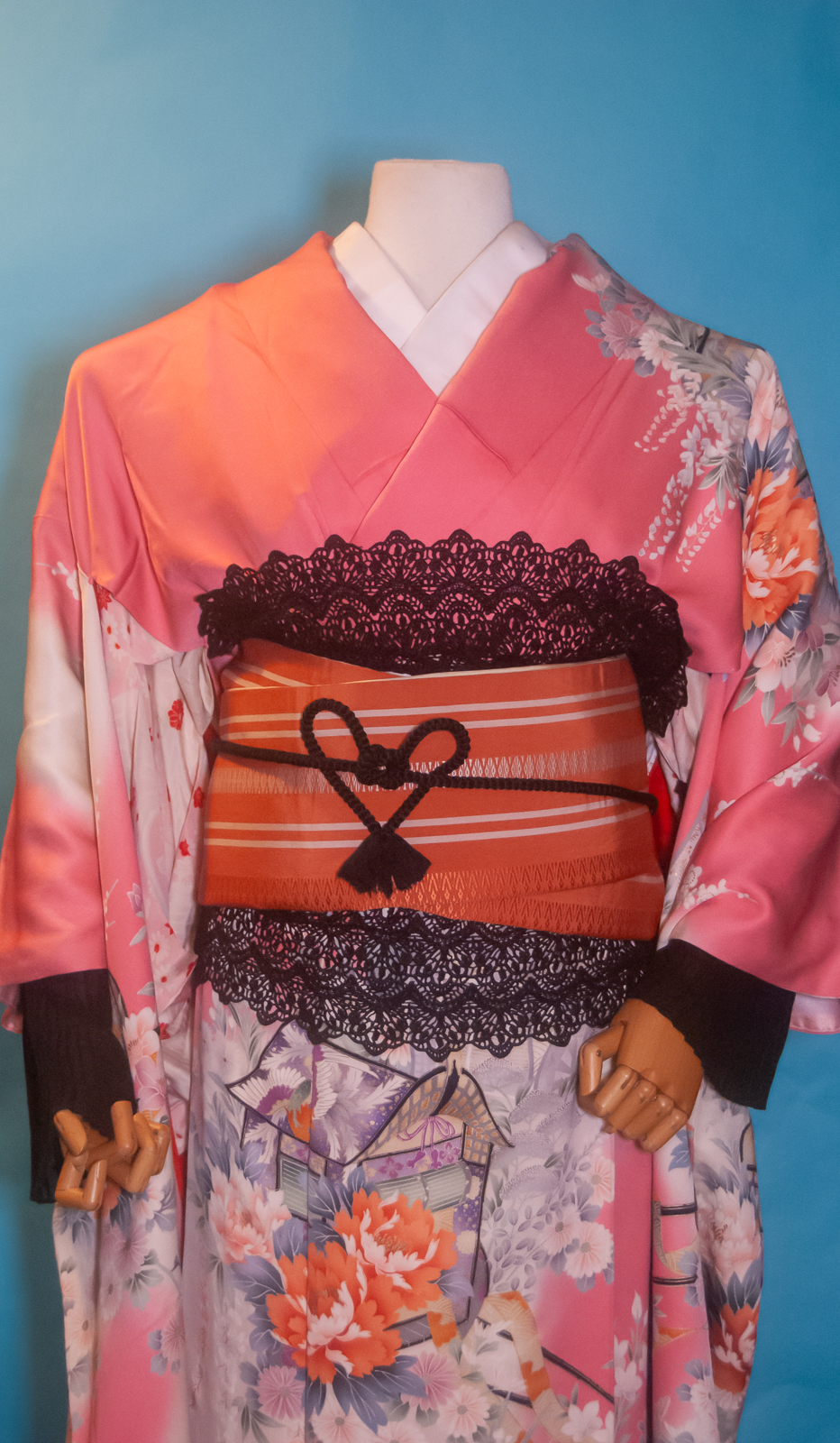
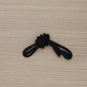
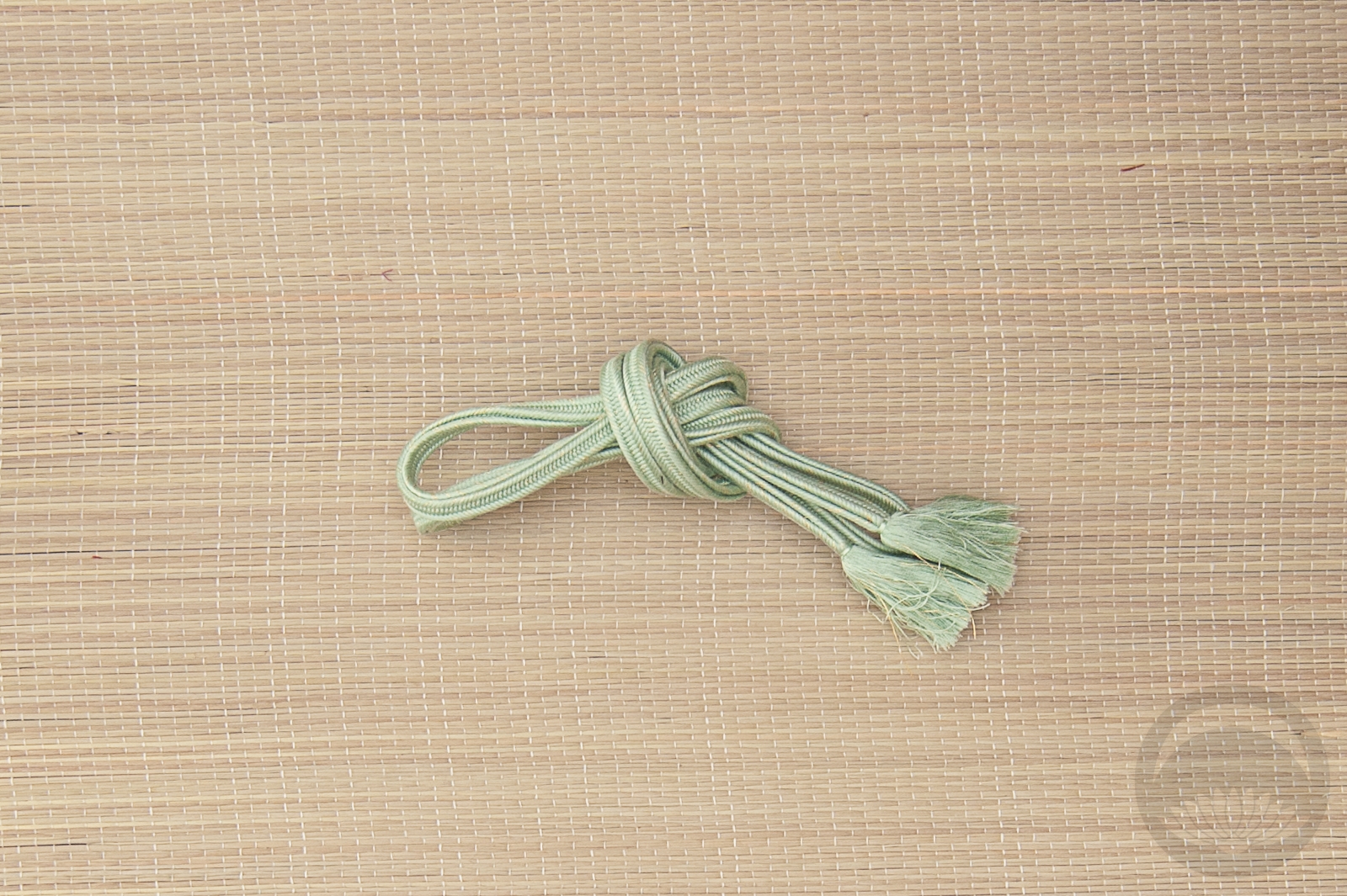
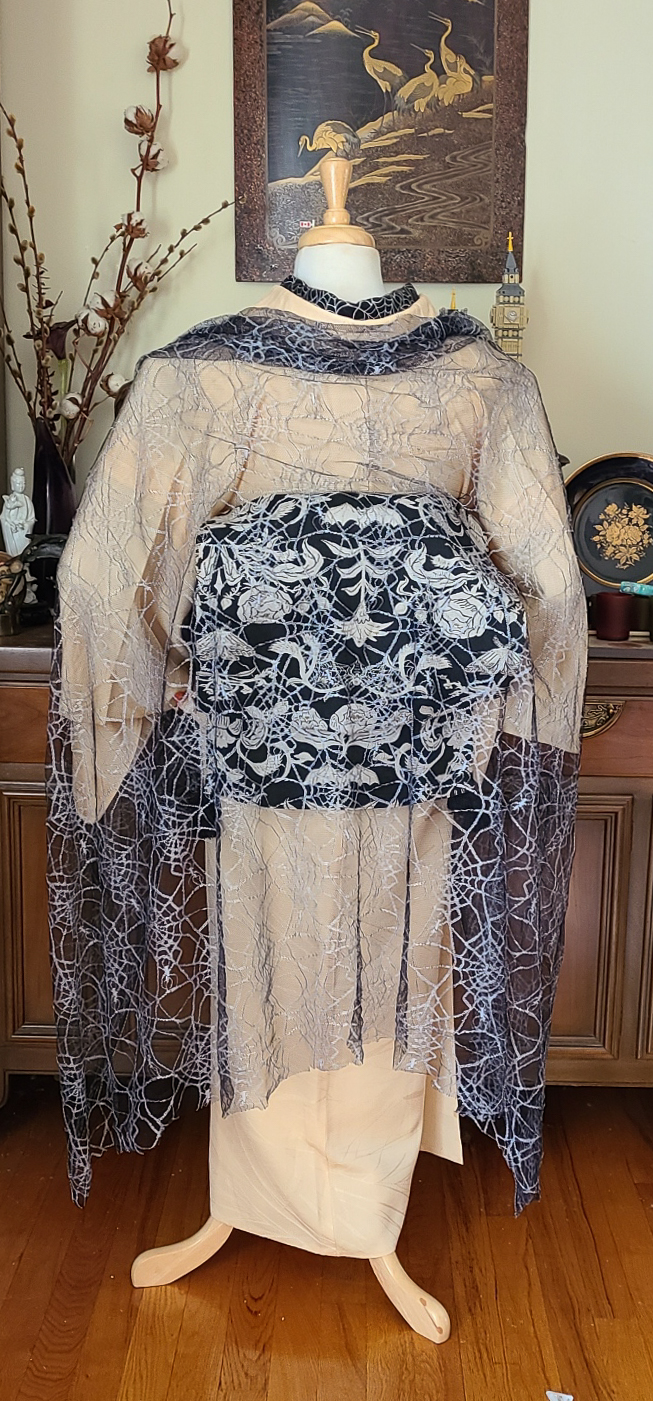
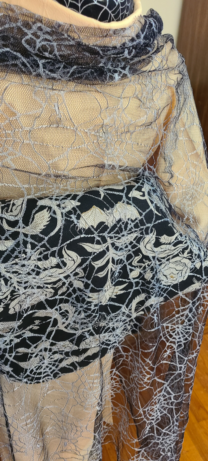
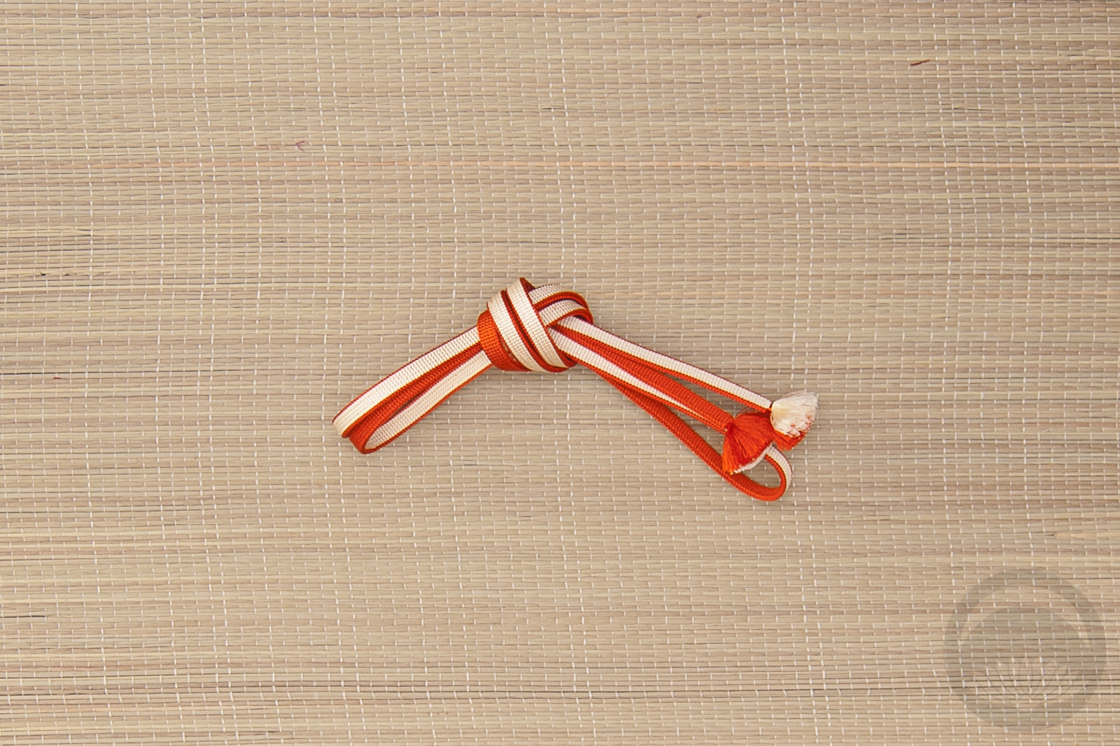
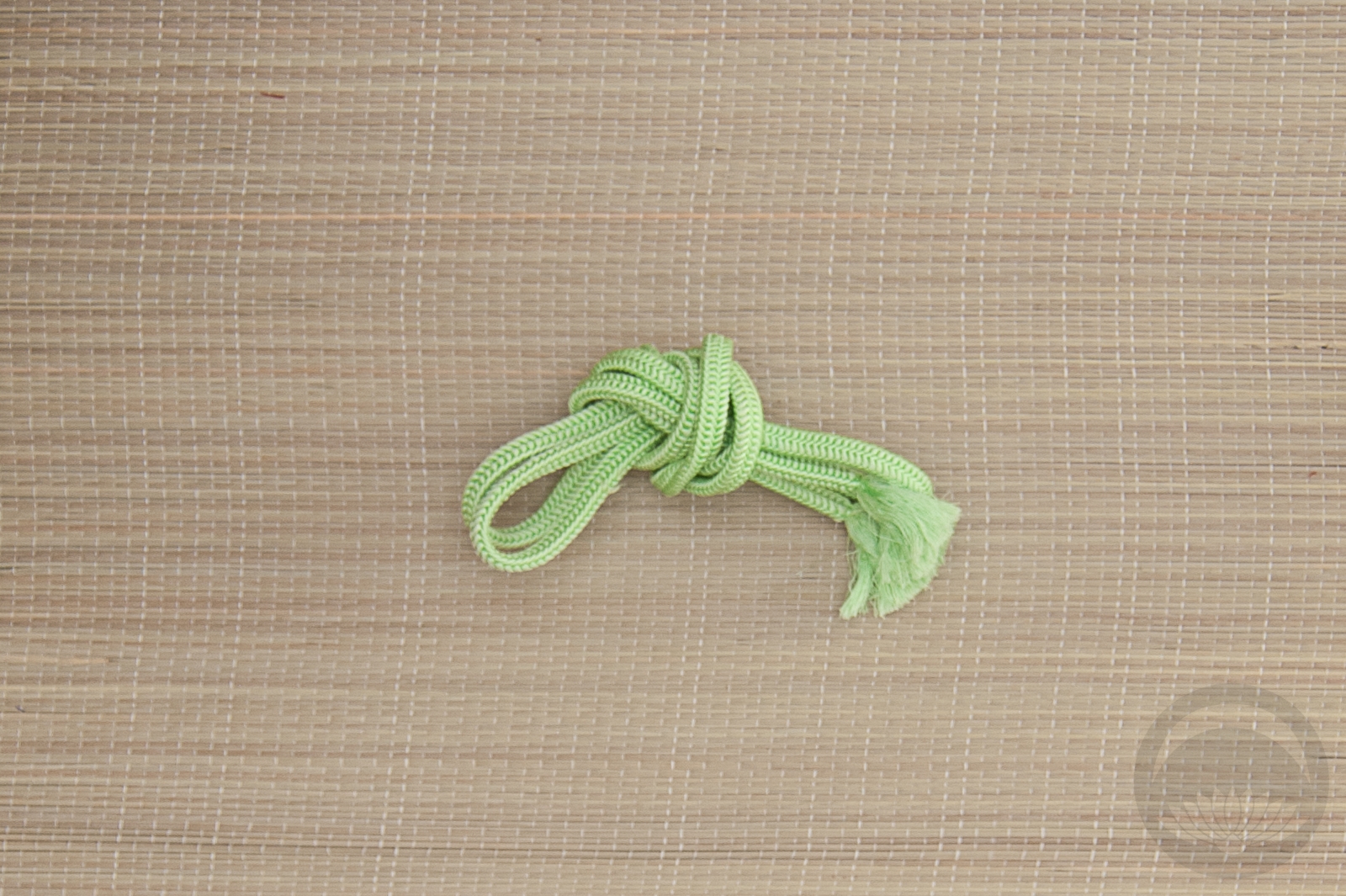
To break up the tonal similarities of the salmon kimono and orange obi, as well as reinforce the non-traditional vibe and aedam style, I used black cotton lace as a sort of obiage and shigoki-obi, as well as running it through the obi-musubi. It also makes the black ruffles feel more cohesive I think, and brings more attention to the stark black outline of the gosho-guruma motif on the kimono. Without the lace I think this would have just felt confusing and the exposed juban more like an afterthought or an accident, but with the punches of black accessories it pulls everything together. A black obijime tied in a modified kokoro-musubi was the final touch. It’s too short to do a normal one, but if you’re looking for instructions I made a tutorial years ago which you can find here.

Are you doing anything special for valentine’s day? Since I’m so far from Keith, I’m going out for bbq chicken with my folks later tonight. Ahhh, middle age. So romantic. But hey, at least I don’t have to buy him honmei-choco this year!


Beautiful Belated Birthday Blooms

Last month on Sunday the 16th, I celebrated my 44th birthday. My husband and I go to pub trivia every Monday with some friends and the day after my birthday, our friends Kelsey and Emilie showed up with this beautiful bouquet of zinnias from their garden for me. I knew I wanted to make an arrangement with them as soon as I got home!

The colours they planted just happen to be the same ones in the lesbian sunset pride flag, (which we all had a good chuckle about) so I figured this rainbow-shaped vase would be the perfect vessel. It’s subtle but still quite thematic.

Rather than over-complicate and clutter the arrangement with separate flowers and foliage, I decided to focus entirely on the bright, blousy flowers themselves, arranging them into a gentle but somewhat architectural-feeling modern diagonal to contrast with the organic curve of the vase.

They lasted roughly a week and brought a smile to my face every time I saw them in our kitchen.

(Also if anyone is curious, our team is currently ranked first at our local venue and third overall in the regional standings. Go team Pet The Dogs!)


Poppies and Promises

Those of you who’ve been around for a while know I make a point of keeping an eye out for items with a poppy motif, since my mother’s name is Poppy. They’re doubly special to me now since orange poppies are also the state flower of California, my new home. I got this kimono from Sasa and I’ve had it for quite a while and I knew I wanted to coordinate it before I headed back to California in a few weeks. My kitsuke skills are a little rusty, since it’s been over a year but once I got into it muscle memory took over and I think I did alright, all things considered.

In person this houmongi a gorgeous pale minty colour that’s basically impossible to capture digitally. My mobile phone actually did a better job so that’s where these photos are from, but it’s still not quite accurate. It really makes the red, orange, and yellow poppies… well… pop. I used my beloved orange hakata chuya obi since it’s such a perfect match to the flowers, and the green obijime is almost the exact same bright mint as the kimono so that was a no-brainer.

I had to take these photos in a different spot in our living room due to things still being upside-down from the fire I mentioned a while back, but I think it works for now. I’m not sure when I’ll be able to do another mannequin coordination since I head back to California in a few weeks, but I’ve got lots of fun DIY projects, reviews, and little field trips in the works so hopefully those will tide us all over for a bit 🙂

Items used in this coordination

Classy and Creepy

Happy Halloween! An appropriate day to raise myself from the dead, I think. I’ve just been incredibly busy, travelling and working and whatnot, but I do have some stuff in the works for the next little while.

I knew I had to get this one up today, though. The “obi” is too perfect for a classy and creepy outfit. Funny thing is, it’s not an obi at all. It’s two table runners from Target! One wrapped twice around the body, and one for the musubi. I wanted to keep the rest of the outfit subtle but still halloween-y so my bat menuki obidome and spiderweb haneri, and then remembered I had this lovely piece of soft spiderweb mesh I found in a remnant bin at the fabric store. It makes the perfect shawl, doesn’t it?

I love how this outfit feels seasonal and creepy but totally wearable, and I also love how the two star pieces are both found items that have nothing to do with kimono. The orange accessories were the finishing touch, and they add just the right amount of pop.

Items used in this coordination

The Seventies called; they want their outfit back

I haven’t used this gorgeous showa-fabulous houmongi Sophie got me for my birthday a while back anywhere near frequently enough. I decided to have some fun with it today, and realised this obi (which I nearly sold! what was I thinking?) is the absolute perfect seventies-style match for it.

As timeless as the shape of a kimono may be, the patterns and colours are just as susceptible to trends as western clothing is. This particular shade of orange, especially paired with gold, and the big warm-toned and almost pop-art flowers, are very emblematic of the middle of the second half of the Showa era, from the late 60s to the early 80s. I could just as easily see this general colour and pattern scheme on a polyester pantsuit as I could on this particular coordination.

I decided to keep things relatively quiet with the accessories, since the kimono and obi are so flashy already. This soft leafy green picks up the green accents in the design so it seemed like the best choice, but the obijime did get a bit lost against the obi. Then I remembered this padded, decorative little cord I picked up at the Daiso last time I was in California. It’s a bit too thin and delicate to be a functional obijime by itself but it’s absolutely perfect wrapped around as an accent. The black and bold colours just call back to the kimono so well and I’m so happy I remembered I had it!

Items used in this coordination