
Tonight, the ton gathers to celebrate that most esteemed of events, the second half of season four of Bridgerton. Yes, I fully admit it — I am addicted to that fluffy, frivolous, historically-inaccurate fantasy. Waiting for Benedict to get his head out of his perky little posterior has been driving me batty!
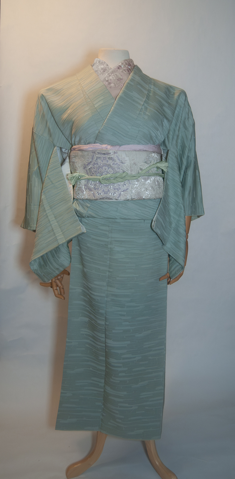
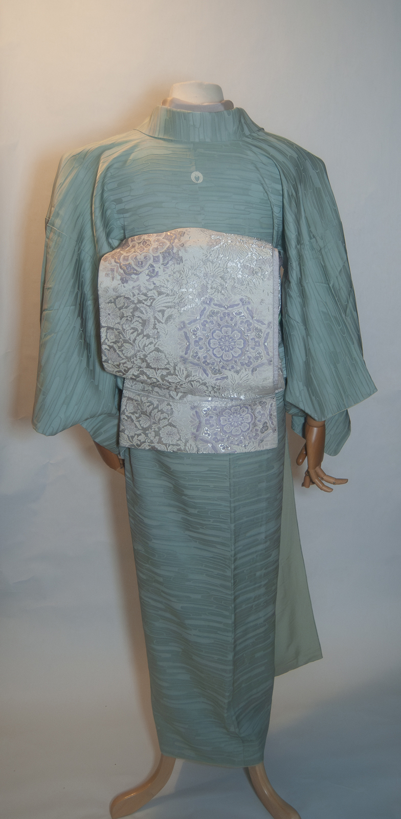
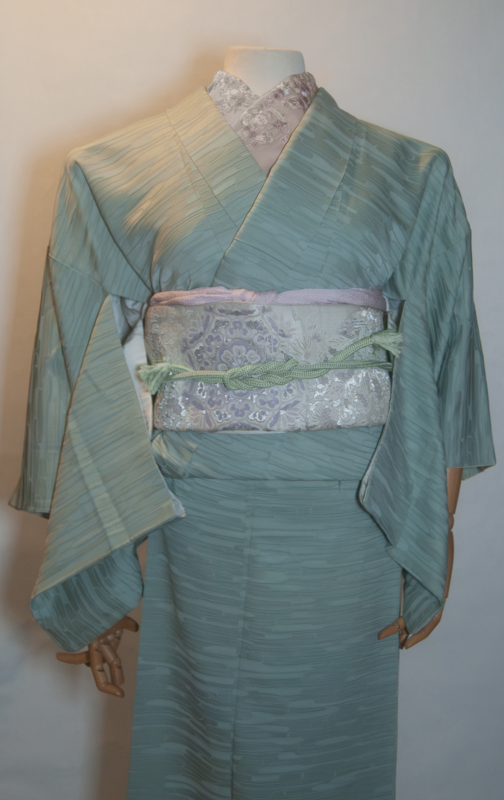
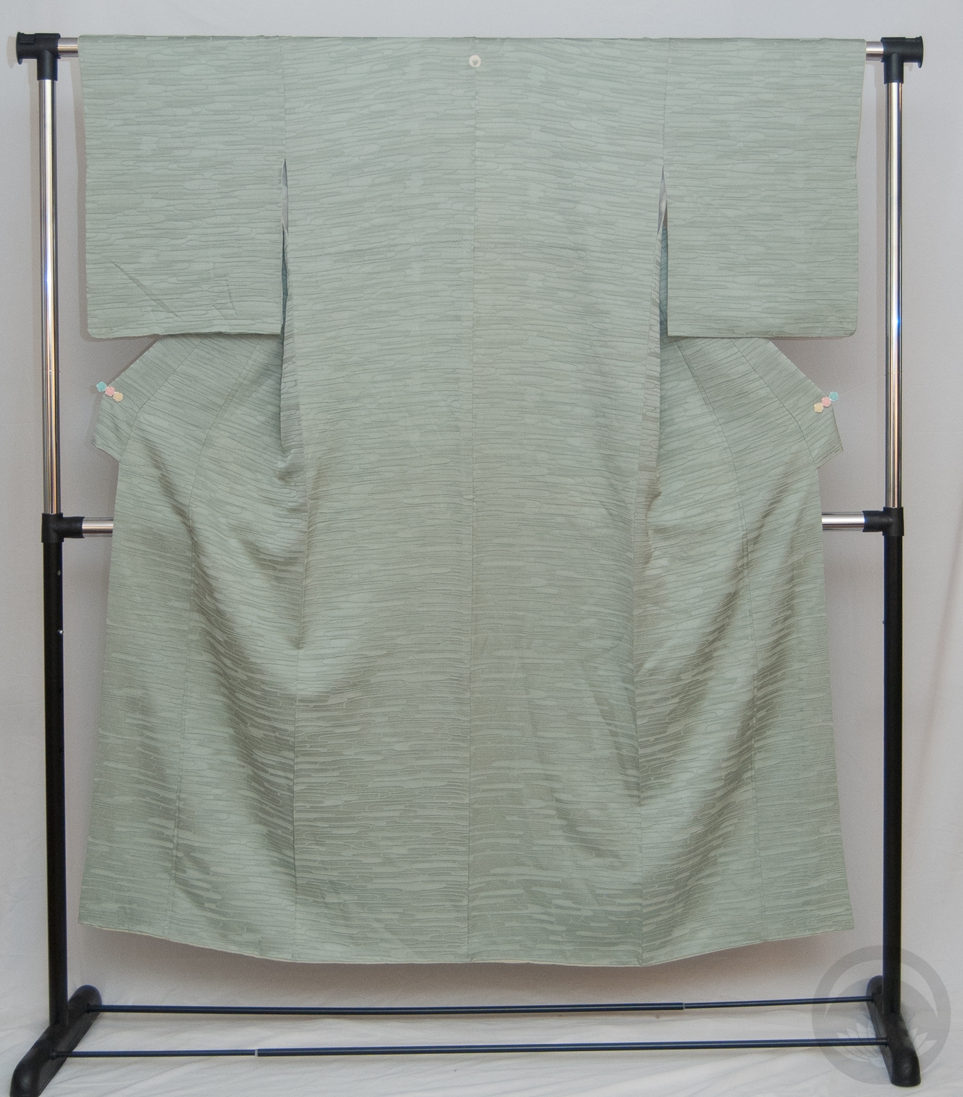
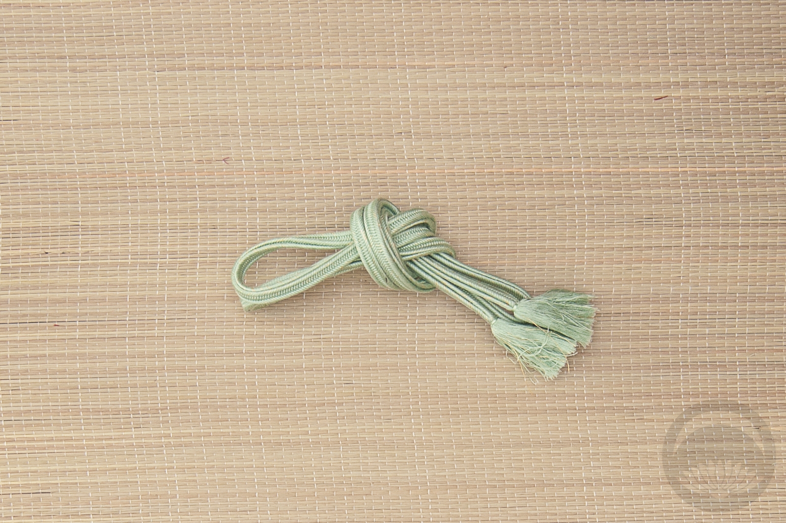
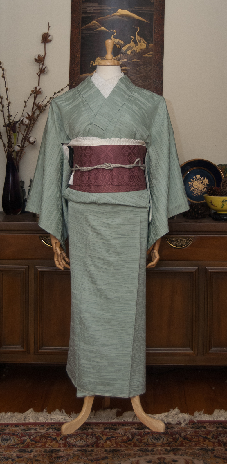
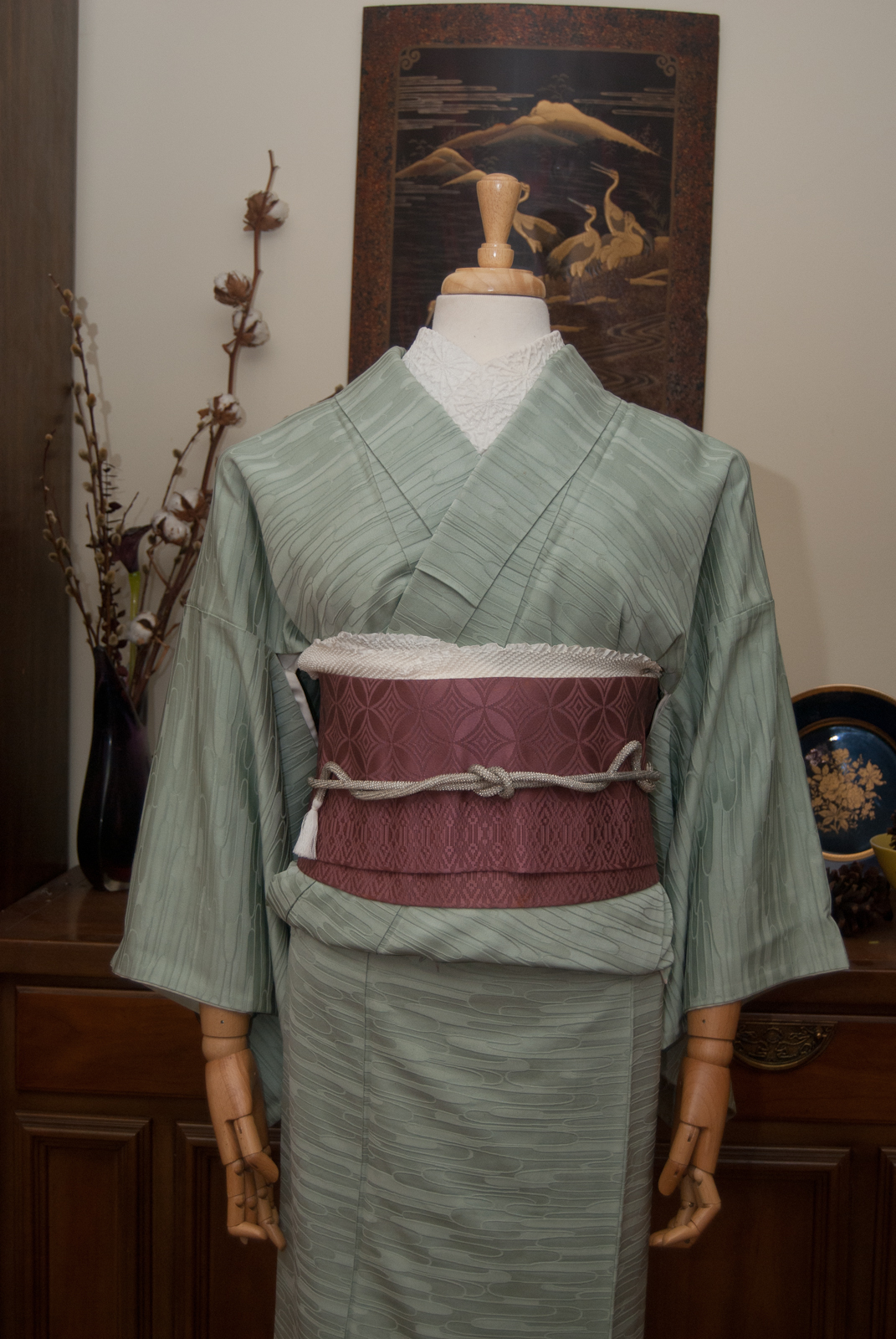
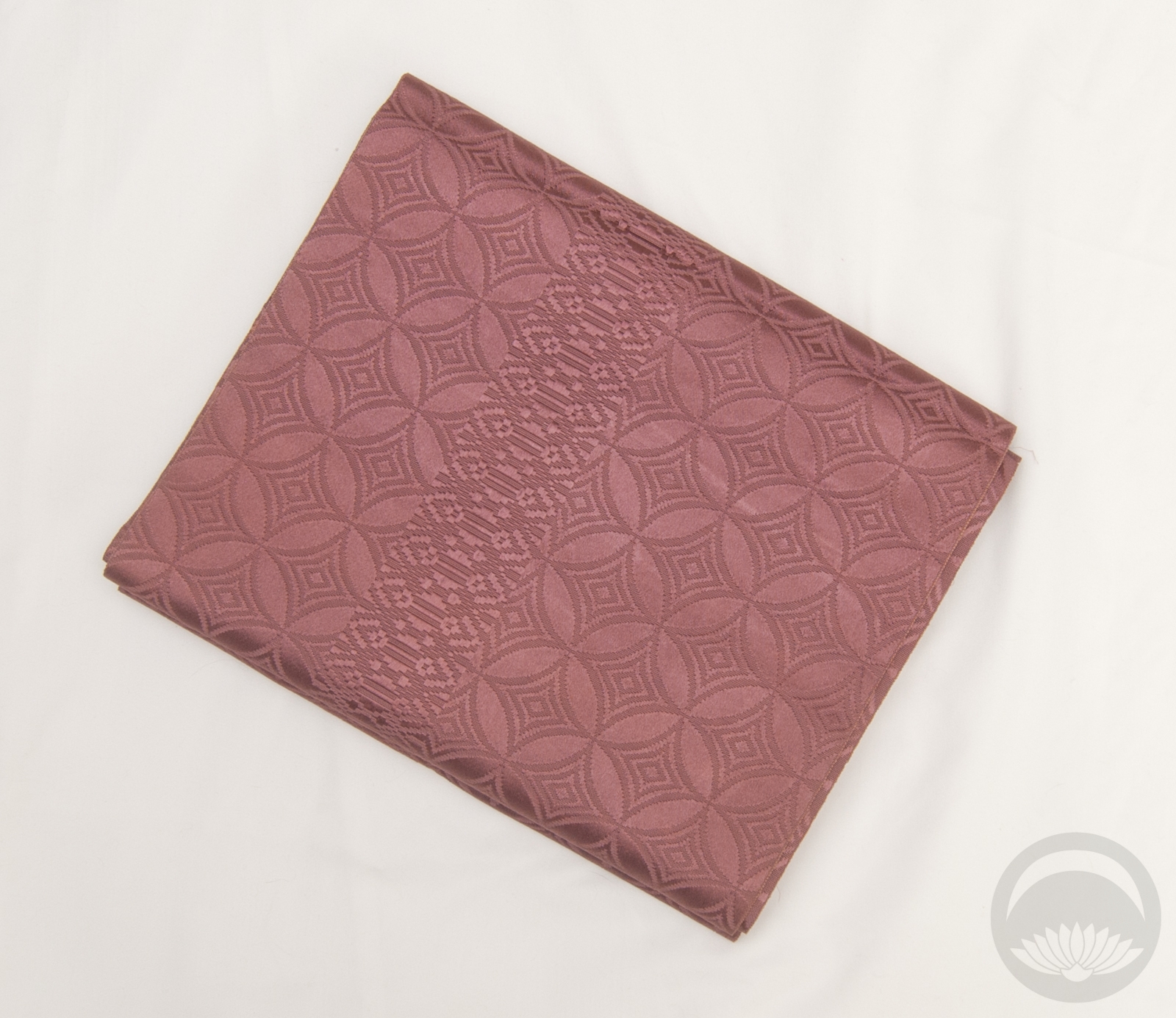
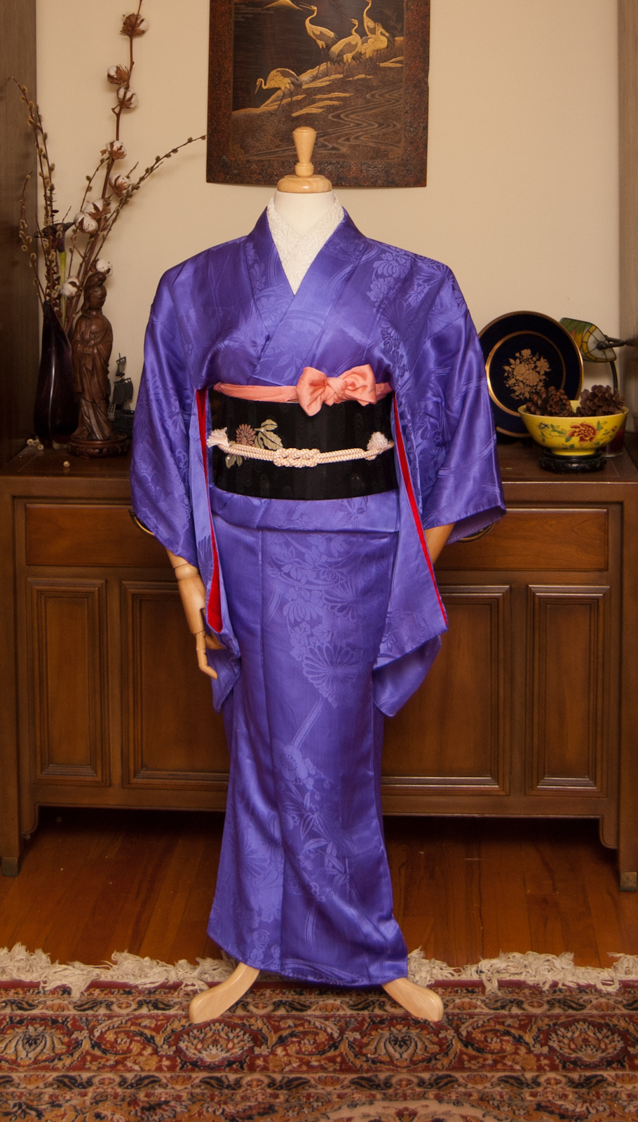
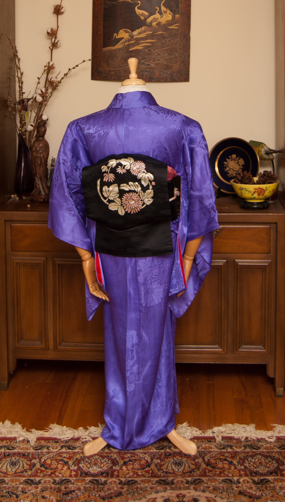
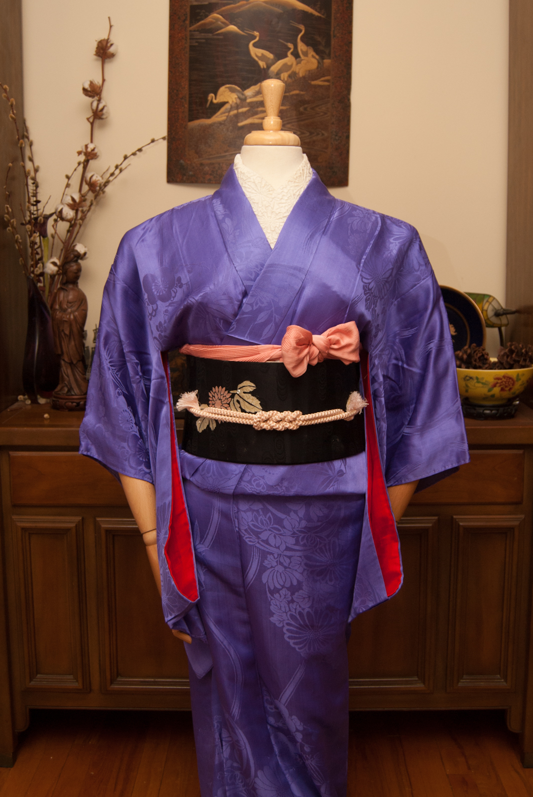
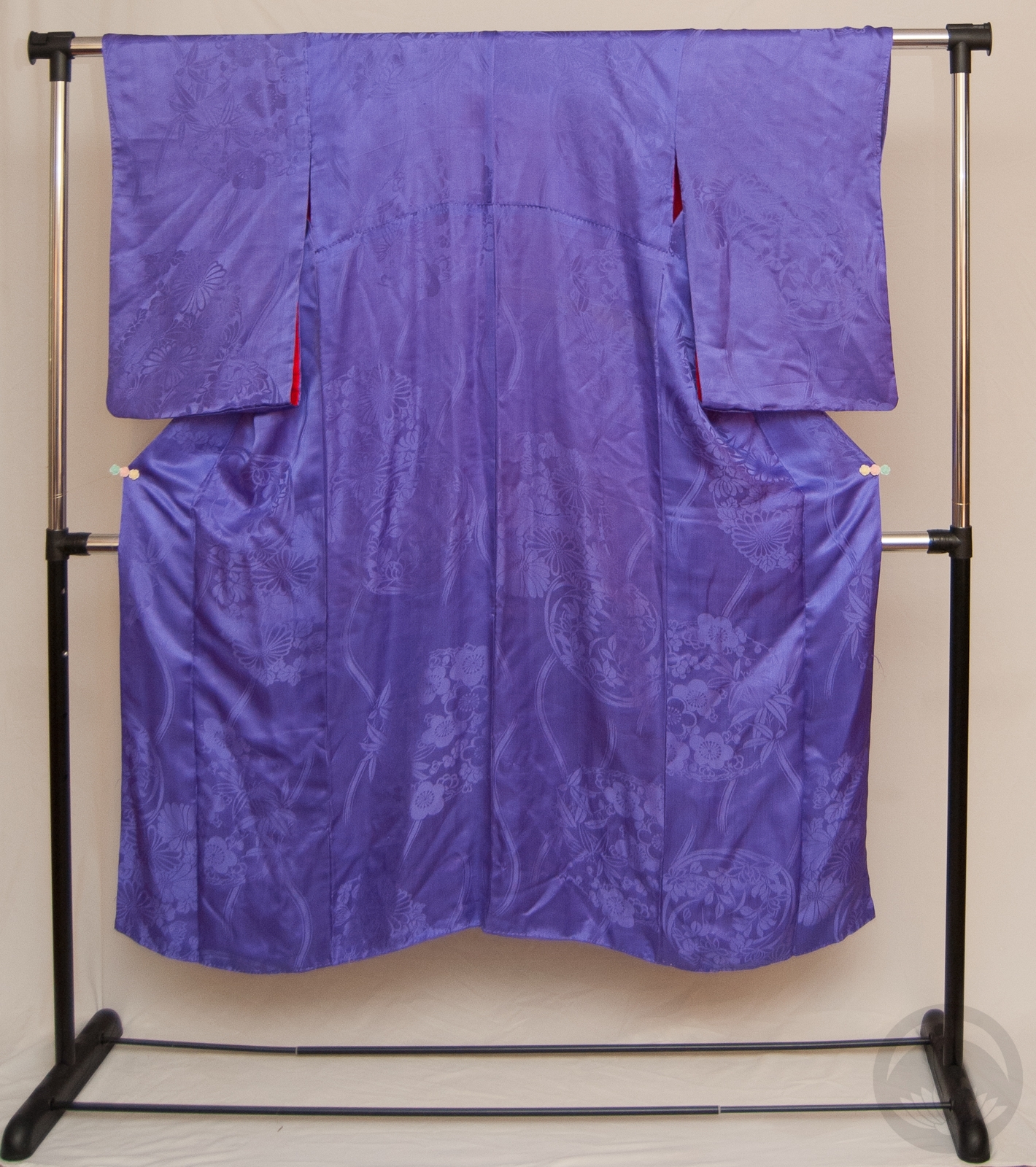
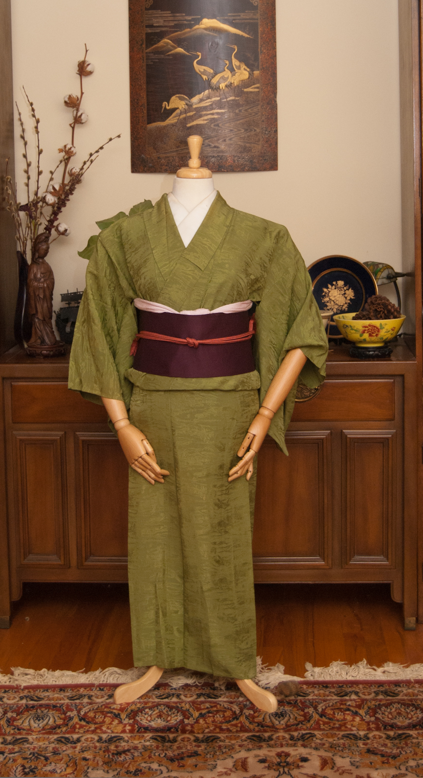
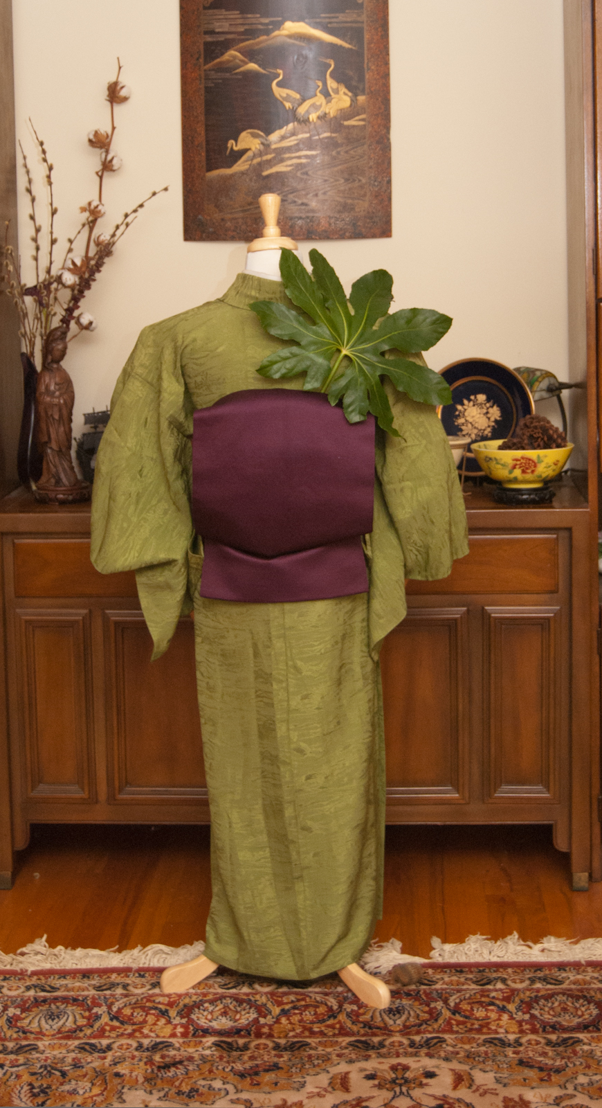
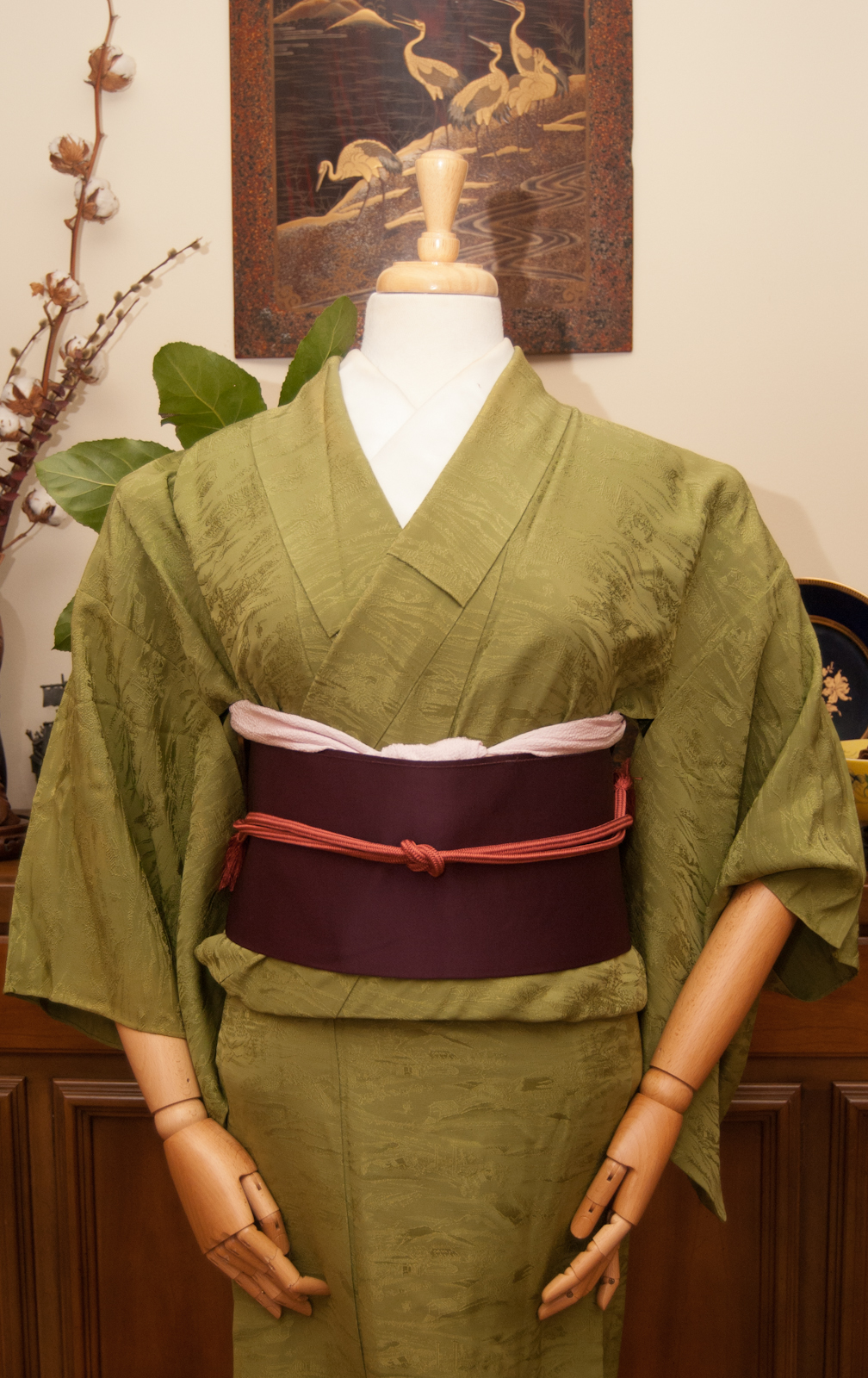
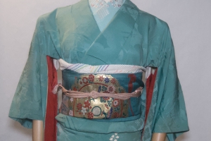
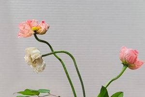
I decided to mark this most auspicious of television evenings by doing a coordination inspired by Lady Violet Bridgerton and her delicate, tasteful pastel colour palette. Ideally I would have had some blue in there but nothing in my extant collection quite fit the bill. I think mint and lavender do quite nicely though. I also think that the very textured, nearly sculptural feel of the kimono and the shimmering silver in the obi are very reminiscent of a lot of the brocades and lush fabrics used by the show’s costume department. All together, this does feel like something she would wear in a different imagining of the series, does it not?
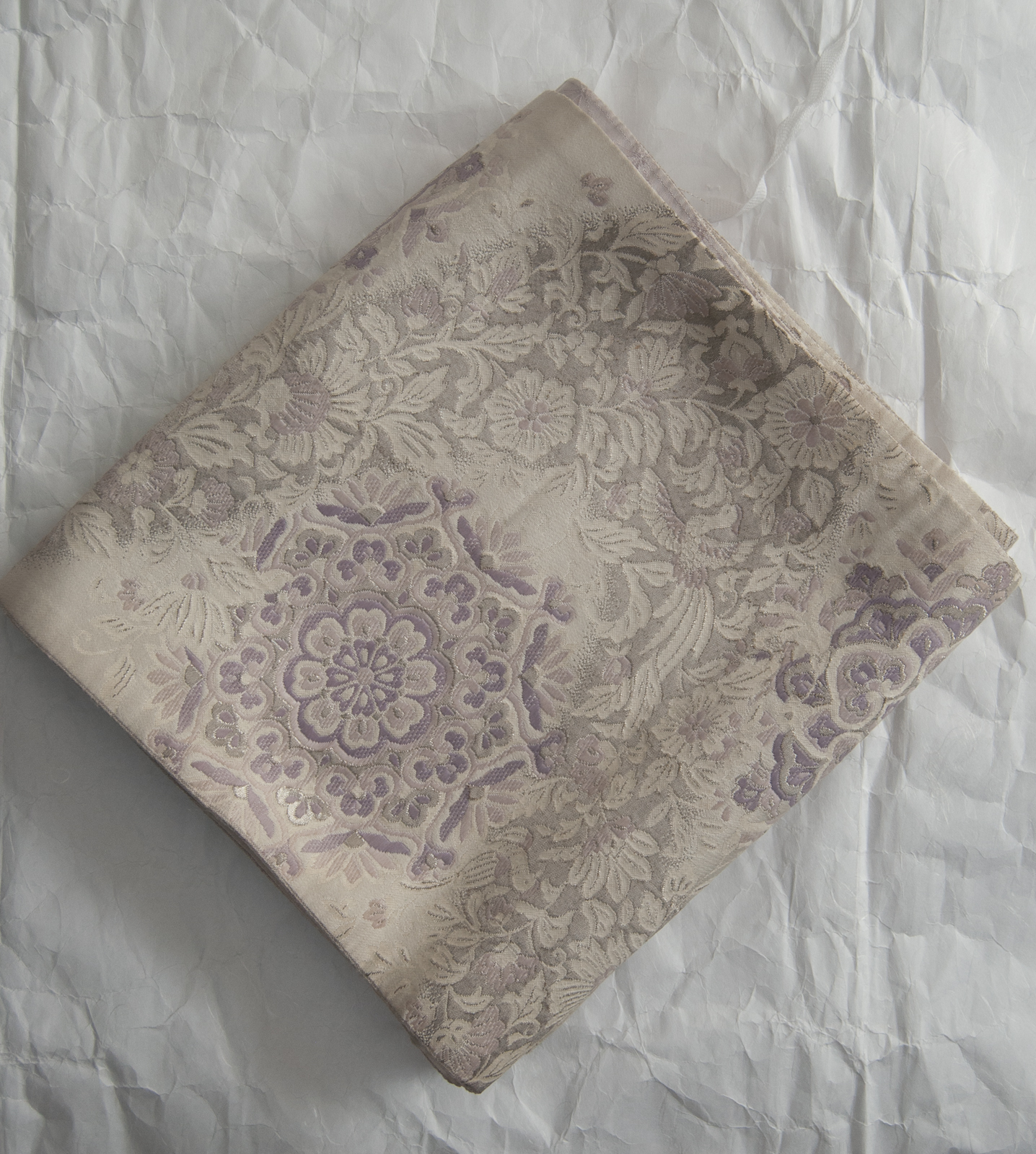
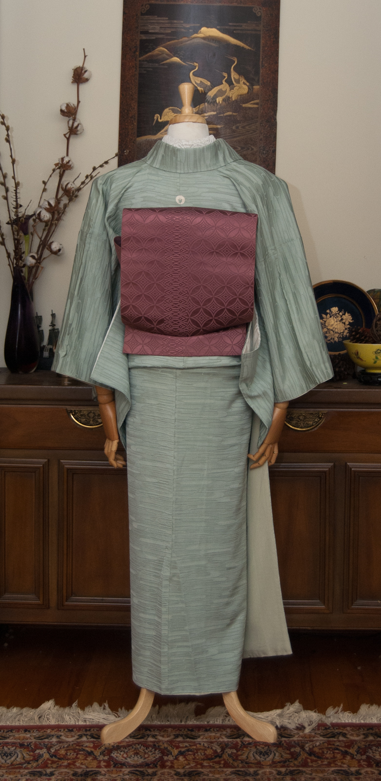
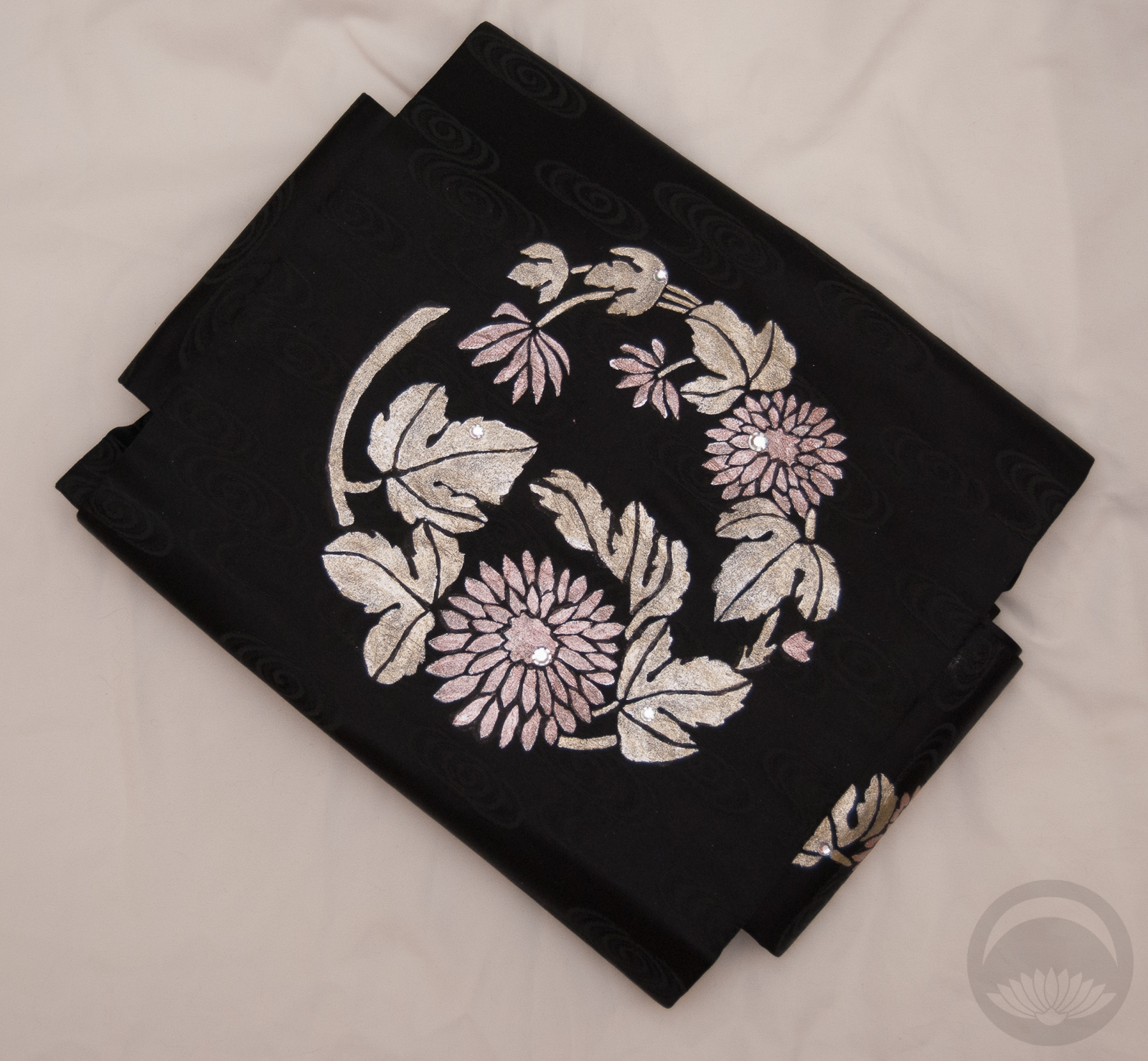
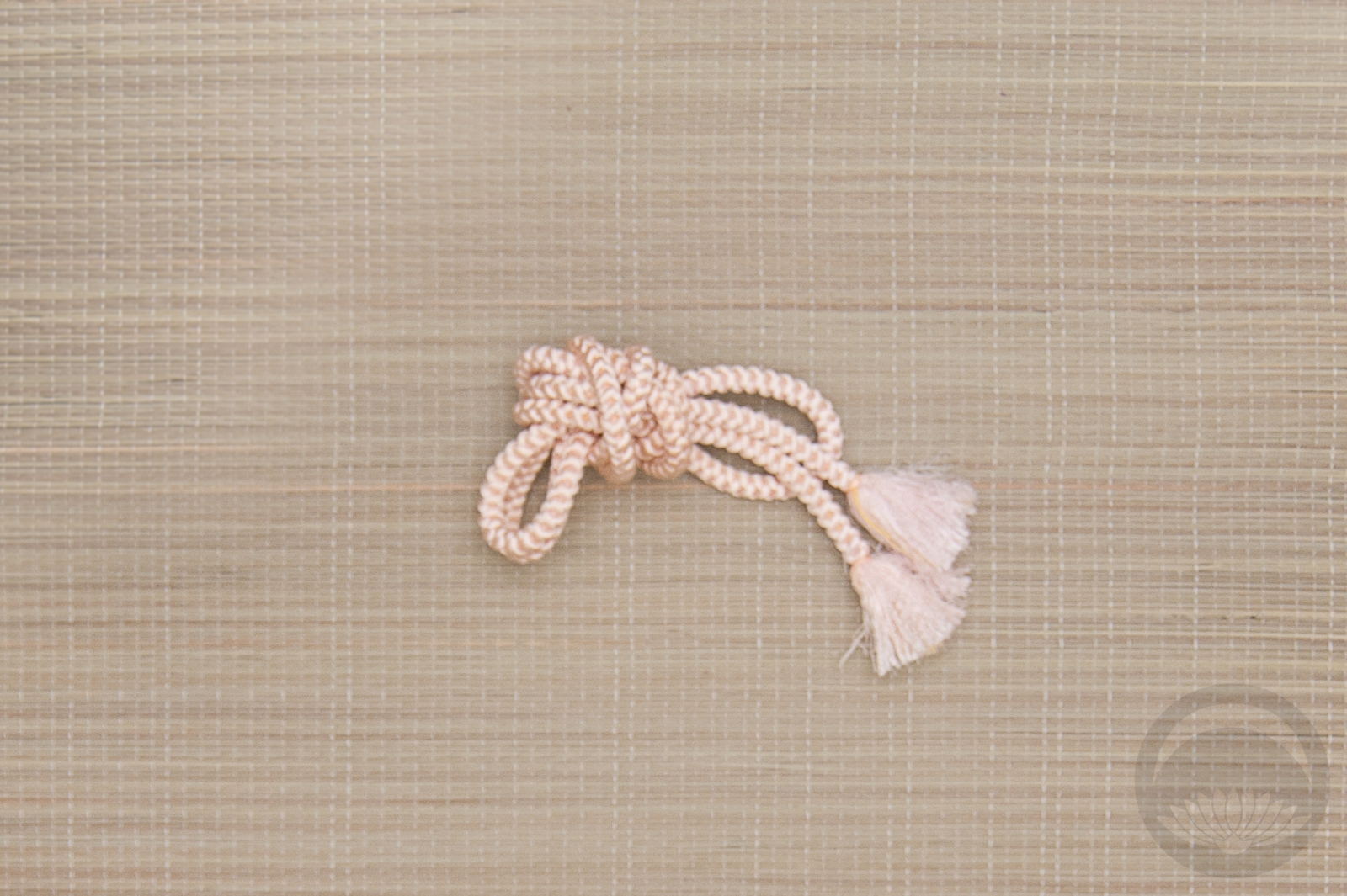
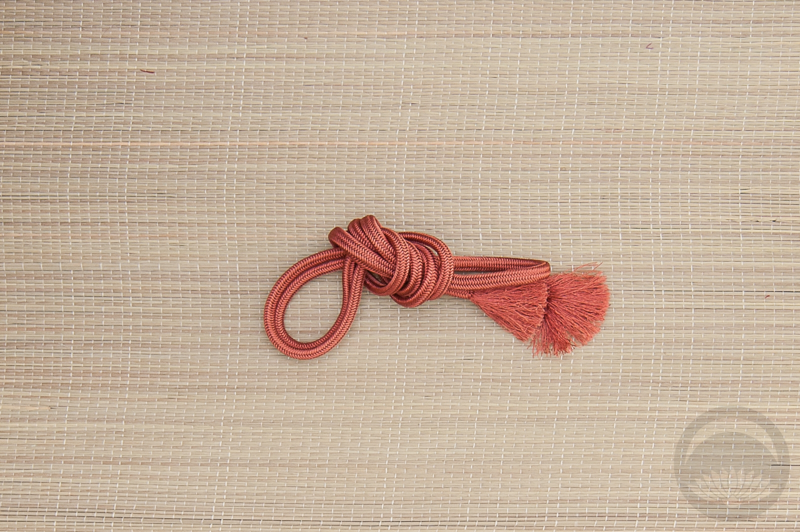
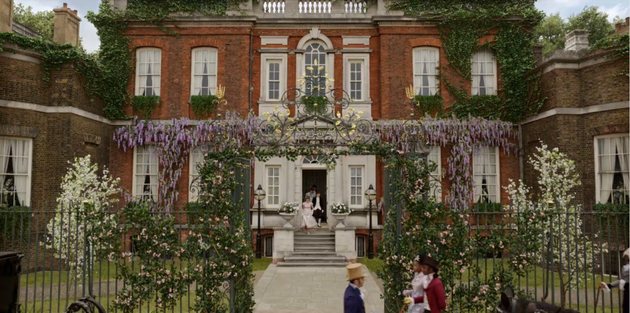 Wisteria is a motif I’ve always wanted but I don’t currently have anything that really features it front and centre. It would have been the perfect choice, due to the huge boughs covering the front of Bridgerton House, alas. I did debate this multi-floral obi, but the colours were too bold and the wisteria isn’t exactly the star of the show, so I decided to stick to my original pastel vision. I did, however, tie the obijime in a fuji musubi to at least call back to it. With the outfit being as simple as it is, I made sure my kitsuke was as impeccable as possible, to let the elegance and subtlety shine, but I feel like that was the one slightly more “fun” touch that finished things off nicely.
How about you, gentle reader? Are you a fan of Bridgerton?
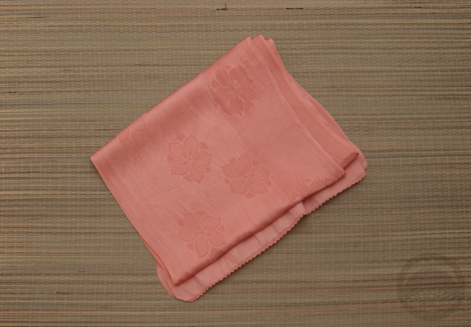
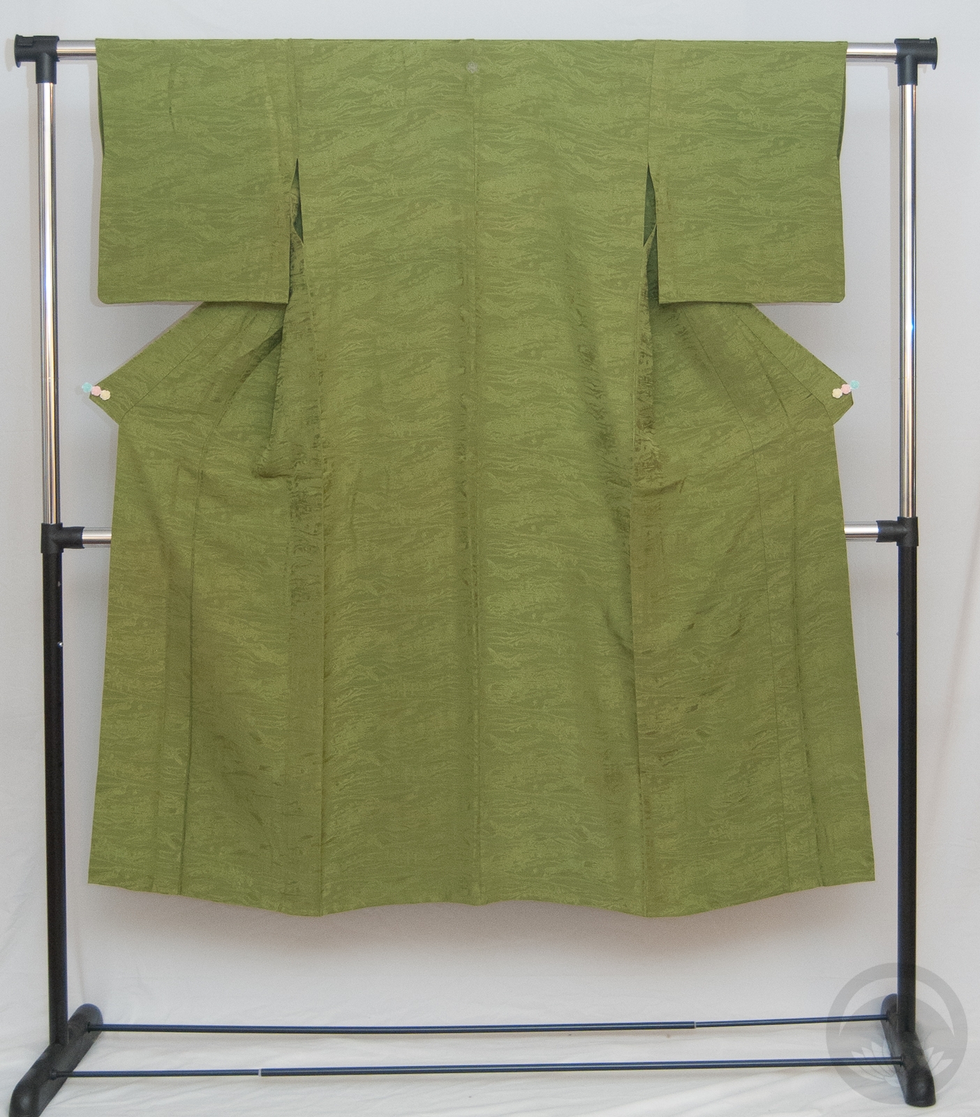
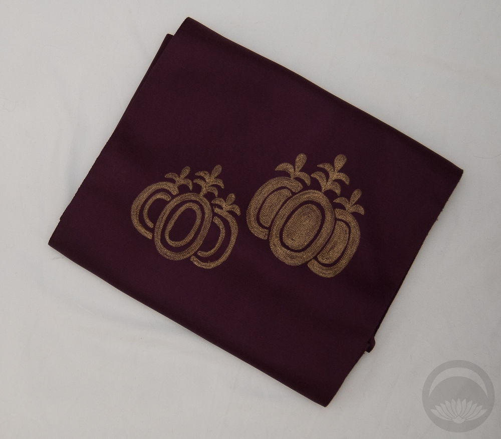
Items used in this coordination
-
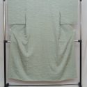
- Mint Green
-
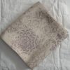
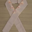
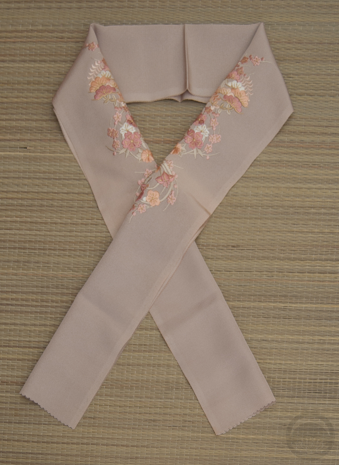
- Lilac 2-Sided
-
- Floral
-
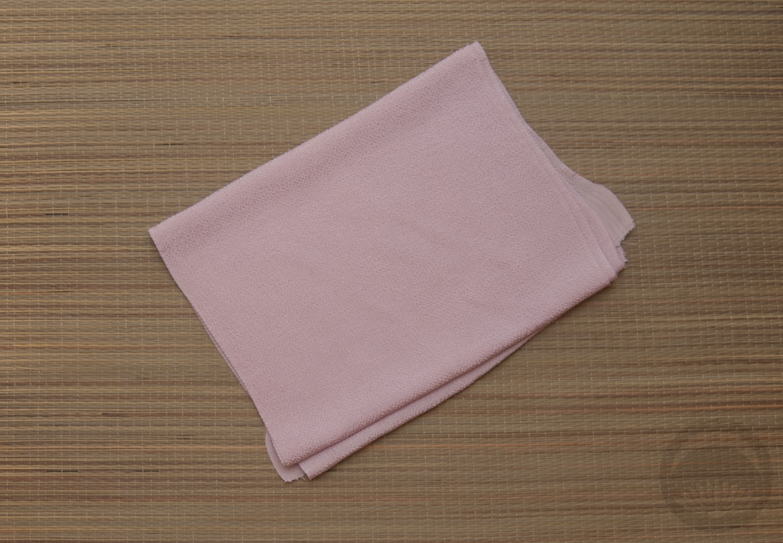
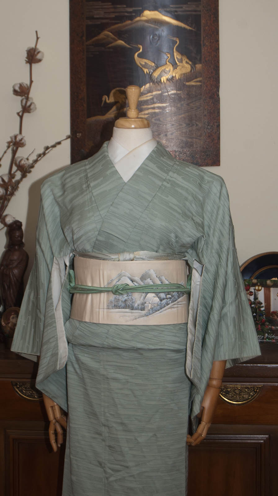
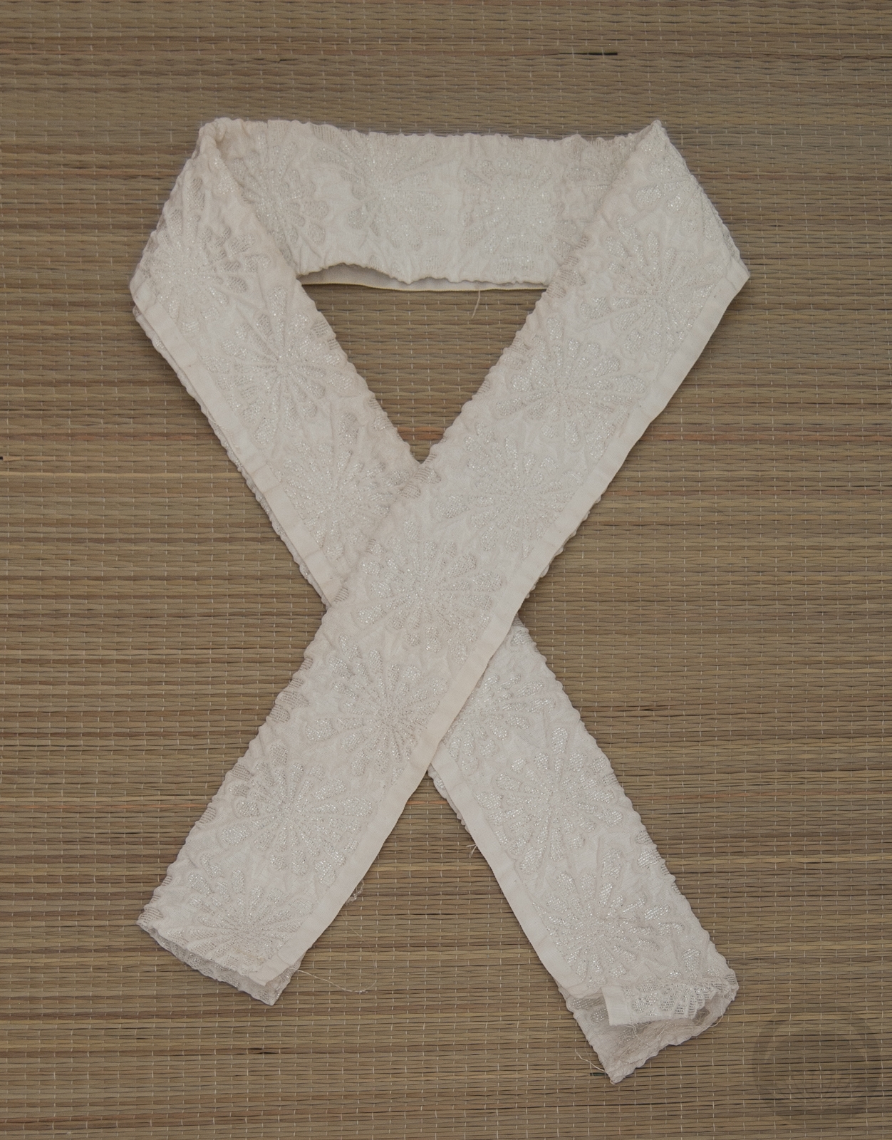
- Lavender Chirimen
-
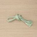
- Mint with Gold


 Bebe Taian
 CHOKO Blog
 Gion Kobu
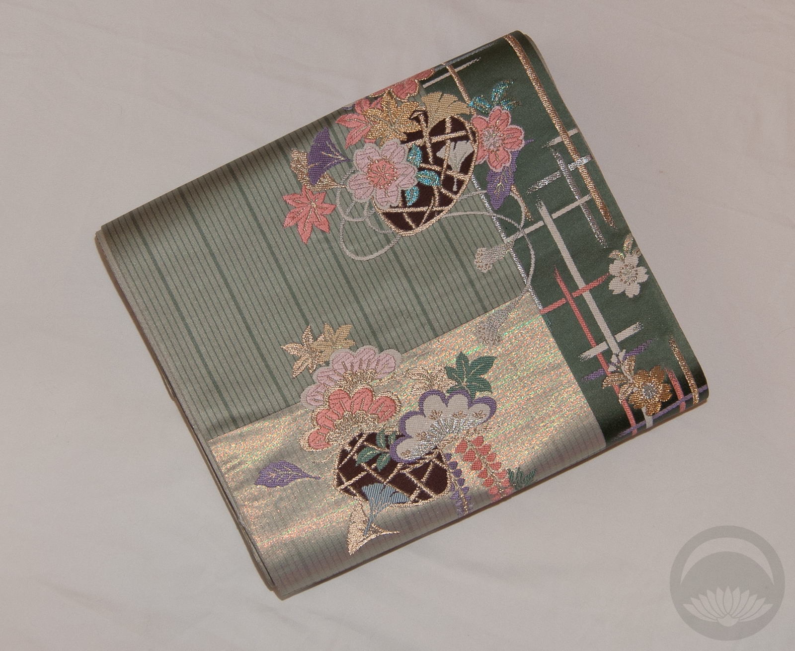