
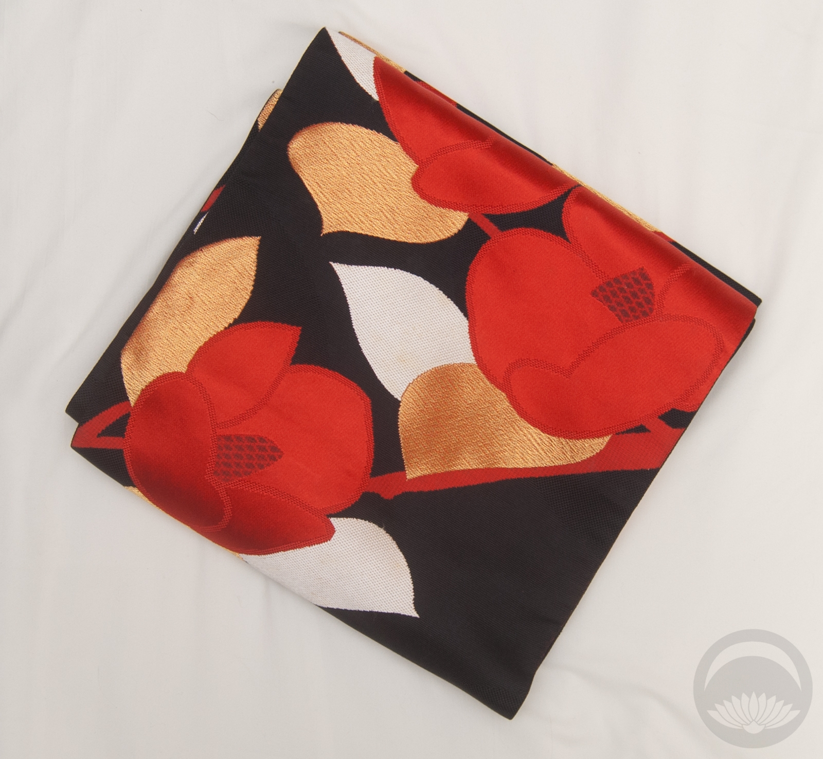
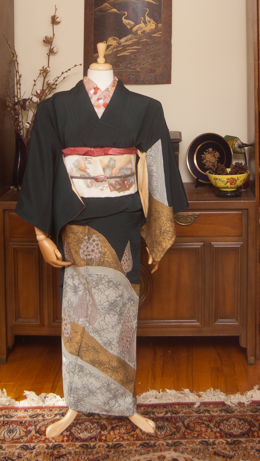
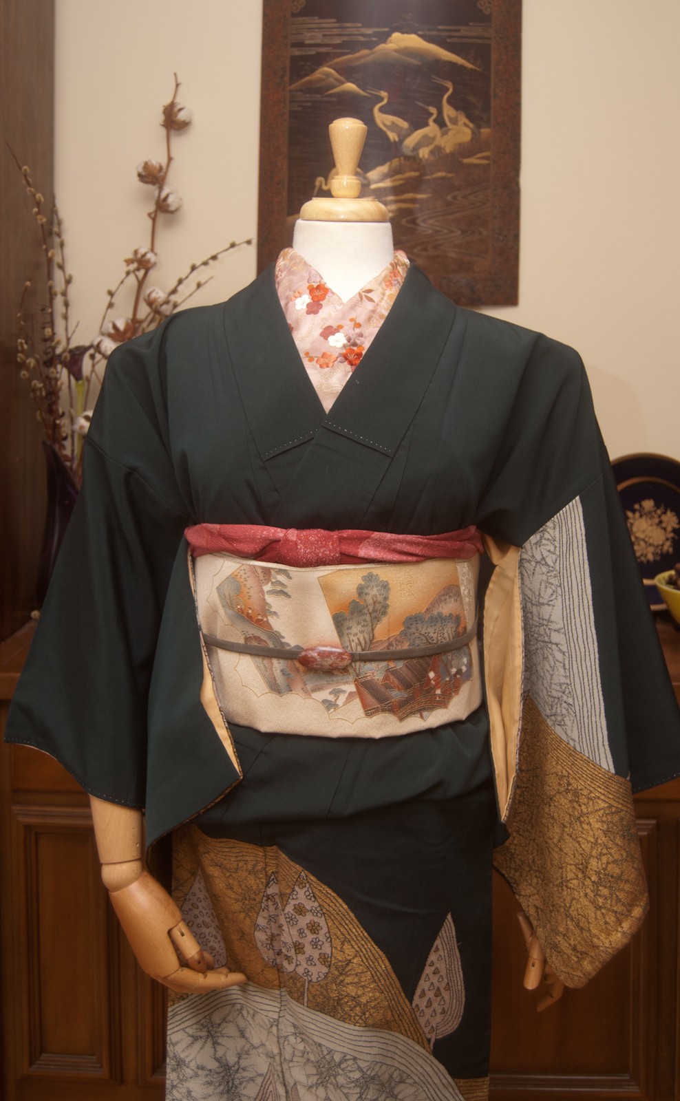
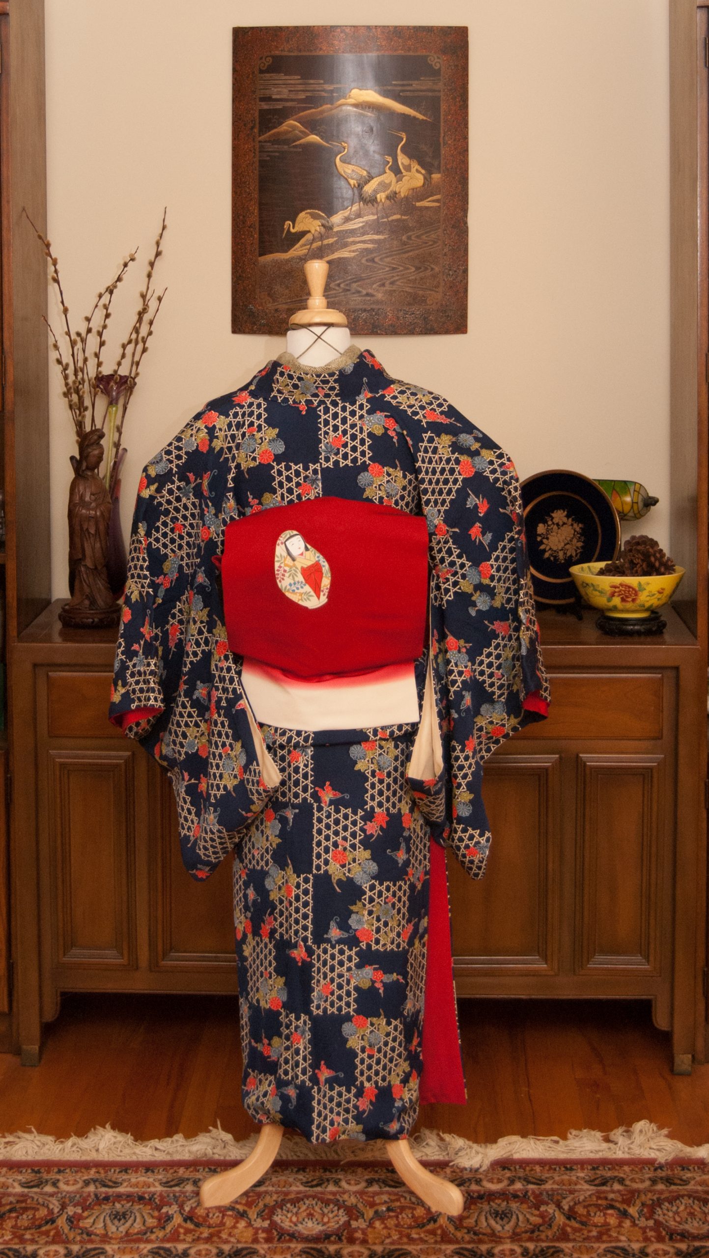
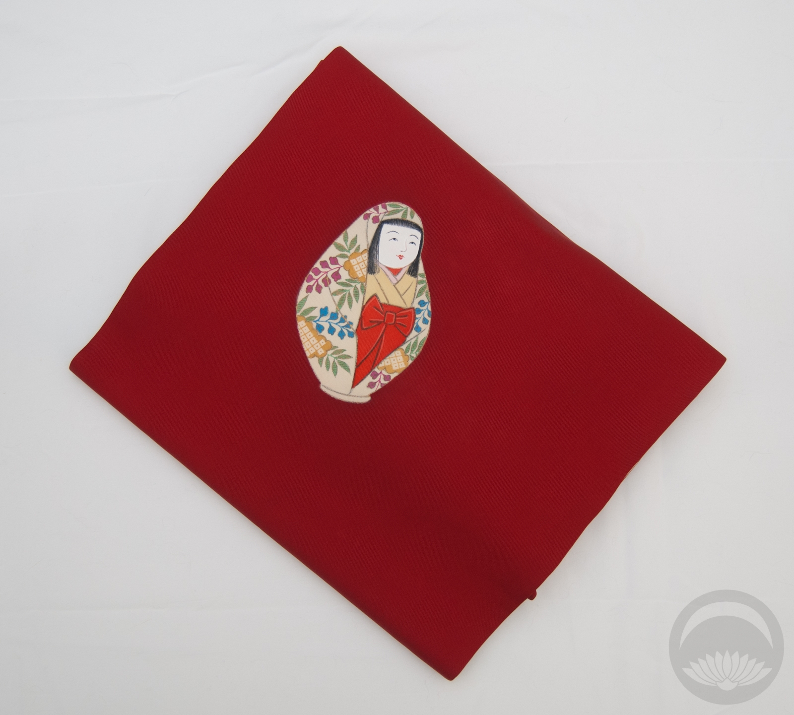
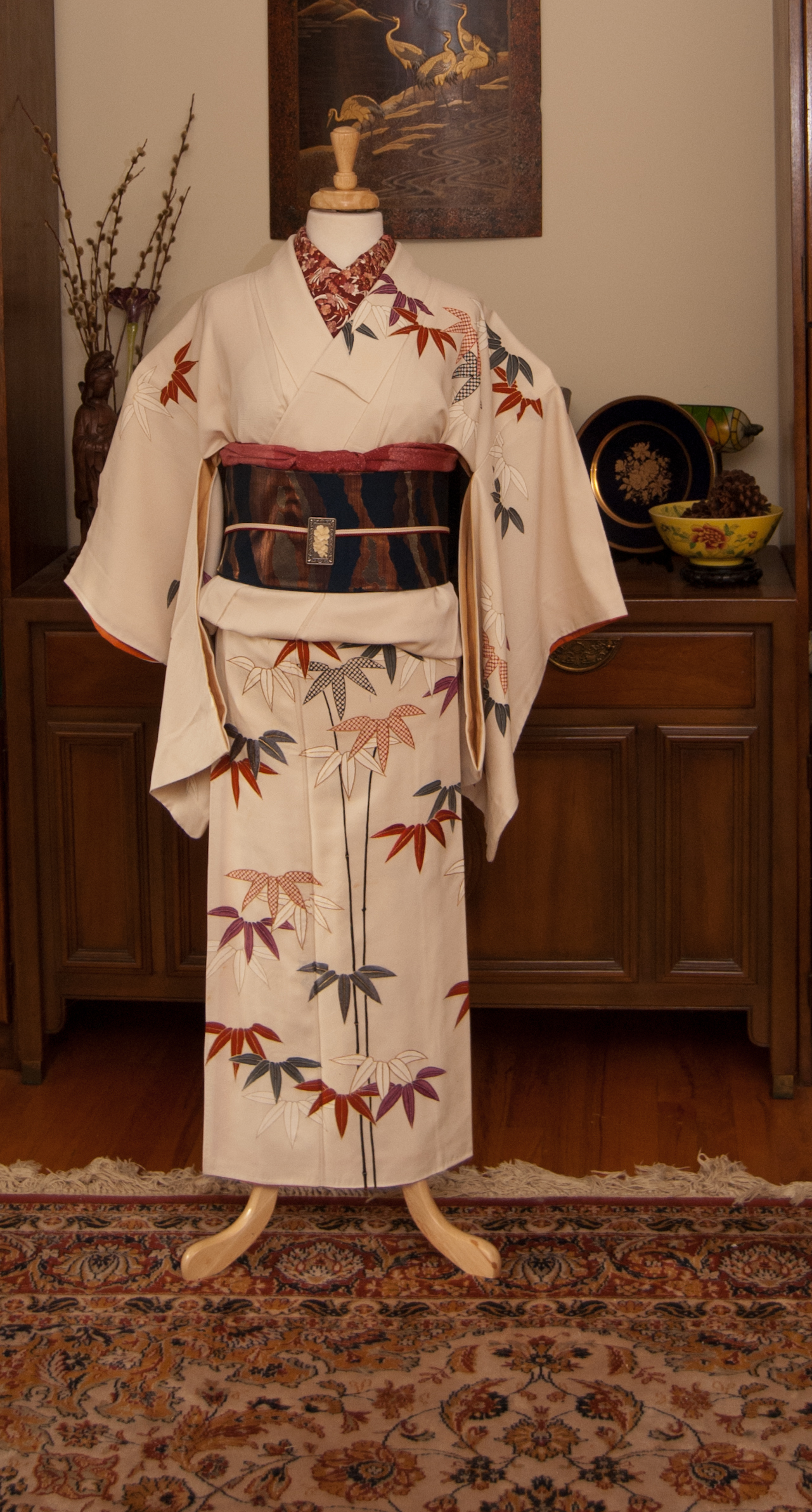
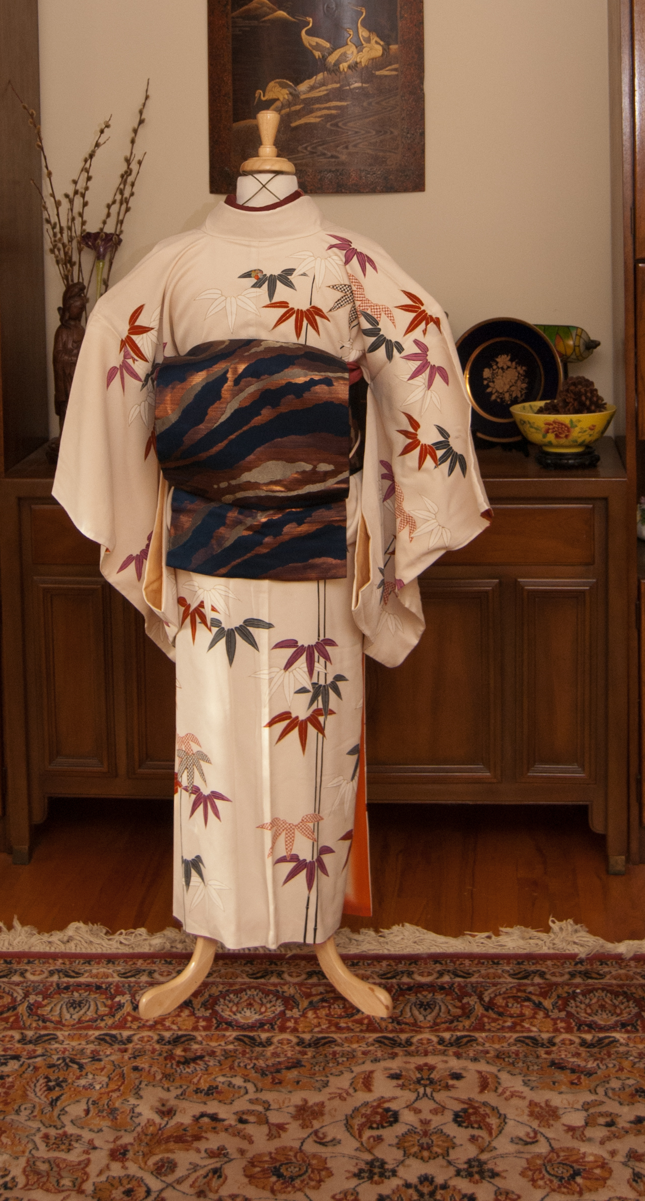
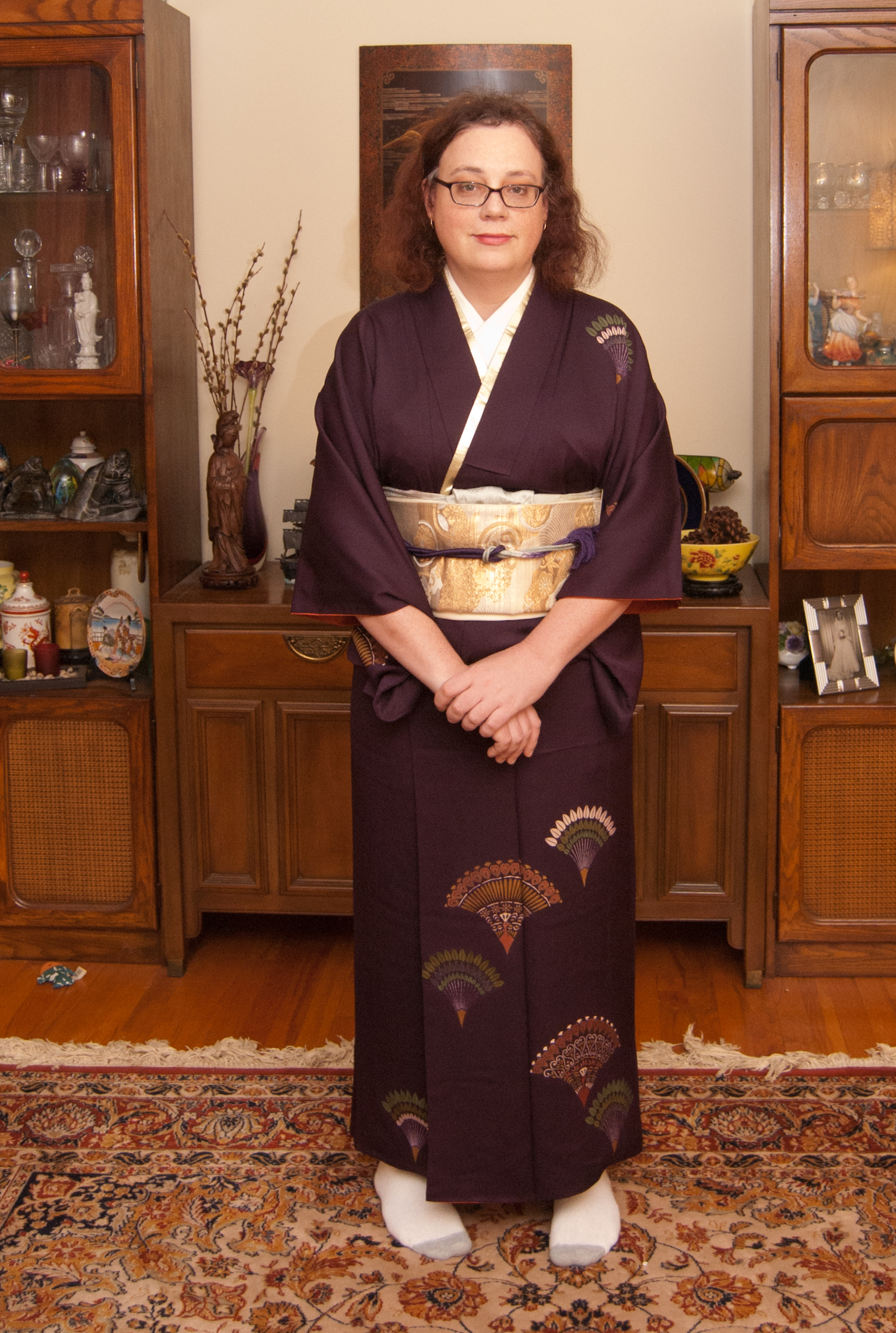
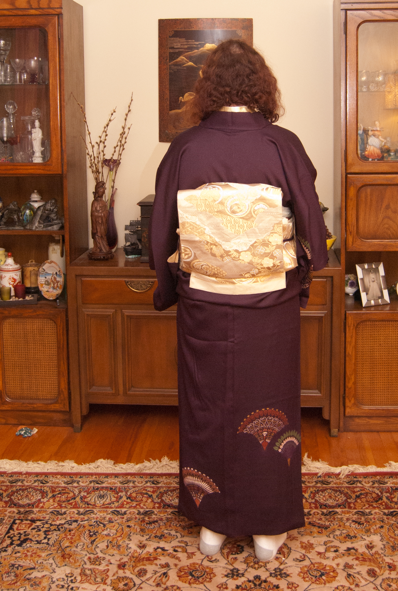
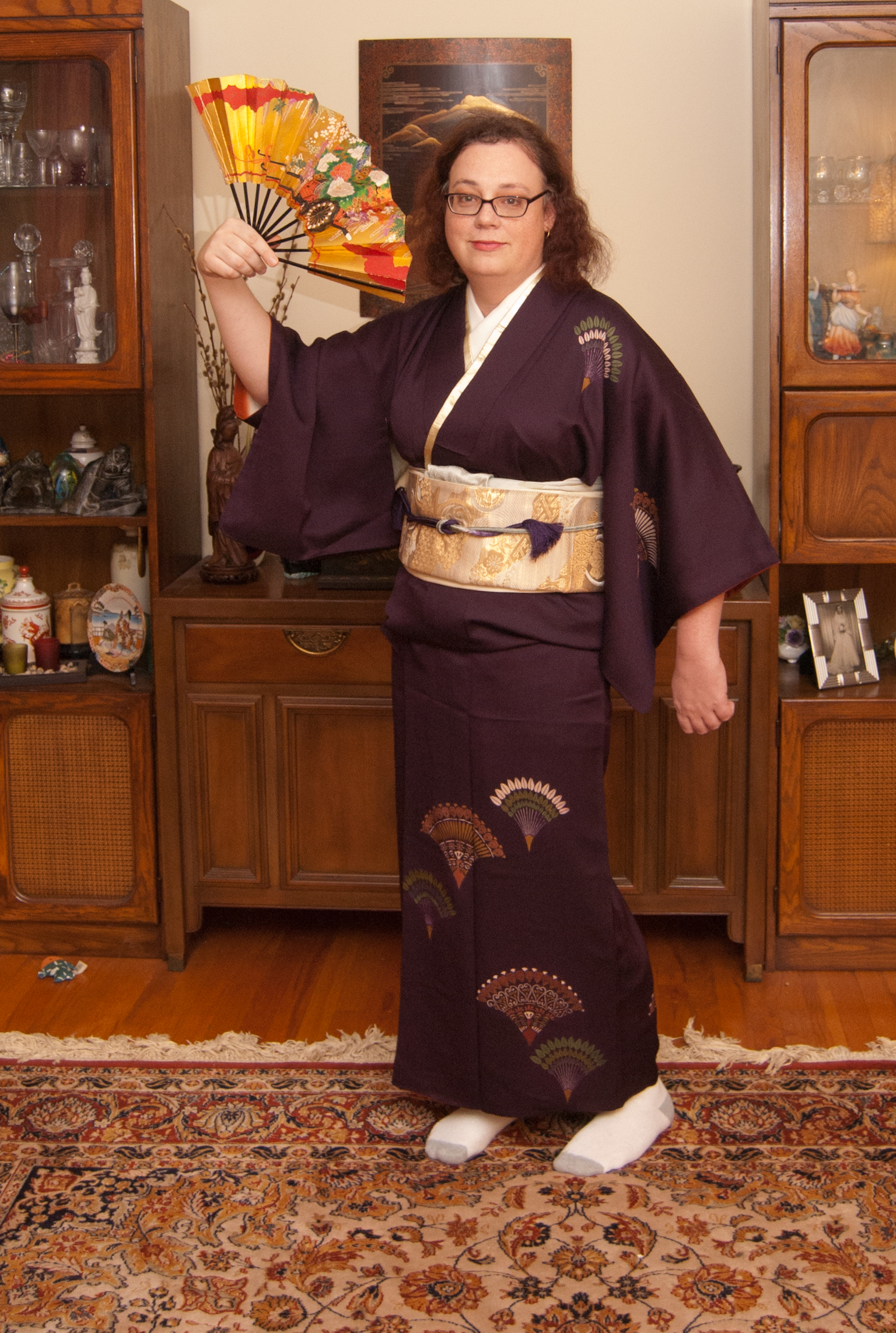
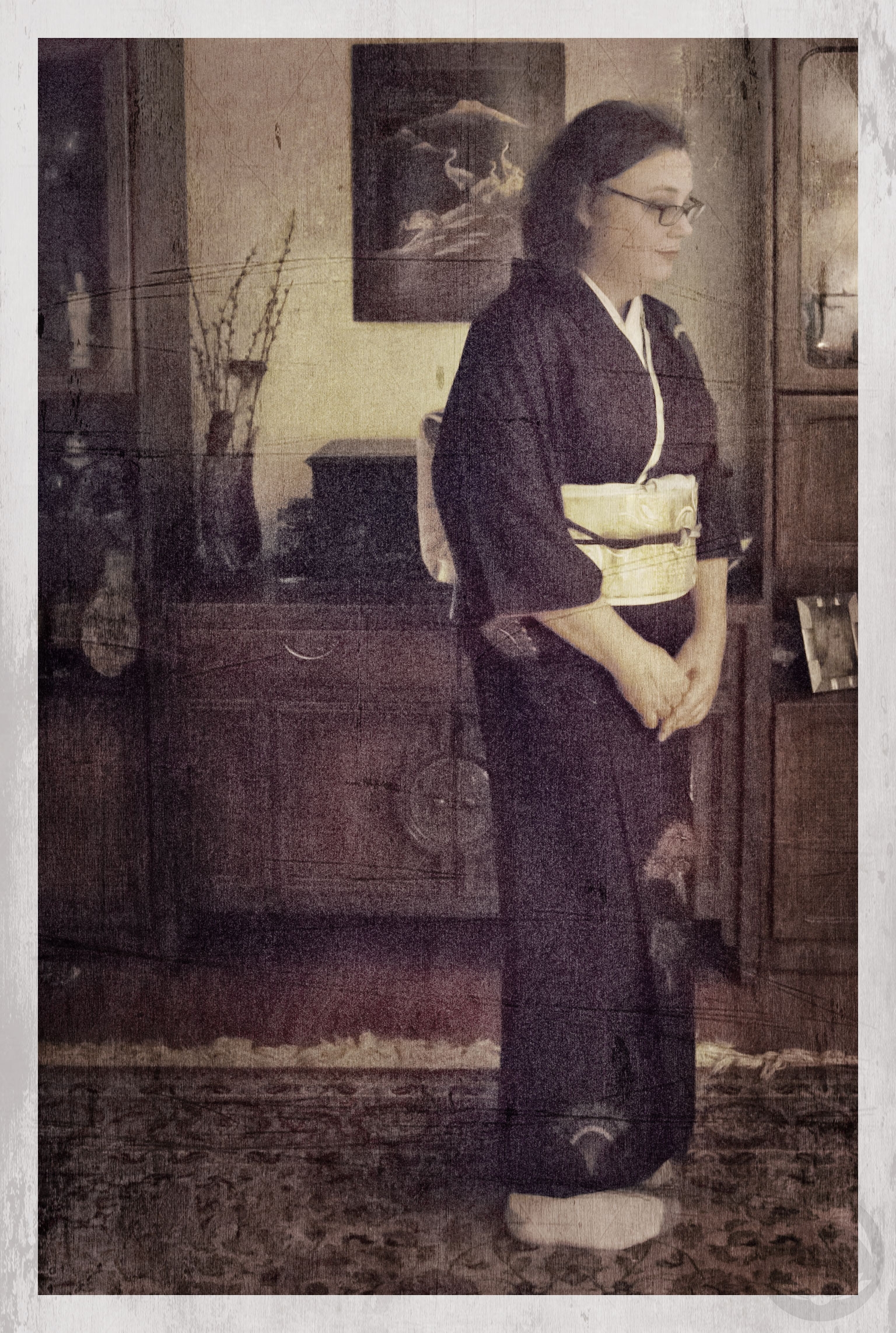
Yesterday I got two obi in the mail that I wasn’t expecting until at least a few weeks from now. It was a lovely surprise! Of course, I knew I’d want to coordinate them soon, so I asked you guys on Facebook and Instagram which of the two I should coordinate. This bold black and red tsubaki nagoya won by a landslide, so here we go.
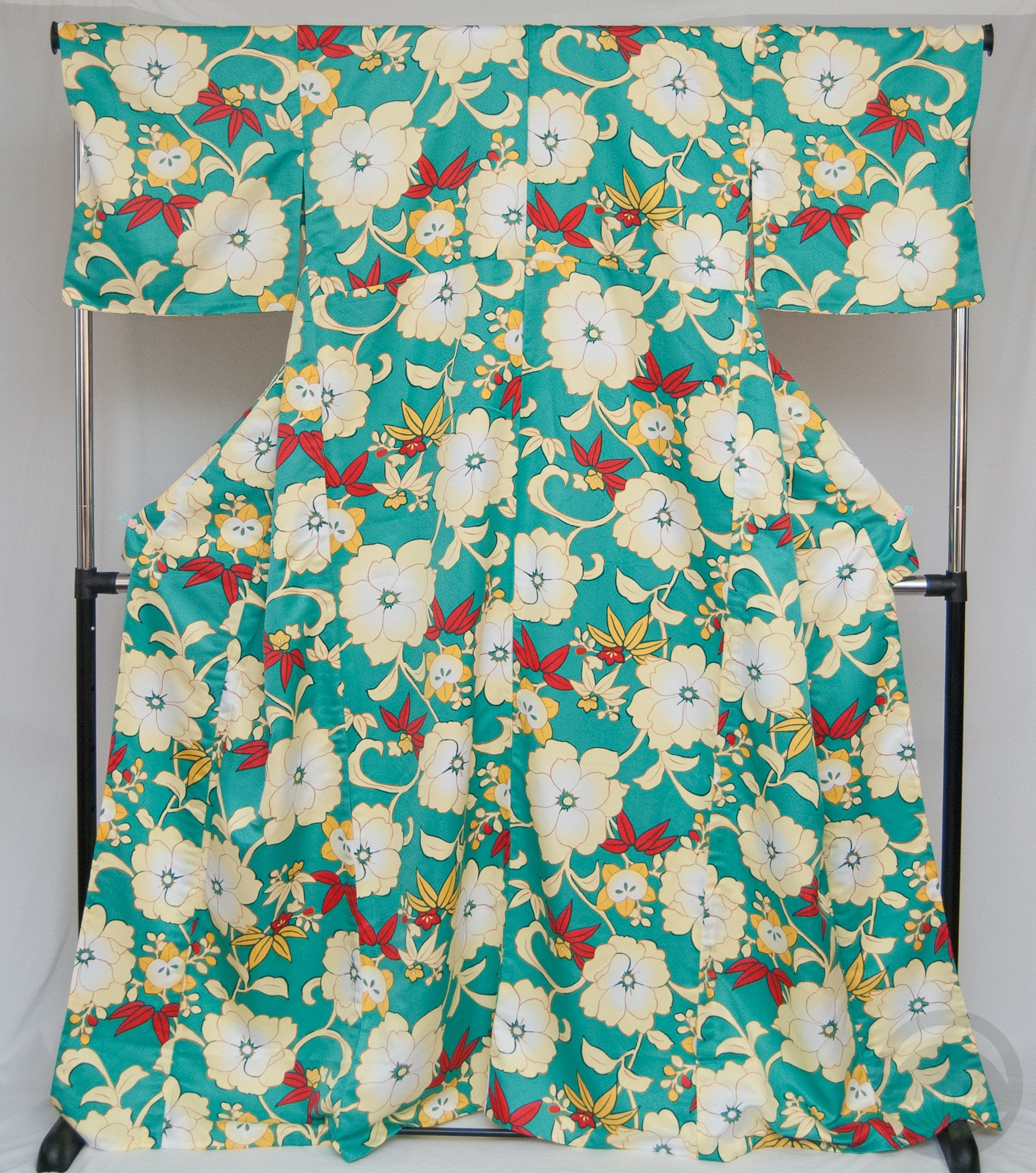
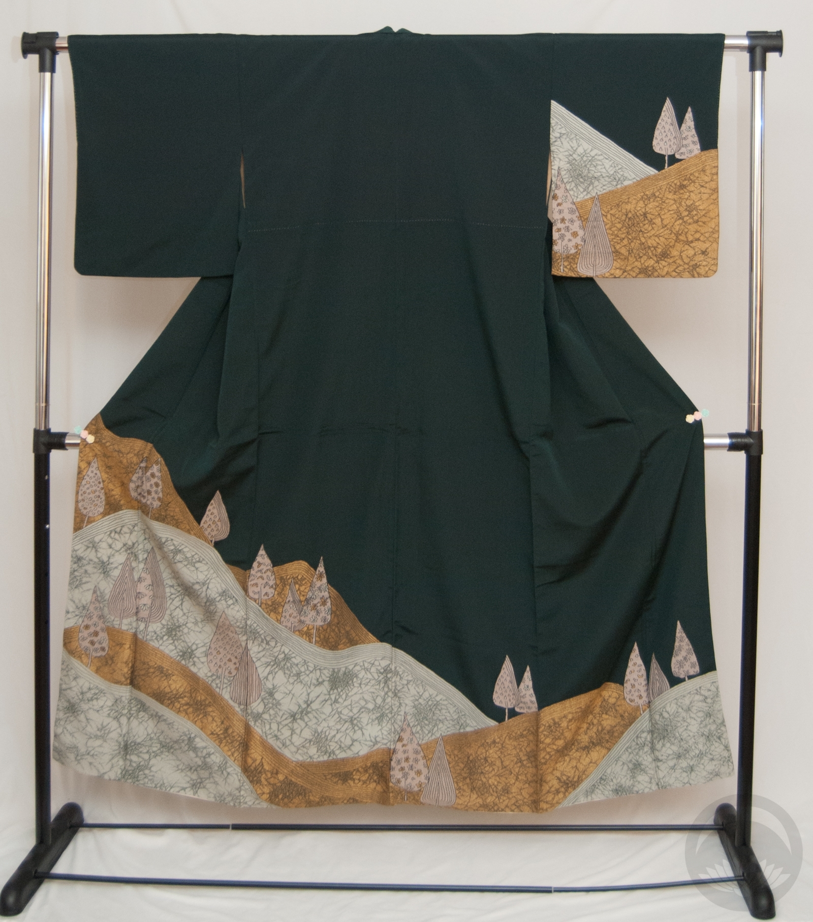
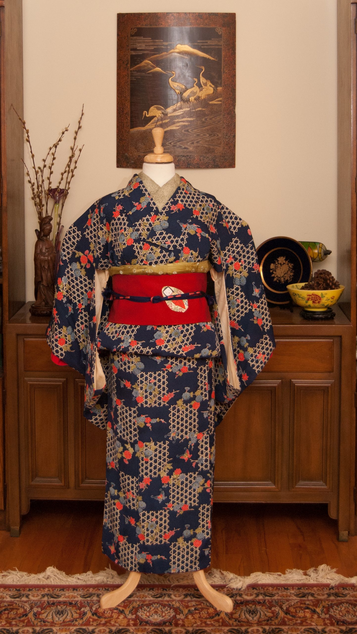
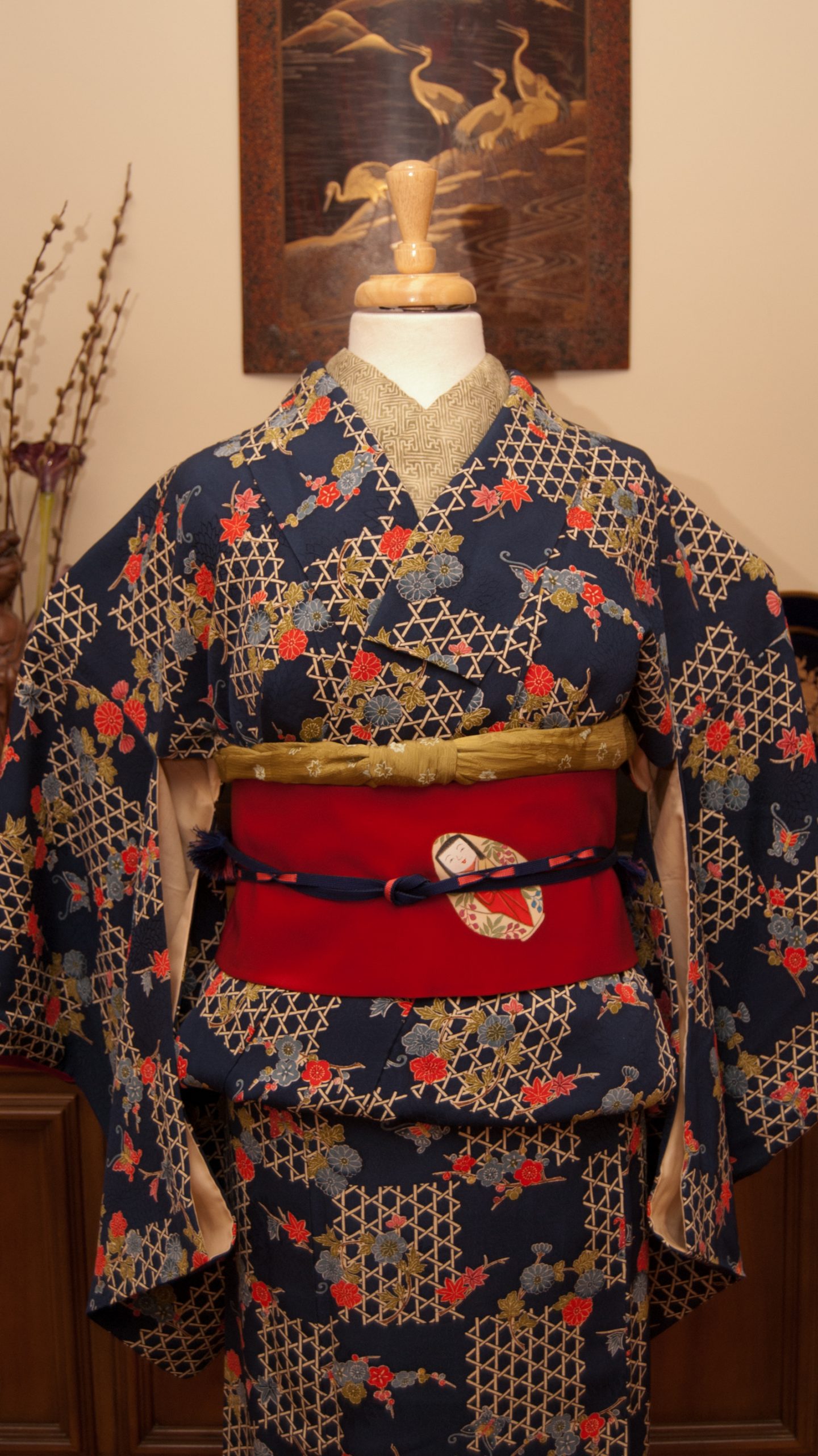
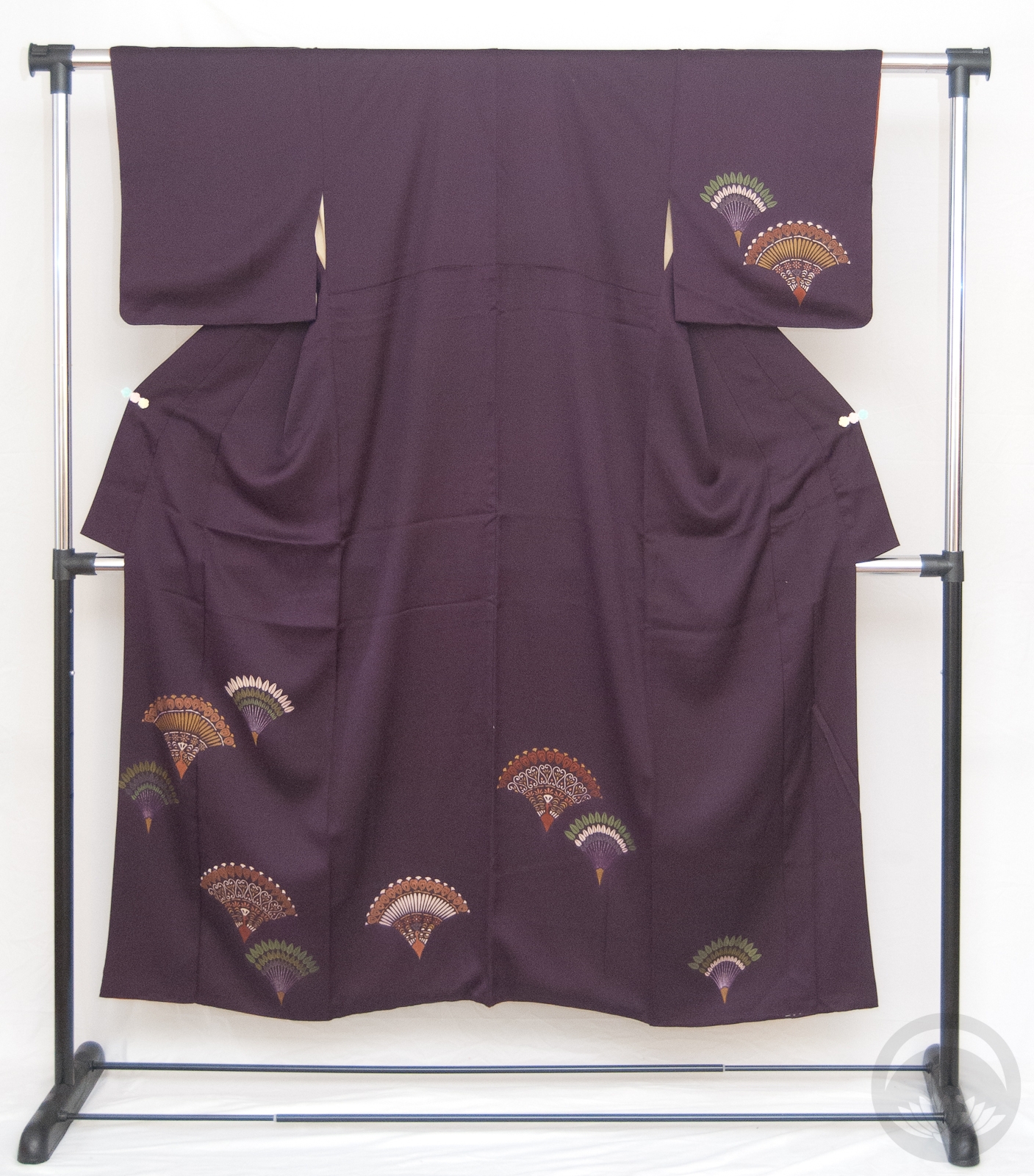
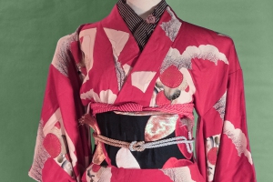
I couldn’t decide if I wanted to go with a very subdued kimono to really show off the obi, or something a bit more bright to try to balance it out visually. Then I remembered that this giant poly komon (one of two kimono I own that currently fit my fat butt) has accents of pretty much the exact same colours – red, cream, and yellow/gold. Loud and busy won the day, as it often does in my life lately!
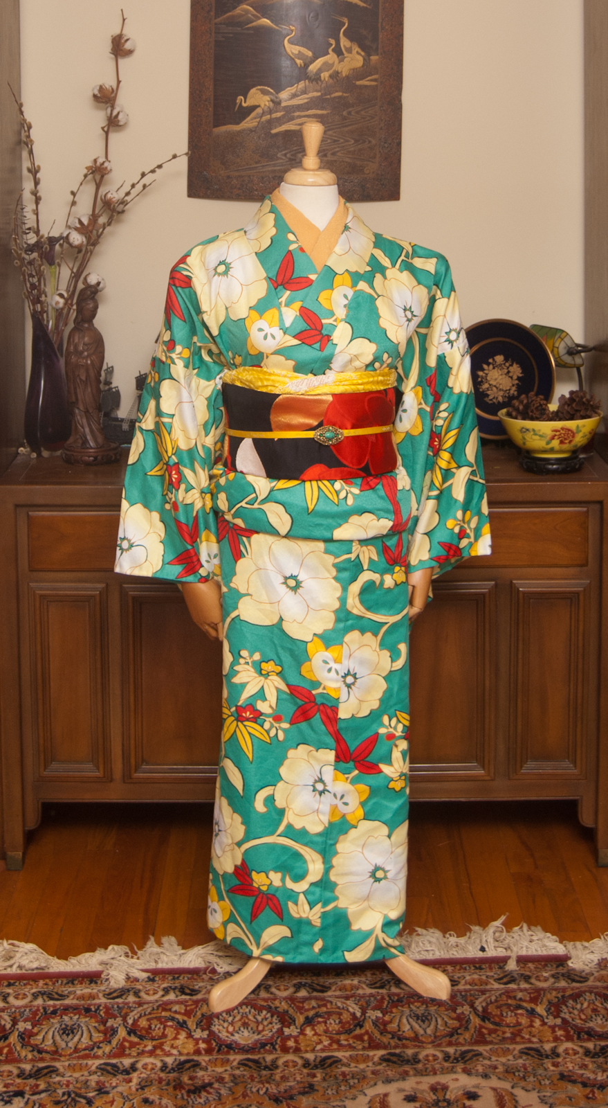
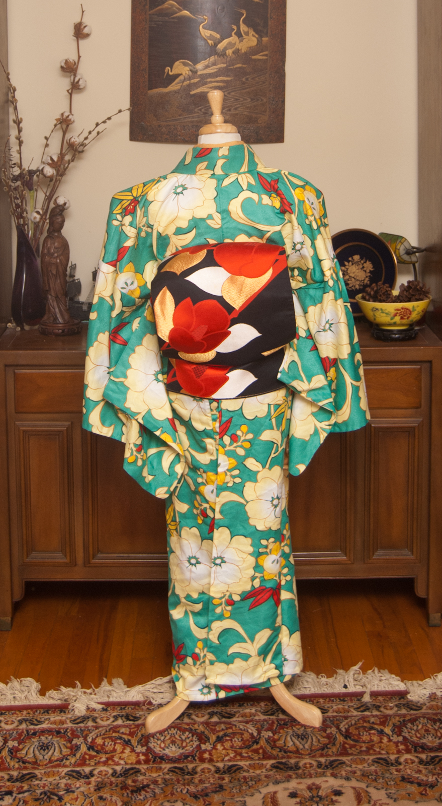
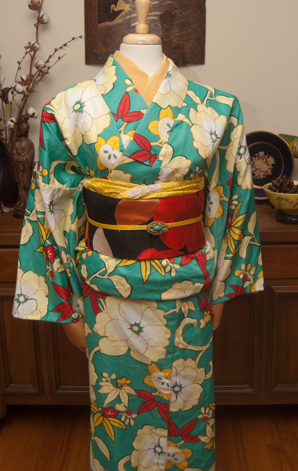
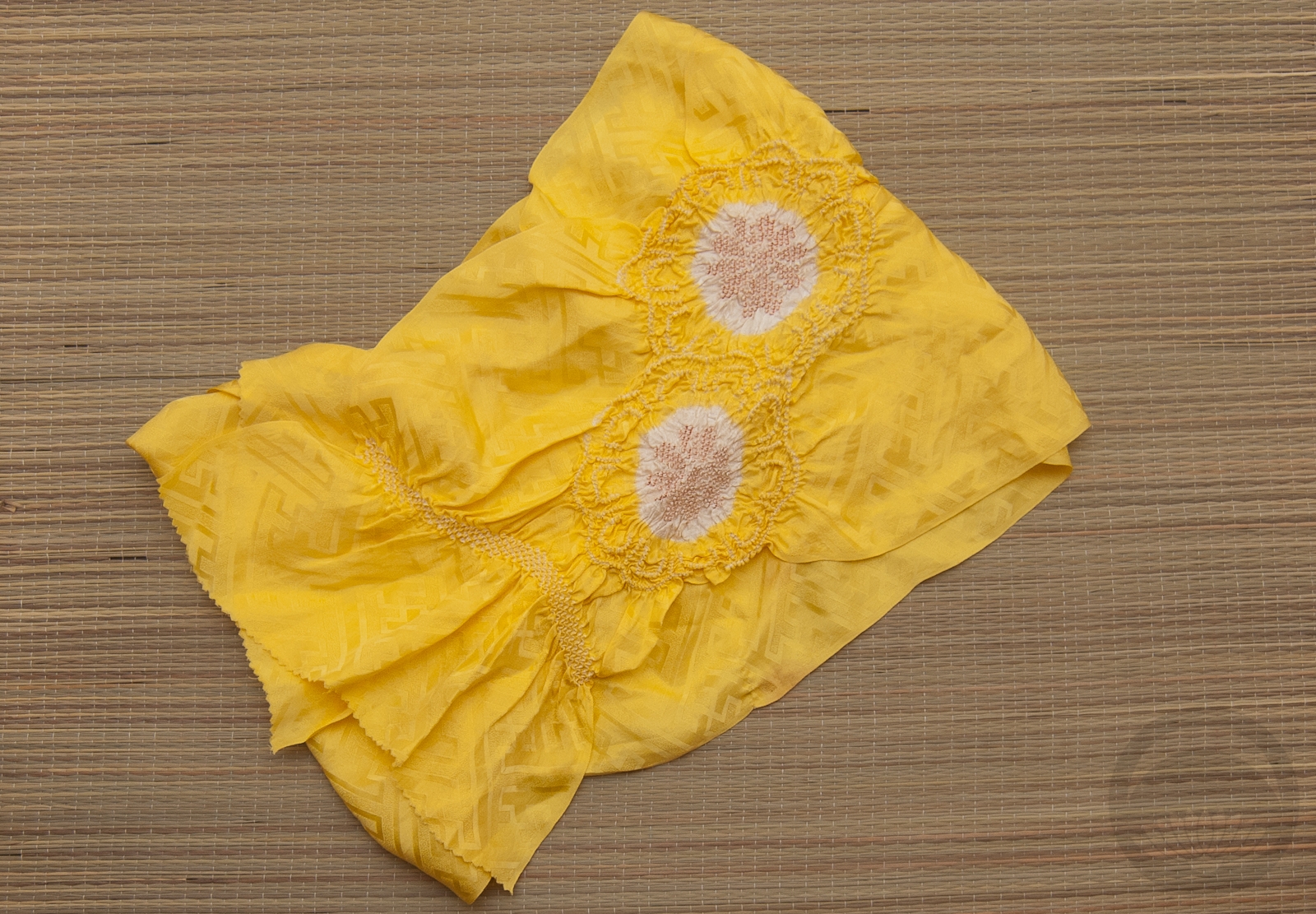
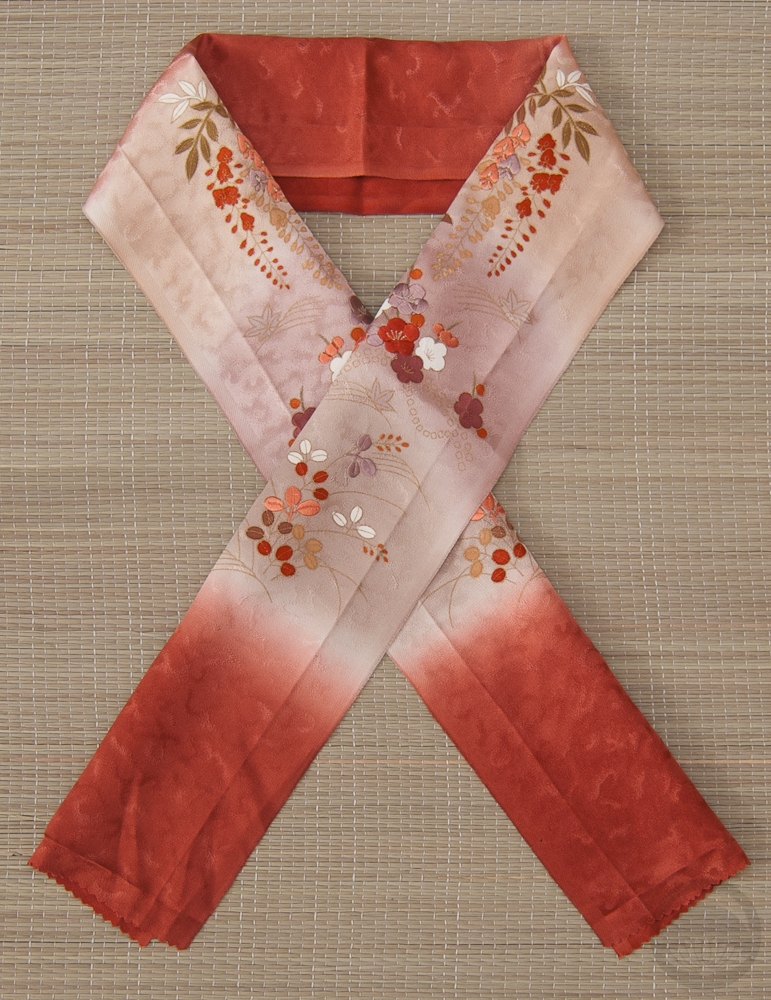
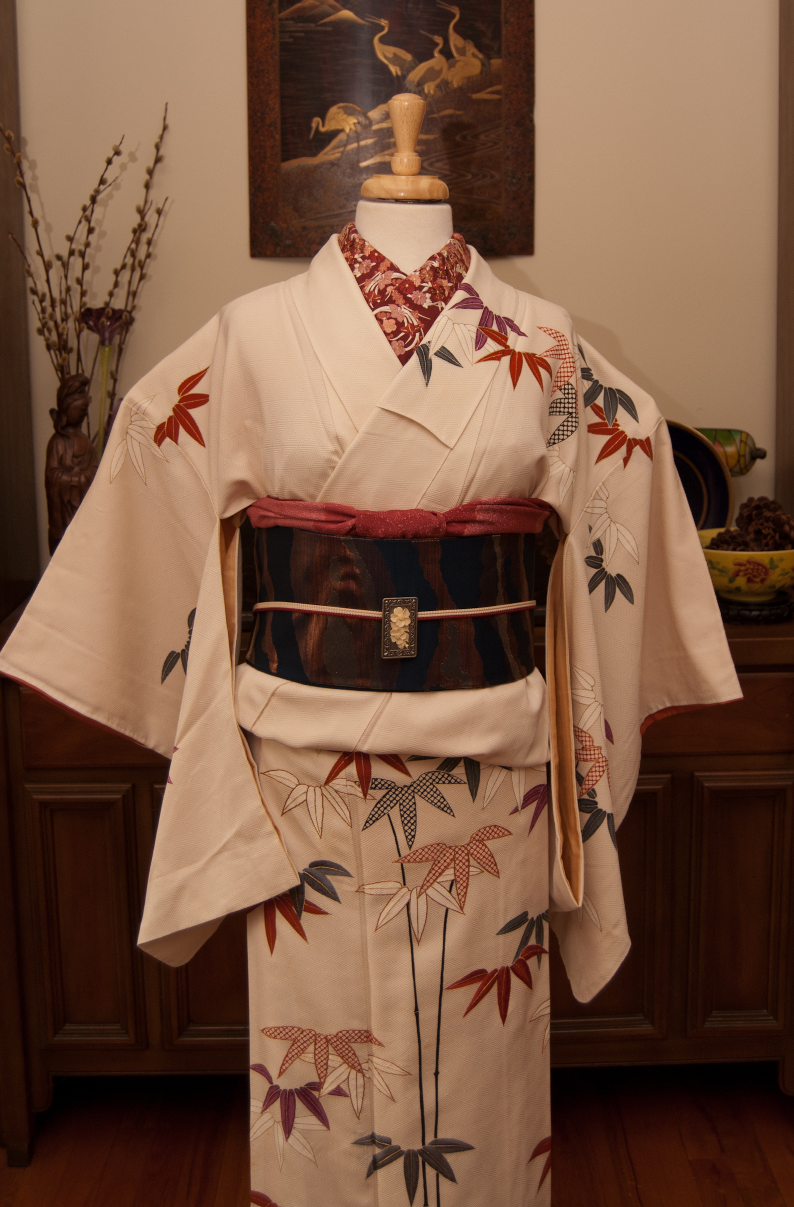
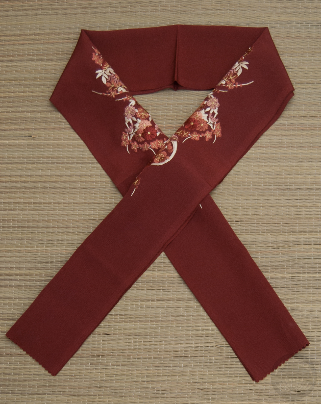
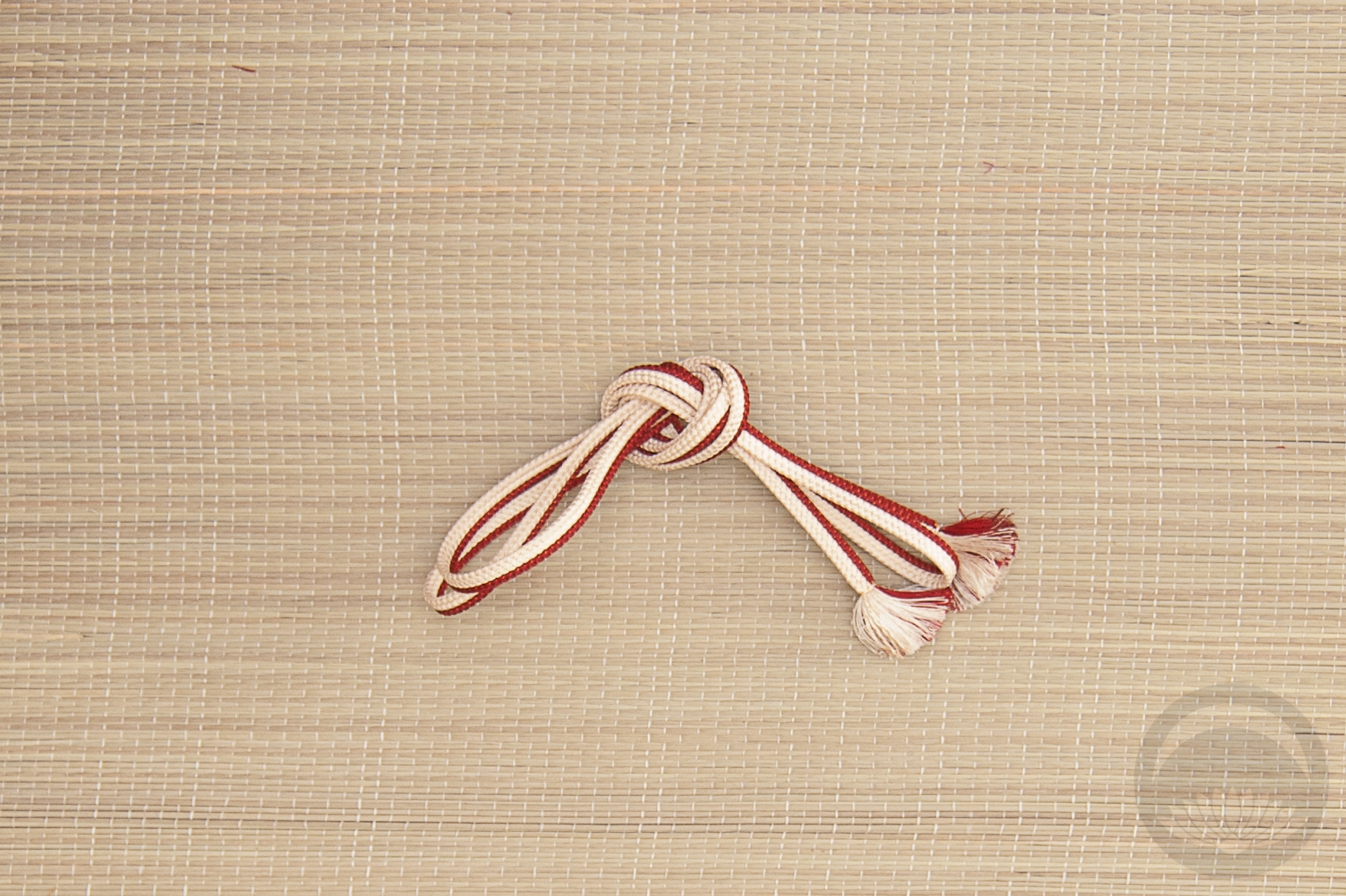
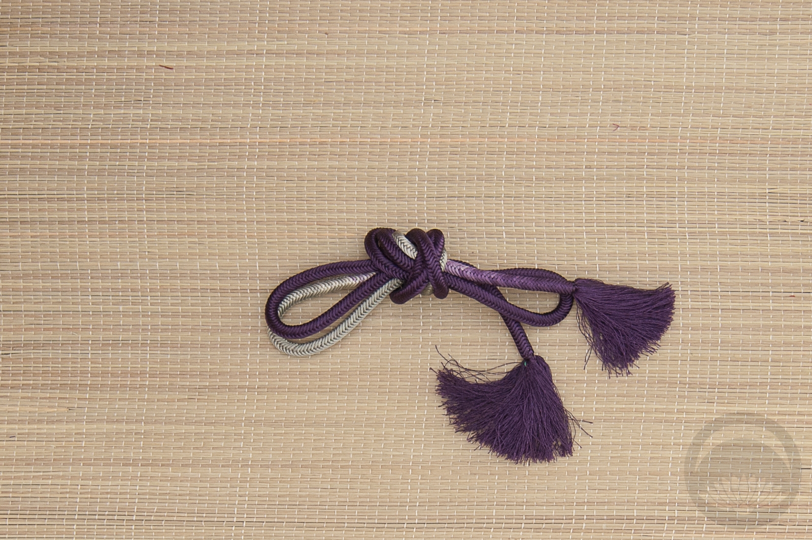
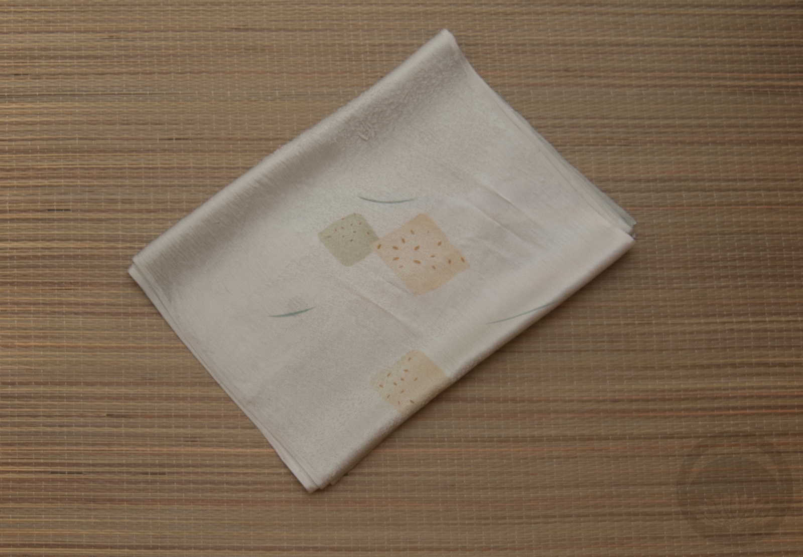
Because the pattern on the obi is so large and graphic it almost reads as quiet next to the busy quality of the kimono. I think that rather than competing for attention they complement each other beautifully. I went with a solid yellow haneri because I figured there was enough going on with the two main pieces that I didn’t want to introduce yet another pattern or visual element. As for the obiage and obijime, I know I use these so often but they just work with so many of my things. I still don’t quite understand how such obnoxious, lemon-yellow accessories match basically everything, but they do. Kimono sorcery!
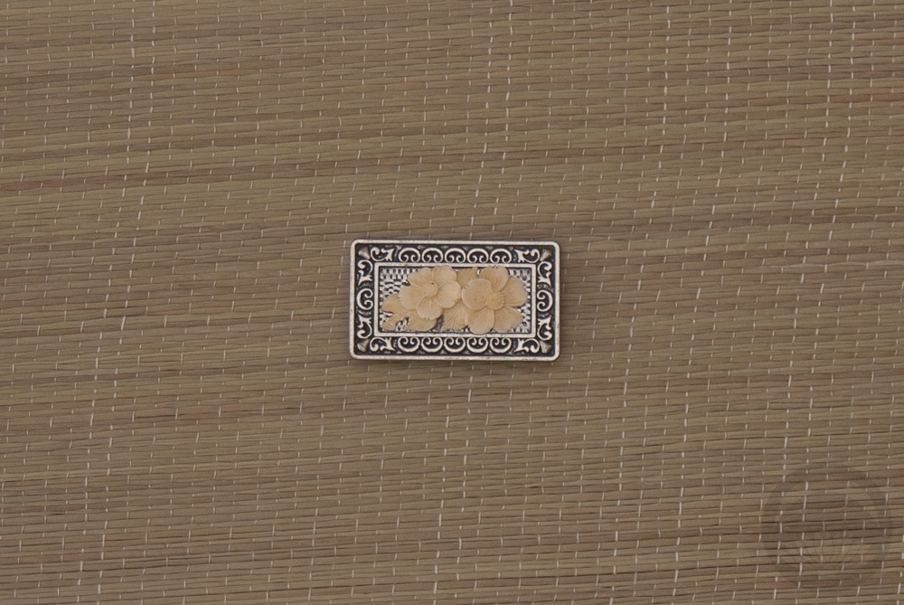
The finishing touch was a brooch that belonged to my grandmother. I’m not sure what the stone in the centre is, but it’s a perfect match to the kimono, and brings just the right pop of teal in to break up the obi slightly.
Items used in this coordination
-
- Turquoise Floral
-

- Black and Red Tsubaki
-

- Solid yellow

-
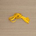
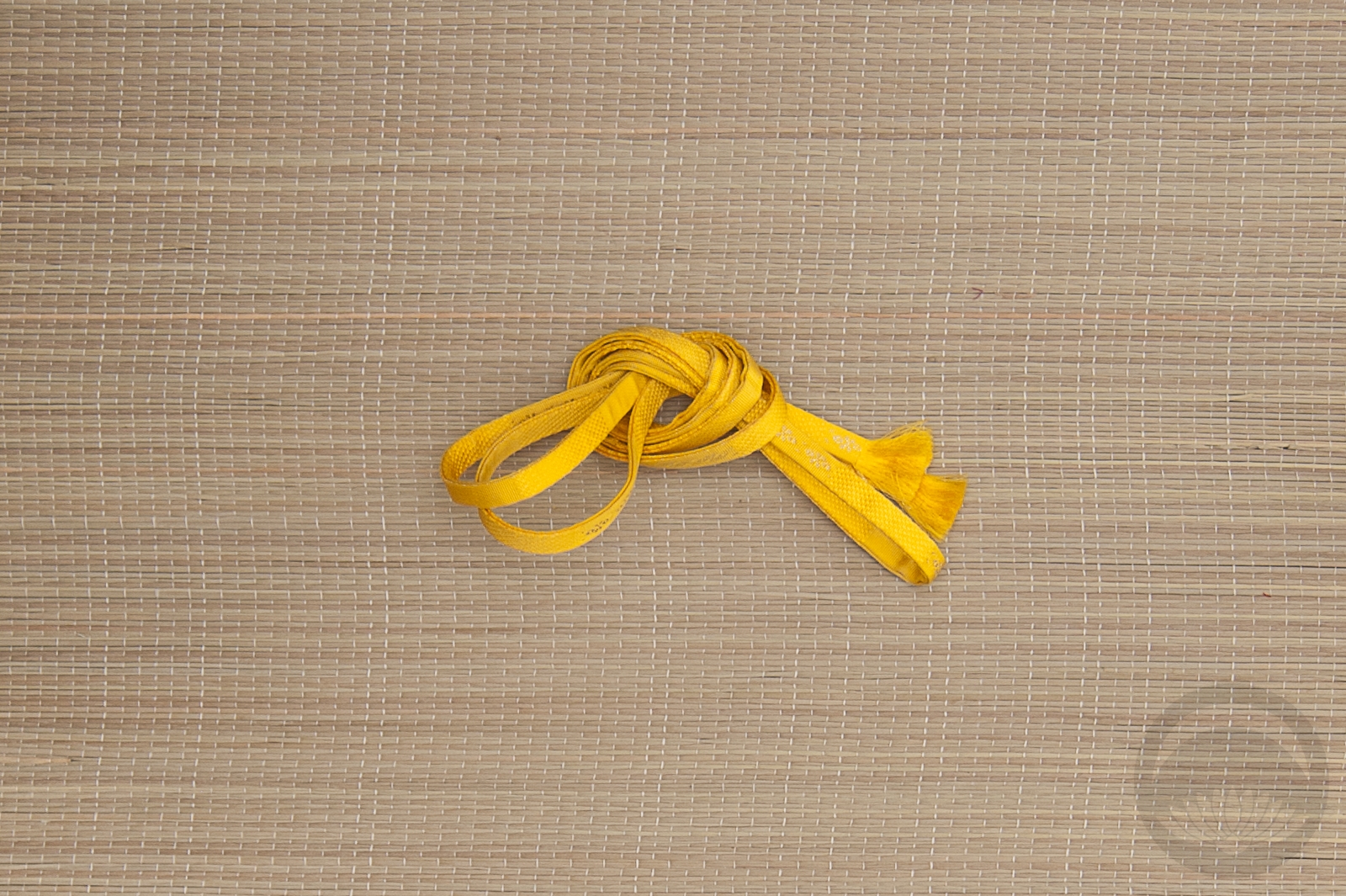
- Lemon Yellow Shibori
-
- Yellow Hakata


 Bebe Taian
 CHOKO Blog
 Gion Kobu