
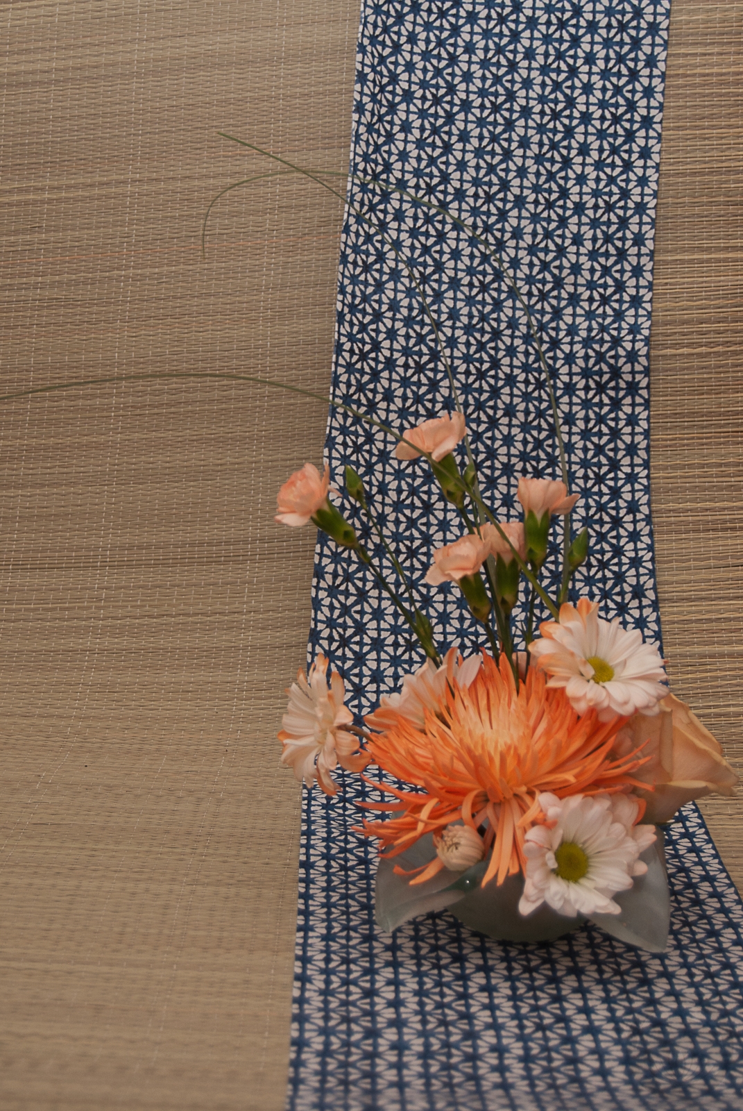
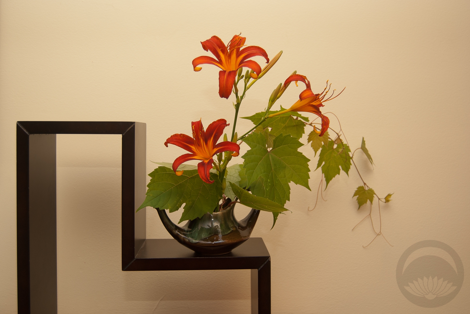
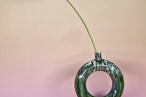
 During the summer, I really do try to work with flowers from the great outdoors but when I saw this marked-down bouquet at the grocery store I felt an overwhelming urge to rescue it. I realise that the flowers were dyed by tinting the water orange, but come on, they look like a creamsicle!
The bouquet was a little past due and a fair number of the flowers were beyond salvaging, but I managed to rescue the large spider mum and the carnations which were what drew me to the bundle in the first place. I didn’t have a lot of length to play with so I focused on a small, tight, rounded shape with a little height for drama.
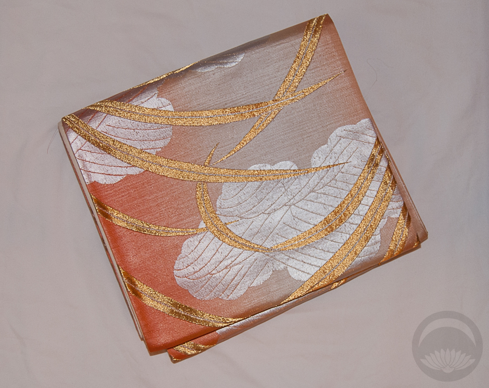
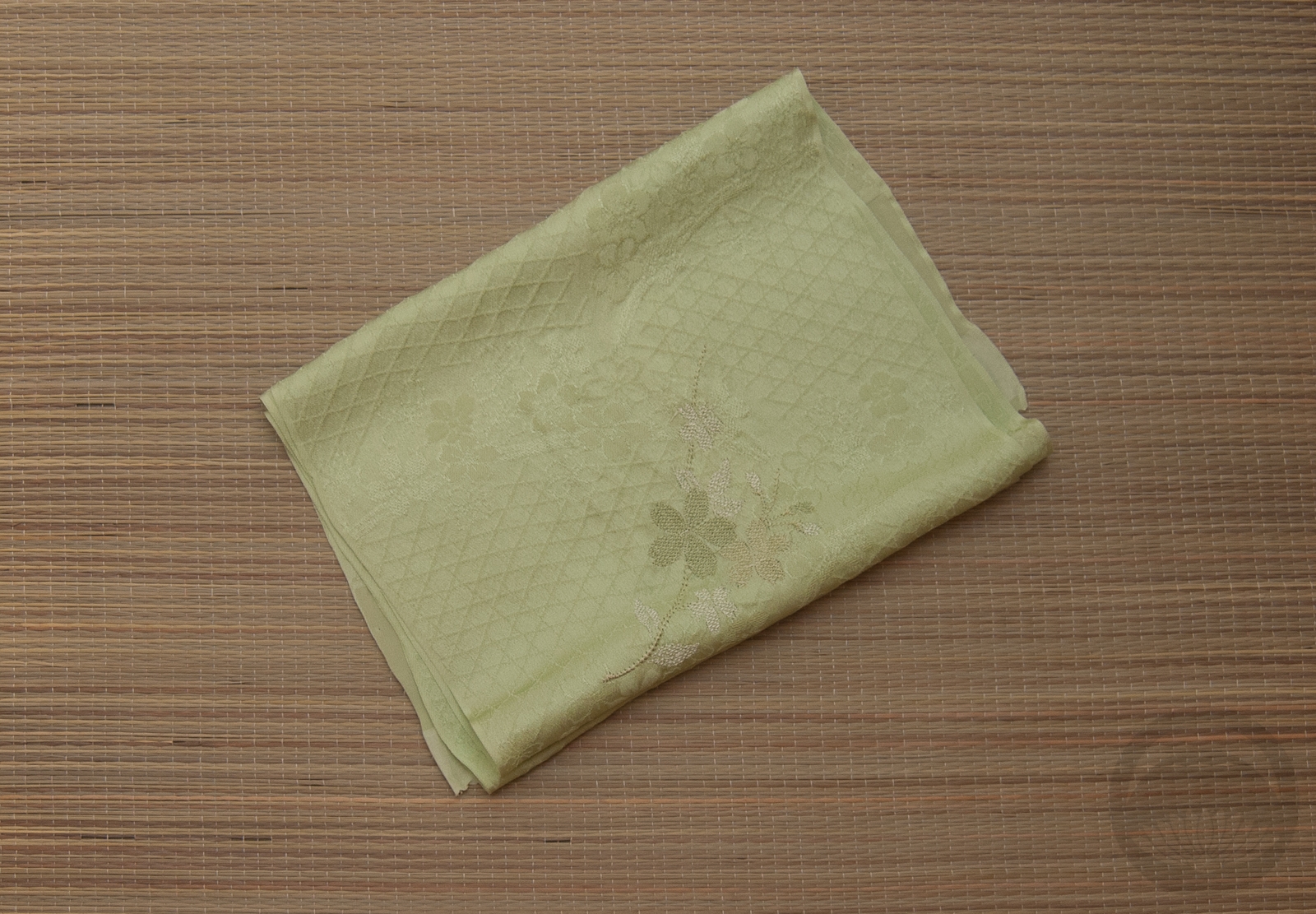
The oranges and creamy peach tones got a bit lost against the backdrop but then I remembered I had this awesome shibori-like fabric which provides great contrast.
Overall, this might not be the most dramatic or stylish arrangement I’ve put together, but there’s something undeniably charming and happy about it, and we could all use a little more happiness in our lives right now.


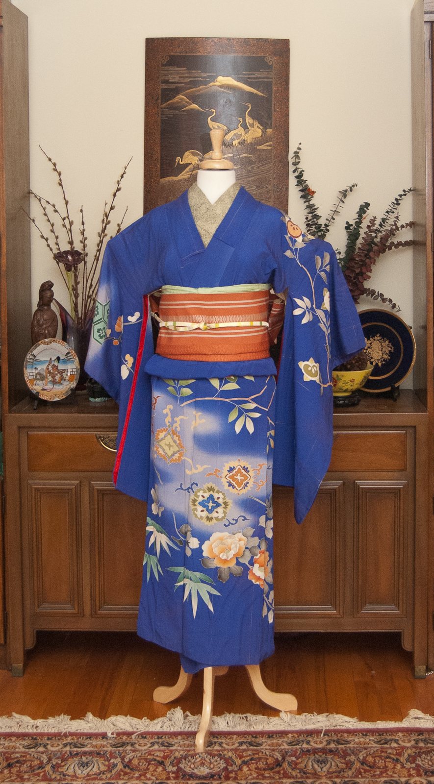


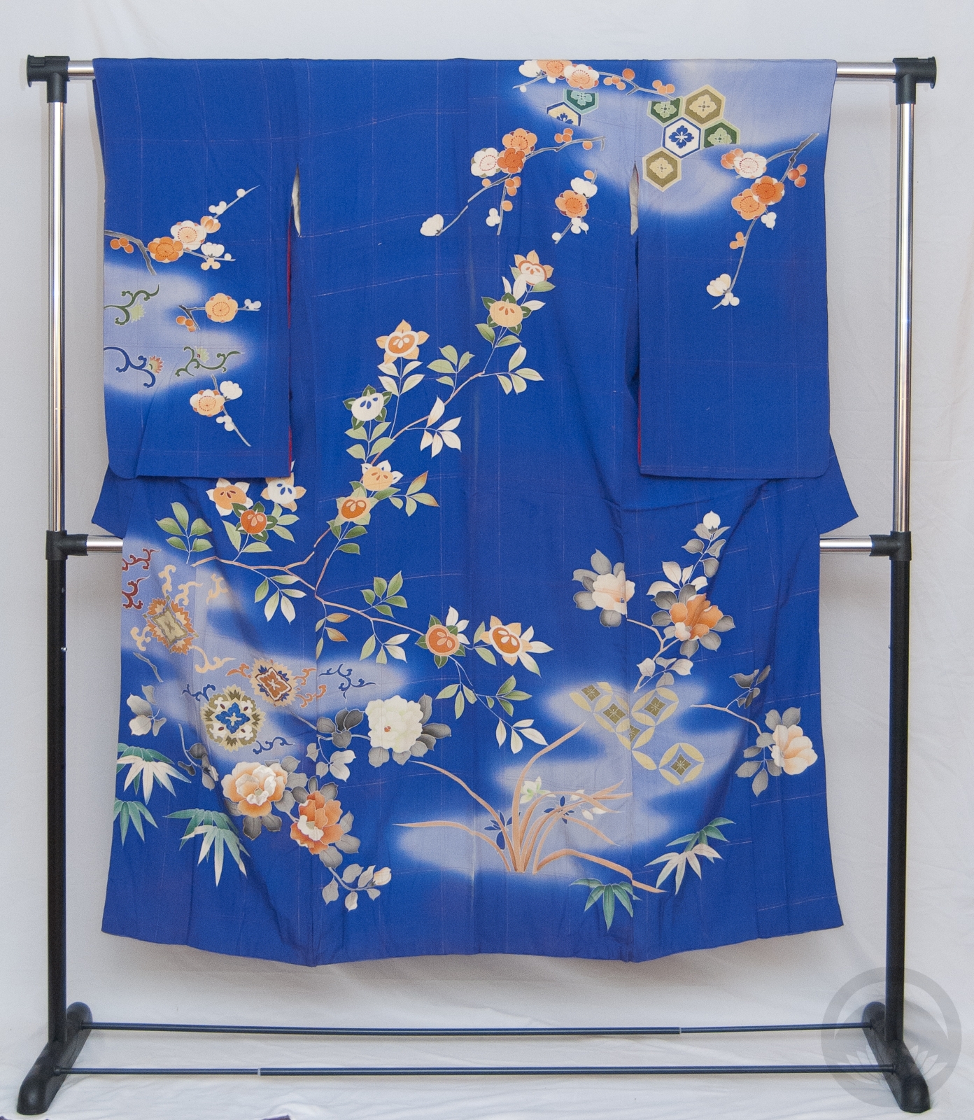
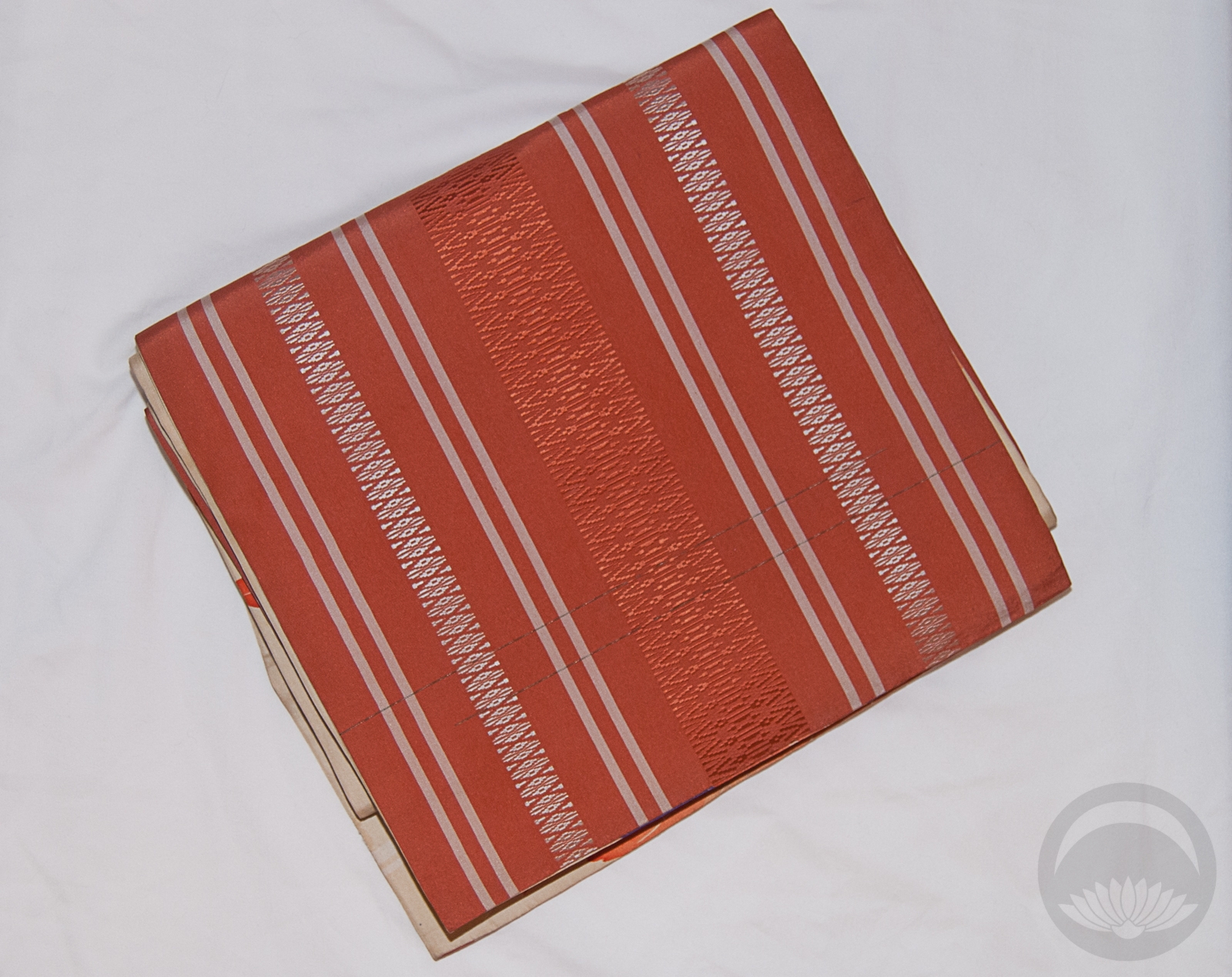
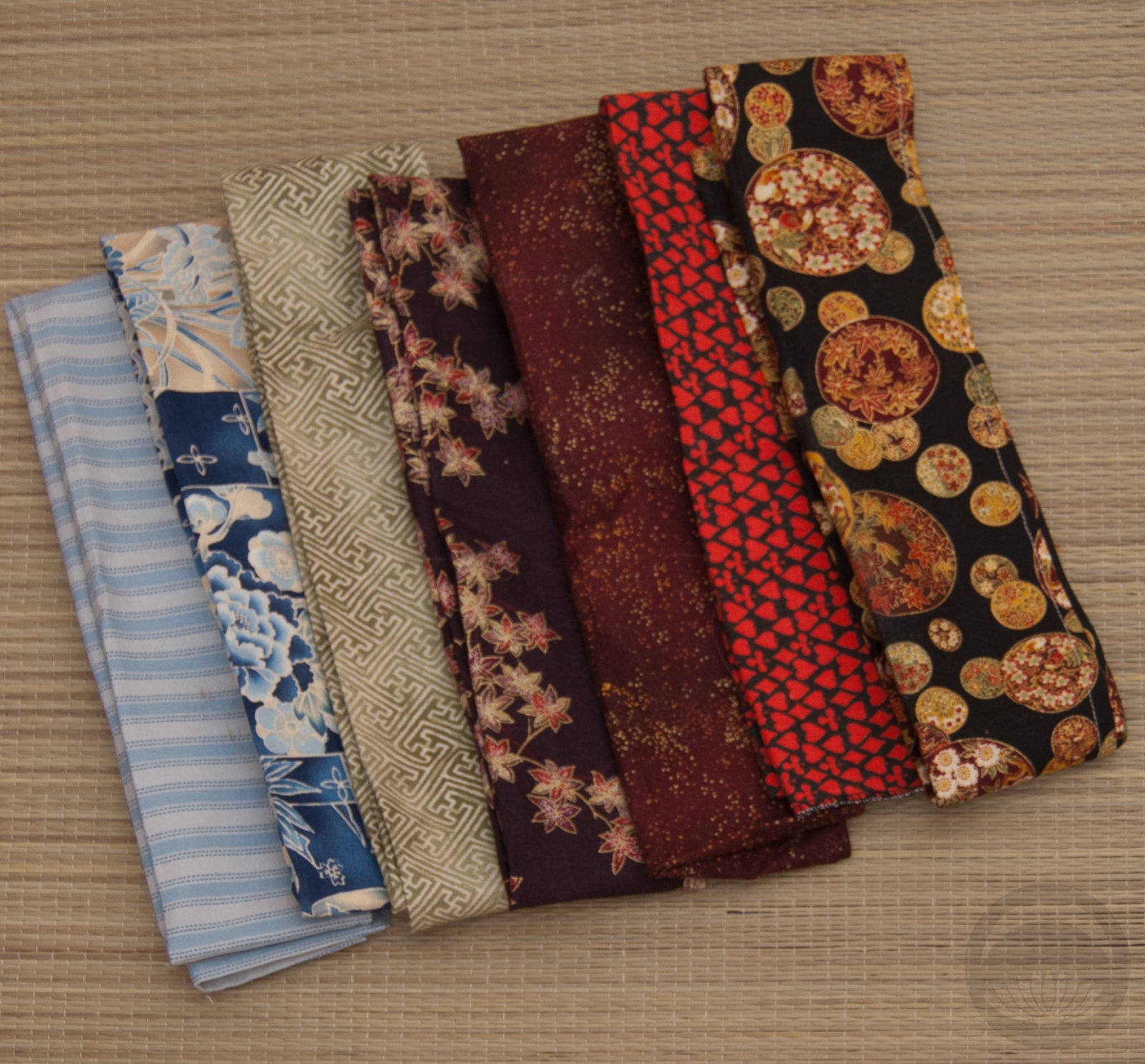


 Bebe Taian
 CHOKO Blog
 Gion Kobu