Rainbow Sherbet

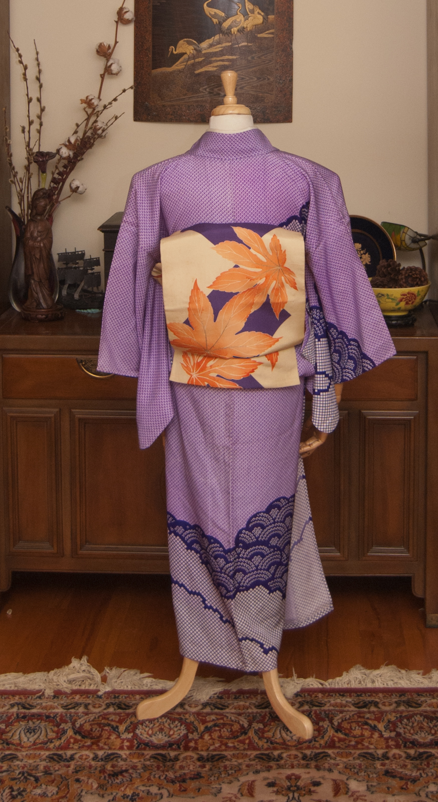
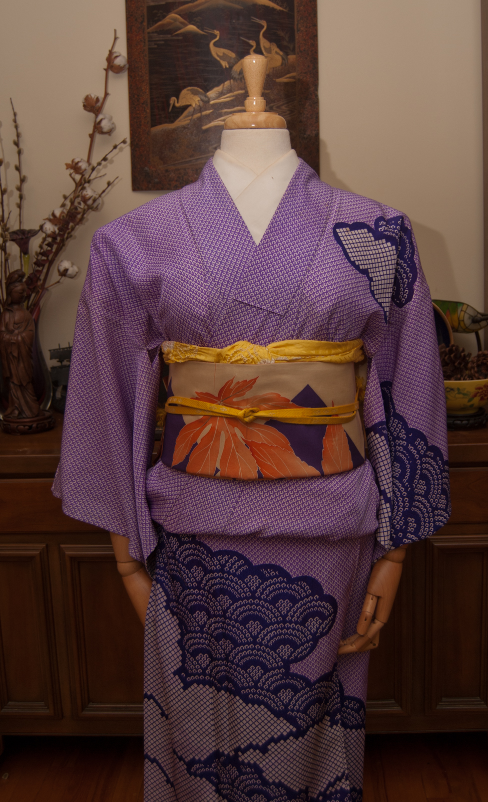
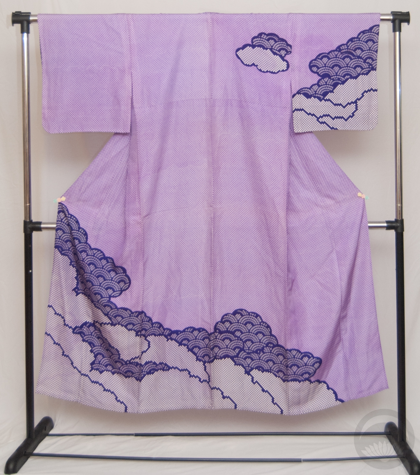
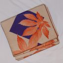
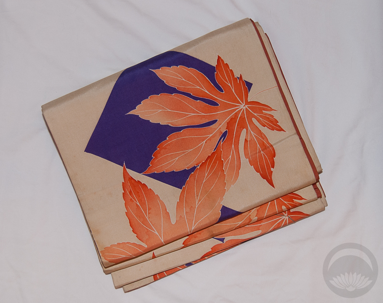
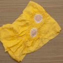
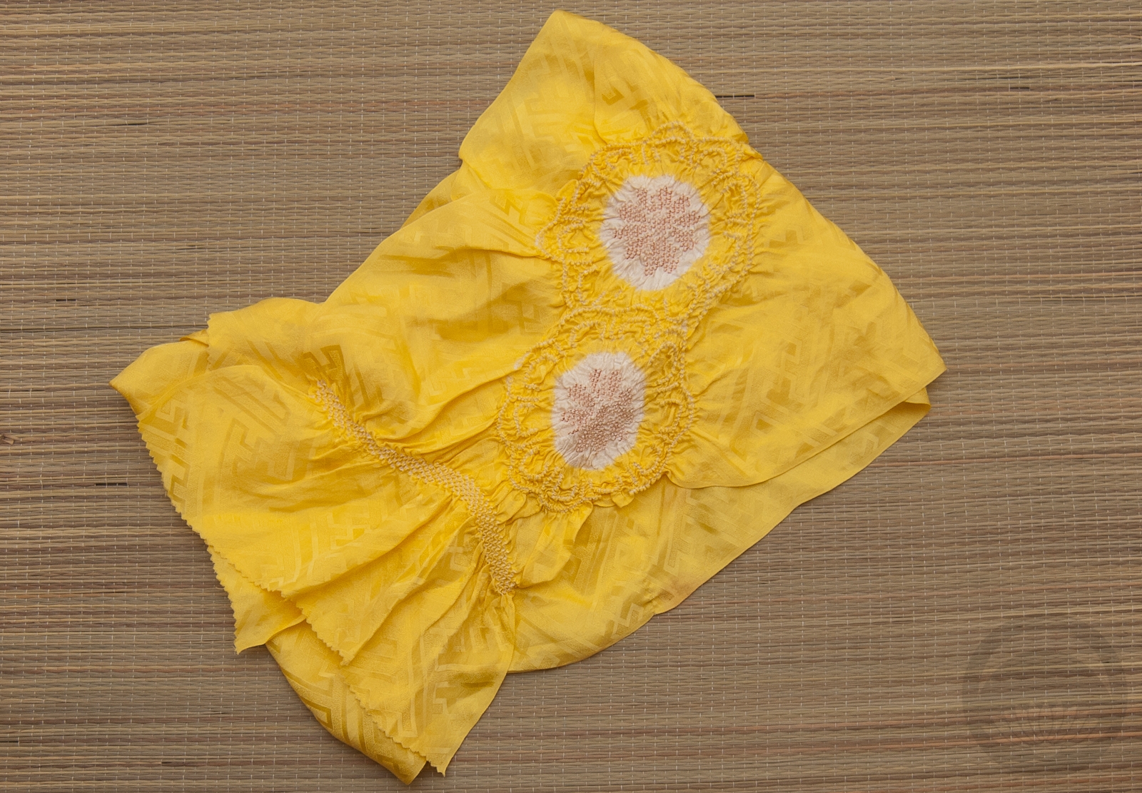
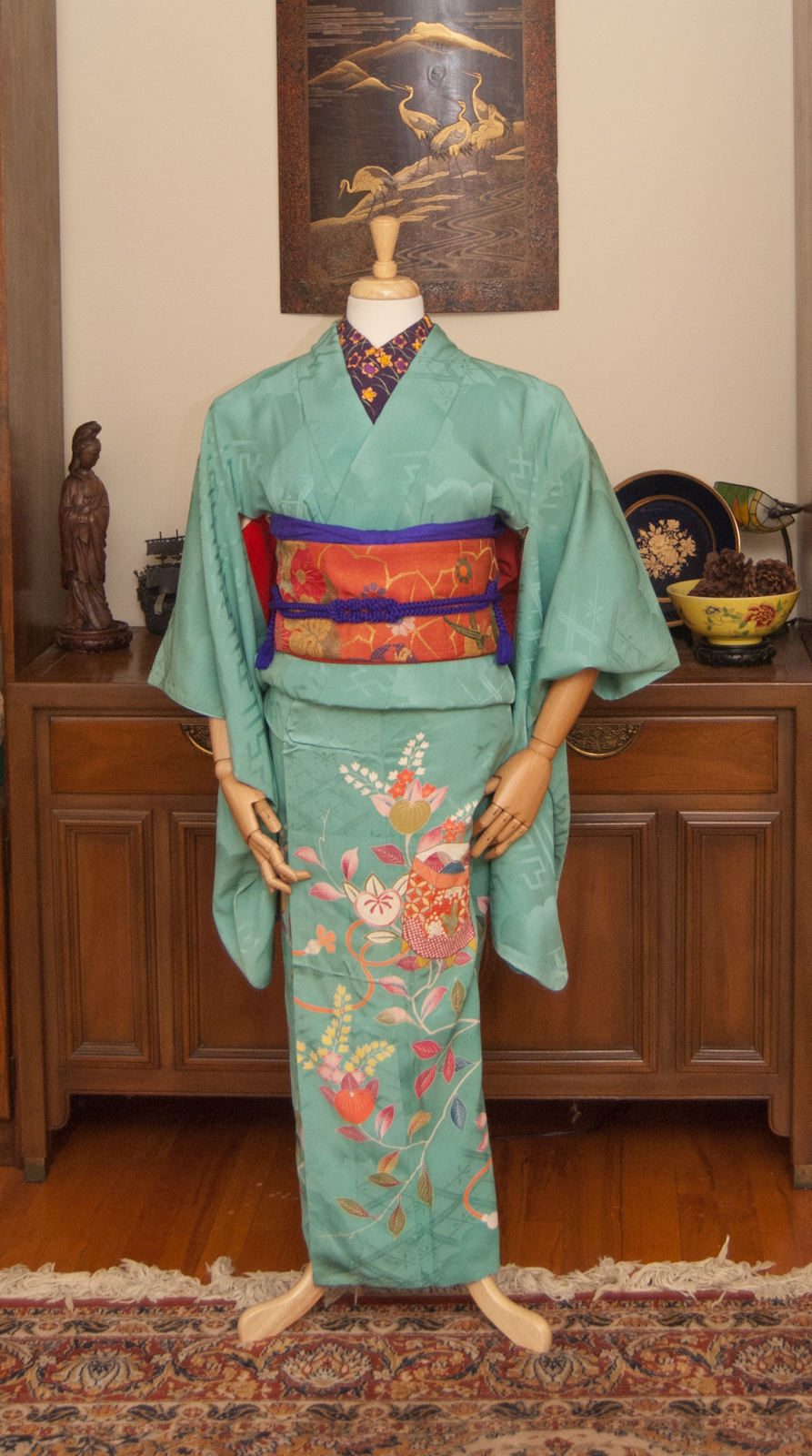
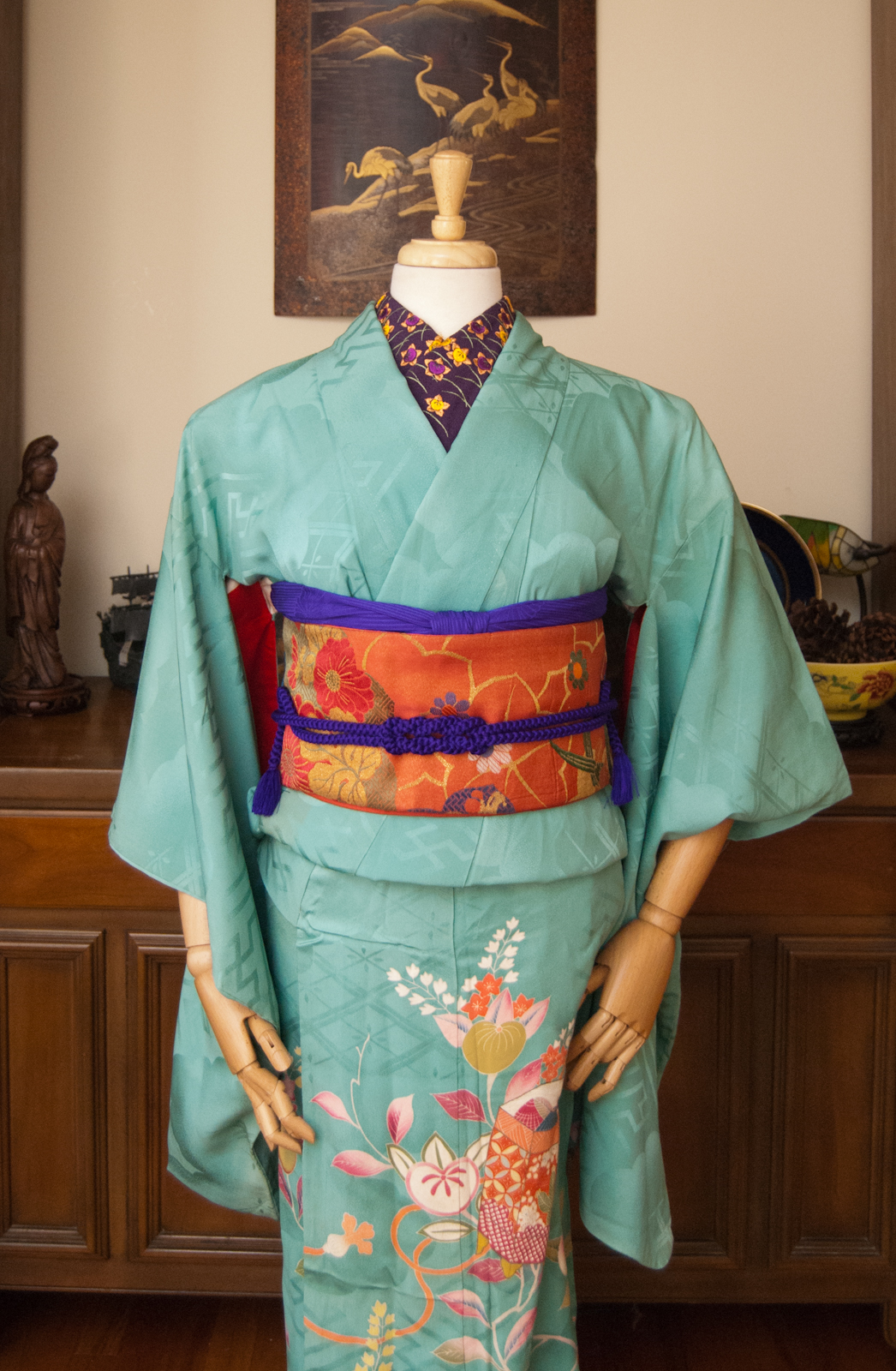
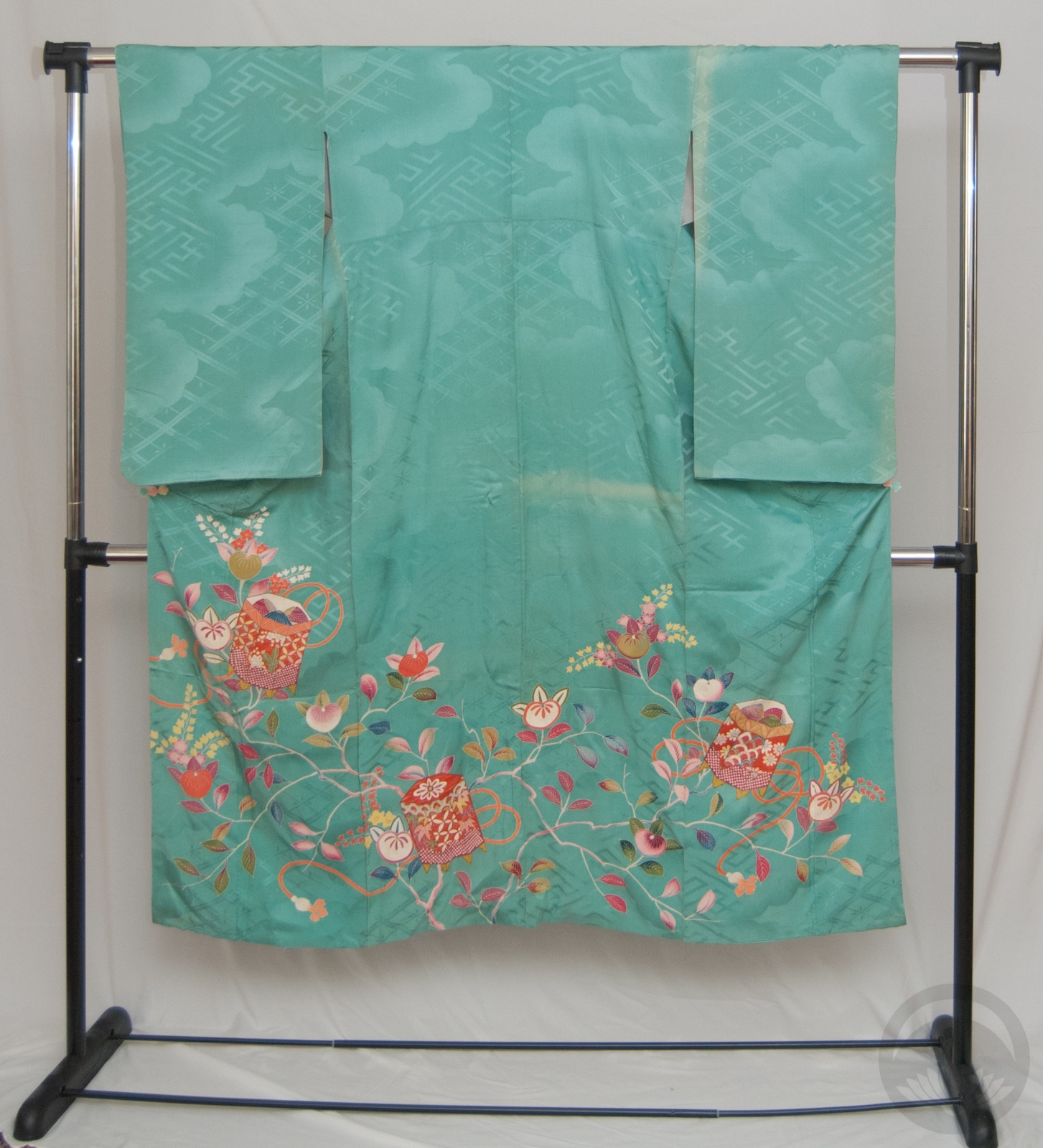
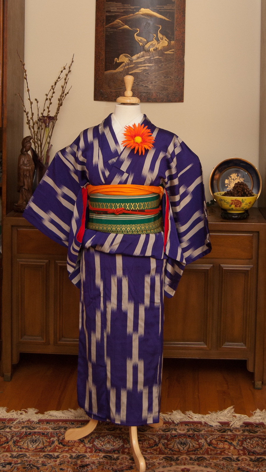
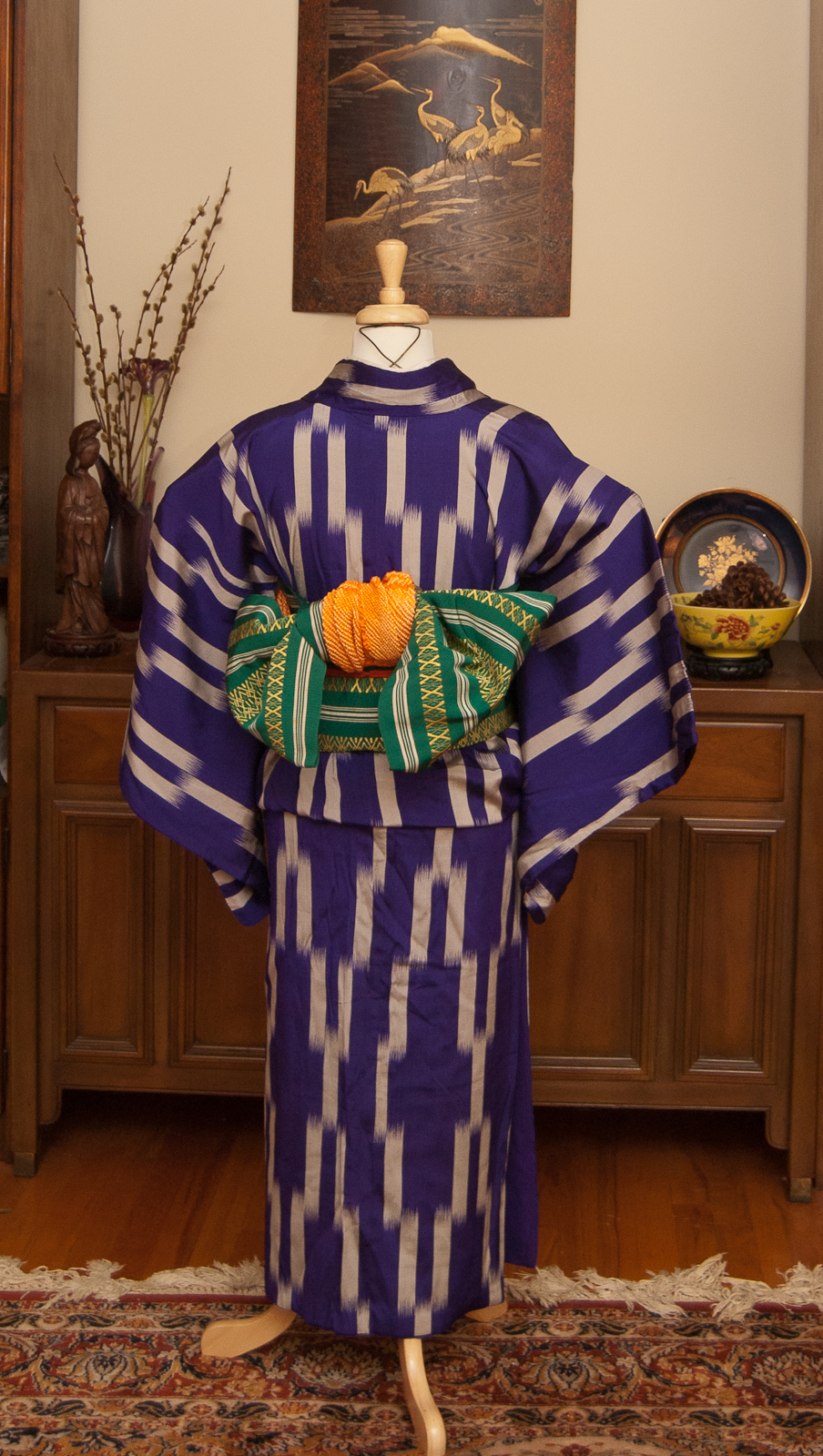
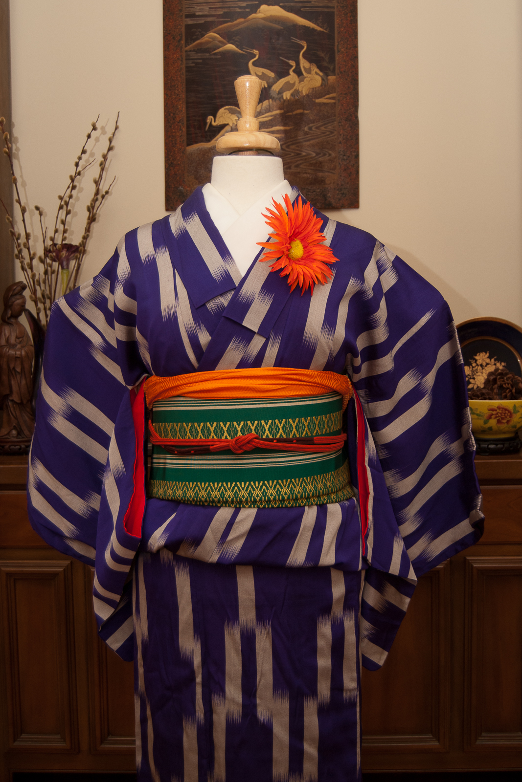
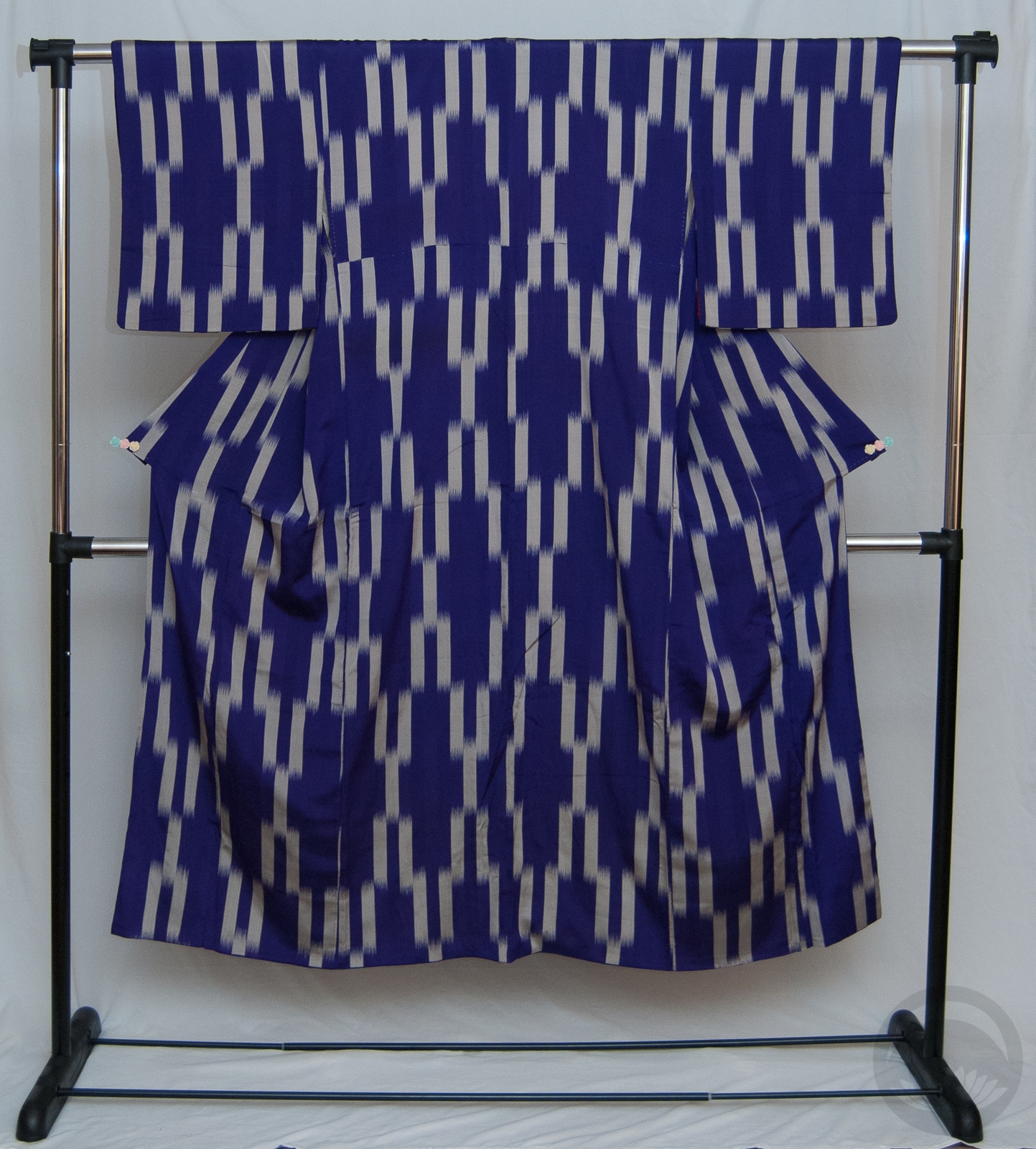
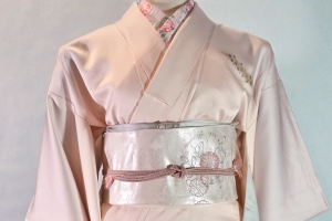
This beautiful faux-shibori odori kimono came home with me last weekend, courtesy of my friend Sasa of SA Design by Sasa. I modelled a plus-size happi coat for her a while back and she was incredibly generous in offering this piece to me as thanks. I also bought a lovely obi from her, but I’m saving that for later. 😉

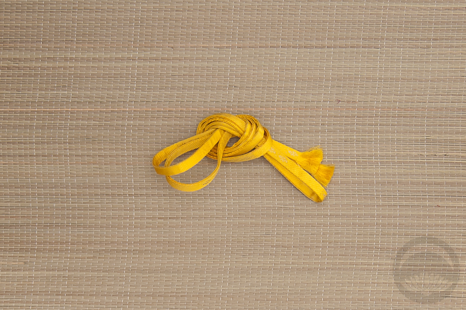
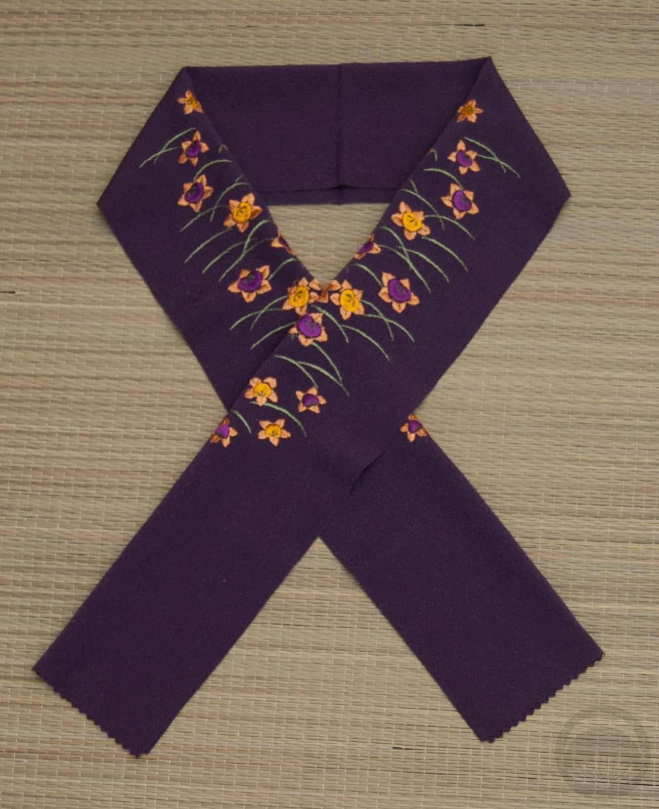
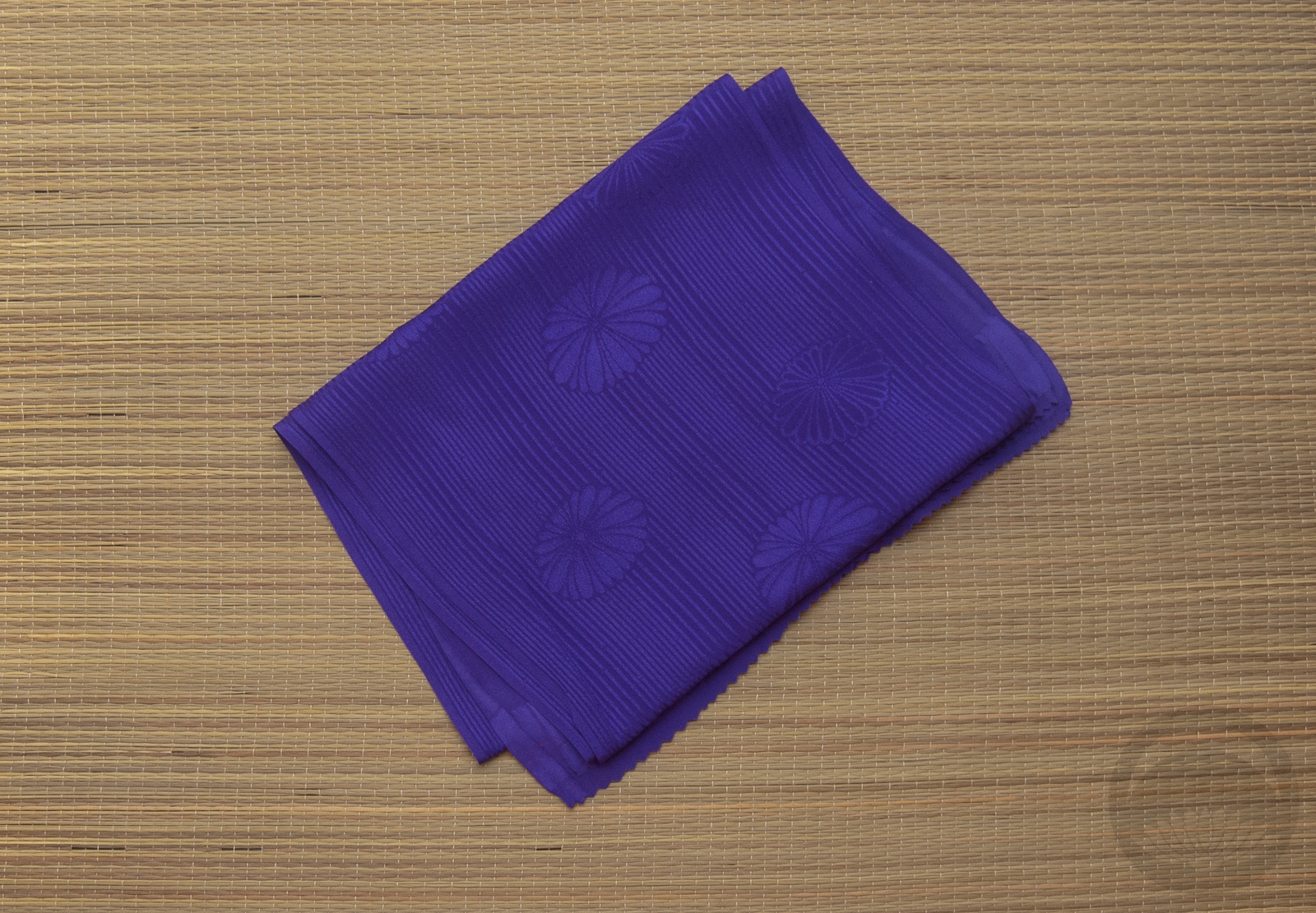
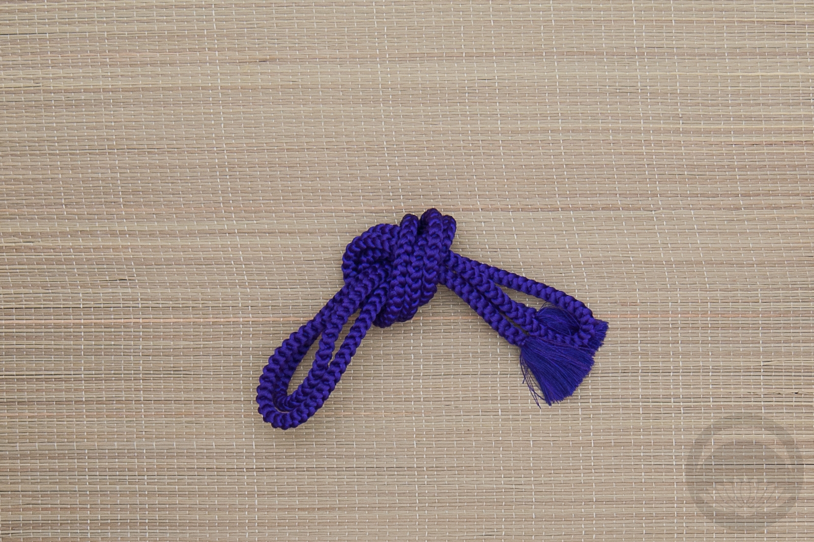
I really love the colour combination of purple, orange, and yellow. Despite the autumn mood of the leaves on the obi, I think the whole outfit together has a very refreshing feeling to me. It feels very summery, like a refreshing scoop of rainbow sherbet. It looks sweet and cool and completely delicious, and now I’m making myself hungry!

It’s finally starting to cool down here in Montreal, and the fashion show I’ve been prepping for is coming up really soon, so that means I’ll finally be comfortable enough and have enough free time to get back into posting as regularly as I used to. We’re coming up on the tenth anniversary of me starting this blog, so I’ve got to do something fun and exciting.

Also, do you spell it as sherbet or sherbert? It seems to change depending on where you’re from.

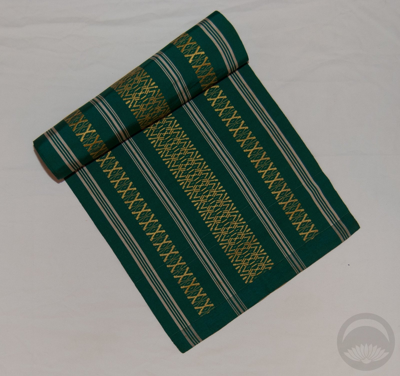
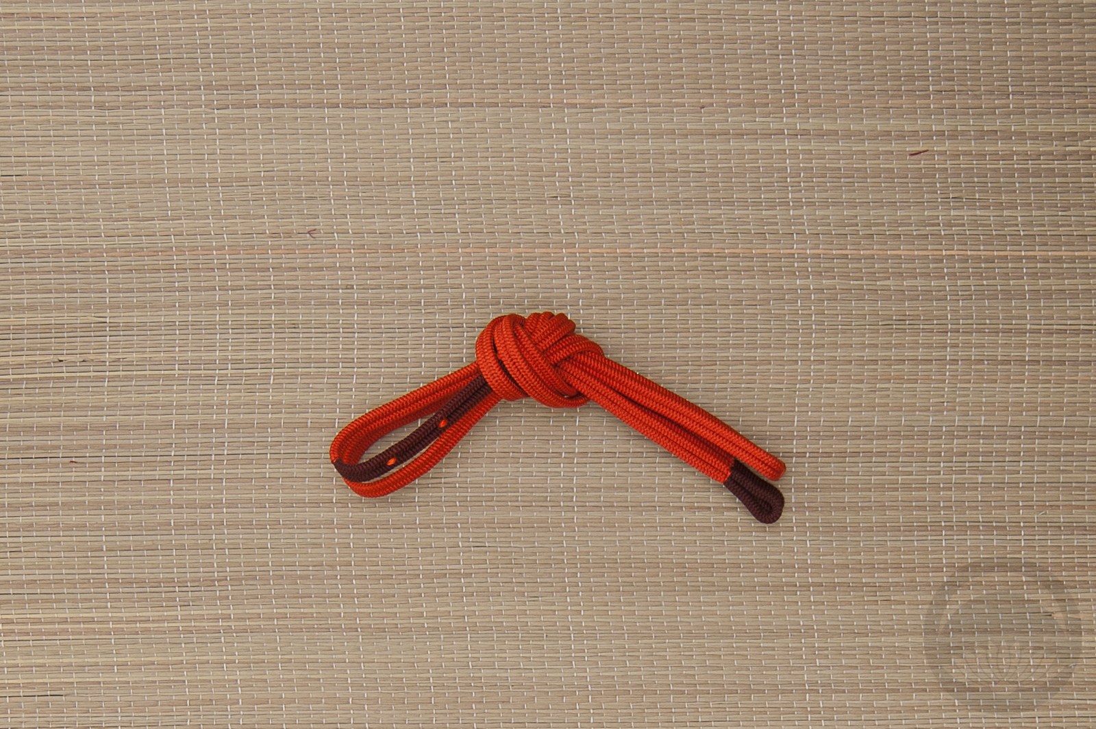
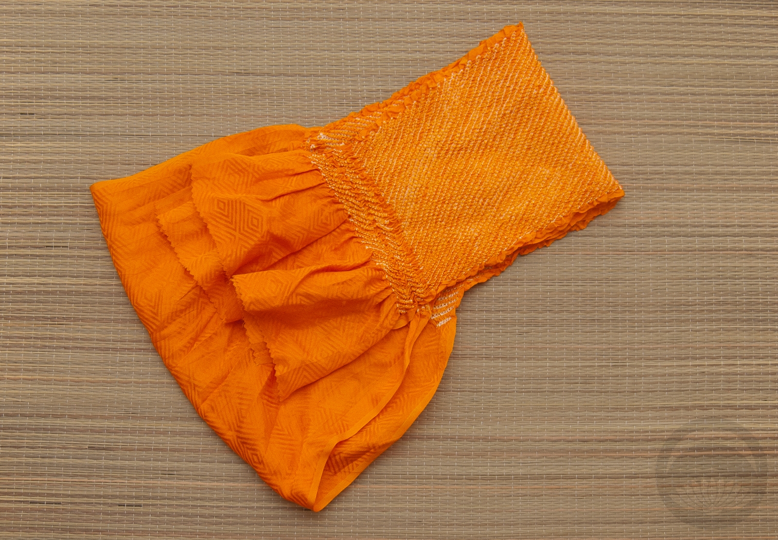
Items used in this coordination

Vibrant Vintage

For someone who keeps telling herself she doesn’t need more kimono, I sure do keep ending up with more kimono. But when I saw this gorgeous vibrant turquoise Taisho irotomesode on Ichiroya recently, I knew it had to come live with me. This piece is not in great shape, admittedly. It’s got sun damage that leads me to believe it was folded and then stored badly at some point in its life. But I was just so in love with the colour that I couldn’t pass it up, and it became my tax refund gift to myself. It’s also incredibly small, bordering on too small for the mannequin even, so I have no delusions of ever being able to wear it even if I lose weight. Alas. 🙁

I knew immediately that I wanted to pair it up with this bold orange nagoya obi that really pulls out all the gorgeous warm tones in the hem design of tachibana and kaioke. My initial instinct was to go for more muted accessories, including an obijime that has nearly the same shade of turquoise, but then I remembered I have this bold haneri with tachibana in the same colours as the obi and just ran with it. I love the emphasis the rich purple tones bring to the whole coordination. I will definitely be revisiting this kimono soon with a more gentle and subtle coordination, but I really do love how bold and vibrant this turned out.

Items used in this coordination

Autumn Rose Ikebana

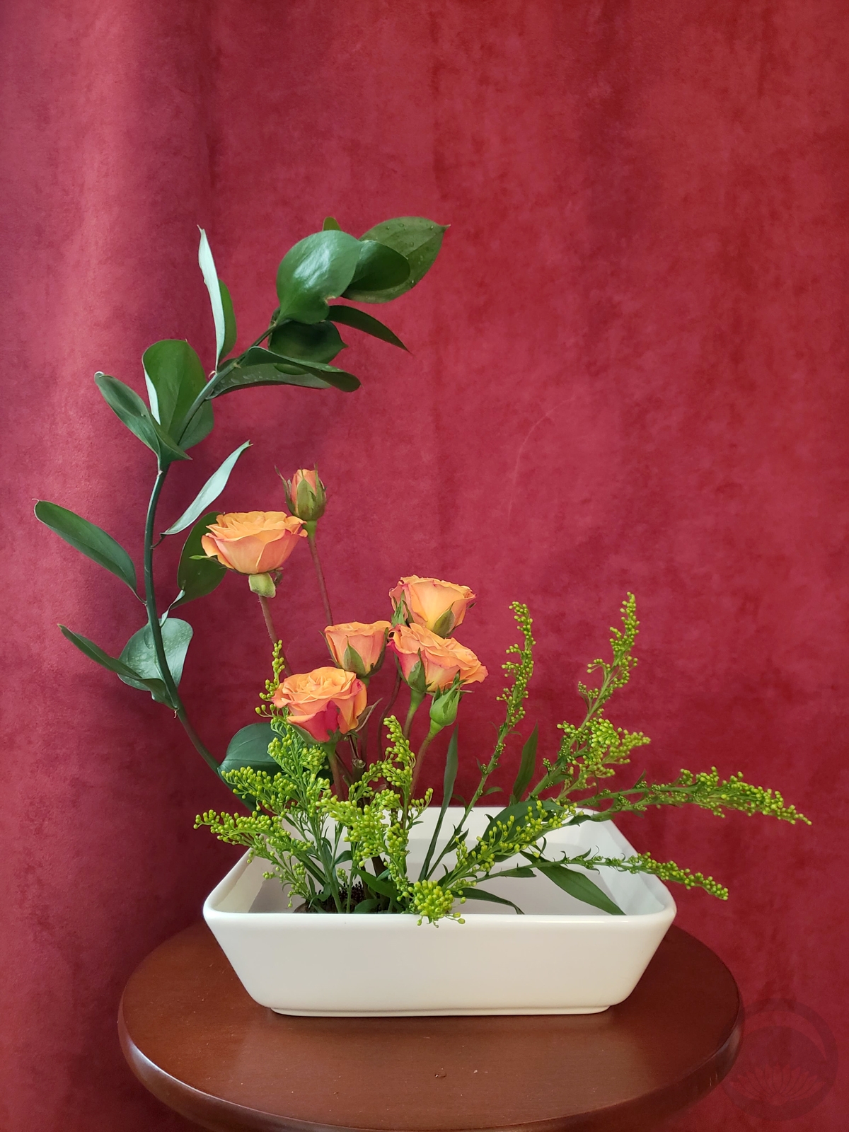
I finally had the time and money to stop by the florist’s today to see if anything inspired me. After a bit of browsing I came across these gorgeous miniature roses that reminded me of autumn foliage. It’s actually been snowy here for nearly a week already, but I’m determined to ignore that for as long as possible, and I thought they’d make a beautiful farewell to the season.

Alex, the kind and friendly owner of the florist shop, suggested the stem of large, shiny green leaves as some contrast foliage, and they look great. I’ve sadly forgotten what they’re called. I also wanted to practice forcing a curve in a stem without breaking it, and I think I’ve finally got the hang of it! The branch was originally perfectly straight, but I managed to get a nice, natural-looking curve to frame out the roses perfectly. It was feeling a little bit empty so I picked up some of this fluffy yellow plant at the flower counter in the pharmacy to fill it in a little bit, and it feels much more balanced now.

I’ve missed practicing my ikebana, and I feel like things generally weren’t flowing as well as they used to because I was rusty. But this turned out very much how I’d envisioned it, and I think it features the flowers perfectly, so I’m quite happy.

October Rust – MonoKimono Challenge & Fudangi First Friday

I’m cheating today. Someone alert the authorities! Typically, the #MonoKimono challenge occurs on the last weekend of the month, and Fudangi First Friday occurs on, well, the first Friday. However, I had other things on my mind this past weekend, and I know this weekend is going to be quite busy, so I figured I’d take advantage of a free afternoon and combine the two smack in the middle of the week.

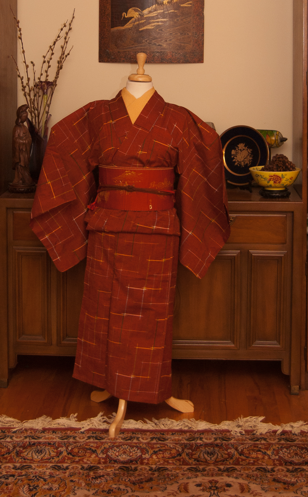
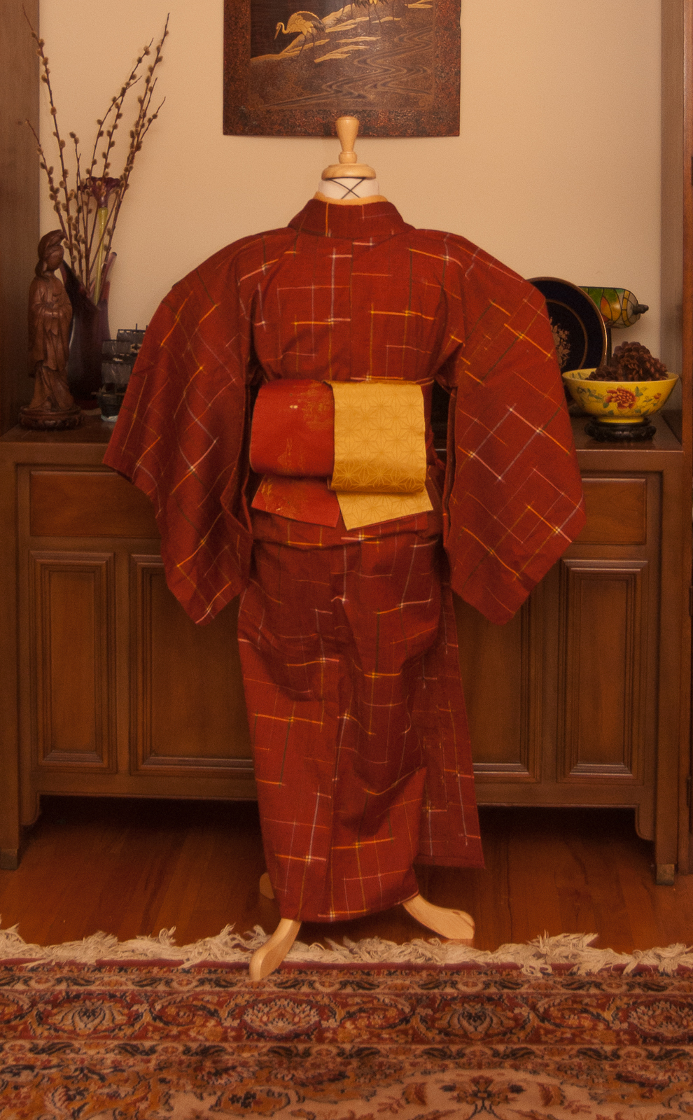
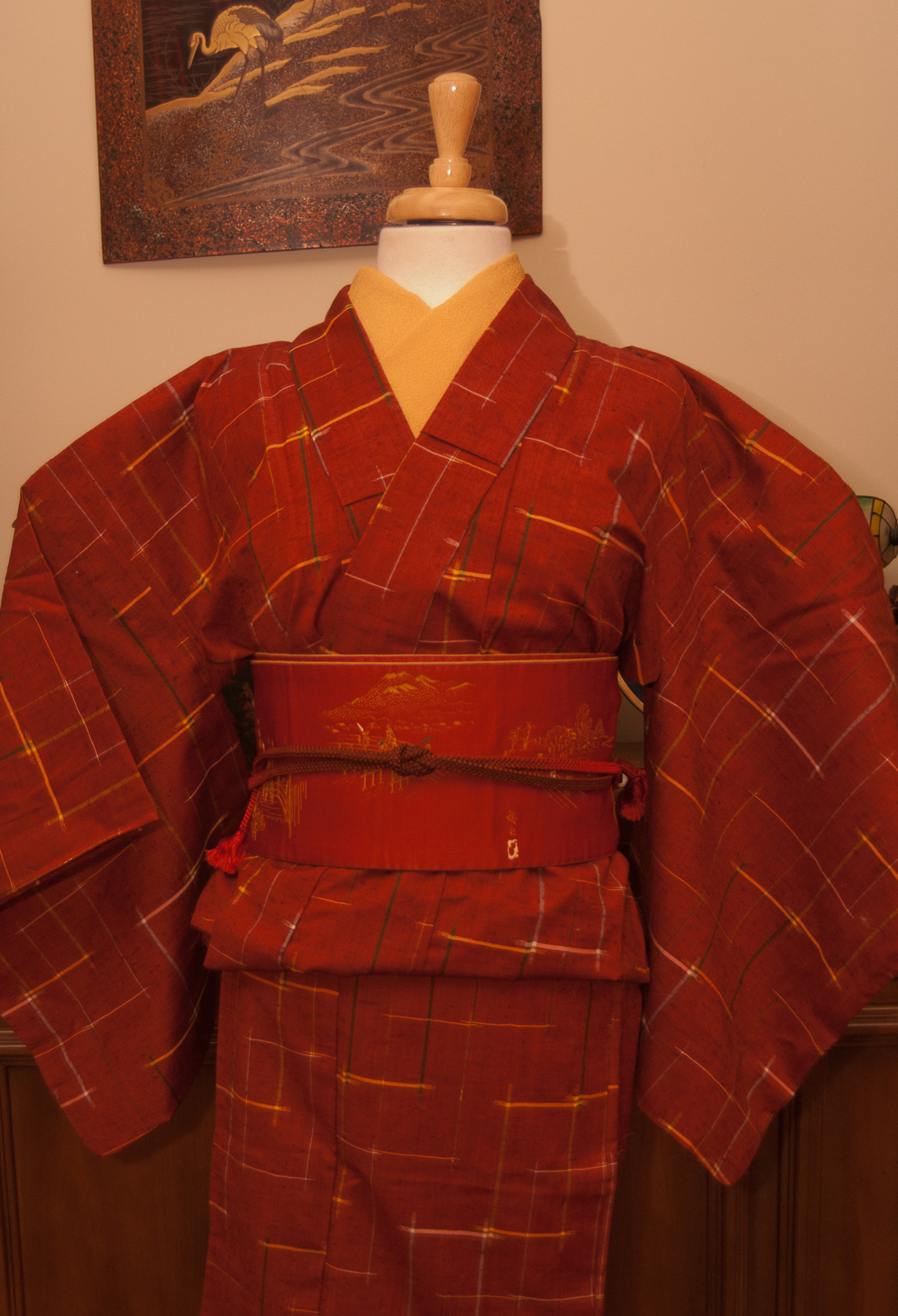
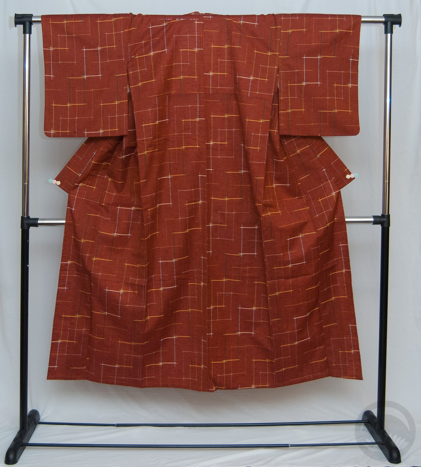
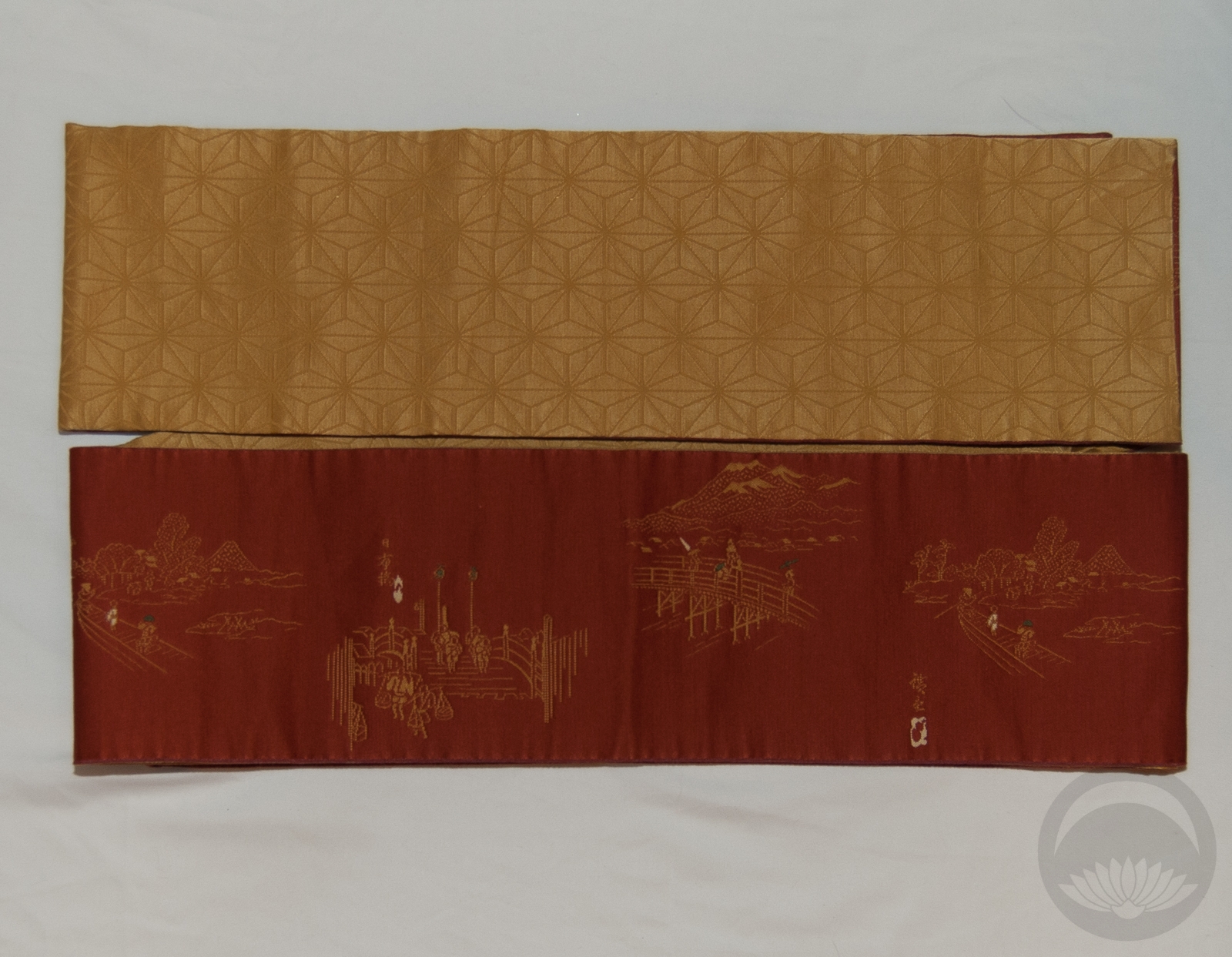
It’s finally, mercifully, starting to feel like Autumn here so that was my jumping-off point. I had to build an outfit that was both casual and monochrome, so it felt like the right time to bust out my rusty red-orange wool komon. My Tokaido hanhaba obi is an absolute spot on match for the kimono, even down to the yellow accent colour matching the yellow weave.

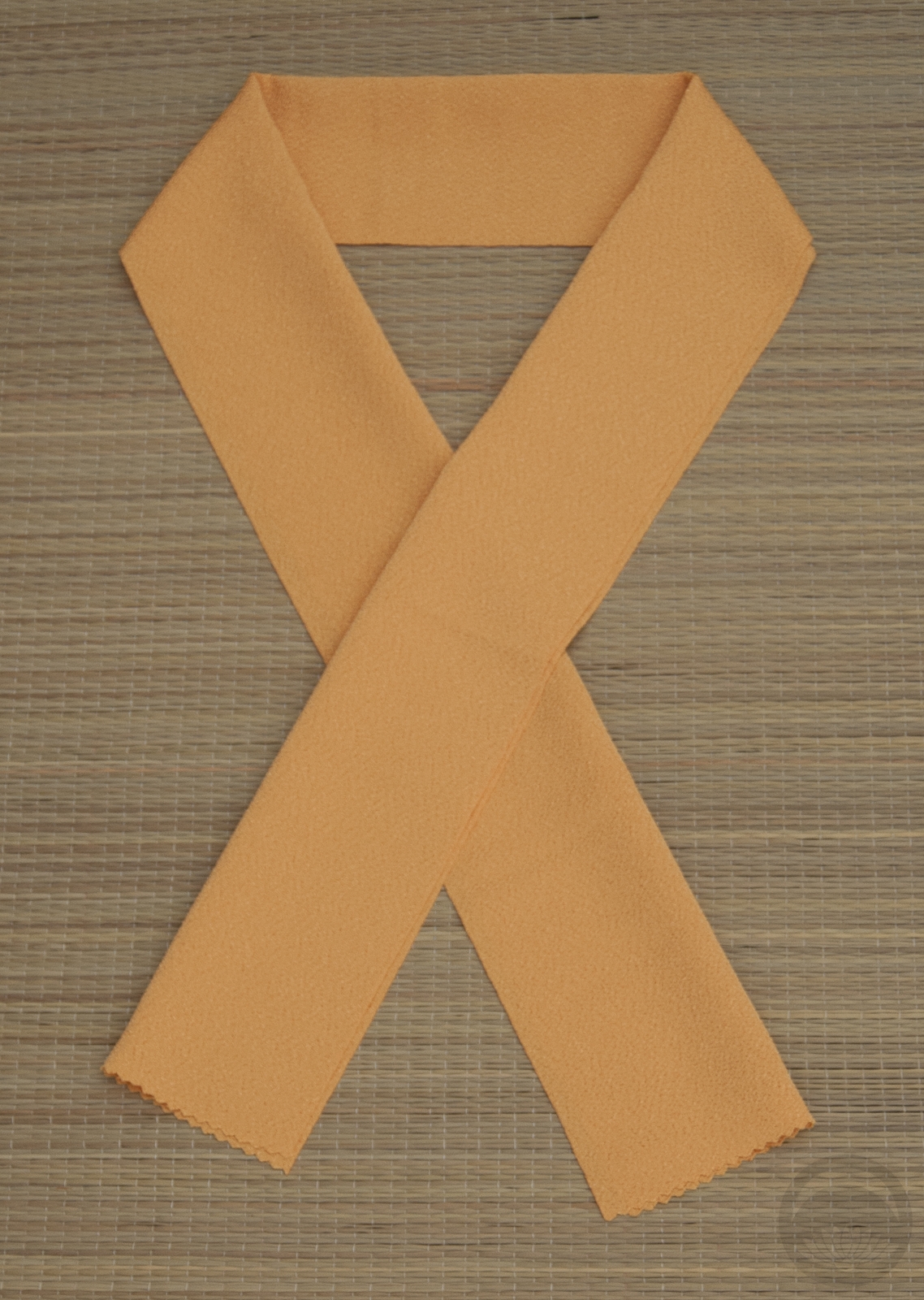
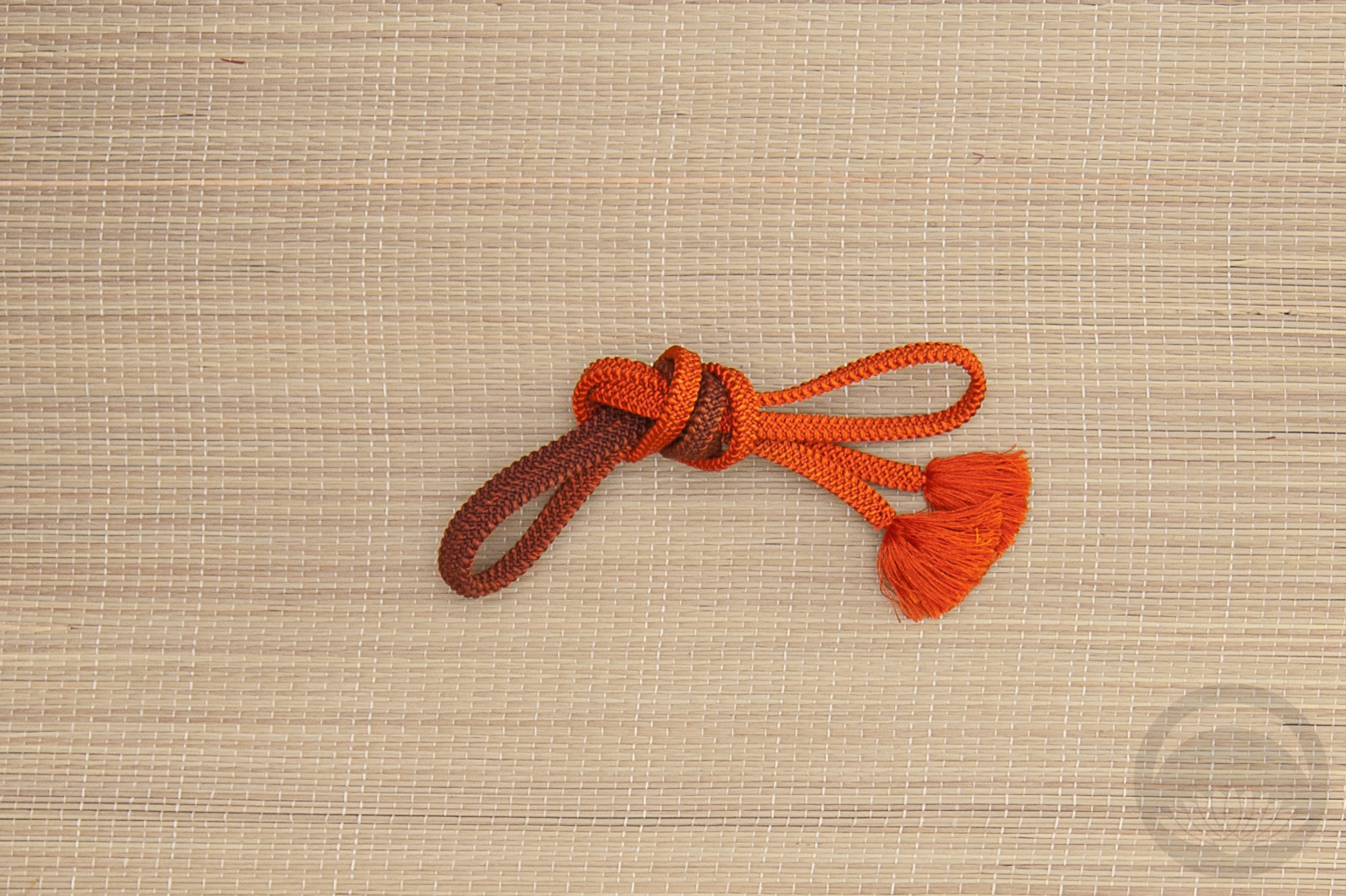
I’ve seen this sort of hanhaba musubi that almost looks like a miniature otaiko and wanted to give it a shot. It worked out quite well, I think. I also like the pop of contrast the yellow side offers – it echoes the yellow han-eri on the front view and helps draw attention to the subtle pattern in the kimono itself. I still think it’s subtle enough and in a close enough colour range to count as monochrome, too. While an obijime isn’t a necessity with this sort of an outfit, I did need it for this particular musubi and I just happened to have one that was another perfect match. I’m pretty sure this is the most monochrome outfit I’ve put together for this challenge so far.

Another reason I wanted to get this outfit on the mannequin is that I have something very neat in the works, and wanted her in something that felt seasonal and was nice to look at but also was very much a “background” feel and not something ornate that would steal the focus away. I’m being evasive now, but I promise I’ll tell you all what it’s for very soon!

Items used in this coordination

The Joker

I did Batman last weekend, but I couldn’t very well leave him without a Joker, could I? Translating the clown prince of crime into kimono was no small feat! I knew I wanted to keep the outfit relatively subtle and wearable, like I did with Batman, so I started with the colour scheme.

Purple and green are the Joker’s classic colours, and I pulled in the orange accents from Batman: The Animated Series, which remains my favourite screen adaptation. A big ridiculous orange flower seemed like the perfect accessory. Initially my plan was to use it as an obi decoration, but I preferred up on the collar, where it felt more like a lapel boutonnierere. I went with a plain white haneri as a nod to a white dress shirt you’d wear under a suit. Also, the outfit was colourful enough as-is and didn’t really need more oomph.

[AFG_gallery id=’167′]

I think I did a good job of visually conveying the Joker in all his various incarnations. I’m actually quite proud of that, because as you may or may not know, I am utterly terrified of clowns. So you can imagine how creepy I tend to find the Joker! Oddly enough, harlequins don’t bother me at all, so I am actually very much looking forward to doing something for Harley Quinn! I’ve also got Catwoman and possibly Poison Ivy on the roster. If there’s any famous or infamous Gothamite you’d like to see, do let me know!

Items used in this coordination