
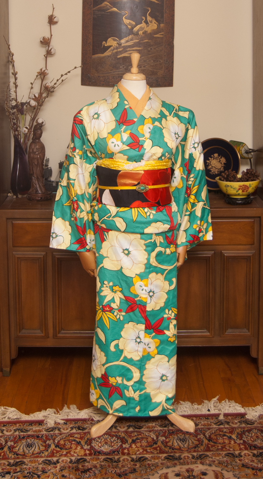
By now you’ve likely heard the viral, catchy, colour-mixing song from Dokodemo Jamboree and either you love it or you hate it. But either way, it’s probably stuck in your head! It was certainly stuck in mine while I was trying to come up with a cute coordination, so I decided to go in a monochrome direction and have a bit of fun making a video to go with this post. I am trying to be a bit more active on short-form reel platforms, but I am old and tired and prefer being behind the camera nowadays. Interacting with my TikTok or Youtube accounts will help me find the motivation to keep up with them.
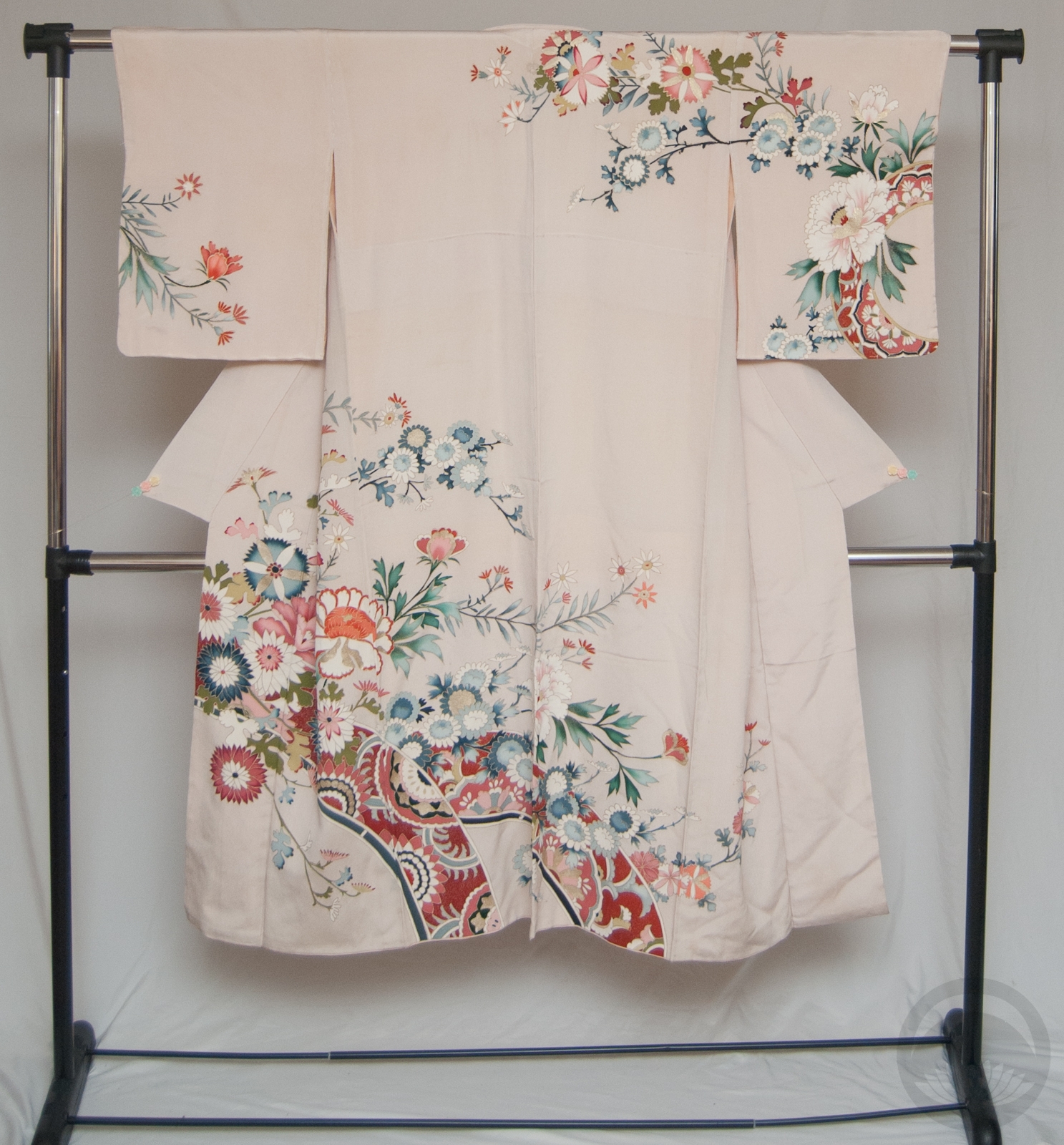
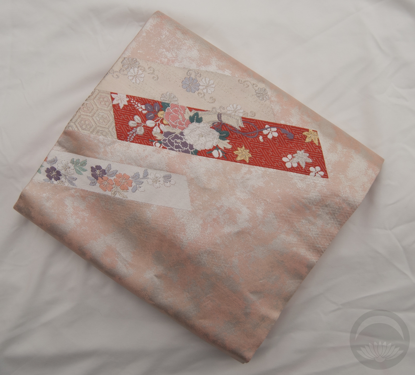
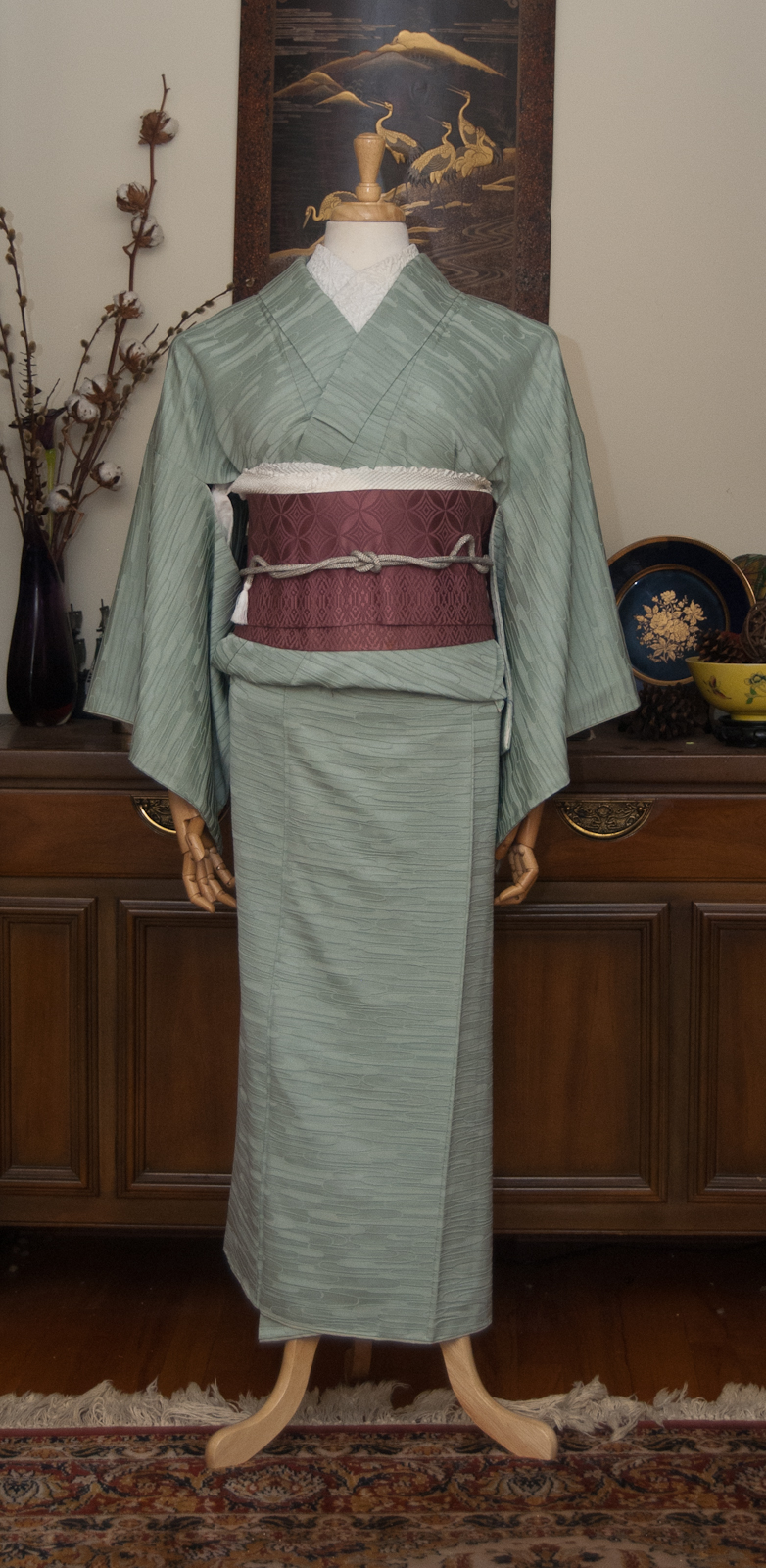
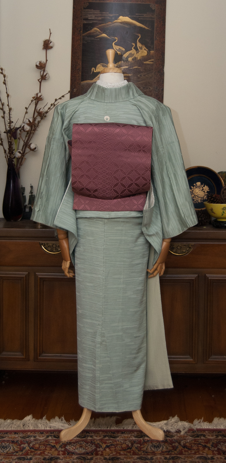
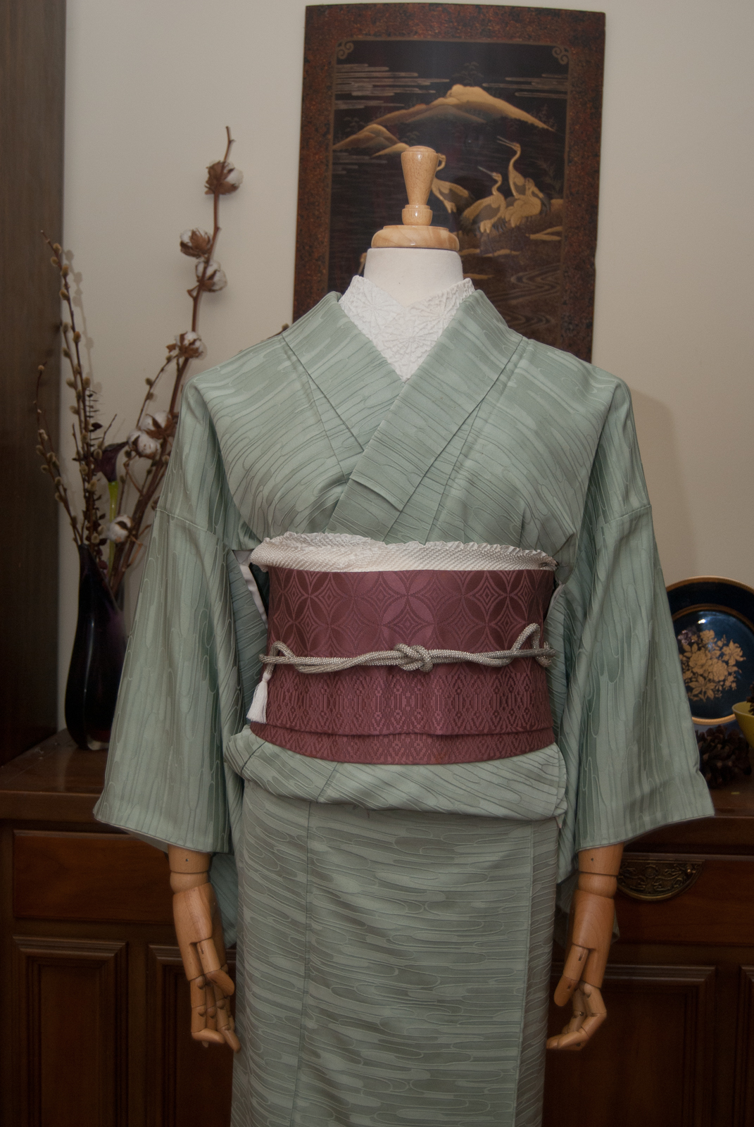
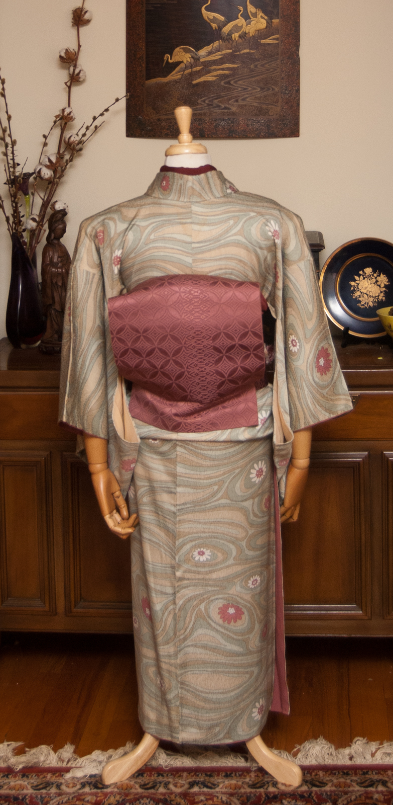
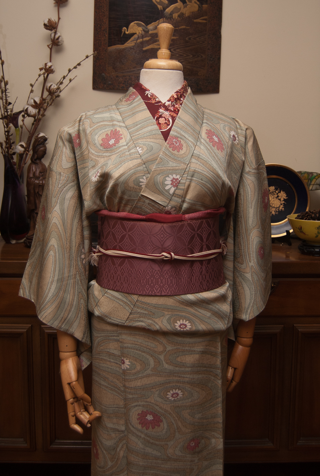
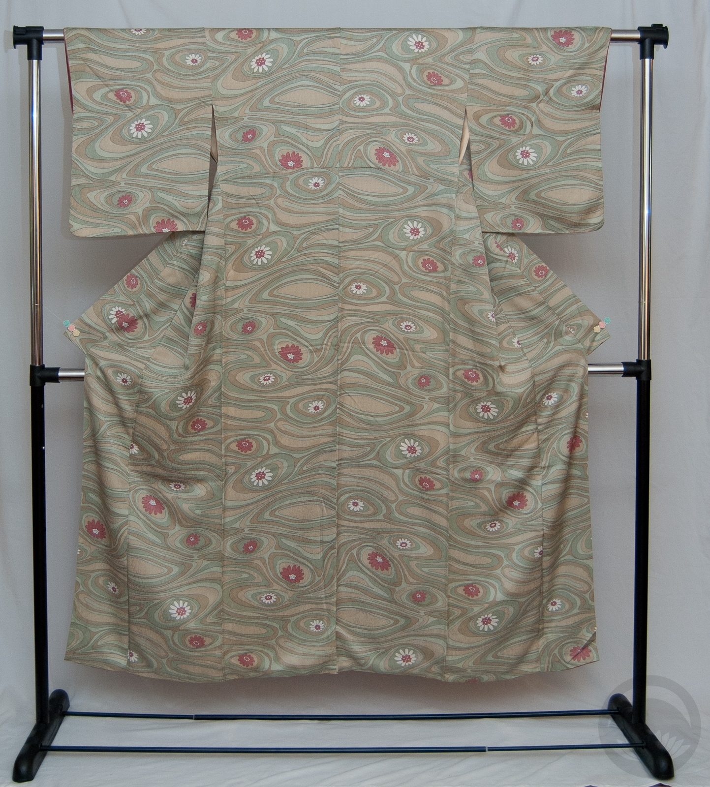
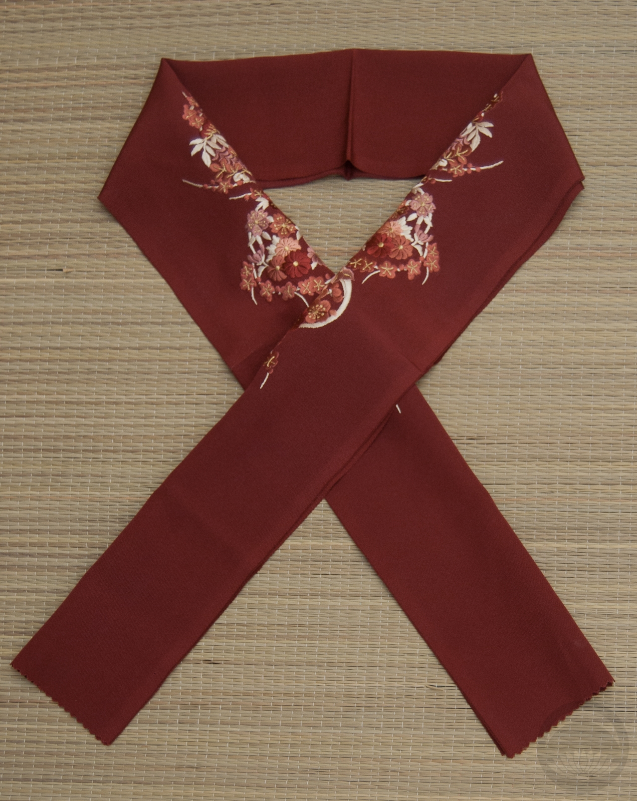
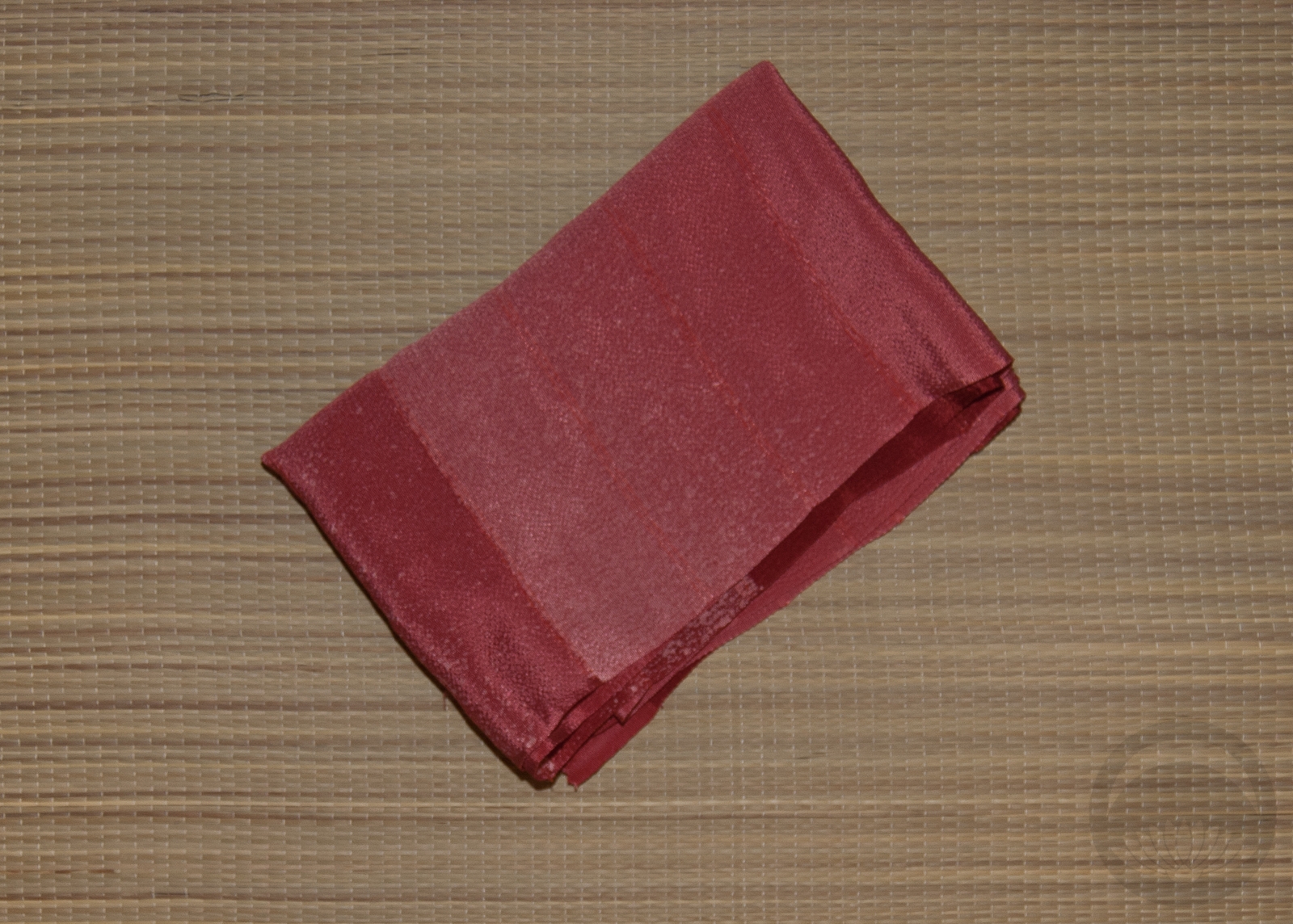
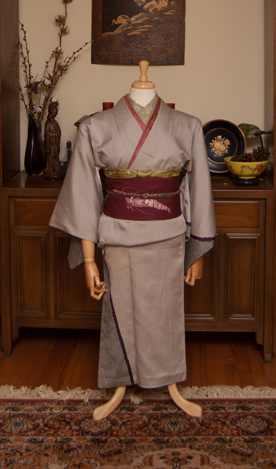
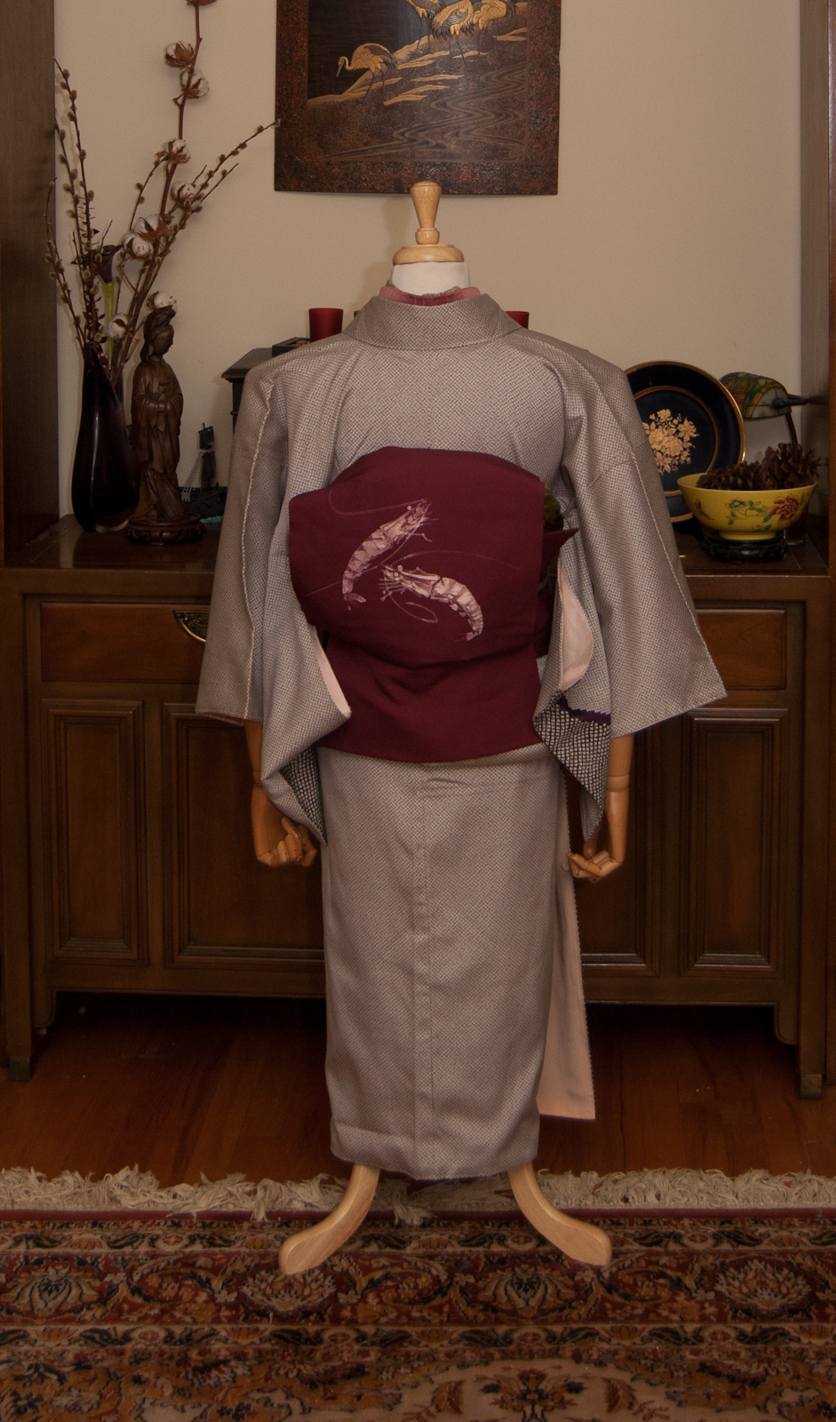
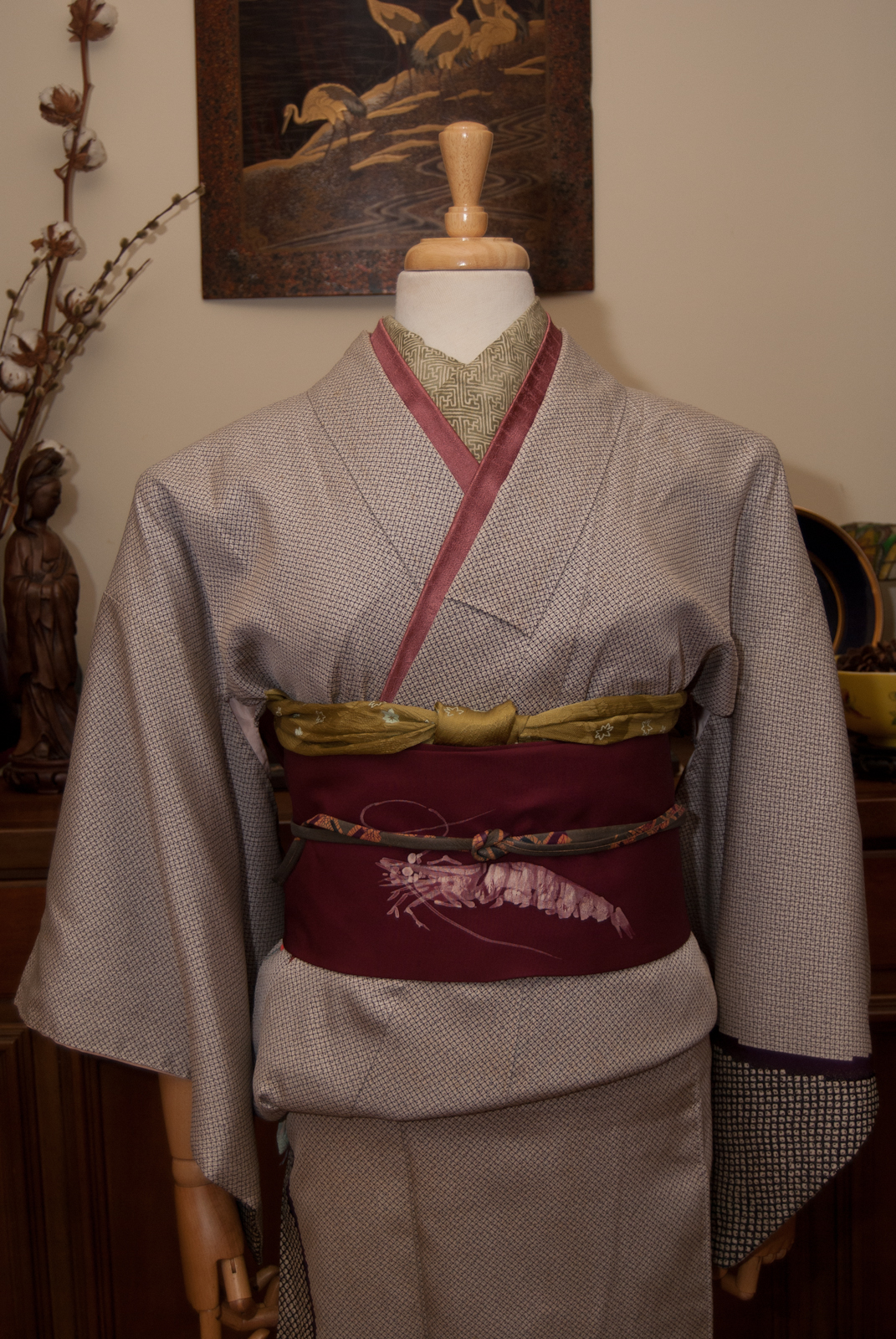
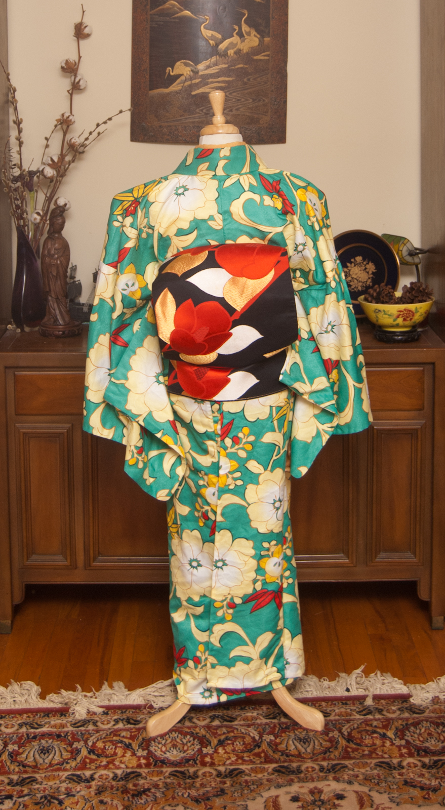
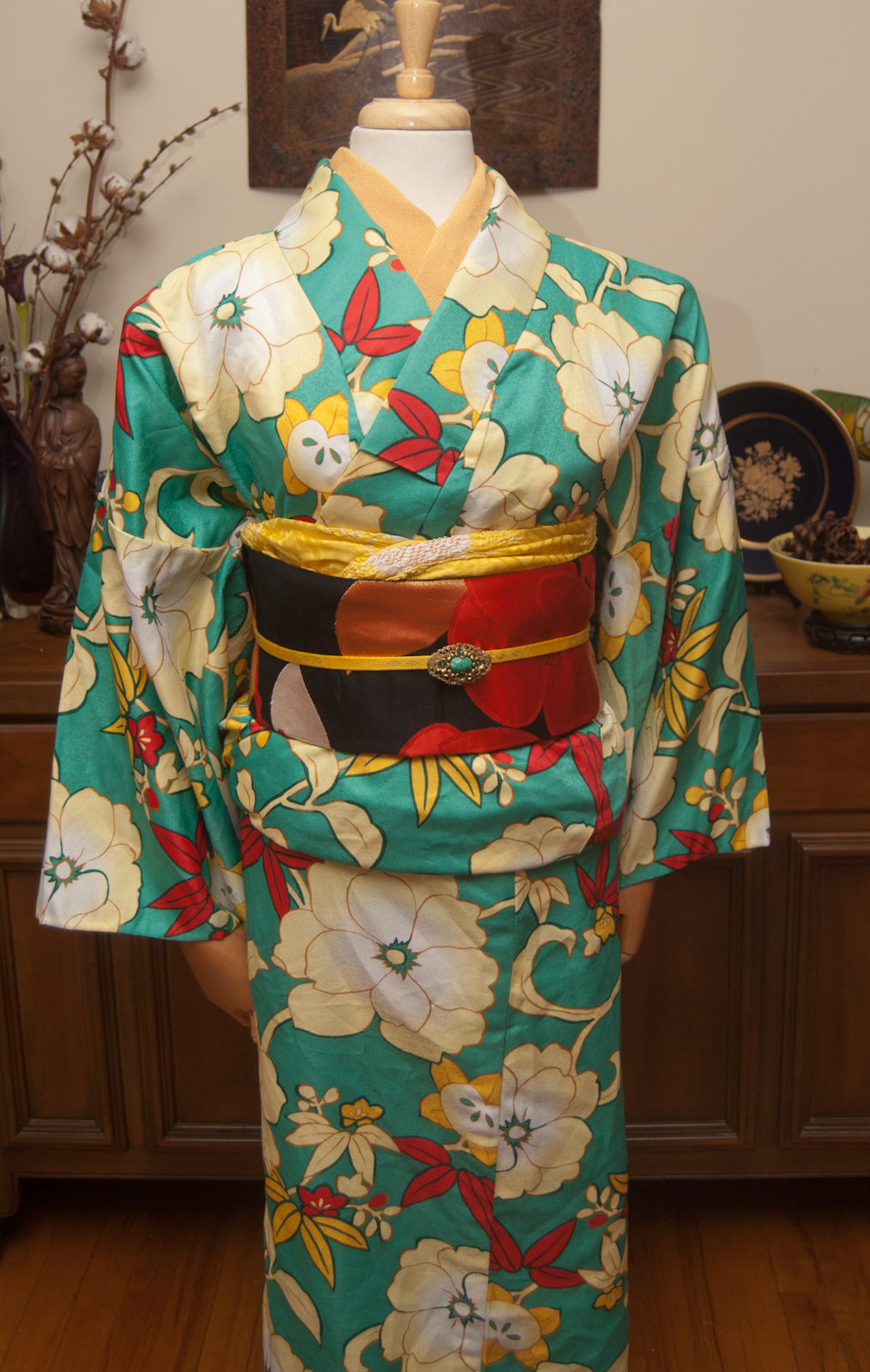
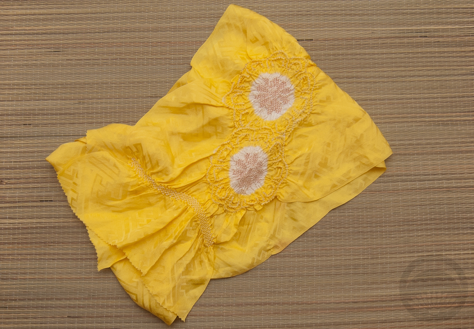
I have plenty of items in multiple colours I could have “combined” to do this, but soft pink is always a really safe and comforting fallback, and I suspected these two pieces, with their warm blush backgrounds and bright pops of colour, would work really well together. While it’s not really “proper” to have a kimono and obi be the exact same like this, you know I love bending the rules. I just made sure the rest of my kitsuke was as perfect as I was capable of assembling considering how out of practice I am.
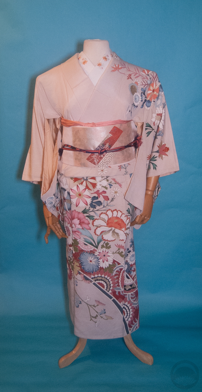
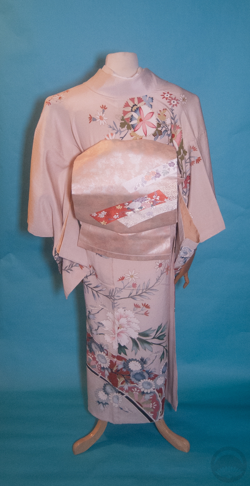
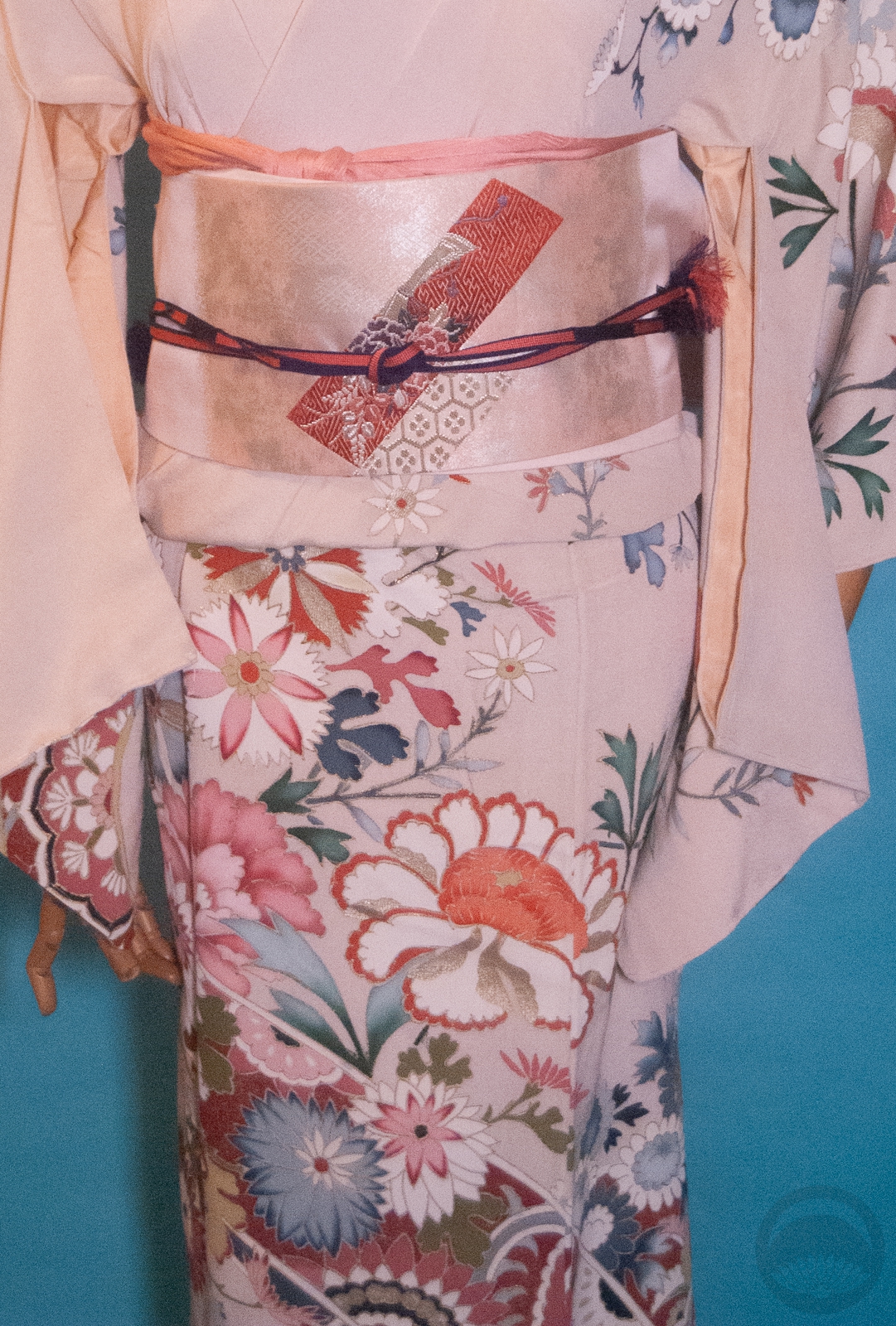
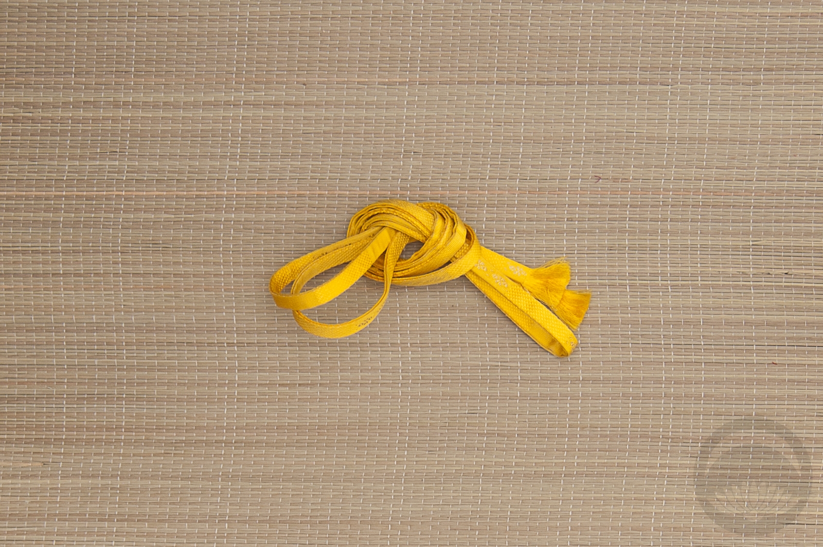
Toss in a few more accessories in a deeper shade of the same salmon pink and voila! It might not be vibrant or “PINKU!”, but it makes me happy and nowadays isn’t that the important part? I have to find joy wherever I can. You should too! Whether that be unconventional combinations, making meme videos, putting a kimono on the fake Labubu you found in a parking lot, or anything else people might deem frivolous or silly. If it brings a smile to your face in these dark times and doesn’t hurt others, do it unapologetically.
Also, I’m trying out a new setup for photos that allows me to work in my bedroom instead of taking over my parents’ living room. I might even be able to bring it with me to California because it all collapses down, but I definitely can’t bring the mannequin. Let me know what you think!
-
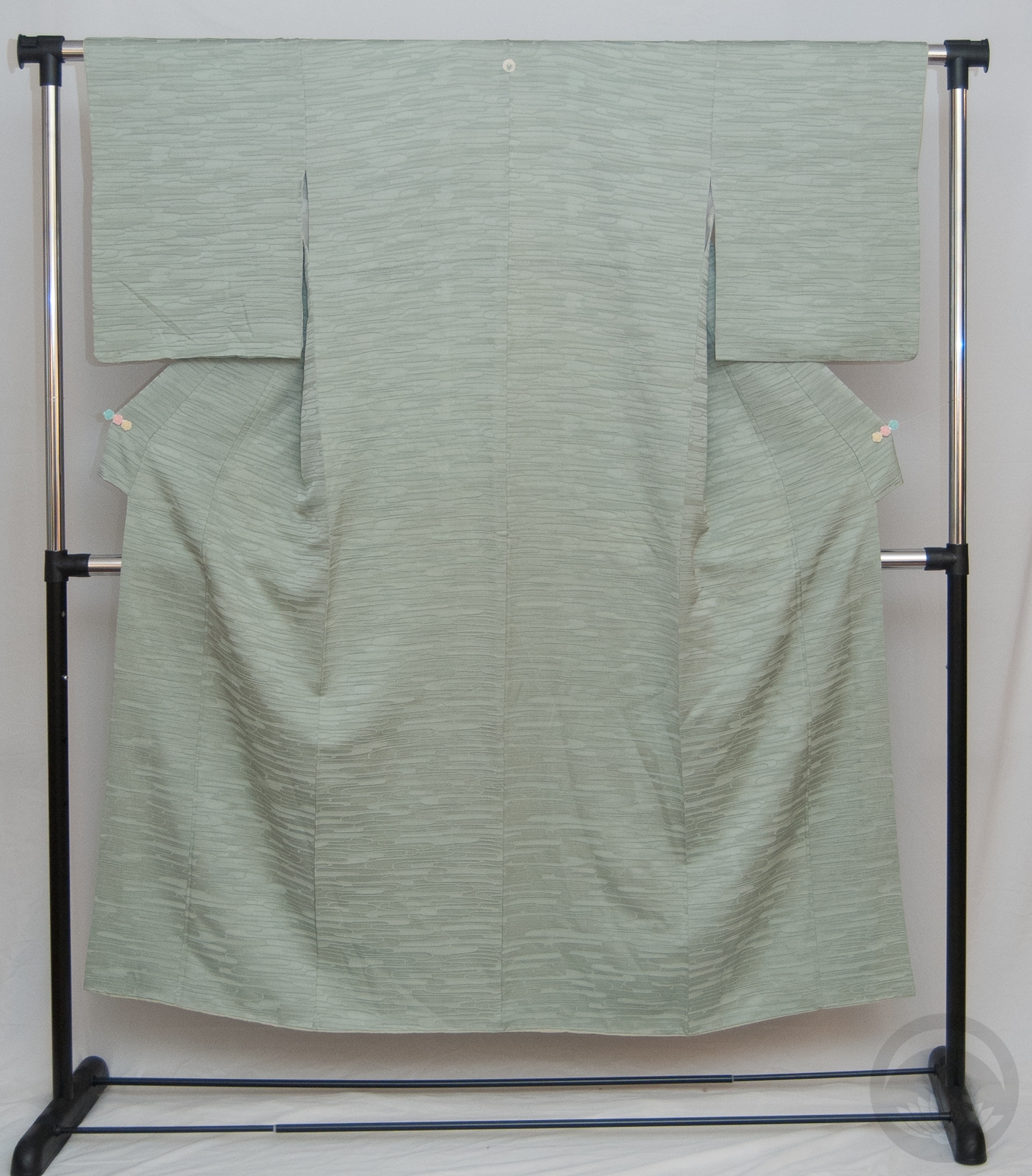
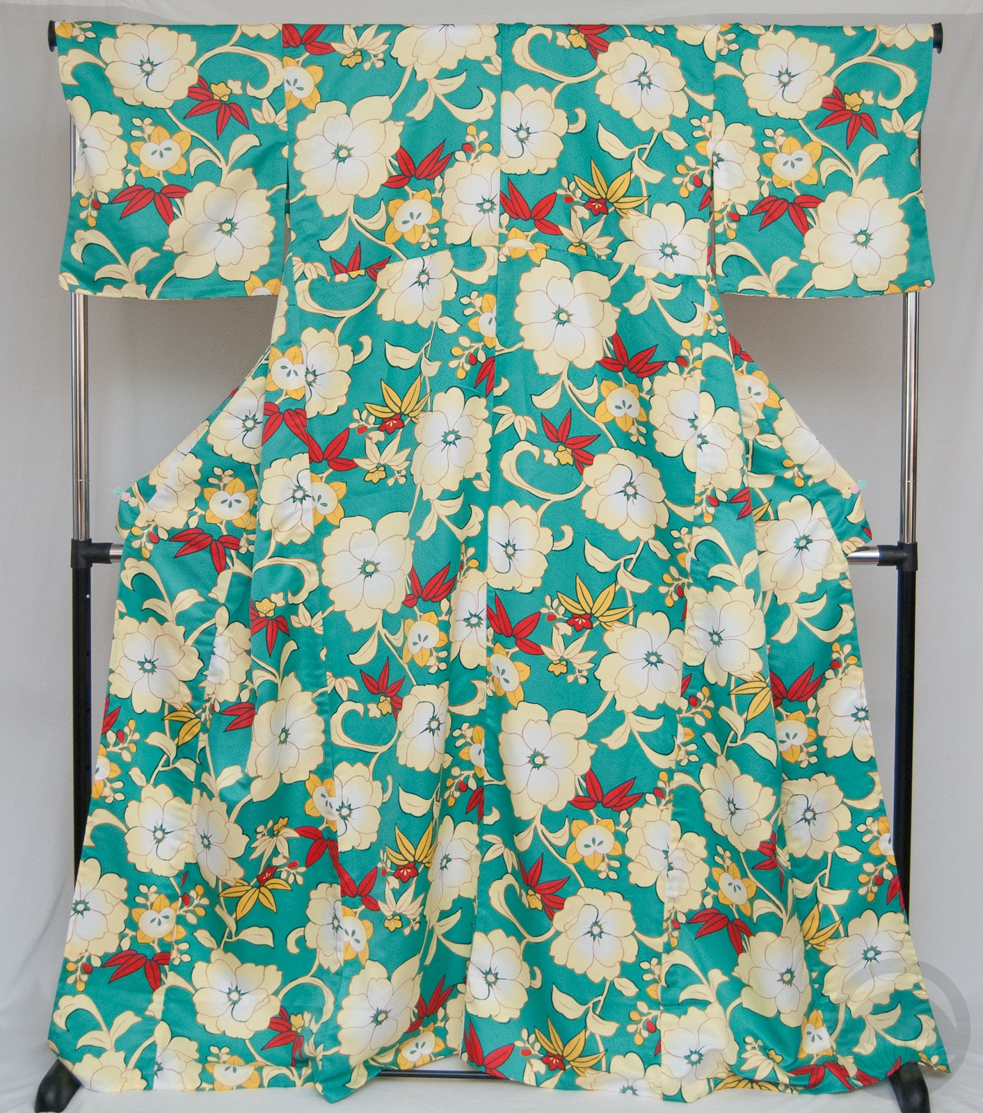
- Blush Showa Floral
-
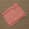
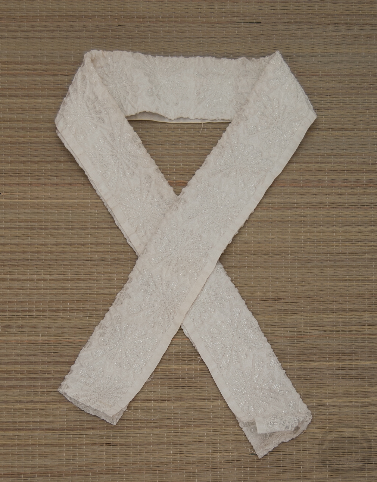
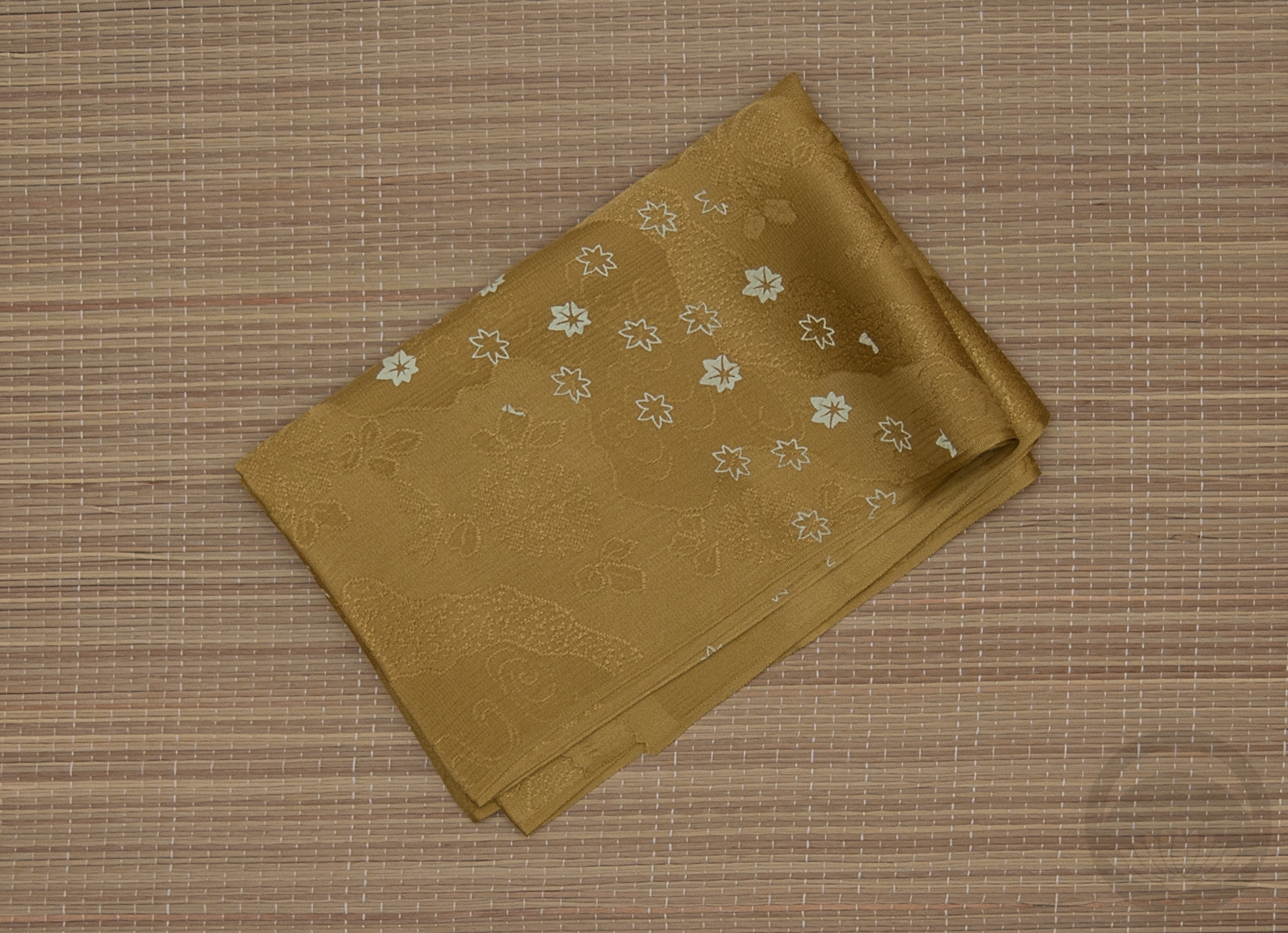
- Pale Pink
-
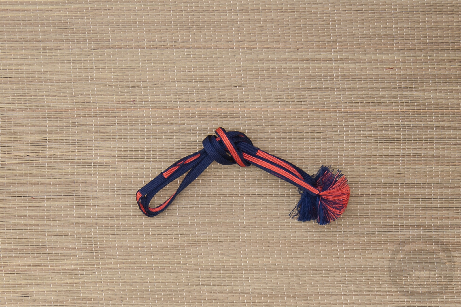
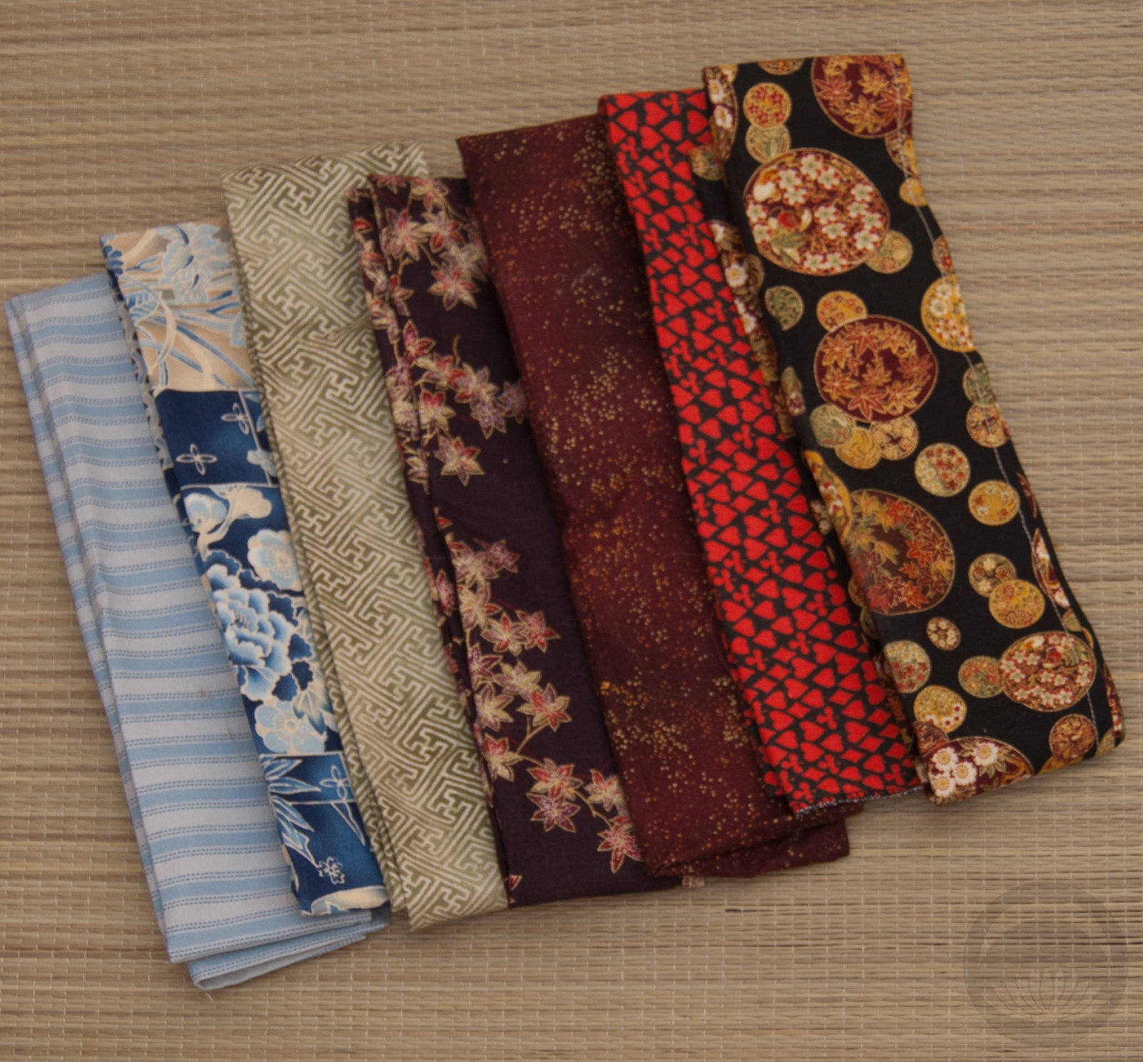
- Navy & Salmon
-
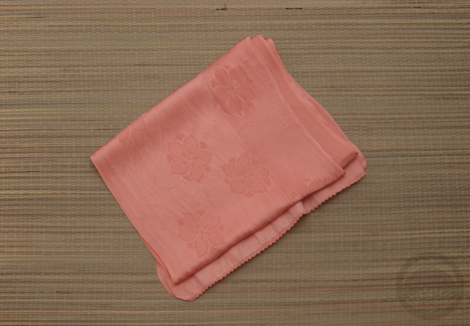
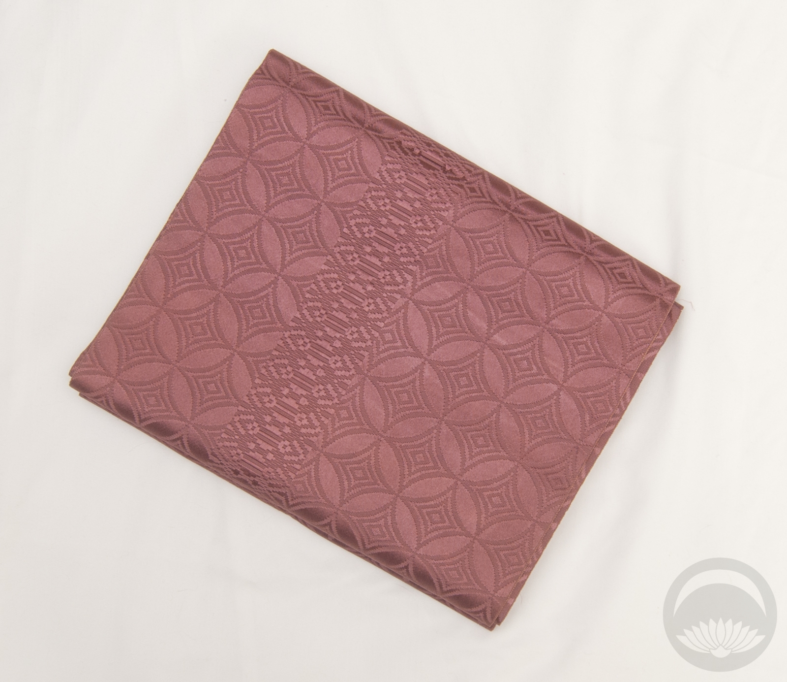
- Salmon Rinzu
-
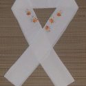
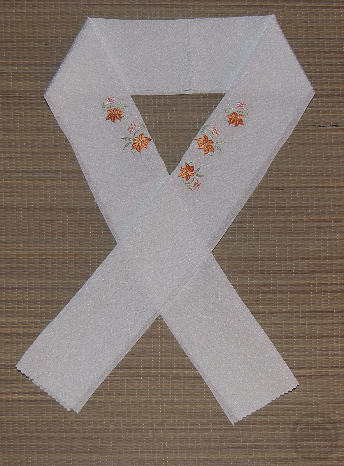
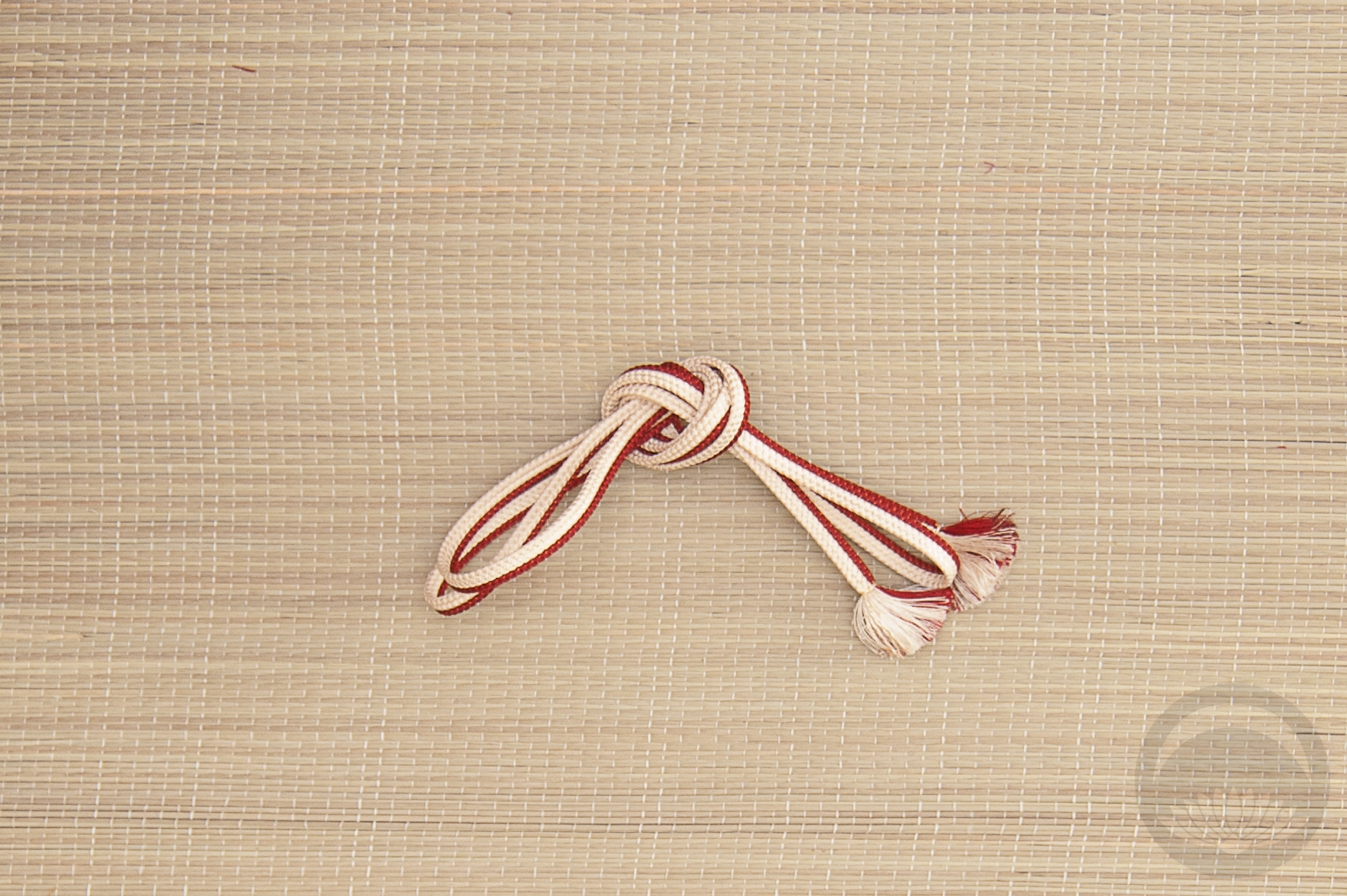
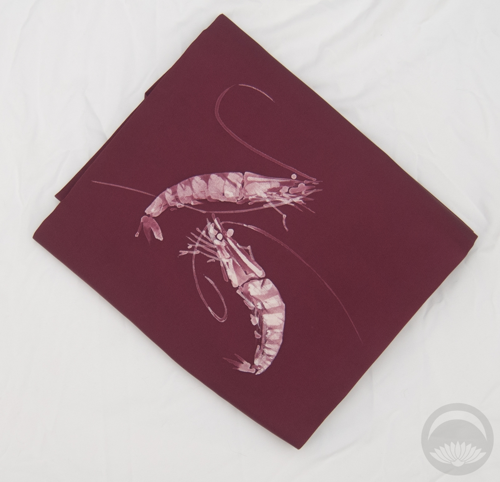
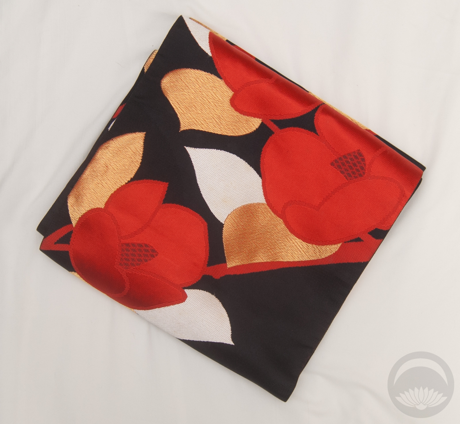
- Salmon Lilies


 Bebe Taian
 CHOKO Blog
 Gion Kobu
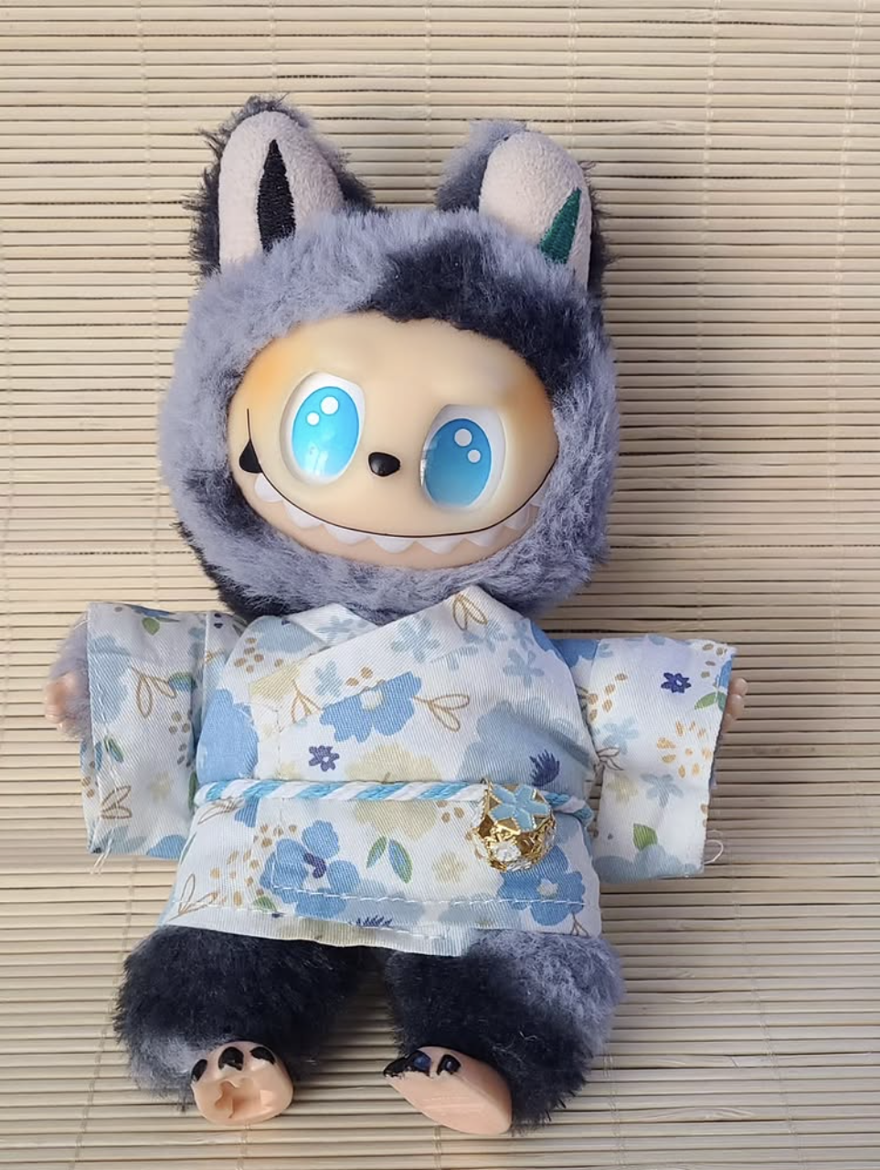