
Yes, I am in the process of getting a US green card. Yes, I plan to move to southern California full-time once that happens. However, I am Canadian through and through and nothing will ever change that. I don’t have blood, I have maple syrup in my veins.
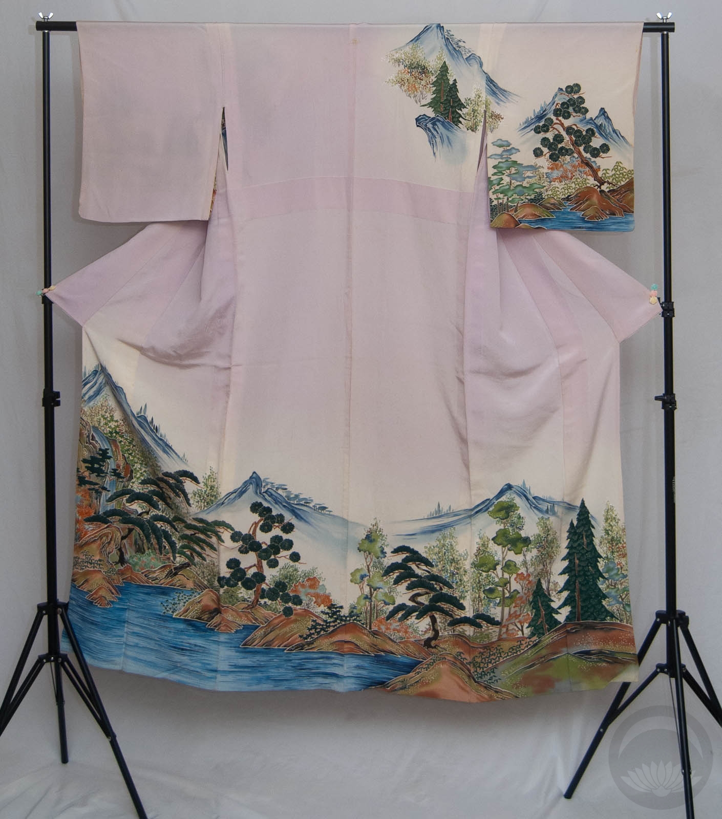
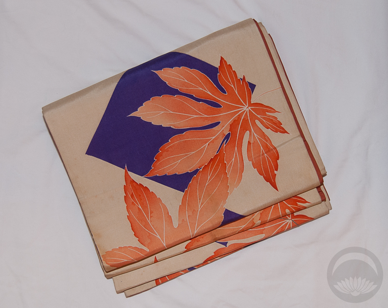
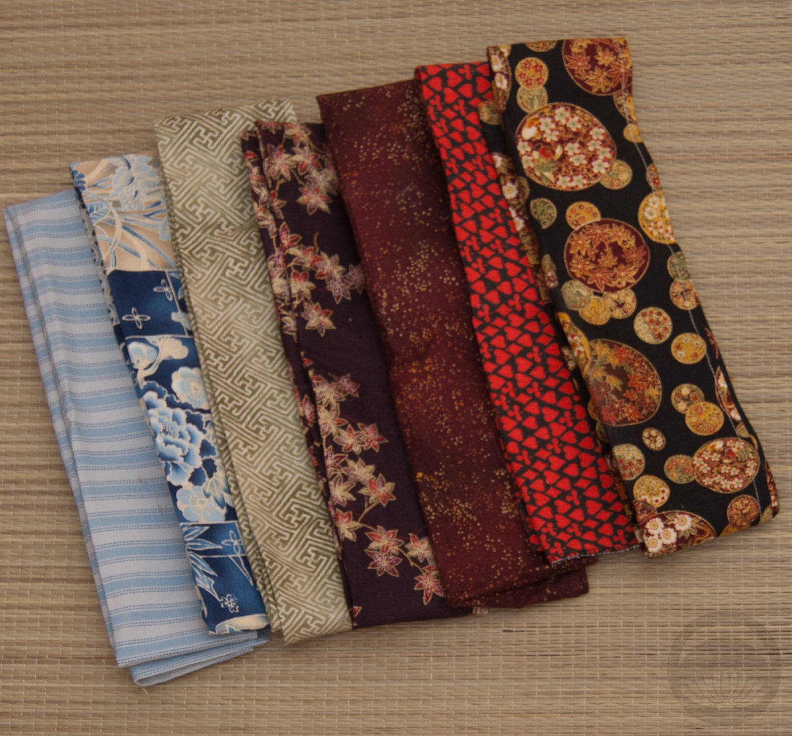
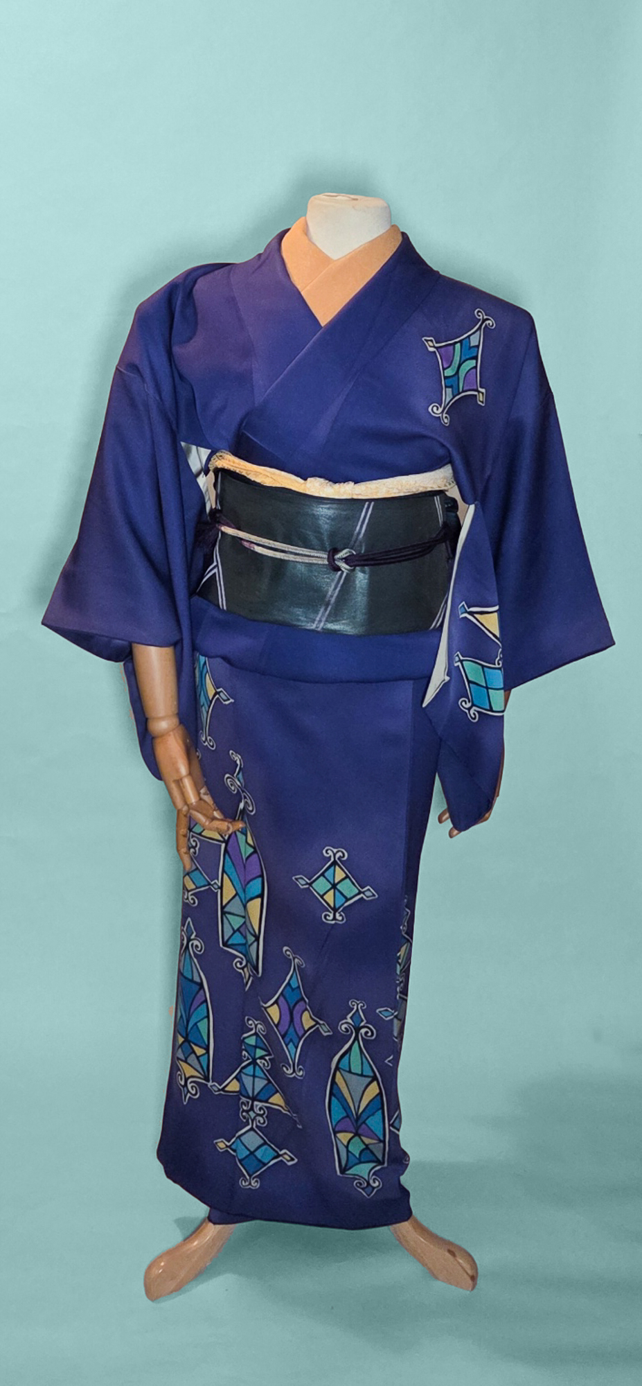
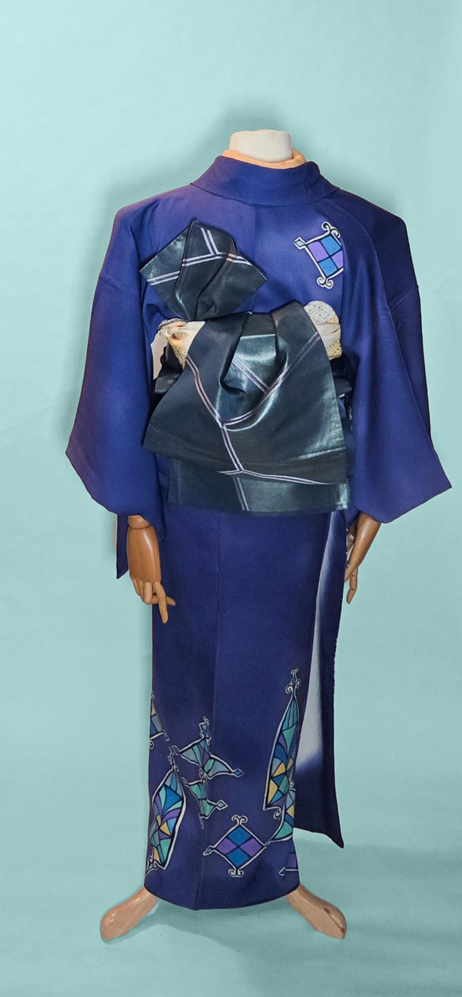
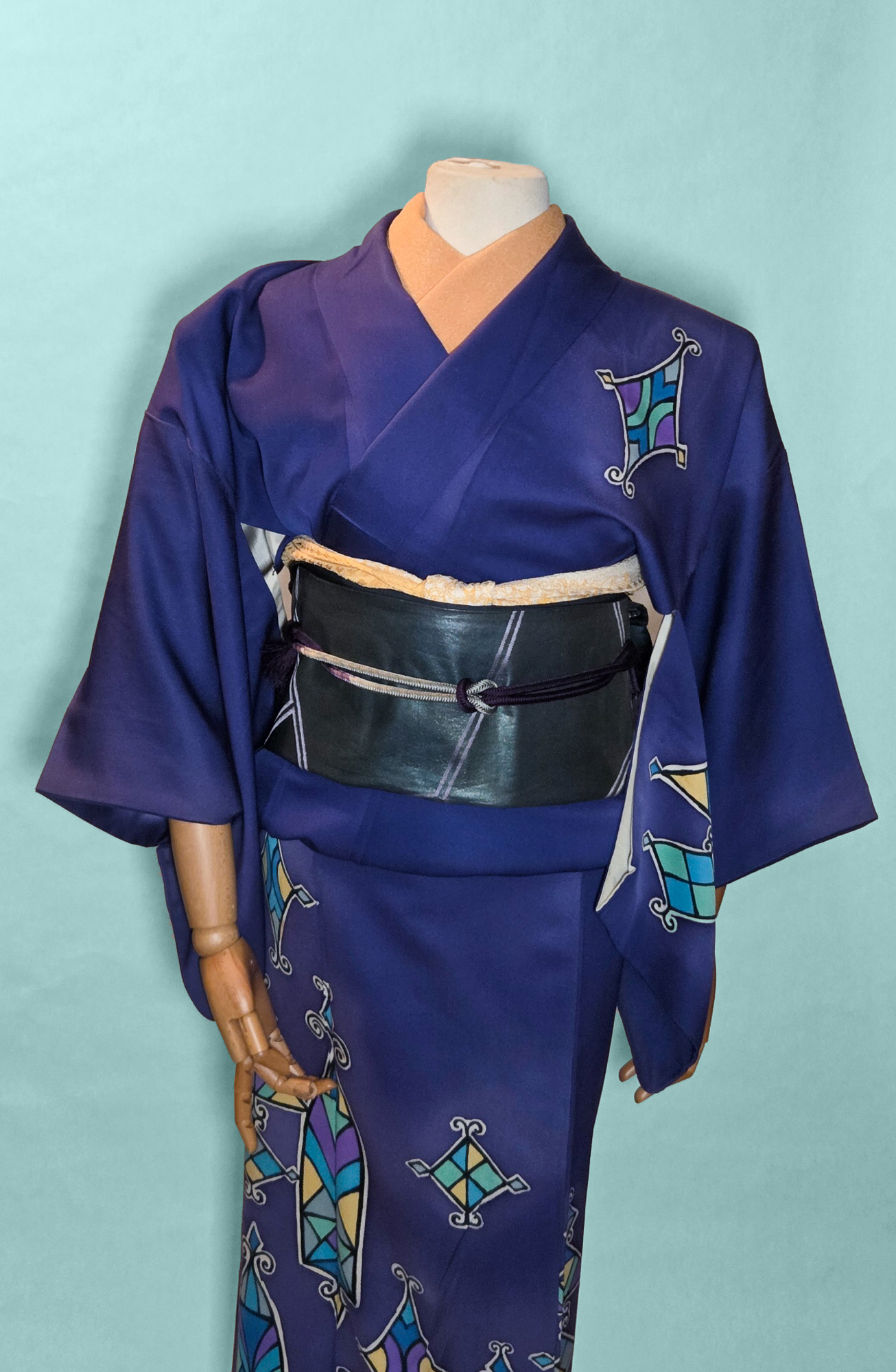
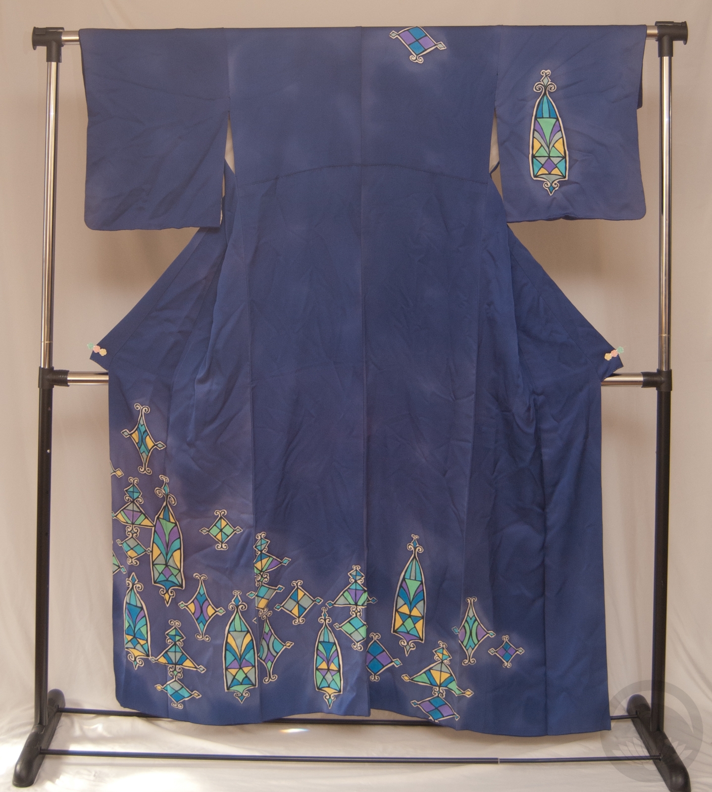
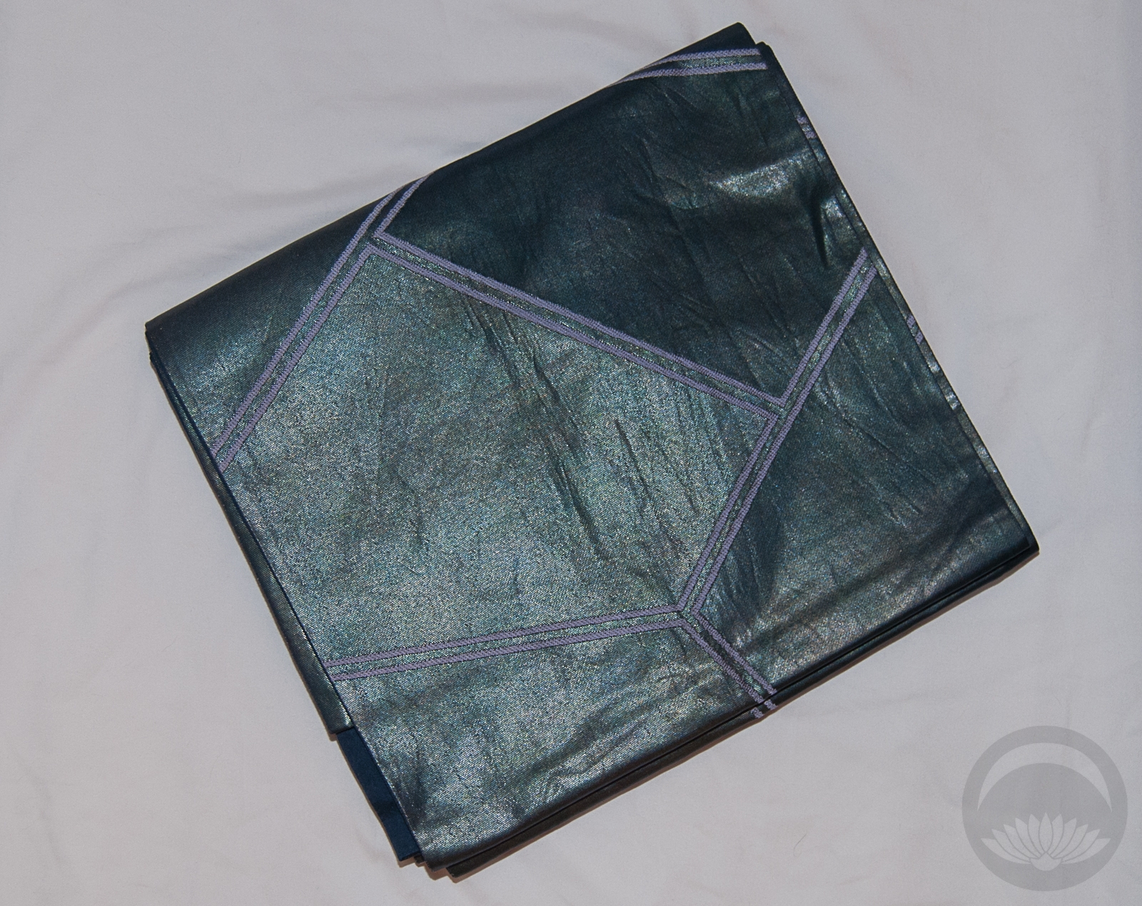
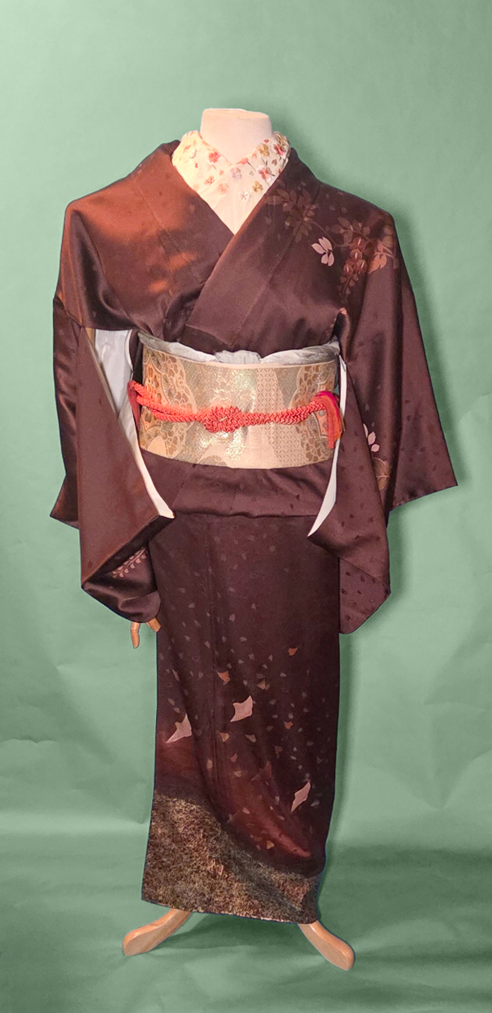
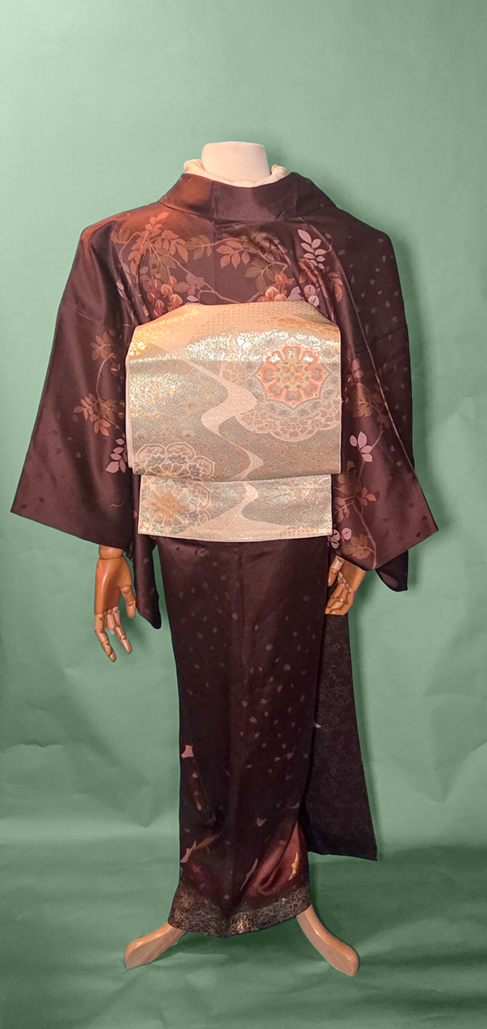
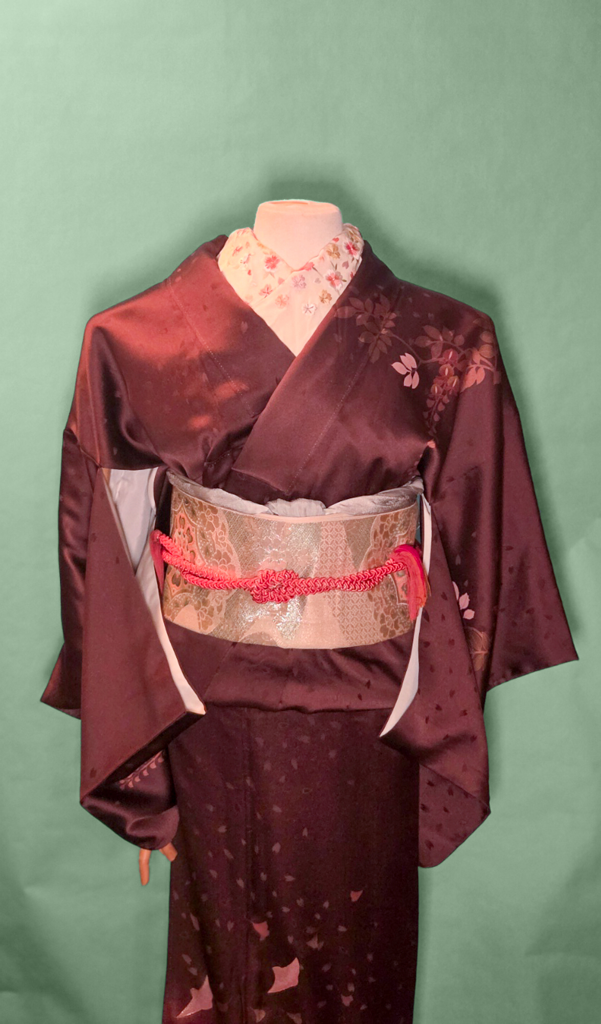
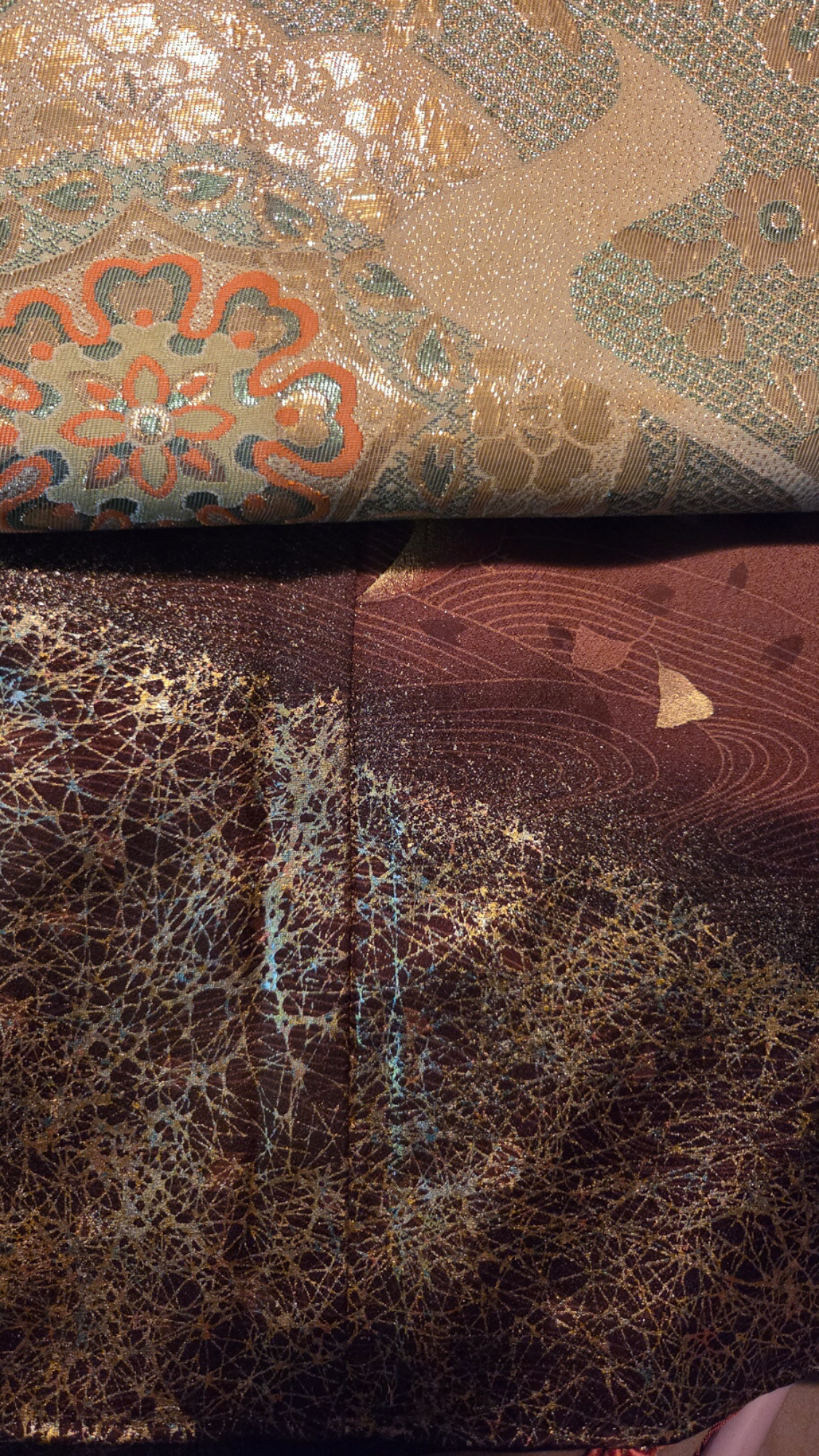
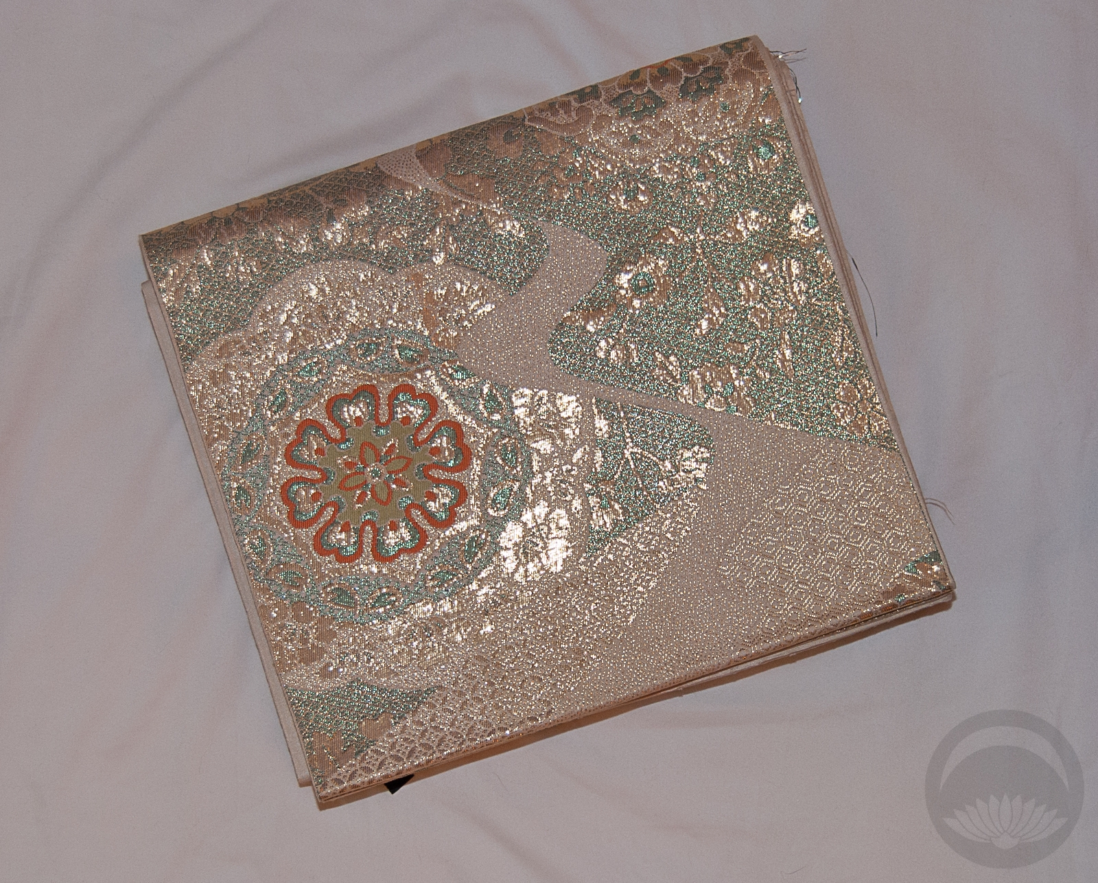
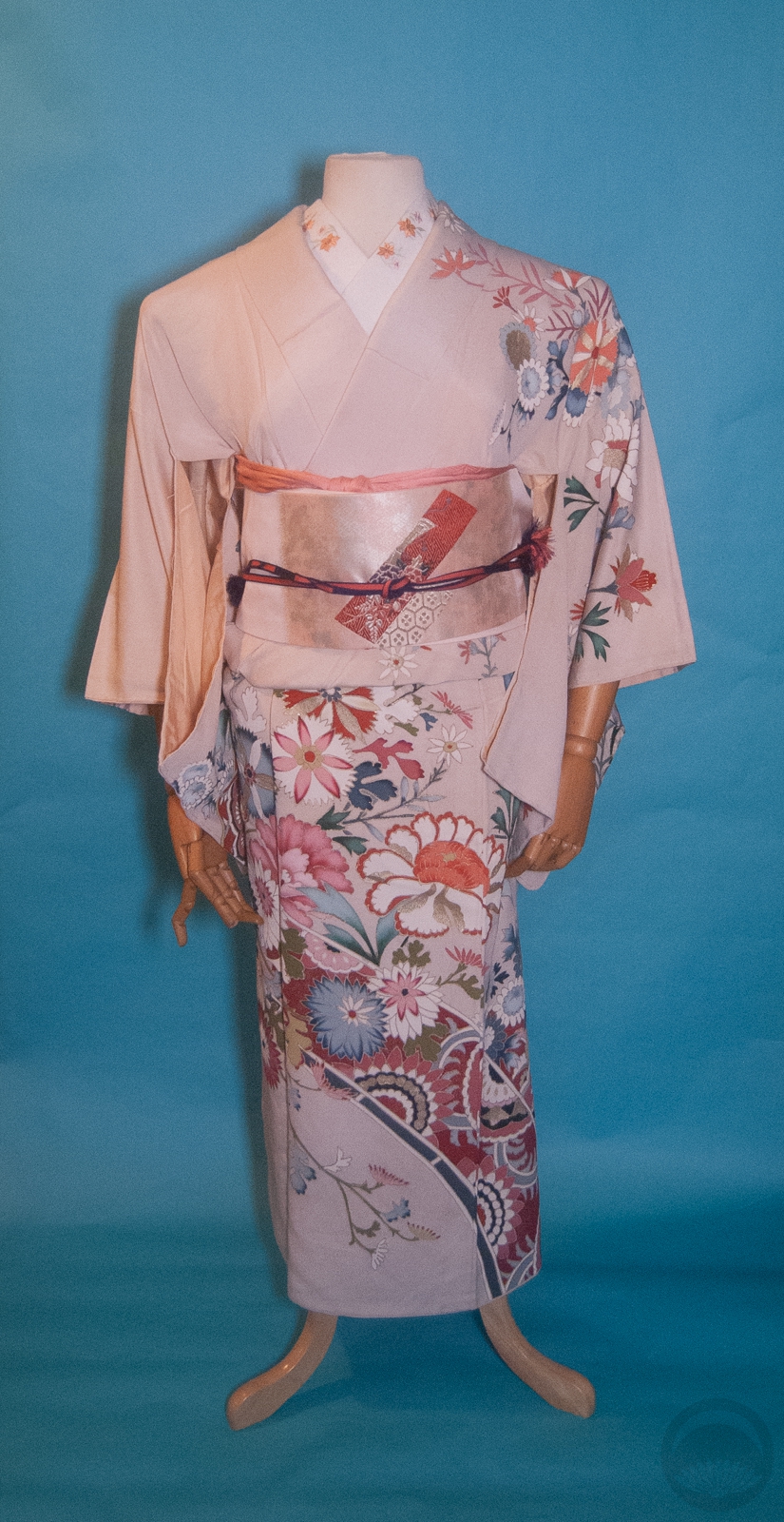
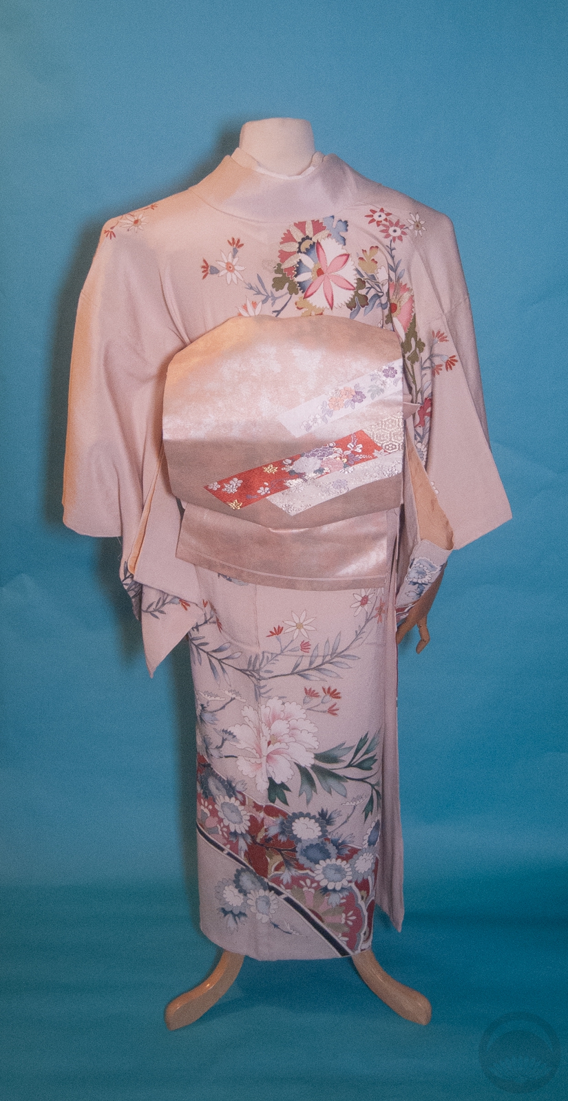
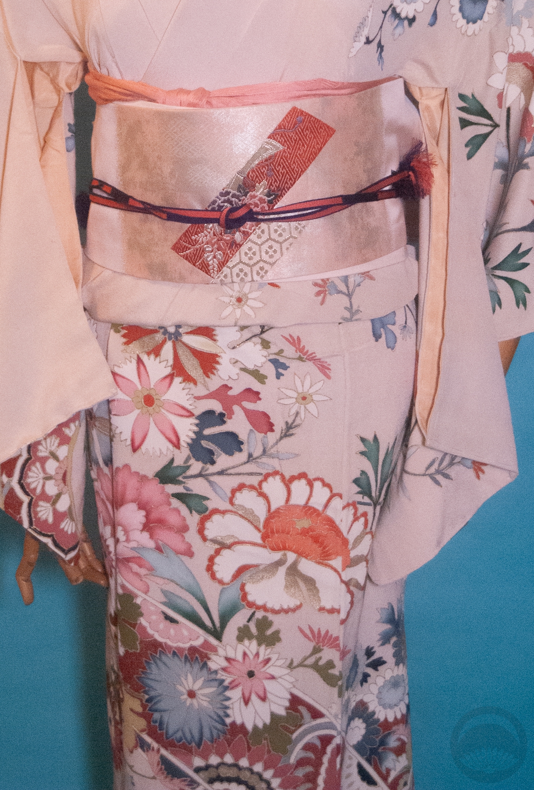
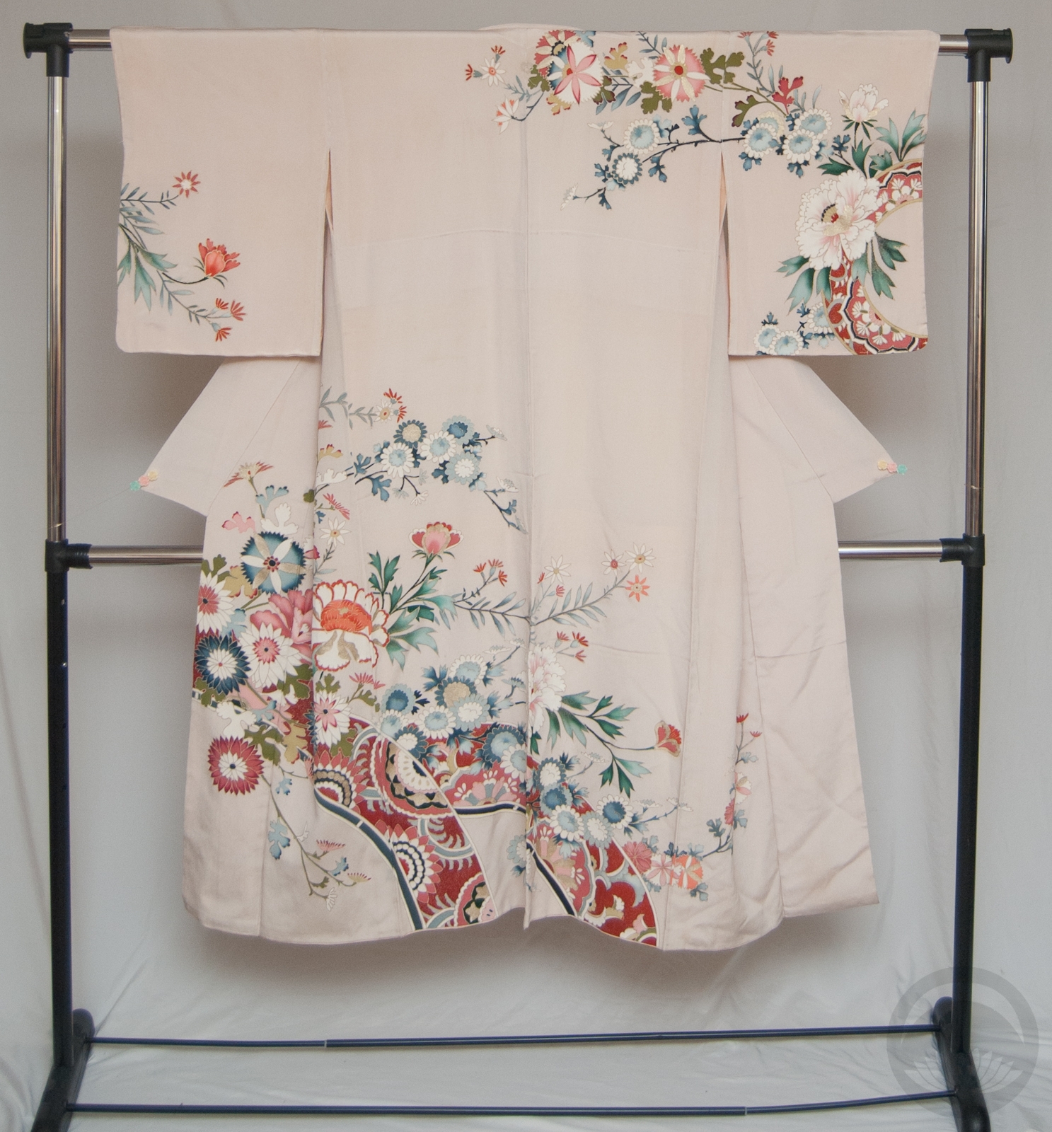
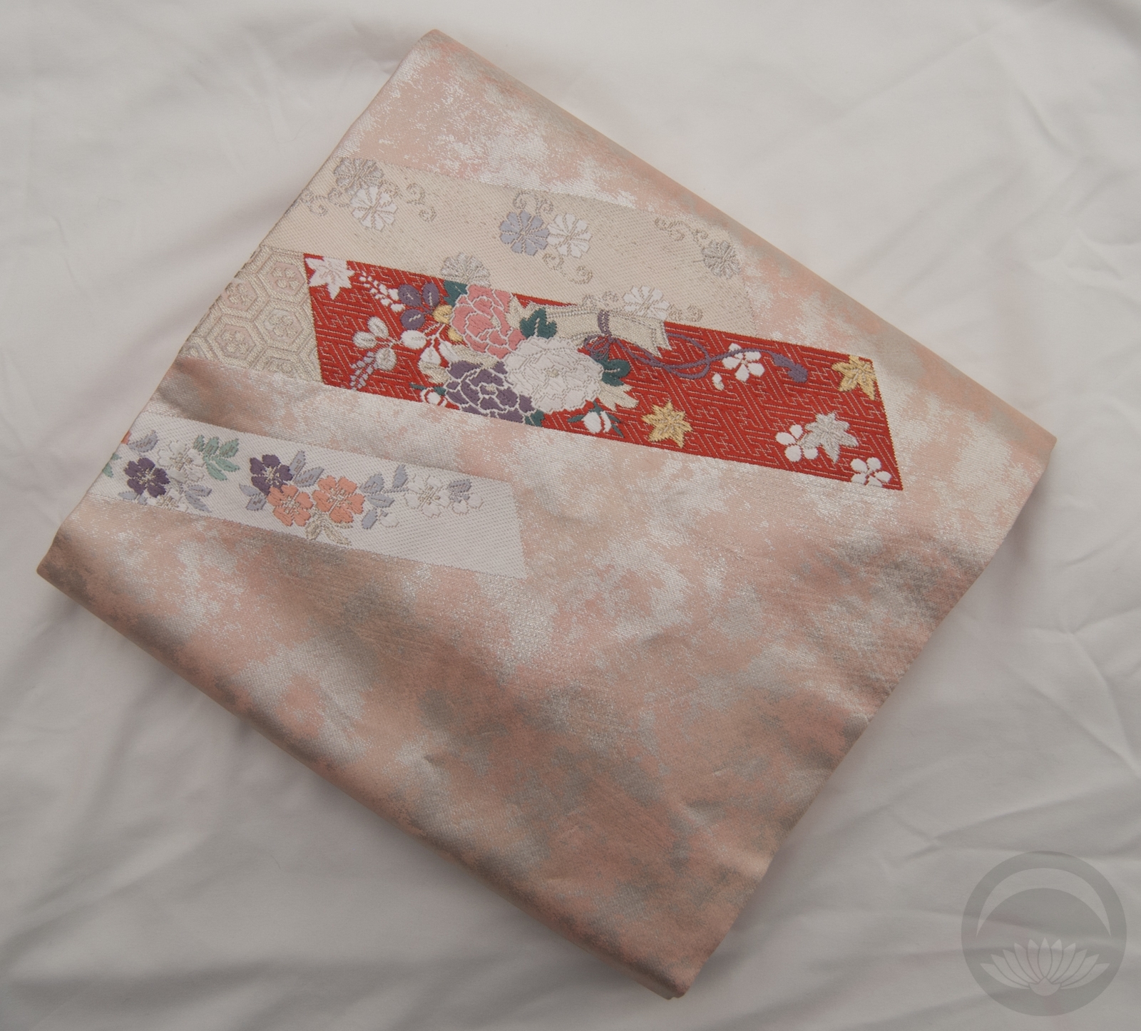
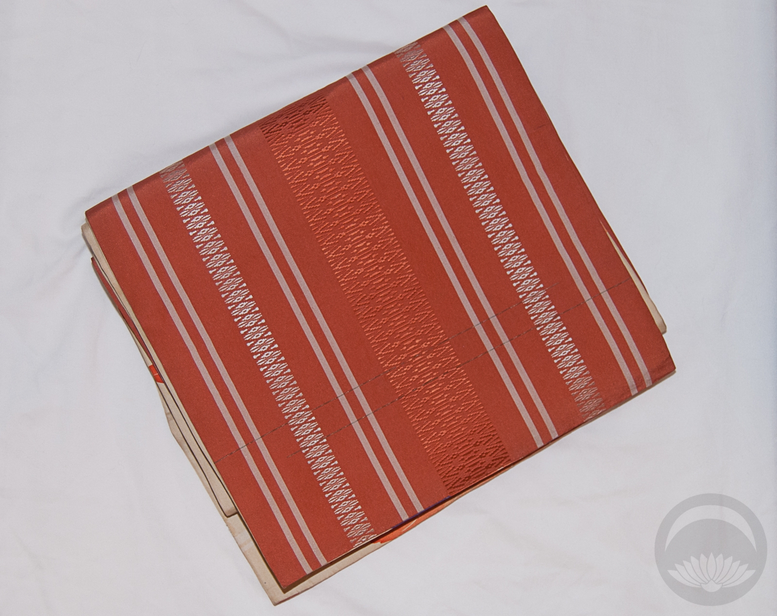
Since today is Canada Day I decided to celebrate with a thematic outfit. I’ve done red and white before, so today I’m thinking outside the box. I’ve said before that this houmongi reminds me of Canadian landscape paintings done by the Group of Seven, so what better place to start? Of course, I had to work in maple leaves again so I got out my beloved momiji/hakata chuuya obi.
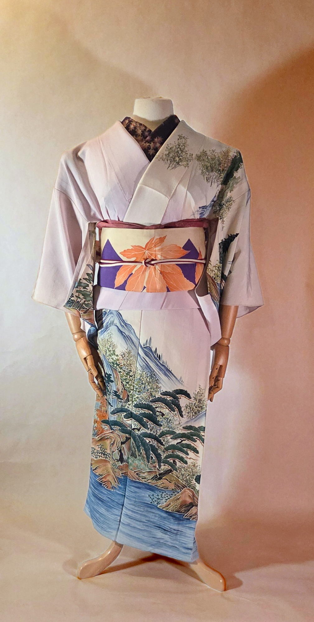
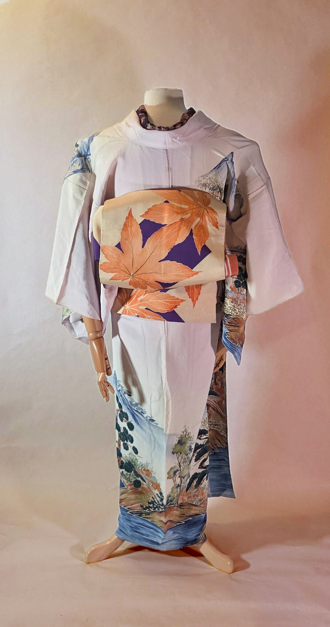
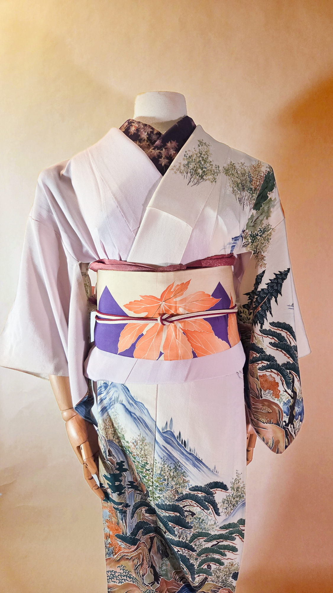
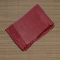
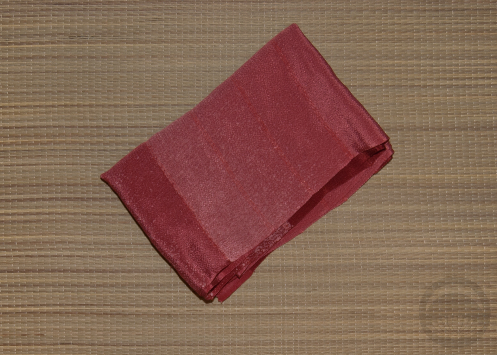
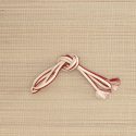
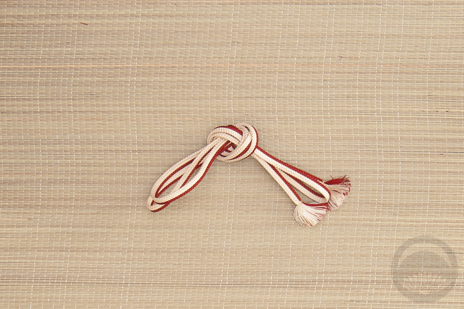
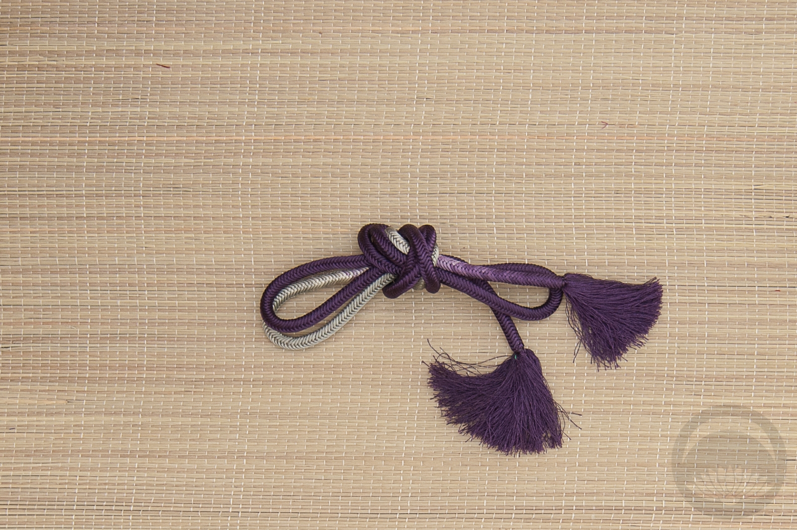
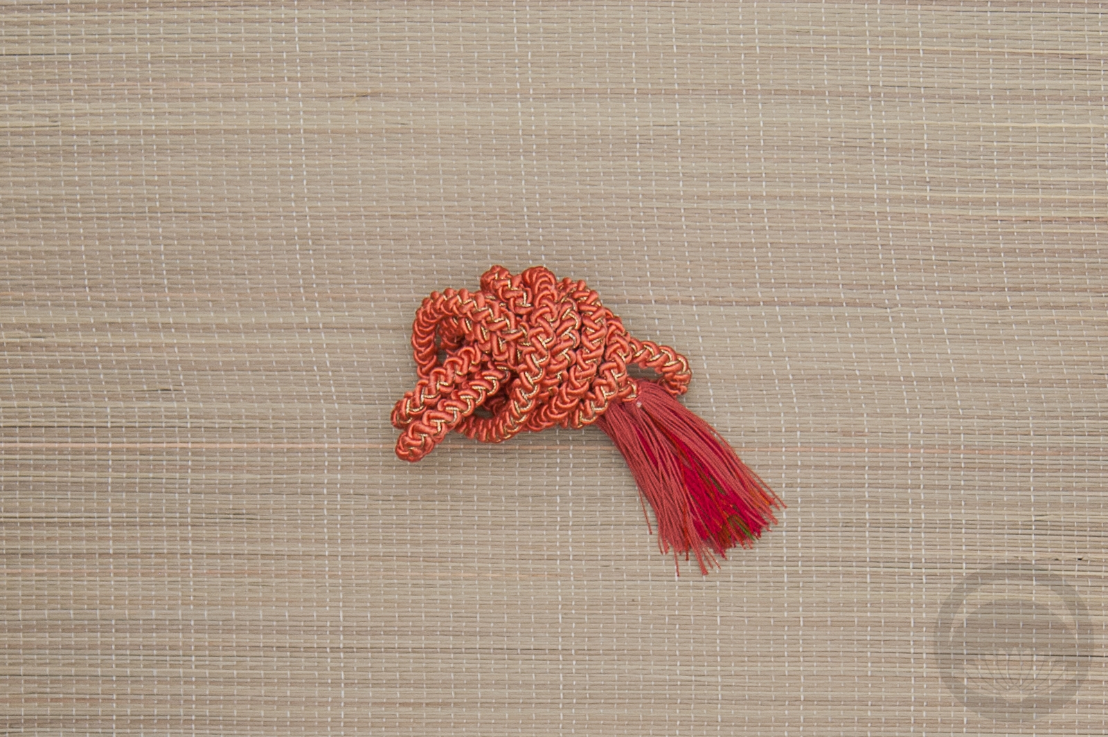
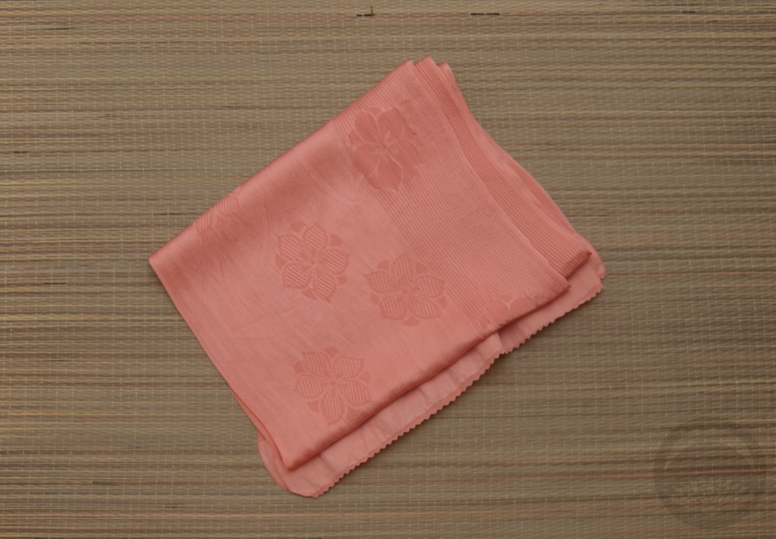
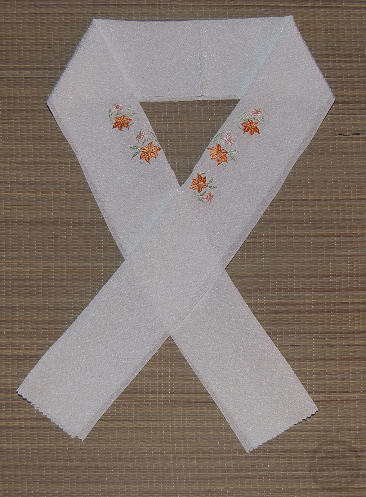
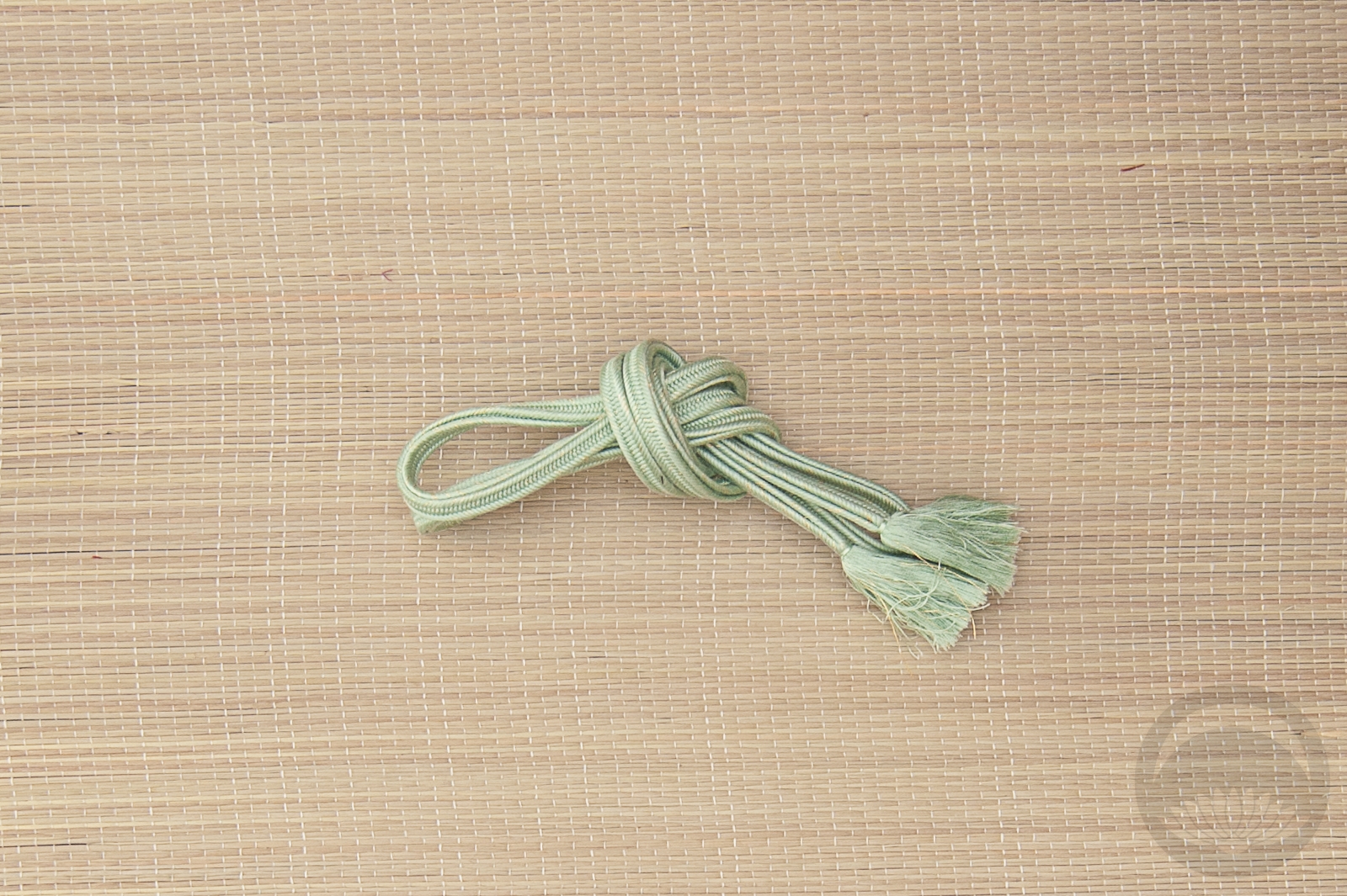
To amp up the maple, I used a burgundy haneri with momiji print and then used similar-coloured accents for the obiage and obijime. I tried to tie a tsunodashi musubi but it’s been eons since I did and I’m a little rusty. Everything else just fell perfectly into place and was a pleasure to do, which is always a great feeling. I love how the whole thing turned out, and while it doesn’t scream Canada, it definitely murmurs it, like the wind through trees or waves lapping up on a rocky shoreline.
Maybe in the future I’ll end up doing a stars-and-stripes themed coordinate in July to celebrate. Not for a few years yet, though…
Items used in this coordination
-
- Landscape
-
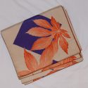
- Momiji side 1
-
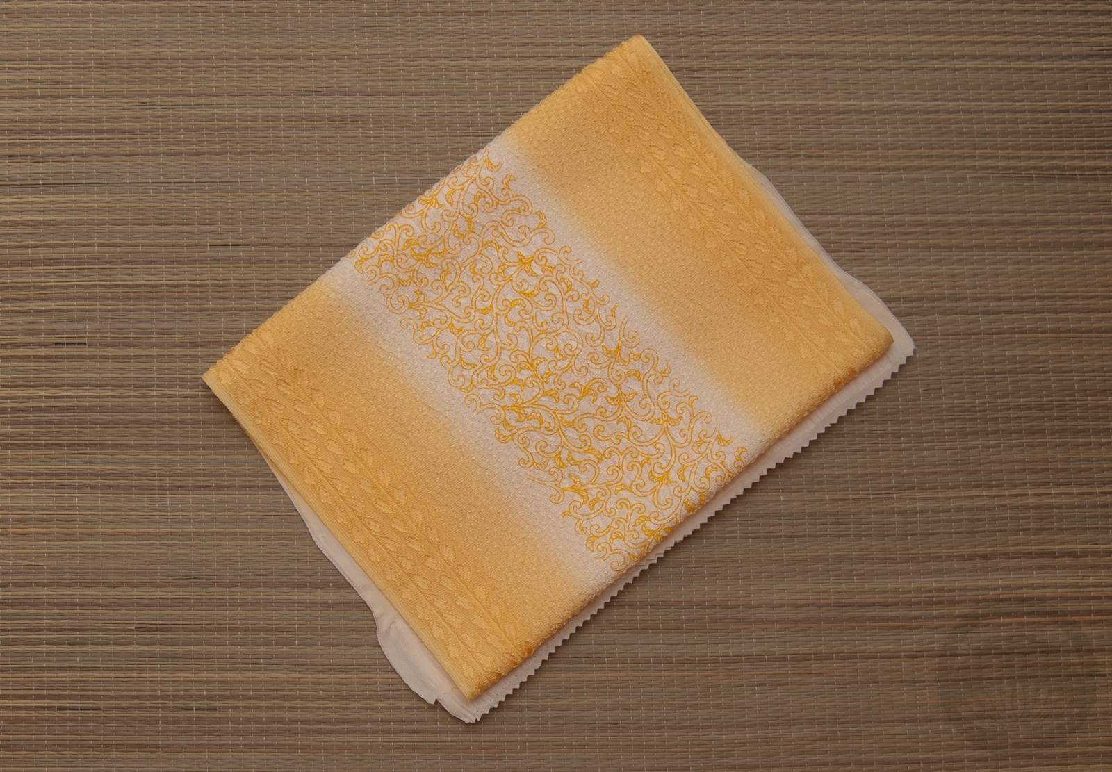
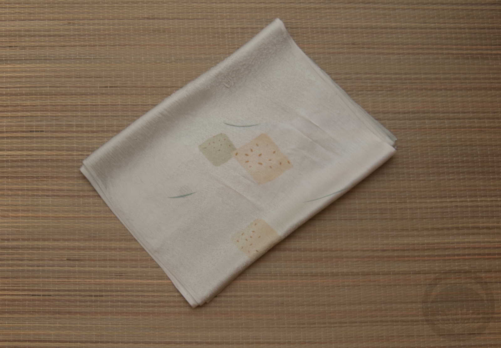
- Mixed Cotton
-
- Maroon Rinzu
-
- Red & White


 Bebe Taian
 CHOKO Blog
 Gion Kobu