
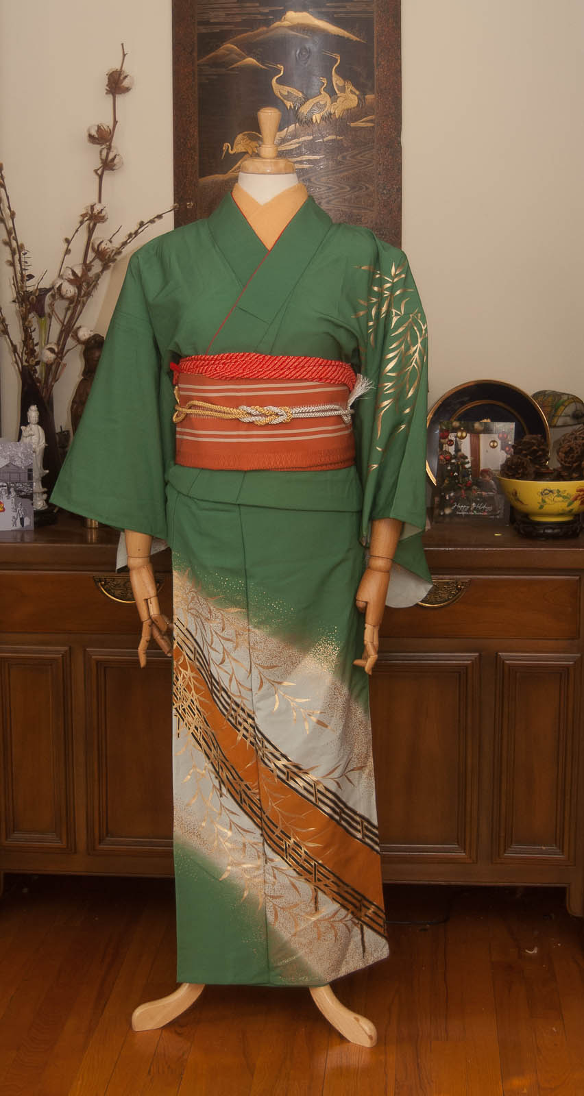
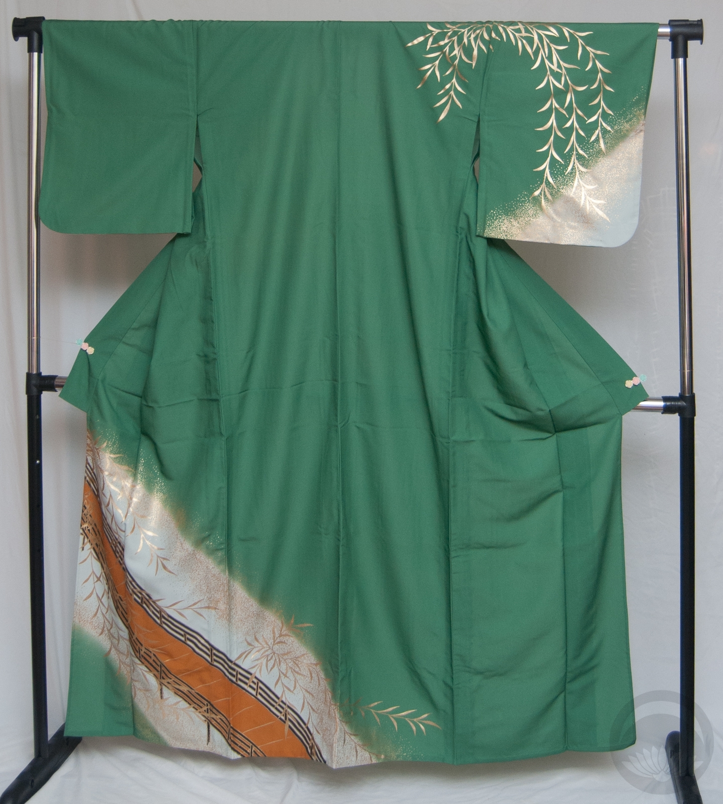
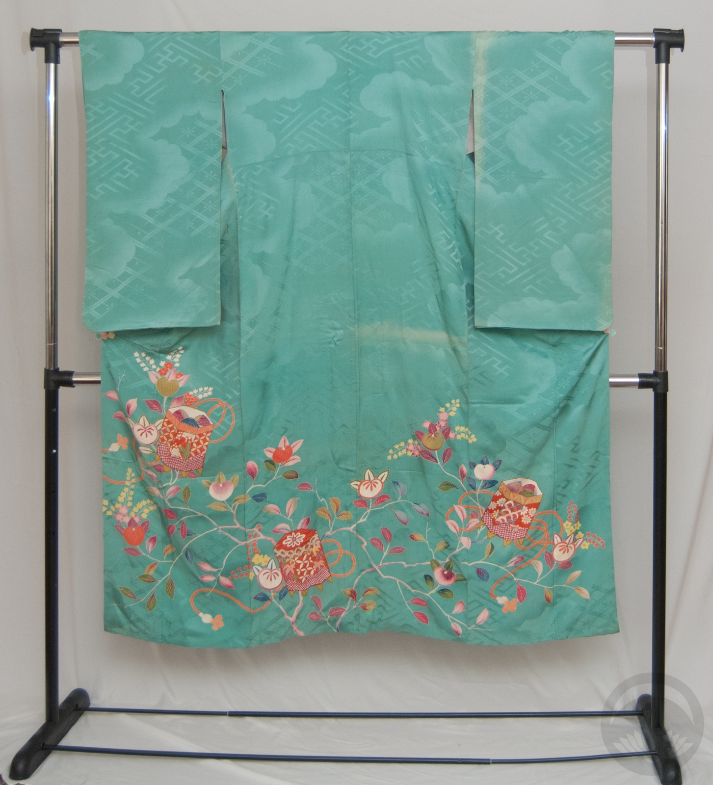
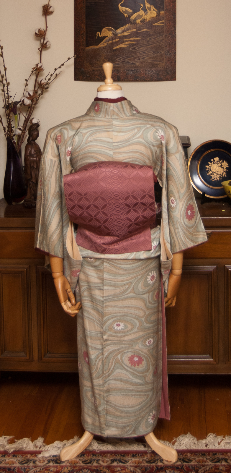
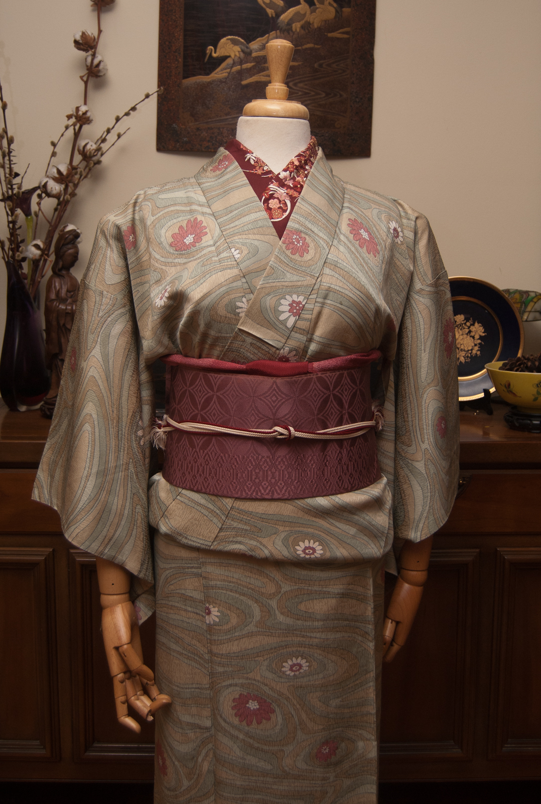
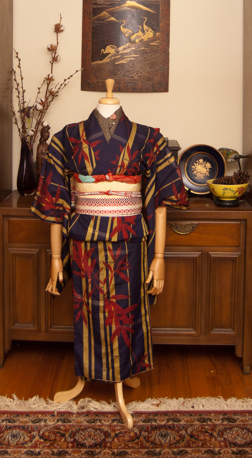
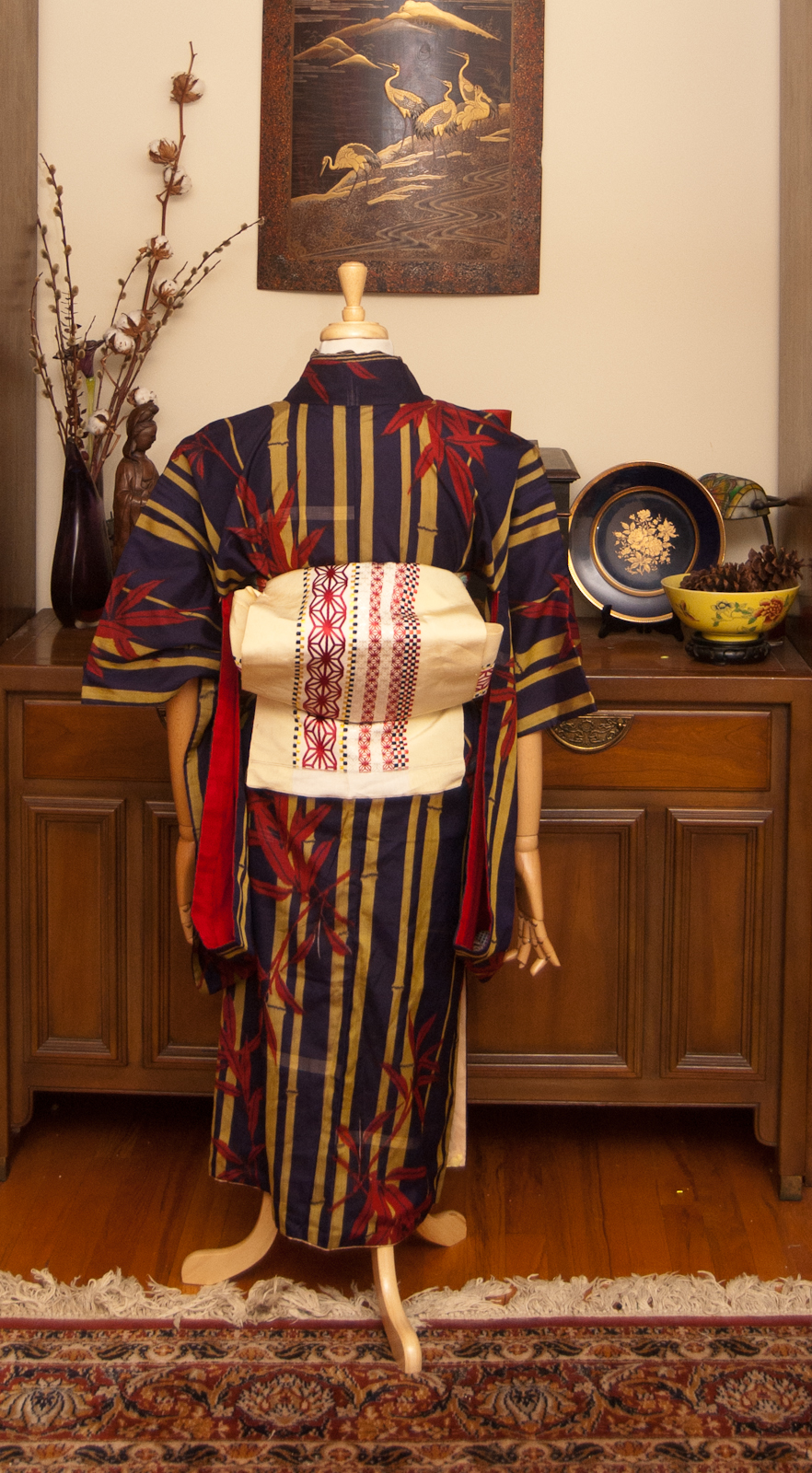
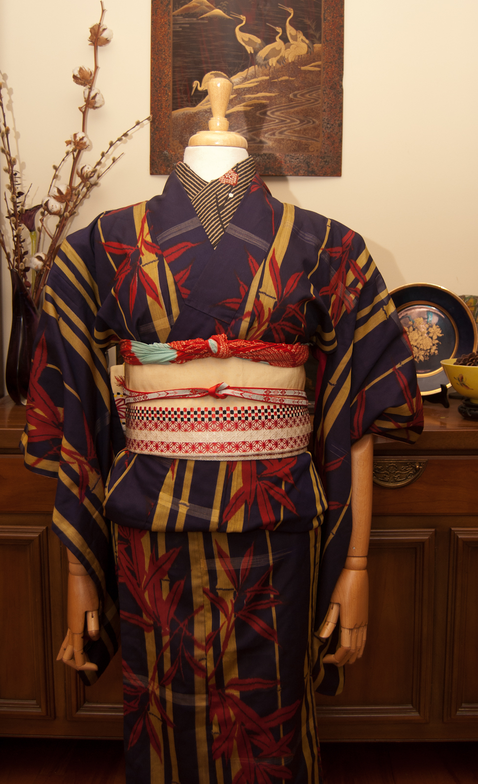
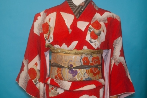
Those of you who’ve been around for a while know I make a point of keeping an eye out for items with a poppy motif, since my mother’s name is Poppy. They’re doubly special to me now since orange poppies are also the state flower of California, my new home. I got this kimono from Sasa and I’ve had it for quite a while and I knew I wanted to coordinate it before I headed back to California in a few weeks. My kitsuke skills are a little rusty, since it’s been over a year but once I got into it muscle memory took over and I think I did alright, all things considered.


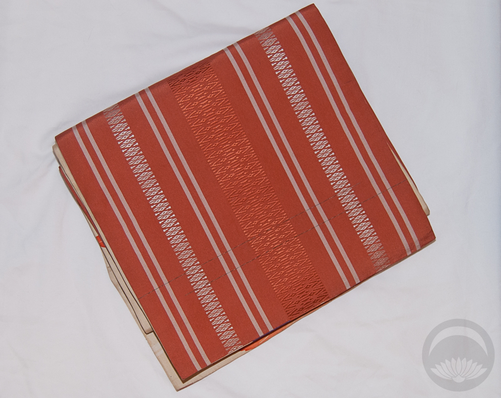
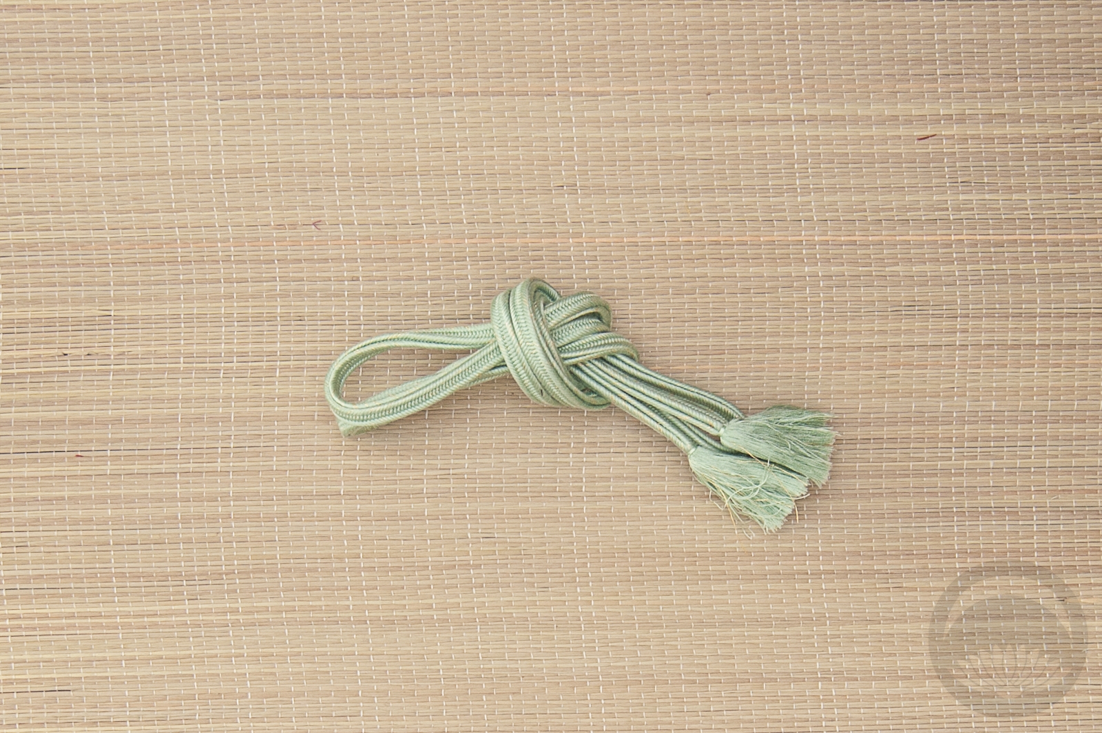
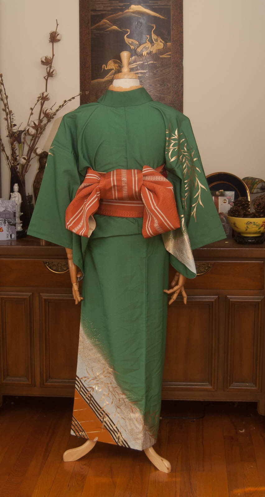
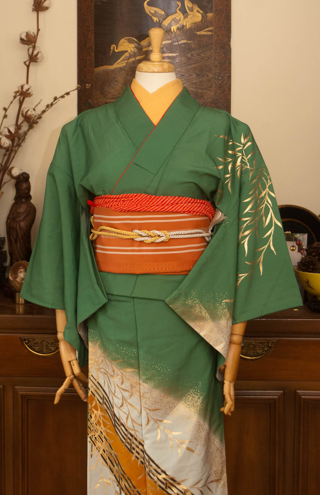
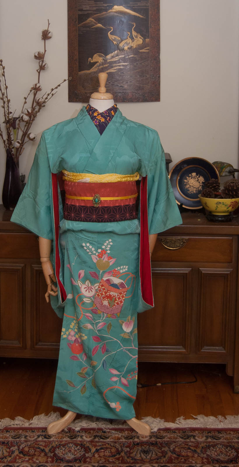
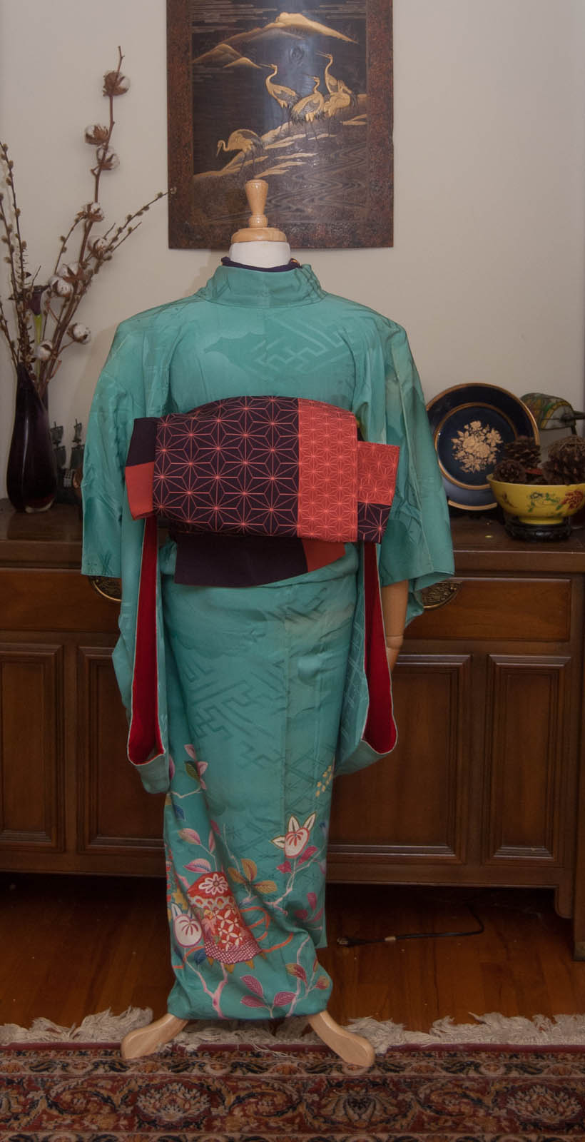
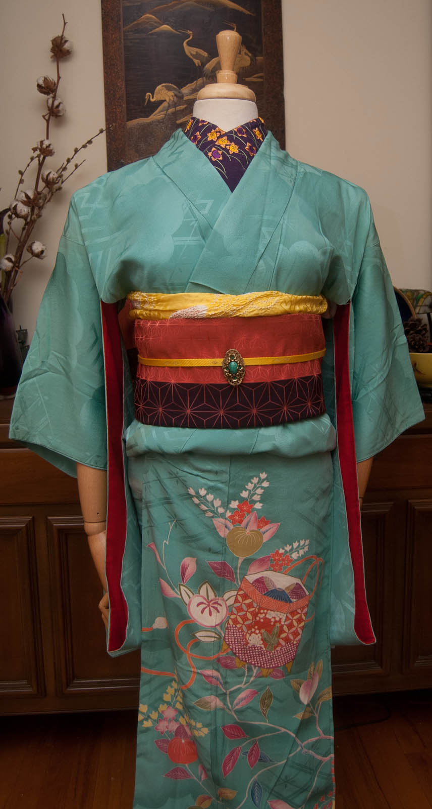
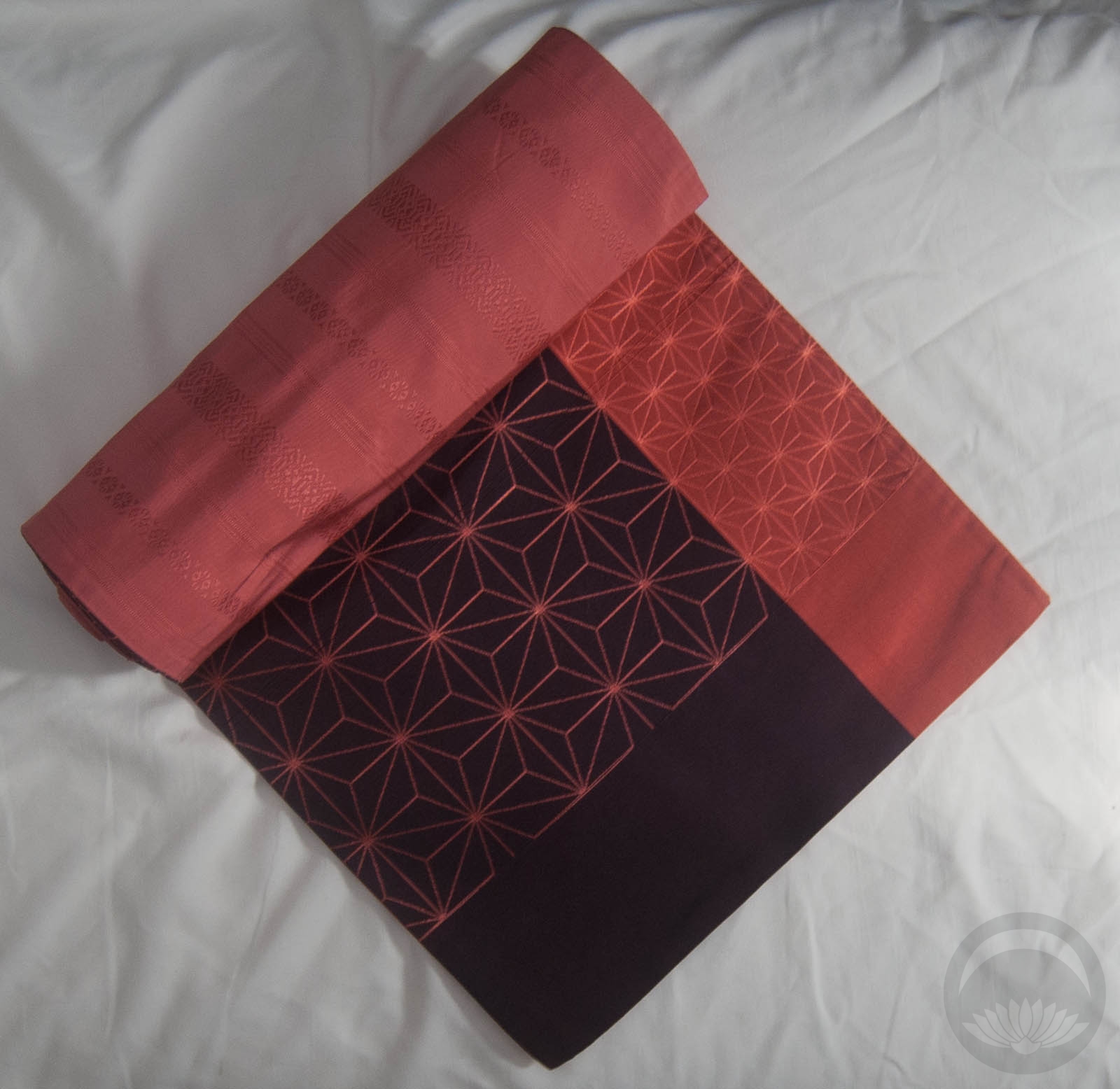
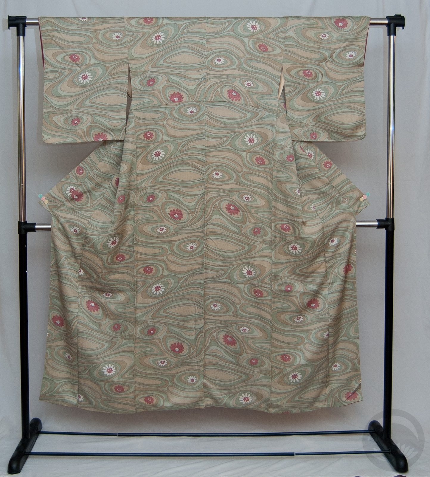
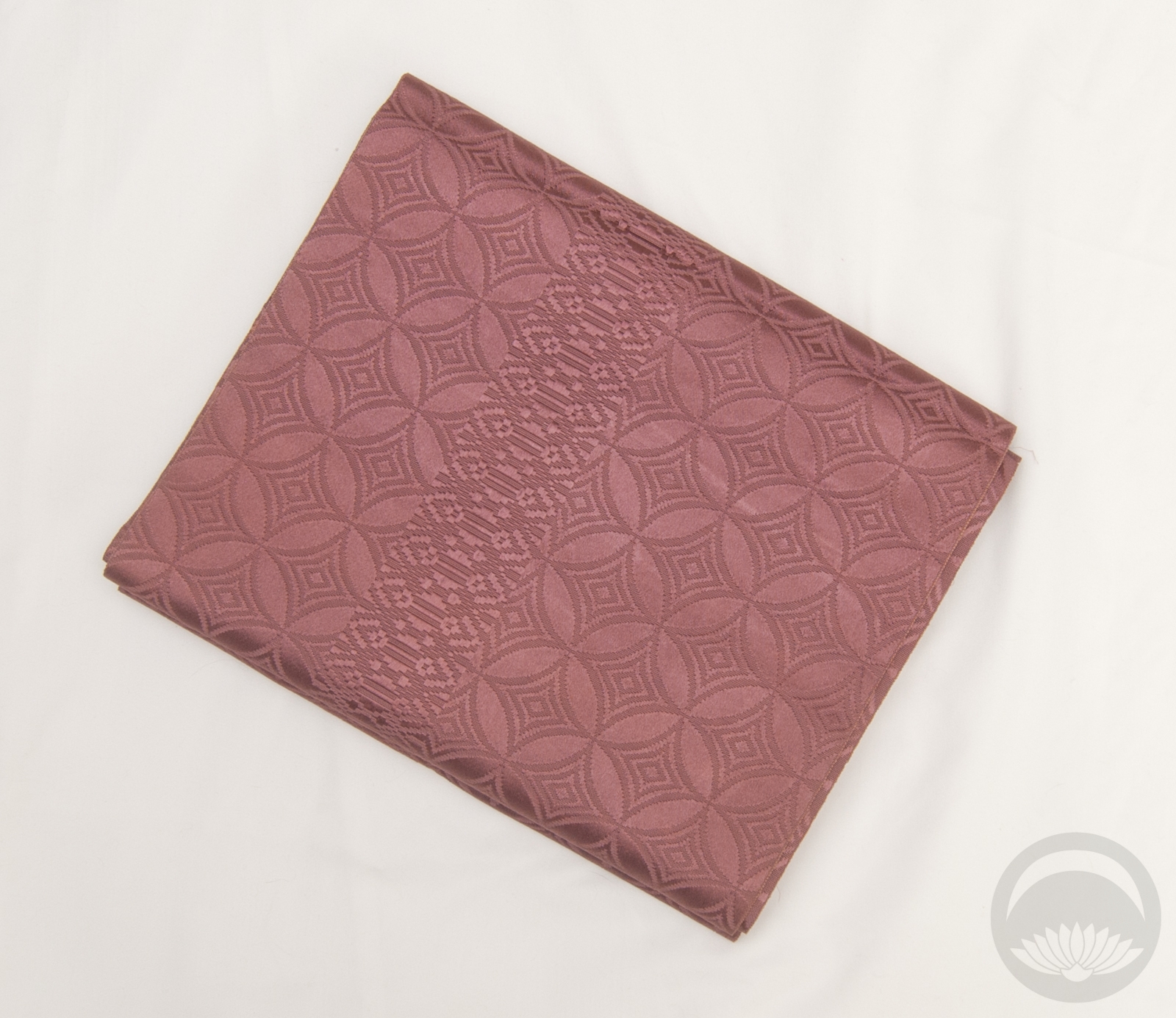
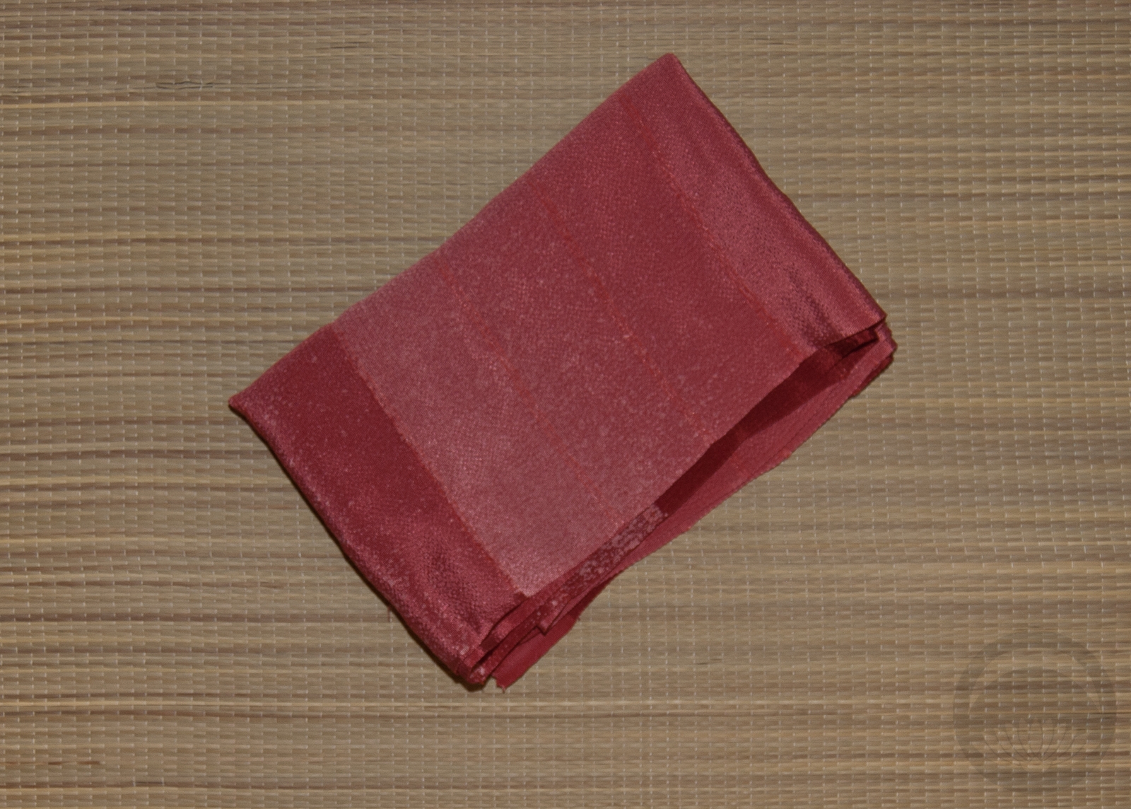
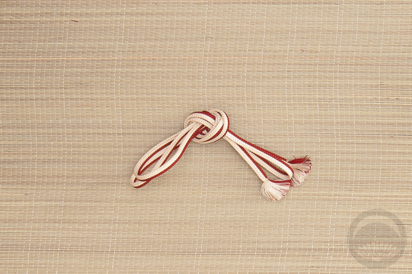
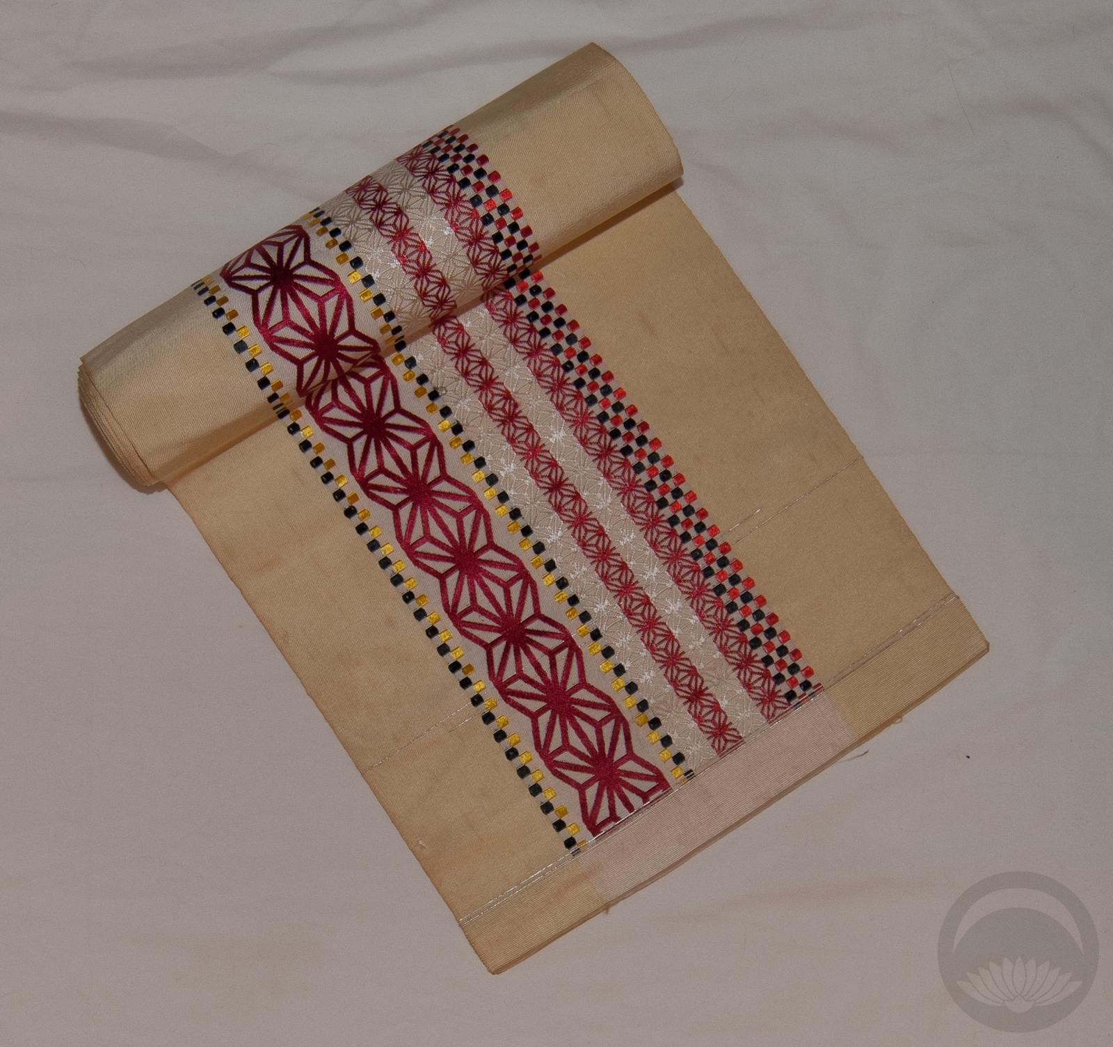
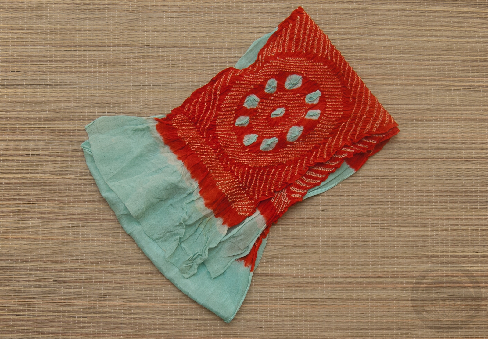
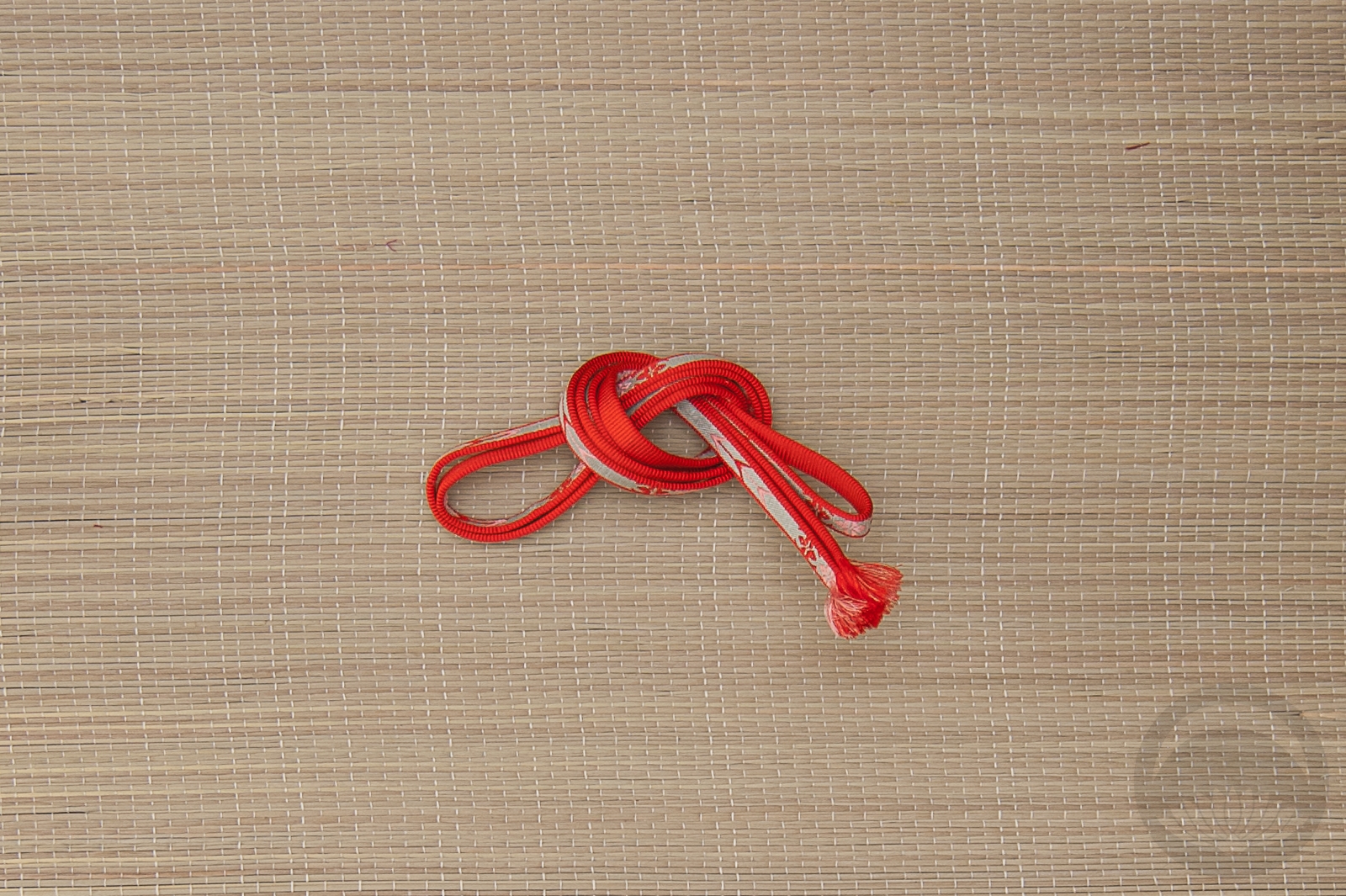
In person this houmongi a gorgeous pale minty colour that’s basically impossible to capture digitally. My mobile phone actually did a better job so that’s where these photos are from, but it’s still not quite accurate. It really makes the red, orange, and yellow poppies… well… pop. I used my beloved orange hakata chuya obi since it’s such a perfect match to the flowers, and the green obijime is almost the exact same bright mint as the kimono so that was a no-brainer.
I had to take these photos in a different spot in our living room due to things still being upside-down from the fire I mentioned a while back, but I think it works for now. I’m not sure when I’ll be able to do another mannequin coordination since I head back to California in a few weeks, but I’ve got lots of fun DIY projects, reviews, and little field trips in the works so hopefully those will tide us all over for a bit 🙂
Items used in this coordination
-
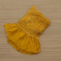
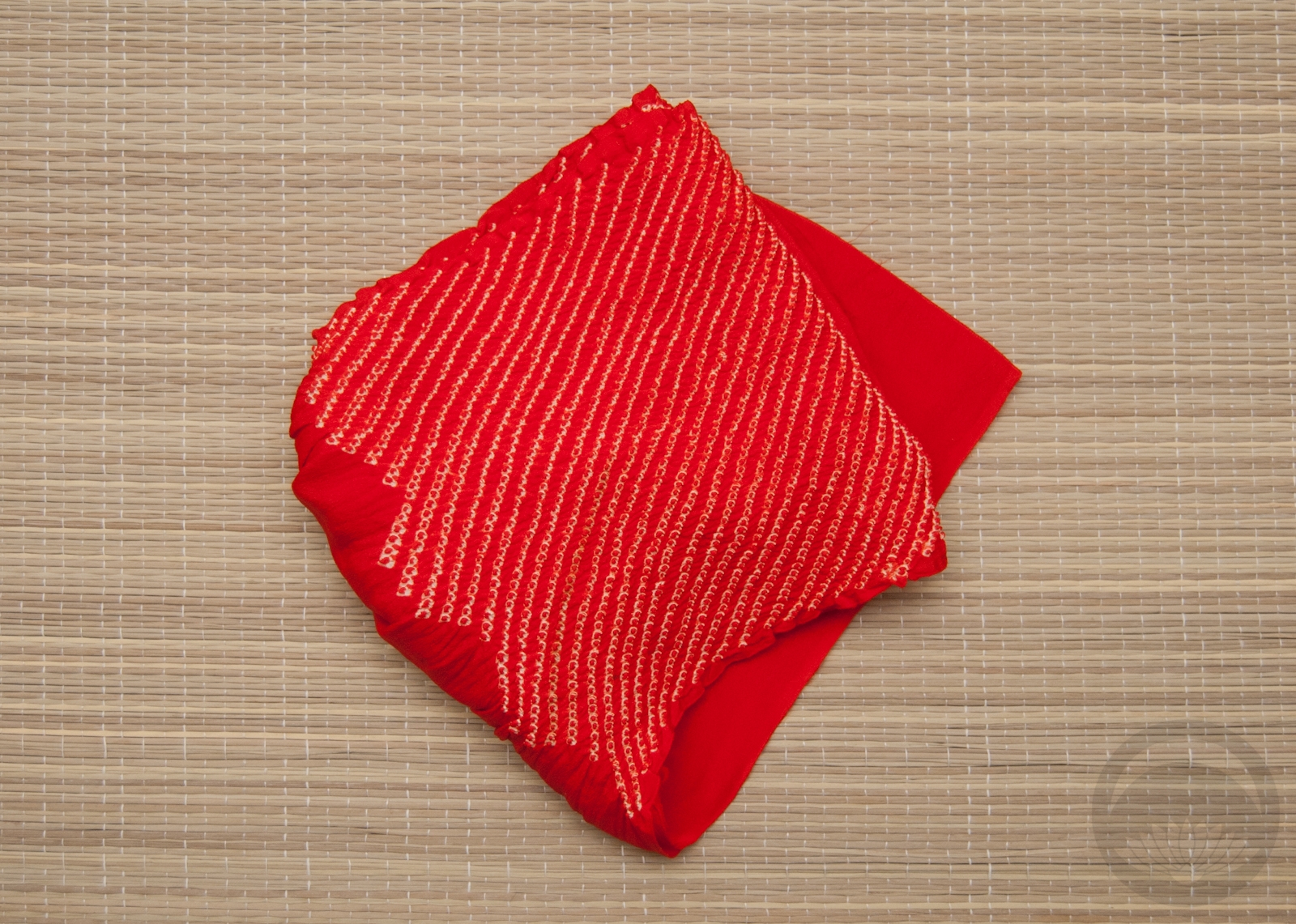
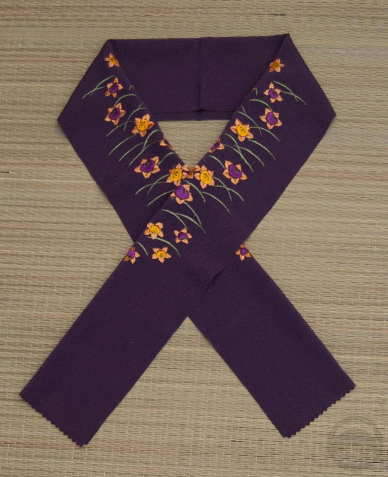
- Mustard Shibori

-
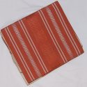
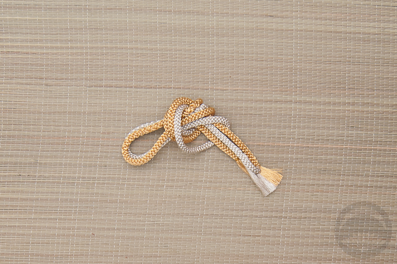
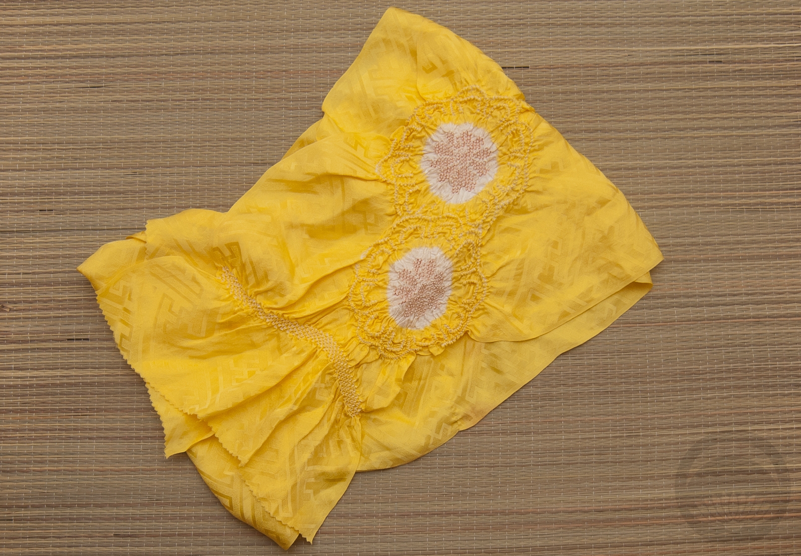
- Momiji side 2
-
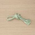
- Mint with Gold


 Bebe Taian
 CHOKO Blog
 Gion Kobu