
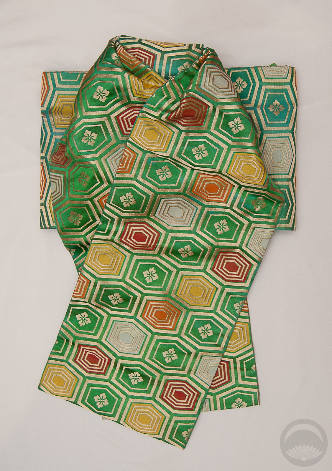
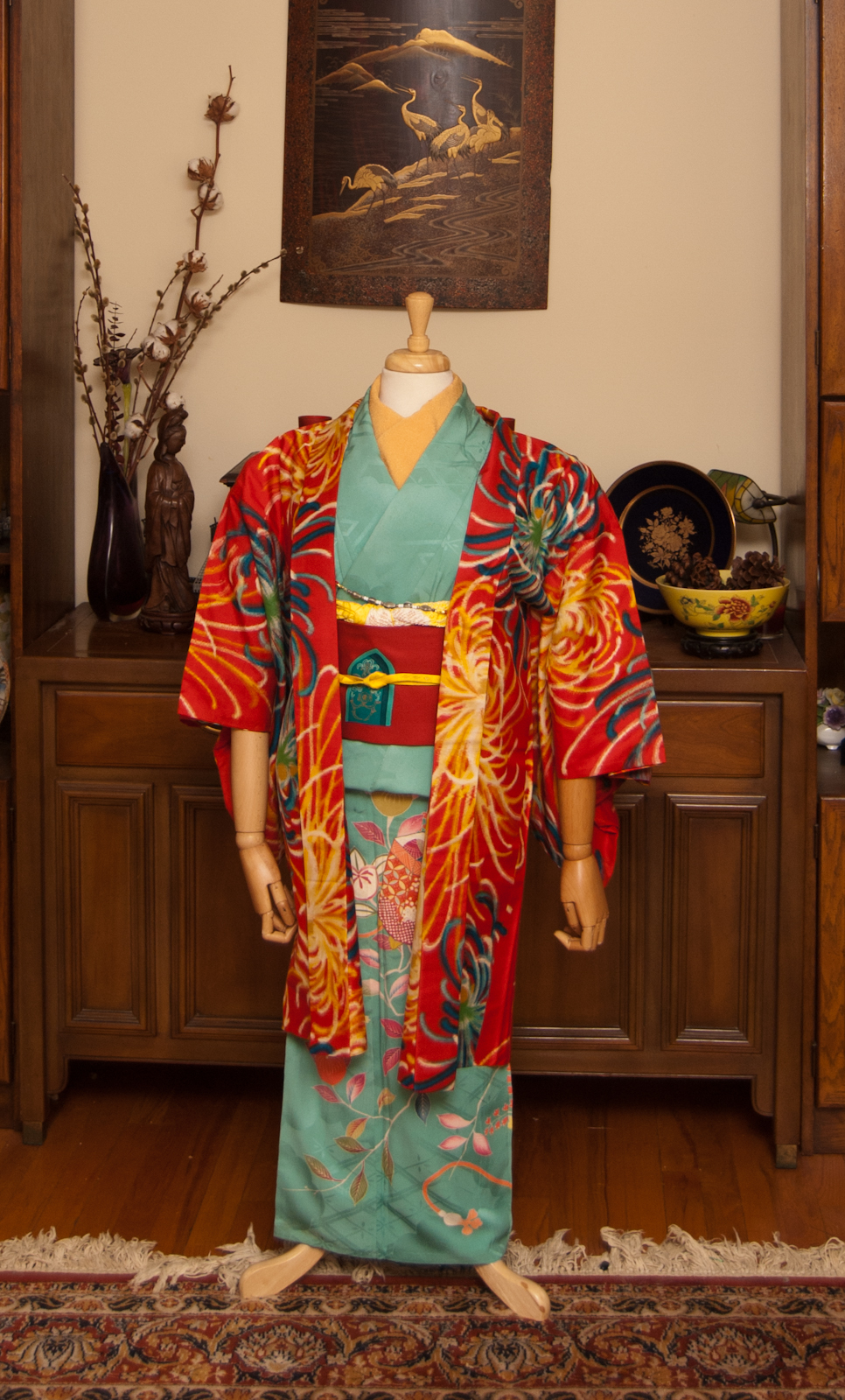
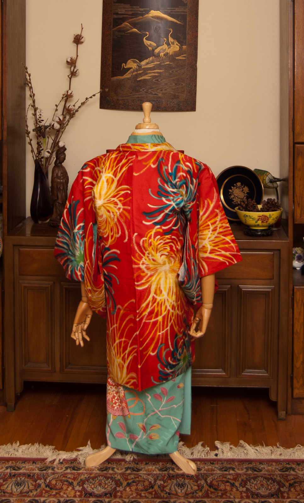
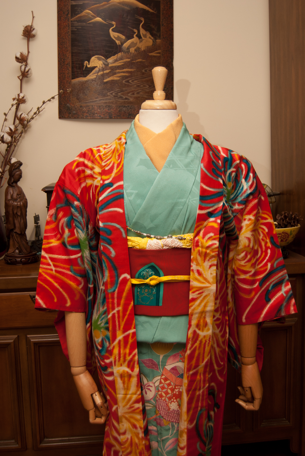
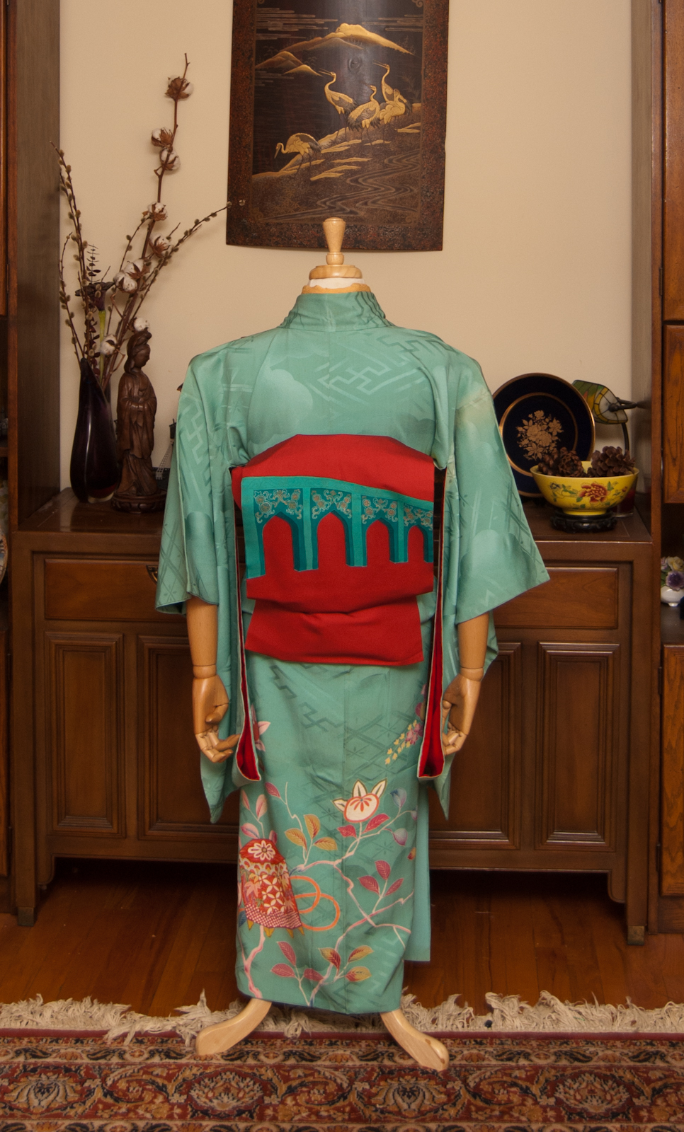
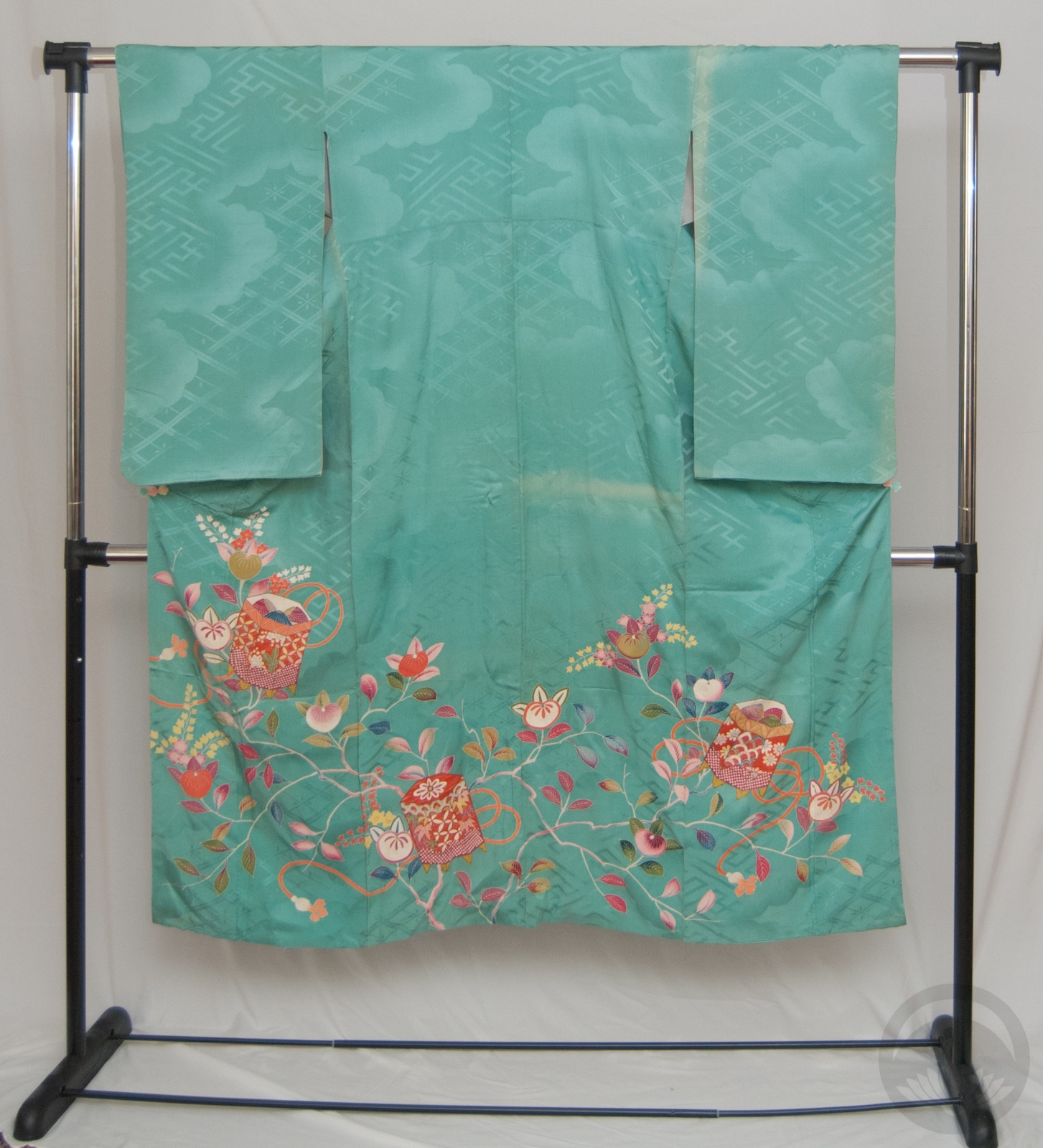
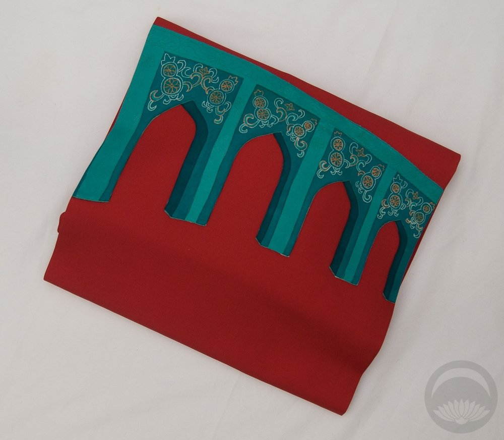
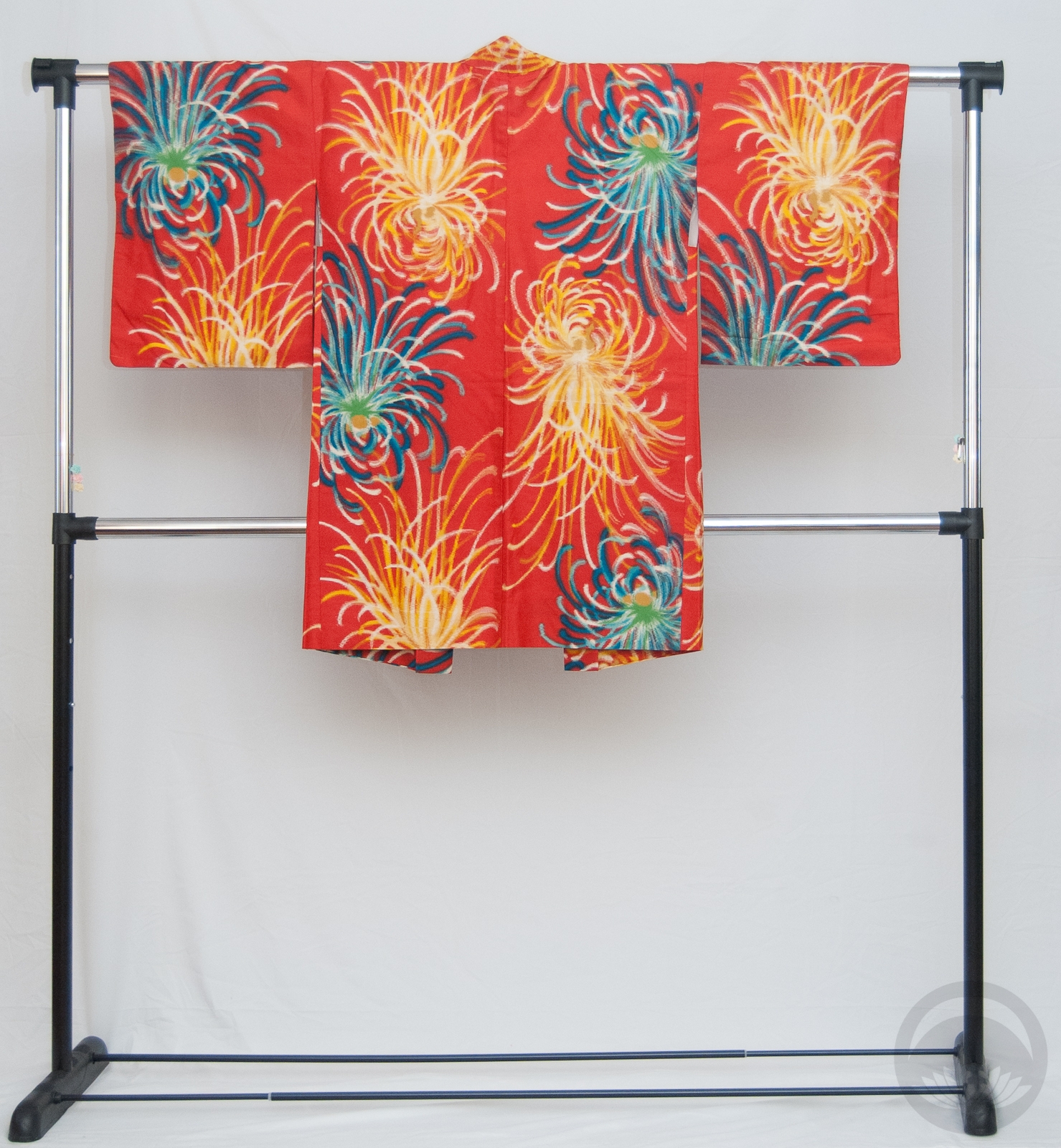
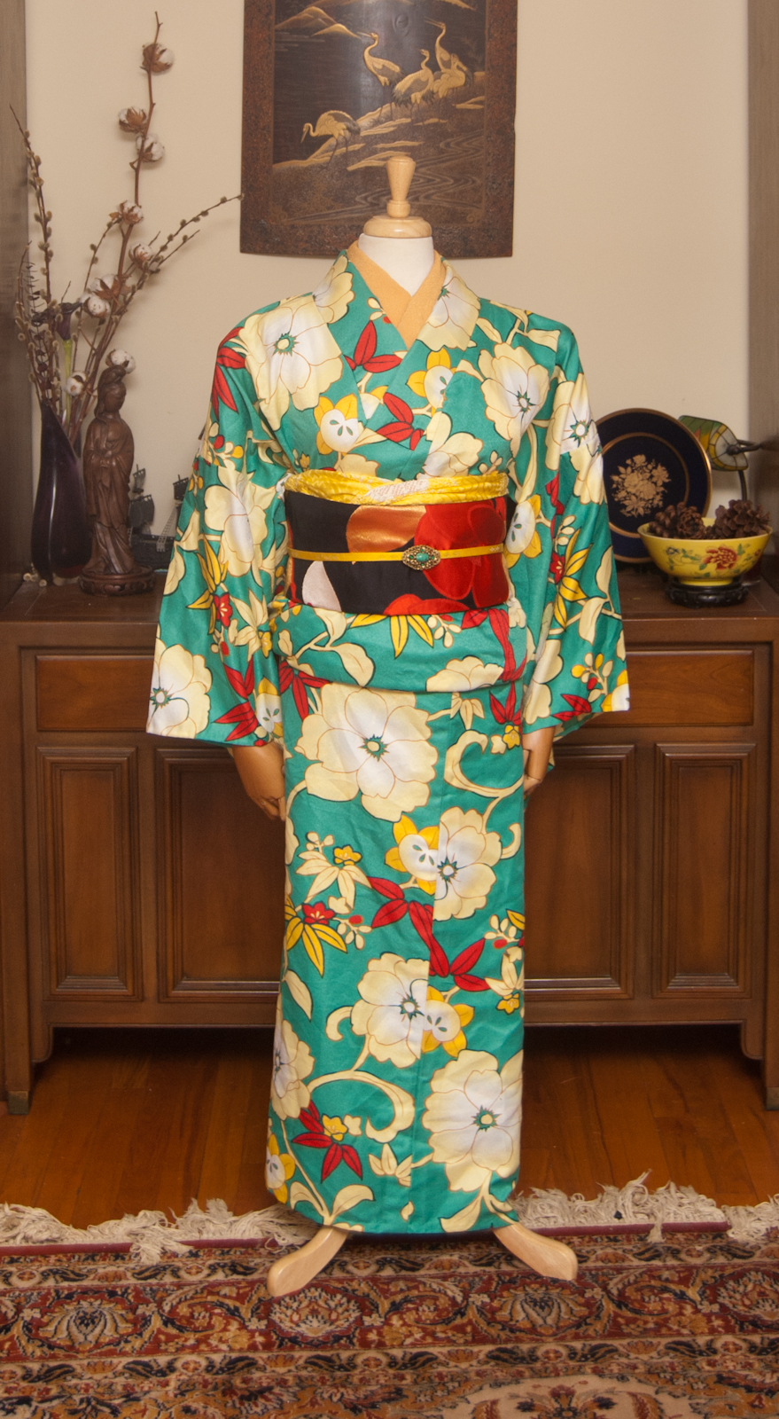
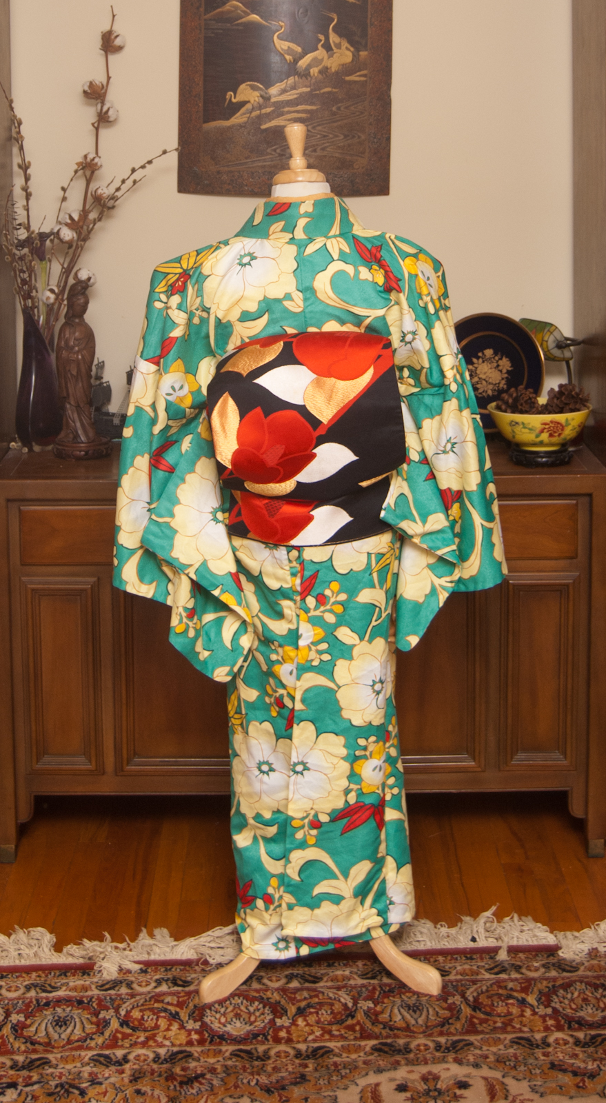
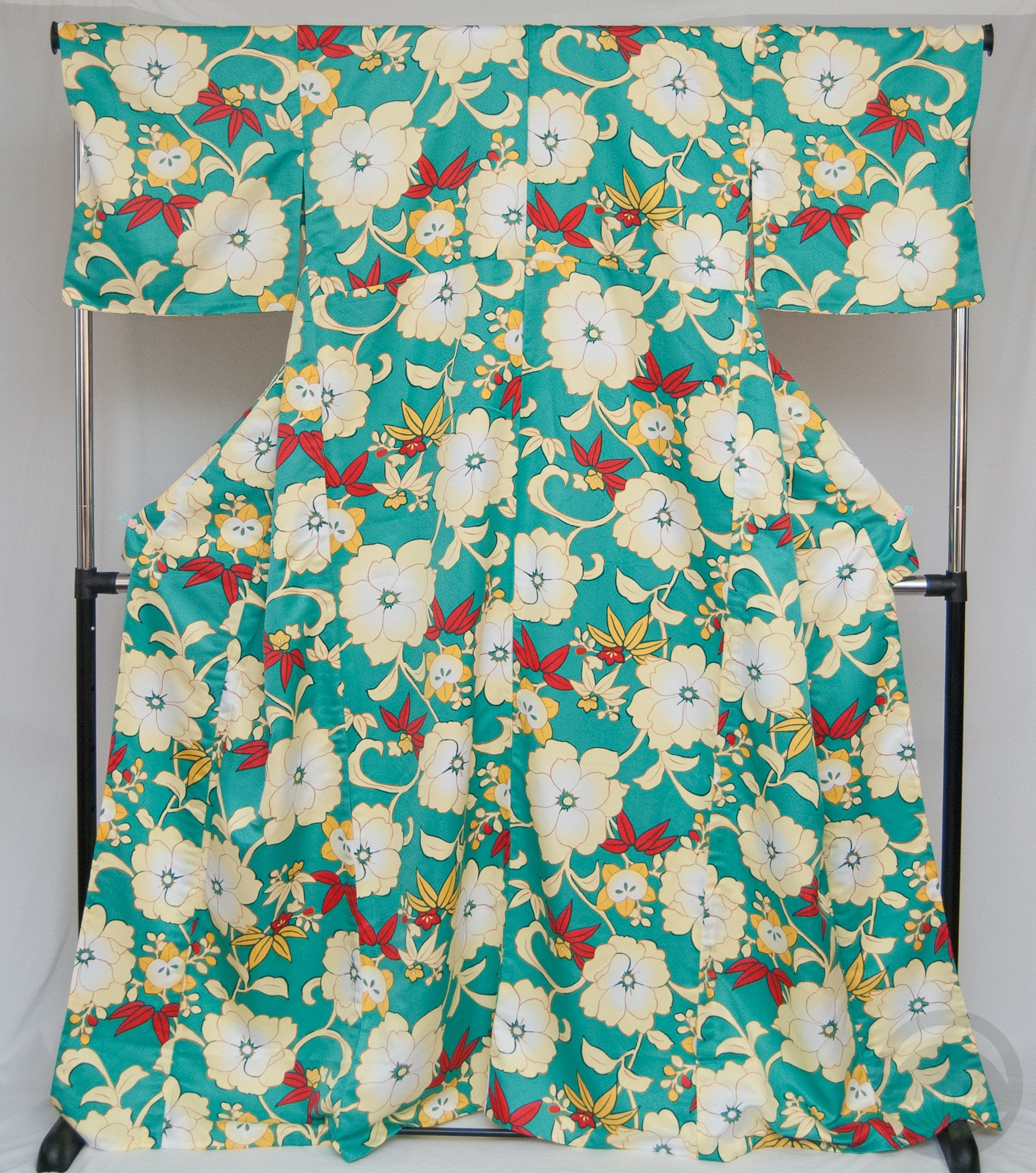
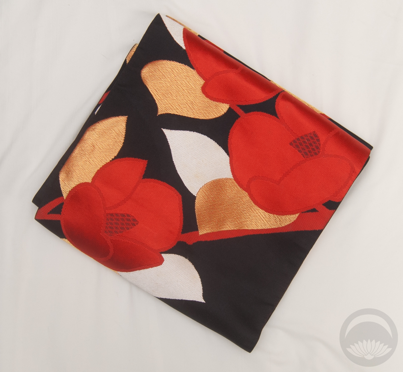
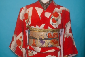
For today’s outfit I was inspired by the lush decadence and pure kabuki glamour of the costuming in Kokuho, which I reviewed earlier this week. This astonishingly big and heavy stage hikizuri was the perfect base, and for once I’m actually in season with it. I waffled between my black and white hakata tsuke-obi and this green short han-darari style, but in the end the bling and the drama of the darari won out. I also really like how it picks up the green in the ume branches of the kimono. They feel very theatrical together, don’t they?
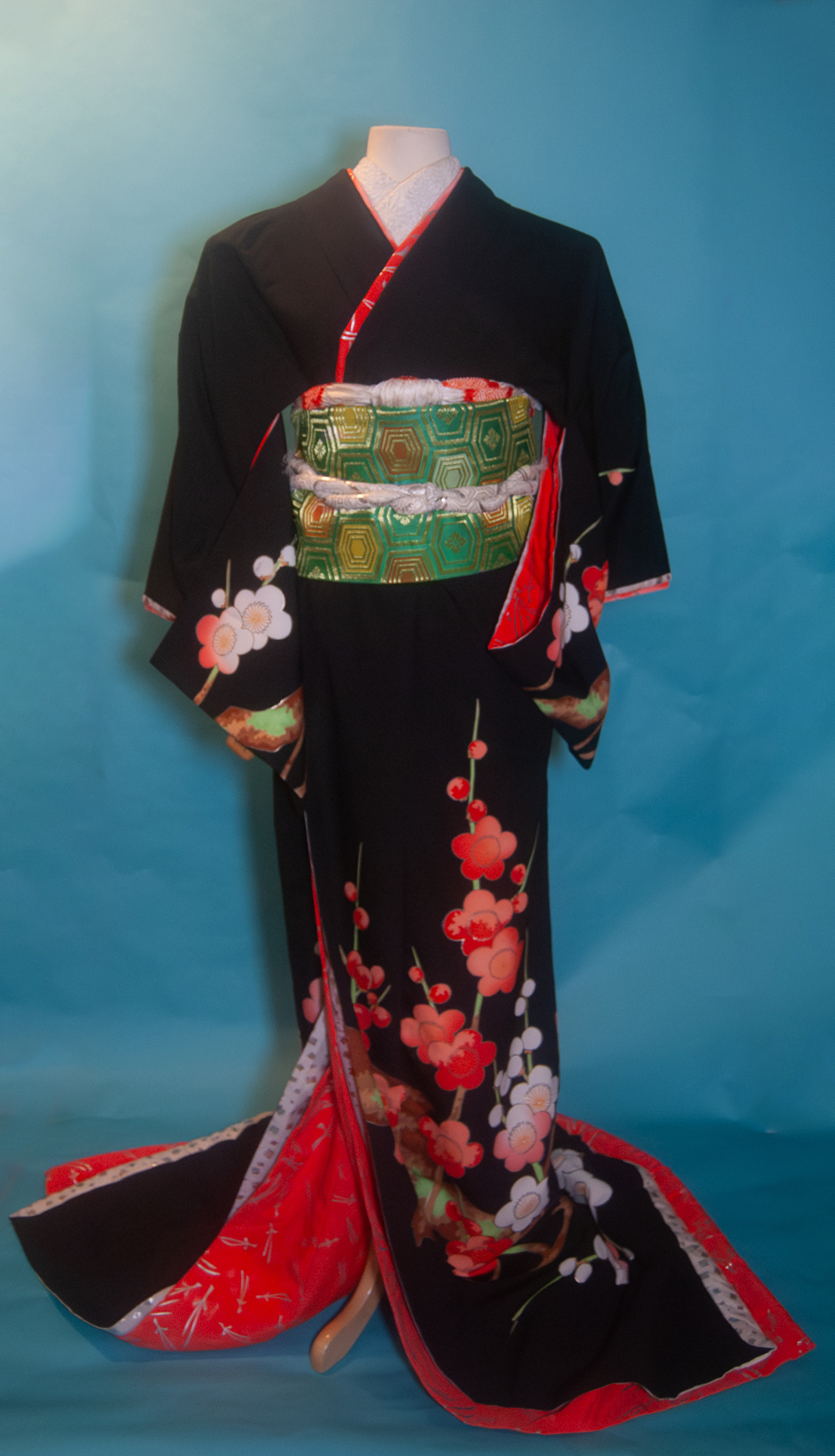
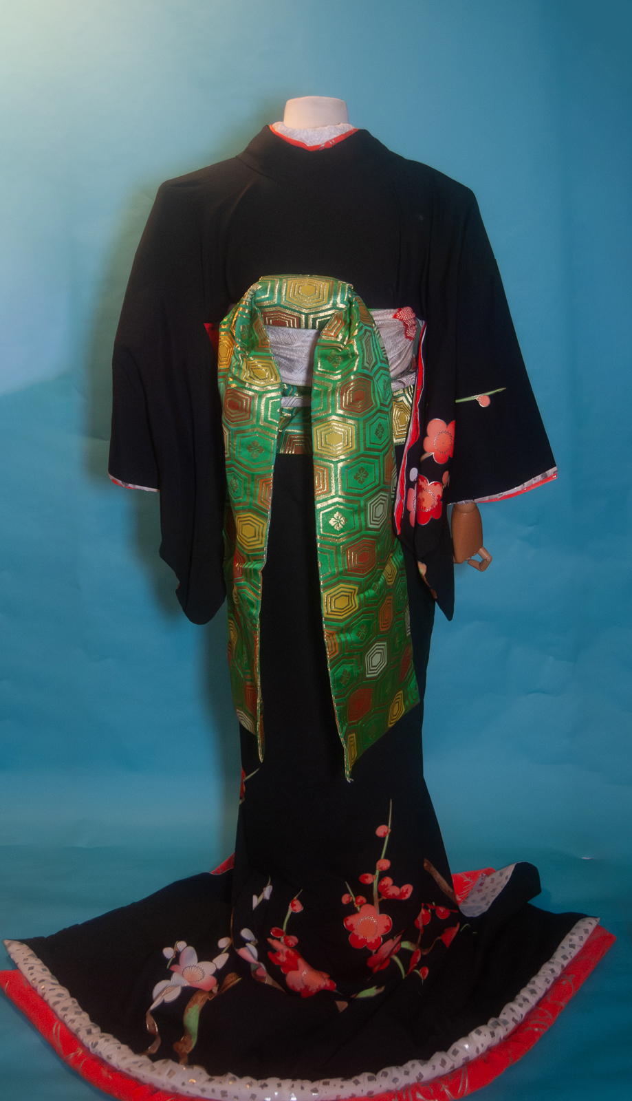
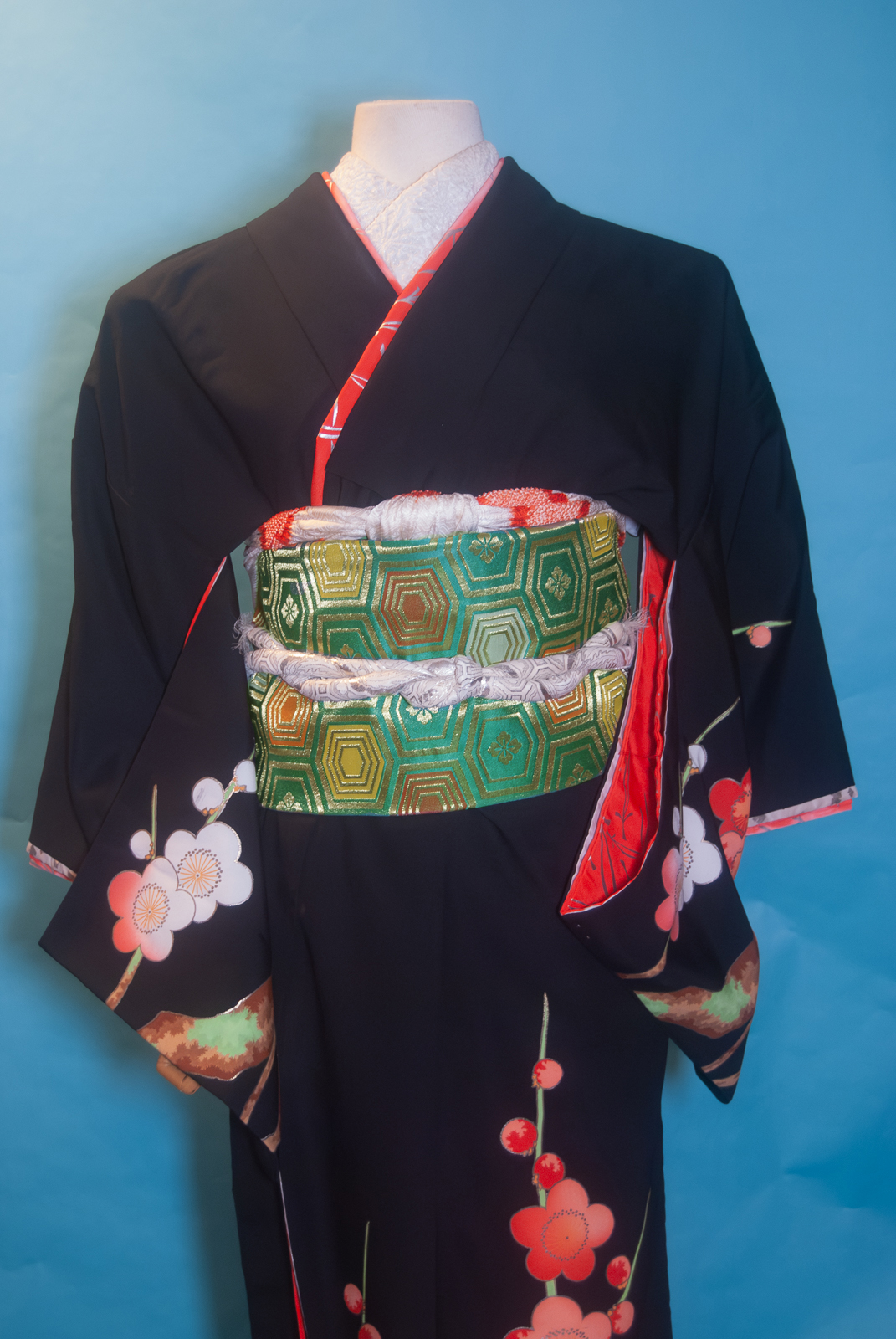
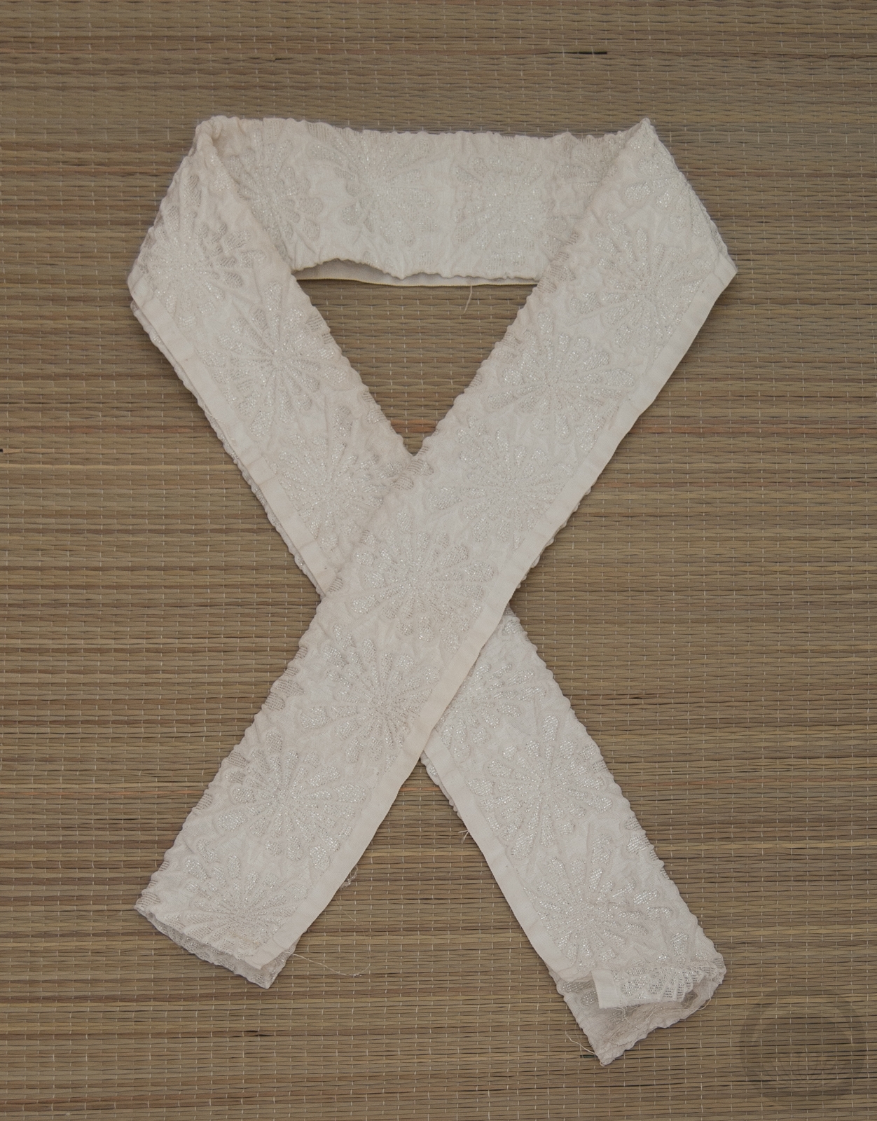
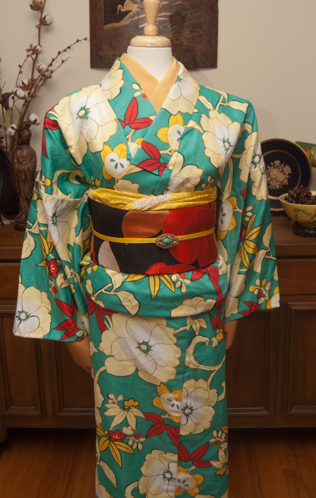
Colour-wise, there was already more than enough going on so I figured white accessories with a lot of rich texture would be the best accent, and I’m glad I didn’t add in anything else. I went with my tried-and-true textured kiku haneri, the white and silver maruguke obijime from one of my bridal sets, and my white obiage with red shibori clouds. I think they make an excellent combo!
This kimono is so big, and the obi so easy to put on, that I am seriously debating wearing this entire outfit myself and going to take photos in the snow before it melts. We’ll see if I end up finding the time and energy. (ed note: Don’t get your hopes up, the writer is tired)
Also one fun note about this kimono, there are still trace of oshiroi smudged onto the red inner layer. I should have taken a close up, now that I think about it.
-
- Ume Stage Hikizuri

-
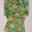
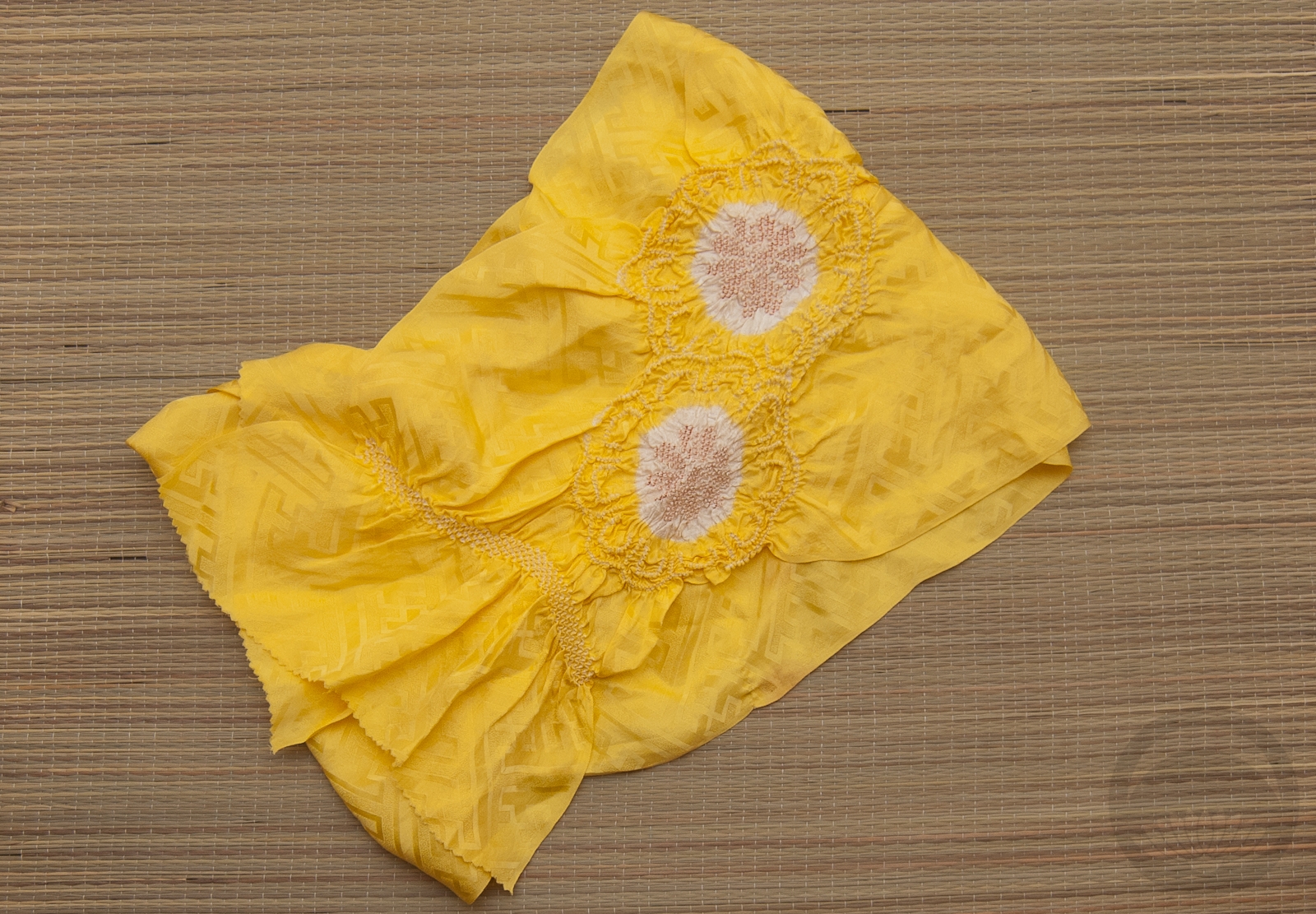
- Green Tsuke Darari-Style
-
- Textured Kiku
-
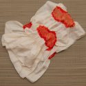
- White with Red Shibori
-
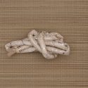
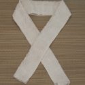
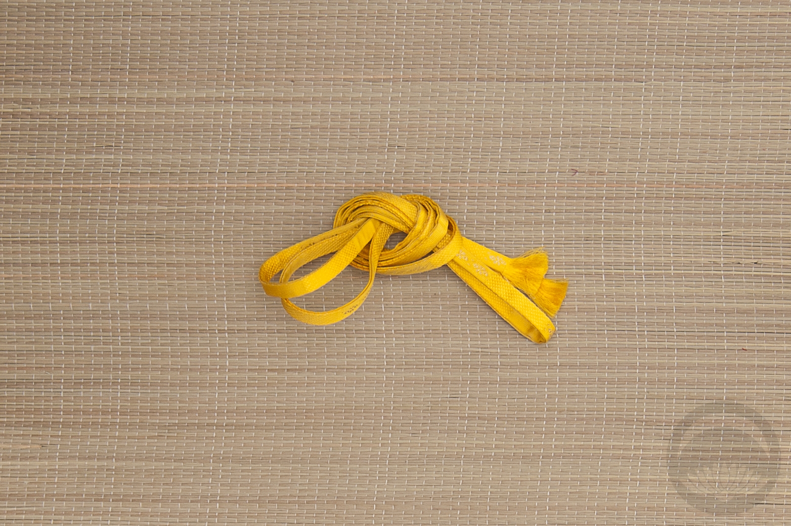
- White Marukuge Obijime


 Bebe Taian
 CHOKO Blog
 Gion Kobu