Review – Japanese Collection from Squish Candies

Squish is a locally-based candy company that’s grown into quite a success story over the years. They focus on unique and seasonal flavours aimed at adults (including an entire cocktail-inspired collection), and offer a huge selection of all natural and vegan options. As someone with allergies to both artificial flavours and milk proteins, their efforts in avoiding common allergens and really clearly labelling all their products is incredibly appreciated.

So of course when I saw they’d released a special edition Japanese Collection for this spring, I knew I had to jump on it. I was very curious to see how they’d hold up to some of the more gummy variations of wagashi, traditional Japanese sweets. They released three separate flavours that all play very nicely together; sakura & sake, sake blossoms, and yuzu mimosa.

I was most looking forward to the sakura & sake flavour, and while they were tasty enough they ended up being my least favourite of the three. Between the cherry flavour and the slightly herbaceous accent of the sake they come off a tiny bit medicinal, for lack of a better word. They’re by no means unpleasant and I’ll happily eat them, but I’m not nearly as crazy about them as I am about the others.

The sake blossom ones have a very fresh and clean taste. It’s subtle but definitely has the familiar taste of sake. There’s even a hint of that warmth you feel after drinking alcohol. The nice thing about these is that they aren’t overly sweet, so they’re refreshing and not overwhelming.

The yuzu mimosa ones are by far the standout here. They’re absolutely delicious and it was very difficult for me not to eat them all in one go as I was trying them out and photographing them! They’re the perfect balance of tart citrus and sweet gummy, without being cloying. They taste like sunshine and summer and brunch with friends on the patio.

And look how cute and springy they are all mixed up in this jar! Eating them mixed like this seems to balance the flavours perfectly. You get the sweetness of the sakura, the bright citrus flavour of the yuzu mimosa, and the delicate sake to balance everything out.

Are these a substitute for imported wagashi? Sadly, no. Are they delicious, and a great accompaniment to a seasonal meal or snack? Absolutely! I’m definitely going to be stocking up on the yuzu mimosa and the sake ones.

 I purchased this item myself and chose to review it.Note: A portion of all purchases of sakura & sake during the month of April will be donated to support The Véro & Louis Foundation. This Quebec-based charity’s mission is to build and operate group homes to support autistic people twenty-one and over. 

Slytherin Kitsuke

Or perhaps in Slytherin
You’ll make your real friends,
Those cunning folks use any means
To achieve their ends.

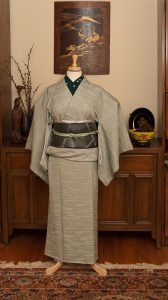
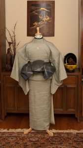
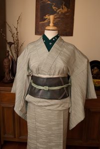
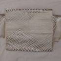
At last, we come to Slytherin. The kimono choice for this outfit was obvious; this green and silver yabane is the perfect colour combination. From there I decided to stick with a very vintage feel, which also suits the “old blood” mentality of many notable Slytherins. I’d never used this silvery-grey obi before, and I realised why as I was working with it. Not only is it frustratingly slippery, it’s a very strange size. Too wide to be a hanhaba obi, not wide enough to be full width, I had to fold it essentially in thirds. But because it’s stiff and slippery it fought me the entire time. I managed to get it to stay in place, but I don’t think it would last very long like this tied on an actual person. Thankfully the mannequin is good at holding still!

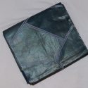
The haori is black, which isn’t a traditionally Slytherin colour, but it seems to me that when not in school robes, all the prominent members of the house tend to favour elegant black clothing. A long, sleek black silk haori with very subtle urushi crows on it seemed to fit the bill quite well.

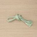
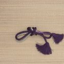
The obijime is admittedly way too formal for the rest of the outfit, but the green shimmering beaded texture made me think of a beautiful snake when I first received it, so of course I had to use it to represent Slytherin house’s animal.

I’m also cheating a bit in that this outfit is doing double duty, it’s also entirely applicable for Fudangi First Friday. And with this, the Hogwarts House kitsuke project is complete! I had fun, but I’m looking forward to coordinating more “normal” outfits for a little bit. At least until another ridiculous theme project strikes my fancy.

Items used in this coordination

Ravenclaw Kitsuke

Or yet in wise old Ravenclaw,
if you’ve a ready mind,
Where those of wit and learning,
Will always find their kind;

Today, we’ve arrived at Ravenclaw; my house! Every single test I’ve ever taken, including the Pottermore one, puts me squarely into Ravenclaw. What can I say, I’m a proud and noble bookworm, like my parents before me. At least I come by it honestly.

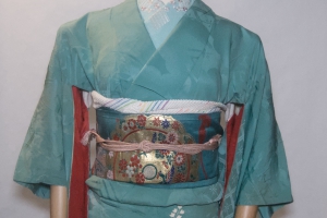
Of course, since it’s my house, I knew I had to do the best job I could. If you’re familiar with Harry Potter, odds are you’ve got an opinion on the bronze vs. silver debate when it comes to Ravenclaw’s house colours. I think both options have merit, and thankfully this obi has all sorts of metallic tones to it, so it feels like a solid acknowledgement of both options. The birds on it are hawks, not eagles, but I still think it suited the “sharp and intelligent bird of prey” feel better than any other option I had available to me.

A kimono with scrolls or books on it would have been completely fantastic here, but I was really trying to stick to a budget and use pieces I already owned, so I went with the most vibrant blue piece in my collection. I wish I could say that the flowers had particularly relevant symbolism, but really I just had to use this blue.

The obidome is a converted pendant that’s always reminded me of the Lost Diadem of Ravenclaw, and the fact that it’s a feather makes me think of writing quills, which are also incredibly relevant for the most nerdy of houses. The accessories were chosen primarily for colour and emphasis, not so for motifs, but still this is an outfit I’d be glad to wear to show off my house pride. Also, this kimono actually still fits me, so there’s always a chance I might actually put it on sometime soon.

Only one more to go!

Items used in this coordination

Hotel Lobby Ikebana

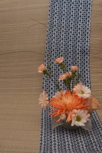
This is what I tend to think of as Hotel Lobby Ikebana. It’s big, bold, tropical, and symmetrical, and it wouldn’t feel out of place as you’re checking in to a nice resort. This isn’t a bad thing at all, it’s just where my mind immediately goes when I see this sort of arrangement.

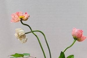
For this one, I challenged myself to work from a pre-assembled bouquet from the drugstore, of all things. Who knew you could get ginger flowers in that sort of a place? I love how sculptural and bright they are, and thought this red vase I found at the thrift store would balance them nicely.

I tried to keep the balance and framing I learnt about in last month’s ikebana atelier in mind while I put this together, but still kept it more modern and free-form. I liked the idea of symmetry and like how the end result has a pleasant fan shape that also adds to the formal and dramatic feel of it.

I can’t wait for the weather to start getting nicer so I can go back to using seasonal flowers from the garden and great outdoors, but for now I’m just glad I have access to interesting plant material.

#Monokimono Challenge – Leaf Green

We interrupt your regularly-scheduled Hogwarts House kitsuke to bring you this month’s #monoKimono challenge. March brings us St. Patrick’s Day as well as the start of Spring so I thought green would be the perfect colour to work with this month.

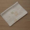
My vintage green irotomesode anchored the colour scheme, and since it’s so gentle and subtle I wanted to keep the whole outfit feeling very subdued. The back side of my green chuuya obi worked well, keeping things very simple and tying in with the slightly less saturated greens of the kimono’s hem design. My initial plan was to use a green cotton haneri with sayagata but it was slightly too warm and clashed with the kimono. Instead I chose a simple embroidered haneri that had enough green to tie into the monochrome theme but a few dusty pink accents to reflect the hem design. I ended up using the original cotton haneri as a kasane-eri, with so little of it visible it didn’t clash as much as it would have on the collar.

I tied the obi in a sort of bunko variation; no real concrete reason, I’m just getting tired of doing otaiko or niijudaiko musubi all the time lately. The obiage wasn’t necessary but I did want to inject one last shade of green to pull everything together. I skipped the obijime, since it wasn’t necessary either and none of the ones I had on hand fit nicely. I don’t think the outfit needs it, honestly, especially not with the pinstriping on the obi already.

We’ll be back to the Hogwarts project early next week. Until then, I hope you’re having a great weekend and a wonderful Easter or Pesach if you observe either of them.

Items used in this coordination