
Last October, amazing and modern kimono stylist Akira put out Akira Times – Wafuku Anarchist, a book of his work. On the cover is a gorgeous woman in a fantastic, punk-feeling kitsuke with a leather jacket over top. Needless to say, I fell in love immediately. I knew I wanted to try something similar, but somehow never got around to it.
Fast forward to a few weeks ago when I was reminded by Nichole Fiorentino, who also does some utterly gorgeous and aspirational kimono styling, when she posted older photos of her doing a similar kitsuke with holographic accessories and a holographic leather jacket. I knew the time had come for me to do a kurotme & jacket experiment of my own!
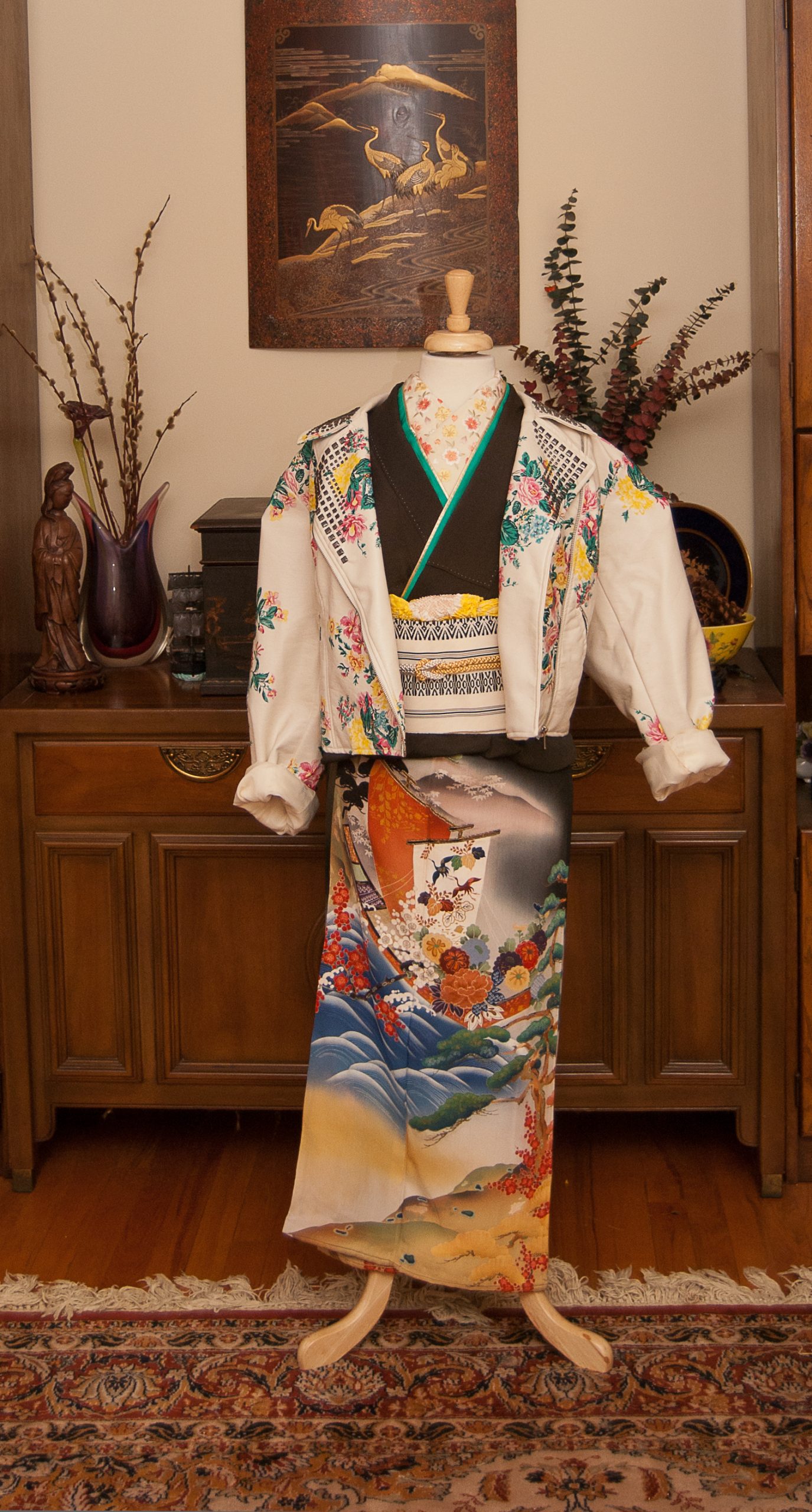
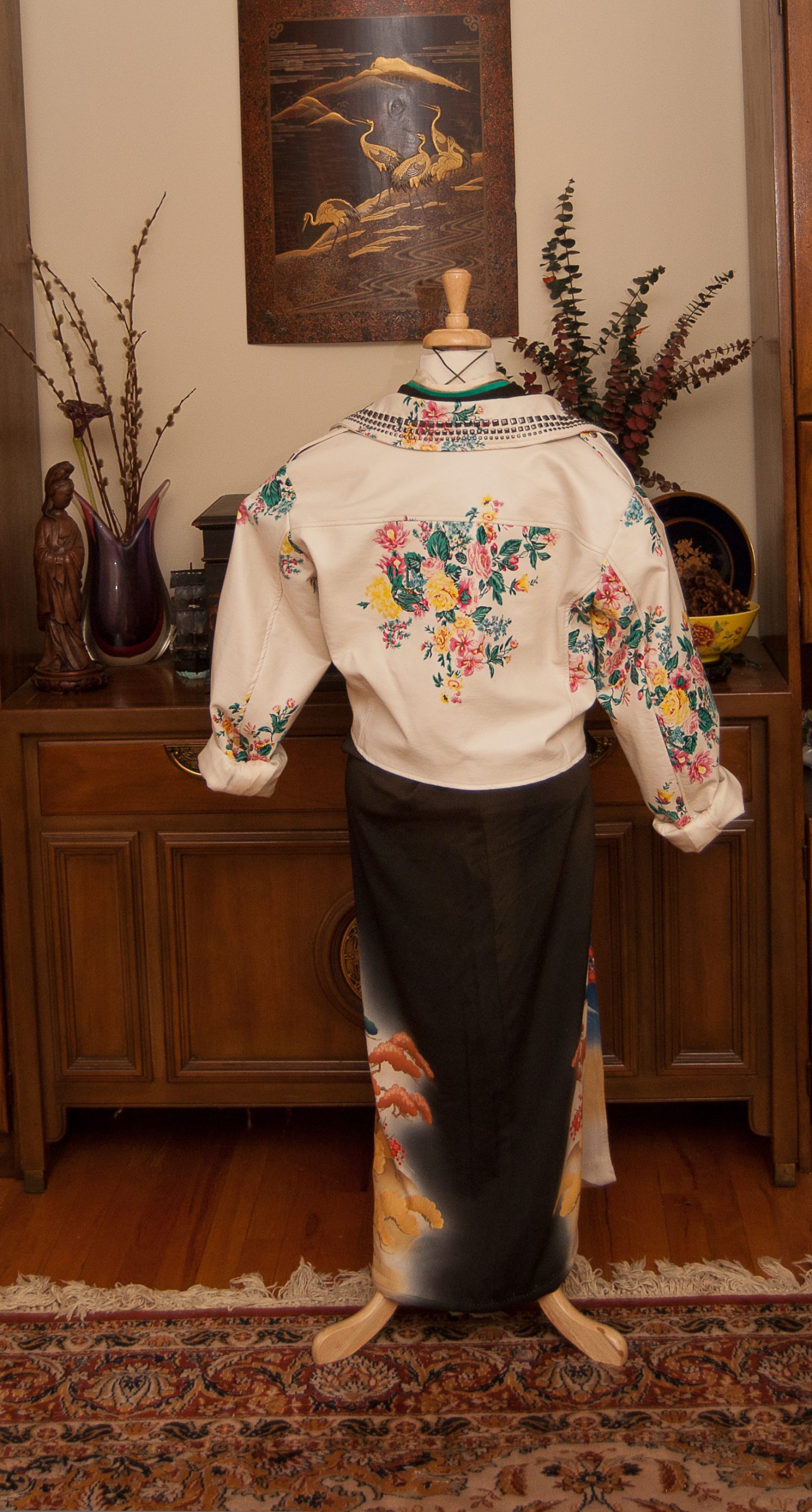
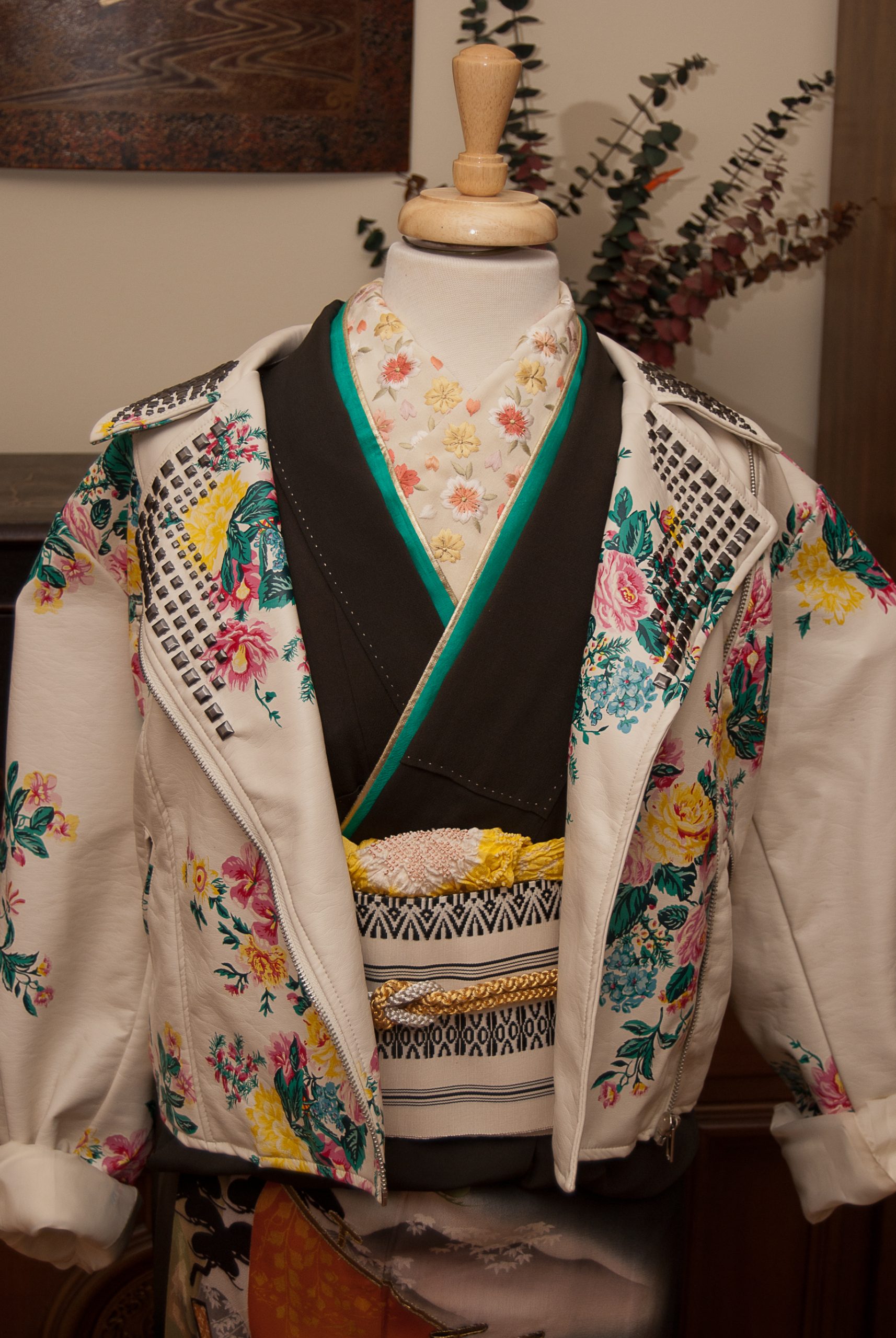
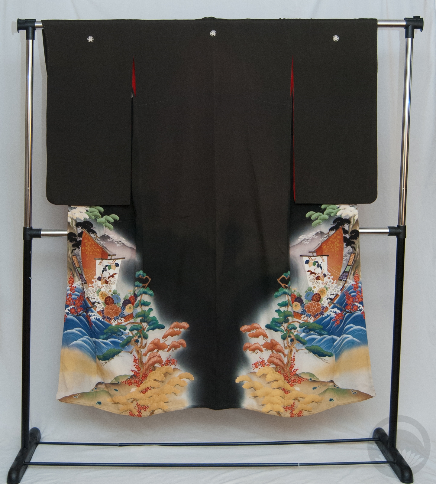
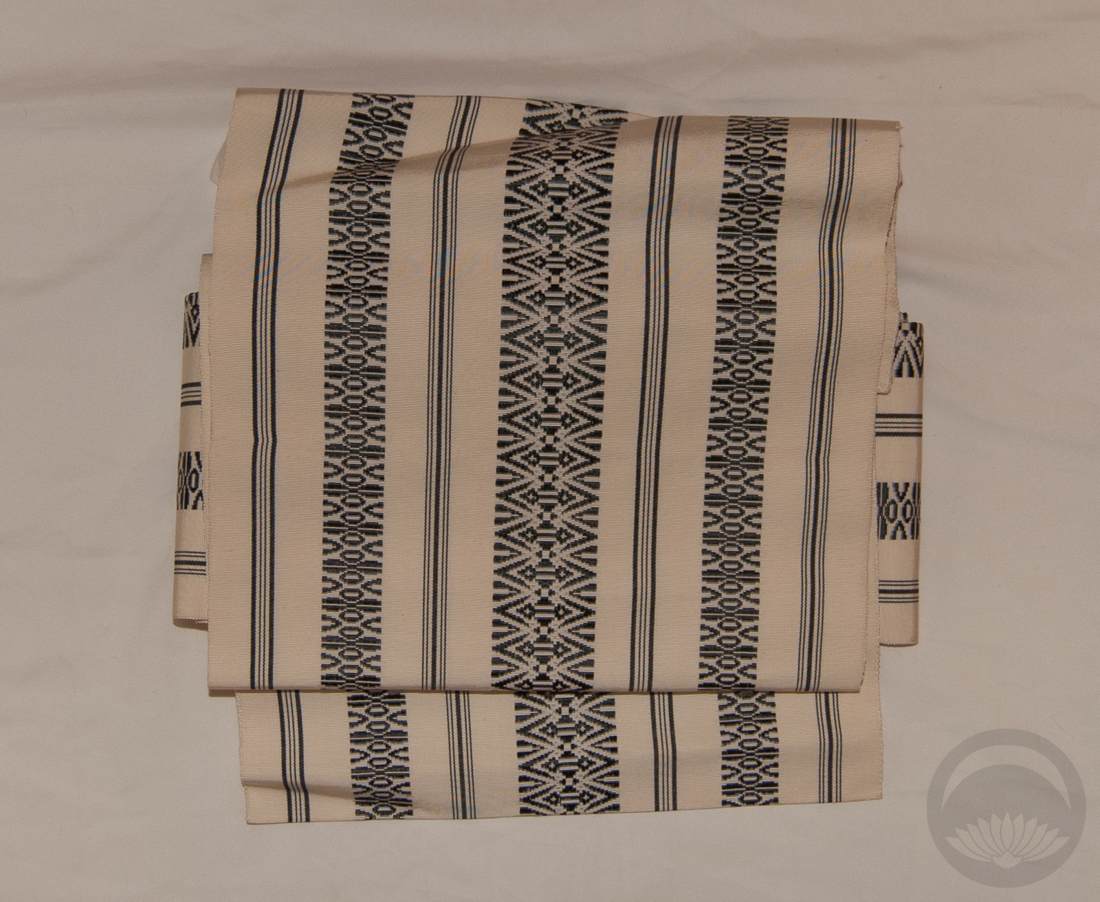
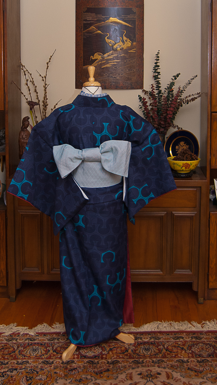
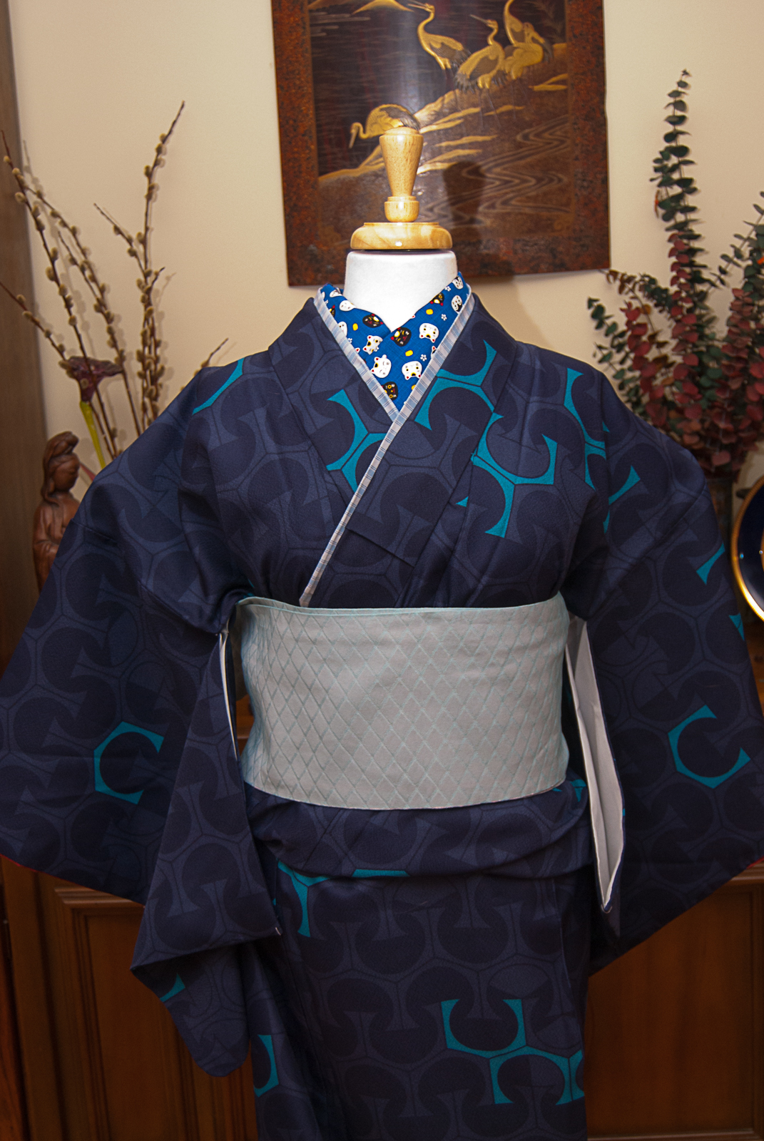
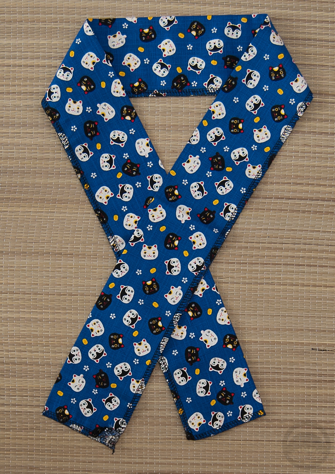
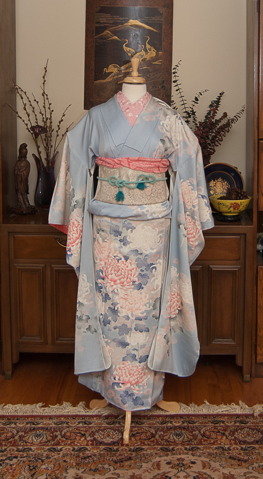
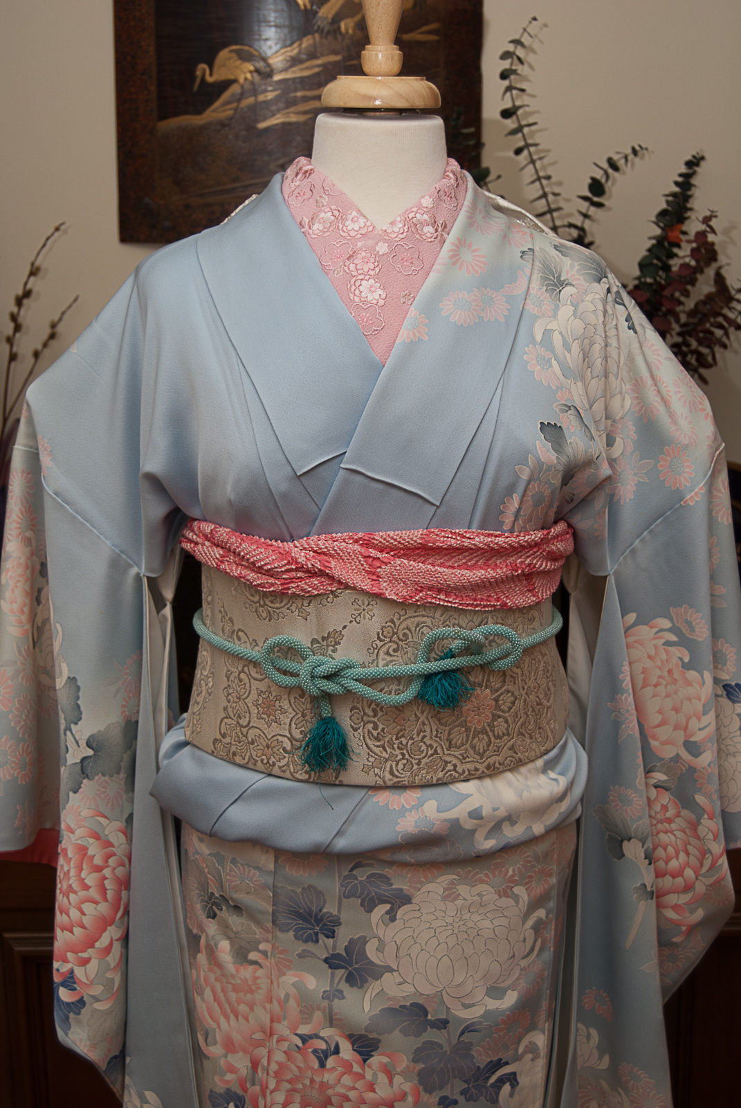
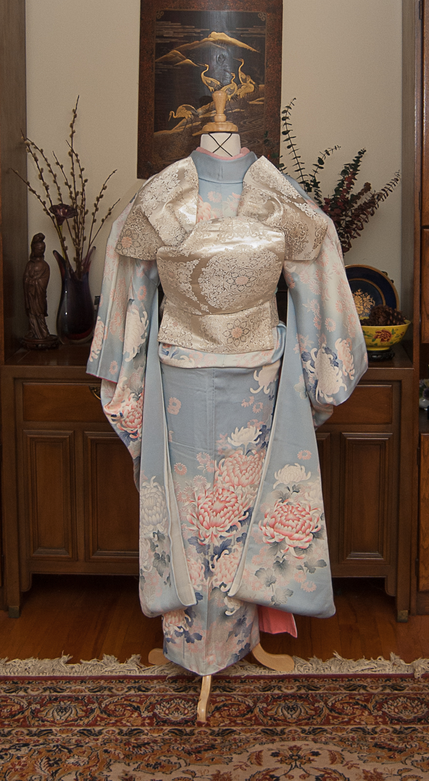
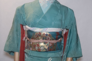
Amusingly enough, the jacket itself came from another dear friend named Nicole, and it’s one of my favourite things in my wardrobe. I knew I wanted to use it, instead of a plain black one, so I chose this vintage kurotome because of the similarities in colour accents, and the flower motifs. I figured since I was already doing something “wrong” I could just throw caution to the wind and have a little fun. I pulled out some really bold accessories, and went with the narrow band of my hakata tsuke-obi since the back would be hidden anyway, and it helped to reduce bulk under the jacket.
While I can’t say whether or not I’d ever be confident enough to wear something like this out in public, I do think the experiment was ultimately very successful and I’m glad I did it!
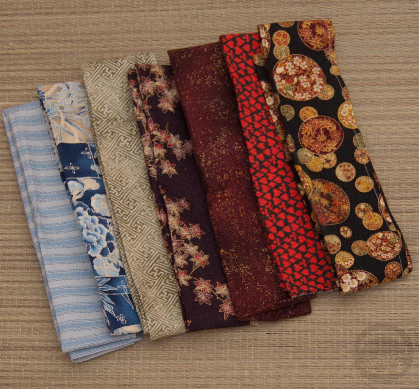
Items used in this coordination
-
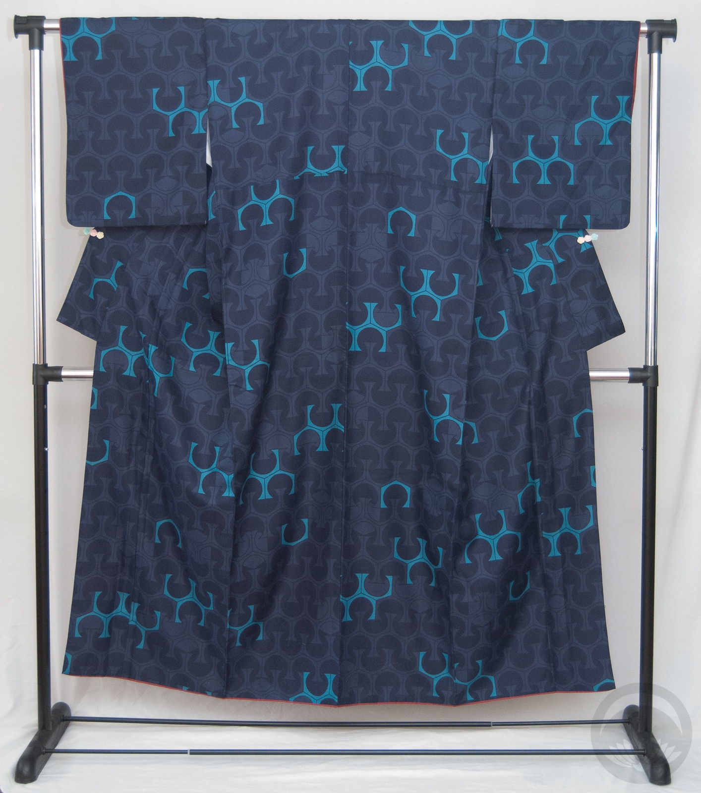
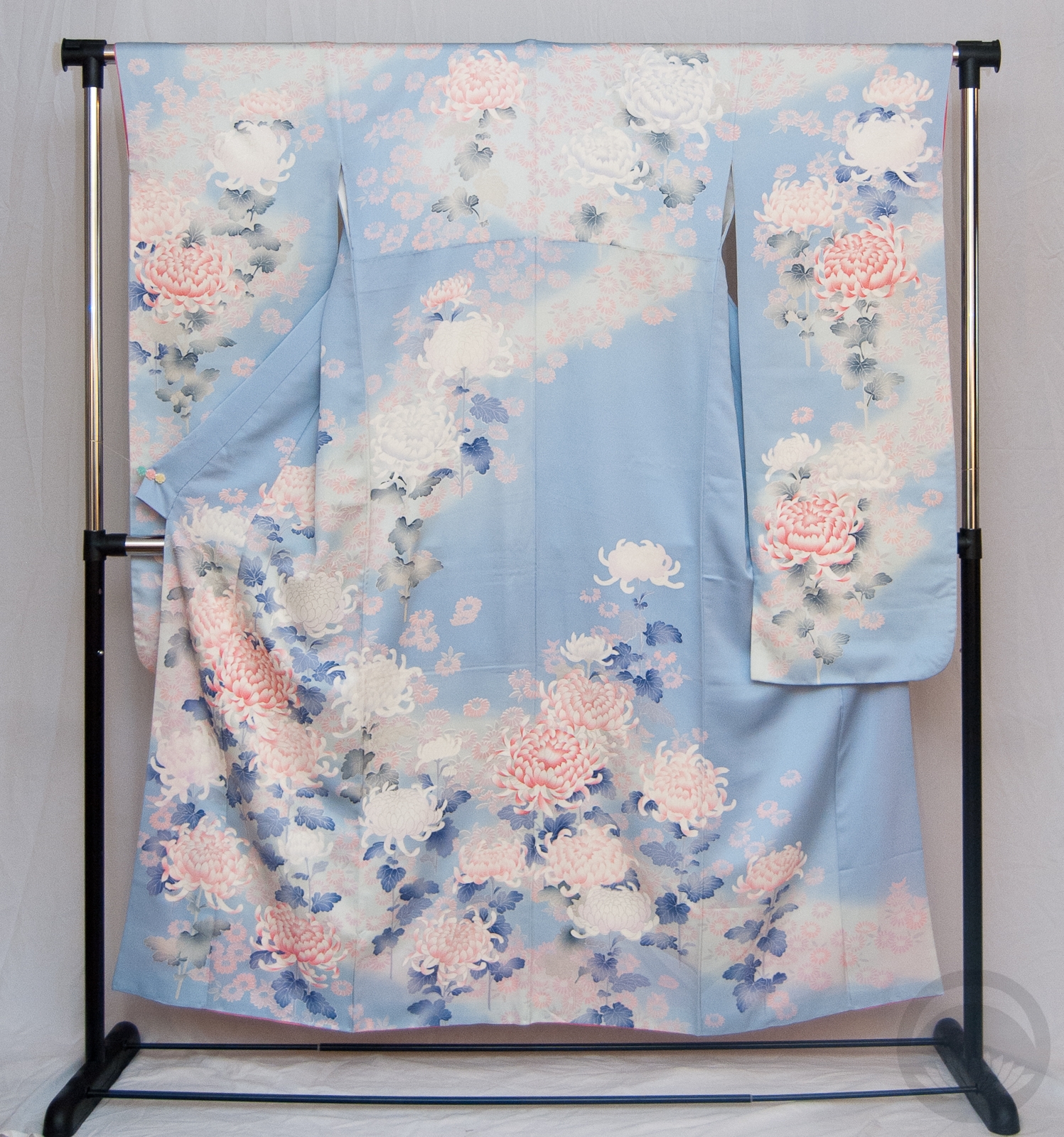
- Vintage Mirrored Boat Kurotomesode
-
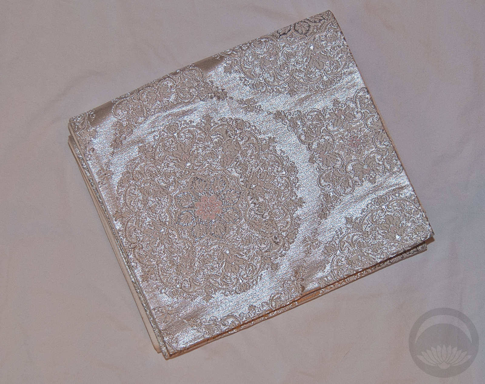
- Black & White hakata
-
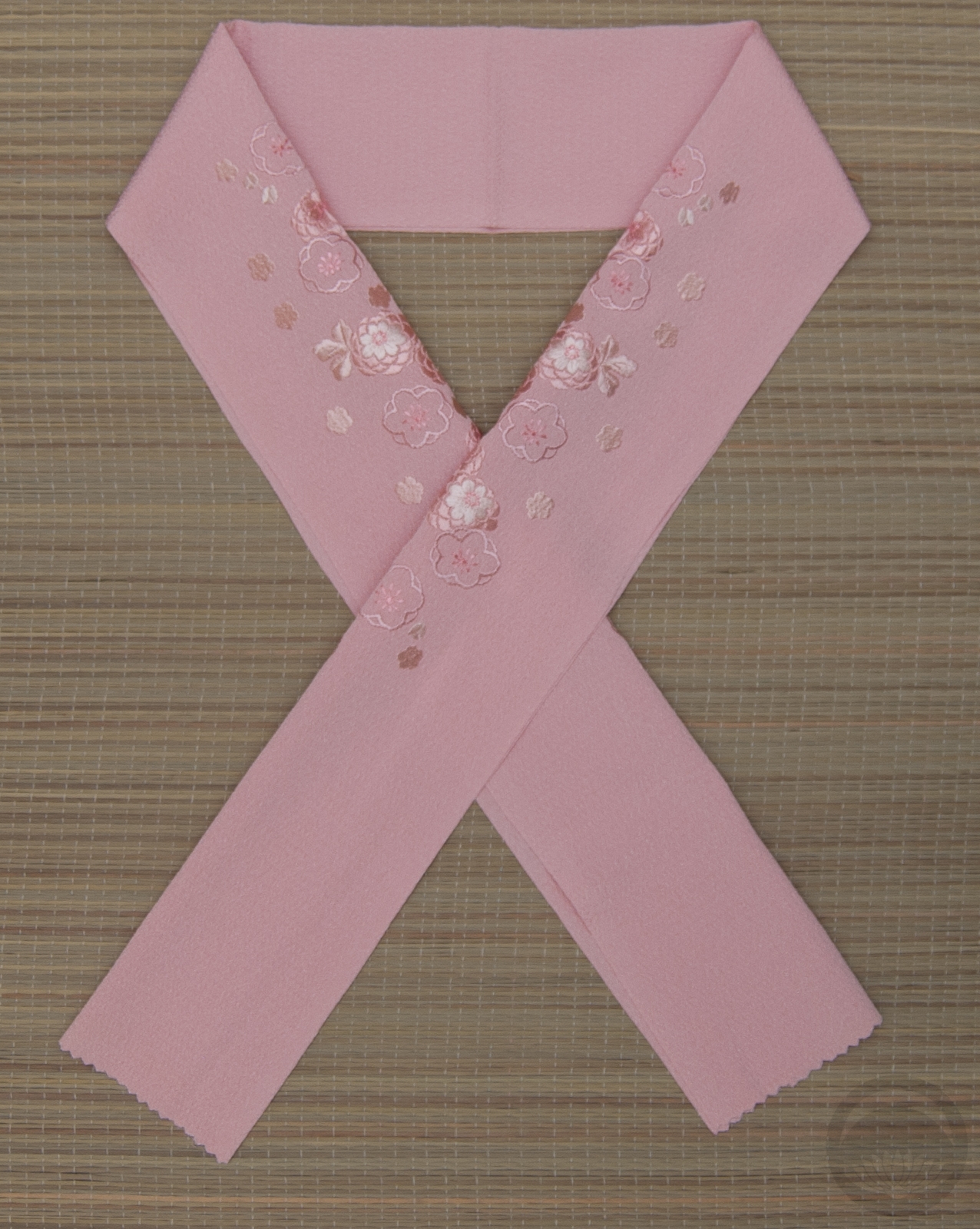
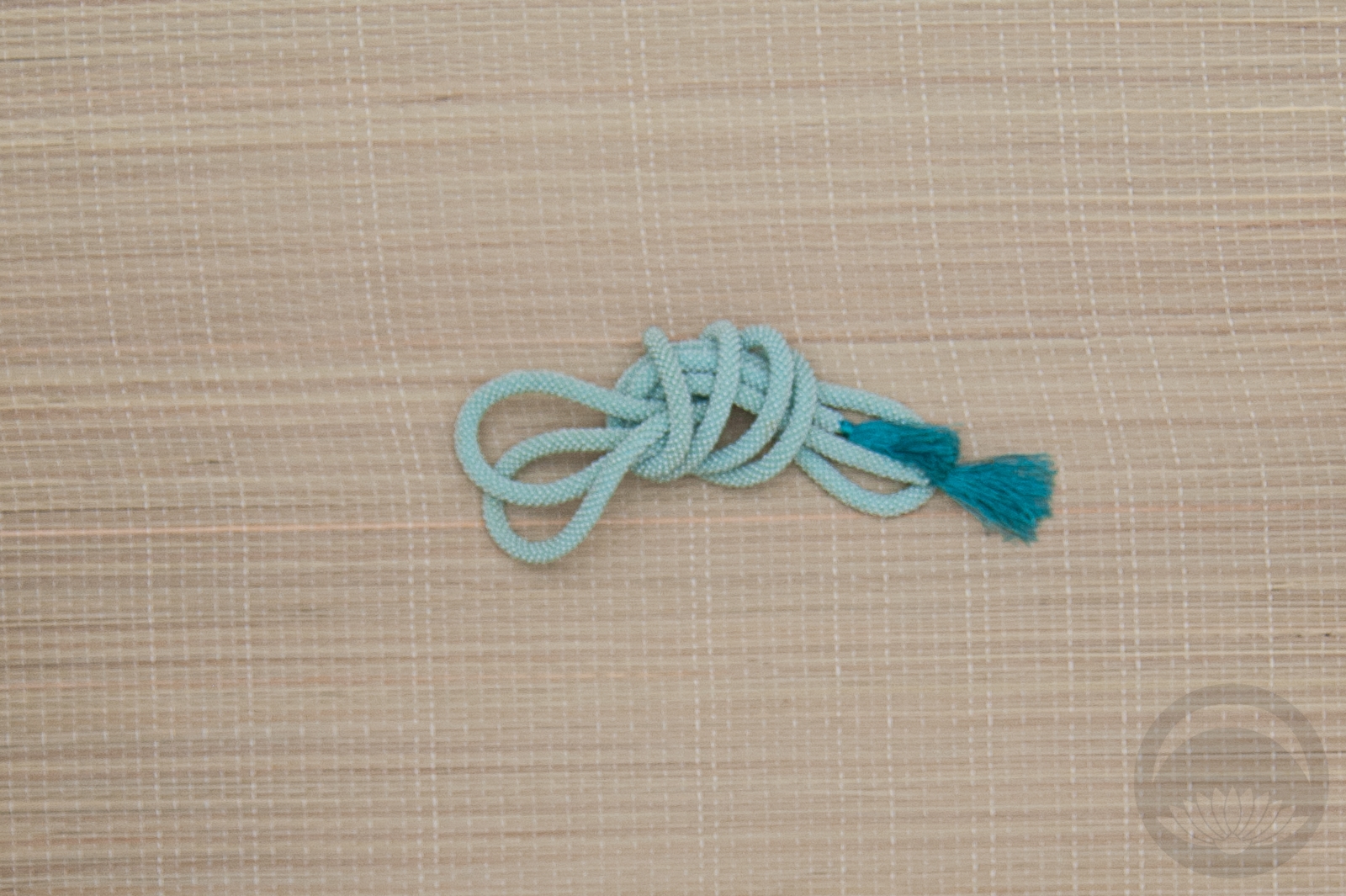
- Sakura

-
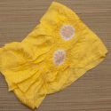
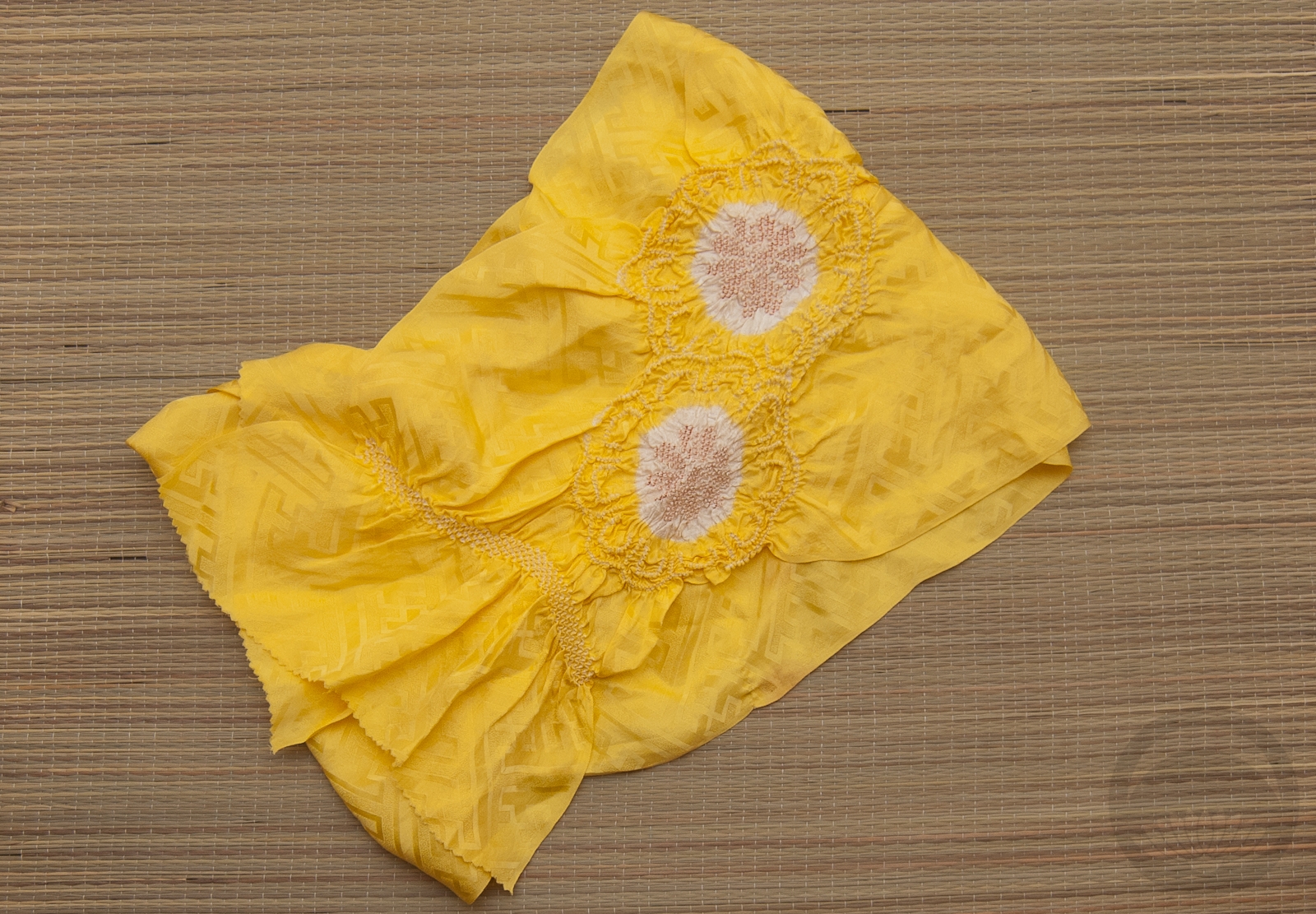
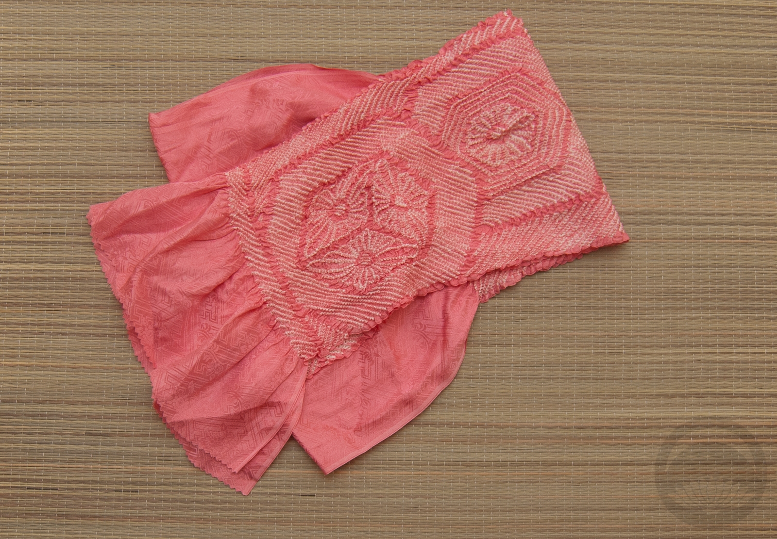
- Lemon Yellow Shibori
(and one epic jacket!)


 Bebe Taian
 CHOKO Blog
 Gion Kobu
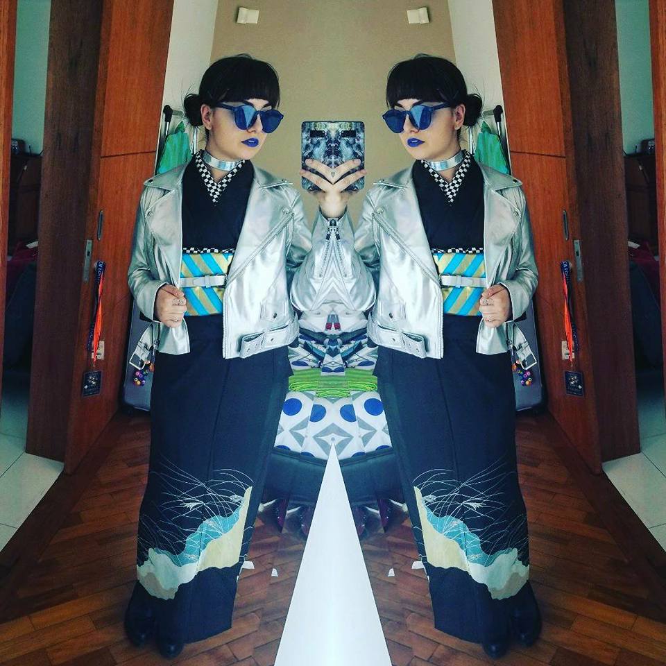