
Today I am participating in the Scarves in Solidarity project, which aims to show support for the Muslim community in NZ by wearing a head scarf. It’s a small gesture, but one that helps show that we’re all united in the face of terror and white supremacy. Several years ago, Quebec had a much smaller but similarly motivated attack, so the attack in Christchurch, New Zealand, last Friday hit especially close to home here.
Personally, I am an atheist. However, I firmly believe that a place of worship (be it a mosque, church, synagogue, temple, shrine, or any other) should always be a place of hope, faith, and safety. To attack people in during their prayers is the height of cowardice. I wanted to do something to show my support for the survivors of this attack and their families.
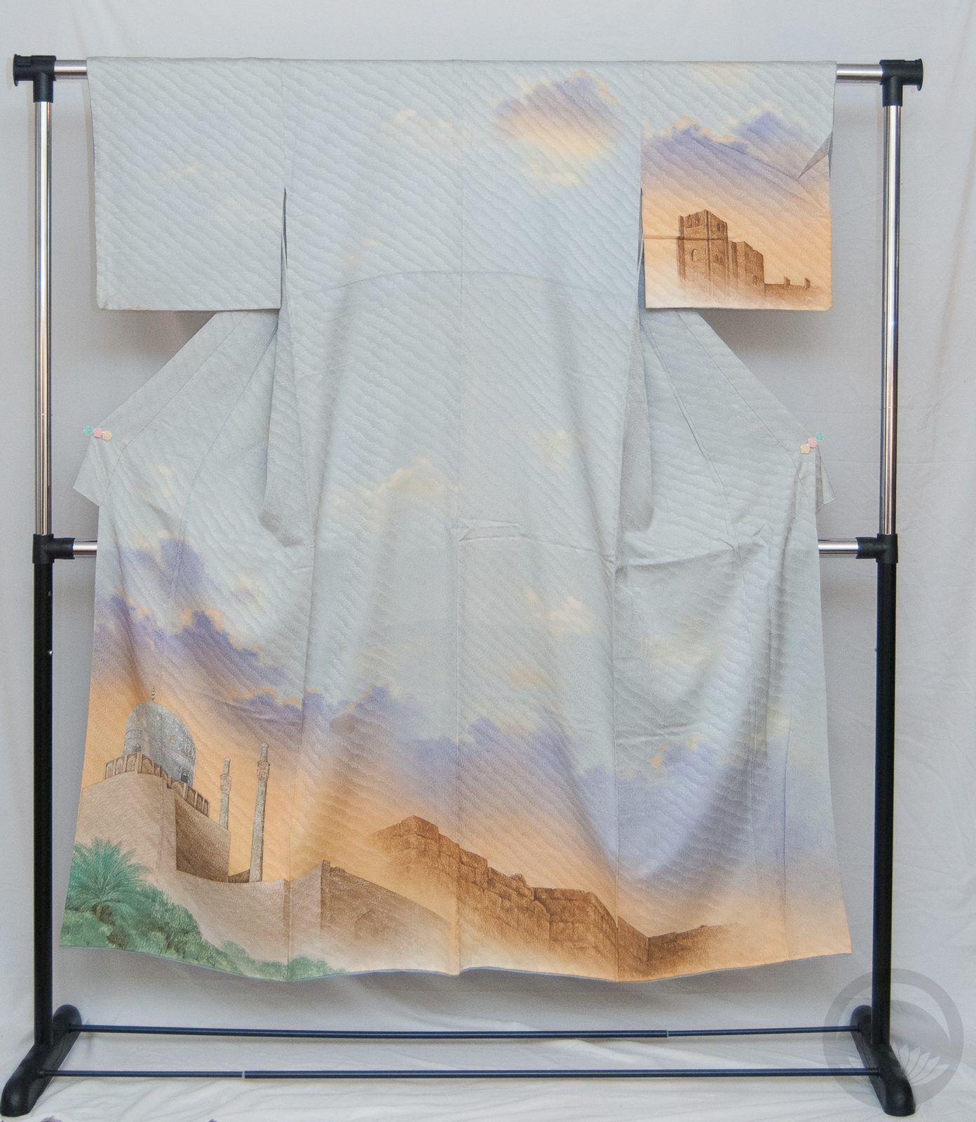
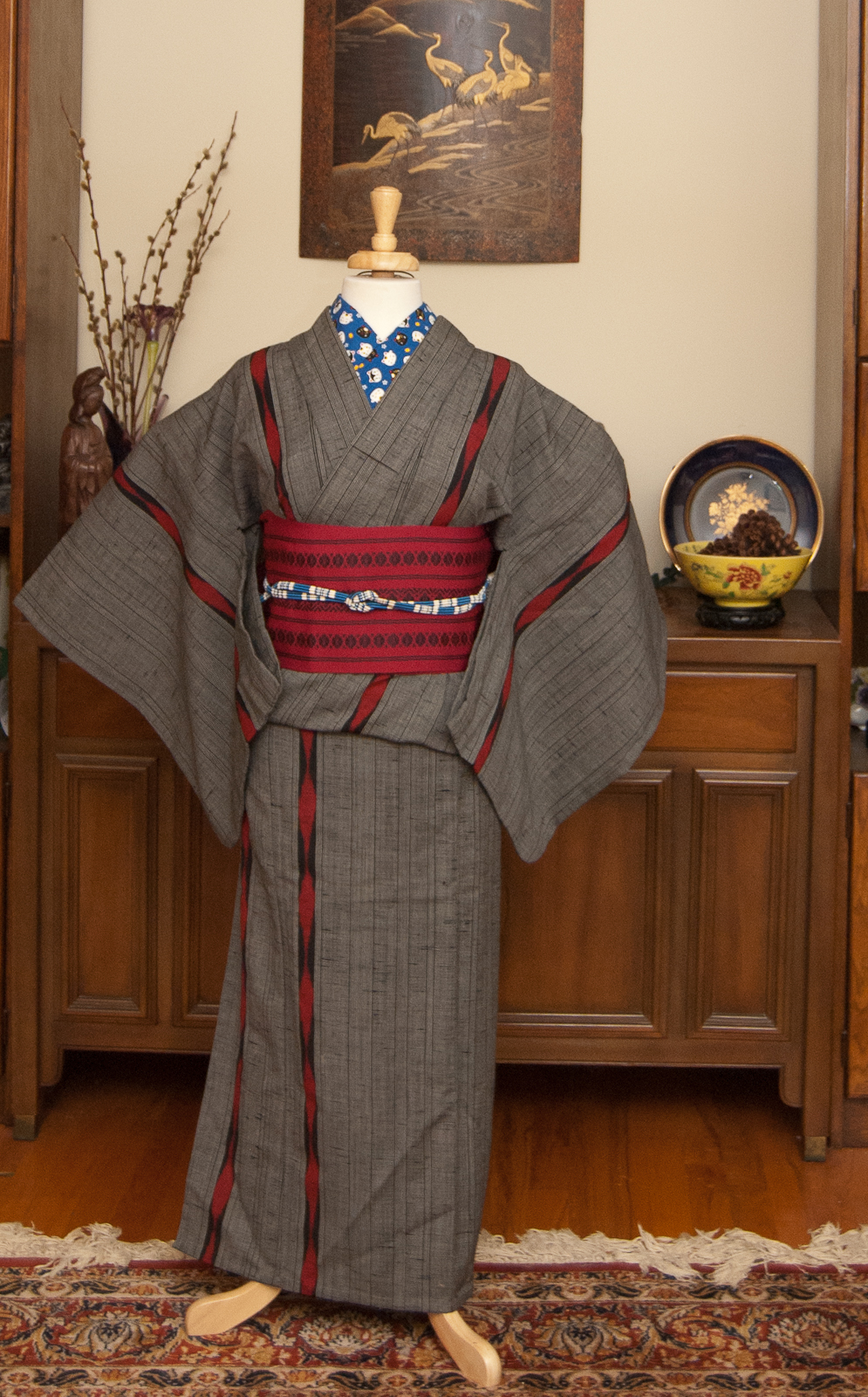
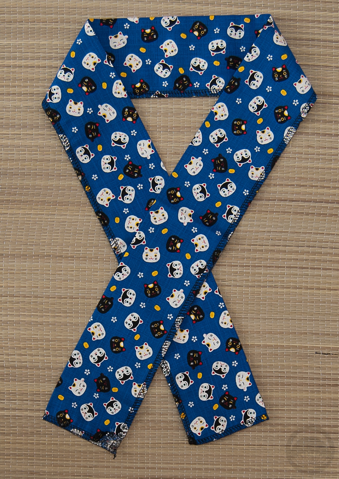
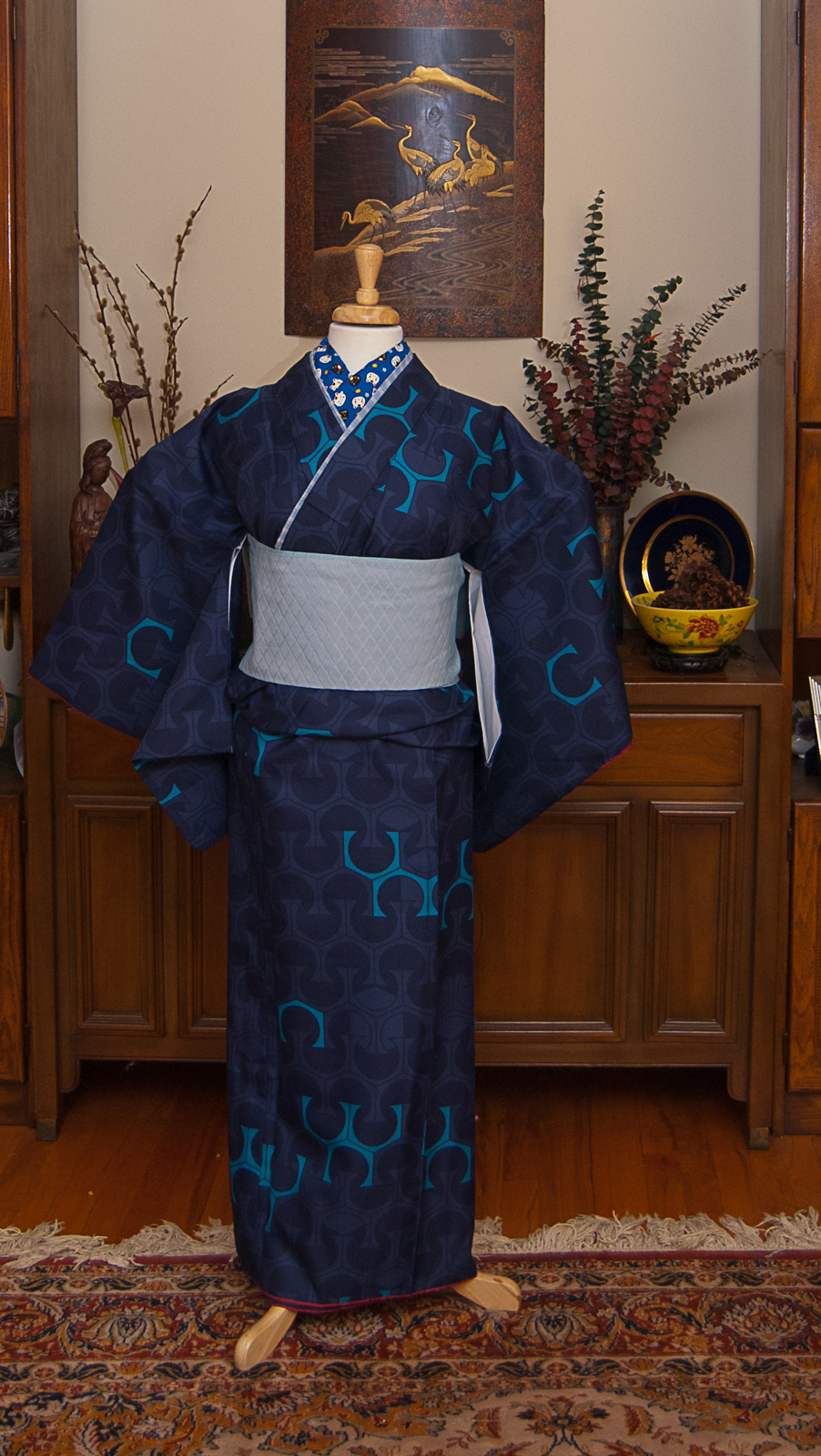
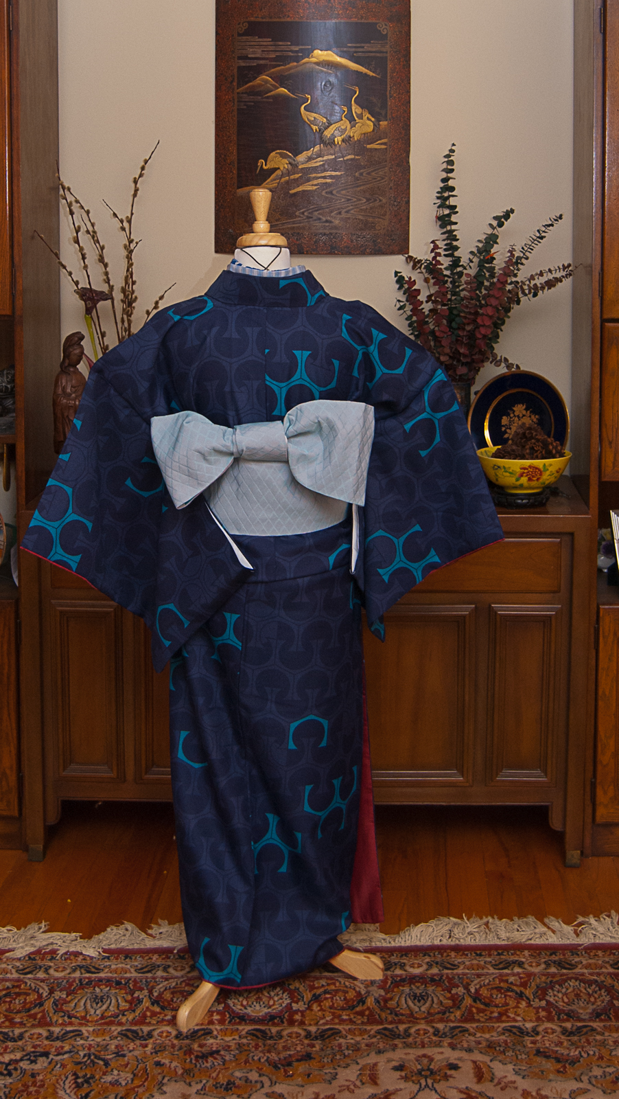
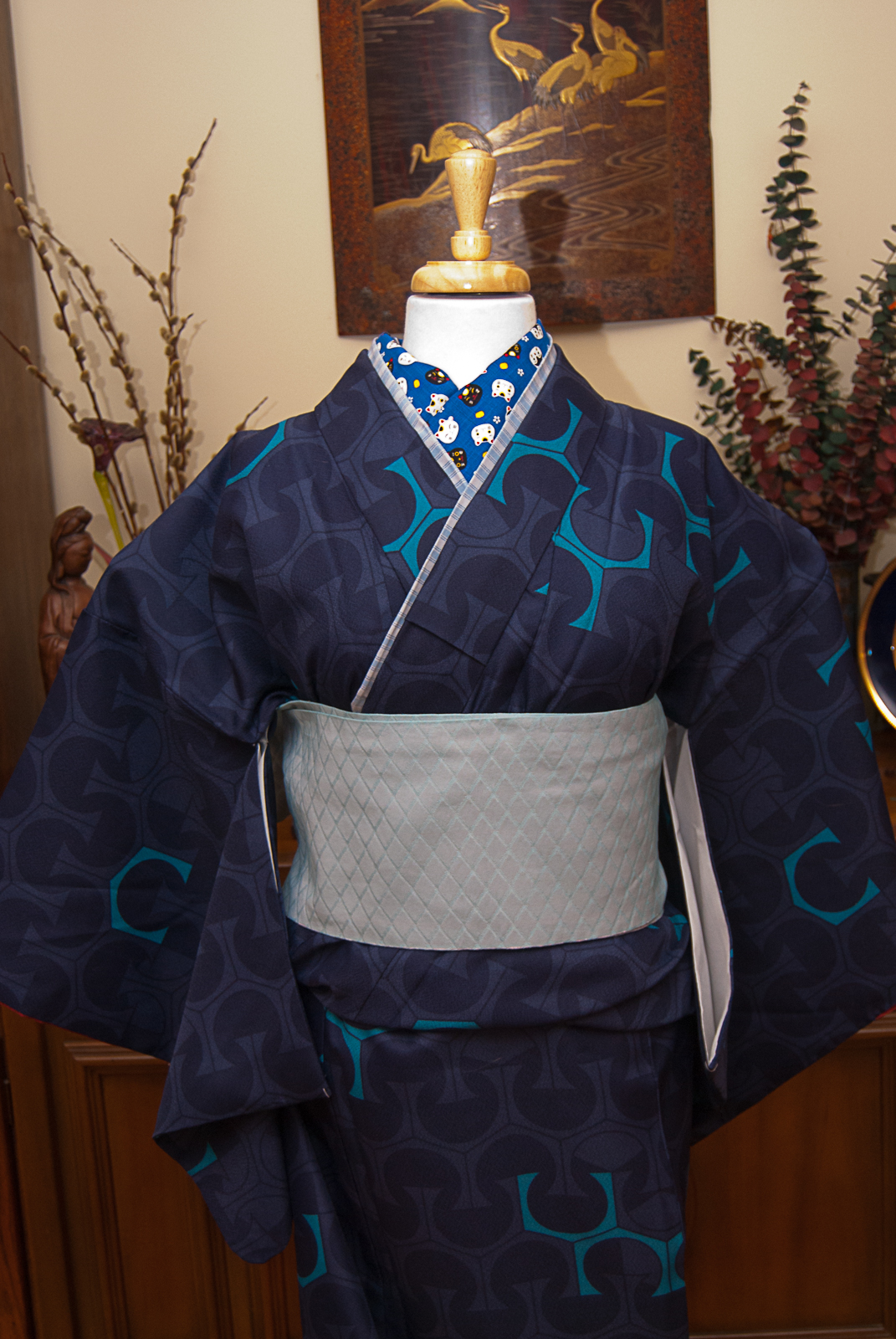
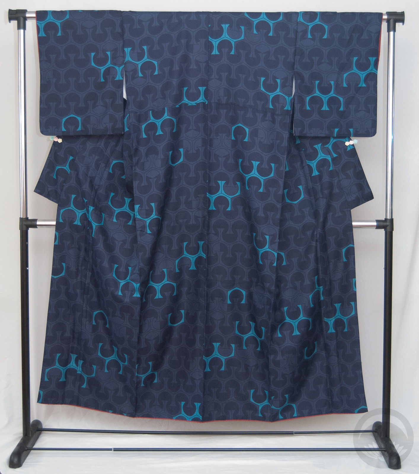
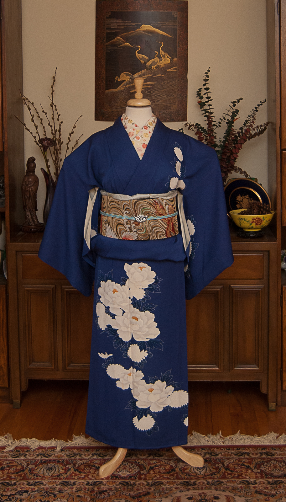
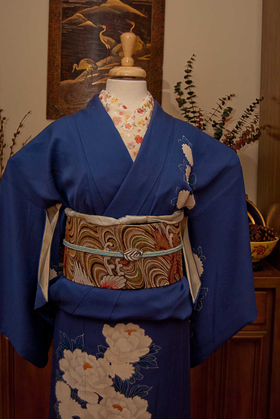
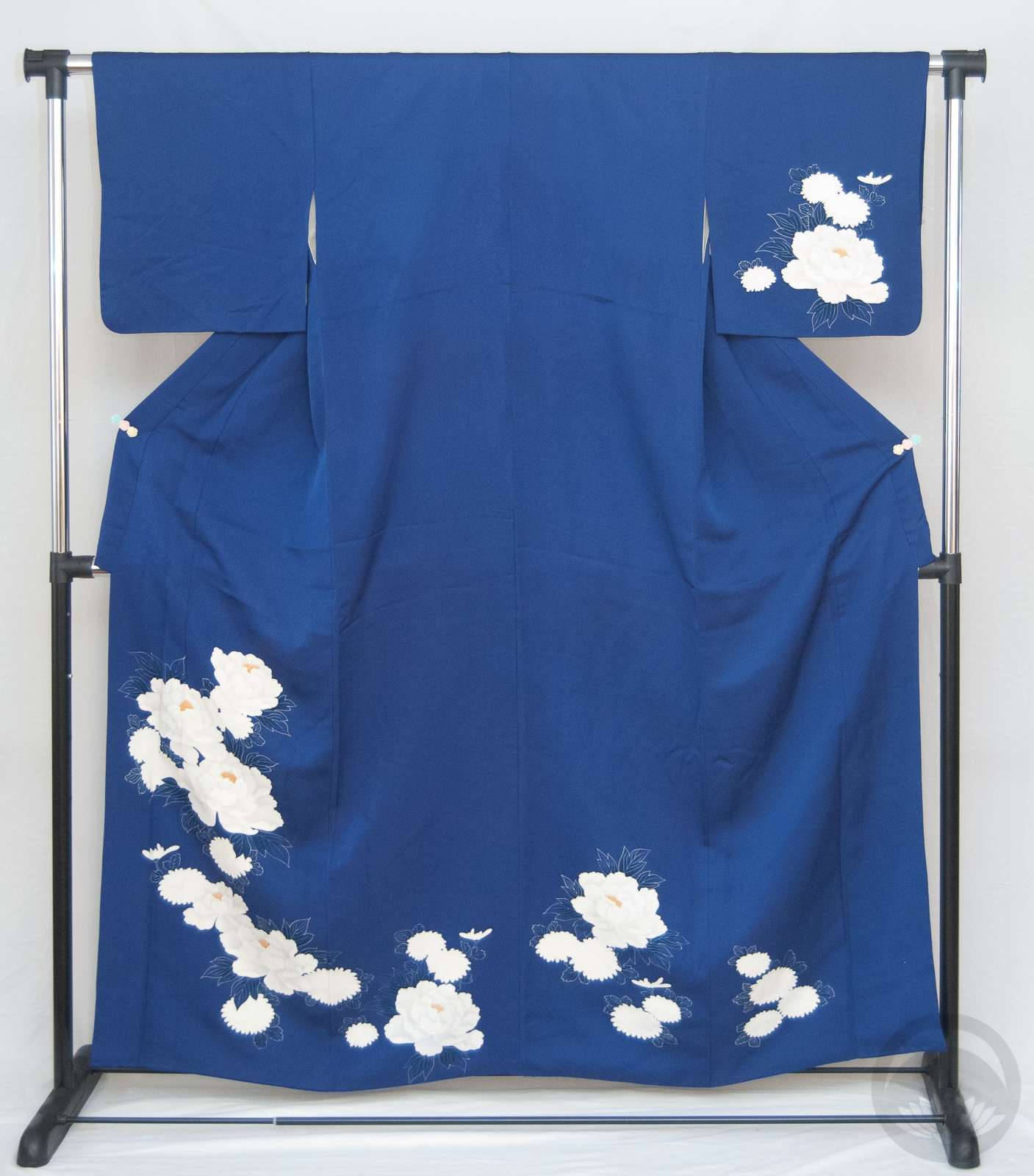
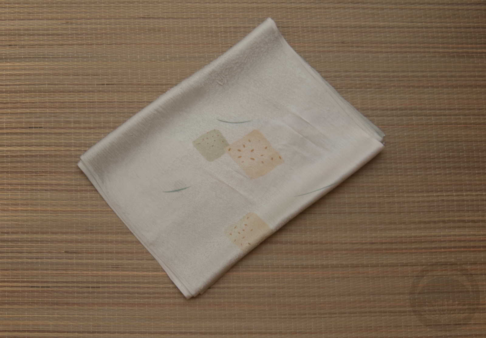
Of course, I had to wear my beautiful mosque houmongi for this project; I could think of no more appropriate piece in my collection. I could barely get it around my hips, but I was determined to make it work.

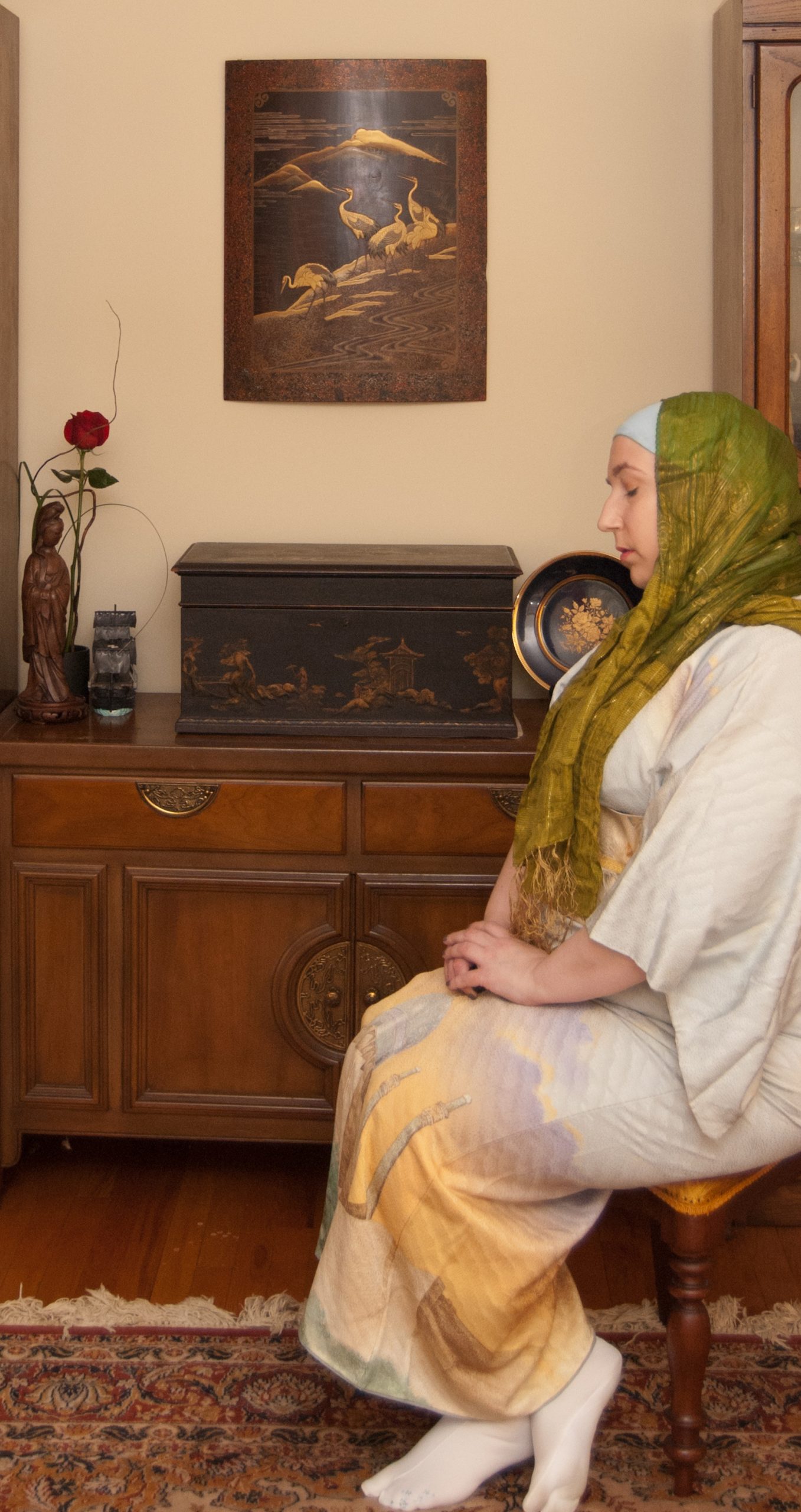
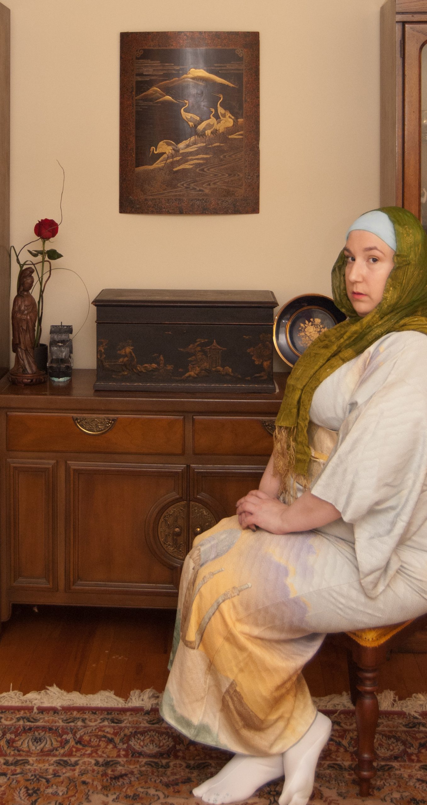
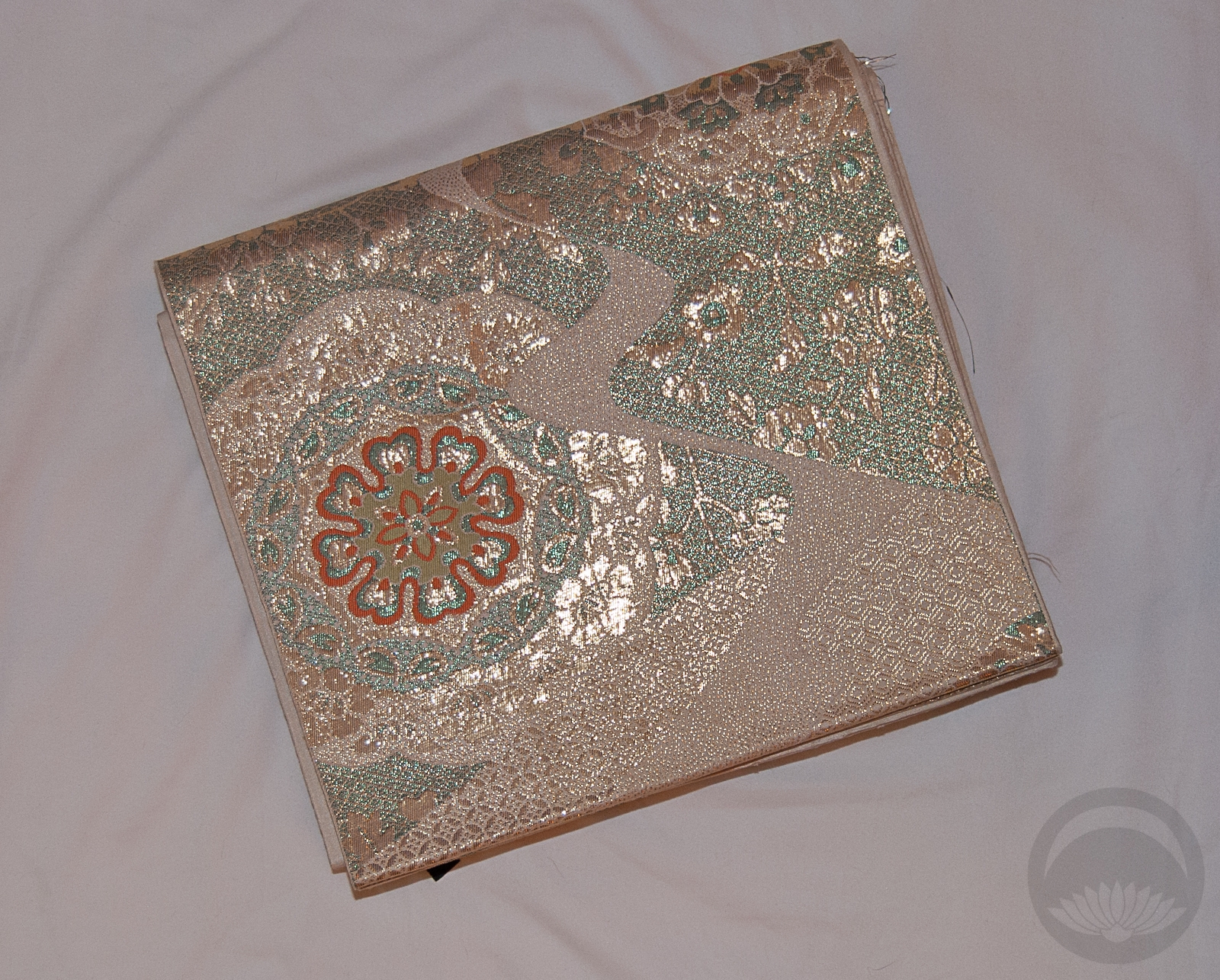
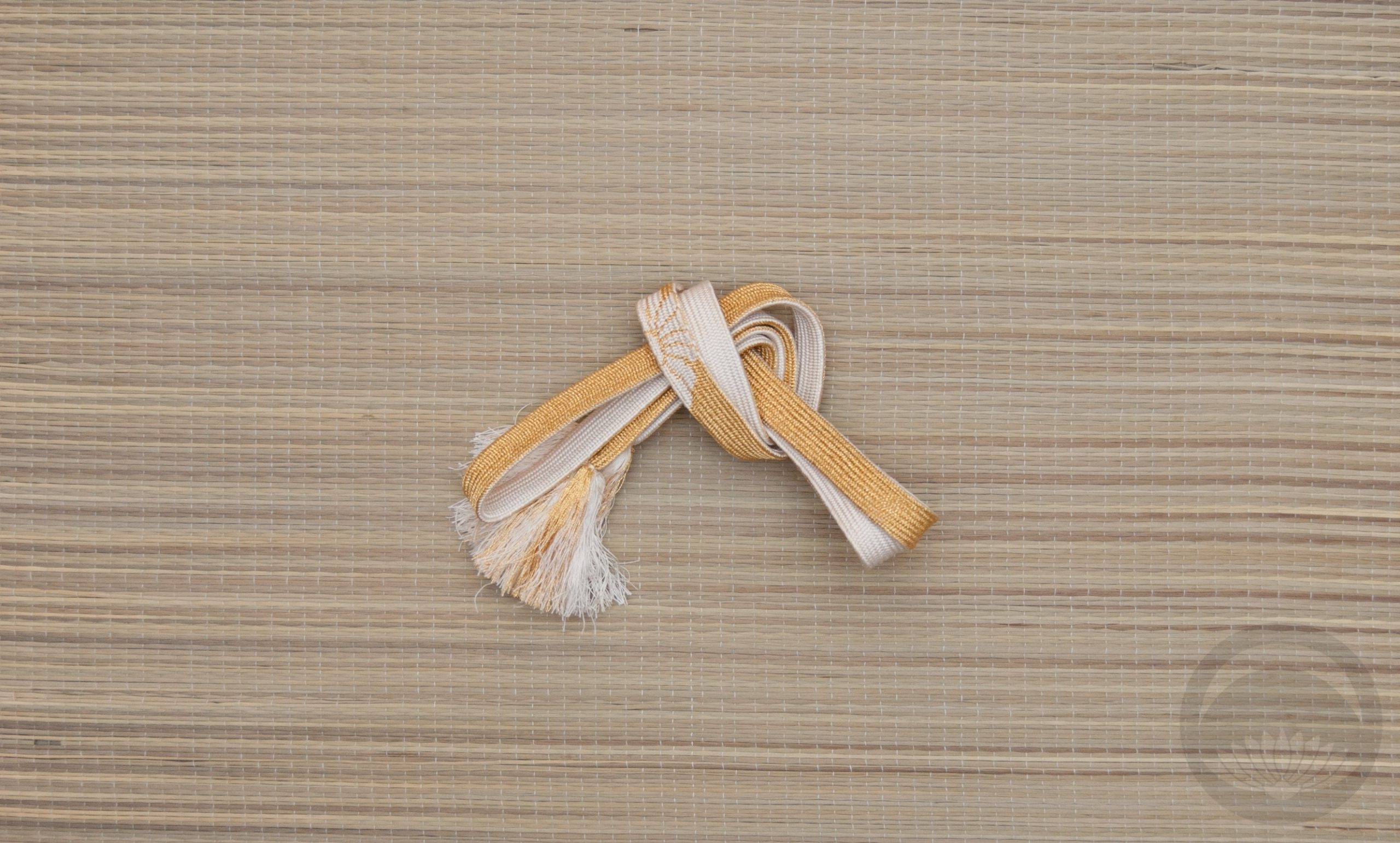
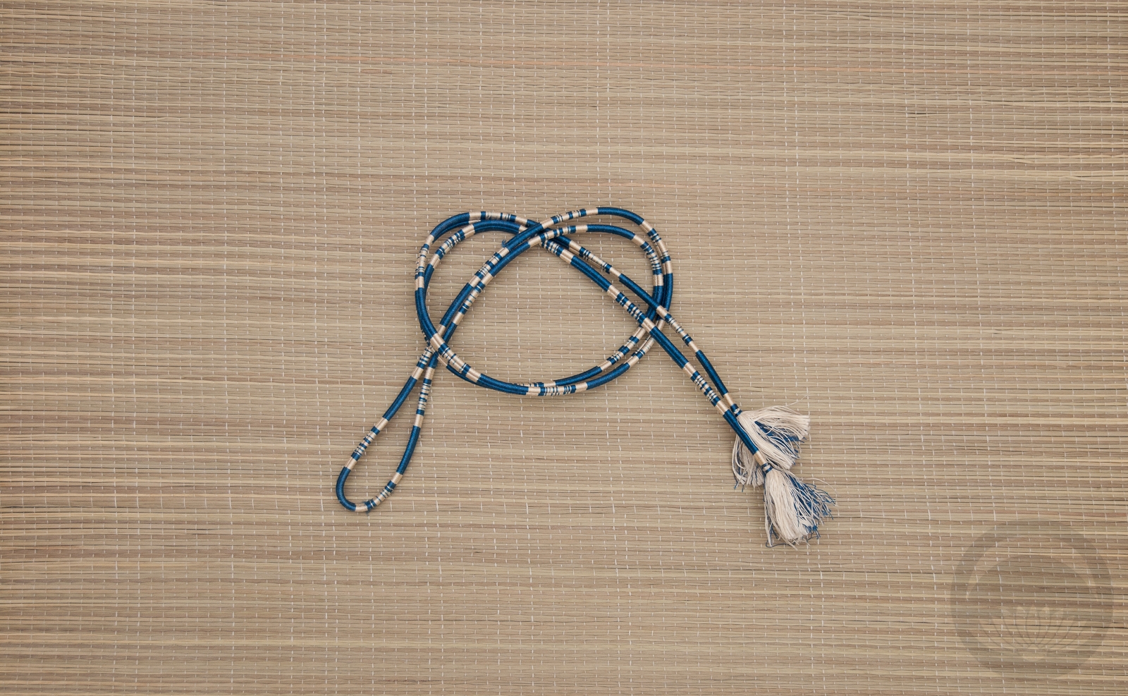
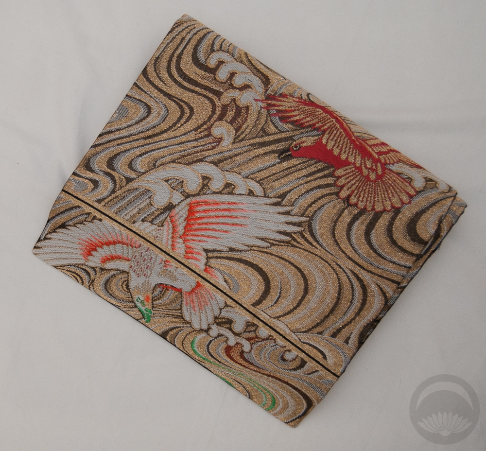
I wore a light blue-green buff underneath to tame my unruly blue hair, and then this beautiful green and gold scarf over top, which ties in to the green and gold tones in the hem of the kimono. I think it looks perfect together. Gold obi and accessories finished off the outfit well.
Whatever your view on religion in general, or religious head-coverings may be, I think we can all agree that nobody deserves to be targeted for their beliefs. People of Christchurch, NZ, and Muslims around the world, we are with you.
Items used in this coordination
-

- Shah Mosque
-
- Seafoam Arabesque
-
- Gold and White


 Bebe Taian
 CHOKO Blog
 Gion Kobu