
Tenmoku (天目, also commonly referred to as Jian Zhan 建盏 in Chinese) is a stunning style of ceramic ware, created using high temperatures and glaze with a very high iron content. The end result is a variety of incredibly rich, deep, and iridescent finishes.
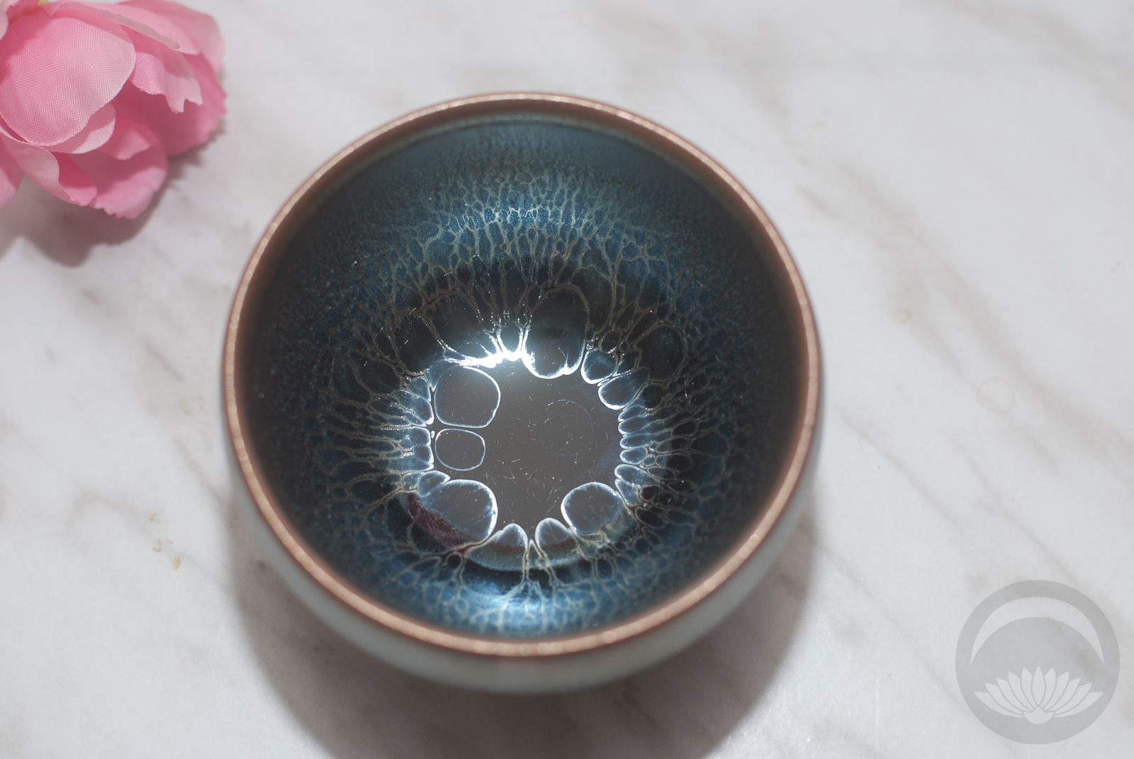
I received this beautiful “Jellyfish” teacup from Tenmokus.com, who provide a wide array of beautiful tenmoku cups and teapots. I was expecting it to be pretty, but nothing prepared me for how stunning it was in person. The glaze is so luxurious and layered, the shimmering rings peering through layers of translucent blues. This cup was undoubtedly named after the moon jelly, which just happens to be one of my favourite sea creatures ever.
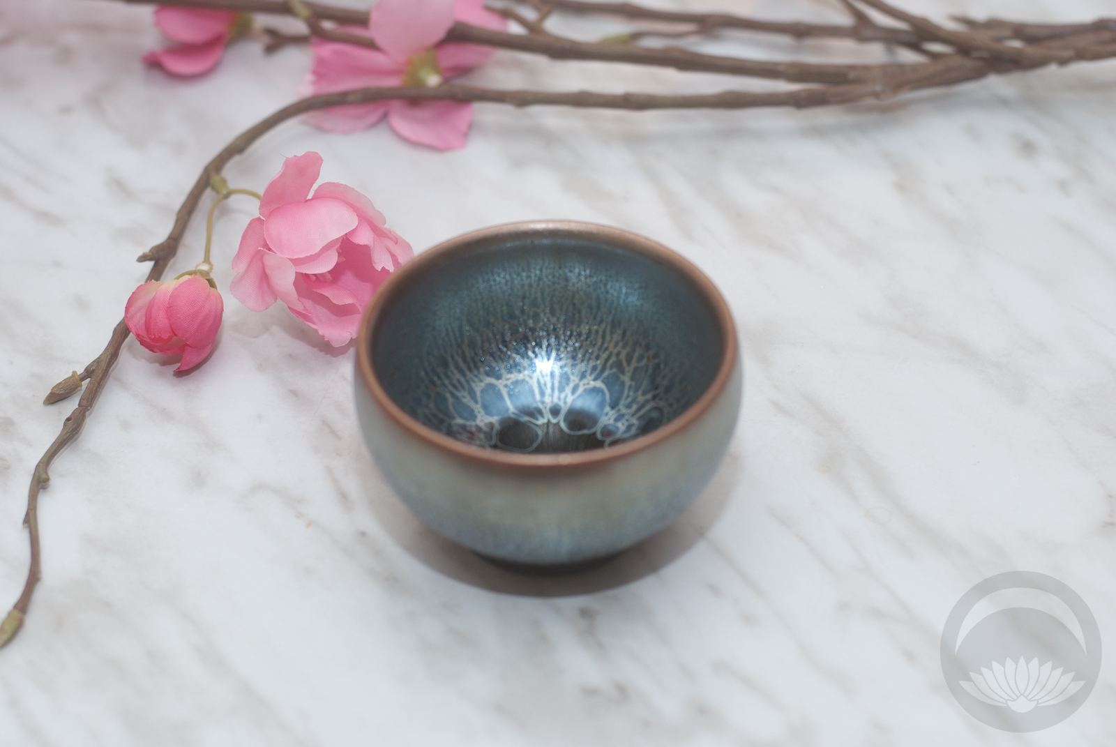
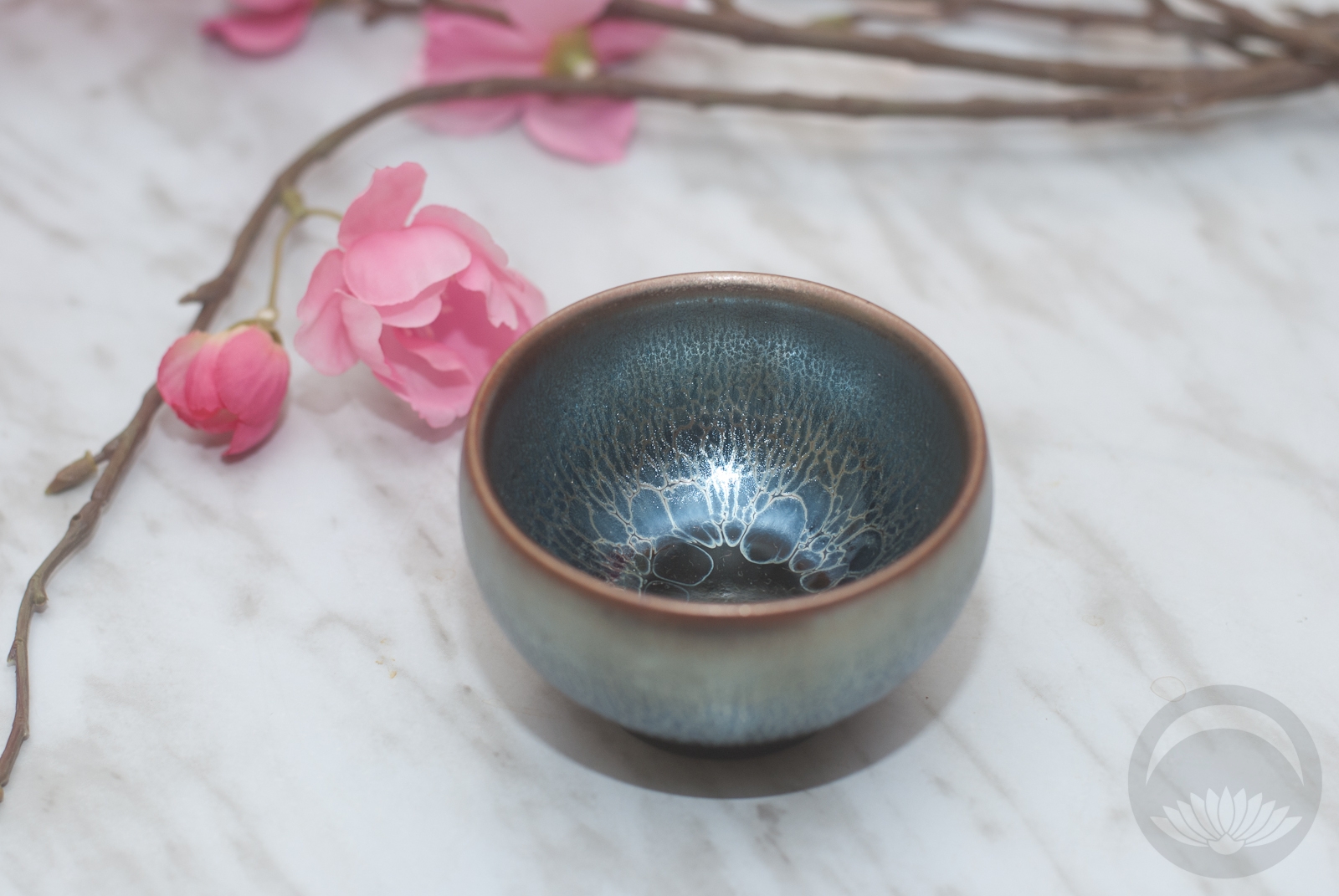
It also feels perfect to hold. I have large hands (to go with the large rest of me, hah) and often small Asian tea cups are too small and I end up feeling clumsy and awkward holding them. This one is still delicate, but just large enough that it feels great to hold. It’s also a bit thick, which will also make it very comfortable when holding very hot tea, thicker walls mean less heat transfer.
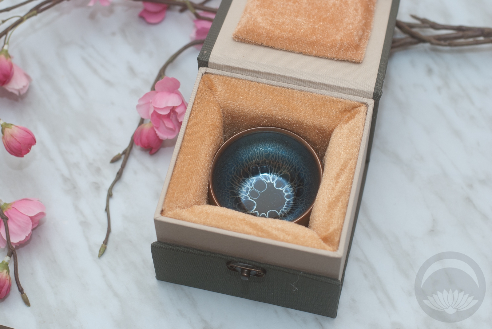
Their cups are shipped in absolutely gorgeous presentation boxes that serve dual purpose; not only are they perfect for gifting but they’re so thick and well-padded that the cup was very well-protected during shipping.
My only “concern” with this cup, if you can even call it that, is that it’s so impossibly gorgeous that I almost don’t want to use it. But somehow just leaving it in the box or even on display feels disrespectful. This is a cup that cries out to be used and appreciated.
I highly recommend checking out Tenmokus.com if you’re in the market for a unique, stunning cup either for yourself or for a very special and unique gift.
I purchased this item at a discounted price for honest review purposes.


 Bebe Taian
 CHOKO Blog
 Gion Kobu