By Any Other Name

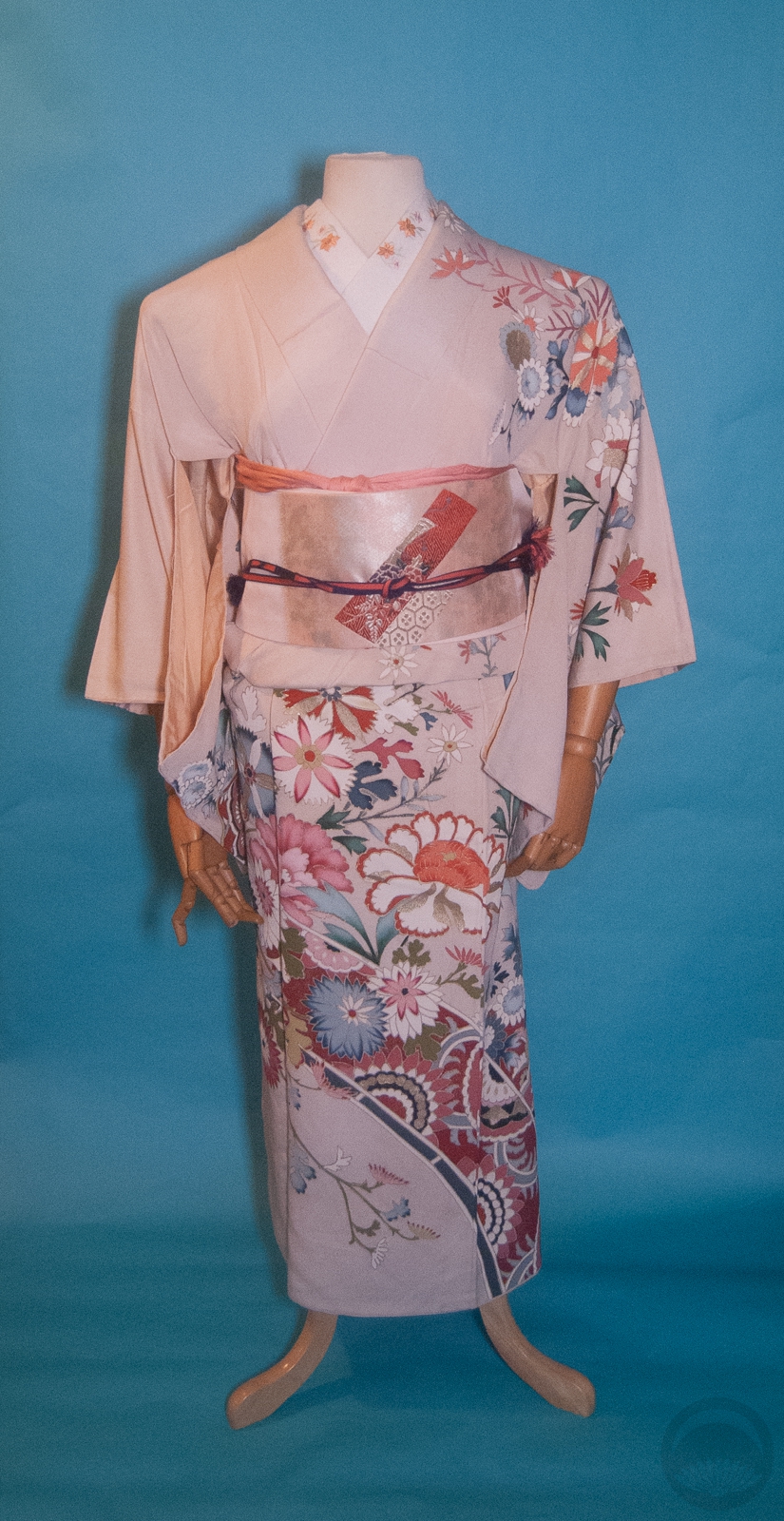
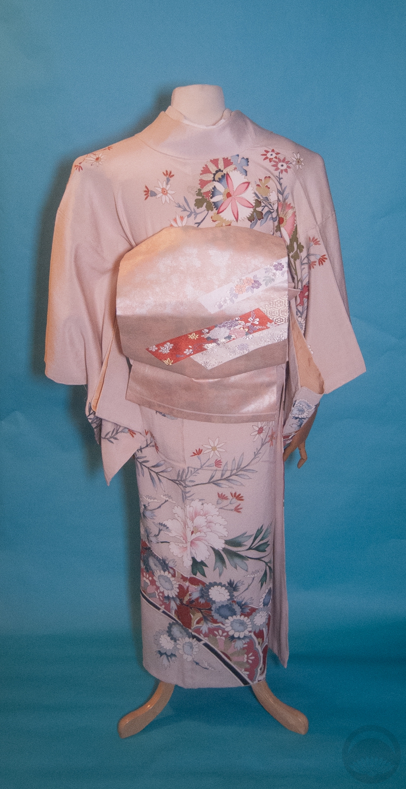
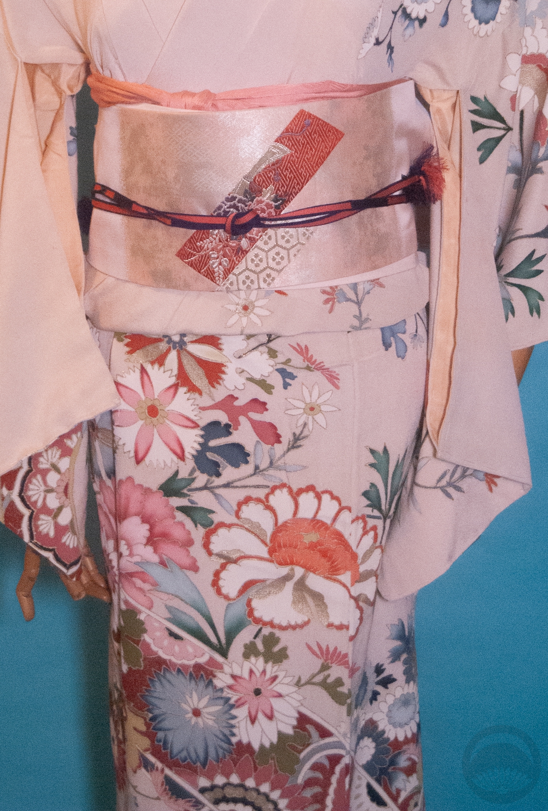
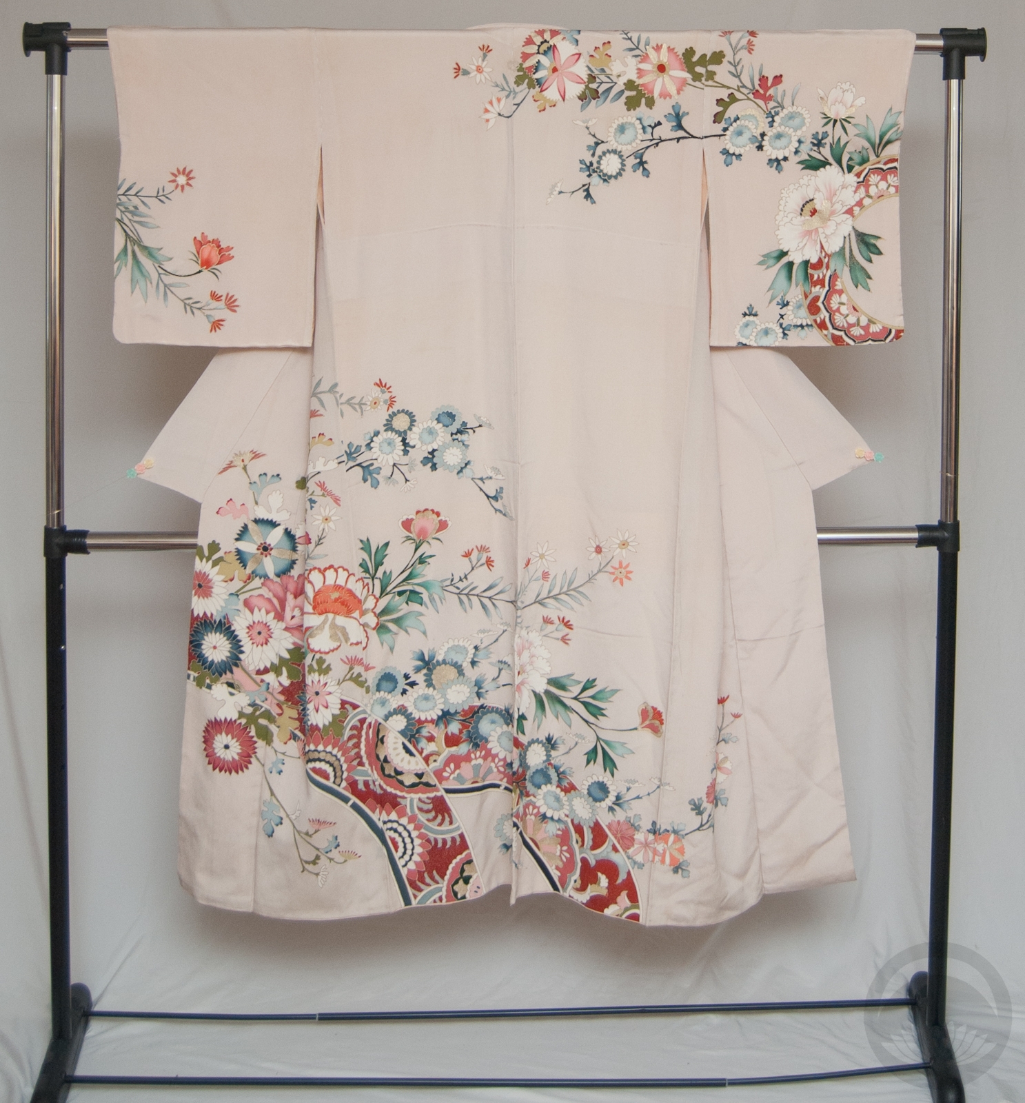
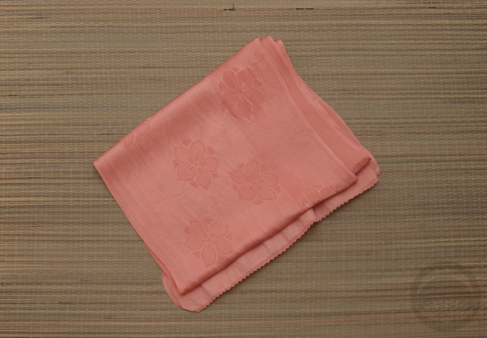
I found this charming rose furisode at the same time as I got the absolutely unctuous brown houmongi recently. As a married woman in her mid-forties, did I need yet another furisode? Heck no. Was I going to let that stop me? Also no. I love how subtle and demure it is, especially for a furisode. And the price was fantastic.

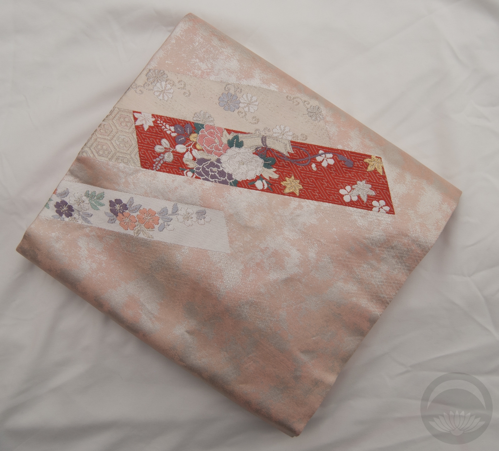
My beloved emerald and gold hakata packs a nice punch against the muted creme tone of the kimono, and pink accessories were a no-brainer. I’d love to get an actual rose obidome or obi-kazari to go with it, but this gold and sakura piece works in the meantime. I feel like this is a good “mature” furisode outfit, especially if I were to tie the obi in something a bit less large and fluffy next time.

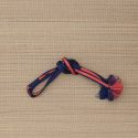
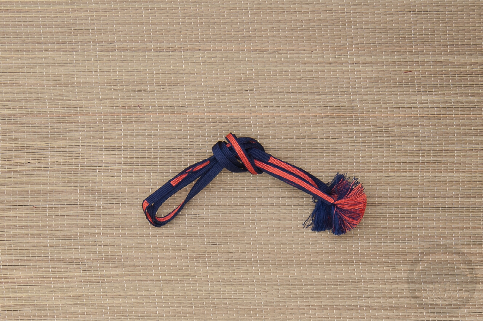
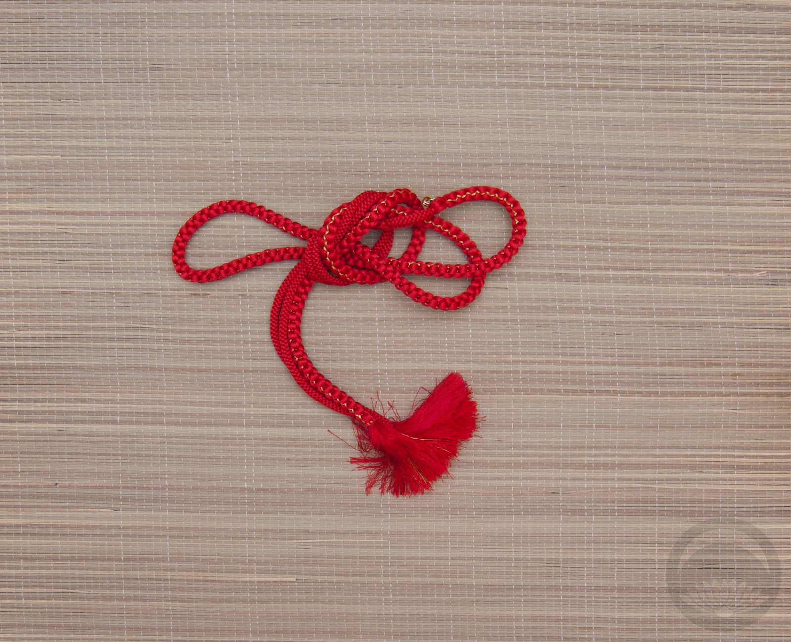
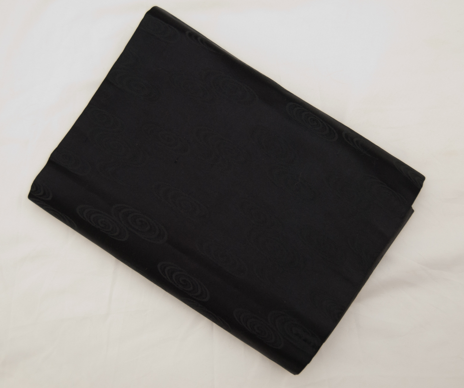
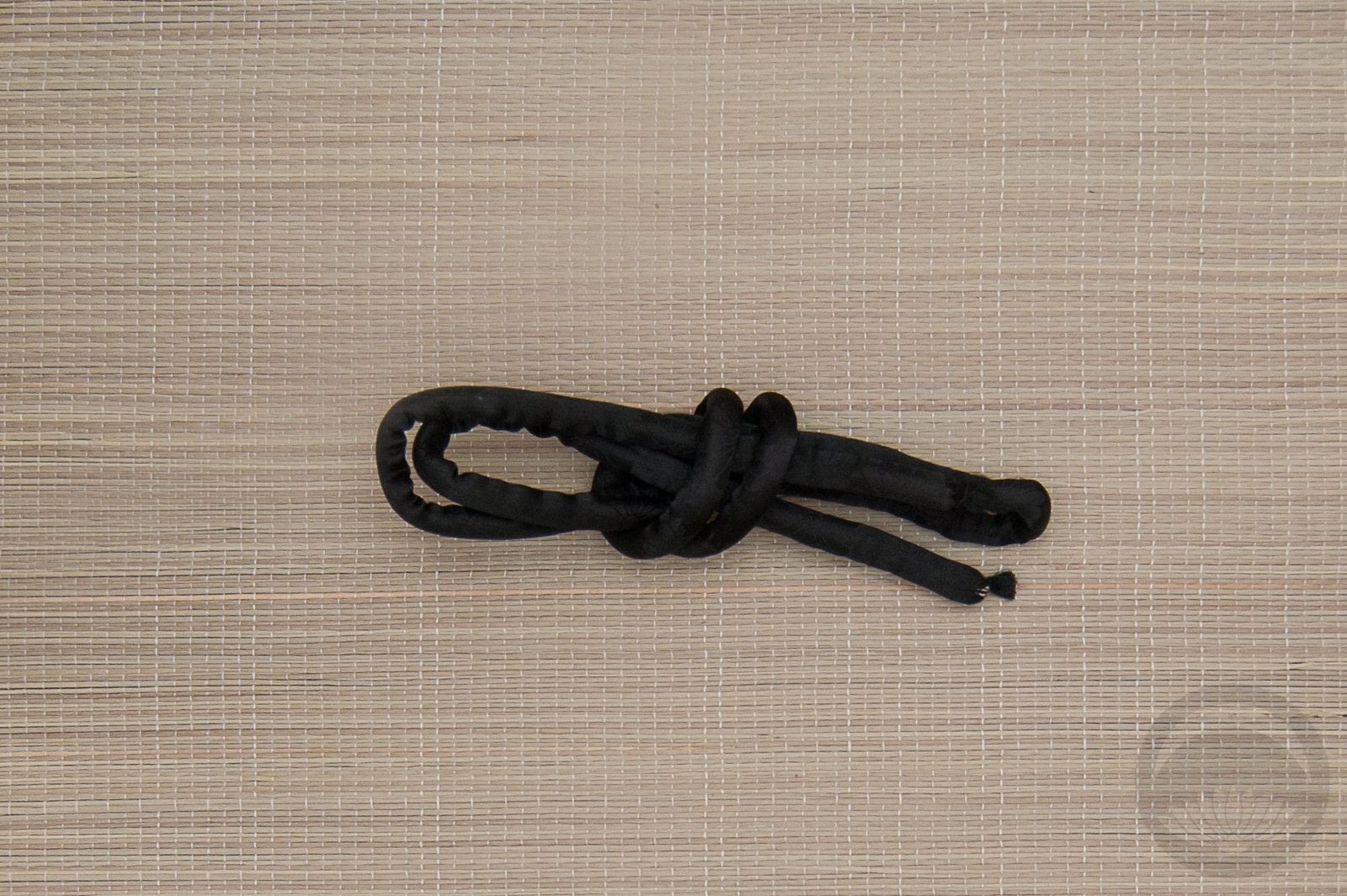
The kimono is quite new so I don’t have a catalogue photo for it, but weirdly I don’t seem to have one for this sanbuhimo either? Which is odd, because I’ve had it for eons. One day I’ll get my collection catalogue up to date. One day…

Items used in this coordination

Birthstone Ensembles – June – Alexandrite

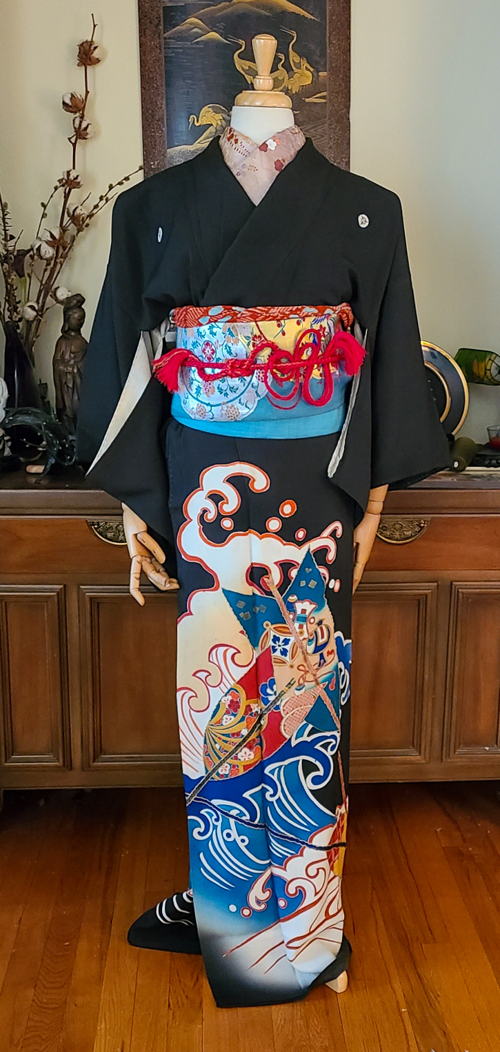
Alexandrite is my favourite of the birthstones, and it holds a special place in my heart. Not because I’m a June baby — far from it, my birthday is in November — but because I love the unexpected intersection of physics, chemistry, and aesthetics that cause it to change colour so much that my engagement ring and wedding band feature it heavily. Many stones have a sort of iridescent shimmer or glow to them, but few legitimately change colour the way alexandrite does. The main stone in my ring is typically a rich indigo, looks teal under fluorescent lights, bright purple in the sun, deep plum in candlelight, and on the rare occasion I’m under direct UV light (gel manicures, the occasional round of day-glo mini-golf) it beams an impossibly eerie neon red.
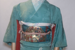
Of course, I knew I had to reflect as many of these colours in today’s coordinate as I could, and this houmongi has them all aside from the neon red. The shapes of the… windows? around the hem also remind me of cut gemstones, which made it even more perfect. While the actual gemstone does not have a propensity to shine yellow, there’s already yellow accents in the kimono and they reminded me of gold so I ran with that for the accessories. The obi also looks faceted and shimmers between blue, green, and teal, so that was a no-brainer as well.

I tried something funky with the obi musubi but to be honest I’m not sure it worked. At least the pieces all work well together otherwise!

Items used in this coordination


Fit for a Party

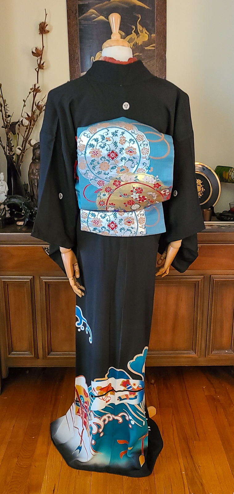
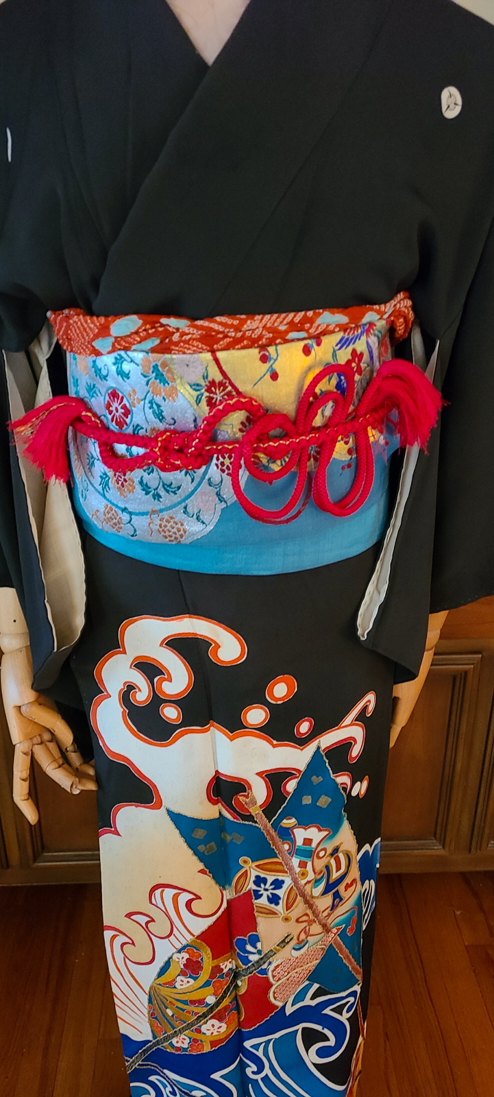
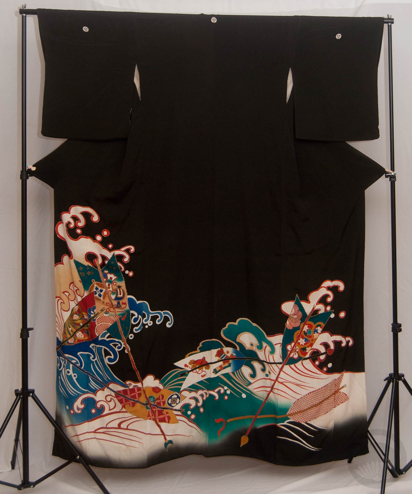
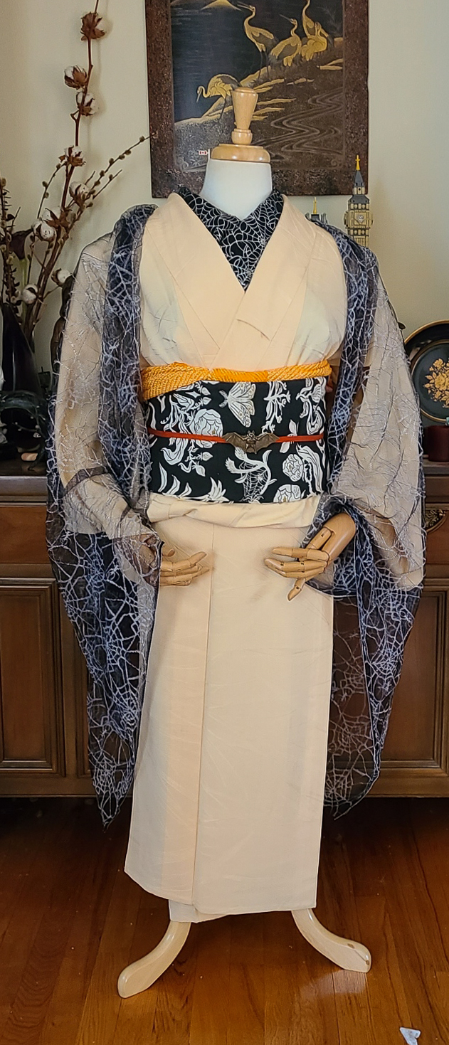
Just a little entry today, but I was so inspired by the Oshiroi perfume that I knew I had to make an outfit worthy of it. I knew it had to be something timeless and elegant, so using a kurotomesode was the way to go and this gorgeous hamaya piece fit the bill. It’s quite long and the design comes up very high. Also, when worn in a more standard way a lot of the design gets lost in the ohashori. This leads me to believe it was originally intended to be worn hikizuri-style, so of course I ran with it.

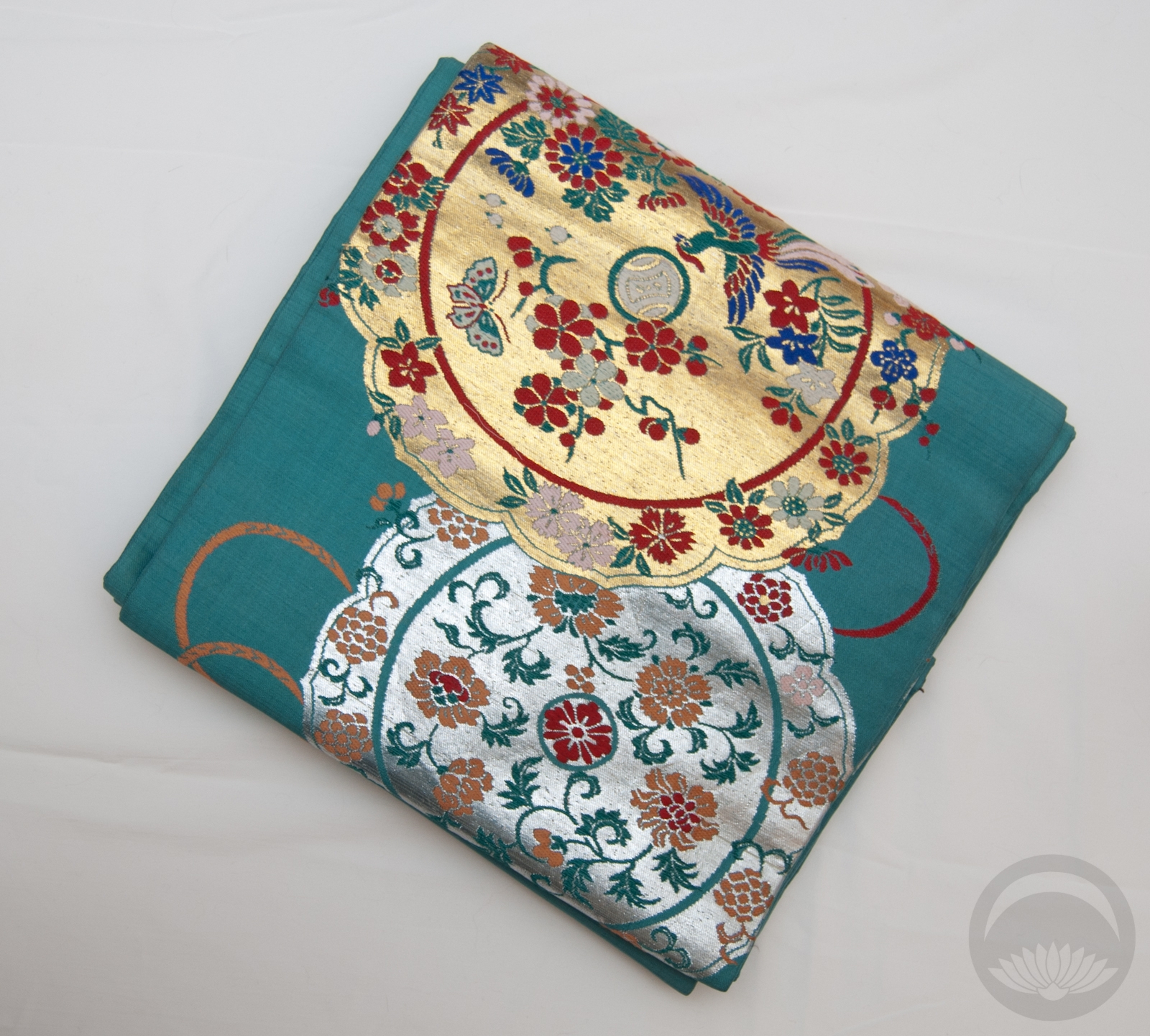
I went with my own twist on typical tachikata geiko-inspired styling, with a gorgeous gold obi and white and gold accessories. I even used a red obiage as a sort of momi beneath the obi, but it got a little lost. The obijime is technically too casual, but it matches the kimono so perfectly with that rich teal and almost pinkish red, I couldn’t not use it. 

Getting the mannequin to show off the beautiful perfume box was a bit of a challenge, and I’ve had to photoshop the hands slightly so if they look mangled I apologise.

Items used in this coordination

Birthstone Ensembles – May – Emerald

It’s (roughly) the middle of the month, which means it’s time for another birthstone ensemble! This month, the queen of green gems, the emerald. Emeralds are often treated with oil to fill in microscopic fissures and fractures, and in certain lights those fill-ins can flash yellow or orange, so I knew this green odori piece with orange and gold accents was the perfect choice. I feel like they’re also quite often considered one of the more “regal” stones, and this flashy outfit works well in that aspect as well, doesn’t it?

Further emphasizing the green, the gold, the orange, and the dance aspect, my go-to pretied darari obi was the obvious pairing for this outfit. When I bought it I honestly did not think I’d end up using it as frequently as I do, but I am certainly not complaining. I decided to add a bit more pop and contrast with more yellow and gold accents in the accessories. Of course I had to use my green beaded obijime though. This whole birthstone project makes me wish I had beaded obijime in a whole array of colours, but they tend to be incredibly expensive due to the labour involved, and I’ve only managed to get the three I own through sheer luck. You can be darned sure I’m always on the hunt though. If you happen to come across any you don’t want to purchase for yourself, hit a girl up.

Items used in this coordination


Go Habs Go!

One thing you may not know about me is that I am descended from hockey royalty. Newsy Lalonde was my great-grandfather. While this isn’t something that generally overlaps with my kimono interests, sometimes a girl’s just got to represent hometown and familial pride, in the form of a coordination evoking the Montreal Canadiens team colours. Especially now that we’ve made it into series two of the Stanley Cup playoffs. Go Habs Go! Tricolore jusqu’au bout!*  I’d originally planned to put this up before Series 2 Game 1 on Wednesday but was feeling under the weather, so I’m making sure it goes up before Game 2.

Sadly, I don’t have any hockey-themed accessories, and I don’t think my father would be too thrilled with me using things like his grandfather’s Hockey Hall of Fame ring as an obi-kazari, so I had to work with the “tricolore” (three colours) emblematic of the Habs — red, with blue and white as accents. Our primary jersey colour is, of course, a nice bright red, and as is standard in the NHL the away jersey is white so of course this red-and-white yagasuri komon was the perfect base. I just always forget how danged huge it is, which makes putting it on the mannequin a little awkward. It also looks a bit pinker in these photos; blame the light in my room. In person it’s definitely a true red.

Sadly I don’t have any obi that are quite the right shades of blue, but this one works pretty well. I tied it in a karuta musubi because the square shape with the red and white lines of the obijime reminds me a bit of an ice rink, if you squint! There’s no significance to the cat motif, I was just going for colour cohesion. It does tie in nicely with the blues and white and the motif on the haneri though, doesn’t it?

How about you — are you a hockey fan? Are you watching the playoffs, and rooting for any particular team? If so, let me know so I can tell you how factually incorrect you are (I kid, I kid).

Items used in this coordination

*(this literally means tricolour until the end or tricolour all the way, referencing the three team colours)