
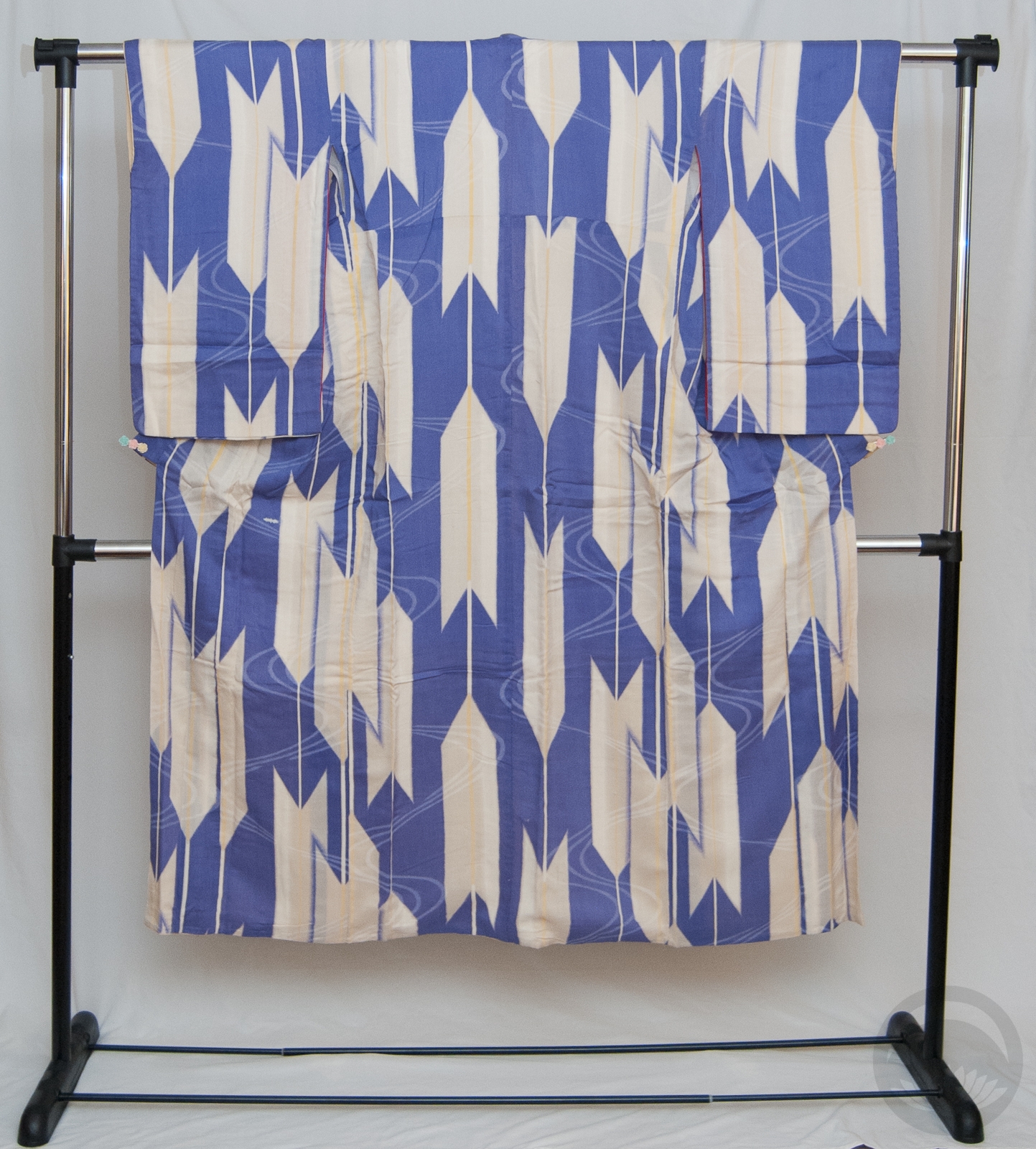
Yabane, 矢羽, Arrow fletching
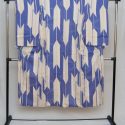
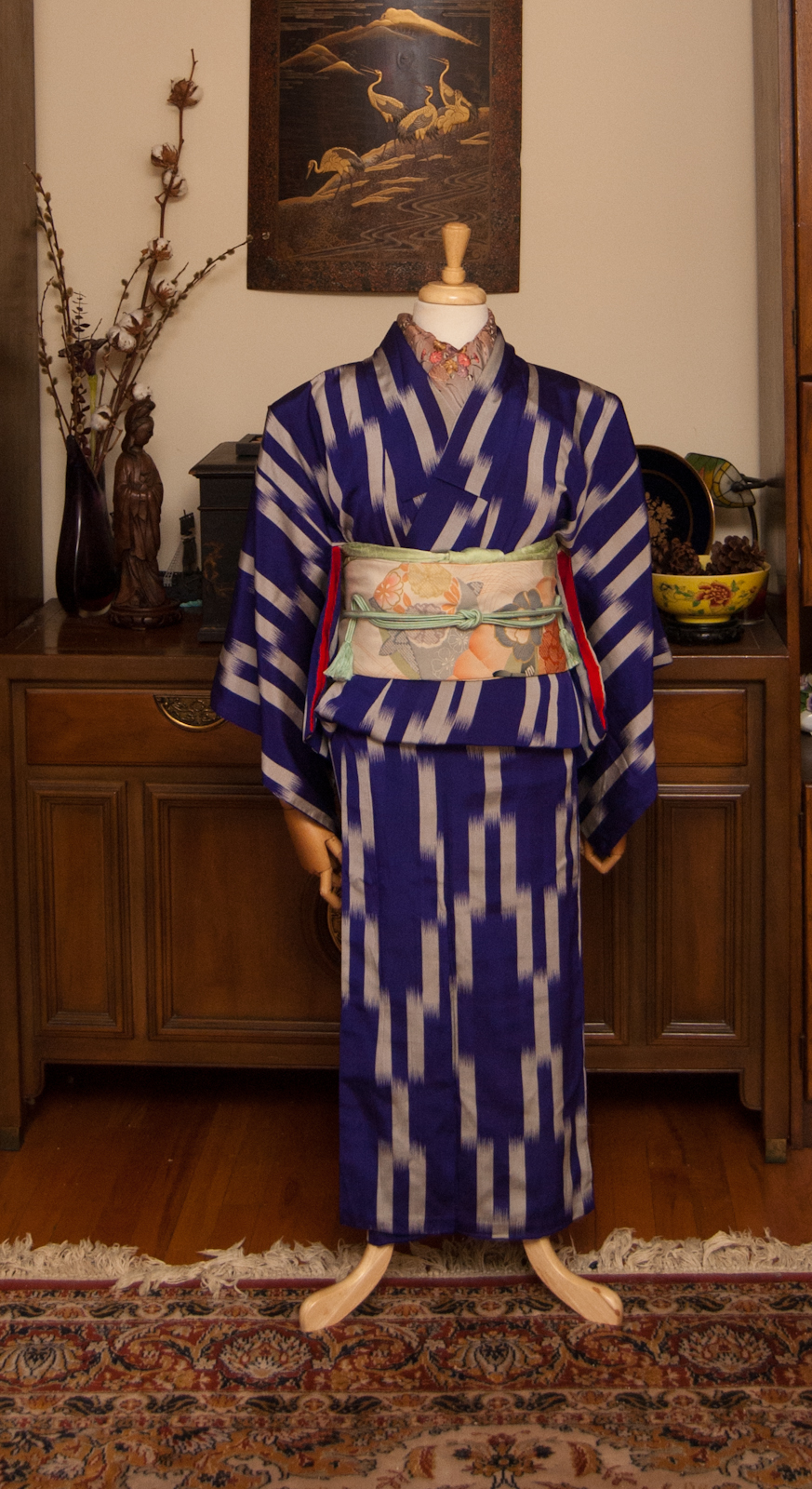
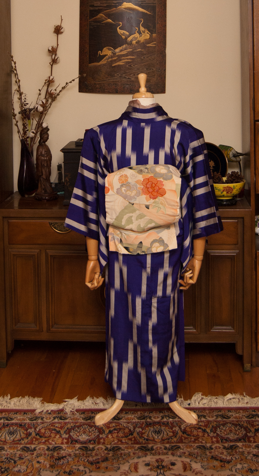
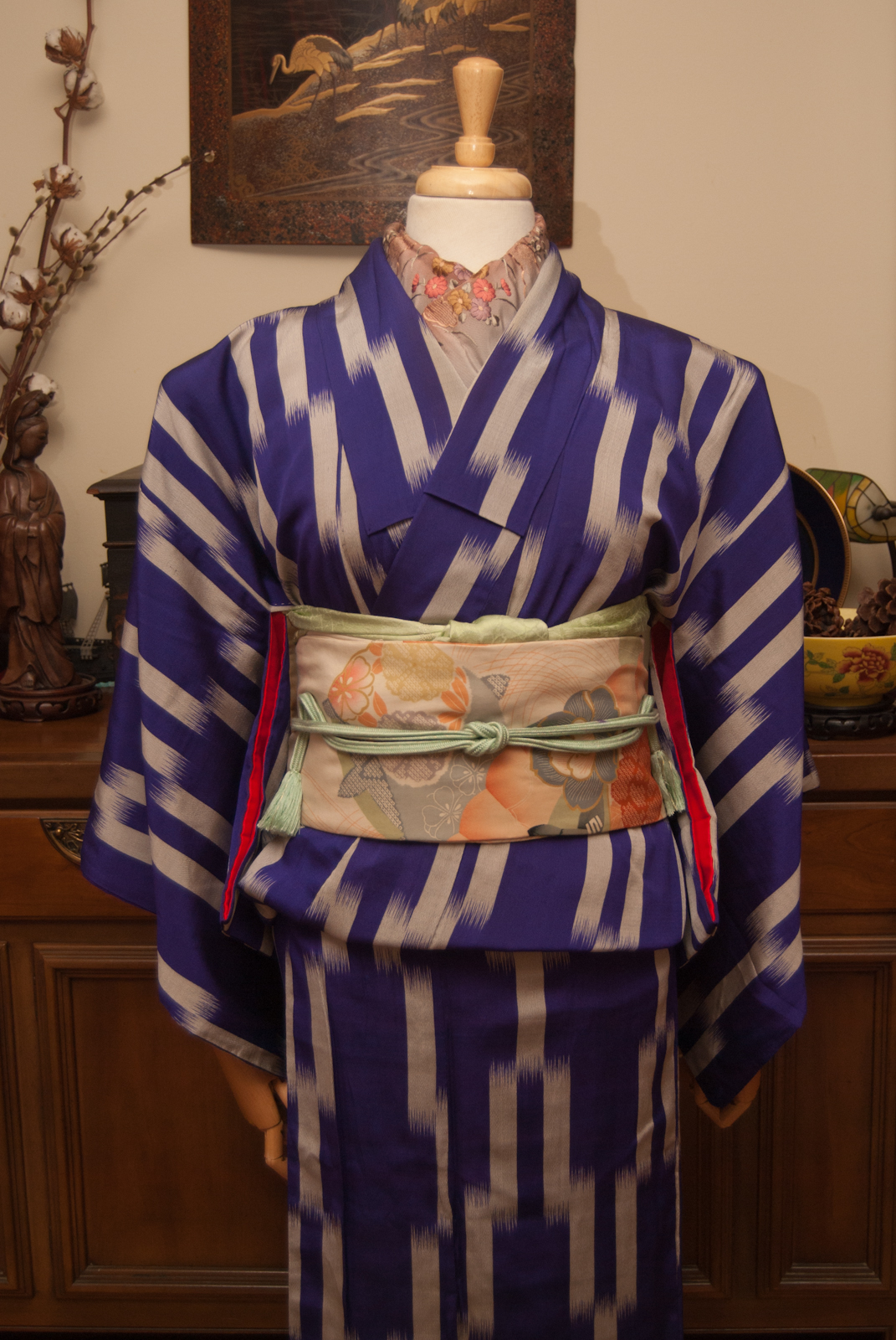
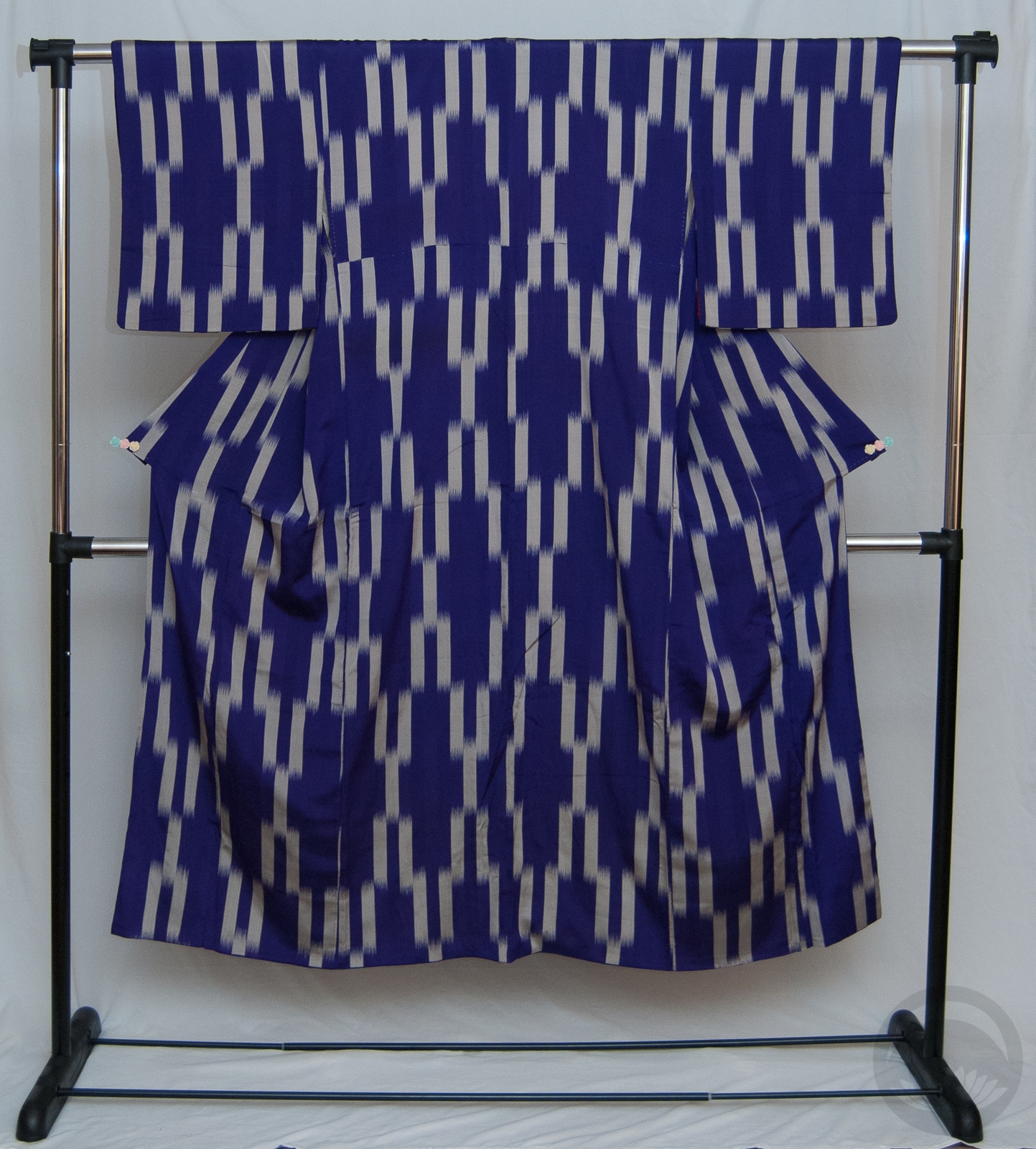
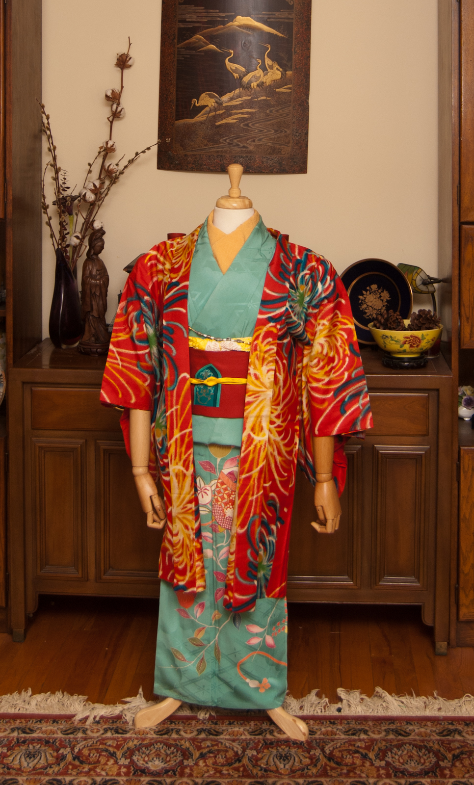
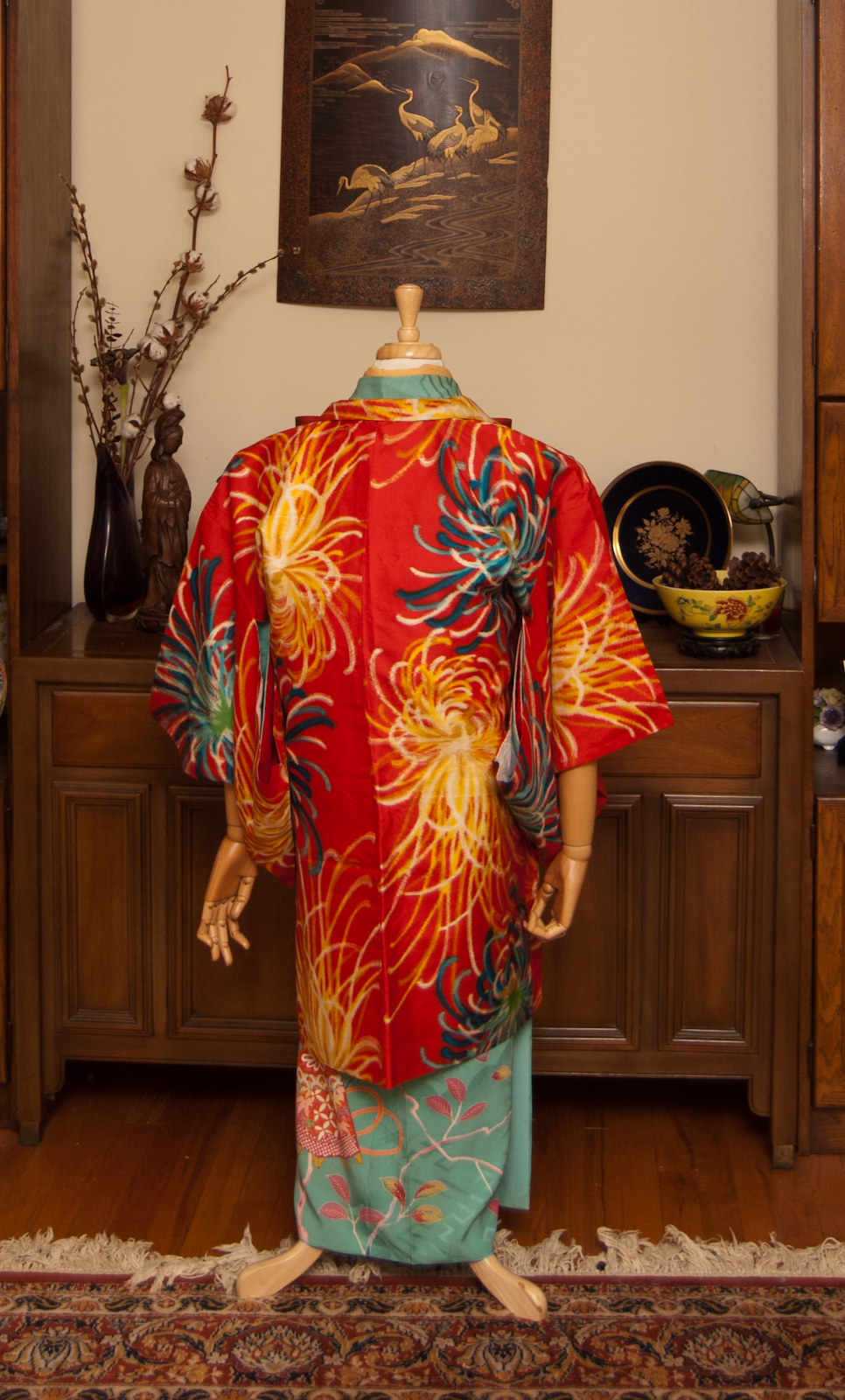
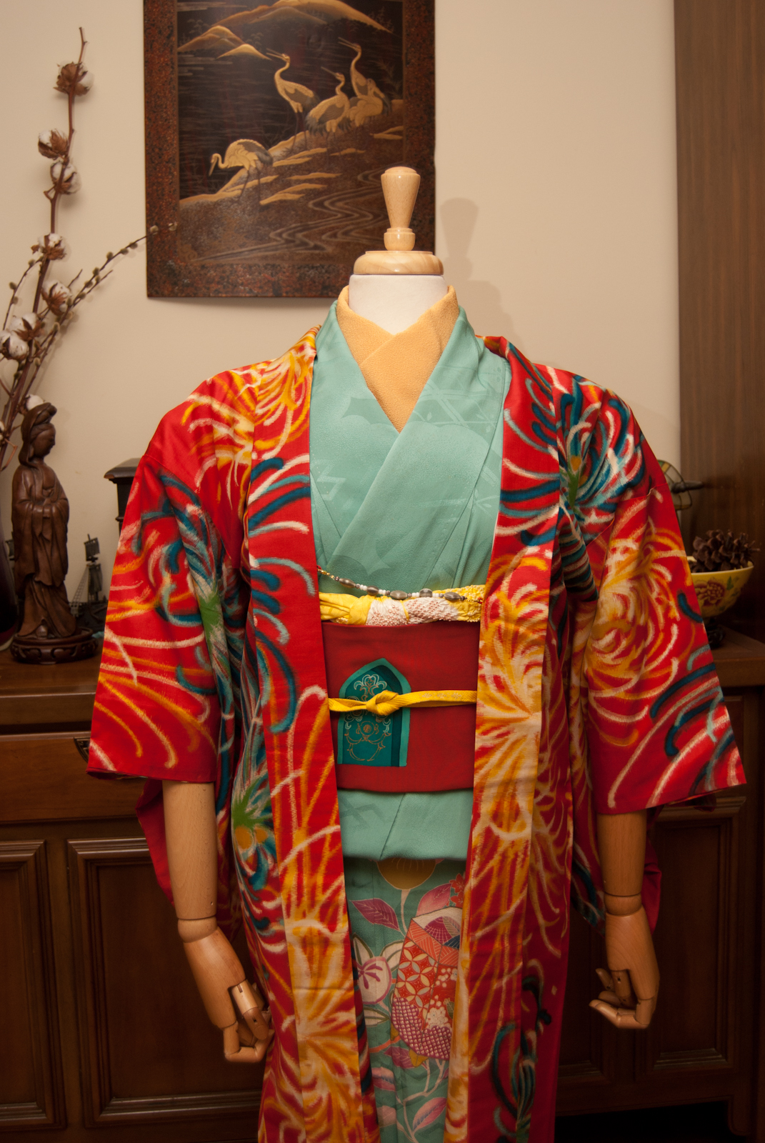
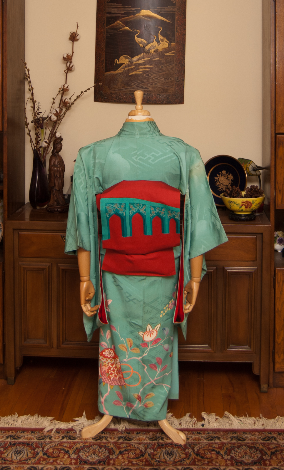
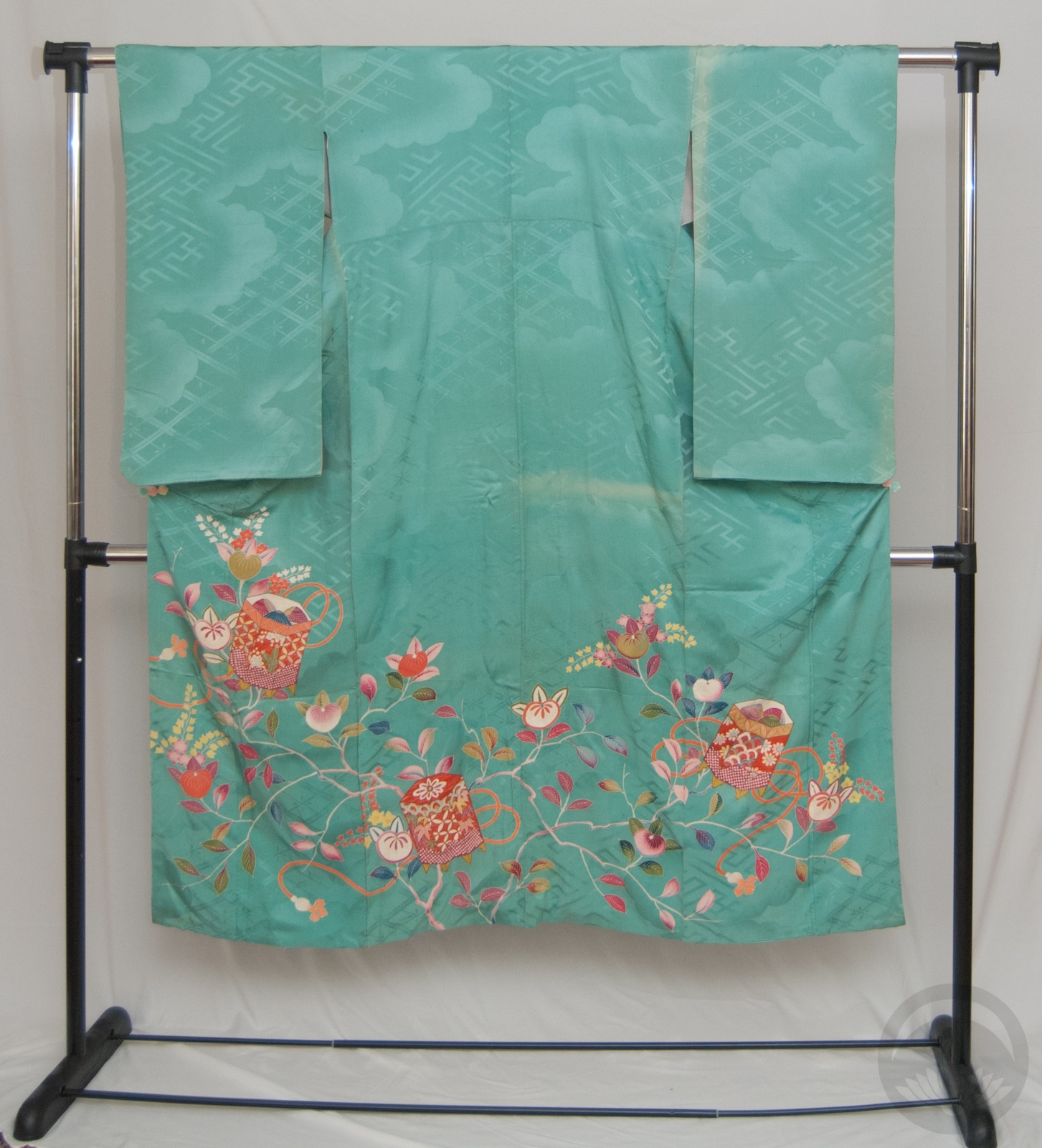
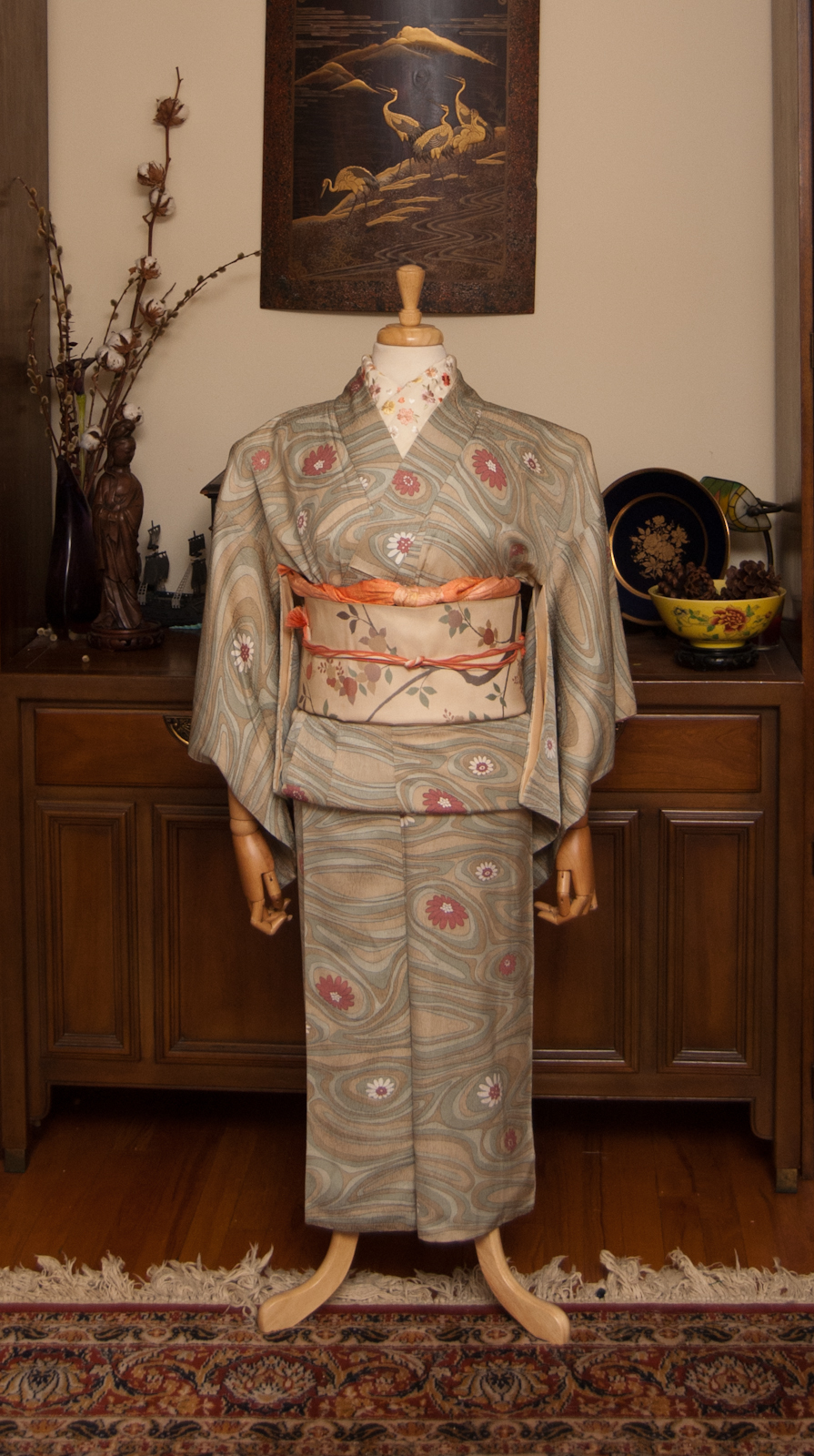
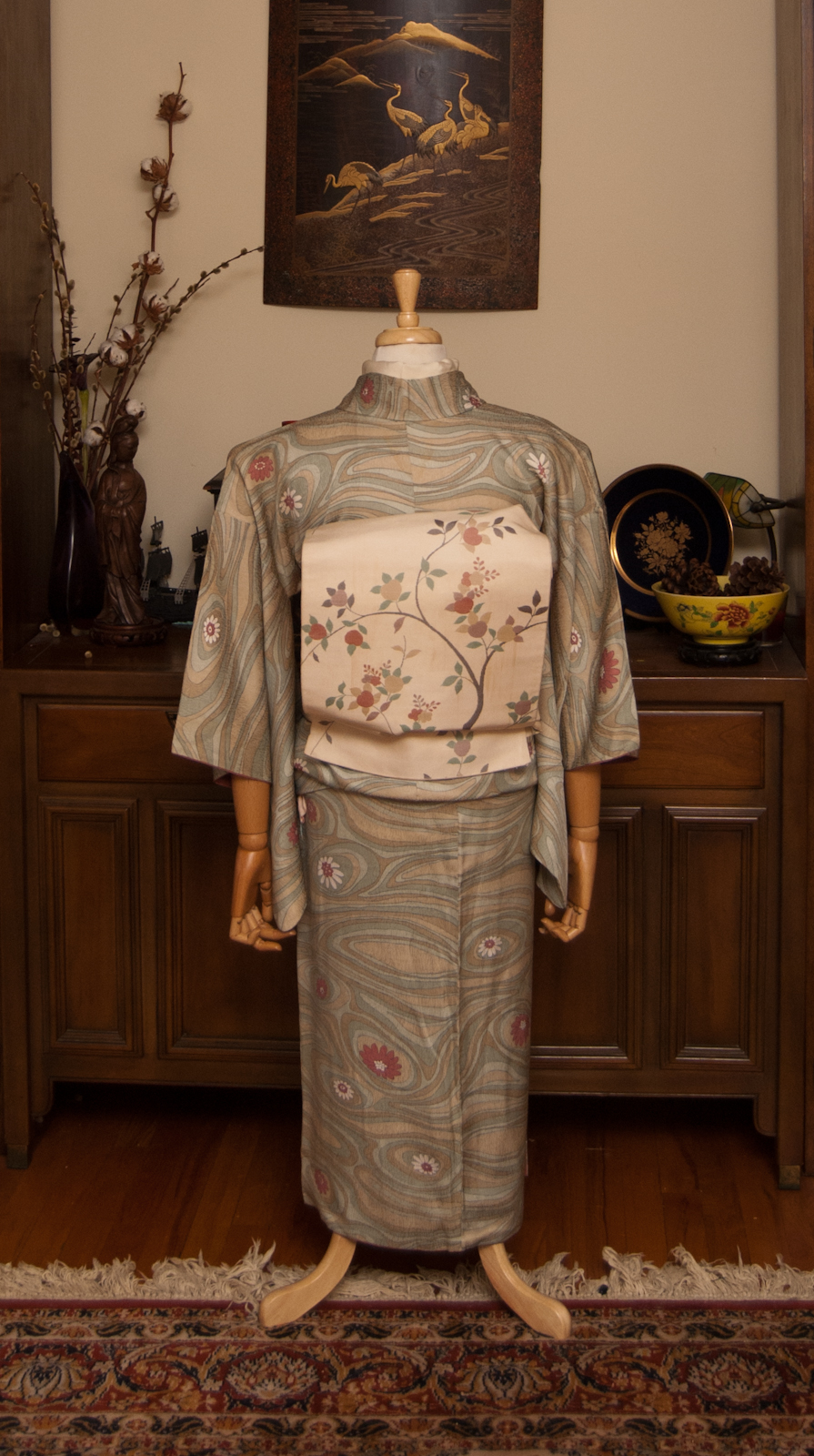
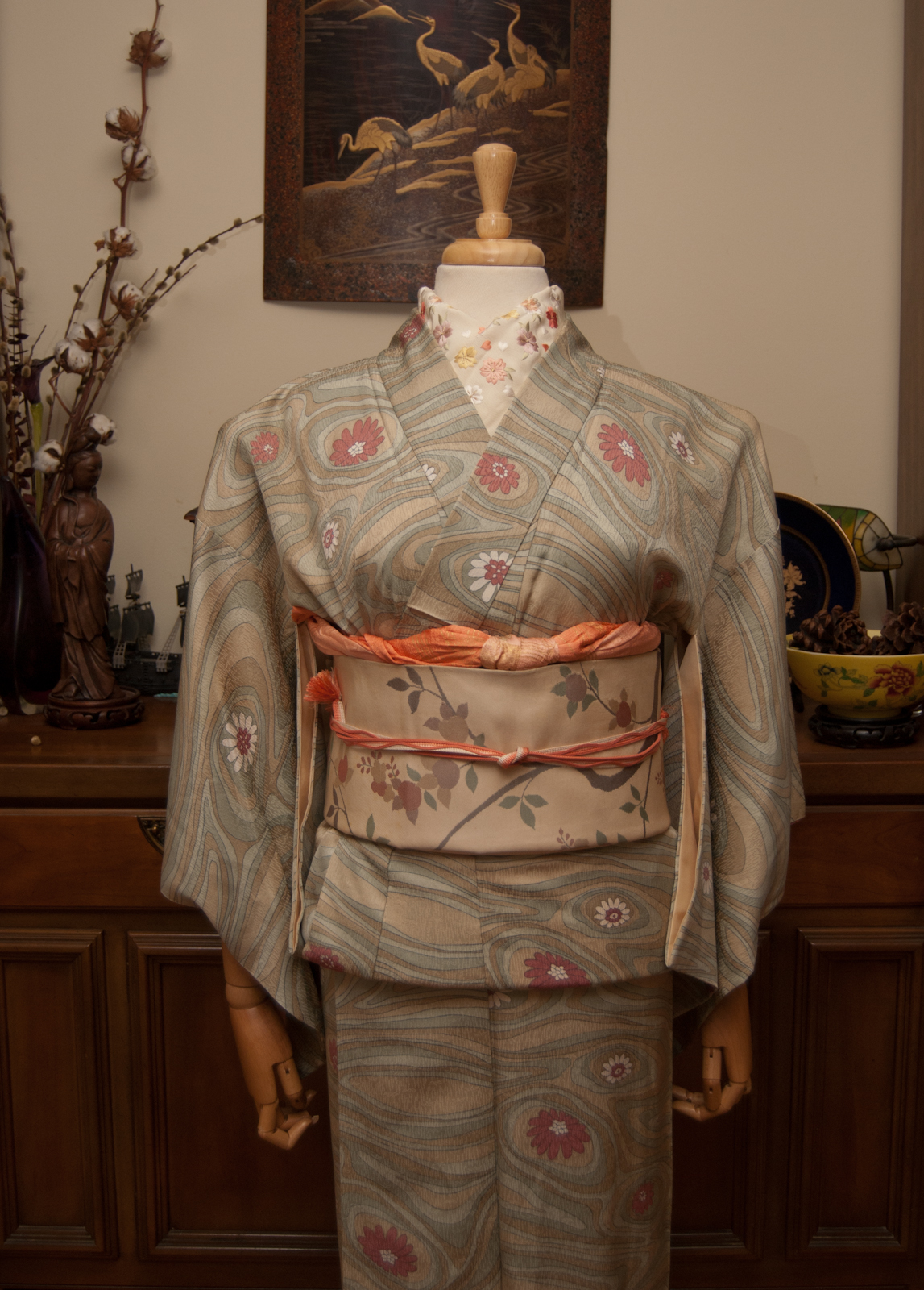
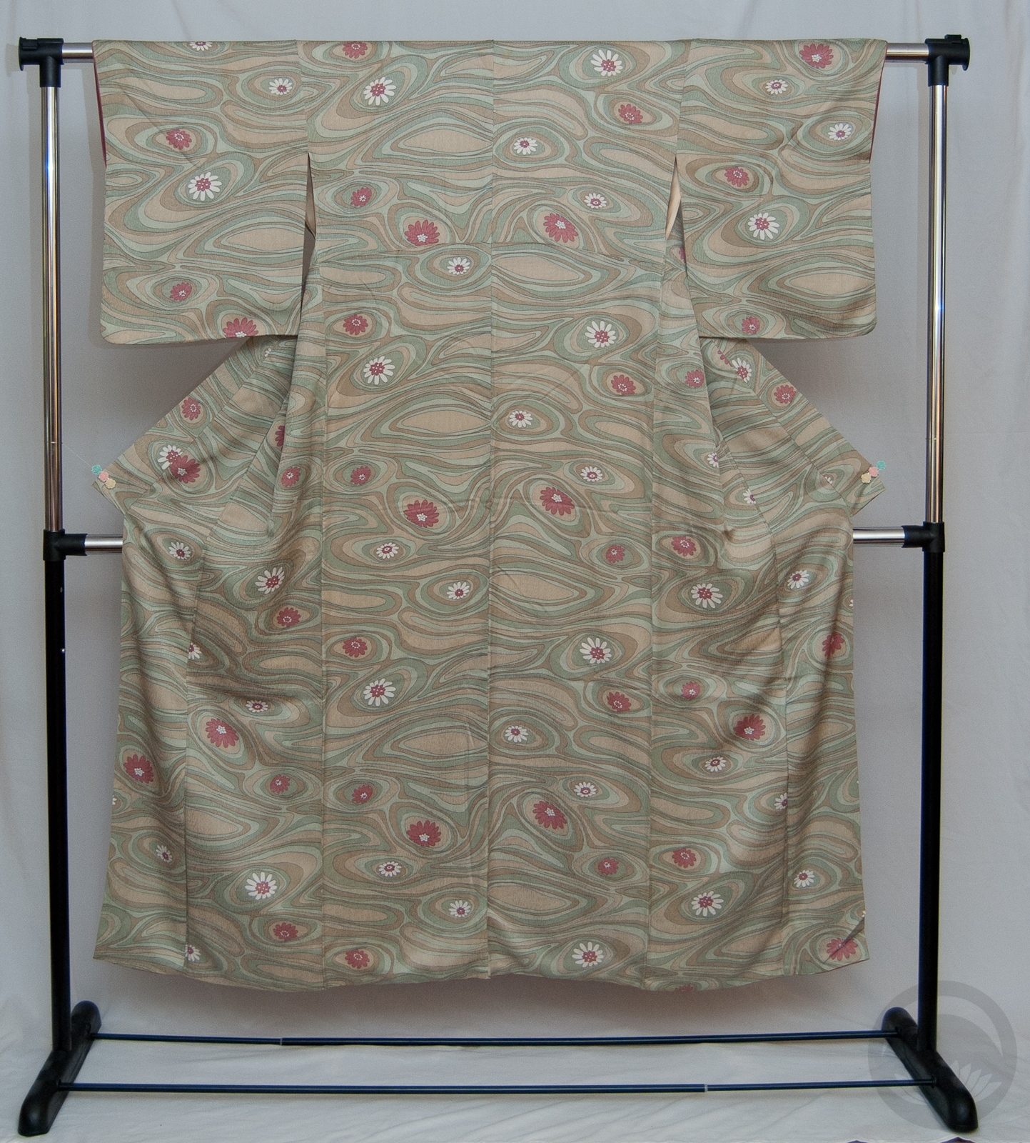
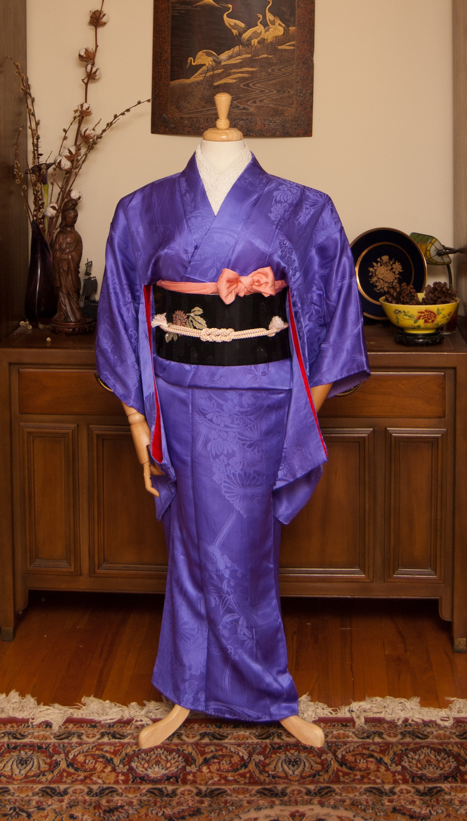
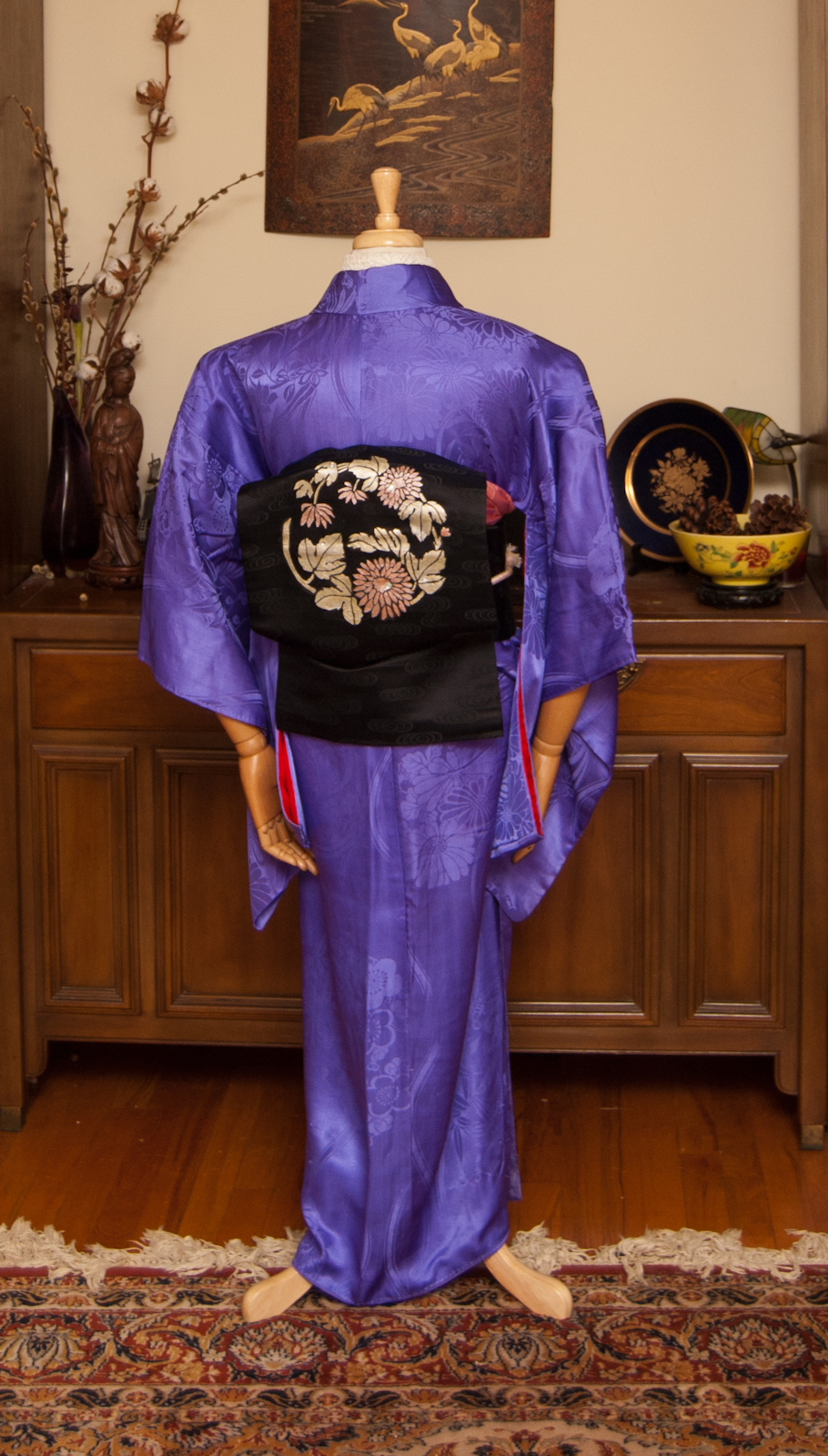
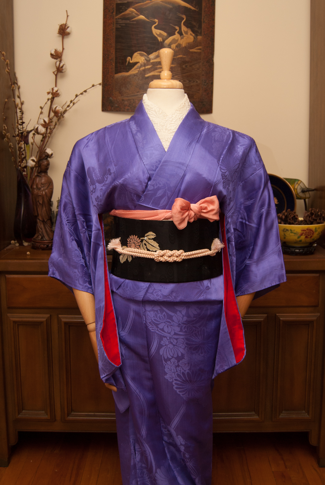
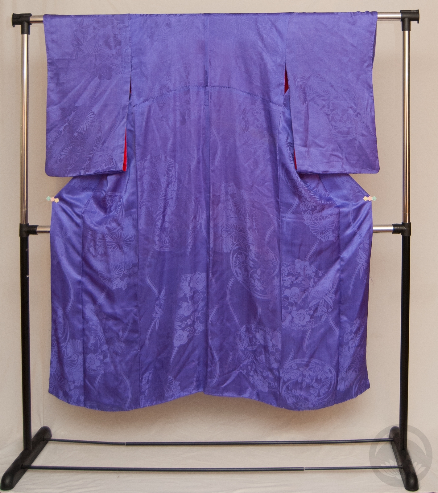
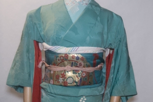
Yabane (also yagasuri for the small, tightly-repeating variation) and hakata; two of my favourite things together! I love all depictions of yabane, but particularly these big, semi-random depictions that were so beloved in the Taisho and early Showa eras really get to me. I’ve loved this kimono ever since I first bought it back in Boulder, Colorado. It’s an odd fabric, it feels like a mix of silk and cotton. It’s very light and breezy, despite being lined, and is smoother than cotton but has a lovely grip that makes it a pleasure to put on. However, I still can’t believe I ever wore this comfortably though. It’s so tiny!
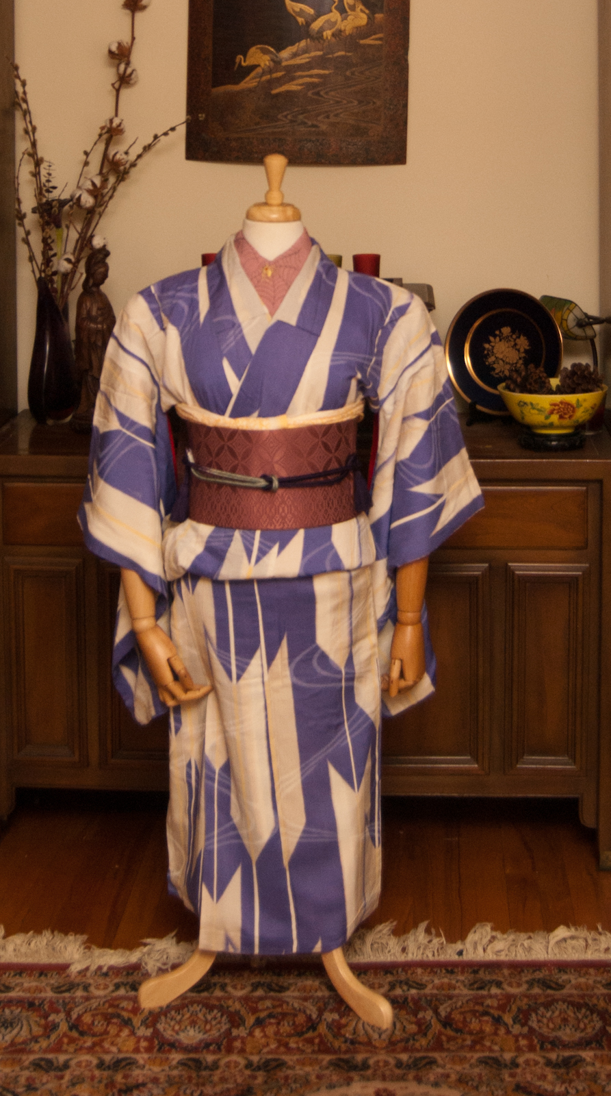
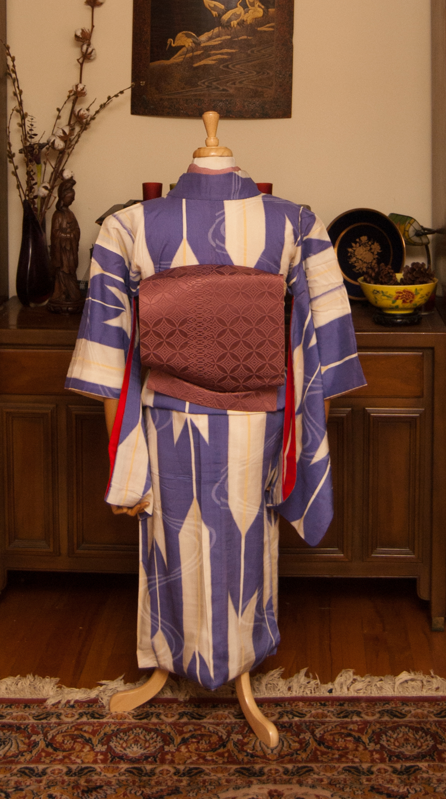
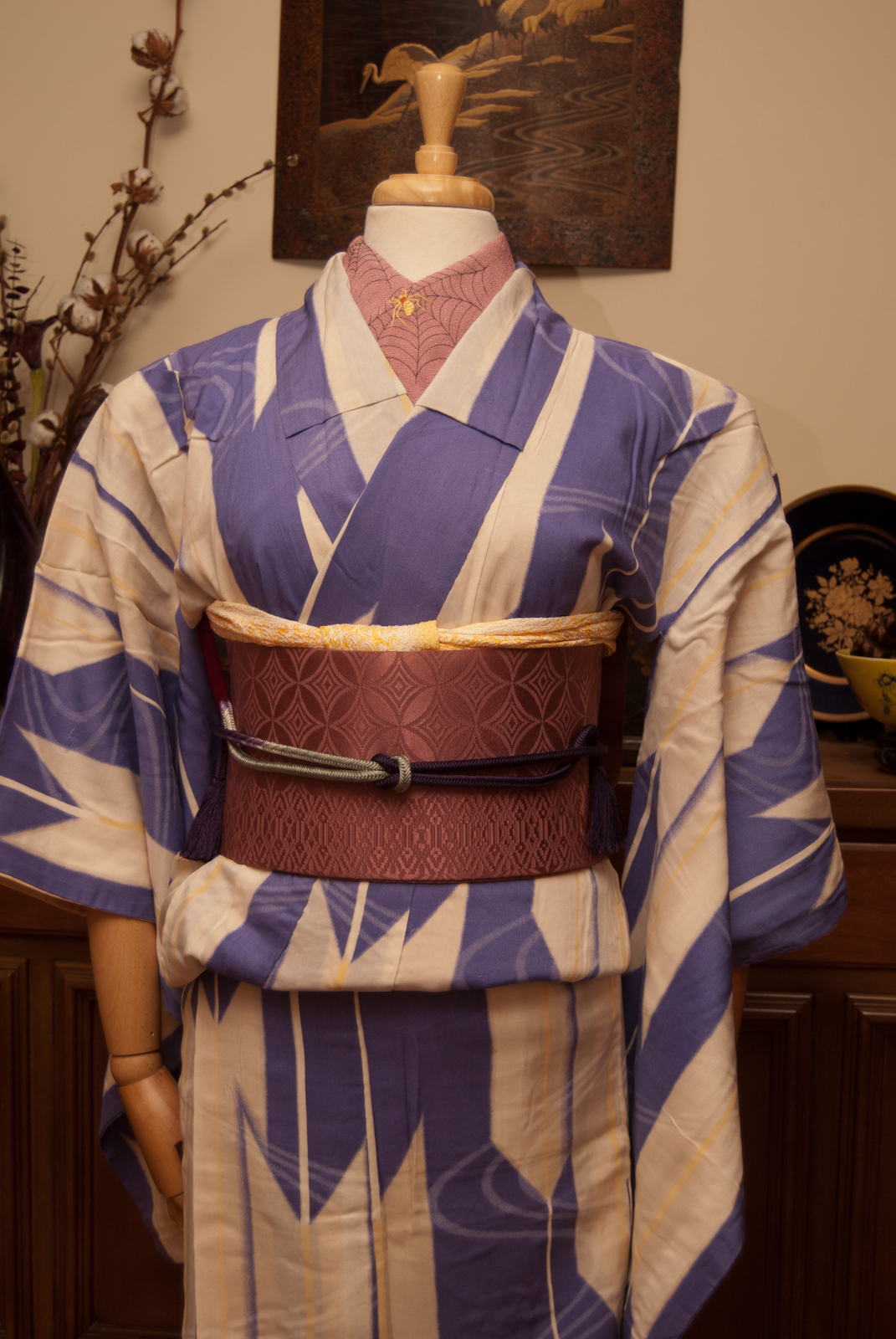
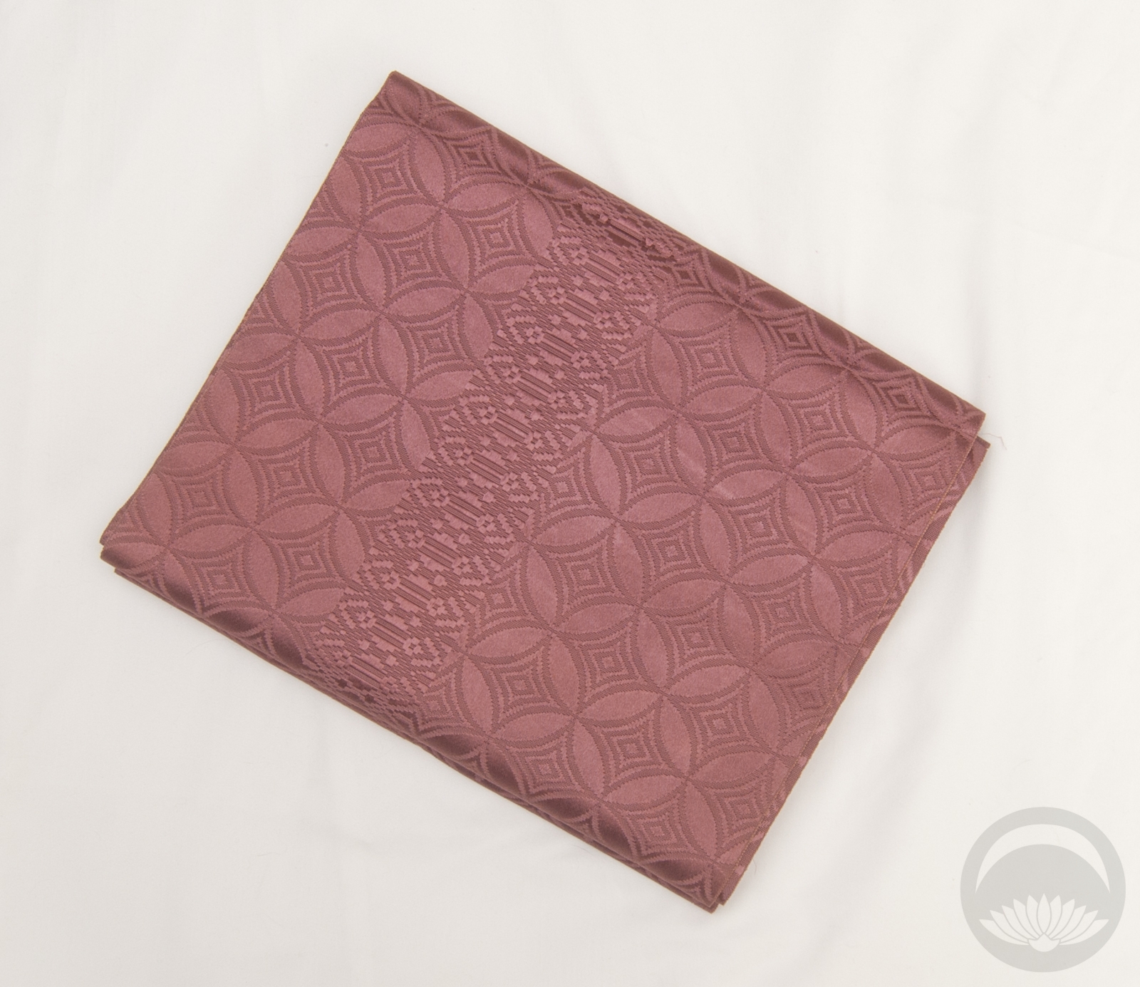
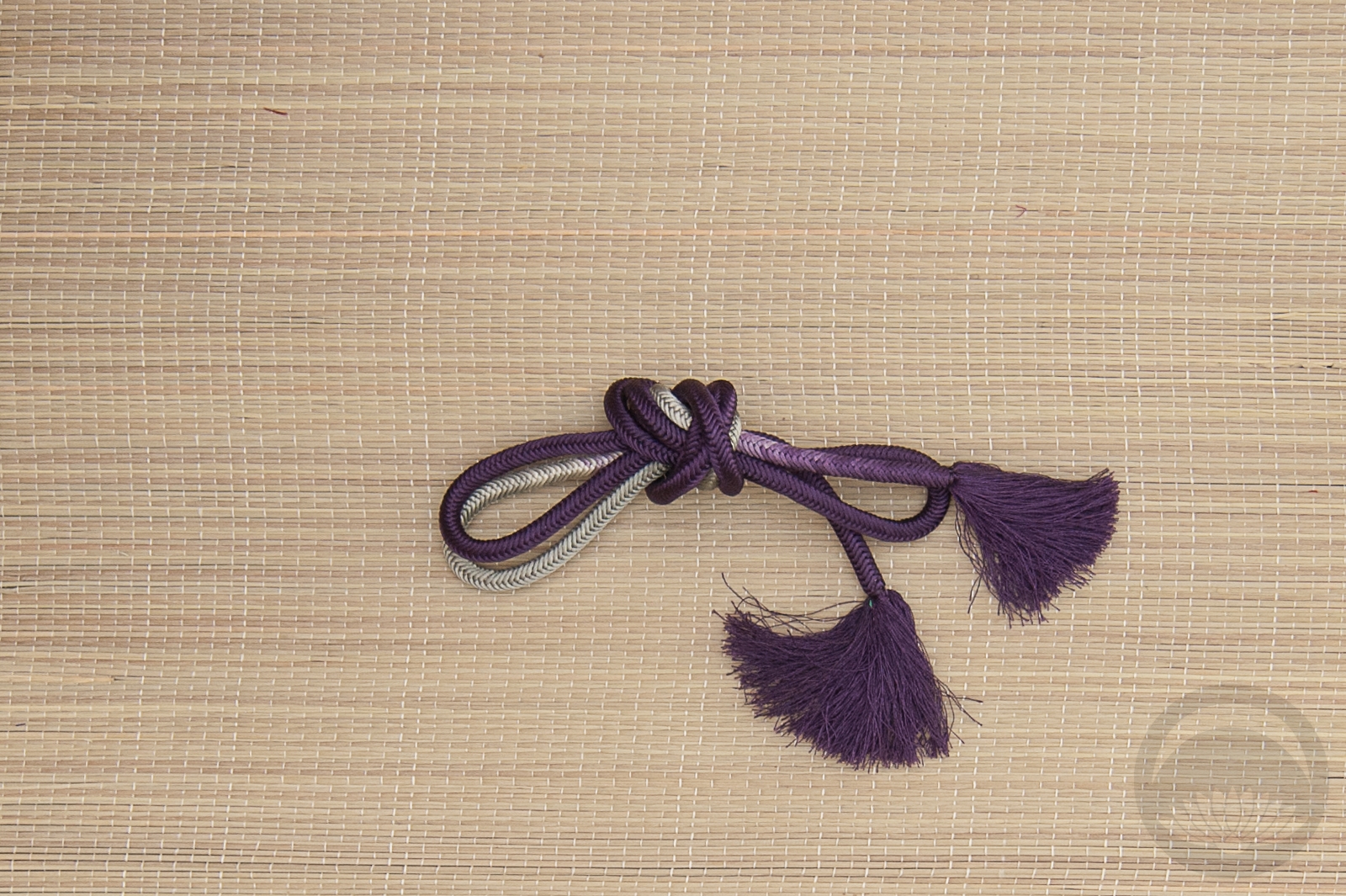
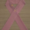
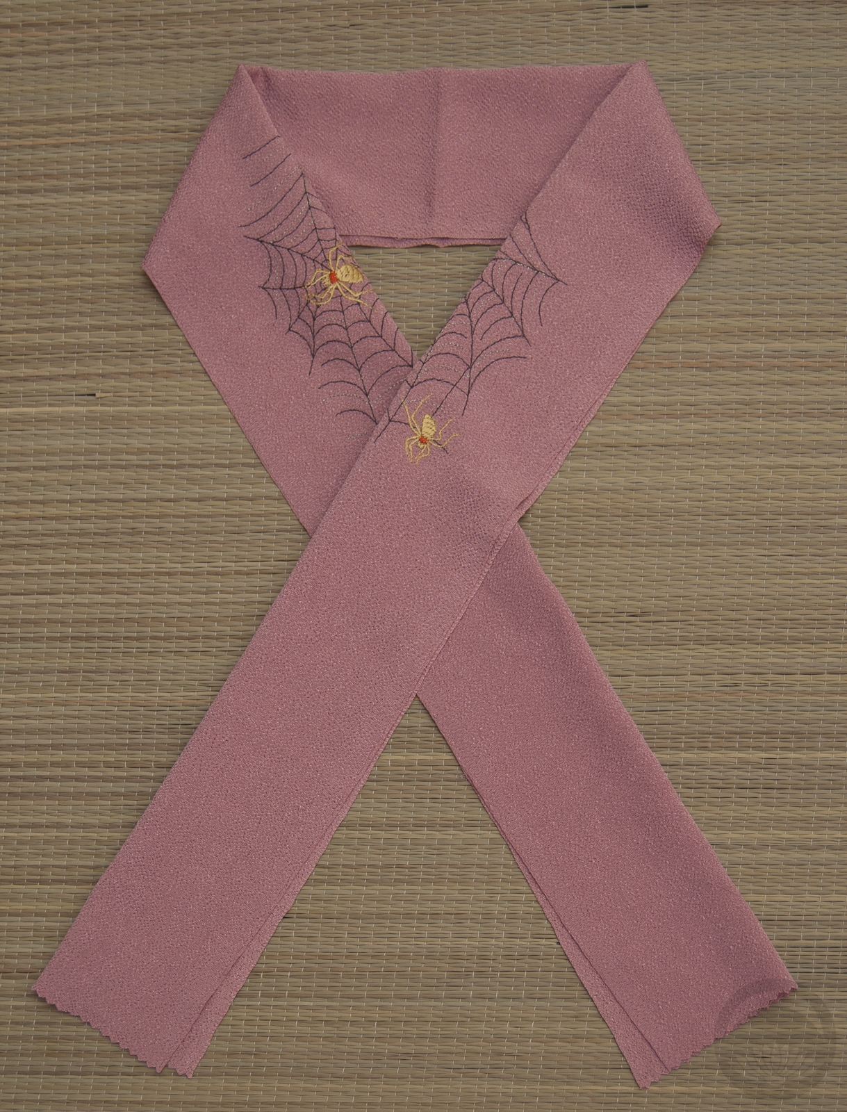
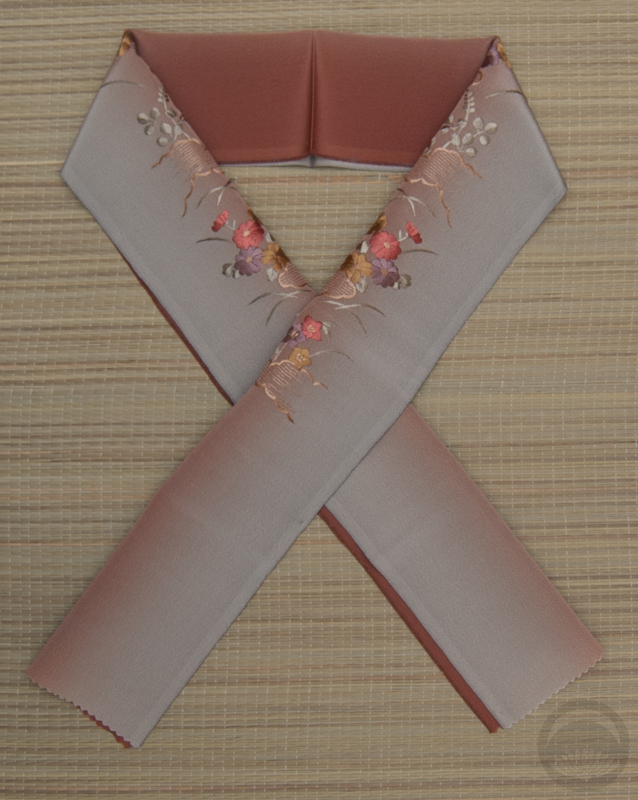
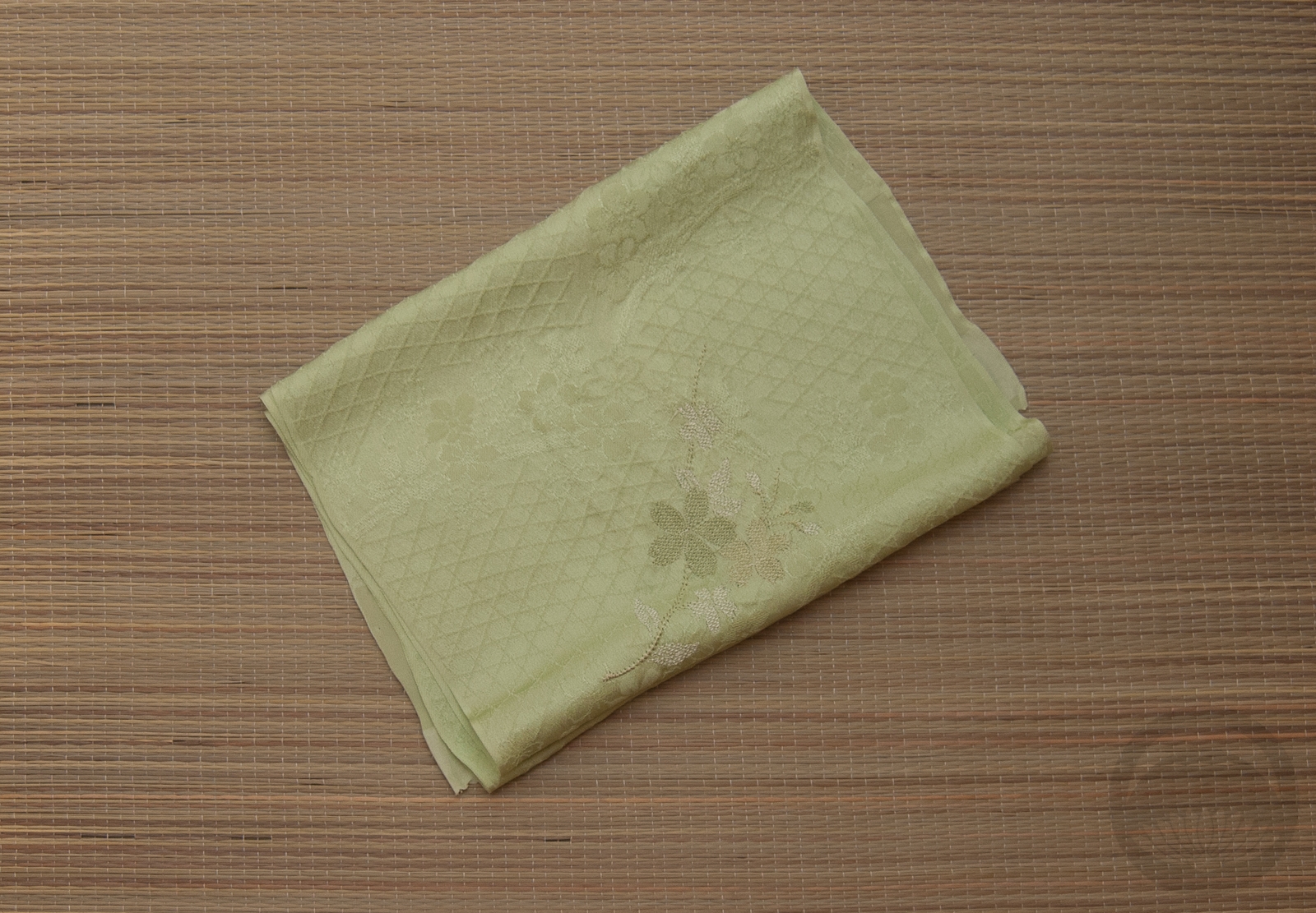
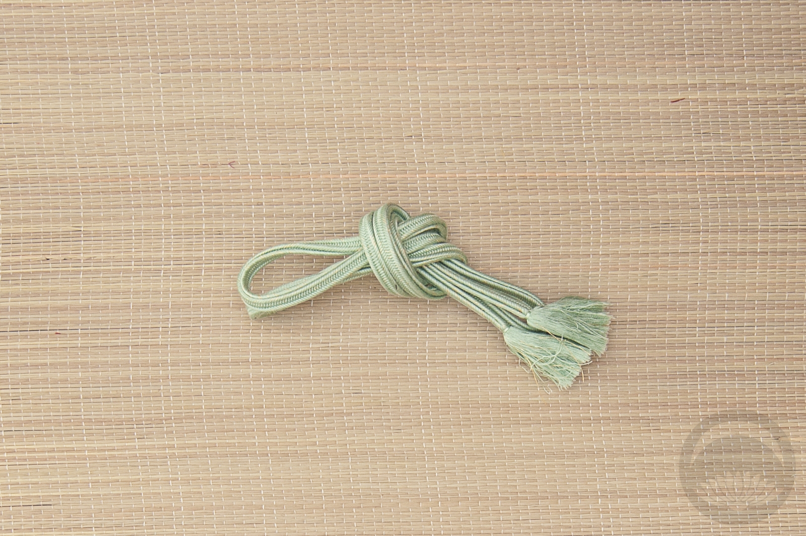
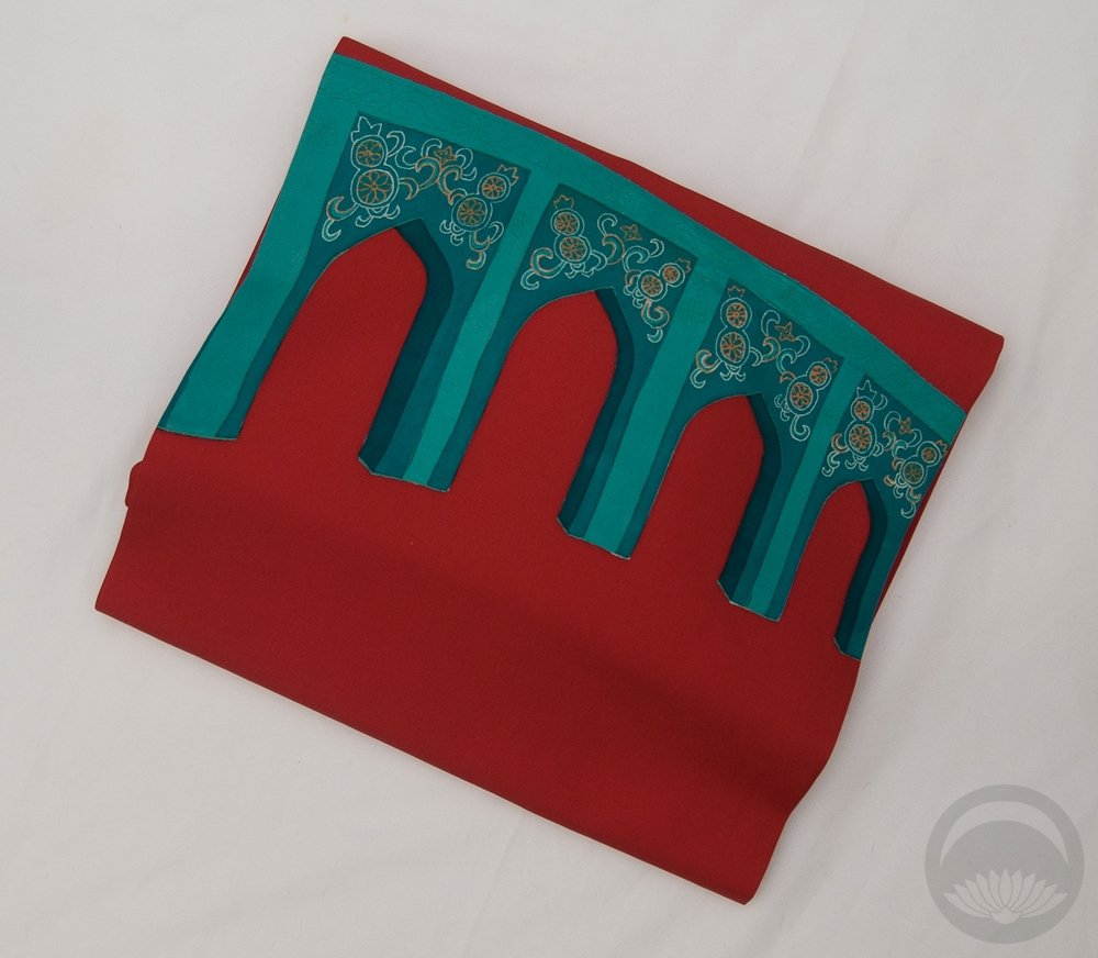
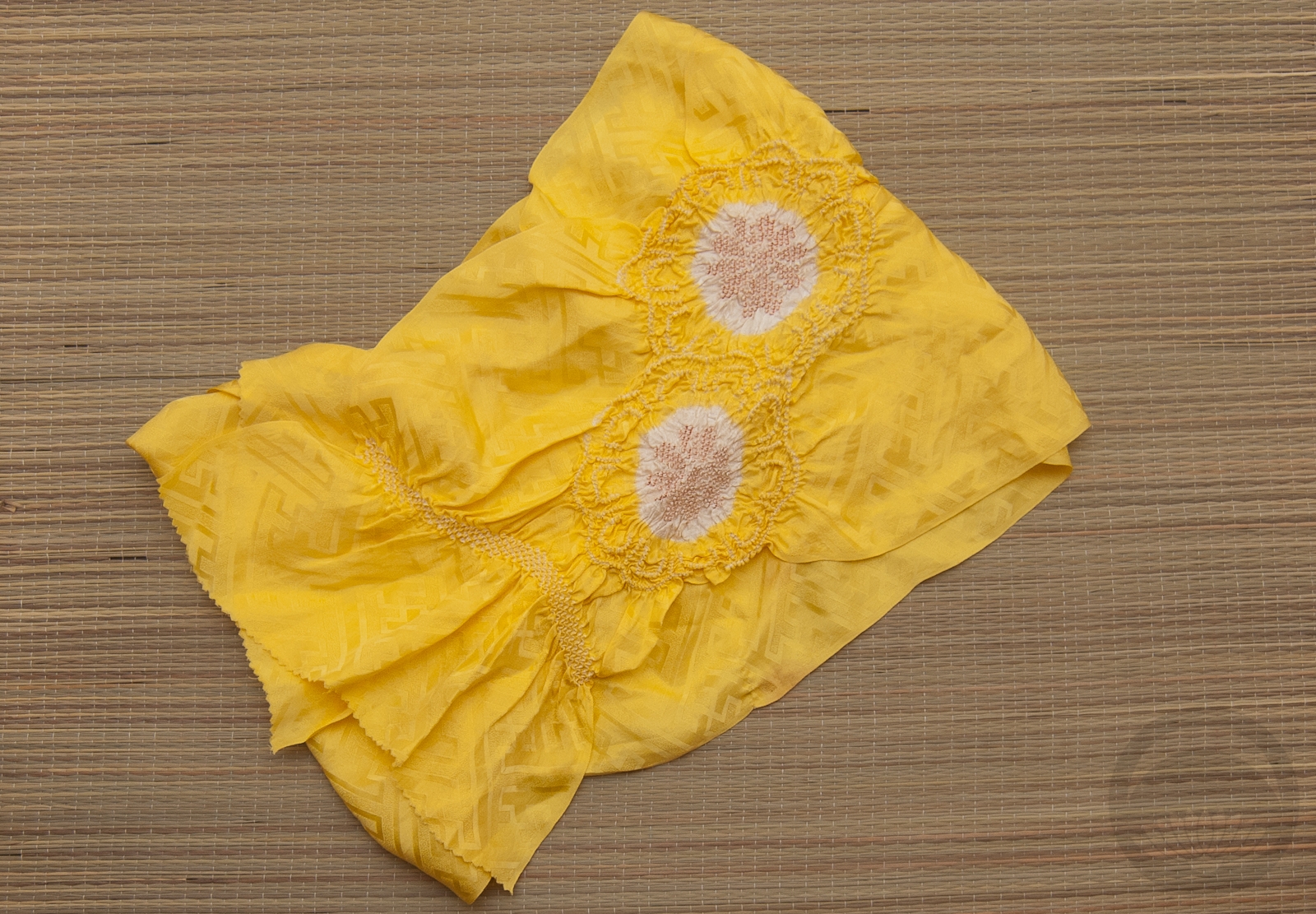
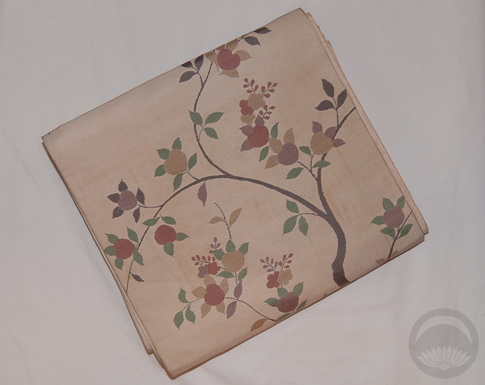
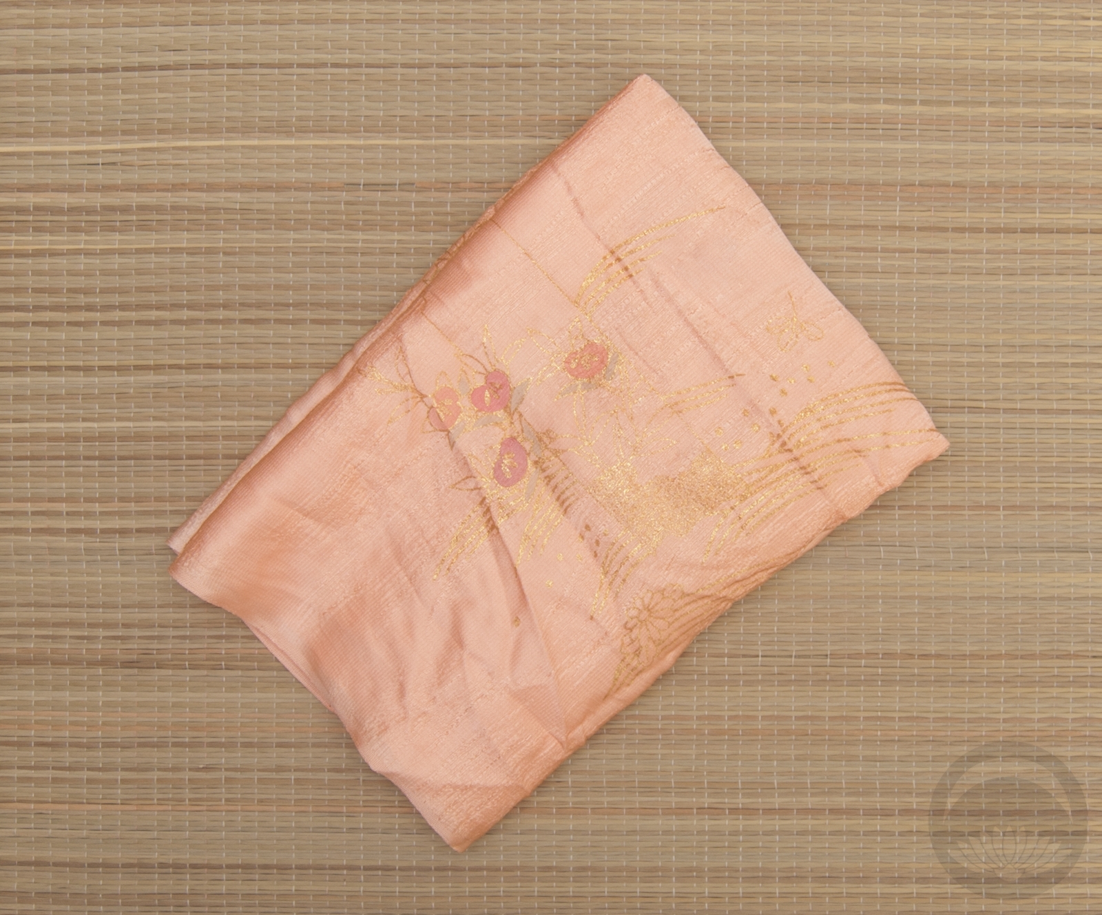
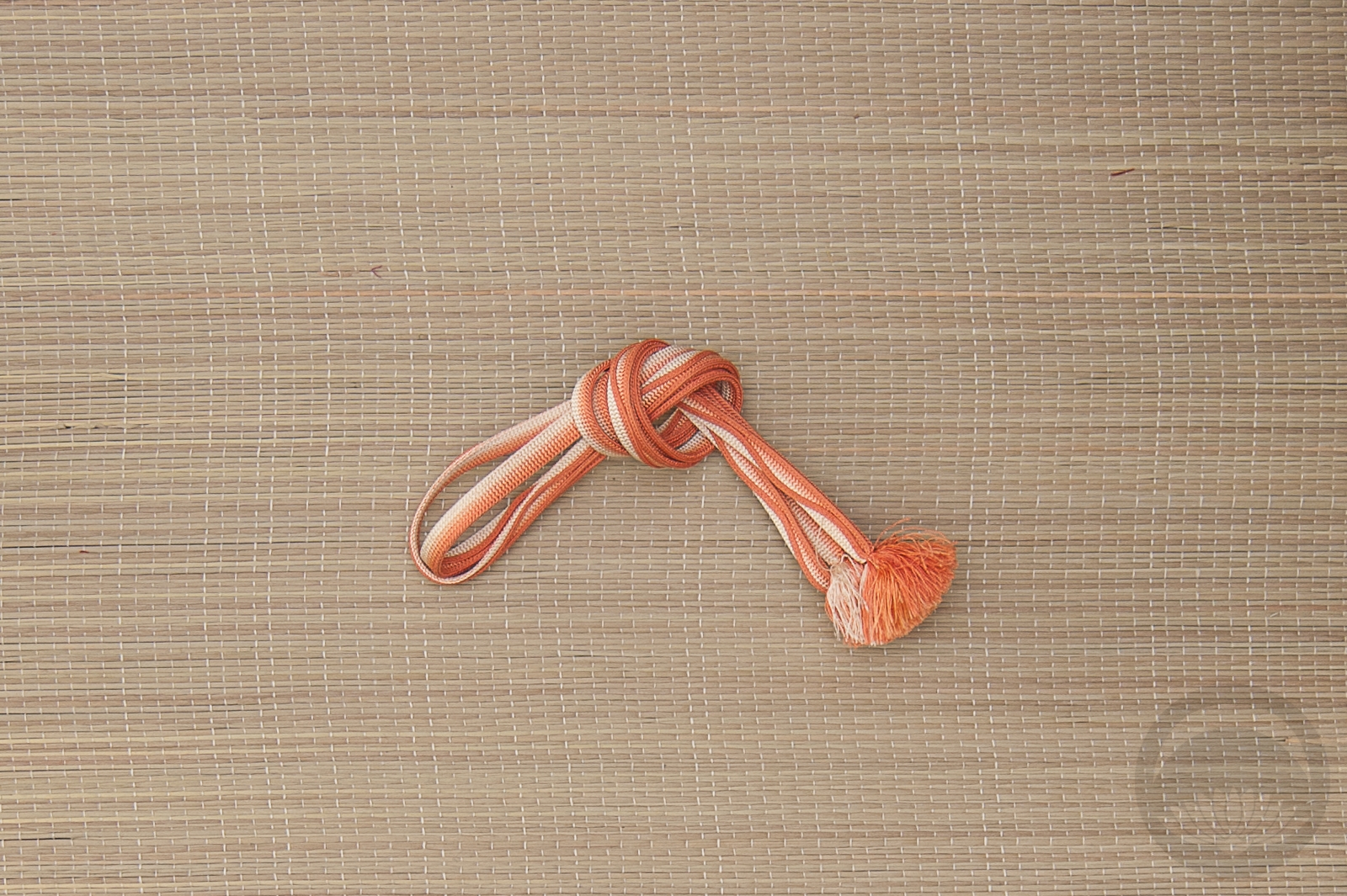
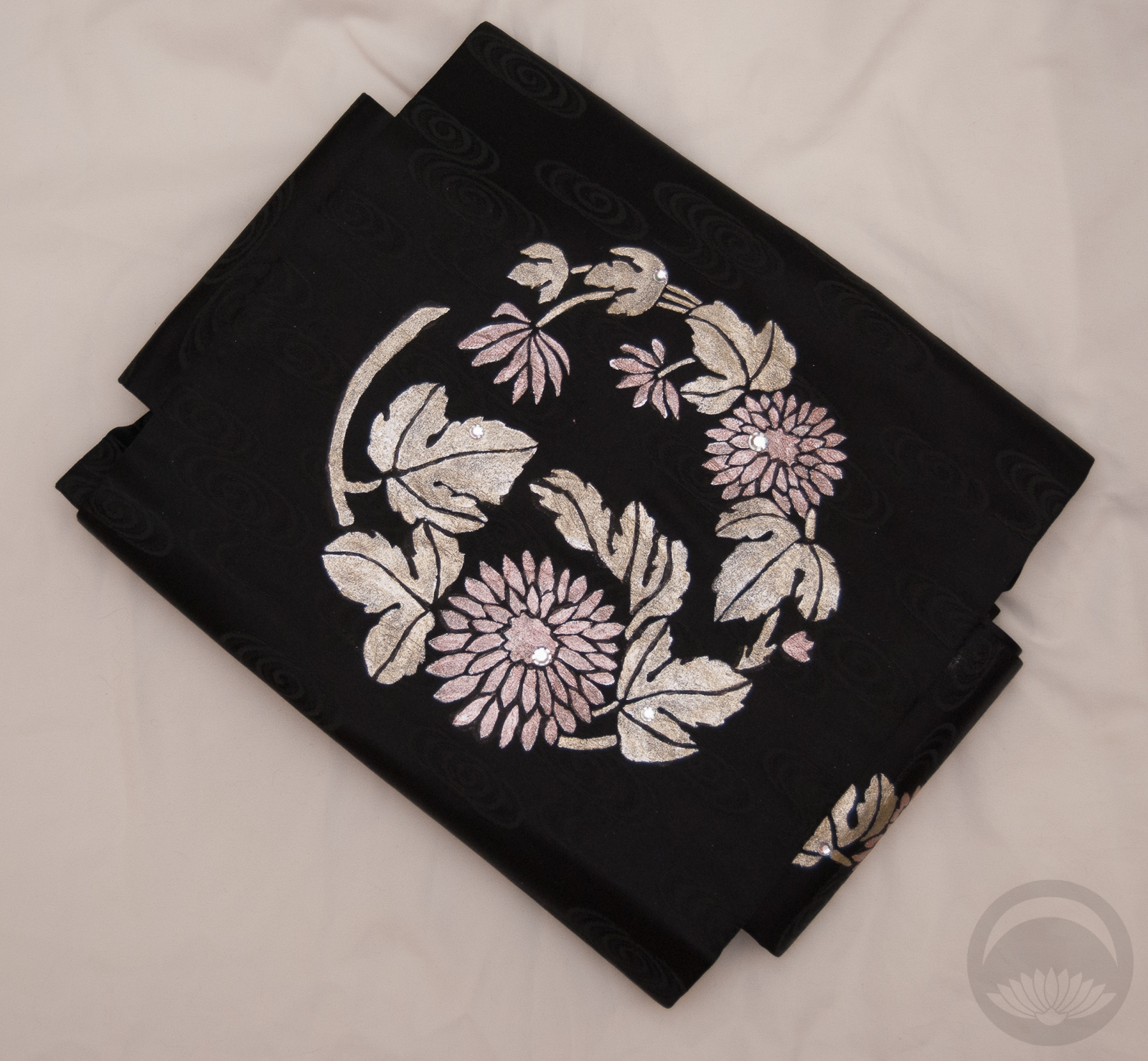
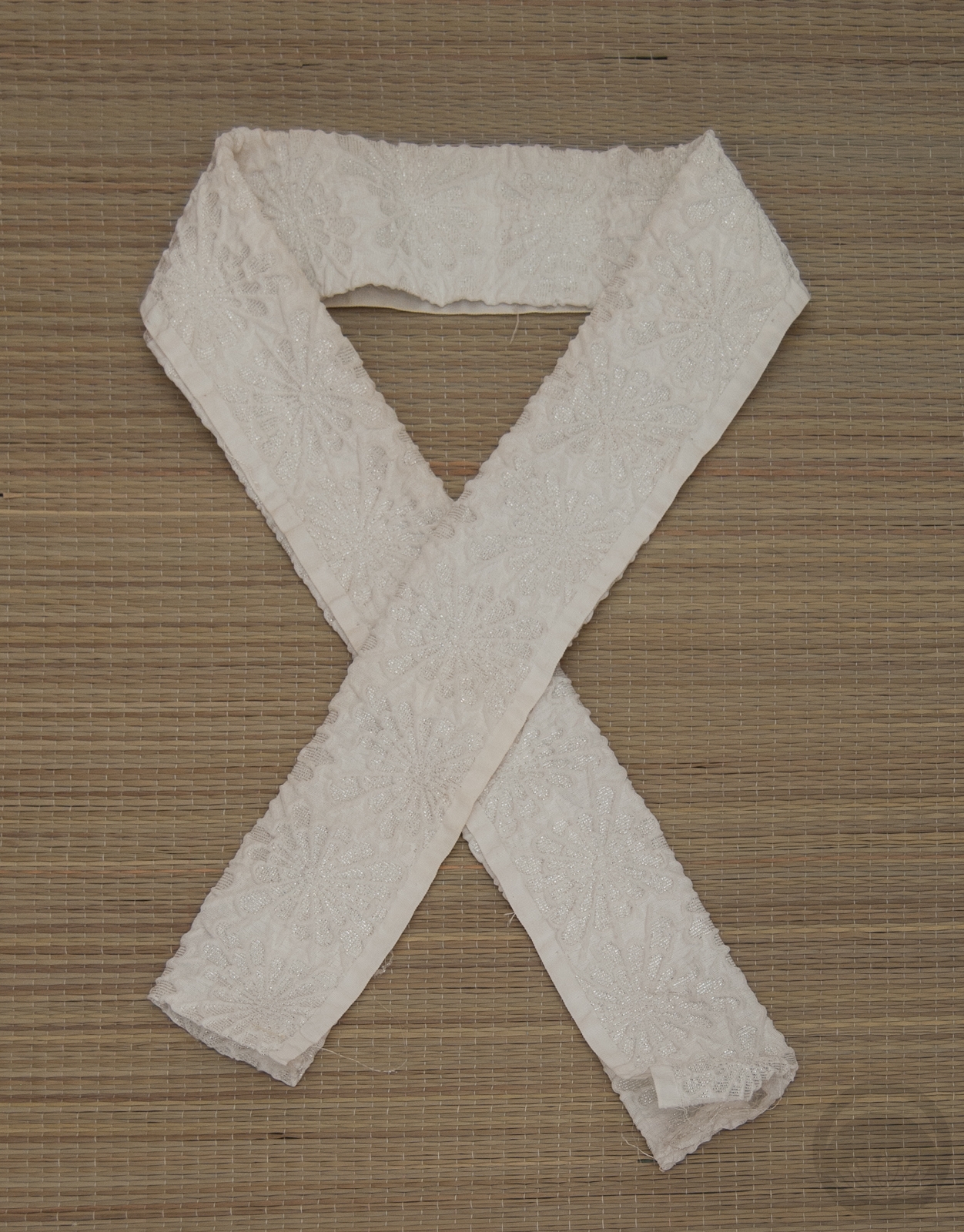
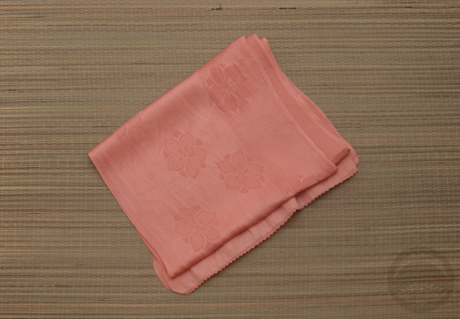
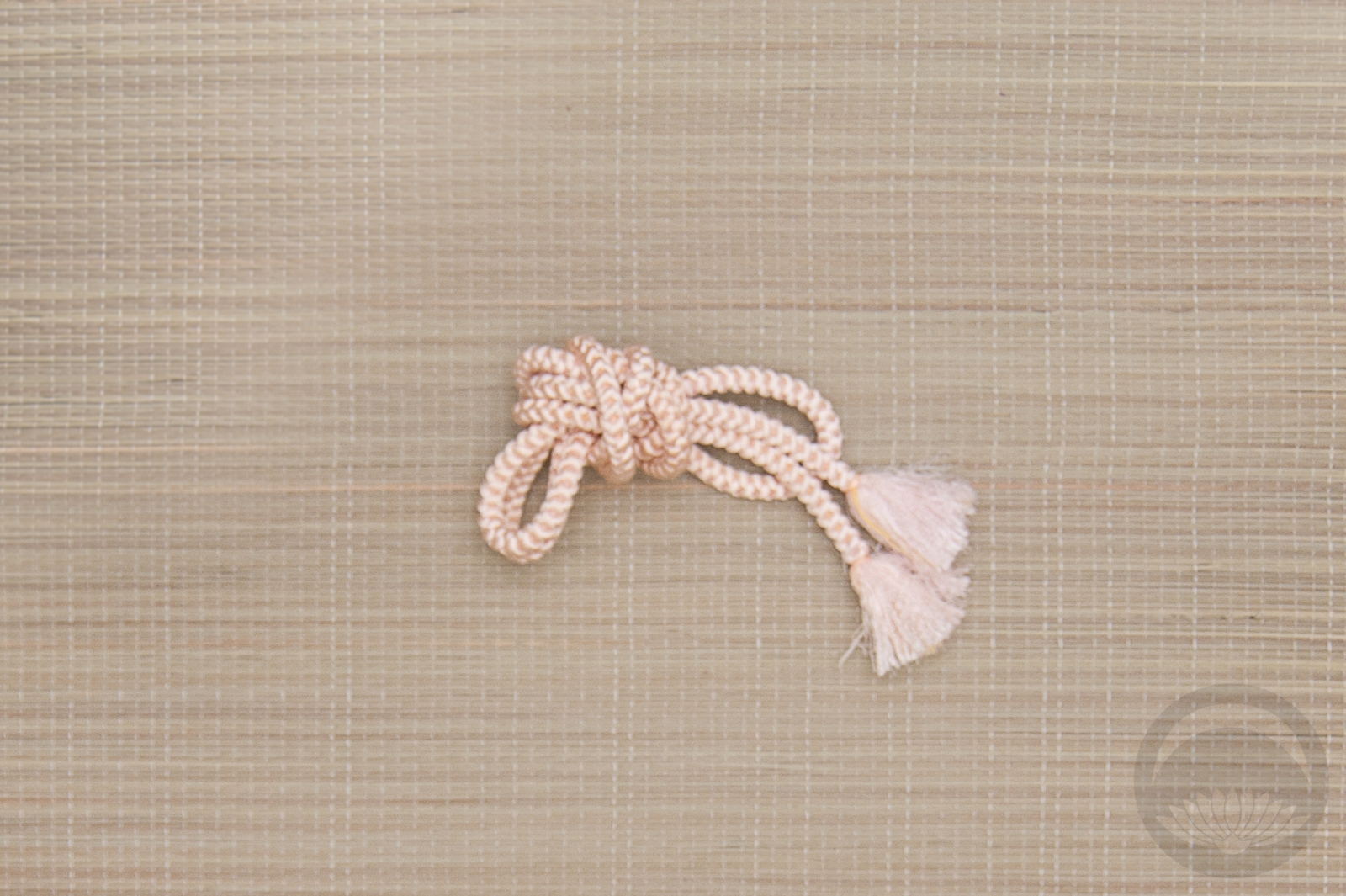
I’m glad I had an opportunity to use this dusty rose-pink hakata nagoya obi. It’s really subdued but the texture of it makes it feel so lush. I couldn’t resist using my spider haneri which is a near-perfect match to the obi. Also, you guys, I’m so proud of myself. I did an ensemble with yellow accents and didn’t use that lemon-yellow shibori obiage and hakata obijime I use all the time. Will wonders never cease? I did use a yellow obiage, but a much more subdued one. The obijime was a better choice in theory than in practice I think, but it’s not terrible. I just know I can do better next time. XD
Items used in this coordination
-
- Vintage Yabane
-
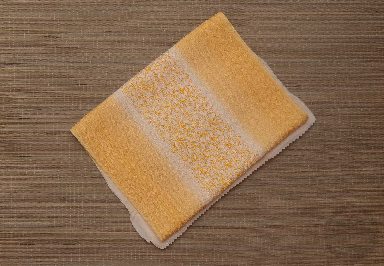
- Dusty Rose Hakata
-
- White and Gold Rinzu
-
- Shades of Indigo
-
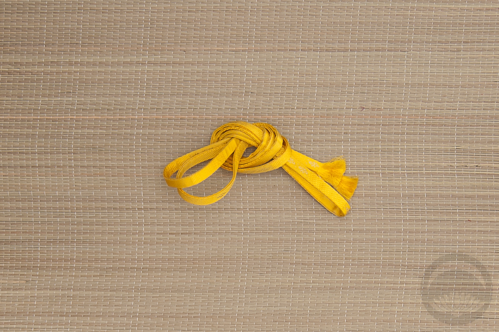
- Spiders


 Bebe Taian
 CHOKO Blog
 Gion Kobu