
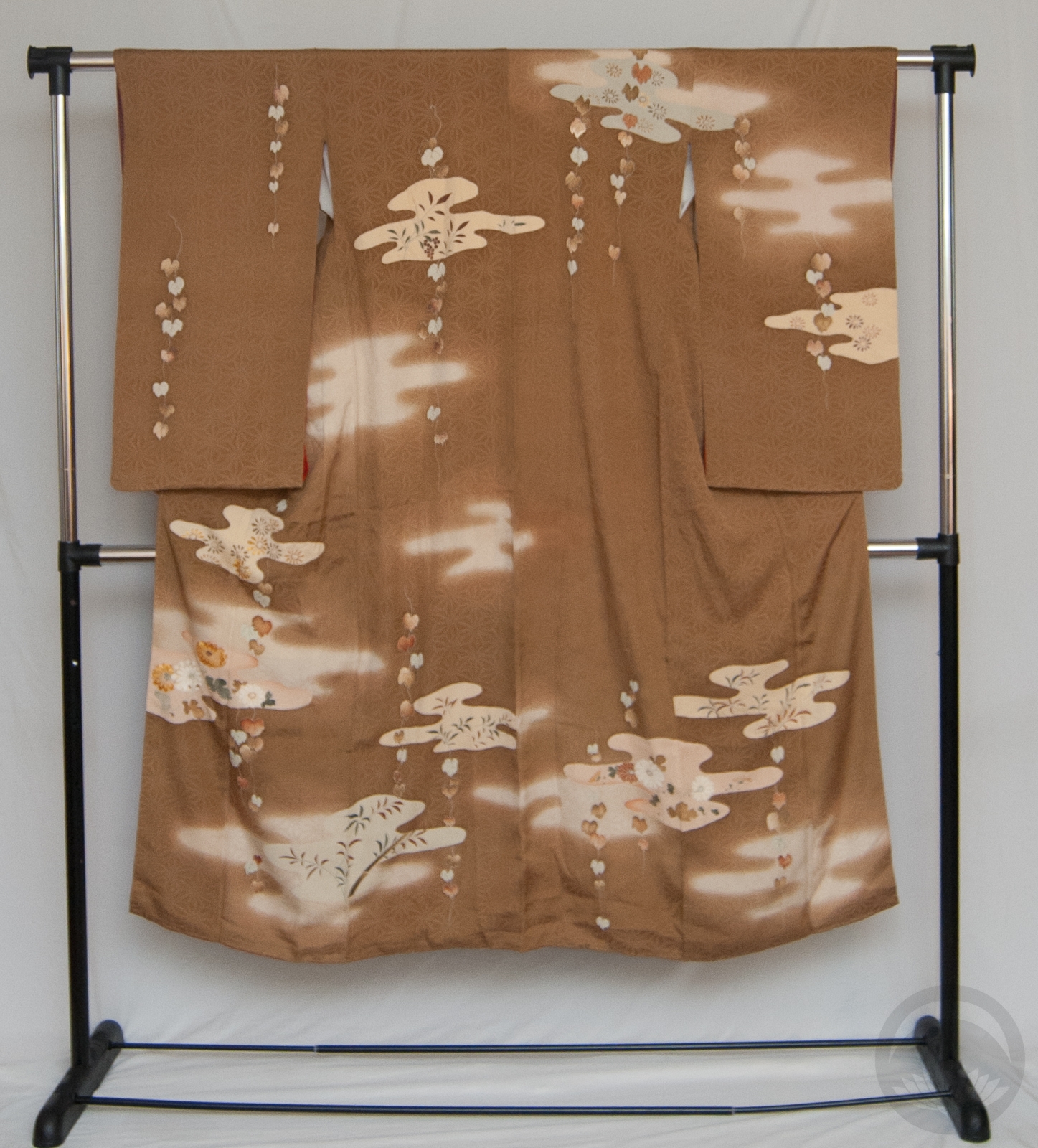
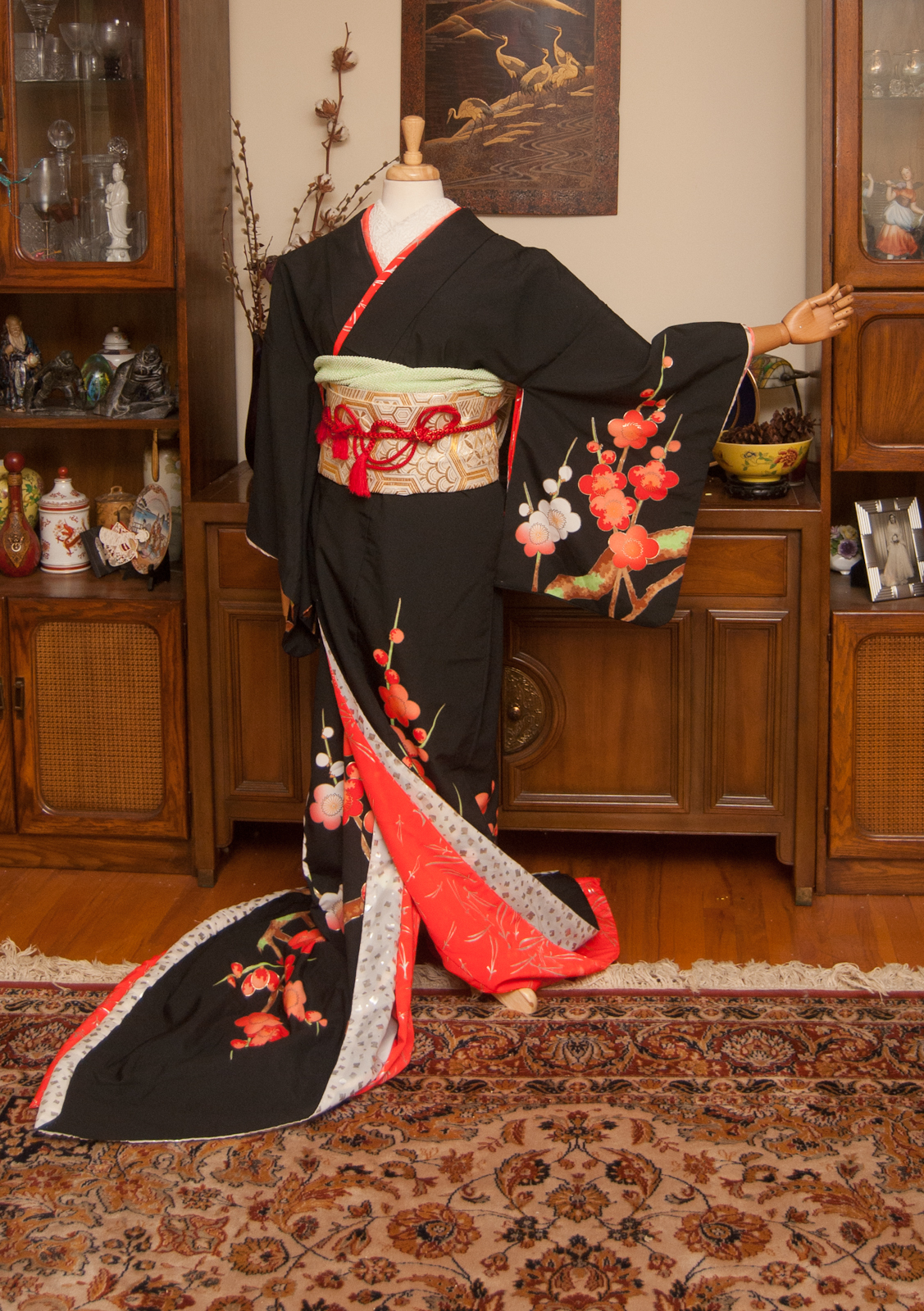
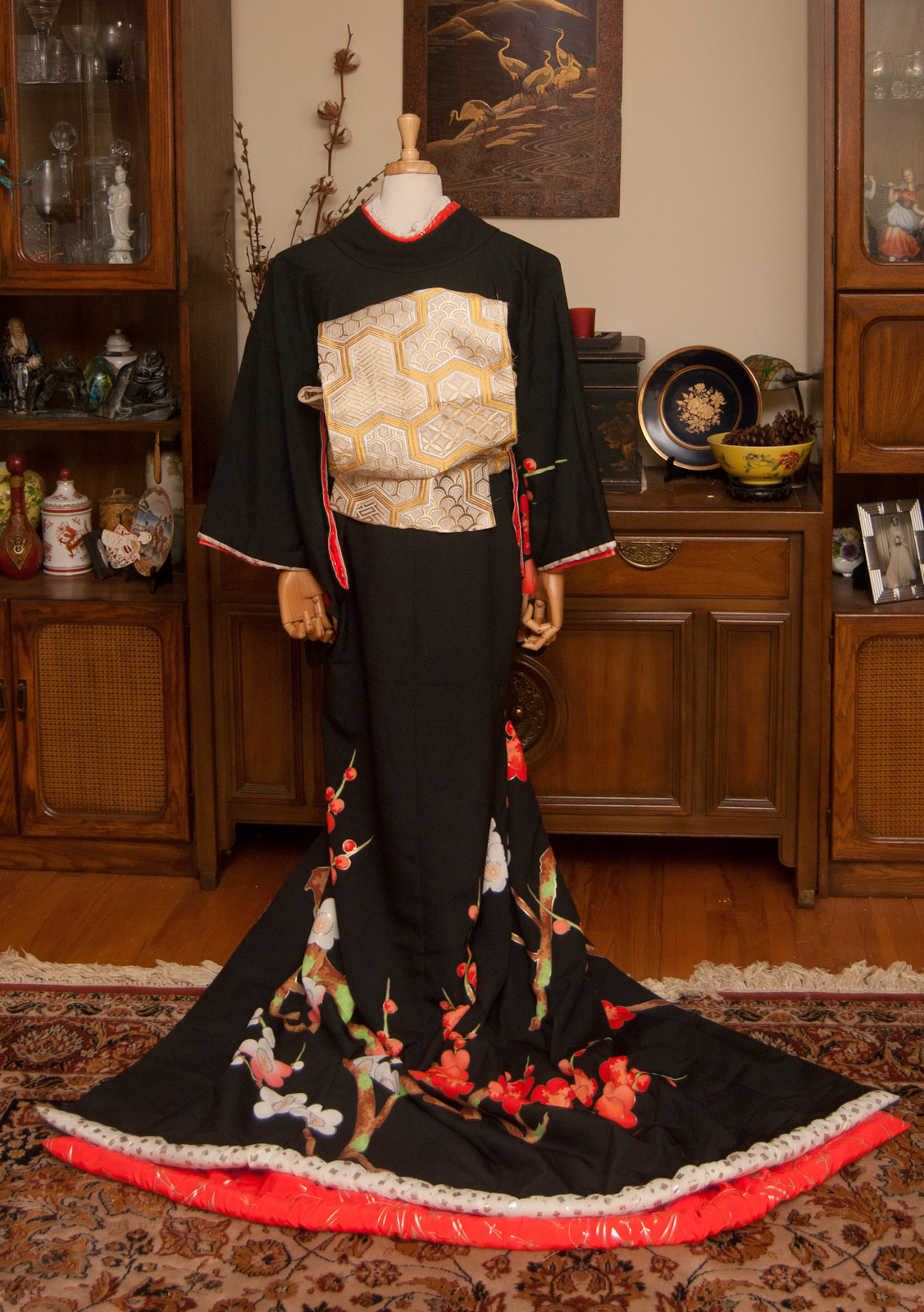
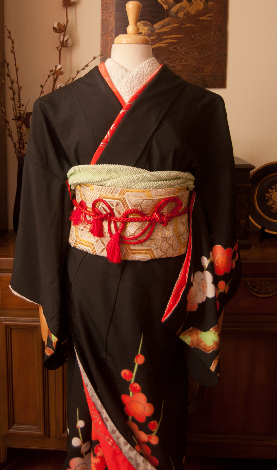
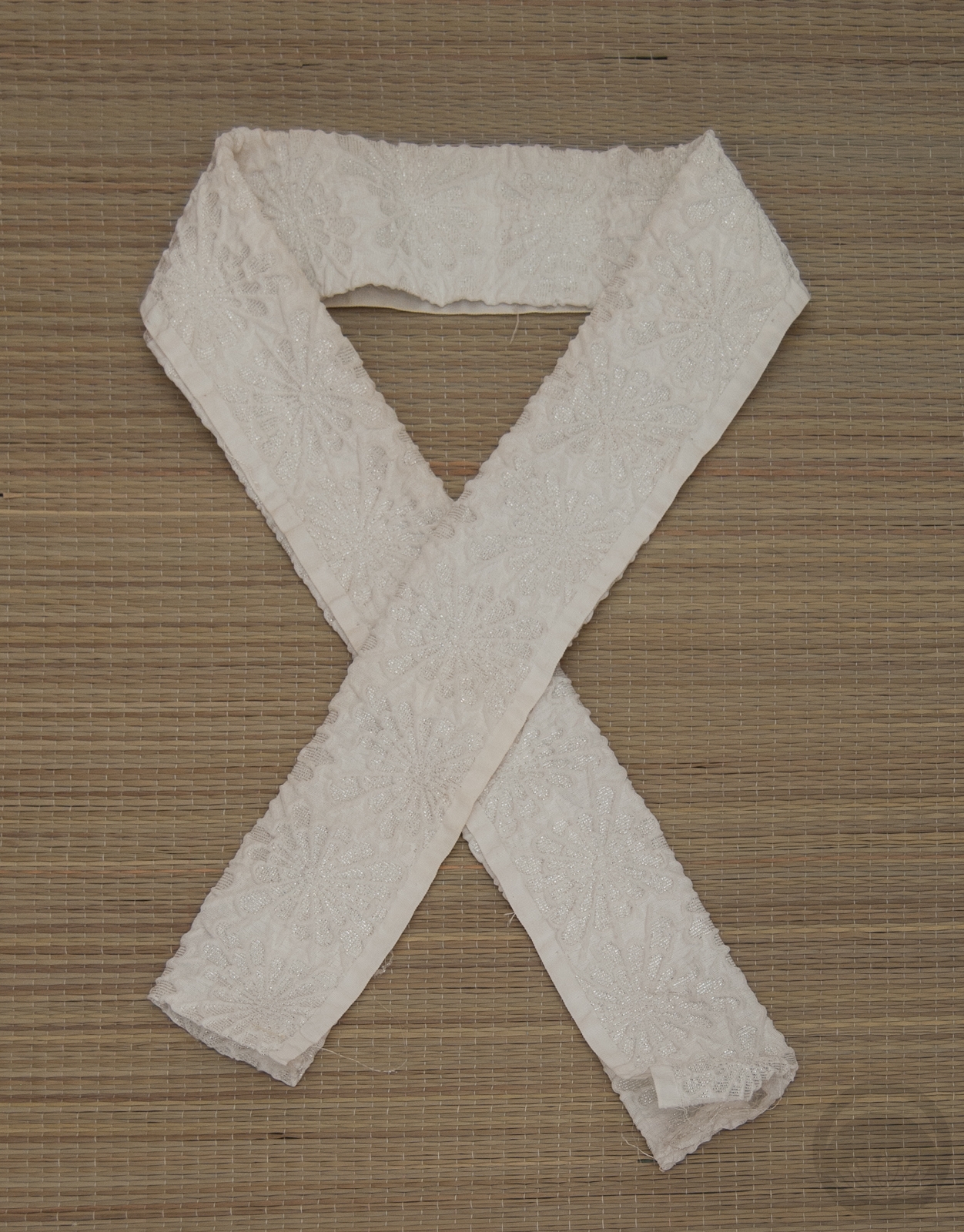
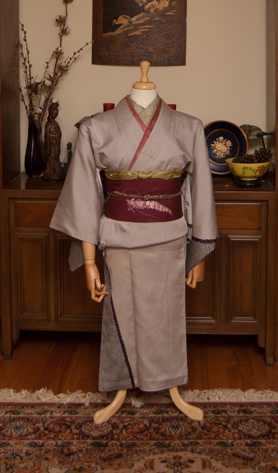
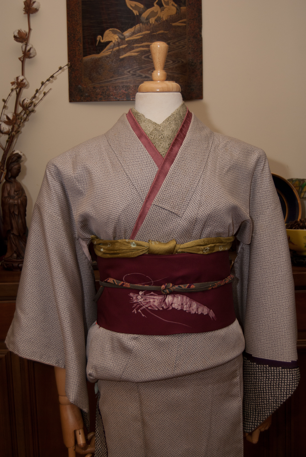
I recently got this really pretty lace collar from a friend, and it has a wonderful sweet vintage style to it. I decided to build a whole outfit around it. I wanted to stick to the vintage feeling by using soft browns and muted colours, and natural motifs. I am also more than ready for autumn, and wanted to see if I could evoke that without shouting “ORANGE! RED! FOLIAGE!” from the metaphorical rooftops. I do think that I managed to grasp it, as well as emulate the look and feel of an old tintype photograph. All the browns and beiges work so well together.

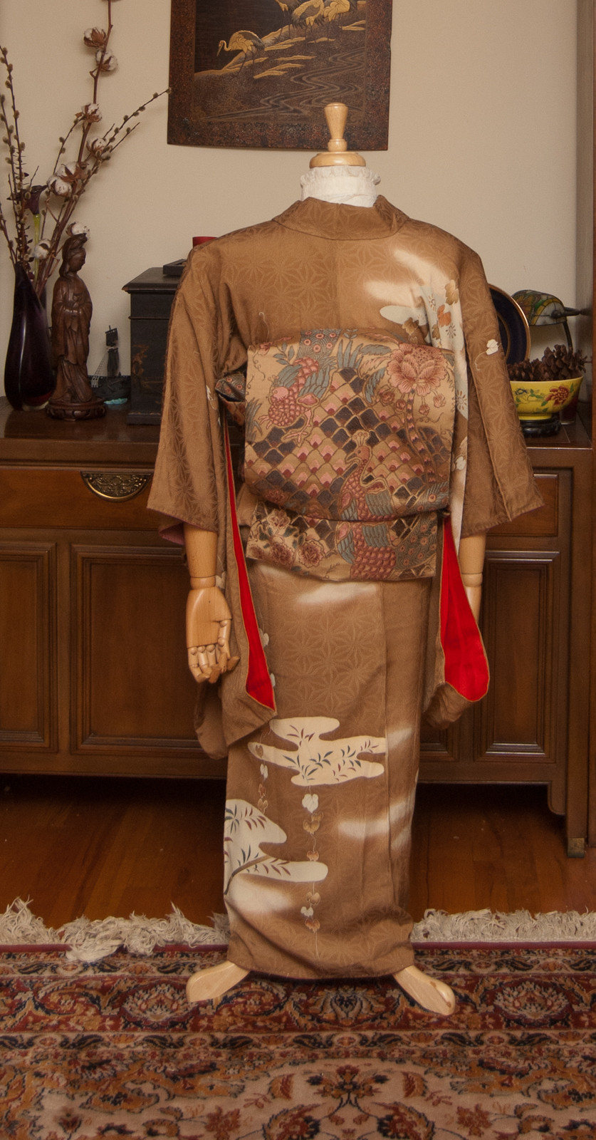
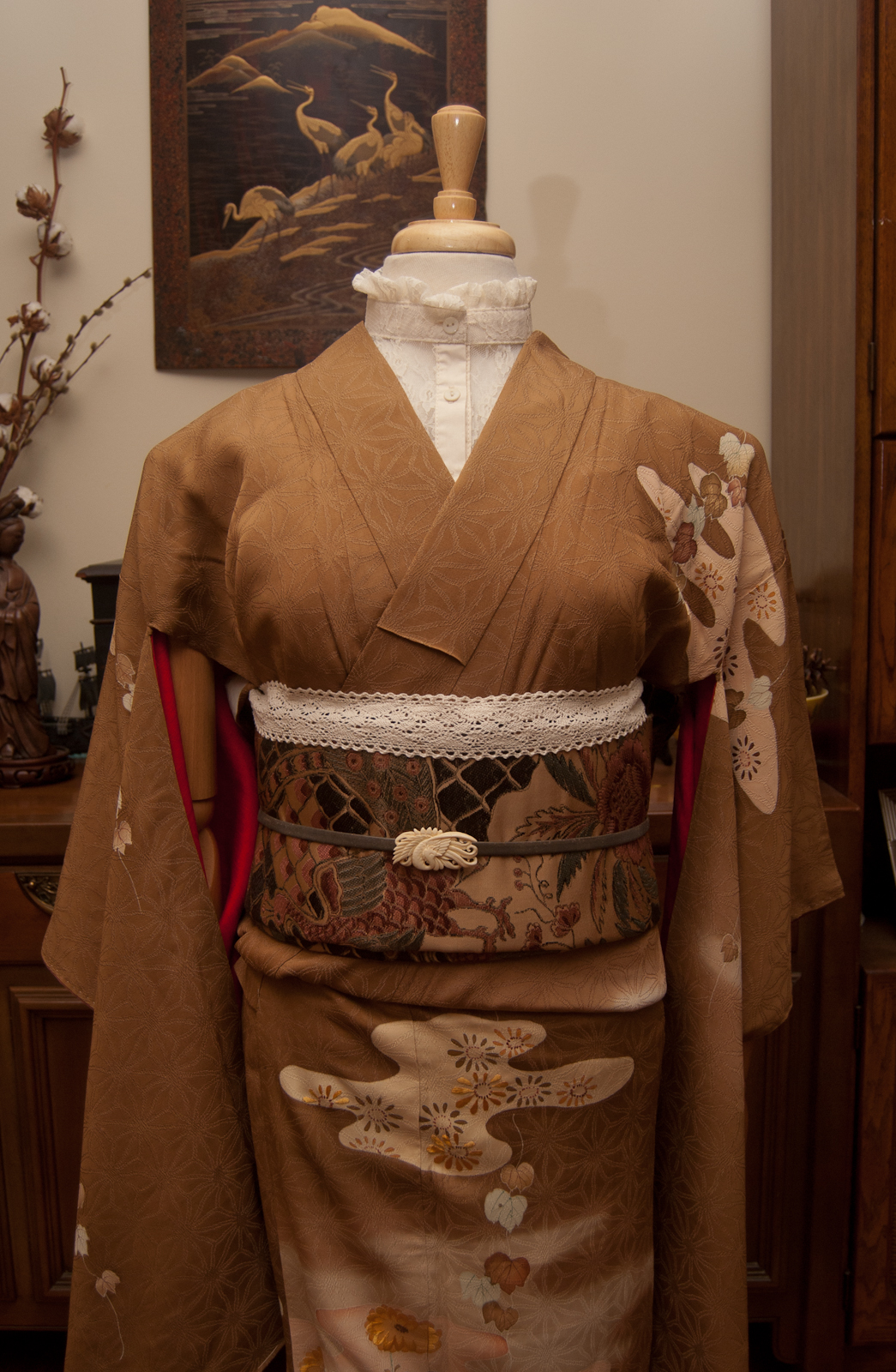
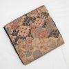
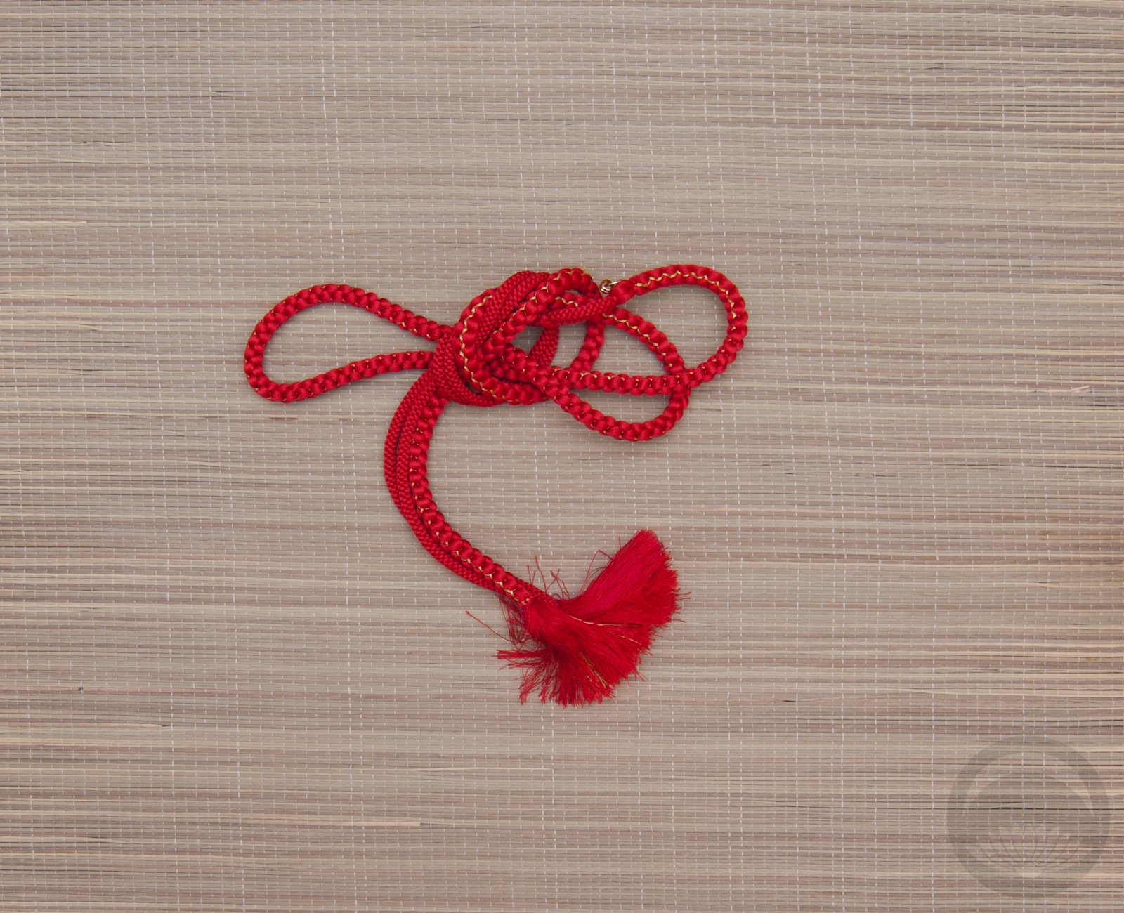
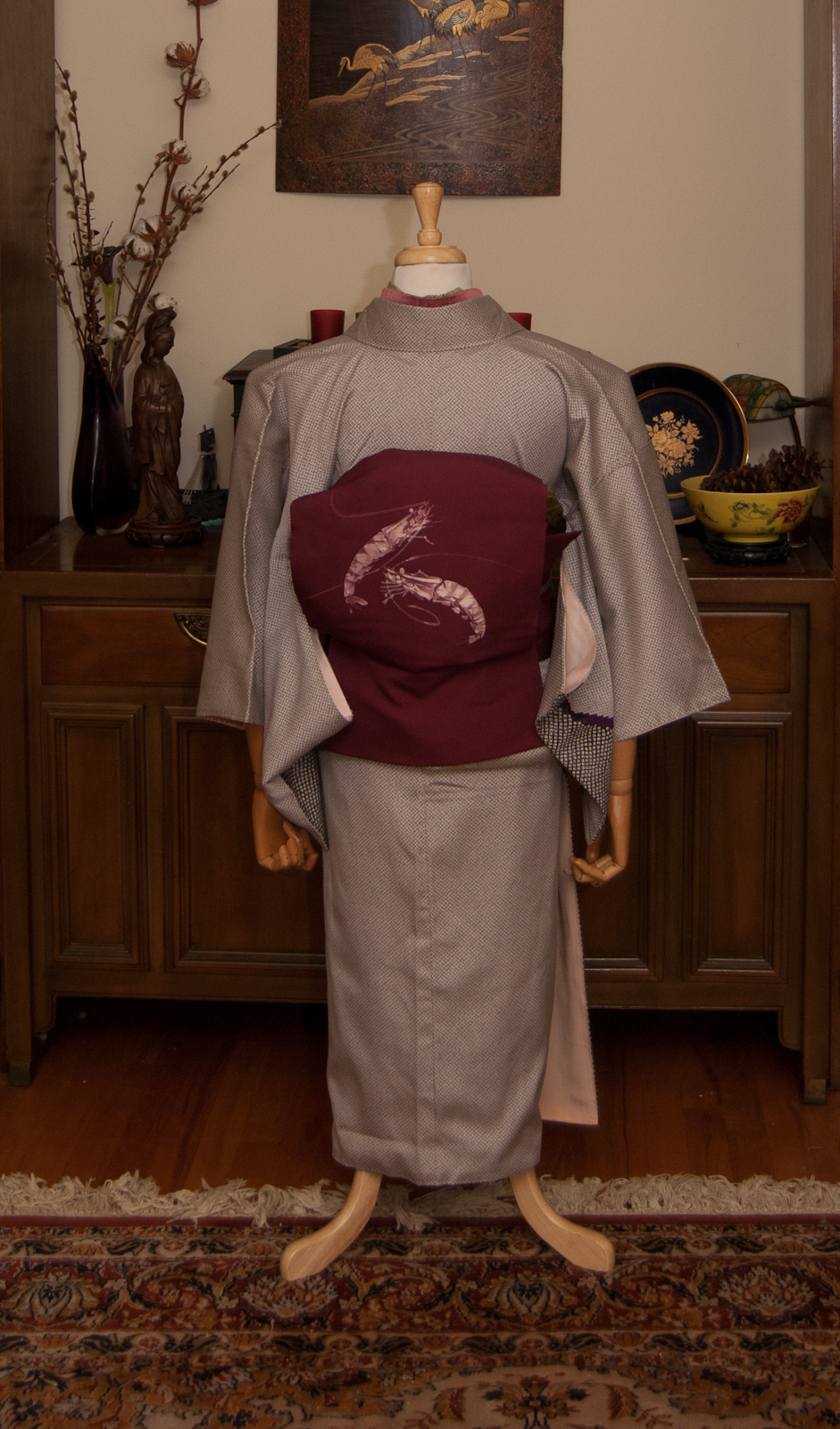
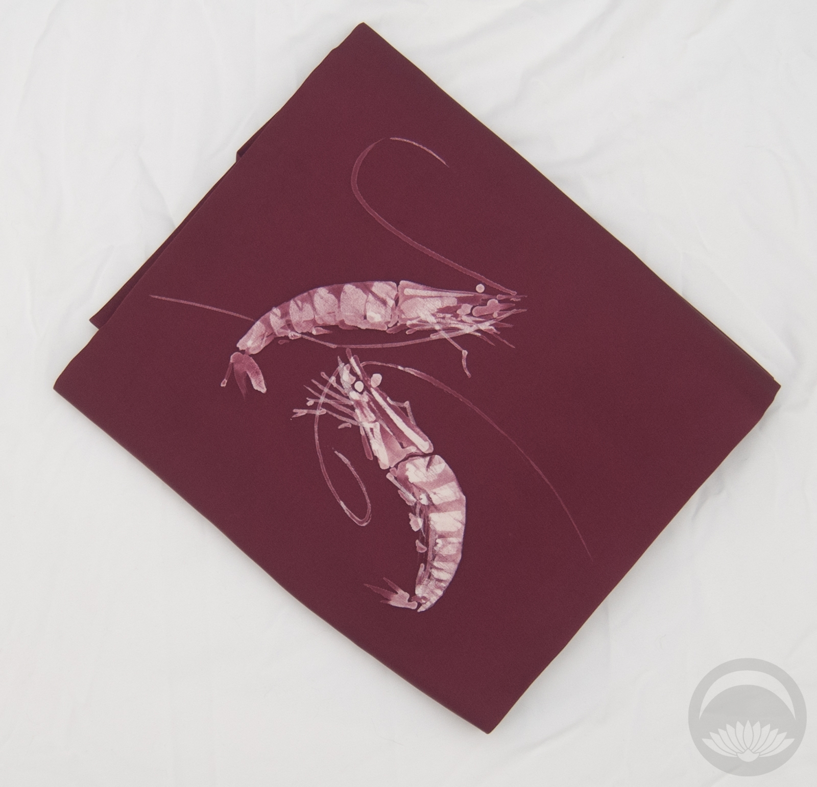
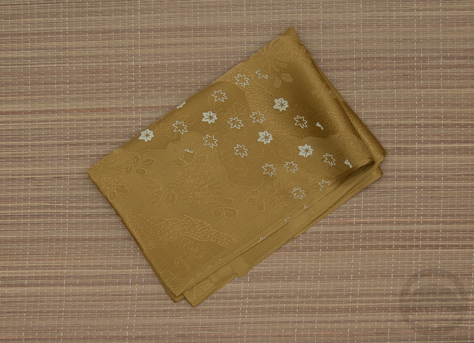
The obi I bought as part of my final Ichiroya purchase ( 😥 ) was perfect – more matching than contrasting, which suits the soft and subtle aesthetic I was aiming for. In lieu of an obiage I used some beautiful creamy crocheted lace to echo the collar. My initial plan was also to add some at the cuffs, but unfortunately I didn’t have enough.
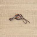
Despite being relatively busy, the obi felt like something was missing. The ivory phoenix obidome brings in more soft cream tones as well as more birds, and is the perfect finishing touch. Unfortunately this obidome has somehow escaped my cataloguing escapades so no close-up photo of it for now, but I will fix that later.
I am thrilled with how this outfit feels almost monochrome but not quite, with the unexpected accents of pale blue and an almost salmon pink shade popping up in both the obi and the kimono. They’re the sorts of details that only make themselves known up close, and one of the things I love about kimono.
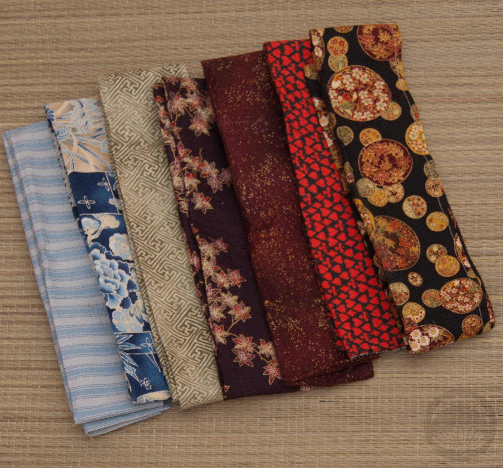
Items used in this coordination
-
- Taisho Brown
-
- Vintage Peacocks

-
- Grey Leather


 Bebe Taian
 CHOKO Blog
 Gion Kobu