Z is for Zen, Zoge

Zen, , Buddhism
Zoge, 象牙, Ivory

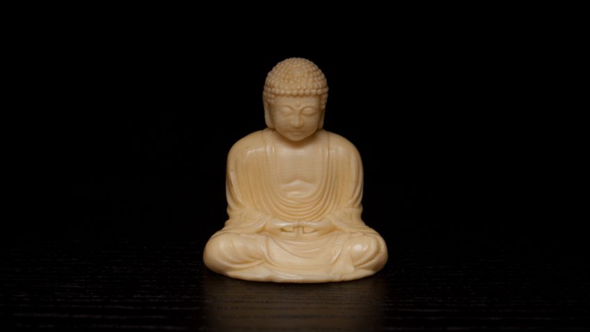
Celebrating the last day of this challenge with a two-for-one. Zen, the Japanese school of Mahayana Buddhism emphasising the value of meditation and intuition, and Zoge, the Japanese word for Ivory.

Rather than dump more info on you, I thought I would just let this statue speak for itself. There’s a grounded beauty in its simplicity I could never hope to explain properly. This ivory Buddha belonged to my grandmother. Both my father and I grew up playing with it. The texture on his head is incredibly soothing, and I have strong tactile memories of running my fingers over it whenever I was allowed to take it off the shelf where it was displayed.

Please note, I absolutely don’t condone the sale, trade, or collection of ivory. This piece is from a time when people had different mentalities and knowledge about this sort of thing. It’s treasured by our family and we appreciate it for what it is, and have no intention of ever letting it go back on the market.

Y is for Yabane

Yabane, 矢羽, Arrow fletching

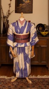
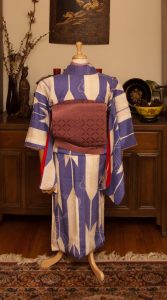
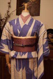
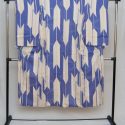
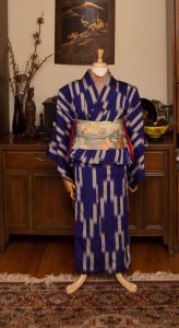
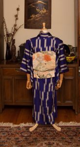
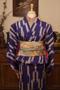
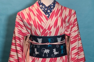
Yabane (also yagasuri for the small, tightly-repeating variation) and hakata; two of my favourite things together! I love all depictions of yabane, but particularly these big, semi-random depictions that were so beloved in the Taisho and early Showa eras really get to me. I’ve loved this kimono ever since I first bought it back in Boulder, Colorado. It’s an odd fabric, it feels like a mix of silk and cotton. It’s very light and breezy, despite being lined, and is smoother than cotton but has a lovely grip that makes it a pleasure to put on. However, I still can’t believe I ever wore this comfortably though. It’s so tiny!

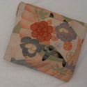
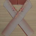
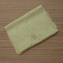
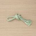
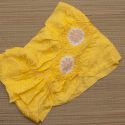
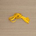
I’m glad I had an opportunity to use this dusty rose-pink hakata nagoya obi. It’s really subdued but the texture of it makes it feel so lush. I couldn’t resist using my spider haneri which is a near-perfect match to the obi. Also, you guys, I’m so proud of myself. I did an ensemble with yellow accents and didn’t use that lemon-yellow shibori obiage and hakata obijime I use all the time. Will wonders never cease? I did use a yellow obiage, but a much more subdued one. The obijime was a better choice in theory than in practice I think, but it’s not terrible. I just know I can do better next time. XD

Items used in this coordination

X is for X Marks the Spot

X Marks the Spot
Expression regarding the target on maps

Whoof, this was a challenge. Not only are there no Japanese words starting with X, there aren’t really many in English either! I certainly don’t have any items with a xylophone or a xerox machine… My friend suggested “x-rated” and I did debate doing a post on erotic woodblock prints for a hot minute, but I’d rather keep this blog family-friendly!

So what was I to do? I racked my brain until I remembered this kimono I have with a vaguely x-shaped meisen design. It’s lovely, and I don’t use it nearly often enough in coordinations, so I figured what better time to feature it than today’s post?

I kept the rest of the outfit fairly simple and desaturated. The obi is pale enough that it contrasts nicely against the kimono but is definitely not the focal point. All the attention stays on the kimono. I pulled out accessories in soft tones from the obi to keep things subdued. Today’s outfit might be a bit of a stretch, but I think I pulled it off in the end. I’m happy with how it looks, even if it does only barely relate to the challenge.
Items used in this coordination

W is for Wa

Wa, 和, Harmony, unity.
Used to designate traditionally Japanese concepts.

When I sat down to figure out a topic for today’s entry, I realised I had a surfeit of words beginning with W. Not just W, but “wa”. Then it hit me, these words all have the same root and explaining why that is, and what that root really means, would be a perfect subject. Rather than pick one word, I’m essentially doing all of them!

I’m sure you’ve noticed the common thread of wa- used in Japanese items. Here are some of the more common ones that crop up, especially amongst kimono collectors and fans of traditional arts and crafts. But why is that, exactly?

The character , Wa, alone is most frequently translated into English as harmony, like I mentioned above. However, it’s really so much more than that. It’s come to represent an intangible quality of a Japanese-ness, a cultural identity that defies any real definition. It’s often used as a way to distinguish the Japanese version or aesthetic of something that has a western or cross-cultural equivalent as well. For example, where yofuku means “western clothes”, wafuku means “Japanese clothes” and is used for kimono and all related bits and bobs. Yogashi are often elaborate, French-style desserts like tiny pastries and cream cakes, whereas wagashi are the iconic, minimalist, seasonal sweets made from traditional ingredients like bean paste and sakura leaves. Less frequently but becoming more common, yoshitsu can be used to describe rooms (particularly hotel bedrooms) that have a raised western-style bed and legged chairs and tables, where washitsu regularly describes the idealised Japanese room with tatami flooring, sliding screens, and seating on the floor.

There are so many more examples of words using this root, but here’s a small selection that are the most likely to crop up on this blog. This list is far from complete, but if you see a word that begins with wa and is written with theyou can be fairly certain that it’s got at least something to do with traditional Japanese arts and aesthetics.


V is for Vivid

Vivid, intensely deep or bright colour

We’ve reached another one of those super-fun letters that essentially don’t exist in Japanese. Like the L and Q posts, I knew I had to run with an English word and what better word than Vivid? Or possibly vibrant!

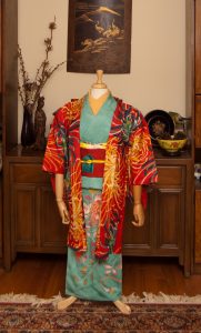
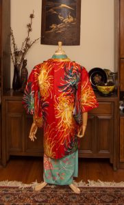
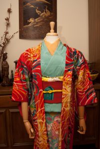
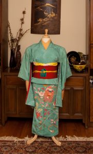
Taisho and early Showa era kimono are absolutely some of my favourites, due in no small part to the vivid, bold colour choices brought about by the advent of synthetic dyes. Prior to the 1910s, kimono colours tended to veer to the gentle, subdued, and either pastel or very dark tones thanks to natural dyes. With the introduction of synthetics, colours went pretty crazy.

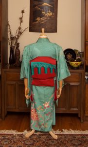
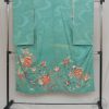
I went with my beloved turquoise irotomesode with tachibana, since I didn’t get to use it last week. And heck, compare the colour story of that entry to this one, and you’ll get a really good sense of what I mean by vivid!

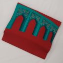
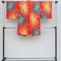
My initial plan was to use a vintage mustard-yellow floral obi but it just wasn’t bright enough. Then I remembered this gorgeous modern piece with the moorish arches that are a spot-on complement to the kimono. This obi was a gift and to this day I still don’t know who sent it to me! Next up was this gorgeously eye-searing meisen haori. Doesn’t get more vivid than this piece, when it comes to my wardobe. And to bring in the hit of yellow to echo the yellow accents in both the kimono I ended up using my yellow obiage and obijime again. This is starting to feel like a running gag, but they really do match just about everything!  Honestly these photos don’t even do this ensemble justice. One day I’d love to see this coordination on a person, but this kimono will never fit me so I’ll have to find a willing model.

Items used in this coordination