
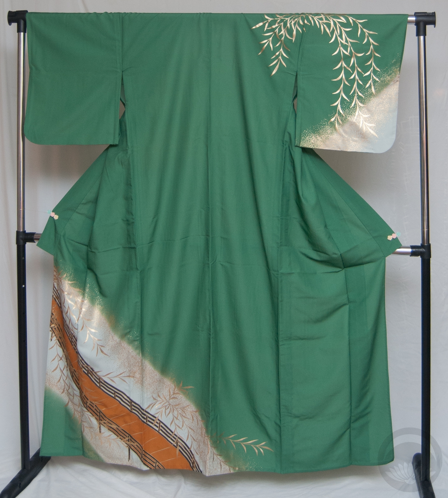
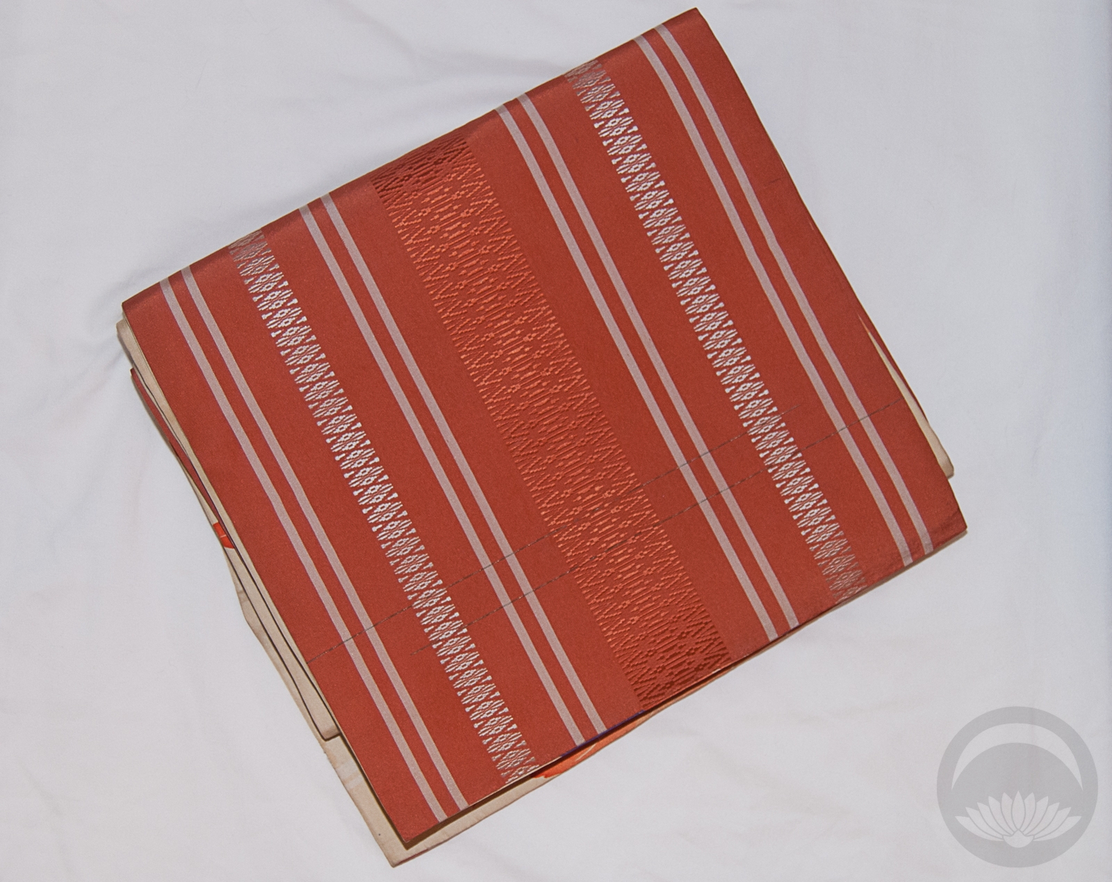
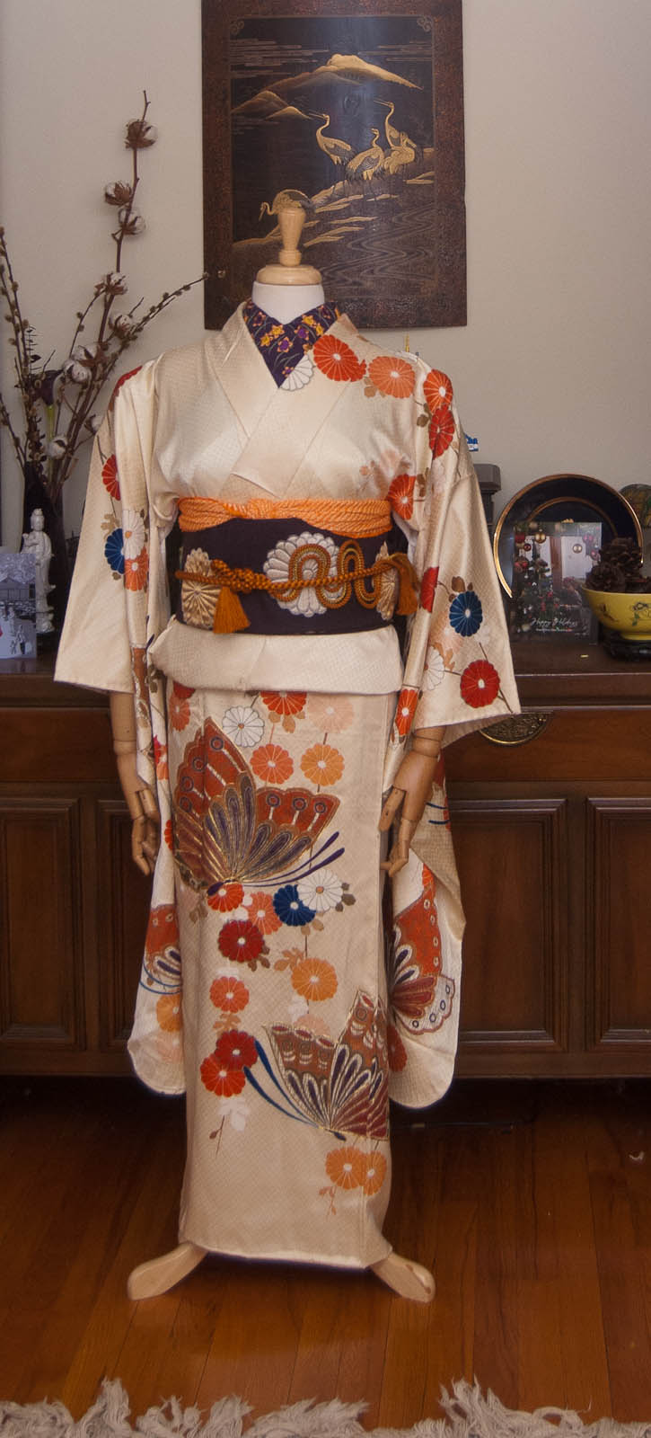
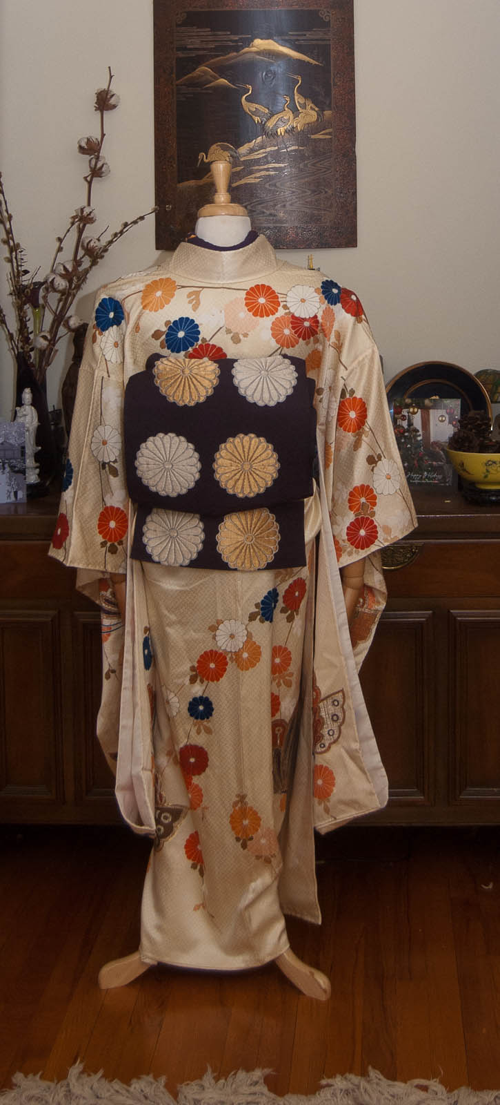
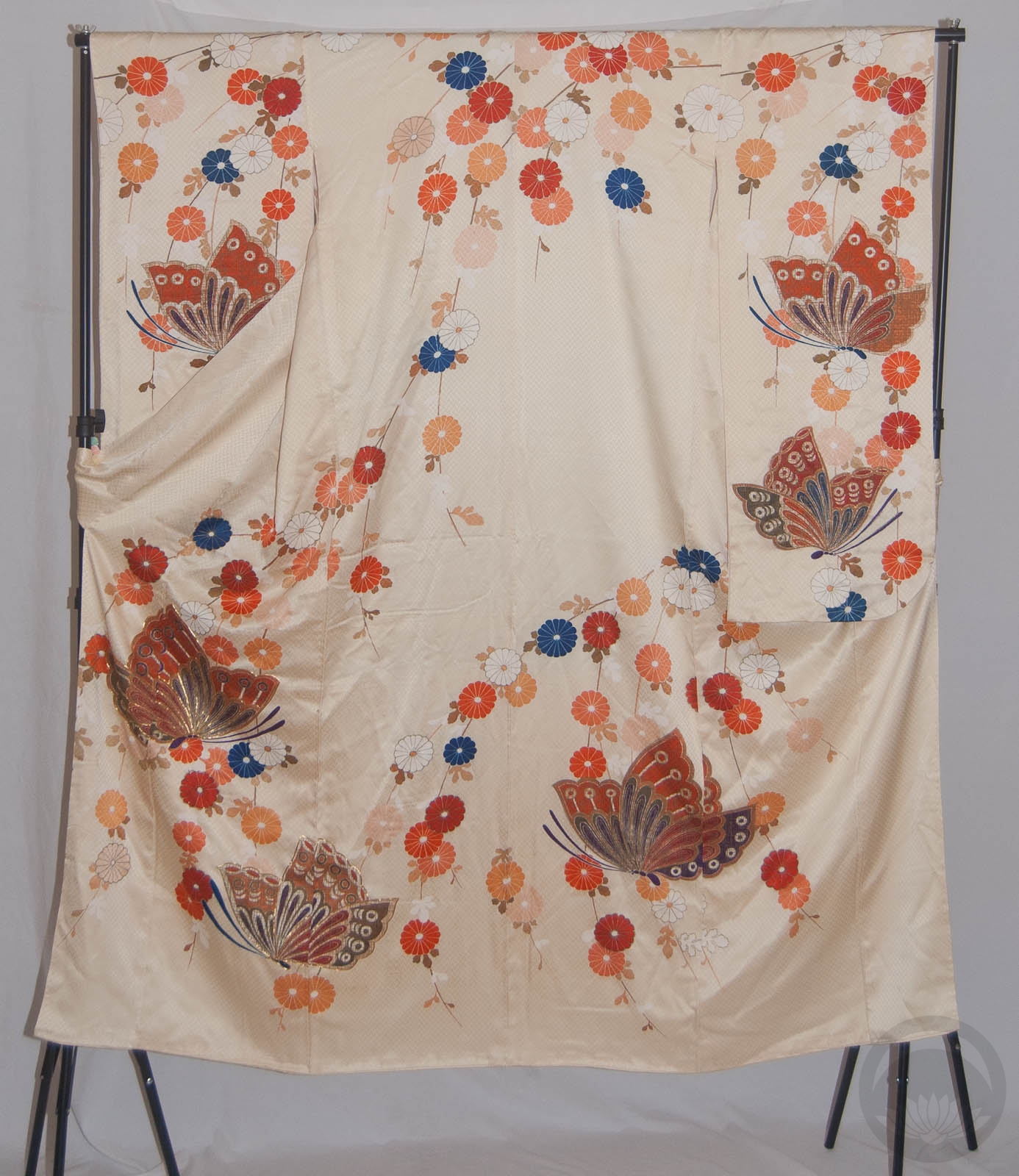
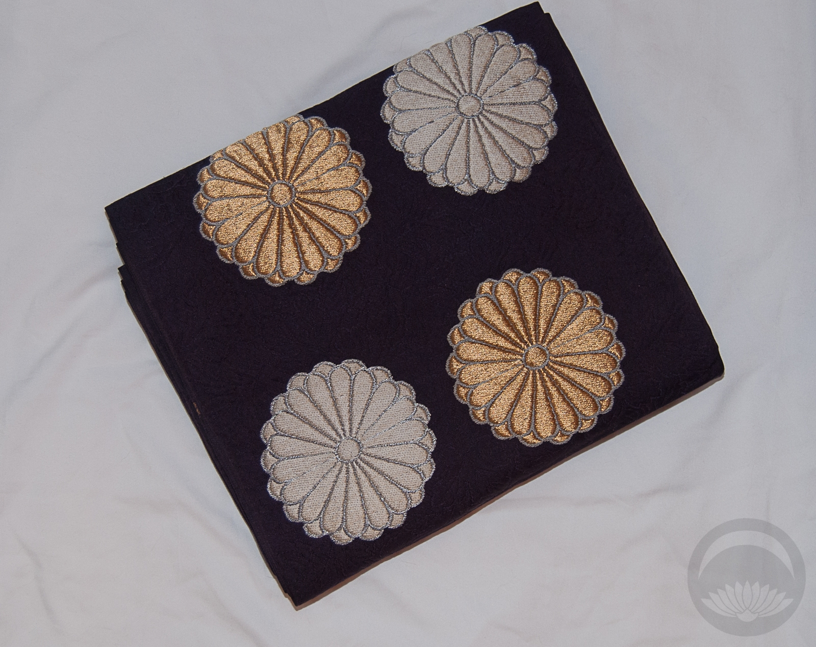
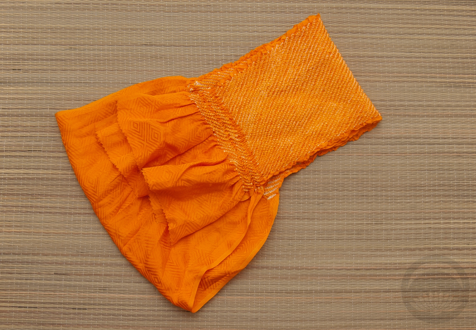
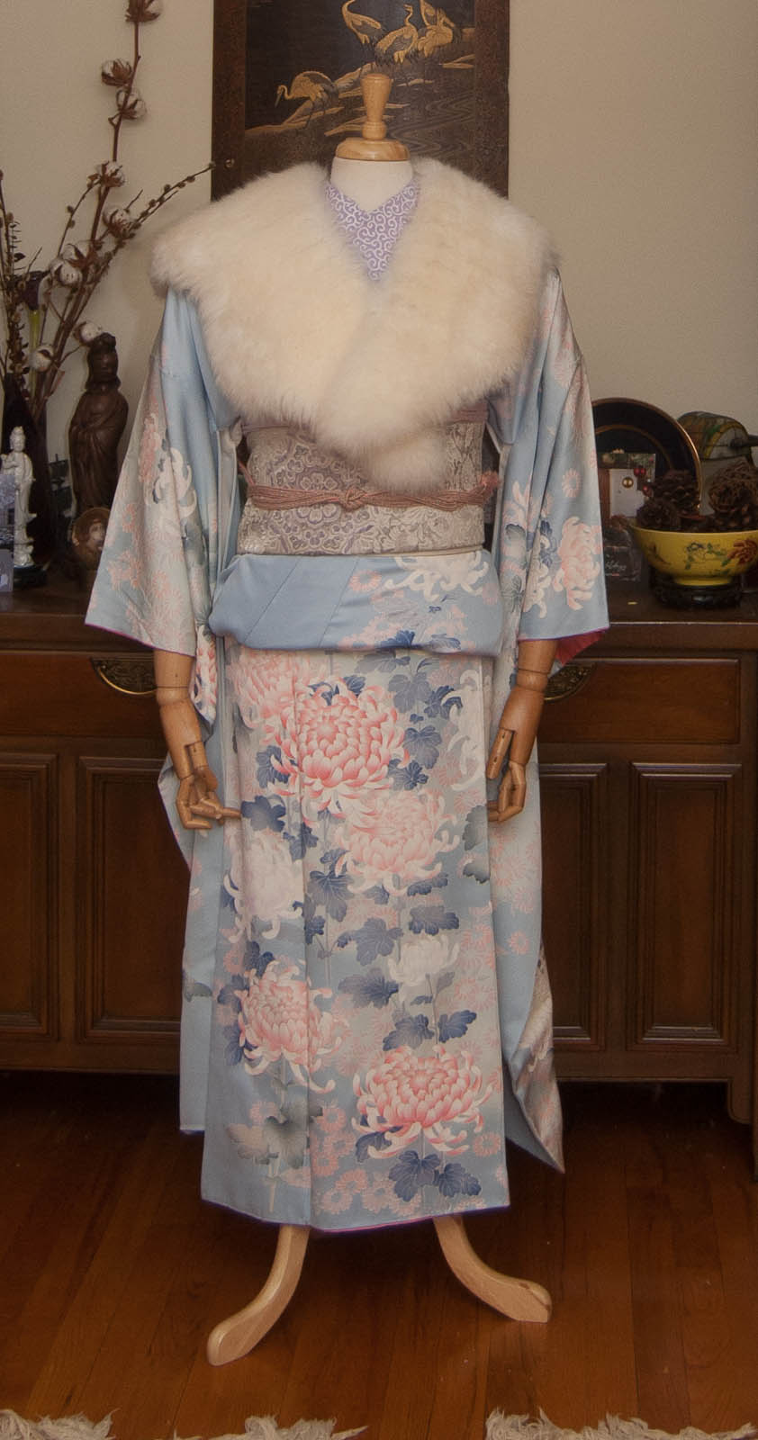
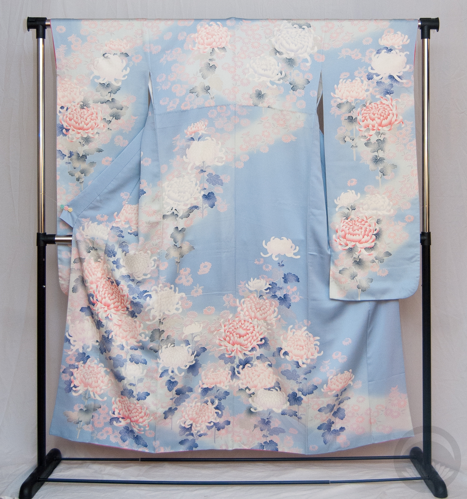
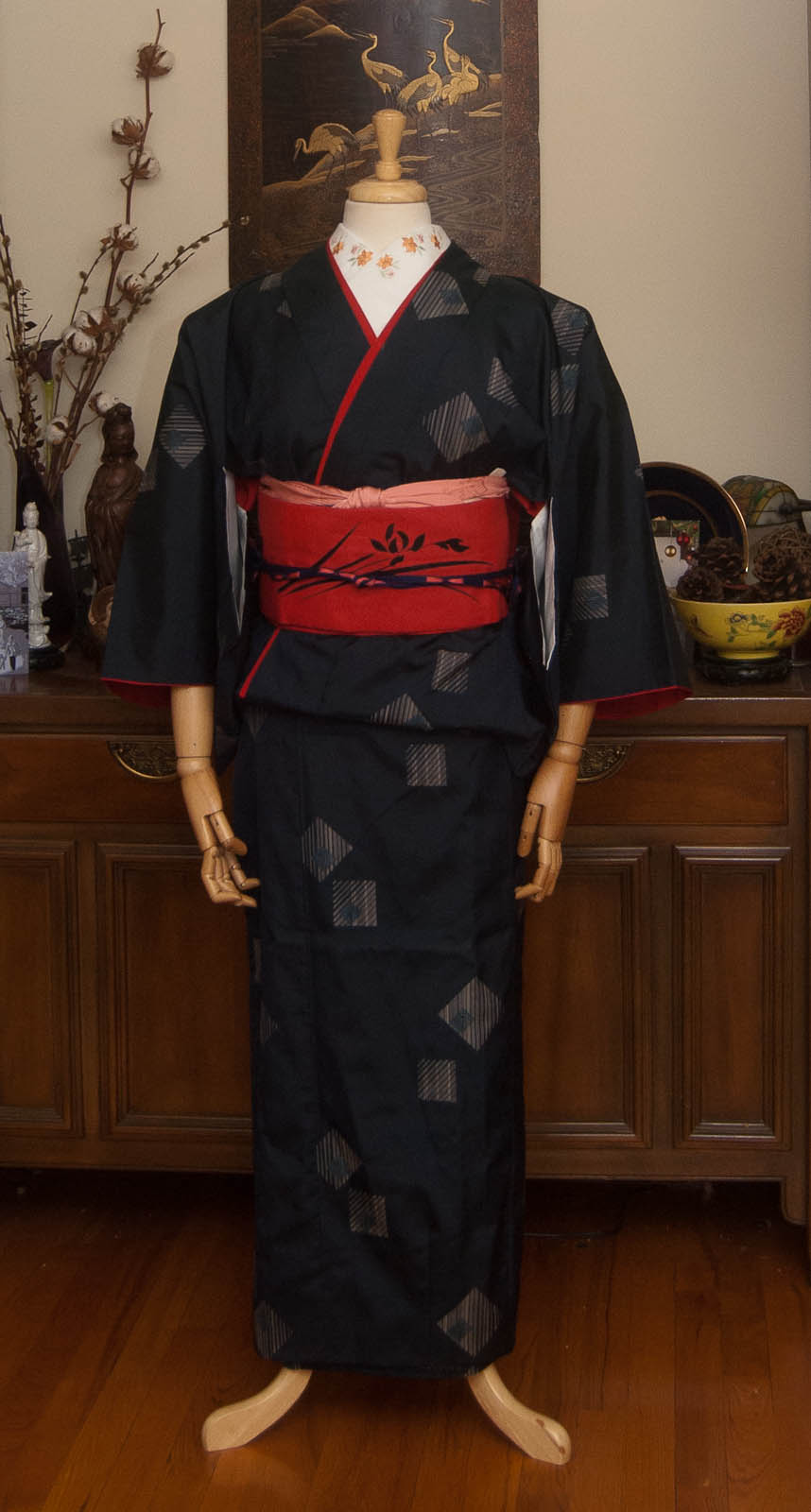
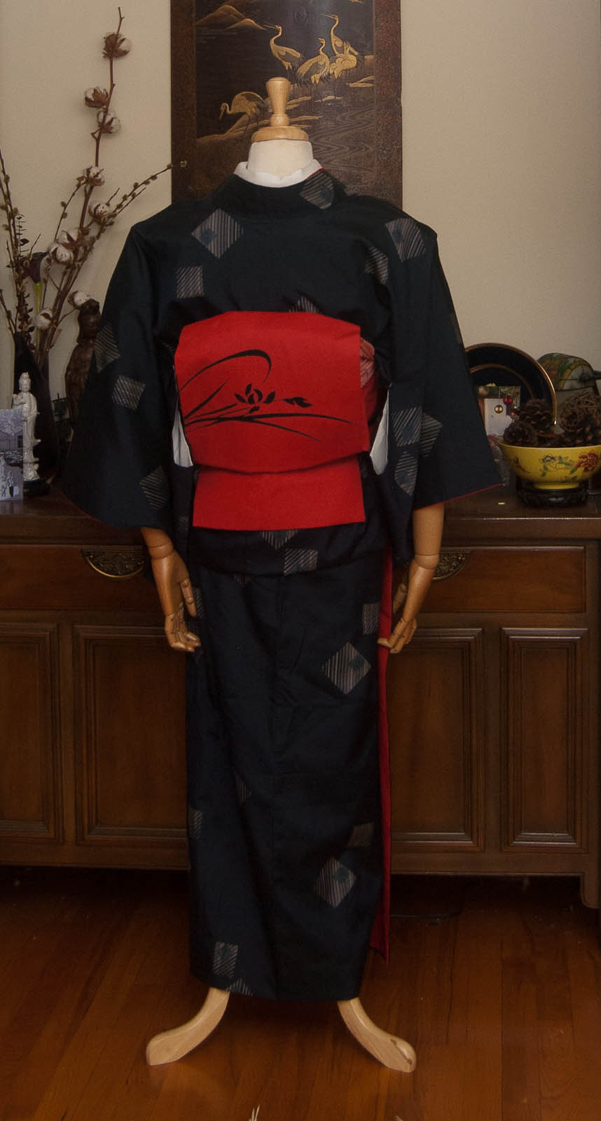
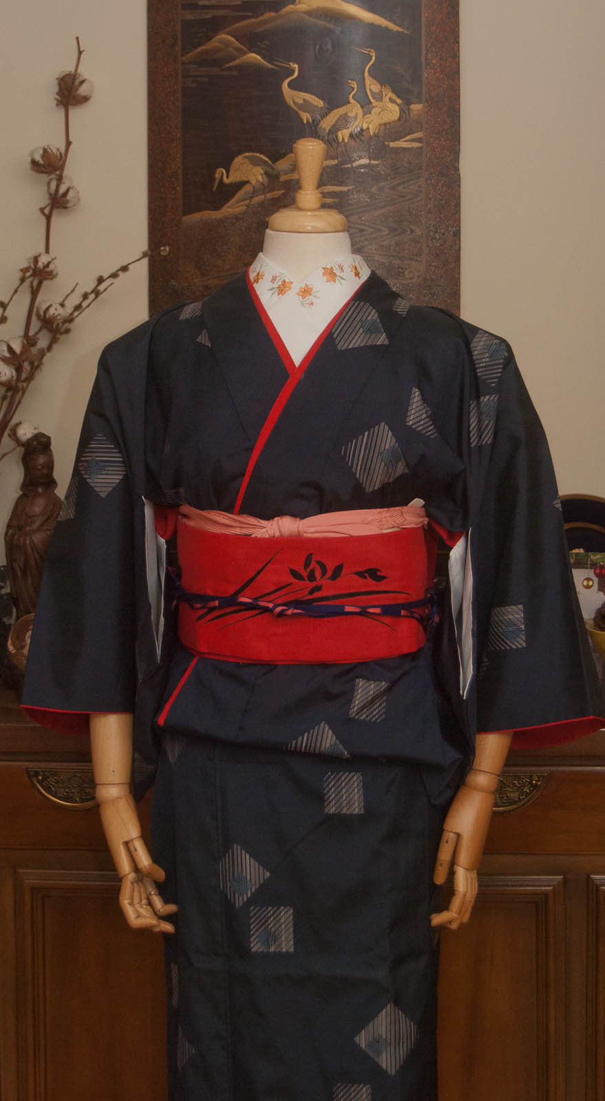
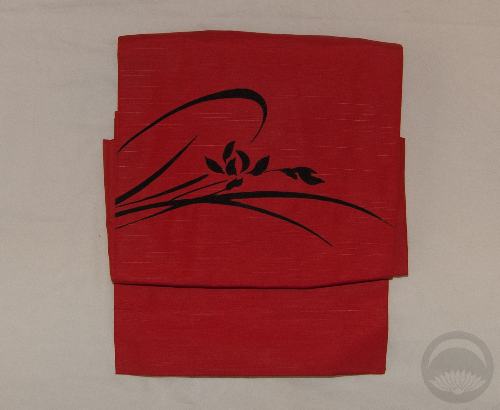
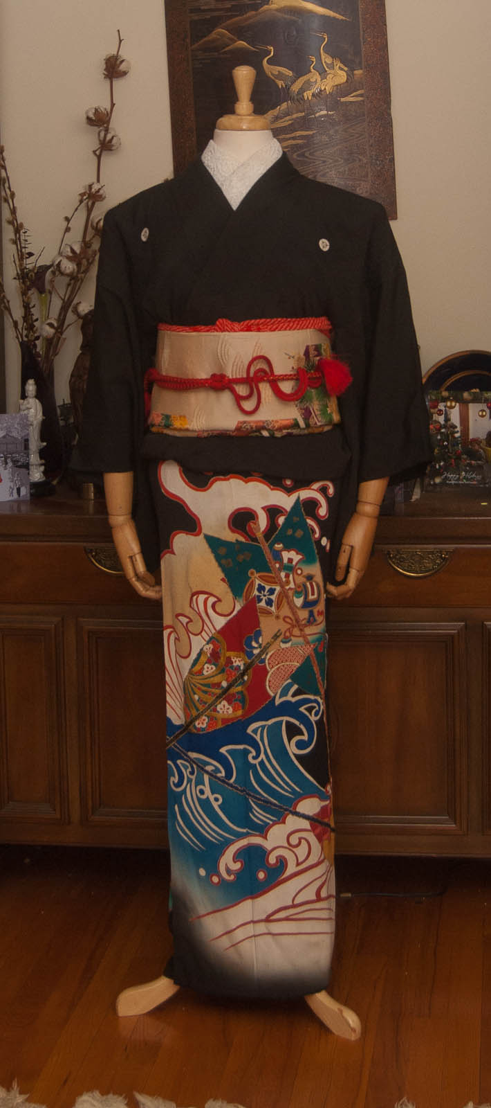
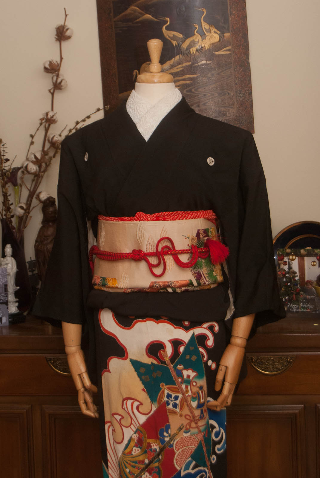
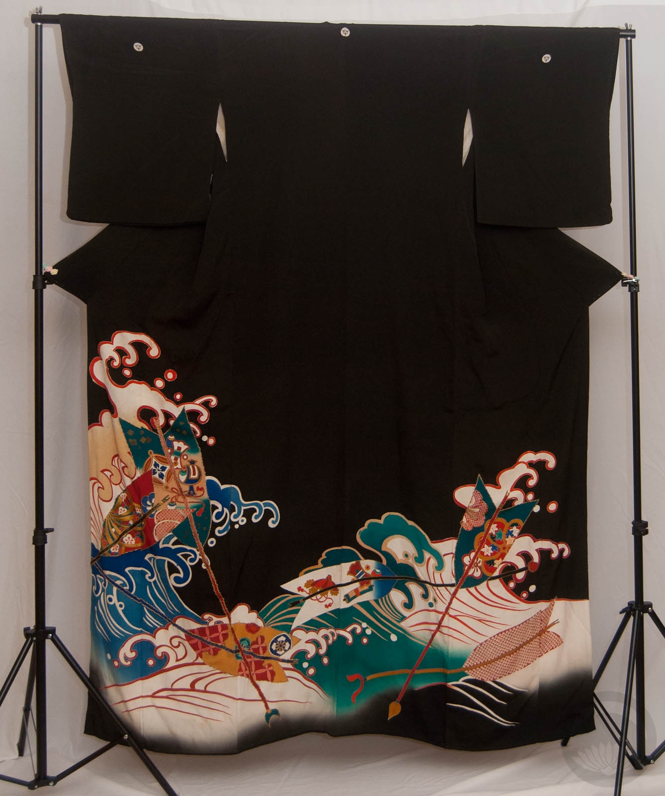
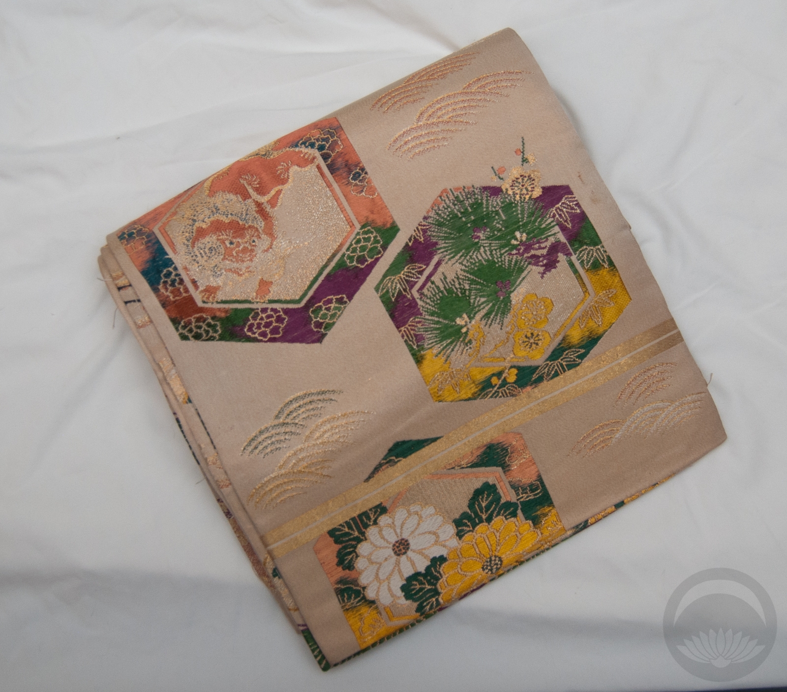
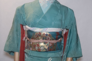
This is one of those coordinations that’s been on my to-do list pretty much since the day the kimono arrived. I love this dance piece and I really wanted to pair it with the orange hakata side of this vintage chuuya obi and do a fun odori-influenced outfit. For some reason the photographs don’t capture either orange properly, they’re a much better match in real life.
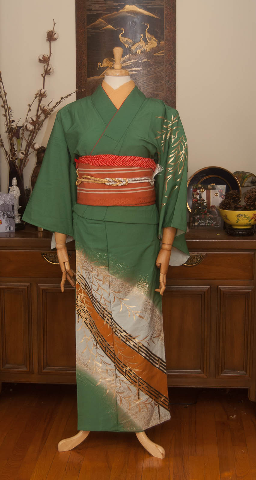
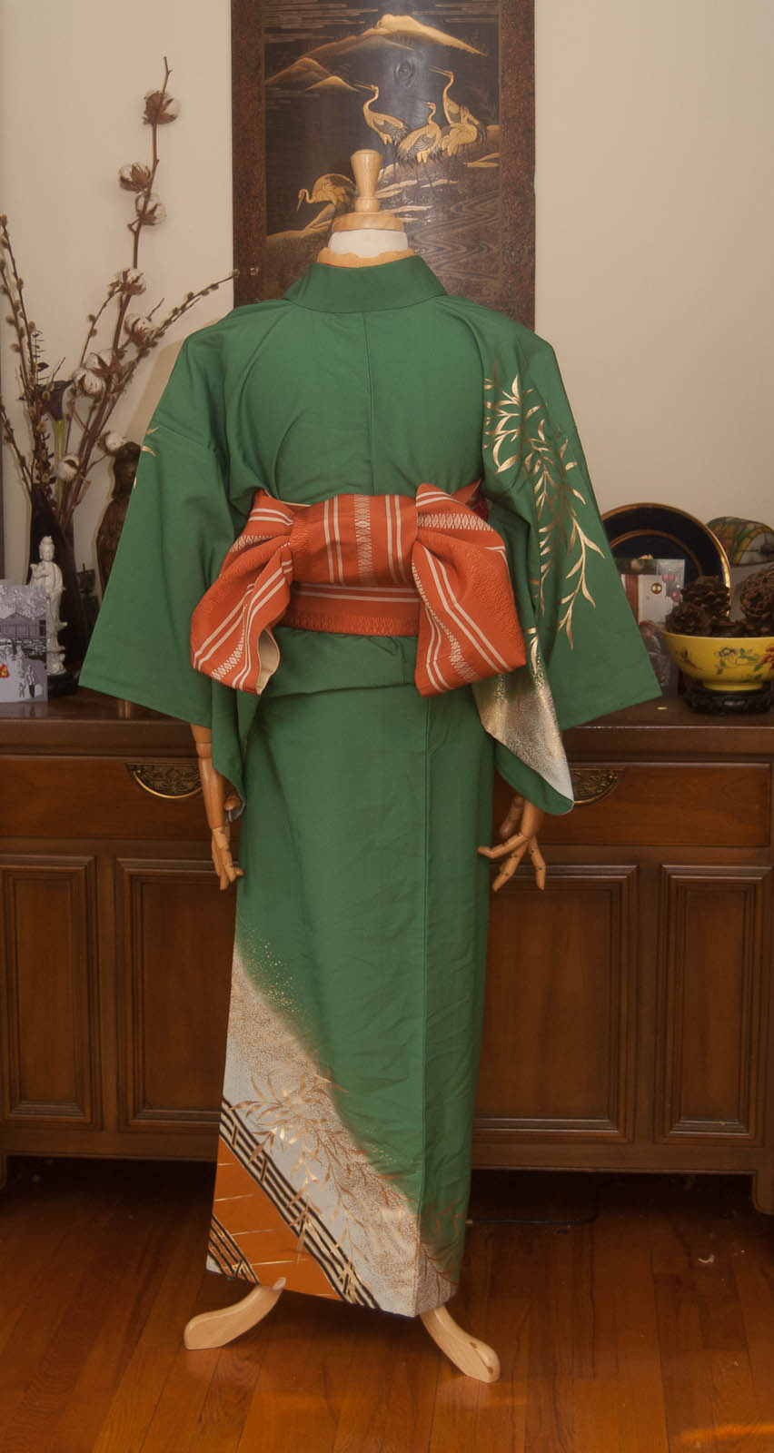
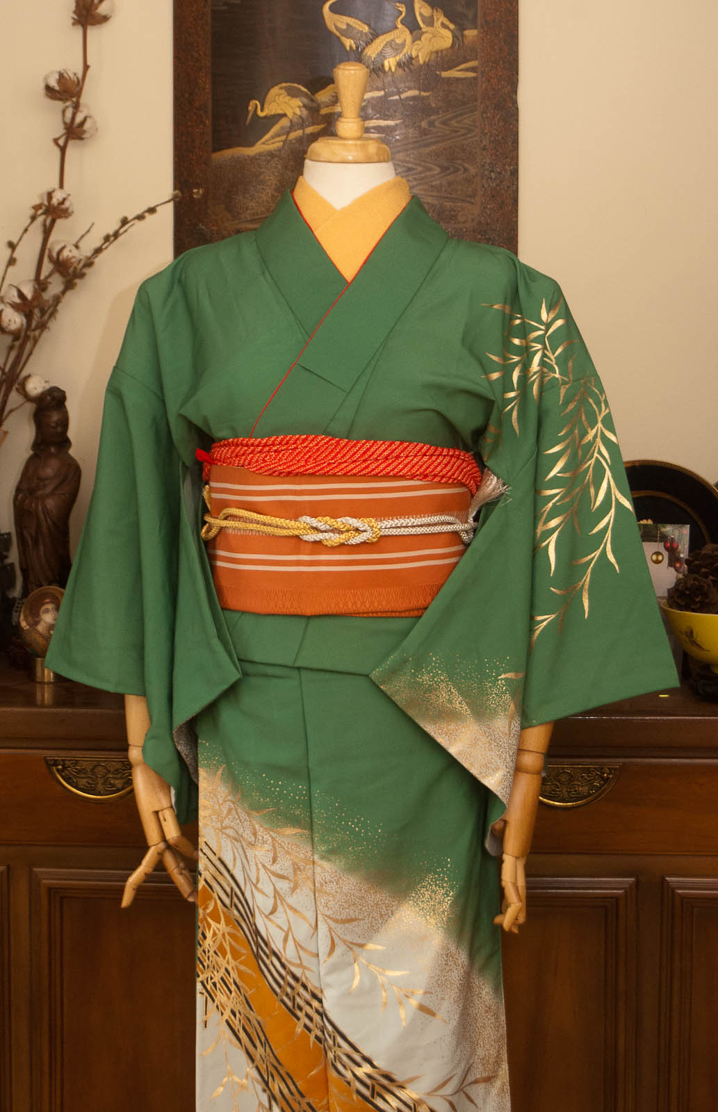
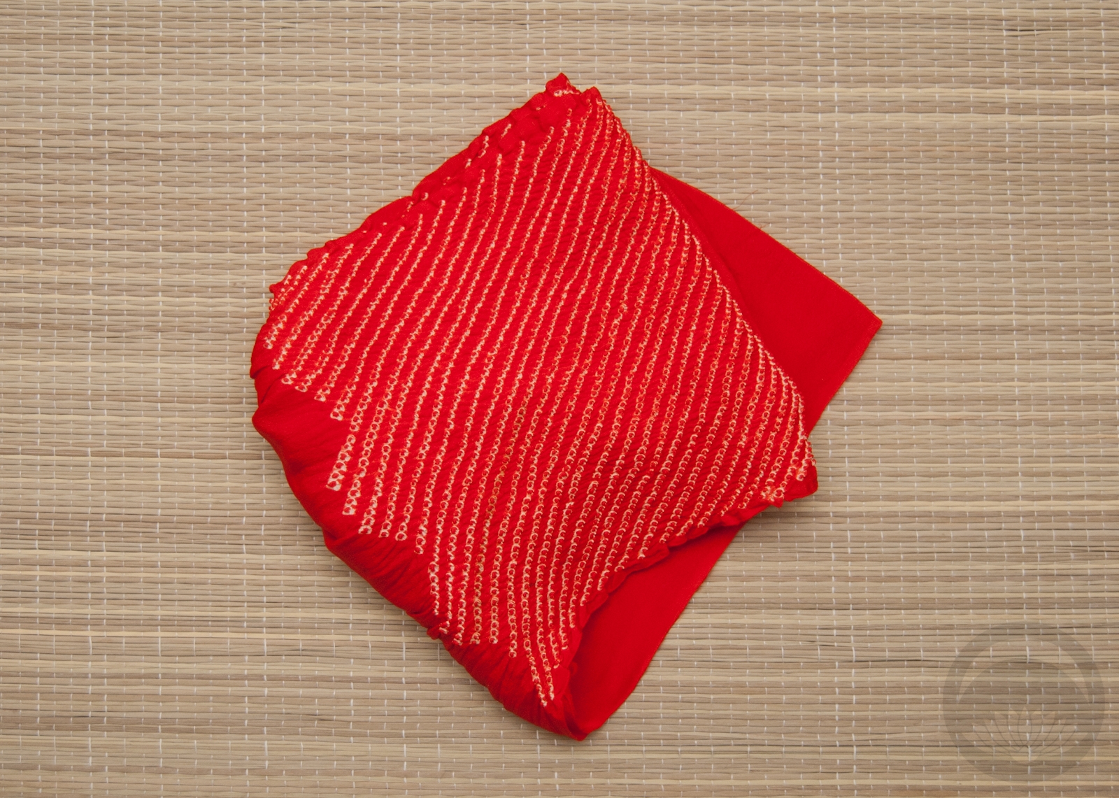
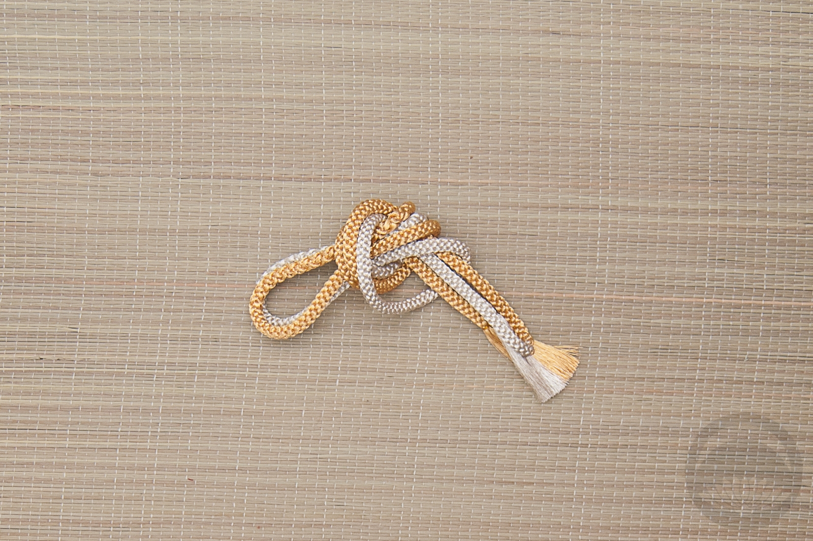
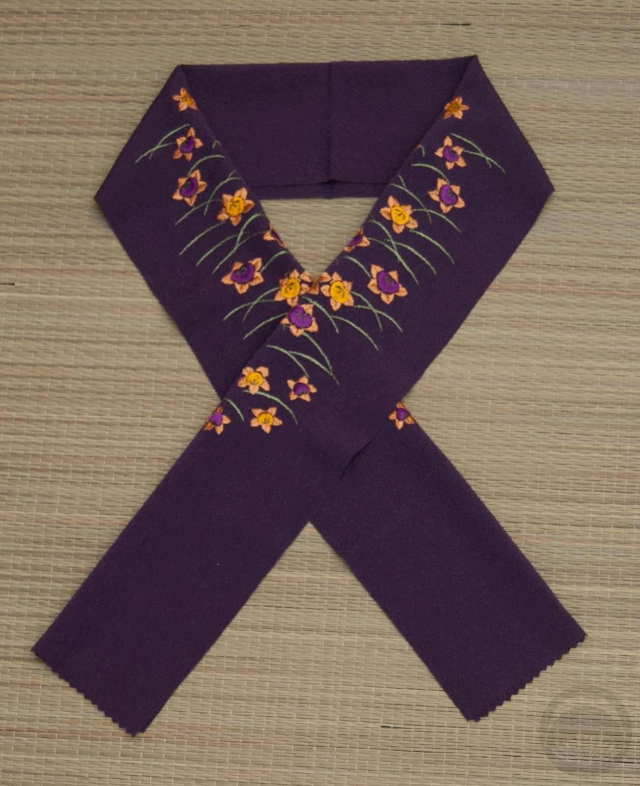
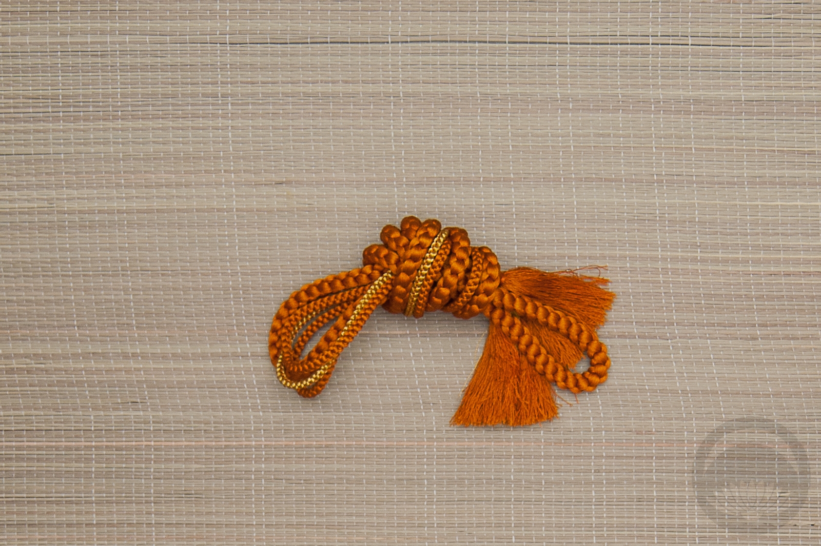
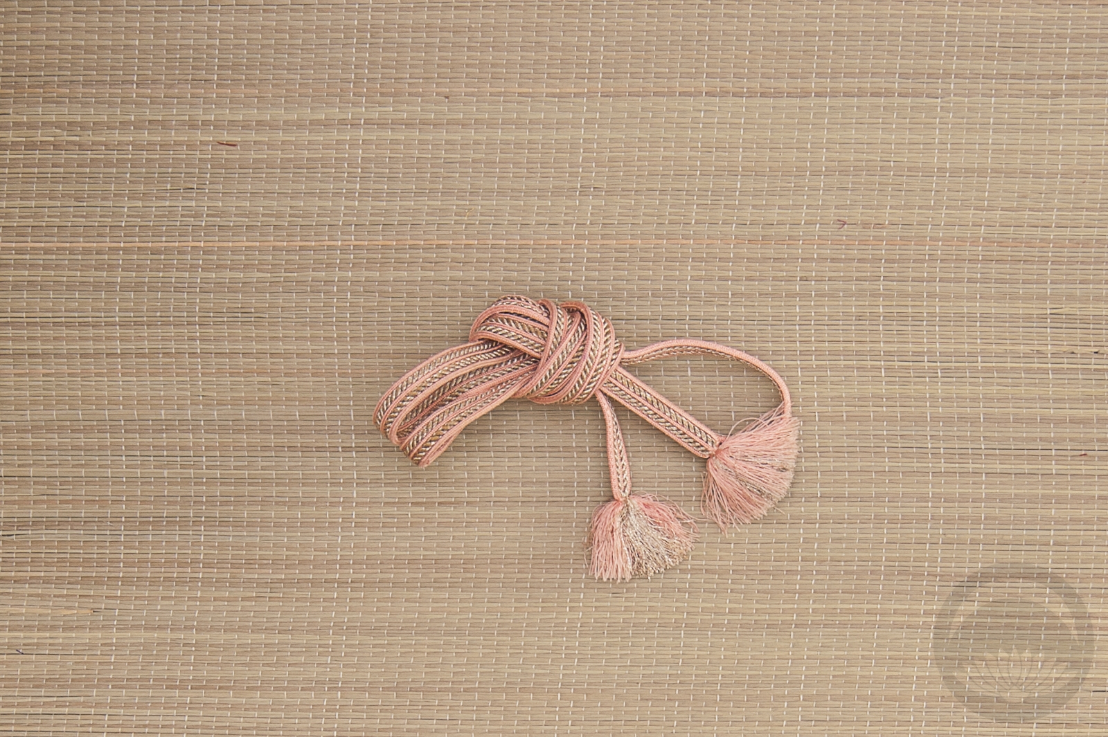
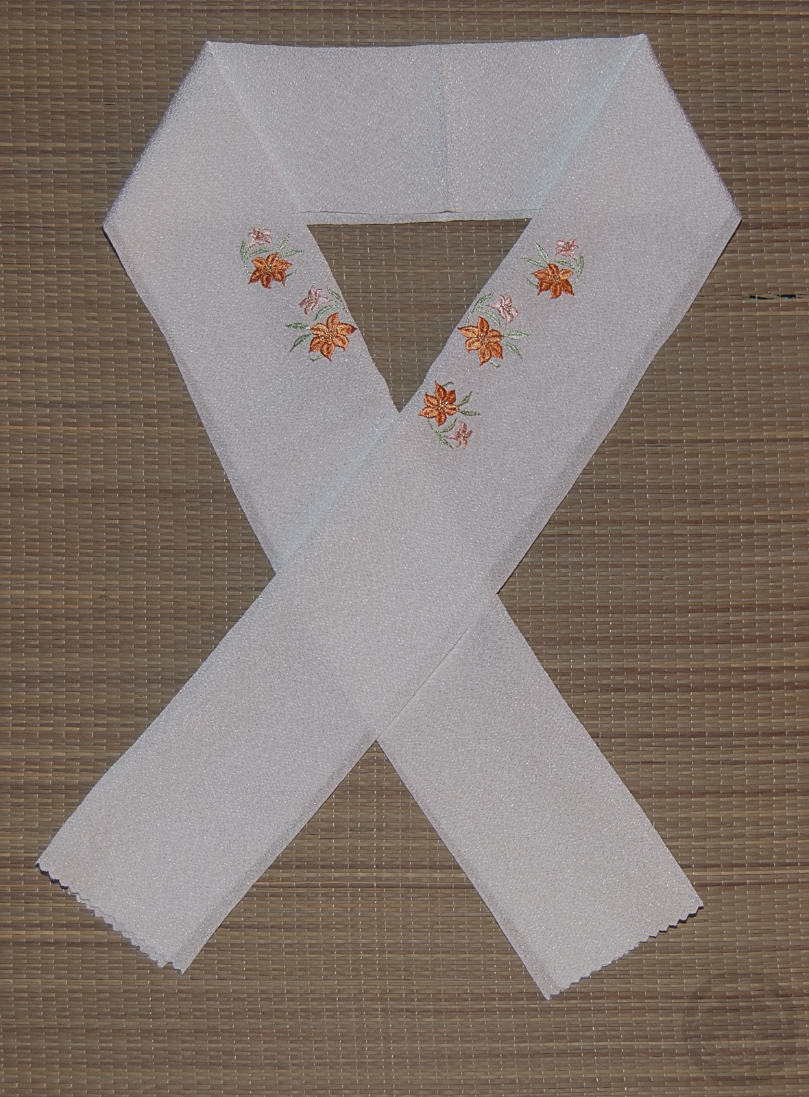
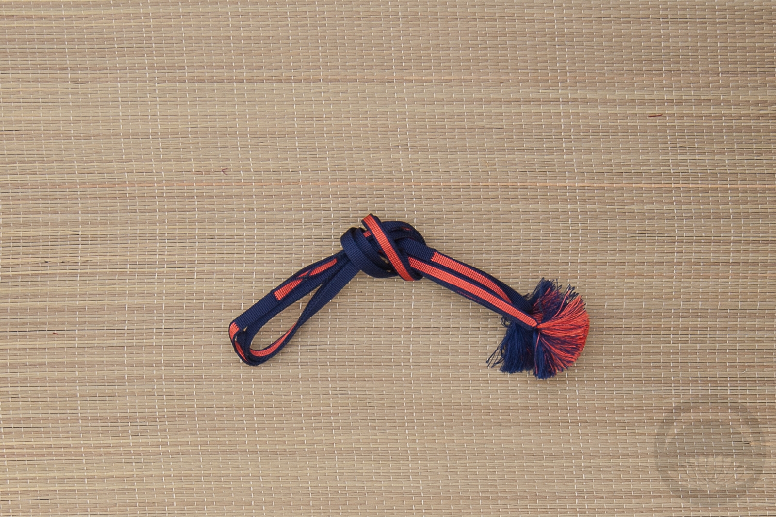
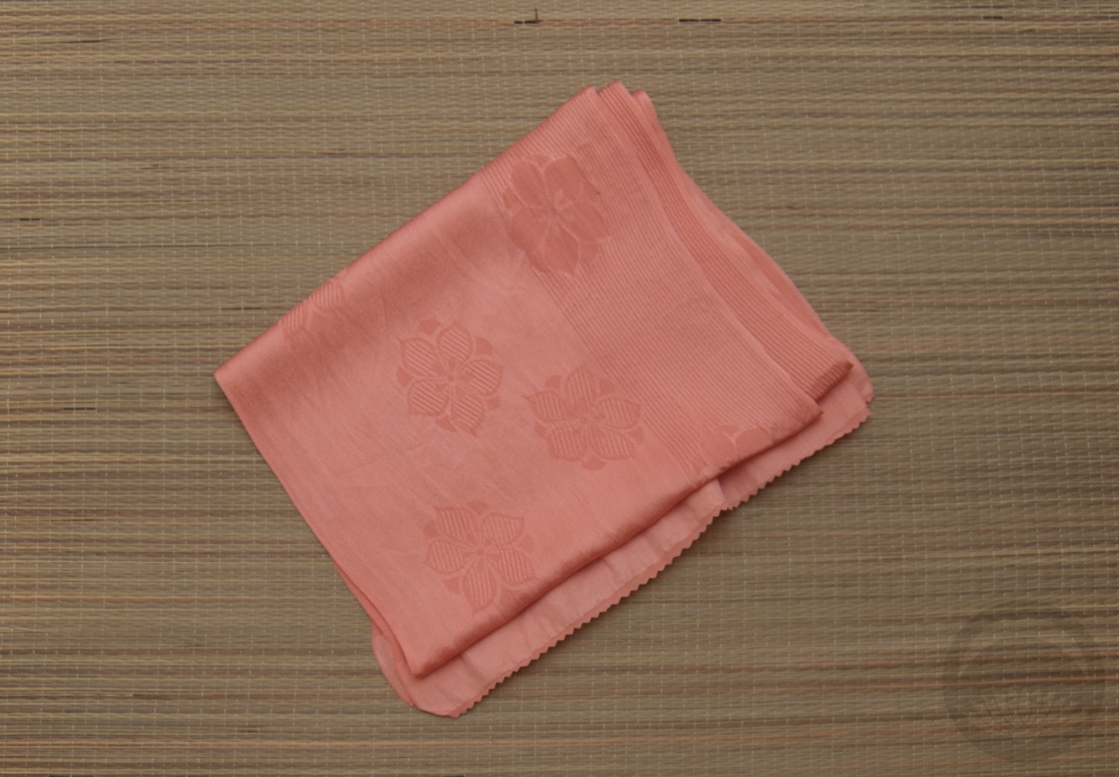
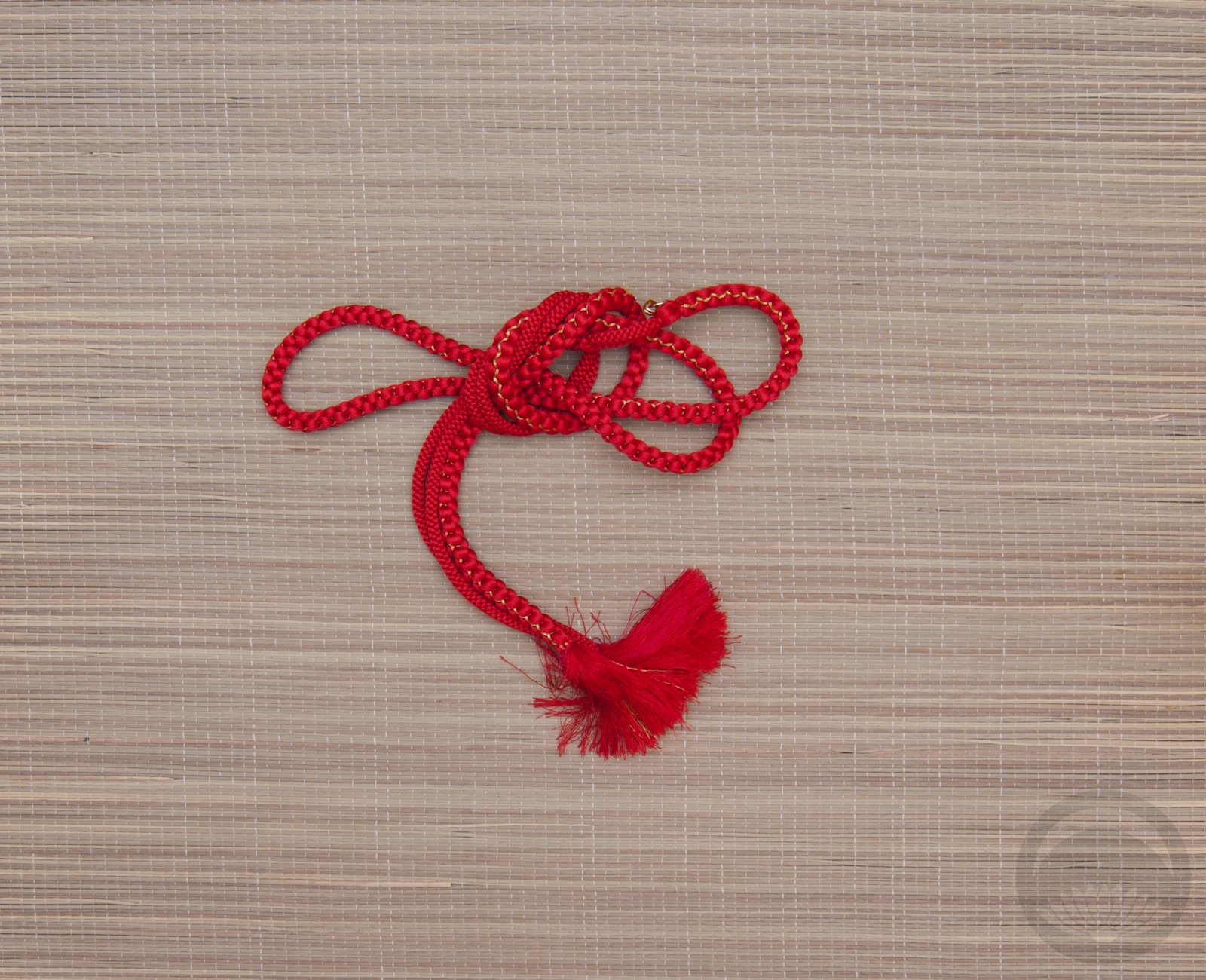
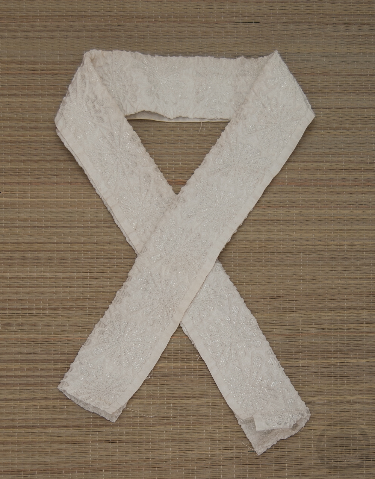
I decided to go with an ochre haneri to kind of reflect the gold of the kimono, a gold and silver obijime for the same reason, and this red shibori obiage was to draw attention to the red date-eri that’s sewn into the kimono. A simple bunko musubi literally ties it all together, a fairly standard one for odori outfits.
Also, every time I hear or think of Dancing Queen by ABBA now, this ridiculous video gets stuck in my head. If you have a few minutes and need a good laugh, I can’t recommend it enough!
Items used in this coordination
-
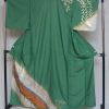
- Green Odori
-
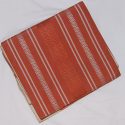
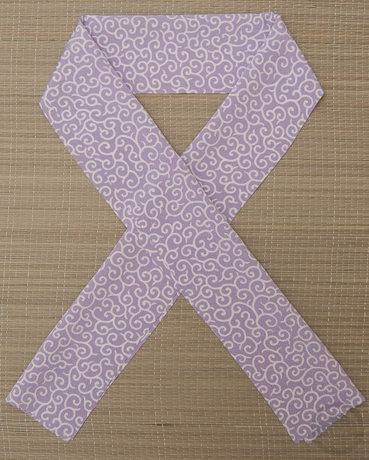
- Momiji side 2
-
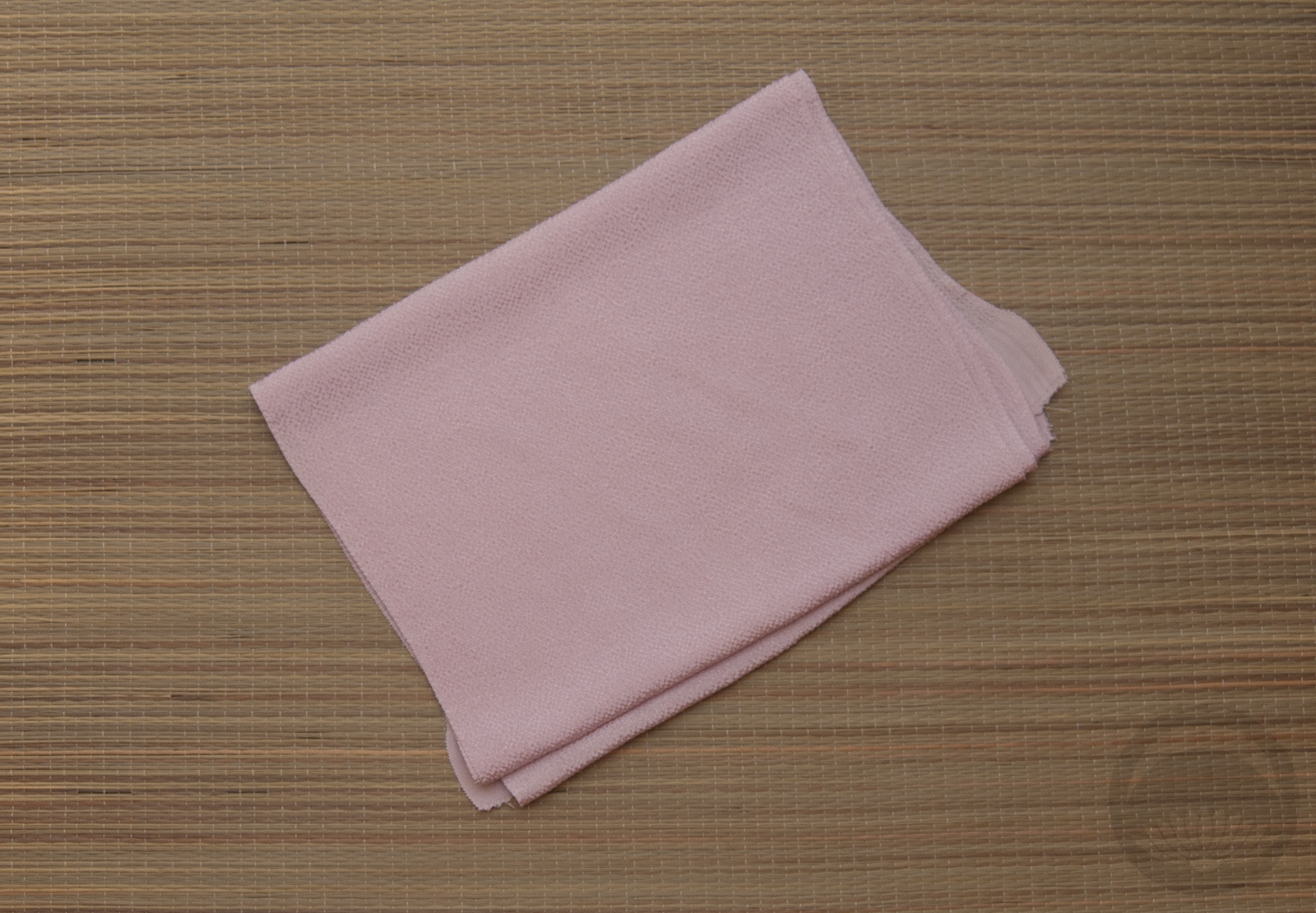
- Solid yellow

-
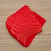
- Red Shibori
-
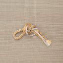
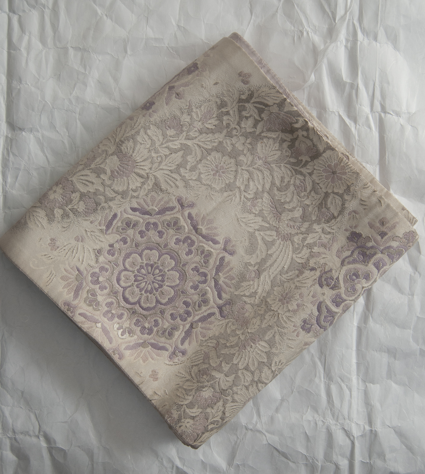
- Gold & Silver


 Bebe Taian
 CHOKO Blog
 Gion Kobu