
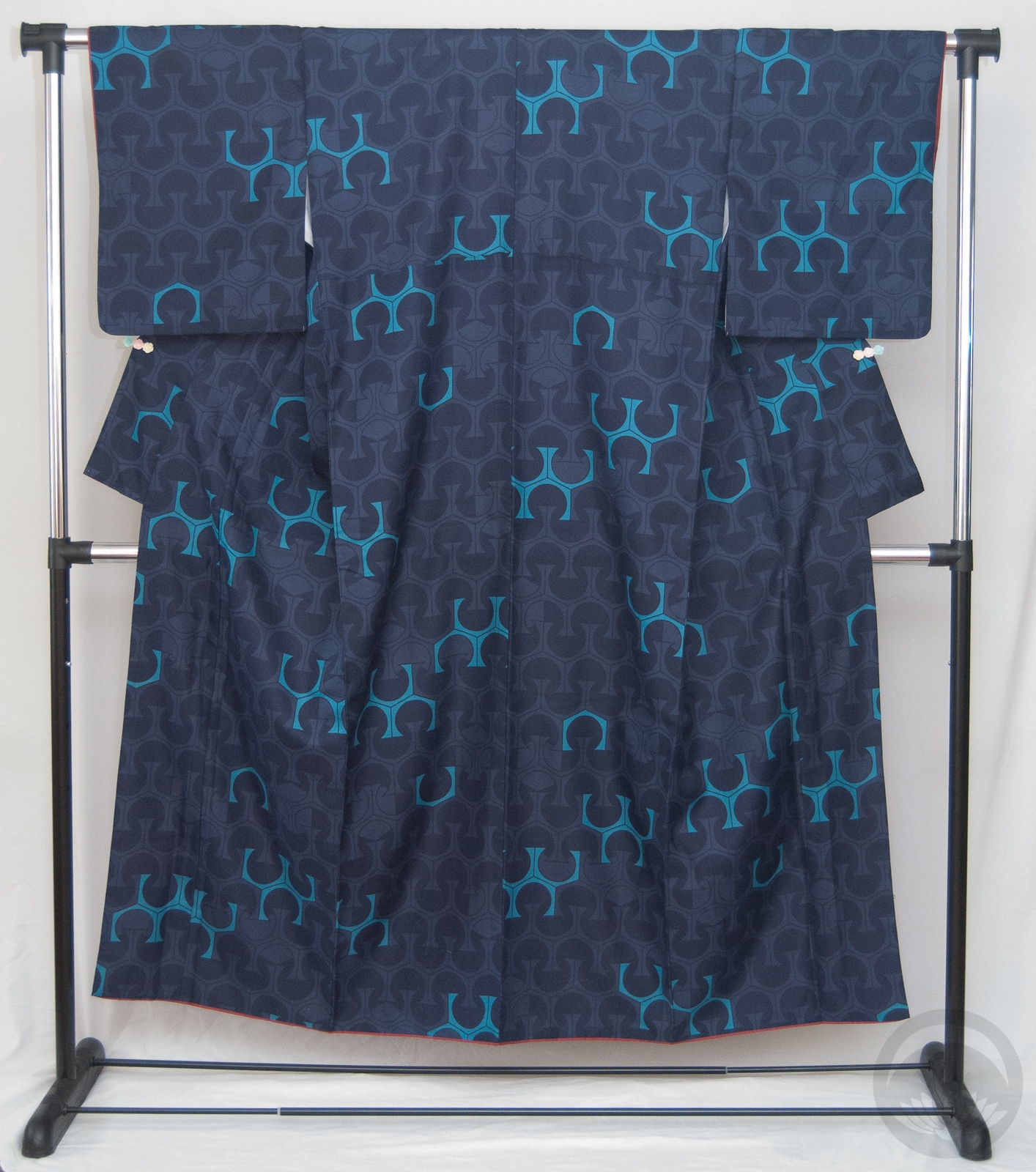
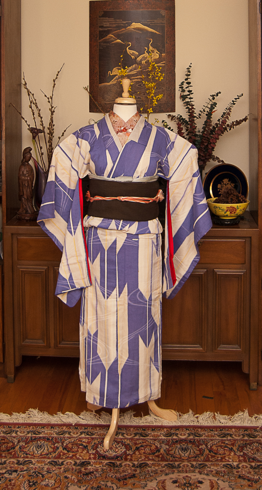
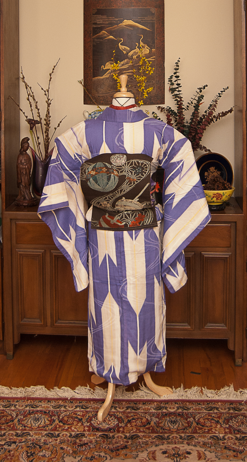
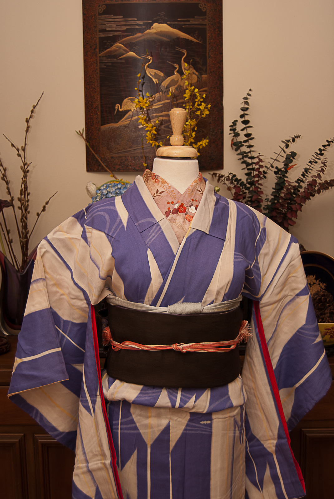
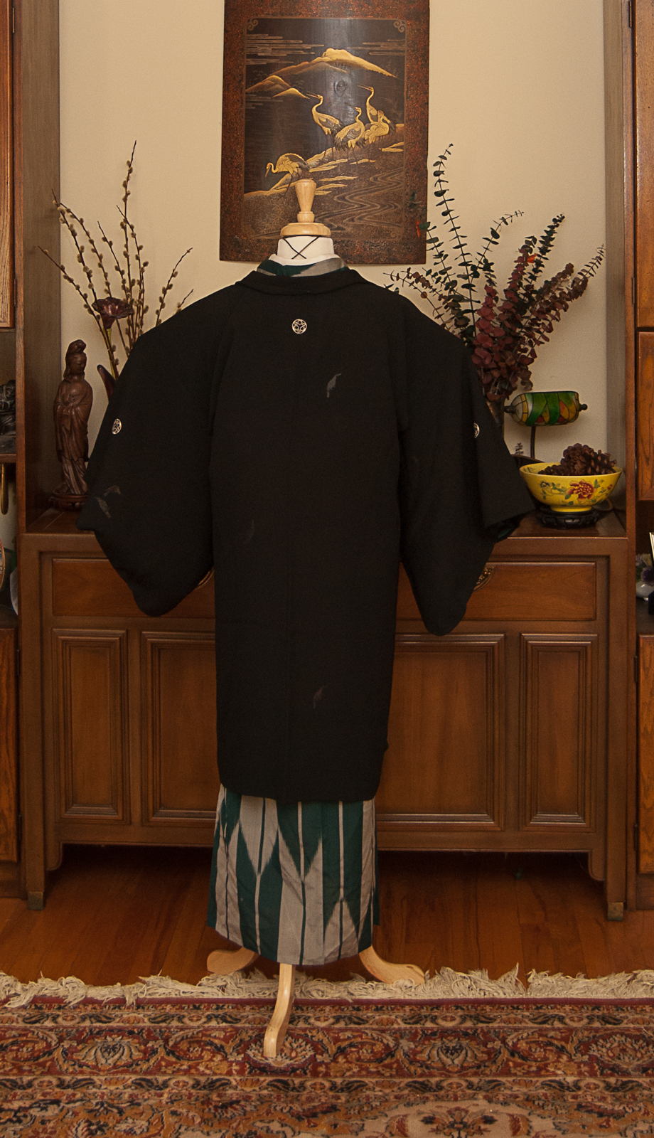
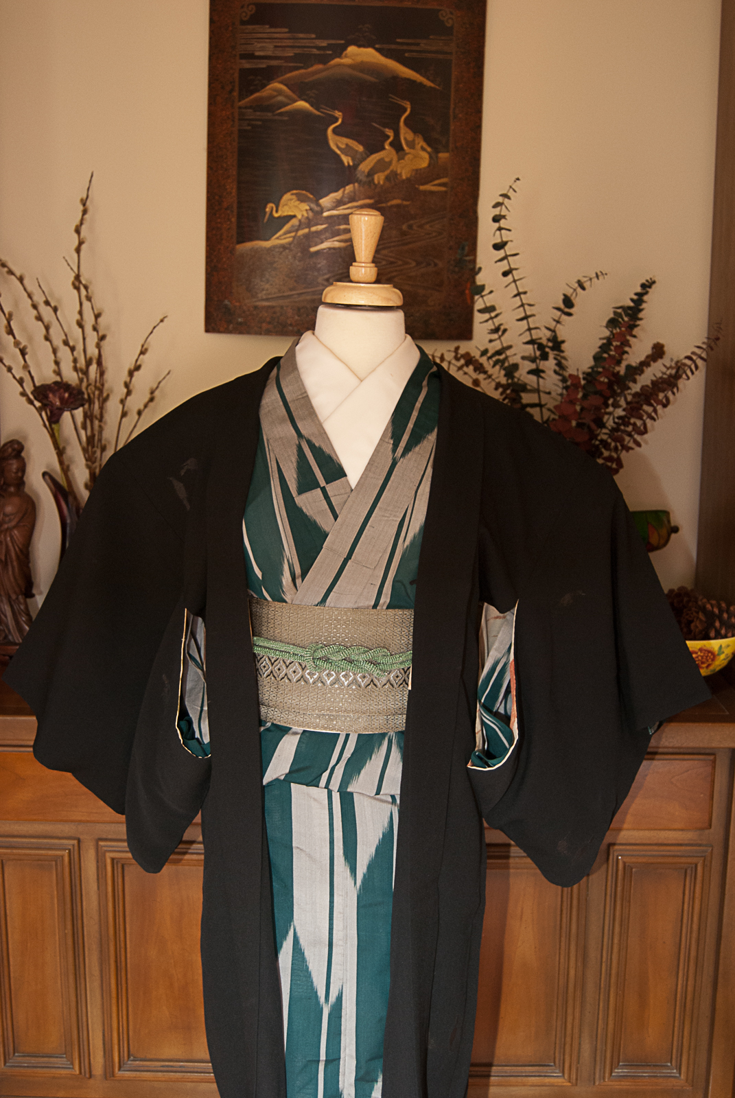
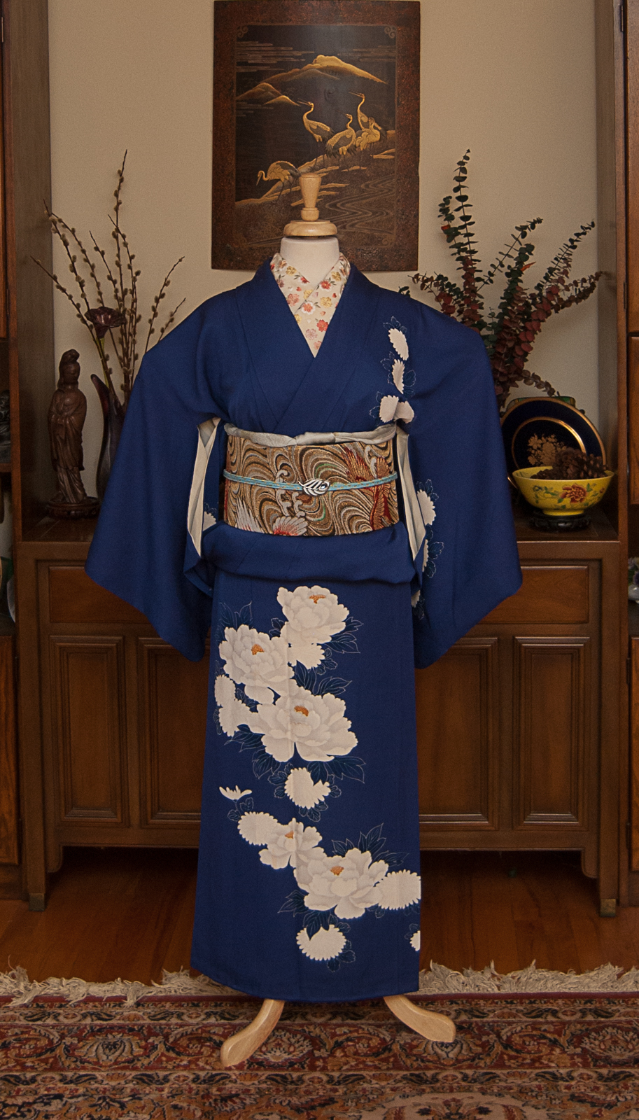
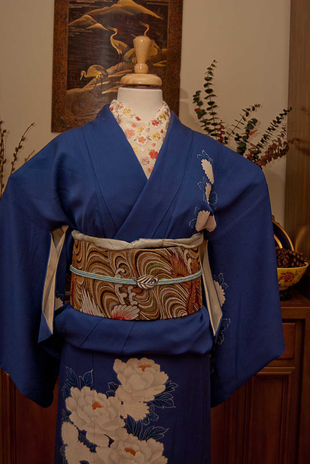
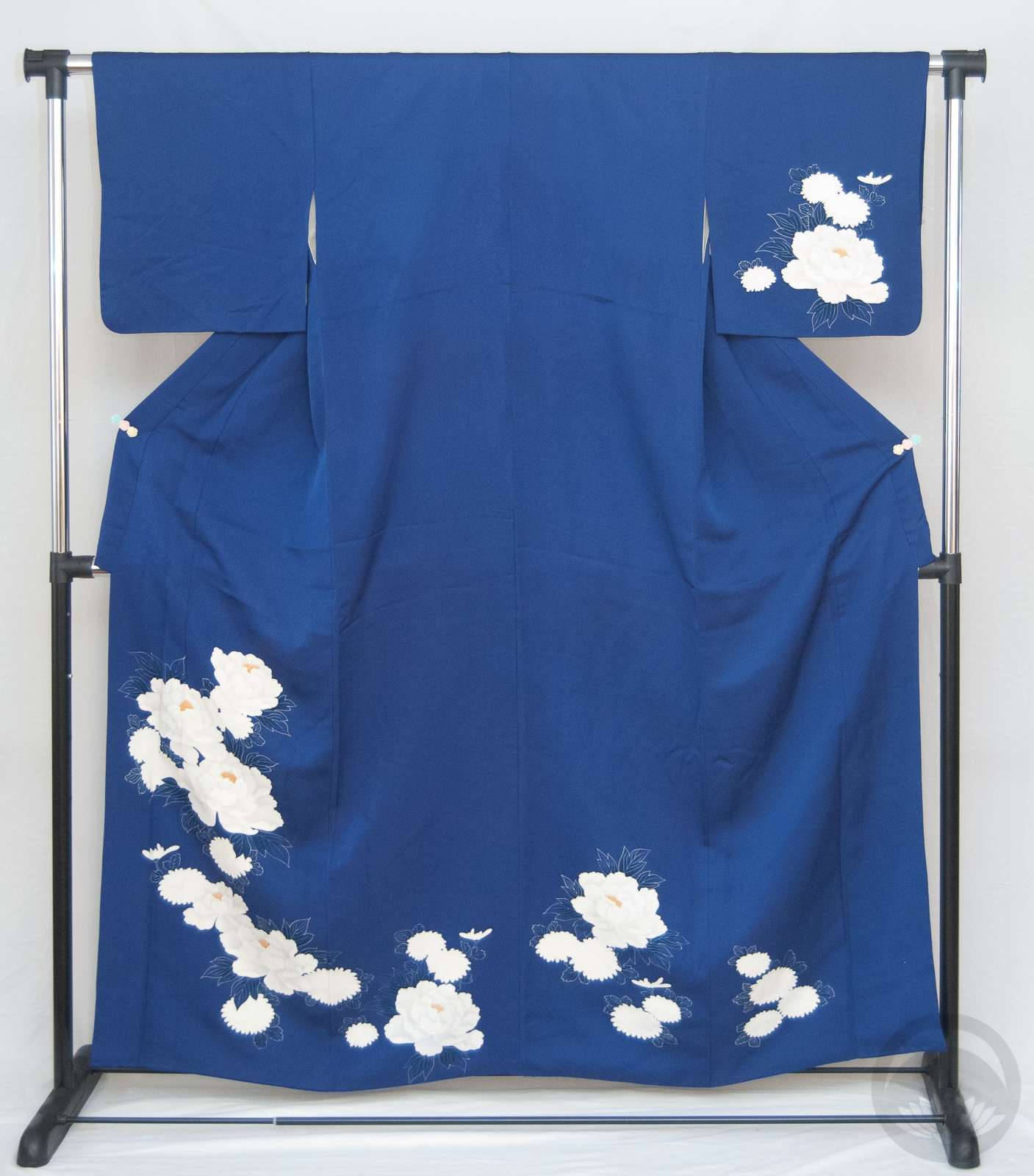
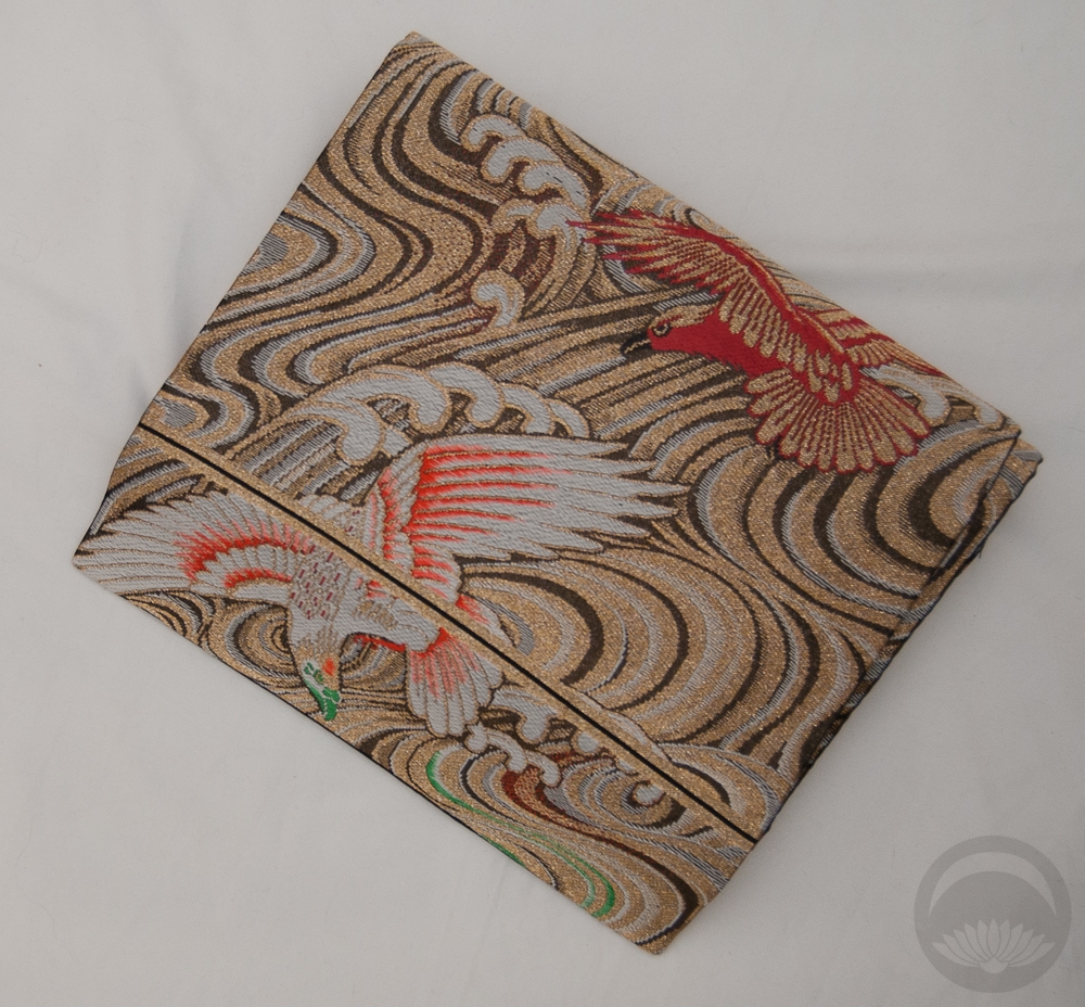
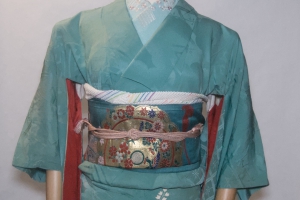
It’s the last weekend of the month, and you know what that means! It’s #monokimono weekend, and for this one I decided to go blue to suit the rainy mood outside. I also knew I had to go with something easy, so a poly komon and hanhaba obi fit the bill. If you’re not a fan of Kimono Tsuki on Facebook you won’t have seen my post, but Friday afternoon I lost an argument with the staircase at work and came out of it a little worse for wear. I’ve got a mild concussion, a sprained knee, and two cuts across my forehead that required surgical glue and a tetanus shot. That’s not counting all the varied aches, pains, and bruises scattered all over the rest of my body. Because of this, I knew I had no energy to wrestle with a bigger obi or a more fussy or fragile kimono. I didn’t want to skip this month completely, so I found the solution with these easy, modern blue pieces.
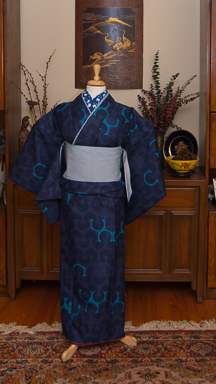
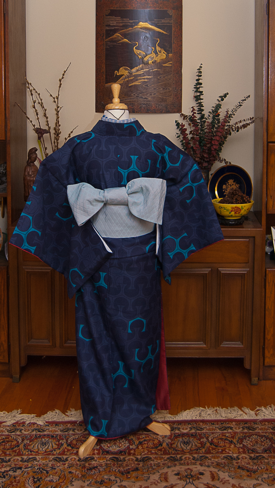
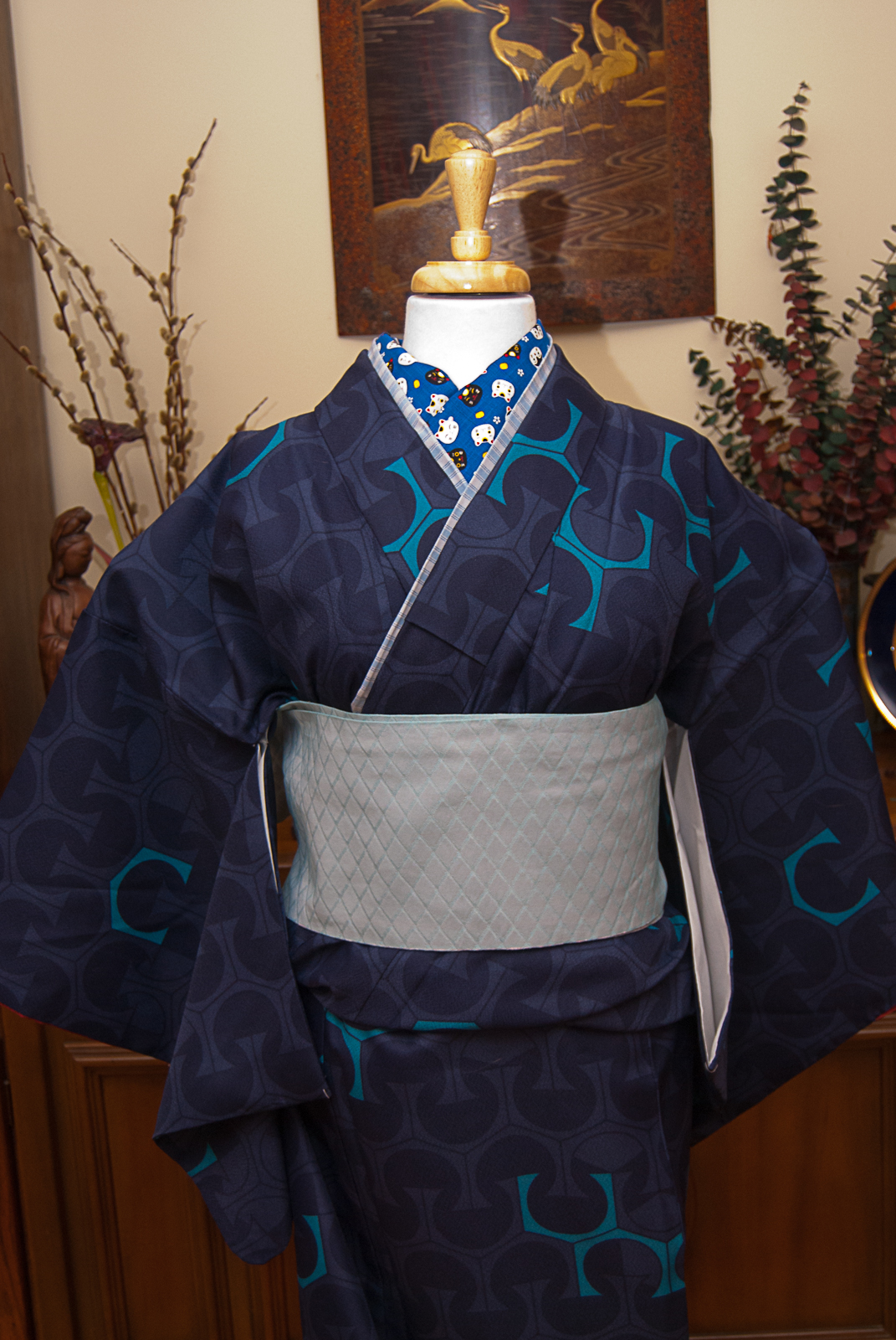
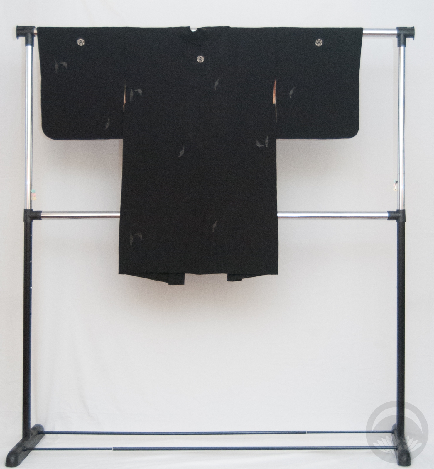
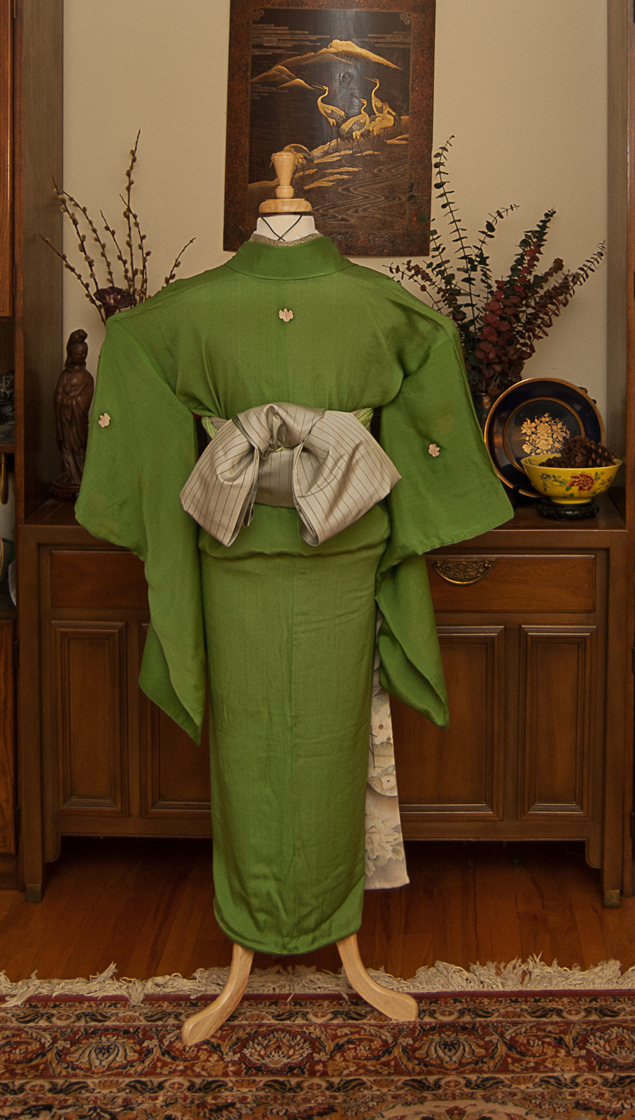
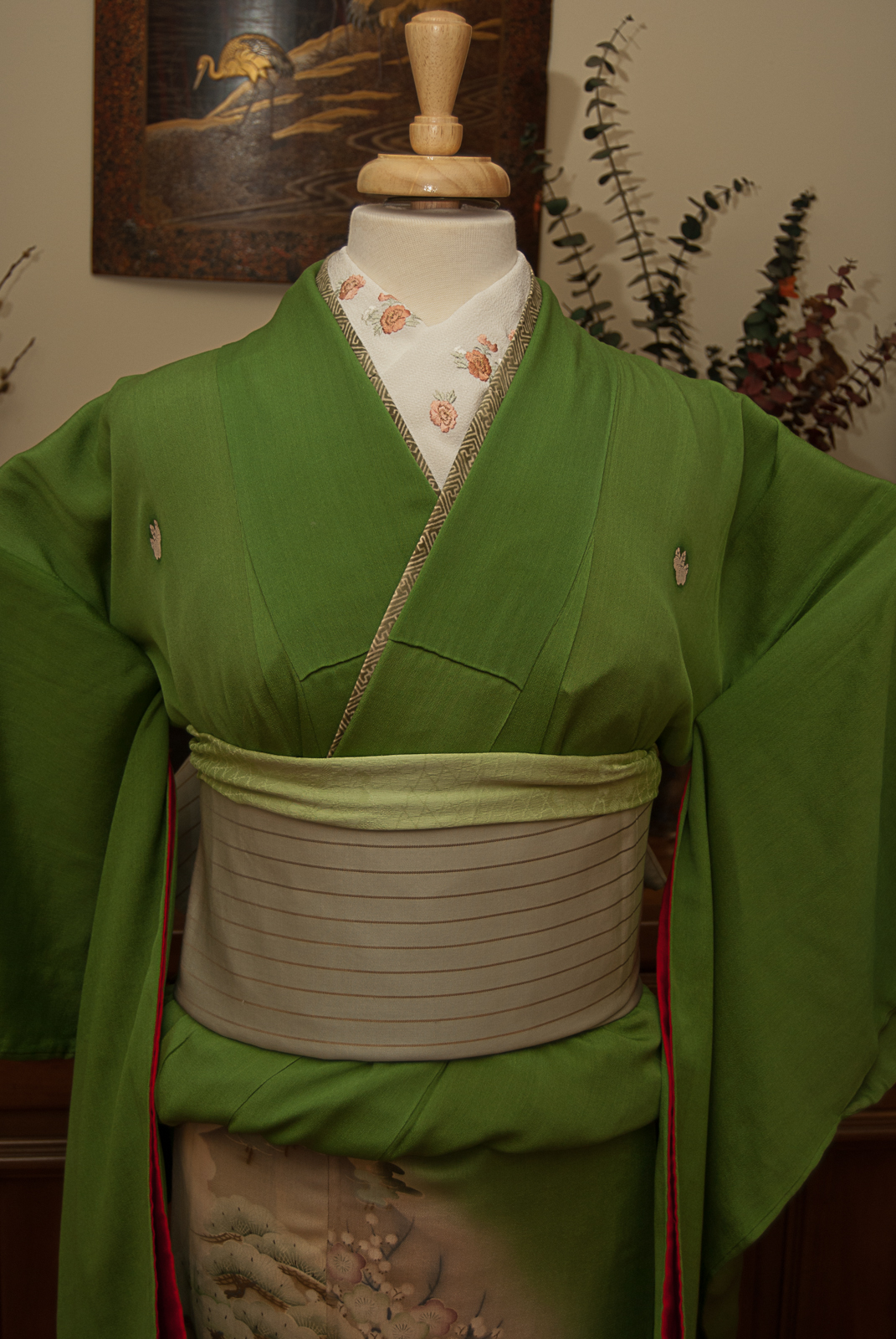
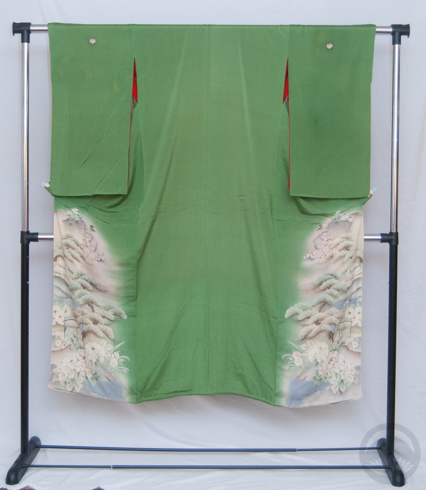
Initially, the outfit looked a bit too dark and heavy, and the obi wasn’t really jiving. Thankfully, using my blue cotton striped haneri in place of a kasane-eri helped lighten things up around the top. The kimono is also very big; I’d forgotten how big, so getting it onto the mannequin was a bit more fuss than I’d hoped for. But I think I made it work. This certainly isn’t the tidiest or best kitsuke I’ve done recently, but I’m proud of myself for managing to get something out despite my battered state!
I’ve also just noticed this outfit bears more than a passing resemblance to my little kimmidoll mascot over there on the sidebar. That was entirely accidental but it pleases me greatly.
Items used in this coordination
-
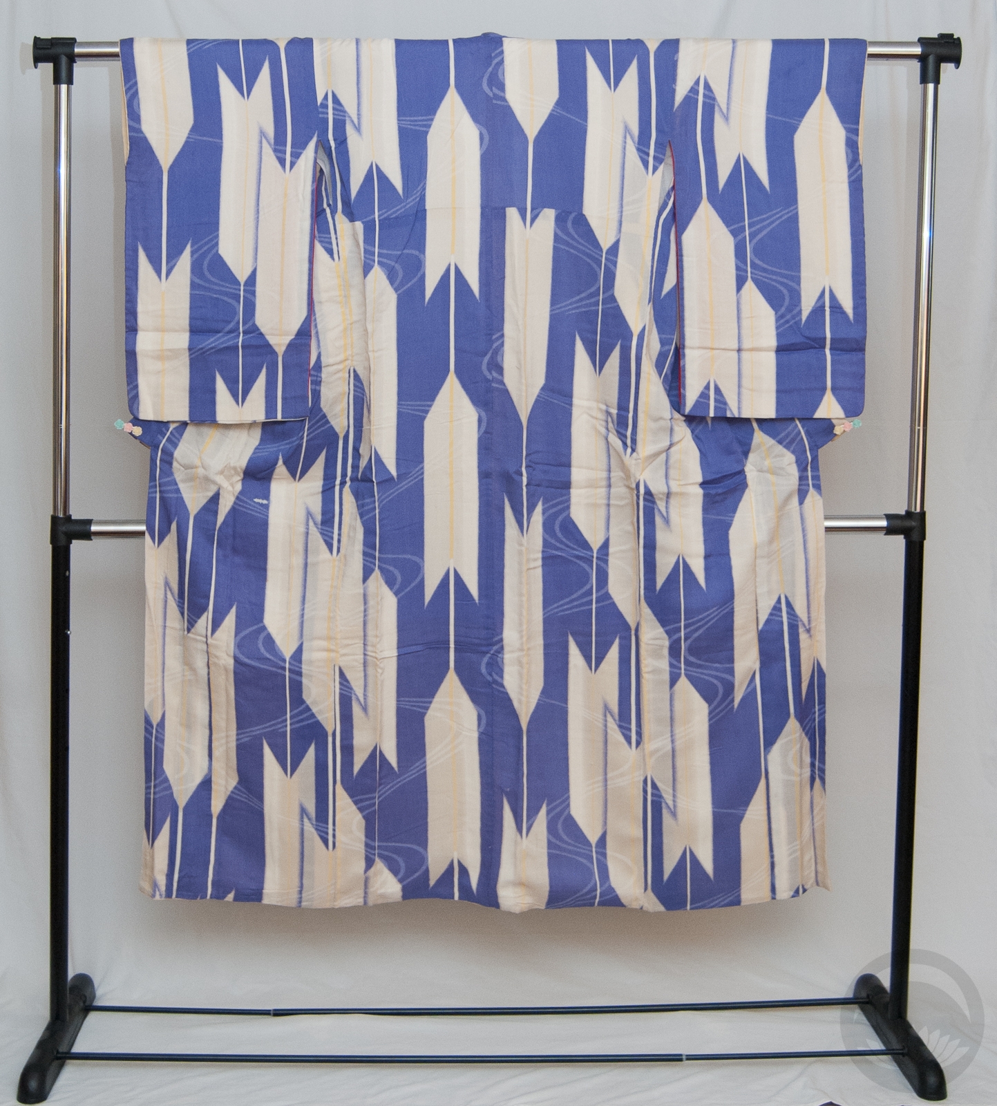
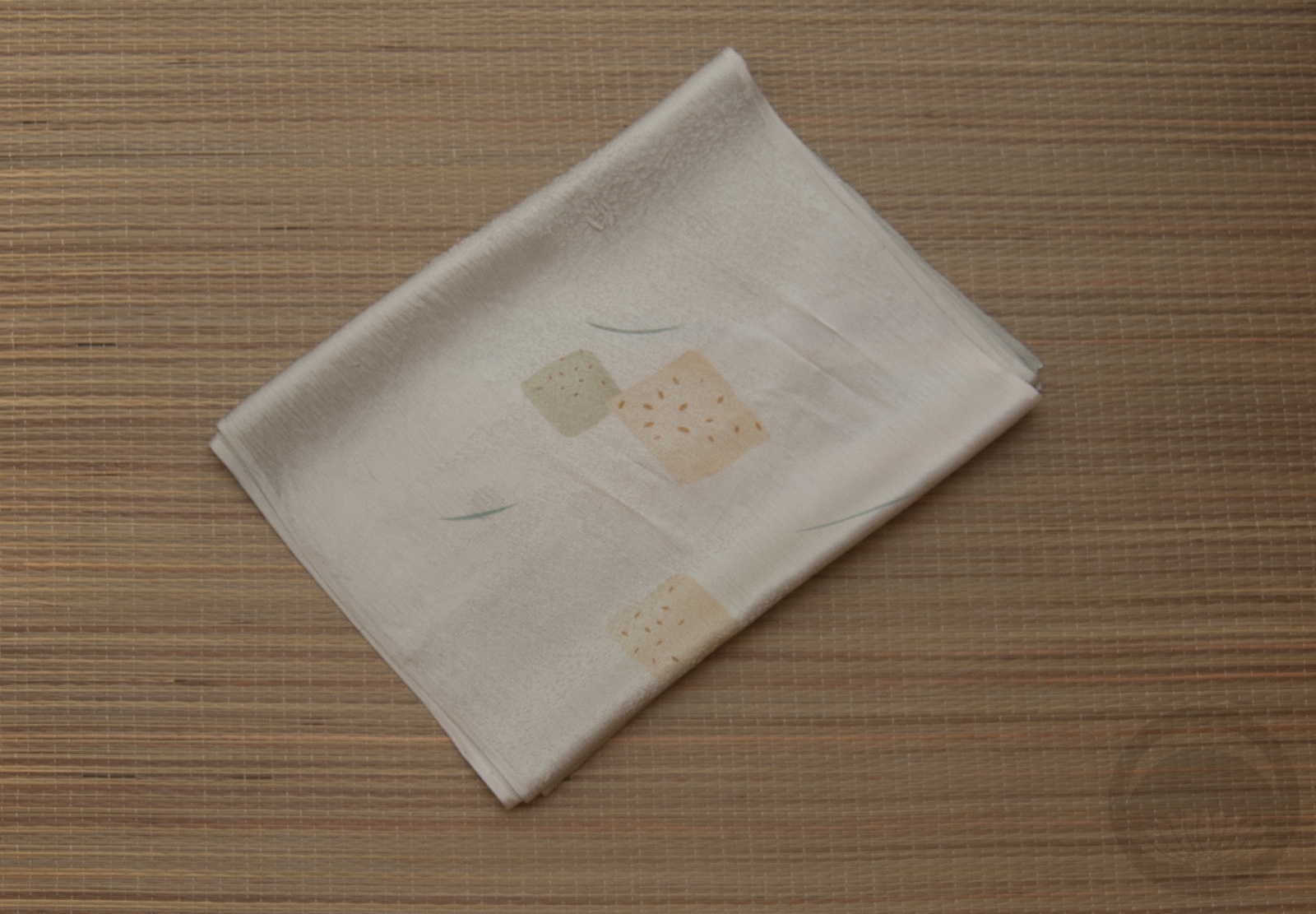
- Blue Arches
-
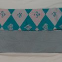
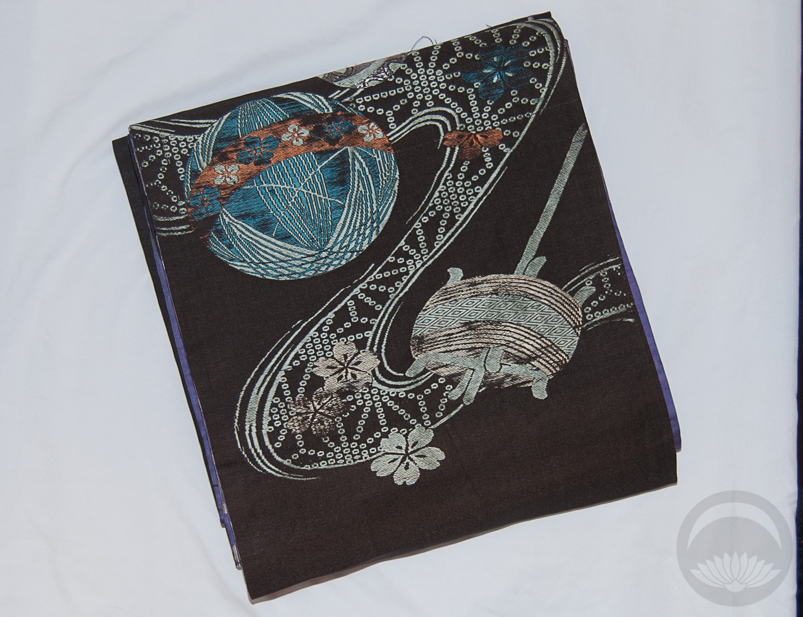
- Pastel Cards/Blue Geometric

-
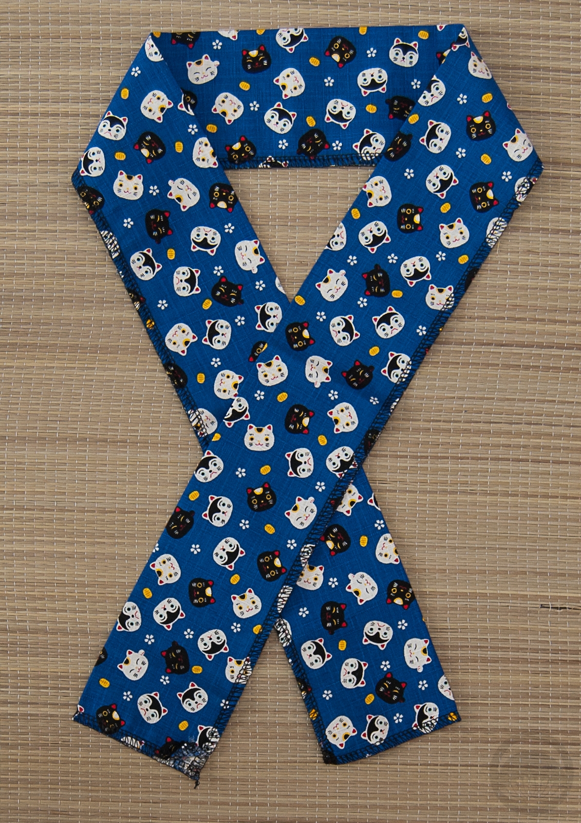
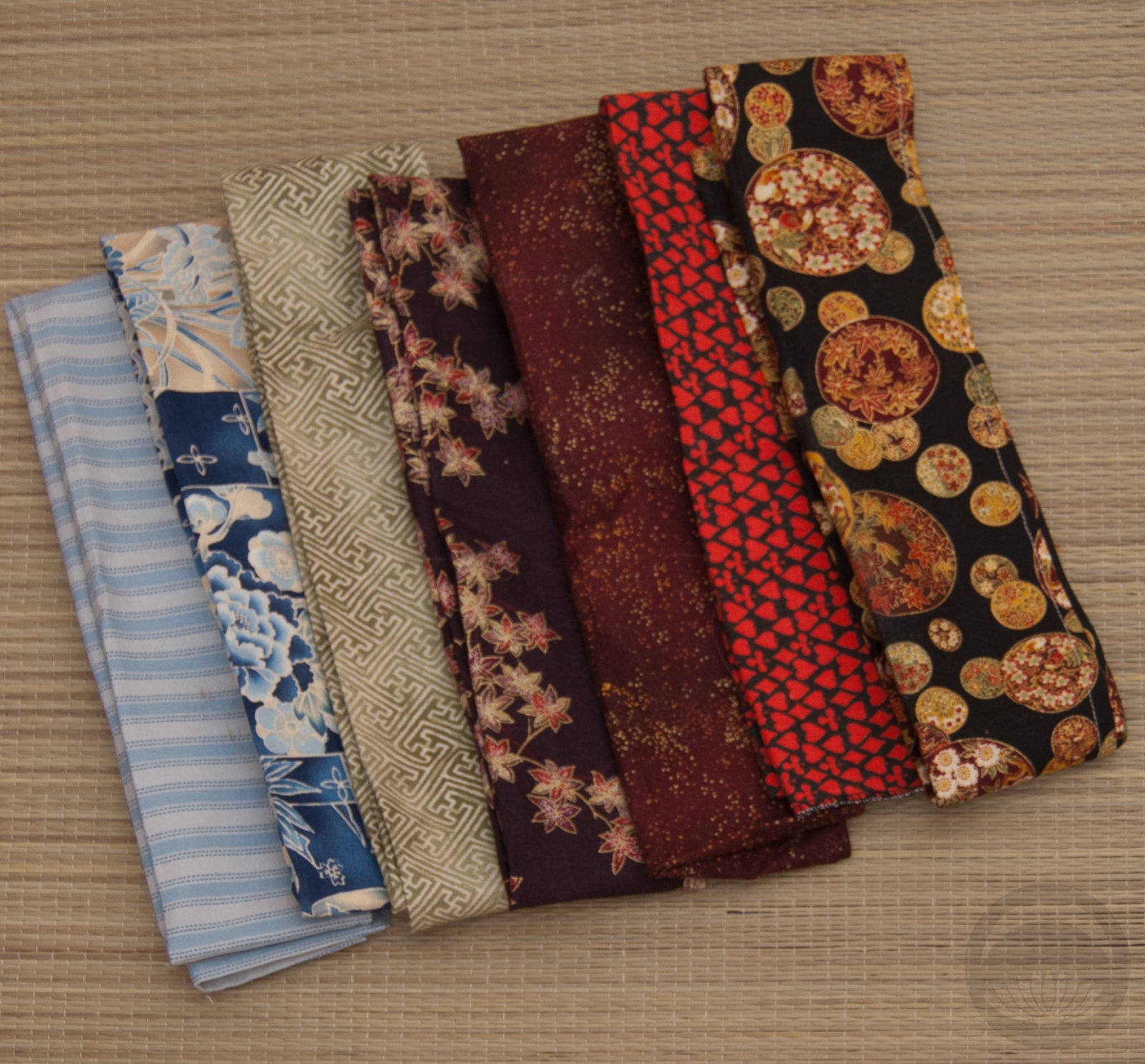
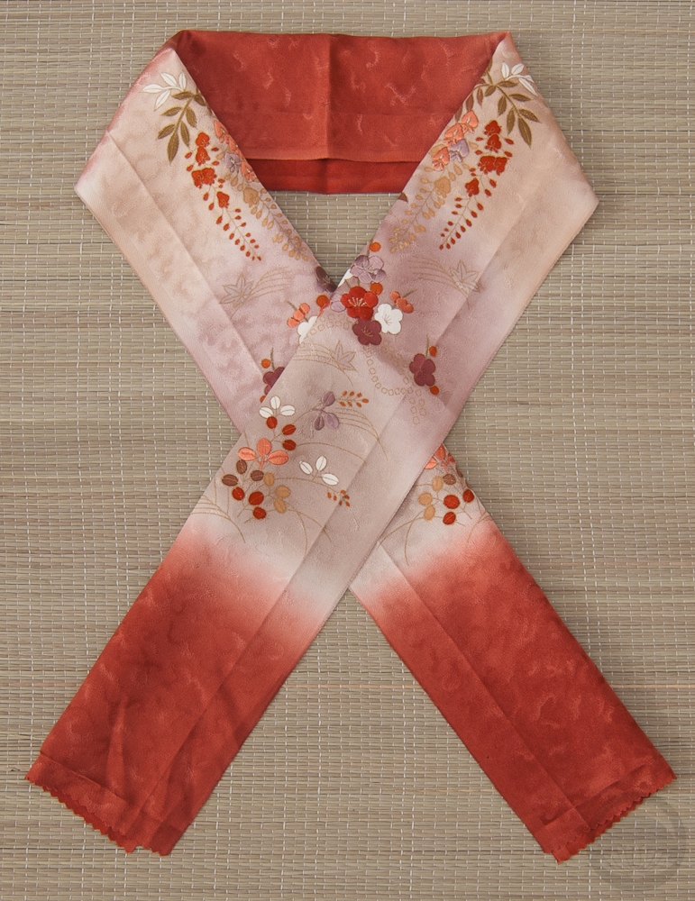
- Cotton Neko & Inu
-
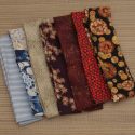
- Mixed Cotton


 Bebe Taian
 CHOKO Blog
 Gion Kobu