Vibrant Vintage

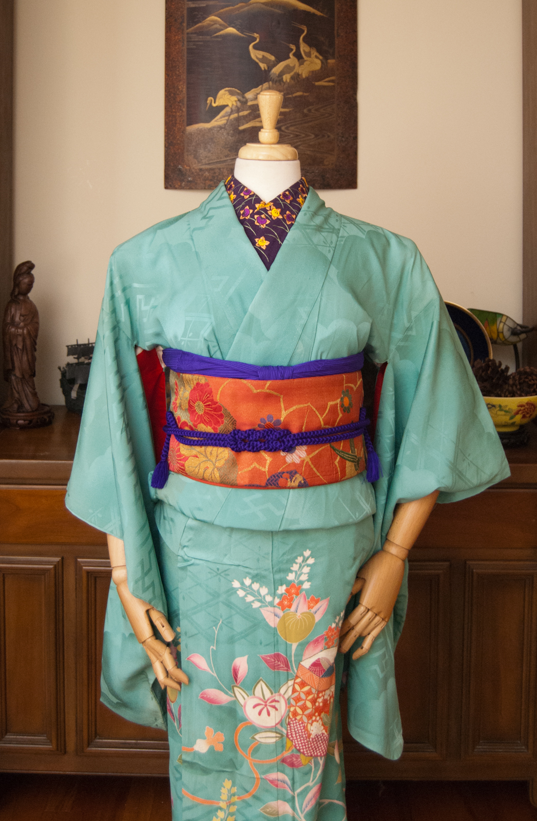
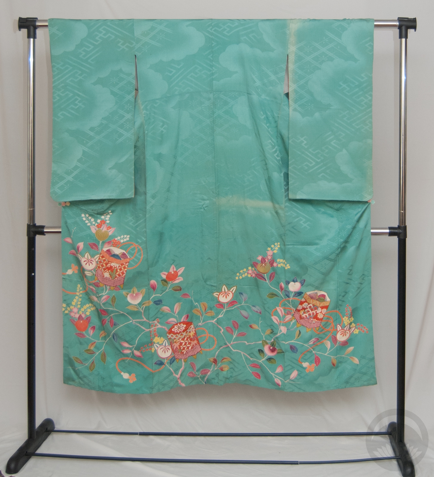
For someone who keeps telling herself she doesn’t need more kimono, I sure do keep ending up with more kimono. But when I saw this gorgeous vibrant turquoise Taisho irotomesode on Ichiroya recently, I knew it had to come live with me. This piece is not in great shape, admittedly. It’s got sun damage that leads me to believe it was folded and then stored badly at some point in its life. But I was just so in love with the colour that I couldn’t pass it up, and it became my tax refund gift to myself. It’s also incredibly small, bordering on too small for the mannequin even, so I have no delusions of ever being able to wear it even if I lose weight. Alas. 🙁
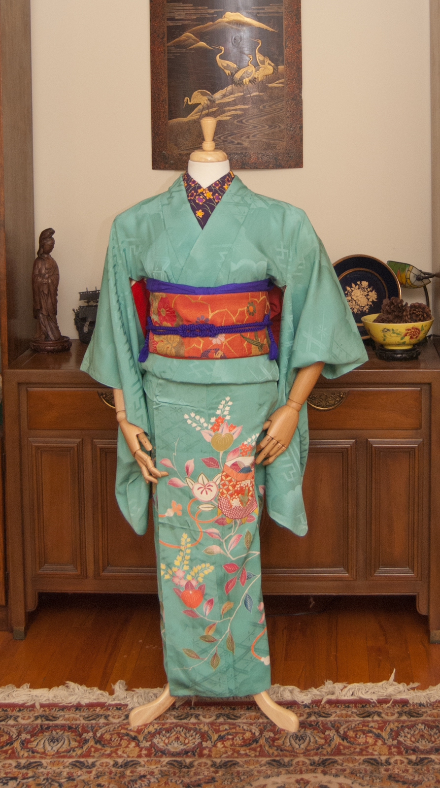
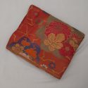
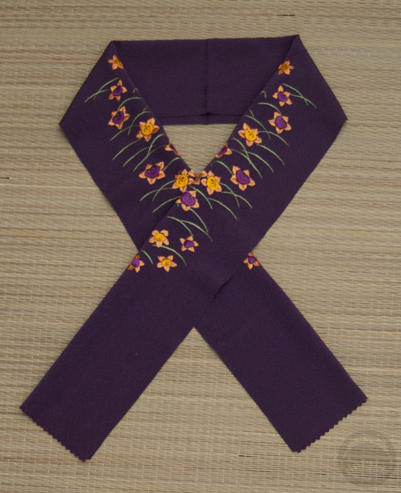
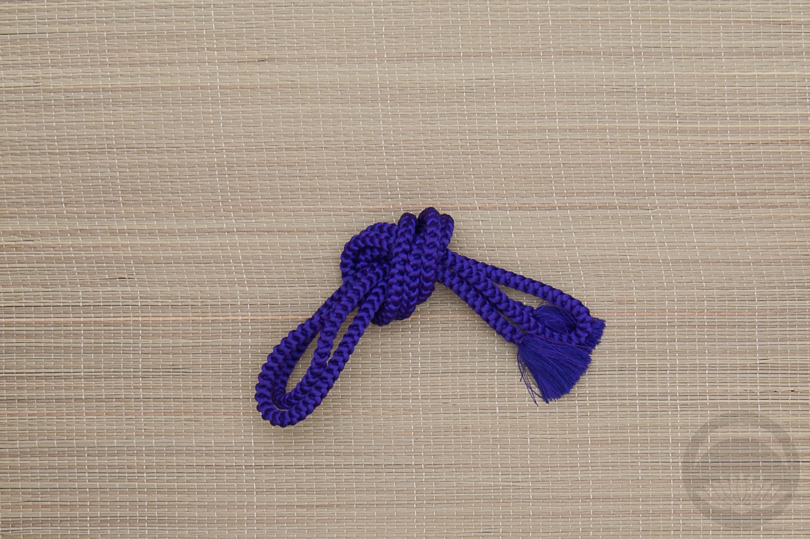
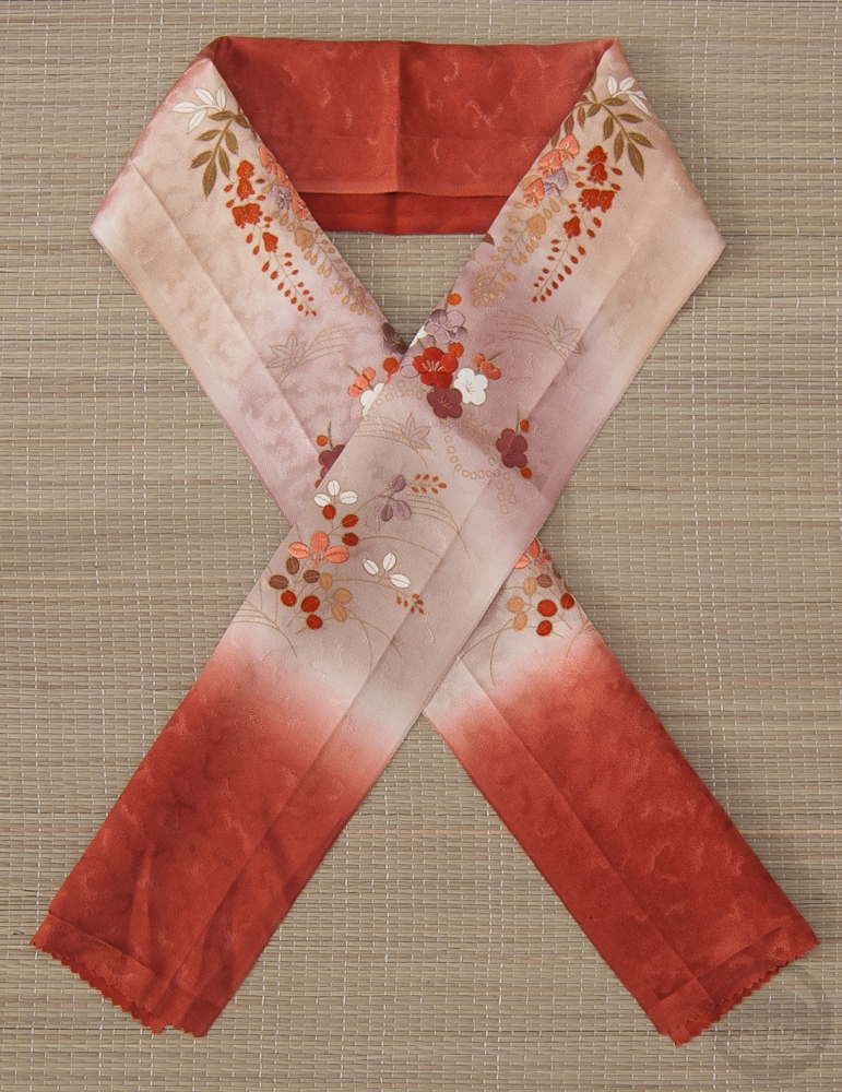
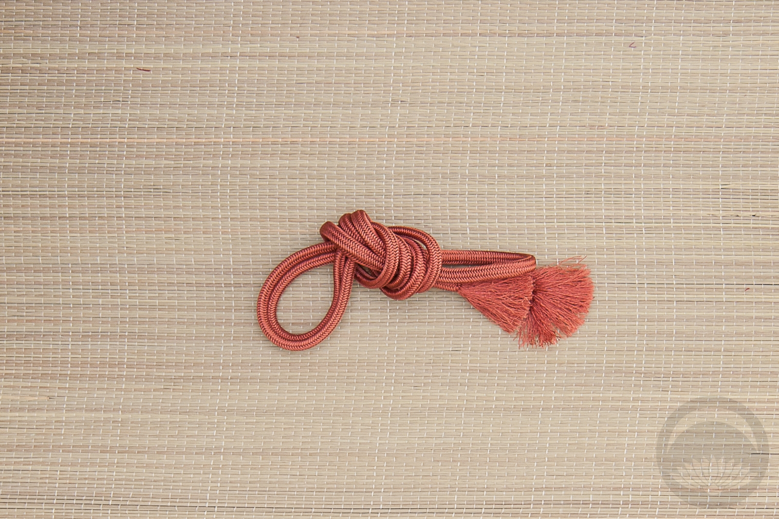
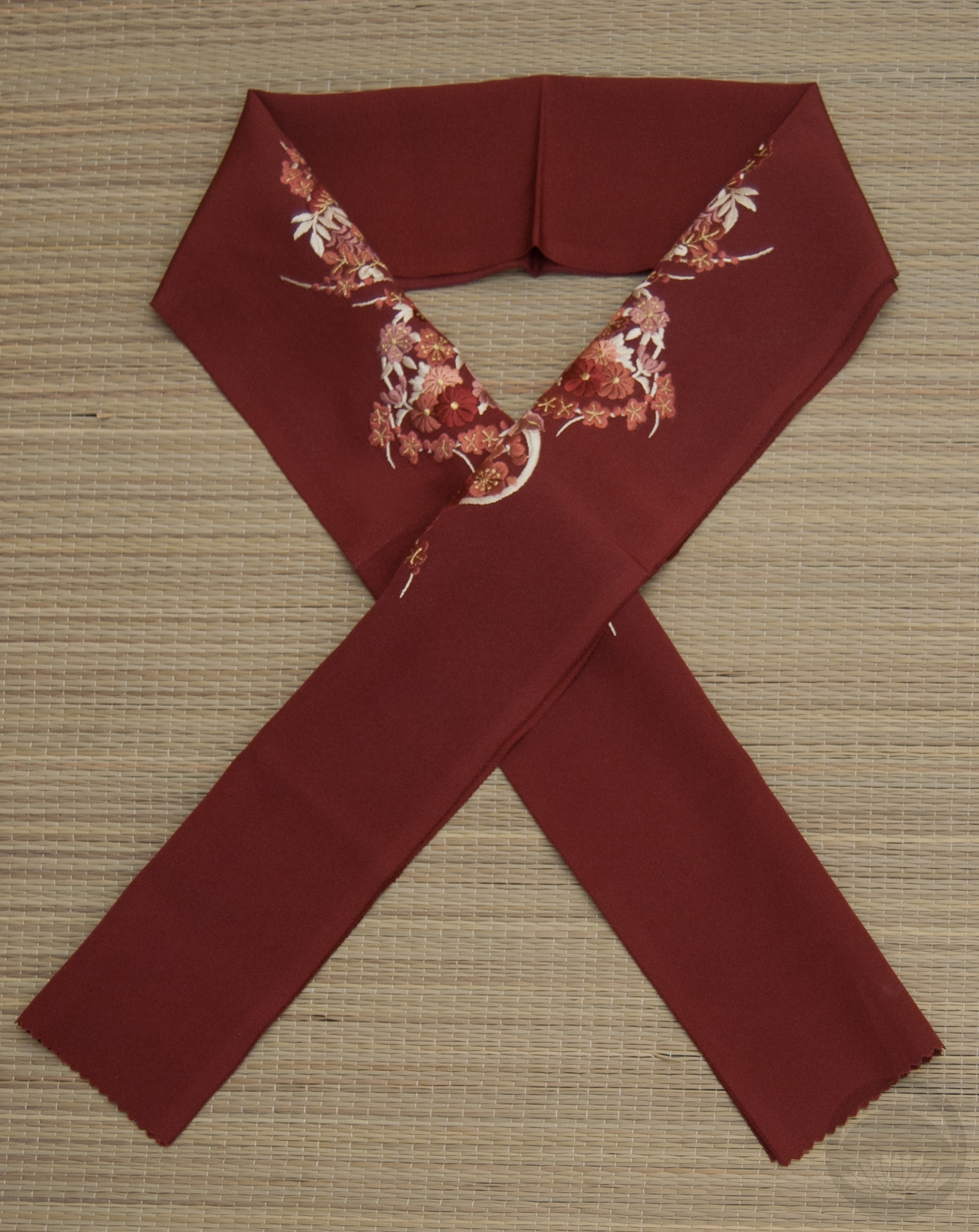
I knew immediately that I wanted to pair it up with this bold orange nagoya obi that really pulls out all the gorgeous warm tones in the hem design of tachibana and kaioke. My initial instinct was to go for more muted accessories, including an obijime that has nearly the same shade of turquoise, but then I remembered I have this bold haneri with tachibana in the same colours as the obi and just ran with it. I love the emphasis the rich purple tones bring to the whole coordination. I will definitely be revisiting this kimono soon with a more gentle and subtle coordination, but I really do love how bold and vibrant this turned out.

Items used in this coordination

こどもの日 – Kodomo no Hi 2019

It’s become a tradition for me to use my koinobori obi on Children’s Day (こどもの日, Kodomo no Hi), because the motif is so unusual and so perfect. This year I chose to pair it up with this bamboo houmongi, which is vaguely representative of chimaki, a sort of traditional steamed mochi dumpling that is often wrapped in bamboo leaves. Admittedly mostly I just chose it because I liked how they looked together.

The obi has very faint hits of pale, icy blue so I used an obiage that coordinated there, and then some warm reddish accessories that match the kimono well. Thankfully the whole outfit came together quickly and easily, because I was fighting off the early stages of a migraine when I started. But I was determined to get the outfit up today, and I’m glad I did.

I may have no children of my own, but today is a day for me to appreciate all the kids in my life. My niece and nephew, my friends’ kids, the kids who hang out in the store where I work. They all bring me joy and humour in different ways, and I hope this year brings them all the best 💖

Items used in this coordination

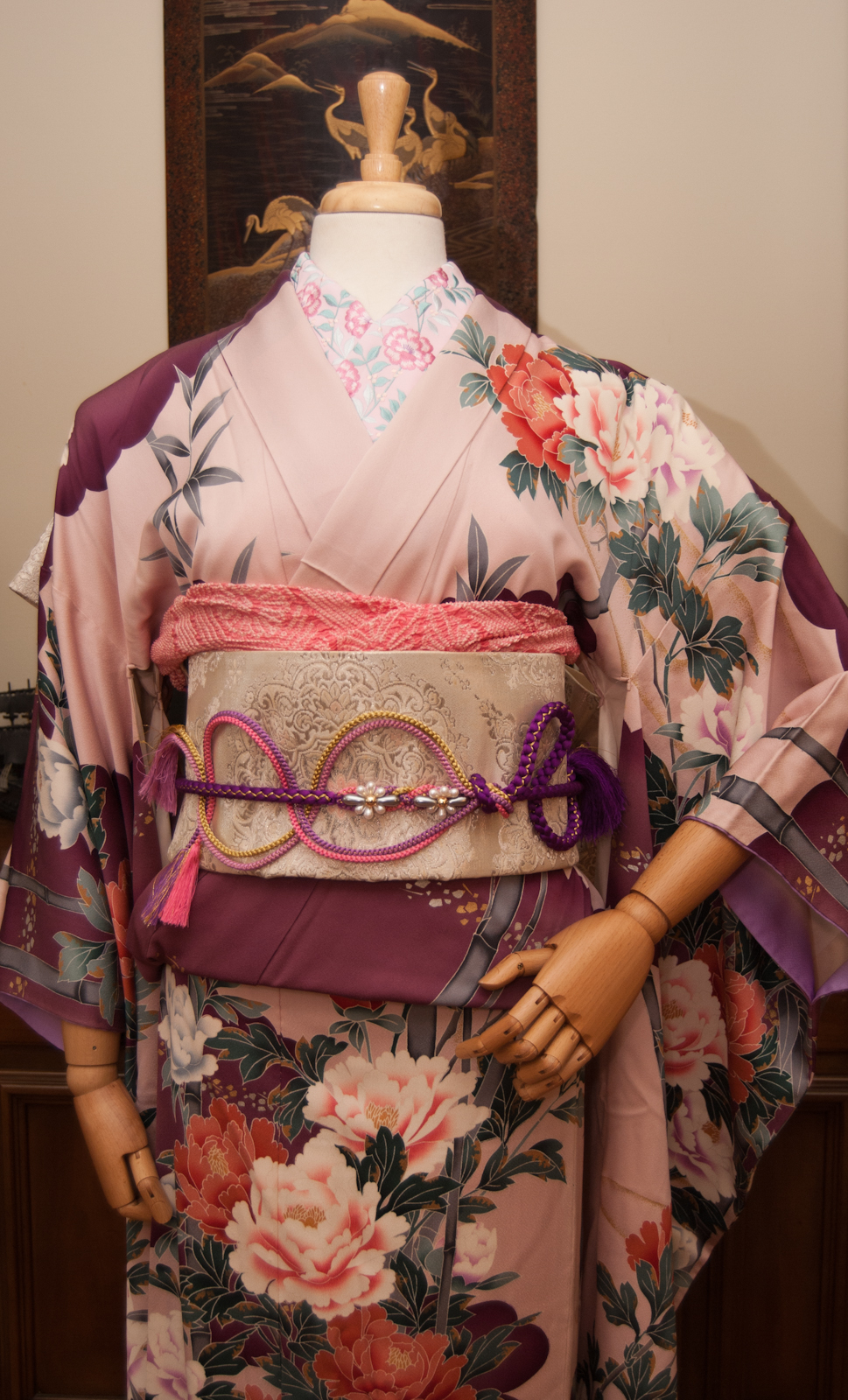
Let’s Celebrate the New Era of Reiwa!

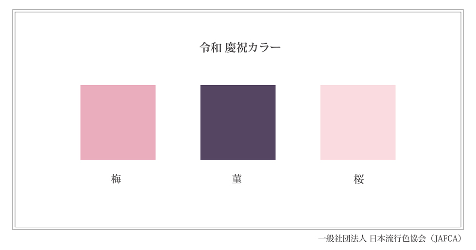
Yesterday marked the beginning of a new era in Japan. Emperor Akihito abidcated the throne at the end of April, paving the way for his son Naruhito to ascend to the throne. This ushered in the end of the Heisei era and the beginning of the Reiwa era. There will be a week of celebrations of all sorts, but when I saw that they had announced a special colour palette for the event, I knew I had to do a coordination to celebrate. The three celebratory colours are ume (plum), sumire (violet), and sakura (pink).  They  were  chosen  because  they  are  all  traditional  spring  flowers,  and  also because  they  are  mentioned  in  the  Manyoshu,  Japan’s  oldest  recorded  poetry  that  served  as  inspiration  for  the  new era’s  name.

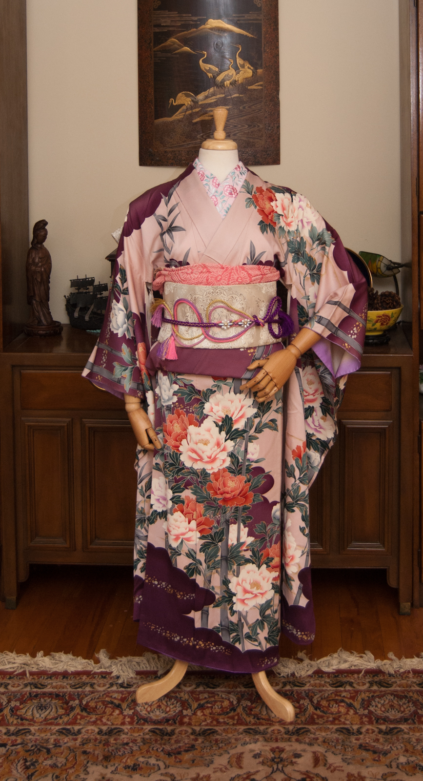
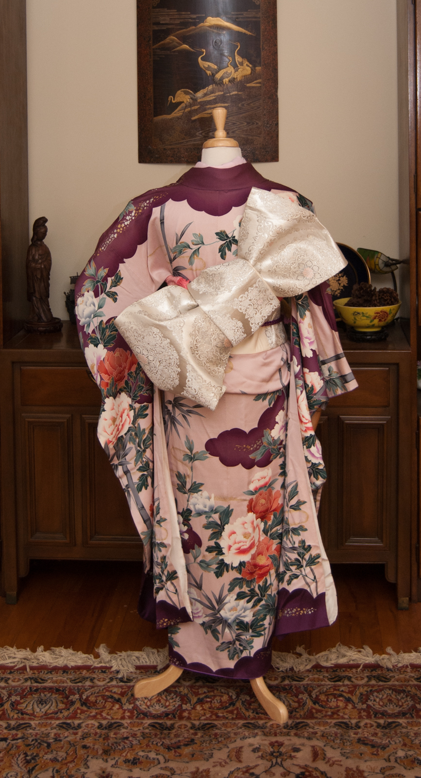
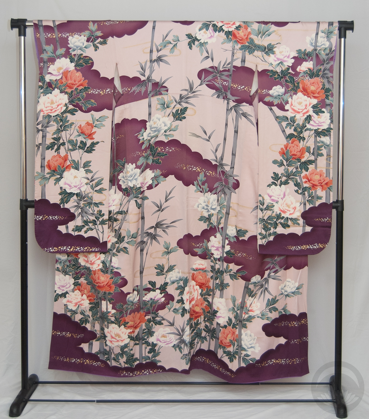
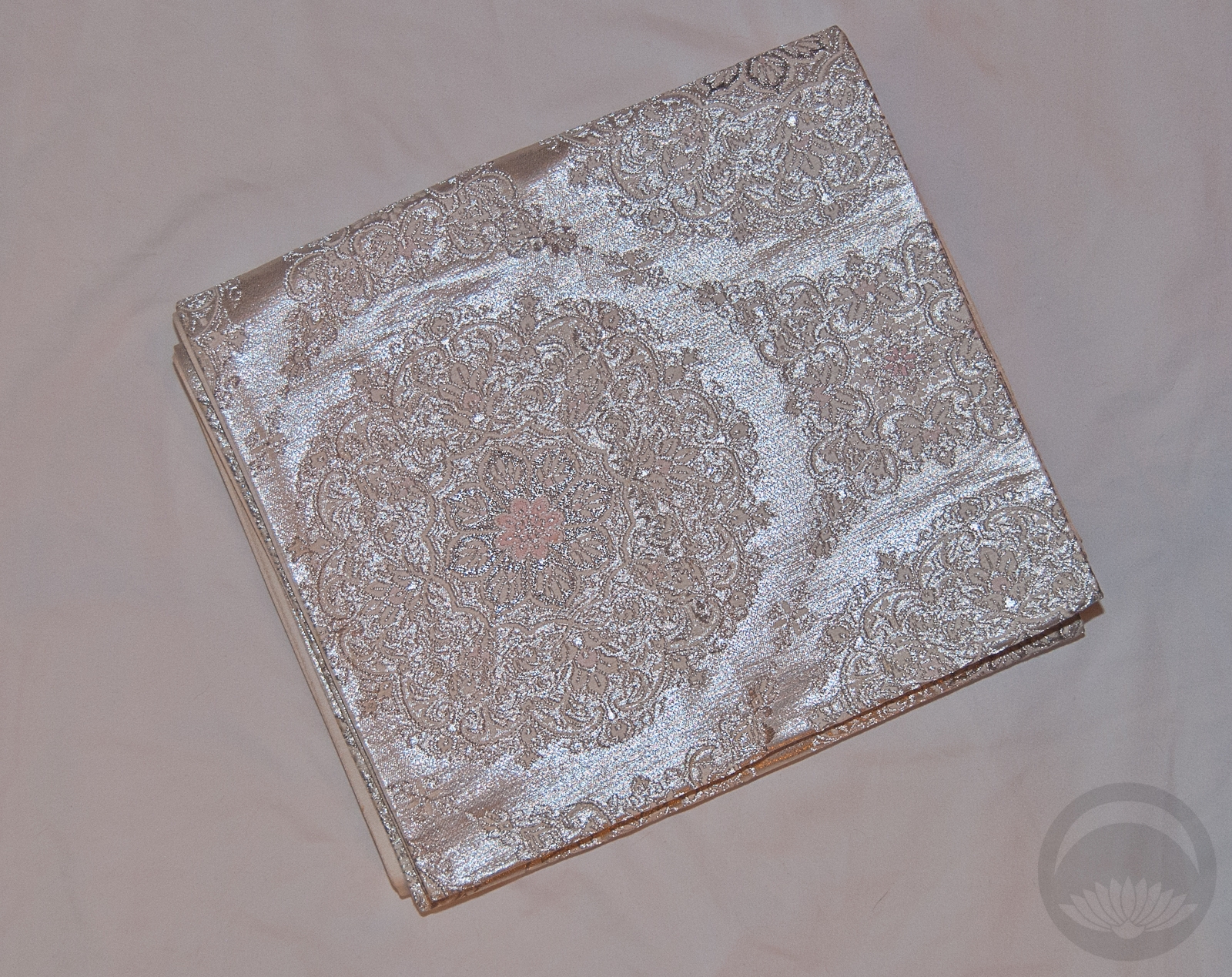
I knew right away that my beloved peony furisode would be absolutely perfect for this outfit, since it features all three colours already. A white-based obi with delicate pink accents gave the outfit a bit of visual rest, since the kimono itself is quite busy and bold. I chose more pink and purple accessories to reinforce the theme and went with a classically feminine but modern styling.

To me, this outfit is the perfect way to usher in what will hopefully be a new era of peace, cooperation, equality, and prosperity for Japan.

Items used in this coordination

Pastel Pearl-fection!

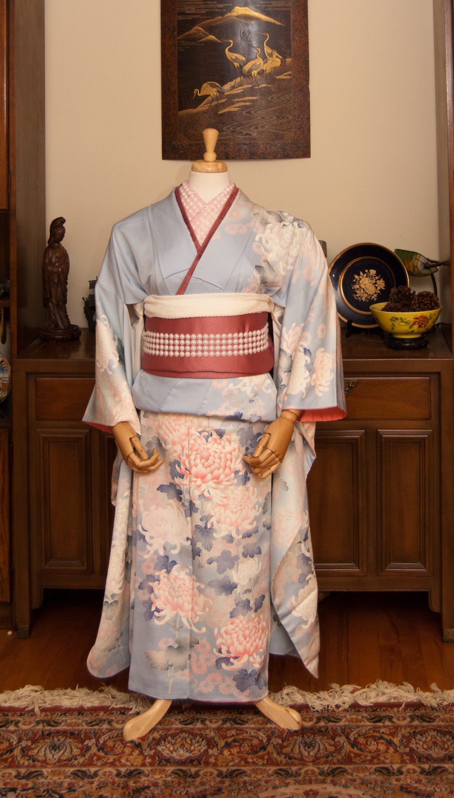
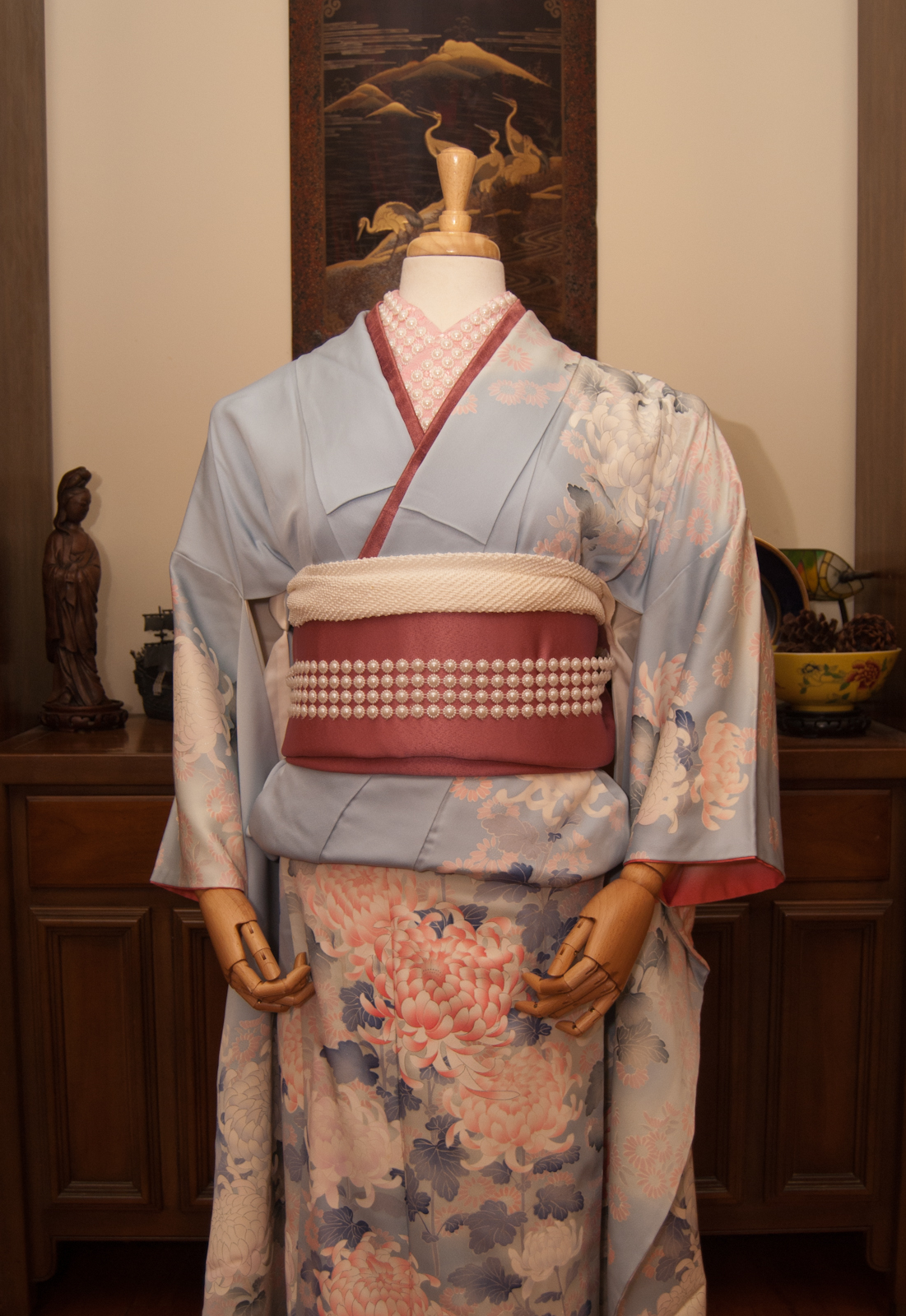
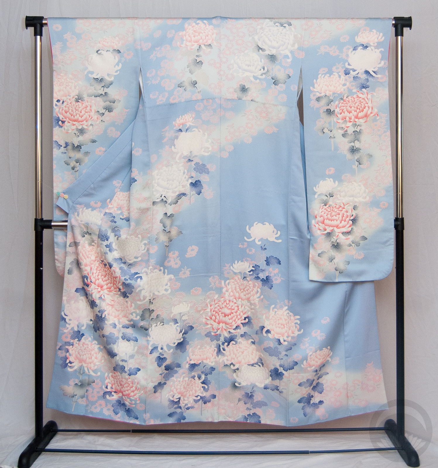
I bought this pearl ribbon thing a while back with the intention of using it in kitsuke and somehow never got around to it. When I was looking for an inspirational jumping-off point for today’s outfit I remembered I still had them and decided to work off that.
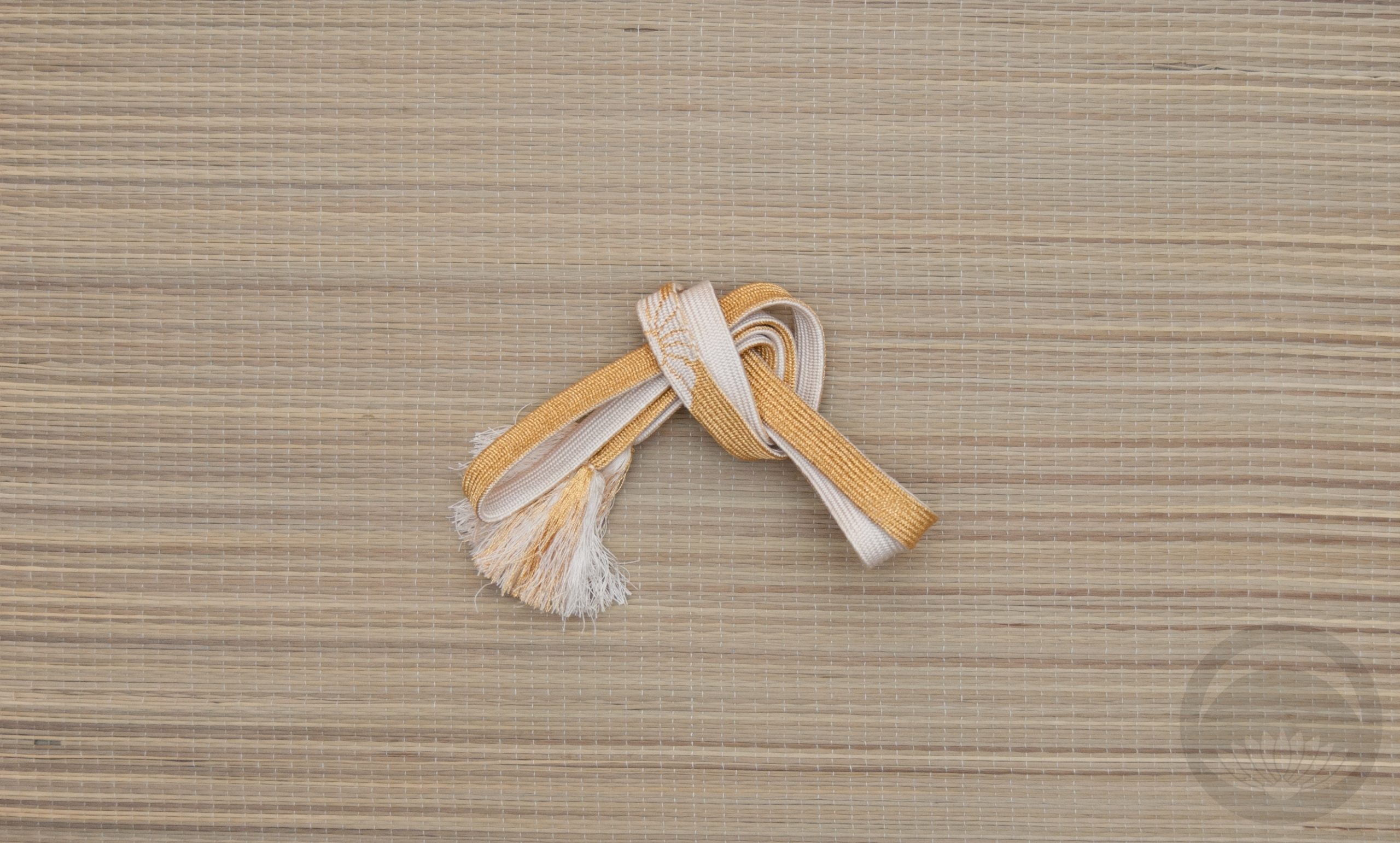
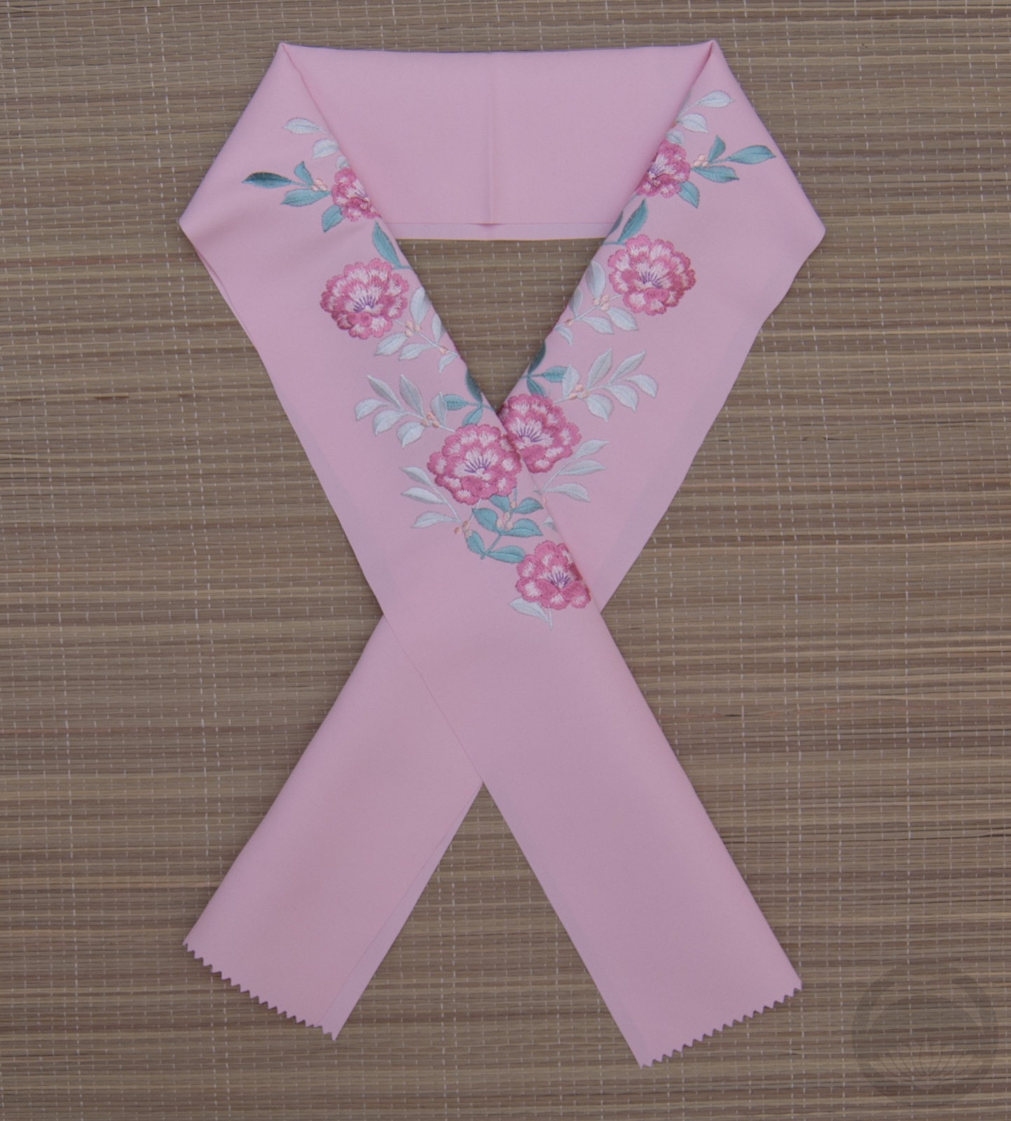
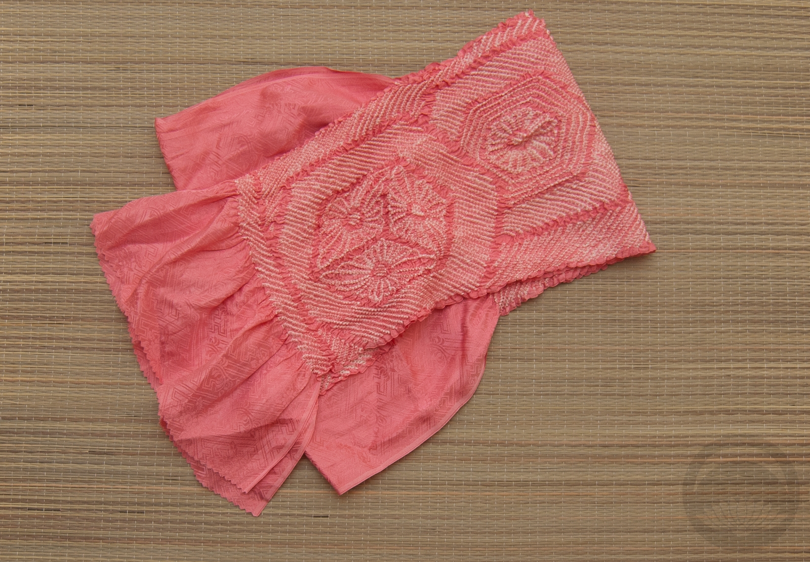
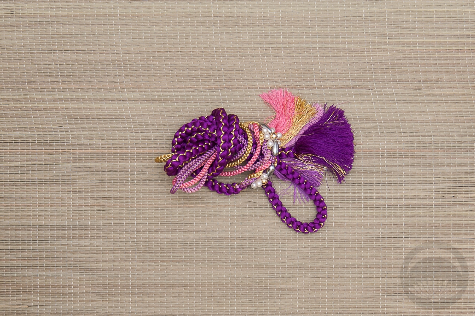
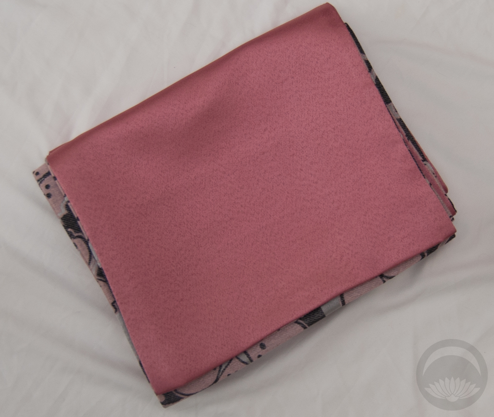
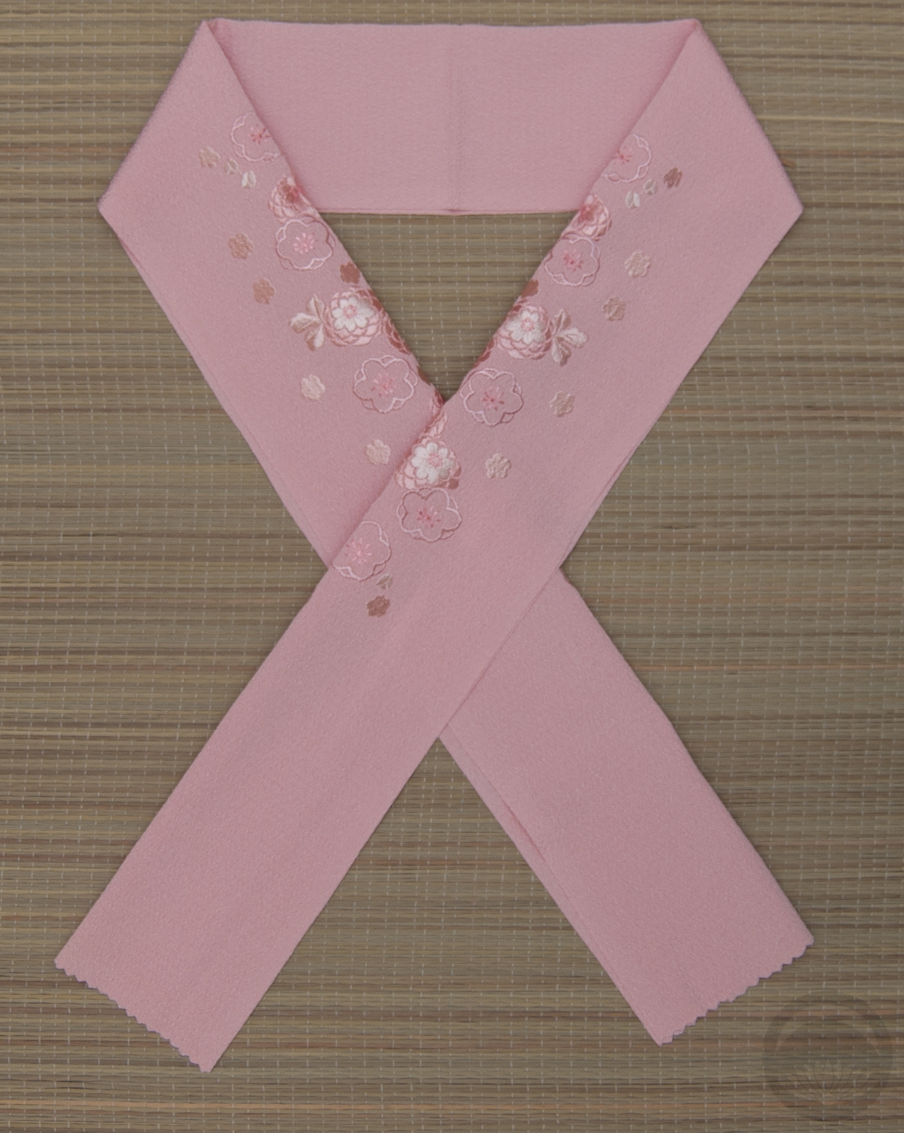
Pearls, to me, needed a really sweet and feminine outfit, so it was time to bust out this gorgeous blue furisode with pink accents again.  I went with the solid deep rose side of my sakura chuuya obi, and decided to use the pearls as something between an obijime and a pattern itself. I really like how this looks! I also covered up a pink embroidered haneri with more pearls because sometimes more is more. The obi provides a bit of visual weight to an otherwise very light and airy kimono. Previously, all the coordinations I’ve done with this piece have been with white or silver based obi, and it’s pretty cool to see how different it feels with something richer and more colourful.

I also had fun improvising the obi musubi, it sort of looks like a cross between a fukura suzume and a han-darari. It feels very sweet and youthful, and took advantage of this soft, floppy obi well I think. A few more rose and white accessories just pulled the whole thing into a really pretty, girly, cohesive outfit.

Items used in this coordination

A Prayer for Notre Dame

Monday, I watched with the world as the Cathédrale Notre Dame de Paris burned. I may be, as I’ve mentioned before, an atheist, but the thought of the world losing such an important monument filled me with despair. There is no denying that aside from spiritually, it’s an incredibly vital structure historically, artistically, architecturally, and culturally. It has witnessed revolutions, wars, births, deaths, been central to great works of fiction, and great works of art.

Now, several days later, we know the extent of the damage, and mercifully it’s not as dire as it felt watching it live. However, it’s going to need a massive amount of restoration in the years – and likely decades – to come. Thankfully the structure is still mostly stable, and the bulk of the art and religious relics contained within were saved, but she is still going to need a ton of work.

If you’re a regular around here, you’ve likely seen my use of kitsuke as a coping mechanism for distant but impactful deaths. This time, I’m using it as a coping mechanism for loss and despondency. I wanted to honour Notre Dame in the best and most personal way I know how.

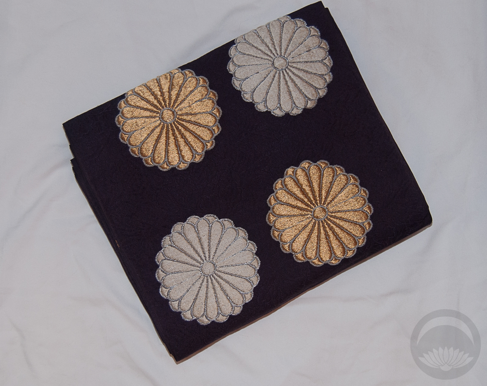
The wrought-iron metalwork designs on the haori call to the famous spire that was lost about halfway through the blaze. As an unintended but not unappreciated bonus, the haori over the obi makes a distinctive hump, hearkening back to Quasimodo, the cathedral’s most famous fictional resident. I chose an obi with the circular floral motif to echo the Rose Window, central to the front facade. The roses on the kimono are also a bit of an indirect nod there. The red accessories add a vital, aggressive pop of contrast, exactly what Notre Dame needs right now. A reminder to fight, that she’s been through worse and come out the other side, and will remain standing for centuries to come.

Items used in this coordination