
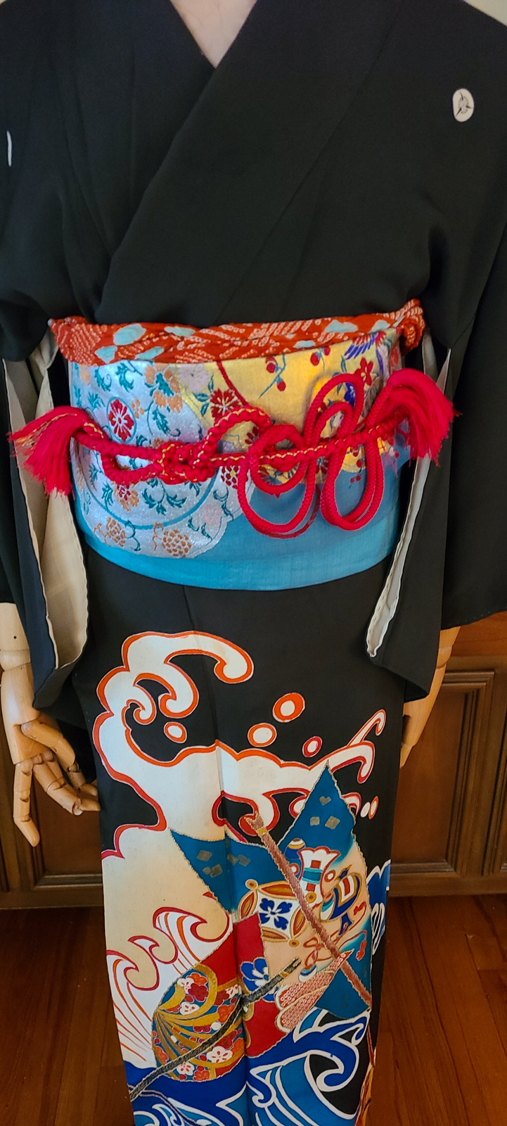
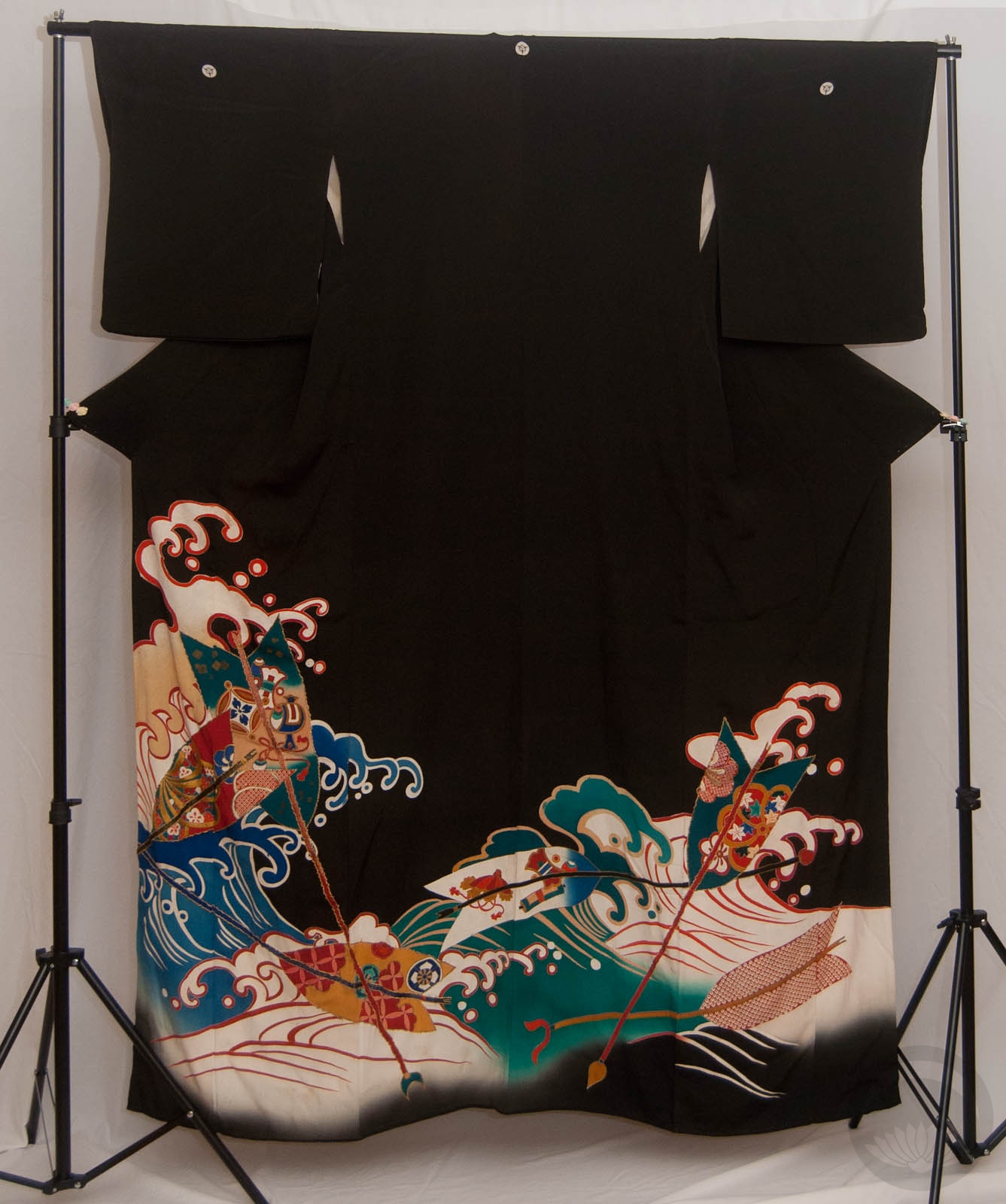
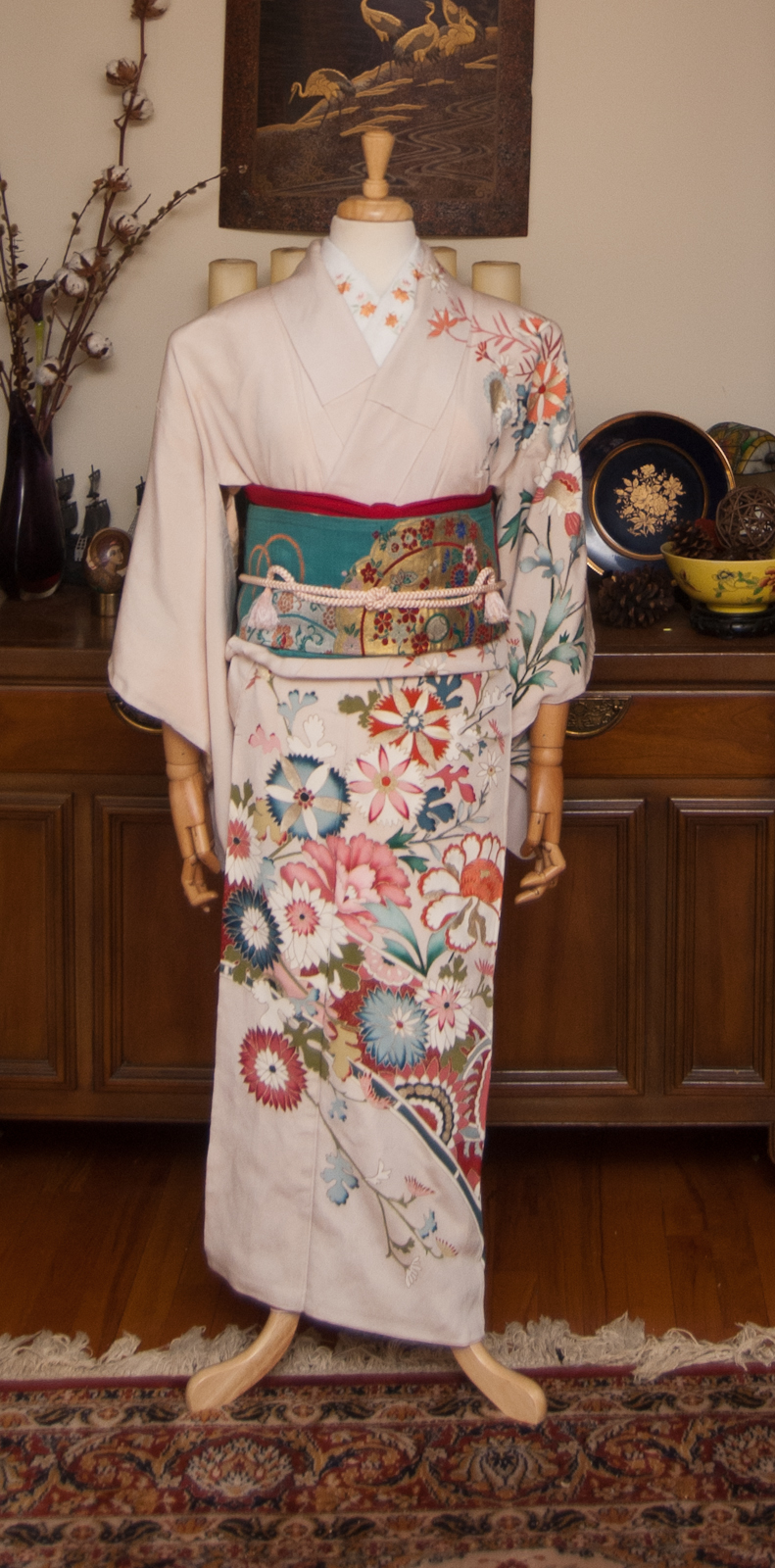
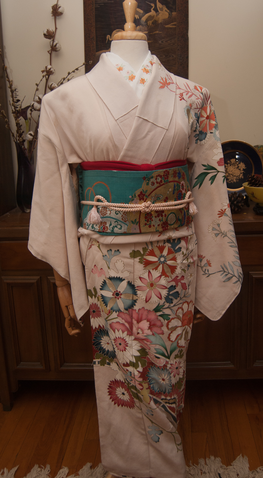
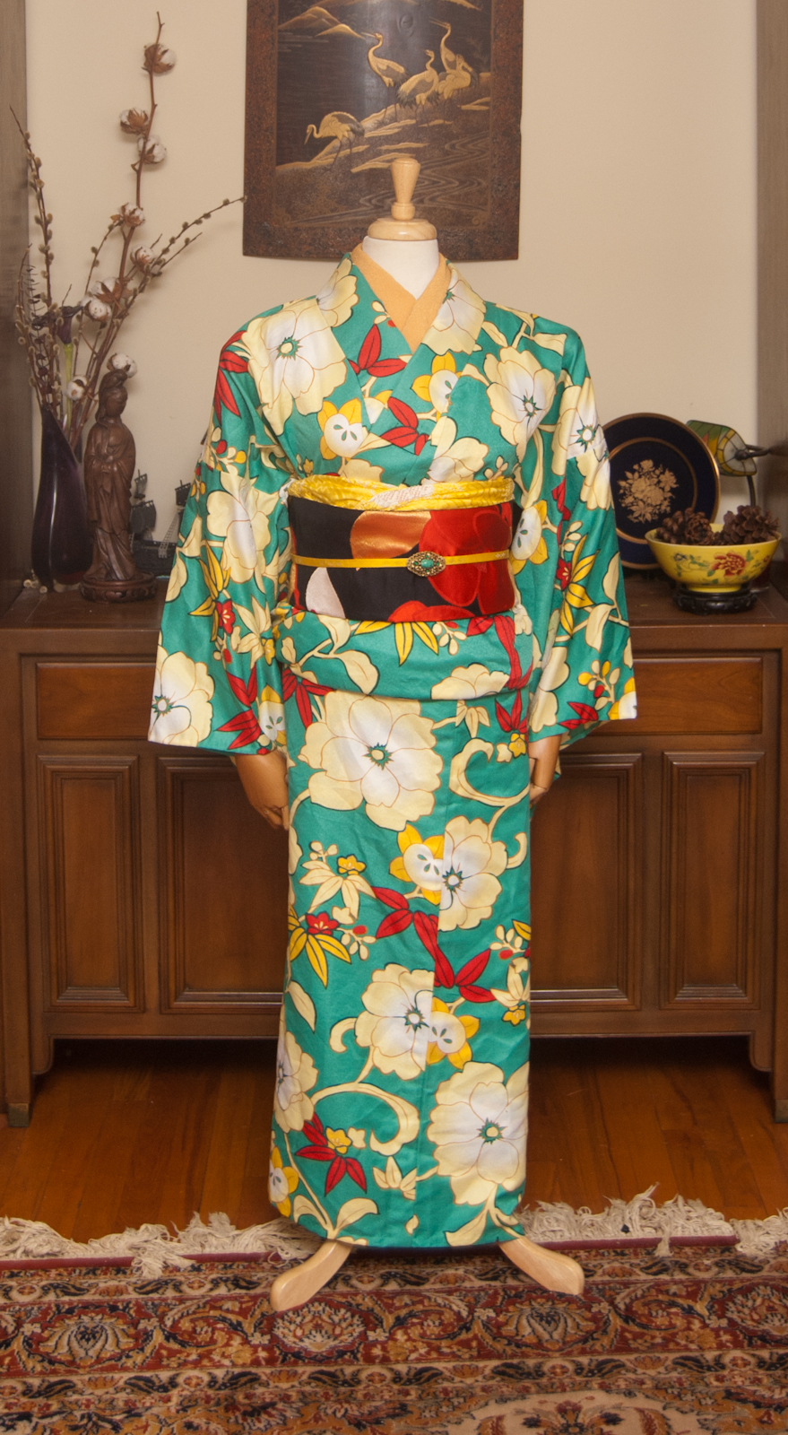
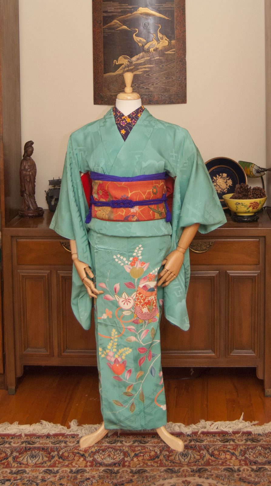
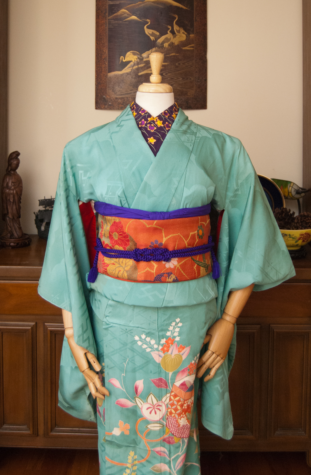
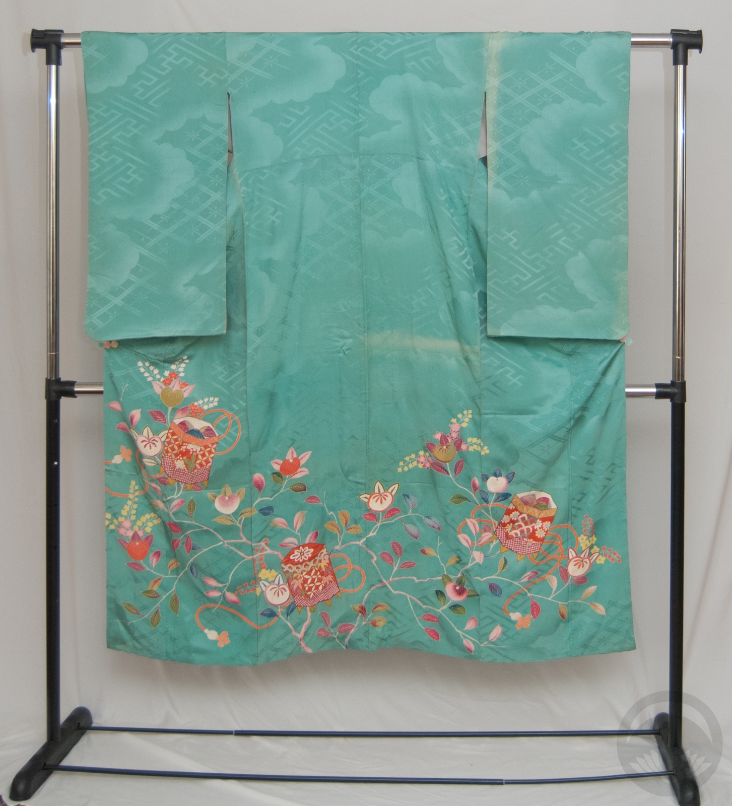
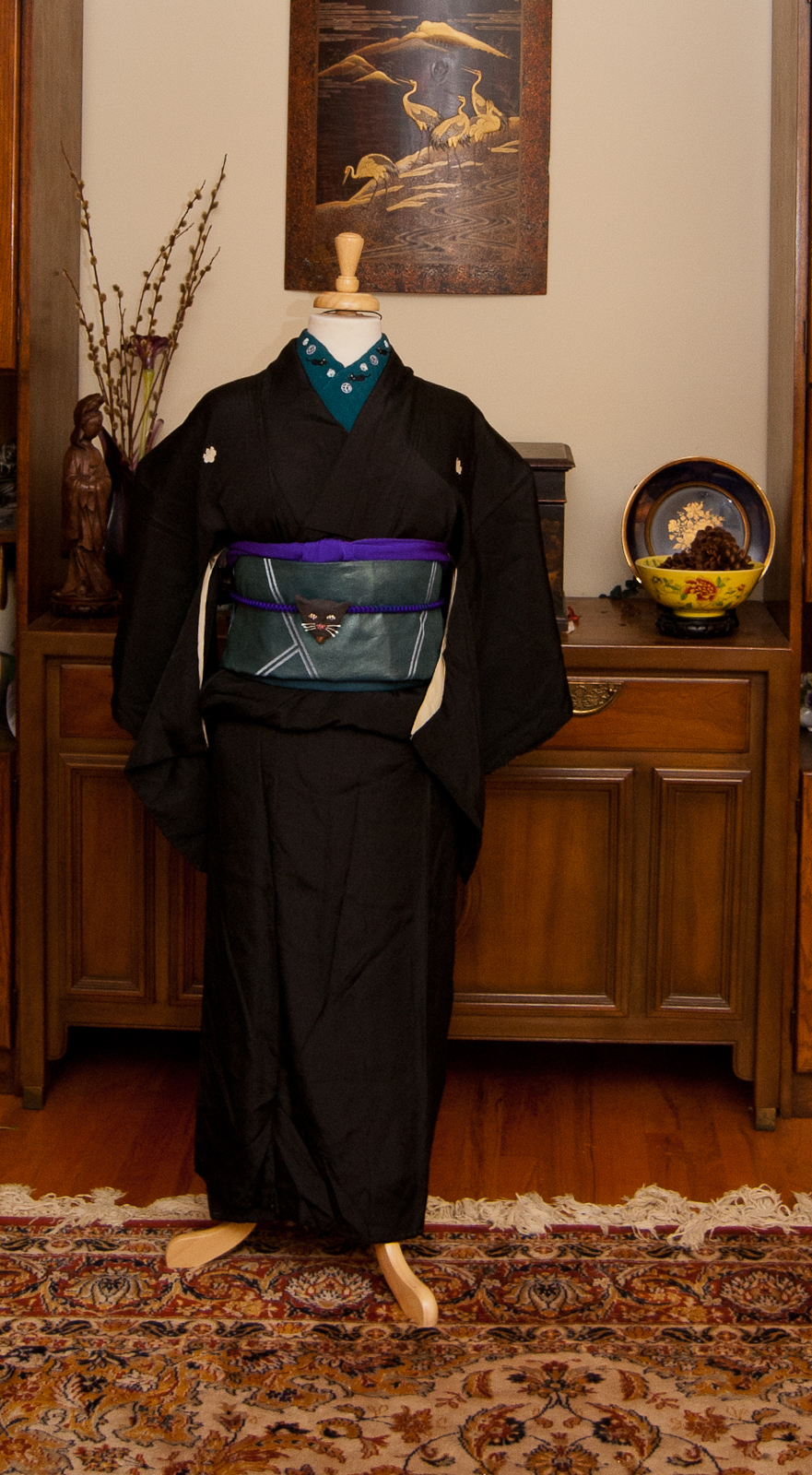
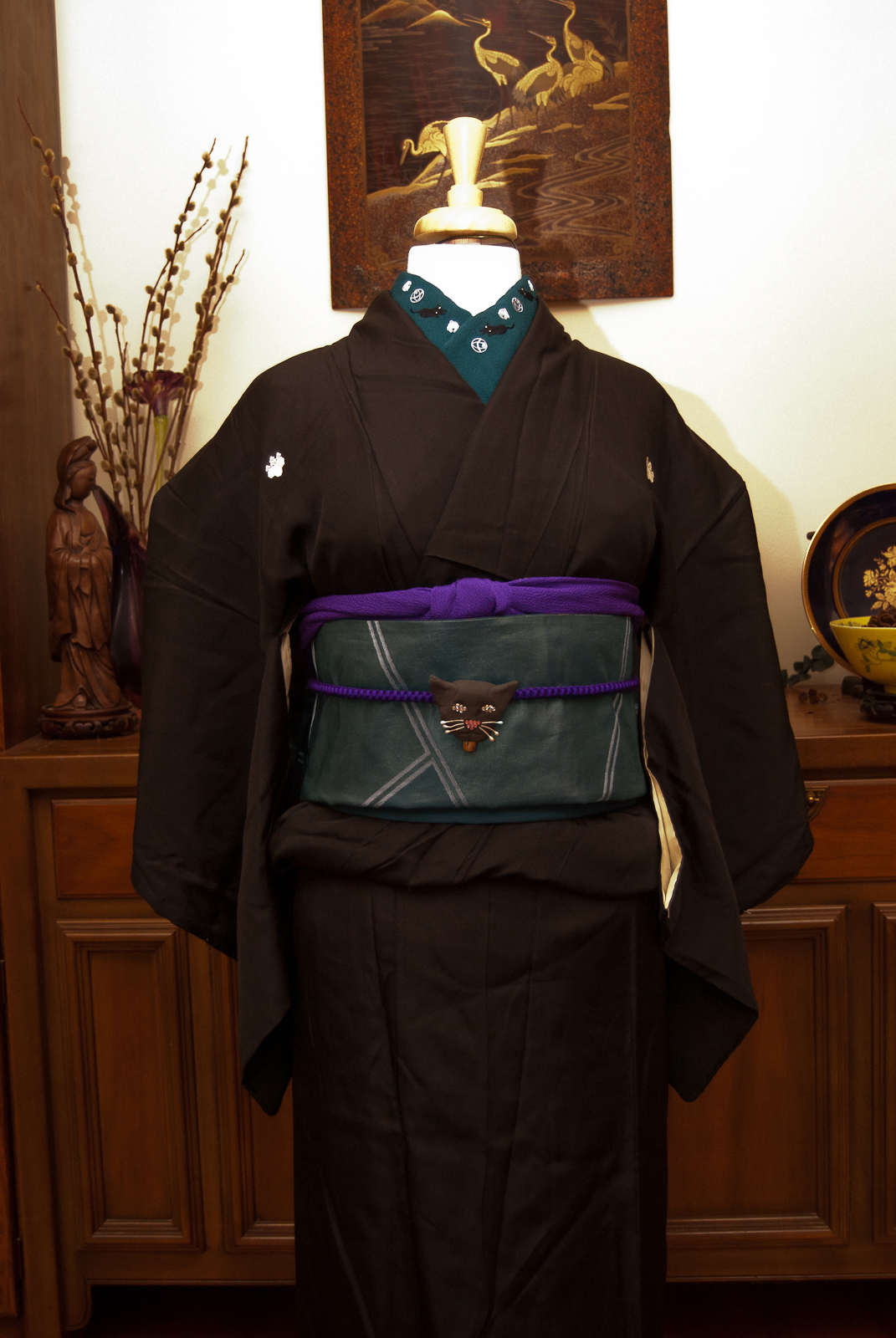
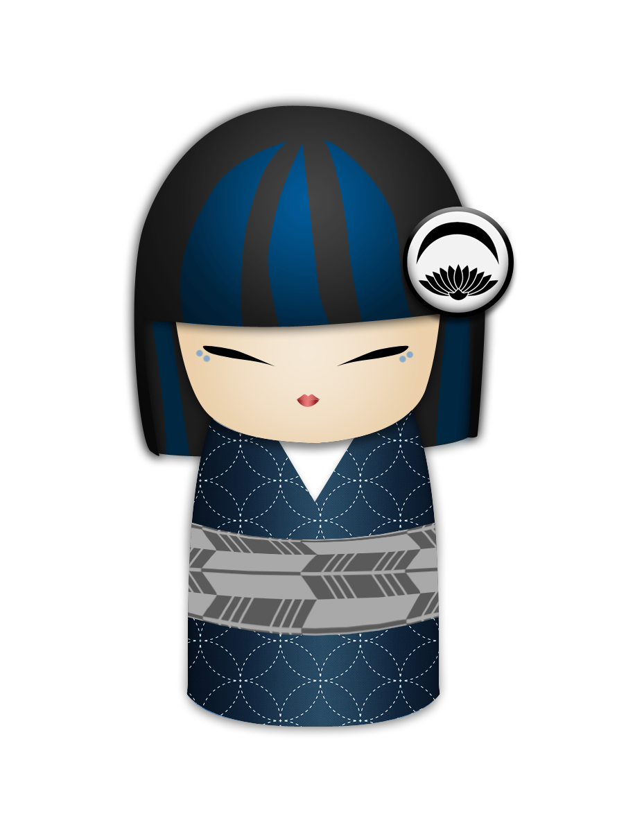
This is one of those coordinations I’ve wanted to do from the very moment I got this kimono, and have just been putting off for one reason or another for years. It was high time I fixed that! This past Thursday was my 42nd birthday, and this coordinate has auspicious motifs of hayama and kagami (arrows and mirrors) and my favourite colour (teal) so I decided it was finally time to do it.
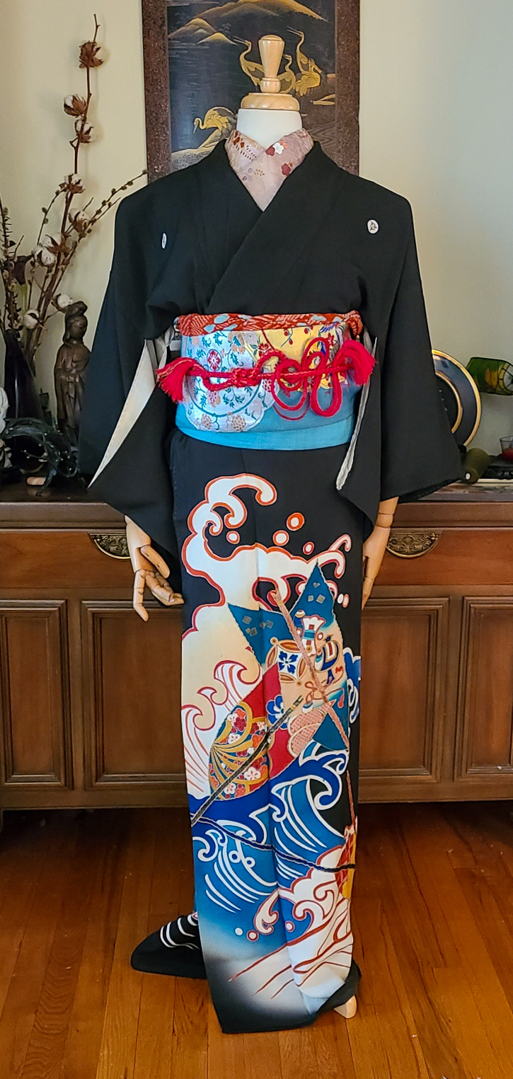
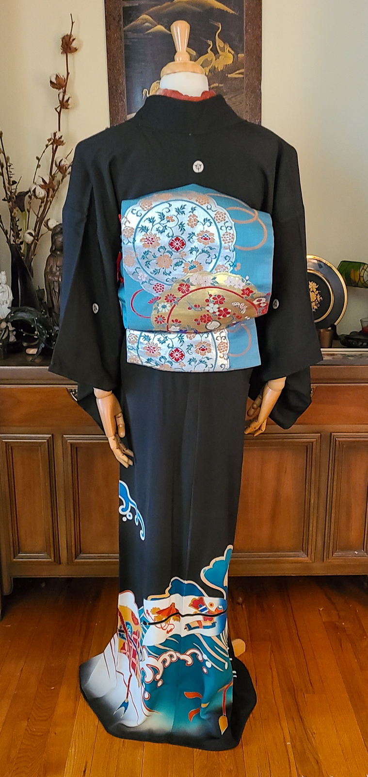
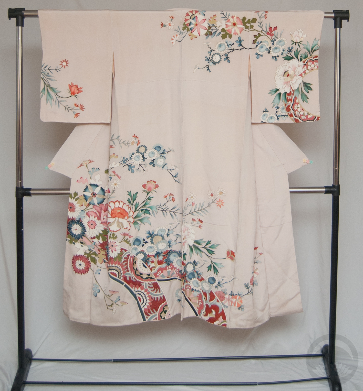
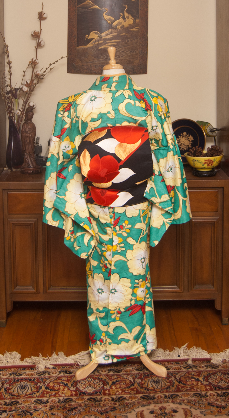
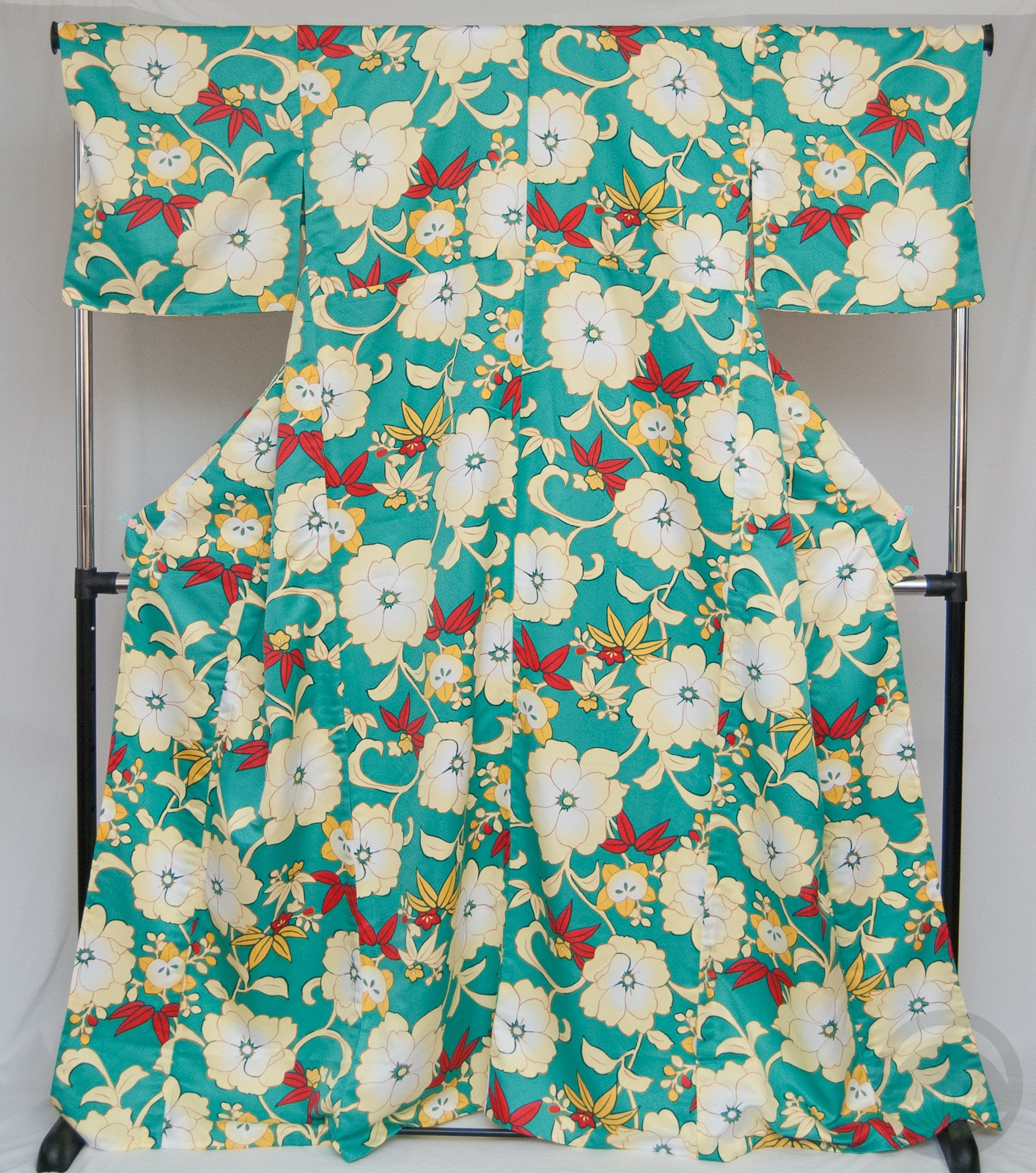
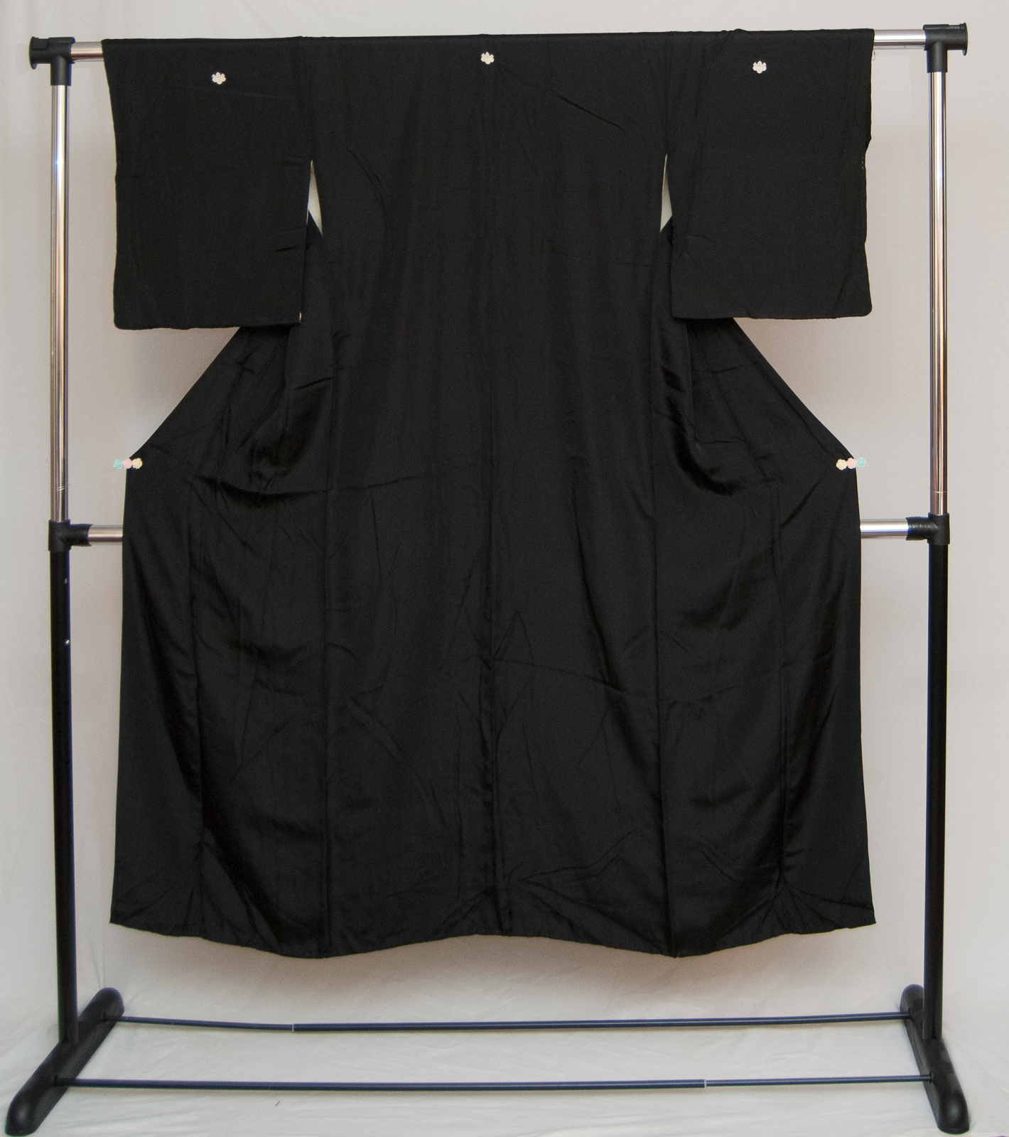
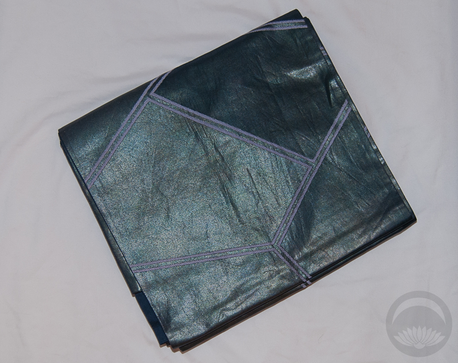
This kimono is definitely interesting – it’s brighter and more bold than most kurotomesode of the era, and it’s definitely very long for its age. The hem has a slight roll to it, so it’s a bit heavier than the rest of the fabric. This, along with the length, lead me to suspect it was a hikizuri, meant to be worn trailing. I’d like to think it may have been a geisha’s piece, worn at the new year, but this is just a suspicion of mine and I have no way to verify it. Whatever it is, I absolutely love it and should coordinate it more often.
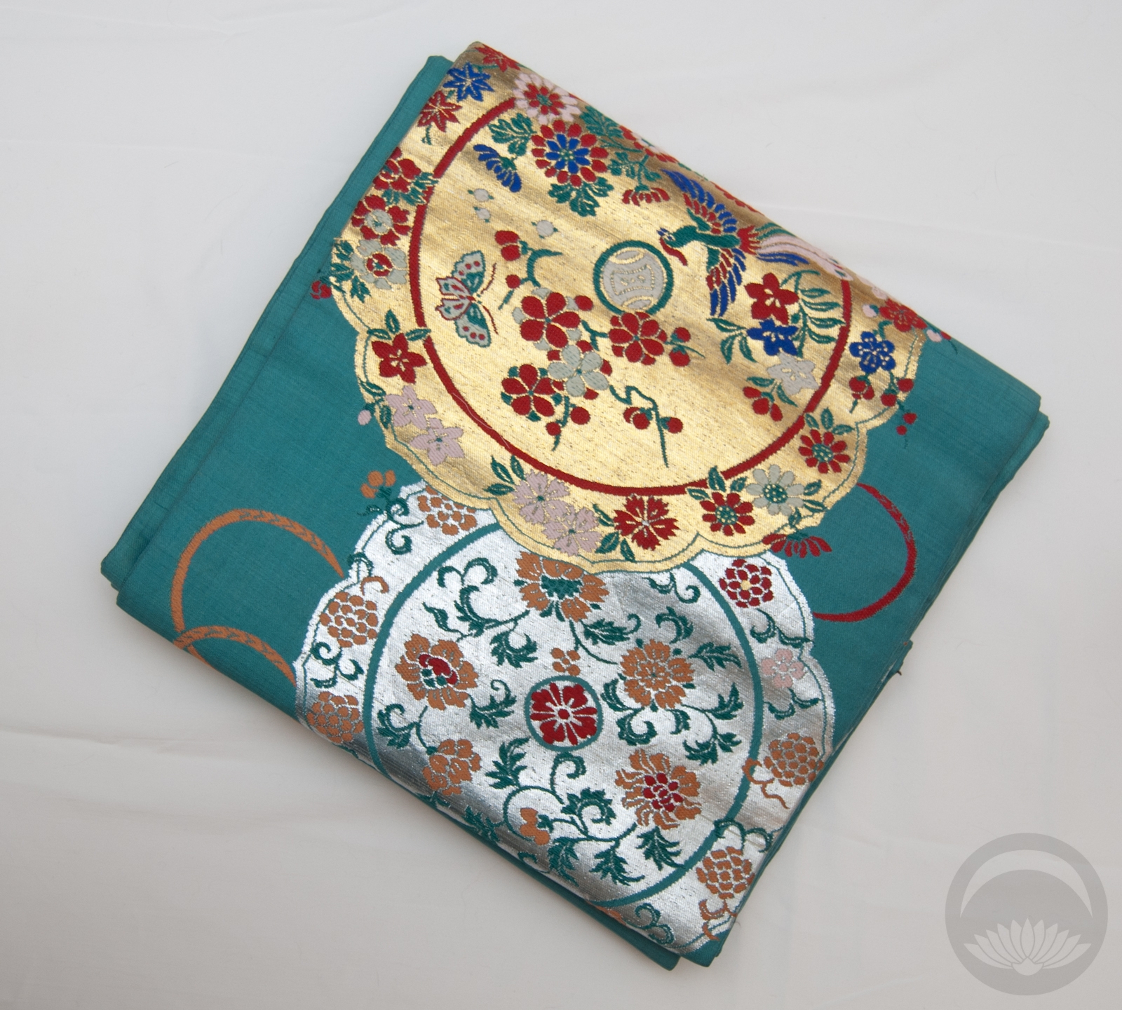
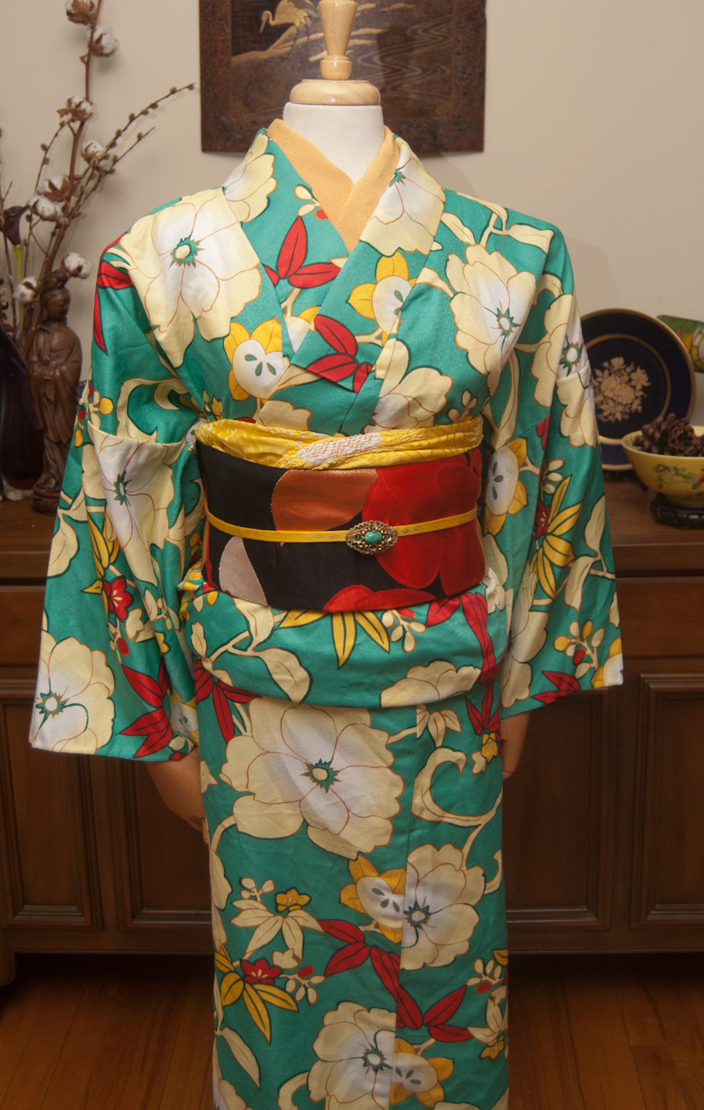
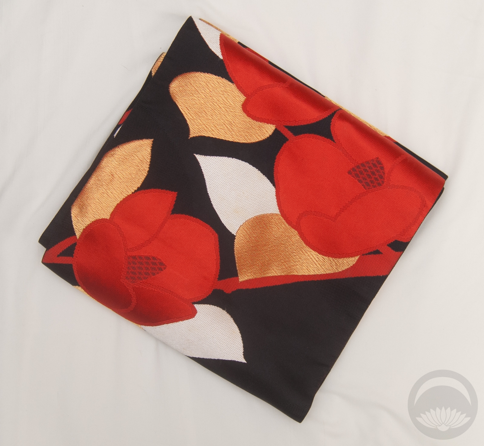
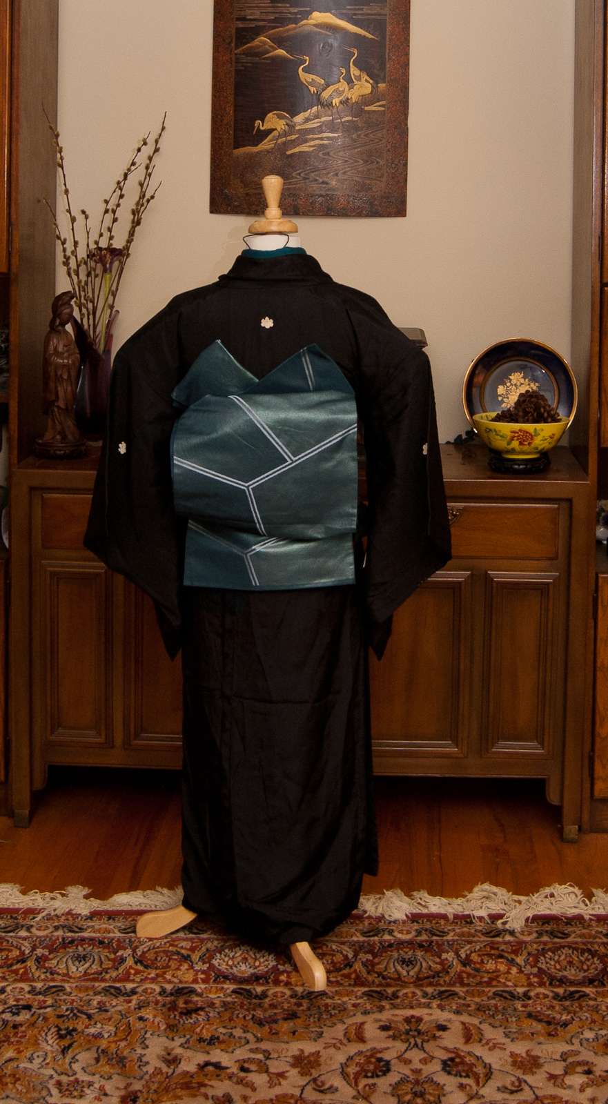
The cool afternoon lighting in my living room makes the teal look bluer in these photos, but it definitely sits right between green and blue in person. I decided to use reds and blues in the accessories to emphasize how bold and punchy this piece is, and to sort of reinforce the geisha-adjacent feel of it. I also decided to let it drape, hikizuri style, to show off the beautiful flow of it, and tied the obi wider than normal to match. The collars are a bit wonky, but sometimes I just cannot get them to cooperate due to the shape of the mannequin. Alas.
This birthday has been a good one and I have very upbeat feelings about this coming loop around the sun. I hope I can share lots of new content and great news with you all soon!
Items used in this coordination
-
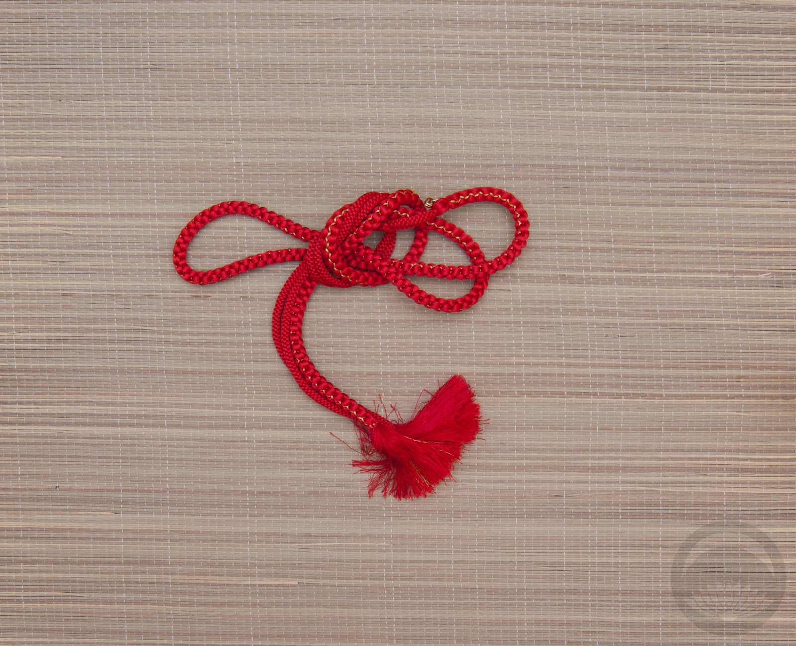
- Arrow Kurotomesode
-
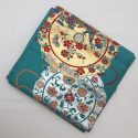
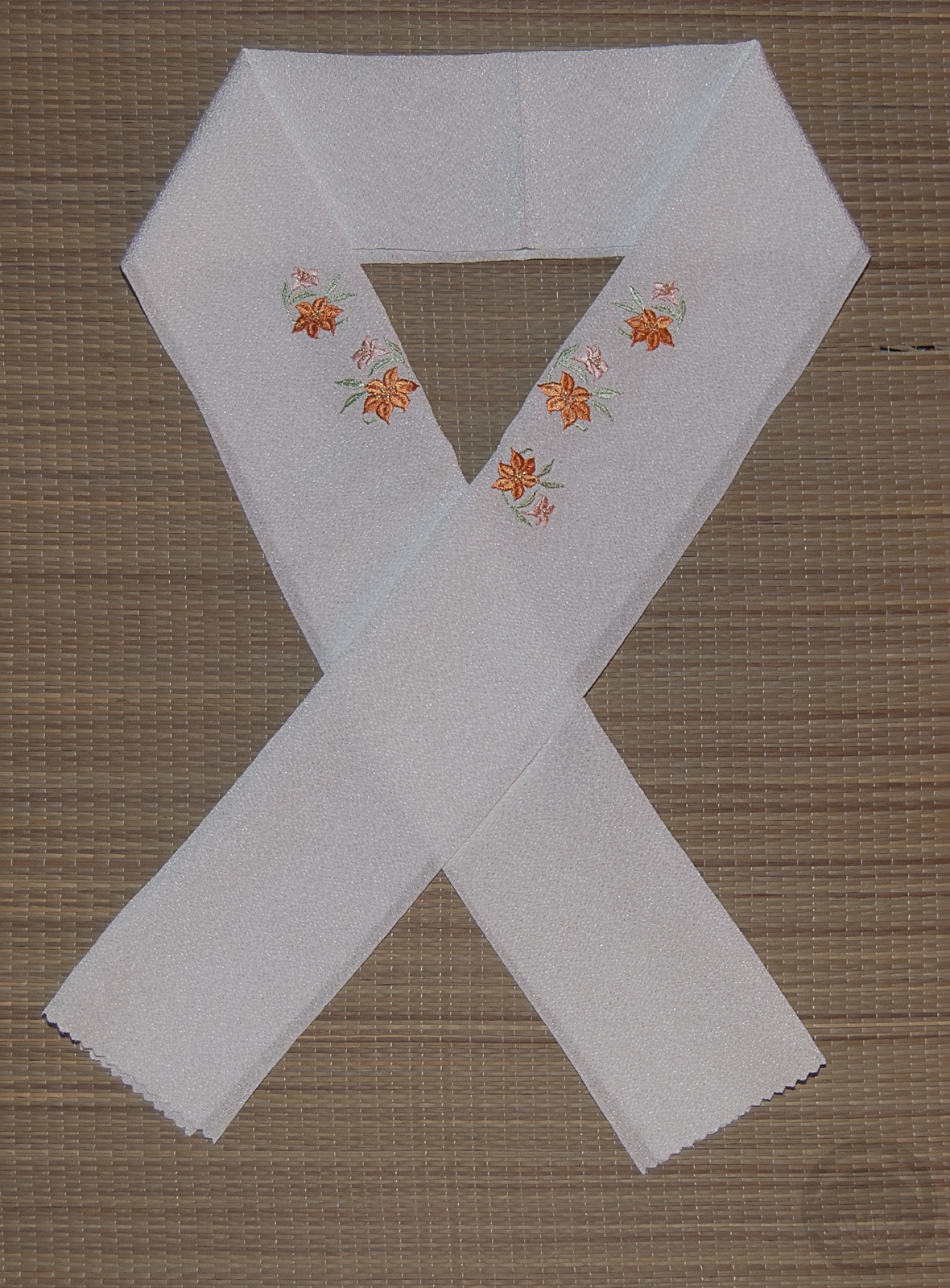
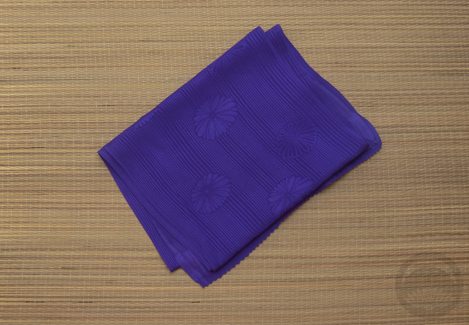
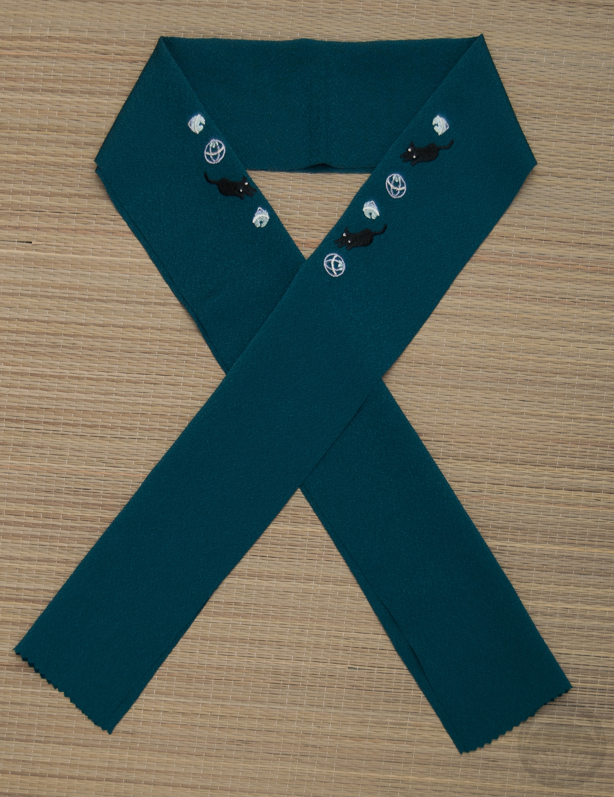
- Teal with Mirrors
-
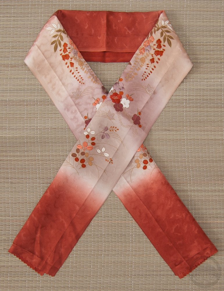
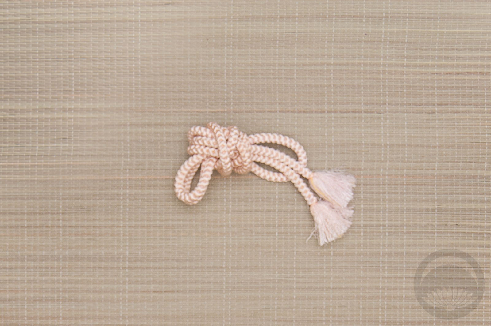
- Embroidered Bokashi
-
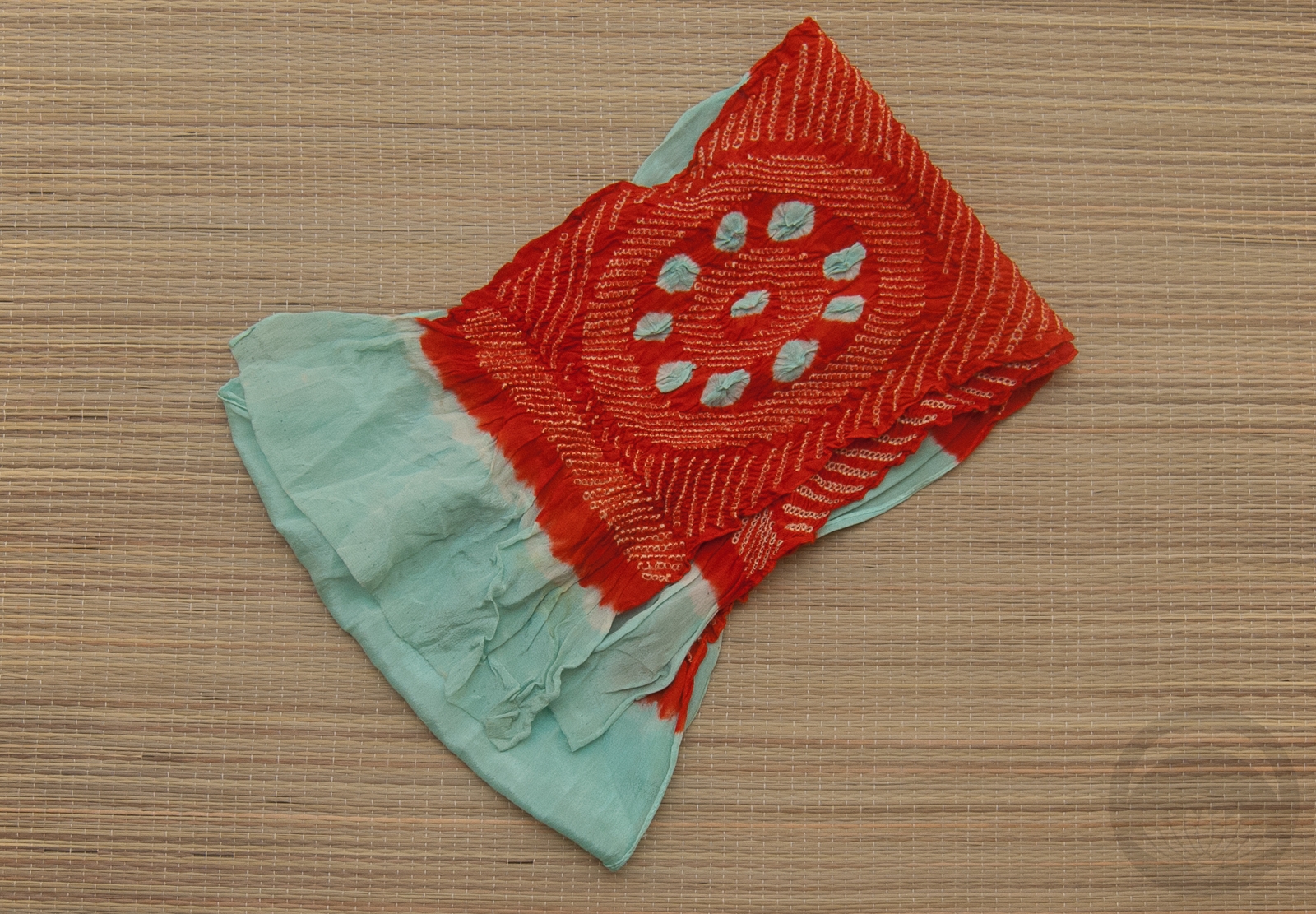
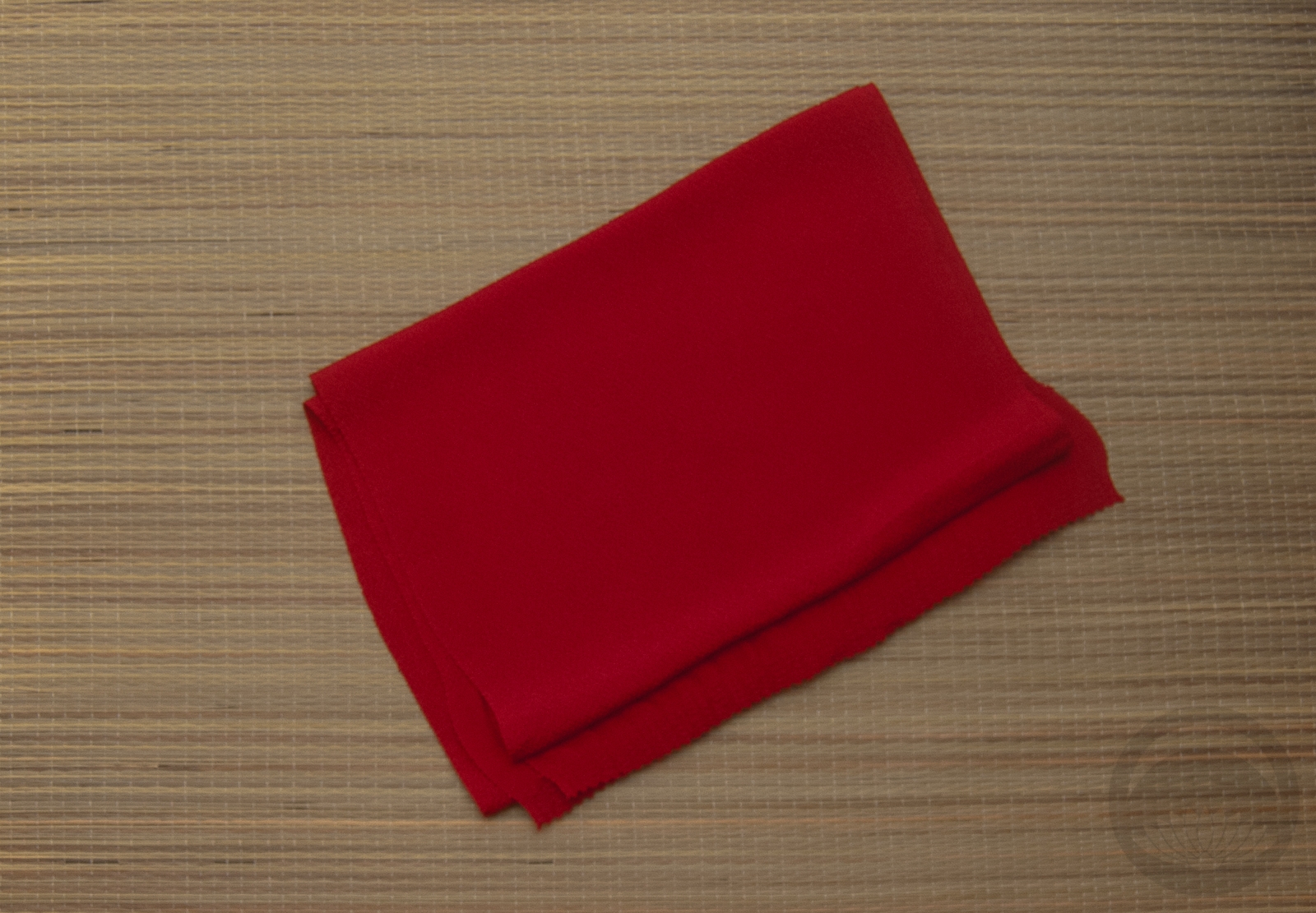
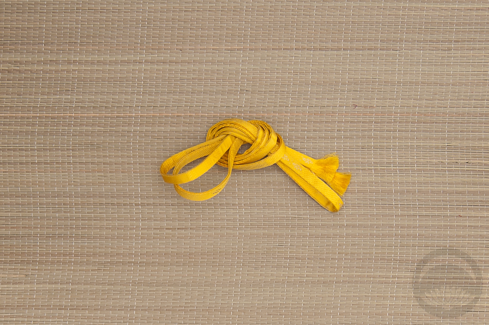
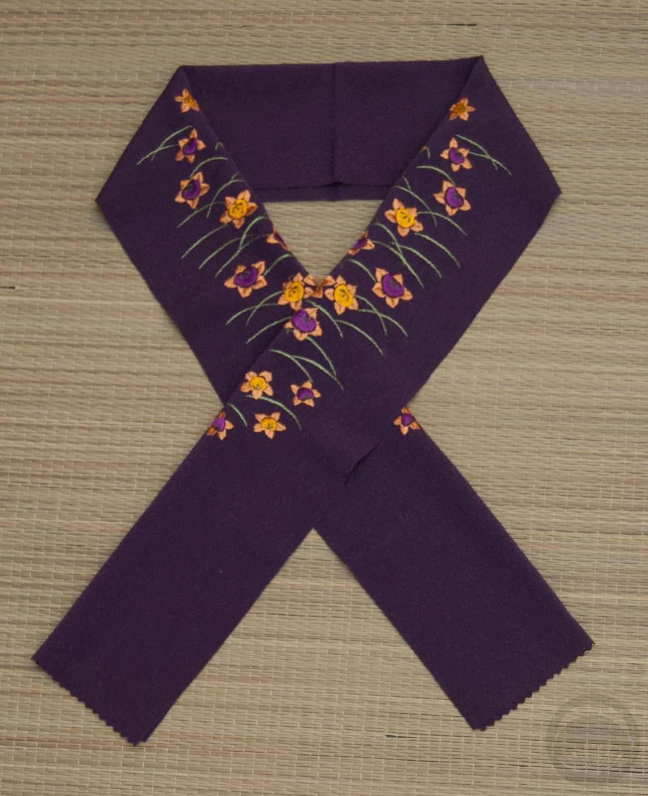
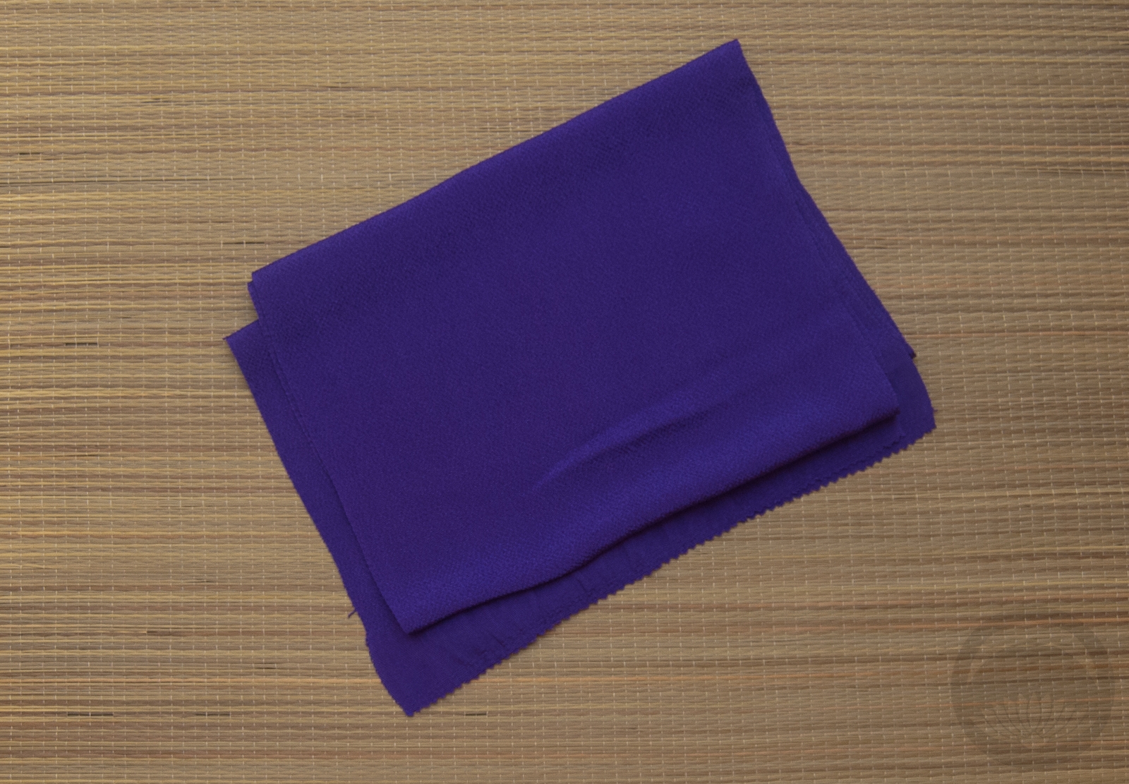
- Red and Blue Shibori
-
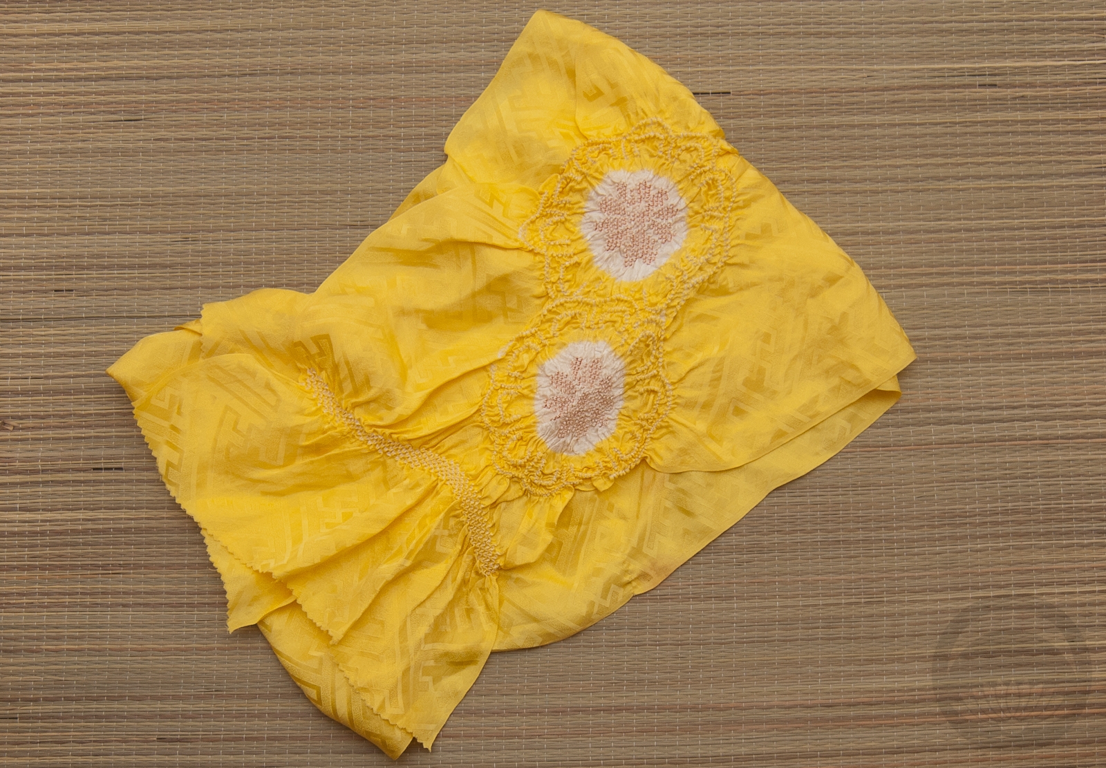
- Red Furisode


 Bebe Taian
 CHOKO Blog
 Silk & Bones
 Gion Kobu