
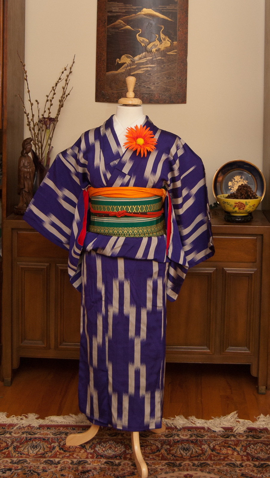
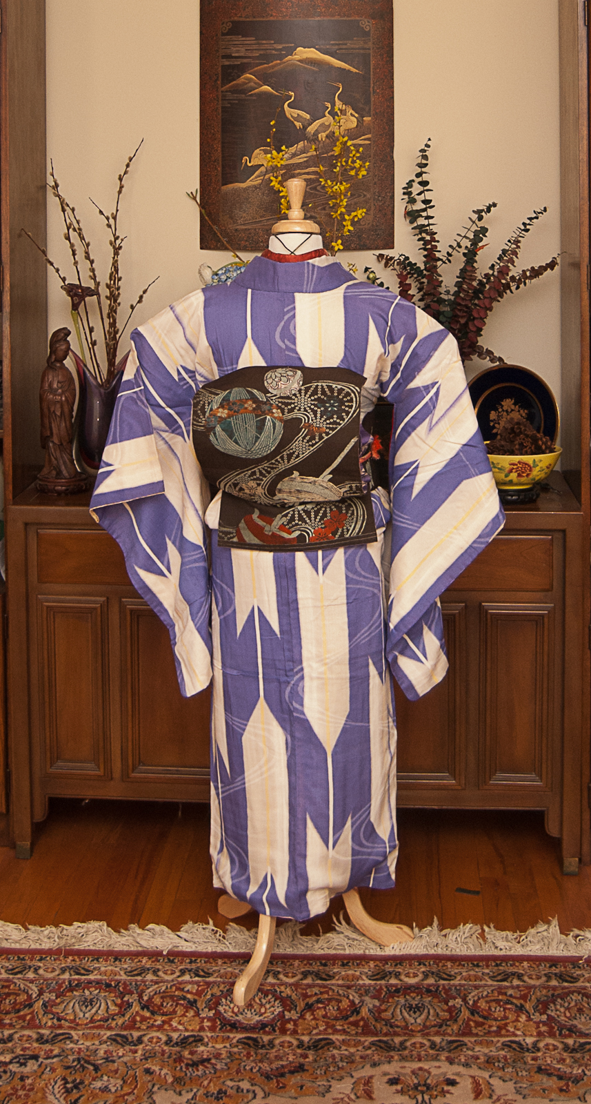
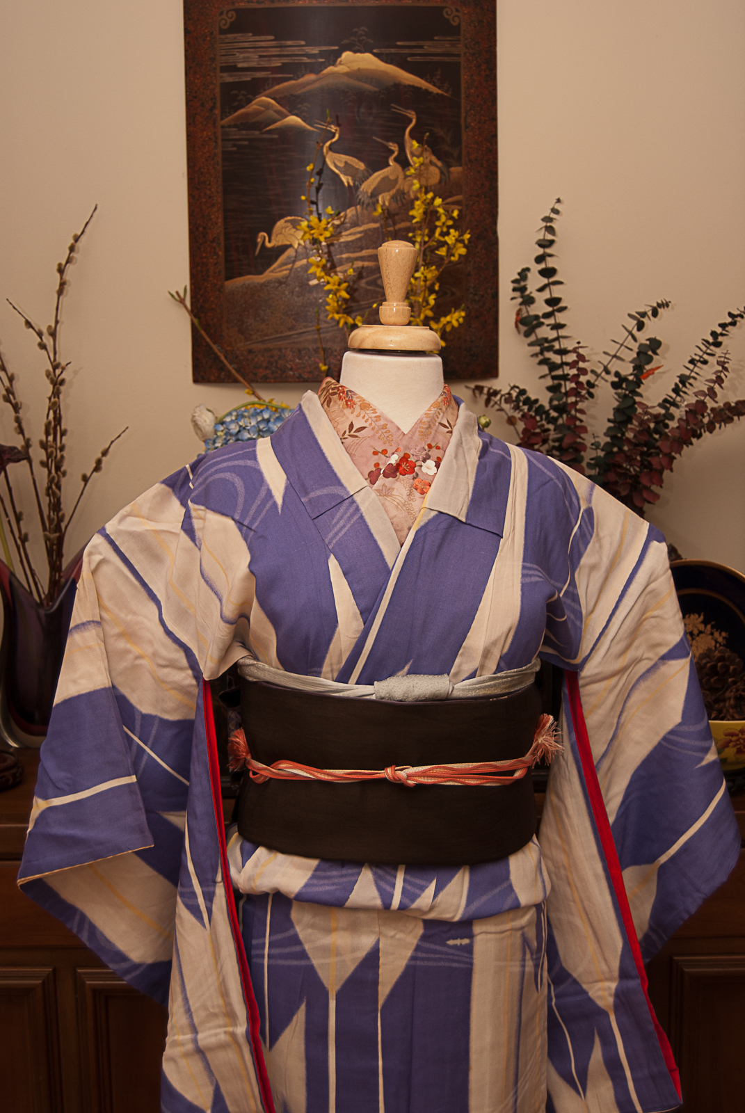
Up next in my Batman-inspired coordinations, Catwoman! A jewel thief extraordinaire and on-again off-again love interest for Bruce Wayne himself, no project like this would be complete without her.
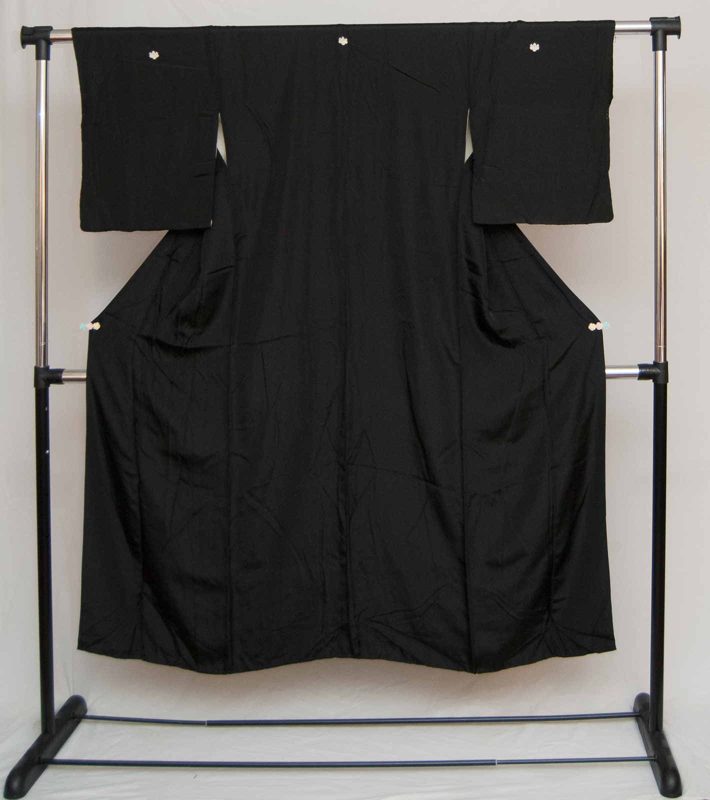
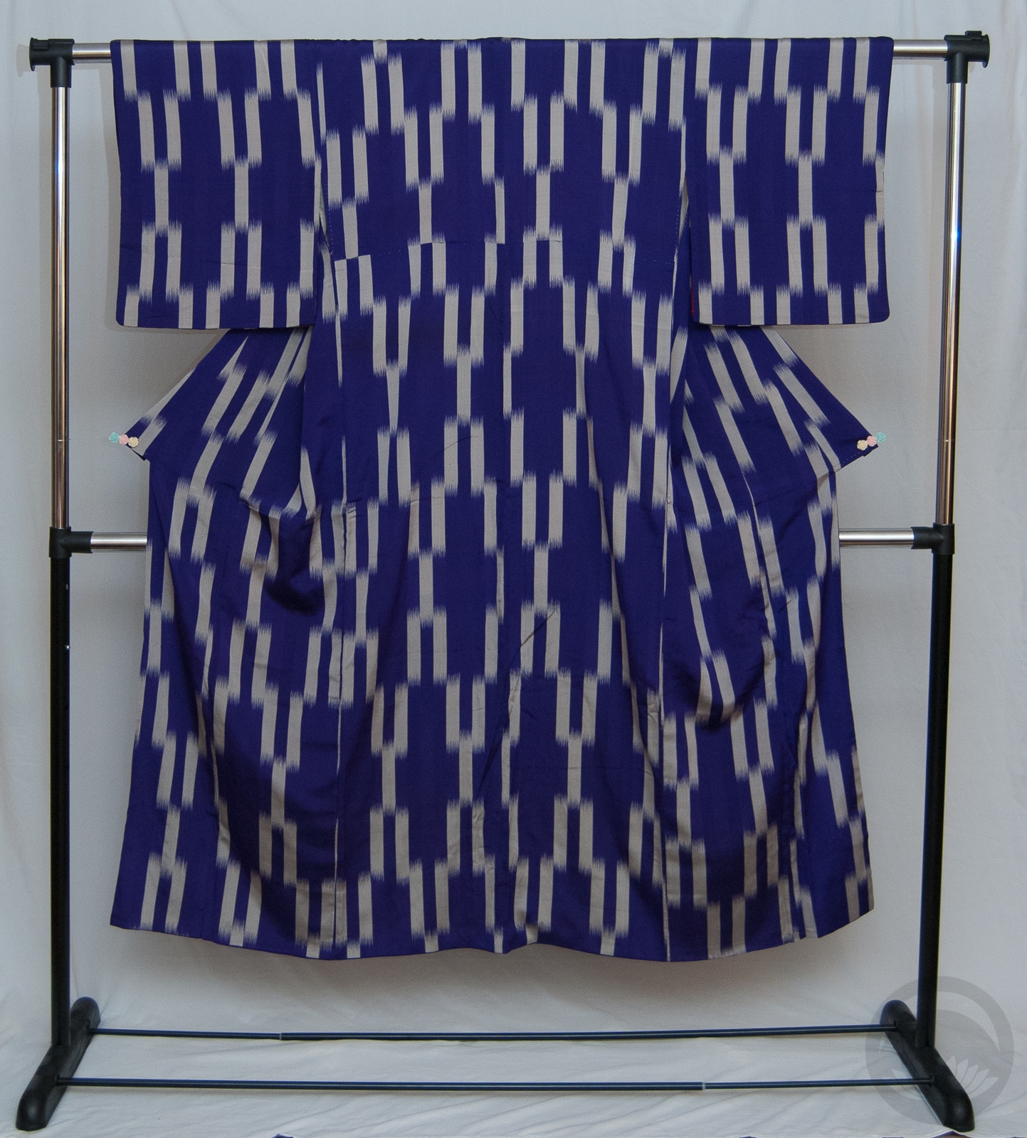
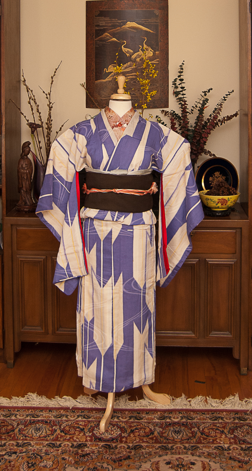
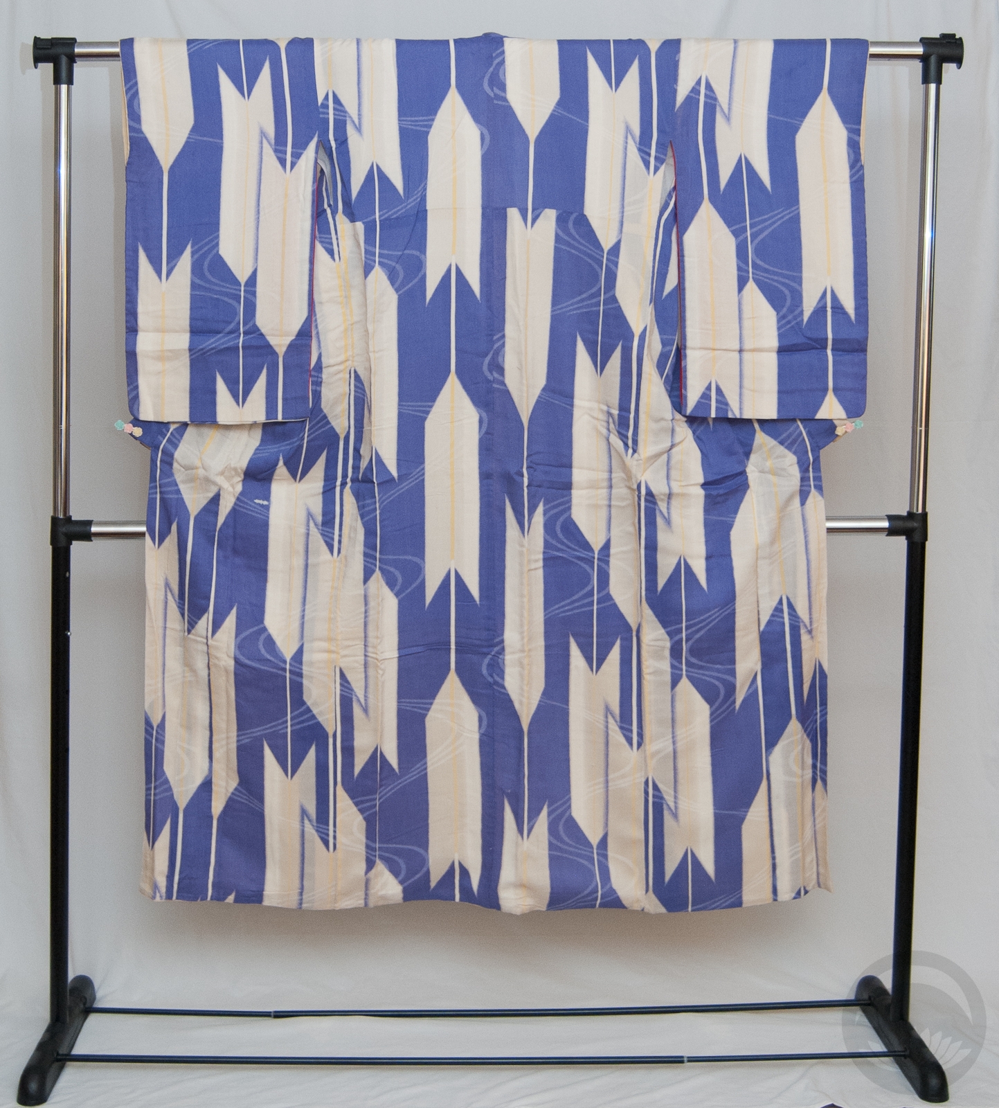
Her look and costume have evolved almost as much as her origins, and my initial plan was to go for black with hints of blue-green to evoke the gritty night-time feel of Gotham as well as echo her outfits in the Batman Ninja movie. But after some discussion with a friend, I realised I could absolutely pull in the purple as well, and have a very harmonious outfit that nodded to her original costume as well as the more modern iterations.
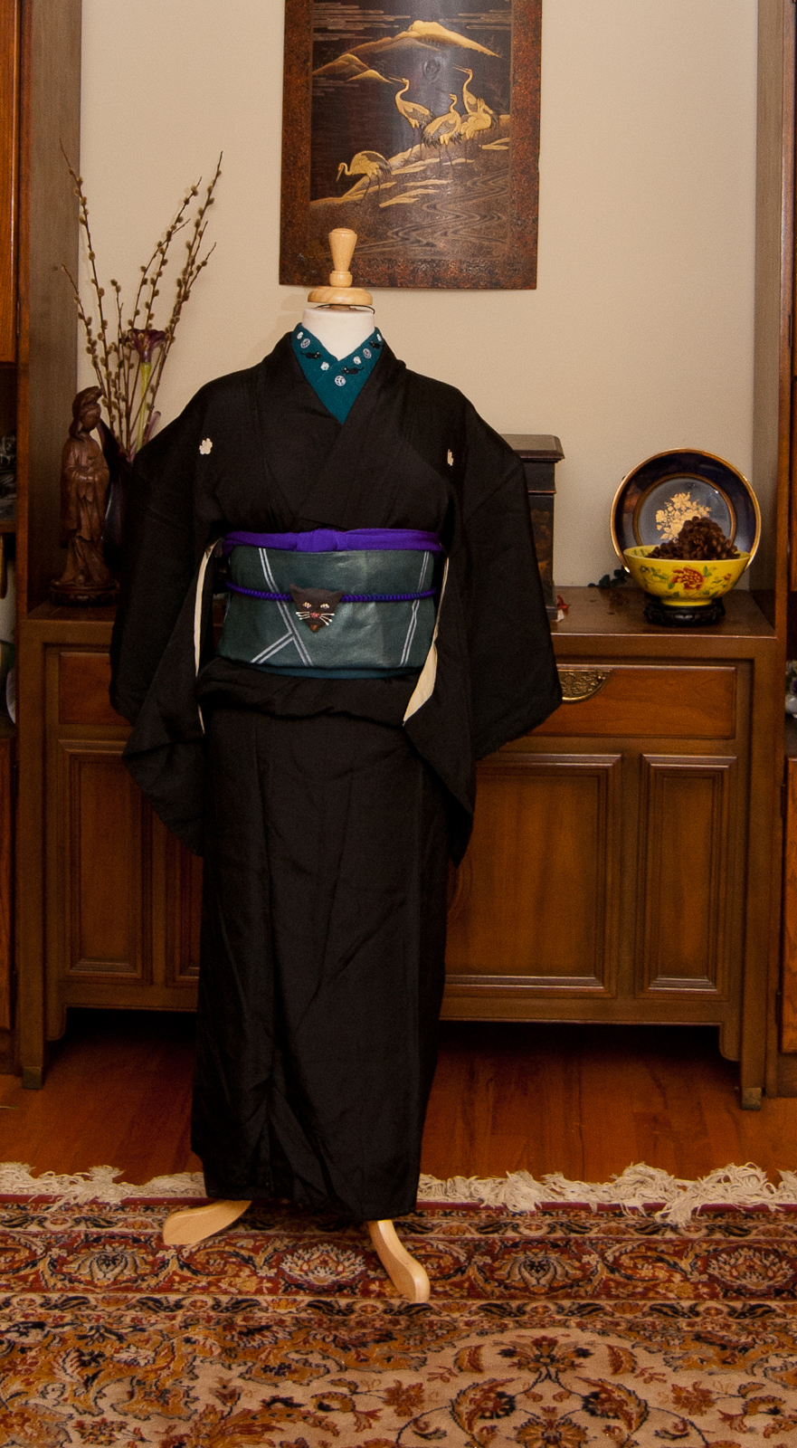
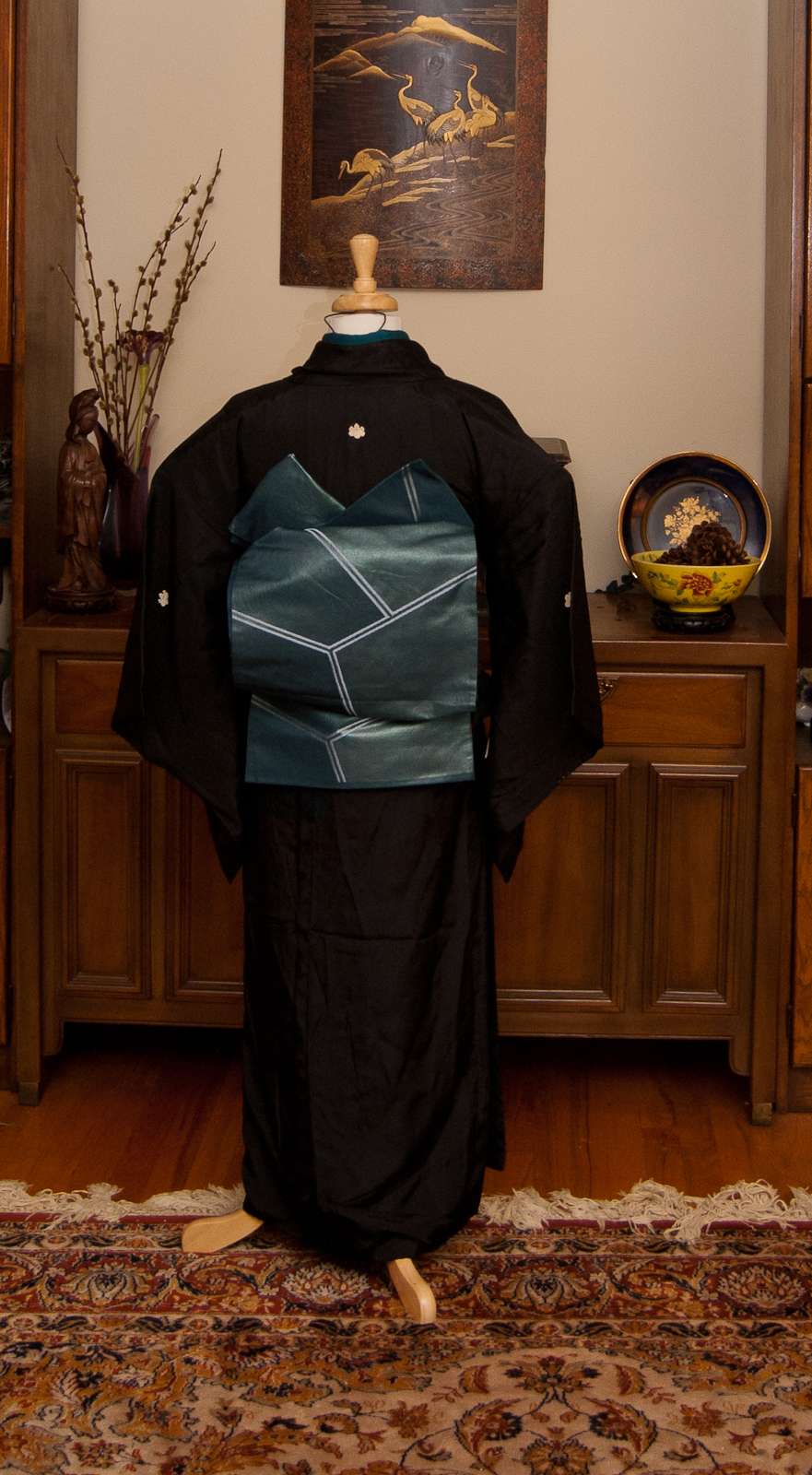
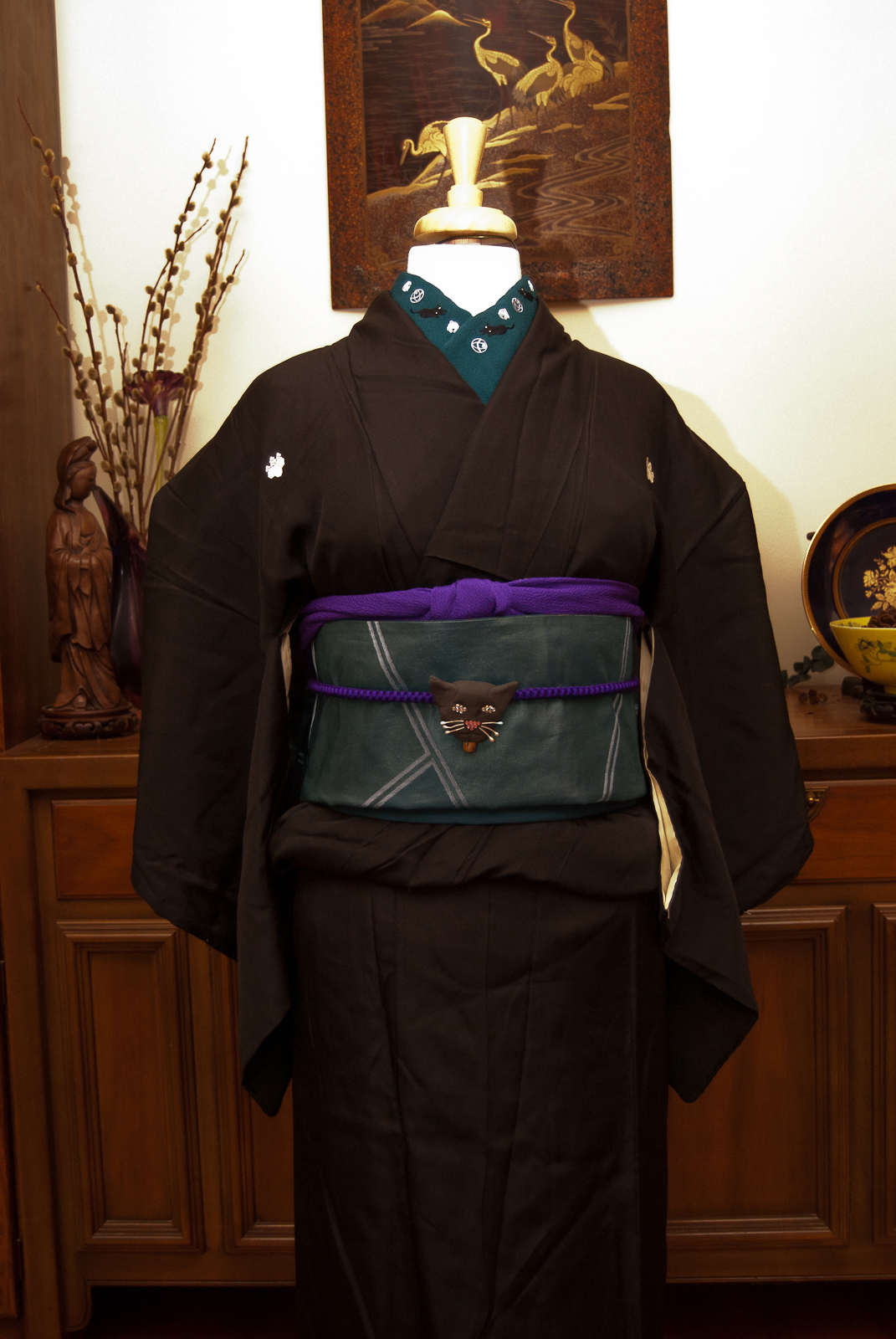
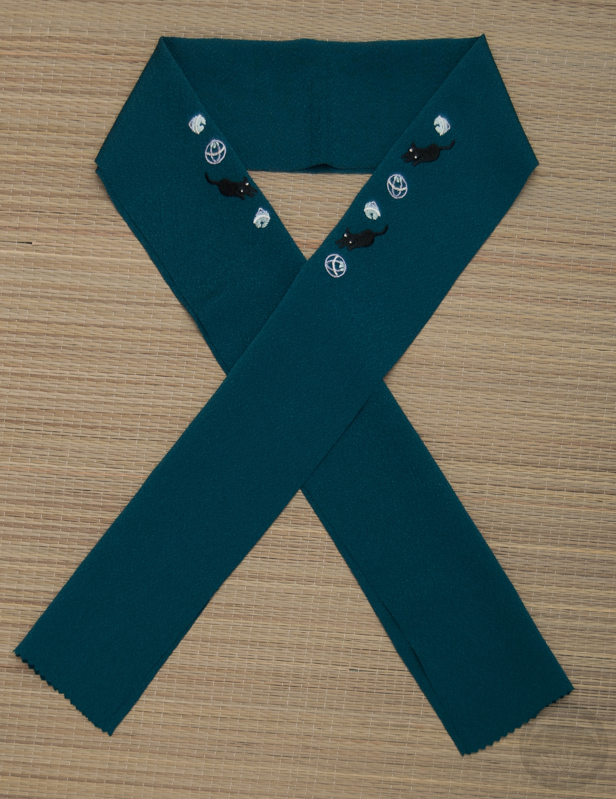
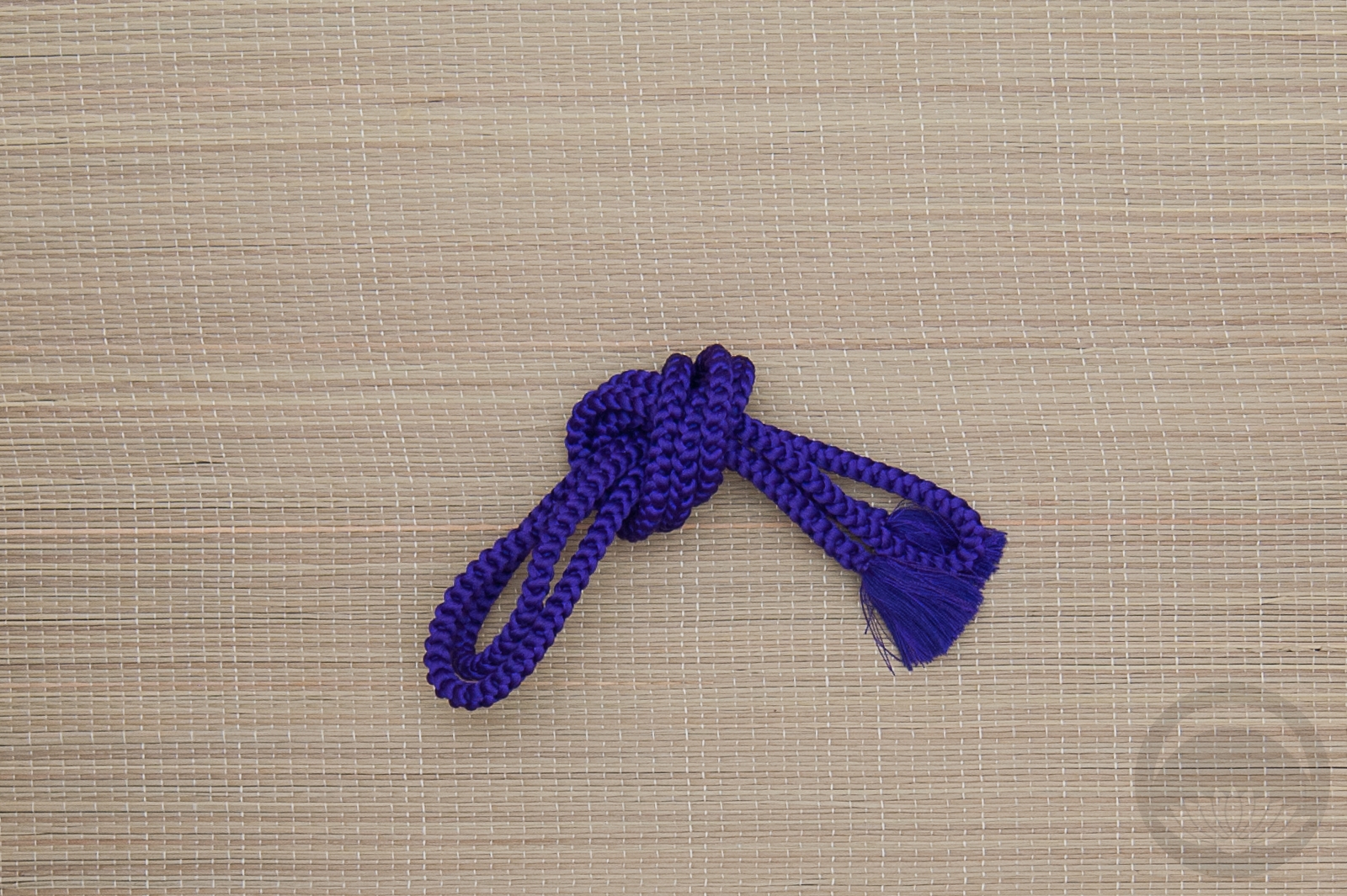
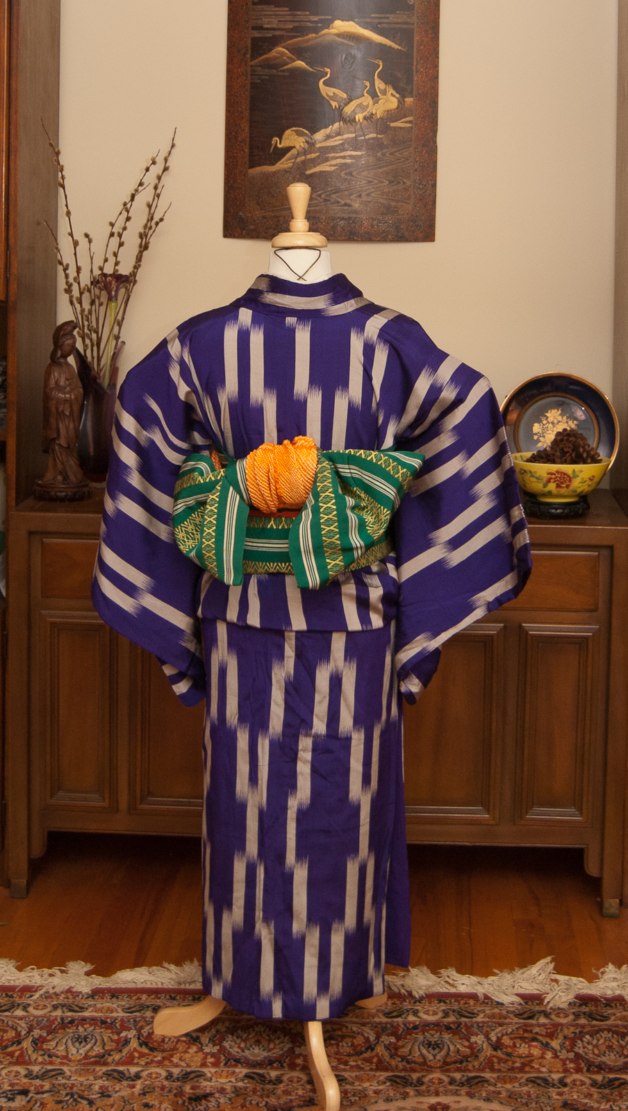
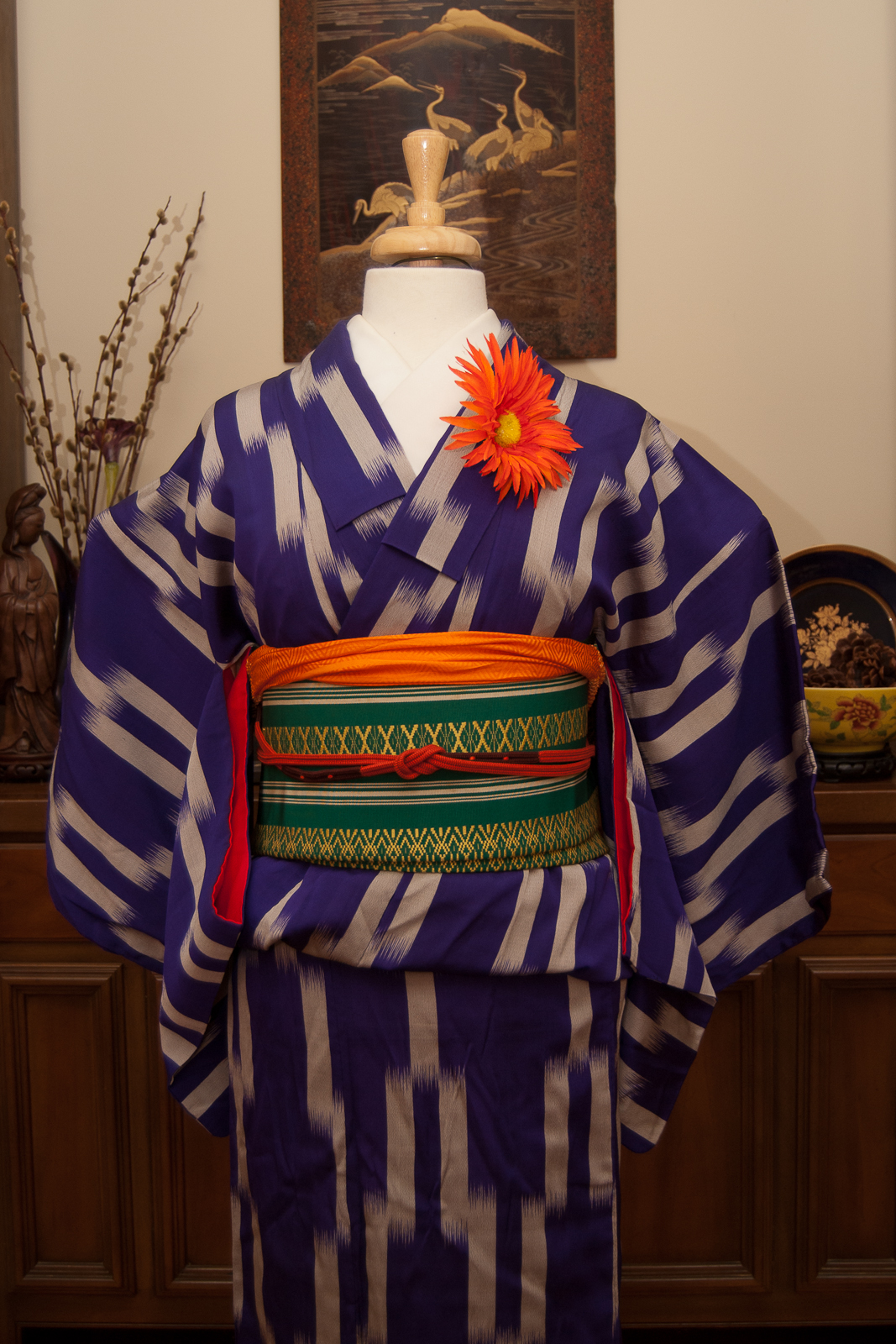
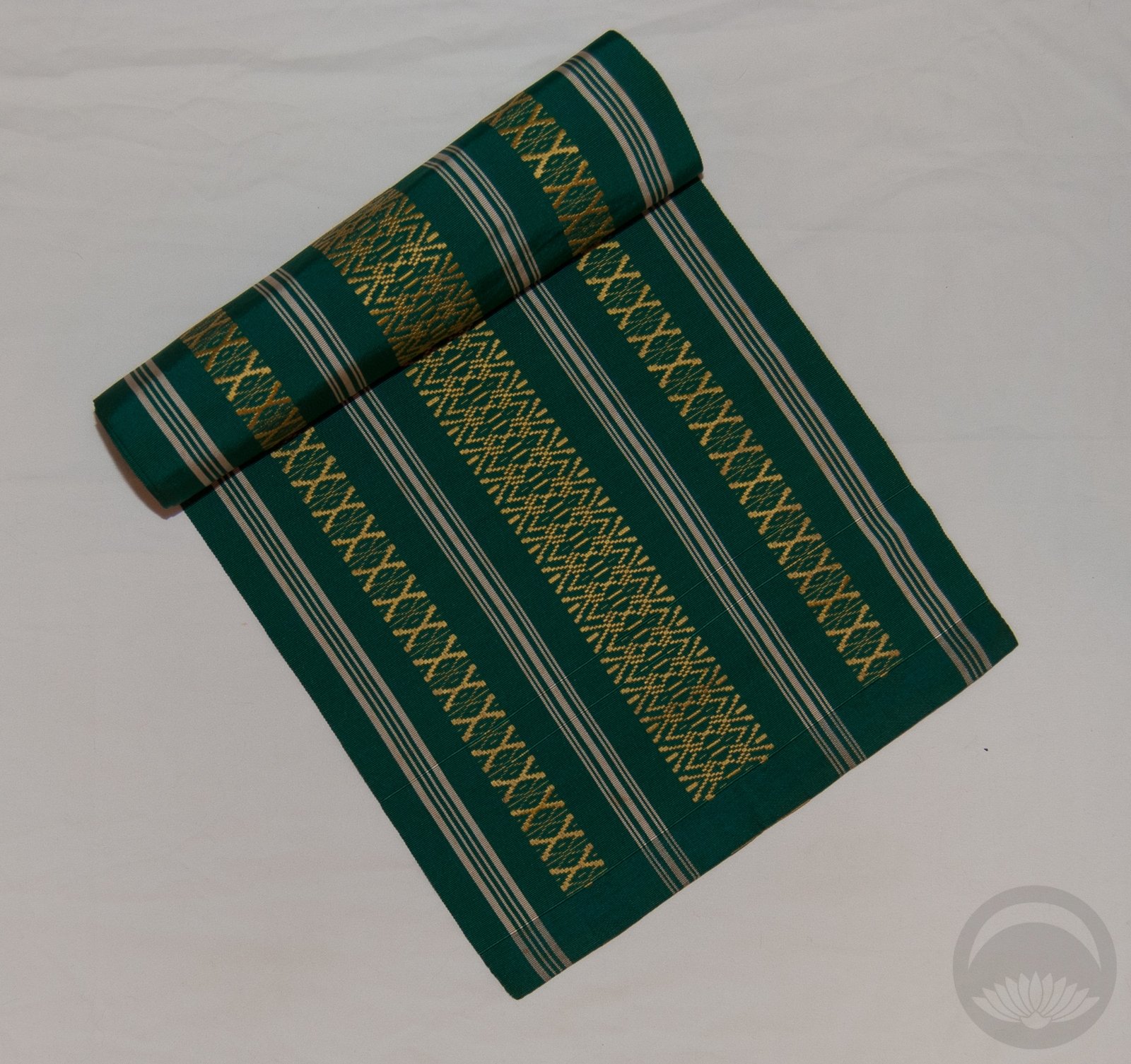
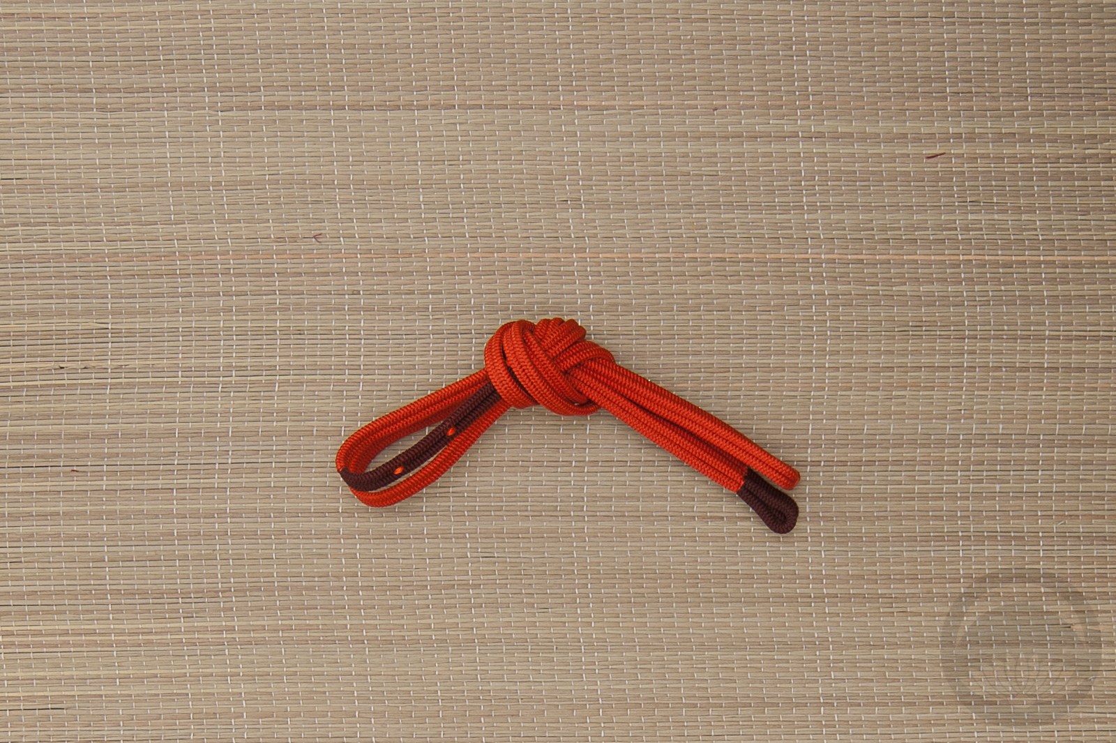
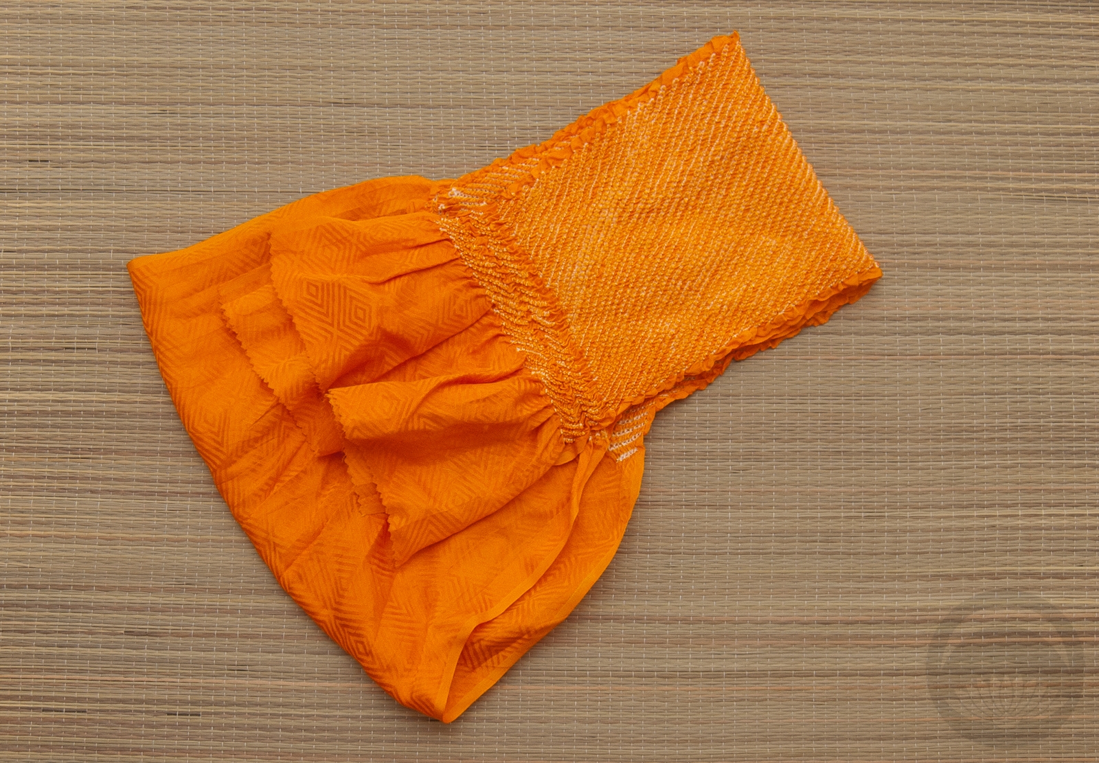
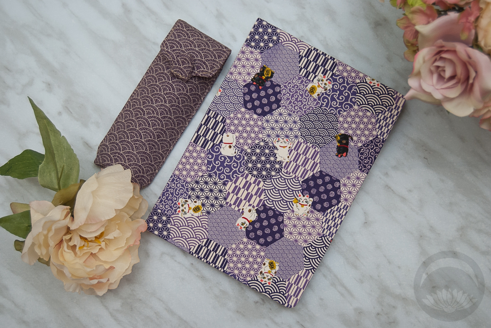
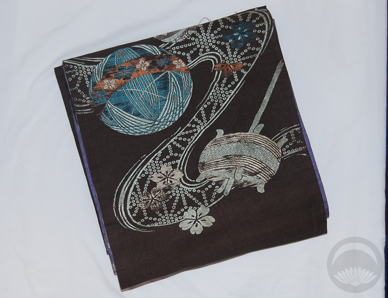
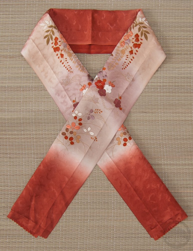
Of course, this was the perfect opportunity to use my teal haneri with black cats on it. I also tied a variation on a standard otaiko musubi with my teal obi that gives off the impression of cat ears. I really wanted this outfit to be as sleek and elegant as Selina Kyle is, but with a sense of whimsy and a clear nod to cats. The obidome is a stylised clay cat face my father sculpted and I then decorated with pearls and rhinestones to call back to her cat-burglar past. A rich purple obiage and obijime tied everything together, both visually and literally.
Unfortunately, the weather here is awful and dreary and the light in the living room was not amazing today. Combine that with the fact that purple and teal are two of the most difficult colours to photograph. I had to process the photos quite a bit, but I think in the end they’re pretty accurate, and the outfit conveys exactly what I was hoping for, so I’m quite pleased.
Items used in this coordination
-
- Mofuku Kimono
-
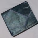
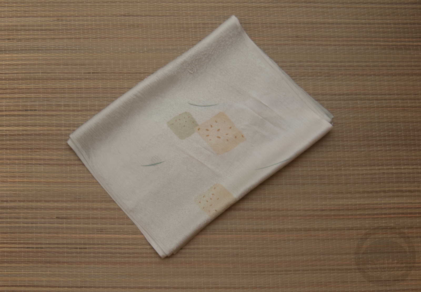
- Teal Geometric
-

- Cats
-
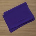
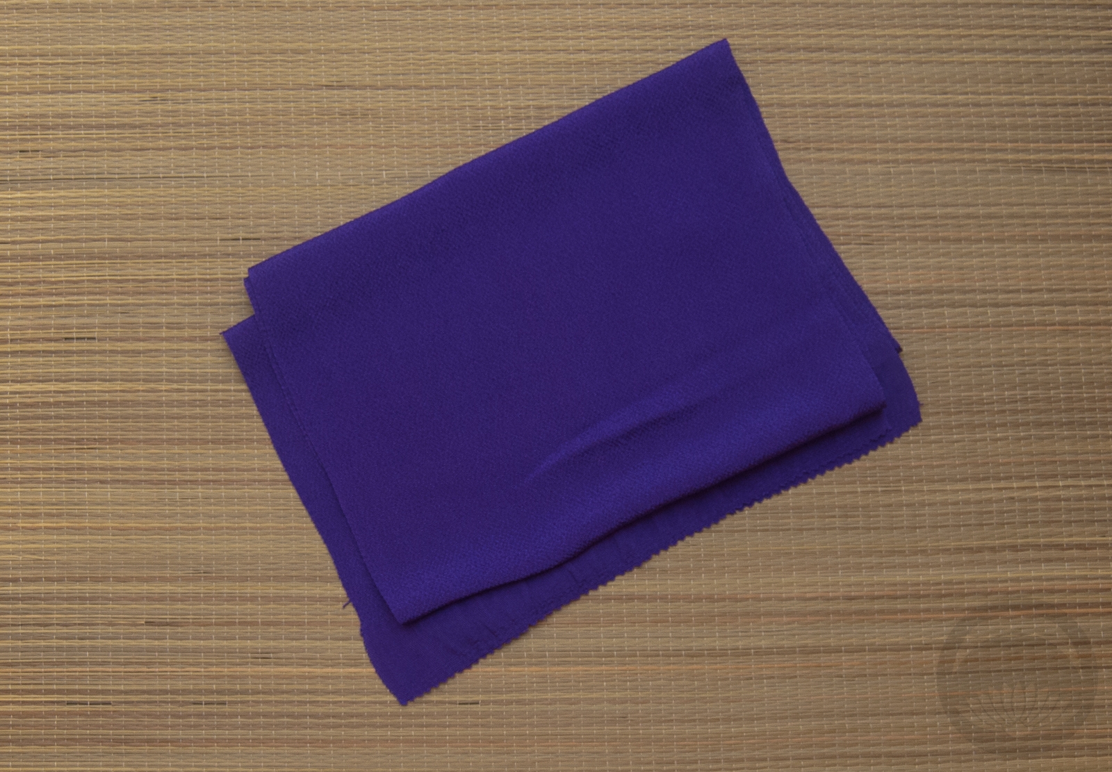
- Rich Purple Chirimen
-
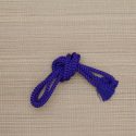
- Purple Round


 Bebe Taian
 CHOKO Blog
 Gion Kobu